Hi Everyone,
This post contains parts 1 and 2 about my quest for the perfect teal paint color for my newly refurbished den/second bedroom off the living room. If you’ve already read part 1, please click the link below to skip to part 2.
If you’re here for the first time or wish to review, please begin from the top of the post.
Part 2 Begins Here
Hi Everyone,
I realize the post is quite late, however, I am trying to loosen up. After all, I’ve been writing this blog without fail a minimum of twice a week for nearly 11 years.
Besides, my darling son, Cale, came for a visit. So, we had a couple of dinners out and went to a movie in Brookline last night. Tonight, he has a wedding gig. (If you don’t already know, he plays the trombone.) I’m meeting him in JP (Jamaica Plain for most of you) tomorrow. And then, he’s coming back in two more weeks for another wedding gig!
Now that I have a working toilet downstairs and am back in my bedroom, Cale is once again sleeping in the den/second bedroom, only there’s no furniture. So, I got him a tatami mat and a futon. He said it’s terrific—very comfy!
Okay, back to the paint colors!
Today, we will focus on the den, but before we do, I will quickly go over what has been done and what we’re doing with the rest of the walls and ceiling throughout my duplex.
The primary bath is done and is lovely painted Benjamin Moore Cloud White oc-130. I’ll show you a new photo very soon.

The same color continues in the embrasure hall and then in the primary bedroom, which looks okay at night but lavender in the daytime, particularly the crown moulding.

It looks purple because of the reflection from the ubiquitous red brick outside my windows.
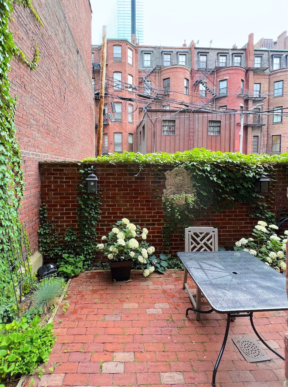
See what I mean?
The lower or garden-level entry and stairwell will be Knoxville Gray hc-160. Everyone who walks by remarks on the large strip of hc-160 and says the same thing.
“Oh, I love this color!”
Cale never comments about colors, but he adored this one.
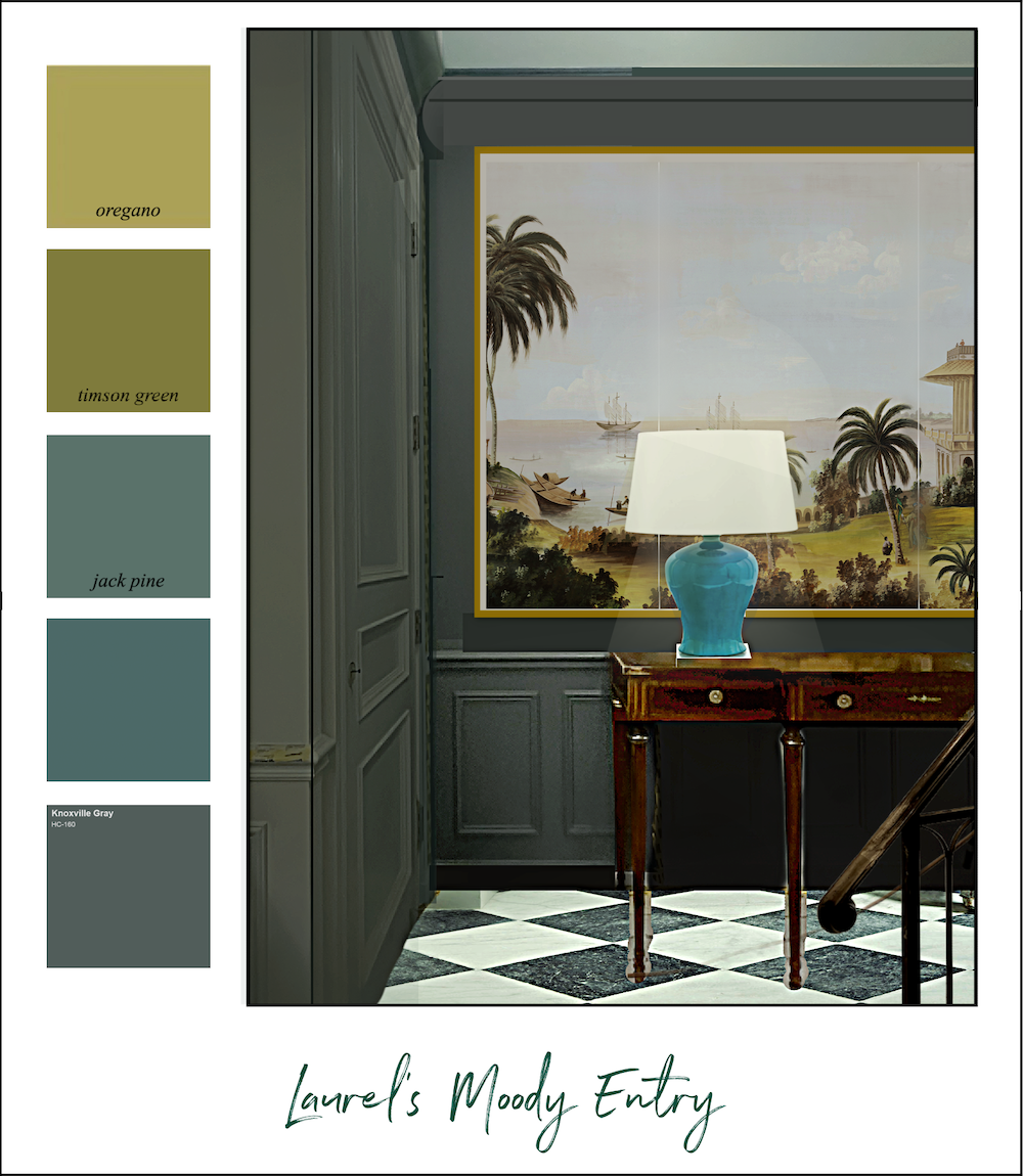
The lights bring out the green undertone. But one of the things I love about this color is that it’s difficult to pinpoint what it is. It usually reads as an exceedingly muted yet saturated pine green, and it’s neither too dark nor too light.
The ceiling will be painted a new color for me.
Benjamin Moore Newt Green 2149-10
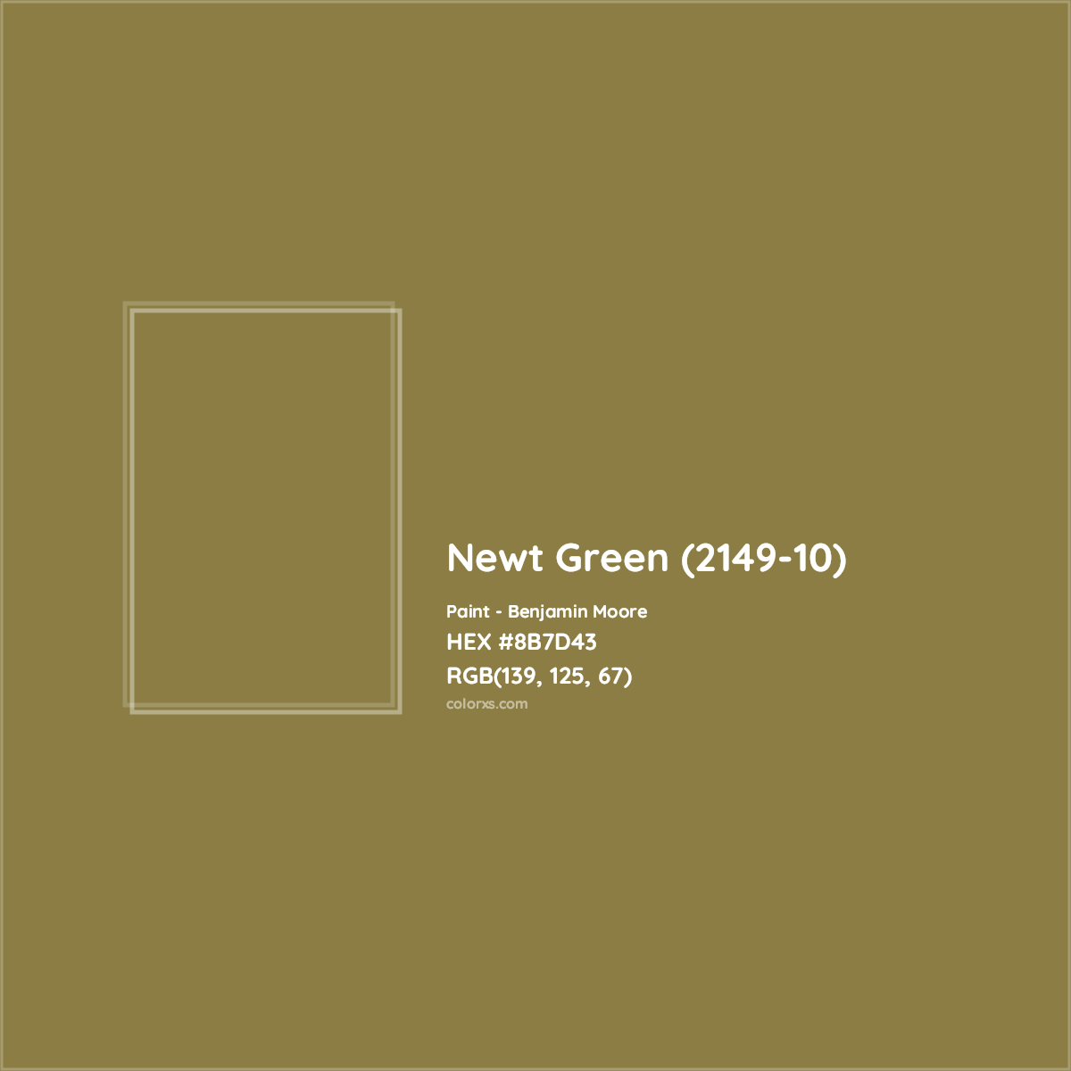
I also got a sample of Timson Green, another Laurel Home paint color. However, Newt, with its distinct brown undertone, got the gig.
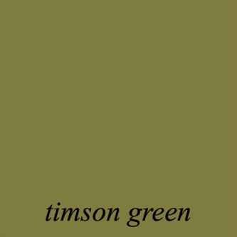
It’s a lovely color, but Newt looks better with Knoxville Gray.
I got Samplize samples this time, and one of the painters stuck it to the ceiling for me. Of course, I forgot to take a photo. However, we both concurred that it looked terrific with the Knoxville Gray.
And, that, my dears, is the lower-level paint.
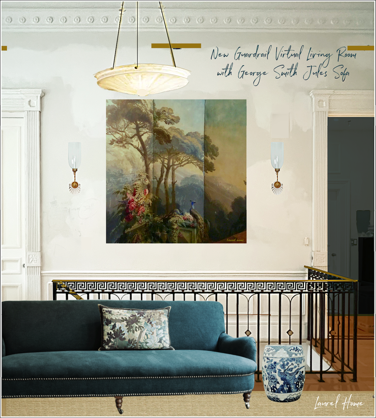
Upstairs, beginning with the entry, I plan to do the wallpaper I’ve been featuring for the last three months or so. I will put it in framed panels (one for each wall) because it doesn’t make sense to do it any other way.
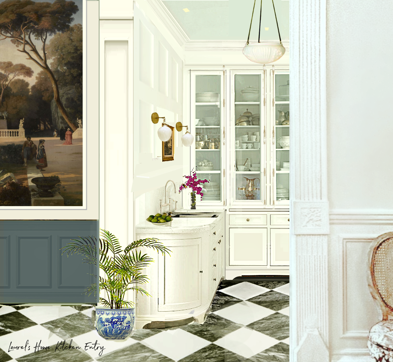
We will continue the Knoxville Gray for the wainscoting and front door wall because the door is off-center, and anything else will look silly. However, I want a piece of the wallpaper in the over-door area.
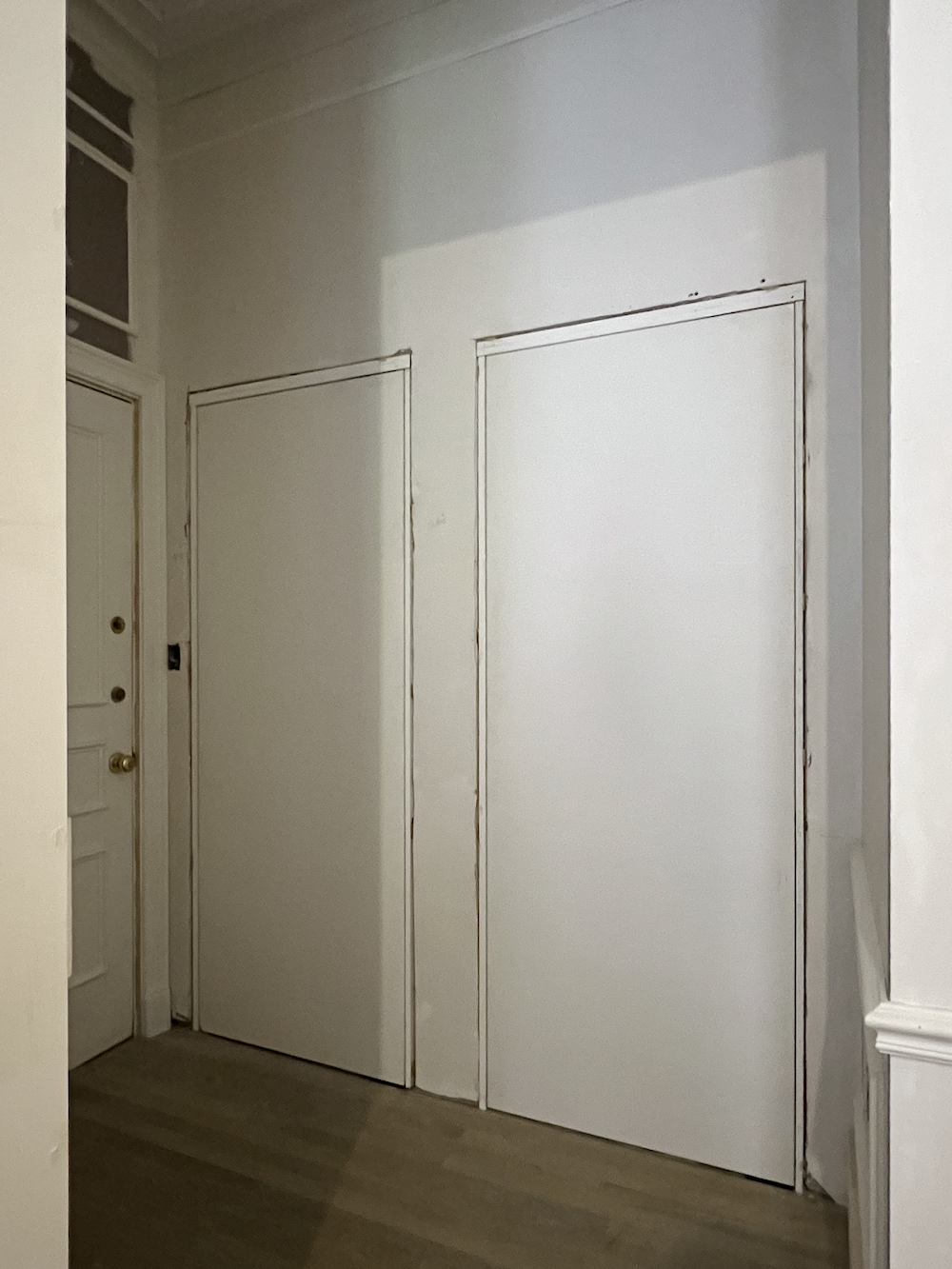
This image better shows the overdoor. However, the jib doors look a lot better in the photo below.
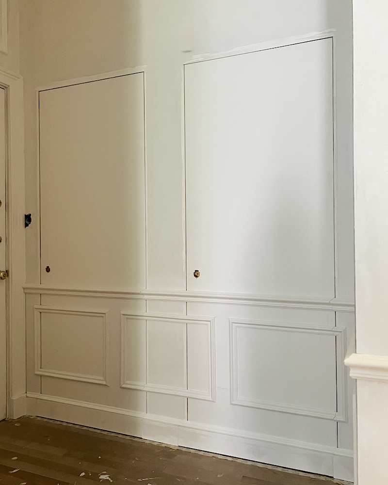
Then, will continue the Sherwin-Williams Greek Villa in the kitchen. It’s already on the beautiful Crown Point cabinets. I want to repeat the Italian Ice Green 2035-70 on the ceiling, which will also be in the entry.

The living room trim (satin finish) and ceiling (matte) will be Benjamin Moore Cloud White oc-130.
Then, I would like to do the walls in Benjamin Moore Moonlight White oc-125 for a bit of contrast.
And now, for the den.
The quest for the perfect teal paint color that’s not too bright, gray, light, or dark.
What’s funny about my upstairs is that because there are no real hallways, it acts like an open-concept floor plan in that everything is visible to everything else.
Plus, we still have the pink issue. It’s not as big an issue in the living room, but it is for the den. Part of that is because of the current pinky-barf-beige paint color.
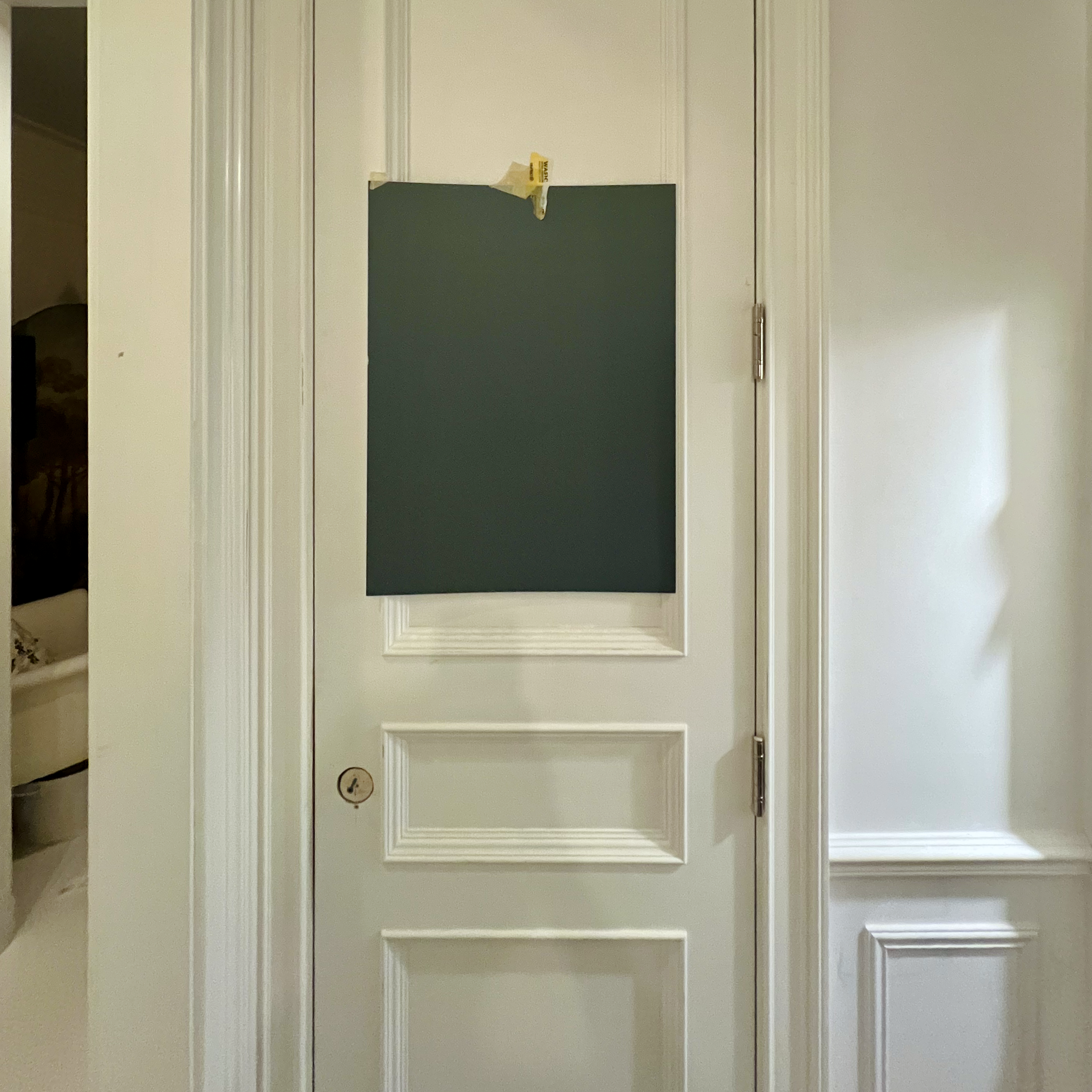
The other day, I picked up some new paint samples. However, the Beau Green was off-color.
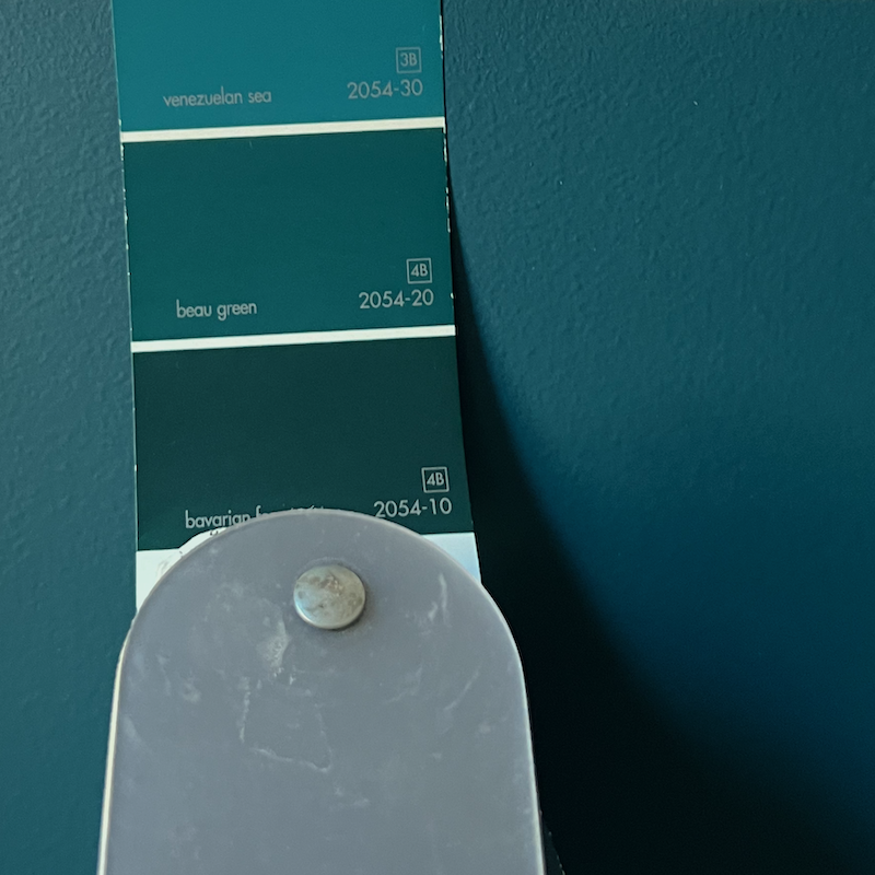
The background is the paint color. It is not my paint chips that are off-color. The other colors matched quite well. This time I got samples in Aura and matte. I don’t recommend getting eggshell for samples, especially for dark colors because of the reflection when viewing from some angles.
I also got Venezuelan Sea, North Sea Green, and Dark Teal.
They are all gorgeous, but for my room, my favorite teal paint color was Benjamin Moore North Sea Green.
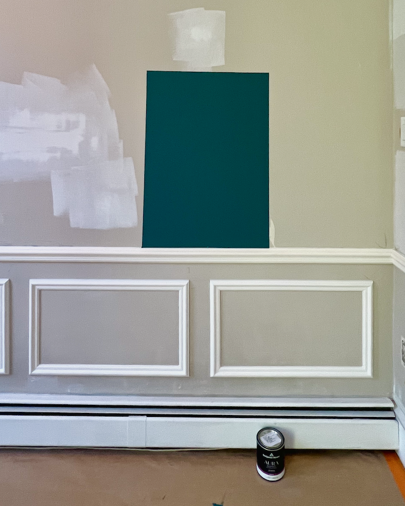
Last Friday, I had one of the painters paint NS Green and Galapagos Turquoise on the wall. After all, Galapagos is one of the Laurel Home paint colors. That doesn’t mean it’s a better color than the others around it. However, it is a lovely deep teal paint color that won’t knock your eyeballs out. I very much like it, however, for my den, I think I prefer a color just a touch lighter.
Still… I pondered…
I mean, if no one is holding a gun to my head, I’m going to ruminate and ponder on which color to use.
Thankfully, Chris came by, and by the time he left, I felt much better, as talking it through really helped.
We’re planning on doing a “color drench.” That’s a newish term for the on-trend look of drenching the entire room in one color—or at least colors that are very close to each other.
However, painting everything one color is nothing new. Interior designers have been doing this for decades. Social media is what makes these classics “trendy.”
I still think I’d like the ceiling, coving and frieze to be a shade lighter than the walls.
Chris recommended that I do one of my renderings.
So, while Cale was at Aikido yesterday, that’s what I did.
Here’s how I did it.
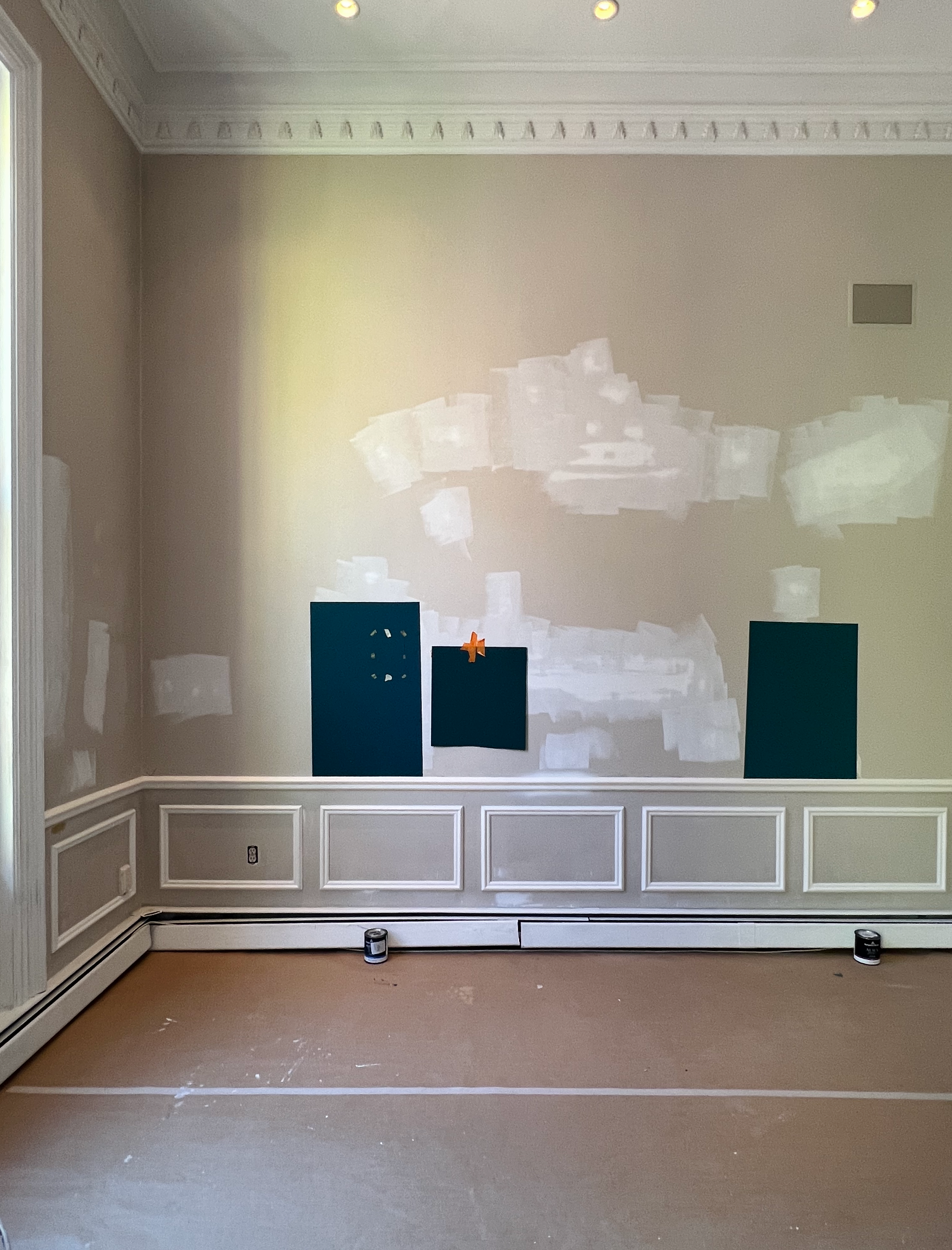
I took a photo and made it as straight as I could. Then, I manipulated the color, making it bluer and greener with my photo editor.
Then, I put the image in Picmonkey, where I have all sorts of tools to make the walls any color I like and cover up the things I don’t want to see.

I duplicated the image and reversed it for the third wall on the right. This is North Sea Green.
Then, I got to work furnishing the room.
Okay, please stay tuned to see the results tomorrow for the perfect teal paint color for my den! I think it’ll be tomorrow, but it might be Tuesday.
Anyway, I hope you are enjoying the outrageously terrific sales this holiday weekend. Please check out the newly updated HOT SALES pages for a preview of some of my favorite sales and items.
xo,
*********************************************************
Part 2 Begins Here
Tuesday September 3, 2024
Hi Everyone,
I hope you had a terrific long weekend and aren’t too messed up about what day it is!
Luckily, I had an extra day to ponder the teal paint color in the den.
Per Chris’ recommendation, I did a rendering of the den. Well, actually, a few renderings because, as I’m always harping saying, we need to have a cohesive plan before selecting paint colors.
Well, let’s say we need a solid direction– a foundation for our space.
That doesn’t mean everything is rigidly set. No, not at all! In fact, the idea is to give yourself enough leeway to make changes along the way, if necessary.
So, let’s look at rendering #1 with walls in Benjamin Moore
Laurel, an orange drapery?
Yes, I quite like it with this saturated teal.
For those who want to see COLOR, this should make you quite happy. That is unless you don’t like these colors. I’m fine if you don’t.
But, here’s the important thing.
Nothing is done in isolation, especially in my space, where all the little rooms open onto the main living area.
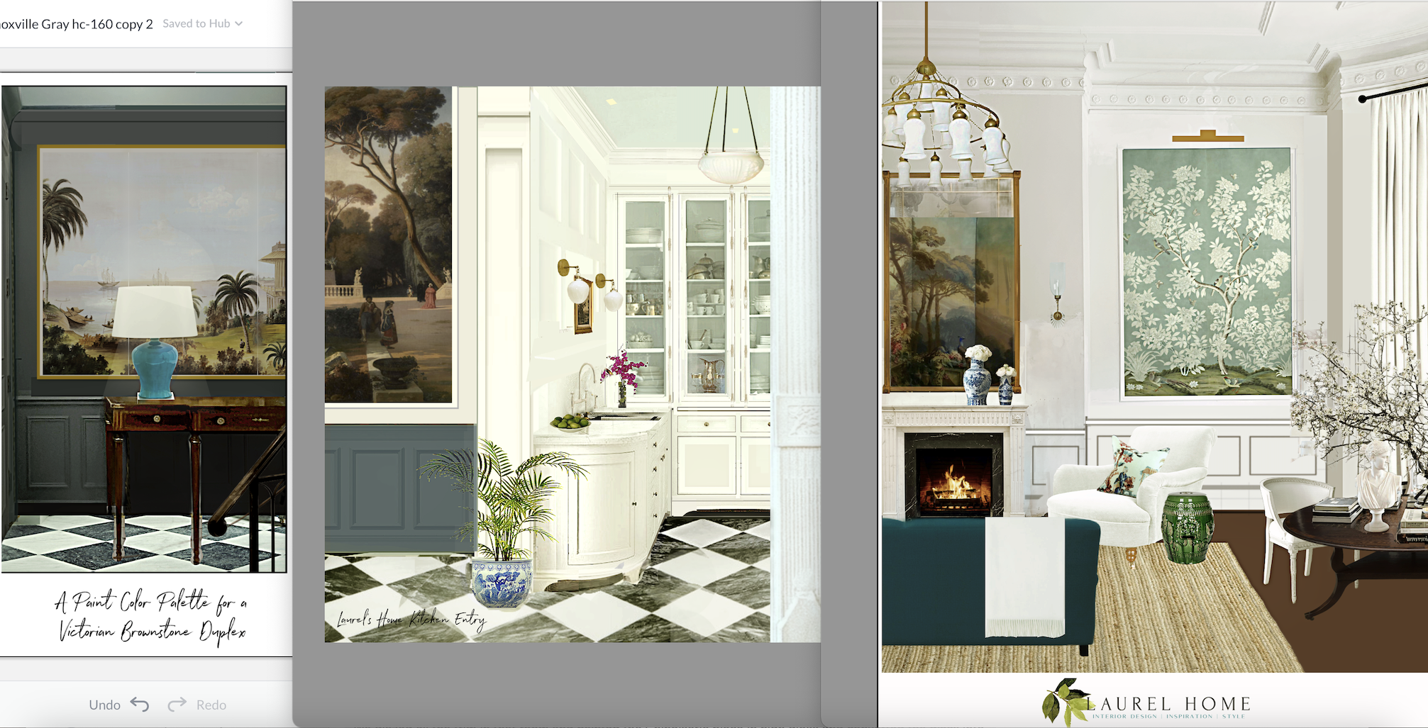
Sometimes, North Sea Green looks like this. But most of the time, it looks far more saturated.
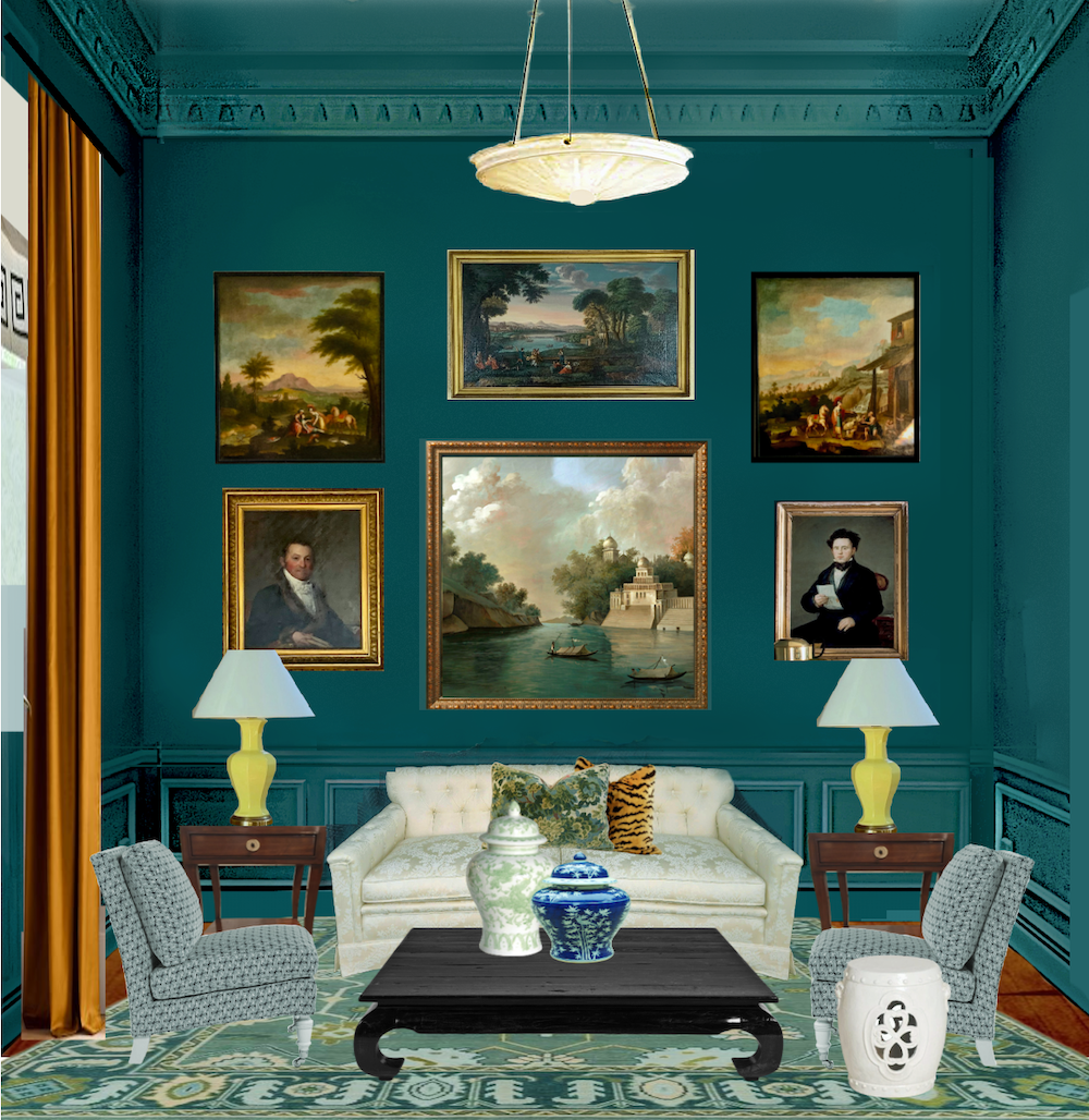
Like this, above. Oh, this is so English!
So, I returned to the lightest shade we tested, Fair Isle Blue csp-715.
This is one of the beautiful paint colors from the Color Stories Collection.
The thing is, it’s not that much lighter. However, it is less saturated.

That’s much better. So, let’s look at the rendering with Benjamin Moore Fair Isle Blue. Perhaps this will be the perfect teal paint color for my room.
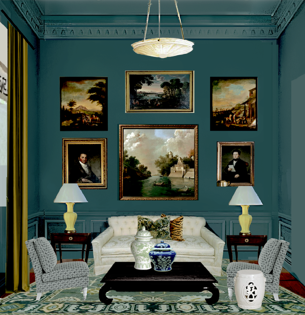
Muuuuuuuuch better!
However, I have another problem.
It’s the coffee table I searched for for two years before finding one.
Yeah, this coffee table.
I can’t paint it black. I mean, I could, but I don’t think it’ll look right. I’ve always wanted to paint it white ala William McLure’s old coffee table.
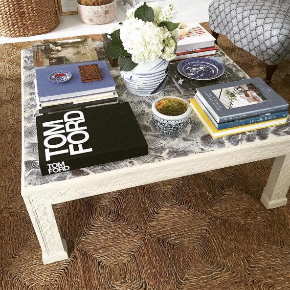
However, I won’t do the faux finish on the top.
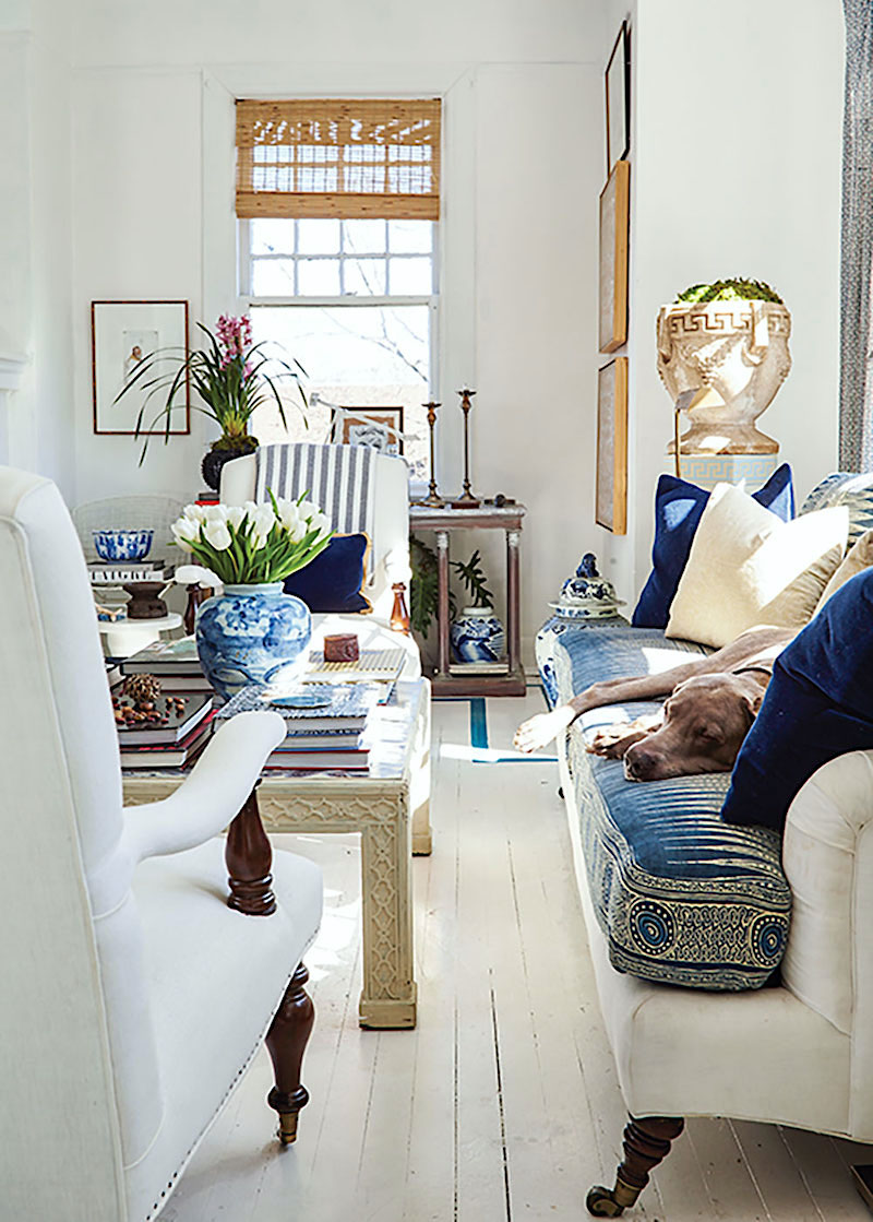
Below is the vintage sofa I’m getting in a few weeks.

They don’t make them like this anymore. The back is only 31″ high. This is the type of sofa Albert Hadley might very well have made 60 years ago.
Okay, this is going in my den. That is where my TV is and where I almost always used to work, so there’s no way I will have a white sofa.
Besides, I can’t have a white sofa AND a white coffee table.
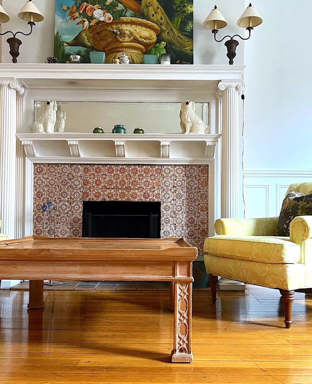
To complicate matters, I found the perfect black coffee table, but I have nowhere to put the table I waited so long for. (Please see above)
And no, I can’t use either one in the living room. There is only room for a coffee table that is 18″ deep—max. My current one is 38″, and the black table I found is 30″. It’s a bit frustrating because 30″ deep would also be better in my den.
However, the new sofa is a scant three feet deep, so with the vintage Century table, there will be about a 40″ path in front of the coffee table. That’s plenty of space.
So, let’s assume I’m keeping my coffee table and that I’ll have Chris help me spray paint it shiny white.
Below are two iterations with a white coffee table similar to mine and the walls painted Fair Isle Blue.
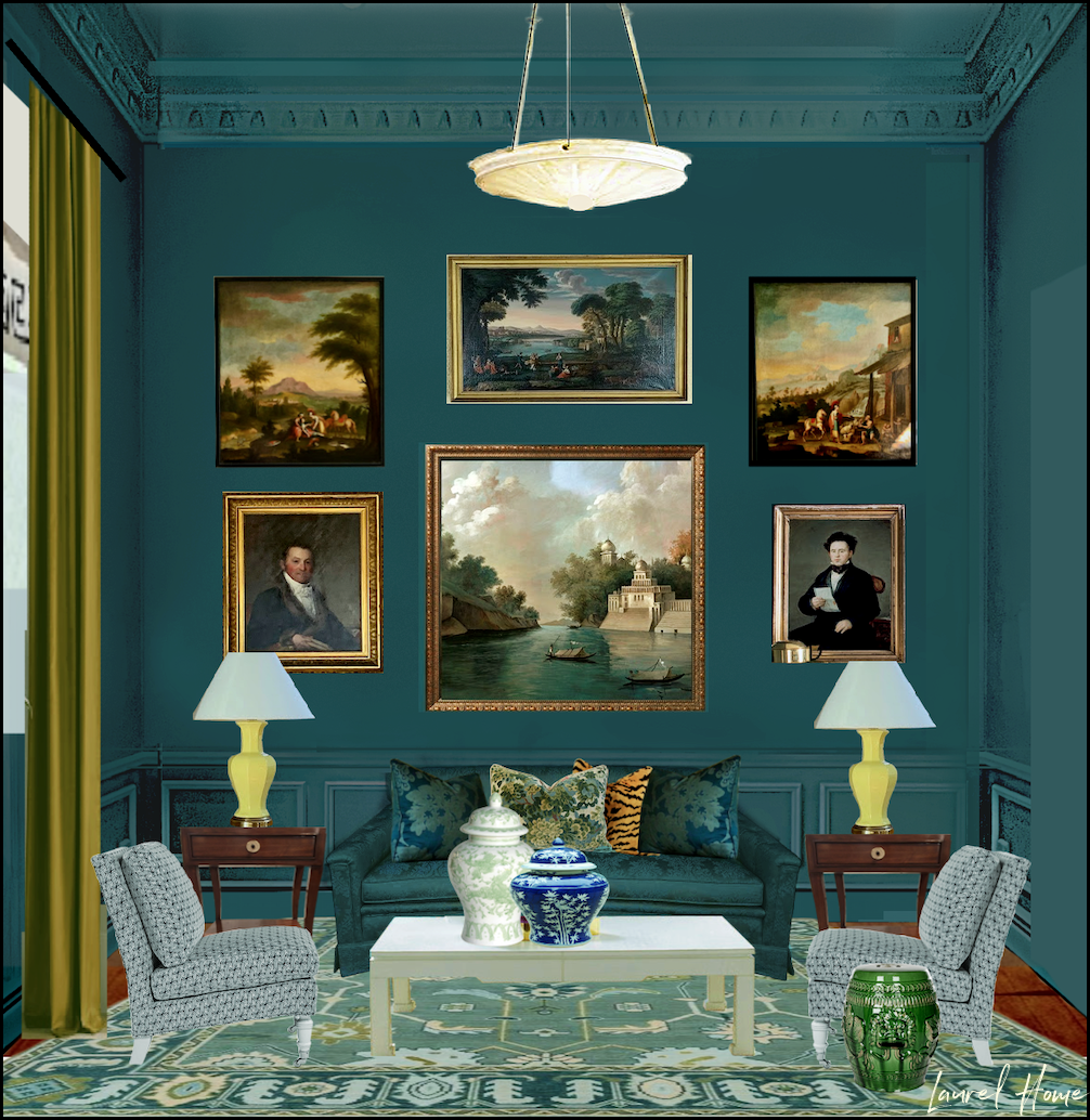
I love the gold drape but am unsure about the teal sofa. I long to see that color broken up some more. Besides, the plan is to have a teal sofa in the living room.
Below is the second Fair Isle Blue rendering with a chartreuse sofa.
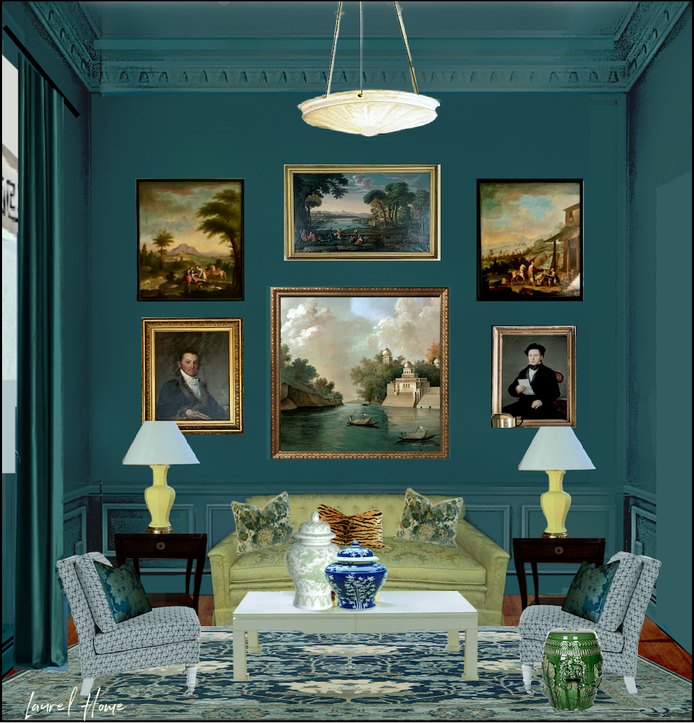
By the way, those are most likely not chairs I’m doing, and the rug exists, but I manipulated the colors.
Laurel, where did you get the fabulous art?
Ahhh… thank you. The image in the middle is from Ananbo, and the one on the right is from Benjamin Moore.
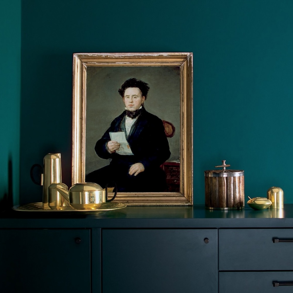
The rest I “borrowed” from the Harrison Gray Otis House on Cambridge Street. (The photos were taken in the fall of 2021.) On the left is a portrait of Mr. Otis. Surprisingly, the colors in this room are 100% in keeping with those used in the late 18th century.
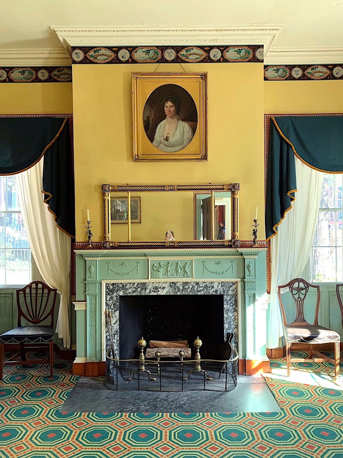
Mrs. Otis’ (Sally) bedroom.
One last thing. I’d like to paint the ceiling and crown a slightly lighter shade of teal, and the best I could find is the one above Fair Isle Blue. That is Tropical Oasis csp-710
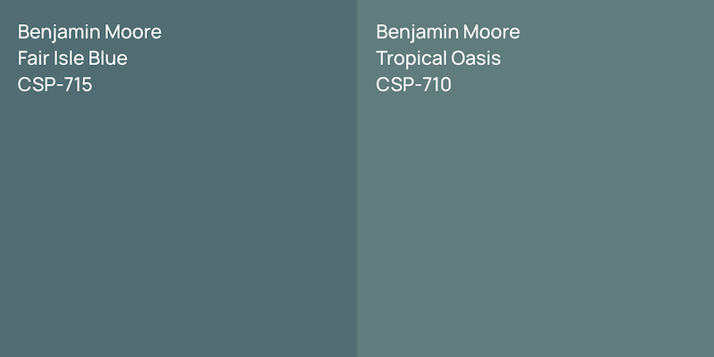
Paint colors tend to go darker as they go up the wall. Plus, I think they look terrific together.
Before I go, look what I woke up to this morning!
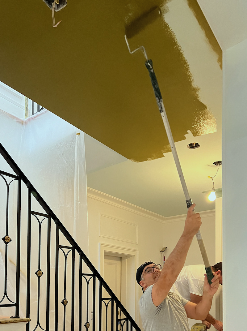
Yes, my ceiling is the color of pond scum, and I LOVE it!
It all began nearly 30 years ago with this image of Barbara Barry’s living room.
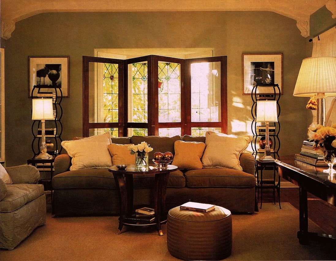
We’ll look at all of the colors together on Thursday, and I hope to have some new surprises for you, as well.
xo,
***Please check out the recently updated HOT SALES!
There is now an Amazon link on my home page and below. Thank you for the suggestion!
Please note that I have decided not to create a membership site. However, this website is very expensive to run. To provide this content, I rely on you, the kind readers of my blog, to use my affiliate links whenever possible for items you need and want. There is no extra charge to you. The vendor you’re purchasing from pays me a small commission.
To facilitate this, some readers have asked me to put
A link to Amazon.com is on my home page.
Please click the link before items go into your shopping cart. Some people save their purchases in their “save for later folder.” Then, if you remember, please come back and click my Amazon link, and then you’re free to place your orders. While most vendor links have a cookie that lasts a while, Amazon’s cookies only last up to 24 hours.
Thank you so much!
I very much appreciate your help and support!
Related Posts
- The First Renovation Tour Of The Upstairs Living Areas! (Parts 1 & 2)
- 14 month Renoversary! and I’m Back In My Bedroom!

- The Perfect White Bedroom Paint Color
- Hidden Door Challenges and Update on the Kitchen Tile

- Laurel’s Home Renovation 2024 – News & Deets!

- Merry Christmas 2023! + Happy 3-Year Bostonversary!
- A Laundry Closet Entrance Combines Beauty & Function
50 Responses
Laurel, I love your teal den with the dramatic orange drapes, white sofa and black coffee table. Are you sure you can’t have your fretwork table painted black? It would look SO amazing! I’ve always loved William McClure’s living room, but his white fretwork table floats on a cloud of white, white, white. You’re saturated den is an altogether different space!
I have my dining room painted in polished slate (bm). It’s maybe the slightest bit less saturated than fair isle blue and looks lovely!
I really enjoyed reading about your search for the perfect teal paint color! As an interior designer, I understand how important it is for the color to fit well with the entire space, especially when rooms flow into one another. It’s interesting to see how North Sea Green changes with lighting and how Fair Isle Blue from the Color Stories Collection might be the perfect choice. I’m excited to see how this teal will look in your den. Thanks for sharing your thoughtful process!
Laura, how about a Vintage Plum couch with the Isle Teal color? Medium light shade? I also love the Vintage colors you chose. Gold’s Teals are nice. I’m currently working on my 1917 home. I did the living room walls in BM Nantucket Gray, Trim, Gloucester Sage. Ceiling is white. Do you think I should go a Gold? Which one?? East facing. Bright most every day. The drapes are faux silk, in a dark vintage plum. My furniture is florals with olive background. I love watching you design!! I’ve been doing it 40 years!
Thanks for another Master Class, Laurel. I think my favourite blog entries are your design boards because I get to see the evolution of your thinking process as you assemble the various components to form a cohesive and satisfying vision. After that mouthful, I agree that the chartreuse sofa makes a statement and I am not put off by the white coffee table at all. I am fascinated however that with the replacement of the light coloured drapes the overall effect is to see the room become cooler in appearance and less dramatic to my mind. The side chairs and rug become more noticeable. Somehow I want to see more contrast. Lighter drapes perhaps?
Dear Laurel, I love that your considering a “drench” for the den. I’ve wanted to try it in my house but I have no idea what happens when you get to the door trim. Where does the drench color end and the adjacent room trim color begin on the door frame? What if there’s an actual door between the rooms? I check every image of a drenched room that I see online or in the magazines but they never seem to show the openings between one room and the next. Are there guidelines? Love following the progress on your lovely townhouse.
I was delighted to read in your comments that if you decide to go with a chartreuse sofa, it will be a wee bit on the gold side… All of your choices have been so fabulous, but at least on my monitor, my eye was distracted by the chartreuse – rather than seeing it as complementing your other choices. What fun to follow along – I adore your attention to detail!
So funny about the newts eating all the mosquitos! But, of course, the situation is not at all funny. I’m glad you got that figured out, and I hope it doesn’t become an ongoing problem. In our last home, one season we had an infestation of mosquitos, and we never could tell where they came from! (And this was in the Arizona desert, so no standing water that we could find.) Luckily, it was just that one season, but it was NOT fun! I take great delight is seeing your renderings, Laurel. I appreciate that we get to see the steps in your process. I love the chartreuse in that room; it looks perfect with your teal. I’m also a fan of the orange and gold drapes (and perhaps, chartreuse??), though teal would lovely as well. I know that the art on your wall isn’t what is going to actually end up there, but it looks so good :] Your den is going to be fabulous!
I think your painter is having as much fun as you are with the paint colors!!
Oh my gosh, these pictures are stunning! I’m so happy that I am a subscriber and get to witness your talent at work. What a privilege and pleasure.
I like the very last den image the best, but as someone else has noted, where is the desk you surely need?
Teal drapes for the win. Why not reverse the fabrics on the den chairs (which you are not the precise ones you are getting) and the chartreuse sofa?
In other words, a teal pattern on the sofa with the chartreuse appearing as more of an accent on the chairs. This softens the contrast with the white coffee table. How white do you want that table? It looks bright white right now.
I don’t think we can add links here, but I found an interesting fabric just now through a quick and dirty search:
Maybe one small chair, leaving room to work in your desk? Then the chartreuse becomes an accent color in just the right amount.
And yes, a lighter teal on the ceiling. Much lighter for my taste.
Hi Ramona,
You’re right, I discourage adding links because it’s extra work for me, but thank you for looking.
The den is only 10 x 13 and therefore, there isn’t enough space to dedicate to a desk without giving up something else. In any case, I haven’t used a desk in nearly ten years, ever since I got my first Macbook Pro. (I’m on my third one.)
TOTALLY loving the den so far, but the white cocktail table is jarring to my eye. I think it grounds the room and if the size fits, I wouldn’t rule it out as is. That said, you probably have at least 7 intervening ideas since I wrote this comment, so I’m sure you’ll end up with the most aesthetically pleasing choice, you *always* do! I just wanted to say that all the art, murals that you’ve placed in the space are so soothing and peaceful. It feels like living in the most beautiful painting! You deserve it!
One of the comments mentioned using latex paint rather than oil-based paint to save the planet. I think that there is some widespread misconceptions about oil paints. Years ago oil-based paints were made using linseed oil made from the seeds of flax plants. Flax seed oil is literally an edible oil that you can buy in the grocery store. Linseed based paint fell out of favor because of its long drying time and tendency to dull and lose its sheen. It also yellows a bit. Its big advantage is its overall durability, especially on wood exteriors. The long drying time increased the amount of labor needed, and so as labor costs increased was a big push to find a faster drying paint, even if it had a shorter durability. I think that there is a bigger cost to the environment if the owner has to repaint more often because of early paint failure.
The real environmental hazard in all paints whether oil, acrylic, water-based is from the pigments, in particular the heavy metal based hues such as the Chrome greens, Cadmium reds. Lead white, outlawed in house paint, but still used by many artists.
I paint in oils and I worry more about the pigments in the paint I handle than my oil mediums. The jury is still out as far as I am concerned on acrylic paints.
Hi Caryl,
I have cried buckets over the loss of our beautiful alkyd (oil-based) paints. I only used oil for trim and loved the beautiful, warm, pearly luster.
Laurel, you have always had a thing for Chartreuse…go for it with the sofa color. It is a happy color. I love, love, love the Pond Scum ceiling. Orange and Teal…YES! The yellow lamps are grabbing too much attention at least on my monitor. They are beautiful though.
Laurel, your color combinations are amazing. Cannot wait to see how it all turns out. Question: will you have a desk in the den? I loved the den layout but was wondering where you would be working if not in the den? I have my own study separate from my husband’s and I love disappearing into it when writing or catching up on your blog.
Hi Laurel, I’ve been following you for several years, and have come back to your blog many times to search for this or that specific piece of wisdom. I am originally from the NY/NJ metropolitan area, and your quick wit reminds me of family and friends I grew up with.
Anyway, I came here to say that I used BM Fair Isle blue in my living room and love it! It’s a very small room, with chair rail and wainscoting below in BM White Dove. I sampled most of the colors you have mentioned and came back to Fair Isle. It reads differently depending on time of day/lighting, but it’s always beautiful. I can send photos if you’d like.
Hope you are finally on the upswing as you near the end of your remodeling saga!
Hi Laurel,
You are lucky that you can pick paint colors without the rug you’ll use being in place. You’re good!
I love the teal sofa in the teal den. But I understand you can’t have 2 teal sofas. The chartreuse one would be my next choice. In the end it’s going to be beautiful. Dare I say my favorite space?
Be careful with the mosquito situation. I’ve been hearing encephalitis is on the upswing again.
Hi Mary,
One thing I’ve noticed with rugs and only because it was for myself is that it’s okay if the colors don’t match the upholstery perfectly. In fact, I find it better if the colors are a little off. Otherwise, the colors fall a little flat. It would be like going into a forest where all the leaves on the various trees were the same color.
Hi Laurel. Two thoughts:
1. What if you upholstered the den sofa in gold, instead of teal or chartreuse?
2. Is it possible to find a finish carpenter who can cut your current square coffee table into a rectangle that you could use in the living room?
Hi Linda,
I would call the color I have somewhere between chartreuse and gold. One option for changing the color of the sofa is to paint it. Right now, it’s white, so we’ll see when it comes and the room is painted.
I love all the teal iterations and I love when you did the curtains chartreuse (a more true chartreuse than the sofa). Now I want a teal retreat with either chartreuse or copper satin curtains. Lord, that room is spectacular!
I adore your Italian Ice Green ceiling colour. Also loved to original Opal you started with. I also love teal and will look at getting samples for my bedroom.
I must admit that I was surprised that you are painting the wainscoting the same colour as the top. I expected that to be off white. Is what you’re doing period perfect then? I assume so.
You like the look of orange curtains but I have a suggestion. Instead of orange per se, how about more of a Burnt Umber, a popular colour in the Baroque period and used by Caravaggio and Rembrandt.
I have a very old recovered leather Louis XV armchair in that colour and I just love it! Will never tire of it. This colour looks fabulous with teal.
Your home will be amazing when it’s finished. I can hardly wait to see it pictures of the finished product.
There’s a Benjamin Moore teal color that I love. It’s an old color and I’m not sure they even offer a chip for it anymore. It’s called Bainbridge Blue 749. On the BM website they describe it as “A rich denim blue that looks at home in both traditional and contemporary spaces.” I don’t see any denim blue in it. It’s definitely teal and it’s been my front door color for about 10 years. Although it looks like you’ve narrowed your teal selections, I thought I’d mention it anyway in case it’s a color you’re not familiar with. I love the white coffee table!
Hi SDC,
I’m familiar with Bainbridge Blue, and you’re right, it’s a blue-leaning teal, not denim which is more of a true-blue. It was on my short list for the Laurel Home Paint and Palette Collection. However, I selected some other similar shades of blue. There are many fabulous blue paint colors.
I love, love, love all the colors you have chosen for your home! That teal for the den is so rich and cozy, and I think the Knoxville Gray with the Newt Green (unfortunate name) ceiling will très élégant. It’s so exciting to see everything coming together!
Hi Sheree,
I am hoping the newts will eat all of the carnivorous mosquitoes and tiny biting flies that ate me alive last week.I have DOZENS of little scabby super itchy bites on my arms, primarily.
Over the weekend, a lightbulb finally went off. I have a small fountain in my little garden that I could never figure out how to turn on. Well, I know better, but of course, it’s filled with standing water and in the shade a fair amount of the day. Oh my! No wonder! So, I found some netting and stuffed it in there and then poured vinegar into the water. I read that the mosquitoes won’t lay eggs in vinegar water.
Than, Cale helped me put up a portable screen on my garden door. It’s pretty ugly but at least I can get some lovely fresh, alley air while the painting’s going on.
I adore Boston at anytime, but at Christmas it is just beautiful. I’m dreaming of your house this December – what fun it will be to decorate and entertain! Can’t wait to see it and think of you in your dream home:-)
Hi Gretchen,
I’m afraid I won’t have it all together in time for Christmas, however, yes, Boston is enchanting during the holiday season. It’ll be getting there. But, I won’t have a sofa for the living room until January at the earliest. In any case, I need to keep things simple for the holidays.
I feel good today. (Beautiful weather!!!) However, the majority of the time, I am out of my mind with exhaustion.
While I don’t like to go on and on about it, this has been the most difficult thing I’ve ever done. The challenge is I’m doing it ALONE with zero help and a lot of well-meaning but oftentimes runaway tradesmen who do things like build rooms without informing me first that the floor is off by 2.5″ in a 15 foot span.
And also some not-so-well meaning tradesmen who’ve created massive problems for me, caused a huge extra expense and delayed the job by weeks with their incompetence.
Or, things just don’t get done unless I beg, plead, and cry on and on and on…
However, as challenging as this renovation has been, I don’t regret my decision to do it. But, if I knew even half of what I’ve learned in the last 15 months, things would’ve gone more quickly. I guess it’s almost always like that.
Hi Laurel,
Love, love love your site, but I think the unwelcome lavender reflection on your bedroom wall & molding will probably always annoy you unless you keep your drapes closed all day. That wall of red bricks outside the windows has almost become your “accent wall”. How about decorating with wall colors that harmonize with this red brick such as alabaster or sea salt or one of your “moody colors”?
Cloud White (OC-130 or #967) has been my go-to white for 20 years in my design business. It’s got a little bit of yellow undertone and a little bit of pink too so it is fundamentally neutral and looks good with warm colors and cool colors too. 2/3 of my own house has Cloud White trim in oil based paint and it ages to a soft meringue tone but the newer part is all latex paint (I don’t love it as much but I do want to save the planet). It’s a BFD to change from oil based paint to latex so I’ll leave that to the next person who lives here. You’ll be very happy with it.
I’m so happy for you that it’s all coming together. I’ve always wanted to live in Boston – now I know why – I’d love lavender tinted walls! Seriously, your colors are fabulous, but the pics don’t do them justice. How about a House Tour when you’re ready – worth every penny to your followers!
I love your posts. I have learned so much from following you and especially this journey of restoring your home to reflect the period it was built. I just love to make a home a home. Thanks for sharing. It’s going to be beautiful and already is. Can you make a video when done to se the whole thing?
An idea for your red brick reflection problem impacting the colors…. Perhaps consider a colored window tint glaze. Clear but with a tone to remove the red coming in. There are many out there, almost clear and unnoticeable (no longer 1970s 🙂 and frequently they are peel and stick via water so easy to install or remove.
Good morning Laurel,
Are you going to live with the lavender tones that you’re seeing in your bedroom? That doesn’t seem like you. I’m also wondering if some sheers hung on the windows would diffuse the brick & the way it’s affecting your bedroom color.
I can’t wait to see your color drenched den. I love that look. It seems so cozy yet dramatic.
Hi Laurel! Have you been to Folio, the new restaurant at the Boston Athenaeum? The walls are teal and the trim is a darker teal and it is beautiful! Your rendering of your den looks gorgeous!
This question is not meant to be snarky: why Italian Ice on the ceilings? I just don’t get it. Yes, you’re combating the red brick, but won’t everyone look sick? It also seems just too cold, esp. in MA.
Hi B,
Usually, when I have an orgy in the bedroom, I keep the lights low. Everyone will look fine.;]
No, seriously, the color is a soft aqua, very beautiful and ethereal. The ceiling looks like it’s floating and doesn’t reflect green. I wish it did to counter-act the red!
After quite literally years of indecision trying to find my own personal perfect dark teal, I took a leap of faith and painted a very large room in beau green. The colour compared to my samples and chips is way too blue for my liking, and I’ve been searching for a greener teal ever since. I recently bought a few gallons of an antique burgundy to move on from my years of paint samples all over my walls, but now I want to wait to see your final result! Your palette has inspired me after almost giving up! Thank you!
I love the color drenching idea for the den. Would love a home with ceilings high enough and windows late enough to pull something like that off. It’s going to be gorgeous!
I will bow to your expertise on Knoxville Grey, which, when I look at it on the BM site looks like a quite pretty blue green; however, nothing named newt will ever go on any ceiling around me, lol.
I do see how newt goes with your wallpaper; however, there are other colors from the wallpaper you could pick up on. I will concede that the newt is a bold and therefore interesting choice.
Thank you for giving us the scheme in one posting. I am seeing the whole now.
But how will you do the upstairs panels in three pieces when the doors themselves will be two separate rectangles on one wall?
I like the dark teal in the den, but don’t think I could deal with a dark color on the ceiling. Personal preference. And you like dark colors far more than I do. I adore the ice green on the other ceilings. Just love it.
Why not lightening up the teal that goes on the ceiling so that it echoes the intensity of the ice green elsewhere.
Please rest if you need it. We can wait. Also, Aikido was once a passion although I had no talent. I had a great teacher but could not do the forward roll to save my life. Backwards was fine.
Hi Ramona,
Sorry if I wasn’t clear. Each wall gets one panel. So, the jib door wall is one panel. The other two panels are on the wall perpendicular and parallel to the jib door wall, for a total of three panels, plus a small one over the front door.
Have you been in a small room with a dark ceiling and dark walls? I am wondering if it’s the idea you don’t like, or if you’ve experienced it and don’t like it?
Dark colors on the website tend to look lighter than they are.
I’m with Elena regarding container gardening with evergreens to minimize the sea of brick. I would recommend avoiding boxwood due to potential blight. A few yew topiaries if allowed to grow large enough could look spectacular.
As for the teal den. About 30 years ago while my mother was traveling I painted my childhood bedroom Martin Senour Blue Devereaux. Essentially a teal color, and a bold choice in a primarily beige house. Years later when the house was for sale many potential buyers said it was their favorite room.
Laurel I love your paint color choices and look forward to seeing images of the painted rooms.
You will love your teal green look. After going through a dozen samples, I settled on Benjamin Moore Sherwood Forest for a south facing small library. At first the chip and the peel&stick sample struck me as too light green, but once everything was painted, the effect was astonishing – a rich, luxurious saturated teal green.
Can’t wait to see what you choose.
Hi Laurel,
I love teal! One of my favorites is BM Aegean Teal 2136-40. I’m sure you are familiar with it and it is probably too light or not saturated enough for your den. Can’t wait to see what you choose!
Depending on the amount of sun on your patio, a row of large containers with Sky Pencils (Japanese Holly), Arborvitae, Cypress, Boxwood or other tall, fast growing, narrow evergreen shrubs could be a welcome respite from the sea of red brick!
can you encourage the existing ivy to grow a little faster and wider…? vitamins and plant food?
either way, your home will be so beautiful… truly in the home stretch now….
Are you allowed to paint that red brick wall facing your windows grey as only you can see it and the brick floor as my Body Corporate let me repaint my brick outside path because no one could see it. I could not change the colour of the wall but l was allowed to decorate with garden plants and choose grey succulents
Hi Rosemary,
Great question and the answer is that you can’t change one brick on the outside of the building because this is a historic district. Yes, even in the rat infested alley and admist all of the steel dumpsters from Newbury Street. However, it’s not only my garden wall. It’s the four story solid wall next to the garden and then the row of solid red brick houses directly across the way. As I am on the ground level, I don’t see as much sky, henceforth, what you see is the result.
Of course, the red brick tints everything, so I suppose I really am seeing the world through rose-colored glasses. haha