A recent home botox/paint consult inspired this post. There’s been much discussion on laurel home about the color white and white trim. However, we don’t always use white for trim. Sometimes we use other colors and in more recent years, black is being used more and more in interiors.
Therefore, I thought it would be fun to explore the use of black and as I love to do, go back in history to see how black was used.
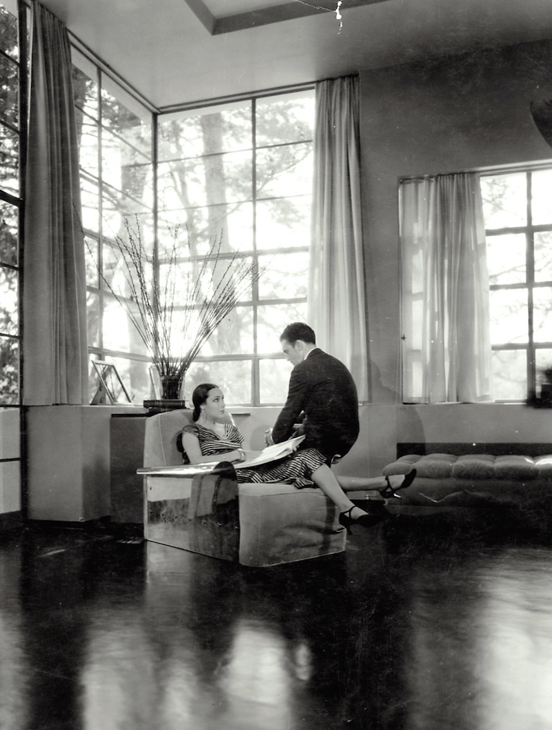
I came across this photo when I was searching for iron windows as my consult’s new home has iron windows from the thirties. This is the actress from the 1930’s Dolores del Rio and her husband Cedric Gibbons. He built this incredible home for her. I’m amazed at how modern it looks!
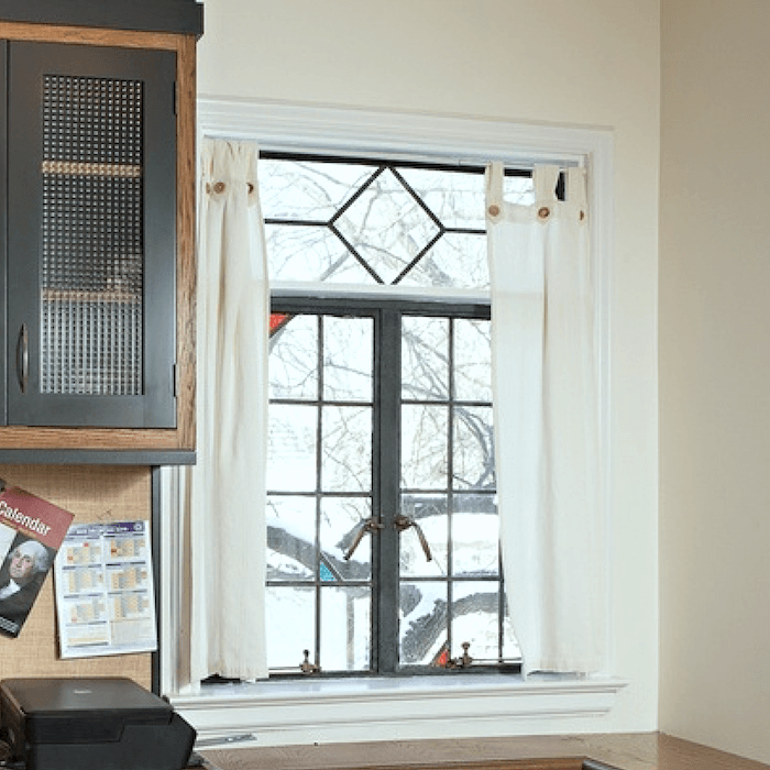
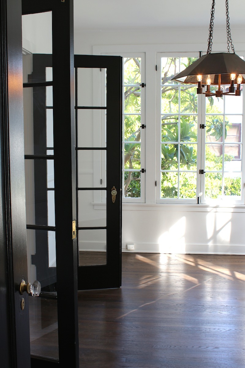
Above is one window from the client’s home but the windows in the living room have a lot more of the heavy iron and are much larger windows. I love this diamond motif!
People often ask me about current trends. Certainly, we are seeing a lot of black in our interiors. Is it something that’s going to go out of fashion? Will I regret it if I paint my walls black? Isn’t it going to make the room look smaller?
Oh, so many questions. But first of all, let’s go back in time. Black has been around for a long time. It is a classic color. When I think of black in old paintings, I think of artists like Rembrandt and Caravaggio. They used the technique of Chiaroscuro, the contrast between light and dark
 The Seven Works of Mercy – Caravaggio 1607
 Portrait of a Man Rising From His Chair – Rembrandt 1633
I hope that she eats her meals through a straw. ;]
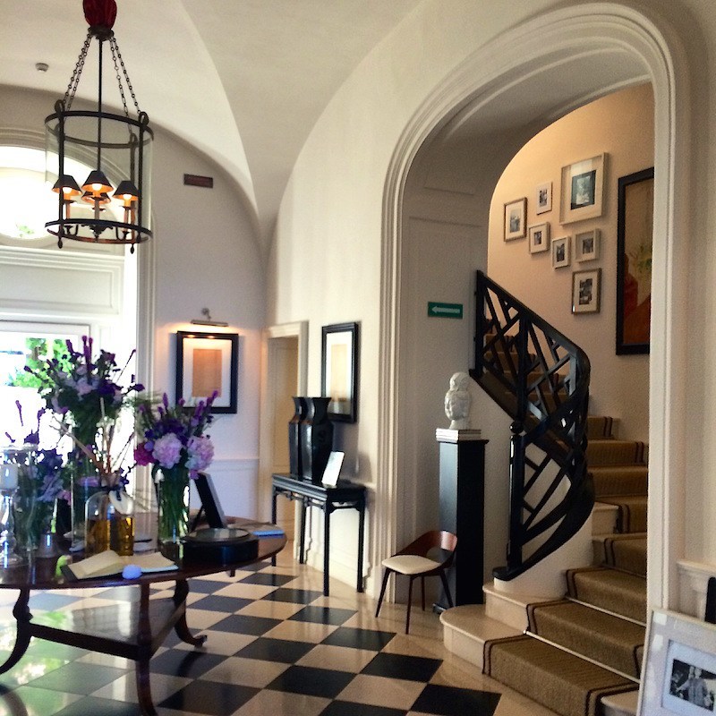
The lobby of my favorite hotel. The JK Place Capri designed by the amazing Michele Bonan.
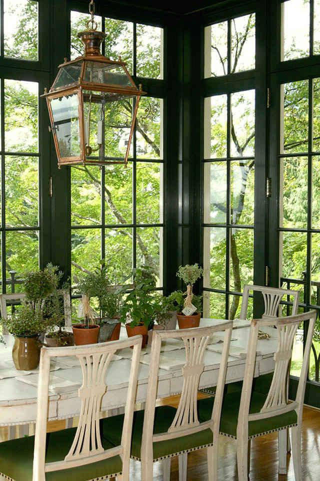
I think that this actually a very dark green, but no matter. The deep color actually blends in better with the gorgeous view. Love this fabulous space by Windsor Smith!
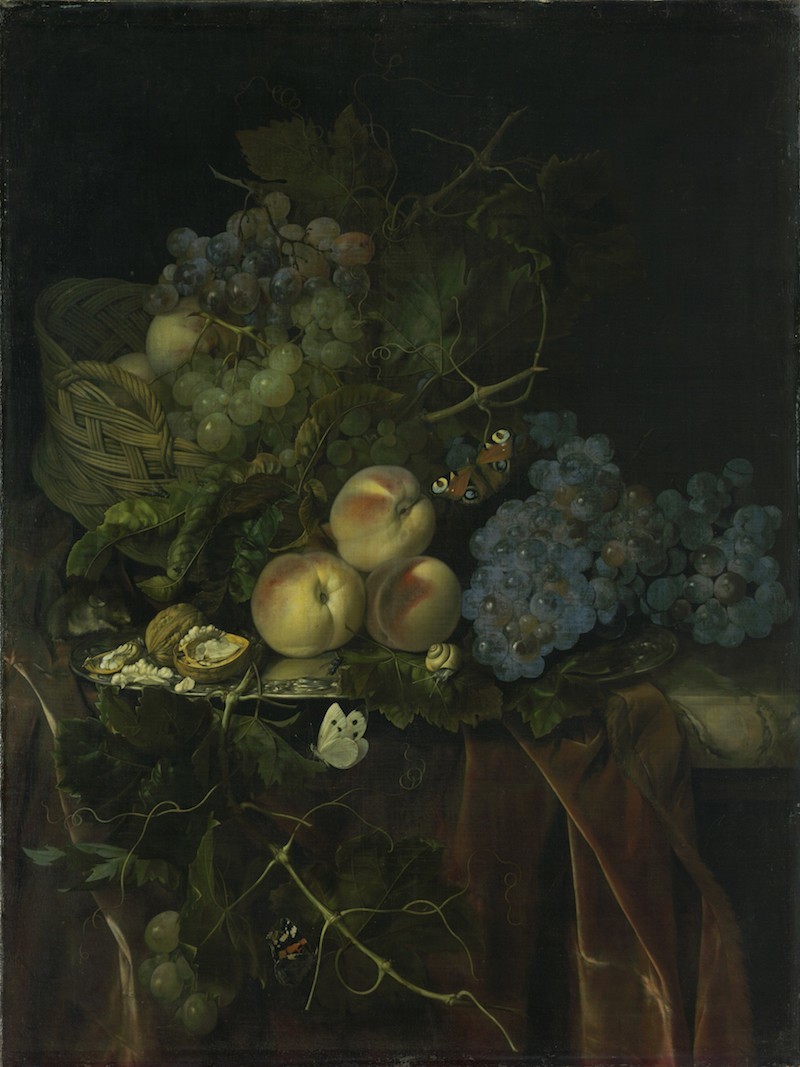 Willem Van Alest – Still Life With Fruit Mouse and Butterflies 1677
I love the enigmatic feeling of this painting by another great Dutch Artist during the golden age
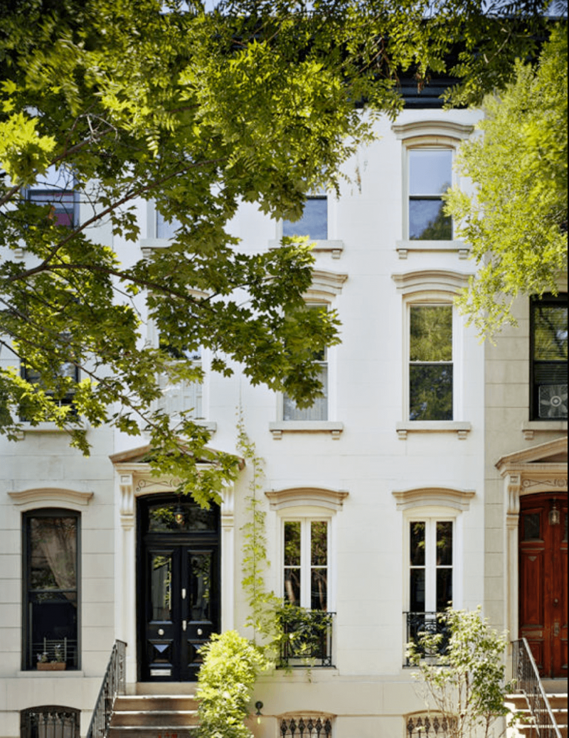
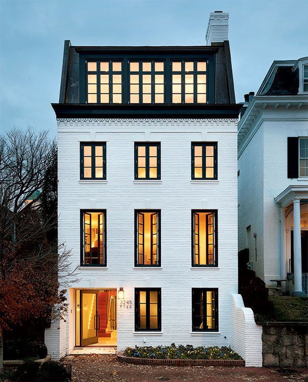
The exterior of Jenna Lyon’s former classic Brooklyn, NY Townhouse. Sweet. via Sotheby Homes
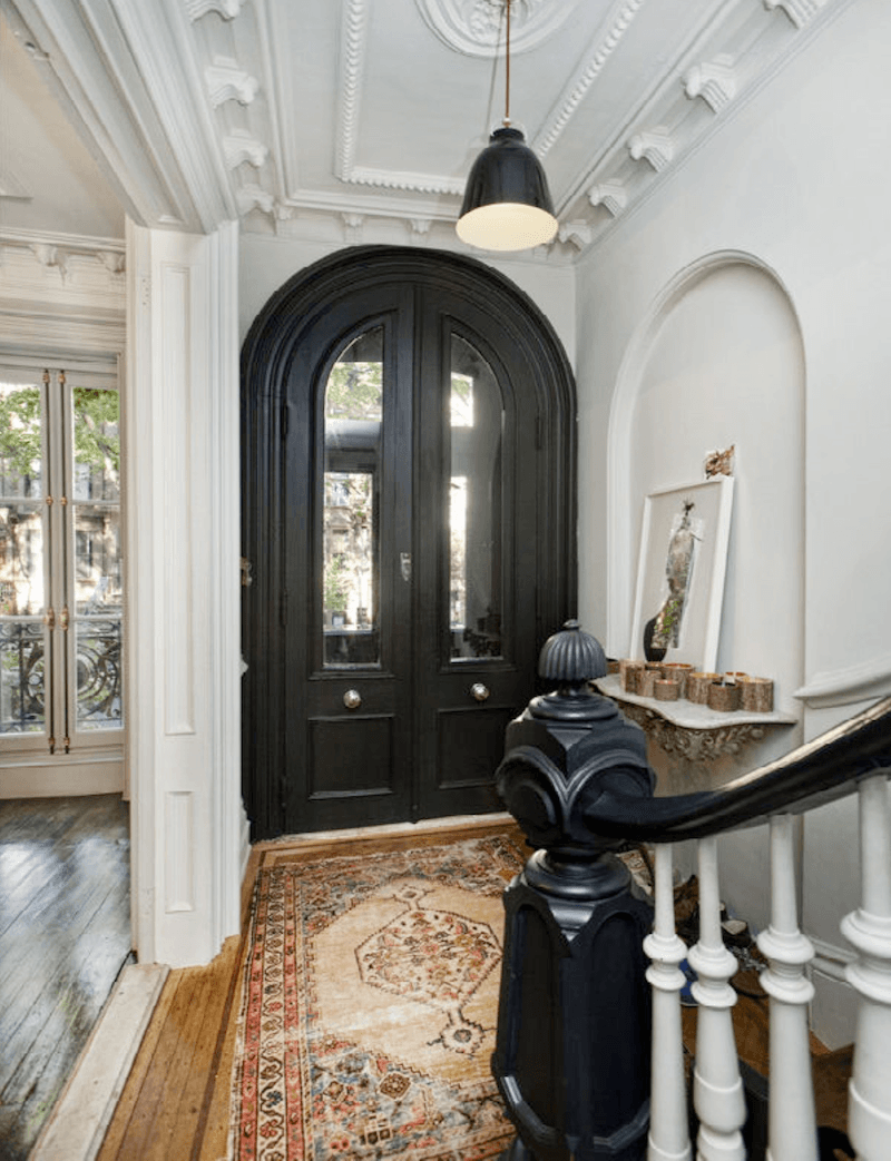
Inside the same apartment. Jenna used much black throughout the apartment. It was classic, yet urbane and sophisticated.
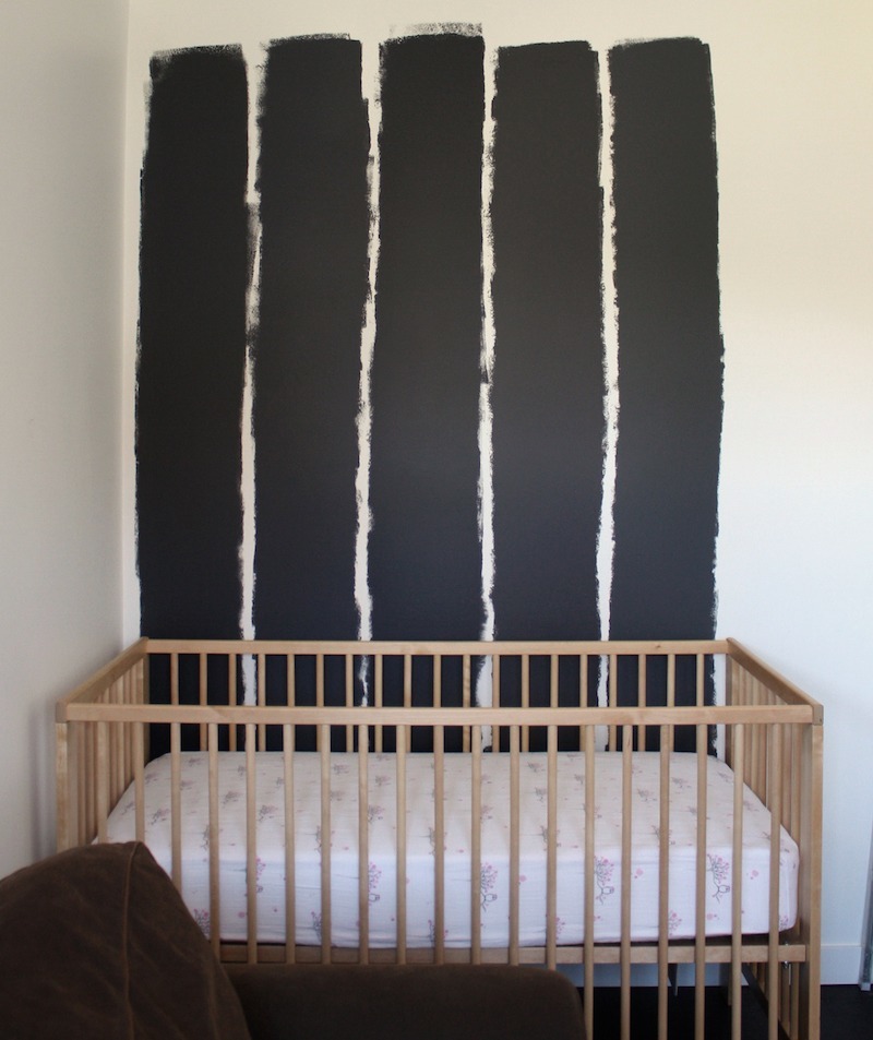
Pondering black? ;]
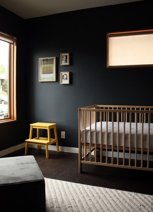
The end result. That has to be the chicest nursery I’ve ever seen! The color they chose is Benjamin Moore BABY SEAL BLACK 2119-30. It is a very cool black with blue undertones.
Fabulously talented young interior designer. Please check out her beautiful portfolio. Many of her rooms incorporate a fair amount of black.
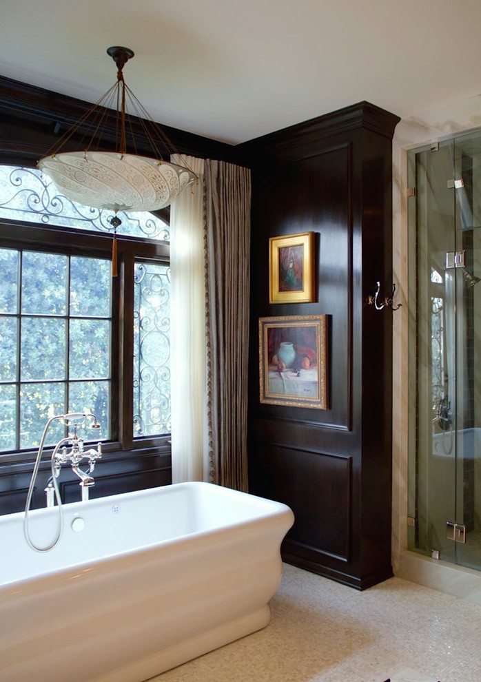
A wonderful rich black is Benjamin Moore is ONYX
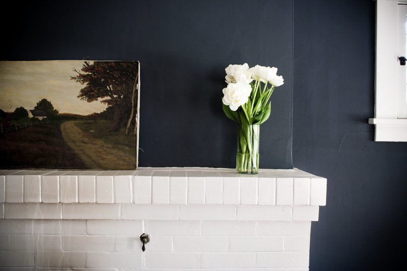
Love the painting with just enough color to cut through the black and freshened up with the white.
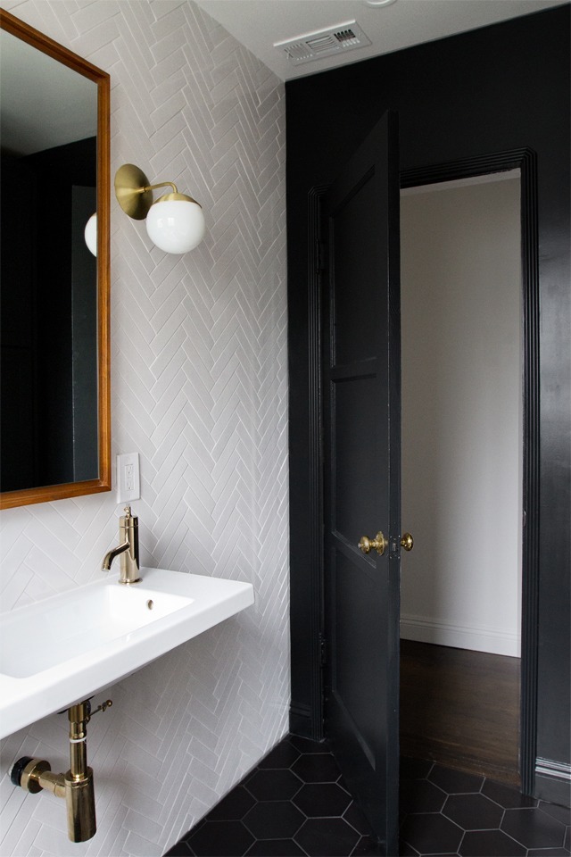
Fabulous modern black and white bathroom! Love the herringbone white tile pattern. Gorgeous blog too, by Sarah Sherman Samuel. Please check it out for a ton of delicious room candy!
In answer to the question, will black or another really dark color make a room look smaller?
The answer is no and here is why. Dark colors recede and light colors appear to come forward. Therefore a dark color will make a wall look like it’s further away than it is and a light color will make a wall look like it’s closer than it is. It’s the same principle with dark clothing and light clothing. A dark color, however, will make a room— well, darker, duh. Dark colors absorb light. Light colors reflect it.
Won’t it make the room look like a cave? Well, sure. If you have a narrow boxy room with few windows and nothing on the wall. It will look like a cave for sure.
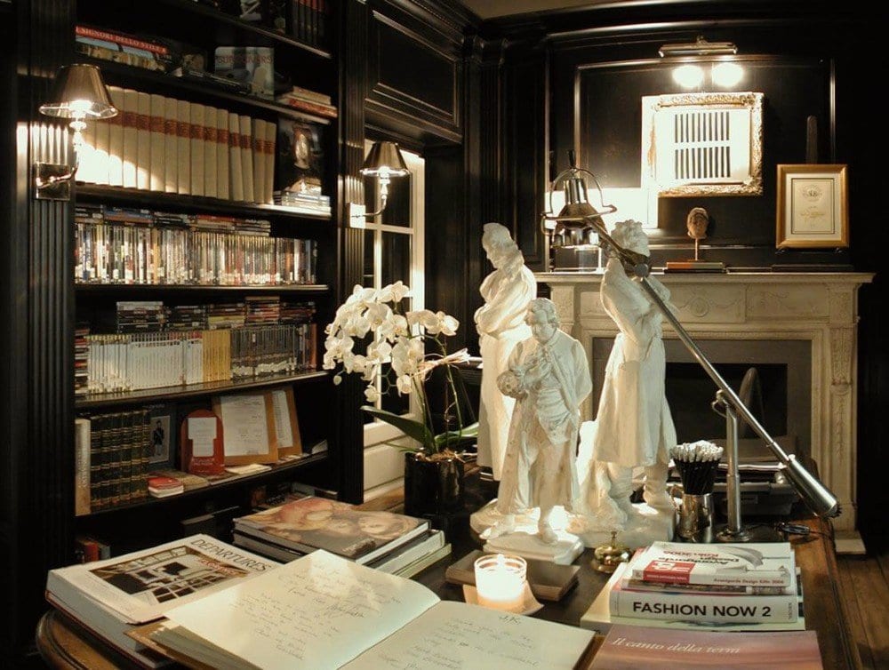 The Library Lobby JK Place Firenze by Michele Bonan
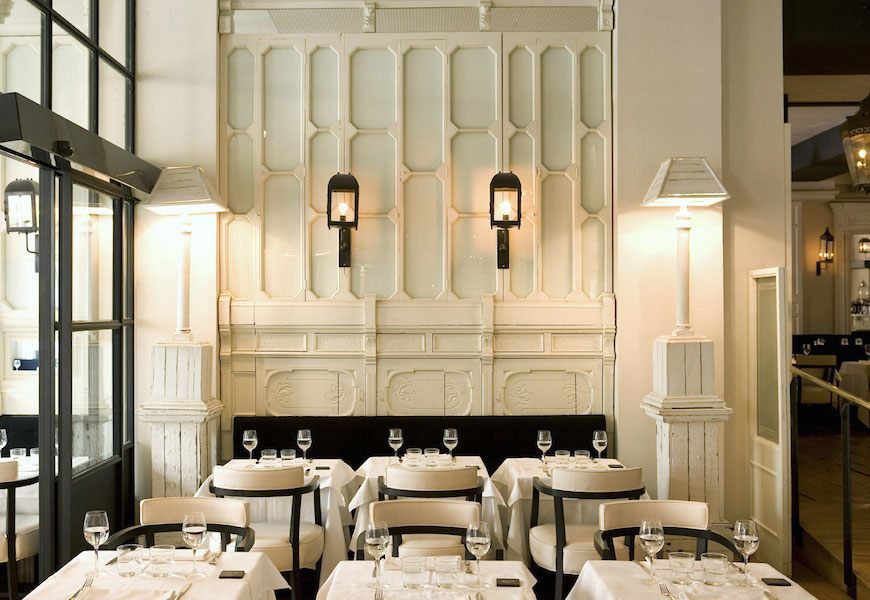 A Most elegant restaurant Praktik Rambla in Barcelona, a hotel in a historic with a black and white theme
Here Are Some Things I Recommend When Using Black
- Black and dark colors in general when used as a wall color are better for smaller rooms– under 200 sq. feet.
- Dark colors are better in rooms with lots of doors and windows
- Black loves warm tones. So, yes to wood.
- Black loves white
- Black loves reflective, so gold, mirrors and glass are good
- Black loves color
Okay… I know that I’m always going on and on about accent walls. Well… take heart. I think that one black wall is often the exception to that rule. However, I feel that the other walls, need to be white and there needs to be a good balance of white and black throughout the space
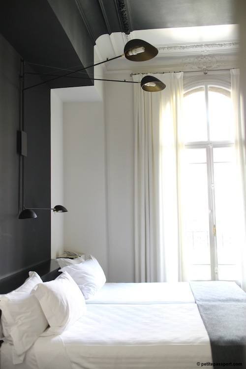 via: Petite Passport – A room with a black accent wall in Hotel Pratik Rambla in Barcelona
In all honesty, I have less experience with black than any other color. I live in the burbs and I used to REALLY live in the burbs as in horse farm land until 2.5 years ago. Therefore, the shades of black I am recommending have come through research.
Here are a few more highly recommended shades of black from Benjamin Moore
BLACK BEAUTY 2128-10
SOOT 2129-20
MOPBOARD BLACK – CW – 680 This is a pretty soft black which runs neither warm nor cool.
BLACK SATIN 2131-10
What about you? Do you use black in your decorating? Would you? If so, do you have a favorite black you can recommend? Or any that you tried that turned out not-so-great? Please share in the comments!
xo,
![]()
Related Posts
 The Nightmare of Doing Long-Distance Interior Design Work
 Decorating Paralysis – What Causes it? And How to Fix It
 Laurel, I’m Desperate! I Think I Totally Screwed Up My Window Shades
 15 Hideous Decorating Mistakes With Fabric
 We Bought An Ugly House, But The View Is To Die For!
 A Gracious Apartment Renovation in Scarsdale, NY
 54 Iconic Designer Fabrics To Make Your Room Look Rich










29 Responses
Laurel, what a great read! I love black in my house also! we just finished painting front door black and we also put black shutters on the outside next to each window. Wow, love the look. Now we are looking into some kind of barn light to put up in front between the 2 windows up high. I had bought some pillows and such for the inside, wide stripes with wide tan stripes. In love! Thanks
Thanks so much Esther!
Perfecto! We are in the very earliest stages of building our forever home. I was pondering black Windows interior and exterior along with black doors interior and exterior. Yes, I said interior instead of that ever popular builders white. Well anyways you empowered me to say “let’s do it!”.
Hi Tina,
Best Wishes with your new endeavor!
Hello Laurel,
Firstly thank you for your amazing site. Part of my life each year is lived in a 1132 tower in France in which we are in the throws of renovating. Having said that it is the kitchen which offers the conversation of ‘black’. We have designed and had built a large (3mtrs high) kitchen cupboard in a very dark grey/black. Our walls are 2mtrs thick stone comprising granite and quartz so the walls are a no-go zone for change other than artwork. At the present moment (as I type) the men are preparing the old tiles to receive a new topping of Pandomo which is a resin floor resembling polished concrete. For our installation the benefit is that the finish is 6mm and with that our in-floor heating is not compromised and the other benefit is that the existing tiles do not need to be lifted. We are choosing to have a black/grey granite colour which has a satin finish to enable the reflected light to contribute to the internal lighting (fingers crossed). To support this we have changed all the doors (5) which were large wooden frames with glass to dark slate grey aluminium. This one change has added an air of distinction and more importantly the doors will now close and not be affected by the heat differentials given by our summers and the snow in winter. I love the grace that black offers.
It is no wonder that Rembrandt and Caravaggio relied on black to present their offerings of light and drama … such is the brilliance of black.
Hi Suzanne,
That sounds amazing!!! Thanks for sharing.
I must say I completely agree with Mary from Mississippi! I’m new to your blog and never tire of beautiful art or beautiful design. Throw in some history as well and I’m a goner. It is obvious you put much thought and research into your posts and you are so informative! You have another fan down South in Georgia!
Now if I could only get my husband to agree to black interior doors in the new house we are building…
Thank you so much Debra! Really appreciate the kind words. Oh, those husbands! lol Maybe if he sees some photos? There should be lots on pinterest.
Wonderful post, Laurel! Thank you! My favorite has to be the nursery (no surprise there). It is so chic. I’ll be thinking more frequently of black as a trim color as well. Thanks for the highly informative post!
Hi Jen,
I can just imagine the grannies going… YOU’RE GOING TO PAINT THE NURSERY BLACK??? hahaha! One thing I’ve always detested is “BABY” nurseries in insipid pastels with ducks, etc. What’s with the ducks? lol I would put up a Rembrandt or a Turner landscape. Get into those neural pathways from the get go! Thanks for stopping by!
Hi Laurel, I used BM onyx in a powder room with very little light, Inspired by a bathroom by Mark D Sikes. I adore it! Also, used onyx on the windows in my kitchen that are French casements and “read” iron because of the black. Also, just finished my master bath with the onyx on the ceiling. It is great but with all of the white in the room it has a bit of brown. We just finished the room and there is a lot of foliage so may appear blacker in the winter. Our new detached garage is almost finished and we used BM Racoon Fur on the board and batten exterior. It is a showstopping color. We don’t see even a hint of blue. I researched the additives of the BM charcoals and thins one seemed least likely to read blue and it doesn’t. Spoke to BM “experts” and they couldn’t answer which colors didn’t have a blue undertone…The Racoonn Fur is perfect!
Thanks for your blog! Nancy
Hi Nancy,
That is all so interesting! I have heard a lot about Racoon Fur in many forums. And this is one color that DOES look blue on the chip! So, when up, doesn’t look blue. It must have warm undertones. They should be able to answer the questions. I have seen a question and answer where they have some questions like that answered. The thing with undertones is that some are very under and don’t appear in all lights.
Thank you for the recommended BLACKS! Black is jazzy and dramatic.
Great article and photos as usual. I agree with you 100% on your
list of what BLACK loves!
I wish, my clients were more courageous though and dared colors besides white and taupe.
Hi Magdalena,
Well… most of my clients aren’t that adventurous either. In this case, we had the iron windows with lots of moulding and the black is a natural choice.
I am obsessed with black windows and black paned shower doors. We building a house and both of these items are on my wish list. Our builder looked at me like I had two heads. Unfortunately, we are using several style windows and doors and the companies do not offer the black in all styles. We could do custom, but that would blow the budget out of the water. (I also want a Carrera marble bath.)
I appreciate your candid approach to design. Very, very helpful. The Shaker style kitchen cabinets will be……drumroll…….BM OC-17!!!!!! Easy decision after reading your post.
Thanks, Laurel
Hi Cookie,
I know exactly what you are talking about and have pinned at least one or two of these on my pinterest bathroom boards. Oh, those builders! lol They’re not always up on the incredibly cool but tend to get set in their ways. Not all, but most. White Dove is another winner for sure!
Hi Laurel, I enjoy your blog very much…I can’t remember how I found you, but I love every post! I like and use a lot of the BM colors you have recommended, and I also LOVE Farrow and Ball paints…(my painter less so…but he is a bit of a diva, lol) I have not used onyx or iron mountain from BM but have been wanting to try them…..I have been using quite a bit of black lately, and my absolute, never-fail black is F&B Off-Black…..charcoal-y warm black….I highly recommend it!
Cheers,
Meredith
Hi Meredith,
I took a look at F&B off-black and I agree. It looks wonderful. While F&B it’s gained a lot of attention in recent years due to their marketing push, it’s still not widely known by the majority. And, it’s more expensive which is a problem for some people. Then, some people claim that BM can match the formulations. I don’t trust that to be true. Close, perhaps, but identical is unlikely due to the different bases.
When it came time to focus on our exterior colours after extensive gardening and a trip to Martha’s Vineyard, I realized our red brick wasn’t really red. The builder referred to it as Williamsburg. It really is a mix of terra cotta, brown and clay so I didn’t want a black with a blue undertone. Our BM dealer in Ontario helped and we settled on BM Onyx for the front door and shutters and also painted box planters for our front walkway the same. I loved the colour so much I brought it inside and painted the interior front door, side door, mud room and our new French doors off the kitchen to the backyard all in BM Onyx! Getting the undertone right was the real trick and I don’t regret it! I still love all the other interior trim and passage doors in BM cloud white!
Hi Kelly,
Onyx is the color we ended up with for the client’s trim and front door as well! It’s black without looking like tar and I see it as not reading particularly warm nor cool–just soft and rich. Thank you for all of this. And yes, cloud white is one of the greats!
I still like my cloud whit trim and we had an oak kitchen that required 4 coats of cloud white using Benjamin Moore Advance. (I did it myself over 5 weeks in our garage). BUT when it came to our exterior doors to get a new coat of paint
Laurel – Your inclusion of actual paint names feeds my obsession for Ben Moore paint. I have taken Maria Killam’s True Color workshop and have been glued to the fan decks ever since. Your spunky writing style and and your knowledge of history and art history makes your posts come alive. I devour every one. Just wanted you to know that you have a huge fan way down south in Mississippi.
Oh, wow! Thank you so much Mary!
Maria is such a delight, isn’t she? I did study a lot of art history and it was my favorite subject.
I know that a lot of designers like to hold back on information thinking that they are giving away the store. But no. I can actually tell people the six best shades of white and they still don’t trust themselves to decide!
I have had chairs finished in black onyx and turned out to be the perfect black. Also saw a room with many windows painted BM iron mountain which is more brown black but appears black. This room didn’t feel dark at all.
Hi Lauren,
Well… Onyx is the color we chose for the window trim– just today! I should do a little follow up post, because we almost goofed! Or rather *I* almost goofed, but I caught it fortunately! Interesting too what you say about not feeling dark. People get so hung up sometimes on the wall color as if it’s the ONLY thing in the room. But of course, there’s the ceiling, floor, furniture, stuff on the walls, windows and doors and the amount of wall showing might only end up being maybe 10-20% of the room.
Thanks for the information on using black my husband wasn’t a black game room so this will come in handy.
Hi Martha, That sounds very handsome!
Bravo! Love everything about black.
Thank you Reanee! Of course, it’s not popular with everyone but I try to spread things around and also introduce some less common but what I think are wonderful choices.