

Hi Guys,
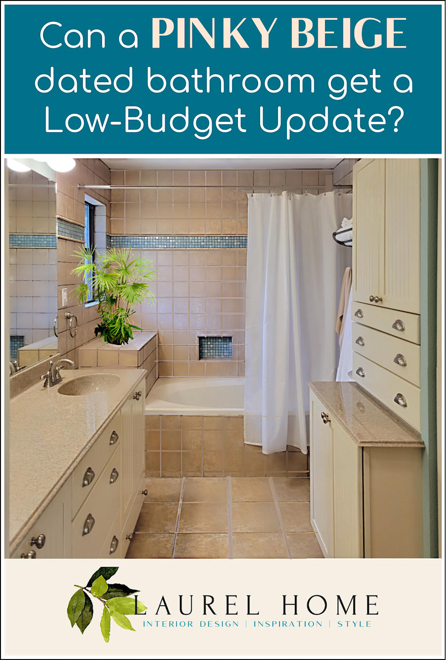
If you’re just tuning in, this is a reader-dilemma introduced very early Wednesday morning, eastern time. It concerns a modest budget updating of her pinky beige bathroom.
If you have already read the post, you can skim until you find the asterisks. *** There, you will find my response.
Dear Laurel,
I thought I might take the chance to write and see if this is a problem you could write about on your blog. 20 years ago, I updated my bathroom to be just like Martha Stewart’s at the time.
You know what it looks like, beadboard cabinet doors, seafoam walls, lots of green glass decor, and cup handles for drawer pulls.
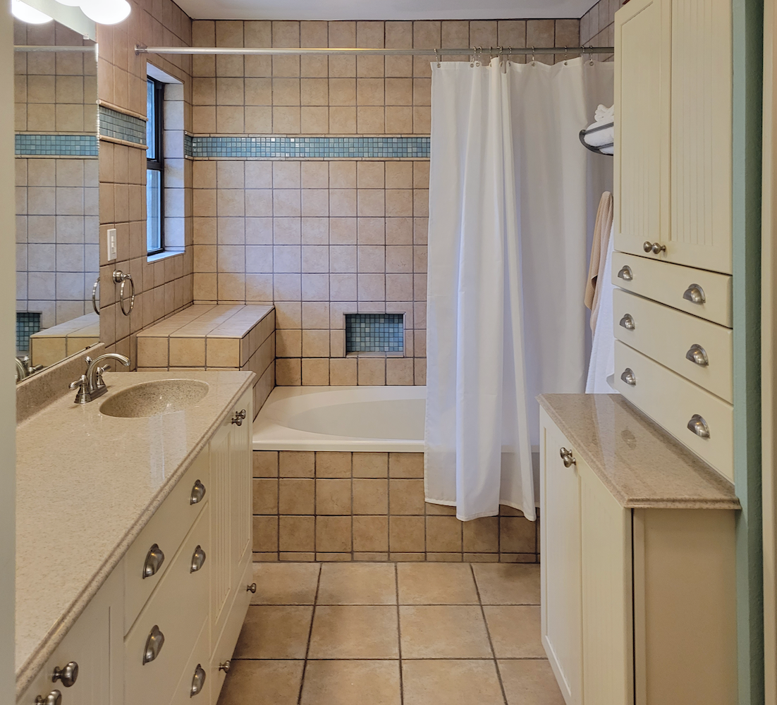
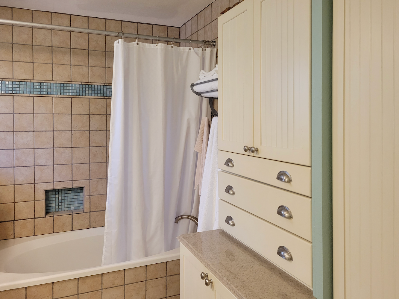
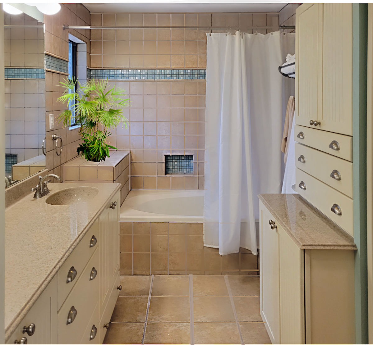
Walls and floor of pinky beige travertine, with turquoise accent.
These cabinets are custom and very well made, with a baked-on finish that holds up to heat and humidity in the bathroom without cracking or chipping. I really don’t want to paint them or replace them.
Is there any way to bring beadboard cabinets into what is now a contemporary transitional-style home? What decor could I do without remodeling? I’ve scoured the interwebs, and everything I see with beadboard is farmhouse which I do not want.
There’s no shower curtain up at the moment because I’m in the midst of shopping for a new one. That’s just a white liner you see, so I can shower.
Thanks for your input!
Robin
***
Hi Everyone,
I wasn’t planning on doing another one of these on the heels of Vicki’s dilemma. I just realized this is Robin M., who is a frequent commenter on the blog.
Here’s what I said about the pinky beige bathroom tile:
Hi Robin,
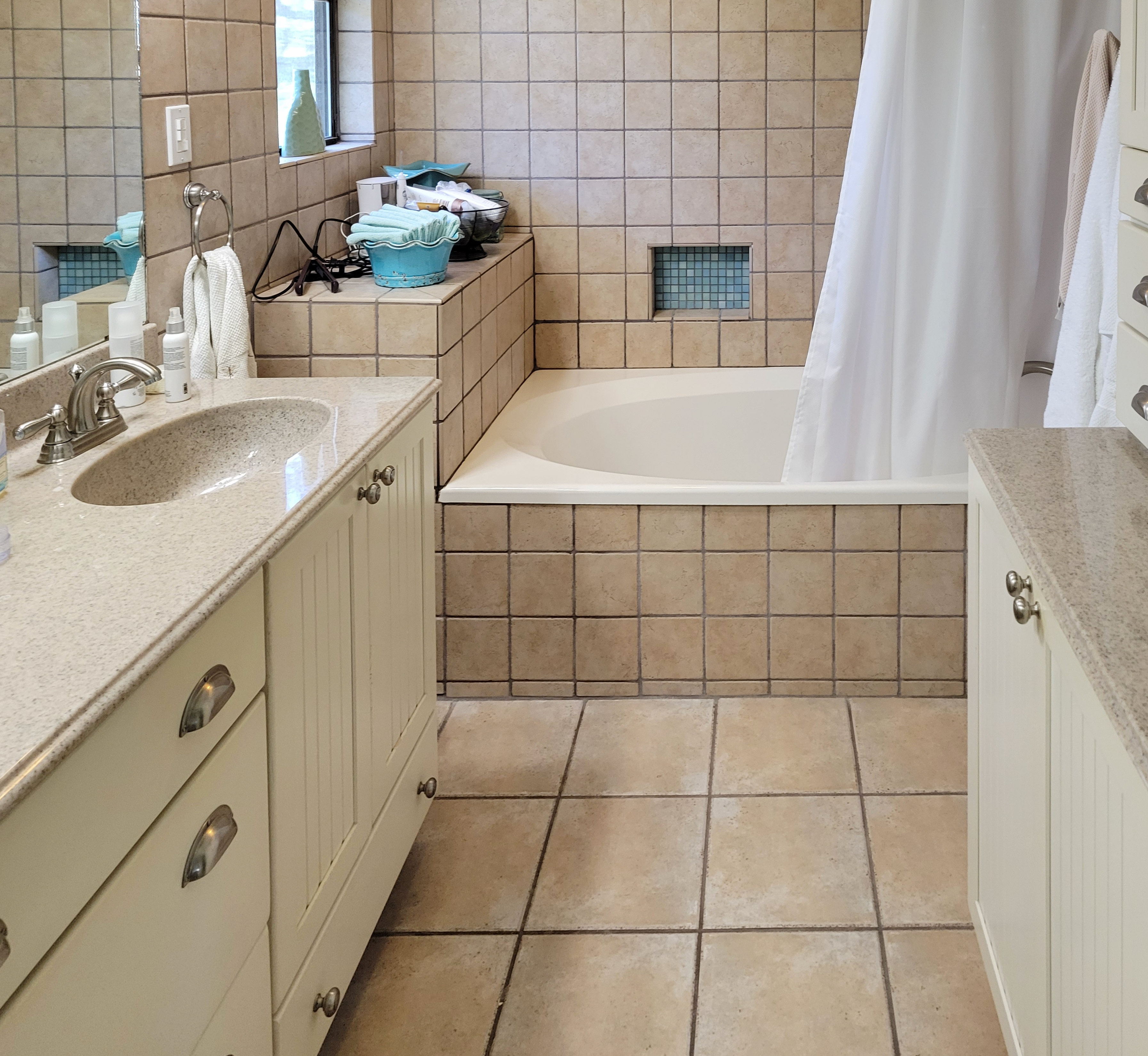
This is a tough one. It’s not the beadboard that I see as the problem. It’s the miles of pinky-beige bathroom tile.
Of course, getting rid of that is even more problematic, but I’m pretty sure it can be lightened and made to look less rustic. (No, it can’t, because later I found out that it’s porcelain tile.)
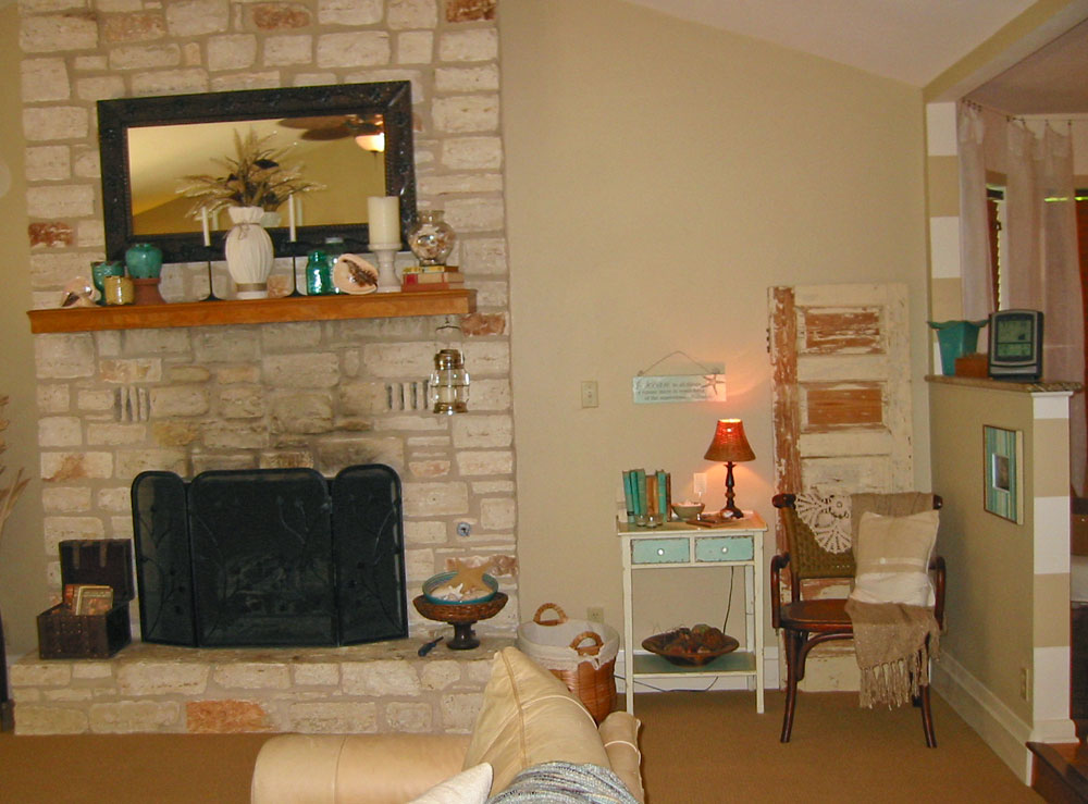
What does the other side of the bathroom look like?
Robin sent a lot of photos!
What I didn’t tell Robin is it’s the grout that’s making me crazy. I’m sure it’s not dirty, but it looks dirty, and there’s a lot of it.
By the way, guys. I know most of us are not too fond these days of pinky beige bathroom tile. As I mentioned earlier, this is actually porcelain tile made to resemble travertine. And Robin likes it. Or, she likes it enough to keep it.
Now, one can paint tile; however, let’s put that one on the shelf and work with what we have.
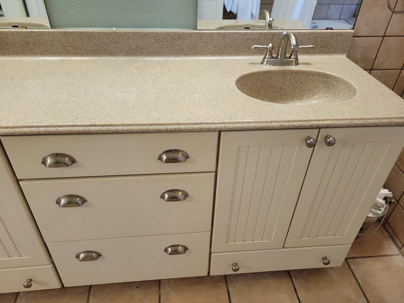
The next problem for me is that the cabinets are a yellowish-light beige and clash slightly.
Finally, the lighting is not helping to create a warm, inviting space.
So, we can fix the grout and the lighting. We have to work with the cabinetry, too, but we can paint the walls!
I would get a stunning shower curtain to tie the colors together.
I would get something long and luxurious and get a nicer rod. So, a 90″ shower curtain instead of the skimpy 72″ typical shower curtains.
We need to fix the mirrors, lighting, and faucets, and I’d change the hardware, too. While brushed nickel is very popular, I always think it looks cheap, even though it’s usually not.
I received a few more emails from Robin. Here’s what she had to say:
I have used your mood boards, paint colors, and Rolodex extensively over the past 3 years to redo almost my entire house. Learning from your suggestions and mood boards has been invaluable. My house is small and modest, with an accompanying modest budget. But it has been transformed, and I love it. Thank you for being you.
In the bedroom, Quiet moments is on the walls.
I wanted a little bit of glam, but I am mostly coastal style. I am determined to remove any cottage looks I had in the previous decade.
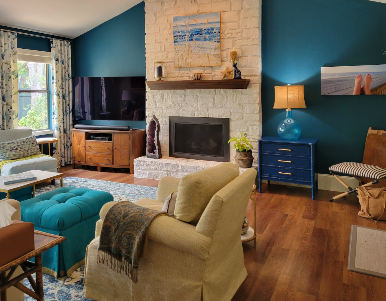
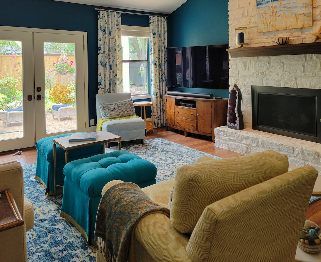
The living room I also redid after reading your design books that I purchased. I am absolutely in love with everything, and everybody that walks in gasps and talks about how pretty it is. The don’t do it justice, but I’ve included them so you can see the room.
I took your advice and made a plan for the first time and executed it all at once.
That is instead of piecemeal and never feeling like it was complete. I understand why making a plan first is the way to go.
The mood boards in your paint guide helped tremendously and inspired me to make bolder selections, which makes me so happy now that it’s done.
I was inspired the most by these boards from the paint and palette collection:
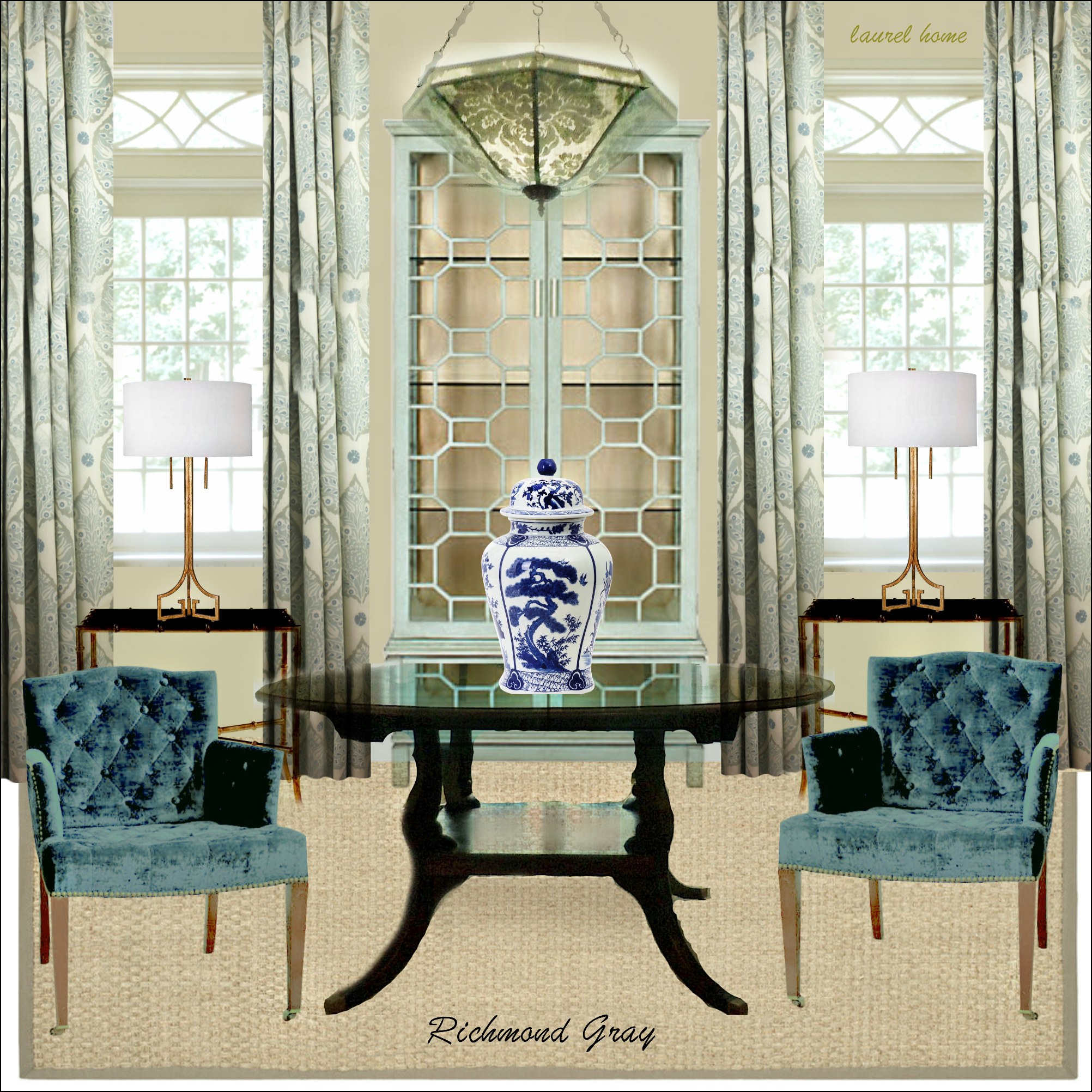
Richmond Gray
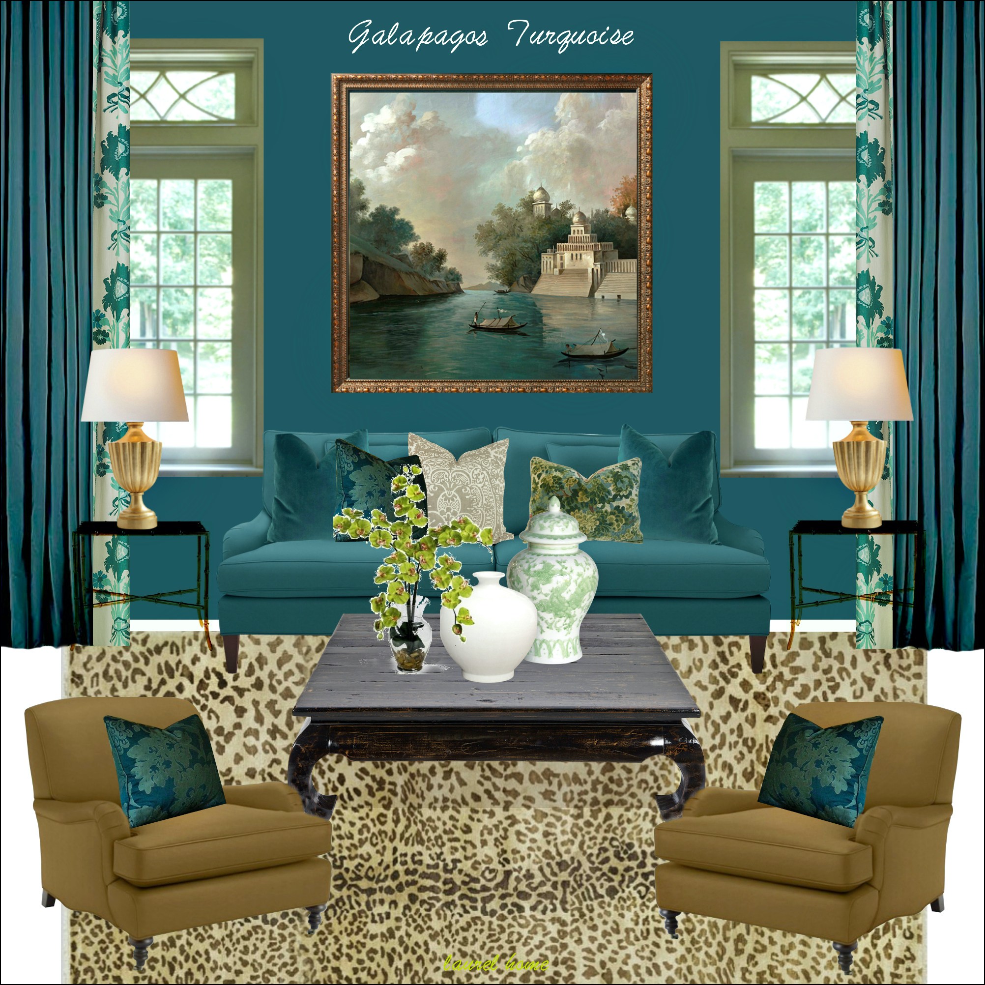
Galapagos Turquoise
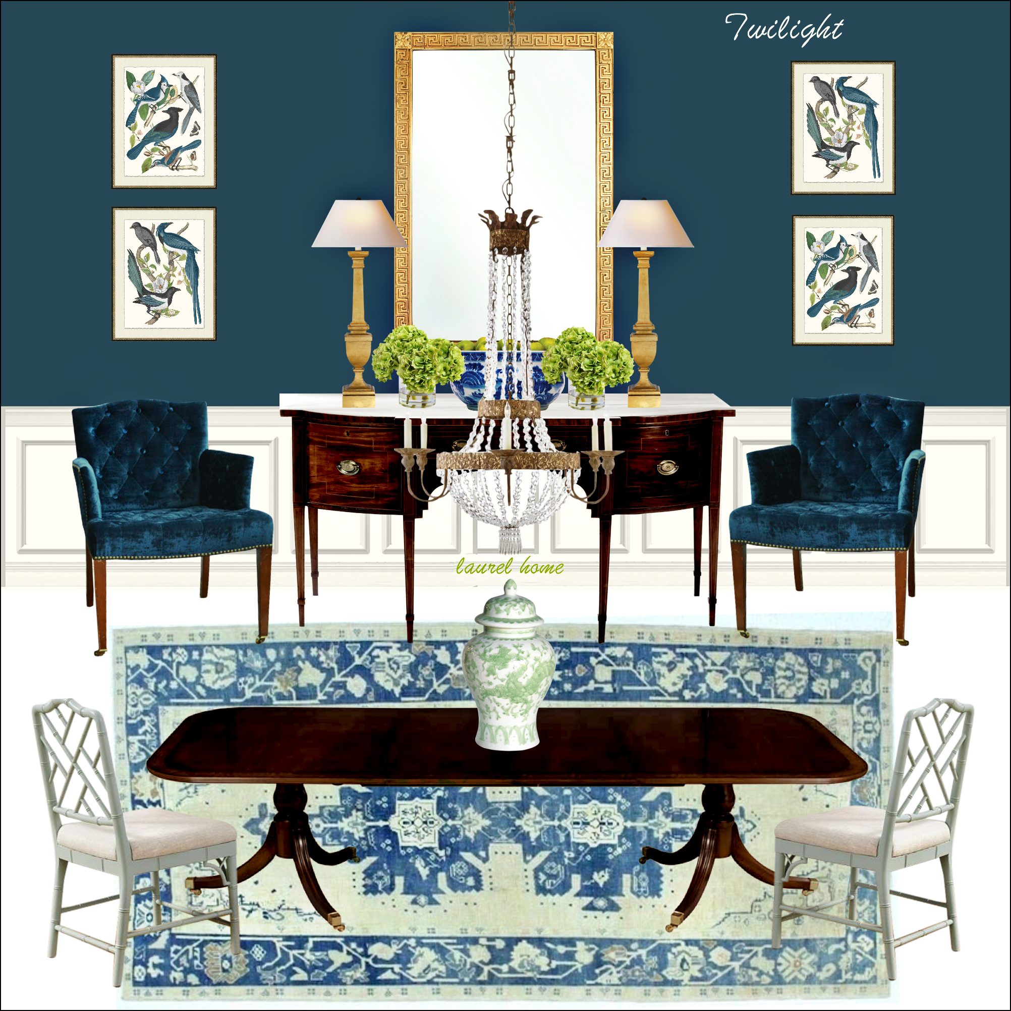
And Twilight.
But here’s what helped the most.
I studied the boards very closely. I observed where you brought in patterns, where you created contrast, and where you left it alone and why. Then, all I had to do was add my more casual, coastal, textural preferences.
***
Thank you so much, Robin! I’m very proud of my digital guides. The 144 colors and 40 palettes are designed as a jumping-off point. Your design is the result of having them guide you in your selections.
I love what you did. But, this is also very helpful in thinking about the bathroom and working with the pinky beige tile.
Below is Robin’s living room before.
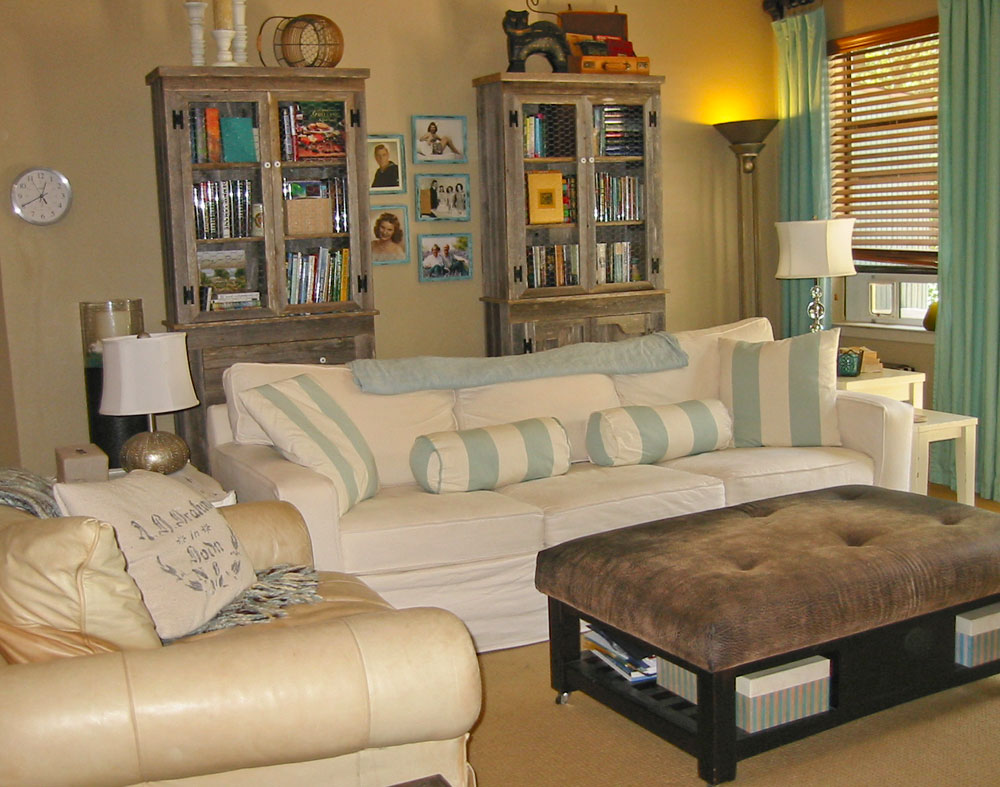
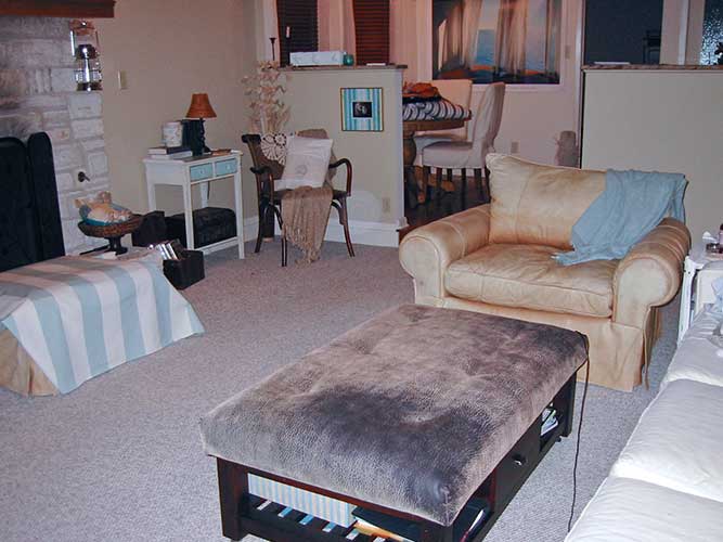
Wow! What a difference! She did a great job.
So, getting back to the task at hand. Robin needs help with her pinky, beige tiled ensuite bathroom.
We are not allowed to touch the tile or the cabinets. We can change the countertops, sinks, faucets, mirrors, and lighting. And, I’d love to see a beautiful runner in there.
Maybe if we I think of the pinky beige tile as pinky beige Bermuda sand, we I will appreciate it more?
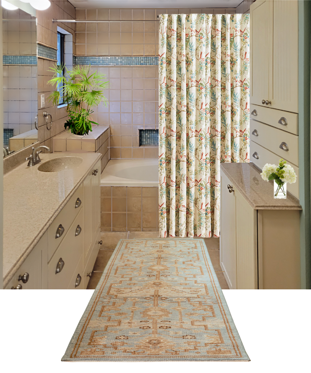
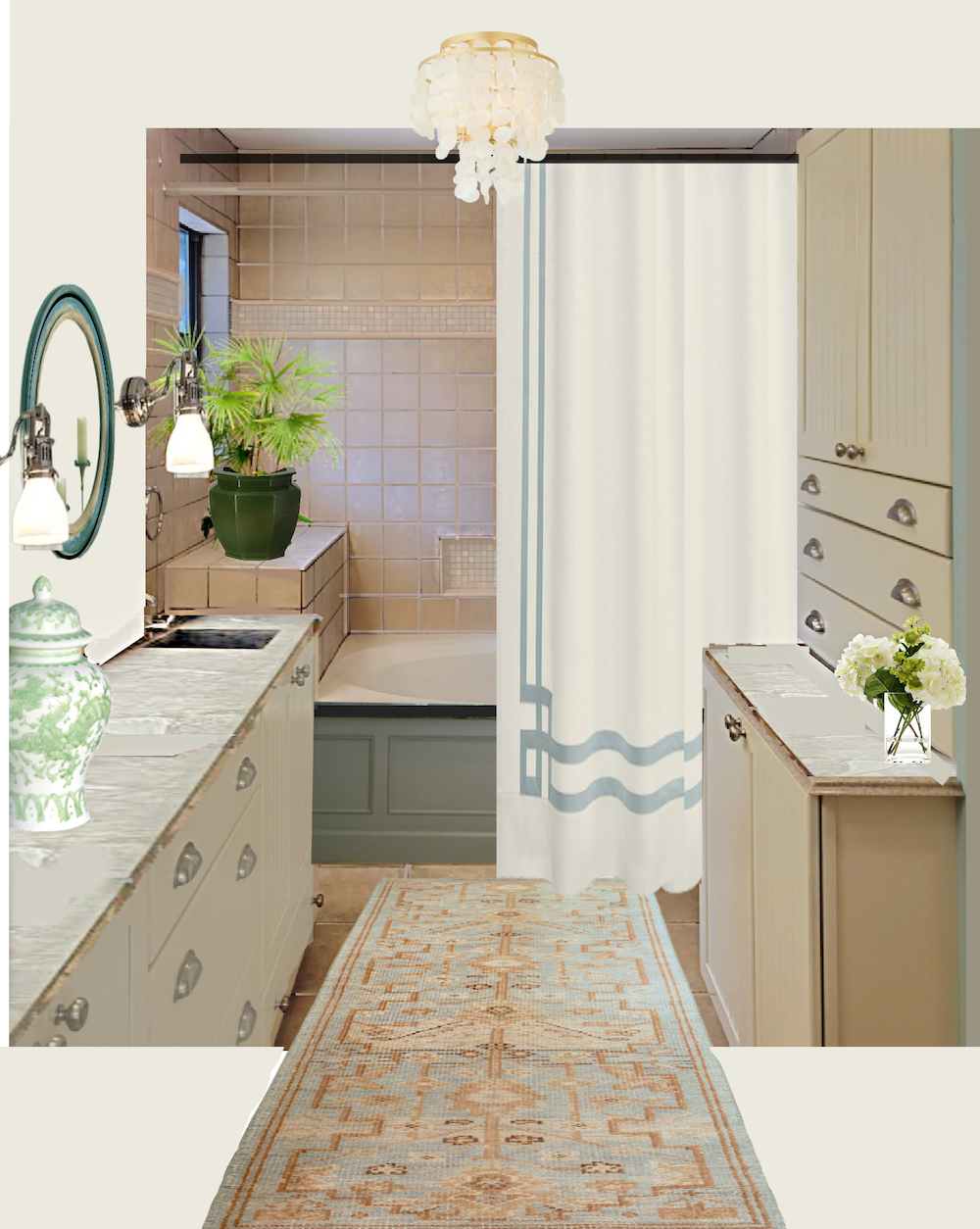
So, more Thursday evening; however, in the meantime, I did a little virtual cosmetic procedure on Pinky Beige.
She went from this, (below).
To this…
What do you think? Better? I think it is.
Okay, everyone. What would you do with this bathroom to bring it up-to-date?
I’m looking forward to reading your ideas.
***
Hi Everyone,
I’m back.
First of all, I forgot to post a few other images of Robin’s lovely living room.

Above is the gorgeous rug from Karastan. You can find it here at the Rug Studio.
I have some fantastic shots of the before and after of her exterior, but I’ll have to save those.
Back to the pinky beige bathroom!
I have worked on a design for several hours.
Okay, I’m working backward. You see, I got an email from Robin yesterday, that she wasn’t opposed to changing the tile color.
Really? Okay!
And yes, it’s totally possible with the right prep and products. Several of you mentioned it in the comments. In fact, these were some of the best comments ever.
Now, I did not read the comments until a few hours ago. I was smiling to see many of you coming up with the same ideas I did.
Please know that there’s no one way to do this room, or even one best way.
However, I tried many different options and came up with some interesting results.
I discovered that I didn’t like super-saturated colors in here. And dark counters didn’t look so great either. Besides, Robin wants a beachy vibe.
And then I kept thinking about her Quiet Moments bedroom right outside the door.

What color is this? Well, it depends upon the light. It’s a very grayed-down aqua color. For this reason, I find it especially beautiful in brighter rooms.
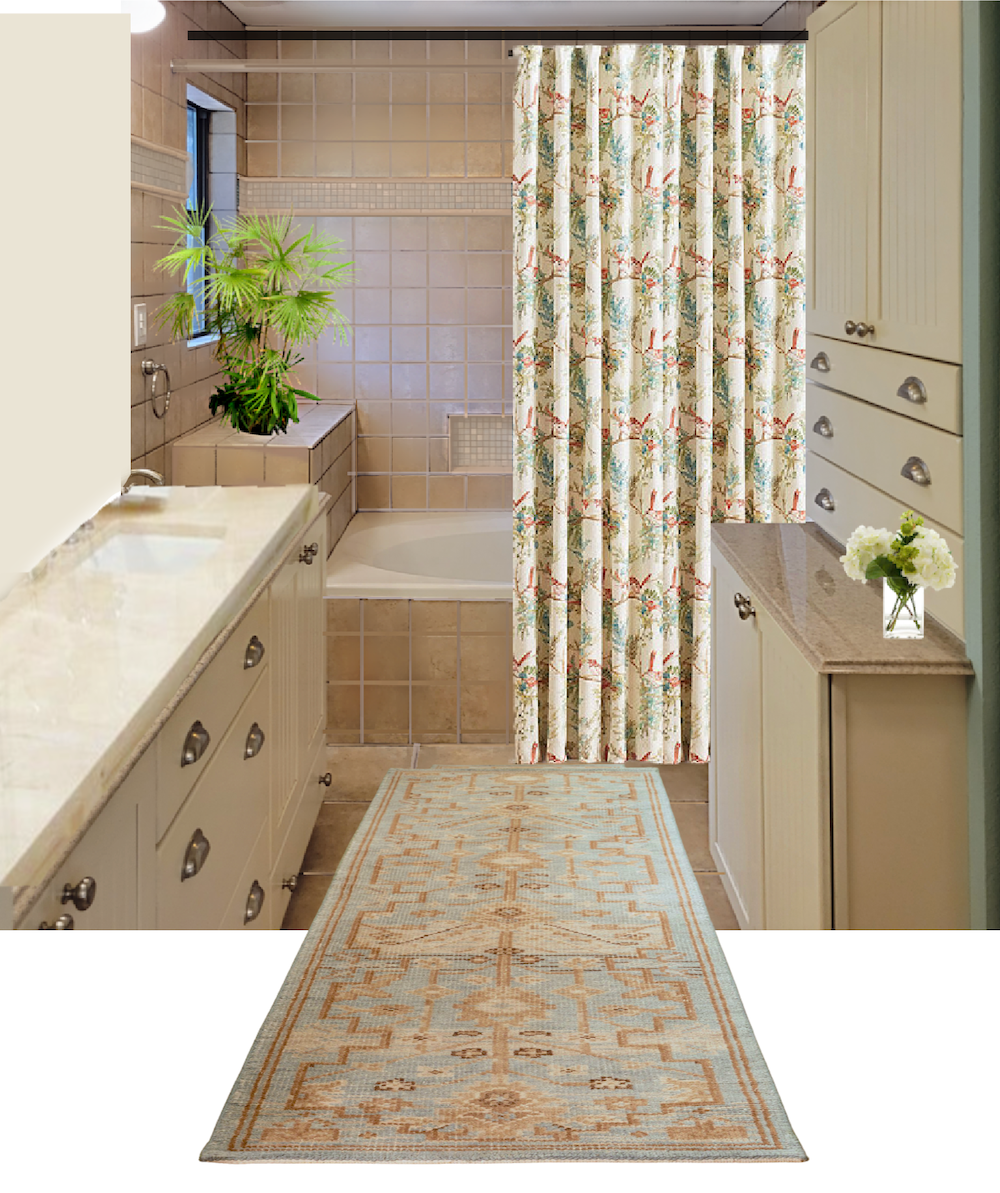
So, let’s look at some ideas I tried while keeping the pinky beige bathroom tile.
The first one I tried is an impressionistic floral from Ballard Designs.
(There will be a shopping widget at the end with my selections.)
It is a regular curtain that will require some hemming, and she’ll need two, but it’ll be nice and full that way.
I paired it with this runner from Rejuvenation. Not bad. However, that stripe is bugging me. I realize that everyone has these stripes. I did, too, in my old apartment, and I painted over it. lol
Of course, some of you will love it the way it is. That’s totally fine. As I said, there’s no one way. The other thing I find is by playing around with the mood boards, opens up the creative space, and new discoveries are made, which you’ll soon see.
So, I took out the stripe.
I prefer it this way. I changed the countertop too. Sorry, this is so sloppy.
Now, I’m going to show you the one I did yesterday. This one, I did spend several hours on.
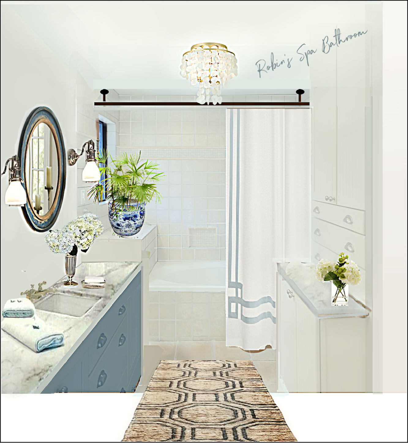
Yes, that’s the same tile but painted a new color. What color is it? It’s off-white. But, with a slight greenish tinge. I see it as water and white sand now, instead of pink sand. This curtain is from the Well Appointed House.
The Hexile rug is from Dash and Albert.
And yes, I did go ahead and paint the two cabinets. If the cabinet is properly primed and the right kind of paint is used, the finish will hold up beautifully.
Okay, yes. To do this costs a lot more than $4,000. It would probably be more like $14,000 with the new counters and fixtures.
Okay, I did one more board keeping the pinky beige bathroom tile.
I didn’t change the cabinets this time. I did still eliminate the contrasting stripe. However, if Robin or any of you keep your stripes, it’s fine with me.
Oh, yes, there’s a tub surround. Several of you mentioned that too. I thought yesterday that with the painted tile, it might not be necessary, but if possible, I think the paneled bath surrounds look fantastic.
However, the reason it’s this color is an accident.
I saw it on Wayfair (my neighborhood shop) and when I put it in, think it looks fantastic with the tile. Yes, green makes the tile even pinker. I don’t have a problem with that, as I think these colors look beautiful together.
While I didn’t try it, I’m wondering if a soapstone top for the tub would look beautiful. However, I do love the dark edge.
By the way, that fantastic shower curtain comes in several fabrics, and there are dozens of trim colors. There are other styles of trim available and a choice of three lengths.
While I did try at least a dozen other items, the last two are my favorite iterations for Robin’s pinky beige bathroom.
I hope y’all enjoyed this post!
Please pin to Pinterest for reference
Below is a shopping widget with all of the items I mentioned. Please click on any item to find out more about each product.

Update July 16, 2023
Robin changed the light bulbs to a cooler white and here’s the transformation. The bathroom went from this (below)
To this. (below)
That definitely killed some of the muddiness which I think already looks better.
xo,

PS: Melissa has worked hard to update the HOT SALES! Please check them out!
***Also, a big head’s up for the Nordstrom Anniversary Sale has begun today, the 13th, for all early-access customers.
The sale is open for everyone on the 17th. You have to have a Nordy’s credit card to qualify for early access.
This is a fantastic sale. More about that for tomorrow’s HOT SALES!
Related Posts
 My Living Room Furniture – Two Layouts, One Winner!
 A Week In The Life Of An Interior Decorator
 HELP ME PLEASE! My Child Picked An Ugly Paint Color!
 The Little Known Reason That Mother’s Day Kind of Sucks
 30 Fantastic Coffee Tables + Sofas + End Tables! Parts 1 & 2
 Is An Unorthodox Small Unkitchen A Good Idea?
 The Best Neutral Paint Colors Full of Color!


119 Responses
Hello, what kind of paint can I use to paint the tile?
Thank you.
What kind of paint do you recommend to paint tile?
Thank you.
Claudia
This is a welcome post because my new condo also has a pinky beige ceramic “travertine” floor that goes up the side of the tub. For bonus points, the walls are covered in a clashing orange beige, because the designer obviously skipped class the day they taught undertones. It’s about 500 square feet of ugly all in.
Wow, such an amazing amount of comments. I wonder if you could install mouldings around the door, ceiling, window, and across the side of the tub and the “box” at the end of the tub that are very close to the same style as the cabinets. I wonder how the mirror would look if it were quarter-turned to be very tall instead of very wide. Then the wall space beside the mirror could be painted a shade of pink that would coordinate with the least objectionable shade of pink in the tile. The ceiling could also could be painted a lighter shade of pink. A rug and towel in a shade of gray might be inexpensive; Costco has some cheap. If I had more money I would like a ceiling mural maybe and eventually some gold handles and fixtures (could gold leaf be glued over the handles you have and sealed?) When I saw this bathroom I thought the cabinets look they could be in so many turn of the century beach houses here–kind of colonial revival. I keep thinking that a Dante Rossetti painting of a woman with red hair from the Romantic era would look good next to the mirror. Maybe you could find one with the ocean in the background. Monet has one in pastel colors, but I would prefer the richness of Rossetti to go with the pink tile. I personally would love a gold antique chandelier, but you are wanting contemporary, so perhaps my ideas won’t work for you. You might find something vintage that would work,. I also would check about painting the tile grout, but you don’t want it to match the cabinets exactly I don’t think. Another thing I would change is I would change out the green small tiles with whitish cream similar to the cabinets and mouldings. I would try to find some way to eliminate the niche completely; I don’t know how. A solid piece top for the box at the foot of the tub would be nice. I think I don’t think the niche works because there are just too many different rectangular shapes going on in such a close space. If I could I would change out the window with a large one with beveled glass panes. It would make the room so much lighter. I think thing troubling about the room as it is is that all of the design elements stand alone without echoes in other elements, or it seems that way to my untrained eye.
Hi Robin! I already posted, and I agree with so many of the wonderful suggestions here. But there’s one thing I didn’t say- having your tiles painted is remarkably cost effective and makes such a huge difference. I know Laurel said ‘no touching the tiles’ and I don’t want to be a rebel, but I have had several clients who didn’t want to tear out all their tiles and didn’t have the ability (or perseverance) to do all that grout painting, and had their ugly tiles, grout and all, painted white by professionals. Having a professional do this really makes a HUGE difference! You end up with shiny white, fresh looking tiles and grout! I realize that doing the bathroom floor might feel scary, but they definitely stand by their work and it can save you a ton of money. I think one of the biggest problems here is the clashing difference in tone between all the tiles and the cabinets. And if the floor and shower tiles are white the cabinets will be great, especially with fresh hardware. I would keep the pretty blue mosaic tile and use that as an accent. Especially with the Quiet Moments in your bedroom next door. Also, you can buy affordable quartz countertops prefabbed to standard counter depth and the just fabricated on the ends that are exposed, and this saves the $ you spend on expensive slabs. If someone already said this, forgive me- I haven’t had time to read every single word!
KIM M LUCCI ELBUALY, you are speaking my language. The things you mentioned – lighting, hardware, drawer pulls, curtain and rod, faucets, paint color – are exactly what I had in mind to replace. And the whole process started me writing to Laurel because I couldn’t figure out what to do about the beadboard cabinets. I want to start with those affordable basics, and then see what it needs. I am concerned about changing the grout lines – besides it being a tedious job that I would have to hire someone to do (there’s a LOT of it), the grout lines aren’t narrow like I would prefer, and then I think I’ll just have a bunch of lighter wide grout lines which I would dislike even more. I think they show up more in the photo than they do in person, and I am going to see what I can do to minimize their appearance.
Hi Laurel I designed medium to high end baths and kitchens. Grew up in a NKBA three family custom kitchen manufacturing business in PA, although a metal visual artist now. My family use to sell at the shows years ago. I love seeing your visual suggestions. Especially the painted wood panel to cover the dated front tub area and especially using lighter groute color.
What dates this bathroom is the grooved doors, the hardware, faucets, lighting, curtail rod, etc. Could be glass. My suggestions would be replace all the inexpensive things mentioned, most especially the grooves in doors. If not new doors, to replace grooved doors. They could use a two part bondo resine to fill grooves. Remove all the nasty dated cup pull HDW. Fill holes if needed and repaint the cabinitry. Personally I think think in a teal/blue/gray color. Whatever sets off the small accent tiles best. Although I like your white color change. I love color, and honestly the dark color would ground the space.
Changing the grout color to a lighter color is an absolute must. I would not recommend painting the tiles in the tub area. If done, it must be high the best paint sold that is waterproof. Possibly, replacing the floor with
The overall cabintry layout, Corian tops, is too expensive to replace. The client could always do granit tops on down the line. I personally would change the floor tile to a modern long tile in monochrome colors in that teal/blue/gray. Or some type of pattern that is mutted. To not compete with the teal accent tile.
In response to Melanie – I love the idea of wallpapering over the tile, and I love hiding anything that “hurts my eyes”! Just a question: tile is not flat like sheetrock, so won’t you have grooves where the grout is?
Love this post! I have many ugly tile bathrooms in my life right now and it’s a struggle. My beach house has two tiny bathrooms with this awful tile. Fortunately, I was able to gut one but I’m stuck with the other for a while. I’m really grateful for everyone’s ideas in this post! Let me add a couple of things: we have used a grout whitening product from
Home Depot that has really made a difference in one ugly bathroom. It was laborious but worth it. It helped in the ugly pinky beige bathroom too but now I see Mike’s comment above I am going to look for a color that maybe blends with the tile. This minuscule bath at my beach house has these pink beige tiles almost floor to ceiling all the way around the room! So I swapped out a dilapidated medicine cabinet for a wood mirror and am replacing a light fixture – all helped. I found an oak floor register blended better with the tile than white (which kept getting rusty anyway). I also plan to remove the super dated and gross sliding doors on the shower and replace with a glass splash panel. (It’s a tiny shower and would require $$$$ custom) Here’s the big thing I’m considering: peel and stick wallpaper right over that tile!!!! I found a shop on Etsy that has an elegant monstera leaf print in a variety of colors. I ordered samples and some colors blend with the tile (which would remain on the floor and shower walls). This would improve the view from the door tremendously and I think really improve the space. I would paint the ceiling to match the wallpaper. This would be easier to do than painting tile, which is important because I can’t be there long enough for tile repaint. Hoping others like this idea!
A few (late) suggestions:
Grout–get a free quote from a tile company for changing grout color and maybe also painting over turquoise tiles. May not be as much as you think.
Mirror–if you would like to keep the existing mirror, one option is using molding (painted to match the cabinets) to “frame” the mirror, which will make it look a little newer but at lesser cost than removing and reinstalling.
Paint–I think the contrasting blue-green paint is playing up all the peach tones. I would match the cabinet color or go with a neutral white like Chantilly Lace by BM. Even though the cabinets are a creamy white, I think that having it all a similar color will calm all the colors down.
Tiles–is there a possibility that in the future you will want a walk-in tiled shower instead of a tub/shower? If yes then that’s when you can make the big changes to the tile.
Robin,
My TSP suggestion did not mean I thought the grout was dark from dirt! TSP gets rid of any oils (from our feet or even cleaning products) that may be on the grout. It also etches the surface of the grout so you have to be careful to dilute it. A slightly etched surface accepts the sealer/new color better. I can’t remember what % to dilute it, but a tile place would know.
Follow Laurel’s more budget-conscious suggestions, keep any new colors soft white (or the muter blue gray green for the bathtub surround), add a no-pattern sisal rug, and spend the thousands of dollars you save on a trip down the Nile.
Once I looked at the interior of a house that was for sale and the WHOLE interior was done in pinky beige and mauvy lavender.
In a bathroom it is important to think about your reflection in the mirror. You’ll want to start your day feeling good about your appearance! I have noticed that heavy weight vintage mirrors make you look your best. If buying a new mirror, do not skimp on quality. Also, be mindful of installing flattering lighting. Laurel will be a great guide on this.
Sharon
Hello, all three bathrooms would be lovely. I think I would probably opt for the first just to save some pennies. But what draws my eye in the first one is the shower curtain. Taking it away from the other items in the room. But since she will need two panels, I would put them on either side like window drapes. With a two rod shower curtain and the liner on the other rod. I think it gives a wonderful finished look.
I will try to be brief. Laurel’s ideas and the comments have been so good. Like most bath remodeling, this could get expensive. (We’ve all been there. I’m there now!) This is where I would end up: (1) at a minimum lighten the grout and install an attractive wood tub surround in blue; (2) Take Laurel’s suggestion for new shower curtain, curtain rod, and runner; (3) replace the bead board in the upper cabinet doors with glass; (3) remove the towel holder from the wall; (4) replace countertops and sink in white; (4) replace hardware with polished nickel, including an 8″ spread faucet; (5) I might leave the mirror as is and have sconces wired into it; (6) splurge on a new toilet and bidet; (7) consider replacing the bathroom window.
Laurel – the spa bath paint color you say is white with a slight greenish tinge. I have your paint colors (and palettes and rolodex) products, but do you know of a good white that has that greenish undertone?
I love your ideas Laurel! Gosh you are good and such attention to detail in all you do.
My favorite though is the first choice without the stripe and new countertop . It is simpler and more pleasing to my eye. Probably the most budget conscience as well. I don’t kind the color of the tile or cabinets. It has a richer feel and such a change from white in a good way.
Robin,
Just a suggestion about hanging a shower curtain from the ceiling. Check out this site: Ceiling Shower Rod.
They have ceiling track kits that give you the track and the hooks. I have them in 2 of my bathrooms and love them. The second bathroom I ordered the 108 wide liner curtain for a tub area to make it more generous. For the decorative curtain I bought a grommet kit and reworked a curtain, but there may also be other ways to hang one from it.
Enjoy!
Tracey
I can attest to the miracle of “painting” tile. Google Miracle Method in your area. They epoxy-coated all our shower tile surrounds (and stripes!) from a hideous brown to a crisp white. These bathrooms all had dark gray or “trash can blue” walls, which I repainted in SW Greek Villa, which I know is one of Laurel’s darling whites. The tiles do not look fake. The epoxy coating grabs the grout differently, making it look authentic and just plain white. Best of all, the epoxy is low maintenance for soap scum and it won’t get mold/mildew. The travertine and pink floor tiles now look at home despite the white walls and tiles because we repainted all vanities in BM colors like Mount Saint Anne, Herbal Escape, Hudson Blue, and Raindance.
Now, please help… I can’t seem to wrap my head around $500 shower curtains so I got ringless “hotel” curtains with snap-on liners as a stop gap for the kids’ baths (other two have glass doors). One is a Jack-and-Jill shared by my girls and one is for my boy (they’re all 8 and under)! Thoughts? Should I share pix?
I sure hope Robin contacts you with updated pictures. It will take some time but we all know that decorating takes time.
I had Quiet Moments in my previous bathroom. It looks fantastic with Carrera marble and white cabinets.
I so enjoy reading these kinds of posts. Seeing reader updates and various solutions helps me to be more imaginative in working through our own projects. Thank you for tackling Robin’s dilemma, Laurel!
For a lower budget update, I think the bath surround is genius and makes such a huge difference. I think the last plan you created might my favorite for big impact while more budget friendly. My biggest hesitancy would be the upkeep for white grout. I, personally, despise the task and am looking forward to my children getting old enough to do it for me 😉
I can’t wait to see what Robin does! I do hope you’ll share her update.
Amy Howard has an amazing line of paints that can be used in her cabinets!! 1 hour miracle paint. I’ve used it on furniture, cabinets in my bar and a door. It is virtually indestructible and beautiful.
Oh Laurel, you’ve done it again… that spa bath design is fantastic – just makes me want to be in that room! And I agree with one of the other commenters that if Robin was willing to get her hands a bit dirty, it could be done for much less than the $14k (e.g. the painting of tile and cabinets – I just sanded/primed/painted 2 exterior doors with little to no experience but a lot of googling and they are beautiful). You’ve inspired me once again – I have been staring at my small beach house bath for a couple of years now thinking that I need a contractor to rip out the tile etc. but I’m going to order the runner, shower curtain, rod, and mirror, paint the room a soft white and add a plant in a chinoiserie pot – yay! Thank you!
This kind of post is like winning an interior design lottery! For every one project someone needs suggestions designing there are probably many more readers that either have a similar dilemma or had one previously. In searching for The Colony Hotel came across Kips Bay Show house in Palm Beach in 2022 which is loaded with ideas for rooms with a coastal or beach vibe!
Laurel, I knew you would do some thing breathtaking, and the expensive spa version definitely is Gorgeous. It is a fabulous inspiration mood board for me, just as your ebooks were. The second shower curtain is the one that I already had planned on ordering, I was looking at embroidery instead of the ribbon detail, but the same concept. I’m absolutely crazy in love with the idea of hanging the rod from the ceiling. I’m pretty sure I’m going to have to do that. Is that a regular curtain rod that you order from the ceiling? The reason I have the rod that I do, which is so unattractive, is because that space is extra long and required a custom rod. When I did that bathroom 22 years ago, those were not available. I actually went to Home Depot and had that one cut to fit from steel pipe and then bought the ends for it and put it up. It has stayed there since.
I’m definitely going to have fun creating it now myself with these as inspiration and ideas, thank you so much! Oh, and I do love that you used a Capiz light in the spa version, similar to the one I showed you in my dining room. I might need to riff off of that also. Many thanks to all the commenters for playing along!
Hi Robin,
I should’ve put it in the post. However, a while back I found this fantastic source on Etsy for affordable completely custom rods, many configurations, and any size and drop from the ceiling, you need.
There are also dozens of glowing reviews with photos from their bathrooms.
I like the first option. Allows Robin to connect the colors to her bedroom with minimal fuss. Sometimes the simplest solution is the most elegant and appropriate one.
Etsy can be your new best source as they will make custom curtains for the shower (tie back one side and hide the liner behind. Have the curtain go floor to ceiling with a decorative rod. Use a linen that is bordered in a color of your choice (to go with the bedroom ). Change the faucet out for a hand made unlacquered brass (Etsy) Change the hardware on the cabinets too to unlacquered brass in a very simple pull and knob. Prime and paint the tile to an off white. Prime and paint the cabinets too. Put the trim panel on the tub. On the floor you could paint and then stencil again in a color that is the same as the trim on the curtain (youtube has great DIY for this job). Check out Etsy for Indian dhurrie rugs in a simple design or solid with a border. Take off the mirror and find a vintage one. For lighting I would also look for a vintage double sconce light with shades.
If you do the basic work yourself I think you can keep the costs down. I would splurge on a new counter top in Quartzite.
In all honesty, I have not thoroughly read each and everyone of these comments so if I’m repeating anyone else’s idea, please forgive—- there are so many things going on in this bathroom, competing for your eyes attention— the phrase “Modest budget” means something completely different to everyone. I hope nobody hates me, but I would spend as much of my budget as I could to dismantle that raised tile square at the foot of the tub. I have had skilled contractors dismantle tile and be able to save enough to go back with it where you would need to on the wall, and even if you had to go flat across behind the tub. And unless it is covering something mechanical that cannot be changed, the protruding bottom cabinet on the right side of the room I would have cut back and straight down to the floor. Then address the remaining countertop— I agree the shower curtain should be to the floor, but I would use a clear one hoping to visually bring in the turquoise tile. I think it would help quiet all the things going on in the room if the hardware were simple and elegant, and a satin nickel.
There are so many carpet options out there these days I would have a piece cut ( probably a sisal with a very low pile ) to cover the entire floor; if you feel like you need a bath mat in front of the tub when you take a shower, keep it in the closet until you need it — I would keep the wall color as close to the cabinet color as possible— instead of trying to go coastal and emphasizing the beadboard,I would try to go artful and put more emphasis on the mosaic tile-over the sink area I would either do two mirrors done in an aqua glass ( on wayfair for $166) or use two simply- framed silver mirrors w/ satin nickel finished wall scones that have turquoise mosaic shades ( lamps plus-$99 for 2)— someone else already mentioned removing the towel rack that peaks out from the cabinetry on the right side of the room—agreed
(Commenting again!)… in photos looking toward the tub, on the right is a piece akin to a built-in chest w/cupboard lower and drawers above. When you redo the sink counter top might you waterfall this ‘chest’ in the same? The painted side panel of that ‘chest’ is begging for something. IF you can still obtain the blue tile that is in the shower, that tile could be interesting on the side of that ‘chest’… you’re receiving so many great, interesting ideas. Laurel got everyone off to a super start!
Please excuse any repetitive suggestions, my internet keeps reloading and am not able to read all comments!
1. Have removed tile and painted/replaced grout, so tedious – major DIY!
2. Contrasting grout may emphasize tile.
3. Place sea grass rug and/or beige textured washable rug perhaps mimicking
sand to cover as much tile as possible.
4. Cover front of tub and extend it up the front of shower shelf, create
narrow shelves on front of shower shelf for display. (i.e. shells, coral, natural
sea sponges)
6. Paint the covered front of the bathtub/shower shelf to blend with your choice
of shower curtain
7. Build a waterproof sheetrock wall extended from ceiling across tub which
would hide a shower rod and coordinate with shower curtain, side wall colors
or ceiling color whichever one would blend best with the surrounding
surfaces.
8. Have seen a shower curtain that fabric weave mimicked colors of tropical
waters, not a photo placed on fabric. If viewed from doorway would give one
the feel of standing on sand looking at the ocean.
9. Paint or cover walls with textured wallpaper that is a sandy beige to make
them recede and the room appear larger.
10. Countertop a blue which mimics ocean/shower curtain in color or beige to mimic sand.
11. Paint ceiling blending the colors of a tropical sunset – pinks, oranges blues.
12. Maybe to kitsch, but handles that appear to be made like bamboo or shells.
Everything sounds great so far. I had one of those bathroom mirrors that went from one end of the vanity to the other. Took it down, got some good sized mirrors to put over each of the sinks. Then got some lights from a lighting store, one in the middle and one each above the mirrors, it really made a difference.
Me again. Throwing this out for you. I use fabric shower curtains without a liner like the hotels.
I just had one made by GlamourKing on Etsy. We installed a Talavera sink – I took a photo of the inside of the painted bowl – used my iPencil to crop as I wanted – sent it out & had it printed onto a white background. It’s Super!!
You know what “glam” and “beach” mean to you. Find a photo etc that expresses your style and have it turned into a shower curtain!
It was not very expressive, we had a choice of different lengths for the curtain & different background colours.
It’s that perfect touch that brings everything together in our bathroom.
Love the brain wave of Gail’s to install a beadboard front to the bath. This should match the other beadboard in style and colour. This has a two fold result – breaks up all that tile and solves the misaligned floor and bath tiles.
There are lots of excellent low budget gems being suggested – love it.
I love reading these and love that you, Laurel, cover all the budget stuff that regular people deal with. In that vein, my ideas are hyper-low budget ones, as if I’m prepping a house for sale. I’d do the diy grout thing bc that will make YOU happy. Otherwise, I’d hide the stuff I’m over. Change the faucet to something you love. It’s tricky to find sexy ones with those small-spread ones but they’re out there. Chrome with coastal bc everything rusts at the beach otherwise. I know it’s just a vibe, you’re not at the coast but still. (Likewise, with the cabinet hardware.) Long, white/off-white textural something-something shower curtain. Maybe an cream on white oilcloth look, floral, abstract but super high-end fabric. Schumacher maybe. Go nuts with a carpet runner with color. Here’s your punch. Maybe that gorgeous living room color and some of the Quiet Moments in an abstract. (We call it “Precious Moments” at our house.) My idea covers a lot of the tile that you’re over. Your cabinets are still very nice. Your tile is sound. You say ‘budget’ and I say, why rip that out? Id removed the lone metal towel rack. They are always made loose by our yanking at them, they aren’t quick and honestly, towels look awful on them, imo. You’ve got that slim counter where towels can be rolled if needed, or my fave is to put some painted wood towel hook bars up. So much easier to use and also, coastal. 🙂
Love when you do reader dilemmas – esp since I’ll probably have one I’ll want answered at some point. 😂
Anyway, I would consider the tile and the cabinets as your neutrals in the room. The green paint (at least it looks green on my monitor) isn’t doing you any favors, so I would lean in to the teal on the tile and paint the walls AND the ceiling that color. Heck, your living room paint looks to be a good match. Treat the bathroom boldly to counteract the elements that can’t be changed. Maybe even take some trim painted Farrow and Ball Setting Plaster (which will match the tile and cabinets) and do a fun design on the ceiling to make that an unexpected focal point. Your electrician could also wire a cool light fixture in the center of the ceiling design if you’re going to have someone change the lights over the mirror. It’s amazing what different fixtures will do to a space.
If you don’t want to wire, you could still hang a cool small modern fixture from the ceiling that is never on but adds interest to the room.
Obviously a patterned shower curtain to pull the colors together.
And a runner, accessories, etc. Also a contemporary piece of art, dual mirrors, and even though it won’t be seen by anyone but you, wallpaper the inside of your cabinets so you’ll give them new life in your eyes. Can’t wait to see the transformation!
I’m thinking adding a terracotta/burnt orange color would tie it all together or draw your eyes away from the tile. So a color pallet of terra cotta, that light aqua blue and the fleshy beige tile color. The tile looks more yellow/flesh toned to me than pink, but that could just be my eyes. I would change the grout color but not to white. To more of a beige color like you have shown. Something to downplay the dark lines. I might try a linen shower curtain in a terracotta/burnt orange color. Something with texture in the fabric. I would do a double shower curtain and cover both sides. A washable antique looking rug in a terracotta/orange color with bits of blue in it. I don’t know if ruggable has something. I’m not crazy about the tile so I would downplay it. Blue towels or white with a blue band. I would get a darker (black or bronze) modern looking faucet(s). I would look for simple hardware that has both black and brass in it. I would get a modern mirror with a brushed brass frame and use a brushed brass colored shower rod. A dark rod will just create a dark line across the room. For the Lighting I would find something modern with a woven or rattan shade. This will make it feel more coastal. I’m not sure I would change the countertop only because I’m not sure that would change much for the money. Changing the tile would do more than changing the counter tops. I would paint the walls a warm cream color.
Lots of good ideas here. Personally, instead of replacing the shower curtain with a longer curtain, I would remove it altogether and put in a nice glass shower/tub enclosure. I find that to be a more current look, and I also find it much more pleasant to use from a practical perspective. The introduce pattern via a rug or wallpaper.
This is my second comment but I had a brain storm last night. How about installing a lovely tub skirt in wood painted to coordinate with the cabinets? It could easily be fashion from ply and mouldings. It could even be bead board. That would really break up the tile and eliminate the eyesore where the tile meets the floor. Google “wood tub skirt” for beautiful examples.
Replying to Kim. I also toyed with the idea of the grout colour matching the tile. I often do this when wanting not to draw attention to the tiles. I think this could also work well. The fact the the floor and bath surround tiles do not line up is another reason to match the grout colour to the tiles.
Mike C’s comments are also resonating with me… I would find a grout as close to the tile color as possible so it disappears. I really like his idea of painting the walls just slightly more pink than the tile (and there are many fresh pink-ish colors being used now).
I think Mike C has nailed it for me. I too was wanting to introduce black hardware, shower rod and possibly faucet. I like a silver grey grout with this colour of tile. I feel white is too stark and draws too much attention to the tile.
I also like Mike C’s ideas for mirrors/glass and lighting.
Well done Mike C.
I see the cabinets in a blue to pick up the color of the accent tile. I think it would play off the peachy color of the tile. White counter tops. Maybe new pulls on the drawers.
I’ve always hesitated to comment, so this will he my first ajd only because I’ve been dealing with a similar situation with a customer at work.
Ultimately there are grout recoloring products that will either cover and seal them while lightening or darkening the color, or stain the grout but will need to be sealed after. That’s probably the most bang for your buck here. Unifying the tile by minimizing the look of the grout helps resolve the “weird” contrast and variation in scale between the wall tile and the floor.
As for the beadboard? I think it works and can work in a more modern sense, so long as you don’t go too glossy with the sheen or do any sorts of glazing or highlighting. My inclination is a bit different I think than most when it comes to paint coloration though. I’d veer more towards that pink tone, something rosier but only just slightly to help make that tile look more stone-tone and less flushed-blush. My brain thinks BM Opal but that’s not quite right. I don’t think you need to go painting the walls Sulking Room Pink, but if you’d use more, I think the pink-beige will start reading more like a neutral within the context of the whole room. Now if that’s what you use on the cabinetry or the walls, or both, I can’t say. I’d do one in a clear, warm white, and the other with something a hair more shaded and saturated. Grey I think can work, but would be trickier when battling lighting and undertones. That, coupled with the bedroom already being Quiet Moments makes me think it would render the tile the odd one out even more so than currently.
What I think the space lacks is some form of pattern and something /dark/ (grout notwithstanding.) Whether going with modern black hardware and lighting, or doing something really bold with the shower curtain. Personally, I’d keep the walls and cabinetry light, black on the hardware, and sleek black or charcoal grey for the vanity top. Maybe something soapstone style with really minimal veining. If you’re looking for a modernized look, I’d say an integrated rectangular basin, maybe something like Silestone’s Marengo. For contrast, the faucets could be something gold or chrome?
I think Laurel is absolutely 100% right to go with a tall shower curtain, and my mind wanders to something in the vein of Schumachers Chiang Mai Dragon in Alabaster. (Or something with a smaller scale fretwork motif.) Here you can pull in a fair amount of white and those pink tones, some texture to boot, and even pick up on some of those blue tiles. Not to say that specific pattern/colorway is perfect, but it’s the sort of direction I envision if you want something modern without being purely minimalist whilst breaking up the walls of grided tile. Stick that sucker up with a hefty black rod with some nice squared ‘finials’ on the end and I think it’ll provide some more modernity.
As for mirrors and lighting? My inclination is either thick black frames without much adornment paired with tubes or sconces with a milk or opal glass. Or… a mirror with a mirrored frame, again maybe a fretwork motif or something geometric, and paired with something done in black metal or gold. Additionally if possibly I’d say some sort of semi-flush mount or tiny little suspended light in the middle of the room would look fantastic. Moravian star or, again I keep thinking milk or opal glass.
Then again, I’m just spitballing.
I really like your cabinets and am glad you are keeping them! I have 2 suggestions. I used a product from Home Depot to paint my grout color in my shower and on the floor of my master bathroom to lighten it and it has held up for 7 years. It took a lot of time to do it but made a huge difference. The other thing you might consider is changing out the tile in the border and the niche to a white.
Enjoy the process, you have wonderful taste!
Such a cute post! I have a 1940s old bathroom with pink/beige ceramic square tiles, I hated it when we moved in and wanted to replace it, but now I am glad I didn’t, it’s very retro and it still looks new and fresh, it’s a very soft pink with beige speckles, lends itself to many different variations of color schemes in shower curtains, hardware, vanity, towels, it really reads more like a neutral like Robin’s actually, very workable. I think you have lots of options here to play with really, the grout is a must, and then you can have fun with the rest. I currently have a cute Marimekko shower curtain up, the type of material where you don’t need a liner, European shower curtains don’t need liners, very practical, I love it, I always looks for their new patterns. And look for lush, fluffy towels! They make such a difference! Good luck!!
Robin! Great work on your living room..such a difference. You are a good student of a master designer.
I wish I could play along and give you my own suggestions, but I’m on the eve of heading to a family reunion. The suggestions I read are terrific. Can’t wait to see what you end up doing! Thanks for being brave enough to share.
Helping with design puzzles is a favorite blog post for me. Thanks Laurel! Thinking of the tile as a sandy beach in a coastal style home is a great insight.
I can’t seem to edit my original comment, but William Morris’ Honeysuckle fabric for the shower curtain might be another great option, with a deep gray-green paint color.
I would start with a fabulous William Morris patterned fabric for the shower curtain that contains blues, greens, and beigey colors – such as Pimpernel or Vintage Blackthorn. Lighten the grout, but not necessarily white – there are so many grout colors, that maybe a lighter gray or even a color that almost blends in with the tile, so that there aren’t so many “squares” catching the eye. Of course, paint color would be picked from the fabric, but I’m thinking a dark gray-green. A warm medium gray and/or cream quartzite for the counters (I’ve also seen some amazing subtle gray-green quartzite if you wanted to go all in!), and a more traditional/vintage style faucet. For mirrors, towels, etc – search under gray-green or moss green and get something to coordinate with the shower curtain. Lastly and not totally necessary – but popping out just the turquoise tiles and putting in something a bit more subtle would be a nice bonus. But, they may end up coordinating with the fabric as-is.
Robin, your house is so beautiful! I LOVE your living room updates! … and then there’s your bathroom. I think we all have a bathroom that needs a little help. Thanks for letting us dream about yours.
With your limited budget, I suggest you invest in a custom white shower curtain that hangs almost to the floor. I’d select one with white-on-white vertical stripes, carrying a vertical stripe from the top row of tile visible above the curtain to the curtain itself and then to the beadboard, and then to the runner. I would lay a high quality white runner with beige pinstripes (beige to match your gorgeous countertop).
Robin, the beadboard is a visually small aspect of your bathroom. It’s a very subtle stripe, and it could be elegant, not farmhouse, if you lean into it.
I would paint the walls the exact same white as your cabinets. If your budget can stretch to new grout, then absolutely, yes.
Drawer pulls are so much fun; pick whatever you like. Donate the cup-style pulls to Habitat for Humanity’s “ReStore”; someone will love scooping them up!
Please keep us posted Robin – and good luck!
Faucet fixtures are not cheap! So if it’s out of the budget to replace them, then I wouldn’t. I do not think Brushed nickel looks cheap. But that’s my opinion. I remember when we all thought chrome looked cheap. It’s all about trends and change. Definitely the countertop with and under Mount sink would increase value and update the look. I agree that the dark tile calls attention to itself and would lighten it. Wall paint with that color of tile can be tricky. Get lots of Samplize samples to see it in current lighting. A new light fixture and mirrors. I wouldn’t worry about replacing the beadboard unless you just hate it. Since you won’t paint it, new cabinet hardware might update it as well, what is the look you want to accomplish?
Hi Robin, I think your bathroom has much potential and your custom cabinetry sounds wonderful to me. If I were refreshing your bathroom here’s what I would do:
-Raise the shower curtain rod to just under the ceiling
-Paint the ceiling the same shade but a slightly lighter color than the cabinets
-Get a flat-weave indoor/outdoor rug that matches the newly painted ceiling, cover as much of the tile floor as possible with it
-Update the faucet, maybe something in a polished nickel
-Add some light wood accents like:
-A teak serving tray, or planter next to the sink AND on top of the tile pedestal in the shower
-Get a set of coordinating bath accessories
-Replace the vanity mirrors with glamorous old Hollywood mirrors that have lightbulbs around them that make you look old Hollywood.
-Get plain, floor-to-ceiling sheer linen curtains for the shower.
-Get some fun towels.
I would love to see what you end up doing with your bathroom. Please update us!
Lighten the grout color. Ideally change out the countertop (maybe she could find a granite or quartz with pinkish beige and cream tones?) and add a second sink. Replace the plate glass mirror with two blue-framed oval mirrors, one above each sink. Either add two gold-toned lights, one above each mirror, or add one gold-toned sconce on the opposite end of each mirror with a third in the middle between the two mirrors – if there is enough room. Change out the hardware to brushed gold hardware. I personally love Jeffrey Alexander’s brushed gold hardware. I also like Emtek’s crystal hardware with a gold base. Find a pretty indoor/outdoor rug that has shades of blue, cream and pinkish beige. Add pretty blue towels. For the faucet, I would personally go with chrome, because chrome never goes out of style. You could repeat the chrome in any towel bars, or you could use hooks. No would also repeat the chrome in the shower curtain rod.
If adding the extra sink is cost prohibitive, I would frame out the plate glass mirror in a gold frame.
NFONCA Great minds must think alike. I was literally looking at ideas for covering the beadboard insets with mirror or etched glass. I think that’s do-able, though Laurel may have even better ideas. Thanks for the info about the grout and why I got the width I got. And laughingly, I was literally in the bathroom measuring the insets for mirror/glass, and realized that the beadboard doors could easily be painted to a different color. They were custom made and not part of the cabinetry, and the paint on them is far enough away from dampness that it hasn’t cracked. This is fun!
Fun! Robin, from the living room, you’re obviously talented, capable and a go-getter. I get that too from your description of the custom cabinets and how you designed them to work. I happen to like the pinky colour of the tiles.
Grout: I used to selling building supplies in the 2000. There is a general rule in tiling that the width of the grout is relative to the size of the tile. That’d be why you got wide grout. Changing the colour of the grout is something I think you can do yourself.
It may be my monitor (or my eye), but the small tiles look blue and the wall paint looks more green. Painting tiles these days is super successful. For my tastes, I would paint the 1” accent tiles the same colour at the paint trim. I’d also paint the bedroom folding doors the colour of the walls instead of different.
Beadboard: you could glue a mirror right over the beadboard. Make it as glamorous, or clear, veined or smokey as you’d like.
Cabinet Hardware: Personally, I like what you’ve got. Maybe for a bit more glam you could spray paint them a more shiny gold and then lacquer/varnish/poly them to not chip. The Benjamin Moore paint consultant will know which is best of your application and humid conditions.
Shower curtain: I live in a beach house with not a single bit of nautical schtick. I made curtains with a Tommy Bahama print of huge tropical leaves and flowers with a slightly cream background. It also comes with a light blue background. It’s a very happy-put a smiling on your face print, yet, a bit 40’s.
Whatever you choose, I’m confident it’s going to be GREAT!
So many great ideas here! Robin, your living room makeover is fantastic! My 2 cents regarding the bathroom… I think a sisal rug would be too “blah” in this space; I’d go with a colorful rug. Styling can help make the pink beige and yellow beige look more “deliberate.” Choose a rug, shower curtain, and accessories, that have shades of pink, yellow, and blue (that coordinates with the existing blue tile). I also like the idea of switching out the hardware. I know that Maria Killam has a blog post or two about mixing metals that would be worth a look. Thank you for sharing your lovely home with us, Robin!
You have a great bathroom! It just needs a little creative TLC to feel more like 2023 “you”☺️. We had a similar problem with our master bath. We were prepping our house to sell a few years ago, and the 20 yr old bath was looking dated! As we didn’t want to do a full reno, we tried a minor facelift to make it more current. Since the tile was the biggest issue (and it wasn’t going away), I tried to embrace it by painting & staging the bathroom with a mod/bohemian vibe. Soft white walls (Benjamin Moore’s Swiss Coffee/OC-45) helped us tone down the peachy tile, and I tried to ground the space with charcoals & grays. We also changed our towel bars to mod black hooks that we hung with gray & ivory Turkish towels (this was a small change that made a HUGE impact). Finally, we updated the lighting to more clean lined black fixtures, mounted a vintage/modern basket as wall art, added a gray/white geometric rug and a floor plant. Ideally we would have swapped out the old plate glass mirror to two black rectangle mirrors, but ran out of energy/time.
While we were able to paint our cabinets a deep gray/charcoal to ground the space (Benjamin Moore’s Raccoon Fur/2126-20), I imagine even changing out the hardware on your cabinets would make a big different to their feel! Have you found a solution to your beadboard doors? If you still want to update them, two ideas: you might be able flip the inset panels (and use the plain back sides) if the interiors of the cabinets are painted. Or you could fill the beadboard grooves and wallpaper the insets with grasscloth. It comes in a ton of different colors and weaves!
Re: the grout, I had a similar issue with grout line width and color. Somehow grout must have trends, too! I have used grout paint markers before. If you feel like a weekend project, I’d try to match your color tile with the grout paint. That might make the grout lines disappear into the tile. You can order the markers on Amazon or check them out at Home Depot.
I hope the ideas help! If you’d like to see “after” photos, just let me know!
Ooo fun challenge!
1. I would definitely lighten the grout.
2. I would paint the bead boarding and cabinets in a whiter color that compliments the tile so it all blends and paint the wall and cupboards that same color or just a couple off.
3. I would get rid of the hardware on the drawers and do something a little less farmhouse and simpler. 4. 4. And I agree, if she could get a beautiful shower curtain that, when closed, goes over the entire area, when it’s closed it could really change the look. (I once had a small bathroom with nice black and white tile on the floor and halfway up the walls, but it had a blue sink, toilet, and tub. I changed the toilet and sink, painted the upper wall black, and got a shower curtain that was floor to rod black and white. When closed, you NEVER knew there was an ugly blue tub!)
5. Get a neat rug that complements (not compliments!) the floor and when that shower curtain is closed, it will really modernize the tile.
Plan B – take the plunge and pull all the tile off. Then do classic subway tiles and penny tile floor.
I actually don’t mind the tile. With some changes, I believe it can look happy and chic! Lighter tile grout, plants, a luxurious shower curtain and window treatment, and upscale (not necessarily expensive) mirror/hooks/hardware.
Can’t wait to see what you and she come up with.
Opps – meant to say drap panels (linen, etc.) on both sides of the shower with an opening in the middle. The left panel could hide the shower liner.
Valerie, thanks for your note. I was a little worried people wouldn’t like my involvement in the conversation, but I really like it. Y’all are awesomely full of ideas, and brainstorming is the best mother of invention.
Just FYI – the grout is clean and has always been a dark color. It will never be white unless painted or washed with something to cover it. When I had it installed in 2000ish, I requested that they make the grout lines as small as possible, believe it or not. I’m pretty sure they just ignored what the little woman said and did what they wanted that was what they knew how to do. I was picturing a minimal, very thin grout line, but oh well.
Hey Robin – I can’t seem to reply directly to your comment above re: jewel box feel, but check out Amerock’s Glacio Collection for contemporary glass knobs & pulls. Glacio comes in various shapes of knobs & drawer pulls (as well as other bathroom hardware) available in a variety of metal finishes. We used Glacio in our transitional kitchen with shaker style cabinets and they were gorgeous. They added so much life to the room!
Robin M., it’s so nice that you are replying to the comments! The inside of your cabinets being so customized sounds wonderful! I think just changing up all the hardware to something more modern will make all the difference. I would go with polished chrome as it is more timeless. Gold, and brass are more glitzy, which you said you like, but I don’t see them with the beadboard, and I’m not sure they’ll still be trendy in 10 years.
There are grout sealers and other products that can be used to seal the dark grout (after it’s thoroughly cleaned with something like TSP) and turn it white. Much less labor-intensive than chipping out and regrouting all that tile. Ask a good tile man, but you may be able to DIY that part.
The room needs a print to play up the turquoise and add some pink and yellow so the surfaces no longer look mismatched. Something tropical. It could be peel and stick wallpaper with a plain linen shower curtain (extra long) or a print shower curtain keeping the walls as is or pale neutral. You might even be able to use the some of the same wallpaper or fabric in the adjacent bedroom. Obviously, a new shower curtain an no wallpaper is more budget friendly. The extra long ones are pricey, but it’s easy to make on with fabric, or you can attach a boarder of several inches on one you buy. I happen to love your existing turquoise paint; it goes with the rest of the house and the coastal theme. Painting the ceiling a lighter shade of it sounds inviting.
A big runner, either sisal or a washable oriental or other print will make a huge difference on the floor.
If budget allows, new solid white countertops and sinks would be great. However, if you want to save more $ for the kitchen project, just change the faucets to higher chrome ones and replace the mirrors with oval ones. As someone else suggested, put colorful decorative items in turquoise on a tray in between the sinks. We can’t see the fixtures above the sinks, but new ones or better bulbs. Laurel has such good posts on lighting.
After those changes, I don’t think you’ll mind the tile & countertop colors at all. Best of luck!
Another thought – pale turquoise or pinky ceiling – but the shower curtain with red trim or in red and white stripes – red will look great and neutralize the pink
Sisal rug – crystal knobs – slim silver pulls, trim the mirror with the mirror glass pieces that make a frame, dressy lights with a little bling – and then wallpaper – either a patterned neutral or, I agree – the palm beach style leaves would be great – find a version with a little turquoise
How timely! Melissa and I spent the weekend at the beach with our dear friend, Sue, brainstorming about a refresh of her “Almond” bathroom. Tile, sink with hideous 80s vanity, toilet, tub and tile floor that isn’t finished under the vanity. She bought her place about a year ago and almost barfs every time she passes that bathroom. Our ideas: We are going to find a beautiful fabric and have a floor to ceiling curtain made so she will never see all of the almond, tub and tiles. We have suggested a black and white vinyl floor to cover this tiles. She wants a new white sink and toilet. We have suggested Toto Promenade, which we both have and love. We are going to skirt it with same fabric so she has storage under it that she will lose with the vanity. One great piece of art and a new light fixture. Fortunately, this is not her primary bath and she wants to redo her kitchen before a complete overhaul of this bathroom!
Change the grout for sure. I like the idea of doubling down on the turquoise by adding light turquoise to the ceiling and painting the cabinets dark turquoise, along with the wall (this will echo the changes in the living room).
Adding a wood face to the tub is also a great idea. Would white work as a visual extension of the white tub? Ditto breaking up the mass of tile with a runner rug.
Greek Key design shower curtain is a great choice. They come in white with black. A little bit of black will knock back the current vibe. In fact, a black pot for the plant might really work.
Unsure about the hardware. Should this bath take a plunge into the dark side?
The suggestion for The Colony Hotel after Carlton Varney worked on it the BEST! Brazillance wallpaper and all. Embrace the pink!! Make sure you have a light fixture over your tub or your very tall elegant shower curtain will leave you in the dark.
My sister and I used grout paint to cover dark grout on my mother’s fireplace and it made a world of difference without looking like painted grout! Your ideas/changes sound great!
Knowing Robin’s prefences are key to this project and transformation. She does not want to replace the tile or paint her cabinets. Some great suggestions from others that I have included in some inexpensive changes that would hopefully achieve “her” goals for this bathroom.
– New floor to ceiling curtain panels with teal trim at bottom that matches the decorative tile in the shower. Curtain panels one either side for balance and the shower liner could be hidden on the right side behind the panels. Linen panels in an off white would be stunning and Potty Barn and others have some real bargans.
– Replace all hardware – faucet with a tall arch, door cabinet hardware, tile racks, etc. in a gold (champagn gold, etc.) that will add some glamour and will be a nice contrast to the tile and cabinets.
-Paint the walls a very light off white that picks up the same tones as the cabinets and counters if possible. The bath will look larger and more updated with one color (or blended beige colors).
– Replace the two mirrors with one large framed mirror and match the frame to the hardware metal color. Other option is for two mirrors or to frame her existing mirrors. I think one large mirror would make the space feel larger and be less busy.
– Optional wood panel for the front of the tub if your budget allows. Once the tall curtain panels are added, there eill not be that much tile showing.
– Solid rug runner and could be a beige or teal color depending on how much color Robin wants in this bathroom.
– A floral or geometic print wallpaper with teal, beige and gold would be stunning on the wall behind the vanity and the mirror.
– I could not see the vanity light fixtures but assuming they would need to be changed and I would chose a glam style in the same gold as the other fixtures.
Whatever, Robin does, I am sure it will be beautiful once all the changes are in place.
I just checked out the Beverly Hills Hotel site that Kris Bettd suggested for inspiration. What a feast for the eyes.
Yes to white grout. The idea of replacing the beadboard in the cabinet with glass or even mirror will bring some glam in as well as changing out those pulls for glass or crystal knobs and pulls (clear, not colored). We are after sparkle here! I didn’t see this elsewhere, but another suggestion is to take down the big mirror over the sink and put up a wallpaper that brings in all the colors! Normally I don’t do wall paper in baths for obvious reasons, but an accent wall would do wonders. then find some lovely old frames you will use with mirrors or predone mirrors to put in over vanity.
Thanks, Laurel. I really enjoy these real life projects and look forward to the reveals. You say the bedroom is painted with Quiet Moments. I just used that in my primary bedroom without any doubts after your previous recommendations. It is the only room I have ever painted that I needed only one wall sample. Soft (blue, green, gray) but not unnoticeable. Beautiful. Trying to color match it at Sherwin Williams for my painter, we found that Benjamin Moore Quiet Moments (1563) is now aka Benjamin Moore Smoky Green (CC-700).
She does not want to change the tile, but the paint that GL mentions really works. My grandparents had a tile bathroom that was avocado green (floor to ceiling, including countertops) that they had professionally painted in a nice, crisp white. The painters covered everything, etched the tile and then sprayed it a couple of times. Took about a week to finish and a couple of weeks to cure. Did not show a scratch or a chip after 15 years. The grout lines never accepted dirt or stains. It seems like they were an automotive paint company, but can’t remember. It was very low in cost compared to the cost of demo and new tile. What a difference!
This bath is full of wonderful elements that are begging for a little softness and sparkle. The lovely natural light from the window, yes please! Costal will work so well here. And a bit of glam, well..thats the sparkle you’re looking for to feel alive! I love the cabinet opposite the vanity. But, it really wants to be recognized for the apothecary cabinet it is. Therefore, I would start there.
Tall Cabinet: replace the beadboard inset panels with clear glass, paint the inside a lighter shade of the blue accent tile. I would refinish the pulls in chrome and add glass/crystal knobs. Fill it with your prettiest necessities in apothecary jars, baskets, or sitting on metal trays.
Grout & Walls: take Laurel’s advice on the grout, go with wonderful shade of white and follow that through on the wall color.
Vanity: like arctic white quartz for all the counters. It is so durable and timeless. It will work well with the apothecary elements. White porcelain sinks in oval or round. Replace headboard with frosted glass. Update pulls and knobs in chrome and glass or crystal to match the tall cabinet.
Water Closet: replace headboard with frosted glass or remove the doors and hang floor to ceiling white linen drape on brass rod. Paint the water closet walls same as apothecary cabinet interior.
Faucets and lighting: in Brass and retro styling to reinforce timelessness and mix the metals!
Mirrors: Two, pivot, tall mirrors in chrome with rounded corners. Standing off the wall adds lovely dimension. I found some budget ones on Wayfair.
Window and Shower: unlined white linen for both. Place a soft roman shade inside mont on the window. Use a floor to ceiling unlined stock curtain, but use several panels to create pleats/folds for a lush, soft elements, and pull them back with natural, nautical rope.
Other accents: use natural baskets and plants on tile ledge under window. Embrace the shelf and window by making them special with natural and beautiful elements. Place an orchid or other costal plant (nice looking faux works if no green thumb) in a blue vessel between sinks, and hang coastal prints between mirrors. I would add a traditional rug in neutrals and blues on the floor. Laurel will have some lovely options. Lots of plush white towels. Make sure all metal sparkles in brass or chrome and that there is a mix of the two.
I may not be much help with this because I find the all that tile and dark grout visually heavy and unappealing. And the wall and floor grout lines don’t align which triggers my OCD. I also find the turquoise trim tile very dated. If it were up to me, I would spend the money on new tile, something white and light.
But if the tile must stay because of cost considerations, which I completely understand, I would replace the countertops and sink(s). The mottled pattern of the composite countertop competes with the mottling of the tile. But replace it with what? Tile is out, the room has too much already. A solid, plain composite might work in white might work. And you may also consider a wooden countertop with white porcelain sinks. I put in an ebony-stained countertop in my master bath 18 years ago and it has held up like iron. The newer finishes are great. The wooden countertop can be stained to coordinate with the beige tile, and will provide some visual relief from all the tile and the painted cabinets.
I would also repaint the walls in an off white. I can’t recommend any one shade because it is so difficult to match color online. I would replace the two mirrors with one, large framed mirror. The frame should be narrow—consider a floating frame in black and silver — that will give you a modern vibe.
The shower curtain print needs to hold its own against the tile—maybe something with some deep brown and white?
Sheila, Laurel mentioned this in the blog story, but it’s easily overlooked. That is NOT the shower curtain. I had a floor to ceiling shower curtain that is aged and time to relace, I took it down recently. That is a liner that I left up for photos because I need to be able to shower there.
Such great ideas from everyone! I love the living room vibe, awesome Robin!
I only have two ideas:
1-ditch that white shower curtain as it makes the cabinets look grungy.
2-the colors of seashells are numerous and an old-fashioned project is a mirror surrounded by a combination of old jewelry and shells. This gives you a broader spectrum of colors to work with in accessories such as towels, etc.
Traci B, I love Dash and Albert rugs also! I have one on my front porch that still looks new after being outside for several years now. The one you linked to is gorgeous, and I’ll check it out. I tend to spend on quality items that last, so that’s not an issue.
Jean, the Queen Anne Pink board might indeed be a great inspiration, thanks for that suggestion. It might help connect the dots betweeen the yellowed cream cabinets and pinky beige tile. Though whitewashing the tile is something I’m open to. I’m fine to changing the tile with a topical solution, just not with pulling it all out in a major remodel right now.
Tea mentioned that square sinks are undesirable. I want to offer encouragement to consider rectangle or square. I’ve had both before, and did not notice any difficulty in cleaning them. As long as it is a quality sink that does not have ‘low’ spaces in the corners, water will not pool. As for dangerous, I must say that when I replace the ovals I currently have with rectangles, I am doing so for (personal) safety. When I have a water in a glass, I place it in the sink (with a lid if it’s there overnight covered by a clean towel!), and have yet to knock it over. I have a tremor disorder which can be significant, and I feel more secure with the rectangle. Also it is a great shape for hand-laundry.
Also, a thumbs-up to sisal. I’ve purchased two quality sisal rugs for my living and dining rooms from Annie Selke which are Dash and Albert. They were pricey but worth every bit. The rug, Diamond Greige Woven Sisal Rug, was of course darker than a natural sisal/sea-grass/ and is now 70% off. It wears like a champ – I’ve two cats, one who sheds, and the other which barfs. I’ve both vacuumed with a non-brush setting, and wiped up things with a cotton dish cloth with soapy Dawn/water – no staining. Love how it feels under my feet. Although I have a couple of quality jute rugs, from Pottery Barn, the sisal seems to be remarkably tougher. (I still like the idea of a washable Oriental rug for the appearance of an upgrade for your bath).
Finally great job on your living room! I have a similar home, with the original green tile which I’ve worked around. I considered papering the upper walls and ceiling with one paper. Some would say, “Never paper in a bath,” but I disagree. Worked fine in two homes I’ve done as long as the exhaust fan is routinely used after bathing/showering. I nearly suggested papering your ceiling but thought with the gorgeous shower curtain that paper could be a bit over-the-top. Doesn’t mean you wouldn’t make it work though. Clearly you’ve a great eye!
Even though Laurel has ruled out painting the tile, people should know that it is an option that WORKS. They key is to use a proper primer/binder/sealer like XIM (there are others out there, ask your paint professionals). I painted my boring khaki tile in the tub/showers (and floors) in 2 bathrooms 15 years ago, and they still look good. I did it myself, (it’s a bit of a pain with prep work) but you can just hire a painter with all the money you are saving!
Robin again …. this is a fun exercise, and I’m looking forward to Laurel’s solutions.
1. It’s not that I LOVE these cabinets, it’s that every time you paint a cabinet or even have it spray- laqcuered by pros, it ends up chipping in a humid environment in the Texas heat. My kitchen cabinets were made by a custom cabinet maker with lacquer, and they started chipping within a year. (Hence the need to save up for kitchen makeover). So I don’t want these cabinets in the bathroom to chip or crack, hence no painting of them. And I customized the function for me specifically, so I love it. I have a jewelry drawer, outlets inside the cabinets, butterfly hinges on the middle medicine cabinets, all my needs are met.
2. There are two mirrors now, not one huge one. It just doesn’t look like that in the photos. However, they can be replaced if the wall behind them is painted. They each have a light fixture over it – there’s no room for sconces. I tried putting in sconces with the initial remodel, and the electrical won’t be easy for that wall to move it.
3. I love the idea someone suggested of embracing the aqua tones. I have aqua/teal/blue/green throughout my entire house and wardrobe as well.
4. I’ve tried using wicker in there because I also love that texture. The undertones of yellow in wicker don’t work with the pink-beige tile. I could try bringing in the burnt tortoise bamboo like I did with the (stupidly expensive) antique Victorian Japanned burnt bamboo side tables in the living room. Maybe the black might make it work.
Loving all the ideas! Thank y’all.
2.
I think the idea of changing the grout is a great one! But I’d do it to match the tile so that the busyness of all those pinky-beige squares makes it more of a background than the star of the show. Then I’d do white walls and ceiling, and white solid surface counters with simple squared edges, including the top of that tiled surface next to the tub. Then I’d do a floor to ceiling shower curtain in a beautiful teal (matching decorative tile) and white print- Spoonflower has some gorgeous fabrics. Then I would change out the cabinet hardware and fixtures to a more modern, squared edge brushed brass design. I’d add a teal or brass footed bowl with white bath bombs and a plant on that small surface by the tub, as well as a brushed brass flushmount lighting fixture. I think these stylish accents would draw the eye away from the pinky beige and keep the eye on the pretty stuff.
My inspiration would beBeverly Hills hotel or The Colony, which uses this pinky beige. I’d install a valance at ceiling with a lush full shower curtain. I’d use a lush tropical botanical print, like Braziliance used in Bev Hills hotel OR embrace the pink and do a broad cabana stripe like the Colony. She could try turquoise or pink and white stripe.
Id also add a valance over the half window so it’s not bare. I’d lay sisal runners, replace the hardware in either lucite or retro chunky hardware. Lighting again get retro looking gutsy pair of sconces Replace mirror with big painted frame in either pink or turquoise to match curtain. Add GREENERY! Get orchids, banana plant etc.
Hi Robin,
Thanks for your comment and question!
Countertops – My ideal plan would be to coordinate a really dark turquoise/blue marble or other stone on the newly painted turquoise cabinet. Crystal knobs against a dark color remind me of diamond earrings with a little black dress ;o)
On the other cabinet (left), I’d stay with the light color that is currently there, nickel knobs or deep turquoise knobs to mirror the painted cabinet on the right. Also replace the counter top with a beautiful white(-ish) stone. Kitchens look great with coordinated countertops, not necessarily matching ones — bathrooms can too.
Wall color etc – Soften the white ceiling with just a hint of turq/blue paint (lightest shade possible to make the ceiling look taller).
Replace the mirror with two individual mirrors to break up that space; check out Visual Comfort Savannah sconces, which remind me of Aladdin’s Lamps. Understated, very elegant, and go with most any decor.
I like the warm white paint colors Laurel has been writing about for wall color with your color scheme. But as I look at the tiles, the lightest color in them seems a little silvery. In which case, I’d go with a shade that subtly picks up that accent.
Good luck with your project! And thanks for keeping us all in the loop!
WOW! Your living room transformation is incredible. I love the teal wall. I also love the bathroom cabinets. I would embrace the teal again in the bathroom. Get rid of the green and paint the walls and ceiling in a teal/blue that coordinates with the accent tile. It wold be nice to do drapes on either side of the tub to hide the block of tile at the end. Counters, etc. I’m sure it will make a big difference. Thanks for sharing.
Hi! I totally agree on changing the grout color. It makes a huge difference. I did this in the kitchen once where the grout was terra-cotta color. Yikes! My other thought would be, Is it possible to put some sort of bead board front on the bathtub to cover that existing tile there? The bead board would coordinate with the cabinet bead board as well as break up the miles of tile. I’ve seen things on Pinterest of how to put the fake fronts on tubs so I’m sure that’s possible. I also agree with changing the mirror, the lighting and the cabinet hardware.
Sometimes a stitch in time saves nine…the tile is so prominent (please tell me it doesn’t continue on the walls outside of the photo area!) I do not like wide grout. (And how long will it take to bleach it all, and will it do it evenly?!) Ripping out tile might be not too terribly expensive (even a blah but clean big box store tile could be an improvement, with light grey grout to avoid dinginess).
Do you use the bathtub? My house only has a clawfoot tub–no shower!–so I’m all for keeping them, but such a cramped space could use a walk-in shower/glass front.
But if she really wants to spend money to get partway to what she may end up having to go all out for later…light counters. Take inspiration from the sparkly blue tiles. Maybe a brighter ceiling (something that reads white but that is blue–I don’t know what the tile really looks like in real life). No chrome or brushed anything. Keep the plant. Raise the shower curtain and have it go very very close to the floor (something simply hemmed from fabric at Joann’s, with a thin liner behind it, would be lovely). The linen cabinet looks too deep. Fix the scary gap between the tile and the ceiling. A tiny bit of black somewhere.
I agree with the commenter suggesting painting the ceiling. However, either I’d pick a turquoise color matching the color of the accent tile, or I’d pick a pink that coordinates with the tile and cabinets. I’d also change out the mirror or frame the existing one with a frame painted in turquoise. If the budget could enable it, I’d change out the floor tile to a charcoal grey hexagonal style.
I have tile of a similar color in my bathroom, miles and miles of it, so we definitely did not want to rip it out. The only color that will work is to double down on the aqua accent in the tile. We painted our walls Sherwin Williams Rainwashed, and that made the overall effect be of the sandy beach and ocean waves. Get a new mirror with similar blue frame instead of the big wide plate mirror. Consider replacing the counter material and faucets.
Definitely agree the lighter grout helps tie the tile into the yellowing cabinets, so regrout or overgrout. And definitely a shower curtain with aqua, yellowish beige, pink.
Utilize many of the great suggestions already listed. I’d focus on the ceiling, shower curtain and walls. Make the ceiling a focal point with an interesting fixture, maybe a classy eye catching medallion or subtle texture/metallic paper, etc. Use gold and silver fixtures and pulls. Pull in colors from your living room… green plants, tortoise bamboo, art, textiles and experiment with colors before you invest in more expensive, labor intensive things.
I have removed doors that I didn’t like, painted shelves and used wicker baskets for storage. If you can’t find a grout filler to change your grout, I’ve had good luck with a watered down blocker, shellac based paint that I could tint. It lasted for years.
Be creative and live with inexpensive improvements until you are sure that more expensive changes are necessary. You have already improved the resale value of your home….a little “smoke and mirrors” and lots of elbow grease can go a long way. I’m betting you are off to a great start on the real estate adventure!
2 more suggestions…A. square / rectangle sinks are rather difficult to keep clean…REALLY look at them and if that’s a concern, then pass on them! B. Add some GRAB BARS into that tub area. I’m a young and spry 59 and am currently saddled with plantar fasciitis – mobility and safety in the bathroom are paramount – that’s a TALL TUB!!
Terry, Robin here.I love your description of a jewel box. Bringing in some bling would make me happy. And perhaps enough of a distraction from the old style tile. What color would you do on walls and countertop? I think finding some crystal hardware that looks updated and doesn’t go farmhouse looking with the beadboard might be a tricky challenge but fun to do.
I noticed that someone else mentioned Matouk shower curtains. It’s funny because I’m already looking into those, and comparing them to peacock Alley. So we’re definitely on the same page with adding some luxury.
Can’t wait to see the reveal! I have a similar colored tile bathroom and having the LONG shower curtain really helps to disguise the tile choice I made 20 years ago! If you’re looking for a budget alternative…IKEA makes really long curtains – 2 to a pack – and then you could add a lovely trim? Good luck! PS – Robin’s living room is GORGEOUS!!! Congrats on a job VERY WELL DONE!!
Robins living room transformation is incredible! We are definitely dealing with someone here who is not afraid to make a big change!
I like so many of the ideas given, but would like to do a riff on one suggestion. It is possible to put a wood panel on the front of the bathtub. I don’t think I would pick up bead board again, but a simple wooden panel framed out with a possibly 5” frame. Just very traditional. I love the idea of a showstopper shower curtain, but it is inevitable that the front of that tub will show and the panel will really break up the tile.
Can’t wait to see what you put together!
Love this bathroom project! I see an exotic jewel box hiding underneath those drawer pulls and dark grout and light colors. The tile reminds me of the color of Saharan desert sands. White grout definitely.
I know you don’t want to paint the cabinet, but consider the one on the right – a deep turquoise (same hue as the glittering turquoise trim in the shower, but a darker color). Try a few sheets of Samplize paint samples on the side of the cabinet and then take a photo. The cabinet will ‘shrink’ and emphasize a beautiful fabric (hung closer to the ceiling), draped to one side, that conceals part of the bath. There are so many beautiful fabrics on the market right now.
Polished nickel sink faucet with a taller neck.
Replace the mirror with a darker framed piece (metal or dark turquoise).
Crystal or small polished nickel knobs, to replicate the sparkle factor coming from the tiles.
Thanks for inviting us in to your design project!
Jane, I can assure you I am real! I’m loving the comments so far, and a lot of what has been suggested is what I’ve had in there; White towels, floor to ceiling shower curtain, a plant in the corner. And it’s not that I love the tile, I just don’t dislike it enough to pay for the expense of redoing that bathroom completely again. When it was done 22 years ago, that style was all the rage and was also in my budget. I absolutely love Laurel’s suggestion with the grout. I’ve never undertaken that much of a tedious project but it could be worth it to lighten it up. I also love the idea of a sisal rug in there, thank you for that suggestion. Keep the ideas coming. I’m trying to take this from cottage-farmhouse-look to contemporary transitional look. So nothing distressed, because I did all the distressed look last decade and I’m over it! My next major remodel is the kitchen, so my big money has to be saved for that. And until Laurel pointed it out, I had not realized that my cabinets had yellowed and were no longer a creamy white that worked with the tile. It’s a small bathroom, but the function is over the top and works very well for me. Now we have to make it pretty!
I have similar tile in my small bathroom. It’s important to add white wherever possible. I also removed my shower curtain entirely and put in glass folding shower doors with white edges and painted every available wall surface with bright white. I notice others suggesting replacing countertops with white ones, whether marble or synthetic. White towels. Bigger white sink. White matted pictures/paintings. It all helps.
Thank you for asking Laurel. Here are suggestions for Robin’s Bermuda bath:
Countertop:
-when replacing, perhaps a sink (white porcelain) that rises up with a lip to compliment the tub’s edge
that is a bit larger than current sink, and rectangular
-an antique silver tray with a small lamp to add a soft light; soft pink bulb would flatter the travertine ,
although they are becoming hard to find
-hardware might lean toward opulent or elegant direction as contrast to the bold shapes of the tiles
Tub:
-IF any tile work were possible, ‘frame’ the niche. With that tile,
-create a faux rug/carpet that would drape/hang down from the shelf that holds the plant. The ‘rug’
could be inlaid with border of ‘rug’ matching border on niche
-on the shelf that holds the plant, a pillow for the tub, with removable/washable cover in Galapagos
Blue (that I think was used in the LR), in a textured fabric, but lush – velvet, or a close-cropped
chenille
-if unable to augment the tile, stack three bath towels on that shelf of a color complimenting the
shower curtain – something bold to draw the eye back ‘through’ the bathroom
-in the niche, some ‘bling’ – ? soap dish
-with the bold shower curtain Laurel suggested, loosely tie it back to ‘frame’ the niche with the angle
adding interest breaking up the squares
Wall:
-with mirror replacement consider a round mirror with texture to frame – perhaps a narrow, wrapped
wicker – IF it could cover the current electrical receptacle search for side lights/ sconces to
compliment the new faucet. Everything in this bathroom is ‘singular’; a PAIR of sconces dissects that
Floor:
-“Oriental”, washable rug to pull in the Galapagos, teal (of tile), pink, etc.
I’ve had to make the best of some 1950s bathrooms, and agree that the shower curtain and runner are key here. The cabinet color and the counter tops are less awful than the tile, which recedes when you introduce a strong sandy beige/brown/off-white fabric (I found several nice ones that worked). Maybe also consider a sisal/coir runner that would suit Robin’s coastal theme (I’ve used one successfully in a bathroom). She could change the mirror (maybe a distressed wood frame?) to fit that vibe, and the hardware if she wants.
The difference isn’t highly noticeable. Love the white grout though. I would have done a custom shower curtain that’s white with a Roman font in white with a teal monogram or a shower curtain with a thin teal inset border. A nice set of matouk or weezie bath mat and matching towels. I’d keep the shower curtain closed at all times, would have swapped out the hardware, lighting and the faucets and have installed new gorgeous pivot mirrors in chrome. I’d ditch the plant and do a towel bar or a faux wicker waterproof basket with toiletries like shampoo, shower gel, etc. in it. Also would have considered a vinyl wallpaper on the walls in a leaf print although I don’t mind the teal paint color either. I would have personally updated it a bit more but definitely looks better!! I don’t mind retro but hers still looks too dated.
Love your idea of lightening the grout color, well of course I did as everything you suggest is wonderful! A stunning shower curtain as you mentioned would go a long way to adding some pizzazz to this bathroom. And, Laurel, just the addition of the tropical plant by the window was inspired………..perhaps Robin could play off that “tropical” idea for her shower curtain in some deep turquoise to add some depth to the room. I know Robin didn’t ask for any suggestions for her bedroom, but it would be nice to take whatever deep color onto her bedding.
Robin, you did a stunning job on your living room!!!
Laurel, thank you for all the ideas on Vicki’s kitchen. I love watching how you put things together! Hope your own kitchen Reno is moving along!
Hi,
These are full-overlay cabinet doors and they could be changed out for a more contemporary door style VERY cost-effectively and maybe just paint the exposed ends? (Cabinet door company I would recommend is Walzcraft). The yellow-ey beige color on the cabinets is what is making everything look dirty and dated. If the grout was white, it can be cleaned, if not, it’s a bear to chip out and re-grout.
I am re-doing a pinky beige tiled bath in Falmouth right now, all cabinets changed to white, new white quartz countertops with some bold and fun grey and gold veining, off white walls and satin brass-ish (actual color is called champagne) hardware and fixtures and the result is 180% updated without touching the tile. Also, new LED recessed lighting, 3000K temperature will help too.
Maybe look at the Queen Ann Pink board?
Lots of good ideas – on a budget…. definitely the grout – I would paint the ceiling a pale turquoise to tie the colored tile in – patterned wallpaper (creams/beiges on white to tie all the whites together or lots of turquoise shades) – sisal style runner – a green plant on the shower shelf – turquoise tray with a pretty piece of art leaning against the mirror – cream light fixtures- costal frame on the mirror – and white double shower curtain high and long
I think the ceiling is key – drawing the eye up from the floor
Love your blog – and I agree the mood boards you have done have been very helpful and are just a pleasure to look through.
Wallpaper over the tile.
I would run beadboard across the front of the bath tub and paint it the same colour as the cabinets to help break up some of the tile. And change out the countertop to a soft grey so it’s less matchy. And definitely change up the mirror and plumbing fixtures.
Hi Laurel,
I would lighten grout and remove most of the cabinetry, especially the large cabinet to the right.
I would replace the vanity, with a minimal wood console. I really don’t understand the fascination with all the built ins in a bathroom.
Along with all the changes suggested, I would find a sophisticated print fabric for the full length shower curtain, that would pull together the pink tile and yellow undertone cabinets. I used a floral wallpaper for this problem with pinky gray tile and it worked. The key is not going to the cute side with the print 🙂
Extra long ceiling to floor double luxurious shower curtains that are center piece of room. Keep them closed or just a bit open. Shower curtain key here. Replace chrome including awful drawer handles with matching pieces. Nice runner that works with shower curtain Maybe new counter tops
New hardware in a less “Pharmacy meets the 90’s” style. Maybe gold with a bit of stone as an accent More organic light fixtures. A simple textured Wallcoverings that mimics grasscloth. I would stay away from blue or green unless they are accent colors brought in with fabric and go for a toasty taupe ( warm – no pink or purple undertones) And finally, change out the bathroom counters as soon as possible.
I agree with the idea of an oriental runner, which someone mentioned earlier.
This would give her the toned down, elegant and slightly regency/beachy style I think the is looking for.
This one has me stumped with all of the constraints. I do prefer the lighter grout, definitely. And I know that when you’re working with pinky beige, blue colors look best. I would change out the things that are changeable, add a runner & taller shower curtain. Then step back & review it. It might be so nice that you don’t need to do anything more. After seeing the living room & Robin’s transformation, I’m sure she can make the bathroom equally as beautiful.
Robin is not real, right?
I can’t stop looking at the photos and wanting so much to change that tile (but changing the grout does make it look cleaner). But if you can’t change the tile, I think the answer is to hide as much of it as possible e.g. a runner with a beautiful pattern that coordinates with the tile and brings in a little “soul” maybe with some navy or charcoal in it (check out Amber Lewis/Loloi rugs), a shower curtain kept mostly closed hung as high as possible and going to the floor (I like the Greek key idea that picks up a color from the rug), a big plant to distract like in your image. A pretty/interesting framed mirror and lighting (I can’t tell if that is a double vanity?). Polished nickel hardware on the cabinets and faucets. On the walls, maybe a soft white that works with the cabinets – Simply White? and a similar color for the counter. I would ignore the blue tile/not try to pull out that color. I can’t wait to see what you do with this Laurel – this is a true example of what many people deal with!
(1) I love the posts where you address reader problems; (2) I’m not sure if it’s the pictures, but the bathroom looks narrow with lots of strange angles, so I’m inclined to keep the wall color similar to the cabinet color. I like the idea of adding a coastal wood frame for the mirror(s). New fixtures/lights, blah, blah. New counter. Soft goods (towels, rugs, etc.) with a touch of that pinky beige in the shower curtain somewhere will tie everything together.
Sorry, just looked again at one of the photos and realized it’s a double mirror and basin. Same advice applies: white basin, white-framed mirror. But you’ve got space between the mirrors to add one or two white-framed bits of art, and I know just what: prints from Stacey Powell (she used to have an online shop with a wonderful selection but I can’t find it now), look up her seahorse print (Overstock, Amazon, Walmart!), with your blue on a beige-y background.
With the constraints on what one can do, I’d make changes to bring in more white or off-white and more pale blue. Here’s the list: change the grout colour to off-white; change the counter tops and basin to plain white (don’t go for fake marble, you’ve already got the fake travertine in there); change the mirror if possible (is the wall tiled behind it or is there nothing there?) to put in a plain white frame; put in modern chrome taps and all functional accessories such as towel holders; leave the cabinet hardware as is; get a white shower curtain with a Greek key design on the borders in pale blue, mosaic if possible, to repeat the small blue tile on the border (sorry, I don’t know what to call a “listel” in English); get some blue accessories such as soap dish, or white ones to sit on a blue tray; buy some blue towels or blue and white ones. Make sure your blue stuff is an exact match for the turquoise hue, but of course can be paler or even darker.
I understand that Robin likes the tile, but just as a technical note, you can paint tile even if it’s porcelain, with the proper prep — but this involves hydrochloric acid and protecting the bath from that would be a worry. I’ve done a bathroom floor like that and it’s held up very well for 10 years now, including being cleaned with abrasive cleaners. But using the acid and then rinsing a bathroom floor while wearing heavy-duty gardening boots (not to mention rubber gloves and goggles) and making sure not to allow liquid to touch anything else is not a riot of fun!
I agree with Laurel’s suggestions and those of the comment above! I think a shade of gray (eg in the paint) would look great with the existing colors. I’d love to see a long white shower curtain with a black or gray Greek-key border and wicker-framed mirror!
The bathroom is so chic! I think the tile could be so fresh with some white grout as you suggested. New countertops, sink, and faucet (polished nickel) would bring a modern look and brighten the space considerably. New hardware on the cabinets in a polished nickel. Definitely a new mirror and lighting!! With those small changes the space would look revitalized.