A Purple Color Scheme That Purple Haters Love!

Dear Laurel,

I’ve noticed that there are certain colors you gravitate towards, namely blue, teal, green, yellow-green, and white. However, you rarely share images with indigo, violet, red, burgundy, and eggplant. What I mean is a purple color scheme.

Is it that those colors are no good? Or, is it a personal preference? Well, I guess it doesn’t matter. I like all of your color schemes; however, maybe you could do one for us folks that prefer the cooler side of blue, into violet, pink, red, and eggplant families.

Sincerely,

Violetta Scarlett.


***


What a pretty name, Violetta! Well, it’s true, Valentine’s Day is coming up, and you asked so nicely; how can I refuse?

I did notice, however, that the warmest colors, yellow and orange, were left out. Well, that’s okay; we paid homage to that palette in the fall with the mood board that sparked a million questions. Well, actually, it was just a few. It’s interesting, however, that the three least favorite colors tend to be yellow, orange, and purple, followed by red.


However, all of the colors can make beautiful color schemes.

In the Laurel Home Paint & Palette Collection, all of the paint color groups are included, including several in the purple family. However, it’s true, I do gravitate to the blues and greens.

You know, when I was a little girl, my favorite color was purple. And I was so tickled because my birthstone is an amethyst, also purple.

However, by the time I was well into adulthood, my color preference had shifted to the opposite color on the color wheel. Chartreuse. Although, I prefer it in small doses.


OH MY! WE HAVE A BREAKING NEWS BULLETIN!


Classical architect, Gil Schafer has just announced an exciting merger of his firm GP Schafer & Assoc. with the interior design firm Buccellato Architecture and Design. The launch of the merged firms is expected to happen in September 2023. They will work out of Gil’s NY office and a satellite office in South Bend, Indiana!

What’s incredibly cool is that Aimee and Kevin Buccellato worked with Gil some 20 years ago but moved to Indiana to raise a family and teach.

Here is the press release that came out on my birthday! 
I’m sure they planned it that way, but they inadvertently forgot to tell me. lol


Now, the reason I saw this is not because I’m continuously stalking Gil’s incredibly gorgeous website.


Please understand that I do take stalking breaks from time to time. ;]

No, really, I went on his site to share an image with you. This is a sore subject. Image sharing. I mentioned it last week. I am not in the habit of gratuitous sharing. If I share, it’s usually because it’s the best way I can convey my point.

I’m not talking about the pics you guys have so graciously shared with me. I’m talking about A-list designers who deserve the publicity and have done spectacular interior design work. Apparently, they don’t usually own the images. The photographer who took the photos of the designer’s rooms owns them.


Why don’t you just ask for permission, Laurel?


Yes, I am starting to get braver about that. However, if they say “no,” that’s it. Or, sometimes, they tell me to contact their agent about licensing.  Licensing fees are way beyond anything I can afford. One image is usually about $800 to license.


So, I’m going to do what I did the other day and share with you the smallest portion possible of one image so that you can see what’s going on.


And, then, if interested, below the image, as always, I’ll link to its source. There, you can see the entire image and others from the same project to see the beautiful flow.
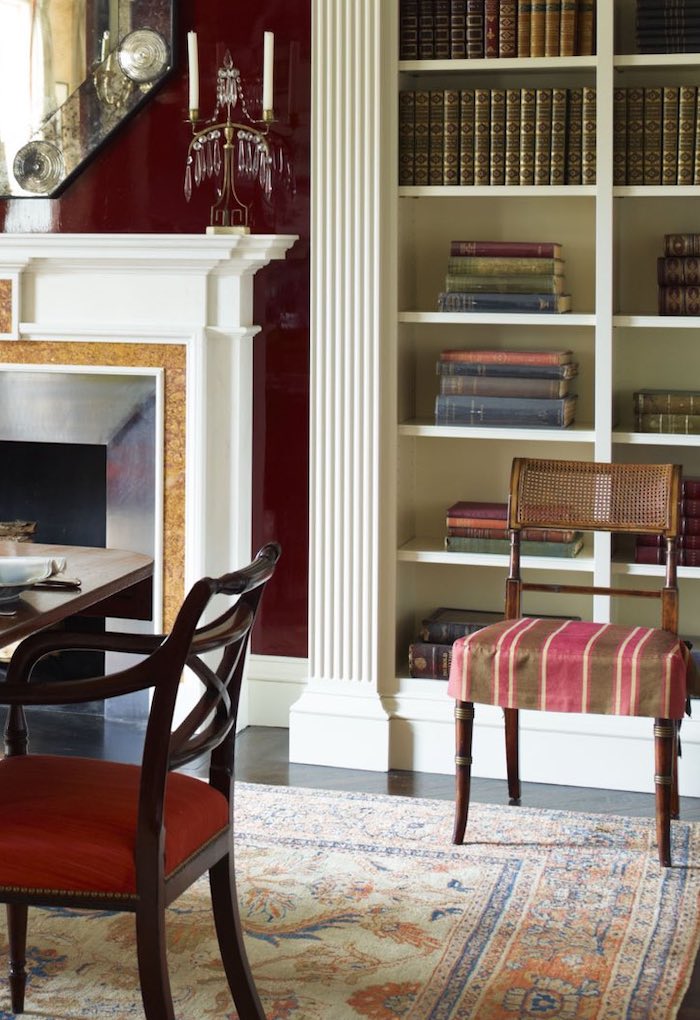
 

Image excerpt- full image, Francesco Lagnese. Architecture Gil Schafer
Gorgeous 5th Avenue apartment in New York City by Gil Schafer.

I’m not sure who the photographer or who else worked on this with Gil.

However, talking about the image, I think there’s enough to see the classical architecture and rich color scheme of many shades in the red family, from deep aubergine to soft red, coral, and gold.

The room on the other side of the doors you can’t see is essentially cream, gold, and orange. Again, here’s the link to see more of this project.


So, for today’s purple color scheme, you will soon see a board inspired by another image below, from Gil’s website.
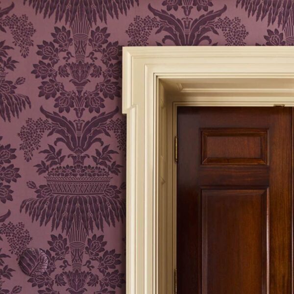
 

New Georgian - Architect Gil Schafer


This is new Georgian-style home is absolutely gorgeous. However, except for a handful of pieces and the wallpaper, it is unfurnished. I will look forward to seeing how Gil and his partners complete the rooms. Regarding the wallpaper; I’m 99% sure it’s been discontinued.

I love the wood tones so much for this room; I made all of the wood trim stained wood for my room. I think it’s gorgeous with the purple wallpaper. This is such a rich, sophisticated shade of purple. It, too, is more eggplant. It is a purple with a lot of brown in it.


Below is a pure purple.


purple

Ouch!


You would go insane if you painted your walls this color. Believe it or not, there are far brighter purples, but I’m trying to be kind(er) to your rods and cones.

When you first started looking at the wallpaper image, it looked pretty durned purple, didn’t it? By the way, did you notice that round area that looks like a botched photoshop attempt to fill in a hole from a three-hole punch? (It’s in the bottom left of the image, above.)


Well, please scroll down and look again.
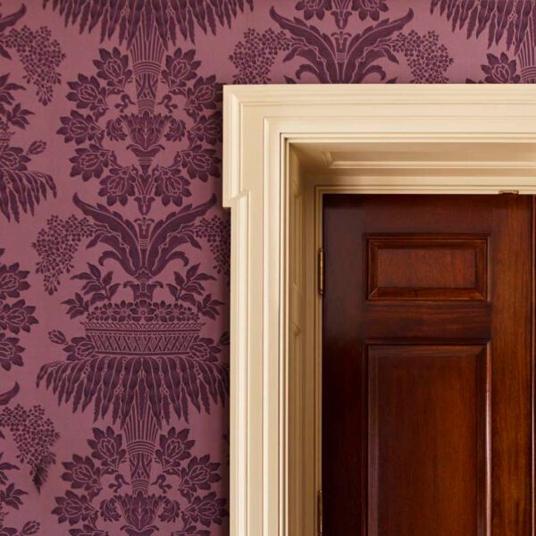
 

New Georgian - Architect Gil Schafer-edited

All fixed!

Okay, Are you ready for the board with the purple color scheme?

First, I’m going to quickly go through my process. I hope that will be helpful.
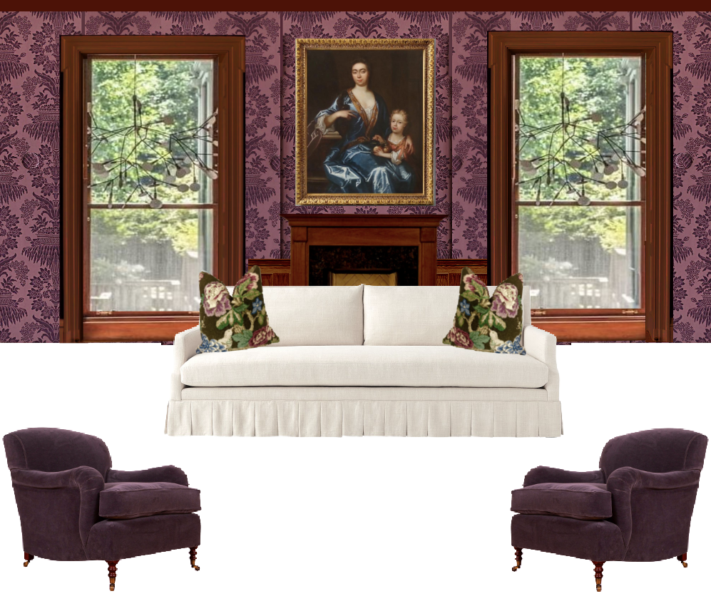
 

Decorating with a Purple Color Scheme

So, what did I do? I added some art over the mantel with a gold frame.

Then came the beautiful Serena & Lily Grady sofa with a box-pleated skirt. And, two velvet chairs from George Smith.
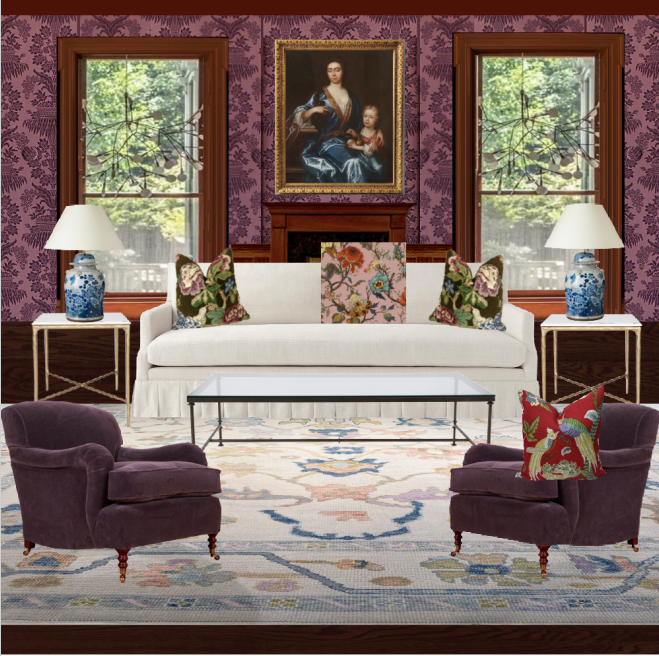
 

Adding rug, experimenting with pillows purple color scheme
Next, I added simple coffee tables and two Chinoiserie lamps. I tried several rugs, but I like this one the best. The rug isn’t the star of the show, but it has to have enough oomph to stand on its own.


What’s the star, Laurel?


The purple wallpaper!

One important thing when using this color is balancing it with a bit of chartreuse and gold.

Even though this is a vastly toned-down purple, it’s still a pretty intense color for most people.

So, I stained the floors a deep walnut color. And, I added a pale modern oushak rug.


And, now, for the finished board with a purple color scheme.


I added more accessories, mostly porcelains, some sconces, velvet drapes with either an edging or a double drape made from a coordinating fabric. That way, the heavy velvet can be stationary, but for light control and privacy, the inner curtain can be pulled across.
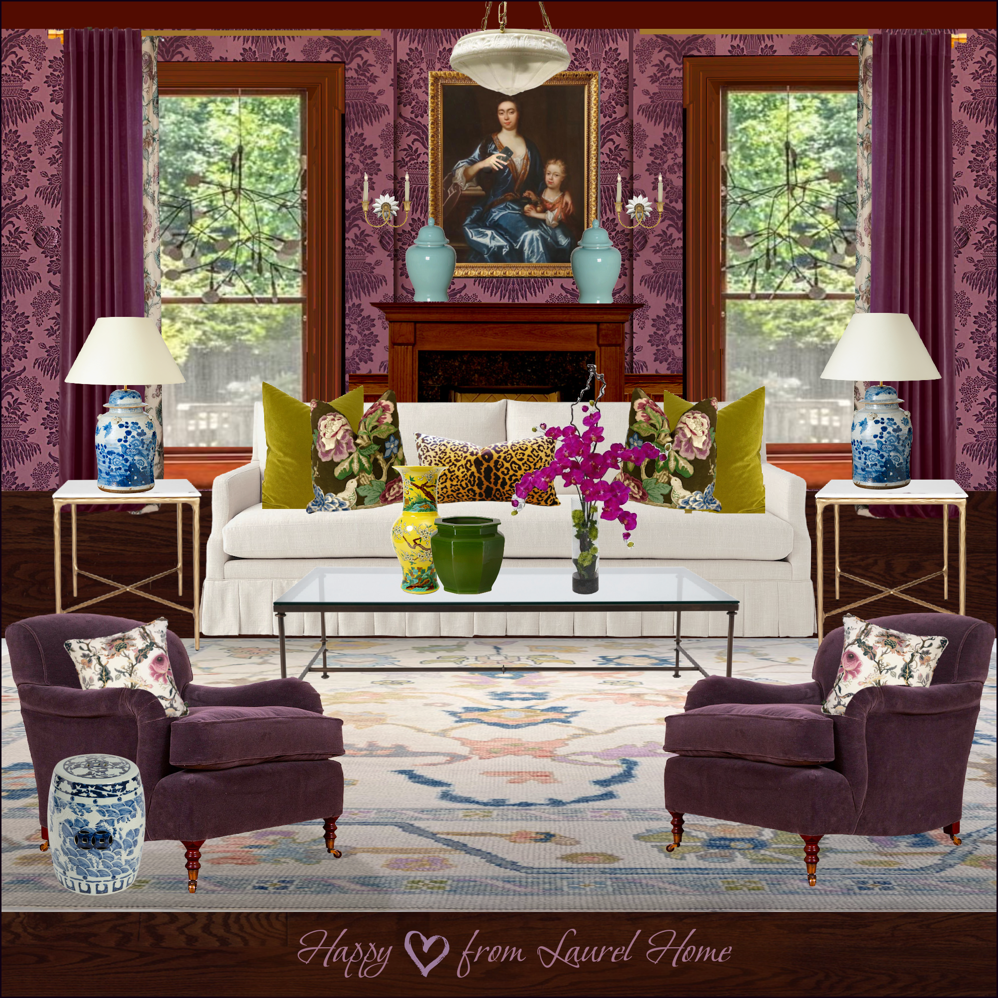
 

Purple Color Scheme Even if You Don't Like Purple selfie


Please note that the sofa is facing this way so that I can get more information on the mood board.

It is not meant to represent a floor plan. Although, it could also be a back-to-back sofa situation.

Below are a few items from the post. Please click on any image for more info.

I hope those of you who love purple enjoyed this post, and maybe some of you have seen a purple color scheme in a new light.

Happy Valentine’s Day!

xo,

PS: Please check out the newly updated HOT SALES! There have been some big changes this week!

33 Responses

  1. Laurel, excellent post. Love your swnse of humor and writing style.

    On another note I have been trying to find one of your blog post where you hhow how to design a room using graph paper. I have searched to no avail. If you could direct me to that post it would be most appreciated.

    Thanks, Bev

  2. Laurel, that is an excellent post as usual. I love your sense of humor and writing style. Very engaging!

    On another note, I have been searching your blog post for days looking for a post where you showed how you did a room design step by step on graph paper. For the life of me, I cannot find that post. If you could point me in the right direction I would really appreciate it.

    Thanks, Bev

  3. I really like and respect your boards, but this purple one is so sumptuous that I have to turn away before I go crazy from emotional design overload.

  4. I love this Laurel! I think the plums are gorgeous and sophisticated. I could live with this in my master bedroom or a libray/den, but not in my main living room. I would end up craving light and fresh greens.

    Noelle

  5. This is interesting because my grandmother had a similar color scheme except she limited the colors to chairs in the room. The walls were a similar paper but in ivory with (ok you gotta realize this was the 70’S) white shag carpet. Sofa was ivory as well. but I would never thought to put a greenish gold and ivory with purple. It was actually a stunning room.

  6. Laurel, your purple board is a tour de force. Only you could transform a room with, forgive me, a fairly challenging wallpaper into a fresh and sophisticated living space. You once stated that working with colors and patterns came fairly easily to you and I can only agree. Thank you for helping the rest of us deal with this much more easily with your helpful and informative advice. (And yes, definitely the humor too!)

  7. I love the deep plums & eggplant purples. They look so rich & beautiful yet I only want to ‘visit” them. I have to be surrounded by green but there again it has to be in small doses not to give a green glow everything including your skin palor. Lighting plays such an important part to using various colors. I once painted our living room 3 times in a week because the blue glare from our swimming pool was totally changing the appeaof the paint color. Thanks for all your help & inspiration.

  8. Thank you, Laurel! I really loved this. You do such a fabulous job of helping readers think outside the box but in an accessible way (using things many of us likely have/love like chinoiserie, white sofa, etc.) I’m less a purple fan but I looooooove pink when used as an accent and this gave me lots of ideas 🙂

  9. Stunning design, Laurel, and thanks for the link to GP Schafer (my new 5 minute work break).
    I don’t know if this will be a popular comment, but here it goes; I think a purple-forward design works best in a room that wants to be dark.
    For example, in a house with a north facing living with a few windows that perhaps are shaded by a deep porch. All attempts to brighten it up fail because… it wants to be dark. So darker stained wood floors, a rich carpet, purple walls, trim and perhaps even ceiling, great crystal lighting, and squishy deep seating.
    I just realized I’m describing one of my favorite restaurants in Lancaster City, PA, the Bellvedere. They added black jet chandeliers, lots of gold trim like you did, leopard print (somehow it works).

  10. I painted the walls above the chair rail in my office a sort of smoky twilight purple (white below the chair rail) and paired it with Scandinavian pine furniture, mushroom/light taupe colored linen upholstered furniture, and a seagrass rug. I added some boxwood balls and willow baskets. In an antique Scandinavian plate rack on the wall, I have white ironstone small platters and pitchers. At the windows, I put a sort of honey-colored bamboo blind. With a green pillow on the chair and gold framed art, it is very soothing! I think it is the subtle twilight purple that makes it work.

  11. I love aubergine and plum, lilac and lavender, with accents of cream and rose pink. Coral orange makes a great accent against aubergine. All the people I know who have purple in their homes are single women or in women only households. Men seem to hate purple, and I think it may be a symbolic hatred because they think it’s too “feminine.” My husband is pretty easygoing about my color scheme proposals, but he immediately nixed aubergine or lavender walls in a bathroom.

  12. OMG. The minute I saw the email about purple I was thrilled. Okay, so this reader question sounds like something I would ask. Like Jenny, I have responded to purple since my teenage years when my bedroom was a pale blue violet. There IS magic and mystery in it and healing. Purple makes me happy. Now, I am not a crazy purple lady, but it looks very good on me, and I named my six year old kitty, Violet (she has her own door as of yesterday afternoon as a birthday present for both of us). So Violet and I are here trying to figure out how to use ‘purple’ without going overboard. Here is the thing, although I am drawn to Amethyst and have chunks of them scattered throughout the house, my favorite purple is Benjamin Moor Bistro Blue – 1421. I am aiming an analogous scheme based on blue purples (Cobalt blues), green (largely in the form of plants). Bistro Blue was in 3 bedrooms and my sunroom in my Michigan house. I dared to use an orange red in my study and I LOVED it (I love purple and red together). I want to transform my retirement home into a joyous celebration of what I call, ‘sea and sky tones’ as opposed to ‘earth tones.’ The only color I really don’t like now is brown, so I use black instead. While I would love to visit this room, Laurel, I don’t want to live in it. I want to be surrounded by Bistro Blue shades. I already have a white sofa like the one above and pale green zebra patterned Bergere chairs and have a length of Ikat in blue/violet for pillows, I am stumped and/or afraid to put that color on the walls in this home. My bathroom remodel turned out stunning, but I took a chance on PPG metallic paint (formerly a Ralph Lauren label) which went gold on me instead of oyster pearl. I did a temporary fix with purple in the art work there. For me, ‘sea and sky tones’ are blue, blue/purple, purple, green, grey, white contrasted in the morning and evening with yellow, red, orange. That is what I am aiming for.
    Thank you, Laurel for this stunning example. Violet thanks you too! (I swear I am not a crazy purple, cat lady. Double swear. A girl just wants to have fun.

  13. We have so much in common, Laurel. My handle on many social web pages is Lavenderchartreuse. In other words, I LOVE purple and chartreuse. And I’m an Aquarian. Happy Birthday to both of us!

  14. I love purple since I was in my late teens-something magical and mysterious about it. A bit scary sometimes, as fairy-tales come, but compelling.
    I started introducing it into decor many years after. I have a lot of purples now. I prefer aubergine to violet, probably. I love red and orange too, there’s a lot of them. And pinks. Fuscia! I love greens so much..well, it’s easier to say which combos I don’t like. Yes, I have walnut floors!(not much in tems of architecture and beautiful moldings..thank you for great inspiration though, to look is to have, even for a bit),
    I have whites and greenish whites and ivory and taupe, a bit of gold, a bit of black, a lot of greens, especially chartreuse)) And I love Artemis well, everything. I don’t have money for it-I would maybe, but I’m swayed by beeing enchanted by too much art, as of late- mostly portraits. It’s all very me, in short. Thank you for this wonderful post(and all the others).
    I’m trying to do analogous palette in our other, much smaller, place-lots of different greens and warm blues. But of course some orange and purple already sneaked in.
    Just to add-because of my love for purple and orange-it’s so, so much harder to find the right fabric when reupholstery time comes..:) Little did I know-the fabrics I used got discontinued, and then it’s 5 year hunt for something similar. I’d buy twice the amount if I knew. That’s my advice to fellow purple(and to a degree, orange) lovers.

  15. Swoon! Your board is so beautiful. The way you showed the progression of the boards really drives home the fact that decorating matters! All the “accessories” that you added greatly elevate the space. I don’t believe I have a bit of purple in my decorating, but I do have quite a bit in my wardrobe. I especially love the plum and aubergine shades. As I was looking for the “sight gag” (per your email), I wondered what those things are hanging in the windows? I didn’t notice the gag, but I see that Nick got it :]

  16. Wow! That is a gorgeous. I never would have thought to put those colors and patterns together. Just wow! The cell phone is a nice touch. 🙂 I think I need that rug for my bedroom, too.

  17. This post is gorgeous! I love purple, it’s my favorite color, and I think that people often don’t give it a chance. I’ve bookmarked this article to show my clients that yes, it is a legit color to decorate with.

    Have a wonderful day,
    Michelle

  18. I’m a designer and growing up also LOVED purple! My entire bedroom was purple down to the large round low pile carpet w fringe. I also lost my taste over the years until I painted my 12yr old daughters bedroom w Behr Gothic Amethyst in flat. It’s the most beautiful soft purple I’ve ever seen. There’s something magical about it. When the sunlight came in through the window there was almost this smoky aura of calm that settles into the room. Amazing color! Okay, yes I was living my childhood over 😉 Thanks for the post.

  19. Thank u Laurel
    I love purple. My bedroom was a very dark purple and it was cozy and romantic
    My bedroom now in my new place is a very light blue violet as is my garage and my office. My garage has a chandelier in it and, yes I park my car on my garage.
    The wall overinflated is just too much for me. Perhaps in a lady ‘s lounge or a highly sophisticated restaurant ur image may work.
    I love ur favorite color chartreuse in areas.
    If I owned the classy restaurant, I would want Clark Gable to come in and order scotch on the rocks and sit in an emerald green velvet chair

  20. I went through a phase where I had a lot of purple clothing/accessories but have never loved the color for home decor. Your board is gorgeous, though, and while not something I would have, shows the possibilities!

    I had a client years ago who wanted purple and a yellow-y gold together. Yeesh. I managed to scrounge up a Laura Ashley fabric that tied everything together, but it took some doing. She was a nightmare to work with, color scheme aside.

    Happy Valentines Day!

  21. I have some purple accents in my condo, a purple pillow here and purple glass vase there, etc. I’m a cool color person: blues, greens and purples fine with me. Happy Valentine’s everyone!!
    (was I the only one who started listening to my Burt Bacharach CD the other day? I loved his music.)

  22. I have, twice now, stayed in an apartment in Paris decorated in a purple scheme. Well, not a bright purple but a gorgeous moody aubergine. The stars of the show were two large aubergine velvet couches. In a Hausman building with lovely windows it was just perfect. Purple lends itself to old buildings and architectural features.Gosh I loved that apartment.

  23. Great post, Laurel! I LOVE purple and green together and this montage is lush and lovely.
    Also love anything by Gil Schaefer.

  24. Really lovely board, Laurel! I’m a February BD as well, so happy belated to you! What’s the hidden object? That’s not you in the picture above the sofa, so I’m stumped 🤔

Leave a Reply

Your email address will not be published. Required fields are marked *

This site uses Akismet to reduce spam. Learn how your comment data is processed.

Welcome To Laurel Home!

laurel-aarons-18th-e1456449963926

Hi, I’m Laurel, and Laurel Home is the website and blog for Laurel Bern Interiors.
I’ve been creating new-traditional interiors since 1988. The blog is where I share all.

New Edition, November 2023! Get The Indispensable Guide For 100s of Home Furnishings And Interior Design Sources That Everyone Is Raving About

laurels-rolodex-final-book-cover-master 10th edition 23-24

laurel home archives

Categories:

Please click the image below for more info about my rockin’ Interior Design Guides for 2024!

Laurel Home Interior Design Guides 2024
Amazon ad

please click below to check out my favorite decorating & design books

Laurel Bern's Favorite Interior Design and Decorating Books