Hey Guys,
This has been a very architectural time recently. I know that many of you want me to continue with the mcmansions. And, I will most likely get back to them. However, for those who prefer other types of posts, I don’t want to make you feel unheard.
Plus, it’s always a good idea to hone the bones of our rooms, if possible.
And, I’m so glad that most of you enjoyed the last post about the hideous mcmansions. In addition we also looked at classical interior architecture a week ago.
But, I want to get back to the classical architecture, because I would like to discuss in greater detail how we arrive at the perfect architectural proportions for our homes. Is there some magic formula?
Good question, huh? Well, actually, yes, there is!
And, I think it’s an important topic because I am frequently asked “How high should the wainscoting be?” “What size should the crown moulding be?” “What about the fireplace mantel?”
Well, today, I’m going to show you a relatively easy way to figure it all out. Or, at least how to get the proportions correct.
By the way, proportion is the scale compared to some other thing. But scale is not dependent on something else. Some folks use them interchangeably, but they are two different concepts.
For instance. That chair is a small scale.
Or, the mirror is too small for the chest it’s going over and the wall it’s on. It’s too dinky. The proportion is all wrong.
But getting back to the formula for perfect architectural proportions.
It has to do with the mathematical element that is connected to every organic thing in the Universe, including our galaxy and others.
We touched on it in this post when we discussed Metrie Mouldings. (please take a minute and check it out.
But, today, we are going to examine this formula in greater detail.
And, this is the mathematical concept of what is commonly known as the golden ratio.
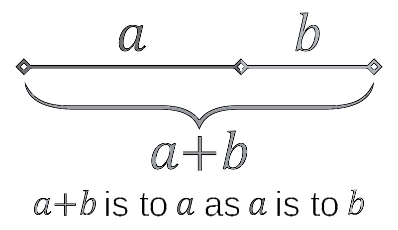
This formula is expressed with the Greek letter phi.

Phi stands for the mathematical formula for the golden ratio, sometimes also called the golden mean or the Divine ratio.
The golden ratio is based on a mathematical formula where two numbers are added together to make the next number in the sequence.
AKA: The Fibonacci Sequence
1, 1, 2, 3, 5, 8, 13, 21, 34, 55, 89…
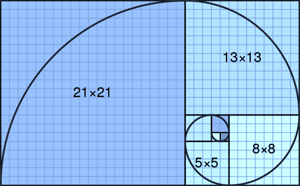
Or, it can be expressed as a spiral. Every square and rectangle = the same ratio which 1:1.618.
It is easy for me to remember because my son’s birthday is 6.18. :]
Did you know that the ratio from the floor to your navel (1) and then from your navel to the head (.618) is roughly 1: 1.618
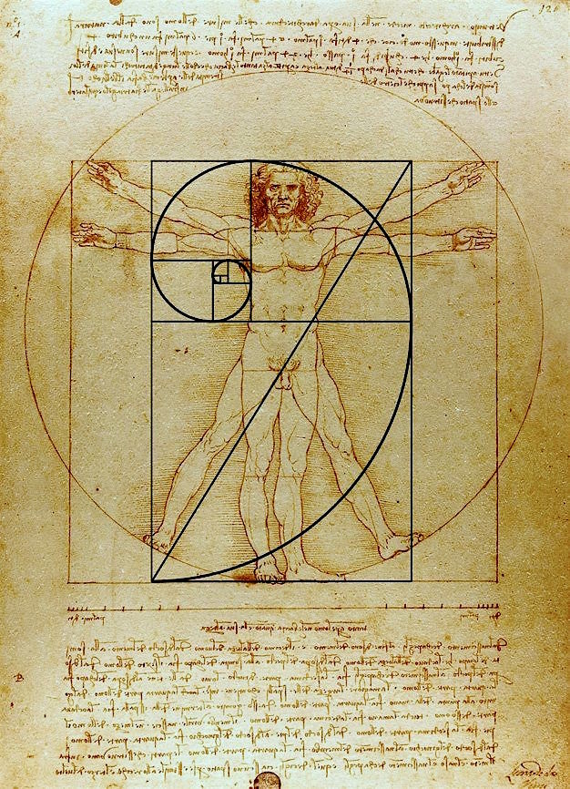
There you go. Leonardo Da Vinci’s iconic Vitruvian Man. The number 1 is represent by each side of the square below the man’s naval. The rest of his height from his naval on up is .618. Henceforth, the ratio 1:1.618.
But, it doesn’t end there. The hand to the elbow and then the forearm to the shoulder. The ankle to the knee cap and then the knee to the hip.
Yes, of course, there are some small variations. But, in the scheme of things, they are not terribly significant.
And, that’s a very good lesson regarding proportion in architecture.
Seriously, don’t get your knickers in a twist about it. It’s a guide-line, not Laurel is going to jackhammer you if you’re a half an inch off or even several inches off if the scale is fairly large.
The examples we saw on Wednesday are not a half inch off. They are not a half of a foot off.
They are a football field off!
Okay, fine. I’m exaggerating. But, not by much!
For today, I want to show you some cool things I’ve discovered and how we can use the golden ratio to create perfect architectural proportions for our homes.
Today, because I think I’d like to try and get an hour or two of sleep, I’m only focusing on the exteriors. But, know that whatever is going on outside, can be applied inside, as well.
For Wednesday, I will most likely take these principles inside to examine the placement of mouldings, windows, wainscoting, etc. I thought I was going to do that today. But, that’s typically me, biting off way more than I can consume in one day.
However, I’m having a lot of fun with this exercise and I hope that you’ll enjoy it too.
Architects from at least the Renaissance onward have used the golden ratio in their designs. And that is why they are so pleasing.
In fact, I read a study where a group of people were shown ten rectangles of different proportions. They were asked to choose which rectangle they found most pleasing. The rectangle that was most frequently chose was the one which measured 5 on the short side and 8 on the long side.
OH, something else I found. And you’re going to love this. This is a link to a golden ratio finder. So, if you know what (1) is, it will tell you what .618 is. Or, vice a versa.
I found numerous examples dating back to the renaissance where we can see the perfect architectural proportions conveyed by the golden ratio.
But, unfortunately, it is not always possible to find out who did the work. If I did an overlay on an image, I put my watermark on it.
 Brunelleschi and the Fibonacci Principle His use of proportions are based on the golden ratio. How cool is this beautiful watercolor!!! I wish I knew who did it. Yes, there’s a name like it’s a book cover, but I could not find this person or this book.
But, there’s more.
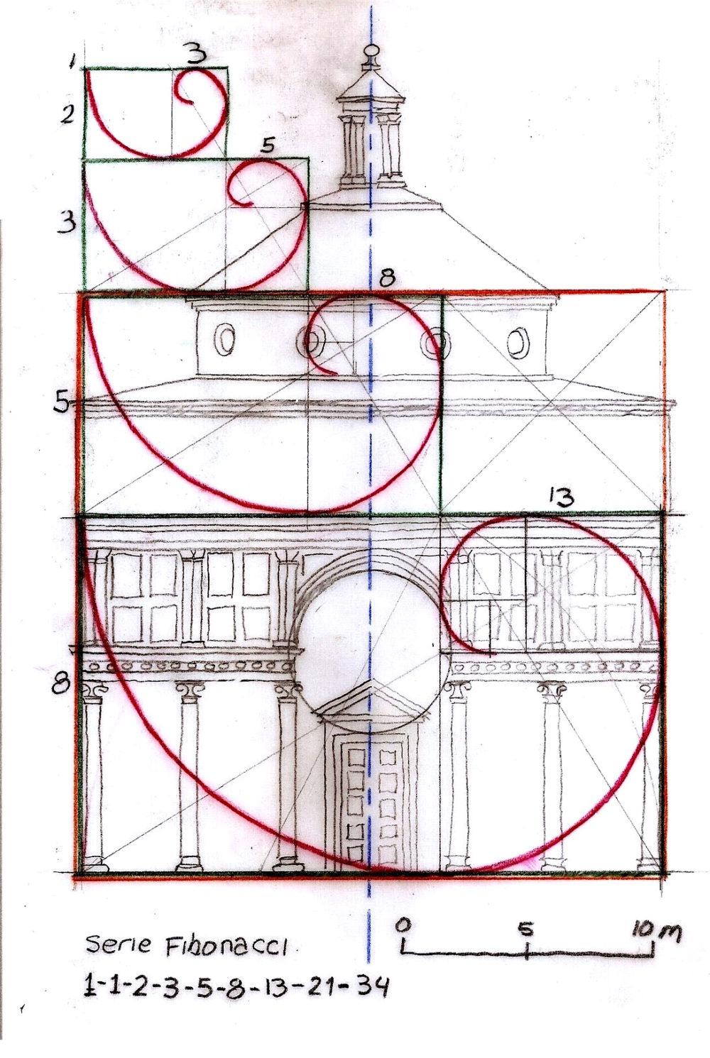
This is a line drawing as you can see of the same building. There’s something so pleasing about these images. Well, of course, they all convey the golden ratio!
Let’s move on to more recent times.
Below is a line drawing of a classical Georgian-style home.
This one is quite easy to understand because it is perfectly symmetrical.
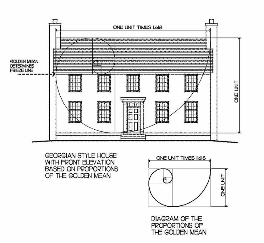 Sorry, I don’t know where the above image is from. It shows how the golden ratio can be used to find the perfect architectural proportions.
By, the way, I downloaded Ben Pentreath’s book (Get Your House Right) on kindle (it’s also available in hard copy) and it is superb. Well, of course it is. Ben wrote it!
There are many wonderful examples of what to do and what NOT to do.
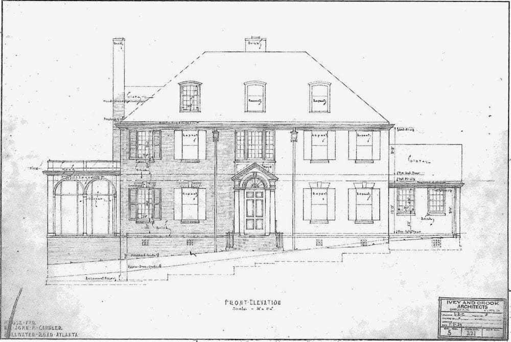
front-elevation via the georgian revival files
Here’s where I had a lot of fun today. I found the above elegantly classical Georgian home that was drawn in 1929.
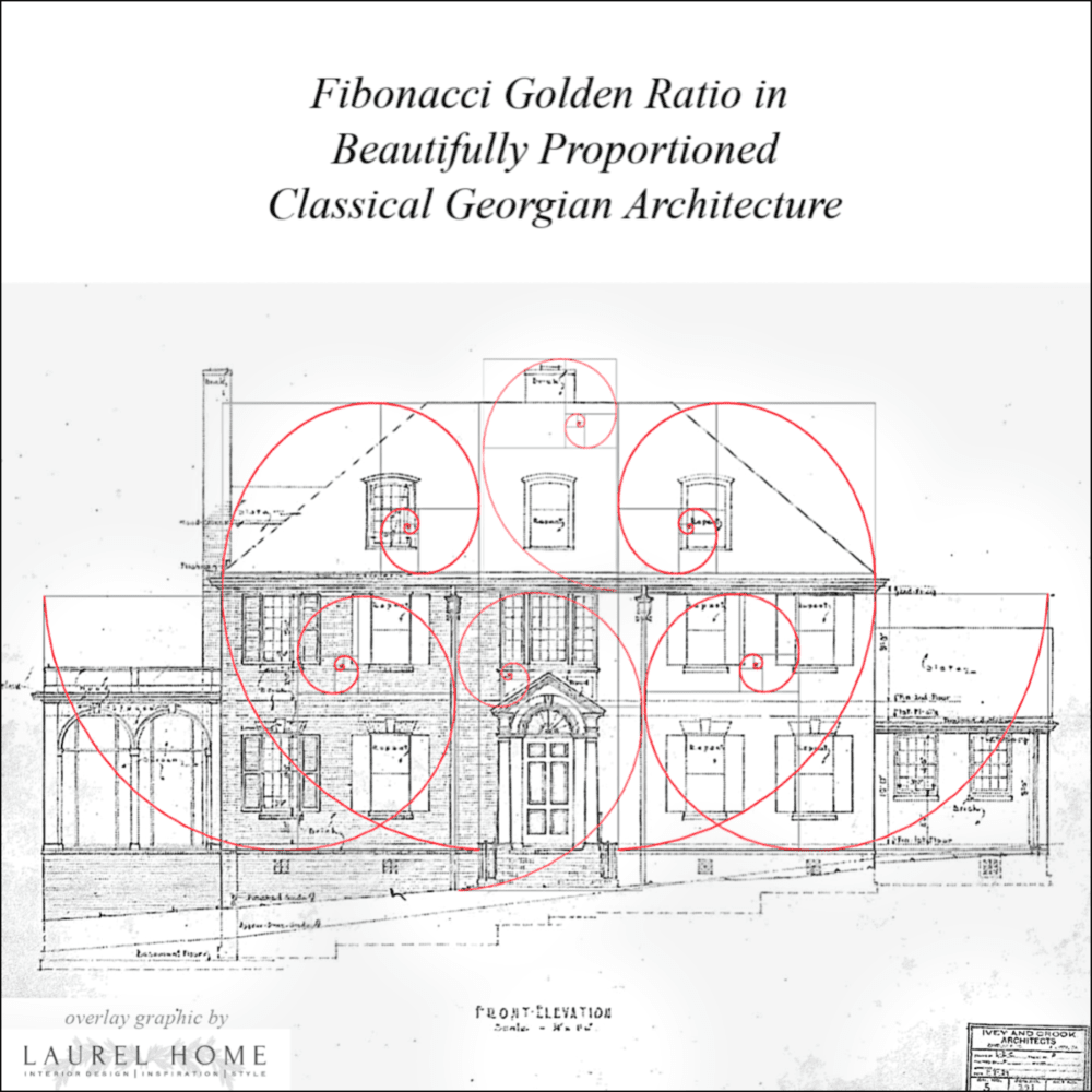
Make no mistake, I could’ve probably kept going, but you get the idea.
There is a wonderful blog by architect, Richard Taylor.
I don’t often see architects with blogs, but this one is excellent. And, I recommend that you check out this post, where he explains his design process for finding the correct architectural proportions.
Not only does he use the golden ratio, he makes use of the golden triangle which is another aspect of the formula that architects and designers can use to derive the perfect architectural proportions.
However, I had more fun with the golden ratio.
I think it’s great to be told that something is classical. But, this examination into WHY it’s classically correct, I think is very beneficial because then we know better what to look for.
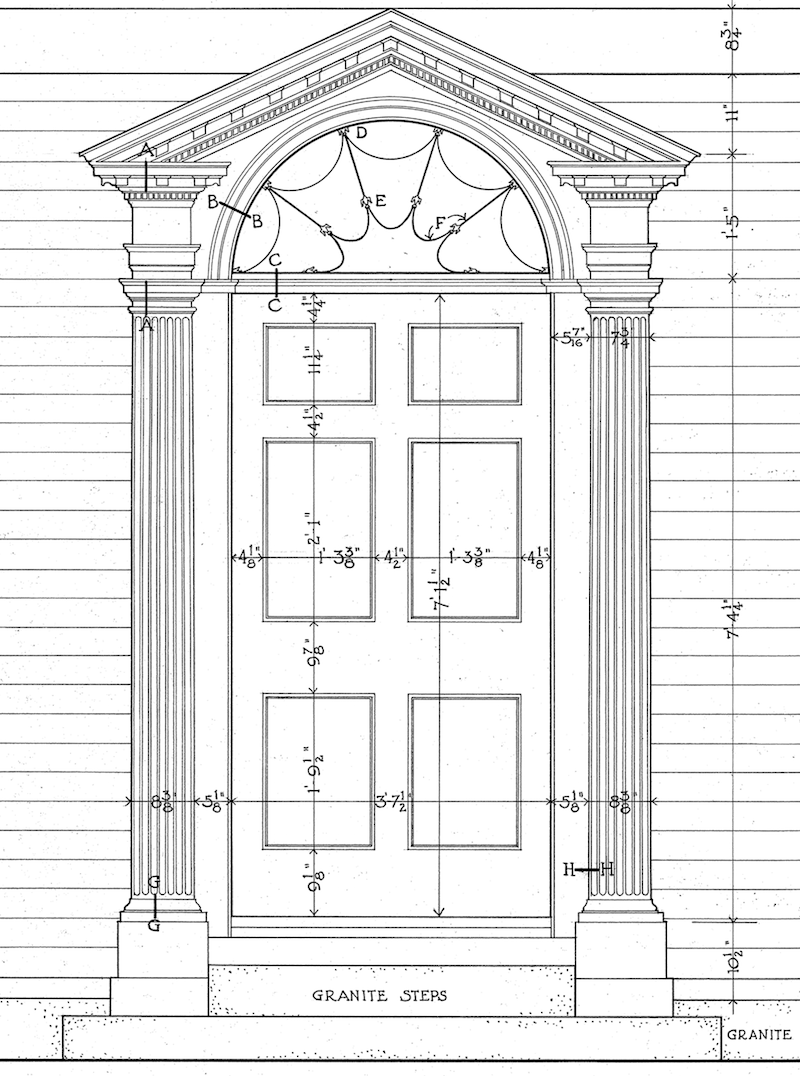 Above is a Georgian door with perfect architectural proportions. I won’t get into all of the architectural terms, but it is flanked on either side by what look like pilasters (engaged columns) that are in the doric order.
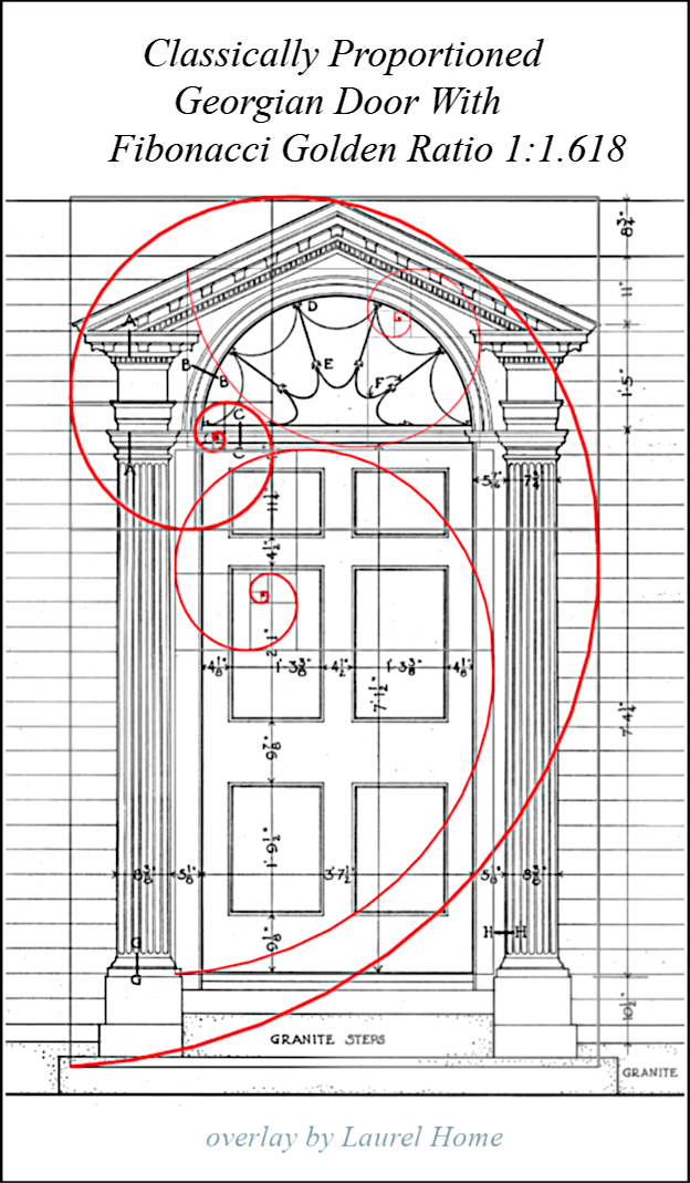
The squares and rectangles are there, but are not easy to see. But, maybe you can see that one of the horizontal lines of the smaller rectangle intersects the middle panel, almost dead-on in the middle.
And the large rectangle hits the parameter of the entire door surround.
I was a little nervous about this post because I was thinking about it for a few days, and this was the general idea, in my mind. But, I wasn’t sure if it would work out. However, if it didn’t, that would be a learning experience too!
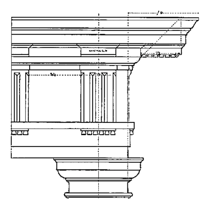 Actually, the first one I did was this doric entablature.
Before I show you what I did, I’m embedding a wonderful video by Todd Murdock.
This is the best explanation of classical proportions I have ever heard or read. And he does it with a power-point presentation. It is very clear and easy to understand.
He recommends William Ware’s book, The American Vignola. You may recall that we spoke of Vignola as one of the renaissance architects who laid out the five classical orders. But, he says that the original is impossibly difficult to follow.
Below is the entire Doric order with the entablature and column. There is also a base, but this image doesn’t show that.

Above is a classically proportioned Doric Column another wonderful blog post from This is Carpentry. I highly recommend that you read it. The Doric order is eight diameters tall. But, that is all explained in the video.
Getting back to our entablature. Below is what I did to show why these are perfect architectural proportions. Or, at least I tried to.
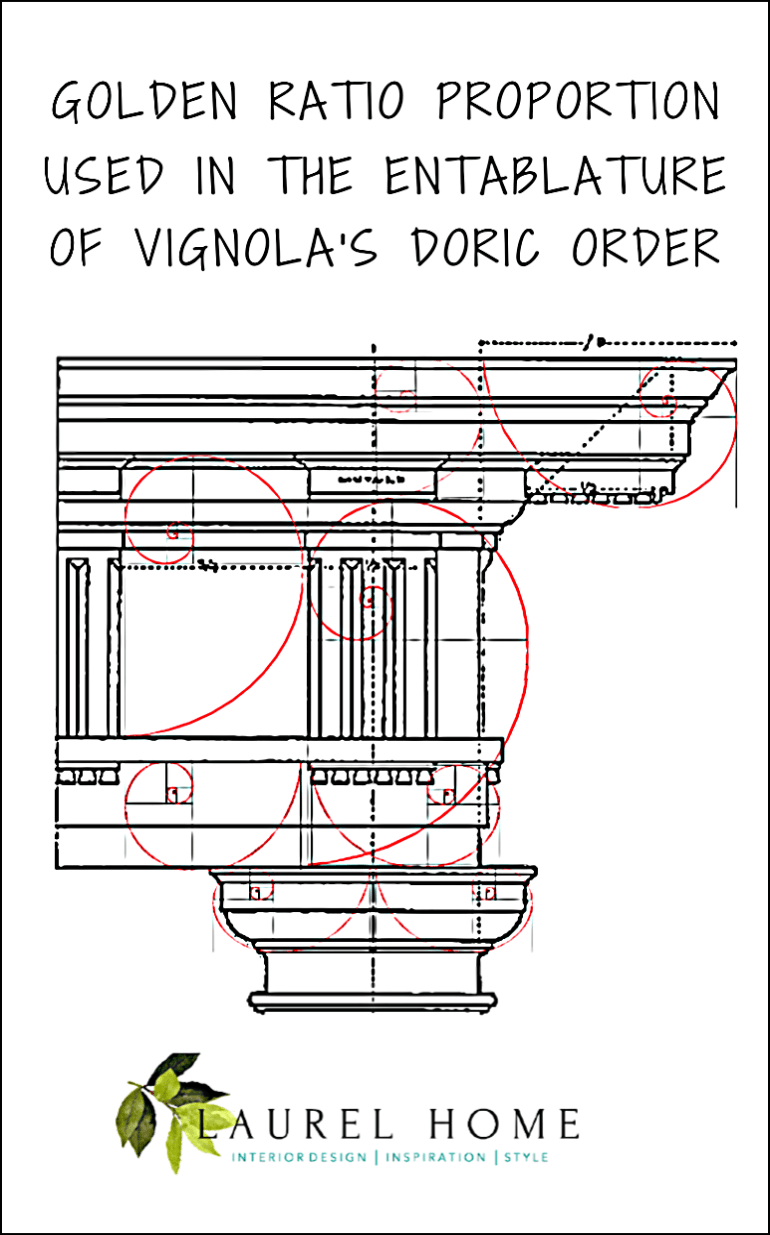
There are golden ratio rectangles every which way! So cool.
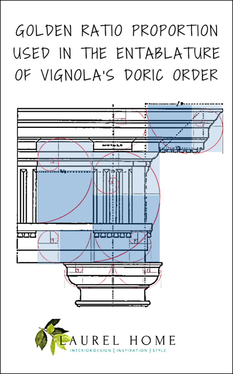
This is another version so that you can easier see the squares and rectangles that create the 1:1.618 ratio. Please feel free to pin any of these graphics to pinterest for handy reference.
Frankly, over the years, aside from drawing things out, I frequently eye-ball where things should go. How many of you do that too?
However, if you’re building a house or furnishing a room, eye-balling isn’t enough!
But, an interesting point that Todd Murdock says in the video is this: There are several experts who’ve written about the perfect classical proportions. And, he shows a diagram of the columns side-by-side. Yes, they are all different from each other. However, the differences between most of them are very slight.
In fact, if they weren’t right next to each other, you probably wouldn’t notice the difference in two homes a mile apart from each other.
So, again. These are merely guidelines. And, as such it is fine to deviate from the ideal. One reason for this is that the exterior of the home needs to look good, but the interior also needs to look good and function beautifully.
Sometimes, it’s a tough call. And generally, the inside of the home is going to win out. That makes sense since our homes are there to shelter us.
This has been a learning experience for me this week and I hope that it’s given you some new insight into how architects and interior designers create classically accurate proportions.
xo,

Please check out the updated hot sales. And, also, hot off the presses! Nordstrom has added hundreds of new items to their Anniversary sale.! They do that a lot in the last week. So, even though some things are sold out, they are continually adding new items.
You can also check out some of my favorite items here. The sale ends August 4th.
Related Posts
 Painted Wood Furniture – Cringe Worthy, Dated, or What?
 The Best Bedroom Paint Colors You’re Probably Not Using
 The Perfect Shade Of White Wall Paint For Oak Trim
 The Ultimate Guide To Fireplace Mantel Decorating
 Gorgeous Bathroom Vanities + Sinks, Faucets, Mirrors, Lights
 The Guaranteed Way To A Beautiful Room (It’s Not The Wall Color)
 Little Known Exquisite, Affordable Wallpaper Murals & Art


67 Responses
I think the Brunelleschi watercolor you show above was probably done by Haydar Disbudak. He’s a Turkish architect, so might not have come up readily in google searches in English.
Completely fascinating, but I am at a loss as to how to apply this. We need to redo the columns on our front porch and have been debating how wide they should be. Is the answer somehow here?
Hi Jessica,
Yes, the answer is there. You need to look at the video to get the formula. If you know how tall the column are, you’ll be able to figure out the approximate width at the base that will be proportionate.
I’ve been meaning to add applied molding wainscoting below my dining room chair rail. I was going to eyeball it, but not now. Where do you start the measurements? Midway between chair rail and top of base molding? I know, you can’t see it!!!!
Hi Denise,
I presume you mean the picture frame moulding that makes the box. It depends in part on how high your chair rail is and how tall your baseboard is. This post about wainscoting might give you some ideas.
Very interesting how things work! A really great post you open my eyes even more with each post!
Now I would like to know how to fix some of the architectural failures my home has… Like asymmetrical or un balanced doors and windows without having to tear downs walls 😬
Help Laurel!!!!
Hi Carolina,
I guess it depends on what the issue is. But sometimes with clients we have moved walls, or added some!
Fabulous! I totally geeked out on the video and will look into getting Ware’s book. Next time my developers ask for my opinion, I will be armed with some pretty decent knowledge! Many thanks Laurel!
You’re welcome Donna!
Superb information! I am the happiest seeing and reading it! Great job!!! So educational.
Thanks Val! I enjoyed this one too.
I’ve said it before, but must say it again: you are a superb teacher, Laurel.
Thanks so much Gaye!
Dear Laurel-
I’m loving this! I appreciate these posts about what constitutes good and poor architecture and classical proportions. I think we often have an innate sense of what makes for good aesthetics, but this gives us “something to hang our hats on”.
It’s nice to be let in on the actual principals that govern good design rather than just seeing dangled before us the latest fad in consumer goods as the answer pleasing aesthetics. Thank you so much for investing your deeper knowledge into these posts. It is very much appreciated!
Thanks so much Susan!
Laurel,
Thanks for the fabulous post. I’ve been trying to impress my design students with the importance of phi for 30 years! Well done.
As a Classical Archaeologist, I have to mention that the column in the Doric Order has no base. The Tuscan column looks similar to the Doric and has a base, but the true Doric order does not. Check out the Parthenon and you’ll see what I mean.
Lastly, I wanted to share the link for the Podcast by BBC Radio on the Golden Rectangle, which as you know, also follows the ratio of phi. It’s really useful for architecture and interior design proportions. Here is the link: https://podcasts.apple.com/us/podcast/a-history-of-ideas-animations/id953508847
Thanks again for an informative post.
Rhonda
Hi Rhonda,
Maybe it was Vignola and/or Vetruvius who added the base during the Renaissance? And, thanks so much for the podcast!
Thanks for this post! I need to get the cobwebs out of my brain and try to remember so many things I learned long ago. This is a great way to stay in my air conditioned house on a Sunday afternoon and not feel it was wasted. Now I want to go around my house and measure things!
Hi Donna,
Yes, I’m doing it too or at least eye-balling everything.
Laurel, What a wonderful post! At 81, if I had my time to live over I would want to pursue study of this subject. I’m sure you’ve inspired younger ones the same. (btw: No disrespect intended to anyone at all, but as for me, I can’t (won’t) spare any time learning about eyesores like McMansions. I’d rather ‘accentuate the positive’!):)
That’s perfectly understandable Gloria.
Sitting at your feet drinking it all in.
SO wise my friend.
xo
oh, haha! Thank you Elizabeth! xoxo
Laurel – superb post! you’ve provided a foundation for people to think about…
Love the detail and how it pertains to everything …
very exciting stuff…
thanks again for posting…
Thank you too, Sandra!
Wow, Laurel, this is great–I will share with my team! Thank you!
Oh, I’m so flattered Elizabeth. Thanks so much!
Oops…. thought they were one in the same….. have seen so many low pitched roofs here in Florida and thought if they were taller/higher it would add so much to the curb appeal….
I’m sure it would too. Around here, if anything, it’s that there’s sometimes too much roof. We need that steeper pitch because of the snow, but it doesn’t have to be disproportionately tall for the house. A lot of those mcmansions have way too much roof.
Great post! Brought back lots of art memories and sadly how many things I’ve forgotten!
Hi Leslye,
I had forgotten them too, until I did the post from a few years ago. This post.
I have known about this since taking an architecture class in college. It is so interesting that you posted about this. It should be the basis of all architecture. I dream about having a small, golden ratio designed home. It would be as simple as possible but the proportions would adhere to the golden ratio (inside and out). What a fantastic post. So glad you delved into this fascinating topic.
Hi Pat,
I agree that it should be the basis of all architecture and design, for that matter. What’s interesting, is that in interior design, we’re always talking about thirds. But, the golden mean is different. However, if one were to do a living room layout. It is naturally going to fall into this ratio where the center section is the largest and the two on the end including the pathway are at approximately .613 of the center section.
You can probably see this in many of these floor plans.
This was a wonderful explanation. We’re in the process of building a new, PNW modern style house, and just out of curiosity I took the spirals and put them on the elevation from the architect. They fit perfectly. Now I know why I love the elevation so much. I can’t wait for part 2 on interiors.
Hi Kristin,
Oh, I’m so glad you brought that up. Modern styling absolutely also should be using classical proportions. The early to mid- 20th century architect Le Corbusier was known for using the golden ratio in his designs! The main building of the UN follows the golden ratio!
My builder, although at first glance a rough DIY small-town guy, has a BFA in sculpture and once started telling me much of what you wrote here, about the golden ratio and spirals and… I was so impressed! His work has a beautiful, classical simplicity that wins awards. (And if I could get him to quit procrastinating and start communicating better, we might have a walk-on-water guy!)
Which is a roundabout way of saying: great post! 🙂
Hi Charmaine,
Chuckling about the “communicating better” part. To you and my fellow-sister friends, let’s stand in a virtual circle hold hands and pray. That’s all we can do. lol!!!
OMG Laurel, I never realized that about the eyes being in the middle of the head! That is mind-blowing!
Hi Elizabeth,
I know! I felt the same way when I learned this maybe 30 years ago. But, our heads don’t stop at the top of the hairline.
Here’s a good image.
I love this! The video about Vignola is first-rate, along with your explanation. I loved learning about proportion, something that has puzzled me as I start planning our new cottage. Thx!!
Hi Jane,
I agree! You can tell when someone is winging it. Not this this guy; he clearly took the time to produce an excellent, very informative video.
Hi Laurel
This is such fabulous information. Thank you for all your hard reseach. Living in an 1890 Greek Revival farmhouse for 45 years, I have always had an interest in architecture. Please do inside too, soon! Thank you!
Thanks so much Pat! I will.
I’m saving this post! Already designed and built my house and no way I’m going to try to figure out if I did it right (math was never my strong suit). BUT when I look at the exterior view I am very happy with the way it looks so hopefully I got it mostly right!
Hi Liz,
I have a design rule that has never failed me.
If it looks right, it’s right. The same goes for “straight.”
Hello-
Can you please post the link to Richard Taylor’s blog? Lots of Richard Taylors out there!
Thanks for a great post!
Hi Nancy,
Thank you! There’s a link to his blog and a specific post that’s relevant to this post right underneath his name.
It was a math class video and I was so taken with it that it was a delight to be able to buy it for my kids. The golden ratio part is excellent. OOH! I found it on you tube:
Thanks so much Janet!
Any discussion of the Golden Ratio is incomplete without a quote from “Donald Duck in Mathmagicland” : Luck, no it’s skill!*
*or at least it is for me- haha
Hi Janet,
I missed this DD. But, of course, I’m sure the wise duck is correct!
Hi Laurel. This post is absolutley da bombe, girl! What great information you have provided to homeowners and fellow designers. You are a fabulous teacher, and I thank you.
The classical architecture elements of my education over the years have always been a favorite of mine. I don’t recall those lessons discussing the golden ratio and how it intersects with design. Your overlays are spot-on to drive the point home.
Kind regards,
Anne Harvey
Hi Anne,
This was fun for me too! So glad that you enjoyed it as well.
Thanks for this, Laurel, a wonderfully instructive and useful post. I’ve been dreaming about a design for a summerhouse using the golden section, your post makes getting the details right a whole lot easier! More, more!
Hi GL,
So glad that you liked this post!
Hi Laurel,
I really enjoyed your post! We use the Golden Proportion in dentistry all the time, especially when designing smiles. For example, the two upper front teeth should be the same shape as the face turned upside-down if you want them to look in proportion to the face. The other front teeth, the laterals and eyeteeth, are in a Fibonnacci proportion to the two front teeth. We even have a Fibonnacci gauge to help us. It’s expandable so it can be used on other things besides in the mouth. The Golden Proportion rules!
Thank you for your illuminating post.
Oh wow! That is so interesting. The face is also full of the golden mean. One thing I learned in a drawing class is that the eyes are actually in the middle of the head. Novice artists, usually think they are higher up than they actually are.
HI Laurel,
This is a very interesting post, and I enjoyed the video. Although I can see that I do not have the aptitude to be an architect, I can appreciate the general concept of scale and proportion and what architects must do to create such beautiful structures. Thanks for my continuing education.
Hi Connie,
I think that being an architect is a lot like learning a new language. But, the skill-set is enormous as they are dealing with inside and outside as well as the terrain and other obstacles. Oh, like lot lines and set backs.
What a wonderful post! Brings me back to my art history classes in college on Greek and Roman architecture….
I am fascinated also with roof pitches and how some architects and builders can get it so wrong…..especially on a one story home.
Thoughts when convenient, keep posting!
Hi Patricia,
I guess if one knows the height of the roof, then the pitch is easy because it can only be one angle. That’s if two sides are meeting in the middle.
So, maybe it’s not the pitch that’s wrong, but the height of the roof. Any architects out there wishing to explain?
Love this post! I’v learned a lot this morning. Thank you.
Thanks so much Stephanie!
Oh Dear Goddess
Thank you!
I have been trying to explain this for years
People are like Huh
I was beginning to feel like the woman who fell to earth
I’m sending it to everyone Ha
Hi Susan,
Really? It should be taught in the first grade! haha
I love it when you post early in the morning and I have insomnia!
haha. Hope you got some sleep!