Dear Laurel,
We moved into our dream home about 2 years ago. Well, it’s dream except for the kitchen! The kitchen design sucks!
The home is from the early 1800’s– A Federal style home with super high ceilings.
The previous owners, or maybe the ones before them, put in this kitchen that’s too gross for words. It’s oak and the cabinets look stuck to the walls. Oh, Laurel, it’s just horrid. Positively horrid!
So, I found a kitchen place that was recommended to me by a friend and I paid their fee and they provided this boiler plate design that I’m so sick of. I know it’s not right. It’s everything I don’t want and it just doesn’t look like the rest of the house. It’s like they are on auto-pilot and pretty much generate the same kitchen for everyone.
Of course, I want it to have modern conveniences, but I also want it to be in the manner of the period in which the home was built? I’ve done some research and I just want something really cool that doesn’t seem so kitchen-y.
Am I nuts?
Betty Krokar
Oh Betty,
Heavens, no, I don’t think that you’re nuts at all! I think that you’re a pioneer in a growing movement towards homes which are less “decorated.” In fact, in the early days of my blog, I did a post about undecorated homes. This trend, if anything, I believe, is gaining more and more momentum. It’s a trend that I love and am hoping is the wave of the future.
The younger generation lives differently. More casually and with less pretense. This can be seen in the popular magazines, Domino, Lonny, Domaine and the popular lifestyle blog, Apartment Therapy.
I’m going to call this the UN movement. Undecorated. Unadorned. Unkitchened.
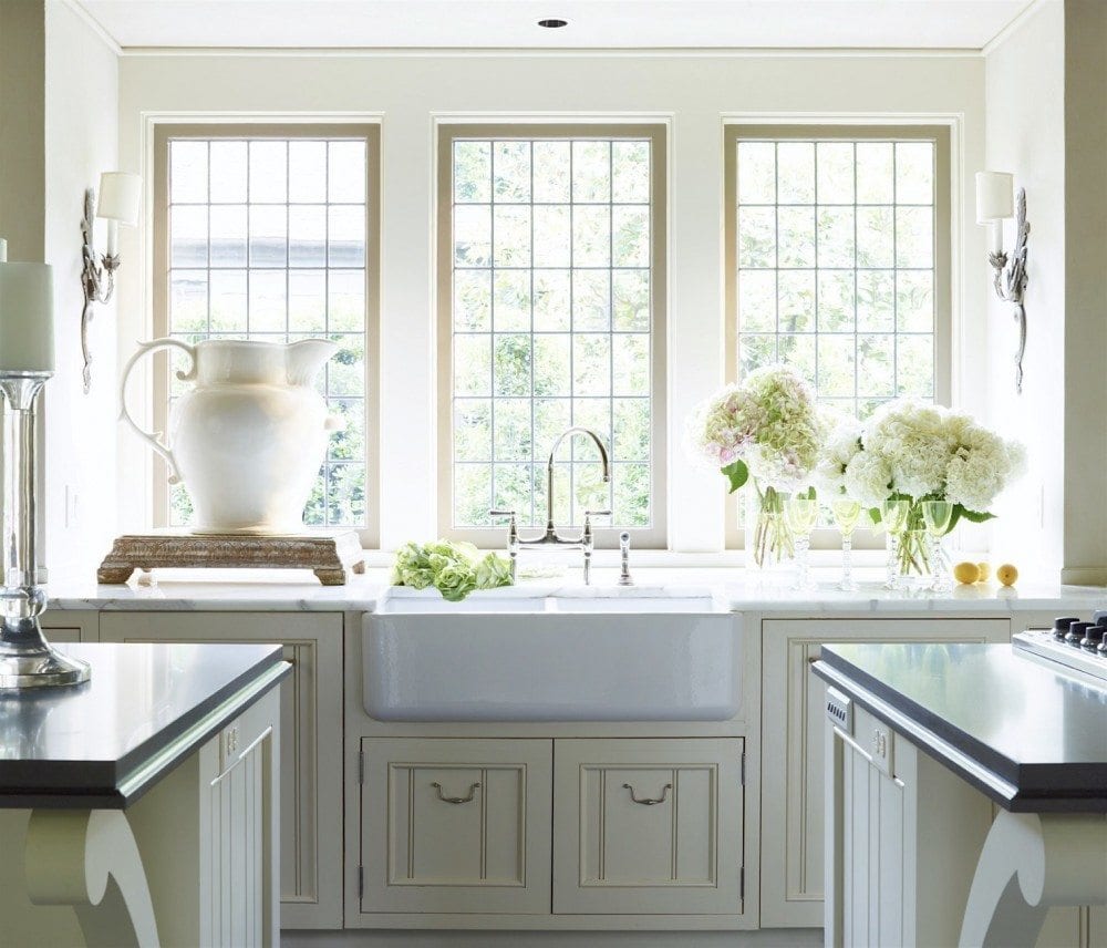
The UNKITCHEN kitchen design
It’s a kitchen, but it’s not like the ones we’re so used to seeing in the USA.
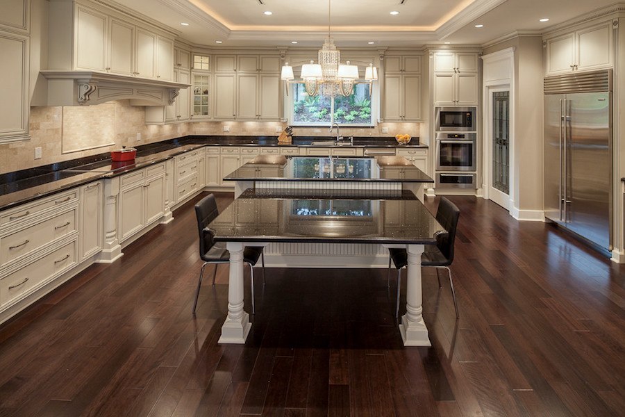
The kitchen above is a converted airplane hangar built for a staff of 12 plus the family that lives there. The staff spends dozens of hours creating hundreds of delicacies for parties of up to 300 guests. If this is you, then of course, you would need a kitchen like this.
The only saving grace is that an hour or two here, replaces the necessity to go to the gym.
What makes a kitchen design an unkitchen design?
Well, first of all, they don’t ever have the typical run of closed upper cabinets and the storage is generally more furniture-like.
I will be getting into storage issues later on because I know that many readers are very concerned that without upper cabinets there will be inadequate storage. As a designer, I would never sacrifice function for form. However, it is possible to have both.
There are several subsets of unkitchens.
The Industrial Unkitchen
Is often seen in loft-type homes with exposed beams and pipes. It often features high ceilings and large windows, exposed brick walls, natural stone and/or concrete. It may also have some rustic elements.
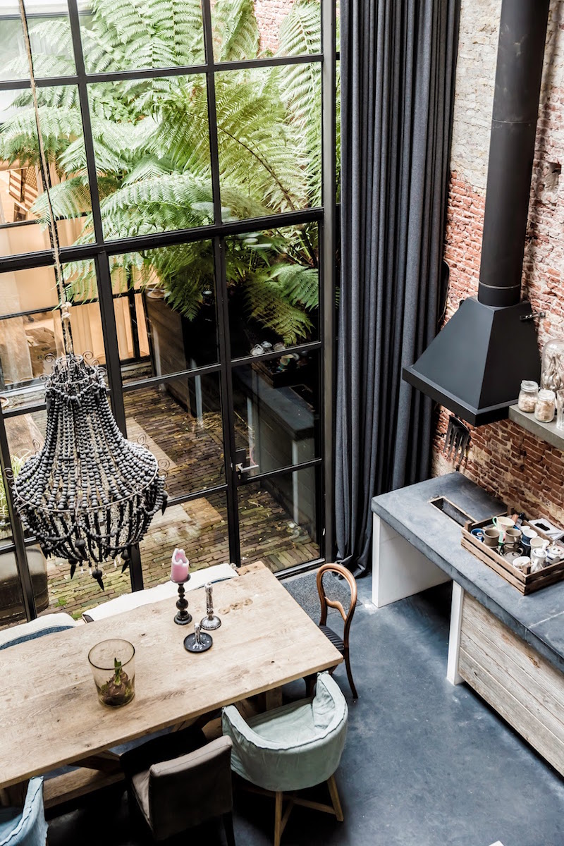
photo: Louise Derosiers via milk magazine
The Rustic Unkitchen
It may or may not have industrial unkitchen features but it always features natural materials like stone and rustic woods. There may be paint but it’s genuinely old looking. Like the industrial kitchen, the ceilings are often high and with a lot of large windows.
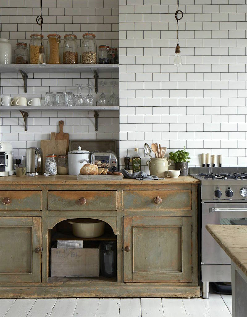
The Cottage Unkitchen
Is a smaller kitchen with similar characteristics of a rustic kitchen but on a small-scale. It often has a homey, cozy vintage feel.
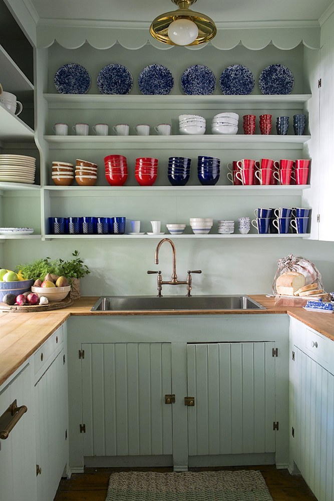
The Young Urban Unkitchen
There are poor young urban unkitchens and rich urban unkitchens.
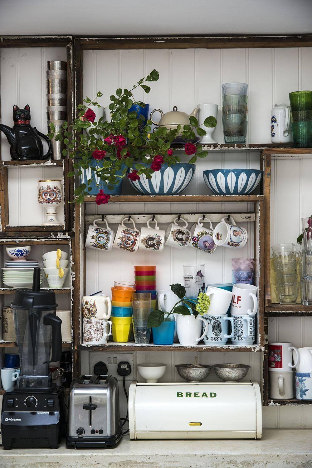
The my-first-apartment-that-I-share-with-5-other-people-in-a-5th-floor-walk-up-apartment-in-Brooklyn. But not really, in this case. It is the fun, funky, stylish apartment of photographer Debi Treloar
The Traditional Unkitchen
This might seem like a contradiction in terms, however, the word “traditional” is a common misnomer IMO. Are we talking late 20th-century (ersatz) “traditional” or 18th-century-real-deal traditional? What most people call traditional to me, is anything but.
Trad unkitchens have elegant, upscale, refined cabinets for the most part. They lack rusticity, but there might be a surprise or two. They also often feature very clever and efficient ways of storing kitchen supplies and food.
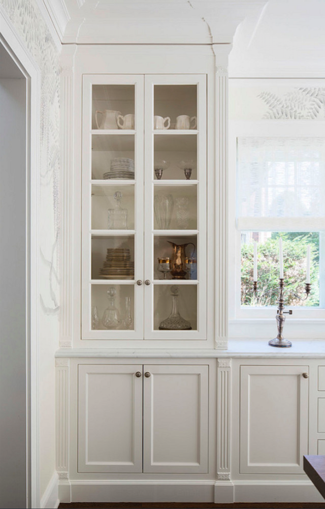
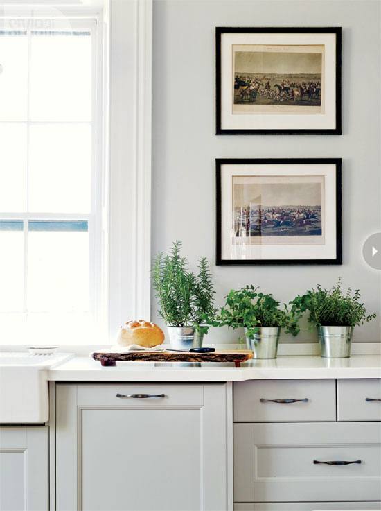
Below, Two Beautiful examples of a kitchen design with floor-to-ceiling-glass-fronted-cabinets flanking a window with a counter-height cabinet below
Cabinet color is Benjamin Moore White Dove
Unkitchens may have some recessed down-lights (aka: high hats) but often feature vintage lighting, chandeliers and minimal or less obtrusive down-lights.
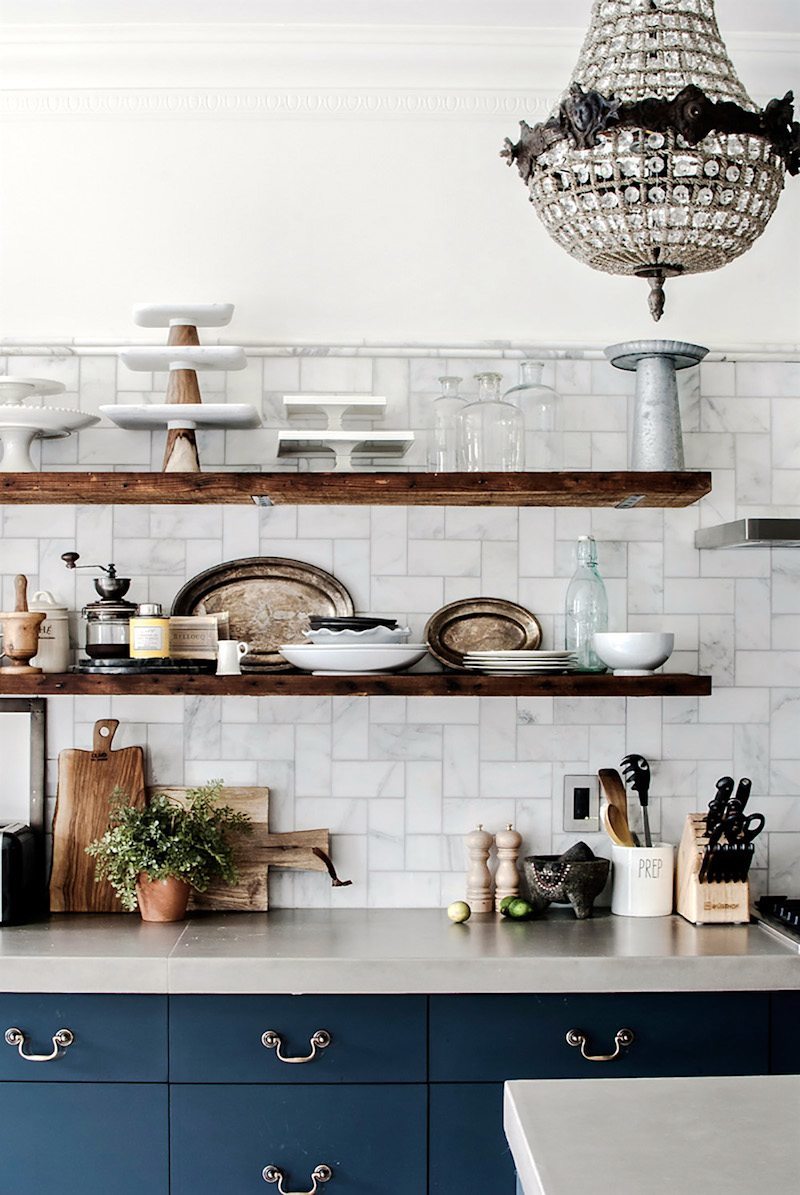
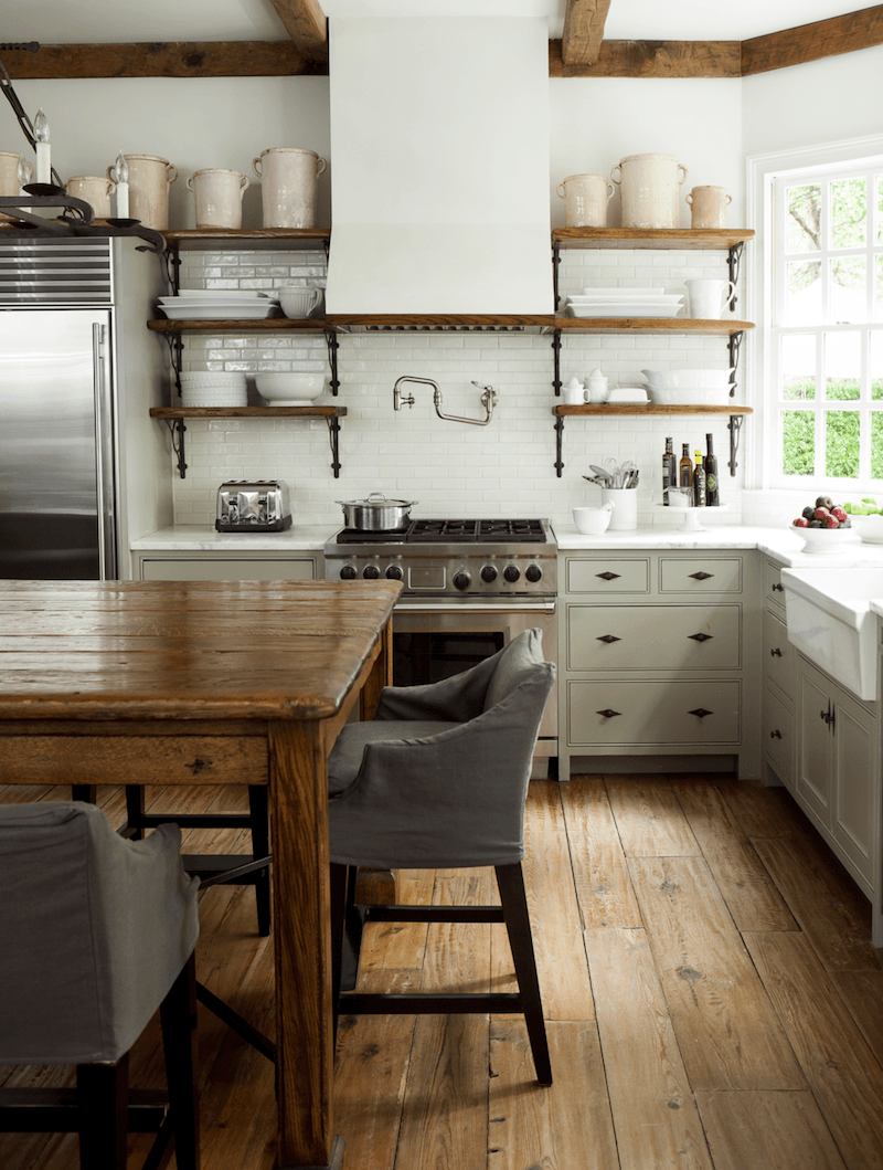
Other characteristics of unkitchen kitchen design
They look as if they evolved over time. They are not glitzy.
There are often wonderful pieces of Art
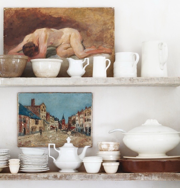
Nelia Dewet via House and Leisure
Sometimes there is tile, often in a brick pattern going all the way up the ceiling
They usually feature a large under mount farm sink or some other large sink. Another growing trend is the integrated stone sink which is an extension of the stone counter top.
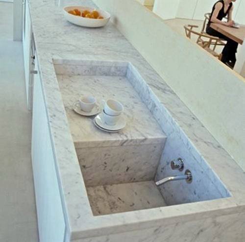
Bobby McAlpine architect, Susan Ferrier designer
So, so pretty. I heard Susan Ferrier speak at the High Point Market and she is totally down to earth and delightful. For more of Bobby McAlpine, Booth, Ferrier and Tankersley click here.
Unkitchens have genuine antiques or antique looking furniture, plate racks and separate pieces of furniture instead of everything totally connected.
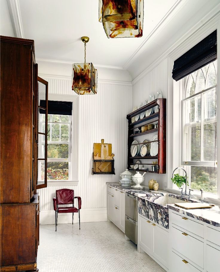
Windsor Smith for First Dib’s Michael Bruno via Elle Decor – Photo: Douglas Friedman
Or, they are fitted with built-in floor to ceiling cabinets with pull-out pantry drawers or glass-door cabinet fronts.
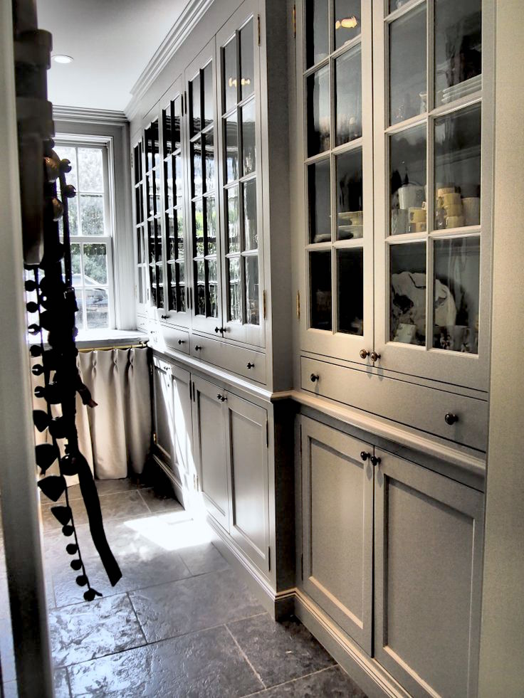
How wonderful are these gorgeous cabinets?
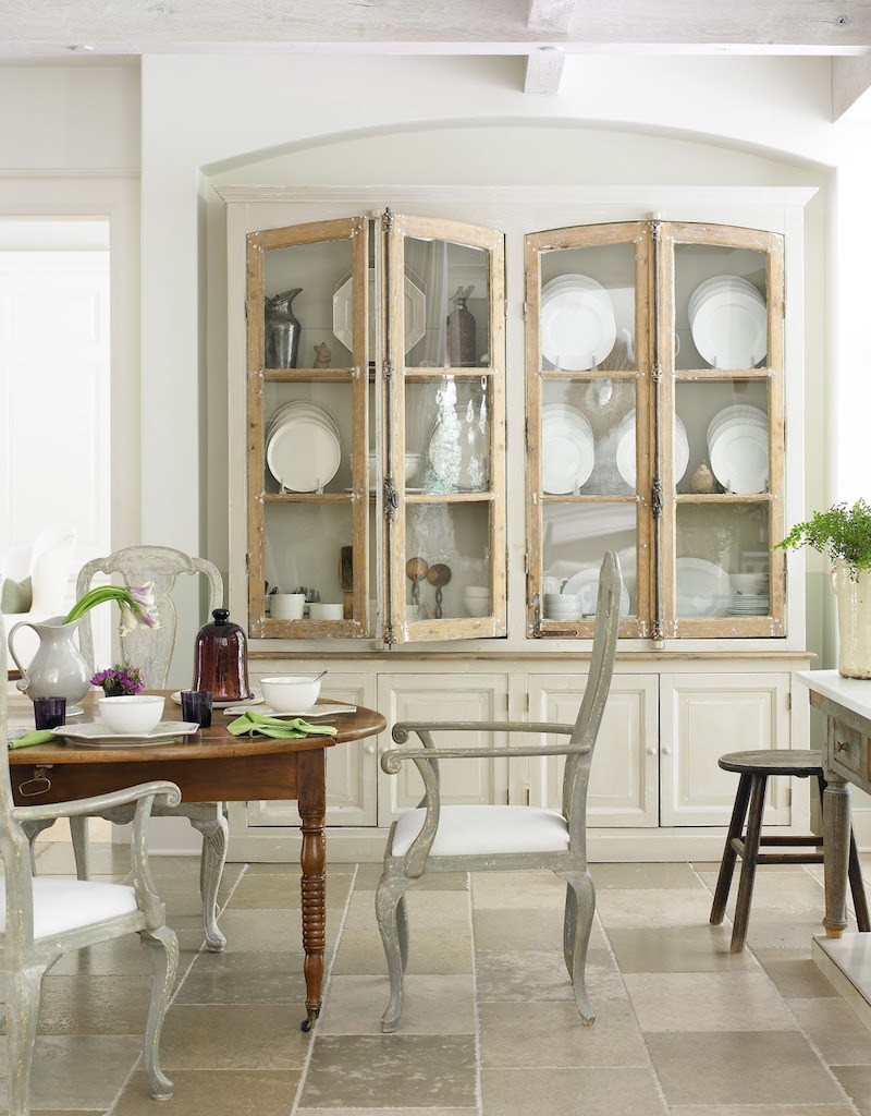
Photo: Emily Jenkins Followill
The former is faux, fake, ersatz, whatever you want to call it. It is obviously a reproduction and is overdone. The wall cabinet matches the island. You will not see this matched set look in an unkitchen.
Yes, in the back row… You look like you have a question?
Well, Laurel ,this is all very well and good but where are we to put our stuff?
And if I put in one of these unkitchens, what is that going to do to our resale value?
Those are two excellent questions which I’m going to address right now.
First of all, designing an unkitchen requires a bit of re-programming of one’s thinking. Imagine someone from 300 years ago being told that their kitchen needed to look like the airplane hangar. Why you would’ve been tarred and feathered and dragged through town!
A beautifully designed unkitchen is going to have everything that a typical 2oth century kitchen would have, just not in the same fashion. There will be PLENTY of storage!
Yes, in the third row, you’ve had your hand up for while.
Well, I live in a 600 square foot apartment with a slob of a husband, a labradoodle and 3 goldfish and I absolutely must have overhead cabinets because if I don’t, I won’t have anywhere to put anything OR any counter space!
Fair enough. And I agree. Small kitchens in apartments are by virtue of their tiny size exempt from the no overhead cabinet rule. However, there are still components of an unkitchen that can be followed to make the kitchen feel more “un.” One of those is to make sure to utilize every bit of space by having the cabinets go all the way up to the ceiling.
I have time for one more question.
Yes, in the red sweater.
STORAGE??? What about keeping all of that stuff clean? I just want to put it away somewhere.
Yes, yes, I realize that this is a burning question. Of course, you can put it all away out of sight.
In fact, the firm, i29 Architects designed a kitchen with NOTHING out!
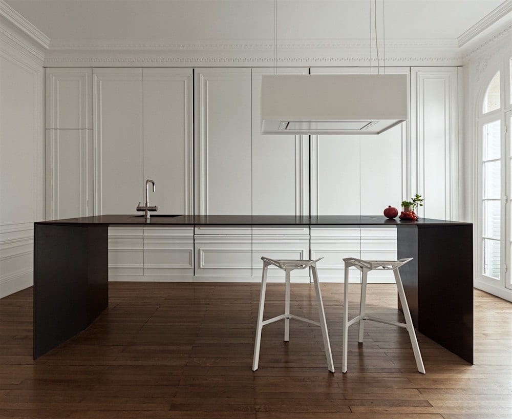
It’s not an unkitchen. It’s an invisible kitchen. This was created in a Paris flat, and all of the appliances, dishes, etc, are behind the closed doors. The doors were fabricated to match the existing panel moulding. How cool is that?
But even more so is the minimalist island, which at only about a half-inch thick houses PLUMBING and a COOKTOP! Holy crap! That’s amazing! And even more amazing is the fact that they created an invisible sink!
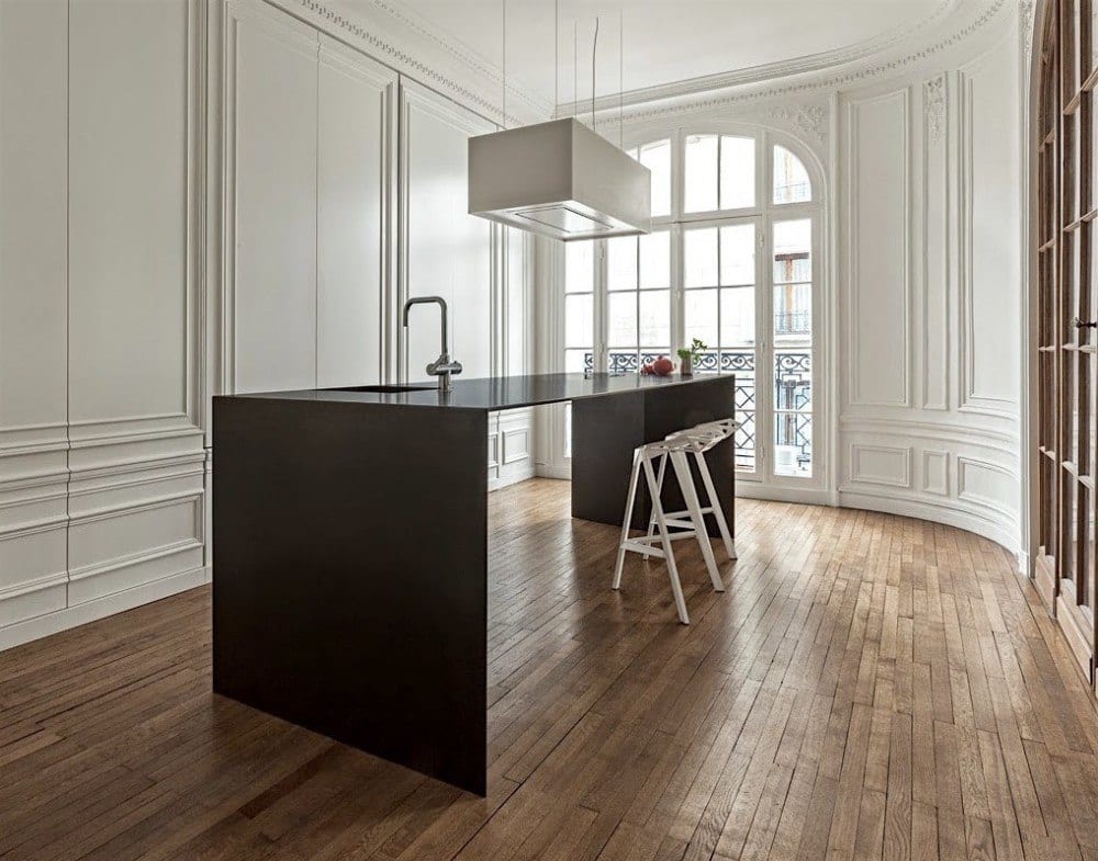
I dunno. There is no way my kitchen could ever have nothing out. At least not for more than about 10 minutes. haha! It is not in my DNA. I could sooner grow hair on my chest than keep a kitchen looking like this. I do love the moulding and doors, but I could’ve gone with a really cool antique something or other for the island.
What about you? Could you live in a kitchen with nothing out? All the time?
If y’all are interested, I will continue this post with lots more storage ideas so that your unkitchen will not only be stylish, it will function beautifully for you–with plenty of clever storage ideas and more!
xo,
Related Posts
- Top 25 Must See Kitchens on Pinterest
- 50 of the Best Etsy Home Furnishings for 2023
- I Can’t Afford 150k for a Kitchen Renovation | Now What?
- Ten Colorful Paint Colors That Act Like Neutral Paint Colors
- I Need Your Help! Eclectic Gallery Walls

- Farrow and Ball Colors Update – 2018 + Matching
- 15 Hideous Fabric Mistakes (I Made Most of Them)
72 Responses
I really like the design of the industrial unkitchen that you mentioned! I love how unique it is. That is definitely something that my husband and I have been wanting to do with our kitchen remodel design. Hopefully, we can find a great contractor to work with so that we can get the kitchen of our dreams!
Hi Danni,
I see that you are in the kitchen business so your comment is perplexing to me. I do accept links from other bloggers, but not businesses who appear to be seeking only a free-ride. And since you’ve never commented here before nor are you a subscriber, it looks like that assertion is true. Therefore, I did remove your link.
I love real wood (natural and stained) and I love paint….. especially the ” all one color white ceiling/walls/trim/cabinets “. We are planning a new home and naturally I want it all ! Is there a good way to marry the two? We are looking at a modified timber frame type home but I want to do all I can to blend both looks. We don’t want a mountain lodge but we do want to use some beams and exposed reclaimed type elements. I some from a sawmilling family and have the love of wood running in my veins……….. but also love the look of painted tongue and groove, clean simple painted craftsman type trim. Any ideas or encouragement would be greatly appreciated.
Just a quick message. Unrelated to the topic of unkitchens, which was yet another great blogpost!!
As I cast my vote for best blog and best writer — to you, obviously — I realized I had never joined the throng of fans who responded to the “mean girl” posts in December. So here it is. It’s rare that someone opens up and shares as frankly and humorously as you, but it’s great. Your blog is rare in that it combines great writing with great design. Will never understand why some choose to spew hurtful ill will like that and to what end? But, in the end, you must have been heartened by all of your girlfriends out here who supported you — including me!
Lastly, every time I soak in an episode of Downton Abbey, I think of you. Could you puh-leeze do a post on the gorgeous use of color? The kitchen. The drawing room, the bedrooms!! You get the idea. Anyway, thanks for an email I actually look forward to!
Christine,
Thank you so much for this lovely, lovely comment! It means so much to me. Actually, I read it yesterday and in true Laurel form, started researching it instead of answering you.
What a great idea! Thank you for that too!
Laurel, I laughed when I read your reply because darting off to research something and getting buried in it is exactly what I would do! Glad you “enjoyed” the thought….
Yes, indeed Christine and glad I’m not the only one who does stuff like that! I used a few images from Downton in this week’s post. It’s a wonderful idea you ad and the perfect way to keep the show “alive.” So, I’m definitely going to do that soon! (maybe the week after the series ends) One thing I discovered in my research is that the way the show depicts the servants is not totally accurate. They’re more like friends in most cases than servants on Downton. It was not like that all and their quarters were far more dank. But nobody wants to see that!
Laurel- your great advice on removing some kitchen cabinets to gain a more beautiful, airy kitchen was spot on! This fall/summer we did a small kitchen renovation. Larger windows,new counters and a new Wolf stove- my one indulgence.
I had a tall, glass fronted cabinet that went all the way down to the counters, and which had to be removed when the new soapstone counters were installed this fall ( which I LOVE, by the way) Once that cabinet was gone- the entire kitchen looked soo big and airy, that I never looked back and instead of returning that big cabinet- I now have my oil paintings there. I elected to forgo any kind of backsplash so the kitchen wouldn’t have that ’kitchen look’, and just painted the walls with BM Cotton Balls( that you recommended in one of your other posts) in matte paint. I even have an old oil painting behind the stove- that one has been there for a few years and nothing seems to harm it- grease spots wipe right off.
I am just kicking myself that I didn’t take that cabinet down years ago- its removal has just opened up that whole kitchen and made me love it again.
Hi Dolores,
Your kitchen sounds amazing! Don’t beat yourself up for not having done it sooner. My kitchen also doesn’t have a backsplash. The previous owner who put in the kitchen either ran out of $ or just didn’t feel like it. Have to say, I don’t miss it one bit.
Beautiful kitchens– and a terrific presentation Laurel!! I am dealing with my bland nyc rental kitchen by hanging art everywhere I can squeeze it!
Lynn
Hi Lynn,
With your amazing eye, I’m sure it’s all gorgeous and anything but bland. But yeah, we lived in a boiler-plate high-rise for a few years before moving to Westchester. If there’s one advent of the post-war period that I hate more than anything, it’s the 8-foot ceiling. It makes such a difference to have at least a 9-foot ceiling.
Lynn- what a fabulous blog you have- I have just subscribed. I am an ebay hound! It’s like having an antique market place right at my finger tips. I have a wonderful collection of antique blue and white china, as well as a great collection of antique paintings that I have slowly acquired through ebay over the last ten years..some for a song.:-)
My entire kitchen needs a re-do. sink, countertop and flooring were replaced 35+ yrs ago. Otherwise, it’s all 1930’s. No exterior venting for stove, for example. I’m not short but realistically I can still only use the first shelf in the upper cabinets. No upper shelves or cabinets for me when this space is re-done.
Laurel, since I discovered your blog you are like an ‘imaginary decorating friend’. I see readymade curtains with a Greek-key tape and think of you! I saw a magazine article that used a green with touches of brown and white fabric (Suzanne Rheinstein ‘Gore’) and thought of you! Large scale serpentine stripes of green floral and solid green on white. Very pretty and chic. And so on!
Hi Libby,
How sweet you are and I bet your home is very charming. Love me some Greek Key! Thank you for such a lovely comment!
Hello Laurel, I loved your post on the un-kitchen I love the kitchen in your post by Jeannette Whitson. I am right now in a full kitchen remodel, and love the un-kitchen,i do have a question I have a microwave/convection oven it is suggested by all involved that it should go counter height but I think it takes away from the look of an un-kitchen where would you suggest putting it? also thanks for your since of Humor laughed so hard on your post on snow!
Hi Teresa,
Yes, the “snirt” is back, but hehehe is melting a little since it’s above freezing temps.
Re: microwave/conv oven – I recommend a microwave drawer. They can go in the island or in a lower cabinet. The drawer slides out, you stick whatever you need into it and voila. It’s actually far easier than the ones over the range as you don’t have to lift up and in.
http://www.sharpusa.com/ForHome/HomeAppliances/Microwaves/Models.aspx?facet:configurationfilter=Drawer
I’m assuming that is not what you have however. I don’t know if it’s too late or not to make the change if that is the case.
Love this post! My current kitchen looks exactly like one of your previous posts regarding what not to do (haha) and I totally bought the house this way and we do not have the cash for a makeover. My kitchen is EXACTLY what buyers want in homes in my area. Dark Cabinets all over (no space of wall left unused), island, granite and and lots of storage. Zero character.
I have been in love with white kitchens and I think the really big part of having a beautiful “unkitchen” is to really break up the space with shelves, windows, glass pane cabinets, etc. I love your referencing subtle lighting options as a way to bring more character and charm.
For me, your quote “Other characteristics of unkitchen kitchen design. They look as if they evolved over time. They are not glitzy” is what resonated with me the most. The idea of the old carefully being blended with new is perfect.
Thank you for another amazing blog entry!
Thank you so much Megan! I think people are programmed to think that this is what is best for them. It’s difficult to change the status quo.
I’ll never forget, about 22 years ago, I helped my step-dad with the design and furnishings of a new building for his business. There was a small warehouse and offices. I had a lot of fun. There was a tiny entrance and I got him two dining chairs with a small table from Pottery Barn. They were their Napoleon chairs in an antique teal stained finish, with a rush seat. The office manager didn’t “understand” them. lol
My mother told her that they were “avant guard.” I was like, Whaaaaaaaaattt???
Loved your faux Q&A!! Comments on invisible kitchen and the missing sink are so funny. That kitchen is absurd and likely belongs to someone who barely cooks. Love the unkitchen look so much. Before I installed a chimney hood and therefore proper ventilation I had open shelves. All my white ironstone, crea ware, plates collected grease and dust stuck to it! Awful. Open shelves look great but it’s one more thing to clean and I was always reluctant to really use anything….doing so ruined my styling. Lol. I have always disliked over designed kitchens complete with the ” mantle” over the stove. I don’t even care for clad appliances. A kitchen can be stylish, functional and fun but it should look like someone cooks in it! Beautiful photos. Really. The Ty Cole photo with navy lowers…is that counter brushed stainless, concrete or some greige Quartz? Too light for soapstone…I cannot tell.
Hi Betsy,
Thank you!
There could be a very, very shallow sink because of perspective it is hidden, but not more than an inch or two. Of course, that’s a joke. I would be drenched in no time!
As for the Ty Cole kitchen counters, they look to be polished concrete to me. I had a client who did that about 20 years ago. I don’t hear about it much anymore. It can crack and does stain, but I actually like that old, worn look.
This is my first time reading your blog. So informative! So funny! Great photos. I’ve been an unkitchen girl since the 70s. I have always adored open shelving and have utilized my walls for storage. I want to have the things I use daily at my fingertips and not hidden in the back of a cabinet or drawer. I am sooo glad nature and worn woods are making a come-back. I am looking forward to your next post on creating the unkitchen and to exploring your blog and webpage.
Hi Kathleen,
Thanks so much for stopping by! Hooray for unkitchens!
Hi Laurel,
Thank you so much for this post. My comment on your last week’s post, was how does one make a kitchen functional in terms of storage, when you don’t have upper cabinets? These kitchens are all beautiful, individualistic, and not one of them looks like a trend or someone else’s idea of the kitchen that everyone should have. Have not heard the term “un-kitchen” or “un-decorated” but it describes perfectly, I think, the environment we all wish for.
Thanks Lisa,
I’ve been hashtagging “#unkitchen.” Actually, I had never heard the term before either, but I did a search on pinterest and a couple people have used it and in the same context. I was a little nervous because I know that some people are very attached to the status quo, but so many readers here are forward thinking and it gives me great hope! Even if it’s only to encourage someone to do what lives in their heart, but they’re afraid it’s a mistake.
I’ve found that when I follow my heart, it’s never a mistake. Or at least in the long-run it isn’t.
Laurel, you rock! You are always a ” must read” , no matter what…love your content and photo examples, but love your commentary even more! PLEASE keep shining your light, xo
Hi Lois,
Are you and Liz twins per chance? lol I am very blessed. The writing is the easiest part for me. And it’s a kind of therapy too. Thank you so much for such a lovely comment!
Laurel, I love your blog and sense of humor! You are brillant.
Thank you so much Liz! That is mighty kind of you to say that!
Ben Pentreath has been advocating for the “un-fitted” kitchen for years. I’m happy to see that the trend has finally crossed the Atlantic. Wish I could undo my kitchen, done ten years ago by the previous owner, but I’m afraid it’s good enough for now. A pity, really. Thanks for a beautiful post.
Hi Barbara,
I LOVE Ben Pentreath! I guess “unfitted” is an English term. There is no such term here because this sort of kitchen is rare, rare, rare, in the mainstream. I’m with you on the kitchen. Mine isn’t my ideal but it’s okay and the cabinets are white!
I have been lobbying for an unfitted kitchen for decades. (That is what I was taught to call it years ago) The husband cannot think outside the box. I keep trying to wear him down, however, and probably the last words on my dying lips will be, “I want to rip out all these boring cabinets.”
By all means continue this theme in other posts because I often force him to listen to me read your posts on Sunday morning. I have mismatched cabinets in three styles thanks to the previous homeowner which I have painted white, but I still don’t have a lot of storage. I am using industrial racks in the laundry, an old Hoosier in the garage, a vertical pot rock near the stovetop, rolling carts in an under-stairs closet, etc., etc., trying to get enough storage for my massive collections of cooking equipment and tabletop. Clearly I need some help.
Arrrgghhh husbands! ;] Please just stick to hunting and let us womenfolk tend to the home, alright? Are you listening dear spouse? No? He hates me Ellen. I’m sorry. I did my best. I will continue to pray that one day he sees the light! :]
Laurel, what a great post. I haven’t found inspiration for our kitchen yet but I think this is the right path. Currently, I am struggling with the fact that the previous owner put in new granite (very busy and brown and not my taste) just to sell it. It seems wasteful to replace brand new granite, but ugh. What are thoughts on counter top materials for unkitchens?
Oh dear, I’m so sorry Katie and I have seen this a few times. It is so irksome when they think they’re making things better but they’re not. Upgrading is a good idea, but I think it pays to get some good sound pro advice on what it is that’s going to be the most appealing.
There are few granites that I like. The ones I like don’t have much going on and look more like marble.
I do love oiled soapstone and I love the calacatta marble. However, Cararra bianco is whiter than the regular carrara and a lot less $ than Calacatta. The quartz composites are nice too. Years ago, I had a client who did concrete which was very cool.
As for marble and concrete staining. First of all, they can be sealed and second of all, I love a honed white marble and don’t mind a little patina that it would get from a healthy dollop of peanut butter. haha!
Good morning, Laurel, and what a delightful post!! I also went to read the one about undecorated homes that I missed somehow-these are my favorite, favorite homes! That’s what I strive to be-which might be easier in my case since I have too many books, and no money for beautiful AND new furniture..)) I’m actually pretty tidy person, the books are the only clutter I ideally would allow, but my family helps me with that, lol.
Our kitchen will be very small..still, we both wanted to skip the uppers, but realistically, out of five people in our family only two(me and my son) have the ability to take something-and put it right back..
I’ll put art there though. Somewhere. I put art everywhere. I love art and quirky ceramics..maybe if didn’t like them so much, I’d have money for beautiful AND new furniture..))
Now I love, love these old doors on the cabinets in one of the kitchen. I wanted to do something like that in the guest bathroom-the only spot in the house we don’t touch while remodeling, since it was done later, and frankly, the budget is out of the chimney.
Since we messed with the walls(asbestos abatement..that’s how this sad story grew out of proportion), I wanted to increase storage space a bit, since that bathroom is also too small, build a niche, and put some wonderful old door on it-there are plenty of old armoires on Craigslist right now, people are getting rid of them, so the best time to buy, use, and reuse them.
And our framer told us that no chance in the world he’d be able to put the old door on that niche in a way that’s hundred percent straight..he said it will be a bit off, and will bug us because of that. Told us to buy a built-in cabinet. Well, I bought a useful but boring as hell built in cabinet( for mind boggling 400 bucks btw-several unfinished pieces of cheap wood, yes?), so everybody will be happy.
Now these doors you posted remind me of our lost opportunity.
Maybe the craftsmen are willing to work with these homeowners more around stuff like that, because the spaces are clearly much more upscale?
Or maybe it’s just easier in case you have a cabinet to work with, as opposed to a niche?
Anyway. I’m SO sorry about this long comment. But you’re a kind of person that invites sharing, I guess..
To feel less guilty I’ll answer the question you did ask-no I wouldn’t be able to live with the kitchen where nothing is out. I still prefer to think that crockery and pots talk at night and dance..)) They need some breathing room.
No need to apologize Jenny, I love your comment! I had to laugh when you said “have the ability to put it right back.” I have to admit although I don’t like to that I do not always have that ability. It takes a very concerted effort. If it’s something creative like editing photos, I will make it just so or I’m not happy. Go figure. Your home sounds incredibly charming!
I just read all the previous comments and it seems you have nailed it again. I knew there had to be others out there who are craving the un-kitchen. I believe the main reason so many drink the kool-aid is because they are petrified anything else will affect their resale value. I said, “to hell with resale value” on my recent kitchen remodel and I’m SO glad I did. I absolutely love my new kitchen. Your post should be encouragement for anyone planning a new kitchen to fight back on cookie cutter kitchen design, keeping in mind that many kitchen designers are in the business of selling expensive cabinets.
Hi Tricia,
You make a very good point there about designers in business to sell cabinets. And of course, they still can. My crusade is to do away with the superfluous and the ersatz. Nothing is more grating to my eyes than something totally overdone and fake looking; like crackle paint under 50 coats of poly. lol Like, who are we kidding??? There are manufacturers who create furniture that is authentically old looking and affordable. My favorite right now is Phillips Scott. Lovely boutique company.
But lets not be afraid! #unkitchen #unkitchenme !!!
Again, a wonderful read. You just keep me in stitches and informed, as well. Since you are such an advocate for all things white, can you tell me if the furniture items in all your blog postings are merely painted with one of your recommended colors or are they enhanced with shading such as dark wax or some other technique. Am so afraid to paint an old piece, which I will have to do myself as there are no tradesmen nor artisans in my area. The antique sideboard/buffet in your living room is exquisite and to die for. I know you had someone else do that, but I am equally sure you could have done it!!!!!
Hi Dale,
Thanks for the vote of confidence! The woman who painted that piece worked for about 50 hours on it! I don’t think I possess that kind of patience. Part of what took so long is that she taped every muntin in the glass doors with blue tape. That alone took her an entire day. In the end, the paint seeped through a little and she realized if she was very careful, it worked better without the tape. Then, she had to put like 3 coats of primer to kill the mahogany and sand between coats. Then, two finish coats and a glaze! The decorative artist Bob Hoven came in at the end to finish the job. He mixes his own paints, so it’s not any color. And it looks different than my photograph. I’d call it a cream with a tiny touch of green/gray in it. I wanted it to have a Gustavian Swedish look.
However, you might try Annie Sloan chalk paint or something like it. You can mix the colors yourself to get the exact color you like. I’ve never used it but those that have say it’s the easiest thing ever! There are also a zillion tutorials on youtube.
Love the un-kitchen! About to move to a co-op with a galley kitchen, however, so this might be unobtainable. But can I compromise with glass fronted cabinets that go up to the ceiling?
My un-kitchen question is — what do you do about DUST? For now I live in Texas, the dustiest place imaginable, I can’t see having bowls and cups out like that without having to wash them constantly because of dust.
Also — coordination. I notice all the kitchen things are lovely shades of white and ecru, or blue and white. I’ve got everything from Royal Doulton wedding china from my first marriage to a funky 70s smiley face cookie jar. Upper cabinets are the perfect disguise for my um… eclectic tastes. No way could that discordant mess go in open shelving.
Finally — a tip to anyone with the historic home kitchen problem — the 1915 house I live in now has 11 foot ceilings — standard cabinets will not work. I got a local craftsman to do our cabinetry, but he had to make the cabinets 8 inches taller than standard so the room wouldn’t look out of proportion. It turned out beautifully – and it looks very period.
Also… airplane hanger kitchens aren’t period. (Actually, what’s probably period is zero cabinets and a sink for the scullery maid.)
Hi Tracy,
I think you won’t have nearly that kind of dust issue in DC. However, my first thought about a dusty home is that if it’s in the air, it’s also in one’s lungs. That can’t be very healthy! I do have a lot of readers in Texas, maybe some will chime in. Perhaps there are air filters in the AC system that can filter out small dust particles?
Otherwise, housekeeper? lol
LOVE glass fronted cabinets that go to the ceiling!
But again, the rules of the unkitchen are not exactly the same with much smaller kitchens were space is at a high premium.
As for having a lot of divergent collections. Perhaps some that isn’t used very often gets stored somewhere else?
The other thing about a galley kitchen is that they actually already have a ton of counter space (unless really small), so it’s possible to do the floor to ceiling cabinets and still retain a lot of counter space. That way, the storage is maximized without the more cluttered look of an entire line up of uppers and lowers.
More coming for some very cool storage ideas!
This is an earlier kitchen post that I think you’ll like. laurelberninteriors.com/the-one-kitchen-trend-that-should-never-leave/
I’ll take the Heidi Perrin kitchen, please. I love gorgeous white cabinets with plenty of trim molding.
Hi Laurie,
Seriously. YES! She’s an amazing designer! Some say that white kitchens are coming “back.” I wasn’t aware that they ever went “away!” While I can certainly appreciate other colors, if I were doing for myself, just couldn’t turn my back on the white!
In the midst of updating our small kitchen after downsizing.
Looking for what I was calling an ‘unfitted kitchen’ yet wondering where to store everything without upper cabinets. Hopefully with reference to you and these wonderful photos it will be easier to explain. Thank you!
Love the article, photos, and your blog, post more!
Hi Cynthia,
Storage and other cool ideas will be forthcoming. Thank you so much for the kind feedback!
Laurel…I have been preaching “un kitchen” for years, just didn’t have that name for them! I did mine about 4 years ago in a 1910 house with one of the ugliest kitchens I have ever seen. The previous owner redid it in the 80s…Wallpaper border with fruit at the 10 ft. ceiling. You get the picture. I have abhorred uppers for years and especially what I call “hanging” cabinets that start in the middle of nowhere. The best compliment was received from a friend who said she knew it would be wonderful, but didn’t expect it to look like it had always been there. My contractor ripped the old beams we removed to make shelves for a coffee station…My husband did a before and after video. I would love to show you! Nancy
Hi Nancy,
So funny, but yes, THAT is the kitchen I had in my mind when writing this. YES! please send me some pics! I would love to see it!
Laurel,
LOVE the photos you put together – one of your best posts ever! More please! The kitchen from The Intern did belong to the Intern but he was 70 years old and coming out of retirement to intern after a long business career, explaining why he had the money for such a beautiful kitchen.
Keep ’em coming!
Hi Kim,
I have to see that movie! It sounds wonderful! I find that people in movies often “live” above their means, but maybe not in this case.
I am totally up for a post on kitchen storage. This was a great read with my coffee on a snowy New England morning. Thank you Laurel.
Hi Eileen,
Ya know… I can really picture that now! Yes, there will definitely more about kitchen storage. I’ve found some very cool ideas that make a ton of sense. Thanks so much!
Oh no! That gold/brass fixtures thing is really coming back?! If it’s in your blog I have to believe it is a thing. Hated it the first time around when we didn’t have money for more than what was in Home Depot. Too experienced to live with what I don’t like now. Please tell me I can hang on to my rubbed bronze or that there will be some non-glitzy alternative. Please
Hi MB,
Yes, brass IS back! But… it’s not the 80’s brass at all! Oh, I know I did a post about this. Hold on. Here’s one post which features brass and gold.
https://laurelberninteriors.com/hottest-decorating-trend-2015-never-going-go-away/
Today’s brass is bared with lots of white and sometimes black. You will not see the barfy beige of 30 years ago! That’s what made it so horrid. Also, a lot of today’s brass is unlacquered so it will get a naturally aged appearance. If not unlacquered, it’s generally in a brushed finish and in a space that’s more “new traditional” Elements of traditional tempered with modern. Studio McGee is a great source for that look.
Yes, I’d love to see more! This is my favorite approach to kitchen design. 11 years ago, my mother designed her own unkitchen which was installed by my father, on a very humble budget. I’d love more inspiration so I can do the same in my 1893 home.
Hi Sophia,
Oh, I do have more! In fact, when I begin a post, the first thing I do is collect photos. Doing so helps me write the post. As I’m writing, if something is missing, I go hunting for it. And if something isn’t working, it gets deleted. I end up only using at the most, half of what I started out with and sometimes a lot less than that! There is definitely going to be a follow-up to this post!
I enjoy you so much. That black and white sink is stunning. I get so frustrated looking at “professional” kitchens. I was a professional. You get only about as much counter space as is in front of you, if you are lucky you get maybe a foot on either side., unless you are doing something specific like butchering or making Danish. Even then you share space. Sometimes I think I”ll never find a just right kitchen.
That is such an interesting comment Celeste! So, the 12 burner “professional” range is something you’d be sharing with 5 other chefs? Love it! Love me some cheese danish! Years ago, I lived 3 blocks from Zabars on the upper west side. Verrrry dangerous. lol I used to treat myself to their mini cheese danishes.(3-5 times a week!) Mini means normal size in New York! I would convince myself that they were actually good for me, because I could’ve kick started a jumbo jet after eating one of those. Although, the rational part of my brain (about 5% lol) knew they were one of the worst things one could eat. Maybe the euphoric feelings balanced out the fat and cholesterol? haha!
Never feel guilty about eating a good danish, feel guilty about wasting calories on a bad danish! When I worked in a winery we were in very tight quarters and I shared a stove, When I worked in a super fancy Italian restaurant I had to get in early and stay late to have enough burners to make ice cream in piece. Casinos were the only places I ever worked where there was really enough room. Ideally I’d want a table with enough room to set down four cookie trays at once, and a double oven. I HATE when the sink is not close to the stove, you are just begging to spill boiling water. I was looking at a home for sale and the sink was completely on the opposite side. My husband has resigned himself to me eventually ripping out the whole kitchen, whereever we end up. I like a practical kitchen that can handle abuse and heavy use.
I really like the cottage one. It looks like it has Windows on both walls which is seems magical. I wonder where they put their recycling? I am forever tripping over it and the compost scraps. UGH. I LOVE YOU EARTH BUT IT’S A GRODY EYESORE.
Morning Laurel from a grey & wet Hertfordshire (UK) home. Oh, how you’ve stirred kitchen envy in my soul….another wonderful & inspirational blog – please keep them coming,
Lol Liz
Thank you so much Liz! I’m seeing so many of you from across the Pond and am so flattered. I think I probably would’ve fit in better over there than here. I’ve even had marmite a few times and didn’t die from it. hahahahaha!
Thanks for the precient posting as I’m currently in the middle of a remodel and trying to redesign my kitchen so its not outdated in a couple of years.
Blending the traditional and modern to create contemporary spaces is a great deal more difficult than it seems-which is why we rely on designers!
I’m opting for the “everything out of site” model as in the Paris apartment. This is currently a well developed design option in Europe. Even the sink is hidden in the row of back wall cabinets where the doors open and then slide into pockets along the side of the tall cabinets so they stay out of the way. The tall cabinet designs also allow pull out stations for coffeemaker, toaster, stand mixer, etc and store their related utensils.
This also allows for pull out tall shelving drawers and pullout dedicated pantry shelves for those of us who don’t have much square-footage to work with but need lots of equipment and supplies storage.
I’m currently trying to soften the modern design by mixing materials and adding artwork.
Thanks again for your wonderful insights-they save me from making often expensive mistakes!
Hi Susan,
You make a great point which perhaps was implied but not expressed in the post. The unkitchen is not nearly as strange in Europe as it is in the USA. Hey, I would be happy just to get rid of all of the fugly oak!!! lol Seriously. Oak and granite, oak and granite. No… GRAAAAAAAAANITE!!! What I love about the Paris Apartment are the amazing doors with the moulding, so it looks just like a beautiful architecturally detailed wall, in keeping with the rest of the place. Brilliant idea! I think this model of unkitchen where 90% of it is tucked away behind a wall is a trend with some legs—even here. Time will tell.
I love kitchens that contain elements of the sitting room, paintings, a fireplace, (if your extremely lucky) & am so tired of the tyranny of the uncluttered work surface.
One orange on it & you may as well call me a whore.
So..great article, reading on an english early sunday morning, which always includes a journey to New York, coffee in hand in my mildly cluttered kitchen. (with plate rack)
The dogs are on the sofa, there is a stove in the fireplace &lamps are lit. Bliss.
Stay snowy-safe, my daughter is in Brooklyn at the moment staying with friends, & who knows? if you are snowed in you may just have to write some extra posts.
LOL! What does two oranges mean? Thank you for such a lovely comment Joanna. I can picture it all perfectly and am honored to have a place in this cozy scenario!
nice kitchens just finished do ours, takes a bit of sleepless nights to work it all out… I do living rooms, family rooms, dining and bedrooms… my husband (the client at my house) loves it all so so much…
ps, the intern… that kitchen is the bosses not the interns xxx
wonderful movie, I’m sure you will like it xx
Hi Carolanne,
Good your hubs/client appreciates your good taste! Thanks for the recommendation about the movie. I’ll have to watch it soon!
Laurel, thank you for another imformative post! I love these modern un-kitchens, particularly the ones with glass-front cabinets. I like the look of shelves, but I fear any plates, bowls and glasses placed on shelves in my house would become cat toys–we have three kitties, and they’re still young enough to jump up high. Since you asked, yes, I’m interested in learning how to store all our stuff in such kitchens.
Hi Joyce,
Oh, I can relate to the havoc pets can cause. I miss my adorable Peaches so much but I had to be so careful. He loved to chew on paper and yes, he would eat my drawings! No joke! It seems in a lot of these kitchens that have shelves that there isn’t really much on them. Yes, I’m going to address storage and some other nifty ideas for kitchen design.
The more I read you the more I know we were separated at birth or at least at the threshold of the last “un-kitchen” we visited. I just used this term, “un-kitchen”, with both my dry waller & cabinet guy today! We are in the midst of a huge renovation of an 1886 Victorian Farmhouse. I am going as un-kitchen as possible. Thanks for the support – and you crack me up. Love a NY sense of humor…like mine.
Hi Kelly,
I know that feeling of being separated at birth and I’m so flattered! Although I’ve lived in NY for some 36 years, my roots are in southern Indiana! Your home sounds amazing! I need to check out your site!