

Post updated July 2022
Dear Laurel,
I seem to recall that you were talking about this dream kitchen a while back and I’ve looked high and low through your website and don’t see too many images of the outcome. Would love to see the results.
Faith Fowler
Dear Faith,
You’re not the only one who’s been asking about the dream kitchen.
It’s a bit difficult for me to talk about.
And this is why.
Something happened but I don’t know what.
The only thing I know is that it was made clear to me (but not in so many words) that there are to be no final photos.
Right. Bummed doesn’t even begin to cover it.
Please don’t try to make sense out of it. Nothing happened that I’m aware. As a matter of fact, my client was incredibly good to me for the 3 years we worked together. I’m very grateful for this job because it came at a time when I needed it most.
However, this was my Mr. Holland’s Opus, Babette’s Feast and Rocky all rolled into one glorious once-in-a-career-kind-of-job. I fantasized about styling this wonderful space and possibly hiring a professional photographer this time. Ahhh well… not to be.
There is a silver lining, however and that is that something special is happening and I can’t say anything more than that because I’m not allowed to until early April when it’s revealed to the public.
In the meantime, I’ve been posting every day on instagram which is a lot of fun. What happened is I dug up some images taken on my cell phone before the kitchen was completely finished. With a little cropping and editing, I think this first one came out pretty okay.
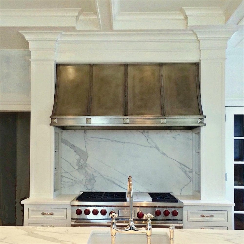
I nearly cried because I’ve been dying to show you guys the gorgeous nickel hood exquisitely rendered by Texas Lightsmith. And here it is! In the foreground is my fave Perrin & Rowe polished nickel yum yum faucet.
The backsplash is a simple slab of Calacatta Gold marble that we drove out to New Jersey to select!
This is a very charming but somewhat quirky room due to the inherent architecture. There are FIVE doorways! One to the entry, one to the basement, one going upstairs, one to the dining room and a big French door with a transom going outside.
And then there are four windows, so very little wall space. In fact, we covered up one window in the now defunct dark, cramped butlers pantry. It just wasn’t working and wasn’t necessary either and it allowed us to have our pantry/fridge/freezer wall flanking the entrance into the dining room.
The kitchen now opened up seems far larger but this is not a huge football field of a kitchen.
I think the size is perfect!
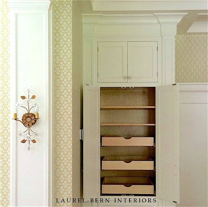
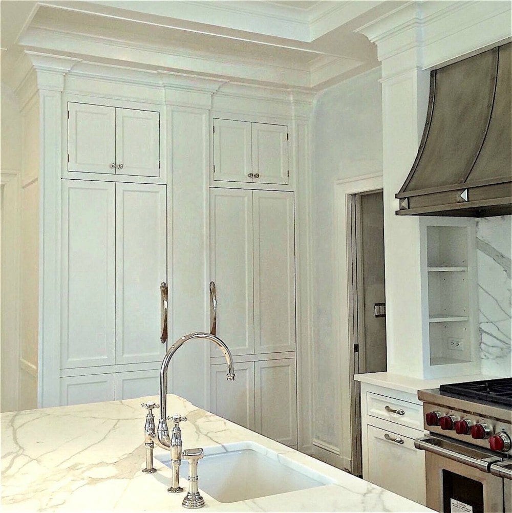
Another shot shows the built-in fridge and freezer clad in their gleaming cabinetry created by Jem Woodworking. Between them on the large pilaster will be another sconce. The island counter is once again the magnificent Calacatta Gold marble.
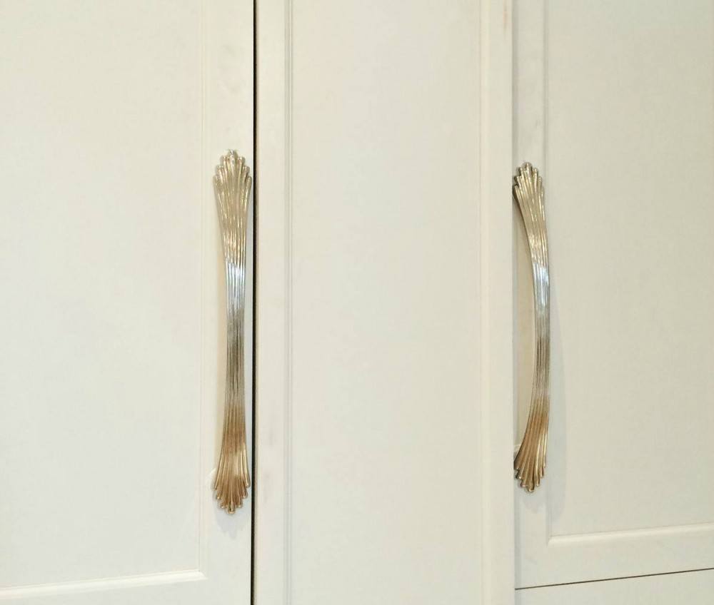
Above is a closeup of the unusual fridge and freezer handles in polished nickel. I love these because they remind me of old silver. I felt they were perfect for this home which had just celebrated its 100th birthday in 2010.
You might enjoy looking at this post which shows several shots of the kitchen in progress as the cabinets were being installed.
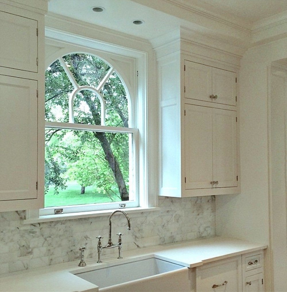
One of the two original Palladian windows with more of the Calacatta Gold marble backsplash, this time in a brick pattern. Please note that these are the only two overhead cabinets. The counters are a quartz composite. I often do two different materials for the perimeter counters and island counters.
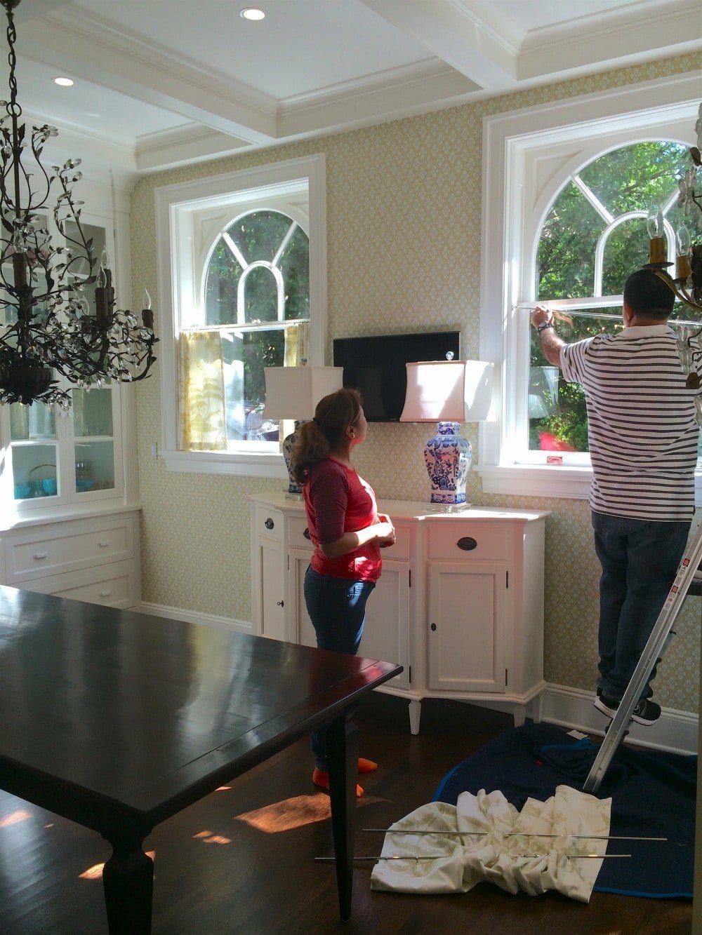
Above, is a shot from the (duh) window treatment install. Here you can see the two new Palladian windows made to match precisely the original windows!
You should’ve seen what was here before.
Someone had stuck an absolutely horrid ersatz Palladian window that was way too big and not centered on anything! It was weird and drafty and we couldn’t wait to get rid of it!
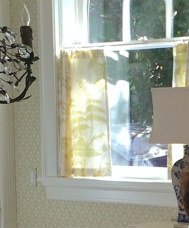
A closeup of the cafe curtain made in Barbara Barry’s Indo Day for Kravet
And yes, that is a view of the workers’ Port-O-San in Barney Purple. haha!
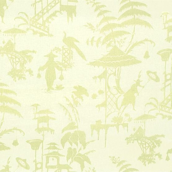
Indo Day
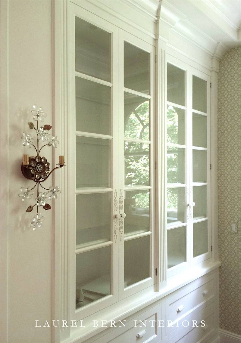
You’ve seen this one before but it’s everyone’s favorite part of the kitchen, along with the custom-made sconces from Canopy Designs.
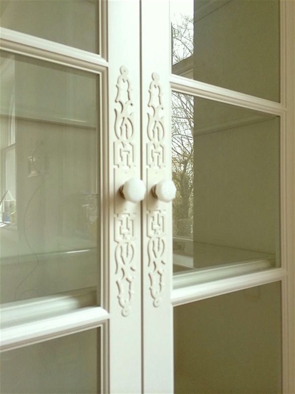
I found the escutcheons (don’t you just love that word?) online and had them painted to match the cabinets. We also painted the brass carved bin pulls. I love the white on white!
Oh, you want to know WHAT color white?
I did promise that, didn’t I? :]
It’s Benjamin Moore’s classic WHITE DOVE OC-17
I love white dove because it is the perfect chameleon off-white. It is both warm and cool, soft and creamy without being too yellow. But on occasion, the yellow comes out more and sometimes it looks very white, so please as always—test your colors!
Please click on this link for more of my favorite white paint colors and here for my top six white paint colors.
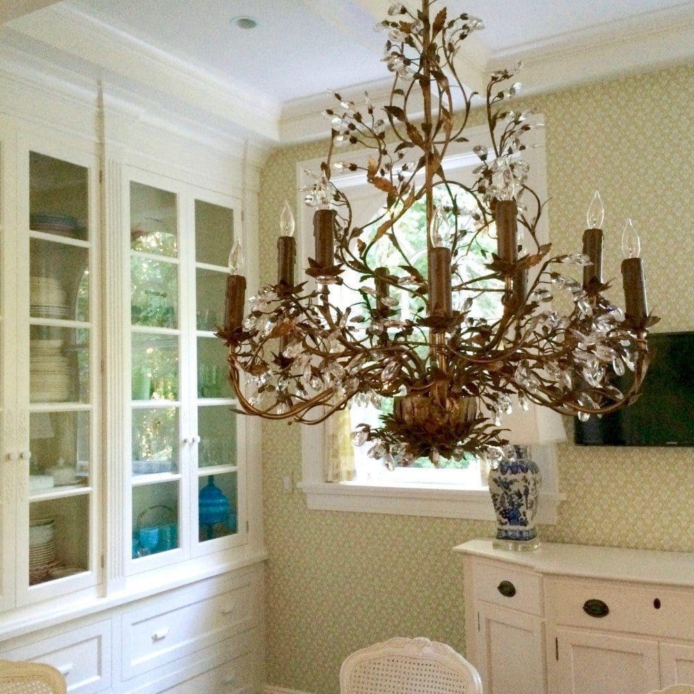
A shot after I hand-painted the chandelier over the table. I love doing that sort of thing except looking up makes me dizzy and nauseous so I had to come by three times to finish the job! I used some simple acrylic gold craft paint that I got at a good hardware store. I just brushed it on!
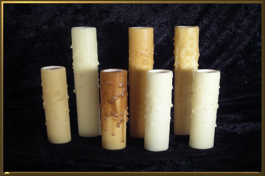
We did replace the candle sleeves with authentic beeswax candle sleeves.
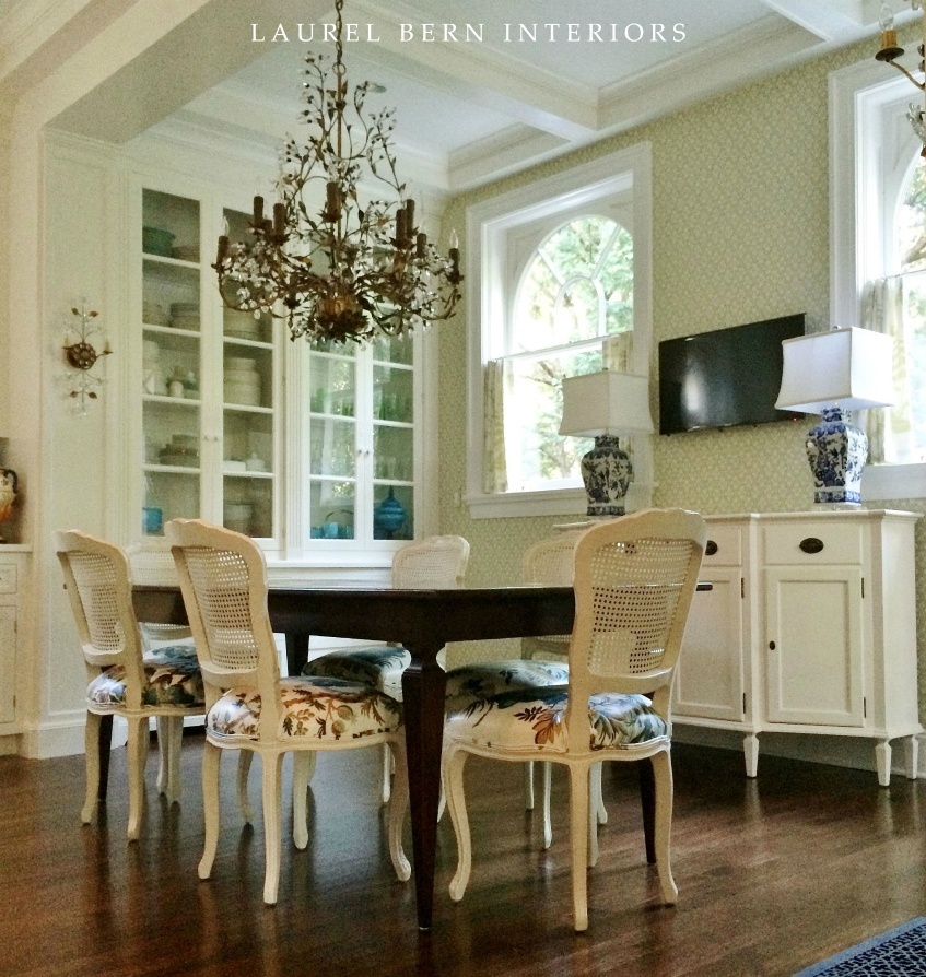
It’s a little fuzzy. It was a gray day, but at least we have this! The chair fabric is Brunschwig et Fils Le Lac but laminated because at 8 million dollars a yard, we need to protect it. It looks like a chintz, and you can wipe the chairs down now!
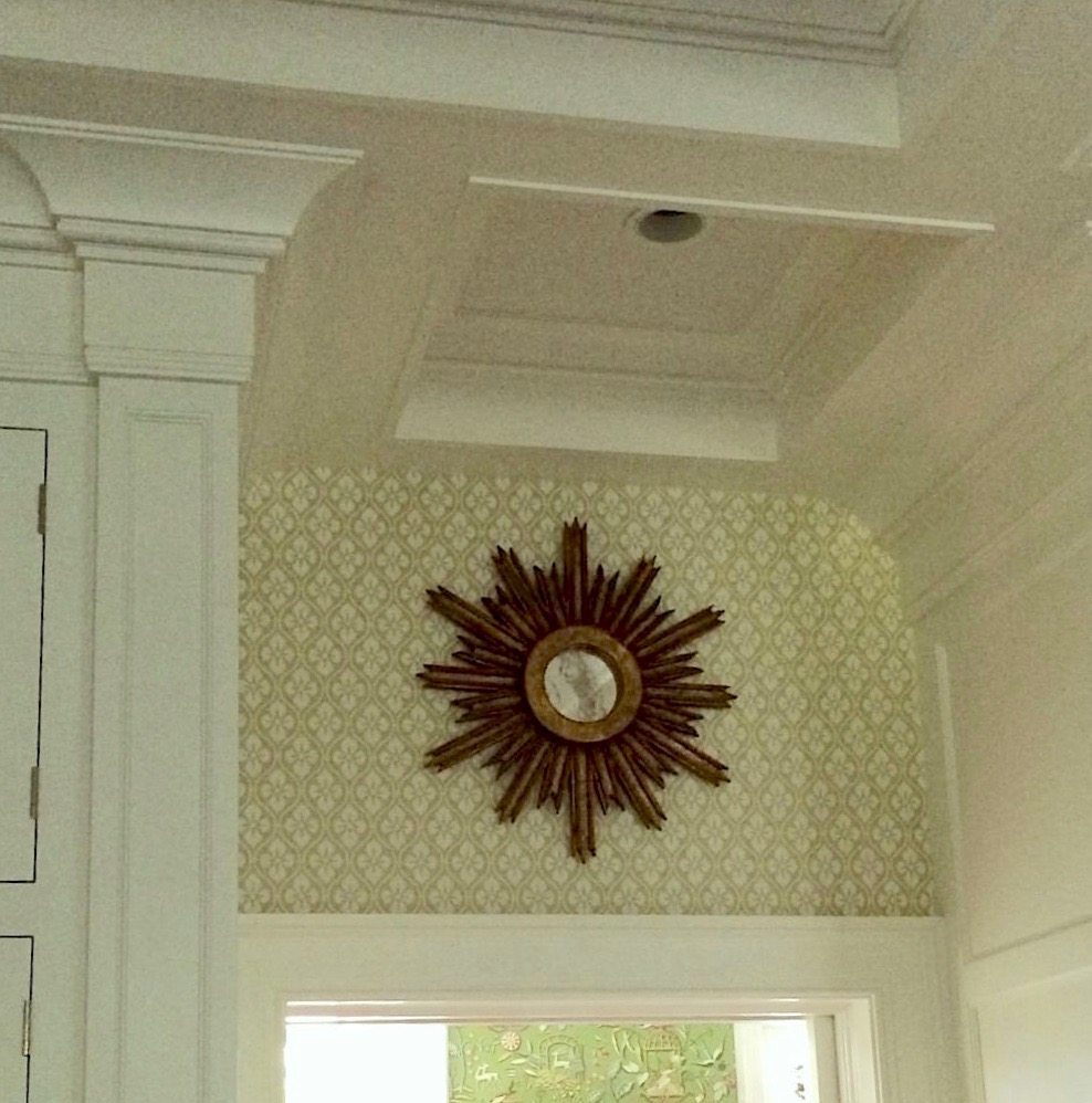
We did this sunburst mirror over the doorway to the dining room and a larger one over the TV but I don’t have a shot of that.
And, above is a newly edited shot from the dining room. We copied the coffered ceiling here for the kitchen ceiling. This shot was taken with my Canon, so better than most of the cell phone pics. At least I have them, and now you do too!
I hope you enjoyed a glimpse into this dream kitchen. I’m lucky to have these photos.
xo,

PS: Please check out the newly updated HOT SALES!
Related Posts
 20 Favorite Exterior Paint Colors + Doors and Trim
 25 Ways To Hide The TV – The Ultimate Guide
 How To Paint A Room – 20 Steps You Need to Know
 My 20 All-Time Favorite Benjamin Moore Paint Colors
 Are Green and White Rooms Trendy or Passé?
 50 Cool, Casual Dining Tables That Can Go Anywhere!
 Affordable Home Decor – 18 Ideas You’re Gonna Love


90 Responses
Hi Laurel,
I just love your blog. I’m about to have my kitchen cabinets painted by brush and the paint store now said I shouldn’t use satin impervo oil base but use BM advance satin paint for my black island and Elmira white cabinets. What are your thoughts on this change?
I value your opinion. Thank you
Bonny
Hi Bonny,
Arrrggghhh. Really, I can’t stand these guys when they interfere. He probably doesn’t carry the oil-based paint. However, a lot of people really do like the Advance Formulation and on new wood, it’s probably nice. Why don’t you have your guy make a sample of each and decide then. I will say that in the three kitchens I’ve worked on recently, they were all oil and absolutely gorgeous, with the hand-painting.
Beautiful!! I have a question if you don’t mind, I love white dove paired with Calacatta Gold, but, if you were using honed cararra marble, which tends to be more pure white in the background, what white would you suggests for walls and/or cabinets? Thanks! Again, love this kitchen and so enjoy your blog!
Hi Denise,
I’m sorry but I cannot see your particular stone. Cararra runs from pretty white to very gray. We had it in our old bathroom and it was the latter. I recommend finding some pro help in your area if you are struggling with the colors.
Hi Laurel,
I love what you did with this kitchen. I have a house of similar age (1919) and was wondering where you found the silver handles for the fridge and freezer doors? I love that they nod to Art Deco, but aren’t over the top.
Thanks!
Megan R
Hi Megan,
Thanks Megan! The handles came from myknobs.com Here’s the direct link. http://www.myknobs.com/ss869pn.html
HI Laurel, A rolodex question, is it an on line rolodex or a book or? Thank you. Linda Watson
Hi Linda,
It’s a digital PDF, meaning that after you purchase it, you download it and can view it on your device(s). However, some people have printed them out. OR, there are services which will do that for you and I understand that they aren’t expensive.
Here is a link for some of them if that’s of interest to you.
https://www.google.com/search?q=turn+a+pdf+into+a+book&ie=utf-8&oe=utf-8
One of the primary reasons for doing it in this manner aside from being far easier is that I can do updates without releasing a new edition which would mean another fee, of course.
Thanks for your interest!
To die for, Laurel, truly! That hood is just plain magic, and those ceilings and the rest of the woodwork and hardware… absolutely divine.
When I was about 10, my mother hired a designer to do our new house, and that was about when my obsession with design started, literally sitting at their knees. I had this to-die-for fabric in my bedroom that they did both the bedspread as well as both window curtains and even a shower curtain out of for the bathroom. It had to be treated somehow for the bathroom, obviously, because I do actually remember parts of that discussion, although no further details, but it was a very early lesson in how you can almost always have the most gorgeous fabrics possible in places you never thought you could because of what they are made of and what they have to hold up to. I am a huge, huge fan of treating them for places like kitchens and when there are little kids and old people.
My obsession with keeping the place clean as a whistle (in between the housekeeper’s efforts) eventually waned, but those curtains held up incredibly well and were always stunning despite all of the moisture. Clearly no one was doing much with ventilation and moisture extraction in old houses in the 60s, so it really always got hit, and there was never the slightest hint of a problem. I think that by the time my mom sold the place when I was around 30, the curtains had started to fall apart, but that was a pretty long run, particularly with the moisture.
I have to laugh remembering how my mother offered me a few different choices for carpet and soft goods, and told me that if I picked B I could also have an air conditioner in my room, but not if I picked A. A, of course, was by far the more desirable set of options – and I was not the least bit fooled. Naturally that is what I chose – and got the AC as well. No way was she going to *actually* let me suffer without that – or herself 🙂 And I would have happily done so anyways to have had those fabulous things in my room. Yes, that die was cast quite early 🙂
So you can see that when the topic of treated fabrics comes up, it brings up all sorts of happy and formative memories 🙂
Hi Wendy,
What a great story! I love that you got your fabric and the air conditioning. I have a feeling that your mom preferred that fabric too and was just trying to be frugal.
If it had been me, I would’ve said, fine, if I can’t have A on the windows, then nothing on them. I need my AC!!! lol
Lauren, this is beautiful! It has the most warm and welcoming feeling and I love all the white. I’m so sorry you weren’t able to take final pictures, but what you took are still amazing. Thank you for sharing! I love white kitchens!
Hi Megan,
Thank you for that. I had to do some creative editing on all of them to take out things like dangling cords flopping out of the walls, etc. In one image, there were a bunch of boards piled up in the doorway and I got rid of those too!
Aside from that, I love white kitchens too and always have! I know that some say that they show the dirt. Well, yes… that way you know what to clean! If it doesn’t show it doesn’t mean that it isn’t still there! Layers of “invisible” dirt leads to sticky grime. yuck.
I adore the Dining Room!! Did you get any other shots? Why fabric did you use on the chairs? And that WALLPAPER!!! What is that gorgeous thing called? Did you also paint the Dining Room chairs? Needless to say—–your kitchen is dreamy. Come to Alabama, please!
Nancy
Hi Nancy,
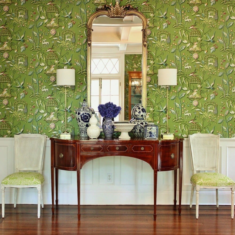
Thank you! There are some other shots in my portfolio. The wallpaper is from Thibaut. Chairs from Aidan Gray and they came that color. The fabric is from Quadrille.
Alright. When should I come to Alabama? lol
Gorgeous! I love the brick-style use of marble on the backsplash especially. You are genius!
Hi Beth,
haha! Sometimes I feel quite stoopid but I’m so appreciative of your kind words! Thank you!
I am so inspired by your vision and creativity. What a lovely kitchen!
I’d say move to Charlotte, NC where I live, but unfortunately, they tear down old houses here. I’d suggest Savannah. It’s lovely and the old houses are cherished there. Tell me when you’re up for a visit and I’ll meet you there and we can be best friends.
Aw Elizabeth that is so, so kind! I would love that! And I’m just crazy enough to take you up on the offer!
Lovely job on both the kitchen and dining room! It must’ve been tricky to design a kitchen with five doors! I know. Many years ago I needed a kitchen Reno because it had 7 doors!! Lol. It’s also nice to see the charm and coziness of older homes preserved rather than the ubiquitous open concept. Cabinets and upper mouldings are so pretty….Shows that the entire cabinet doesn’t have to reach to the ceiling. Nicely done!
Hi Betsy,
Thank you! You had SEVEN doors!? That’s crazy time! Actually, around here, open concept is not very common. In my town, all of the homes are old. If anything though, they are the old tired traditional with lots of dusty swags and cheap sheers. I recommended a cabinet maker that I had the taste level to interpret the designs and a wonderful GC who created that magnificent coffered ceiling!
The entire room was gutted down the studs. It was A MESS!!! The wiring was all over the place and pipes had to be moved so we could create the fridge pantry wall. The floor and ceiling also needed an intense amount of leveling.
I love it all! Can you share the source for the cafe curtain rods and rings? It is hard to tell by the photo if the rings clip on. I am looking for small rings without clips. Thank you, thank you.
Hi Bunny,
These are from Rejuvenation. http://www.rejuvenation.com/catalog/products/inside-mount-cafe-set
But yes, they do have clips. I too wanted small rings without clips and searched high and low for them.
Hi Laurel, ….such beautiful work! Your client is so lucky to have found you. As soon as I saw the door handles I thought to myself that they looked like a beautiful silver pattern. And that was before I read your text. I like your idea of switching to perhaps a vinyl fabric for covering kitchen chairs and barstools. Do you have a fave go-to fabric house for the ones that have a softer feel? (I’m a designer down in Fla). I’ve been having stain & soil repellent finish added,usually on fabrics from Norbar, but perhaps this is a better way to go.You have done just a drop dead gorgeous kitchen! Just deliciously awesome!
Hi Carol,
This is funny, but yes, I do have a place that I love for all kinds of fabrics. Boy, someone must’ve slipped me some sodium pentathol! lol But really, at this stage of my life, especially, I am so happy to share what I know!
But here’s what’s funny. It’s Norbar Fabrics and they are located in Boca Raton! I have ordered thousands of yards of fabric from them. Maybe millions by this point! It’s my go-too for reasonably priced linens especially, but they a lot of awesome fabrics. Some of it is not awesome but it’s a huge line. There’s something for everyone from elegant to tres tacky. lol But it’s a great company!
Oh gawd. I swear, I didn’t read down to the very bottom of your comment before I dove in! hahaha. tooooo funny! You already know them! But yes, they have a very nice line of vinyls.
Yes, you can absolutely have stuff stain protected, but when that PBJ sandwich goes face down washed by a glass of chocolate milk… haha! And it’s not just because of kids. I’m the worst! Very clumsy!
This is really funny about our fave fabric source.I even know a “celebrity” designer who sources them. They are so nice to me (& I’m a quite small solopreneur). My retiree clients always want the protection. There is a lot of neighborhood entertaining that goes on here. So now I have something else to offer them and we can go with more “pretty”. Thanks so much! P.S. Lately, I’m right there with you on clumsy!
Very pretty! Thank you for your good work, Laurel. God gives us all very special talents and you have responded well to this grace 🙂
In the past I may have seen you recommended Cotton Balls as a paint color for trims – but it definitely looks like White Dove is a perfect color all around. Blessings!
Hi Maria,
Thank you so much! Both White Dove and Cotton Balls are great colors. When I did my post on the one color that goes with everything, I chose cotton because WD in a few instances can go a little too yellow. Not usually, but it can. On the other hand, it has the edge over Cotton with deeper colors because of that. So, WD is in the number 2 spot but only by a little.
Also, certain colors like very clear yellows and blues might not work as well with white dove. It all depends on the light. I don’t think it could ever be terrible, however.
One white that I’ve never understood the appeal is Decorator’s White. Every time I see it looks cold and unappealing. One time, I saw it on a ceiling and it went way lavender. weird.
I totally am with you on Decorator’s White. I don’t get it either. I’m glad to know I’m not the only one!
You are the very best! Thank you for your kindness.
I have no website but am a devoted fan from the Deep South. Wouldn’t you like to move? Your dream, yet unpublished, kitchen is sublime. Everything about it is gorgeous. i found the pulls that look like old silver, although they don’t quite on the screen. How long are yours? That probably makes the difference. Thanks for all the joy and inspiration.
Hi Dale,
Yes. I would like to move and I’m not joking one little bit. I just don’t know where I’d like to move to.
This might sound funny as I feel so incredibly loved, but I don’t have any very close friends. My BFF died a year ago. Still can’t believe it even though I knew it was coming.
Aside from that, there would need to be gorgeous architecture and a good ballet class. I still dance for fun and exercise. It’s been a lifelong passion of mine and if anything has only gotten stronger as the dancers have become so phenomenal!
I love the idea of Charleston, Savannah or NOLA. I’ve never been to any of them. Wherever the people are the nicest.
My new home would be white, white, white!
We did the pulls in two different sizes. I don’t remember exactly but I think one was about 5 inches and the other about 8. The latter went mostly on the appliance drawers in the island. It’s way cool but no photo of that. We did the fridge handles. We chose a knob (or I did, rather) from Shaub but not in that collection.
Thank you so much for your lovely message!
Me again. Hi. I have scoured the internet until I am cross-eyed looking for any escutcheons similar to those you used. Any advice?
Hi Dale, I think we got ours on Ebay. There are a few sources that sell something similar. Here’s one of them. http://www.knobs4less.com/Cabinet+Hardware/Backplates/_/N-category+Backplates+type+Escutcheons
I also spent hours looking for just the right ones. Etsy is also a good source for stuff like this.
What a beautiful space to create tasty meals! Just love your work….
Hi Patricia,
Thank you so much and for all the kind support! Much appreciated!
Oh my, that’s a beautiful kitchen! Is the ceiling painted a different color? Also, may I get my “how to pick the perfect color”? Thanks!
Oh dear, you too? Sorry about that Kelly. I’ve tried to find the answer to that and failed numerous times. I will send it to you right away! Most people get it but occasionally not. The ceiling is the same color. That is a perfect example of how paint reflects what it “sees.”
I think I just found my dream windows. They are beautiful and such a lovely compliment to the fabulous kitchen.
Hi Rachel,
Yes, they are gorgeous and larger than they appear. This is a ten foot ceiling! (incl. the coffers) These particular windows since they are 100% custom were quite expensive. I believe that they were close to 4k each— just the window, nothing else.
It’s beautiful.
It made me especially happy to see that you used floral motives, and in light fixtures too..I have an ongoing infatuation with flora (and fauna, lol), and I try really hard not to overdo it..every time I see it can work out beautifully gives me some encouragement.
Hi Jenny,
Funny… I just used a Forrest Gump line and then, “there she was.” Sorry. :] Flowers are so beautiful. This one was more of a coincidence. The client wanted a lot of sparkly lighting. I had found these French sconces which were like 2,500 each! So, that wasn’t happening. These were ‘only’ about 900 each!
Here’s a whole page of the bague sconces! They are to die for!
bit.ly/1TXSr7k
Thank you:) Yes, I know..I travel the webs a lot for these, even just to admire..Etsy and E Bay sometimes can lead to luckier finds, especially foreign shops. Then you get yourself into more expensive shipping, of course..
I LOVE Etsy!
This kitchen is fabulous! I hope to see it published soon or perhaps some of your other work. Thank you for being so gracious & sharing your sources. It’s very helpful to your readers who don’t live close enough to hire you. Love those sconces too.
Hi Terri,
Thank you so much! Publishing is very nice. I’m not very good about pursuing it and the few times it’s happened hasn’t led to anything. You would think so, but nothing. I’m far better off self-publishing on my website!
But, there might be something in a few months. Of course I’ll let y’all know if it happens!
Loved this kitchen! As a Designer and Upholsterer I’d love to know more about that laminated fabric for the dining chairs. Somehow I’ve never heard of this and I feel like it would save me from having to wrap my beautiful fabrics in vinyl at my clients request. If you could share I would appreciate it! Thanks!
Carrie
Hi Carrie,
Sure. I send the fabric out to a fabric finisher. My favorite one is Schneider Banks in Texas. They do a terrific job! It’s a matte vinyl that’s heat sealed to the fabric and barely noticeable. As you can see there is a very slight sheen but no more than that of a cotton chintz. I’ve done it dozens of times in kitchens and everyone loves it. If there’s a banquette it is an absolute must!
What is the wallpaper in the kitchen?
Hi Sara,
It’s from Cole and Son, but I’m sorry I don’t remember the name. I believe it’s on their website.
I love this kitchen. Your choices and direction are perfection. I was a little surprised to see the tv on the wall, but understand totally, as there seems to be a tv in every room these days. I wonder if you could talk them into hanging a hinged piece of beautiful artwork over it?
I fully expect to see the first picture (the money shot!) on the cover of Veranda or another publication in April!!! Congratulations!
Yeah… I hear you on the TV and I even tried to cover it up in my photo editor, but it looked fake. What amazes me is that there’s no staging whatsoever in many of the images. This kitchen doesn’t need much! But imagine with a little enhancement. Oh well…
The Veranda cover would be a dream come true, but that isn’t happening either for the same reason I can’t take more photos. And that’s all I have to say about that… :]
Regarding the ubiquitous TV – I’ve seen decorators frame the TV with beautiful frames and then have “artwork” on screen via a CD, something like a screensaver. I’ve seen this in period homes and I’m considering doing this for my TV over fireplace mantel. My AV people say they do that often. TVs above fireplace can look good if done right; it’s my only choice in my family room.
Hi Lora,
Yes, I’m familiar with that but my client didn’t want anything. I never argue.;] If something’s a big mistake however, I will find a way to let them know.
Perhaps the kitchen will be published in a national magazine and that is why your client did not want you taking more photographs,
Hi Judith,
That is a very reasonable and logical deduction, but is about as likely as the Pope getting pregnant.
Regarding your comment, you are too funny.!! One of the many reasons I do so like your blog posts, is your wonderful sense of humor!
Love this kitchen! We’re building a house now so the timing for this article is perfect. But I also have a question: I recently subscribed to your blog and am wondering how to get the free how-to guide about paint colors that your website mentions. I subscribed a few weeks ago and haven’t yet gotten it by email, but maybe there’s something else I should be doing but haven’t (?). Thanks!
Hi HJC,
It happens once in a while and no one can figure out what causes it. My apologies; I am sending it off to you right now! And thank you for your kind words. All the best with your project!
Thank you for bringing to our attention how lovely the white pulls look on the cabinets – no distraction just enhancement. Thank you so much. I will not be afraid to do this later when I can afford to redo the kitchen. By the way, are those silver pulls by Edgar Berberi? They look like one of his lovely designs.
Hi Emilia,
Thank you, I love it too!
The idea behind the white hardware was to make that piece look like a separate piece of built-in vintage furniture. I think it works because it is completely separate from the rest of the kitchen due to the big beam and ensuing 13″ wide pilaster. The nickel hardware is from Schaub and Co., The Casual Elegance Collection. I got that at myknobs.com.
Love love love…..so excited to see your mid week blog too. Please keep them coming.
Thank you so much Liz. I really appreciate the support!
Absolutely Gorgeous!! Right down to each and every little piece. Love that it’s an older home and kept character and beauty. Updated but still holds true to heritage feel. As for paint color, I have white Dove also and I love it. Beautiful job.
Thanks so much for stopping by Karina and for your kind words!
I’m so happy to see this post (what are the chances?) because I JUST came home with my sample kitchen cabinet door and it SO looks like the cabinets in this kitchen. I’m even doing the quartz, and Calacatta gold marble backsplash. I like the look of white Shaker cabinets but mine will be a warm white and have some soft details. This kitchen is beautiful and warm right down to the floor. Selecting everything is overwhelming and I feel so reassured that I’m not making any gross, costly mistakes. I was filled with excitement when I saw this kitchen – I hit the real jackpot!
THANKS a billion Laurel
Hi Lora,
I don’t think it’s possible to miss with a white kitchen. I’ve loved them forever and that’s a pretty long time! haha. Glad that I was able to relieve some of your anxiety. It’s a lot of $ so that’s understandable!
Beautiful kitchen, Laurel. I especially love the hood, the custom architectural woodwork, the Palladian windows, and the chandelier is wonderful!
Thank you Lisa! I wish I had before photos. The kitchen was so dark and it was wrong for the house. It was in a French Provincial style and the home is totally Beaux Arts neo-classical down to the ionic columns in the front to back center hall!
Babette would have died for such a kitchen .. 🙂
haha! I bet she would! Loved that movie!
Just beautiful! Breathtaking!
Thank you so much Chris!
Dear Laurel,
Thank you for sharing the beautiful kitchen photos! Everything is so lovely…
I have a question about your rule of thumb on paint finishes. Do you recommend using a satin sheen on cabinets and trim? White Dove is my color choice, too!
Thank you so much. Your blog is so inspiring!
Hi Anne,
I use semi-gloss but satin would be fine too. There isn’t a huge difference. Only in certain lights would you notice it. And thank you for the kind words!
The kitchen is beautiful! Every photo is wonderful! I am wondering about the laminated chair cushions–is it a matte finish or more glossy? Do you think the chairs are comfortable with a laminated fabric?
Many thanks,
kathy
Hi Kathy,
It is a matte finish. They are very comfortable. You really don’t notice anything at all. I suppose if you were butt neked and it was 102 degrees outside and there was no AC, you would not be happy, but that’s not very likely. :]
Hi Laurel! LOVE, LOVE, LOVE THIS ROOM!
Can I ask what sheen you used on the cabinets by chance, and is the ceiling and window trim White Dove along with the cabinets? Thanks so much!!
Hi Rachel,
Everything is white dove – semi-gloss. It is hand-painted on site which took them about three weeks. It’s very labor intensive because it’s many layers which get dried and lightly sanded. The result is a very smooth lustrous, durable finish.
Oh, it is oil-based paint. If you notice the glass cabinet at the crown how it looks so luminous. That’s oil paint. New York State took ours away. Such BS. But we can jump the curb and get it in Connecticut. Same thing with the oil-based poly on the floor. They could only get it in pints and needed 25 of them!
Laurel,
I’m guessing the cabinet paint was brushed vs sprayed? I love seeing the subtle brush strokes on cabinets in older historic homes.
Hi Kelly,
Yes, it was brushed on but it is many fine coats that are lightly sanded in between. You don’t really see any brush strokes or if you do, they are very subtle. They do an amazing job!
Laurel …. LOVE the dream kitchen you designed. Would you be able to share the wallpaper manufacturer/pattern ?? Absolutely adore it and it would work perfectly for us. I so enjoy your talents and you are generous to share on your blog !!
Best ~ Patti
Would love to know the wallpaper too!
Hi Laura,
Yes, it’s Cole and Son Wallpaper.
Hi Patti,
I know that most of my colleagues hate divulging sources. They say that the client paid for the source. No, they pay for the products! At least with me that’s how it works. It’s from Cole and Son, and English wallpaper Co. which is to the trade (don’t know if you are or not) and repped in NY at Lee Jofa. I don’t remember the pattern but you should be able to find it on their website. It comes in several colorways.
This kitchen is stunning.
One hundred years stunning!
Love white on white. That nickel hood is so perfect.
I must ask how do you laminate fabric. I could really use that on my kitchen chairs too. Such talent you have and those who create your vision.Bravo!
Thank you Kathleen. I use Schneider Banks in Texas. You send them the fabric and they laminate it before it’s upholstered.
Sooooooo beautiful.
But I have to ask — how do I laminate upholstered seats (and would they stand up to my cats?!) With multiple pets, I am forever cleaning fur off one surface or another and so have gotten neurotic about eliminating upholstery wherever I can get away with it, e.g. dining chairs, side chairs, bed frames, etc. To add another obstacle, I am vegan and prefer not to decorate with leather. Needless to say, I now have way too many hard surfaces, and need a way to add softness that does not require constant labor intensive cleaning. When I saw your laminated upholstered dining chairs, and your comment about just wiping them clean, I was like WHAT CRAZY DESIGNER MAGIC IS THIS?!
Haha! LJ,
I forget sometimes because I’ve been doing this so long, but here’s how it works. The fabric and it has to be a fairly smooth weave gets sent out before it’s upholstered. I use Schneider Banks in Texas.
Awwww… I had a kitty who died 13 months ago. I miss him insanely but he was trashing my furniture! So, I understand. If their claws are sharp it is possible to puncture the plastic coating, otherwise, you should be okay.
In addition, there are a lot of really great vinyl fabrics on the market. I use those sometimes for kitchen chairs or banquettes. Some of them even look like linen and have and almost clothlike feel.
I also had a linen velvet sofa and that one he didn’t touch. I did have to clean off the hair but otherwise, it remained intact for the 12 years he lived with it.
it’s all absolutely gorgeous. The door pulls are perfect. I love the white on white. It’s light, fresh and elegant.
Thank you Jane! I spent many hours obsessing over knobs and pulls! haha! There are worse things, right?