For some reason, I have an online subscription to Zillow. You know that online real estate listing place that has something called a “zestimate?”
The zestimate is total BS, BTW. I’ve had confirmation from several realtors. Still, I like to look at places in my hood since I’m a property owner. (and I’m dying for a spot in our garage. Soon, I hope as there are 3 units in my building for sale!)
The area that I live in is a tiny section of Bronxville that is a two block square of apartment buildings. They were all built in the 20’s and 30’s.
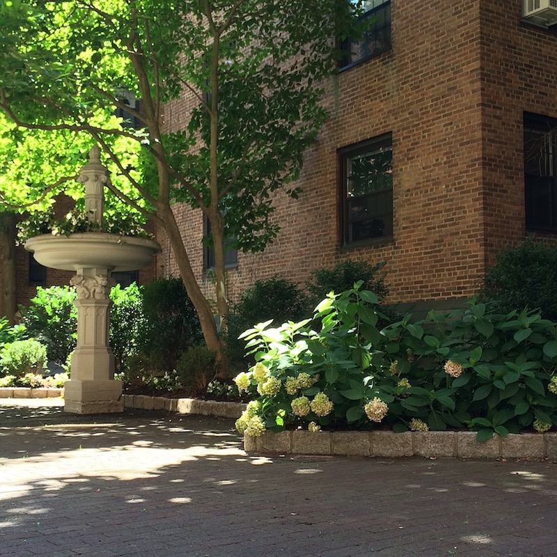
Here is our lovely courtyard garden in my building known as Tudor Arms
All of the buildings have high ceilings and interesting detailing. (unless someone has mutilated them into something else.)
The other day, a 3-bedroom duplex for sale, with a roof terrace caught my attention.
The building is a stone’s throw away. It’s on the market for $800,000. That’s a lot of $ for an apartment, so I figured that it must be really nice.
Well, it’s not; not for 800 large.
But, it could be. Yes, it would cost some money, however, I have seen apartments around here sit and sit and sit and sit… Then, what happens is a price reduction. Once, twice, three times… and before long it’s been on the market for many months with the homeowner potentially losing tens of thousands of dollars.
And Why?
Usually, the main reason I think is that they are hideously finished and decorated.
Horrid remuddling.
If the homeowners had made the necessary changes before putting their botched classic on the market and priced it correctly, a place like this should not be sitting.
For more info about what to do if you’re serious about selling your home please click here.
Let’s begin here.
The kitchen.
Everyone knows that kitchens and bathrooms sell homes.
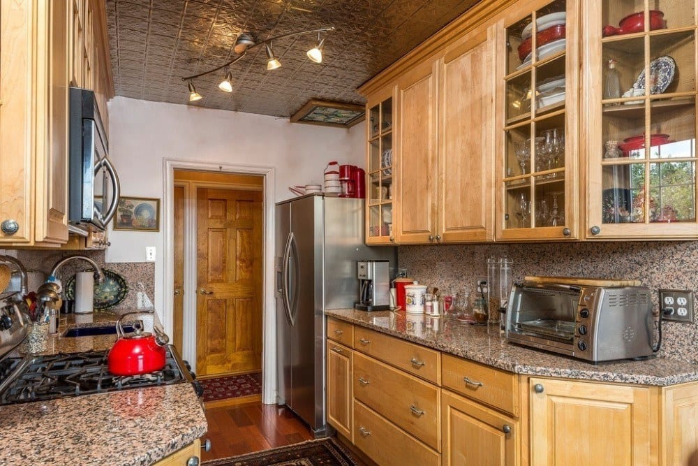
not this one.
This isn’t the worst disaster I’ve ever seen but this is a kitchen in a home worth 800k? No. Here, we have the classic fugly oak kitchen cabinetry (actually, this is probably cherry but still…) with pinky barf granite.
I really can’t stand it anymore!
I’m quite sure that God never intended this stone to be unearthed for anything except maybe as a trough for slopping the pigs. They must’ve gotten a great deal on this stuff because they ALSO used it (as you can see) for the backsplash for an extra dose of hideous.
Look. I don’t expect to see an authentic 1920’s-1930’s kitchen. We live differently now. We NEED more storage. We have 25 different flavors of corn flakes. We need to put it somewhere!
Before we dig in here, let’s first look at a few kitchens from 80-90 years ago, so we have a point of reference.
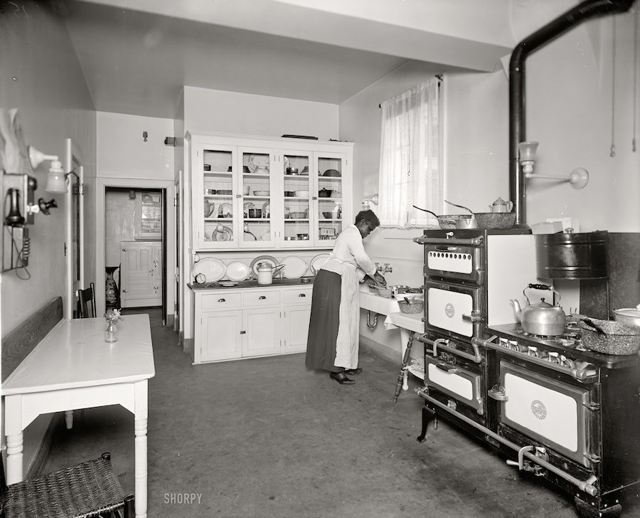
This is a classic kitchen from the 1920’s. There is only one cabinet which was for the crockery, glassware and silverware. But notice how modern it looks! Behind it undoubtedly was a very large storage pantry. Behind that looks to be a butler’s pantry. And is that an ICEBOX? Oh wow. But we do have a lovely counter for preparing the meals on. Love the stove! Ain’t that a beaut!
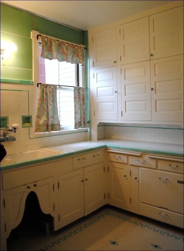
Two kitchens from the late 1920’s – 1930’s above and below.
I don’t see any oak.
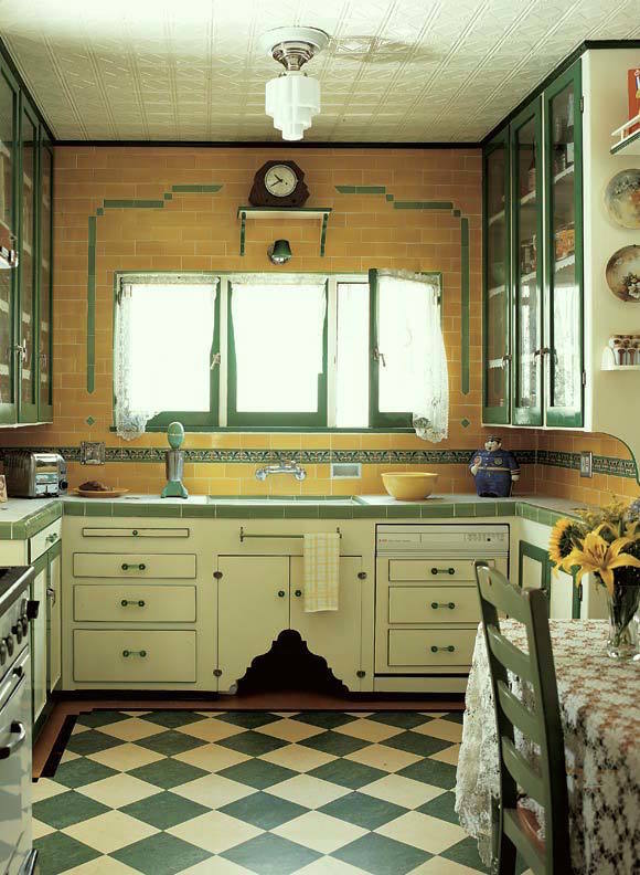
I believe that the cutout under the sink was for the doggie. That’s where his food was kept. So sweet.
Look, it’s not that you need to put in something exactly like this. I wouldn’t do that either because it wouldn’t look right today either. However, if you choose to live in a historic building, then why not at least design it with respect to its heritage? That means NO OAK cabinetry. Oh man, I’ve seen it thousands of times. There are a few exceptions, but for the most part, no oak.
I feel pretty strongly that white in a small apartment kitchen is always best, or at least painted cabinetry. And yes, subway tile.
For those of you who are going to give me flack saying that it’s difficult to keep white cabinets clean, that’s fine. Paint it a khaki color or gray or buy a different home. I like to see the dirt so that I know what needs to be cleaned! :]
If you are planning on staying in your home until you die and it’s all paid for, then I don’t care if you paint the entire thing in purple zebra stripes, but most people stay in their home an average of 7 years. I wish people would be smarter about this. If you’re selling your home sometime in the future, then this is for you, whether it’s an apartment or a free-standing home.
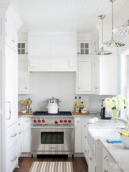
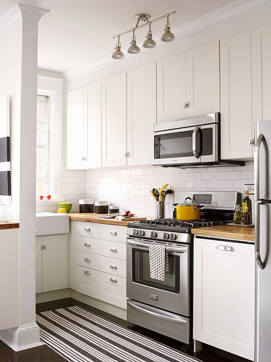
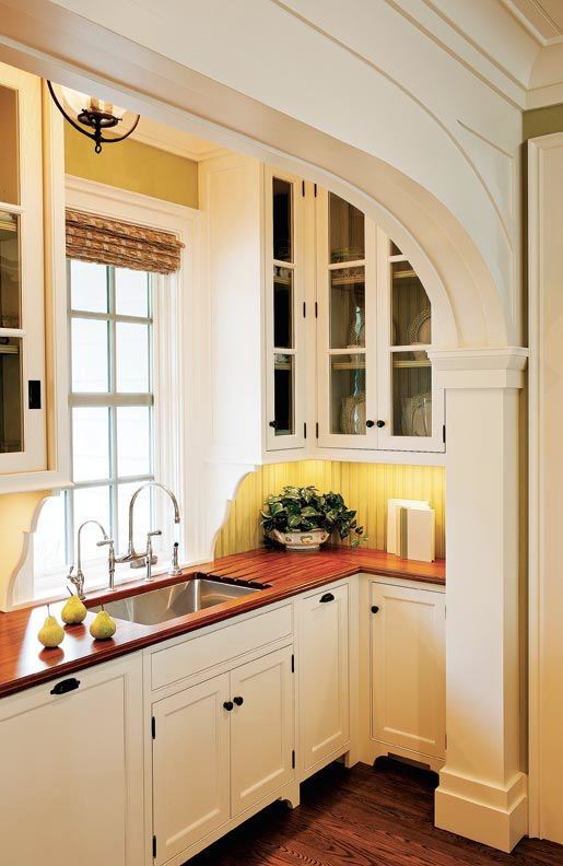
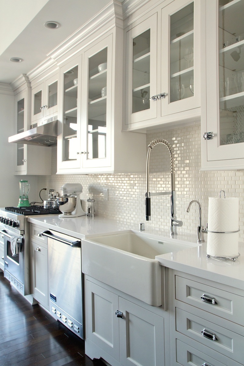
Here are some beautiful small kitchens that would be appropriate for an apartment built in the 20’s-30’s or any time really.
I think I could stop right here. This one is absolutely perfect!
This kitchen looks very vintage-y but it’s not.I think some adaptation of any of these would be perfect for an older home, OR a new home too!
What About Our Seller?
For about 10k-20k— tops, (which they would get back and then some!) they could make this kitchen something to make prospective homeowners take notice and begin to want to live here!
Remember, if you are selling your home or thinking about selling it in a few years. Buyers want move-in ready. But… check this one out. These are the original cabinets covered in what looks to be shelf lining paper. lol
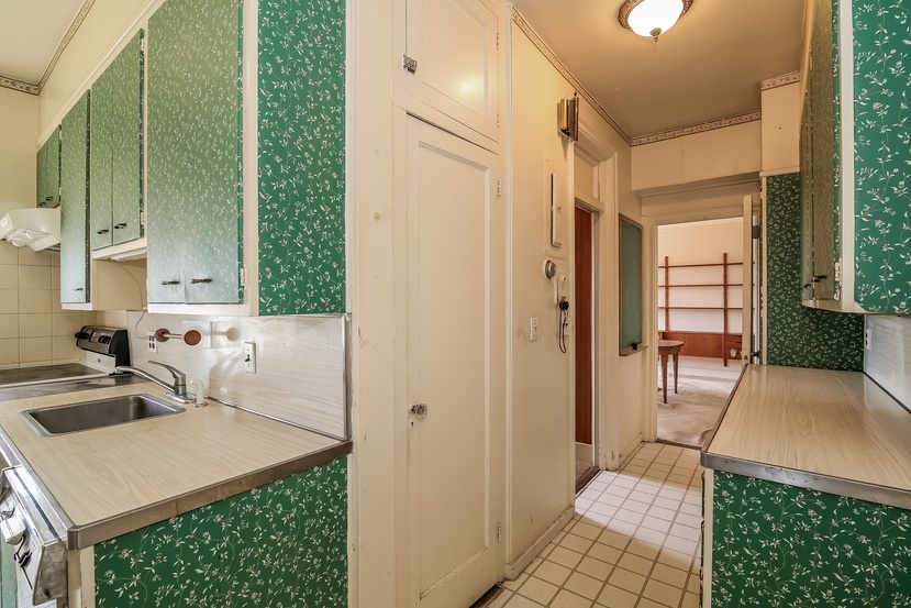 oh my word!
Let’s now go back and see what it would take to make our $800k duplex worthy of that price tag.
Before I talk about what’s wrong, what’s right is the ceiling, but it should be painted a shiny white.
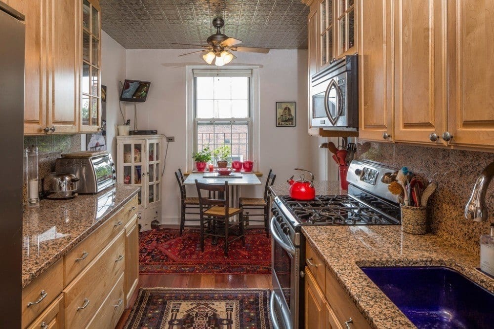
the cabinets
They’re actually nice except for the fact that they’re brown. They can be painted.
You can find info here about painting your cabinets.
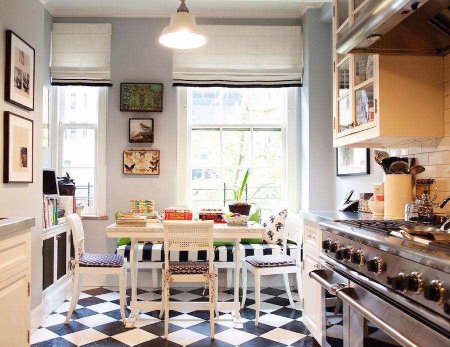
The wonderful vintage-inspired kitchen of Andy and Kate Spade, designed by Stephen Sclaroff
This is much more like our $800k home kitchen should look like. It’s clean, fresh, classic and inviting.
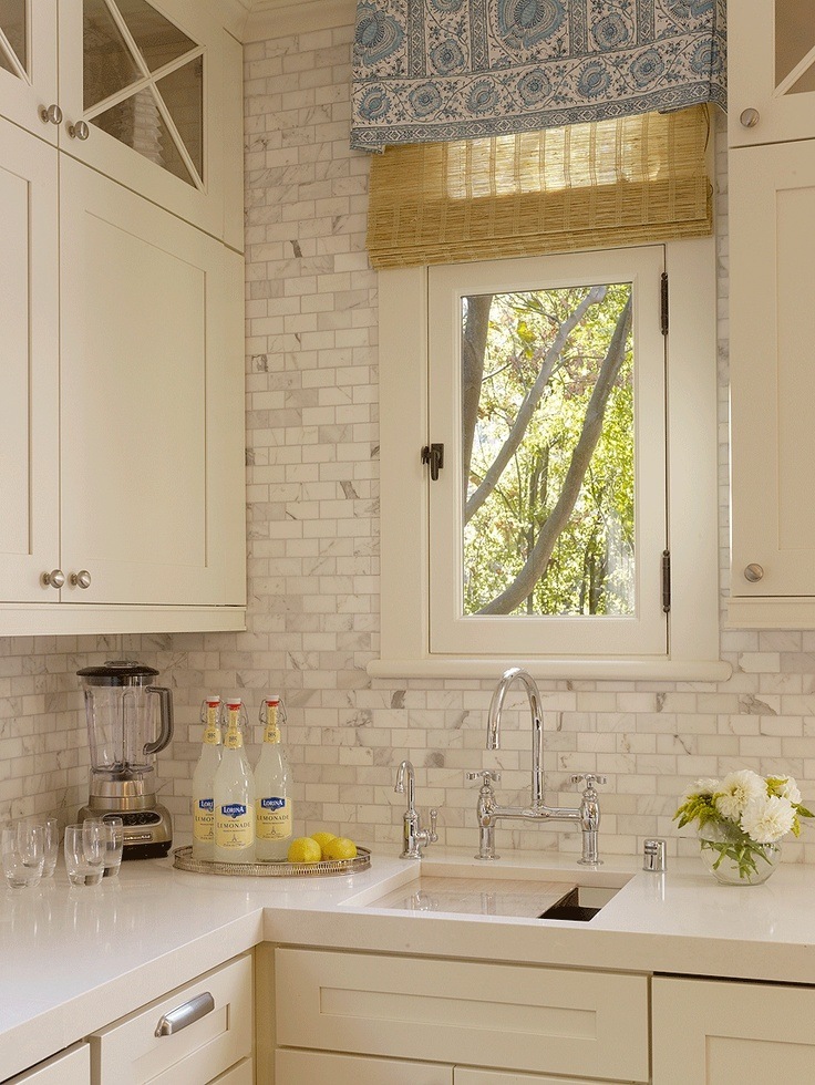
the counters and backsplash.
I love the engineered quartz counters by Caesarstone and Silestone to name two companies who manufacture this great product. It’s very durable and easy to maintain. Again, I like white but you could do another neutral color. Don’t worry about mixing your whites. In fact, they should all be a little different. That’s a richer look. The tile above is calacatta gold. It’s very expensive and lovely, but ceramic is absolutely fine.
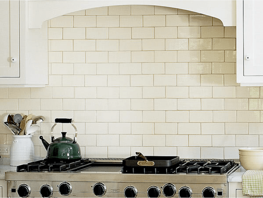
Subway tile.
There is some confusion I find as to whether this is a trend that’s going bye-bye in a few years or what.
Well, yes, it’s a trend, but it’s also completely classic. It did go away for a while and then came back with a vengeance about 20 years ago. It’s not going anywhere. And it’s what should definitely be in a vintage apartment.
Ideally, you would find a reclaimed subway tile. They don’t make it like this any longer. Oh, wait. Hold on. I have something to show you that’s really for the next post. Hold on…
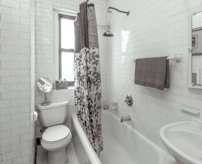
Here. This is an apartment in my building that’s currently for sale. I wish they had put up a white shower curtain, but they didn’t ask me what I thought. ;] This is the original tile from 1920! And a lot of the apartments here still have it! One of my neighbors couldn’t wait to get rid of hers. No comment. And yes, she just put in a new cherry kitchen. She’s a very nice lady. I’ll forgive her. (I guess) :]
Below is a close up of some reclaimed vintage subway tile.

Of course, you don’t have to do this. It’s expensive, but if you have a tiny kitchen with only 9 ft of backsplash, maybe it’s worth it? You can also get the hand-made stuff like they sell at Walker Zanger or Ann Sacks. One 3 x 6 tile is about 25 bucks. Plus labor of course. Then, you can get tile that’s less than $1.00 per tile.
For the sellers, I’d go cheap. Not so cheap that it looks tacky, but no sense in spending $5,000 on the backsplash. We just need to get rid of the fug.
To grout or not to grout. Meaning, should it show or blend? Well… the contrast is okay if you know how to pull it off. It’s more difficult. It’s a funkier retro look. I usually prefer it to blend. It’s never a mistake.
Size? The standard subway is 3×6. It comes in everything from a tiny .5″x 1″ to really BIG. I like either the standard or the 2×4. Although a few years ago, we did a lovely backsplash with the mini version in Thassos Marble.
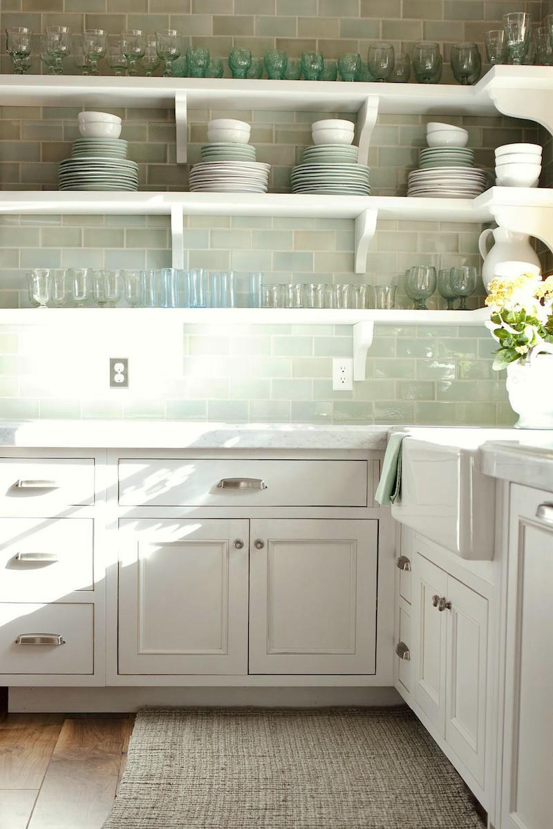
Another viable option is a colored subway tile. If you really can’t stomach all-white, then this would be a great option. This bottle green was very popular in the ’20s and ’30s. Glass is also lovely but more contemporary and expensive.
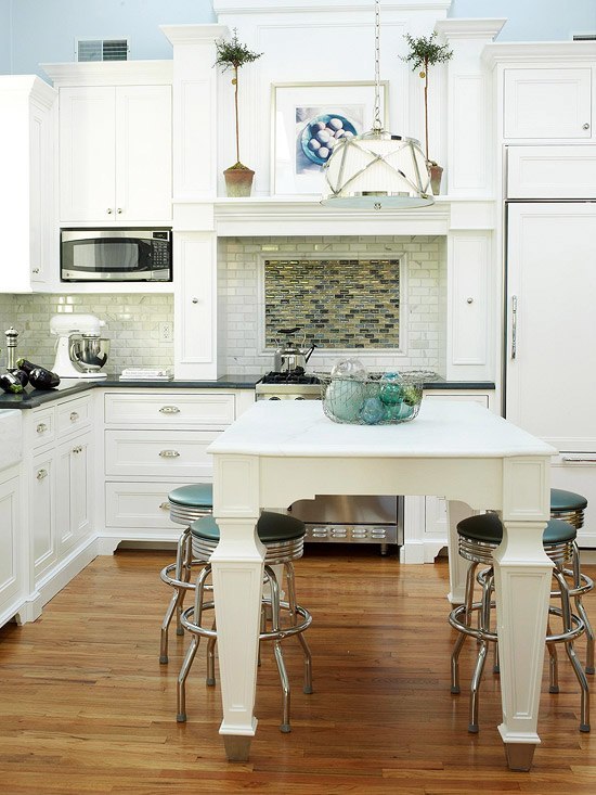 Whatever you do. Please do not do this to your backsplash. Lovely kitchen, mucked up by weird contrasting non-classic tile over the range. I don’t understand the necessity of this. Oh, sure. If you must, you can change textures for a feature, but I’m sort of over that one. I prefer it to be plain. (like the image above with the green tea kettle)
Some will say it’s boring. “Boring” is okay. The backsplash is not the star of the show. It’s an integral part but it’s not the star.
Should the entire wall be tiled up to the ceiling? That’s a good question. It is classic and it’s also a recent trend. I think it depends on a lot of factors, but if done well, it’s a beautiful look.
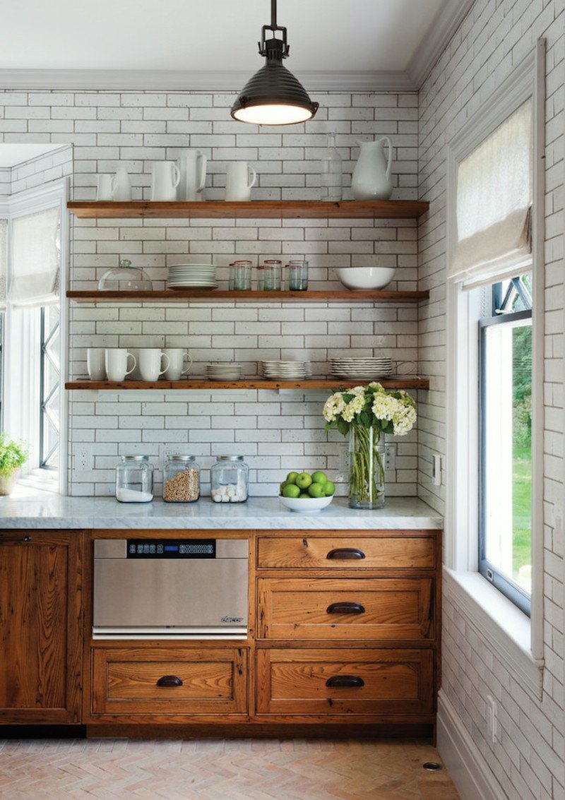
Here’s a kitchen that has the tile up to the ceiling with dark grout and brown cabinets that work. The trick? Lots of white, airy shelves and no uppers. I know… it’s hard to give up your uppers. :]
Lighting.
We have to get rid of that horrid fan and that other monstrosity as well. By the way. I have a similar monster in my hall. lol.
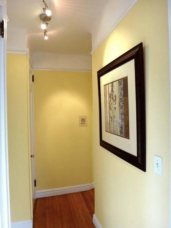
I know… I’m such a hypocrite, but my apartment is not 800k and it’s just the hall. The little hall is one of the things I love best about my place. There are some changes I’d like to be making soon.
back to our kitchen
Below are several ceiling fixtures all from Circa Lighting They have a fabulous collection in all different price points. Our ceiling is 9′, so you could do a pendant but it really shouldn’t come down more than 24″ over-all.
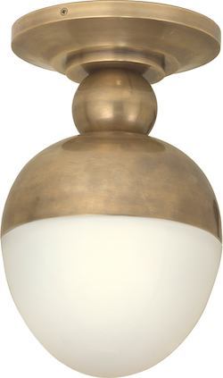
I don’t know what this is called, but I think it’s really cool. There’s a pendant version as well.
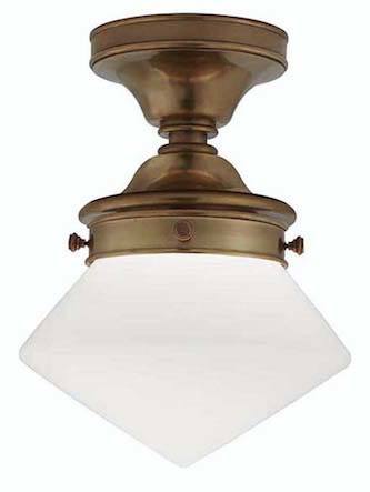
This is a variation of the school-house fixture.
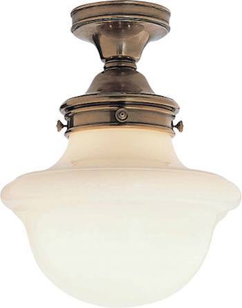
regular school-house
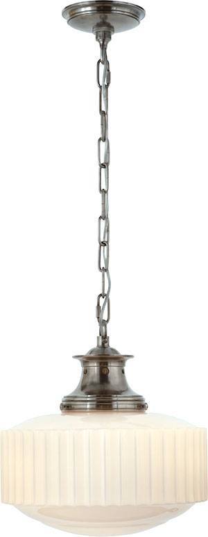
Another schoolhouse variation by Thomas O’Brien. I did this one a few years ago over an island and they looked great!
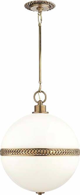
This one is very expensive but I just had to include it because it’s my favorite. It’s designed by Ralph Lauren.
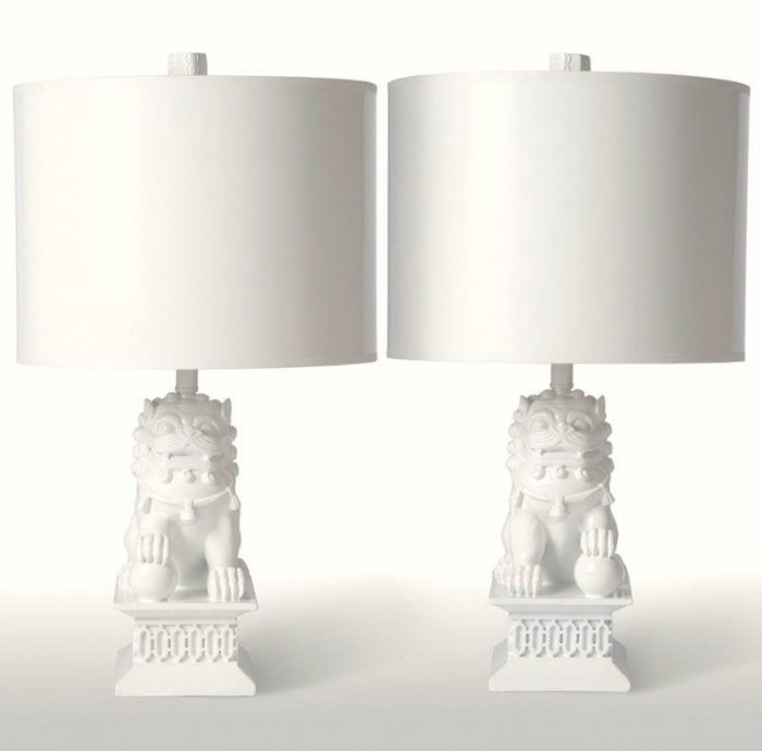
Lamps
We don’t usually think of lamps in the kitchen, but that’s unfortunate because table lamps in the kitchen are wonderful! They add a lot of warmth. If you have upper cabinets the space between the bottom of the upper and counter is usually 18″. It’s not easy to find little great looking lamps. I love these Foo Dog lamps by Barbara Cosgrove.
Hardware
Finally, we need to switch out the hardware. I love nickel if you can swing it. I also love mixing metals such as nickel with gold and brass, but nickel and chrome don’t look well together.
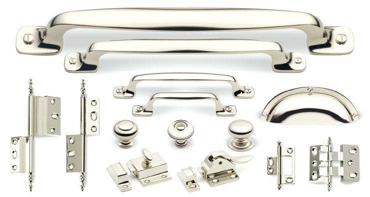
This beautiful collection of polished nickel is from Cliffside Industries
Other wonderful sources for hardware include
Well… that’s the kitchen. I’m not done.
Wait until you see the bathroom!
xo,
![]()
Related Posts
 Plaster Ceiling Design + Architectural Mouldings
 Freshen your Home for the New Year {Part I – home lighting}
 I Can’t Afford A New Kitchen. Can You Paint Stained Wood?
 Laurel’s #1 pick for the best sofa (addendum)
 20 Interior Designers I Would Hire {part I}
 Summer Whites {with a little red and blue}
 The Only Six White Paint Trim Colors You’ll Need


