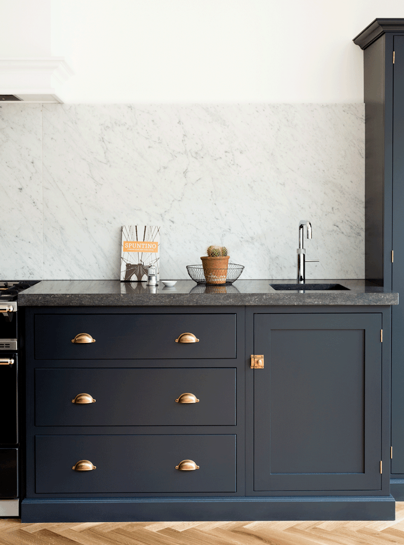
Hi Guys,
Greetings from the charming town of Northampton, Massachusetts! That is if you did not see my HOT SALES love note, (I call it) on Friday.
Why am I here?
Ummm… cause New York kinda sux??? Or maybe, just Westchester. I guess that opens up a can of worms. I better put the lid back on. lol No, it’s because my darling son is here. And, I decided to come up here for a few weeks and get out of New York and my life of solitary confinement.
Social distancing and mask-wearing. Absolutely! But, living ALONE, except for my pet plant, is no Bueno.
And, thank you too, for all of the great suggestions for my plant, Joe.
Yes, he’s here with me. I have him by the sunniest window in my lovely Airbnb.
Thank you, too, for your terrific comments about last Wednesday’s post.
It really is a mega-post, and I should have it for you, for Wednesday. It was supposed to be for today, but to do it right takes more time. I promise that it’s going to be go,od.
So, today, we’re going to revisit an old post that is newly updated with new content about 12 Farrow and Ball Colors for the perfect English Kitchen.
Or, it could be an American kitchen or a Brazilian kitchen. I don’t think the location matters that, much.
When this post came out, there were several requests to know which Farrow and Ball kitchen cabinet colors do the De VOL kitchens use?
At the time, I tried to find out from DeVOL what their colors are.
Oh, pretty please with a dollop of clotted cream on top?
By the way, have you ever had authentic English scones with clotted cream? If not, then you’ve missed out on one of the most heavenly things you will ever put in your mouth.
Okay, this was the answer:
Regarding our Shaker colours, although they are based on those Farrow and Ball kitchen cabinet colours they are not the same. We mix all the paint ourselves so we would really prefer you not to publish this information as they’re similar but are not a colour match. I hope you understand. Best wishes, L
I had a feeling they wouldn’t let me know. Alas, I don’t love them any less for it.
So, these may not be the exact colors, but they s,hould be fairly close. Please, always test!
Here Are the 12 Farrow and Ball Kitchen Cabinet Colors
DOWN PIPE
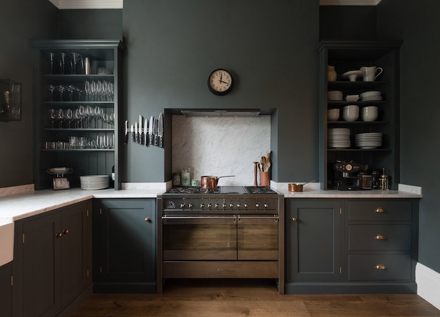
Talk about the perfect English kitchen! Let’s begin with my tall, dark, handsome, mysterious hunk from De VOL that I’m mad about. Well, I’ve looked at many images, and I do know that the English are bonkers over Farrow and Ball Down Pipe.
And for a very good reason. It’s a wonderful color!
But, here’s the deal with Down Pipe;
it looks different in every photo I see. I’ve seen it look almost pastel to almost black. But usually, it’s a dark gray-blue-green or dark gray-green-blue.
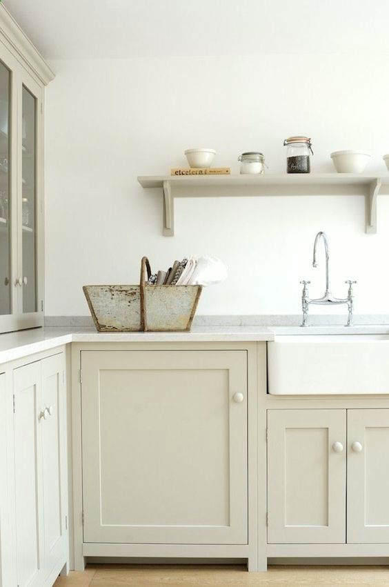
SHADED WHITE – Yes, this is the same kitchen as on Wednesday with as Benjamin Moore’s Halo. Are they the same color? No, but pretty close.

Shaded White is one of those colors that changes from a kind of soft cream, to a dirty cream, to a warm gray-green. I love colors like that and it’s a wonderful color to warm up a dreary, cold kitchen.
RAILINGS
Railings is almost definitely one of the De Vol colors. The chip on the card looks like black, but it’s really the darkest navy possible.
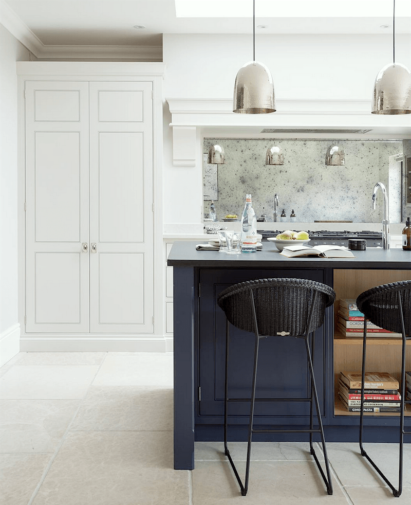
Railings on an island in a kitchen by Humphrey-Munson who Emily T turned me on to after Wednesday’s post. OMG. You must check out their instagram account. But go grab a drool bucket first.
Note: Humphrey-Munson has their own proprietary colors. They say they are not from Farrow and Ball.
Okay, I won’t argue.
The perimeter cabinets are in Humphrey-Munson Half Windsor and the Island in Humphrey-Munson Helm
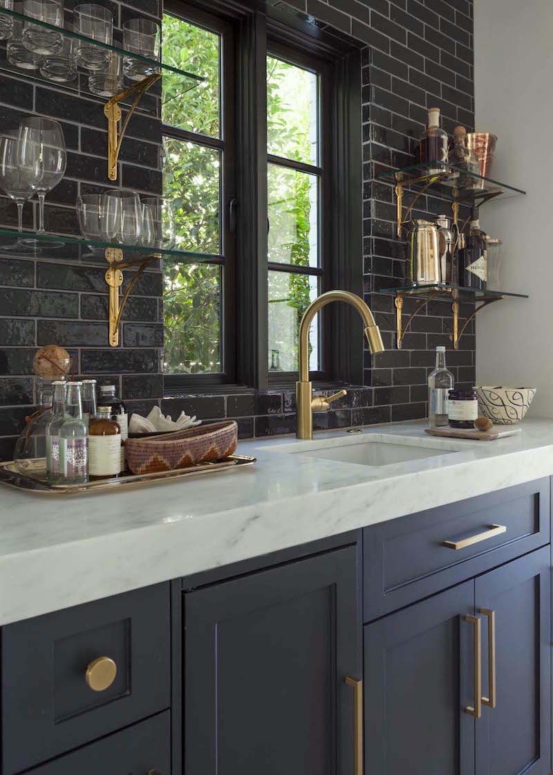
More Railings. I think this would make a fabulous butler’s pantry with the black subway tile.
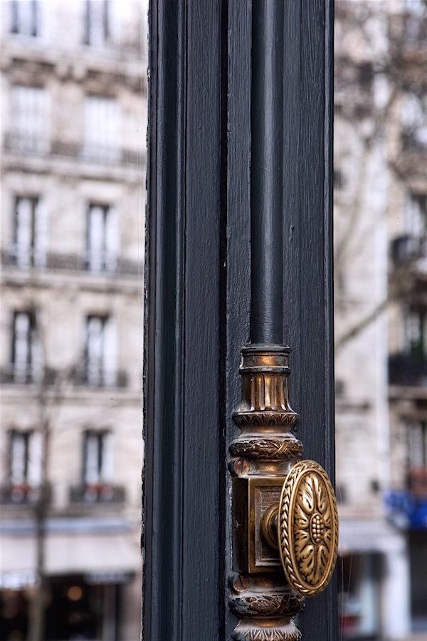
Railings is a terrific color for exterior trim too.
PIGEON
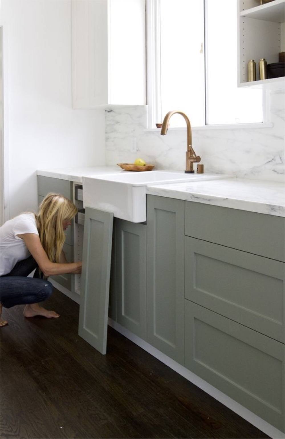
Seriously, this is the most clever thing ever. Sarah is installing custom doors over Ikea cabinets.
And yes, they are in Farrow and Ball’s Pigeon, which is a medium-gray-blue-green. There’s a lot of info in Sarah’s link about the process, the before images… Great blog!
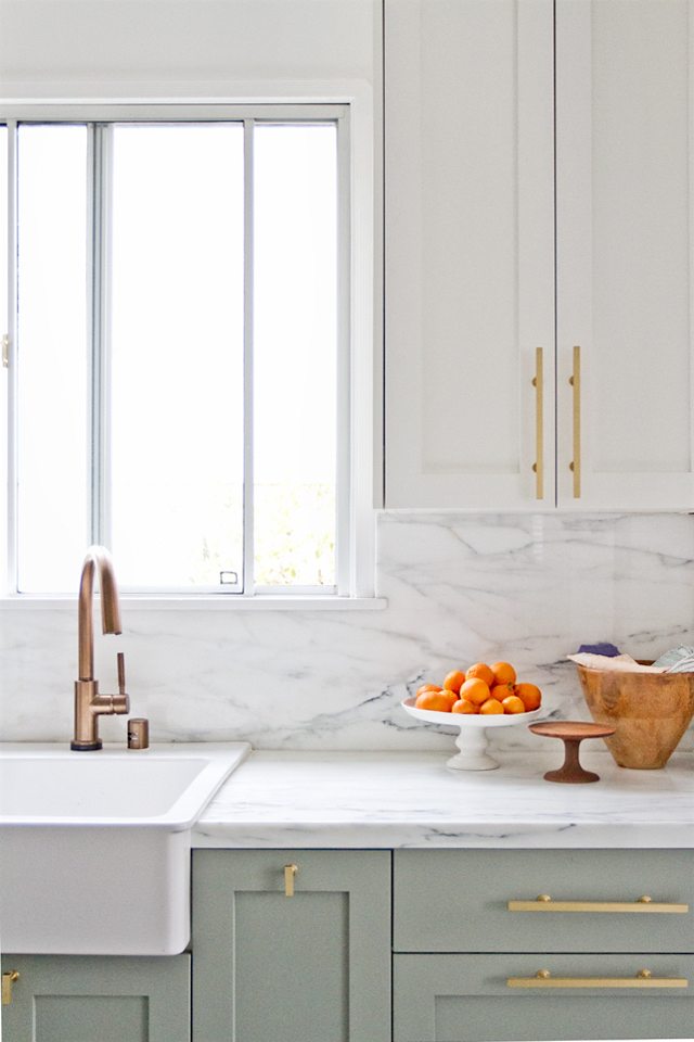
Here’s the finished kitchen. The uppers are Wimborne White.
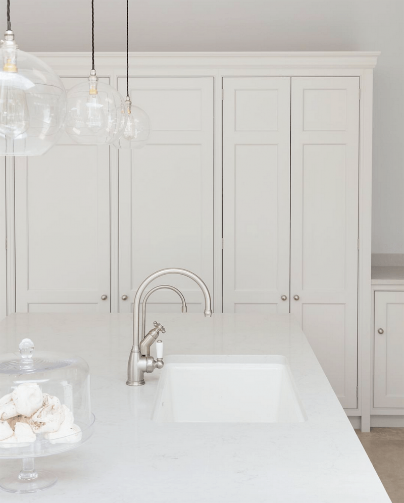
CORNFORTH WHITE
Well, it’s not really white, but it sure is one of the loveliest grays in the universe.
(The paint color is Humphrey Munson Lapel)
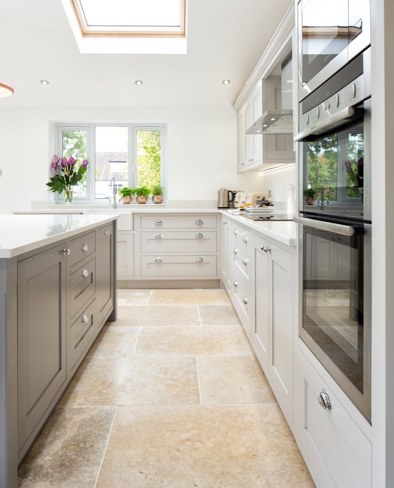
A lovely kitchen from Maple and Gray.
Another UK manufacturer of bespoke kitchens. And they also give out their paint colors.
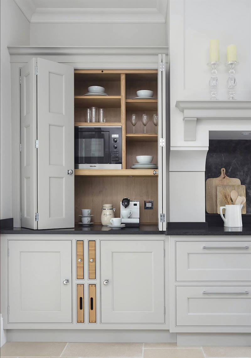
PAVILION GRAY
Farrow and Ball’s Pavilion Gray stays pretty true to gray and is absolutely gorgeous. Just like this exquisite English kitchen.
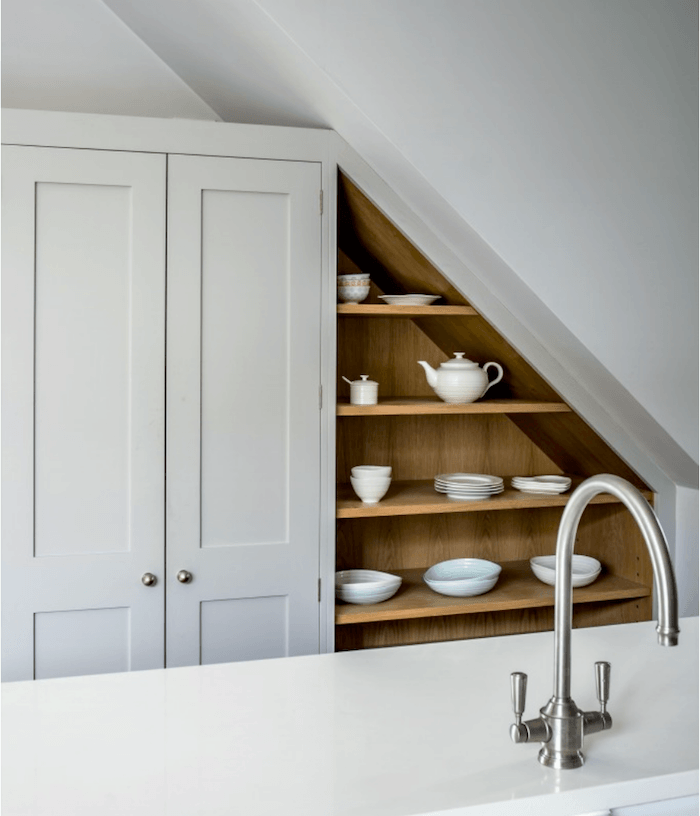
This is a really nice website and they DO give a lot of the Farrow and Ball cabinet colors that they’re using for their kitchens.
Well, I don’t see the big deal. If folks want to work with the company, they’ll still work with the company and if they ne,ver were and are only repainting or something, it’ll make them think fondly of the vendor and perhaps recommend them to someone. Just my thoughts.
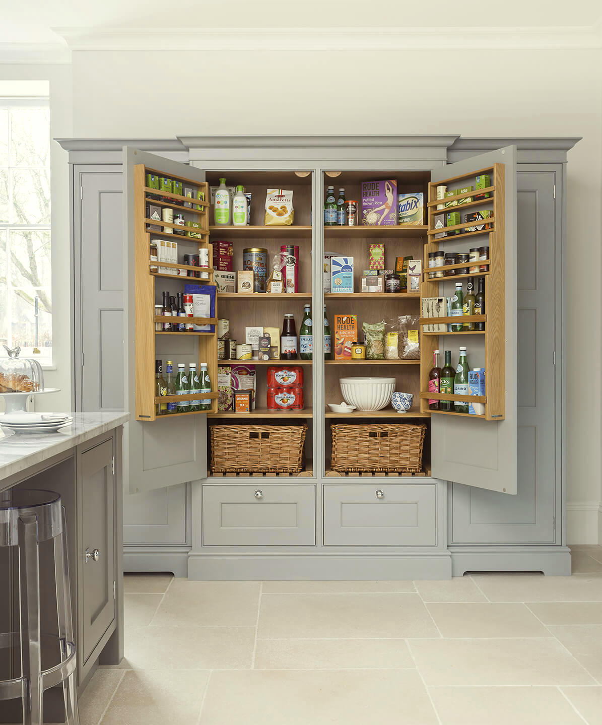
Lewis Alderson is another beautiful English cabinet company. Someone said again that they are worried that in a kitchen with no uppers, there won’t be enough storage. No, there is usually MORE storage. Or, perhaps I should say, more efficient storage. This unfitted pantry is a wonderful example of that.
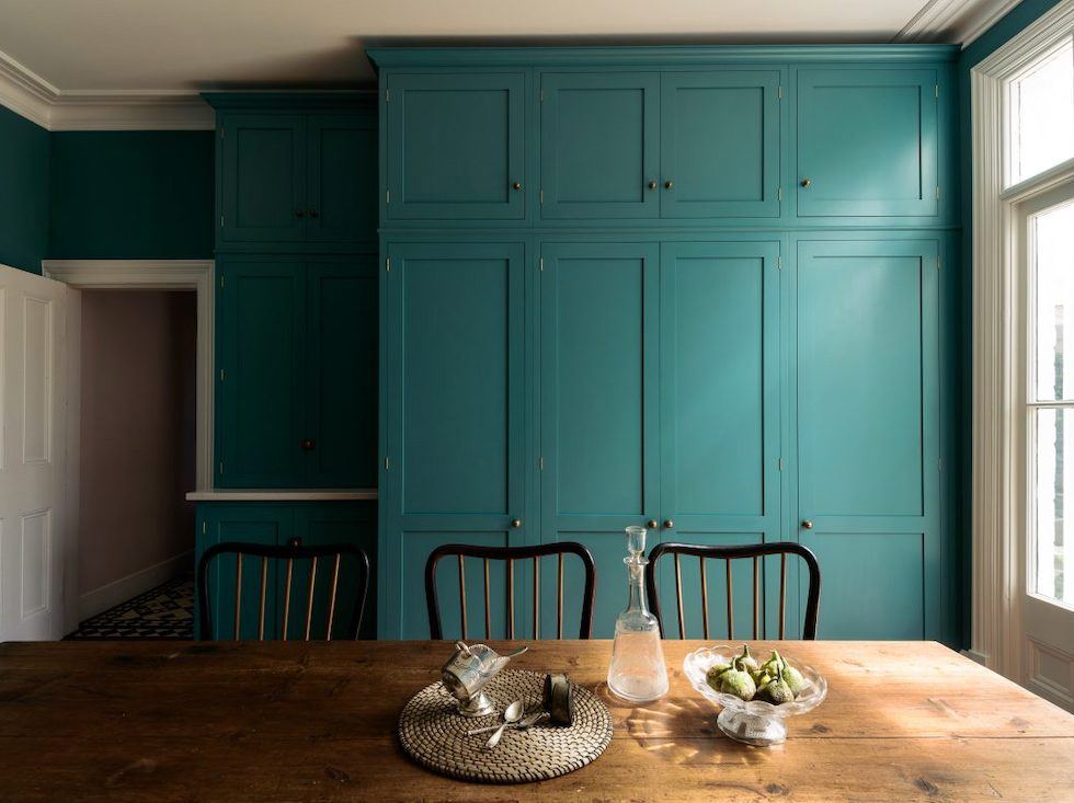
Essex Shaker kitchen from DeVOL
VARDO

This is one of Farrow & Ball’s colors that came out a few years ago.
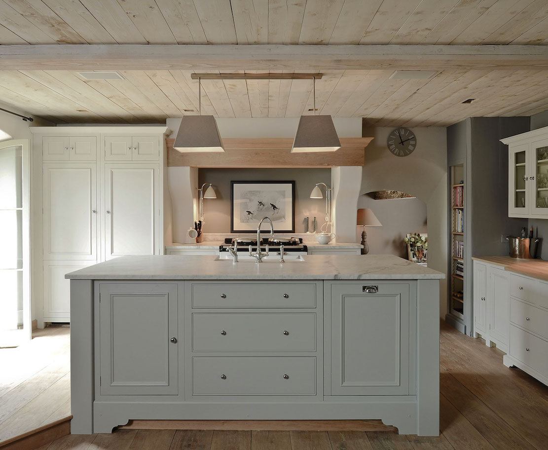
FRENCH GRAY
French Gray is similar to Pavilion but with a soupcon of blue-green which is also very, very pretty and classic; just a little more color. And please check out Neptune Kitchens. Really pretty!
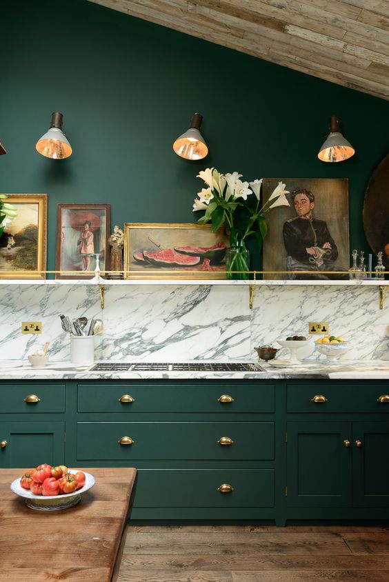
STUDIO GREEN
In any case, Everyone loves this De VOL kitchen even if they don’t like dark green. There’s just something inviting about this English kitchen.
By the way, did you know that De VOL spelled backwards is LOVED? It’s not intentional, I don’t think.
I looked at all of the greens. Hmmm… I even looked at the archived greens. Hmmm… again.
The one I kept going back to was Studio Green, but it is VERY dark on the chip and quite dark in most images. But the one below, came from the Farrow and Ball Website and looks like an exact match. So, let’s just go with that one.
For reference, please also check out Melissa Tardiff’s gorgeous green kitchen.
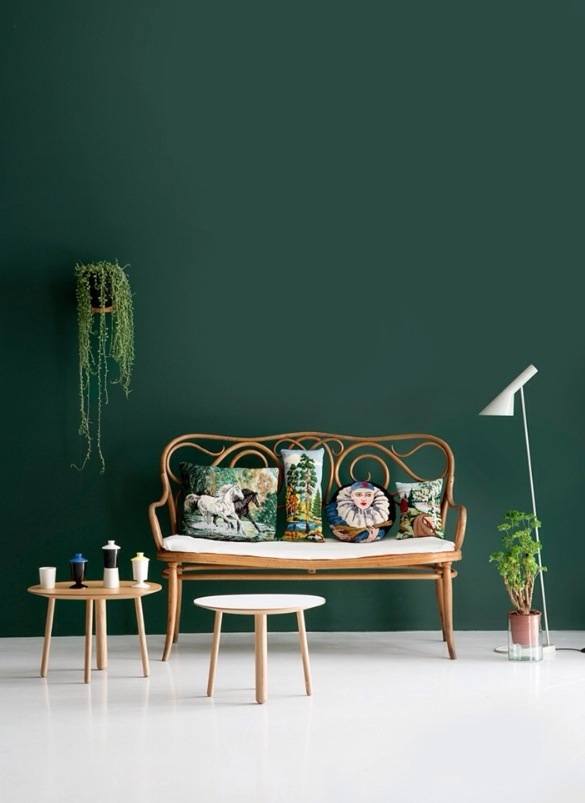
I’m not saying that it is… Please test. For Studio Green to lighten up this much, it would need to be in a very bright room!
However, tonight, I found another color by accident.

It’s from a company by the name of Motor City Paint called Delray Moss. I think it’s a pretty close match.
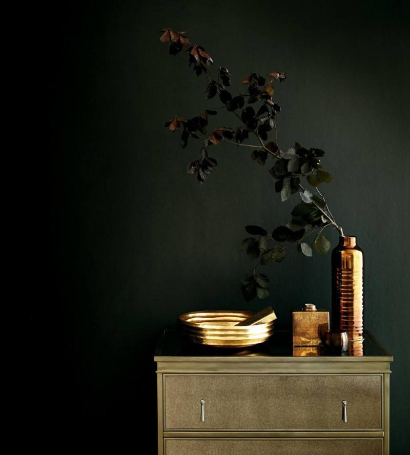 Sometimes Studio Green looks like this. Sorry, not sure of the original source of this image.
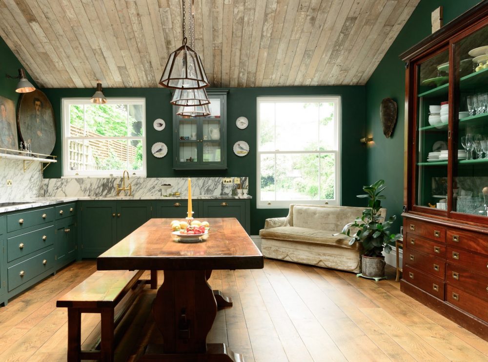
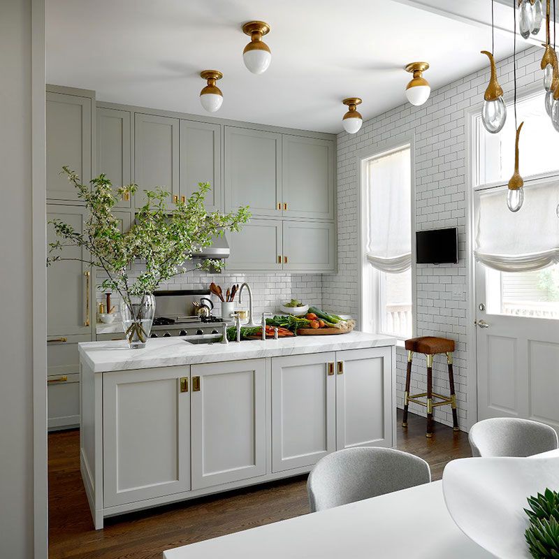
CROMARTY
Cromarty is a pale watery, gray-green which was introduced to the line about a year ago.
If you want to see the other eight new colors, please click here.
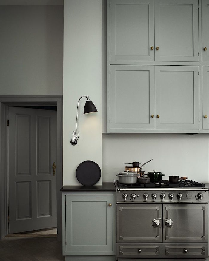
original source unknown.
LAMP ROOM GRAY
Oh my, how handsome is this English kitchen with Lamp Room Gray Cabinets!
Lamp Room Gray is another classic– a rich sophisticated gray with just the right amount of blue and green.
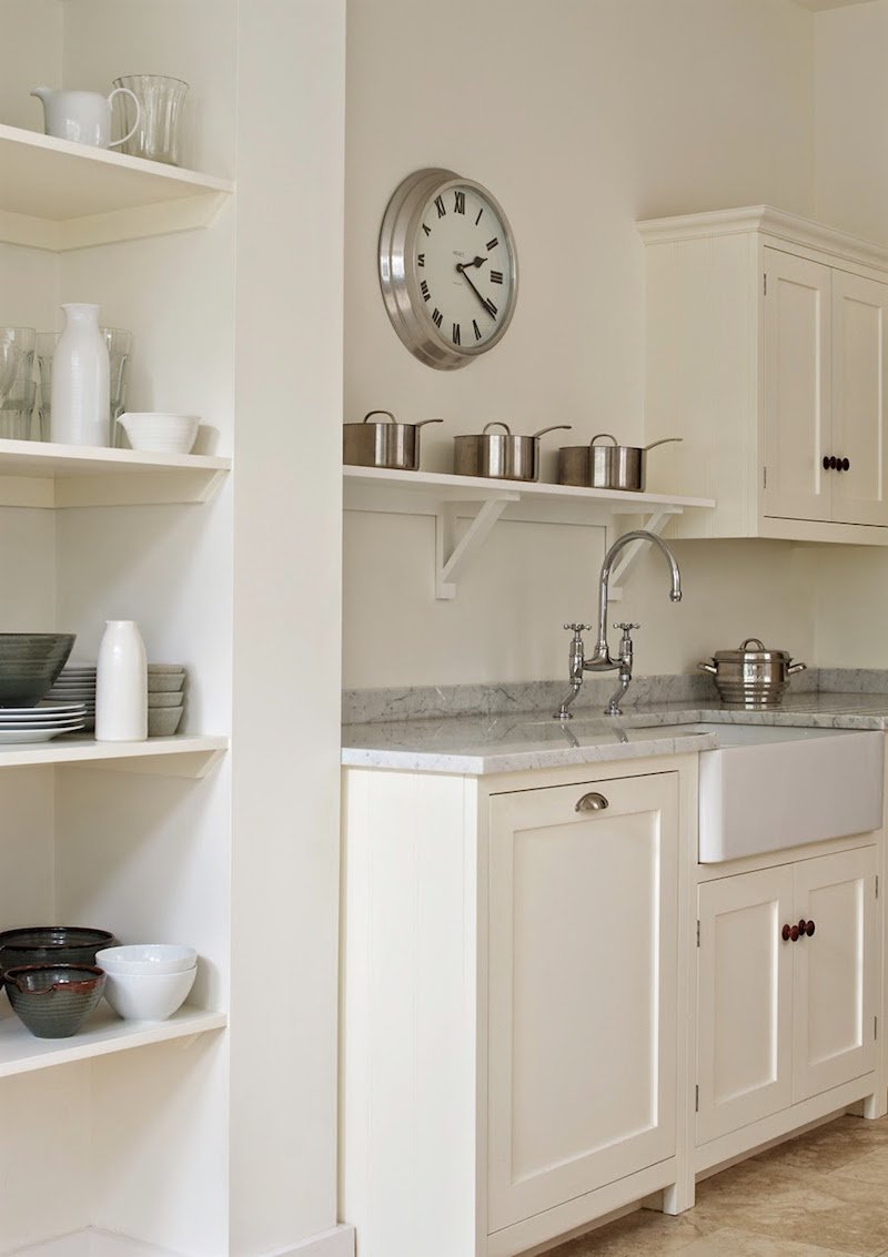
WIMBORNE WHITE
Wimborne White is my favorite F & B white. It’s just warm and lovely. A true white classic. It’s counterpart in Benjamin Moore is Simply White.
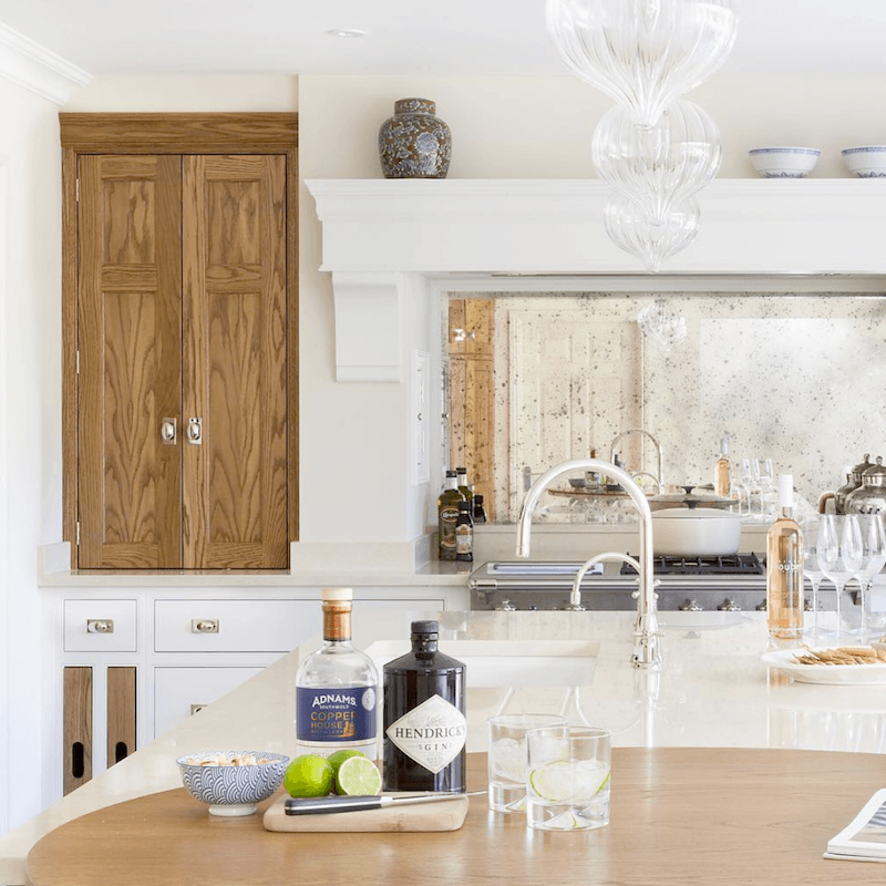
Another stunner from Humphrey Munson. Love the white on white. And the wood pantry is a stunning addition. I also love the antique mirror backsplash behind the range.
The cabinets are Linen by H|M and the accent wood Westminster Oak (a custom smoked oak finish)
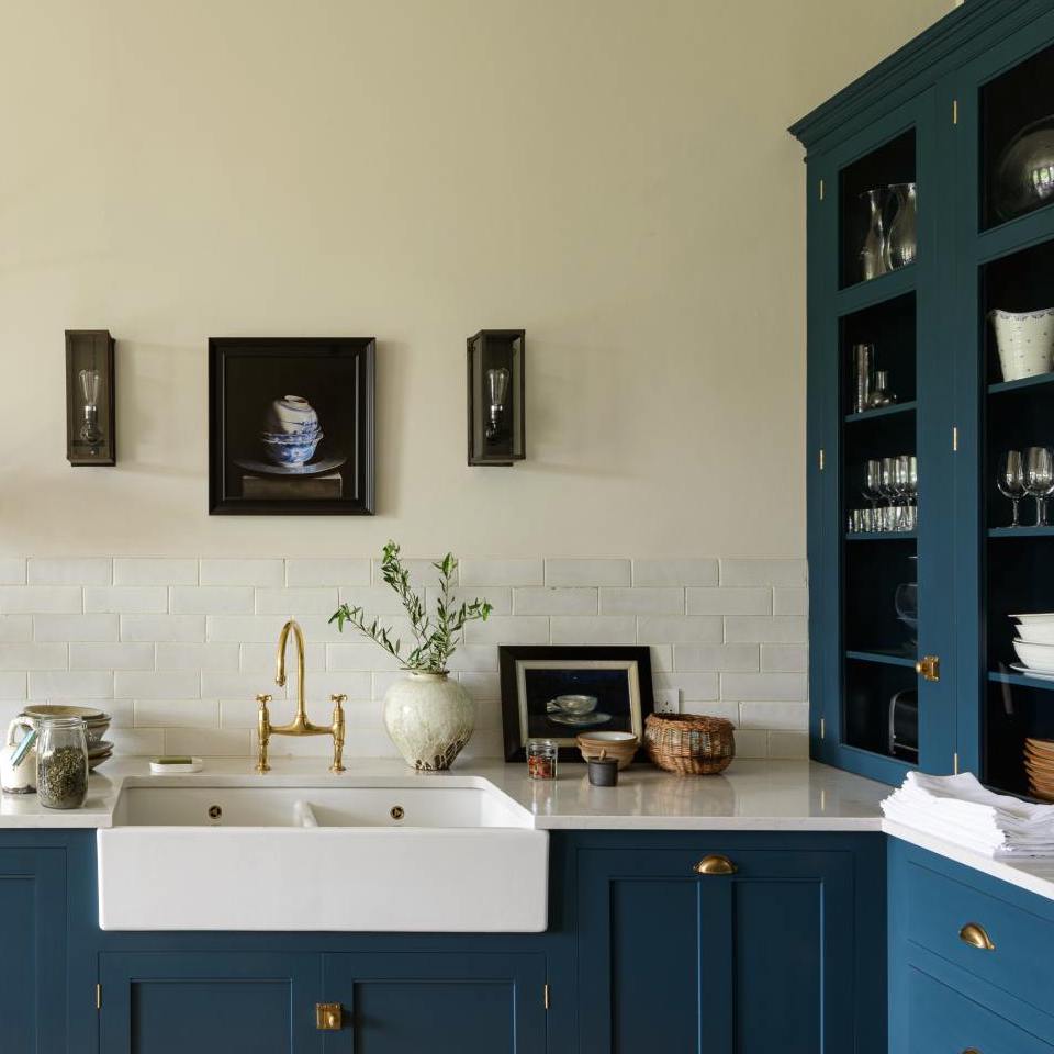 Another beauty from DeVOL Kitchens
HAGUE BLUE
Farrow and Ball’s Hague Blue is my favorite navy, if I had to pick a favorite. There is no exact match in Benjamin Moore. It’s a rich, saturated navy with a welcome note of green, but stays just shy from being teal.
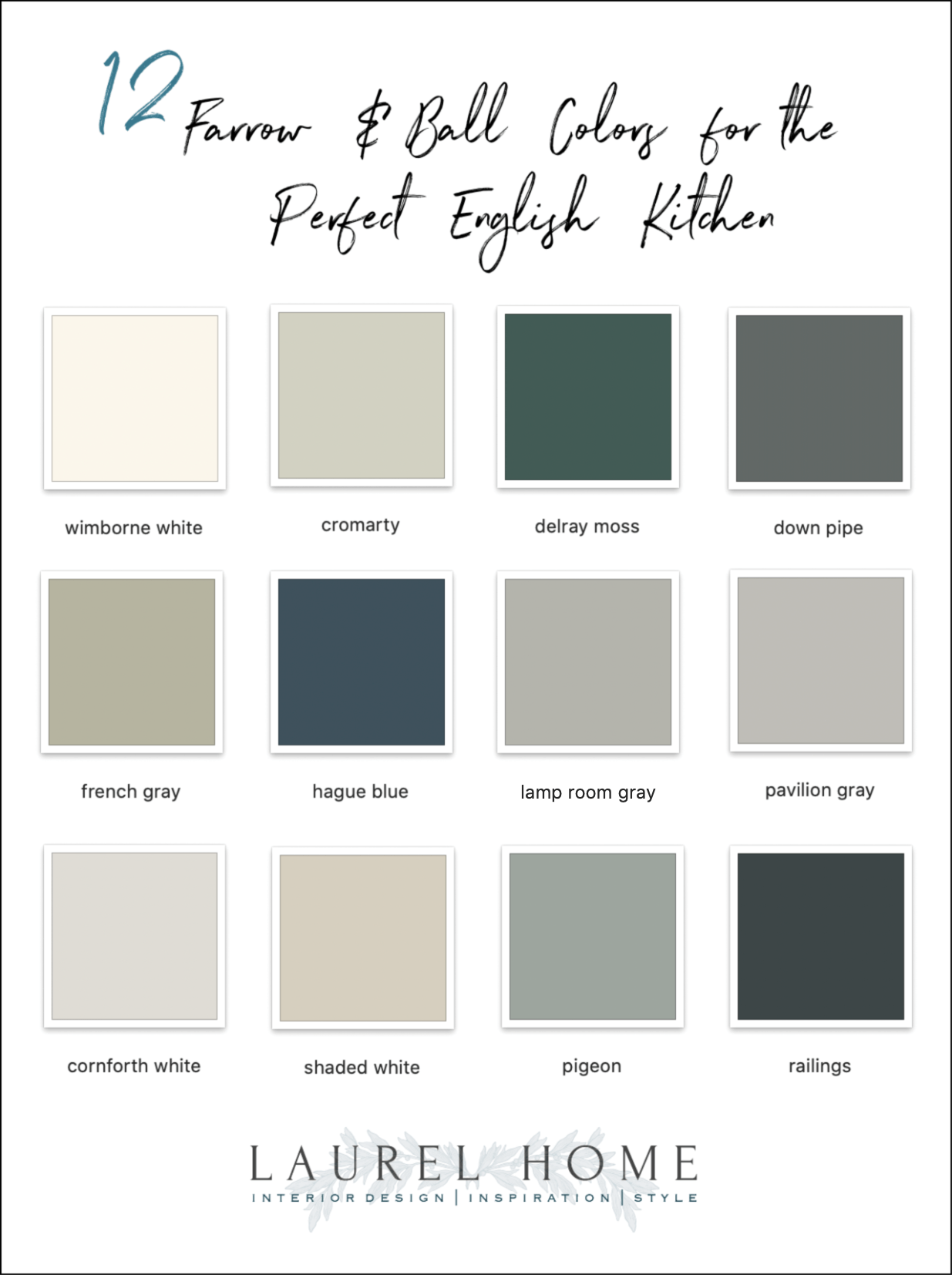
Is this similar to the graphic I made a few days ago? Yes, it is. But, those were for the perfect American kitchens and these are for the perfect English Kitchen. Of course, there isn’t a whole lot of difference in my world.
***Oh, an update in March 2021. Did you know that you can now purchase Farrow and Ball paints, samples too, and wallpaper ONLINE? Yes, you can, so if you go to their website, you can have access to this wonderful line.***
xo,

PS: If you are looking for the Benjamin Moore Equivalents to these Farrow and Ball Colors,
Please Click Here for the 2018 updates.
PPS: Please check out the newly updated HOT SALES. Lots of great early Memorial Day sales going on.
Related Posts
 Subway Tile Alternative Everyone Knows About But Me
 Ultimate Window Treatment Guide + Interior Window Shutters
 21 Common and Hideous Interior Design Mistakes
 40 Outdated Home Trends. But, Are They All Passé?
 Best Proportions For Interior Trim – Why You’re Confused
 The Granny Decor Mistakes You Might Be Making
 How To Hang Art – Little Known Ways + Mistakes to Avoid


