Hey Everyone,
I’m back to give you another updated post for the best bedroom paint colors you’re probably not using. OR, maybe you are using some of them, because some of this post came out four and a half years ago like Sunday’s post which addressed nine no-fail paint colors.
I’m saying “some of this” because the post is actually quite different than the original.
It’s quite interesting, to go back and see what I wrote when I was a relatively innocent, naive 58-year-old interior design blogger. ;]
And, by today’s standards, I think the old post is not-so-great. (and no, you won’t be able to see it because I’ve done a 301 redirect, which upon deletion of an old post directs it to a new post.) In this case, this one!
Let’s begin with our upstairs floor plan before we get into the best bedroom paint colors for each room.
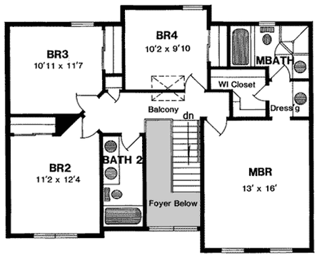
Here we have a fairly typical configuration of four smallish bedrooms.
So, the first question I want to answer when coming up with a great palette of colors for the upstairs is this:
Do we need to use the same colors upstairs as downstairs?
You don’t have to but, you can.
Do the best bedroom paint colors need to totally coordinate with the downstairs paint colors? Like, if you have earth tones downstairs, can you do a pink, orange or a violet bedroom upstairs?
YES! I think so. However, what I would recommend if the colors are earthy neutrals downstairs, to stick to the less chromatic versions of the colors, for the most part. Chroma, if you don’t know refers to the brightness of a color. The less chroma, the grayer the color is. Great Scrabble word. haha.
This is one thing I love about the Laurel Home curated paint/palette collection. Most of the colors go with all of the other colors. Even in the case of the brighter colors and there are several, there are shades which look great with neutrals, as well.
What I’m going to do for today, is select five different color combinations for the four bedrooms to go with the no fail paint colors that are downstairs.
Naturally, one bedroom will be a master and then I will assume that there is a boy and a girl and a baby that you aren’t sure what it is. ;] OR, it could be guest bedroom.
One thing I hate more than I can possibly say are nurseries that are well– “babyish.” Ya know…Cute little ducks and boats and other stuff. Hey, put up some antlers and a photo of Katy Perry. Just kidding. Let’s face it. Nurseries are for the adults, not the babies. Babies couldn’t care less what the wall color is or if their linen is from Pratesi or Target. One of my favorite nurseries is here.
We all know that their raison d’etre is to sleep, eat and eliminate and if you’re lucky like I was, you’ll have a couple of adorable dumplings who will projectile vomit for 7 months straight. Good times. (I love you my darling young man if you are reading) Besides, they are only going to be babies for about 10 seconds. Really. Blink, and you’ll soon be humming Pomp and Circumstance!
I want your children to grow up happy and self-assured, as of course, I know that you do too, so let’s start by giving them sophisticated colors to help give them the best start in life and a taste for the finer things. Of course, all of that is only my opinion. You are free to raise your children however you like.
Before we jump in. Please note that the paint color that’s in the photo is often NOT what I say it is.
In the interest of sanity, the idea is that it looks close to the color I’m talking about. In fact, at least half of the time, I find that photos of the real colors in rooms are a distant relative of what they actually are. So, please don’t freak out if you recognize a room and know what its real color is that is not what I’m saying it is.
So, here’s what I’ve done. I’ve created five sets of bedroom possibilities. Please know that I could sit here and make thousands of combinations. But, each one will have something a little unexpected, or maybe not.
Below is a graphic of an overview of today’s no-fail bedroom paint colors
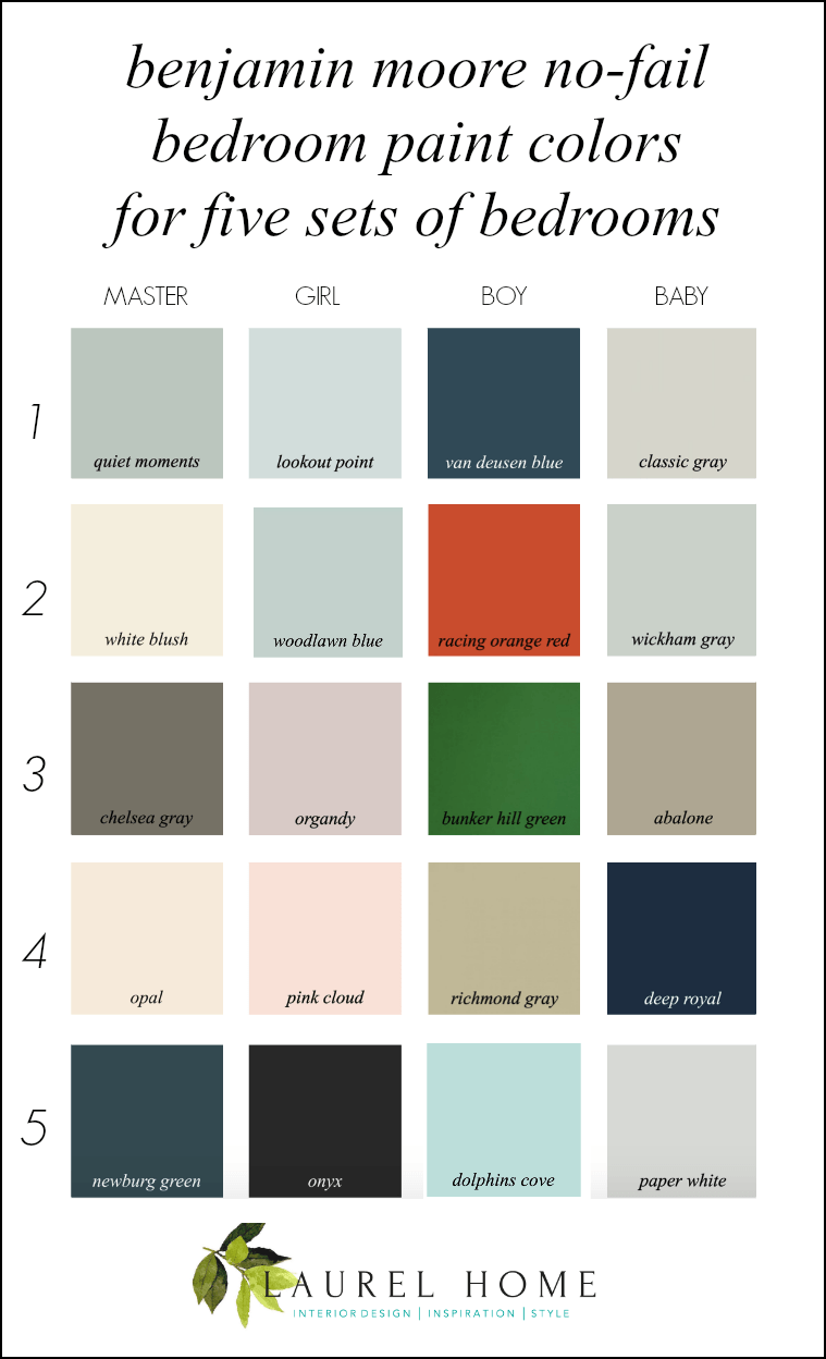
please pin to pinterest
Best Bedroom Paint Colors Number One

Master – QUIET MOMENTS 1563 – My never-fail go-to bedroom paint color
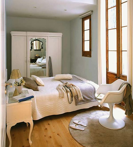
Daughter – LOOKOUT POINT 1646 – a really beautiful, soft pale gray-blue.
Son – VAN DEUSEN BLUE hc-156
Baby – CLASSIC GRAY 1548

Best Bedroom Paint Colors Number Two
Master – WHITE BLUSH – 904
Daughter – WOODLAWN BLUE hc-147
Son – RACING ORANGE RED 2169-10 – Son must have a red-orange bedroom. That’s fine. Keep everything else quiet. Oh, and just so you know, this color will NOT make him more hyper than he already is.
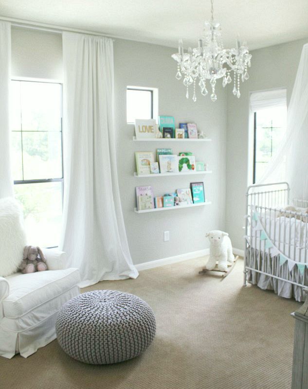
Baby – WICKHAM GRAY hc-171 – Please note, that this gray is supposed to be revere pewter. It doesn’t look it from the photo, but that’s why I try to put up photos that look more like what they are.

Best Bedroom Paint Colors Number Three
Master – CHELSEA GRAY hc-168
Daughter – ORGANDY 1248 – daughter has to have violet. Organdy is a violet that everyone will love, even if you can’t stand purple.
Son – BUNKER HILL GREEN 566 — ahhh… remember the son who wanted the acid green bedroom? You get brownie points if you do, because nobody read that post. lol
Baby – ABALONE – 2108-60 – This is a very beautiful warm greige color with a slight lavender undertone that looks great in a wide variety of settings
Best Bedroom Paint Colors Number Four
Master – OPAL -oc-73 – Actually this post has a lovely photo of this color
Daughter – PINK CLOUD 887 – This is a very non-gaggy shade of pink. There are nine shades of pink from pale, pale to a beautiful coral pink like in the coral bedroom in this post about the 20 best shades of orange paint.
If you love pink, please check out this post.
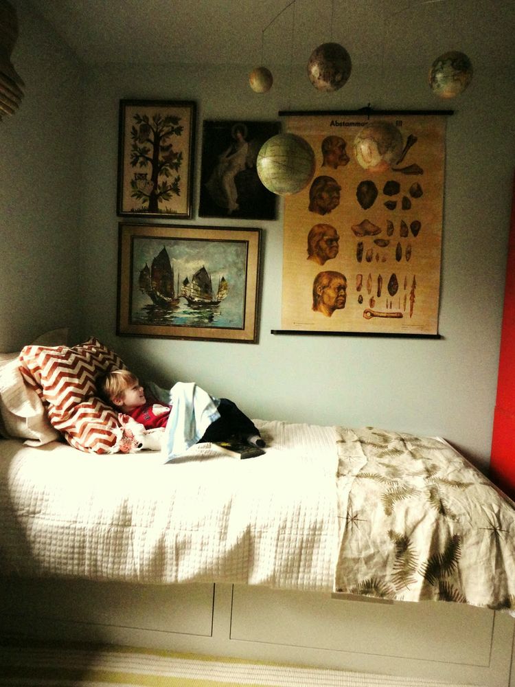
Son – RICHMOND GRAY – hc-96 – This is another go-to bedroom paint color. Great for a boy’s bedroom, but the first time I used it in a handsome master bedroom with this bed (the one with the cool navy and white duvet)
Baby – DEEP ROYAL, yes a navy nursery. You can see that in the link above, as well.

Best Bedroom Paint Colors Number Five
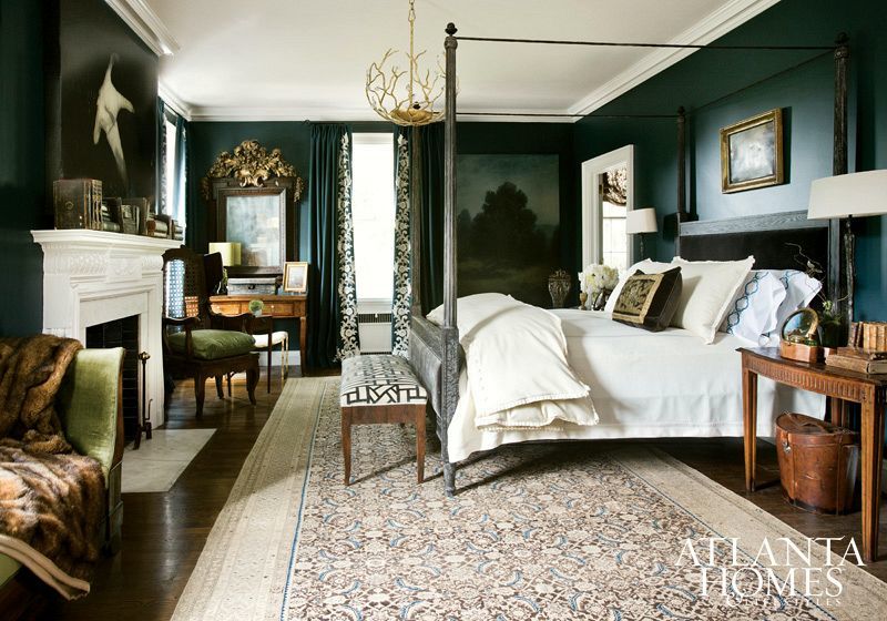
One of my favorite bedrooms every by Barbara Westbrook
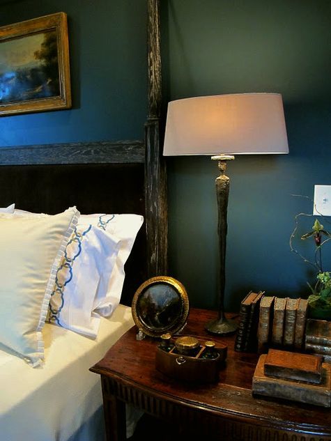
A detail via Design Indulgence
It’s actually Narragansett Green. But when it came time to create the Laurel Home Paint Collection, I switched it to Newburg because it’s easier to spell. haha
Master – NARRAGANSETT GREEN hc-157 or NEWBURG GREEN hc-158
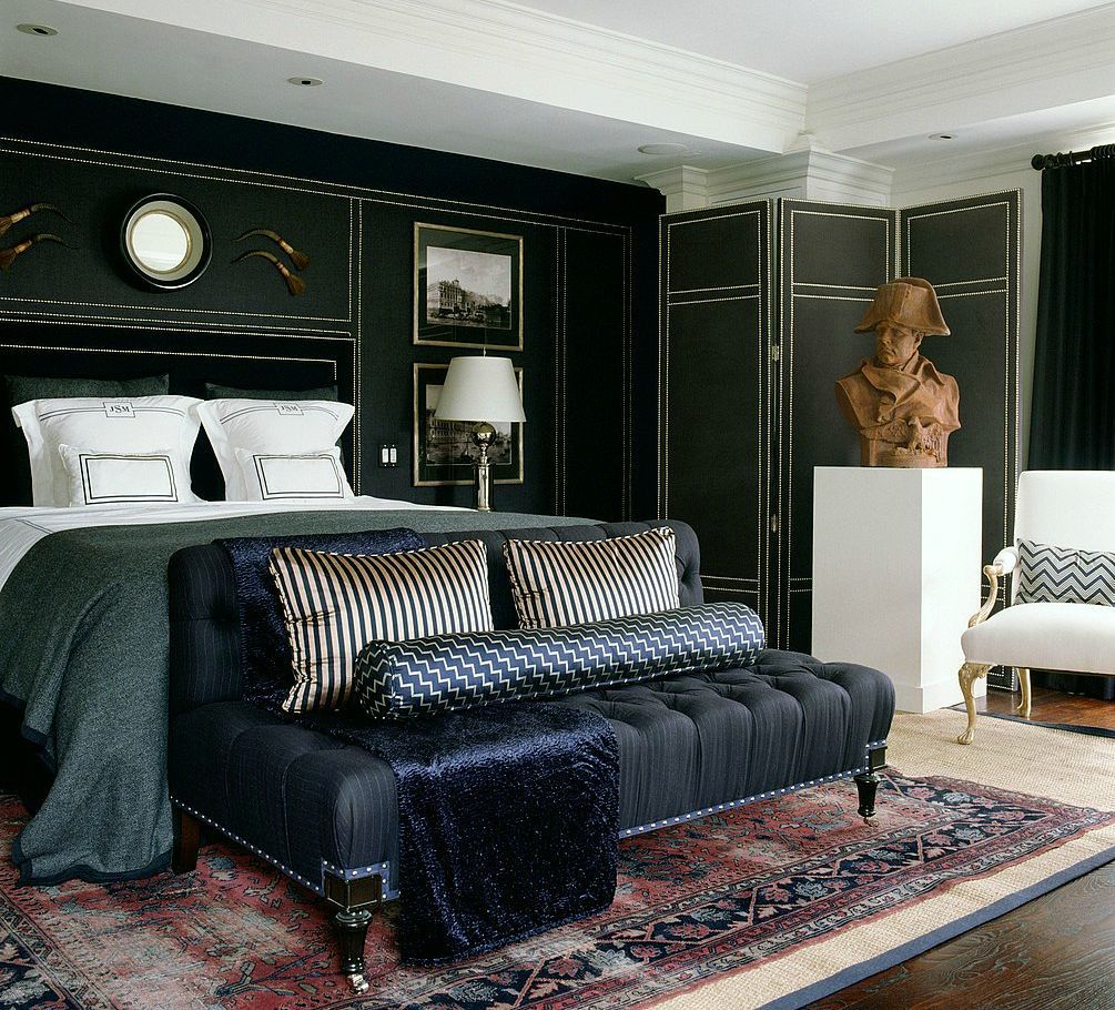
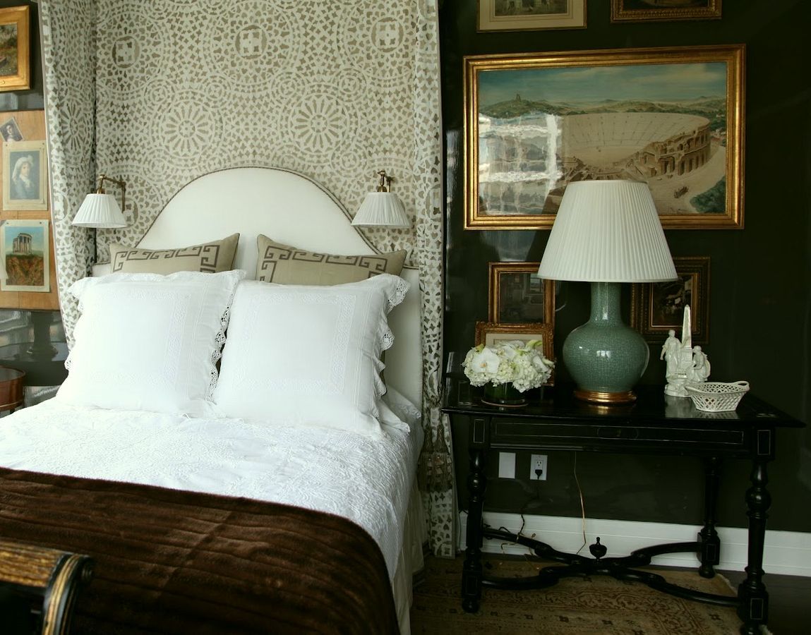
Daughter – ONYX – Your teen-age daughter must have a black bedroom or else. Actually, black is a fine color for a bedroom. Please note the two bedrooms below. I don’t think this is what your teen-ager had in mind, but it’s something to consider.
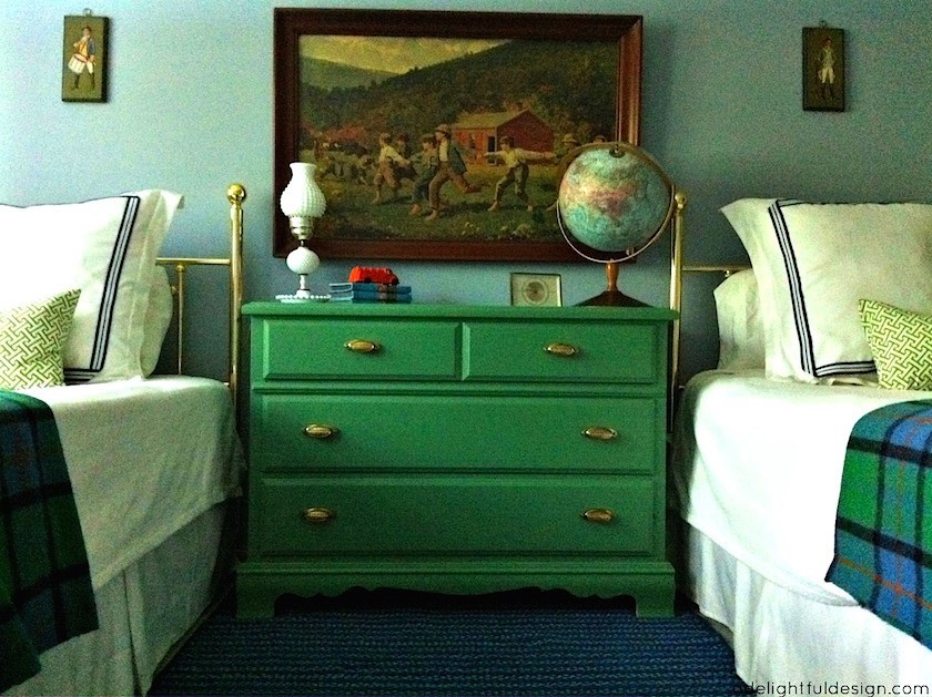
Son – DOLPHIN’S COVE 722 – Love the bedroom below!
Baby – DEEP ROYAL 2061-10 – Yes, a navy and white nursery. You can see one, plus the image above in this post. The website doesn’t seem to exist any longer.
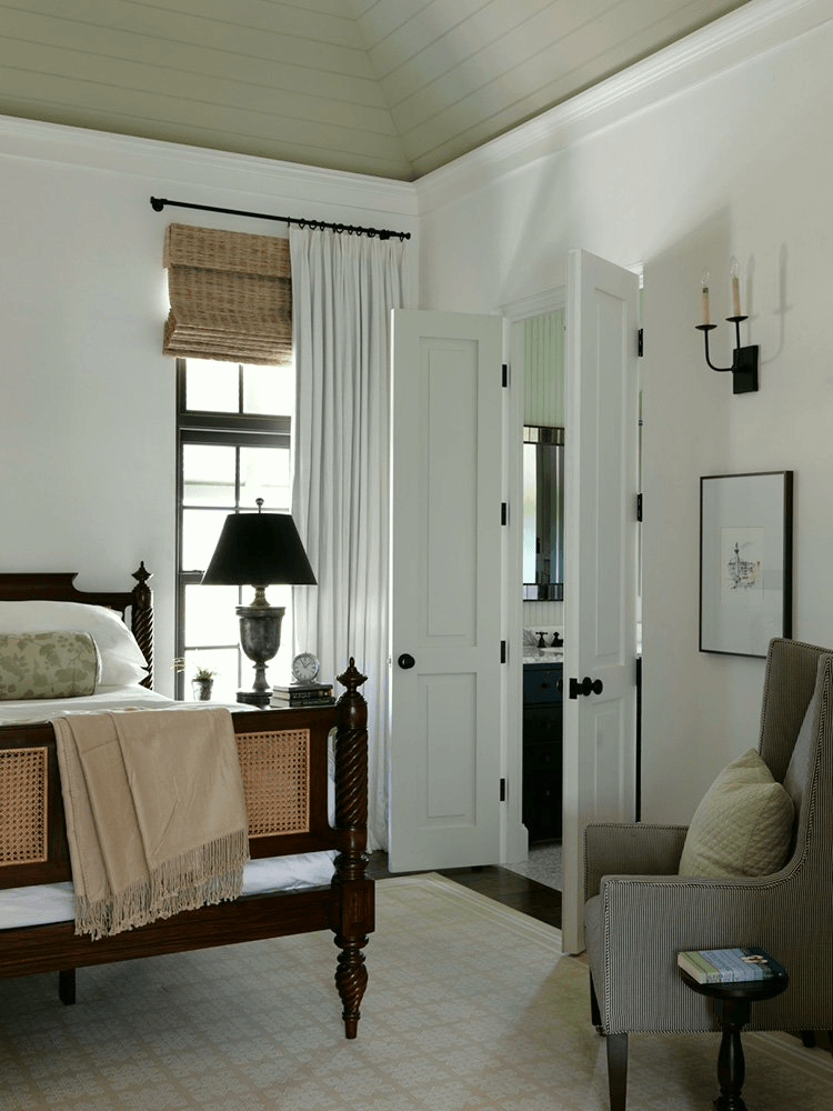
Or, You could paint any bedroom white. COTTON BALLS 2145-70 I’m totally fine with that.
Bathroom paint colors will be coming later on.
Below is a graphic that I made so that you can pin for reference.
You might also enjoy this post about my 16 favorite Benjamin Moore colors.

Oh, and there are a lot of new mid-week things to see on the hot sales page!
xo,

Related Posts
 My No-Fail Paint Color Failed – What Went Wrong?
 Roman Shades Weren’t Built In A Day – What Until You See!
 Help For a Small Family Room That’s Not Quite Coming Together
 Here’s Why Buying Furniture Online Is A Bad Idea
 Benjamin Moore Color of The Year 2016 – Anything But Simple
 Help! My S-I-L is Coming For The Christmas Holiday!
 The Ultimate Christmas Tree Decorating Guide











30 Responses
Fun post! I’m a little behind and catching up on your posts. This one is timely as I am having all of my bedrooms painted, well actually, most of the house is being painted, all at once. I’m living in such disarray. My mother is moving in and I have a deadline. I LOVE Woodlawn blue. I especially love it with Glass Slipper. How would I know to put those two gorgeous colors together? Hmmmm, because it is Palette #22 in the Laurel Home Ultimate Paint Palette & Home furnishings Guide! Haha! Seriously though, it is the most beautiful combo and it is my master bedroom. I get lots of light from a large bay window and it is just so dreamy. Unlike the palette, however, my trim is White Dove. The master bath is Woodlawn blue and I’m looking for a fabric as close to Woodlawn blue as possible for the curtains. I even bought the Melchior De Hondecoeter print to hang above my bed. That might be a little out there for a bedroom, but I don’t care; I love it! My furniture is dark cherry. It’s coming together beautifully. The rug is impossible to find, but I’ll find another like it. Thank you so much for providing the tools that help us make our homes so beautiful!
Oh, thank you for making my day Donna! Sounds gorgeous!
We need a day-after-Christmas hot sales post! Don’t wait until Friday! The best deals on holiday decorations will be gone. Even a general short email about who has the best percent off would be helpful.
Hi MH,
That’s a great idea! Actually, I will be sending out an email on Christmas Day in the evening, so that will be a good time to provide that info. xo
That’s great!!!
Hi Laurel,
A correction for you- Quiet Moments is 1563. You have it listed as 1653. Beautiful color with old oak floors that are a bit orangey.
oops! At least it’s not on the graphic this time. Thanks for letting me know.
I did the Narragansett/Newberg Green in my master bedroom and love it. It’s a very large room and I was looking for a way to cozy it up. I used mostly mahogany for the case goods and a camel sofa. Cozy achieved!
hooray!
It’s funny you posted the Alexa Hampton bedroom photo. It”s my master bedroom inspiration. I’ve been searching the internet trying to figure out how to put up a canopy (is that what its called?) in a similar fashion. The only links I come across are childish princess bedroom canopies. I suppose I could just get a canopy bed but I really like the height the canopy gives in that pic. It’s like faking architectural interest. Anyways, do you have any idea how it was put up? None of the hardware is showing.
I’m sorry. I have no idea how they did the canopy.
Laurel, I’m very happy you’d use Richmond Gray in a master bedroom. I had Richmond Gray in the hallway and son’s room, and was going to switch to Opal for the master but there’s a lot going on in that suite in terms of design elements being slightly different from the rest of the wing. I thought I might continue Richmond Gray into the bedroom to lend an air of consistency & leave Opal for the master bath, but wasn’t sure if it would be a good choice.
Now I’m sure it’ll be fine, I have Schumacher Quail Meadow Winter for the draperies and that will keep it from being too masculine, I think. Thank you!
Hi Danielle,
With the dark floors and Mahogany bed the color looked lovely, but I wouldn’t call it necessarily masculine. The room was fairly low light as well in an old home.
I love Dolphin’s Cove. Do you think Sherwin Williams Tame Teal is close to Dolphin’s Cove?
Hi Lorri,
That would require me to get off my tired ass and go look at the two in very dim light as the sun has already set and it’s quite over-cast. However, I quickly looked at each on my computer and they are close but SW looks a bit greener and brighter. I prefer Dolphin Cove, but this just based on what I just saw here.
I have to cast my vote for white or pastels in a bedroom.
Hello Laurel! Beautifull paint collections and very difficult to choose only one! Love those dark bedrooms, I also read the post on green and search through the tool for every post having green! Love them all!
Thank you!
Hi Carolina,
Thank you and also for mentioning the search box. That is a very handy tool if one is trying to find something on the blog. I use mine all the time!
Laurel,
My husband recently asked what I wanted for Christmas. My response???????? So this morning, amid the ever increasing gray days, the light bulb went on. I could have him purchase your Rolodex. Yes, indeed and I think he might even say YES!!!!!!! This would give me something to ponder through the gray days of winter and my part-time work during tax season. Cross your fingers!
Hi Barbara,
Well, I’m phenomenally honored and yes, crossing fingers for you!
Had to laugh at the teenager daughter with black bedroom. My 15 year old HAD TO HAVE a black bedroom. I figured what the heck, it’s just paint, let her express herself. We went with BM Wrought Iron. Can’t admit it to her, but I do like how it turned out.
Thank you for all of the great advice and inspiration!
Hi Kari,
So cliche, but this definitely goes under “you have to pick your battles.” So glad that you like it too! When she’s older, you’ll be able to admit it and have a good laugh together. I promise.
Loved reading about the bedroom colors and recognize many of the rooms from previous posts and refer back to them often. My then teenage son wanted a black bedroom and we settled on Chelsea Gray which was one of the few rooms we needed to paint when we put the house on the market. In our “new” house we painted one bedroom Copley Gray from one of your posts. What really makes the bedrooms are your styling touches that are always so perfect! A real talent.
Hi Cynthia,
Thank you so much! Chelsea Gray is a wonderful color which is readily noticeable on the chip.
I DID READ THAT POST!!! The one about the green bedroom!!! In fact, I pinned it, and I used the photo of the Bunker Hill Green bedroom as my inspiration photo for my kids’ room (one of them, that is). We have the green room, and the other kids’ room is Champion Cobalt. I’m still using that post as a guide on furnishings and bedding and decor. That is the perfect bedroom that transitions well from young child to older child. I could see my five-year-old in that room as well as my ten-year-old (and then I can picture teenagers in it someday).
I am loving the colors you picked out for this post. They are lovely!
haha! I like that post too. It came out in June 2015 so 3.5 years old. But I recall that it wasn’t as widely received as other posts at that time. Maybe this post will help boost it up in standings, some.
I’d love to see this as an addendum page to the paint palette collection – it’s that good of a post. These are such fresh ideas for coordinating multiple rooms harmoniously. I’ve painted bedrooms in my home Crystal Blue, Vandeusen Blue, Bunker Hill Green, and the main spaces have Sea Froth and Sunlit Coral, with the bedroom colors and some Racing Orange interspersed as accents.
I get so many compliments on these colors now, and it’s all directly from your paint collection and palettes. These particular room combos just take so much guesswork out and I’d agree with you that each combo in your post today really does look ‘no fail’. Bravo, lady!
Thanks so much Taryl. Your palettes sound gorgeous!
Laurel, your original posts about this fictional house were some of my favorites ever so these revisions are icing on the cake! I own your paint palette which is worth every penny and more and I have been wanting to paint my master bedroom something new. This gives me some ideas:) Sleepy Hollow is my little girls’ room and I used Desert Twilight in my boy’s nursery and they are gorgeous but I really struggle with the master. It’s Ivory White right now because I didn’t know what else to paint it but those dark, deep bedrooms really appeal to me. Do you have any advice for those of us country folk who choose ivory bedding over white? Are there color schemes we should avoid or other considerations. White is not practical for a lot of people I know in my rural area. Even with a state-of-the-art water softener and Oxyclean it is very hard to keep whites white. I have read some designers think all-ivory beds look dirty but I think it is elegant. You just don’t see a lot of it in magazines. It’s all about the all-white beds
Hi Eleanor,
Thank you for your kind words! I love white on white and feel that it’s fine to mix shades of white. Of course, you don’t want anything too stark. And I think, if your walls are dark, your bedding will appear brighter, I think if that’s what you’re wishing for. But, I don’t know the lighting in your room. I do love mirrors in dark bedrooms, however.