Before I begin today’s post. I do recommend that you not eat or drink anything while reading. (a few sips of plain water is okay) In addition, please note that I cannot be held responsible for cases of vertigo or any other deleterious effects that may come from your visit here. Thank you ~ Laurel
As an interior designer, this blog is a great outlet to release frustration about some of the decorating trends that are foist upon us. We see them in magazines, on pinterest boards, etc.
They are new, seductive and surely are immensely cool?
Right? In some cases, YES! This new trend might not even be new. But sometimes it’s either in the wrong place, grotesquely overdone or just plain weird.
Sometimes, it’s not a big deal, meaning not a costly thing. Like these poofs, for instance.
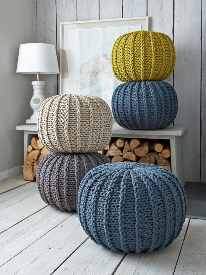
Someone apparently goofed while knitting a cable-knit sweater for their pet elephant and decided to wrap it on the outside of a big ball. And voila. A giant pin cushion. All I can see is digging out peanut butter or cat puke from those little crevasses. No biggie. Into the dumpster it goes.
But Some of Today’s Hottest Decorating Trends are going to cost more than 59.95 at Target.
I’ll start you in gently. This first one is a bit subtle but I find it irritating.
Hospital Track Drapes
One of the newest and increasingly common decorating trends is drapes hung right from the ceiling, or else right at the juncture of the wall and the ceiling. Yes, on a “hospital track.” Something like this.
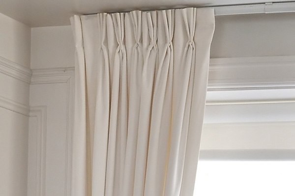
The idea being that the drapes are hung as high as possible to create as much ceiling height as possible.
- First of all, unless the drape is meant to be a room divider and the track is in the middle of the room, it looks dumb, IMO. The drapes look like they’re just stuck up there and usually look sloppy and weird. With a rod, the return is usually about 3.5″ (where the drape is turned back to touch the wall) and We can’t do this with a hospital track. Therefore, the look is cheap and unfinished and we can’t have that!
- If the ceiling is already quite high, then what is the point?

The example above isn’t so bad, but another issue is that sometimes the difference between the top of the window and the ceiling is so great that it looks REALLY weird.
More about that, in a sec.
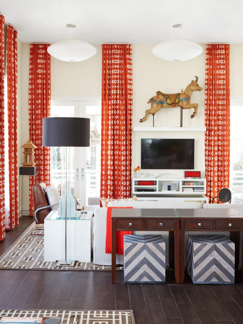
This is a very cool room done by the darling Vern Yip. Sorry Vern. However, while I LOVE the drapes, that cavernous space between the top of the window and ceiling is really bugging me. What do you guys think? I wish he would’ve dealt with it differently.
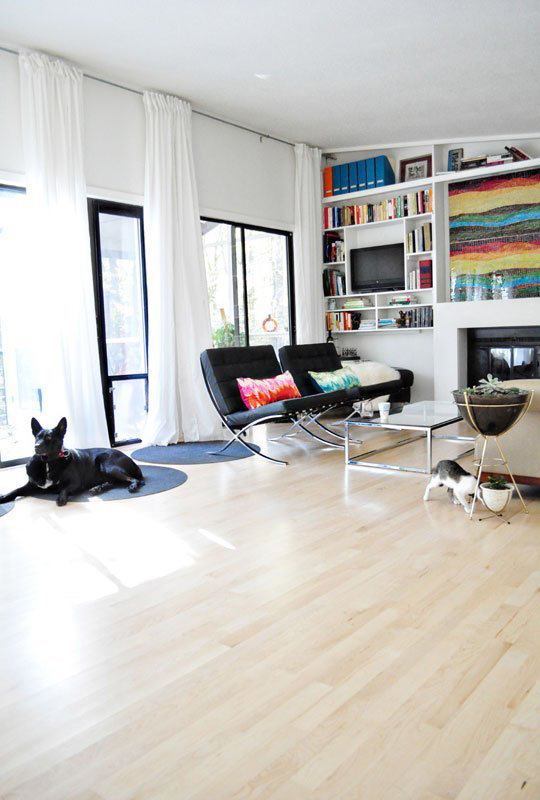
More of the same.
So, what should it be? There is a lot of logic in this business. I agree that hanging drapes very high up is a good thing, but first, let’s use a rod, okay?
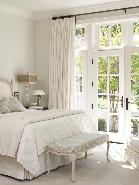
Carolyn Caroll
That’s better!

Victoria Hagan did it right by splitting the difference. The drapes are still plenty high.
If one wants to hang their drapes up very high and the architecture/windows aren’t cooperating, is there a solution?
Yes! There are a few things you can do.

This requires a highly skilled installer and a good discussion regarding brackets. However, the idea is to hang an outside mount Roman Shade to fill in the space above the window and then hang the rod over that. Here, Phoebe Howard used a matchstick shade, but it could also be a fabric Roman Shade.
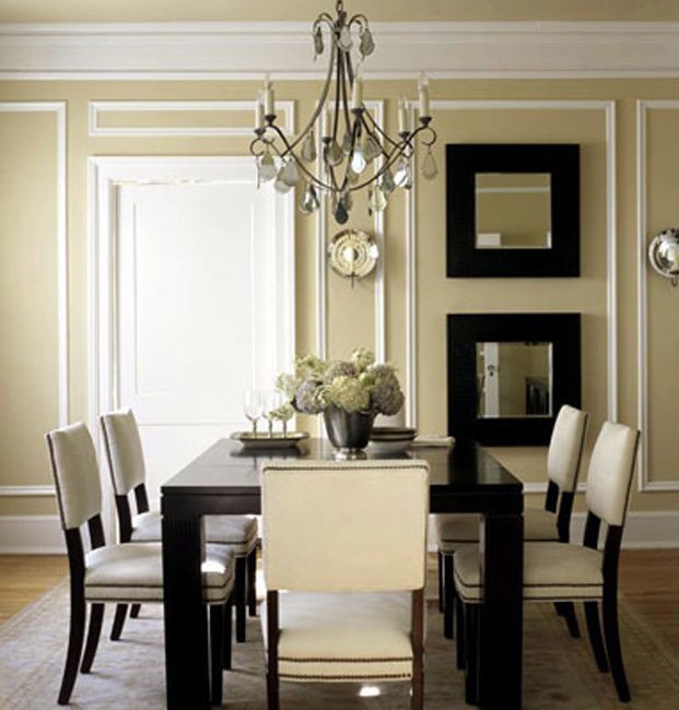
Another idea and it was very difficult to find an image to show you what I mean, but the idea is to create a transom above the window– a faux transom. This can be done simply with picture frame moulding as you see above the door.
This is a similar idea, with the moulding above the window built up to be a panel. In this case, there’s a decorative crown, but if planning on using drapes, I would leave that off since it won’t be seen, anyway. It can also be nice to paint the panel a slightly deeper color to give it some additional visual interest. It all depends on the style of the room, the fabrics, etc.
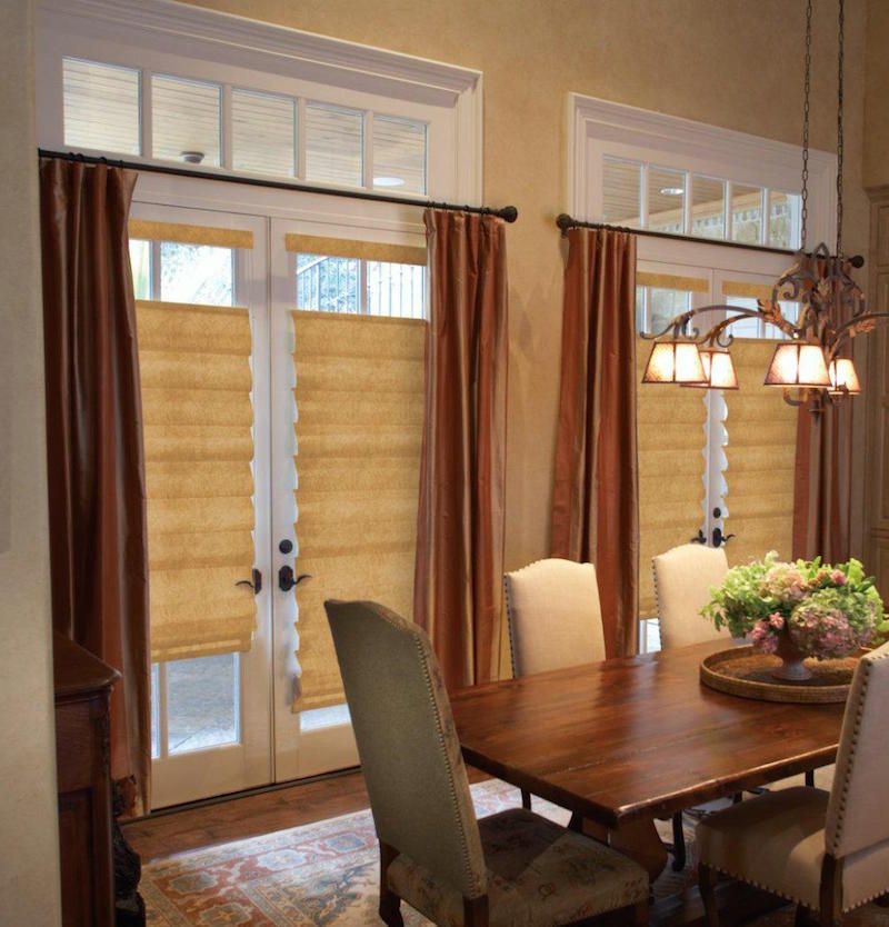
Here is what you never should do. The drapes always go above the transom!
And while I have you here…

Please, for the love of God, these truncated drapery rods are NOT drapery rods!
It looks like you got the wrong size and now you can’t close the drapes! Even if the drapes are stationary, they should not look stationary. Really a shame too, this is a very lovely living room, but they also goofed in that there should be a third panel on the left and the middle panel should be fudged over to the right a bit to give the entire window/door area balance. Oh and no flood length, drapery please! Drapes should either touch the floor or be a hair’s breath above the floor.
Psycho Geometric Patterns
A parent actually did this to their child.
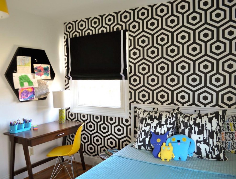
Someone needs to call Child Protective Services!
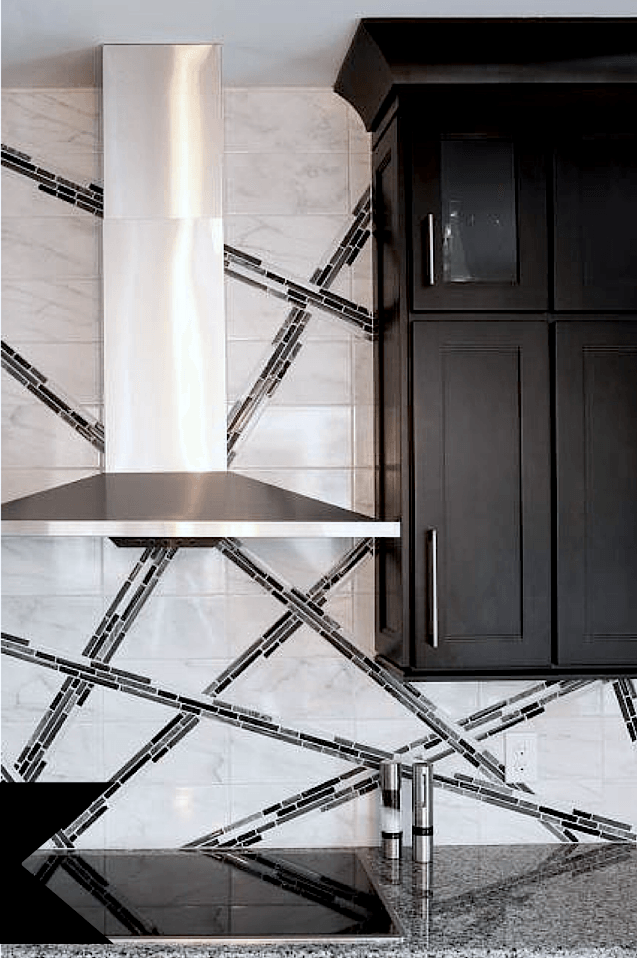
Oh dear. Norman Bates?
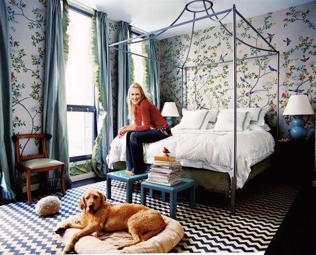
Remember about 10-15 years ago (it’s okay if you don’t) how charmed we were by Miles Redd’s fabulous eclectic bedroom in Domino Mag? I have to say that I wasn’t a big fan of the rug. I mean, I do get it. The graphic nature made a strong counterpoint to all of the delicate Chinoiserie wallpaper and ruffled silk drapery.
It was at that time, when I began seeing Chevron patterns—EVERYWHERE. And the bolder and more obnoxious, the better. Everyone was oohing and aahhing over how horrendous cool they are. The pity is, the Chevron pattern is very beautiful–when done right.
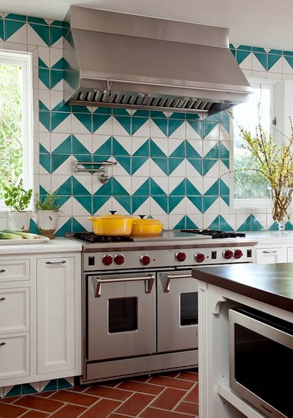 ouch
ouch
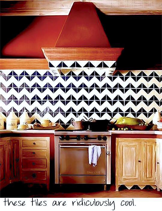 I did not write the caption. That came with the photo. Sure. They’re cool unless you have to live here. I don’t get it. It costs a LOT of money to do this. With all of the wonderful options, why this? I would be very happy if someone would explain this to me.
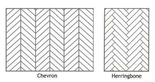
BTW, people sometimes confuse chevron with herringbone. Here’s the difference

Barnum and Bailey living room and what disturbs me the most is how horribly the wall clashes with the sofa.

One of Tory Burch’s 15 living rooms. My mom always called this look a “marshmallow in the snow.”
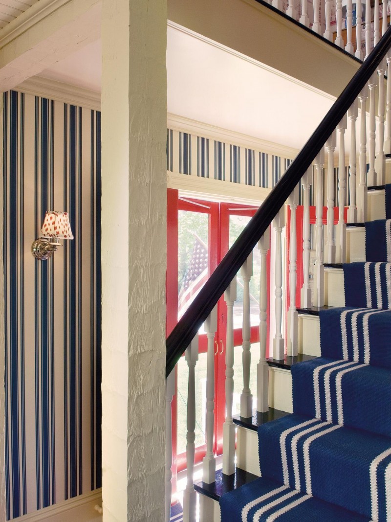
I totally get the expression, “A prisoner in his own home.”
Please be careful with your patterns.
Weird Bathtubs
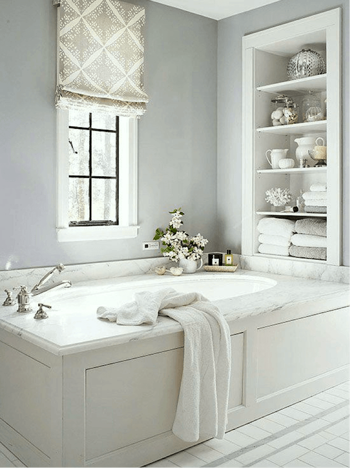
Remember when bathtubs looked like this? Beautifully built into the bathroom with an elegant marble surround? Classic. Right? (original source unknown)
Or this beauty.
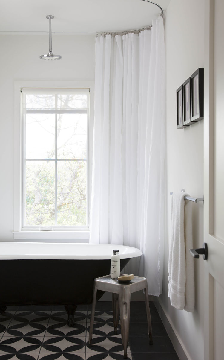
And, BTW, that is an excellent use of a hospital track for the shower curtain. Beautiful!
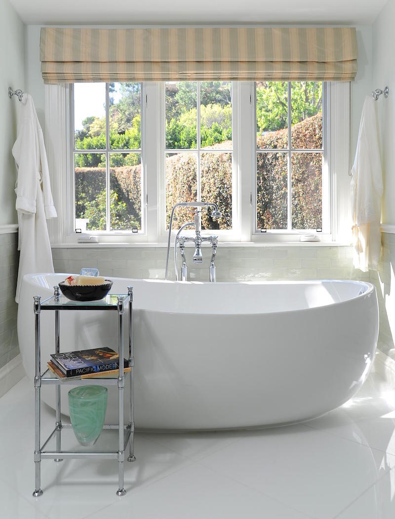
Then, one day, I noticed that people starting putting boats in their bathrooms. Ugly porcelain boats, with no place to even put a bar of soap. Seriously?

A smaller boat with a fire extinguisher. Sweet.
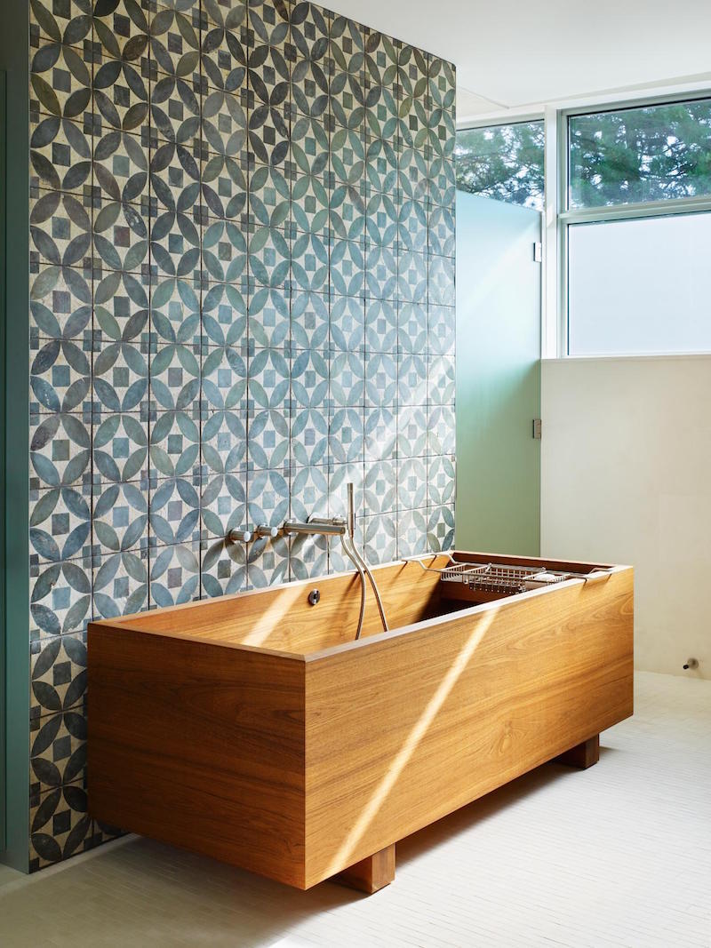
This one actually has some merit, I think. If the person dies while taking a bath, all they’ll have to do is drain the water, dig a hole and they’ll be good to go.
yes, sick. :]
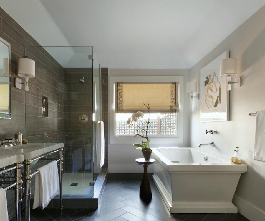
This one is a fancier porcelain tub modeled on the coffin below.

Hey, I’m just reporting what I see!
Three Decorating Trends You Need To Be Warned About
the pin it button is there, but you may not see it, but if you click on the image, it will take you to your pinterest page.
 Rudolph Ernst (1854-1932) “The Harem Bath”
There’s a lot more to come! I have a lot more bloopers and decorating trends you probably would be wise to avoid. Or at least think very seriously about before you dive in.
Happy Sunday!
xo,
![]()
Related Posts
 The Best Neutral Color Scheme – How To Get it Right
 The 21 Funniest Laurel Home Blog Posts
 How to Style a Bookcase {even if you don’t read}
 Can A Horrible Wall Color Become a No-Fail Color?
 The Number One Decorating Mistake and How To Avoid It
 77 Budget Fabrics That Look Rich + Sources!
 5 Classic Kitchen Combos, Cabinets, Hardware, Lighting…










111 Responses
Hi Laurel! I have very high ceilings in my home and I had those weird half rod things between my windows, they were only half way up. I noticed on your blog you like when the curtains go above the windows if possible. I do have a slightly arched window in the middle and I raised my panels up and bought longer curtains, and now I’m thinking I need a rod that goes all the way across. Do you have anywhere where you might have an example of this, so I could see how you might handle it. I have these rods in a couple different places in my home and want to replace them, but this particular set of windows I don’t know what to do!
Hi Janesa,
Since this blog is nearly 12 years old, there’s a good chance I’ve already written about it. To facilitate finding the post amongst the 900 or so on here, there’s a search box in the sidebar on desktop, or at the top of the page on mobile. Here is a post that gives numerous examples of window treatments done correctly, and some that aren’t. https://laurelberninteriors.com/difficult-windows-window-treatment-dos-and-donts/
Hilarius, thank you, just what I needed.
Glad you enjoyed it Christiane!
Laurel – I am typically hesitant about reading blog posts because they are usually rather amateurish (everyone’s sister-in-law has a decorating blog kind of thing…), but your’s was the opposite of that! Thank you for writing with wit, imagination, intelligence and respect for the industry. I appreciate that you illustrated your points with plenty of photos and even educated the reader (chevron versus herringbone pattern) by providing illustrations and tips. Blog posts are so often rants, boasts, or opinions. Yours was informative and humorous. Top-notch!! Kudos!! I shared it with a friend and joined your subscription service. I can’t wait for more! – – Jule V.
Hi Jule,
Thank you so much for your kind words! Means a lot to me!
Thank you! I was wondering if it was just me! Freaking hilarious. #nottrendy
Thanks for stopping by Teresa!
I just found your website and have been reading for hours. Learning so much and trying to take it all in. Question for you on the transom…I have a early 90’s home with 16 ft vaulted ceilings. I have a sliding door on one wall and 2 picture windows on perpendicular walls. All 3 have a transom window. The issue I ran into when looking to hang curtains at the top of the highest window is one of the picture windows has the ceiling that comes down and the top transom is shaped like a Scalene triangle. Because of the weird top window shape and corner ceiling angle I wouldn’t have been able to mount all rods at the same height. I thought it would look weird with one window (with triangle window) being mid transom and the other 2 being higher so I opted to go between the transom on all so they were mounted same heights. It isn’t as dramatic of effect if at the top. If I made sense does what I did my mounting mid transom sound like the best option in my case? Your post has me wondering if I made the best decision. Thanks so much for sharing all of your design advice and making me think outside the box 🙂
Traci
Hi Traci,
I’m sorry, but my powers of imagination are far more dim than might appear. :] It’s probably fine because weird windows are very difficult.
I’m glad that you’re enjoying the blog!
Forgive me if I start commenting all over the place on older posts, I just found your blog and am completely sucked in- been laughing my ass off for two days. 😛 I hate half the stuff I see on Pinterest lately and was starting to wonder if I have terrible taste, and I’m in the middle of another gigantic remodel of a monster house. (bit of a house flipper, here!)
“a boat with a fire extinguisher – sweet.” LOL!!!!! I gotta outfit a few new bathrooms and – YUP!
Hi Katy,
Glad you’re laughing! Me too. It matters not to me if 99% of the world is doing something and everyone is oohing and awing how awesome it is. And no, it’s not you.
If a design trend hasn’t already been around for decades or even centuries, it probably sucks. hmm… that sure sounds like a tweet. lol
Thank you laurel. Great read
Thanks Gail!
LOL. You are priceless…marvelous taste…and the wit. Usually read you late night and have to stifle my laugh as don’t want to wake up the rest of the house. Thank you, thank you, for everything—but particularly your perfect understanding of paint colors.
Hi Sheri,
Your sweet note is priceless! Thank you, thank you so much!
Okay, I have to admit that much as I love this post, I really like (although I don’t own one) those poufs. I suffer a lot with leg pain, and it would be much more comfortable to prop my leg up on one of those rather than the hard wooden coffee table. Maybe I’ll get myself one for my birthday.
Loved the photos and the laughs on the drapes and those crazy tubs! The coffin made me laugh out loud.
Hi Michelle,
I’m all for propping one’s legs up. Mine are!
I recently bought a house and in my bedrooms the windows are set high in the walls. I have 8 foot ceilings, the window sill is 48 inches from the floor and the top of the window is 13.5 inches from the ceiling. It has a stained trim such when added to the window means there is 11 inches of blank wall space above the window and 45.5 inches below the window. How do you recommend adorning these windows? Placing floor length curtains in the usual fashion seems like it would look odd with the proportions. You mentioned above about ways to fix too much space above the window. What do you recommend for too much space below?
Loved this article. In three rooms I have french doors which are about 18″ lower than the window. I had intended making valances above drapes for the french doors so they are the same height as the Roman or London blinds at the windows. I would appreciate your advice on the best way to hang the valances and drapes – two rods or a rod for the valance and track for the drapes?
I had thought about having drapes puddled on the floor – apart from being possible dust collectors, why should I avoid this look please?
Del,
I don’t make anything, but valances are always mounted on a board and if there are drapes, they are pinch pleats with a traverse rod.
The rest is too detailed to get into in the comments. Please refer to the note you might’ve missed just above the comments. Thank you for your understanding.
I agree that the short drapery rods look bizarre, but what is your opinion on drapes on a very broad window? Are “inoperable” drapery panels ok if they are hung on a long rod? I don’t need the privacy on the window, but was hoping to add color/interest to the room with long drapes flanking the sides of the window, without spending the money for drapes that are wide enough to cover the entire span. What do you suggest? Many thanks!
Hi Mary,
That is a very good question! I have had this situation many, many times. Usually, I’ll do a double panel. That’s full enough to look like they might close, even on a very long window. If it’s just a smaller double window and the budget is tight, I might do a panel and a half.
Thanks for your reply, Laurel! Just to clarify – you’d always do a full length rod, right?
YES!!!
I found your blog yesterday and can’t stop reading 🙂 A picture in this post reminded me of a situation I am trying to resolve.
We have a French window similar to the one where the drapes are below the transom, only that our drapes are above it. The prolem is we adopted a cat and installed a cat flap in the double glazed unit of one of the windows. If the drapes are closed, the cat can’t use the flap, so they stay open. Is there a clever solution for some privacy? The only thing I can think of is shades on each wing (below the transom), so that the windows can open, and one of the shades would go down to just above the flap, leaving it exposed. The drapes could be used as stationary then.
Hi Val, That sounds like a wonderful solution! Please give your kitty an extra hug and a kiss from me. It’ll be a year on Dec. 2nd since I lost my dear Peaches. Miss him terribly.
Yes, I read about Peaches in some of your posts. So sorry about your loss Laurel! I am sure he lived a very happy life, if it is any consulation.
Hi Laurel,
Is a traverse rod the same thing as a hospital track? What do you think about reusing a pre-existing traverse rod that formerly hung sheers? There are a lot of older homes that have high quality installations, but are just dated. Like, really dated.
Love the comments about the boat tubs – LOL!
Hi Catherine,
No, a traverse rod has a mechanism to open and close the drapes and I don’t believe can be hung from the ceiling. The hospital track is just a single track which is either attached to the ceiling or some are embedded in the ceiling. Of course, the latter would be more expensive to install. There probably are mechanical systems to close the drapes, otherwise, they ned to be manually opened and closed.
I rarely use the metal traverse rods because I will only do them if there’s a valance to cover them up. 95% of the time, I don’t do a valance, but a decorative rod, instead. There are some systems that do look more like traditional rods with rings. I’ve never used them, however.
Hi Laurel! SO happy I clicked on this tonight. I was quietly smiling reading the ‘don’ts’ until I got to the boat. Burst out laughing (woke my 6 year old). While I hadn’t thought of it quite that way before, it’s perfect! Our former home was just put up for sale and I couldn’t help but check out the listing photos on-line. They replaced our classic bath with marble surround with…a boat! BTW-my 13 yo son cracked up as well : )
Well done!
Hi Michelle,
Thank you so much! Too funny you woke up your son and the other one was laughing too! My older son also liked this post. He’s 25. The younger one doesn’t read the blog. He’s still in the rebellious phase.
So funny! I laughed out loud at the coffin bathtub…you are hilarious and right on the money when it comes to design fads. I too can’t handle too many geometrics in a room ( one but small!) chevron makes me dizzy. I upholstered my LR wing chair in a navy&white Ikat Diamond inside with navy velvet outside. When it was delivered it was too much movement for me so I covered the inside back and seat w a white throw to quiet it down. Lessons learned. I don’t wear diamond prints so why did I think I would like it on my chair?? Care is needed when using pattern. That chevron kitchen tile was really awful!
Rolfing big time! Wooden tub sent me over the edge. And Tory burch’s living room which must be the one she banishes evil relatives to so they leave quickly.
Seriously tho, great drapery ideas for our new house!
Once more you are spot on! Love, love your discernment and wit!
Leslie
Thank you so much Leslie!
LOL! Great post and timely! Saving the world one post at a time!
Thanks Karen! I was getting tired of constantly reading “hang the drapes as high as possible.” Yes, as high as makes sense for the architecture of the room. And if the architecture doesn’t fit in with that concept, well… “make it work!”
Dear Laurel,
thanks for a good laugh this morning. Your kind of irreverent humor is priceless.
It has been like a white elephant to critique other designer’s oeuvres. The ones you found though – I don’t know where – are really amazingly bad mistakes, which does not speak for our profession.
Thank you and I am looking forward to seeing more.
Magdalena
Hi Magdalena,
My son was asking me where I find the images. What I do is just google what I’m looking for. “ugly bathtubs.” lol or drapes hung from the ceiling on a hospital track.
Thanks for the chuckles, made my day. I totally agree with you.
Thanks for stopping by Maureen.
My goodness, it’s like I think it & you say it (with much appreciated humor!)
Trends can be so puzzling! Boat tubs & even some framed-in tubs, equal risk to life & limb. The tub in our master bath just lurks around waiting for the opportunity to break a hip. How can vertigo inducing design–Chevron & crazy geometrics–be SO popular? 9′ and 10′ ceilings that need to look even higher? If you’re 5’1″, 9″ is Everest. In contrast to the mantra of ‘hang curtains high!’–Standard curtain length is 84″, which is almost always too short.
Thanks for your always great posts!
If you’re 5’1″, 9″ is Everest… Oh, I meant 9 feet not 9 inches…haha.
Hi Susan,
Yes! The ready-made drapes are the wrong height for nearly every ceiling height! If one wants to hang drapes say right under the crown moulding in an eight foot ceiling, the drapes would be at about 90″ allowing for the rod and rings.
Love your blog, Laurel!
Hope you’ll post your thoughts on enclosed porch decorating, since it’s summer. I have walls of windows that I don’t know how to cover? One long roman shade? Individually “cover” each window? Keep the color generic? H-E-L-P
Hi Lisa,
That’s an interesting idea. Where I live covered porches proliferate in older homes. Basically, I treat them like a Sunroom. It depends on the size of the windows and if there’s a mullion in between them.
Do you do standup? If not, you should. Love you whit and on point advice.
G
Hi Gail,
Haha! Thank you! I’m still waiting to be “discovered.” I was in show business for several years but gave it all up to go back to college for interior design back in the late 80’s. Nothing goes to waste!
I completely agree on all you said. Chevron..yuk!
Thanks so much Lorraine!
You are so funny I thought everything you see in magazines is suppose to be beautiful we’ll not the case .
We think alike thanks for the laughs. Mary T
Thanks so much Mary! One would think and perhaps some beauty is in the eyes… I guess there’s a fine line between something not your taste and something that’s simply tasteless. lol
Haha, thanks for a really funny and true set of bloopers!
Hi Mel, Thanks for stopping by. There’s more coming!
Hi Laurel,
Please explain to me, as I have always wondered this, why do designers use blinds AND drapes on the same window?
Hi Lis,
That is a very good question! There are a few reasons why this happens, but mostly it’s about greater options for light control.
For instance, if the shades are sheer, they can filter the light, but they don’t provide privacy. The drapes get closed at night for privacy. Or it could be the opposite situation. The drapes are more sheer and filter the light during the day and at night a shade comes down for privacy. This might also hold true for certain times of the day or for TV watching. Using two different types of window treatments offers more options.
Ah Laurel,
Another guffaw worthy column with your sassy spot-on commentary. I look forward to your emails every week. Love your willingness to call out truly bad design.
Often when I’m reading my monthly cache of shelter magazines, I think, “If that designer wasn’t famous this would not be in this magazine, and, if I did that in my home and sent it to one of those “rate my home” sites, I’d get laughed off the internet.
Thank you!
Hi Melody, You’re so right about that! But sometimes I think the mags like to publish stuff for the shock value.
Great post! Also laughing out loud. So glad I found your blog.
Hi Lisa, I’m glad you found it too! I’ve been working pretty hard on that one! Thanks for your sweet comment!
Ha! Love this blog so much it hurts!!
Not a Vern fan- I remember his beach house in HGTV magazine- he loves him some Chevron with strips and a trellis yep he’s got it all covered in a freshman designer way- very forced visually- there is no soul- I so remember those crazy drapes- I also remember thinking what’s this polished designer (by reputation anyway) doing in this over the top dorky magazine? Ahhhh yes, he works for HGTV – ekkkk it’s like design on Ambien!
Another trend I hope scrams far far away.. Burlap covered pillows stamped with French words or anything monogramed omg … had their moment 10 years ago….yawn.
Hi Noreen, Haha! too funny! A lot of the photos came from HGTV and not because I was trying. I just ended up there and it was one after another! I collected a lot of photos because I have other topics to address. One, I really wanted to post because it’s killing me, but this post was already a bit too long, so I’m saving it.
GAH CHEVRONS! they are EVERYwhere! also a huge popular trend in scrapbooking and i’m not a fan, especially when the colors used are really contrast-y. Thanks for the laughs! 😀
Hi Kathy,
I’ve been waiting for them to die for a while but I still see them. It’s one thing to do a cheap rug, but spending thousands for a backsplash is the problem. I imagine every time they go in, they try to convince themselves that it was a good choice. An in-your-face assault is not a good choice!
Love your sense of humor….I laughed out loud at the bathtub posts!
Thanks for stopping by Jackie!
Great Stuff… You are a hard worker.
Thanks again Joe!
This is the funniest post I have read in a very long time. I completely agree with all that you have said.
Still laughing.
Olivia
I’m so glad you enjoyed it Olivia. I never for sure how people are going to react. But I’m always so happy when others are laughing along with me!
Great post. I have written about this topic a few times myself and so agree with the chevron issue and those silly poufs! Can’t wait to see what you come up with next!
I was over Chevron the first time I saw it on something about 15 years ago +/- When I saw it again and again, I knew that we were in trouble.
OMG – I kept waiting for it and it just came, with the bath tubs! I laughed so much at your comments I had to make a quick getaway to the loo – where BTW, I do not have a boat – just an old fashioned tub with shower over – works for me. In the master I removed the tub and have a nice walk-in tiled shower.
Great post – I also admit to no geometrics whatsoever! I’m a plain gal.
Thanks for all the great posts you write.
Mary –
Hi Mary,
Thanks for stopping by! I like plain but I also like pattern if done right. Guess I need to do a post on how to do pattern the right way. And it’s one of those things that comes instinctively for me, so I’ll have to think that one through. There isn’t any one right way, but there are certainly some wrong ways! I think one thing is that some people try to make every element the “star of the show” and that’s a big mistake. We can’t all be prima ballerinas! :]
Hysterical! And some very good advice. I see so much stuff on the blogs that is so bad, and even in the magazines where the design editors ought to know better.
We died laughing, the husband and I, reading this post. You are a funny woman, not afraid to said what you think, and I like that.
Hi Ellen,
Yes, they ought to know better but I’ve found that sometimes they just make things up. I’ve given quotes before that even though I wrote it out for them ended up not being what I said at all! Thanks so much!
Could not agree more about the drapes!!! I’ve had manyso-called drape experts actually suggest some of them. I may not be able to suggest where to hang them beforehand, but nothing like a mock-up to determine what feels and looks just right. I might add that the use of a big, bulky, decorative rod with elaborate finials also drives me crazy…they become the focal point rather than the beautiful drapes.
Hi Christine, That’s funny about the rods,(and I agree completely) because the entire time in my business (since 1996) except for maybe 2 or 3 times, I’ve done wrought iron rods, either 3/4″ or 5/8″. Usually we do antique black but sometimes antique gold. I’ve always been a less is more girl with drapes, especially and am really not into formality.
I broke out into a sweat while laughing! I do have a questions about the “boats”! I’ve thought the very same thing about them. WTF? I am not comfortable imagining myself relaxing in one of those things in the middle of a tiled room. Not a warm and cozy feeling at all! I’m finalizing plans for our new home and am not sure what to do with the tub area in the master bath. I currently have the giant whirlpool tub with wood panels and granite surrounding it. I find it too large and too noisy and therefore rarely use it. What’s the solution for the big space in the bathroom???
Hi Gina, It depends on the configuration of the bathroom. If it’s more rectangular, there shouldn’t be a big space.
Can’t stop laughing. Thanks for the fun read to start my Sunday. I never understood poufs either. They should be dropkicked into the nearest dumpster. Score!
Hi Laurie, Glad that you’re laughing! It always makes my day to hear that!
Love your site,great information and I love how direct you are! You are the best.
Thanks so much Loretta!
A round of applause for this post, Laurel. Thrilled that you are taking on a topic that needs to be explored or should I say, exposed? I have rolled my eyes many times as I flip through shelter publications. It was so refreshing to have someone of your caliber give an honest and sensible review on some trends that just don’t make good design sense.
Hi Tricia, I think a lot of it is about manufacturers wanting to create the “next big thing.” And then the marketers get a hold of it and all hell breaks loose!
I agree with everything you said, except the part about curtains should always go above the transom.
Transoms were created to allow for air circulation in warmer climates. In order for them to do their job, they need to be free of window coverings. With the curtains hung below them, they are free to do the job they were intended to do even when the curtains are closed. If the curtains are hung above them, when the curtains are closed, they can’t allow air to circulate.
Even when transoms are purely decorative, it should always appear that they are functional, which means the curtains should be hung below them. Kind of like shutters on a house, they should always look like they actually work even if they’re fake.
Oh gosh Loribeth, I’m such a northern girl. Our transoms rarely if ever open!
What you say, however, does make perfect sense. I am thinking about a place like New Orleans with a 10-12 foot ceiling. In that case, that would be absolutely fine to hang underneath because the window is most likely up very high to begin with. But, what if we don’t cover up any more than say an inch on each side of the transom? I’m hoping that would be alright–especially for a lower ceiling/window like in the example.
Thank you for your wise analysis and your courage to call out silly ideas. Next time I see one of those “boats” I am going to ask the salesperson if it comes with matching paddles.
Hi Emilia, Yes! Paddles! haha! I remember the first time I saw one of those I thought huh? Now, I see them all the time!
I can’t wait for the next installment of this series, Laurel- you are just so spot on, as always.. and, hilarious! You are responsible for having me start every Sunday morning with a big smile.Thank you!
Sometimes I look at rooms in the design magazines and have to wonder if it’s me that’s behind the times- or if I am looking at what’s just a baaaad trend. I am glad that I am not alone. :-)You brought some real design doozies to the table this morning!
Those columnar curtains, for example, always irked me- they looked as though they were just plastered to the celling, with a rod connecting them visually- that didn’t look like it served any purpose. I did my curtains high up, and with matchstick blinds beneath as you advised to hide the gap; perfect because they also hide the room darking roller blinds that my husband insists on pulling down on frigid winter nights to conserve heat. I also love the extra molding idea you suggested!
Did you notice that the Barnum and Bailey living room even comes with a gigantic spool of rope ,a.ka. side table, in case any animals need corralling? Got to love it..
have a great Sunday!
Hi Dolores, Too funny about the side table. BTW, Animals will be featured in the next post. And not the kind you’re apt to find at the circus. ;]
Loved your blog and I too burst out laughing at the casket – you’re good to go in that tub!! I’m also a designer and agree with your curtain comments. Scale of things is another issue with designers and clients – love to see you do a blog on scale. Too small, too large and effective use of over scaled objects – I know you’d give us all a chuckle.
Hi BJ and thanks for stopping by! Scale is really big with me. People don’t realize that when they go to a store, even though the furniture may be in a small vignette, it’s still in a very big room with a very high ceiling. The sense of scale is skewed by all of that. Right? The post has a classic one with a way too large chandlier over a way too skinny dining table. https://laurelberninteriors.com/10-common-interior-design-mistakes/
Excellent as usual and OH SO FUNNY! It’s 12:30am and I’m sitting here laughing so hard – I’m no longer tired 🙂
awww.. thank you so much Jackie! I make myself laugh too!
Can I add that I hate puddled curtains? I agree with all of your assessments. I couldn’t believe some of the tubs I saw when house hunting. I was sure they were selling because someone broke their neck trying to climb out of one of those monsters.
I think there is a huge difference between chevron and herringbone. A marble herringbone floor is really classy. Chevron looks busy and weird.
I don’t think crown molding should be covered by a curtain rod, if there is the option to put it lower.
Hi Teri,
I love the old herringbone floors you see in Parisian flats too! I think in the cases were it goes to the ceiling, there is no crown. The only time I think it’s appropriate to hang the drapes that high is if the window goes that high. That does happen sometimes in contemporary spaces, but most of the time, no.
I really busted my gut with an unexpected gawfaw when I saw that casket! So true! Plus they must be uncomfortable as all get go. Nothing like a nice soaking tub with a 90 degree angle backrest that makes you sit up straight as a ruler and pull a hamstring at the same time.
What a timely post Laurel, with great examples!…Im looking at doing all the windows treatments in my new house and noticed something that I think suddenly looks weird to me…you know how a word suddenly starts looking weird the longer one stares at it?…well, the longer I am am looking at some window treatments, the wierder some are looking. Specifically, when the window is not a floor length one, but only a normal window with a windowsill about halfway up the wall and it is dressed with long curtains. I see this all the time and it is starting to look strange to me. Is it just me? On the other hand, short curtains look goofy too. Roller shades or roman shades often look too spartan . So I’m at a loss as to what to do. Are sheers behind the drapes ok to “hide” that its only a normal window? Or is that corny too.Or should I just get over it and do it anyway?
Hi Chris,
All good questions! The standard is always long drapes. Unless it’s a kid’s bedroom or something like that. If there’s a window seat, I do some kind of shade. On occasion, I have done sheers behind the drapes. I do mine out of a sheer linen which is a very pretty look. It’s especially nice for a bedroom. However, I love the look of Roman shades behind drapes.
You are so sweet to answer! Thanks for informing me (design 101 flunky) that’s standard. That helps! My eyes have just been focusing in on that big piece of empty wall under a short window that’s about4 ft up from the floor. That piece of wall just looks so bare. And the window is nothing to write home about…basic white painted wood slider. Thought of putting a console there…but then I couldn’t really close the drapes easily. But I will look into linen sheers, that sound great! Do you still do clients long distance? I’ve got 5000sqft of empty and am floundering. Before I got this house, I thought it would be a piece of cake to do. Hahaha… oh the innocent and uninitiated …. The more I read the more I’m procrastinating and the more unsure I’m getting. Your style is right up my alley, I love it. You and ol’ Mr. Furlow Gatewood! My dream….
…Meant to write my dream team! (Hit the dang send button to quick)
Hi Laurel,
I am not quite sure how I stumbled onto your blog but I have signed up and now receiving your articles.. I absolutely love your information, but even more so, I love your sense of humor when describing the decorating “dont’s”! I look forward to each article and wanted to thank you for taking the time to teach all of us who care about good style and the bad too… Thank you!!!
Warm regards,
Kathy Fouquier
Santa Cruz, CA
Hi Kathy, Welcome to the blog! Thanks so much for introducing yourself!
thanks for telling it like it is. Cannot believe what poor laughable deisign crimes that people waste their money on. Somebody has point out that the emperor has no clothes sometimes……
We’re getting ready to build a new master suite and I’ve been planning a freestanding tub. I’m not 100% sure what you consider a do on the tub front? A built-in with a classic surround or a claw foot only? I’d love to hear more of your thoughts on that front, because while claw foots are typically smaller, I don’t see much of a difference between those and some of the newer freestanding tubs with more traditional lines, but without a footed base.
Sorry, I don’t know how this ended up under Laura’s comment.
Hi Shannon, To be honest, I’m not a bath person, but of course, I realize that a lot of people are. I very much prefer a built in tub. I agree that the claw foot also doesn’t have anywhere to put the soap unless you get one of those bridge things, but at least they are pretty and classical.
Thanks Laura. So many times I’ve looked at a piece of furniture, or fabric or something and thought.. “why on earth would somebody not only design this, but then have it produced? Sometimes it seems like the mindset must be, “let’s see just how ugly we can make this!”
“Sometimes it seems like the mindset must be, ‘let’s see just how ugly we can make this!'”Example being the “dress” Jennifer Lopez recently wore to celebrate her 46th birthday. It ain’t pretty but it drew some attention & ‘free’ publicity 🙂