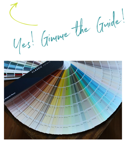
Hi Everyone,
I hope y’all are doing well this glorious weekend! We’ve had the most exceptional run of amazing weather in the last ten days or so. In fact, if you happen to be visiting Boston, please understand that it’s usually hot and humid, not hot and dry at this time of year.
This was another busy week for me in renovation land.
The plumber was here and never has everything he needs to finish the job. However, I do have a faucet in the bathroom, but it’s missing the piece that covers the drain pipe connecting to the p-trap. There’s more, but I’ll save it.
This is parts 1 and 2 of the same post. So, most of you know the drill by now. If you’ve read the post or like to read it in reverse, please click the link below to get to part 2. Otherwise, please begin from the top if you’re landing here fore the first time or wish to review.
Part 2 Begins Here
Hi Everyone,
In a second, we’ll get to my quest for the perfect sofa fabric: beautiful teal velvet for my new living room sofa.
But first, on Monday morning, I woke up to the heavy smell of paint. While it’s Aura, it’s being sprayed on the living room ceiling and requires something other than low VOC to get the paint to spray.
Today, Chris brought in an “air scrubber.”
I had never heard of this before this reno, but it’s a machine that cleans and sucks out the dirty air and vents it outside. Today, Chris brought one in and in no time, the entire house was fresh as can be.
Still, the guys got a massive amount of painting finished on Monday.
So, today, except for the two under-the-stairs doors, the entire entry is painted, and it looks like the rendering.
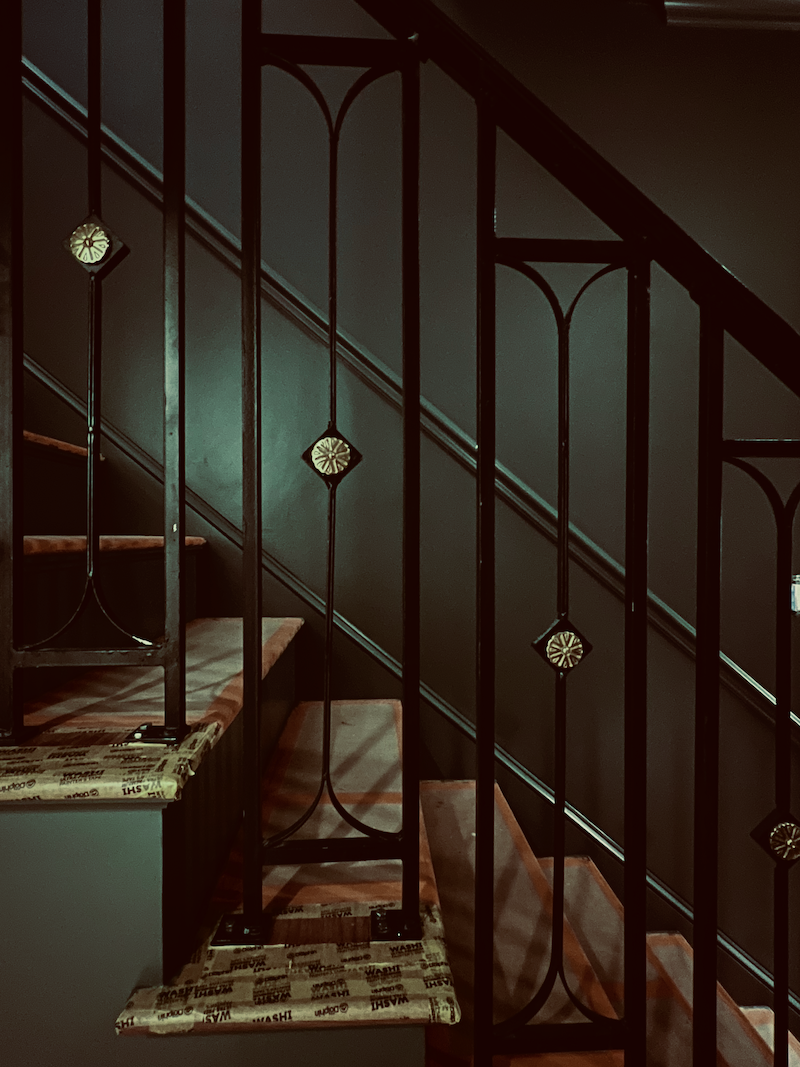
I am kicking myself because I fear I will need more light. Now, I could’ve sworn there would be another outlet on the long wall, but there isn’t. No worries. I’ll work it out. The immediate feeling is cozy, like being transported to late 18th-century Boston.
I’m super happy with the color and so glad I took the leap of faith to paint it this deep shade of smokey green. When the art goes up and the lighting, it will be the moody, sophisticated space I’ve been longing for.
Thank you for talking me out of doing it for my primary bathroom.
Okay, as I mentioned the other day, I have been working on the new George Smith sofa and also the two alabaster chandeliers.
Please also read about dark rooms, are they handsome or depressing?
And, another favorite post about dark bathrooms.
For now, let’s focus on the sofa and the perfect sofa fabric.
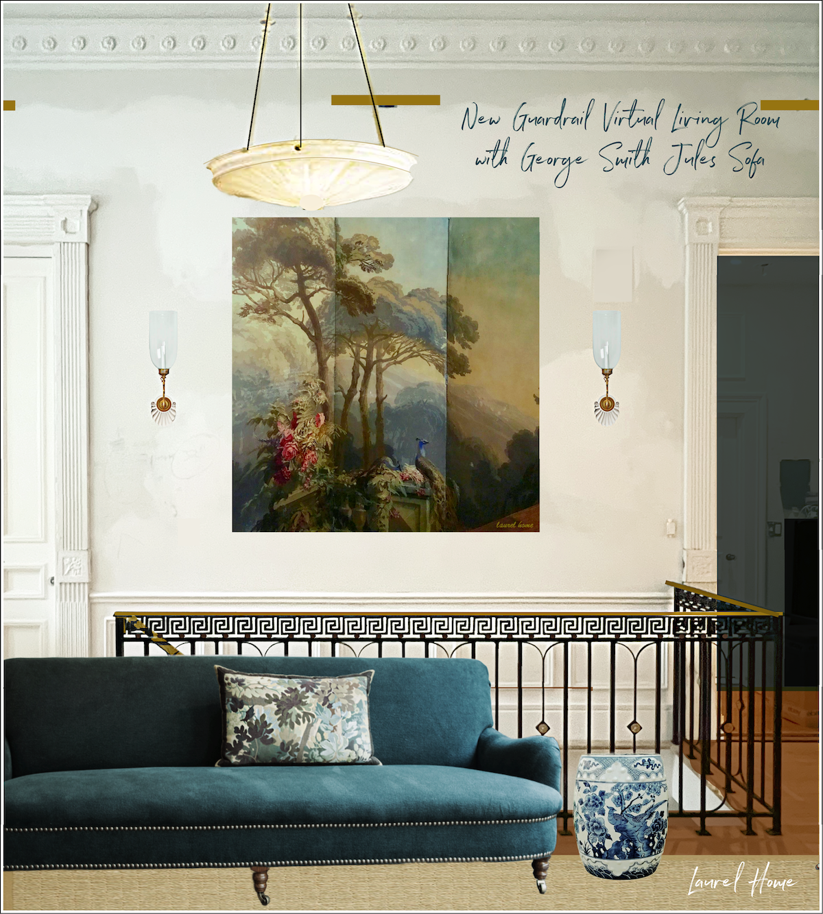
A while back, I decided to do the George Smith Jules tight-seat sofa. I also love the standard George Smith sofa, but there’s nothing else like the Jules sofa, and it feels so appropriate in my living room as this design stems from late 19th-century English sofas and chairs.
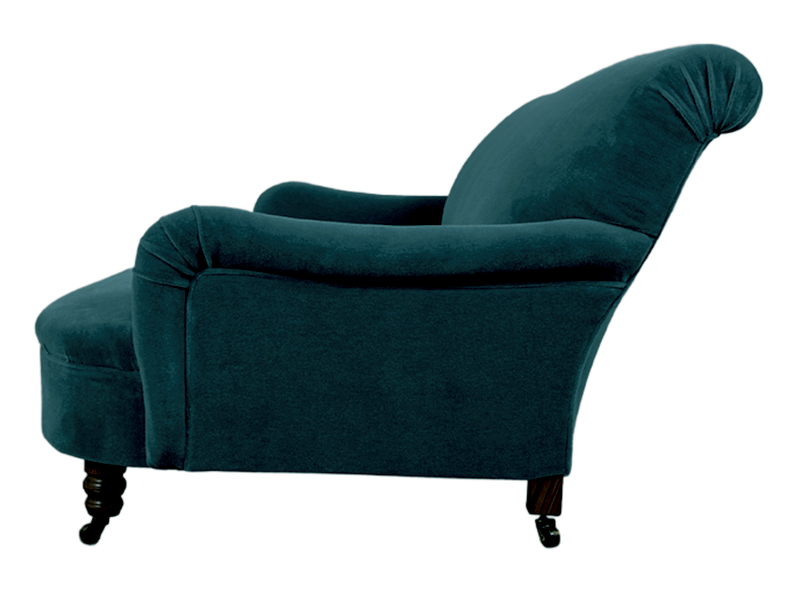
See what I mean? This sofa, which will face the fireplace, will be viewed mostly from the side or from behind if coming up the stairs.
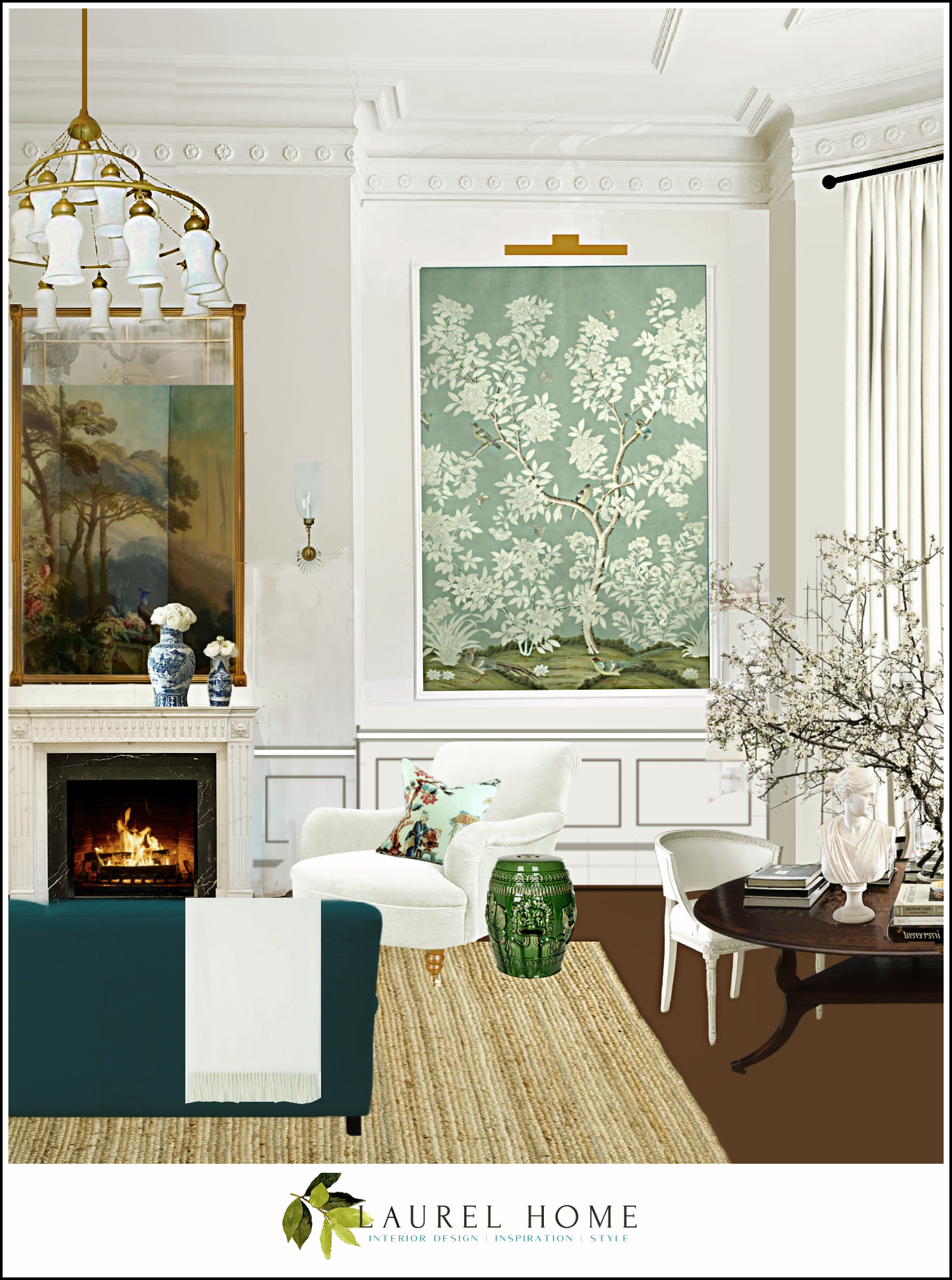
My Gracie panels should be ready in a month or two.
I contacted the Charles Spada shop a few months ago and worked with Renee, who gave me some quotes. Still, I only went down to the shop in SoWa last week. It was such a beautiful day and a super-fun trip.
And the thing that really made it special was that Charles happened to be there and I got to meet him!
After nearly four decades of admiring his work, it was such a thrill! He was as gracious and charming as I imagined he would be.
I showed him the project I did in design school, which was based on his then-home in Boston. I could tell he was both flattered and tickled.
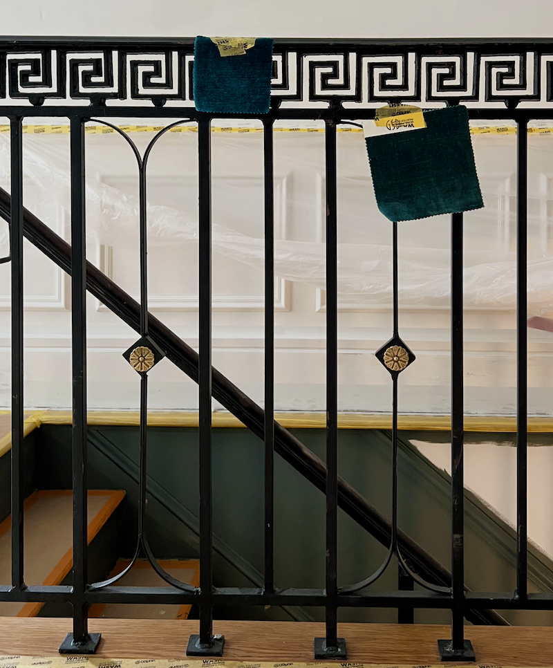
That day last week, I came home with a few fabrics. Most were in George Smith’s line, like the one on the left. The one on the right isn’t in the line. I liked it the best, but it’s 100% cotton. Both look terrific with the Knoxville Gray and the deal paint in the den.
Some of you may recall the coffee and peanut butter test I’ve done with fabrics to test their cleanability. This time, I only did the coffee test and struggled to get it all out of the cotton fabric. This is the problem with 100% cotton. It’s gorgeous as can be, but velvet will stain easily and behave badly when it’s scrubbed.
I liked the one on the left, but I am concerned it might have too much of a nap.
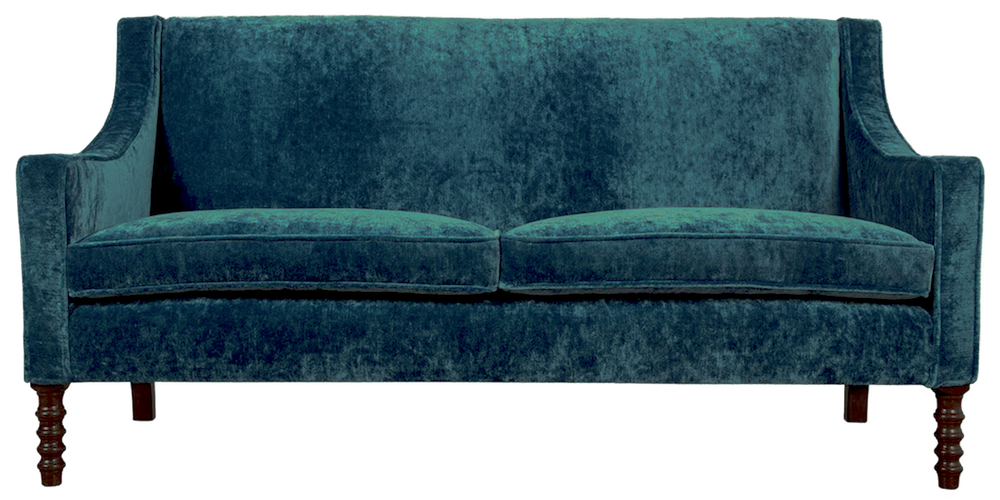
It does. I found a piece of furniture in a different colorway. Although I like the antiqued look in small doses and the right situation, I want something elegant for sure, but not a sofa fabric that calls so much attention to itself.
Below is another George Smith sofa in the Regency Velvet – Teal.
So, yesterday, I ubered to the Boston Design Center located just over two miles from me, on Boston Harbor. I had never been there, and it’s been about nine years since I’ve been to the D&D building in New York City. (Please go ahead and click this link, and you’ll get to see me acting weird. lol)
Well, it all came flooding back to me: how exhausting it is. Still, I had tons of fun looking for not only my perfect teal velvet but also a lot of other fabrics, some old favorites and many new patterns, as well.
Below is a sampling of images I took while out. Please enjoy!
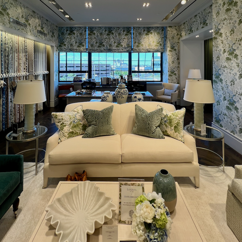
The elegant Lee Jofa showroom at the Boston Design Center
It shares space with Kravet, Brunschwig & Fils, and GPJ Baers.
You won’t be disappointed at Brunschwig & Fils if you love saturated, bright colors.
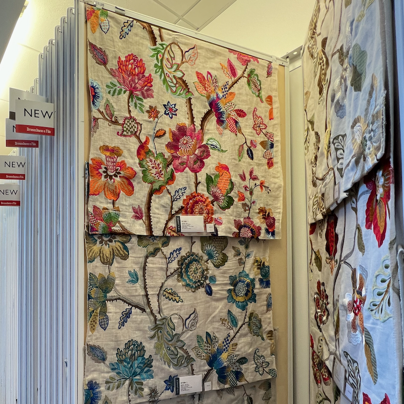
This is not an isolated case. Bold, saturated colors are everywhere.
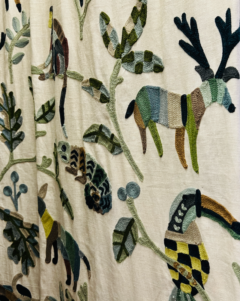
Above is whimsical embroidery fabric from Cowtan & Tout. This was on some pillows, which I should’ve taken a picture of but didn’t. They were so gorgeous that they stopped me in my tracks. Close-up, it looks folksy, but from a few feet looks quite sophisticated.
Today was a great day to be out. The apartment stunk to high heaven, and I am glad Cale put up my temporary screen door in my bedroom. It’s so delightful to have the slightly cool, crisp air wafting in.
Once I got the ventilation going, I got right to work. Below are the finalists for the best sofa fabric!
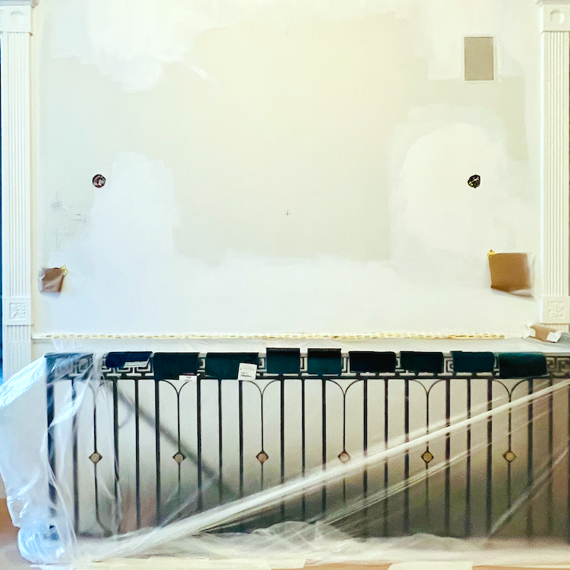
Oh, they’re all so beautiful!
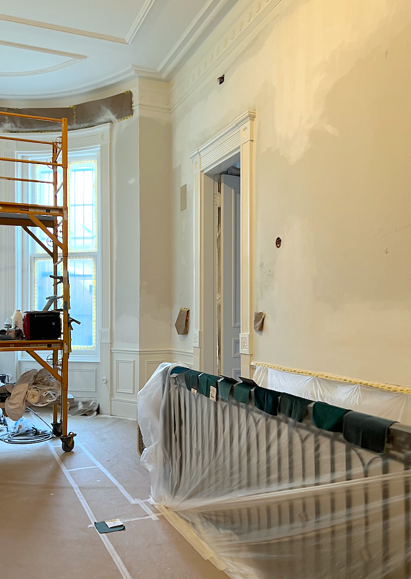
I looked at them head-on and then from both angles to see the shading. Some fabrics shade dramatically and others very little.
But, but, but… please admire the painting job! Remember how the plaster looked a few days ago?
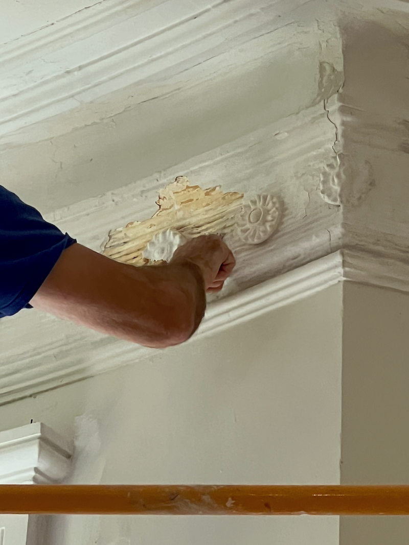
The new rosettes are magnificent, but alas, they’re covered right now.
The door casings have never been this crisp!
Okay, back to the quest for the best sofa fabric, animals and all.
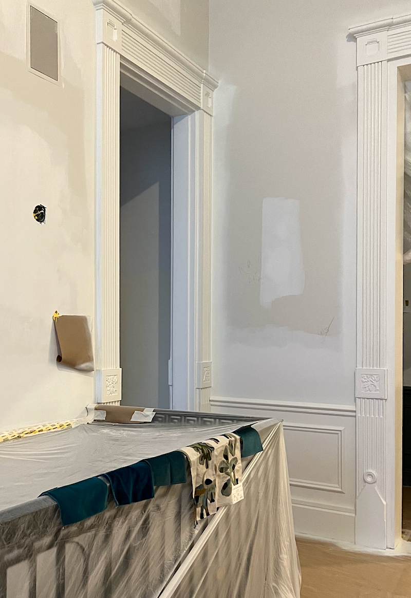
Above is my shortlist.
I discovered that one of the fabrics from GP&J Baker was the same as one of the George Smith fabrics. That makes sense because they are both English companies. George Smith doesn’t manufacture fabrics; they buy huge quantities at rock-bottom wholesale prices.
Well, Laurel, how do you select the best sofa fabric? The color comes into play, but what else should we look for?
That’s a great question. One of my favorite posts answers a lot of this, including a list of the hideous mistakes I made when selecting fabrics in the early years of my career.
Please read this post on the Best Upholstery fabrics for Pets and Slobs and look for some additional information. On Thursday, I’ll go over some things you may not have thought of and also reveal the sofa fabric I’m hoping to get for my new Jules Sofa. I say hoping because I need to know if it’s in stock and if it can be delivered in a timely way.
*********************************************************
Part 2 Begins Here
Sunday, September 15, 2024
We left off with me about to reveal my choice for the perfect teal velvet. Somehow, I sensed there would be a problem.
While I haven’t placed any orders in years, my accounts were still open at Schumacher, Cowtan & Tout, and all of the Kravet brands, including Lee Jofa and GP&J Baker. All of those were open; however, my account at Scalamandre, which is owned by Stark and is also part of Old World Weavers, had no record of my ever having an account.
Before the mergers happened circa 2010, I had separate accounts at every brand mentioned.
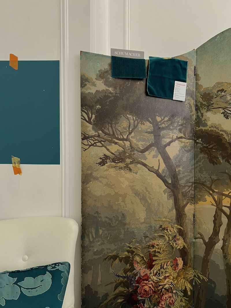
Anyway, the fabric I liked the best was from Scalamandre (see above on the right), so I had to start from the beginning, open a new account, and wait for it to be accepted before I could put the fabric on reserve.
Laurel, don’t they know who you are?
Do you mean my blog? Guys, we’ve been through this a few times.
No, they have no idea who I am or what I do, and even if they are told, it doesn’t compute. All they see is a homo sapien of the female gender with dyed light brown hair.
After all of those machinations were settled, on Thursday afternoon, I discovered that shipping 16 yards of fabric to England would cost $1,100.
WHAT???????????????????
Well, I would never spend such a ridiculous sum to ship a roll of fabric anywhere.
Fine. I will do one of the George Smith fabrics.
As it happened, I realized that one of the fabrics I took out from GP&J Baker was identical to one I had brought home from George Smith. That makes sense since both are English companies. While it is a darker teal than the Scalamandre, it shades brighter in the light. Experience has taught me that a fabric will look lighter once it’s upholstered than it does in a small sample.
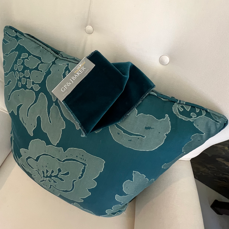
It will also sit directly underneath the new chandelier, which will most likely be dimly lit. I think it’s going to look very rich on the Jules sofa.
Speaking of chandeliers, they are finally on order. I will share more about that shortly, as it’s another good story.
But, for now, let’s focus on the painting, where tremendous progress has been made.
In fact, I expect it to be totally finished by this coming Friday—well, all except for my bedroom and the upstairs bathroom.
The living room is nearly finished and is gorgeous.
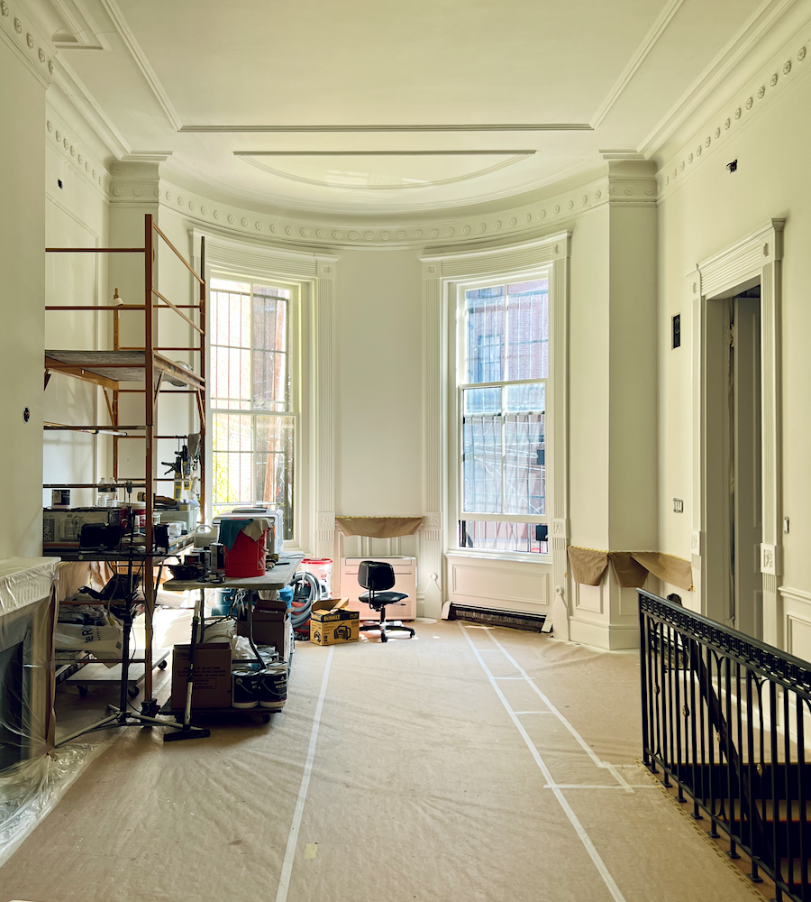
Living room paint colors – Benjamin Moore Cloud White trim, ceiling – Moonlight White Walls
Now, for the den…
All along, I’ve known that I want a rich, teal blue, not too green, blue, gray, or bright.
I’ve experimented with several shades of teal and even three combination colors. In fact, you may recall this recent post in which I went from North Sea Green to Fair Isle Blue.
However, as I lived with the sample of Fair Isle Blue on the wall, I noticed it looked quite gray at times. That’s not necessarily a bad thing, but not quite right.
This is interesting. Below is how Fair Isle Blue looks online.
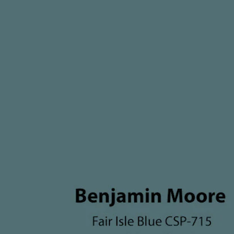
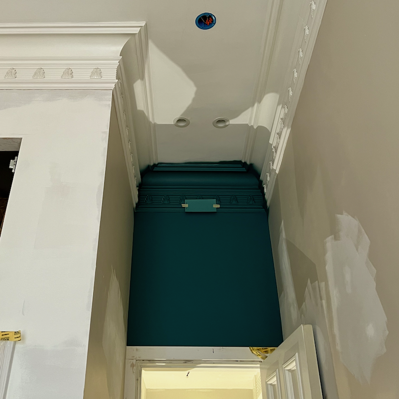
Above, the crown and frieze in Fair Isle Blue.
But, get this. The big square of wall is North Sea Green! I know, they don’t look that different and both look quite dark.
The sample taped onto the frieze is Benjamin Moore Mayo Teal CW-570.


Laurel, I’m confused and I’m horrified that you’re having trouble selecting a color. What does that say about the rest of us if you’re having trouble?
It says that you’re normal.
Look, I don’t care what some try to make others think about choosing colors.
EVERYONE struggles with this. And if they claim that they aren’t struggling, it’s because of one of two possibilities.
1. They are delusional.
2. They are trying to sell you on the idea that they have this all figured out, most likely for personal gain. In actuality, they may have it figured out better than most.
But it is still bloody difficult—for everyone—and it’s the most difficult to select paint colors for yourself.
To make it even more challenging, when the color is applied to the wall, it’s a constantly moving target that changes with the light and is different on every wall.
In fact, I recently heard a (true) story about a famous interior designer (who will remain nameless and genderless). This talented designer has won countless awards, and been published in Traditional Home and Architectural Digest, amongst others. They even have a Wikipedia page.
Well, the designer once asked their painter to create 50, yes, FIFTY, FOUR FEET X EIGHT FEET sheets of 1/2″ plywood and paint each of them a different color before the designer’s mind could be made up.
SELECTING PAINT COLORS IS DIFFICULT FOR EVERYONE. That is, everyone who cares.
But, Laurel, what about your paint guides?
What about them? They are guides, and while I’m exceedingly proud of them, they are not the holy bible of paint colors. There’s no such thing. They are a useful tool that serve as a starting point. Of course, the colors are great and might also be the endpoint. I’m using many colors in the Laurel Home Paint and Palette Collection.
These guides are also designed to help train your eye with pleasing color combinations and to inspire.
So, what did you choose for the den paint colors?
I’ve decided on the Mayo Teal for the ceiling and frieze. Because of the recessed lights which I often have on low, the ceiling is already in shadow. The colors get darker as we go higher up on the wall. I didn’t test it, but I feel confident it will be beautiful based on how gloomy Fair Isle Blue looks.
As for the main color, I am returning to my original choice– North Sea Green. The two colors look fantastic together.
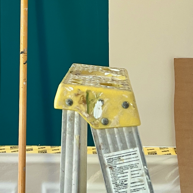
Below is North Sea Green as it looks on the wall facing the doorway, in the late afternoon.
So, let’s put this all together.
Below is a photo I took of the newly painted living room earlier today around 3:00 PM. The ceiling coving and frieze are Benjamin Moore Cloud White 967 or co-130, and the walls are Moonlight White oc-125. Moonlight is a touch deeper than Cloud White. However, it sometimes looks like the same color!
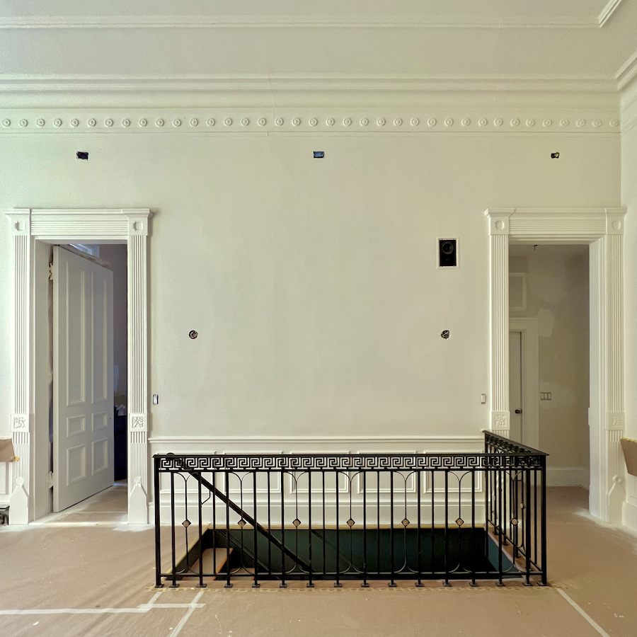
We will see a sliver of the Knoxville Gray in the stairwell. BTW, Cale breezed in last night for an Aikido seminar and another wedding gig an hour south of Boston. But last night, you should’ve heard him when he went downstairs. It was similar to how he was in this video.
Even with the crappy lighting, he went wild for the Knoxville Gray. I guess it’s the perfect caveman color. lol. The green is so understated; it’s like walking through a dense forest. I also love how it looks with the guardrail, and helps ground it and create a foundation for the art on the wall, above.
However, our fabric and screen must also look good with all the colors. So, let’s examine that.
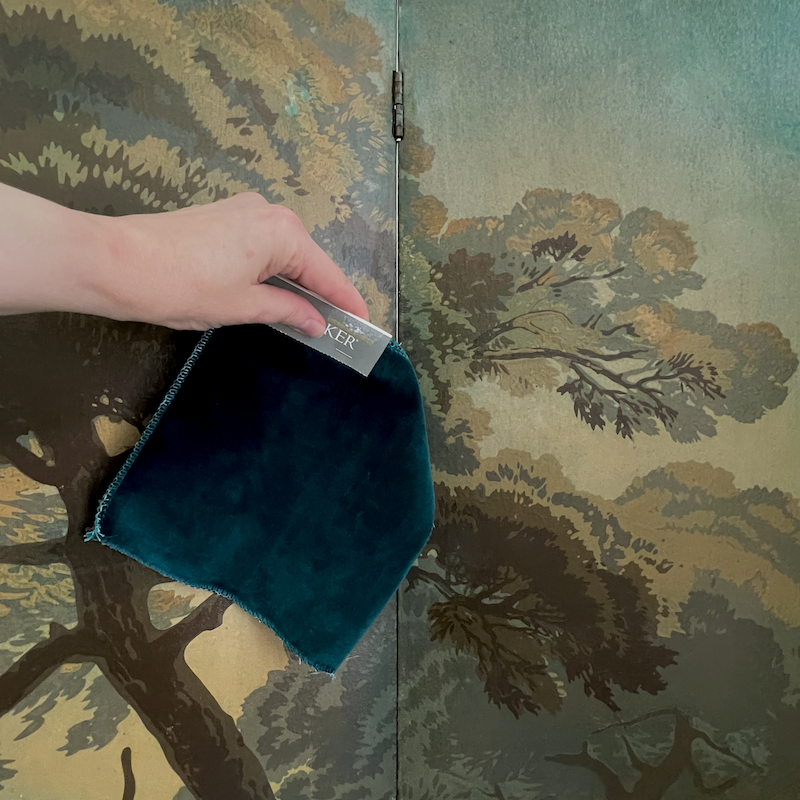
It’s beautiful! Perhaps the exorbitant shipping charge was God looking out for me.

The gorgeous Jules sofa in a luscious teal velvet.
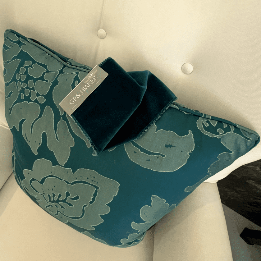
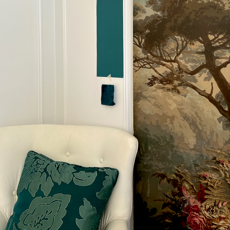
But please remember that sometimes North Sea Green looks like this below.

Here’s an important point to remember.
It’s possible a wonderful color won’t look as wonderful in all lighting situations. I have to remind myself if something seems “off,” to wait an hour or two and revisit it. It’s usually quite different, and for the better.
Monday, the painters are putting the finish coats on the den walls.
I have so much exciting news. Soon, I will be sharing it!
xo,

***Please check out the recently updated HOT SALES!
There is now an Amazon link on my home page and below. Thank you for the suggestion!
Please note that I have decided not to create a membership site. However, this website is very expensive to run. To provide this content, I rely on you, the kind readers of my blog, to use my affiliate links whenever possible for items you need and want. There is no extra charge to you. The vendor you’re purchasing from pays me a small commission.
To facilitate this, some readers have asked me to put
A link to Amazon.com is on my home page.
Please click the link before items go into your shopping cart. Some people save their purchases in their “save for later folder.” Then, if you remember, please come back and click my Amazon link, and then you’re free to place your orders. While most vendor links have a cookie that lasts a while, Amazon’s cookies only last up to 24 hours.
Thank you so much!
I very much appreciate your help and support!
Related Posts
 The Perfect Teal Paint Color for My Den (Parts 1 & 2)
 14 month Renoversary! and I’m Back In My Bedroom!
 The Primary Bedroom Suite – Final Design!
 My Architectural Mouldings + What Many People Don’t Realize
 The Living Room Art and How To Grab Hex Codes parts 1 and 2
 The First Renovation Tour Of The Upstairs Living Areas! (Parts 1 & 2)
 My Renovation Mistakes + A House Tour via YouTube!


