Please notice that I did not say “wow factor.”
You will never hear me say, “wow, factor.”
And, you will also never hear me say, “I want it to pop.”
That is unless I’m squeezing a pimple. haha
Yes, I know.
That was gross.
Sorry.
Anyway, I hope y’all had a terrific Mom’s Day and are having a great week.
It was absolutely gorgeous here in Boston today. I had an appointment with a new eye doctor. All of my doctors are connected with Mass General, so they are all located at the north end of Beacon Hill. Going to the doctor, I went the slightly shorter way, up the hill and down the hill. Great workout.
Coming home, I took a whole mess of photos. Unfortunately, it was a little too bright and sunny, but hopefully, some of them turned out okay. BTW, it is always blindingly bright and sunny when I get my eyes dilated and examined. Too funny.
Tomorrow morning, I’m meeting with a contractor that’s looking quite promising.
One thing I’ve discovered recently is that all of the excellent contractors are verrrrry expensive. But, there’s verrrrry expensive, and then there’s obscenely expensive. My neighbor had a couple of quotes that were clearly in the obscene category. I mean, I’m from over-priced-everything-New-York, and I was shocked.
No names, of course, and no, short of hanging me upside-down from my toenails, you will not drive out of me who gave the obscene quotes.
Tomorrow’s guy is super-nice, does gorgeous work, and is in the verrrrry expensive, but not obscenely so category.
So, of course, he wants to see some drawings of the kitchen I have in mind.
And, yeah, I have a floor plan which is probably enough for our purposes. However, I am continuing on my design path.
Just so you know, as a client, I’m every interior designer’s nightmare, including myself. lol
However, in this case, my pickiness is not completely unfounded.
I want something special and for these reasons.
1. I think this place deserves it.
2. I’ve NEVER actually designed a kitchen for myself.
3. I may never have an opportunity to do it again.
How does one make a kitchen or any room, for that matter, special?
I believe it’s in the details and, in this case, the kitchen details.
Anyone who’s ever renovated or built a new kitchen knows that there are a zillion of them.
The scary thing is it’s really easy to get some of them wrong.
What is the one thing I see wrong in some kitchens?
Well, besides the over-abundance of overhead (with a counter underneath) cabinets and waaaaay too much counter space in some kitchens. The next thing I see that sometimes goes wrong are certain proportions. A common one is with the crown moulding. But, it’s not always the moulding size, just how it overpowers the cabinet below it.
My feeling with all mouldings is when in doubt, go down a size. I don’t think I’ve ever seen a moulding that was maybe a tad too small that looked bad. But, too big and you might regret it.
Okay, it’s time to look at the floor plan.
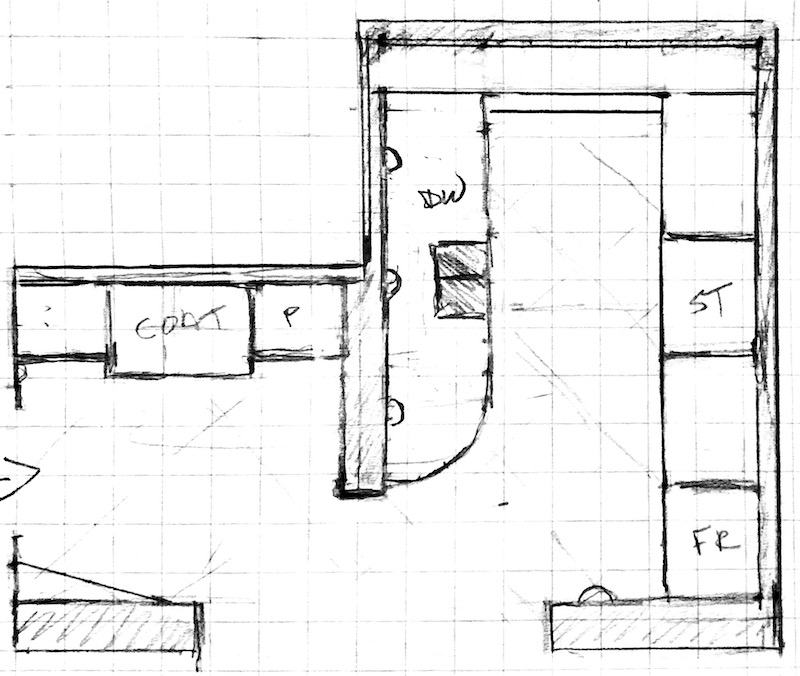
This is the general idea of what I want to have. The built-in cabinet in the entry is floor to ceiling. The only other thing at the moment, which is floor to ceiling, in the back kitchen cabinet and the cabinet that will house the fridge.
Of course, there will be some details to work out—things like light switches and the door buzzer. There’s also still the venting issue. While some people are adamant both ways, the reality is that there’s no window anywhere close.
And that is when I think that some ventilation is essential. Here’s why:
- To keep the air clean
- In addition, to keep the cabinetry, tiles, and walls cleaner
- Also, to get rid of the burnt smell from my bad cooking. lol
Okay, time to jump in a talk about some of the small kitchen details and actually some that are not-so-small.
And then, I’m hoping to show you some elevations.
For non-designers, an elevation is a line drawing over elements on the vertical plane. Like a floorplan, it is a crosssection of the space. It is not a perspective drawing. Therefore, you may or may not see elements in the foreground. Those will show up on the elevation for the opposite wall.
Elevations are a wonderful way to check out scale and proportion.
My rule is this:
If it looks wrong, it’s wrong.
Before we get into some of the kitchen details, I’m thinking of incorporating; let’s talk about some general thoughts.
One, I very much want to have an “unkitchen.”
For the uninitiated, an unkitchen is a kitchen where one might look at it and say, “Where is the kitchen?”
Unkitchens may be fitted or unfitted.
Unfitted is exactly as it sounds. It’s how kitchens used to be. Nothing was connected. There was a stove, a sink, and work table, and maybe A cabinet. Oh, and always a pantry. AKA: larder.
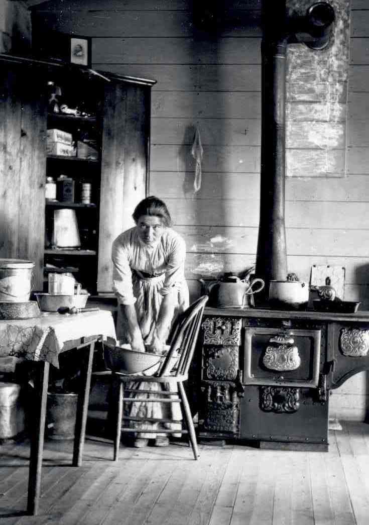
Poor dear didn’t even have a sink. Or, if she did, it’s out of sight.
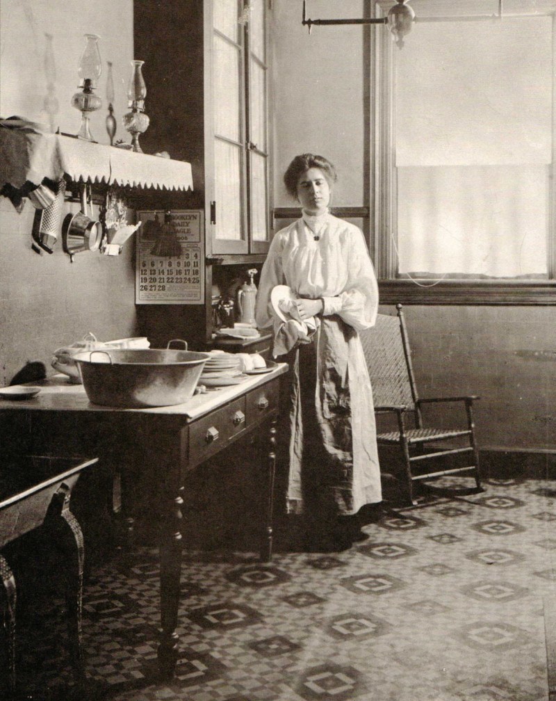
Oh, I forgot about the rocking chair. Please add that to the early 20th-century kitchen—a rocking chair.
So, could she have used a little more workspace and storage?
Yes, probably.
Does she look like she’s suffering too much? Well, not because of the modest appointment of her kitchen. (by our standards)
Sorry for all of that silliness. Well, not really, unless you feel that I’m wasting your time.
The second thought I want to share is about the strengths of this kitchen. That is what I want to play up.
One, its size is super-efficient. It’s not nearly as cramped as my old kitchen, and I can feel it. When Cale (my son) visits, we can both be in there without tripping over each other. As much. Haha.
However, the best strength of this small kitchen is its height. It measures 10 feet 3 inches.
Sweet.
And I intend to capitalize on this feature by having some dramatic floor-to-ceiling cabinetry.
Some might ask if that will be too much.
No, I don’t think so.
However, the design of the cabinet is one that I keep going back and forth on.
But, then I remembered one of my favorite kitchens.
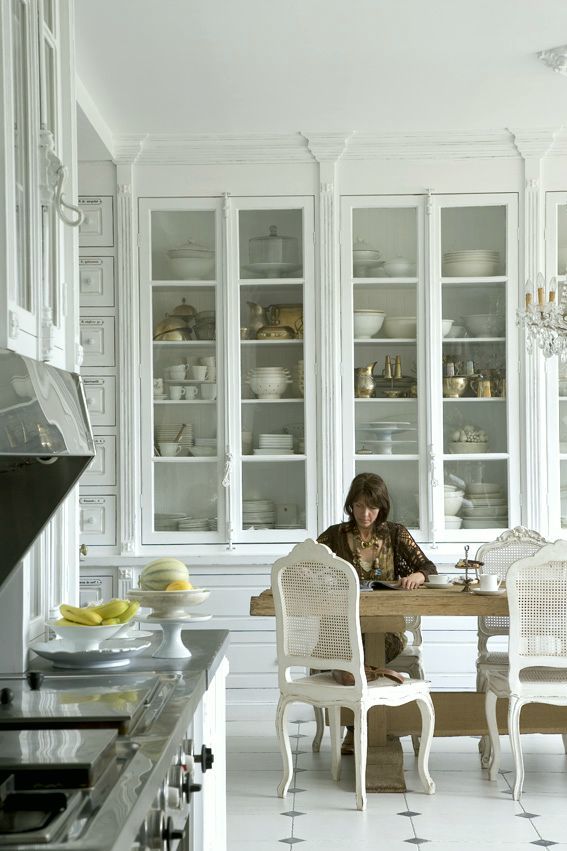
I mean, it’s everyone’s favorite jaw-droppingly gorgeous kitchen, artfully photographed by Bieke Claessens.
And, below is a shot of my apartment looking towards the entrance to the bathroom and den on the left. And, the entrance to the right.
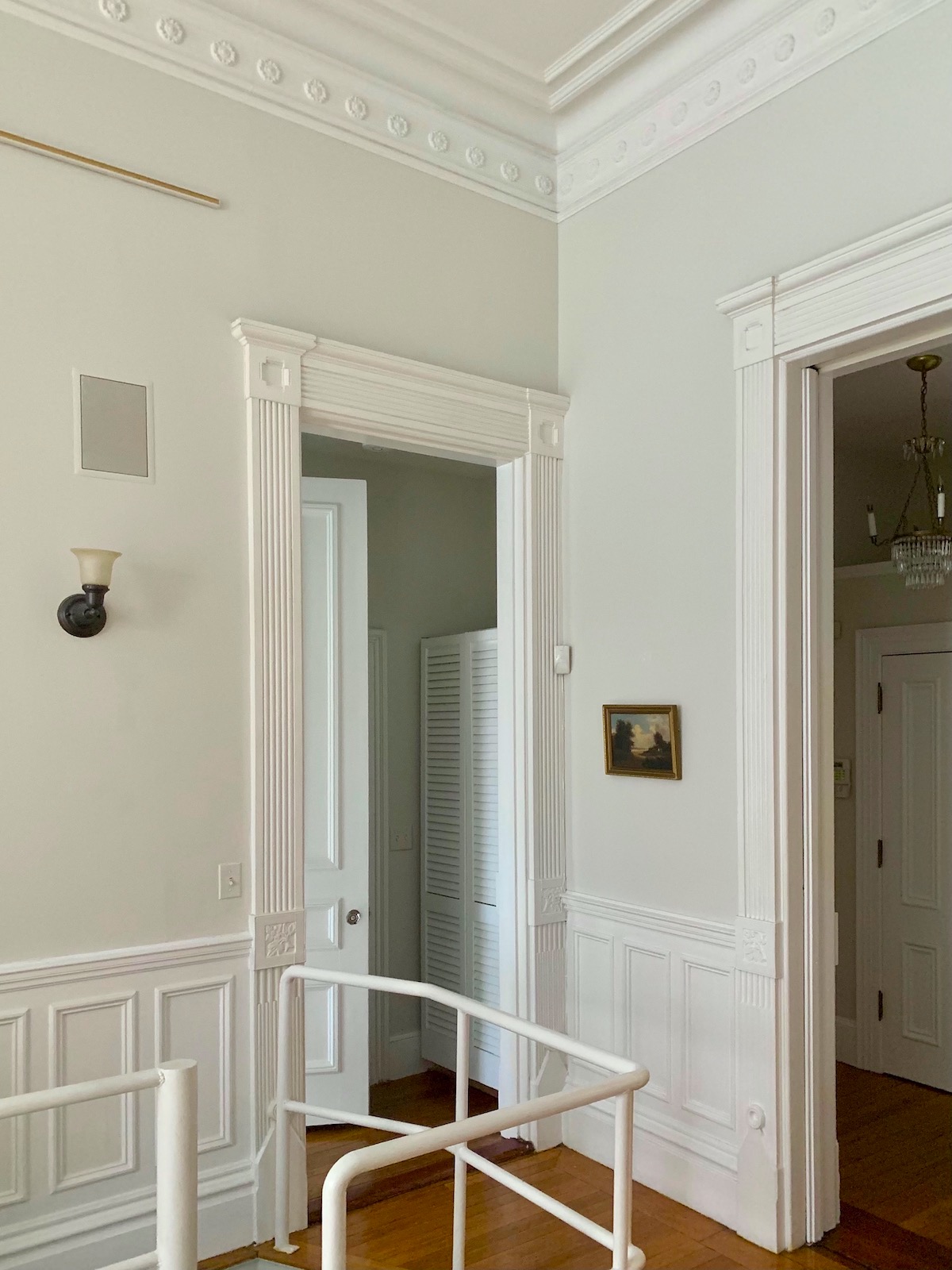
But, doesn’t the Bieke Claessens kitchen look like it could have a baby that would be comfortable in my apartment?
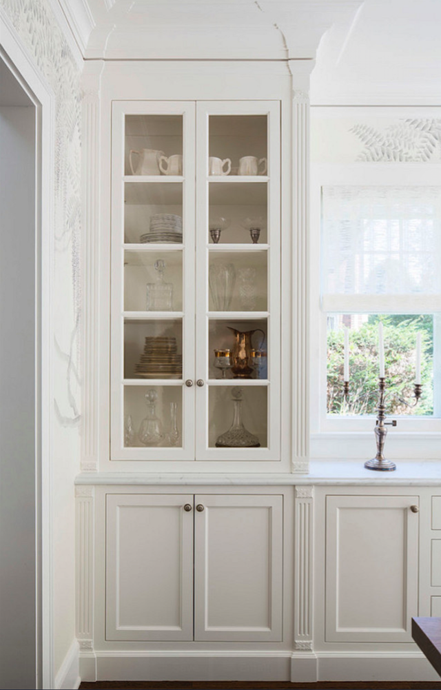
Troy Thies-Photography
This cabinetry is in a dining room by Martha O’Hara. Clearly, she used the Bieke Claessens kitchen as a model.
One of the details I love is the small horizontal rosette at the top and bottom of the fluted pilasters.
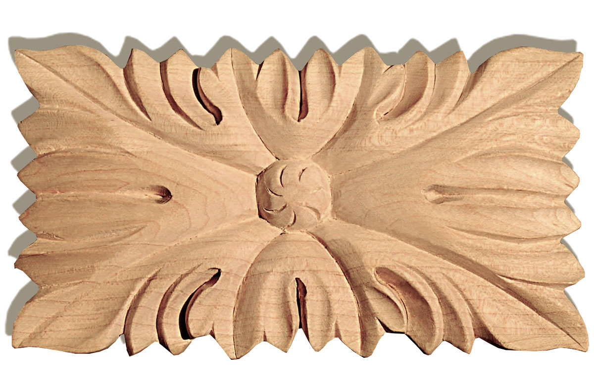
They’re similar to this carved wood rosette. The size is 3.25″ x 1.6″ x .4″ inch deep. That looks just about perfect.
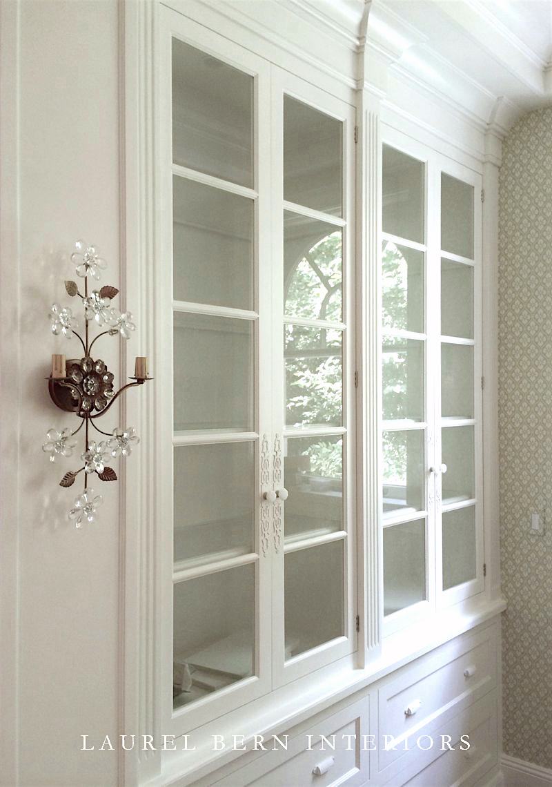
Of course, I also incorporated the Claessens kitchen into my design for the kitchen I designed for a client in Bronxville. But, of course, the cabinet maker isn’t going to beat them up and have the paint peeling a little. Haha.
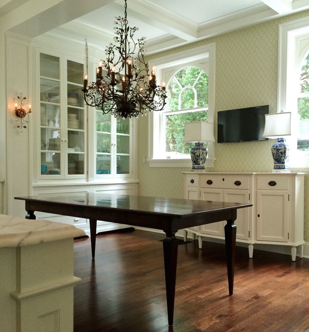
This is before I painted the chandelier to brighten it up.
Therefore, with this newfound direction, I have another one of my rough sketches.
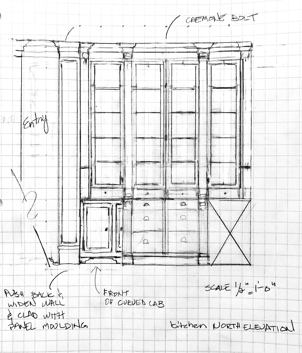
And, the design still needs some tweaking. But, this should give you an idea of what I have in mind. Also, and this is super-important when working on kitchen details or any architectural details.
I did this drawing at 1/2″ scale. Which is the minimum for an elevation. However, for details, such as the crown moulding and others, it’s vital to do a far larger scale drawing, either at 1 & 1/2″ or 3″ scale. That can be done in sections. Normally, I would be using my architect’s scale to help me make accurate measurements. However, I can’t find the bloody thing. And then it occurred to me that I haven’t used it since I moved. So, I need a new one.
Another important point I want to make is this. When designing, I think a certain level of restraint is essential.
It’s something I often had to reign some clients in, but diplomatically.
For example, in this kitchen, the star of the show will be the dramatic cabinetry lining the back of the kitchen. The other elements are supporting players. But, unfortunately, non-designers tend to look at individual elements and want to make EVERYTHING the star. And that’s when it all goes horribly wrong.
Remember the French doors with the cool transoms I want to have made? You can see them here.
Some people might repeat that circle motif in the kitchen cabinets and maybe in the entry door.
Or, they might have another geometric pattern that’s competing for a starring role and more circles. It’s too much, IMO.
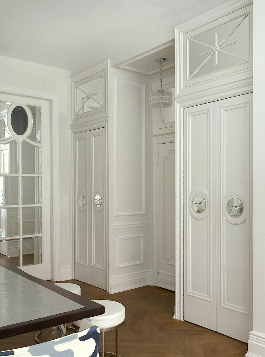
If it’s a one-off like done by the immensely talented Kelly Giesen, that’s great. They’re living harmoniously together.
The next of the small details is one I can’t let go of.
There are no windows in this kitchen, which means that 99% of the time, the lights need to be on. That’s fine. But, I really want to add some mirrors.
At first, I thought I would mirror the two-end cabinets. But, that will only work if I do something closer to my original design.
These have wire mesh doors instead of mirrors. But, it gives an idea.
And, I could go back to this idea. But, I like the new one better.
So, what I’m thinking of is mirroring the wall where the range is.
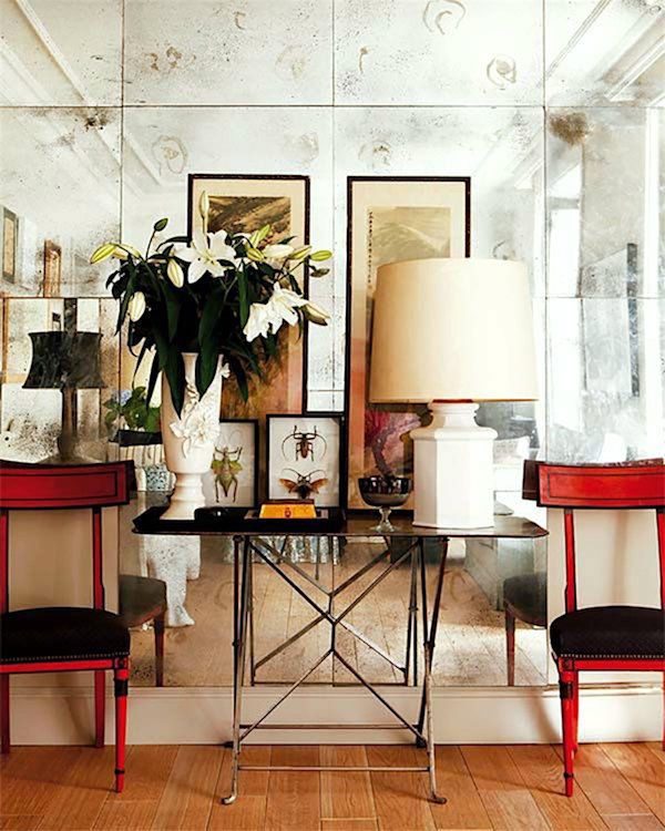
There are a lot more mirror ideas in this post about windowless rooms.
I am thinking of fairly large square tiles. And, I also like the little brass rosettes you sometimes see in the corners. I could do a coordinating marble backsplash or just mirror down to the counter with a small lip like they do in the DeVOL kitchens.
I know that some of you are horrified by the idea of mirrors lining the walls.
It’s like the color orange. It’s natural to have visions of tacky 1970s brown-shaded mirror which made everything look, well – brown; not a good look. This is nothing like that. The kitchen will look warm, but definitely not brown. And, if antiqued, only very lightly to give it a little depth and character. And, also will help hide splatters, so I do not have to Windex the mirror every day.
Another kitchen detail is the small shelves I’d like to incorporate on both of the long walls. They won’t be more than 5″ deep. The door over the counter doesn’t start for about the first 5″.
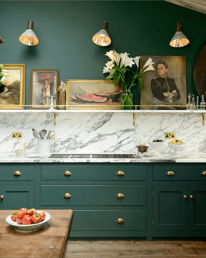
I’ll definitely want a thin brass railing like in this classic DeVOL kitchen.
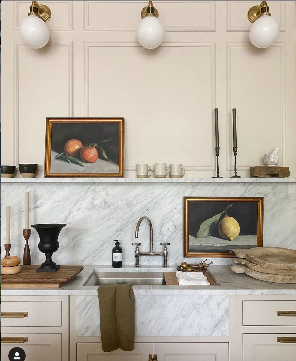
I also want to do a moulding detail something like this on the sink wall. By the way, I adore this sink with the marble front. So beautiful!
And, then for lighting. Yes, I’d love to do the three sconces. Maybe these or something similar. If the cabinet lights up and there’s a mirrored wall to reflect the light, I think that’ll be perfect. If possible, I’d probably add one more sconce to the small wall perpendicular to the large cabinet.
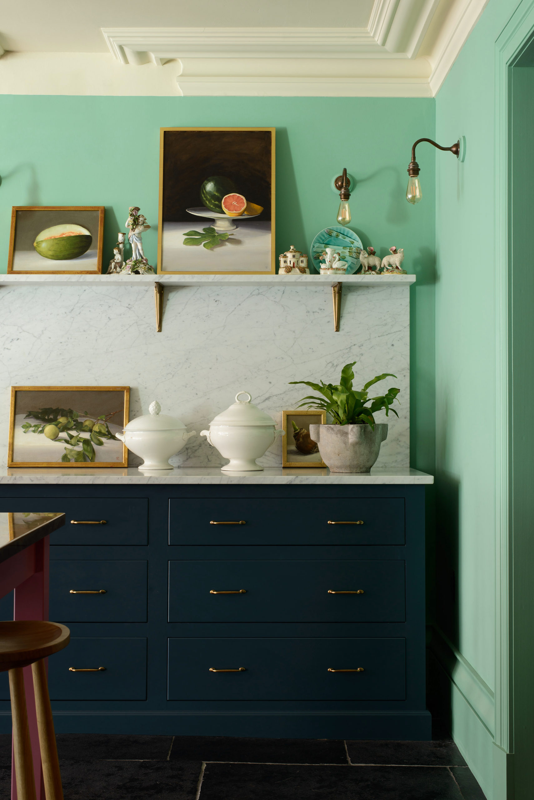
Another DeVOL beauty from the New York Showroom showing a backsplash and shelf.
Of course, there are many more kitchen details.
Like the ventilation.
There’s already an extractor in the ceiling. The ceiling is dropped three feet, so there should be plenty of room.
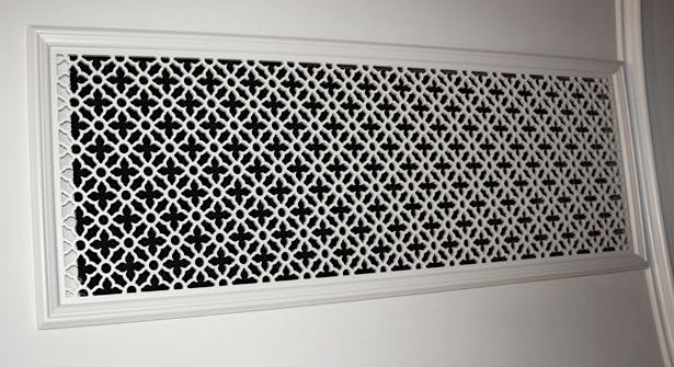
This is not my area of expertise. However, I’m wondering if there could be a larger extractor with a decorative grille over it. Maybe something like what’s above only on the ceiling. I tried to find if anyone has ever done anything like that. But, couldn’t find it. I realize that it’s high up, but maybe it could work?
You might also enjoy this post about kitchen pantries.
Okay, that’s enough for today.
I hope you got some good takeaways from this post about kitchen details. There are hundreds.
Oh, I just want to add. I haven’t addressed the fridge and the entry. However, yes, no one will ever know that the fridge is a fridge. And the entry will also be fitted with a built-in piece that will serve as a pantry, utility, and separate coat closet.
xo,
PS: Please check out the newly updated HOT SALES!
Related Posts
- Transom Windows – Everything You Need To Know!
- How To Make Budget Window Treatments Look Expensive
- Will My Warm Paint Color Palette Look Dated in Five Years?
- Our Home’s Difficult Floor Plan Is Giving Me Fits!
- 30 Inspiring Butler’s and Kitchen Pantries, Old and New
- The Best Builder Upgrades You May Not Have Considered
- Window treatment styles – How to select color, type, pattern
83 Responses
I’ve been following the “Great Wall and Kitchen Debate” and I know this might be a bit late, but I had an idea…
If you are not an intense user of your kitchen (many hours a day, big meals, lots of kitchen tools), you might think about creating a “hidden kitchen” (Google it, there’s tons!) at least in part.
Since the entry wall is the problem (leave it and it looks weird from the living space, cut it back and the view opposite the entry door is awkward and unsymmetrical), what if you eliminate the wall and instead of installing a regular kitchen, you install one that can be entirely closed off behind various doors…
Like this Elsa Crawford’s place: https://www.yellowtrace.com.au/ilse-crawford-home-london/
You never know, it might save money on cabinetry costs and you could decorate the outside of it more like walls. ^_^
Thank you for all the hard work you put into your fabulous content. I tell everyone I know with an interest about your blog. Even if I sometimes disagree with some of your opinions, they are always good at making me think hard and consciously about my plans.
FWIW I can not open my (built in) fridge door 180 degrees and I can still get everything out and clean the drawers in the sink. Not sure what everyone is talking about with that. Love the latest plan.
The best thing ever in my kitchen was when my partner surprised me with under-cabinet LED strip lights for christmas. They’re fantastic and you can put them everywhere without needing all the extra wiring space for can lighting. Putting them inside the cabinets would also be really helpful. And, if you put mirrors in the back of them, they’d add to ambient light gently.
Yes to toe-kick drawers. If I ever build my dream kitchen, I want them to have sliding tops and be sturdy enough to use as a single step-up. I always just need a single step-up to reach things.
Laurel,
First of all…love love love you!
Secondly, the main point regarding fridge placement is to keep in mind that the door(s) need to open 180 degrees in order to pull out doors and shelves for cleaning.
Thirdly, the sink you show is not a true farm sink, correct? It appears to be inset within marble or quartz. Keep in mind the configuration in that pic would be a PITA to clean. Crumbs and miscellaneous debris would get caught wheee the stainless meets the stone.
Hi Laurel! I am so happy for you. Your new kitchen will be gorgeous and I am excited you are including us readers in your own remodel. We also have a tiny kitchen/dining room in our 50s ranch house that we plan to gut and remodel in the future. We might do a botox in the meantime (I love your term). I have been working on drawings so that we can maximize the space and make it more efficient and definitely more beautiful. I really love that I can be inspired by your kitchen blossoming into a beautiful space. Thank you and cheers!
Most important is to9 have lower drawers and not cabinets, except on the back wall.Do you want a spice cabinet pull out, or a spice drawer? do you need a small cabinet for baking sheets?
I love your ideas but i think will be very costly. You could mirror the back of the cabinet on back wall with glass shelves with lighting inside.
I really want to know what you did with small patio.
Hi Daria,
Thank you. I’ll be honest. I’ve not done a thing with the patio; not because I don’t want to, but because I can only do so much without wrecking my health. That’s my reality at the moment. However, I’m very grateful to be here.
I love your ideas and can’t wait to see the end result! It’s so much fun reading your posts and think about things in a different way because my perspective has changed. 💗
Your kitchen ideas are great! What about mirroring the backs of the back wall tall cabinets to reflect some light from living room windows and give illusion of depth? Even with items on the shelves, light will be reflected. I love the mirrored back splash or behind range top idea also. Cannot go wrong with mirrored surfaces in this space!
House of Brinson has a post on how to create period-appropriate extractor fan covers – they used a ‘House of Antique Hardware’ extractor cover and painted it white. The example they give is from their bathroom, but the grilles can be used in a variety of areas. See https://www.houseofbrinson.com/2020/01/13/bathroom-exhaust-fan-cover-for-historic-homes/ for the post.
Hi Erin,
Sorry it took me so long to post your comment. I have to approve all links and this one slipped through the cracks.
Hi Laurel, The un-kitchen kitchen. Great idea! Love the flush farmhouse marble sink, your idea to camouflage the refrigerator, the cremone bolts, but was surprised that all the knobs and bolts were painted white in the Bieke Claessens kitchen. I have a open-air shelf in my 1938 kitchen which I made from an aged-wood, hand-carved window box corbel and old fence planks for shelving. Love it, except for the dusting part. Thanks for your wonderful blog.
Hi Jane,
I won’t be painting the knobs and handles in my kitchen. But, if I can do a cremone bolt, I would love just that to be painted.
Love the moulding detail above the sink and also the small shelf with the brass railing. You have the perfect space for that. Your north wall cabinet design looks and sounds wonderful. Can’t wait to see this happen.
Hi Laurel,
I don’t envy you embarking on a kitchen renovation now.
With lumber prices as high as they currently are, any renovation is going to be so pricey.
Hi Kristin,
For antique mirrored tile, check out Ann Sacks tile.
annsacks.com
That back wall will be gorgeous. I suggest installing pot lights inside the glass/mesh cabinets. I have a wall of floor to ceiling cabinets and the soft glow of light that shines through the upper textured glass doors and glass shelves is so lovely. I renovated my kitchen 6 years ago and refused to add pot lights anywhere else because, like you, I HATE overhead lighting.
Laurel it is so fun to go through this process with you, thank you so much for sharing! One evening I opened a toe-kick drawer and a dinner guest dubbed the room “James Bond’s kitchen”. They hold so much and I love not wasting space! Re mirrors, a friend of mine lived in a condo with the tiniest kitchen ever. All the backsplashes and the walls above the uppers were mirrored. It made all the difference! Can’t wait to see what’s next😊
I can’t wait to hear her source for the antiqued mirror-tile backsplash! My source closed up shop permanently just 3 weeks before I wanted to place my order. Sigh. Perhaps Laurel will have an ‘ace’ up her sleeve!
Hi Laurel, That sink is beautiful! I’m glad you found the mirror looks beautiful–that’s a go in my book, and something you can do now for yourself. Someone I read who has a bunch of kids, loves to cook and is a “maximalist” had a freestanding mirror behind her stove which she said she found to be really easy to clean. I think taking care of that center wall that divides your kitchen / foyer will go a long ways to aesthetic improvement and when you are at the back of your kitchen you will see that gorgeous molding on your grand entrance and any chandelier you might end up hanging in your living room (or, not). Your design for that center wall looks great.
Sounds like functionally, what you really need and want most right now is to take care of that staircase since you say it would be such a blessing to get rid of it. Do it for yourself then, and maybe do the kitchen which you have no major functional issue with, piecemeal–Lord knows, we love reading about the process.
Such fun reading your posts and the comments. (I’m going to look into Norwex glass cloths, for instance).
This is soooo exciting. I’m very glad you take us along on these gorgeous adventures! You have the perfect canvas just waiting for your artful eye to bring it to full life.
Well isn’t this fun! I can’t help chiming in with a functional detail… that you probably thought about already. But here goes. If your dishes are going to live in the cabinet on the back wall, and your dishwasher door opens down next to those cabinets, you would have to stand by the sink and reach over the dishwasher door to put away the dishes. You would have to be an acrobat to do that!
Hi laurel yes storage space under cabinets, great for all types of bakeware. Just a gentle nudge of your big toe and opens. Possibly mentioned this already, but you mentioned you can hear ur neighbors. Add insulation in your walls. Not sure exactly all ur plans but if opening up walls add in here or if not opening walls blow it in, just a small hole at top of the wall for the tube and when done it’s a quick fix. Also do not underestimate the problems than can happen because you think it’s not a big deal to move light switches and vents. More so in a small space like yours. Try to get that figured out first if u have problems it will be easier to fix now than later.
Laurel – how tall are you? I am 5′ 1″ and I cannot reach the shelves in my cabinets and they are no way near as tall as those you want. I keep a step stool in my pantry to get a wine glass! LOL
Hi Laurel, how exciting to be starting on fixing up kitchen! I love all your ideas and can’t wait to see how things progress. My favorite posts are anything to do with your new home! I had to share that we still get a hanging calendar and we hang it on the end of our kitchen cabinet just like in the second historical kitchen picture. Some things haven’t changed haha. Best of luck with all your projects!
Laurel, love your designs as always. Have seen no discussion about microwaves. They are UGLY on the counter and diminish counter space. Consider a microwave drawer. Your un-kitchen will be a lovely addition to your living space, and I am very excited for you
My aunt in Germany had the smallest kitchen and on one wall the cabinets had sliding doors. It was so neat.Denise
I agree that having bottom cabinet drawers are more efficient than doors. Also agree that a refrigerator shouldn’t butt up to a wall because you can’t remove the drawers to clean them so you have to pull the refrigerator out far enough to open the fridge door to get the drawer out….I had this situation in my last home and won’t ever buy a home that I have to have my refrigerator next to a wall. I had all drawers on the bottom cabinets rather than doors and loved them…so easy to find things and great for pots and pans also. I also agree with the comment in not having the sink and stove right behind each other in a tight space. Mine was offset which made it easier to have two cooks in the kitchen. Having all glass cabinets above is beautiful to look at but unless your dishes are stacked neatly and are staged well I personally wouldn’t use all glass but guess when it’s one person living there it wouldn’t be hard to keep everything well organized, neat and tidy. Look forward to seeing your new kitchen and know that it will turn out beautiful.
Good luck with contractors. They are charging like they are lawyers we know because we just went through a whole house remodel in Scottsdale. Get your ventilation plumbing wiring figured out first. All the mechanicals. It may eat up the budget so you know what that means.
Air registers and returns look at Steelcrest they make decorative ones in many colors it’s what we used
Good luck especially with contractors
We flew ours down from Seattle
Hi Kris,
Yeah, I know. It’s going to be very expensive. And, thanks for the advice, too!
ABSOLUTELY with you on the placement of refrigerators and the inability to pull out the veggie drawers and CLEAN THEM.
Another issue is replacing a built-in refrigerator replacement with a new and more efficient design and the cabinetry does not fit (hello -Sub-Zero!). Same thing goes for built-in microwave ovens…
Idea: Toe kick board(s) can become secret hiding places if hinged or press-release latch. Slide in a shallow tray for easy pullout to access contents. Hardware household tools hammer etc. Another could be for oversized platters stored in plastic bags of course. Granny’s sterling flatware in another.
Is there such a thing as too much counter space? Where do we put all the clutter?
As for one of the horrified regarding the mirrors, I, personally wouldn’t try that at home. I do not doubt your ability though to make it look terrific.
Laurel has made it very clear her frig will not look like a frig. The frig, in one comment, does not have a problem as the swing out doesn’t hit the wall.
Laurel is a high end designer and she would never have a frig “hit you in the face” when you come into her home.
I love the idea of the kickplate at the bottom of cabinets being drawers. I wanted to do this but didn’t happen. Great idea,especially in a small kitchen.
The air return can be made bigger IF you want to pay for the duct work to be redone. OR, if you want to fake it, paint a bigger frame outside of the return hole in black and put your new return screen on. The actual return will not be bigger but you can “fake it”.
My complaint is having the painter think I want anything metal painted (air return) in a sheen, no I don’t paint it in sheen I want it painted like the ceiling paint or on wall, the wall paint. Very clear instructions on this. To see a fan in a bathroom not painted makes it stand out like a sore thumb. Of course, many people would only use white on the ceiling and this works for them.
I know this kitchen will make all of us smile with joy and go tell our husband we want the same thing. No husband, call your best contractor!!!!!!
Laurel, you are a joy, even when you don’t feel well. Blessings to you.
Oh I LOVE it! So excited for you. Love how you dealt with the center wall. It’s perfect. Fingers crossed for a positive meeting with the contractor.
Love your kitchen ideas, Laurel! Can’t wait to see more on the antiqued mirror-tile backsplash and the the petite marble shelf. Your taste is sublime!
Would love to have more information on this fridge. My sister is looking to re-do her kitchen and this sounds like something up her alley. What is the fridge height?
Love your kitchen ideas and can’t wait to see finished product.
Are prices for kitchen materials AND labor higher due to wood scarcity than before Covid (BC)?
RE fridge placements–WHY do so MANY photos (eyes on you Houzz) depict the fridge w one side up against a wall? Whether is French door or single it only allows at most 180 degree opening–limiting bin slide out & CLEANING (yeah, that) impossible unless the entire fridge has to be pulled out. We replaced our 15 year old fridge and dear gods are fridges MUCH deeper now! And, no a counter depth wouldn’t work for me.
Speaking of appliances–that’s another worry–inventory is just about non-existent–even w high end ones!
I look forward to seeing your adventure!
For a small space a larger SINGLE sink is much more useful. You can always pull out a basin if you need to soak something, and you will have more room under the sink with only a single drain trap (not to mention saving on plumbing when plumbers charge by the minute). Best wishes!
the sink will be single. If it looks otherwise, it’s just my moving it around. Normally, I wouldn’t present such a sloppy drawing, but it’s either draw or write. lol
Janet, skip the windex, get a Norwex glass cloth. Game changer, why didn’t I get 3 of these 20 years ago???
Beautiful ideas, Laurel! Do the floor-to-ceiing cabinets at the back have glass front doors? If so, they should reflect some of the light from your living room. I love the. Idea of the shelf. My mother had a shelf in our kitchen when I was growing up where she kept a collection of beautiful china spice jars.
Regarding the fridge, if you plan to box it in, you can easily situate it so the hinges are not close to the wall. If you use a wide fillers, on the wall side if can be non-functional, and you can have the cabinet maker incorporate a pullout on the left filler. They would be fluted, of course, with your rosette and be lovely. That would make it look less like a fridge, even with panels matching the cabinets.
Remember not to use cleaners with ammonia on mirrors or it can eventually ruin the finish.
Good luck with the contractor. I was just told by one of my custom woodworkers that wood prices are expected to rise 15% per month for a while. That combined with supply chain disruptions contribute the the high prices the contractors are presenting. Expect everything to take longer and be more expensive than pre-Covid renos.
Have fun!
Love the cabinet wall you have designed. The glass doors will add depth to the space, making it look deeper. Have you considered that everything you put in the glass front cabinets will be on display?
An acquaintance of mine had a Condo with a small kitchen without windows. She did a mirrored backsplash on all three of her cabinet walls, and it looked very upscale. It bounced the light around the room. And, like the glass front cabinet, it added depth to the room. I think the mirror idea is lovely. Just remember to keep it simple. You don’t want to detract from the beautiful cabinet wall. Another thought – with 10’3″ ceilings, a single shelf on the sink wall might look a little lost. You might want to consider doing two shelves. And final thought – you’re favorite kitchen seems to have a crystal chandelier hanging from the ceiling. I think that could look lovely in the space you are designing. Because it is crystal, visually it won’t take up a lot of space.
I totally concur on the advice of DRAWERS vs. Bottom Cabinets. Did that on my recent kitchen reno – and I LUV it:) So much easier to find things, etc. Good LUCK !
One thing nobody has mentioned, which I had installed in my kitchen is toe kick drawers. I have two under the drawers, in a small kitchen it is a boon for hidden storage.You don’t kick the drawers to open them there are concealed handles, in them I store flat baking pans and another dish towels and cloths.
Hi Debbie,
Yeah, those are very cool!
I love everything about your design! I have the antiqued mirror panels in 3 of my kitchen cabinets with X molding on top (found a guy near me who specializes in creating this type of antiqued mirror). I love them so much that last year when we renovated our bedroom we used the same guy for a mirror to incorporate in our fake transom above french doors leading to a veranda (the door wasn’t the same 9 foot doors as in the rest of the bedroom). I created a molding design to go on top of the mirror for the transom and it looks fab. I swear in 4 years I don’t think I’ve had to clean my kitchen cabinet mirrors just a quick spot wipe every now and again. You really can’t see smudges & such. It’s the perfect mirrored solution. So excited for you, however, the process can be frustrating. It’ll be worth it in the end!
Thanks so much Shari for sharing. No pun intended! lol
Your ideas for the kitchen look lovely and will blend beautifully with the character of your new home. My newishly redone kitchen has floor to ceiling cabinets and I love them–more storage for rarely used items and no more needing a ladder to clean the tops of cabinets. Mirrors would be look great and give the appearance of a larger room but would be a no-go for me–too much constant cleaning of smudges, fingerprints, etc. Same goes for pictures, lamps and other decorative items in the kitchen. Look pretty but too much cleaning required. Can’t wait to see your post after meeting with the contractor.
Soooo fun to do this and I can’t wait to see it all finished! You are right, this place deserves a beautiful little kitchen! I love the idea of lightly antiqued mirror on the backsplash – it has been on my wish list for the last gazillion years for my own kitchen. I do cook. a lot. so I’ll be investing in windex stock… 🙂
It is going to be gorgeous, and definitely expensive!! The cost of everything has gone up, up, up. I just did two bathroom renovations and it cost double to what I expected. But so worth it. Do you have any plans to change out the painted handrail just outside your den? It just doesn’t fit in there!!!
Hi B,
Oh yeah… The contractor just came and left and much discussion about the staircase. He thinks a regular staircase is quite doable and not as big a deal as I had feared. I would be the happiest girl on earth to not have to deal with the spiral!
Yay, a Laurel kitchen post! So excited to see this, I settled in right away with my morning coffee. I love every detail. This is going to be gorgeous!
Thanks so much, Dottie!
Laurel, we have a wonderful Thermador refrigerator that looks like it is a built in cabinet. It has a push to open feature so no handles and articulating hinges so no problem with opening against a wall. One slight push on frig or freezer and door swings open! No one can tell it is a refrigerator. We had the panels made like our cabinetry.
Oh, thanks so much for that info. Love Thermador! It’s always a highlight to see their display at KBIS.
Appreciate your design skills and
your eye. Love your emails & humor.
If you plan to cook a lot, I’d reconsider marble, brass rail & decorations on the shelf.
I’ve spent years sanitizing backsplashes and the grease on the stainless shelves above counters in professional kitchens before and at the end of each shift. Cooking is messy & bacteria is always around.
This is an aspect I find is too often ignored when designing beautiful kitchens: who is going to use it how & how often plus food handling safety. It can be designed without any stainless steel.
Enjoy the process and your new home!
Thank you, Bernadette. I don’t cook a lot and I don’t plan on having a shelf crammed with stuff. I do love the brass rail.
Hi Laurel,
I have no doubt that your kitchen will be stunning. Just a thought, as I see you’ve considered mirrored doors at some point in the design process. Have you considered mirroring the interior (back wall) of those upper cabinets?
Yes, I have thought of that too. I just brought in a mirror and put it on the back counter and the effect was gorgeous. I really am going to try to work out a design to have the two end doors that meet the countertops, mirrored.
For the cabinets at the back, I would put a couple of electrical outlets inside at counter level just in case. I did that and it’s been infinitely helpful for charging and using things that you don’t want to always be out.
Great tip, Karen. Thank you!
Oh boy, I can hardly wait to see what you pick out !!!
This sounds like a final move.
I would love to see that chandelier that you painted. That room was amazing as all of them were.
My true wish was you lived in MPlLS. To help me with a basement redo and a few small projects around this great Tudor home I live in.
I think I linked to the painted chandelier post. Sorry, I can’t see the post from where I’m currently at.
This is such good advice! Drawers — with full-extension ball bearing sliders — are much more efficient — just pull it open instead of opening two doors far enough that they don’t get scratched on the inside, then pulling out the pull-out shelf. Slider drawers inside a drawer can be custom fitted for storing shallower items — like a freezer drawer that has a drawer inside. Install a full length drawer slide on the tall sides of a drawer and fit a drawer onto that. Cut out the top half of the back of the tall drawer so the inside drawer can go back and forth. A custom cabinet maker should be able to do this easily once convinced that is what you want. And all drawers should have full extension ball bearing sliders.
Thanks so much for that advice, Elle.
I love your design aesthetic. But I think you need to rethink the position of the frig – if the hinges are against the wall the door won’t open fully and if the hinges are on the left you have to walk around the door to use it. Similar to Laura’s comment, it will be in view from the entryway so I assume you are planning doors to match the cabinets?
Also, having the stove directly behind the sink could be awkward for two people working together.
Hi Kate, the door is currently on the right and I don’t have a problem opening the door. There is a gap of about three inches and I may need to make the cabinet a bit wider to recreate the same thing. Good point.
Love everyone of your ideas! It’s going to be beautiful and I can’t wait to see it.
so you want the fridge the first thing seen as one turns the corner from the foyer? will the doors be clad?
Yes, completely clad. You will not know that it is the fridge and it will not be seen 100% because of perspective. The eye, will instead be drawn towards the living room.
Is the fridge in that spot currently? I only ask because our fridge is next to a wall and it doesn’t allow the door to open completely.
Yes, that is where it is currently located.
Incorporate as many drawers, rather than bottom cabinets, as possible. Drawers are infinitely easier to use than cabinets. And they make much better use of storage space than cabinets. Much easier to find items in the back without moving items around to reach in. Nowadays drawers are often disguised as cabinets so as to keep the lines simple. Your curved cabinet will have to stay a cabinet, but you may be able to have curved pullout shelves made for it. Or, perhaps, you can use it to store oven and baking sheet pans of various widths with dividers to help them stand up straight.
In a small kitchen every square inch counts.
Hi Carolyn,
Big yes to drawers for the lowers. Can’t agree with you more. Yes, the curved cabinet can hold larger things.
It’s going to look gorgeous! Looking forward to following your ongoing progress. A really good contractor is like “gold”. So glad you found someone wonderful.
Thanks, Ani! Let’s hope so. He’s 25 minutes late for our appointment.
Love what you did with the wall dividing the entry and kitchen – shortening it and widening it plus adding the molding makes it look elegant. The layout and details look perfect for that space. Not tons of counter space but it is just where you need it, and without overhead cabinets there, it will feel more spacious. Nice!
It’s the same amount of counter space as I currently have +/- a few inches which is more than enough.
Love your new home! My only question about your drawing for the kitchen is, when walking in the front door it looks like you can see your kitchen and that the fridge is the first thing you will see? If that is the case I think I would rather see a beautiful cabinet from the entryway.
Also, just want you to know that I have learned a lot from reading your blog and look forward to every one of them!!!
Yes, the fridge will be entirely encased in a beautiful cabinet. No one will ever know it’s the fridge. Like I say. It’s an unkitchen. A kitchen that doesn’t look like one.
Sooo exciting, Laurel! Elegant with breath and character. Lovely.