Hi Everyone,
How are you doing now that we have just completed the first week in September?
This year, it really feels like someone turned the switch off of summer. There’s just that feeling of change in the air.
I keep thinking about last year at this time. My six-month rental was more than halfway over, and my renovation had barely begun. I felt incredibly anxious. Still, I tried not to think about it too much.
However, if you had told me a year ago that my renovation would still be incomplete by the first week of September 2024, I would have said, “NO WAY!” Yet, here we are.
Below are the major things left to do:
- Next week (Wednesday and Thursday), the new panel moulding will be installed in the entry. The plumber is also returning to install the bathroom faucet and p-trap for the bathroom sink. He will also install the new Runtal radiator for the primary bedroom.
- The hardwood floor will be fixed by the end of the month, and then there’s the remainder of the painting.
- The painting should be finished this month. It’s taking twice the length of time I thought it would. This week, in addition to the final prep of the upstairs, the lower entry is now 3/4 finished.
So, how is the Knoxville Gray looking, Laurel?
Haha. Well… When you go from white to a saturated, dark color, it’s best not to pay too much attention until the painting is finished and all the lights are in. I know this from experience, but even so, I have to say, there’s a leap of faith that needs to take place. Mid-way the new color usually looks quite jarring.
This made me think this might be why the ol’ “accent wall” got started.
In doing so, folks are attempting not to overwhelm the space with too much deep, rich color. The irony is that doing a colorful wall color for an accent wall can create the overwhelm they are trying to avoid by creating an off-balance design. It is far better to immerse the room in one color or the other.
Yes, you can paint a room in two highly contrasting colors, such as walls and trim. That’s different. But I prefer to avoid painting three walls white and one wall a deep, rich color unless there’s an architectural reason.
Still, I need to show you one of the doors fully painted in the rich Benjamin Moore Knoxville Gray hc-160.
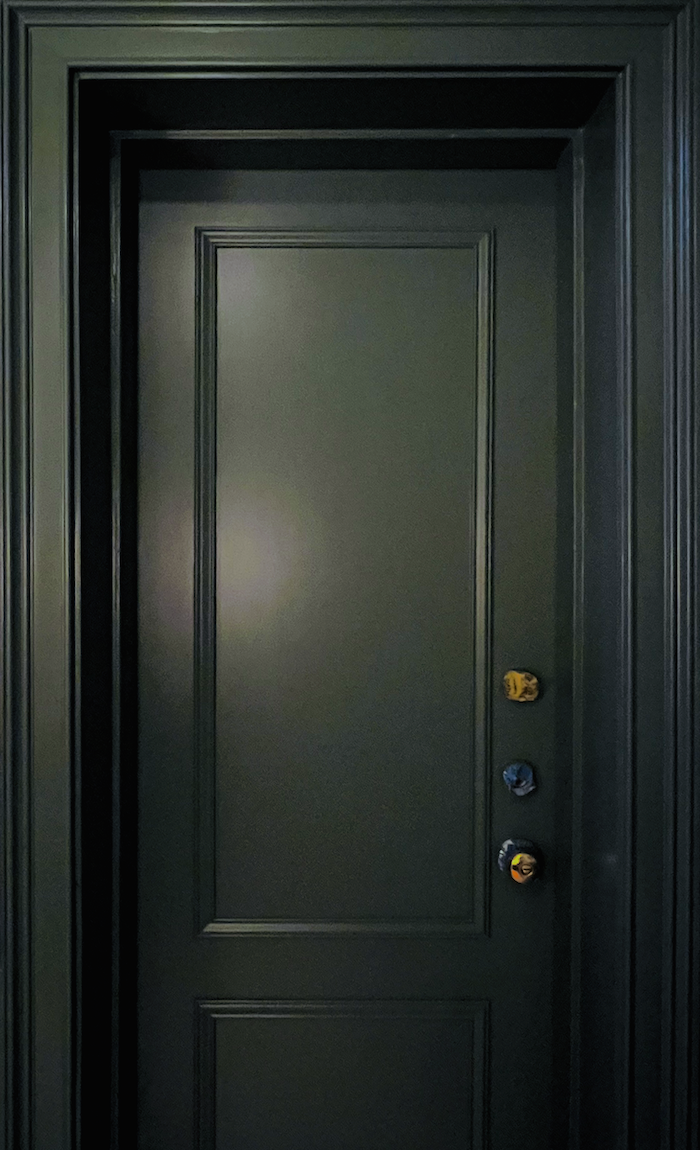
Now, get ready to be pleasantly shocked!
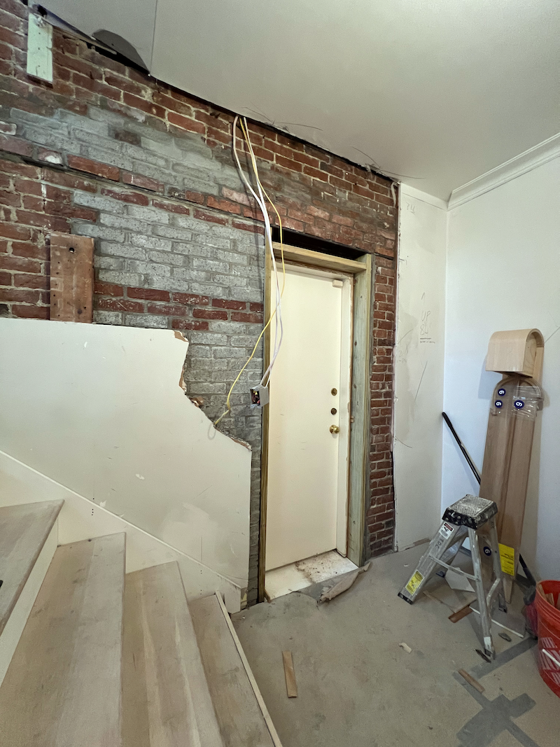
Yeppers. This is how the door above looked like last February. And yes, it IS the same door. I had the guys glue on some panel moulding. Yes, I know. It looks like a raised rail and stile that one typically finds on a traditional door. This shows that if you have a home with those awful 1950s-1970s plain slab doors, you can do something similar and save a lot of money and trouble.
I got the door moulding on Wayfair. It is not expensive, but what a difference it makes! The door casings also came from Wayfair. And, incidentally, they are PLASTIC.
I got plastic because they were going in the bathroom and I liked this particular profile.
Oh, Laurel, you tease. Can’t you show us what scary looks like?
Okay, I can, but only so we can all relax when the colorful wall colors start to get painted, and it feels like the earth is caving in. It’s not. It’s not finished, is all.
Please read about the best neutral paint colors filled with color.
First, you will see the scary image, and then the image will be virtually finished so that you can see the difference ahead of time.
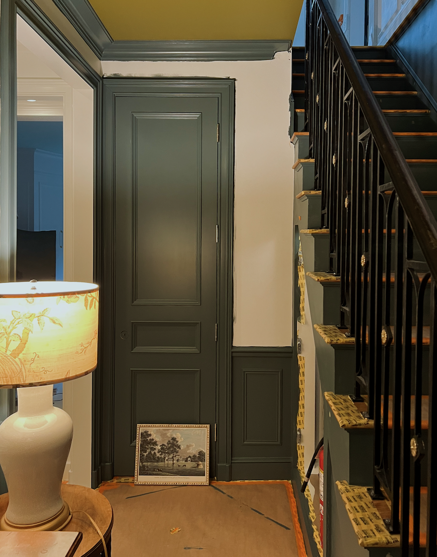
Of course, the floor is covered with brown paper and orange and yellow tape, which doesn’t help. But look at how carefully the painters wrapped everything up. This is why it’s taking so long!
Okay, and now, I’d like to show you a more finished paint job with the new painted floor and a similar bell jar lantern to one that’s going to be installed very soon!
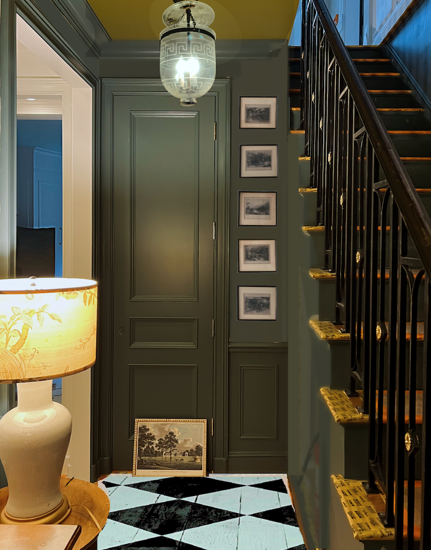
The hidden under-stairs doors are upstairs in the den, where they were painted and are resting comfortably. Although most of the apartment is white, I love these cozy, darker areas. They provide a lot of interest and charm to a space that had zero charm before the renovation. In fact, I’ve thought ever since the doors went in that the lower level looks to predate the original parlor upstairs. I love that!
The area you are looking at above is where the killer spiral staircase once lived. (below)
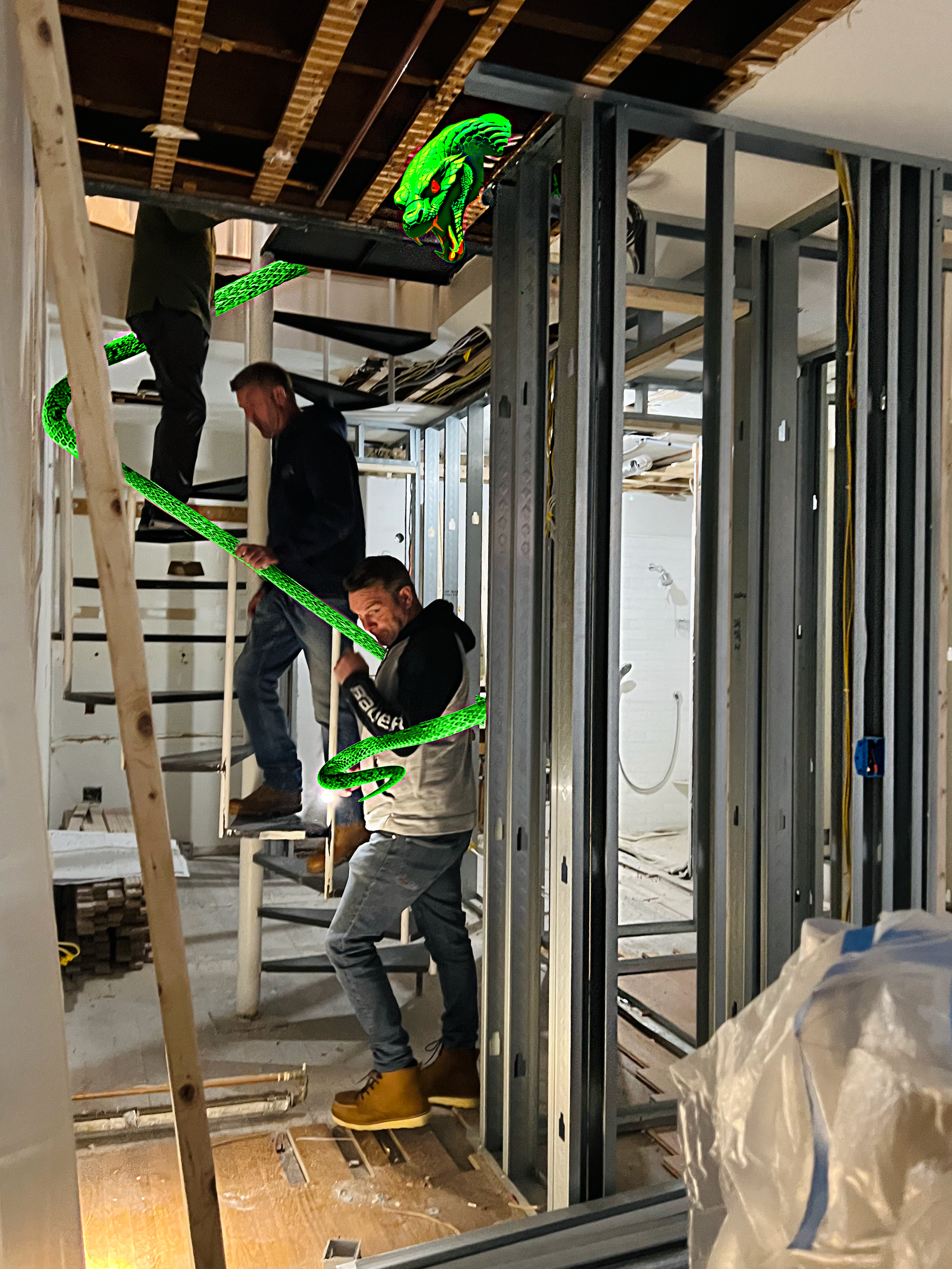
This image is from early November 2023. Towards the right, you can catch a glimpse of the original shower we kept. It was the only thing left downstairs after the demo in June 2023.
One step at the bottom of the spiral led to the bedroom (below), and one more step to the left led to the bathroom.
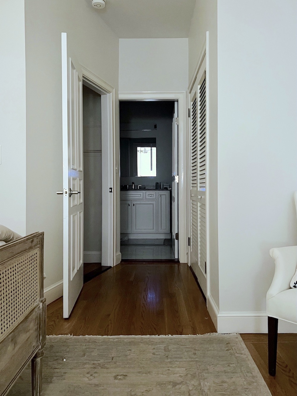
This past week, in addition to the painting, I completed two important tasks: the alabaster pendants and the new George Smith sofa. Those are two separate topics, each worthy of its own post.
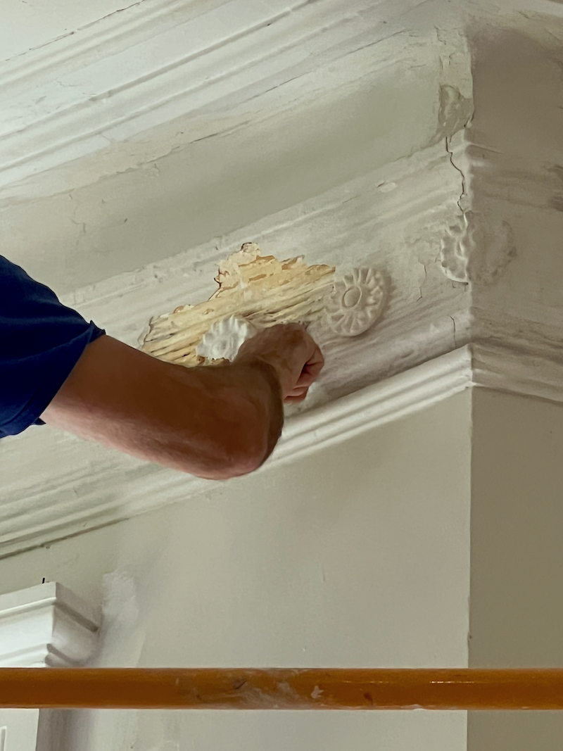
One last image from last week shows Chris standing in the clouds (via scaffolding they brought in). He is applying the replacement plaster rosettes for those missing from the living room frieze.
.
Above, he’s “antiquing” the new plaster rosettes by adding some glop to blend better with the 144-year-old gloppy rosettes.
Yes, close-up, it looks like quite a mess up there. However, they will repair the obvious damage. When it’s painted, it’s going to look a lot better. We left most of the cracks. I don’t mind them; they add a lot of character.
xo,

***Please check out the recently updated HOT SALES!
There is now an Amazon link on my home page and below. Thank you for the suggestion!
Please note that I have decided not to create a membership site. However, this website is very expensive to run. To provide this content, I rely on you, the kind readers of my blog, to use my affiliate links whenever possible for items you need and want. There is no extra charge to you. The vendor you’re purchasing from pays me a small commission.
To facilitate this, some readers have asked me to put
A link to Amazon.com is on my home page.
Please click the link before items go into your shopping cart. Some people save their purchases in their “save for later folder.” Then, if you remember, please come back and click my Amazon link, and then you’re free to place your orders. While most vendor links have a cookie that lasts a while, Amazon’s cookies only last up to 24 hours.
Thank you so much!
I very much appreciate your help and support!
Related Posts
 14 month Renoversary! and I’m Back In My Bedroom!
 Laurel’s Home Renovation 2024 – News & Deets!
 Architectural Details That Will Elevate Your Rooms – Parts 1 & 2
 Under the Stairs Hidden Closet – Finalizing the Plans!
 Renovation News and Deets!
 My Bathroom Design– Architecture, Lighting, Vanity, & More Parts 1&2
 The First Renovation Tour Of The Upstairs Living Areas! (Parts 1 & 2)


