Clever Kitchen Storage Ideas For The New Unkitchen

It may seem  new or avant-garde even, but the new unkitchen (unfitted kitchen) that was detailed in last week’s kitchen design post is actually far more of a throwback to decades if not centuries ago.

isidor-kaufmann-preparationPreparation by Isidor Kaufmann

For some of us, it’s a tough sell, going without a lot of upper cabinets for kitchen storage

Here is a litany of common objections


  • I don’t have room for a pantry, so I need every last one of those cabinets
  • My kitchen is tiny and if I don’t have upper cabinets I won’t have enough kitchen storage
  • We’re probably going to sell in ten years or less and who the hell is going to buy a kitchen without upper cabinets? They’re going to think we’re the Addams Family or something!
  • My kitchen designer looked at me like I had vomit all over my face.
  • My mother says I’m nuts when I tell her my vision.
  • My husband agrees with my mother. (for once)

I hear you loud and clear about all of these kitchen storage issues

Hopefully, they’ll come around. The kitchen designer I’d fire. She won’t ever get it. You can’t teach a caged bird how to fly.

If you want to sell your home in less than ten years, I think it’s best to stay with classic, white and efficient. (unless the style of your home would suggest something else like a log cabin, for instance.)

I received a recent comment about Downton Abbey and I had a light bulb moment.

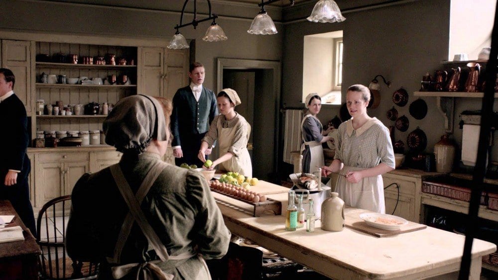
Here is our quintessential Victorian/Edwardian “unkitchen” in Downton Abbey.
maxresdefault

I think in many ways, the popularity of this show has acted as a sort of unwitting kitchen “reset button.”

I mean, how many cooks do we have here?

I count four.

Plus a footman.

and a junior footman.

And how many people were they preparing three meals a day for?

Usually at least ten.

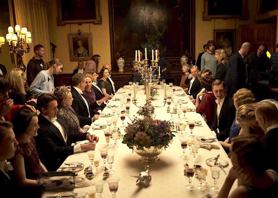
IMAGES NOT TO BE USED BEFORE 13TH SEPTEMBER 2011. 2011 DOWNTON ABBEY SERIES 2 EPISODE2 DOWNTON ABBEY returns for a second series. Pictured: General dinner scene Photographer: NICK BRIGGS This photograph is (C) CARNIVAL FILMS and can only be reproduced for editorial purposes directly in connection with the programme or event mentioned above, or CARNIVAL FILMS. Once made available by ITV plc Picture Desk, this photograph can be reproduced once only up until the transmission [TX] date and no reproduction fee will be charged. Any subsequent usage may incur a fee. This photograph must not be manipulated [excluding basic cropping] in a manner which alters the visual appearance of the person photographed deemed detrimental or inappropriate by ITV plc Picture Desk. This photograph must not be syndicated to any other company, publication or website, or permanently archived, without the express written permission of ITV Plc Picture Desk.

and sometimes much more than ten.

Downton Abbey S4 The fourth series, set in 1922, sees the return of our much loved characters in the sumptuous setting of Downton Abbey. As they face new challenges, the Crawley family and the servants who work for them remain inseparably interlinked. MICHELLE DOCKERY as Lady Mary, JULIAN OVENDEN as Charles Blake, MAGGIE SMITH as Violet, Dowager Countess, PENELOPE WILTON as Isobel Crawley and ALLEN LEECH as Tom Branson Photographer: Nick Briggs
Photographer: Nick Briggs

(not counting the camera crew.)

Yes, it’s fiction, but if they can create huge banquets with the finest crockery, stemware and silver without all of those cabinets, we can too.

As for resale. Fine. You’re worried. You should be. That’s good but tell me. Tell me honestly, which kitchen would you rather own?

This?
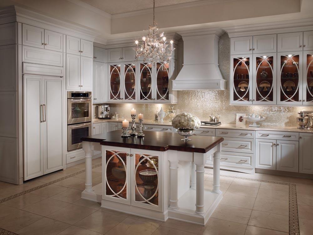
KM MAPLE DOVE WHITE

That your kitchen designer is trying to sell you.

This is not what I mean by mismatched!
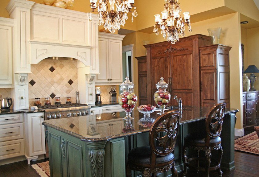
Or This?

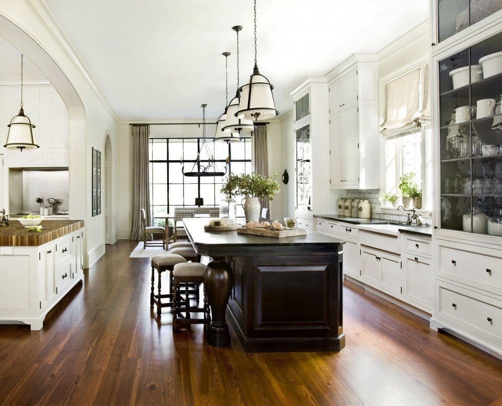
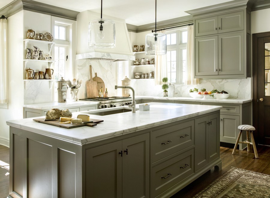
interior designer,Barbara Westbrook

Yes, this is a huge kitchen, but somehow, Barbara’s design feels elegant, clean and inviting. It is both traditional and modern
Kitchens+-+Workbook+Feature

Let’s first focus on the island that most medium to large kitchens have.

Notice what’s missing in Barbara’s gorgeous kitchen?

The stools.

I’m not going to tell you that you can’t have them. You can have them, and you could maybe have storage on the stool side depending on how deep the island is. (for seldom used items.) However, I would eliminate most of the stools and use the area for easy-access storage as Barbara has done. This is if space is really at a premium. It’s something to consider. Stools or storage?

Here are some great kitchen storage ideas for the island.
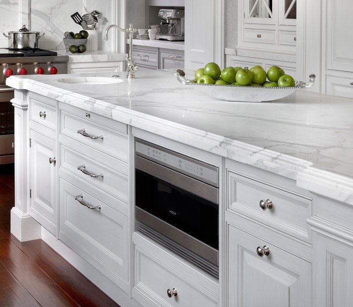
 

ObrienHarris-4

O’Brien Harris

You can get a lot into an average size 8′ x 4′ island.
Above is one of my favorite inventions, the microwave drawer.
They also make refrigerator and freezer drawers.
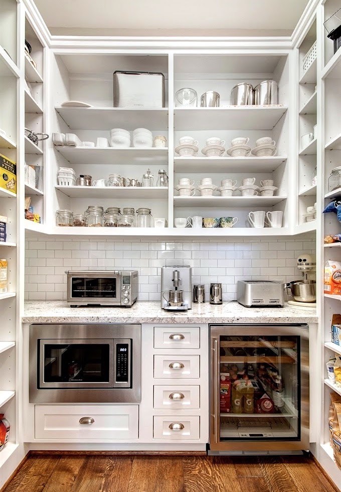
butlers-pantry-zillow

via zillow

And mini fridges. How fabulous is this small butler’s pantry!
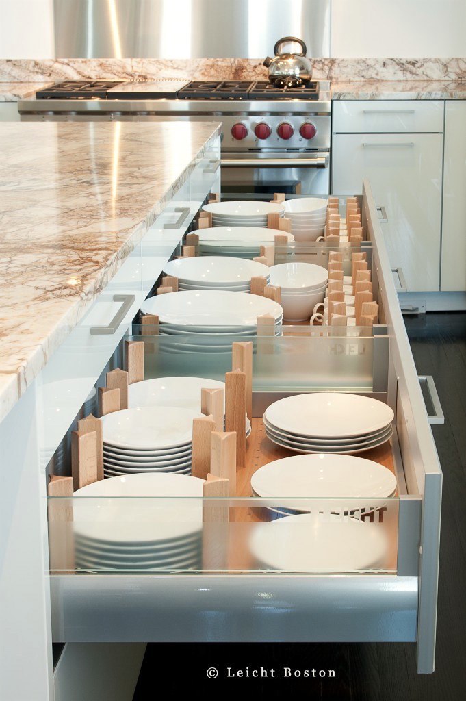
leicht_kuhn_41-681x1024

Leicht

I love this idea for dish storage.

skonahem-pull-out-cutting-table-kitchen-island

skonahem

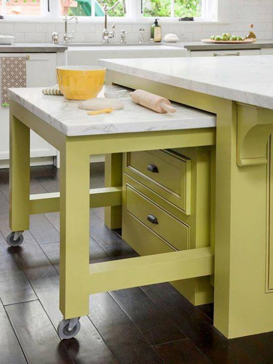
How clever is this pull out counter when one needs it for special times like holiday baking.
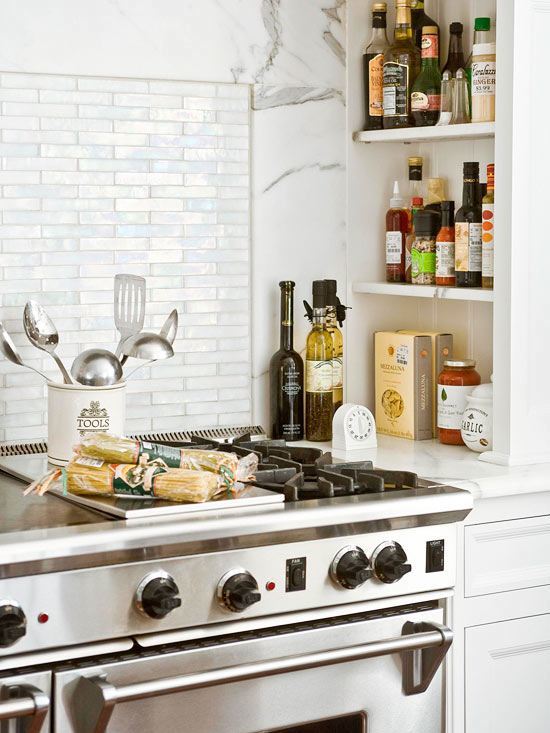
101591109.jpg.rendition.largest

Better Homes and Gardens

Similar spice niches to our kitchen in Bronxville.
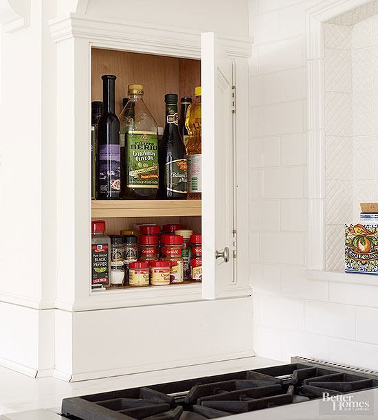
bhg-storage-kitchen-spice-rack

Better Homes And Gardens

Or, housed in a small cabinet

102060893.jpg.rendition.largest

How about this? spices hidden behind a sliding back splash!

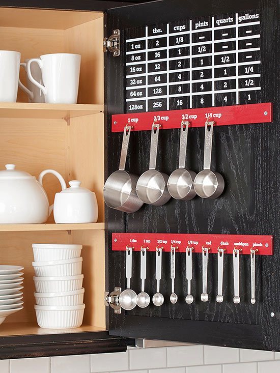
I love this baking cabinet with all of the measuring utensils and conversion chart, right inside the door
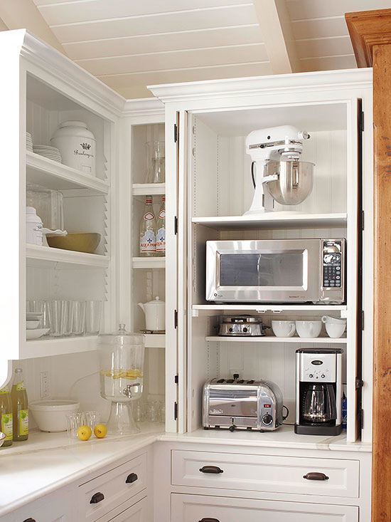
101675764.jpg.rendition.largest

Better Homes and Gardens

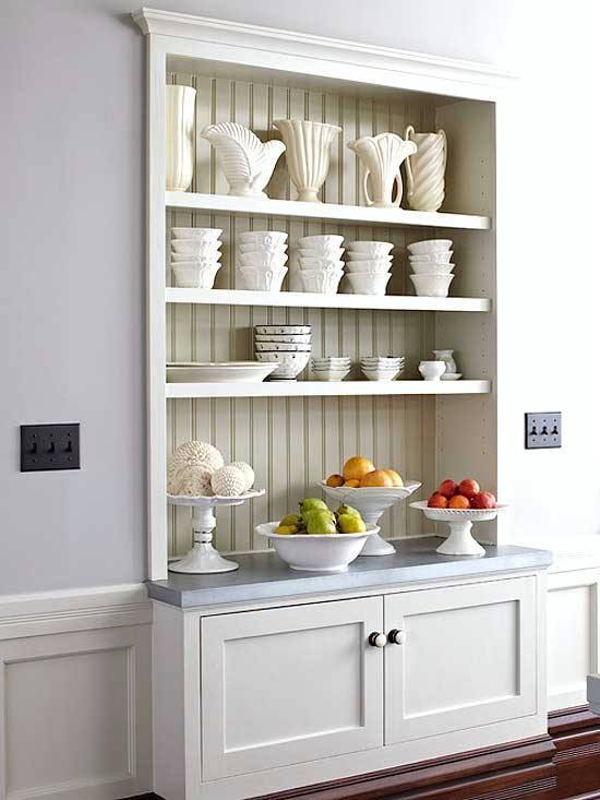
Pocket doors can be a good way of revealing commonly used appliances and then closed when finished.
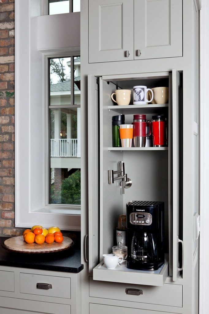
kitchen-details-and-design-Cheryl-Richardson-Home-Kitchen-50_w-682x1024

A popular image created by my immensely talented colleague Cheryl Clendenon.

Love this little tucked away coffee station!
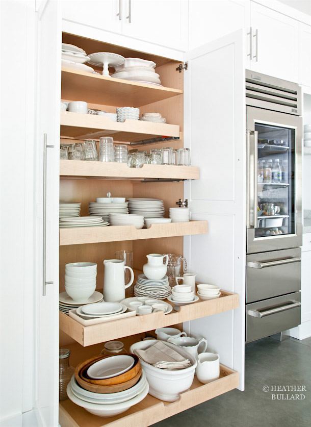
Dish-Pantry-Heather-Bullard-101-2

Heather Bullard

I don’t know why this has only come into the forefront in the last decade or so, but pull-out drawers make soooo much sense!

cory-holland-Harmony-Weihs_Refined-Mid-Century-Kitchen-14.jpg.rend.hgtvcom.966.1288

photo: Cory Holland

These days, cabinet makers are doing such jazzy innovations which make maximum use out of the available space. Nothing goes to waste. By having pull-outs and less deep drawers, things don’t get shoved to the back and lost as easily.
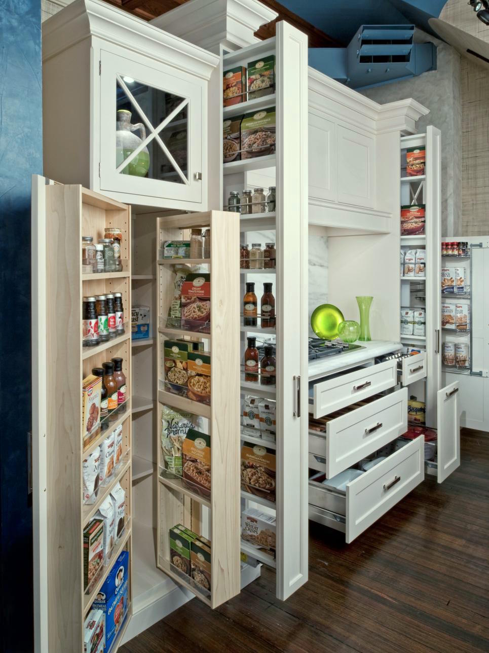
stephen-rossi-photo-Kitchen-Pantry-Cabinets_s3x4.jpg.rend.hgtvcom.966.1288

Photo Steven Rossi

One of my favorite space gaining options for smaller spaces is grabbing space that’s between the studs.
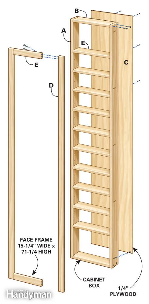
between-the-stud-storage

Between the stud diagram

You’ll only gain about 4″ of space depth-wise, but it’s enough to make a big difference.
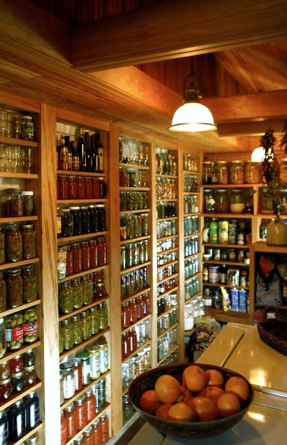
between-the-studs-kitchen-storage-pantry

The Register Guard

This looks like a cellar or basement, but very clever use of between the stud storage in a tight space.
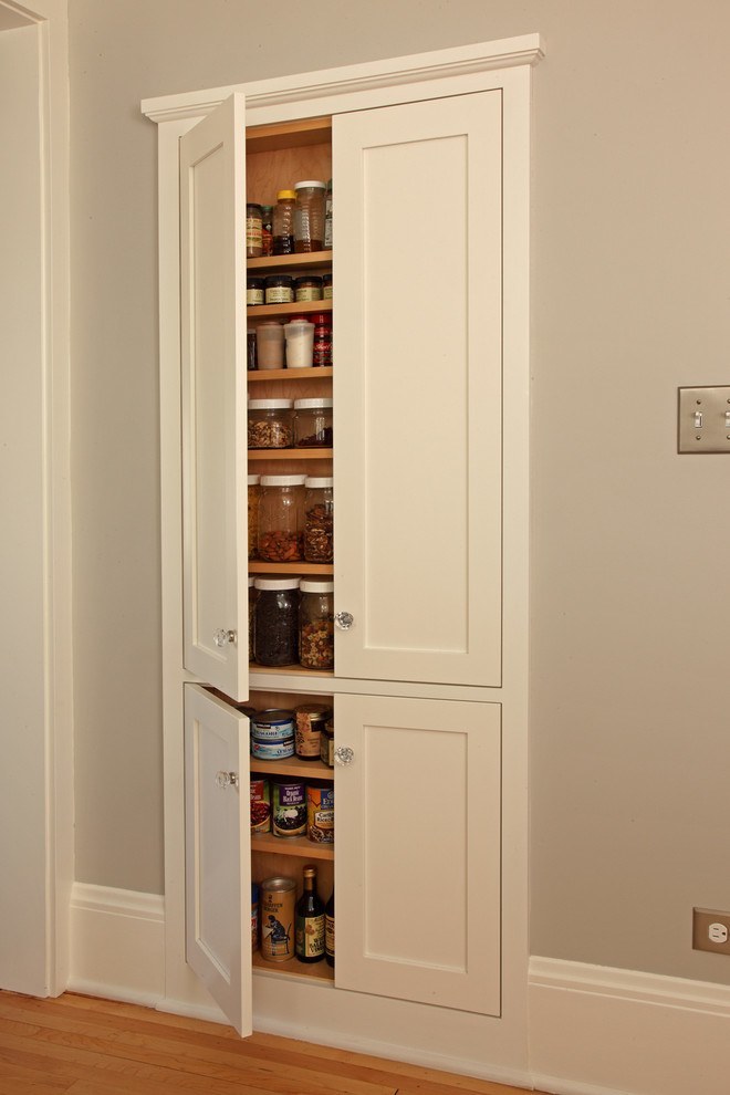
small-kitchen-cabinet-ideas-Kitchen-Craftsman-with-bungalow-kitchen-clever-storage

David Heide Design Studio

Wonderful between the stud pantry.

k13

Better Homes and Gardens

This was touted as between the stud storage. That would be a very thick wall and a little more than between the studs. But one might find this in an older home.
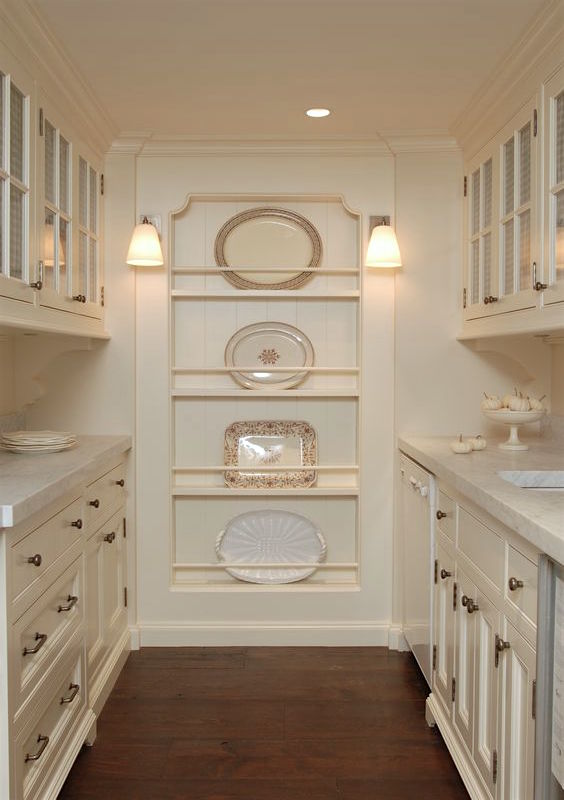
brooksandfalotico-pantry

Brooks and Falotico

Love this little between the stud niche carved out at the end of this charming butler’s pantry.
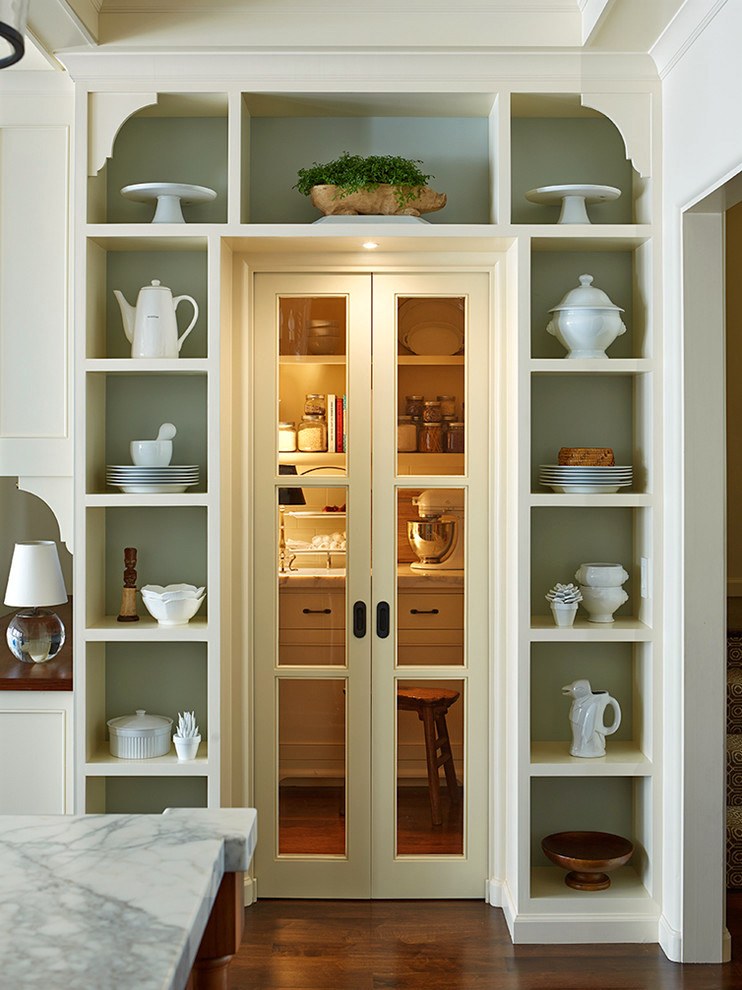
Lorin Hill

This isn’t between the studs but I love these charming niches flanking the entrance to the butler’s pantry.

xo,

Laurel


67 Responses

  1. I’ve just fallen down the rabbit hole that is your blog…I love it!!! I’m renovating a Brooklyn brownstone with 2-family status and have been trying to figure out how to incorporate garden level into upper triplex without this extra kitchen looking like a rental apt. So, I was thinking about turning it into a pantry/kitchenette that was an extension of upstairs kitchen – a la Downtown Abbey upstairs/downstairs – and stumbled upon your perfect inspiration photos. I was the only one in my family so sad when my mom tore out the beautiful white pantry of our old Victorian beach house. And I am so happy to see a new appreciation for tradition in making a home beautiful and functional. MERCI! You are my new favorite blog 🙂

  2. I’m a big fan of unfitted kitchen aesthetic, but the reason the Downton staff was able to produce so much “without cabinets” is that instead of cabinets, they had *rooms.* A larder, a pantry, a room for china, a silver safe the size of a large closet. The kitchen was a complex, and the cookroom itself was for work only, not storage. The average home today, of course, has nothing like this kind of space, just a single, often smaller room and perhaps a pantry. Thus, the development of upper cabinets, and the absence of scullery maids has made contiguous surfaces with few nooks and crannies far more desirable.

    1. Thank you so much for that Mati. I don’t expect you to know this, but all of that has been discussed in some recent posts about kitchens. (If you put in DeVol in the search box in the sidebar, they’ll all pop up) I’m a little obsessed with English kitchens and love how they’re laid out.

  3. I’m so exited to visit your blog. We have purchased a 1893 row house in Chicago and we have been struggling to bring new/modern convenience and keeping the old charm of the home. Thank you.

    1. Hi Arcelia,

      Congratulations, I’m sure that it’s a beauty. I was born in Chicago and have fond memories of visiting my grandparents (we moved to southern Indiana when I was a baby).

  4. Hi Laurel, This edition of your blog is an absolute KEEPER!
    I want to pass along an idea for using those narrow, tall pull out cabinets (as in Cory Holland’s & Steven Rossi’s examples) between 2 master bath sinks. I haven’t had the opportunity to try it yet, but doesn’t it make total sense?
    I’d probably divide the two sides vertically, and put a little collar on the side facing whoever is using it to keep bottles, etc from falling. A hidden plug on the back wall to keep a hair dryer plugged in would be a handy deal as well. Your argument for eliminating upper cabinets and
    using alternatives is so well supported here!
    This represents, I’m sure, hours of research and I, for one, am grateful! THANK YOU!!!

    1. Hi Paula,

      Thank you I really appreciate that because yes… it is many hours. I really do enjoy it and I have learned so much too! But last night at about 10:00, I was very much ready to be finished, but nope. There is getting all of the i’s dotted (hopefully) and formatting issues which… oh never mind! haha.

      Anything is fine except for that mess last Sunday! That was really not fun!

  5. Laurel,
    You are gifted, both as an interior designer and writer. What l love most about your blog is you write as thought you know what we are all thinking. You are clever and make me, most always, laugh out loud. I, by the way, am the one in the front row who is feverously writing down your every word in the hopes I can implement a fraction of what you suggest. You bring joy to the journey of making our homes feel “happy, healthy, safe, and cozy.” Thank you!

    1. Amy,

      Thank you so much for such a lovely, kind wonderful comment!

      I guess I do know what you’re thinking, because y’all tell me! Or my clients tell me. At least my years of experience have contributed too.

  6. Laurel, I absolutely love the idea of the “unkitchen” and making the transition from the kitchen to the rest of the house much more natural. The inclusion of pieces that look like furniture, or are furniture, rather than everything looking very industrious looks in a word, relaxing. So many homes have a clear design direction, but when you walk into their kitchen, you feel like you’ve entered a different home! I’m all for the unkitchen that looks like a natural extension of the rest of the home!

    1. Hi Ashley,

      First of all, I checked out your blog which is so pretty and I see that you are expecting so a hearty congrats! My first son’s birthday is June 18th. He’s 25 now!

      I’m with you on homes where the kitchen doesn’t integrate. Years ago, we were working in this classic old Victorian in Bedford, NY. At some point, someone had put in this hideous modern kitchen with these flat shiny white Euro-style modern cabinets. I think the house cried itself to sleep every night.

      1. Laurel, thank you so much for the compliment and the congratulations! We’re very excited! And yours, already 25 years old, I bet the time flew!

        And haha, I love the comment that you think the house cried itself to sleep every night. I bet you’re right. It’s so, so sad when that happens! One of the most beautifully integrated and striking kitchens I’ve ever seen was on a home tour in historic St. Louis. The house was beautifully and historically decorated with slight contemporary touches, and when you walked into the kitchen it was exposed brick, a copper hood, copper pots hung on the wall, etc. It felt so right and natural, almost like the detached kitchens from way back when. I think that house smiled all day!

  7. Another great post, Laurel!

    I agree about that mixer on the top shelf. Any time I see things like this, though, or anything else that would be unworkable or awkward in real life, I pretty much know that a stylist has been involved.

    In fact, I would guess that a high percentage of professional photos of all sorts are likely styled and photographed before the rooms are ever put into actual use, so that they are pristine and perfect for the camera, before the clients can mess them up, don’t you think? Not all, of course, but certainly a fair number.

    1. Hi Wendy,

      Yes, absolutely. They do all sorts of stuff to “get the shot.” I take my own photos and I too, often move some of the furniture because if I don’t, sometimes a piece will get in the way of the shot. It just depends.

  8. Best of Luck! Two votes for your wonderful blog!

    Another great post! This one may be my favorite of all time as you cleverly referenced Downton Abbey!!! My next house MUST have a butlers pantry!

    1. Hi Megan,
      Thank you for that. It’s difficult for me to ascertain if a post is good or not. While I try to make each one special, it’s great to hear that I hit the mark. Butler’s pantries are so cool. I’m going to be helping a client with a kitchen redo soon and it has a butler’s pantry. It’s another beautiful old home so should be fun!

      Thanks too for the votes! Much appreciated!

  9. Hi Laurel,

    Just cast two much deserved votes for your blog, which I enjoy more than I can say. Your posts are always on point, full of great information and seriously fun to read. Best of luck!

    Jes

  10. I love to see creative use of the space between studs. In my last few kitchens, we created a “vertical junk drawer” by carving out some space, backing it with pegboard and hooks, and covering with a matching kitchen cabinet door. Our current one is only 12″ wide, but it’s a perfect place for things we use frequently like scissors, tapes, measuring tape, utility knife, etc. – everything organized and easy to find.

  11. There is an old-fashioned thing my parents did while growing up that I think could be updated (by someone more talented than me) to keep dust off open shelving, at least for items not commonly used. They had deep wooden shelves in the basement and my mother would hang a piece of fabric – a sort of curtain – over the open front.

    I think much dust comes from carpeting. When we replaced some carpeting with hardwood floors we noticed much less dust. If I could I would have no carpet in my house, anywhere. I can’t be healthy to breathe that dust.

    1. Hi again, Eileen! I’ve read that dust is actually mostly dead skin that’s flaked off! So, the more people and pets, the more dust! But yes, fabric, carpet fibers, food can all contribute to the dust. I found after my beloved kitty died, that my place stayed cleaner far longer. Cat litter. That’s a big one!

  12. Using the between-the-studs space for storage is brilliant and it is completely charming. I knew a man who remodeled a small tiny house and he created little niches all over while replacing the plaster with sheet rock. Genius.

    1. That sounds very cool Eileen! We have created niches before like in a bathroom but I haven’t ever done one as a pantry. One thing, you never have to worry about losing something in the back of the cabinet!

  13. Hi Laurel,

    LOVE the drawer storage! You may have already written about this before, but what is your feeling about appliance garages with pull out drawers, and outlets inside the garages? (I have a very old kitchen, so forgive me if I sound out of touch.)

    Lisa

  14. Yours is the only blog I read so I don’t know if this is a silly question. Have you ever considered a “search” mechanism? So often I see great ideas and when I’m ready to implement one, I can’t remember which of your glorious posts it is in. Perhaps doing the search the old fashioned was in a blog is the pure excitement of finding what you love all over again!

    1. Hi Dale,

      I sent you a message but yes, the search box is in the sidebar underneath the social media icons or in my phone is at the bottom of every blog post!

      You can also search the old-fashioned way in google by putting in laurel bern interiors and then whatever you’re looking for. That usually works for me.

      I’m so flattered to be your only blog! That’s high praise indeed!

      1. He is not the only one for whom you are the only decorating blog! I have never followed a decorator before, but stumbled onto yours while searching for paint colors. I hope to hire you for a paint consultation soon.

        Pleased to vote for you.

  15. Hi Laurel,
    I noticed the placement of the KitchenAid mixer on the top shelf, as did many other commenters, and thought the same thing they did, mainly, that no one who actually cooks would put it there, haha!
    I also see toasters and toaster ovens placed inside enclosed cabinetry, and think that it is a recipe for a fire. Those appliances give off a lot of heat while in use. I used to keep my toaster underneath an upper cabinet which had an under cabinet lighting strip installed, until I noticed that the plastic cover for the strip had warped and melted and the cabinet had scorch marks!
    Thanks for another useful post with those gorgeous photos.
    I also voted for you in both categories, and FYI, I was able to vote again from my phone.
    Rosalyn

    1. Hi Rosalyn,

      It’s true. I don’t think some of these are real kitchens or someone came in with a bunch of stuff and prettied it up. Great point about the toaster.

      And wow! Thanks for voting for me and being able to get a second vote in! I really appreciate that!

  16. Love your blog, Laurel. Pinned many of your posts. Voted for you! Thank you for sharing your advice and talent.
    Susan
    Hoover, Alabama

  17. Oh, the storage pull outs and pantry around the refrigerator is fantastic! Wish I had done that in my kitchen. I VOTED FOR YOU. You totally deserve to win! Good luck

  18. Hi Laurel! You just find the most FABULOUS photos of any other design blog!! I thought I would include a pic of my ironstone collection here….think I need to overlap more..IMG_7546.JPG it’s in my DR……..
    Anyway love these ideas! I will say that I used to have open shelves in my kitchen and although I love the look but it’s unreal how much dust and grease sticks to everything on shelf! Even an exhaust fan doesn’t get all the grease. Plus once I STYLED THE SHELVES I would get mad at my boyfriend for actually USING the dishes! Haha.

  19. Hi Laurel,
    Always interesting and informative information that you share with all of us, thank you. I also voted (for you in both categories) and wish you good luck you are deserving of the recognition. I also own your Rolodex…excellent resources, etc. I wish you the best!
    Karen, Boston

    1. Thank you so much Karen for the votes, support and especially glad that you’re enjoying your Rolodex. I use mine too! There are so, so many times that I’m thinking… oh drat, what is the name of that company??? Well, just open the rolodex, go to the category and in less than a minute, there it is!

  20. Every time I see the picture where they store their Kitchenaid mixer on the top shelf, I think what a stupid place to store your Kitchen mixer. Those things weigh a ton! Getting it down from there to use would be very difficult. Either the person who owns that kitchen never uses her Kitchenaid, or the photo stylist just put it there because it looked good.

    1. Hi Loribeth,

      I was so focused on the cabinets that I really did not see that thing up there that’s definitely the work of the stylist. It looks very nice and sculptural up there. haha! Yes, it’s a ridiculous place to put it unless one lives with a brawny (tall) dude or as you said one never uses it.

      1. I can always tell when I stylist has been involved because they do things like that! haha! I probably noticed it, because I used to have to store my Kitchenaid on a shelf in our utility room. We just didn’t have room for it on our countertops. It was such a pain to get out every time I wanted to use it that I almost never bothered with it.

    1. Thank you Monique. That’s always been my goal. To be entertaining, give good solid advice without sounding too much like I know it all, because I don’t. And finally, to post the highest quality images I can find to demonstrate my point(s).

  21. Amazing ideas Laurel! I think I pinned every picture…lol… always enjoy your blog. One of the few that I itch to open.:) Keep up the great work.

  22. we just bought a new townhouse with white kitchen cabinets and black granite counters with blue/gray painted walls. We have been looking for a backsplash, but all I see in magazines, or on Webb sites, is subway tile! Not that I don’t like it, but would like something different. And believe me, I have not one designing bone in my body, so I can use any help or suggestion you can share.

    Also, I just want to say I really enjoy reading your blog and I have referred to it a lot, especially while trying to decorate my new townhouse. I look forward to all your emails!

    1. That would be a great post Maureen! I’m adding it to my post ideas folder. I do have to say though, white cabinets, black granite counters and white subway tile is an awesome, clean, classic look. I lived in a townhouse too for quite some time. Actually, never put the backsplash in. This is funny, I’ve never had one!

  23. My dream kitchen would be no uppers and a huge bank of windows over the sink. Luv the drawer microwave, but honestly, just give me a cook and I’d be happy with ANY kitchen ?

    1. Thank you so much Kathy! Much appreciated! I feel so fortunate because it’s not enough just to write a blog. One has to have all of the background stuff together, or no one will find it! I’ve had some amazing people mentoring me the last 2+ years and without them, I’d be nowhere!

  24. Kitchen “designers” often look askance when one doesn’t want overhead cupboards

    because, think about it, it can nearly half the price of the cost of their kitchen.

    if you’re not sure, do the bottom ones & wait to see if you can live with it, or,

    preferably, ( & have fun sourcing, “everything shall come to he/she who waits”), put a

    mismatching antique cupboard above, a plate rack, or get a joiner to build far cheaper

    shelves. All, as Laurel,God-Bless-her-&-all-who-sail-in-her-Bern, suggests.

    1. Hi Joanna,

      Yes, the dumb ones I’m sure think that way. However, they could get clever and create an extraordinary storage system in a cabinet or small closet. Part of it is just lazy thinking too. They know what they know how to do and don’t want to change it because it’s become rote.

      I think what I was trying to convey also is not that one has to live with less storage but that the available storage space can be reconfigured and utilized differently so it’s less “kitchen-y.” Something that I’ve stressed but only implied here is that in a larger kitchen, how much counter space does one need? Floor to ceiling cabinets allow for a cleaner line if designed properly. Well… all food for thought. Hopefully, not bErned :] food

  25. Hi, Laurel,
    Beautiful kitchens, but lots of luck getting the Kitchen Aid mixer down from the top shelf every time it is used in the photo with the text about Pocket doors.
    ( a BHG photo.) Mine is in a cabinet just below the counter and it weighs a ton, making it a real pain to lift up and use. I know, …I should have had a ‘lift-up” shelf built into the cabinet.
    Anyway, ….I laughed when I saw this one on that top shelf near the ceiling and just had to write to you.
    Love your blog! I voted for you and hope you win in both categories.
    Suzanne in San Diego

    1. Suzanne and Laurel – That is the first thing that I thought of when I looked at the photo that included the Kitchen Aid mixer on the top shelf! Having one, I know how heavy they are.

      Laurel – I love getting your emails, the photos are beautiful and I really enjoy your writing as well as your decorating ideas. Thank you!

      I am surprised that my big objection to open shelves in kitchens was not included in your list: The items on the open shelves get dusty and require washing much more often than items kept in closed cabinets.

      Love your blog and I am very pleased to vote for you!
      Anna in NYC

      1. Oh Anna, my bad! And believe me, it was not at all intentional! But you are right. I think it also depends where one lives and also how much heavy-duty cooking is going on. In some of these kitchens, it looks like NONE! lol. I think I would be afraid to go in and mine can become a total mess in like two minutes!

        Thank you so much for the vote and I see that you’re in NYC! We’re neighbors! I did live in the city for 13 years and yes, the grime factor is a problem. I would clean off the window sill and the next day it was all back! That sooty stuff!

    2. Haha! Yes, the mixer and I’m just reading comments before answering and I see there’s a whole line of people wanting to rip that baby down! Alas, I wanted one but never got one. (I’ll spare you the sob story) And thanks for your well wishes! Much appreciated!

Leave a Reply

Your email address will not be published. Required fields are marked *

This site uses Akismet to reduce spam. Learn how your comment data is processed.

Welcome To Laurel Home!

laurel-aarons-18th-e1456449963926

Hi, I’m Laurel, and Laurel Home is the website and blog for Laurel Bern Interiors.
I’ve been creating new-traditional interiors since 1988. The blog is where I share all.

New Edition, November 2023! Get The Indispensable Guide For 100s of Home Furnishings And Interior Design Sources That Everyone Is Raving About

laurels-rolodex-final-book-cover-master 10th edition 23-24

laurel home archives

Categories:

Please click the image below for more info about my rockin’ Interior Design Guides for 2024!

Laurel Home Interior Design Guides 2024
Amazon ad

please click below to check out my favorite decorating & design books

Laurel Bern's Favorite Interior Design and Decorating Books
Subscribe To The Laurel Home Blog And You Will Receive A FREE Guide Where I Share How To Get Your Paint Colors Right, The First Time.