I Wanted Charming Home Decor, But Ended Up With Blah

Dear Laurel,

Wondering if you could do a blog sometime on how to layer a home so it doesn’t look like you bought everything from a furniture showroom? I mean, I wanted charming home decor but ended up with a sterile furniture showroom!
 
Here’s what happened. Recently, we gutted and renovated our entire (fixer upper) home. We spent as much as it costs to put all four kids through college- twice! lol
 
How does one wade through the clutter, knickknacks and artwork and edit what to display so a house feels warm and cozy? It’s incredibly challenging!
 
My goal is an uncluttered, yet finished look.  When we bought this house I envisioned a rustic, elegant lake house style with a calm, airy and neutral palette and somehow it morphed into busy and cluttered with no real style direction. I know it’s not right but can’t quite put my finger on why it’s not.
 

Even the kitchen! I regret the painted tile backsplash, which ended up dictating the entire color scheme. What I really wanted was a house with lots of green and ended up with a grey and blue palette.   I’m struggling with what to do to finish off the family room space. We never spend any time in here because it’s not an inviting place.

I know that the brown chairs are too big. I hate them. I’m 5′-7″ and my feet don’t even touch the floor when sitting in one of them.We hired this decorator who talked me into a lot of things I didn’t think were quite right. But she assured me that it would all be fine.

It’s not fine and now I’m kicking myself that I didn’t put my foot down. Although, I do have to say, that she did a fabulous job of the renovation and breathing new light into this dark, dreary and bizarre home.

 
This is the room that feels sterile to me. The ottoman is going away and I think adding tables and lamps will help to give it personality. Do you always like to see window treatments on windows? I hesitate to cover these because the view is beautiful.
 
(I’m on the hunt for new dining room furniture and bedroom furniture too.)
 
I adore your blog- it’s like a little gift in my inbox every time:)
 
All the best,

Kathy

PS: I am not expecting free advice and if you don’t have time or this topic doesn’t suit you, no problem at all!


I was curious about this one, so I asked Kathy if she could send me a couple of photos. A few hours later, she did. Well, more than a couple, but all in one email which is fine.

This is a seriously gorgeous home!

However, I can see exactly what Kathy is talking about; it’s not a charming home, just yet. It has the potential, but it’s not quite there.

Here are some images.
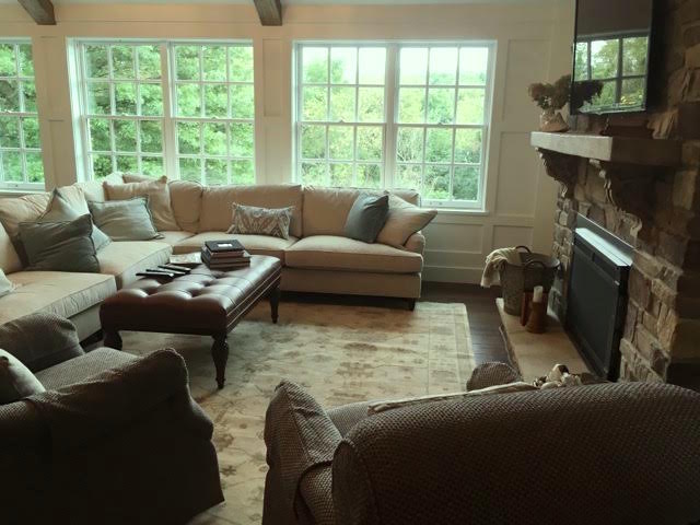
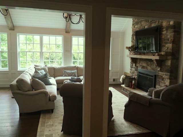
hk-living-room-ottoman

k-living-room

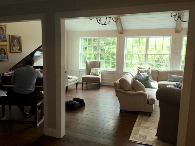
k-living-room-with-piano

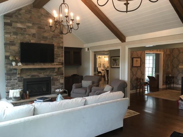
k-living-room-fireplace-wall


There’s a compelling reason why nobody goes into the family room. This is an issue that’s as common as cornflakes.


The room is a little sad.

And one-note.

In the key of B-flat.

B, for blah.

Why is it blah?


This room does have light, medium and dark, but too much medium and the light is only on the walls which is creating an imbalance. There’s just too much gray. And even a neutral room needs some color.


Let’s talk about what is right with the room.


I think that there is plenty that IS right and that’s the good news.

The room (and entire home) is intrinsically pretty. There are big, bright windows, A handsome and in-scale fireplace wall. Hardwood floors in a deep rich color.

The sectional is lovely too! In fact, I rather love it!

And that one is a big deal, because it’s more common that the sectional gets mucked up.

The rug is okay but a part of the one-note issue.

The chandeliers are a good size and the iron is appropriate for the rustic, casual style that Kathy wanted.

The basic layout is almost okay.

I say almost because of the aforementioned BIG GRAY-BROWN CHAIRS.


Now, let’s look at Kathy’s wish-list.


  • rustic and elegant
  • lots of green
  • stylish and layered


I’m not really seeing much in the way of blue. I am seeing beige and gray.

But there’s no reason that we can’t add in the green. We’ll get to that in a minute.


What is a beautifully layered home?


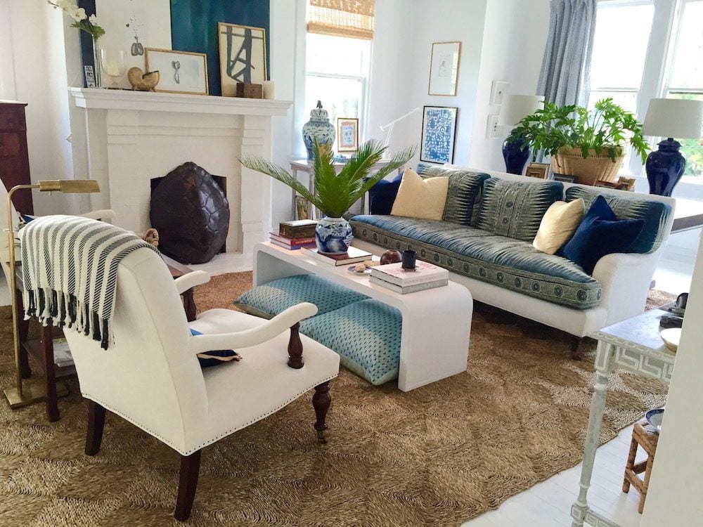
I think it’s easier to show than try to explain. And the first designer who comes to mind who has style to burn is William McLure. Not only is he proficient and interior design, he’s a superb stylist AND an artist! A real interior design triple threat which is exceedingly rare. I am completely besotted with his rooms!
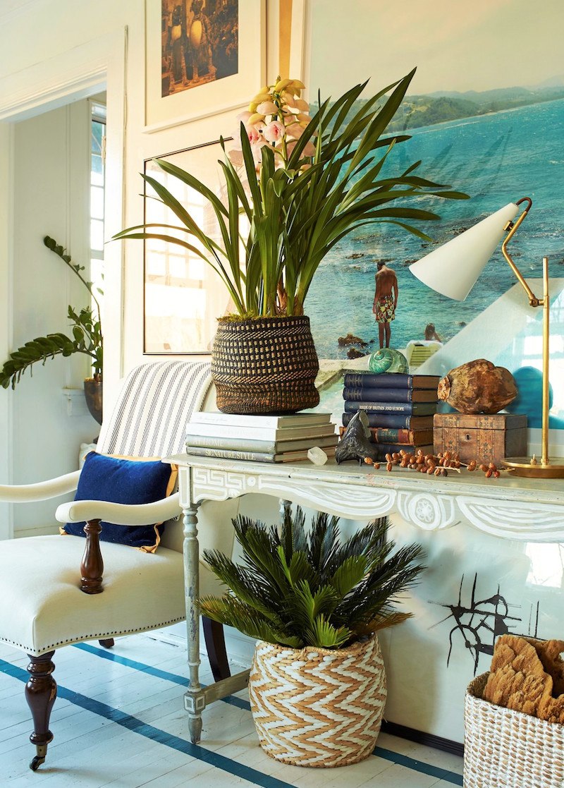
william_mclure_apartment_02_07_2016_6714

A throw on a chair and a pillow. Artfully arranged console. White painted floor with dark blue ribbon banding. Sublime!
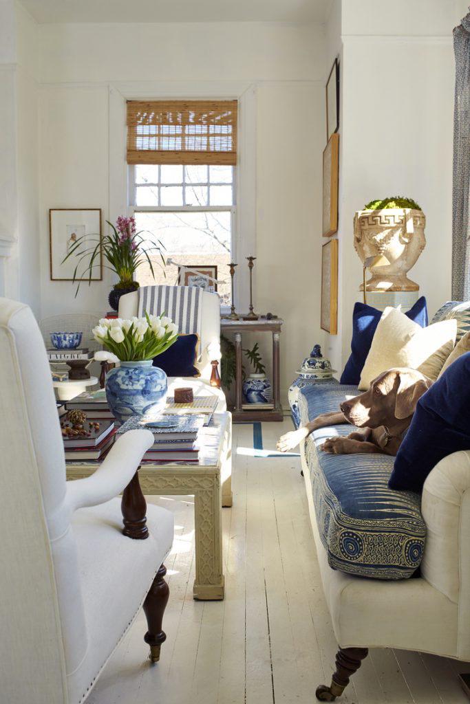
Charming home decor of William McClure

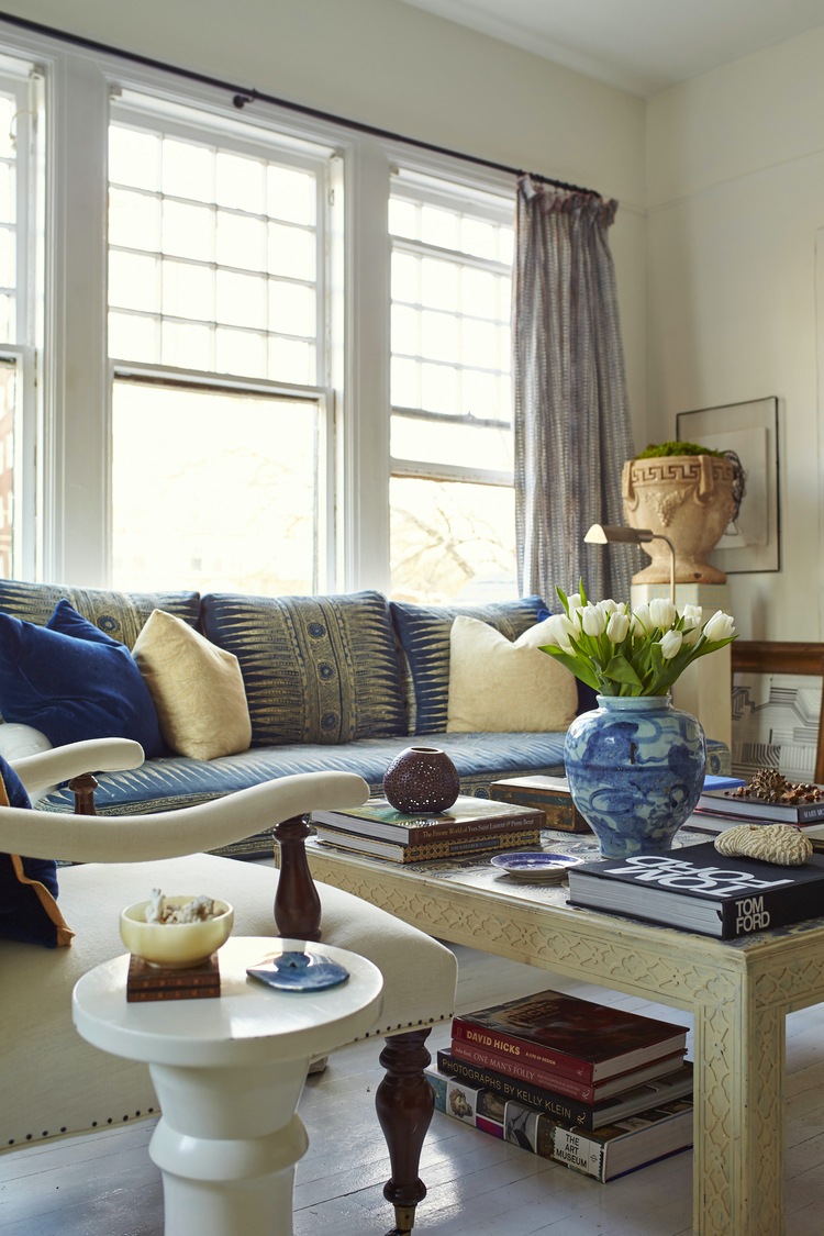
A largely white, neutral room but not completely devoid of color. I think I just have to have a home with white-painted floors!
 

william_mclure_apartment_02_07_2016_6766

Books. Lots of big beautiful books.

william-mcclure-living-room

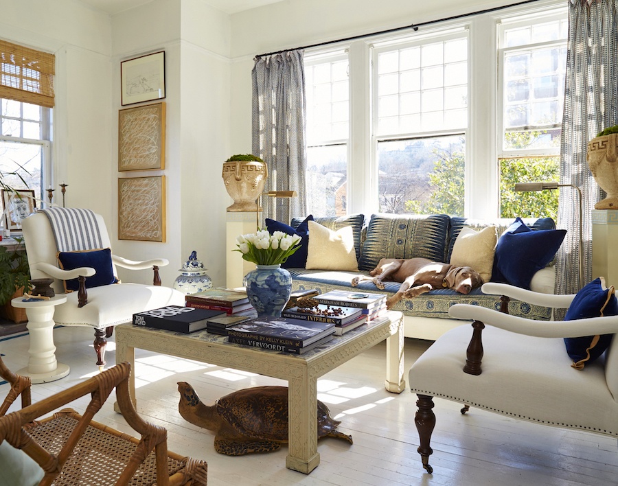
Multiple shades of one color. In this case, blue. And Chinoiserie accents! If you look at William’s portfolio, you’ll see this room in red and I think I found another iteration in navy. It seems he uses his home as a lab of sorts. Or else, he just likes to change things around a lot.
william_mclure_apartment_02_07_2016_6475

Is that a tortoise under the table?  haha. Whatever. See how beautiful it is to style the coffee table with big books and one elegant vase with fresh flowers. Of course, the best accessory of all, is his gorgeous Weimaraner.  Lucky dawg!
william-mcclure-bedroom

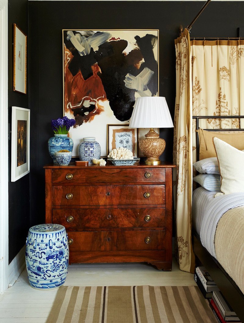
Black walls in the bedroom. But it doesn’t look dark to me. Beautifully styled chest.
william-mcclure-beautifully-styled-vignette

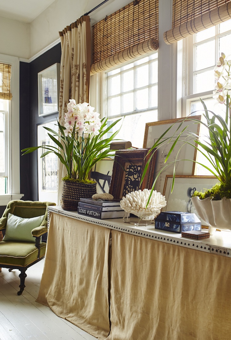
William is a master at stylish layering. And it’s one of those things that is difficult to explain how to do it. But, we can see when it’s not quite coming together.
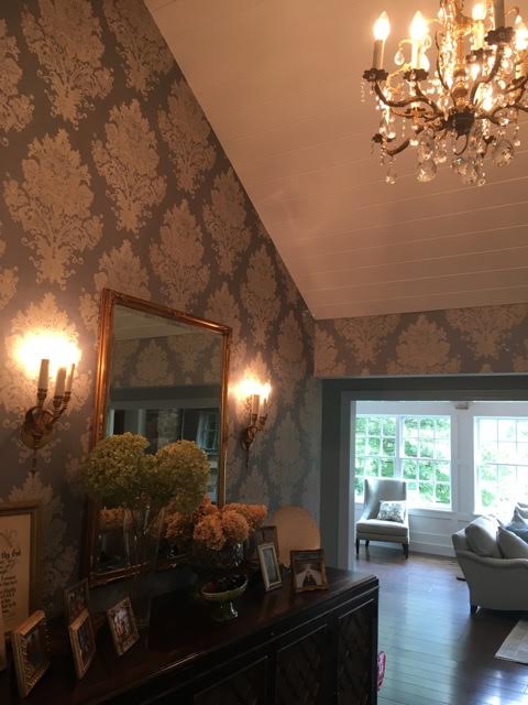
 

k-entry
This is Kathy’s entrance. It is lovely, for sure, but one thing it’s not and that is rustic. The credenza is fine. I wish the mirror was a little larger. There is absolutely nothing wrong this, but that’s not stopping me from making some suggestions. lol

I think it would look great to create a collection of something, or use one of William’s vignette’s as a template of sorts. So, the first thing is we need to find a new home for the family photos.

I see this a lot. A lot of family photos scattered around the house which are used to decorate. It tends to look a little common. But, of course, we must display the photos, just not in the entry.
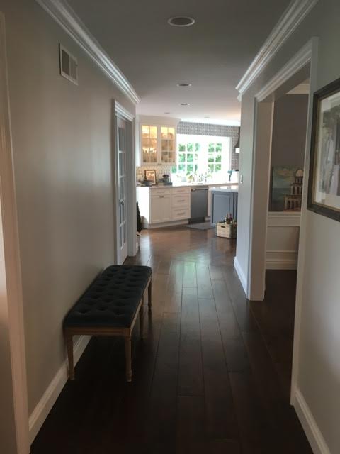
 

k-hall
I would create a beautiful gallery wall in the hall of family photos.


Now for the great room and the need to create some charming home decor.


Kathy wrote me later and said that she thought that maybe the chairs would grow on her. No, it’s the other way around. She is going to begin to grow on the chairs. They are the number one issue. I think that she should not continue to put good money after bad, as they say.


Perhaps sell them on Craig’s List or give them to charity and take a nice tax deduction. Or maybe they could go in the basement if there’s a finished basement and they’ll fit down the stairs.

I think the chairs should be far smaller.
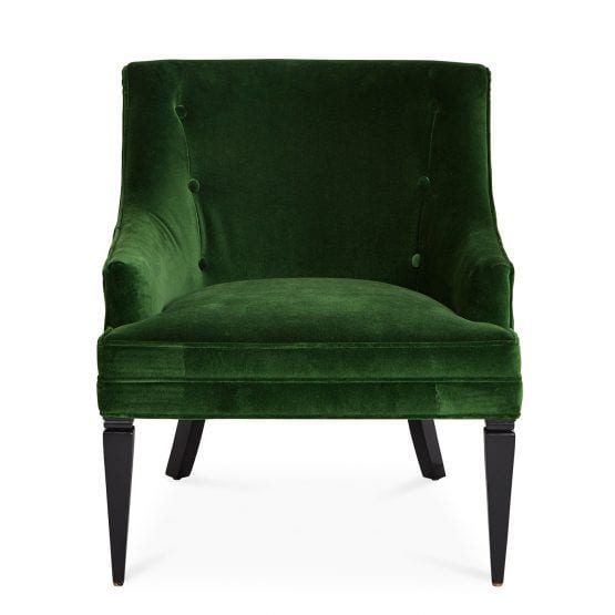
haines_ven_emerald_a

This room needs some color and I found the perfect shade of green in one of my favorite occasional chairs from Jonathan Adler. It’s available in numerous fabrics. I love this rich, deep green!
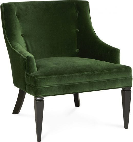
 

haines_ven_emerald


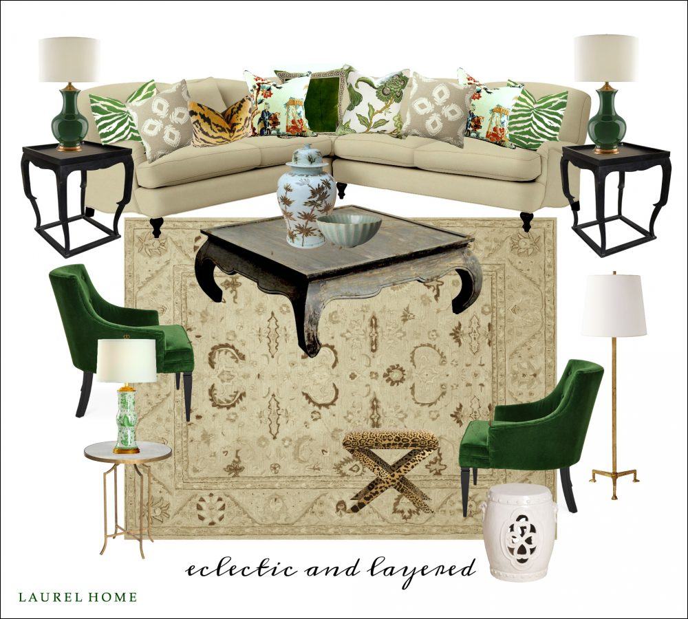
eclectic-and-layered


Here’s a mood board I made.

Hopefully, the mood is happier now! :]

It’s not 100% complete. This is a family home and probably there wouldn’t be as much stuff as in William McLure’s rooms, but I put in a Brown and white Chinoiserie vase and a little bowl for starters. The brown and white temple jar would also look great on the fireplace hearth as long as she doesn’t have kids as wild as mine.

I brought in more green to balance out the chairs and to bring a little life into the room.

The opium coffee table is a one-of-a-kind vintage piece. Sometimes you can find pieces like that on One King’s Lane. First Dibs has them but are usually pretty expensive. Then, there’s Circa Who. And having a few pieces like that is one way to get rid of the sterile furniture store look.
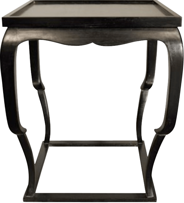


noir-qs-bellini-side-table-hand-rubbed-black-28-high-copy


The side tables are from Noir Furniture which is one of my fave sources in Laurel’s Rolodex.

I think bringing in a bit of black (and white) is important to balance out the room better.

If I had been starting from scratch, I would’ve chosen a different rug. I think the rug needs to have some white or cream in it.
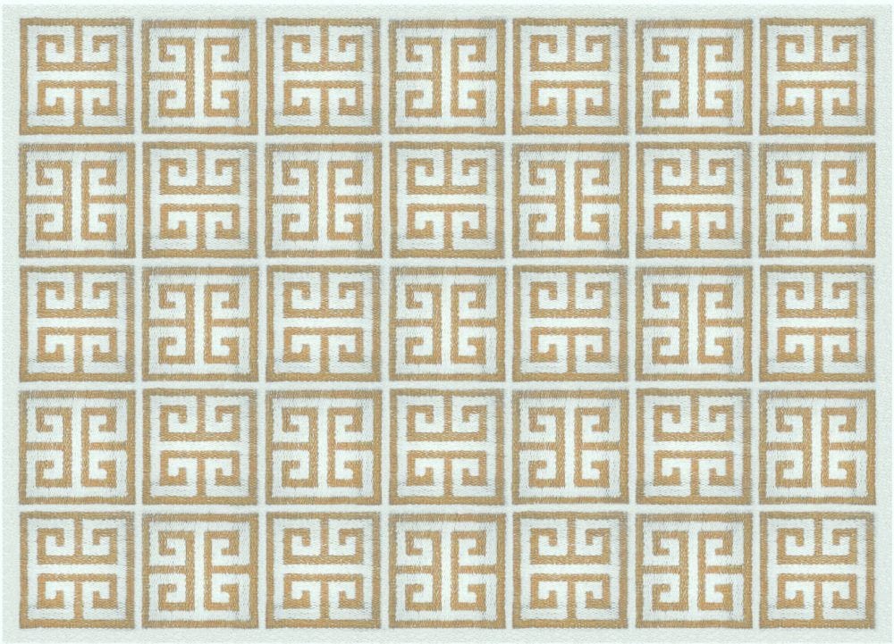
jonathan-adler-rug_greekkey_camel

It could be a simple geometric like this also from Jonathan Adler. This would help balance out the white walls. And the geometry would add a fresh, classical element, I think. Jonathan Adler has lots of fresh, geometric rugs in his collection.
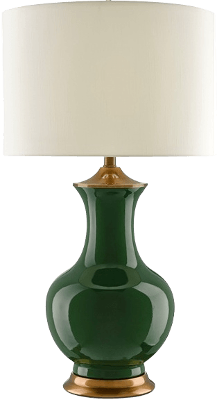
 

lilou-bottle-green-currey-6000-0022-copy

The green lamps are from Currey and Company.
loa-1254_rb__82332-1452637216-1280-copy

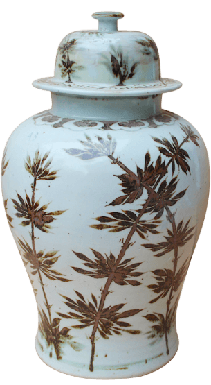
I’m a little obsessed with this Sienna Brown and white temple jar from Legend of Asia. Another fave from Laurel’s Rolodex. (this one is to the trade only but available retail at various sources)

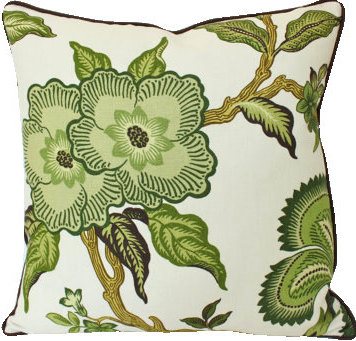
The chairs in the back, I would love to see with another pretty pillow. It could be this one.
the-pillow-studio-hothouse-flowers-green

Schumacher’s Hot House Flowers in Verdence by The Pillow Studio Shop

Or another pillow with green in it.
pillows-for-an-eclectic-living-room-charming-room-decor

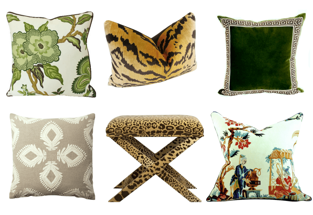
And here are some other pillows and a cool but expensive stool. Please notice that they are coordinated but not perfectly matched. We want to add some color to the sectional, but not toooooo much color!

Below are the links to the rest after the Hothouse Flowers pillow.

Scalamandre Le Tigre Pillow

Green Velvet Greek Key Pillow

Beige Pillow – Serena and Lily

X Stool

Le Lac By Brunschwig Pillow


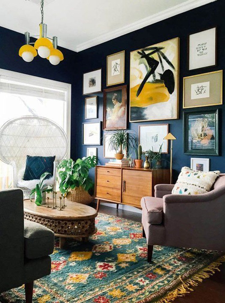
I can’t quite make out the entire back wall, but I would create a wonderful gallery art wall.


I’ve done a few posts about them. (I’ll put them in the related posts at the bottom of the page)
eclectic-gallery-wall-with-navy-walls

For Kathy’s gallery wall if she chooses to do that, I would have lots of neutral tones but also bring in some greens, blues and maybe a few other colors.

This was a challenging exercise. Of course, it is far easier to start from scratch when designing a home.

Kathy shouldn’t blame herself. It’s exhausting to renovate a home and it’s easy to run out of steam and let someone else take over.

No matter what she does, I don’t think it would take much to add the touches that will make this gorgeous home into the cozy, charming home of her dreams.

xo,

Laurel-e1443573876689PS: Some links are affiliate links meaning if you click on them, I will make a few pennies. :]

Save


119 Responses

  1. Hi Laurel,
    I have to agree with Nancy, I’m a strong blue person. Always have been, but I could live in that green room the rest of my life! Great work.

  2. Thanks Laurel, and to all your readers as well for the great comments and suggestions. I’m looking forward to adding some life into my family room. Your blog is so helpful and incredibly entertaining too!

  3. Oh.. and PS Laurel….. this was an absolutely gorgeous, beautiful post and very educational too. thanks a million for , as always, delicious eye candy!

    1. Thanks so much Carol. That was my goal from day one. To share everything I’ve learned (and am still learning!) and rock it with beautiful visuals.

      It took a while for folks to find me, though and it wasn’t until I got some help and got my proverbial internet ducks in a row that the blog even got on google’s radar. But we’re passionate lovers now. lol Although, sometimes we do get in a little lovers quarrel. That dude is always changing the rules but he is better at giving me (and the rest of his harem) some warning, at least. ;]

  4. I too have a fully upholstered swivel-rocker chair with an ottoman to boot. I purchased it at Ethan Allen in maybe 2003. Spring-down cushion. They have names for everything and it was called the Carolyn chair. Probably cannot get it any longer. But i’m never letting go of it. It’s long past due time for a third re-upholstering. But that’s when furniture was still made to last and it all came from America. I’m in Florida and with a hurricane bearing down on us, I think tomorrow morning I will cover it in plastic and a heavy duty drop clothe. Seriously! That chair is irreplaceable and hurricane rain seems to get in a house from everywhere. Thanks for reminding me how precious that chair is .

    1. Hi Carol,

      Praying that Matthew won’t be too bad. I love that you have a cherished piece of furniture that won’t be parted with!

      But, actually, most upholstered furniture IS still made in this country. No, not the super-cheap crapola stuff, but custom upholstered furniture– definitely. Even good ol’ Pottery Barn is manufacturing their upholstery in North Carolina. They even have a video on their website.

      But most importantly, hoping that the storm blows every quickly and everyone will be safe. (including the swivel-rocker!)

  5. This renovation has a lot going for it. I love the paneling. The man sitting at the piano is a nice touch.

    The one thing I realized reading your blog is I need to see everything that goes into a room as a single idea that works together. For example, I don’t think I would like that coffee table if I saw it alone. But when you put it all together, it really works. Great job!

    How do you work in the family pictures? My wife and I disagree about this. I say gallery in the hallway like you did or only a few here and there. Most of the time I think they look tacky. We compromised by allowing me to add filters to either make them black and white or distressed so they fit in better as art.

    On an aside… Do you read mcmansionhell.com ? I think your long lost twin writes that blog.

    1. Hi George,

      It’s true that context is incredibly helpful. Even for us designers. I can’t tell you the number of times, I’ve walked into a fabric showroom and seen a chair or sofa upholstered in a fabric. It looked amazing but if I had seen the fabric in isolation, might’ve skipped over it.

      I do not know that blog, but I do now! Thanks for letting me know. I’ll enjoy reading the posts, for sure!

  6. Laurel,
    Another grand post. I learn so very much from your postings.

    You have the only blog that I consistently read the comments. Two reasons. Number one your readers have wonderful insight and you respond to your readers. It is fun to get others take on your advice and hear what you have to say about other view points.

  7. You are so talented! ~sigh~ I wish you’d take reader submitted pictures and transform one room a month as a regular blog feature. I’d especially love it if you occasionally used homes that didn’t feature great architectural features … oh, you know … like my 1964 ranch! lol

    Also, we live in the South (Georgia) and have a swivel rocker in our living room. I don’t know anyone who doesn’t own at least one! 😉

  8. Laurel,
    I just love you!! Your style/posts have helped me hone in on my true style, which up until recently was quite undefined… I was drawn to the “restoration hardware” bland look for a while but something just didn’t feel right. So, slowly but surely, I will get to the “dream” living room I’ve been craving. Moving into a not-so-charming house, with 2 kids under 2, and having quit my dream job at a legacy fashion mag to raise my babies,, well,, it’s been challenging. But your posts are so inspiring, I feel like I have direction now. Especially after reading another one of your posts about not feeling bad when copying another designer’s design. And you’re hilarious. Yippie! xx

    1. Oh and question on painting hardwood floors… If you do one room, you must complete throughout the rest of the house? Or at least the same level of the house for consistency??

  9. First, I have to say that I just found your blog & I’m so glad I did. Not only are you entertaining but also very educational. I love the advice you give.
    Now onto my opinion…I’m kind of surprised that Kathy’s designer didn’t finish the job with accessories. That’s the most important part!
    I also think some house plants go a long way in adding life to a space.
    And I think Kathy desperately needs drapery treatments. They add so much to a room to give it a finished look. She shouldn’t be concerned with them concealing her view. Stationary panels shouldn’t cover the glass anyways. They’re stacked back on the wall.
    So that’s my 2 cents. I appreciate all the hard work you put into your blog. It’s a joy to read.

    1. Hi Mary,

      Welcome to the blog and thank you for your kind words. I agree that the windows would look lovely with drapes, but here’s the problem. Maybe you didn’t notice but surrounding all the windows is beautiful panel moulding. In fact, it looks like it was done that way intentionally with the idea that there would be no window treatments. Otherwise, what would the point be if it was all covered up?

      Definitely some plants, but there’s an art to that too.

  10. I have seen the BORING phenomenon many times and you are so right, explaining to people how to animate their space when they have done so many things right can be hard (and little risky!). Thanks for addressing the ” issue, it is a big one and as usual you nailed it with great ideas and good humor.

    PS – The only thing I would add is some Belgian linen sheers at the Family Room window to soften the edges of that large expanse of windows.

  11. I really enjoy your posts. I laughed so hard that swivel rockers are for people in the south. Here they would be positioned in front of the windows with a table for cocktails. We would swivel and look at the evergreen yard which never turns brown in winter. The window would be French doors leading outside because we use our yards all year. There would be a space between the chairs and the doors where the children spread out and play. The chairs swivel so the adults can sit comfortably and interact with the children. This is a family room and someone always has a baby that needs rocking! We also have rockers on our porches. It is so relaxing to sit and rock. The swivel rockers are the seats that people fight over. I never realized that it was a regional thing.

    1. I didn’t either, but my client in Kentucky clued me into that. In fact, I did not know that you could get a chair that both swiveled AND rocked. I thought it was one or the other, so I learned something. In the end, the chairs she got (from Lee) only swiveled and she said that they would make do. :] I did discuss with my rep at CR Laine and she said that they had issues when trying to do both. I can see how that could happen as they are two different motions and I could see something getting stuck or breaking.

      1. Oh my, I’m laughing in KY as I sit in my Lee chair, same as your KY client, that swivels AND rocks! I ordered them last year as swivel only, but ended up getting a pair delivered with both motions. A little surprising for most when they sit down, kind of like a novelty ride.

        1. Hi Kelly,

          That’s interesting and I’m glad you’re laughing. My KY client’s chairs are also Lee but I seem to recall that they only swivel and there was no option for them to do both.

        2. Sounds like there may have been some offense taken from my comment. Laughing that I’m another southerner with swivel rockers in my home. Why my Lee chairs do both, I don’t know.

  12. Hi Laurel,
    Great suggestions! I went a little further and looked at your gallery wall post. As part of a house warming gift for my new neighbors I am going to “hang” their art this afternoon. Haven’t seen any of it yet…but my signature is “gallery” style. I am making a file of walls that I will send you when I finish!
    XO Nancy

    1. Hi Nancy,

      I would love to see that! And what a wonderful gift. Lucky neighbors! I’m lucky if anyone even says hello. Okay, a slight exaggeration, but only that.

  13. What a fab post and I love how this room got everyone’s creative juices flowing! Not sure I read all the comments, so I hope this isn’t a repeat, but the moment I saw the room I wanted to throw down a much stronger rug, featuring greens as well as other colors. I want it to be wool and probably hand knotted–not to be a rug snob, but because they’re works of art and bring great life, warmth and beauty to spaces without adding lots of visual noise or “stuff.” A good wool rug featuring strong colors in a fairly busy pattern is VERY family friendly and provides a lot of bang for the buck. Rock on Laurel!

    1. Hi Anne,

      I agree with what you said. But here’s the problem. There are many givens that can’t be changed, so while wanting to infuse some color, felt that it would also be a mistake to get too carried away with it. The kitchen and dining room which I did not show are also gray and white.

      I had to be mindful of that and not overstep my color-welcome. :]

  14. I love your ideas to layer the room! Absolutely beautiful. Maybe I’m filtering for it, but I’ve seen an interest in using a lot more green. I love yellow-greens since they don’t turn “muddy” in my home. Do you think green will be the next trend?

    1. Oh gosh Ann. Good question; who knows? But actually, there IS a current trend for a dark green. I really don’t pay much attention to the latest trends— unless I feel they have legs. I’ve written about that.

      Generally, if it’s been around for a while, it means that it’s a classic that’s just gained some recognition.

      1. “Generally, if it’s been around for a while, it means that it’s a classic that’s just gained some recognition”– and “…and not overstep my color-welcome” -I LOVE the way you put things, Laurel. You have a way with words as well as design (great combo for a blogger, right?)
        BTW- did you know that there is a website called “Laural Home” (with the “a” instead of the “e” in Laurel)! I stumbled on it the other day when I was googling a particular artist’s name. They make things out of artists’ paintings. (Like pillows, bags, etc.) At first I thought it was an off-shoot of yours!

        1. Hi Phyllis,

          Thanks for that. Much appreciated. I did not know about Laural Home. My url is laurel bern interiors dot com. But, I do also own laurenbern interiors and laurabern interiors. Just because I was told to do so. :]

  15. I too love green! Blue, too. Beautiful photos and design feedback as usual, Laurel. I particularly love William McClure’s white sofa with the seat cushion covered in a blue-and-white print. I was just thinking this morning that I need to liven up the seat cushion (and possibly inner back portion)of a cream-colored chair we have in the master bedroom. (rounded back, sort of spoon-shaped wing chair, i.e., wing chair without the wings, if that makes any sense.) But my big obsession this week has been gallery walls. An oil painting I saw last week keeps calling to me, yet it doesn’t quite fit the “theme” of the room where it would go. It’s a big 36″-square seascape that would have to play nicely with oils of flowers and country landscapes, as well as a big sepia-toned fine art photo of tulips hung over the bed. My husband tells me I’m too hung up on themes…so thank you for that lovely picture of the wall gallery displaying mixed art styles. What’s up with that ceiling light fixture, though? 😉

    1. Hi Joyce,

      Yes, it’s true, you don’t have to get too “themey” with gallery walls. But that too is an art and one that is not that easy to get right.

      And yes, the light fixture sucks. lol I agree wholeheartedly!

  16. Your suggestions are perfect, Laurel. Looking at the first few pictures, I see green out the windows just begging to be let into the house. I often wonder why homes — particularly those with large windows and wonderful expansive views — are decorated ignoring where the house is sited.

    1. Hi Lori,

      That is a superb point and something when designing for a client that I take into strong consideration.

      Of course, I’ve spent my entire career working in Westchester County.

      Trees R Us. Particularly when I lived in northern Westchester, where it’s gorgeously hilly, horse-farmed and wooded. (and yes, I lived very close to Martha and not far from the Clintons)

      So, green is immensely popular. But actually, mostly it’s quite conservative. In fact, to be honest, much of what I convey is not what I have done because of that.

      Once, I had a client and I did most of her lovely home in Bedford but built in the 60’s. She did a small reno. We moved a doorway which made a huge difference. Botoxed the kitchen. lol (paint, new backsplash and counters).

      the living room had beautiful but a beige tone on tone sofa. Gorgeous jacquard fabric and two linen velvet but beige chairs. We did a gorgeous new fireplace mantel, pretty pillows, a seagrass rug, black side tables, lamps, white line drapes with Greek Key trim and pillows. Accent color was red.

      And then I had these gorgeous glass front fretwork bookcases made. Unfortunately, that company went to pot. But they did a nice job in those days.

      Gosh, I am taking a long time to get to my point. I wanted her to paint the walls red. There were also two large doorways and two large windows on either end. Very little wall.

      She was nervous about it and despite my assurance that it would be gorgeous, she just couldn’t get there. So, fine. We chose a lovely cream.

      I went back after everything was installed.

      She was very happy and it looked terrific.

      Only one thing, she said. “I should’ve listened to you and we should’ve painted the walls red. I see why now.”

      Not sure if she did at that point. Just an interesting story, I think.

  17. Hi!
    I’m wondering if I could add a suggestion, the foyer ceiling with its very white paint ( tongue and grove?) needs to be painted several shades darker, this might make the wallpaper feel less glam and blend the wallpaper background color up the ceiling and create a less abrupt line. Id also suggest that she replace the dressy chest and get a beautifully shaped walnut live edge console with or tall standing mirror with a long bench covered in a hearty green so the connection with the new lamps, pillows will make the large pattern although muted it’s distracting without something colorful to balance it- it’s all too busy and my eye kept drifting over to that area and not in a good way. That paper should feel more like an accessory rather than a over powering pattern. Id also change the lightbulbs – clear round bulbs or Edison might look less formal. Getting the entry area in sinc with the family room will transform the entry from confusion to intentional.
    I realllly disagree with the Johnathan Adler velvet occasional chairs for this room, sorrrryyyyy, don’t hate me! Ha! I love the chairs, I think they are lovely and would be great in a chic New York apartment with herringbone patterned oak floors.. they just don’t look like they would ever land in this family room even by accident. Art Deco meets Pottery Barn? The room is sooo casual, that earthy fireplace and casual skirted sectional.. I think a beautiful leather small scale chair nothing skirted. I do love those beautiful throw pillows- and lamps-.. but honestly as beautiful as her windows are, they look unfinished with a sectional backed up to them.. she should do simple bamboo roman shades- they won’t obstruct the view but visually at night they’ll look wonderful rather than a wall of black. Plus the added color during daylight will look beautiful with the green landscape and pull your attention to the view – the natural golden colors in the bamboo will reinforce the golden strong color of those fab. tiger print lumbar pillows!
    Love the renovation, but it just went a little safe-

    1. Hi Noreen,

      I love your suggestions for everything! I myself, was on the fence about the JA chairs, stylistically, you are right. But then I thought, oh why not? Why not mix it up a little? But it’s certainly not the only chair. I just love the color so much and the point is that the chairs need to be a lot smaller.

      I especially love your suggestions for the entry. Yes, a darker ceiling color is in order. It’s a little like a slip showing under a dark velvet dress.

      Definitely a larger more impressive mirror. Hard to see what that piece of furniture is, but definitely something a little lighter would be better. And yes, definitely bring some of the green into the entry. A bench is a great idea.

      Thanks for sharing all of that!

      It makes it like how I would work with a client. Sometimes I’ll throw out an idea and I’ll get “the look.” And then, I’ll rethink it.

      Sometimes… and this happens a lot too. I’ll give MYSELF the look! I usually sit on the idea for a few days and come back to it. And then if something is out of place, it will speak to me.

      I don’t know if other designers do that too, but I treat every job as if I were doing it for myself.

      Oh wait. No, much more stringent. lol That’s because it’s not mine. Someone else has to live with it and I want them to love it!

  18. What a fabulous post! This house has good bones, and layering with color, texture, art, and accessories will make a great transformation!

    1. Hi Diane,

      Yes, that’s why I thought this would be a good post. If that wasn’t in place, then it’s a real uphill battle! That’s why it’s so important to get the bones right first!

  19. Wonderful post,as usual Laurel! So, speaking of coffee tables, we have a huge square one, so no matter where one would sit in our 19×19 foot family , you have a piece of coffee table for your coffee! I have 2 gray sofa’s and 2 neutral color English Roll Arm chairs . Using Absenth color pillows and a watery looking flower print for the sofas, on the chairs , I used 2 pretty pear green throws and geometric print lumbar pillows. I did divide the areas on the coffee table for displaying my Art book coasters, large primitive wooden bowl in the center filled with lemons and artichokes, and Georgian candlesticks! I think the room you show does need GREEN, how about some real palms, or ferns, real or artificial. I would need some lamps for reading….floor lamps, or what about a sofa table behind the sofa with nice tablescape ? Or, include a pair of lamps with black shades! I used a pear green as accents in my kitchen and family room that are open! Very fresh, with the grey sofas…..also am thinking, the rug could be larger for my taste. I would like to see the rug to go under the sofa’s back legs.
    Hope that makes sense!! Thank you for the examples of layering!

    1. Your room sounds fabulous! I love big square coffee tables! Also thanks for sharing the great ideas. I looked at some of those options and thought about a sofa table as well, but needed to draw the line somewhere as this post took me much longer than I had planned.

      In real life, this phase can take me 15-20 h0urs or more! And I love the input I get from clients as well.

      Can’t stand designers who don’t listen to their clients wishes. Yes, if it’s a bonafide mistake, I’ll gently tell them and why it is so, but usually there are many, many options and that’s what makes it fun and interesting!

  20. If I can share my opinion, I’ll would say that Kathy could save her big brown chairs. (The color it’s not mine, but reupholster them is an option.)
    I would put the sectional in opposite way, one part facing the windows, the other – in place to the chairs. Then the whole windows space will be open to arrange the two brown chairs all along them. Some small coffee table between.
    Removing the chairs, which I see in the opposite corner.
    Some draperies, flower pots, vases, colorful trow pillows.
    I big art piece to the wall opposite to the fireplace- some poufs,Sheepskin, or small oriental rug.
    I also would put a big, opulent, extravagant chandelier (here I’m rogue and like to put some unexpected piece in my schemes.)
    sorry to be so long!

    1. Hi Ina,

      I considered those options as well with the furniture placement. However, since there’s an opening, I wouldn’t place the back of the sectional to it. The chairs would look better in the back, that is true. I say better, but they are still too tall for the sectional.

      An inch or two is fine, but these look to be at least 4-6″ taller.

      Reupholstery is almost as much as it is to get a whole new chair. A lot of people don’t realize that.

      Thanks for weighing in your ideas. I appreciate that!

      1. Hello Laurel,
        Thanks for paying attention to my suggestions.
        I am trying to do myself most of work around the house and I did not realize that the other people don’t. 🙂
        There probably you would write an article about how to measure the furniture, which we are going to buy. Measure twice, cut- once.
        Regards!

        1. Hi Ina,

          I think that most people do, do their own furnishing. That is unless you are talking about construction matters.

          You shouldn’t have to measure the furniture in the store. The measurements are available and usually on the price tag. If not, you can ask the clerk for help with that.

          What you do need is a scale floor plan of your room before you go shopping so that you’ll know optimal sizes and/or parameters to look for.

          Here’s a post which explains how to do that.

          https://laurelberninteriors.com/buying-furniture/

  21. I love those green chairs, but they give me Fat Persons Anxiety. Haha.
    I saw in the comments that she doesn’t want window treatments, I’m probably wrong but, could she maybe use fabric instead of paint on the walls? My grandma had that in the living room and it was really inviting.

    1. Hi Celeste,

      The chairs are petite but actually 30″ wide which for a little chair is not that small. There’s a club chair with arms that I’ve done that is only 26″ wide.

      Fabric is an interesting idea but the walls are actually wood on the window side, so we wouldn’t want to cover that up. I think a gallery wall takes care of the back and then there’s only one other small wall by the piano.

  22. Love your suggestions Laurel- the layering of textures makes all the difference. One thing I might add in addition is a few plants- your inspiration photos have them and I think the color and texture would add life to the room.

    1. Hi Cathy,

      Yes! Definitely plants. I mentioned in an earlier comment which of course you didn’t see as it wasn’t published yet, that I forgot to include them. I was intending to but time got away from me! Thanks for bringing that up.

  23. The one exception to the lovely suggestions that I have is the chair choice. The large ones that are there, while they may be too large and not the right color, tell me that the owner was looking for curl-up comfort in the family room. The structured chair offered as an option doesn’t accomplish that at all. What about a smaller, swivel rocker chair? We have two in each of our homes from Lillian August that are to-die-for comfortable, and not overscale at all.

    1. Hi Susan,

      Are you in the south? I understand that people in the south love their swivel-rockers? I hope that doesn’t sound derogatory; it’s not meant to, just perhaps a cultural difference that maybe we should adopt.

      The chair is one option. My guess is that 95% of the time the chairs won’t be sat in, or they will be there for over-flow. The main activity is TV watching and the sectional is providing ample seating for that.

      But of course, we are open to alternative chair options. I chose that one just because I love that particular shade of green and couldn’t find it anywhere else.

      1. Hi Laurel,
        Interesting that you ask about the south. Actually, we were in Westchester County in NYS when we were shopping for upholstered pieces for our two other homes, one in Rockport, Maine and the other in Jacksonville, Florida. We saw these chairs at Lillian August in Norwalk, Connecticut. Both my husband and I fell in love with how comfortable they are, but didn’t look like fuddy-duddy ones. They are great in both of our homes. In Maine, we have them in a wide stripe of blue and white; in FL they are in an apricot with a small cream pattern.

  24. Green, I love green and those chairs are gorgeous. I think many people either end up with “store showroom” style or many loved pieces that just can’t figure out how they go together (my problem). I love to shop resale/consignment shops. I am drooling over a pair of lamps with Staffordshire dogs (repo) I spotted, but have no where to put them – they are quite large. Anyway, your mood board just proves someone can have the room they are looking for if one knows how to go about it … your help. The rug in your gallery wall example is so pretty and William’s couch with the different pattern/color cushions is wonderful. I think we all want that cozy lived in feel, but just don’t know how to go about it.

    1. Hi Betty,

      I agree and Kathy lives in a place that’s not a small-town but has over-all the pervasive middle-American taste which right now runs big and gray.

  25. Great post. I hope we get an update from Kathy so we can see how it transformed. Such a lovely canvas she has.

    I have to agree with Christina on the books. I can’t help myself from wondering, who is the unfortunate person having to dust all that. I am perhaps too pragmatic with a side of no clutter. This could be why my own home lacks that pulled together look. Hmmmm. Something to think about. I may need to relax my brain regarding what I consider clutter.

    Thank you for another great post Laurel.

    1. Hi Teresa,

      Funny that word “clutter.” Some people equate it with anything superfluous, and yet, I think that it’s the details which make a room rich. Of course, there’s a very minimalist style, but even then, I think that it looks the best in a Parisian style apartment with ornate mouldings and a 12+ ceiling height and the windows to go along with it.

      1. I meant no offense, honestly. My idea of clutter is not anything superfluous, but just ‘too much’ and that of course is my opinion. I am an understated person and so this bleeds into my home, the very expression of ‘me’. I feel like I need to honor that, at least a little. You’ve influenced me though, I’ll do three books, Laurel and not a book more 😀

        1. Hi Teresa,

          That genuinely made me laugh out loud! But absolutely no offense was taken, so apologies if whatever I said was misinterpreted. I respect other people’s comfort levels.

          If only you could see my wacky family. Believe me when I tell you that you fall well, well, well within the bounds of normal. Whatever that is. hahaha!

  26. I, too, feel like I’m getting a treat when I see your posts pop up! You’re always teaching me something and I love it! Here’s my dilemma, which I lived through just weeks ago. I’m currently building my dream home and ordering new furniture. Though I have had complete free rein on the entire project, my husband wanted to sit in the chairs I would soon be ordering. In keeping with his finest/annoying personality trait, he picked the exact model of the huge chairs we currently have!! Ugh! I’ve chosen everything for this house, from floor plan to door knobs, so I felt I had to consider his wishes of comfort over design. The chairs you chose for Kathy don’t look comfortable enough to curl up in to enjoy popcorn and a movie, though I love the color. I ended up ordering two traditional style chairs, one with an ottoman for him, and a smaller accent chair to tuck in the corner by the fireplace and huge window. While he’s slumped over sleeping and “watching” TV, I’ll be in my “girl” chair sipping tea/wine. I’m interested to know how Kathy feels about the chairs. I do love how you’ve introduced color and pattern into the beautiful but lackluster room and I’m sure she’s inspired to make the changes!

    1. Hi Gina,

      This is the very reason why my next husband will be gay. lol

      Kathy is not fond of the chairs either but the designer chose them and she went along with it. If they were further back it would be better, but the back of them is still too high in relation to the sofa, IMO.

  27. 1. BOOKS! A living room looks cold to me without them. I am guilty of going way to far in that direction, but you’ve gotta have a lots of delicious, beautiful, interesting books!

    2. It seems to me impossible to have a “rustic, elegant lake house” with the TV mounted over the fireplace. To me, a TV on a wall automatically turns the most beautiful room into a depressing man cave with a black hole over the otherwise warm, welcoming focal point of the room. I guess people do go to lake houses and watch TV, but if I were lucky enough to have one, I think I wouldn’t need a TV; I’d read. (But then I’m not the football fan in the family…. oh, and… POLDARK. Swoon! I take it all back! Of course we all need PBS!)

    If the TV could be hidden cleverly it would make a huge difference in the personailty of that room. I’ve seen it done with special mirrors or works of art that can cover it and be easily removed, I think it would do wonders for enhancing the most important feature of this room, the fireplace, along with all of your brilliant suggestions to add color and style and warmth.

    1. Hi Elle,

      Yes, indeed, there are lots of ways to disguise the TV and that is a terrific suggestion. I think ideally, there should be a work of art over the TV. I know that there’s at least one company that does this in one form or another. That would make for a good post. I did do one about TV options and many have pretty cabinets. None are over stone, however, but some good ideas that could possibly work.

      https://laurelberninteriors.com/decorating-around-tv-20-inspiring-ideas/

  28. I’m a new follower and I can’t seem to get enough of your posts – so thanks! Great sense of humor! Anyway, I love your suggestions, always, however I can’t help but think the mood board is missing some of the “rustic” she requested. Or do you feel the rustic is already captured in her current aesthetic – e.g. the fireplace? To me, the look and feel leans way more elegant.

    1. Hi Donna,

      Yes, you’re correct, but I feel that the entry set the over-all tone to the home. While not rustic it does coordinate with the stone. The cocktail table does have some rusticity to it as it’s old and the finish is worn.

      There is more I could’ve added as well. There needs to be something on the other side of the fireplace as well.

      Time was my enemy and despite telling myself only to spend 6 or 7 hours on the post it was about double that! It may not look like much, but I tried out numerous lamps, pillows, rugs, etc. And this is not necessarily how it would end up had this been a real job.

      I always say that it’s a process because it is and I don’t think it’s wise to rush it. That’s when mistakes happen.

  29. Laurel, I think one of the best things you did for this room besides adding color, was to add white to it. It just ‘crisps’ things up, gives it some perk, adds energy. And I so agree with using variations of a color, whatever the main color is in any of my rooms, I always add versions of it, especially lighter and/or darker, or sometimes adding blue/green to green, for example. Adds more interest and life to the room, helps the color to gently ‘rock’ throughout.

  30. Wow, very timely for me! Just moved to a new house and the greatroom is very similar to ours! Stone, cottonball walls (from your recommendations in a blog) lots of windows, wood floor and ceiling. I dragged all our old furniture over and have been puzzeling over options. I too love green.

    Have a great oatmeal sofa from the old house and two stickley modern cherry and walnut adarondack style chairs with, yes, brown leather seat and back cushions.

    I desparately need two new low back swivels and some side tables so as not to obstuct the river view. I think you just saved me as i was looking at some brown seated, tan pattern backed chairs that would have created a boring flat room. (We currently have two high backed loden patterned loveseats and the stickley, sofas will go bye bye).

    Thanks for the post and ideas, and saving me from future boredom!

  31. What a great post! I really love the direction your blog is taking!

    I agree that often once people have put their money into the renovation and purchased the “big” pieces they tend to lose their mojo.

    I agree with you about the room seeming unfinished. There are no side tables or lamps and blinds woulds go along way toward achieving the warm look she is looking to achieve. I don’t think they would closeoff the view too much. In fact, if they had green in them they would draw the viewers eye outside. Also, the corners of the room also look so bare.

    I also agree that the wall next to the piano should be a carefully curated gallery wall (it looks like she’s already hung the children’s portraits). One thing you might consider blogging is how to select a framer. So many gallery walls lack the character that can be achieved through quality framing. Frames can add so much texture to a room.

    Thanks again for a greta post!

  32. Hi, I Love your artical and advice. I am an artist painting statement pieces mainly 1mx1m squares. If you would like to borrow some for your photo shoots send me a note, they could be the splash of colour that you are talking about and that is needed for the layered look.

    Best wishes
    Gabrielle

    http://Www.gabriellebill.co.uk
    New paintings not yet on my web site, but will be soon!

  33. Thank you so much for your timely post! Now that my 4 sons have finally flown the coop, I am starting the process with a designer to turn my brown/beige/blah family room into a space that does not make me depressed. I even have a stone fireplace like this client, and I was thinking green! Thank you for your blog in general and this post in particular!

  34. I love green and it goes well with the windows with a view of green. Also, if she lives in the north, a little green in the winter is a welcome thing. For a room with a grand piano I think the more formal accents you picked balance out the modern sectional and rustic rock foreplace. I would suggest a small table for drinks between the rwo chairs in the corner for listening while the piano is played. I love the idea of a gallery wall.

    1. Hi Donna,

      Yes, definitely a table and lamp for the two chairs in the corner. Even another floor lamp.

      One mistake that people do is rely too heavily on over-head lighting and that IMO is a big mistake. Overhead lighting creates shadows and glare. And it’s hard to create warmth and coziness. Also, I’m seeing too many day-glow (my take) on some of the newer LED lights. It’s like a hospital to me. I HATE THEM!

      But then, with the gray, gray, gray and cold, over-head lighting, it can make for an exceedingly uninviting space.

  35. I love green and love the mood board you created. I hope she can incorporate some of these ideas. She can even find cheaper versions if she researches like I do. I am enjoying your posts and I’m so glad you are part of our bHome family.

    1. Hi Kim,

      Yes, for most of what’s on there, there are cheaper versions. The Jonathan Adler chair is over 2k which I think for a little chair like that is quite a bit to spend. But I just LOVE that green velvet and that particular color is not easy to find. Believe me, I looked. Not all day, but for well over an hour.

  36. Thank you Laurel, for taking the time to talk and show us about layering! I for one cannot afford to hire a professional interior designer but if I was Kathy I would be in tears. I don’t understand what she paid the designer for, to purchase a couch two chairs and a coffee table? Shouldn’t the designer have helped her pick out shelving, books, throw blankets to wrap around her couch cushions, ( I love when designers do that) lamps a couple of pretty vases!

    I just don’t get it, or do you need to hire additionally for layering?

    1. Hi Tina,

      I help clients with styling and accessorizing but only if they ask for it and a lot of them don’t.

      But, if I were Kathy, I would’ve gone elsewhere for that because I think this designer’s strengths are in intrinsic designs of structure, not so much furnishings. And they are two separate skills. And styling is a third!

  37. I love styled layering. I agree, it makes all the difference between a blah room and a charming one. William McClure’s work is a beautiful example…the best ever at artfully mixing personal treasures with home decor items, flowers, colors, patterns and textures. My living space is the size of a peanut compared to Kathy’s — haha!– but I still layer it up. It makes it feel welcoming and comfy.

  38. That is such a helpful article. I’m in the same position as Kathy … except with less money (!) … and trying to bring character to a new renovation is tricky. Your blog is so helpful Laurel – I look forward to your posts and get so much help from them in my struggle to create a beautiful home.

    1. Thanks so much Mel. While not everything is cheap, I try to keep things at a moderate level. And of course, there are always ways to “get the look for less.” I used to live near the Strand Bookstore in NYC which is a great place to get great second-hand books for a few bucks a piece. (maybe they are more now)

  39. Loved your blog this morning! There are a lot of rooms in the “blah” camp right now because the neutral trend (or the gray one, or the one with lots and lots of white) is hard to pull off without expertise using texture, contrast, and scale. (And so much better as a base to use a color as you say!) Also design images on Pinterest, Instagram etc often look great when they are minimal and easy to grasp quickly – that does not make for warm enjoyable rooms in real life though.
    As you note, a few pieces of antique or vintage furniture can help a lot. There are many sources less expensive than 1sdibs. The HighBoy, Chairish, and RubyLane are aggregated sites with interesting pieces. (full disclosure – I sell on those sites and through my own website.)
    Finally, your proposal for Kathy’s room was gorgeous – and a great example of how important art, accessories, and pillows are. And those green chairs-Yum!

  40. Hi Laurel. I too am not a fan of green BUT you certainly made it appealing with your mood board. You have taken the room to a whole new level. And, yes I love books! I find books so “welcoming”. I automatically relax when I enter a home with books. I do have a question, however. Why not drapery panels? They could be kept to the sides without obstructing the view; give some softness, color and warmth to that wall. Kathy said she didn’t want to cover her view but she doesn’t have to with side panels. Just wondering your thoughts on the matter. Thank you.

    1. Hi Gail,

      I considered it and yes, agree. But there’s that lovely millwork that would get covered so it was a difficult decision.

      If Kathy had hired me to help her with the reno, I might’ve advised her not to do so much and rather put it in the entry and hall. It’s not wrong where it is but if it’s going to be covered with drapes, it’s gone to waste.

  41. Laurel, I love how you styled the living room. It’s timeless and elegant — so much more interesting and inviting than the original room’s colorless, bland decor. By the way, if anyone has fallen in love with the X-base, leopard print stool but doesn’t want to spend two grand at Williams Sonoma, Ballard’s X-Bench upholstered in their leopard print Serengheti fabric gives the same look for less than one-fourth the price.

  42. Bones are great and windows lovely!

    I ‘d definitely add some large plants in beautiful pots. She has the room and needs something alive to give the room life. Maybe an orchid or two in addition.

    Lack of books plusTV as centerpiece of room makes it look as though no one talks to each other and no one reads. I guess banishing the TV to the basement and adding artwork isn’t an option?

    Agree with all the other suggestions esp need for layered light.

    Also what’s going on on far side of piano? Looks like a lonely marooned chair.

    This will look great without much additional work!

    1. Hi Atlantic,

      Dang, I was thinking about plants but spent so much time “designing” and time was getting away from me, that I plum forgot. But in a way that’s good because then people can chime in.

      Yes, plants would be great! But that too, is an art because it’s easy to shlock up a room with a lot of ad hoc plants. (my spell checker does not like shlock and hoc. lol) I love those big potted fig plants and a couple of those would add a lot.

      It may not show up in the photos I show, but there are two chairs in the back.

  43. I love this post. I don’t have many window treatments in my home either and I appreciate all the tips on making a room more inviting without worrying about drapes. I have a gallery family photo wall and I love it! All black and white. One tip is to hire a pro to hang all the pics.

    1. Hi Eileen,

      I’ve always been one to do the window treatments last–especially if there’s any question at all if we should even do them. And I’ve always favored light and simple, with few exceptions.

      Yeah.. it’s probably best to hire a pro to hang photos and art unless one is particularly good at it.

  44. Not fond of green either, but i think you did a great job! What a difference!

    From my perspective, interesting to see!

    Thanks!

  45. Wonderful post — another master class in decorating. Thank you so much, Laurel!

    I’m a huge William McClure fan, whom I discovered recently from Lauren Liess’s Instagram account. WM has a great IG as well, https://www.instagram.com/william_mclure

    and he just bought a new place, so I’m excited to follow along on IG to see what he does. I also love that he designs on a budget, which is helpful!

    Thank you again for sharing so much with your readers, and for being such an excellent communicator.

    1. Hi Rebecca,

      Thank you so much for the link to WM’s instagram, of course, I had to click on it before finishing answering you. Handsome dude! And he looks like he has a mischievous sense of humor, too.

  46. Wow! You bowled me over with all that lucious green! Like Kathy, I adore green, and I really cannot imagine living in a home without a lot of it. Your design ideas really brought the room to life. Those lamps had me drooling, and adding them to my wish list.

    For myself, I would go even further, perhaps with woven blinds on the windows coupled with drapes in that Schumacher fabric. It might be too much for some, but not for me. Of course, I live in the South, and while all that wonderful light pouring in might be nice on a cold winter’s day, it becomes unbearable in the summer, even if the sunlight isn’t full on streaming in.

    1. Hi Cyndia,

      I debated the addition of window treatments. Kathy didn’t want them and then there is all of that gorgeous millwork that would be covered up. I also considered shades or blinds but decided if the light and/or sun isn’t an issue to leave them be.

  47. Your mood board shows what could be an amazing transformation! It definitely adds a lot of charm and personality. However, I think I can see another reason why no one wants to use that room that interior decorating alone can’t address—its the TV location, way up high above the mantel!!! For the life of me, I DO NOT UNDERSTAND how anyone could enjoy watching television while straining their neck like you would have to while seated, not to mention having to forgo a beautiful mantel display and painting above the mantel to create a lovely and charming focal point. But I would love to hear YOUR opinion on the subject, Laurel. Maybe I am misunderstanding the attraction of this “high-up in the sky” trend for TV placement?
    Thanks for another great post.

    1. Hi Phyllis,

      Well, it makes sense from the standpoint that the fireplace is the focal point of the room and therefore the seating arrangement is facing it and thus, the TV.

      Oh, how we struggled for years as to where that durned box would go! In years past, it would’ve been housed to the right or left of the fireplace in an attractive built in, or on an adjacent wall or sometimes in the corner in a cabinet.

      And then, of course, came the flat screen TV and as soon as the price came down to affordable level and technicians became proficient, over the fireplace it went.

      I agree, it would be ever so much nicer to have a beautifully decorated mantel and art instead of a big black rectangle over the stone.

      1. Hi Kris,

        Thanks for that. Also, one can get a mounting device that tilts the TV forward a little. That also helps.

        I forgot to mention that I would also place the sectional back a foot or two. That will help things a lot.

        And I would also consider layering the area rug with a larger seagrass rug underneath.

        I love that look and it’s another way of layering that adds texture and warmth.

  48. I have to agree with Kathy (and you, of course) that this room just doesn’t cut it. But for my money (and I have studied but not worked in both architecture and interior design) neither does William McClure. Coffee tables are named that for a reason: they’re a place to put your coffee cup or wine glass, not to be completely covered with books, flowers etc. One or two small things is fine I think. Beyond that I like most of what you have proposed for Kathy’s room. Green is not my favourite colour but one must go with the client’s preferences and in this case the green chairs are great as is the gallery wall. The only gripe I have is a bitty one – the white in the rug. I agree that it would look fine but not for long if Kathy’s family is like mine, lol. I’d stick with the beige rug and amp up with the cushions.

    1. Hi Christina,

      You don’t like William McClure? I don’t have an issue with the books. They’re like very thick coasters. lol I love his entire aesthetic, but of course, it’s okay if you don’t.

      1. OMG!! I love everything you have presented. What a beautiful home.. and I LOVE love love William McClure.When I have time- I will investigate his designs some more. Thank yoU!
        My coffee table is groaning under the same weight of books- so to have a wobble free surface for my cup of tea- I bought a wonderful antique tole tray that sits on top of any pile- problem solved 🙂

        1. Hi Dolores,

          Indeed! I had to restrain myself from lifting his entire portfolio. lol In one iteration the walls are red! It’s awesome too but I prefer the cream.

          I’m mad about that coffee table. I’ve seen similar ones at Circa Who.

      2. Don’t get me wrong – I love books. I love them so much that when we moved to this house (1930’s vintage California Bungalow) we had to build an extension to house our books. We now have a lovely living room with one wall painted dark dark blue covered with book shelves with drawers under. This wall is over 7m long. And there are books in every other room in the house, just not all over the coffee tables. I like to have room for my coffee cup and for my friends’ coffee cups too. William McClure is just too cluttered for me, not that I am into minimalism either, just somewhere in between.

  49. Wow, I am not a “green” person ( lived through the avocado green era) but your mood board just bowled me over. You bought so much life to this room. If done as you suggested I would spend all of my time in that room. Job well done.

    1. Hi Nancy,

      Thanks so much! That is high praise indeed when one can appreciate something they didn’t think they could. I have a theory that applies to almost any color. I’ve also been surprised at liking some colors I didn’t think I liked.

Leave a Reply

Your email address will not be published. Required fields are marked *

This site uses Akismet to reduce spam. Learn how your comment data is processed.

Welcome To Laurel Home!

laurel-aarons-18th-e1456449963926

Hi, I’m Laurel, and Laurel Home is the website and blog for Laurel Bern Interiors.
I’ve been creating new-traditional interiors since 1988. The blog is where I share all.

New Edition, November 2023! Get The Indispensable Guide For 100s of Home Furnishings And Interior Design Sources That Everyone Is Raving About

laurels-rolodex-final-book-cover-master 10th edition 23-24

laurel home archives

Categories:

Please click the image below for more info about my rockin’ Interior Design Guides for 2024!

Laurel Home Interior Design Guides 2024
Amazon ad

please click below to check out my favorite decorating & design books

Laurel Bern's Favorite Interior Design and Decorating Books
Subscribe To The Laurel Home Blog And You Will Receive A FREE Guide Where I Share How To Get Your Paint Colors Right, The First Time.