Hello Everyone,
Happy Valentine’s Day!
Recently, I received a lovely note from a long-time reader, Kat, who recently inherited a small, horribly dated condo from her parents.
Instead of waiting until the end of her email for my response. I will make remarks during the email.
***
Dear Laurel
Your genius never ceases to amaze me.
Ha! You should see me right now in my bathrobe, which I’m wearing until I go out this evening. I’m here to give you guys every shortcut I know. My “genius” is the result of making 100s of mistakes.
Love what you came up with for your recent furniture layouts. Are you up for some fun?
Yes, always!
I inherited a small two-bedroom ocean-view, exceedingly dated condo in Florida from my parents last year. And, I am attempting to purchase new furniture.
Forgive me, you mean you’re thinking about purchasing new furniture. Right?
I am completely stumped.
Yes, I understand. Decorating is difficult.
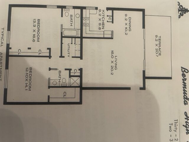
I have a door that goes to the bedrooms in the middle of my living room; not very conducive to conversation. The easy solution is to have a sectional, but I don’t want to kill my ocean view.
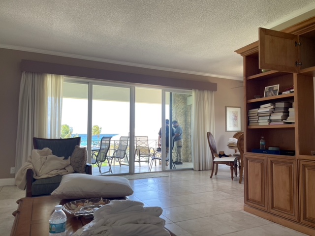
Of course not. That’s a given.
Kat says:
I may open up the kitchen at some point, as other condo owners have done, but then comes the question of where does the tv go?
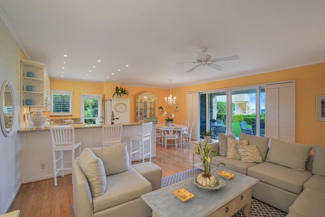
(as an aside) Do you see the problem with this place?
It’s devoid of any heft. It needs some touches of black and gold. And, also some pattern and other colors to balance out the vivid wall color. It’s on its way, but it’s not there yet. I’d bring some of that luscious GREEN inside the condo.

I very much like the way you think, Kat! Or, perhaps I should say that you *are* thinking. The majority of folks don’t.
I wrote Kat back and told her she could send me some photos. So, she did.
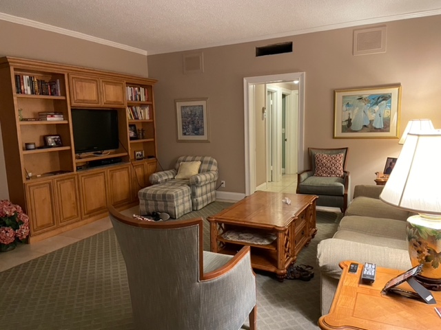
You’ve seen a few; now we’ll see the rest of this dated condo in Florida.
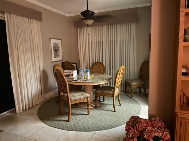
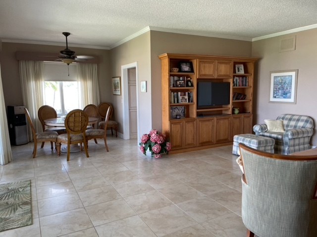

There’s the door to the bedrooms, Kat was talking about.
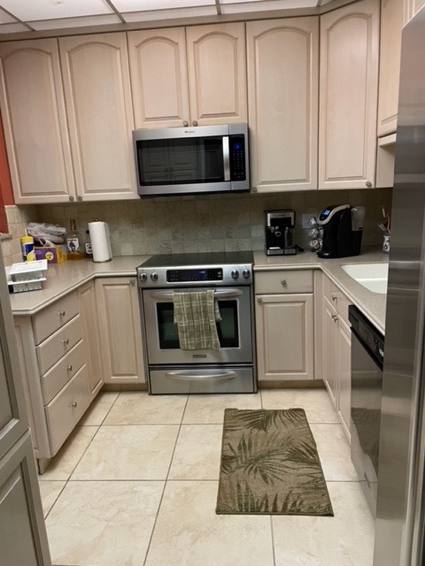
The compact but also dated condo kitchen.
I have said this a million times, but sometimes it takes a while to sink in, or you might have missed it.
Before you set foot in a furniture store, whether in person or online, you MUST have a plan and a clear vision of what you want and need.
Otherwise, yes, you ARE going to be stumped.
And you know what else. You ARE going to make mistakes. Expensive mistakes. It’s okay. Please keep sending me these letters, and I will keep repeating myself. lol
You MUST HAVE A PLAN. And, I have written out all of the steps in this post about how you create your decorating plan and implement it.
It begins with your floor plan, and SPACE PLANNING.
How will you know what sizes to get if you don’t do a room layout? You can’t. Even Bunny Williams can’t do that. She has a very good idea, but I can assure you, she’s not going to take a chance with her clients because it’s her butt on the line if it doesn’t work out. So, just like an architect has a house plan before building, you need a floor plan before furnishing.
Guys, you can do this on a computer, or you can do it with a pencil and 1/4″ graph paper. I love those little yellow-orange mechanical pencils with the erasers on the end. It’s all in the 12-step decorating plan.
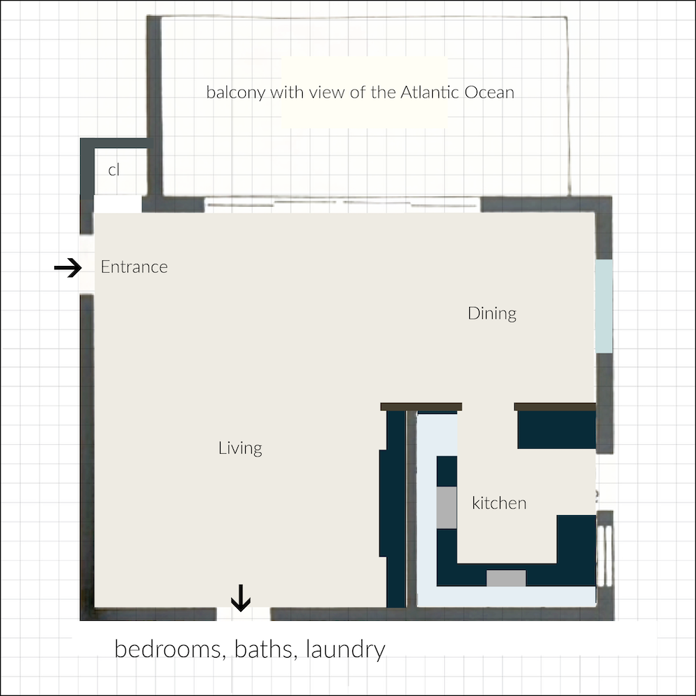
Because I’m a little lazy, I straightened out the image and superimposed it over 1/4″ graph paper on Pic Monkey. As long as you know some of the measurements, you can create your drawing to scale. Otherwise, you’ll need to know all the measurements so you can also draw your room to scale, as Mary did beautifully, here.
One square = one square foot.
Think about what you need for your room, home, and lifestyle.
Kat has told me some of her needs, which are as follows.
- A comfortable place to watch TV, and converse, without blocking the beautiful ocean view.
- This is a vacation home, so not a formal space, but one she’ll look forward to visiting.
Okay, let’s talk about what Kat might do to fix this dated condo, leaving the furniture out of it for the time being.
Let’s begin with the architecture of the room.
The popcorn ceiling has to go. Kat agrees. The easiest and cheapest way to get rid of it is to apply 1/4″ sheetrock to the ceiling. Otherwise, it’s a giant mess, costly, and lots of skim coating, sanding, coating, and more sanding. Just sheetrock it.
However…
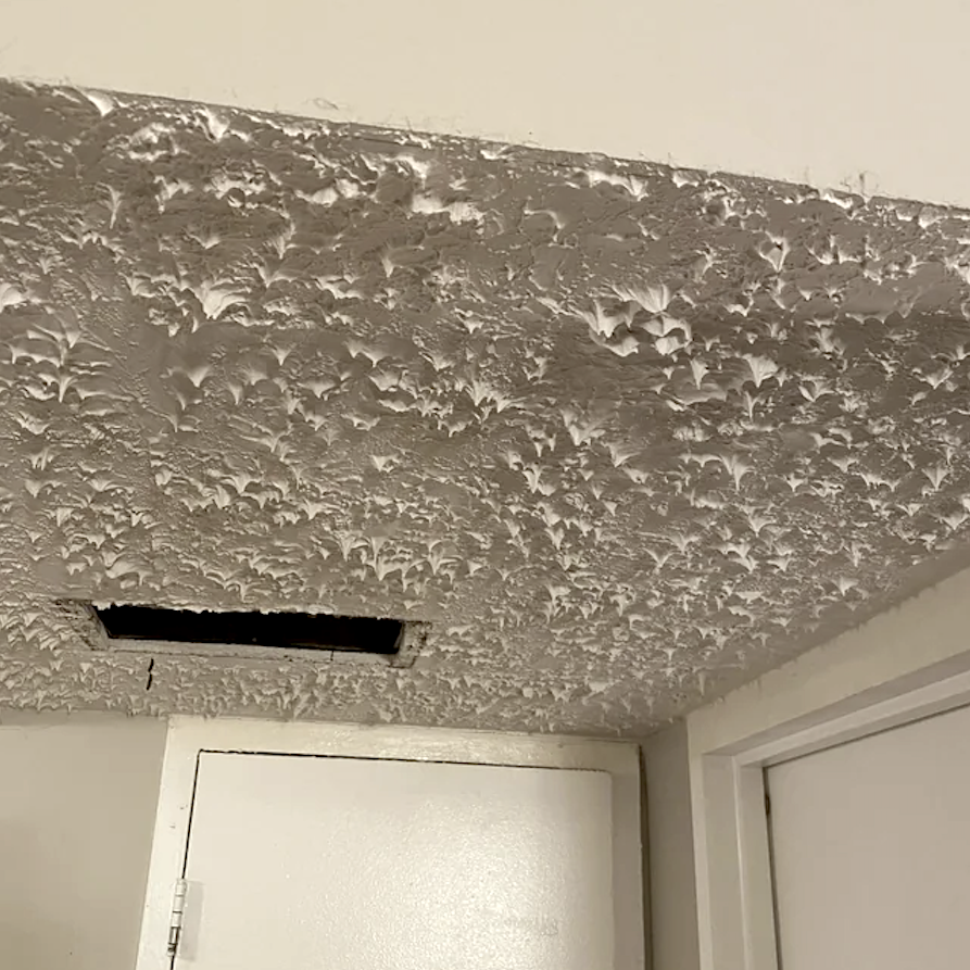
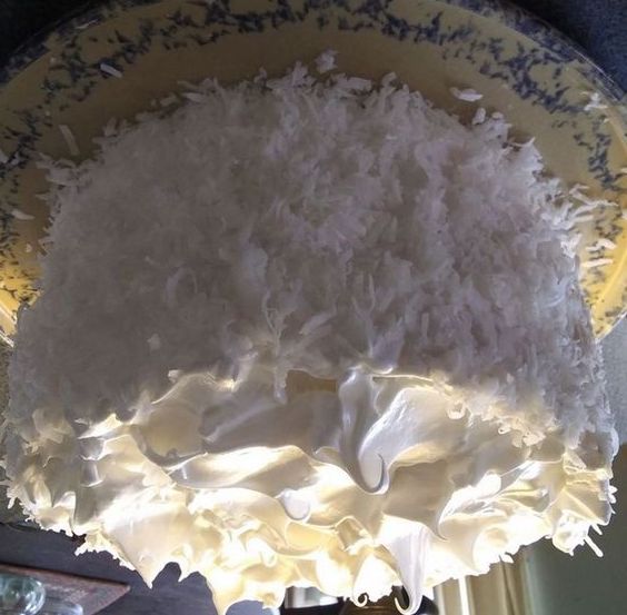
Upside-down coconut cake with seven-minute frosting via Just Cook Well Blog
If you have seven-minute frosting or stalactites coming down from your ceiling, I have given you permission to shoot whoever did this to you.
Oh, is that still illegal? Well, then, someone will have to do some heavy-duty leveling before adding the sheetrock.
Helpful Hint for the easiest AND cheapest method for removing a seven-minute frosting ceiling:
Make sure you are up-to-date with your home insurance policy. Do a lead test on all the paint in your home, especially if it was built before 1978. Assuming all’s good, I would also purchase a bunch of masks that construction workers use.
Then, gather about four to six boys* in your neighborhood between 13-17 (with their parent’s permission, of course.)
Have Two to three large, piping hot plain cheese pizzas and some soda waiting for them. Pay them each 20 bucks to get rid of that crap hanging from your ceiling. I guarantee in a couple of hours, your ceiling is going to be almost as smooth as a baby’s bum. ;]
*In a pinch, grown men who act like boys will work, too. However, you might have to give them a little more money. ;]
What about that kitchen wall? Should Kat open it up?
Hell no! I wouldn’t recommend that. I do believe one day (hopefully today), these open plans will go out of fashion. Guys, in my Boston home, finished in 1880, the kitchen was BELOW the dining room. True, they had help doing the cooking, cleaning, and child-rearing. sigh… I was born in the wrong century.
In addition, if the wall goes, the TV situation will be problematic.
And finally. I’m kind of over the de rigueur peninsula with the three or four stools. I was over it about ten years ago. Fine, if you have the space and an SUV filled with little ones. However, these condos are small. They don’t have the space. They need that space for other things, like STORAGE, for example.
Still, I would consider raising the door height into the kitchen.
Kat says they will redo the kitchen and do away with the dated condo ceiling lights.
Hooray!
Essentially, the architecture is contemporary. However, that doesn’t mean it can’t be embellished. I would love it to have a slight art deco, with a touch of Hollywood Regency. However, we are barely going to touch the furnishings today.
I will do one more follow-up post for the furniture.
Okay, I got to work on the floor plan.
And, I put just enough detail in to confuse the pants off of you.
However, that’s okay. The point is we are only looking at the plan view today.
Kat sent me a few images.
Guys, I know she loves classic furnishings and blue and white.
So, what was my jumping-off point?

See that blue spot toward the middle of the image?
That was where I began.

I have long admired the Lampert sofa from Jonathan Adler. And, I’ve sat in it too. While exceedingly sleek, it’s also very roomy yet cozy and comfortable! There’s a reason it’s been in their line for at least 15 years. It’s the perfect contemporary sofa.
It also comes as a sectional. But Kat could do one sofa and one 60″ loveseat perpendicular to the sliding glass doors. It is only 32″ high and will not block the ocean view.
First, I lay down two seagrass rugs.
One large one covers most of the living area and entry. And then butted up against it, another seagrass rug in the dining room. They will be bound with a two-inch fabric binding. I recommend that the installer sews the two rugs together on-site. Trust me on that one. In fact, they can bind the entire thing on-site. It can be an L-shaped rug if you don’t want to do two separate rugs.
As for the floor plan, Mom and Dad had it almost right in terms of layout.
I will share my floor plan now.
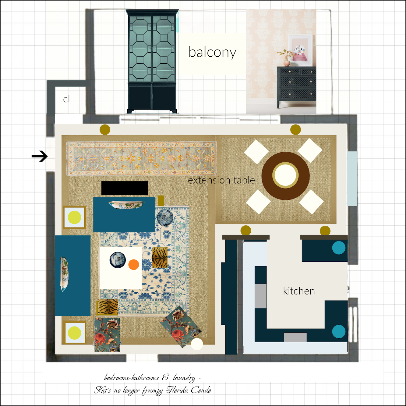
The furniture and wallpaper at the top are not sitting out on the balcony. haha
I love this wallpaper because it hints at tropical without it screaming in your face.
Laurel, wait. Are you suggesting velvet for the upholstery in Florida?
Yes, I am. Why not? Guys, it’s COTTON velvet. And this condo is air-conditioned. It will be supremely comfortable.
Of course, Kat doesn’t have to do the beautiful blue velvet. I’d be just as thrilled if she slipcovered everything in white cotton duck and kept the colors for the pillows and maybe the chairs.
Speaking of chairs.
Let’s look at Kat’s parents’ chairs.


You know, these chairs are quite pretty. And, here’s what Kat could do.
One is to upholster OVER the wood. Yes, you can do that. Everything but the legs.
Or, before upholstering, she could have them paint the wood trim in a vibrant coordinating color.

A Susie Atkinson chair upholstered with a citrus-patterned Schumacher fabric designed by Josef Frank.
Photo: Courtesy of Susie Atkinson
I hope you enjoyed exploring some architectural changes and furniture layout for this dated condo in Florida.
On Sunday, we will discuss the fabrics, rugs, and furniture. I want to talk a bit more about the architecture, as well. Of course, we can also go over any suggestions or questions you might have, which I imagine is a lot. ;]
xo,

PPS: Coincidentally, if you love Palm Beach-style decorating and Hollywood Regency, please check out this new post about Palm Beach Living, by my friend, Andrea, author of the Glampad, a beautiful decorating blog.
Related Posts
 Eight Years Later – Is HGTV Still Misleading Us?
 Reconfiguring the Space When What Is There Isn’t Working
 Chinoiserie Decor – What Is It? & Why You Need It
 Finding Bathroom Storage For A Small Difficult Bathroom
 Mirror, Mirror Over The Mantel – What Size To Get?
 Can You Do A Guestroom Suite on a Shoestring Budget?
 She Wants A Classical Home in Florida. And, Cheap too!


