Hey Guys,
This is a continuation of our looking at kitchen lighting and kitchen light fixtures.
Here’s the good news.
The options are practically endless.
Here’s the bad news.
The options are practically endless.
So, the first thing we need to do when planning our kitchen light fixtures is to think about our home as a whole.
- What scale do we need?
- What materials?
- What’s our budget?
- What style are we going with?
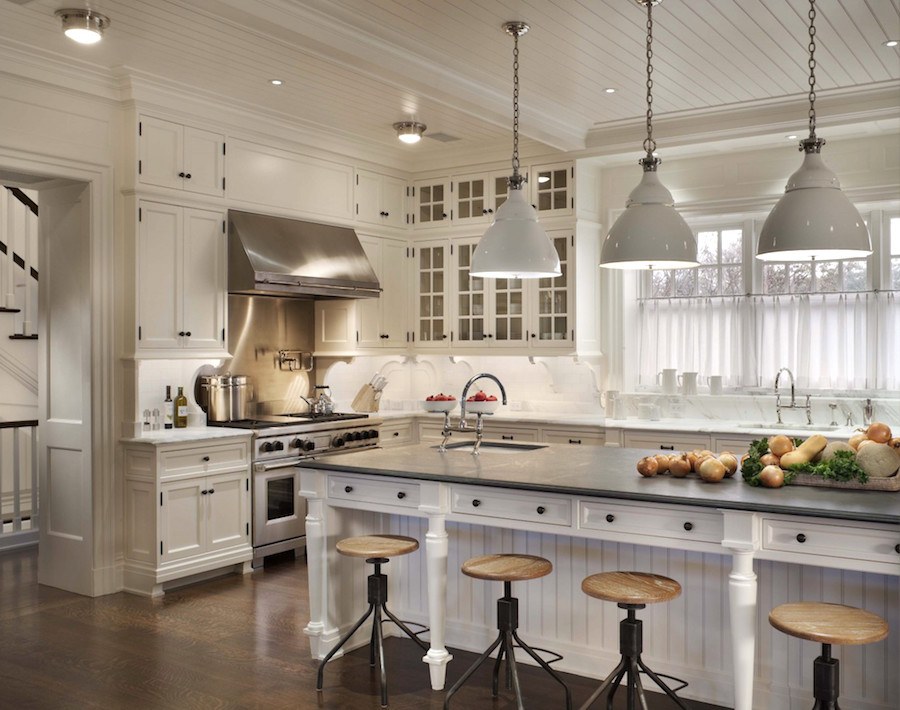
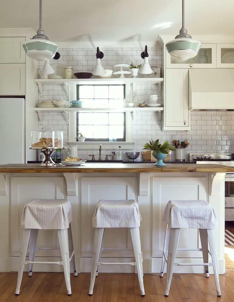
But there are here. And BTW, I can assure you that the island is not a different color than the rest of the cabinets. It’s the lighting! And it’s one reason why I almost always do the island in a different color or finish from the main cabinets. It doesn’t always happen, but I have seen this many times.
Visual Comfort makes a similar one. Actually, I prefer it.
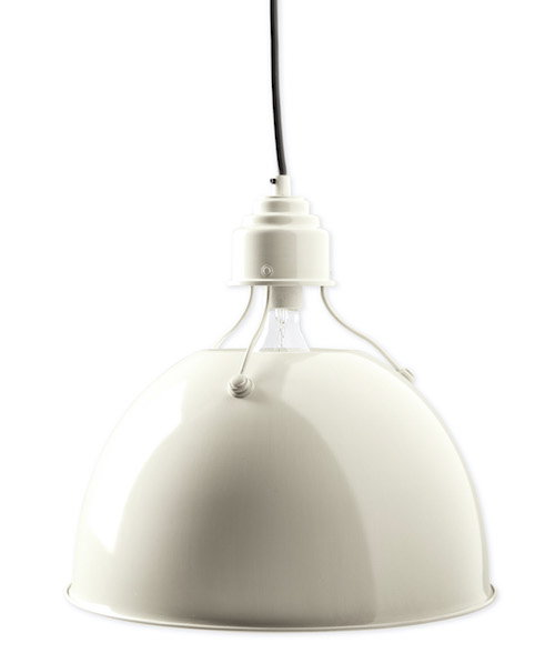
I couldn’t find the same pendants, but these are pretty cool from Currey & Company.
But Laurel, isn’t this industrial look for kitchen light fixtures getting kind of trendy?
Yes, it is.
But, if you love it– and it works with the rest of your home, then why not? There are lots of trendy looks and just because something is a trend, doesn’t mean it’s bad. It’s only bad if you’re doing it because you think you should be doing it! (you can tweet that.)
Let’s move on to another enduring classic.
The schoolhouse fixture.
Usually, it’s a pendant, but sometimes it’s a flush mount or a semi-flushmount. There are many, many versions.
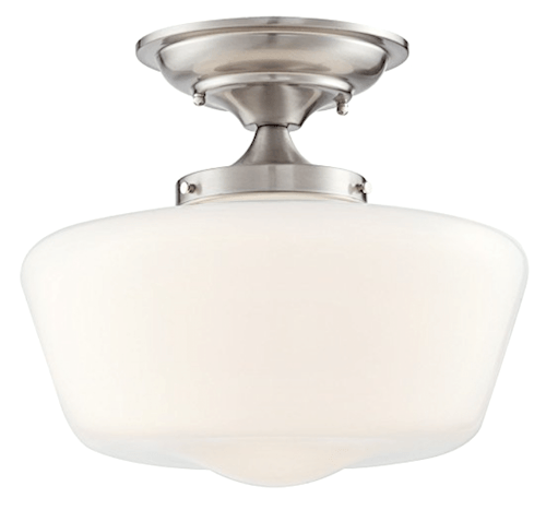
Whoa! Guys, this one from Franklin Ironworks looks pretty fabulous and at 30 bucks how can you go wrong? I did check the reviews and six gave it five out of five on Amazon! And it comes in a bunch of different finishes.
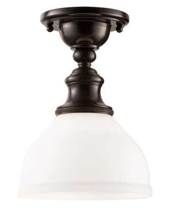
At 10.25″ high, it can easily work in a kitchen or hall with an eight-foot ceiling. What I love about semi-flush mount lights is that the light has an opportunity to bounce up and since this has a shade, it’s coming out all the way around. This is an excellent fixture for all-over ambient light.
And for those who are concerned about bulb glare. We have that one covered too. This style would look great in most traditional or country kitchens.
What I think might work with this schoolhouse semi-flushmount would be to do a different type of schoolhouse pendant.
Fabulous kitchen by Julie Holloway and Anisa Darnell of Milk and Honey Home
These are from Barnlight Electric which is one of the newer sources in Laurels Rolodex.
Image is from the lovely kitchen of Architectural Digest editor Melissa Maria.
Going back to more traditional kitchen light fixtures. Traditional, but not stodgy at all.
Another type of ceiling fixture I’ve seen in Victoria Hagan’s kitchens is some variation of this lovely piece by Hudson Valley Lighting. Again, it comes in a bunch of finishes. Hudson is a mid-priced line and I’ve ordered from them before and the fixtures are really lovely.
I think it would look fabulous with a couple of bell jar lanterns over the island.

This one from JV Lighting is only $310.00. It’s a slightly more formal look.
I know that some of you will cringe because of the glass, dust, grease and all… But if you have a lot of grease, it means that your fan isn’t doing its job. After all, if it’s landing on your surfaces, you’re also breathing it in and that’s not healthy.
original source unknown.
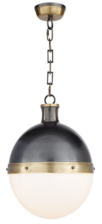
Or the classic Hicks Pendant, designed by Thomas O’Brien by Visual Comfort
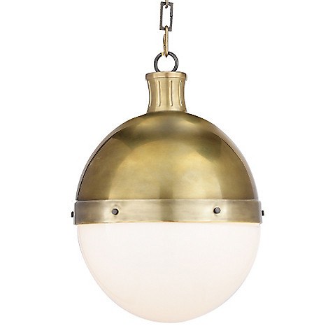
Love it in the antique brass too.
There is also a ceiling mount version of this fixture but I wouldn’t use them both in the same room.
This one is similar from Serena and Lily.
Victoria Hagan also does this or some variation of this sconce from Ann-Morris Antiques.


It would look terrific in the above kitchen scheme in bronze, however, it goes into the category of “if you have to ask, you can’t afford it.” It comes in a bunch of finishes. Victoria usually does it in a dark bronze color.
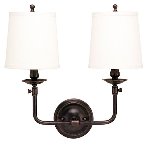
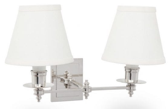
Hudson Valley makes this pretty Pelham two-arm sconce and also a lovely one-arm version. I love its simplicity and classic lines. It also comes in different finishes.
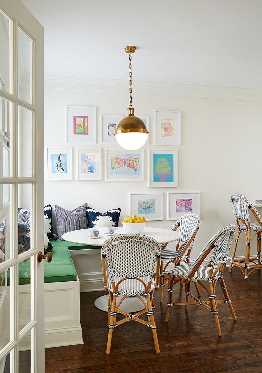
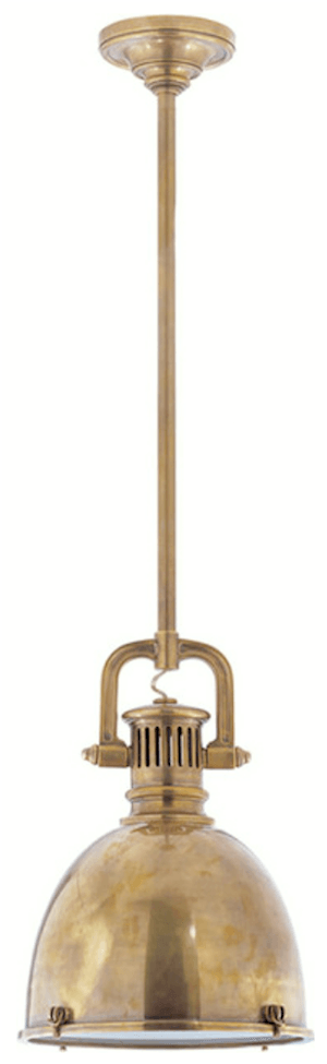
Another iconic kitchen light fixture is this brass marine pendant
(I don’t know where this particular one is from)

Hudson Valley makes a pretty version of this pendant. It’s about $800
This is a nice version from Visual Comfort
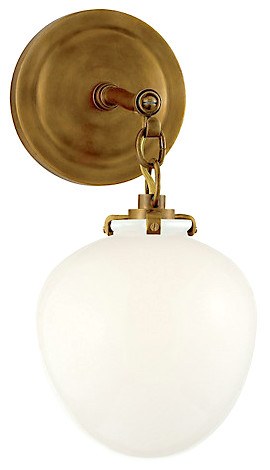 Love this Kate Acorn Sconce from Visual Comfort.
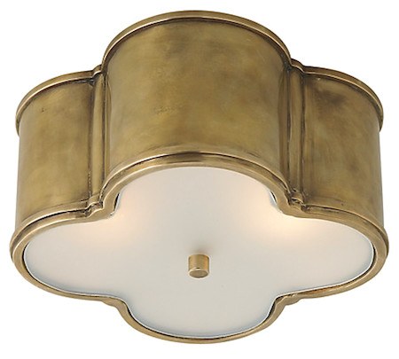
The Basil Flush Mount from Visual Comfort would look great too!
Oh wow! There’s still more to do. But I was thinking it might be fun to do a hi-low post. Or high, medium and low. Something like that.
Happy Spring y’all!
xo,

Related Posts
 Astonishing Home Makeovers You Won’t Believe
 My 16 Favorite Benjamin Moore Paint Colors
 A Beautiful Home Renovation Makes Big Bucks For The Sellers
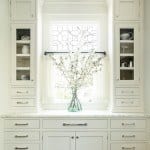 Top 25 Must See Kitchens on Pinterest
 Our Modest Starter Home Might Be Our Forever Home.
 Will My Warm Paint Color Palette Look Dated in Five Years?
 The Laurel Home Paint Palette and Home Furnishings Collection is Here!


