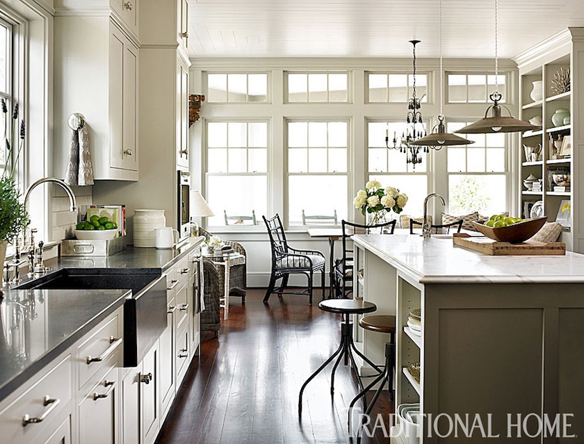
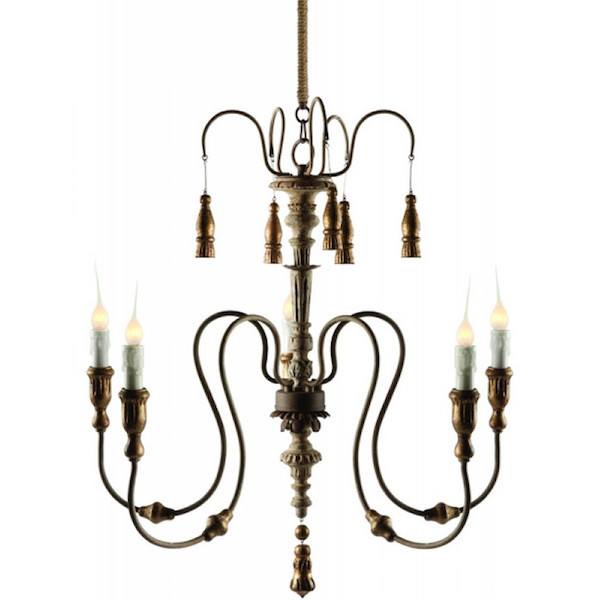
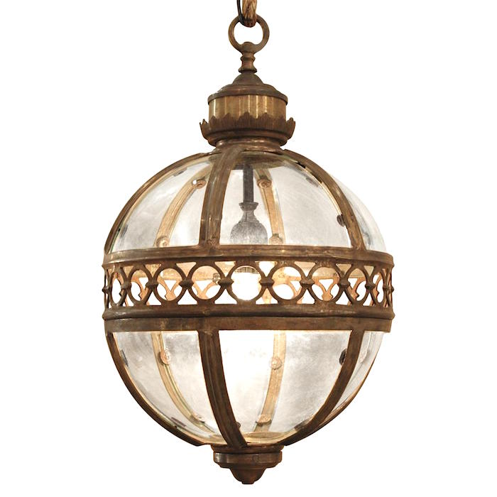
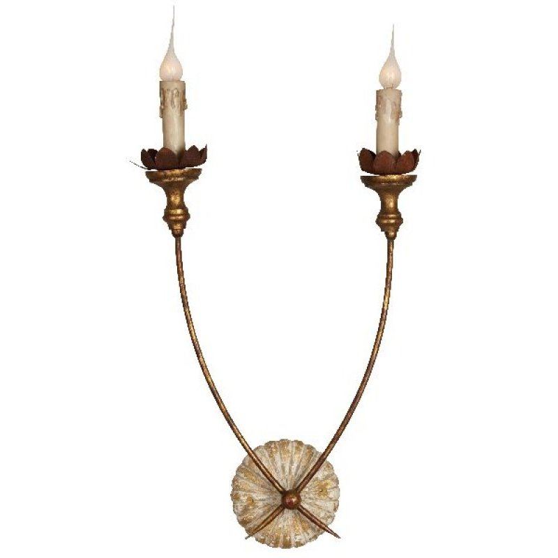
First of all, this post about kitchen lighting is not so much about the actual lighting design of your kitchen. That’s a process that I would leave to your kitchen designer and electrician to figure out.
One thing I will say though is that when it comes to kitchens, better too much lighting, than not enough.
Of course, it needs to be lighting that you can control. Everything goes on dimmer switches and in larger kitchens, I recommend more than one switch if you want to only turn on some of the lights.
Basically, kitchens need an over-all ambient light which I usually recommend recessed down-lights. I prefer the small 2″ Halogen or LED lights. Again, this is not my area of expertise. I’ve always relied on the many skilled electricians I’ve worked with over the years. However, this is an excellent post for that.
If there is an island, these days we usually see either a pendant or lantern or if long enough, two or even three of these. My feeling is that unless it’s a pretty small fixture, if you need three of them, the island might be too large.
But again, that is up to you and your unique requirements.
So, what are we going to discuss in terms of kitchen lighting?
Well, like the dining room post, this is more about the aesthetic aspect of the kitchen lighting fixtures. Of course, “form follows function” and absolutely, it is vitally important the fixture does what we need it to do in the way of lighting requirements.
What makes this very difficult is that there are many, many variables. In other words, I could write an entire book on kitchen lighting covering dozens of different styles and combinations.
Alas, this is a blog post. And while I hope that it at least answers some of your questions, it may not answer all of them.
But let’s begin with some of the basic rules of kitchen lighting.
Or rather, Laurel’s Rules of Kitchen Lighting. ;]
Let’s start with island lighting. (if there is one)
Island lighting is usually about 66″ off the floor to the bottom of the fixture. It really depends on the fixture, the height of the ceiling, etc. One thing to make sure of, however, is that the fixture isn’t blocking the cook’s vision if she/he has guests.
As for placement. If there are two fixtures, I usually like to leave at least a foot from the edge of fixture to the edge of the counter and usually more than one foot.
Okay. Goody. I think we’ve gotten most of the boring parts out-of-the-way.
Oh, before I move on.
A word about the kitchen lighting you see in magazines.
A lot of it is fake. It must be! I can’t tell you the number of kitchens I’ve seen with virtually no lighting. They either photo shop out the recessed down lights and/or crop them out all together. I guess that recessed lighting is a little like hanging out the dirty laundry. We need to do it, but we don’t want anyone else to know that.
While it is common to have one, two, or three somethings hanging from the ceiling over your island, it is not an essential piece of your kitchen lighting design.
It isn’t Laurel?
No, it’s not. And here are some reasons why we might leave off the hanging fixtures over the island in favor of recessed down lights.
- The eating area has the most smashing chandelier that God ever created and it just needs to be the star of the show.
- The kitchen is in a rather open area, and one can see the fixture over the eating area, the front hall, the dining room and the living room. Too much hanging in the line of vision is not going to look good.
- The lighting over the island and lighting over the eating area should never match– unless they are parallel to each other and they are the only two hanging fixtures in the room.
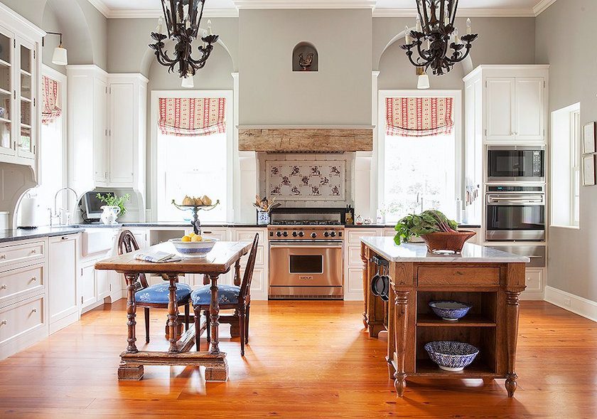
This is an excellent example. Although this is an unattainable kitchen for 99.999% of us. haha. Very important. The island is usually about 6″ taller than a dining table. However, if one has this configuration and a normal-height ceiling, the fixtures need to be hung at the same height or it’s going to not look-so-great.
But here we can see that Maura Endres’ fabulous kitchen has no island fixtures.
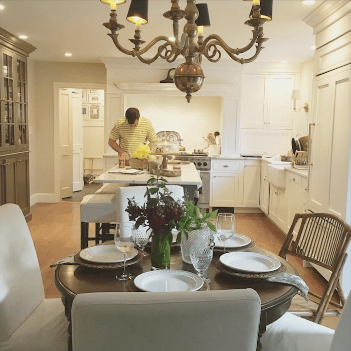 I really like that her pretty chandelier gets featured and that the gorgeous range becomes the focal point.
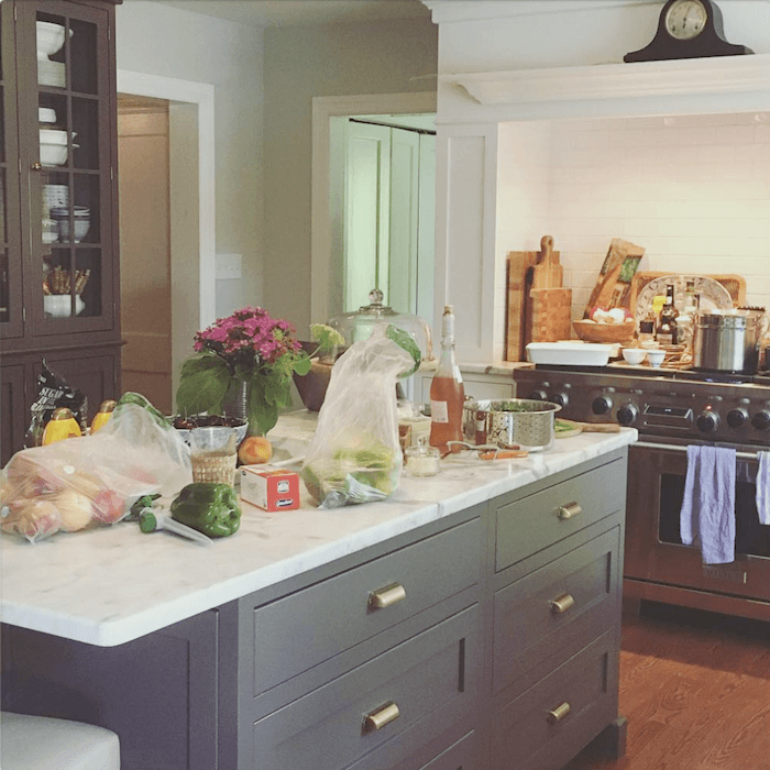
Why does her messy kitchen look like a work of art and my messy kitchen look like a craphole?
(you don’t need to answer that.)

Sublime. And there’s that gorgeous Calacatta Gold marble we were just discussing!
Images taken from Maura Endres (M.O. Endres on instagram)
What we want to avoid in our kitchen lighting is something like this.
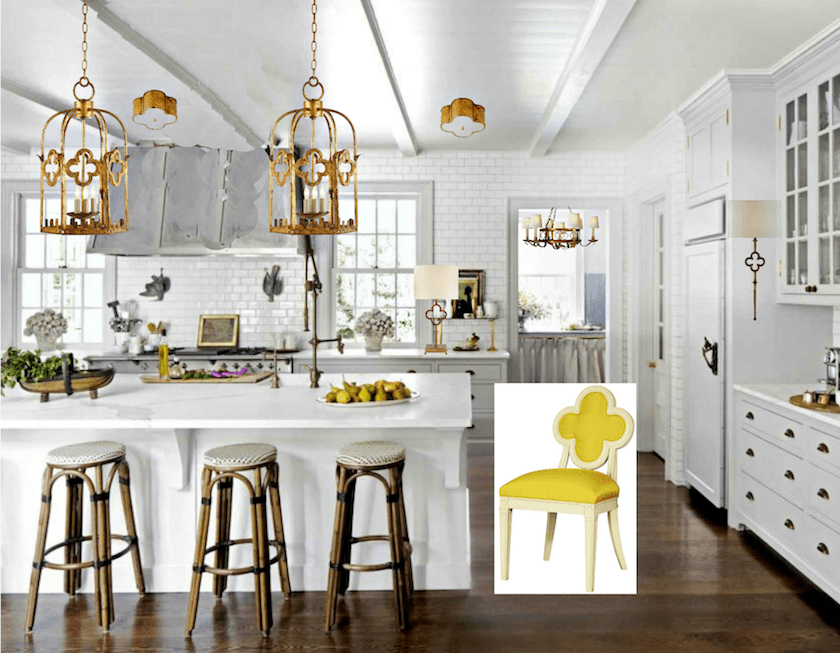
Everything matches. I love a quatrefoil pattern, but it shouldn’t be in every fixture.
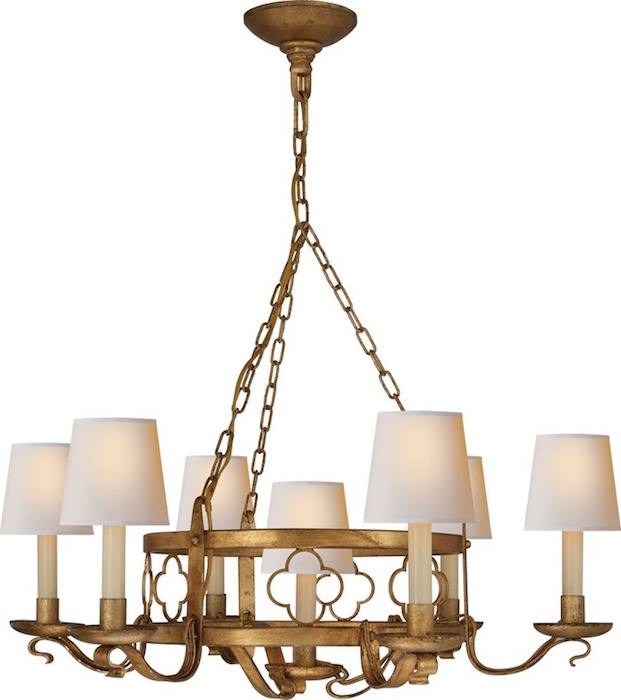
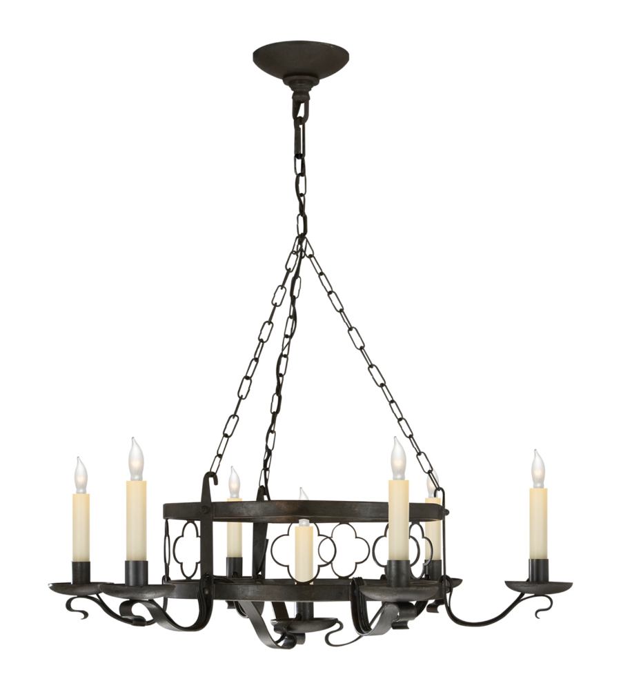
I don’t know if you can see the quatrefoil pattern in the chandelier, but here it is. Here are some more quatrefoil patterns in lighting and other home furnishings.
All of the lighting fixtures are by Suzanne Kasler for Visual Comfort, except for the lanterns which are by Bunny William’s husband ;] (John Rosselli) and the beautiful flush mount which we did a few years ago in a bedroom. Design by Alexa Hampton.
The Quatrefoil chair is another Suzanne Kasler design for Hickory Chair.
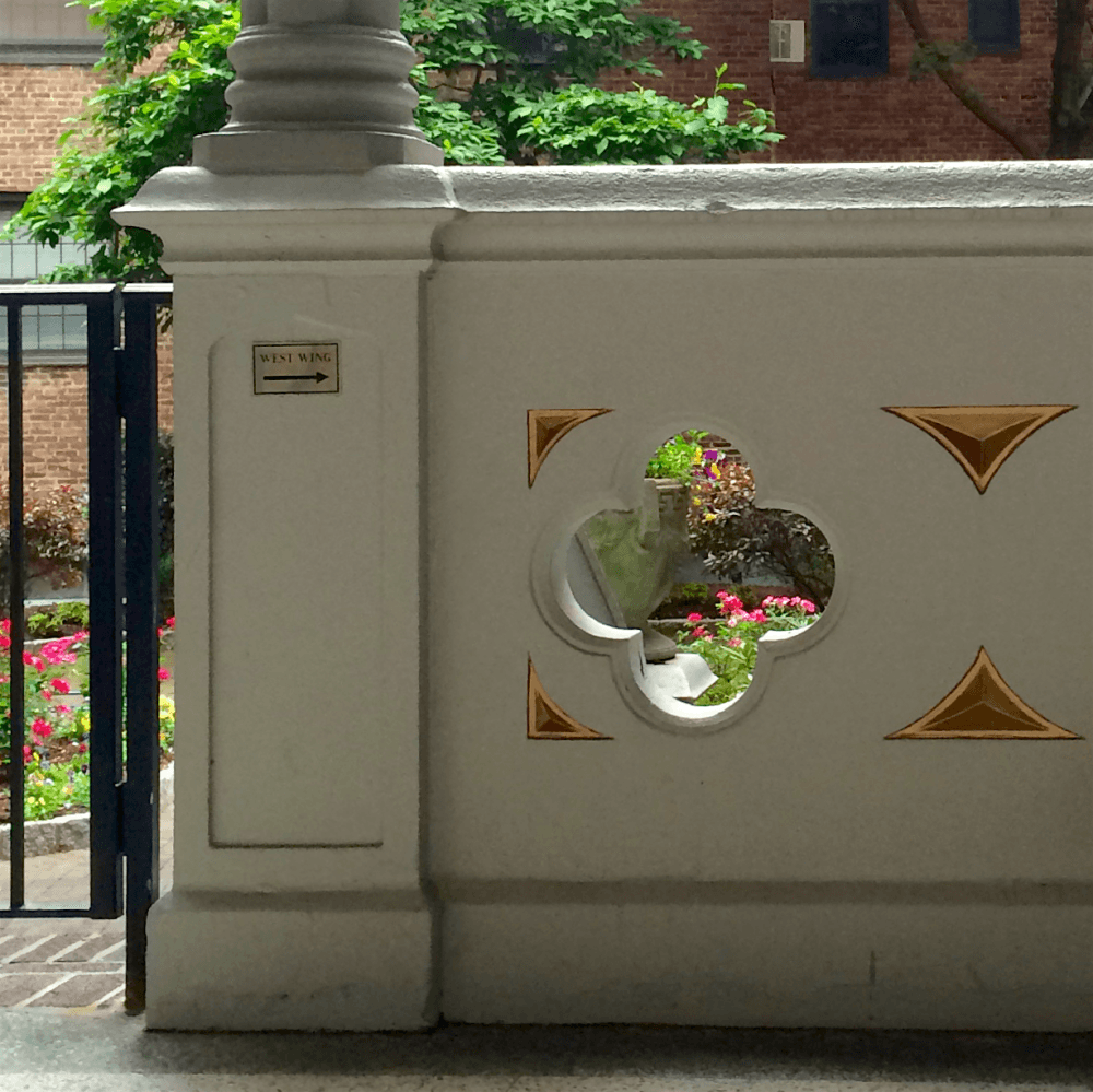
View into our courtyard and a piece of the railing with a quatrefoil motif!
Laurel. We already get that the kitchen lighting isn’t supposed to match. THAT’S THE PROBLEM. How do you get it to not match, but still look okay?
HELP!
Oh, okay. Here are my ideas.
You’re right. It’s not supposed to match, but it is supposed to coordinate. And by coordinate, I feel that there needs to be some commonality in shape, style and finish– maybe not all three, but some common thread.
And another thing. If you have a pendant or a chandelier, I would do only one style of a pendant and then pair with a coordinating chandelier.
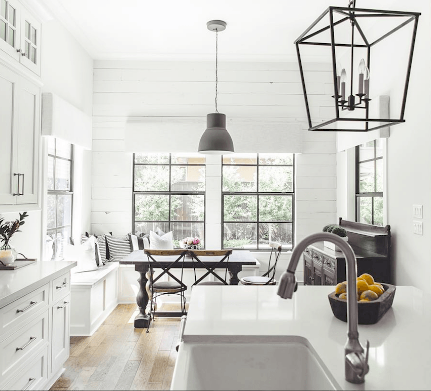
For example. Gorgeous kitchen! But the fixtures are not quite working together, IMO. And also, I’m getting really sick of these minimalist lanterns.
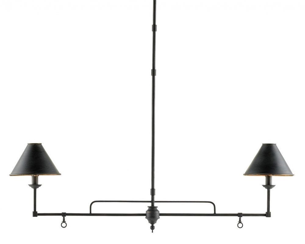
But something more like this Currey and Company’s (trade) Prosperity Chandelier available at Burke Decor, I think would coordinate better with the lantern. Or it could take the place of the boring lantern over the island.
We did Suzanne Kasler’s Quatrefoil chandelier a few years ago in the dark bronze finish over a round dining table in the kitchen eating area.
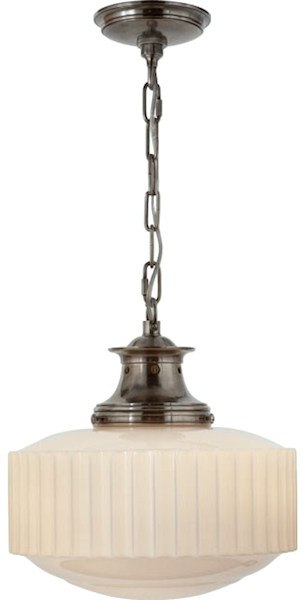
Over the island we did this pendant by Thomas O’Brien for Visual Comfort. I’m not sure if they’re still making this one or not. The finish was darker and more matte.
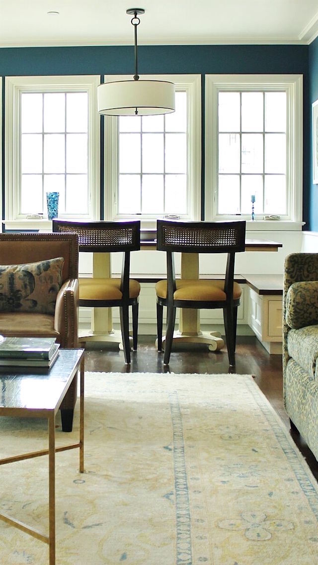
Another solution that’s bailed me out a number of times is the ol’ drum pendant.
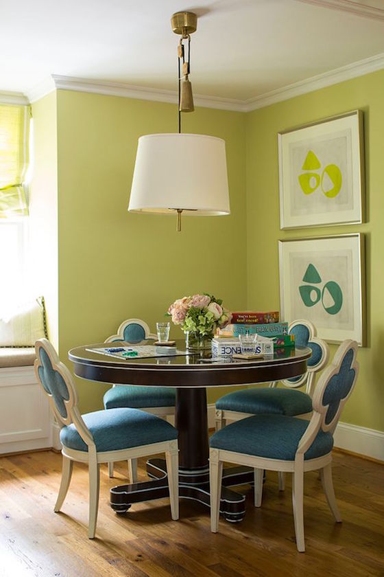
Here is one I did several years ago.
This is another drum pendant, I believe designed by Thomas O’Brien for Visual Comfort. We got it at Circa Lighting.
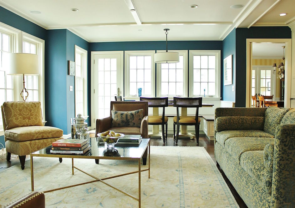
Here’s the sitch. Family room looking into the dining room. We did the family room/kitchen in 2008.
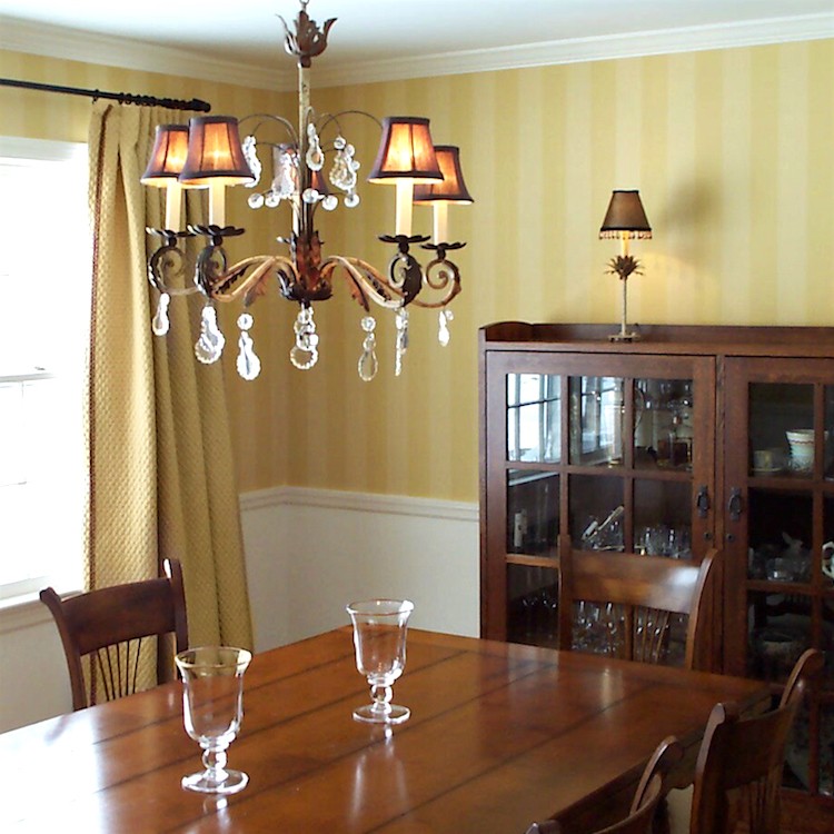
And we did the dining room in 2003!!!
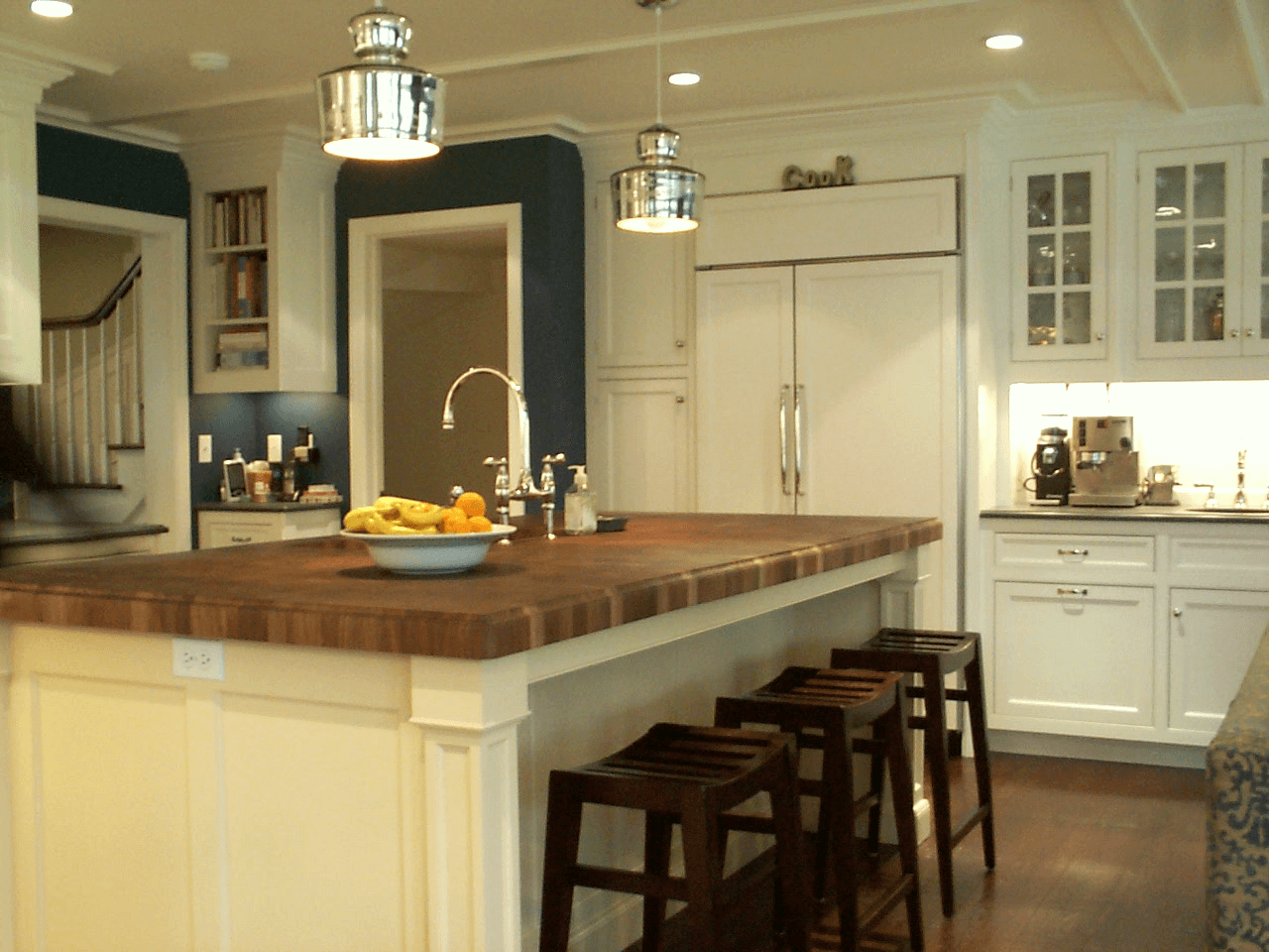
So, all the lighting had to coordinate.
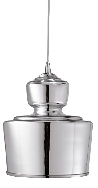 Jamie Young Lafitte Pendant Light
This image doesn’t do it justice. It’s much more antique looking in person.
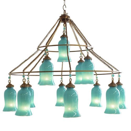
One of my favorite chandeliers forever and ever that I have talked about a few times before is the
Sara Chandelier from Canopy Designs.
*note: 2018 Canopy Designs has sadly gone out of business.
I am so hoping that someone picks up this design!
It is modeled after an antique Egyptian chandelier that caused millions to swoon when it appeared on the cover of Elle Decor in Sara Jessica Parker’s home a while back.
I’ve done the chandelier twice. Once in a kitchen but they’ve moved. And another time in a family room. And damn, I never got a decent photo of it. But I found it in this kitchen dining area.
Lovely room. Not sure of the original source, however.
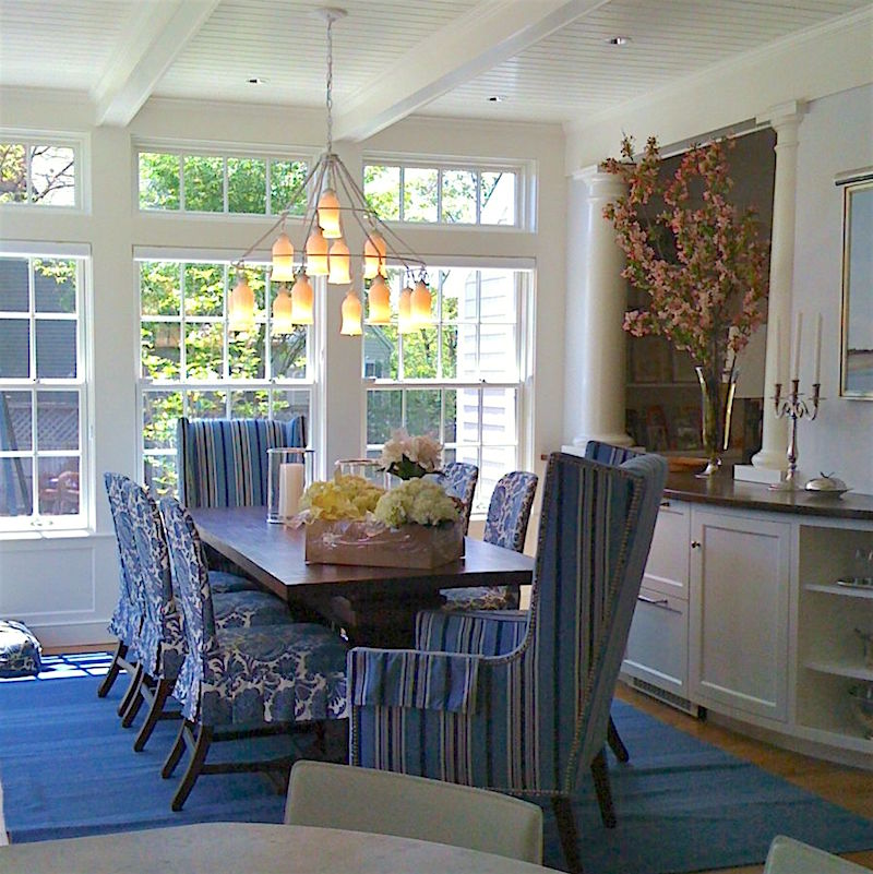
The glass covers come in several different colors and the metal parts come in different finishes as well. I did it both times in an antique bronze which is handsome.
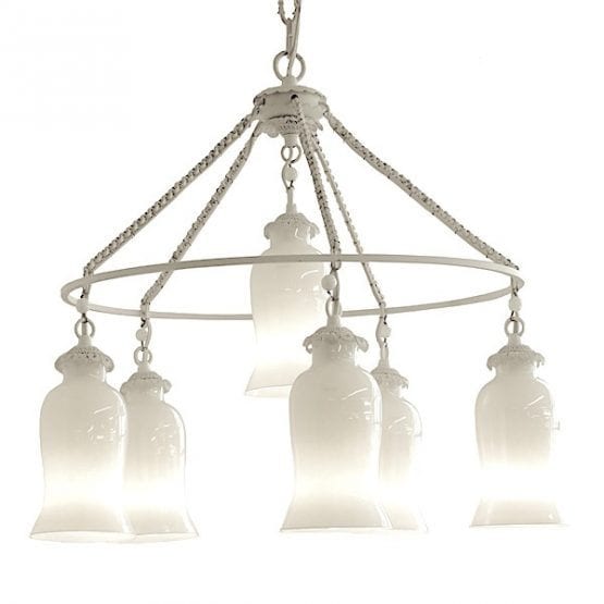 There is also a small version of the Sara Chandelier.
It’s one of the “stunning pieces” where I probably wouldn’t do a hanging piece on the island, but then I thought it would be fun to take a stab at it and here’s what I came up with.
 I thought that perhaps Serena and Lily’s Capiz Pendant in the small-size might work. But let’s not forget that “small” is relative. A 22.5″ ball hanging from the ceiling is NOT small!
 The frosted glass pendant from World’s Away (trade) and available at The Well Appointed House Retail feels too contemporary or something, although the size at 15″ diameter would be perfect for most islands.
Determined to find something for no apparent reason other than to satisfy my curiosity, I think I struck just the right note.
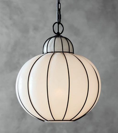
If you imagine the Sara in a darker metal finish, I think that these two pieces coordinate beautifully. And get this. This lovely called the Camille Milk Glass Caged Pendant is from Pottery Barn!
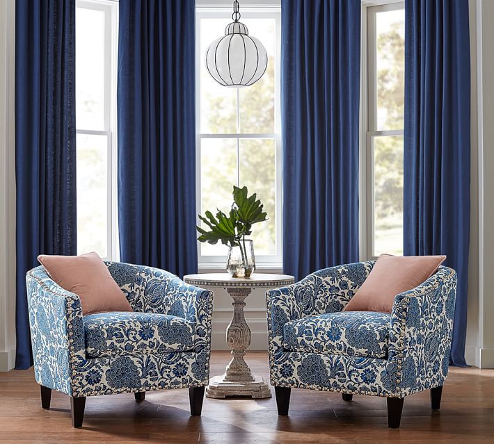
I find it helps a lot if I can find an image that shows the scale in relation to other pieces of furniture. I can imagine two of these over and island and think that the 14″ diameter size is perfect. Oh, and at $179.00/ea, how can you go wrong? Well, you still can, but fortunately they take returns. :]
Here, I think is a very successful combo of kitchen lighting fixtures. They definitely coordinate without being at all “matchy.”

Graceful Elegance Four-light chandelier from Aidan Gray has a similar feeling
Believe me when I tell you that I spent half the day looking through dozens of sources trying to find that chandelier. But Aidan Gray has a lot of terrific chandeliers in that sophisticated European country-style.
This is a really cool piece from Kathy Kuo Home that could coordinate with many of the Aidan Gray Chandeliers and others, of course that have antique gold in them.
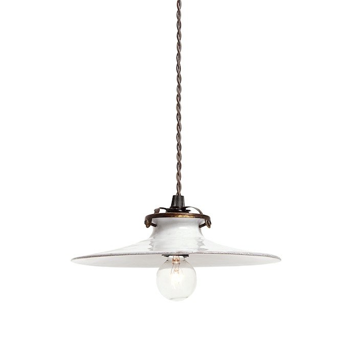 Chic Pendant I found at ABC Home from a French Company – Astier De Vilatte
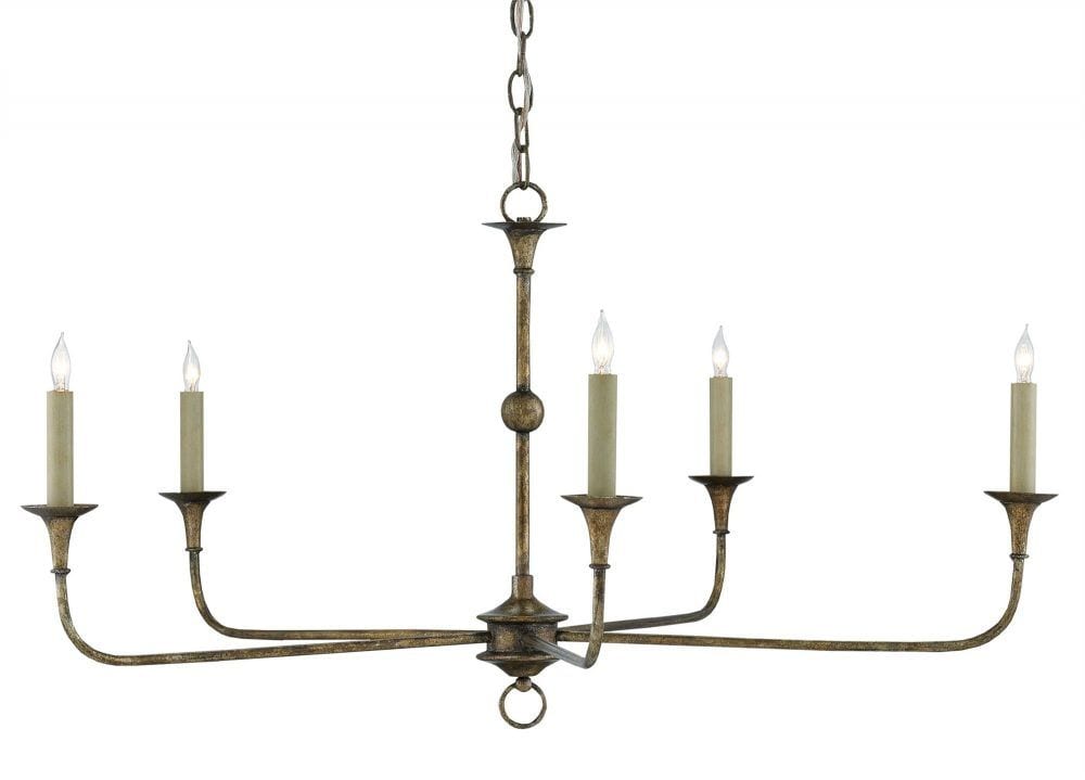 This is a simple and versatile chandelier from Currey & Co.
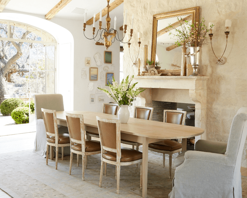
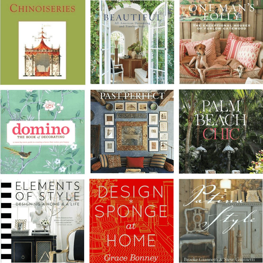
Brooke and Steve Giannetti are a perfect example of a beautiful unified lighting and for that matter all of their home furnishings in their exquisite home, Patina Farm.
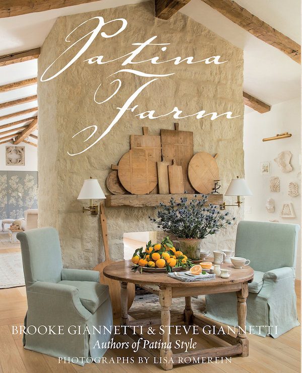
Do you have their book? If you love their style, it’s a must-have book.
And also their first book, Patina Style.
And have you checked out the new book list?
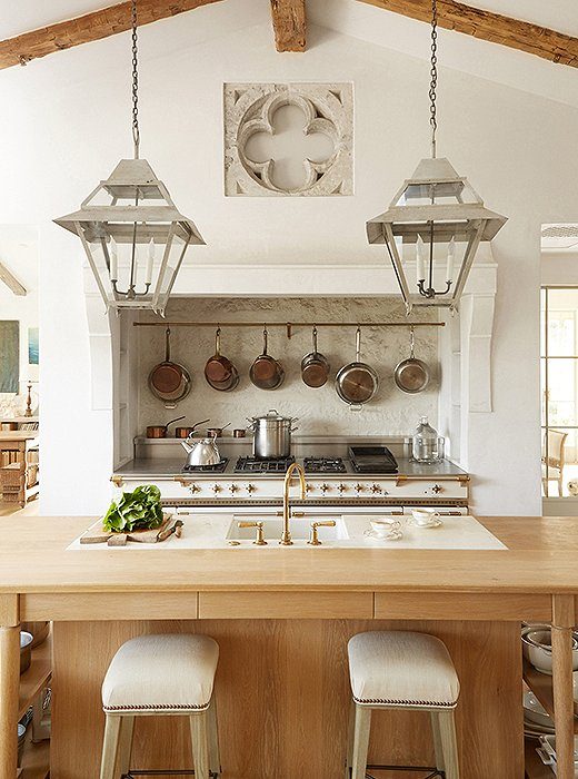
Fabulous pendants in the Giannetti’s kitchen at Patina Farm.
I do recognize Brooke and Steve’s sconces from their dining area from Aidan Gray too!
Switching gears a little
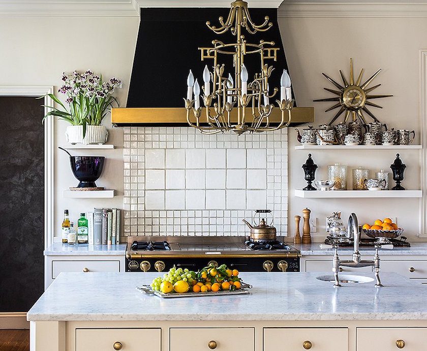
I am totally besotted with this kitchen. Every last thing in it done by Kim Bachman
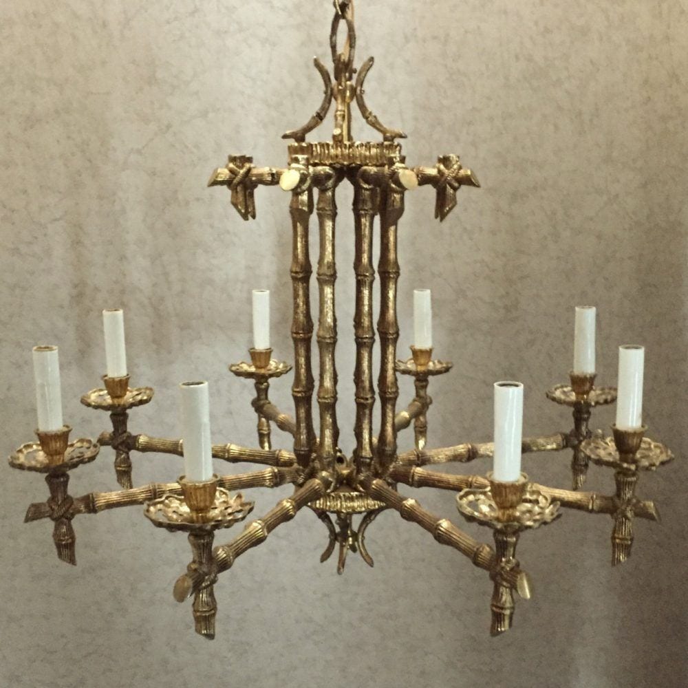
I was wondering if I could come up with a vintage Chinoiserie brass chandelier and I did!
I think I kind of love this beauty I found at the 5th Ave Kitsch Store on Etsy.
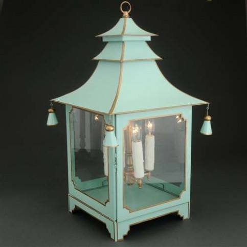
I could see pairing it with a Pagoda Lantern. This one is by one of my fave sources in Laurel’s Rolodex, JM Piers. (to the trade) But, it can be purchased retail at The Well Appointed House. They have a fabulous lighting collection! This piece comes in a lot of different colors.
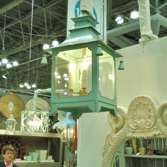
Here is the same piece at New York Now a few years ago.
Oh gosh, I didn’t get to nearly everything that I wanted to! I have about 50 more photos. Not kidding. I love lighting. If you guys want me to go on with this topic soon, I will.
xo,

This post contains affiliate links
Related Posts
 The Number One Decorating Mistake and How To Avoid It
 5 More Fabulous Interior Designers I Would Hire {part II}
 We Bought An Ugly House, But The View Is To Die For!
 7 of the Hottest Bathroom Trends To Avoid or Embrace?
 Interior Design Lessons We Can Learn From The Masters
 Top 25 Must See Kitchens on Pinterest
 Is Your Hardwood Floor Getting Wrecked? An Ages Old Solution


