I’m not going to beat around the Philodendron here.
The one interior design element that will elevate any room is…………………………….
architectural moulding.
In the US, we spell it moldings, but that reminds me of nasty stuff growing on the wall, and applied architectural moulding is anything but that!
Before I go any further, I have to take care of some legal stuff. This is a sponsored post by Metrie.
Metrie is a fabulous Canadian company that manufacturers, exquisite architectural mouldings, trim and doors. Please note that I only endorse excellent products that I would specify for clients and/or use for myself.
Some of you may recall that I’ve written about architectural mouldings before.
I started thinking why we love applied mouldings and trim in our interior designs. After much pondering and research, the answer came to me which I’m about to share.
Please hang on… We’re going to need to take a little trip back in time. I am going to give you the briefest history lesson– much of what I learned both in art history and interior design school. Don’t worry, I promise that you won’t be bored. :]
It’s about math.
All of life is math.
Going back some 2500 years ago, mathematical geniuses from the Ancient Greek Period, Pythagoras and Euclid understood the power of numbers. They wrote it down so that some of us could understand. They taught us about proportion and scale.
They deemed that the perfect proportion was a ratio of 1 – .618 or what is known as the golden ratio or golden mean
In the middle ages, Fibonacci expanded upon the golden mean with a mathematical spiral.
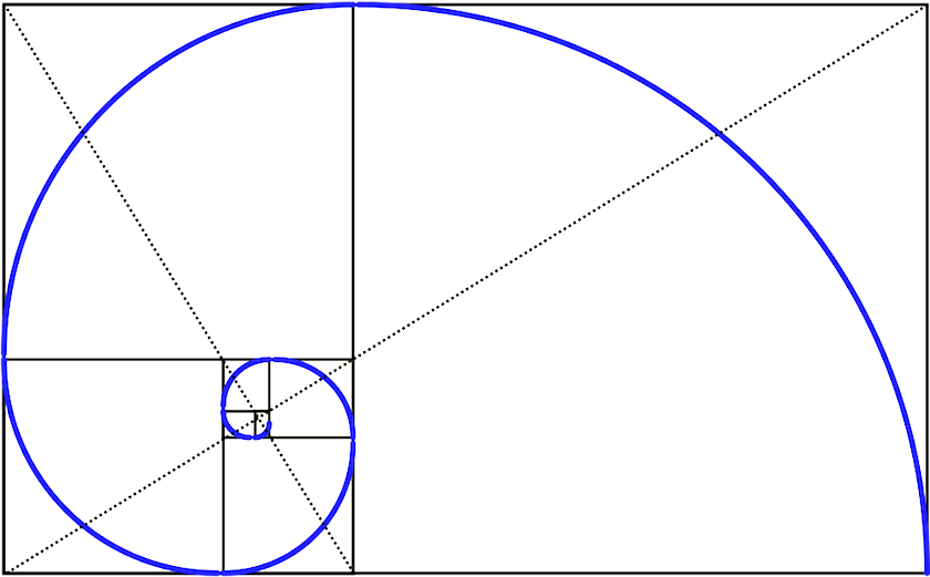
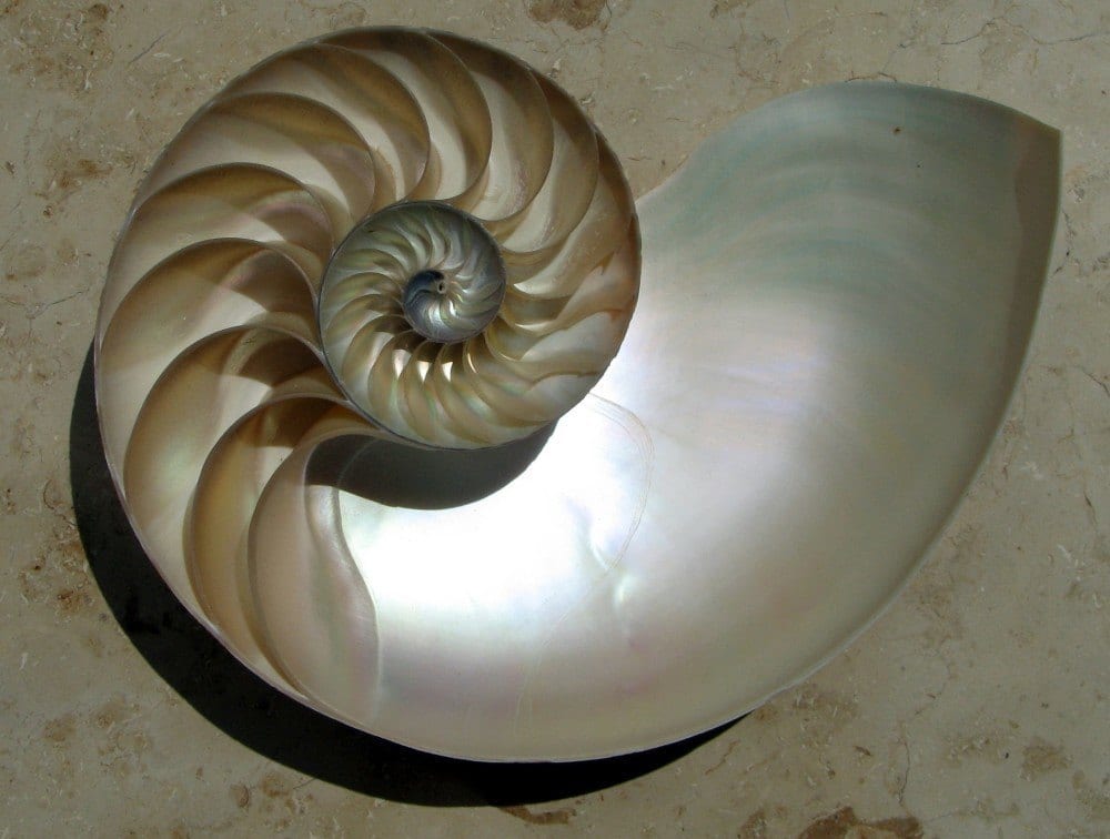
But dude didn’t exactly create this spiral out of a vacuum.
 The Golden Mean appears throughout nature, art, music— everything.
For those purists out there. Let’s not get our togas in a twist if the ratio isn’t exact. Close is good enough
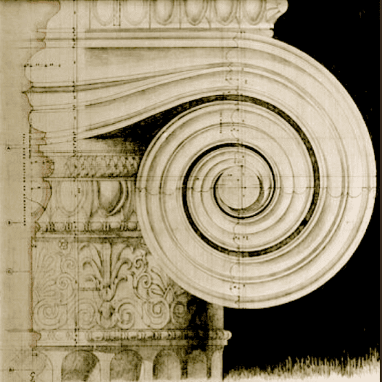
A section of an ionic capital.
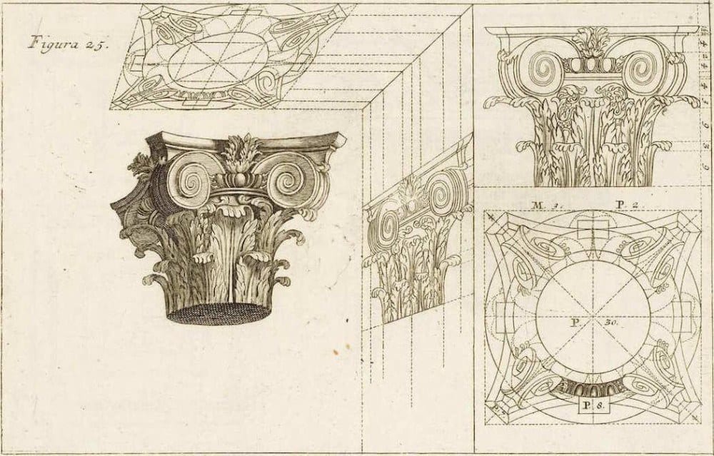
The ancient Greeks followed by the ancient Romans were all about scale, proportion and organic forms
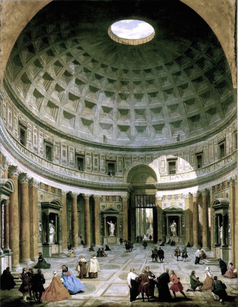 Painting of the Pantheon by Panini in the 18th century
The Pantheon designed circa 60 ad by Vitruvius and built after his death some 150 years later.

The Vitruvian Man by Leonardo Da Vinci. (you knew that, I bet)
The human form is also math and full of geometry and the golden mean.
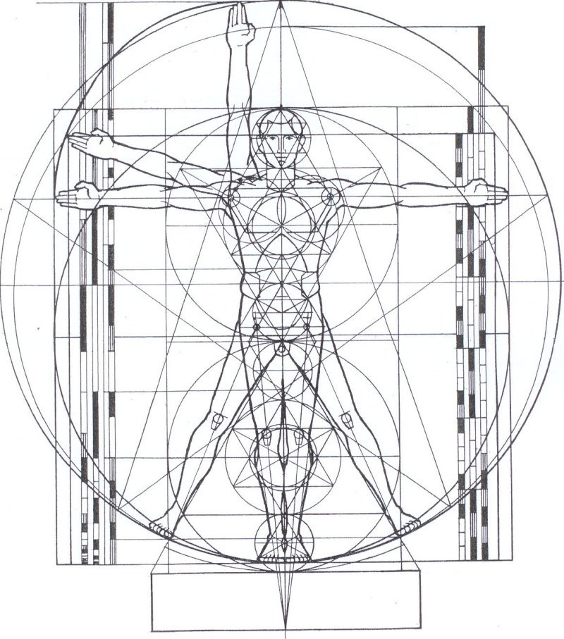 How cool is this latter-day riff by Lance Harding of the Vitruvian Man!
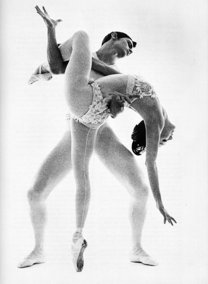 Allegra Kent and Edward Villella in George Balanchine‘s Bugaku–Photo by Bert Stern
Beauty is Beauty. Organic Curves, geometry and hot ballet dancers.
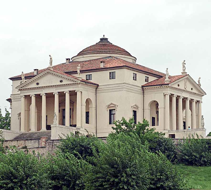
The Villa Rotonda by Renaissance architect Andrea Palladio
The European Renaissance era saw the rebirth of classicism with the neo-classical style. The brilliant architect, Palladio designed this purely classical building. Yeah… that Palladio–as in Palladian Window. And below, Fibonacci’s golden mean spiral superimposed on the plan view of La Rotonda
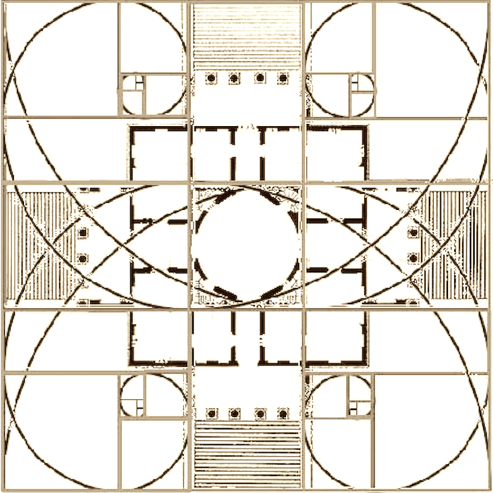
Oh man. Can you tell how much I love this stuff?
This is why when Metrie asked if I would write a post, I jumped at the chance to write about one of my favorite interior design elements.
But before I tell you more about Metrie, I need to finish up with our history lesson.
After the renaissance, classical design still reigned over all architecture throughout the Western World, including the USA.
And then in the mid-19th century came the industrial revolution.
It changed the way us humanoids think about everything.
And the change happened more rapidly than in any other point in history.
The 20th century brought further changes and design styles such as art deco and arts and crafts. All of these styles were the evolution of classical styling. The parallels happened in art, music and fashion as well. It’s always been like that. I’ve always thought that was so cool!
As time went on things got more and more pared down; down to the essence of what was necessary to be considered a dwelling.
Many architects were involved in these new “modern” movements. One of the most notable is the brilliant Ludwig Mies Van der Rohe who designed the iconic glass Farnsworth House in the mid-1940’s. There were no architraves or pediments. No crowns or cornices.
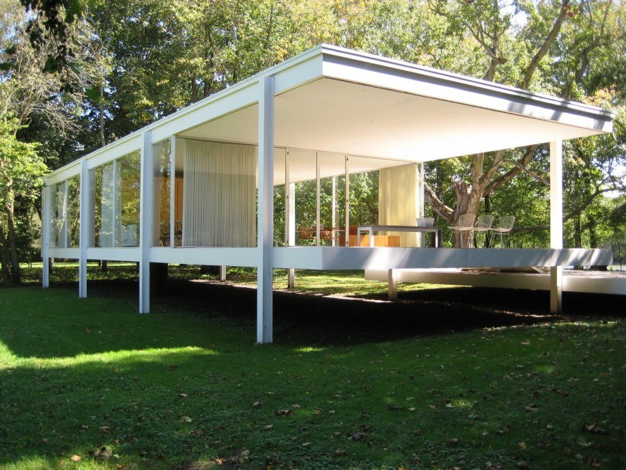
And yet, this classic has a simple, elegant beauty in its purest form.
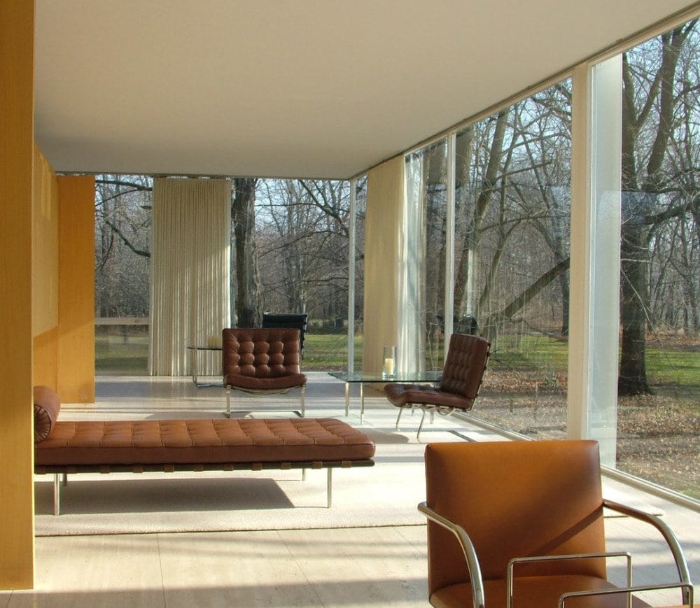
Believe it or not, its proportions too, are very close to that of the golden mean!
But then… something happened. Something not-so-good.
the 70’s.
The elegant essence of Mies’ and other architect’s work became bastardized into something I find quite scary. I was alive then. I lived in a gold and avocado home just like everyone else and I thought it was pretty wonderful.
Young and dumb as they say.

What is that Laurel, the state penitentiary?
Close. It’s where some parents send their kids to college. The State University of New York (SUNY) in Purchase, NY. Been there many, many times for a variety of reasons. The irony is that it’s a college with a heavy bent towards the fine arts. Every time I pull up, all I can do is shake my head…
And then the 80’s; largely post-modern dreck. Poor Palladio. His phenomenally crafted design— hackneyed into some bastardized, grotesquely over-scaled arched monstrosity; not all the time, but far too often. Apparently many of these architects and builders never heard of the golden mean. Or they did and they were too arrogant and untalented (a lethal combo) to care.
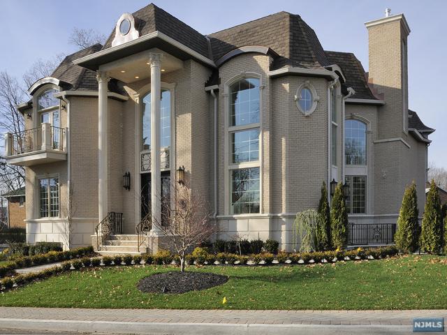
no words.
*********
Thanks the Gods, Greek and otherwise, for the likes of Metrie who are perpetuating the classics as they were meant to be; but for our time.
You must check out their gorgeous website. There is the entire 89 year history of the company and detailed information about all of their products. What I’m about to present to you is only a tiny fraction of what’s available.
What I love most about Metrie is their perfect blend of the classical proportions of Palladio with the modern sleekness of Mies.
The other really cool thing is that Metrie specializes in five distinct styles:
There is a room planner. You begin with a plain shell of a room.
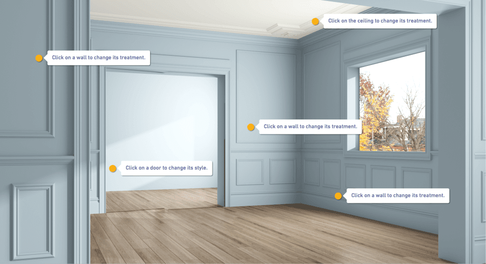
If you’re still not sure, they have a fun quiz which I took.
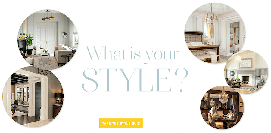
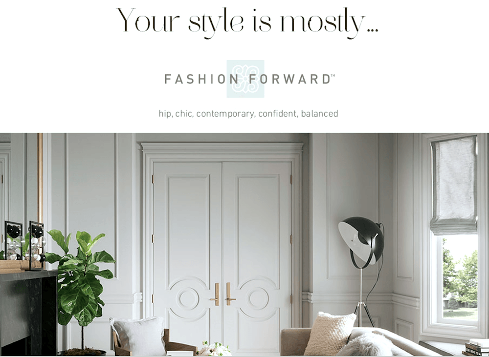
Yes! They got it right! (except maybe for “balanced” lol)
Oh, those doors!
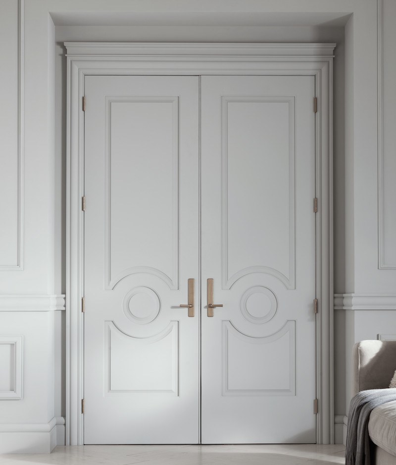
I want these doors!
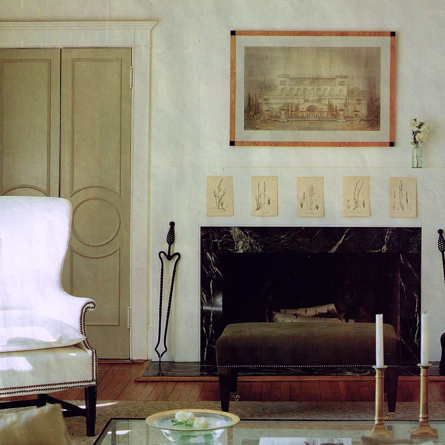
Some 20 years ago +/-, I was captivated and still am by this fabulous room by Victoria Hagan. She was helping her sis out with decorating. What drew me in the most were those amazing doors!
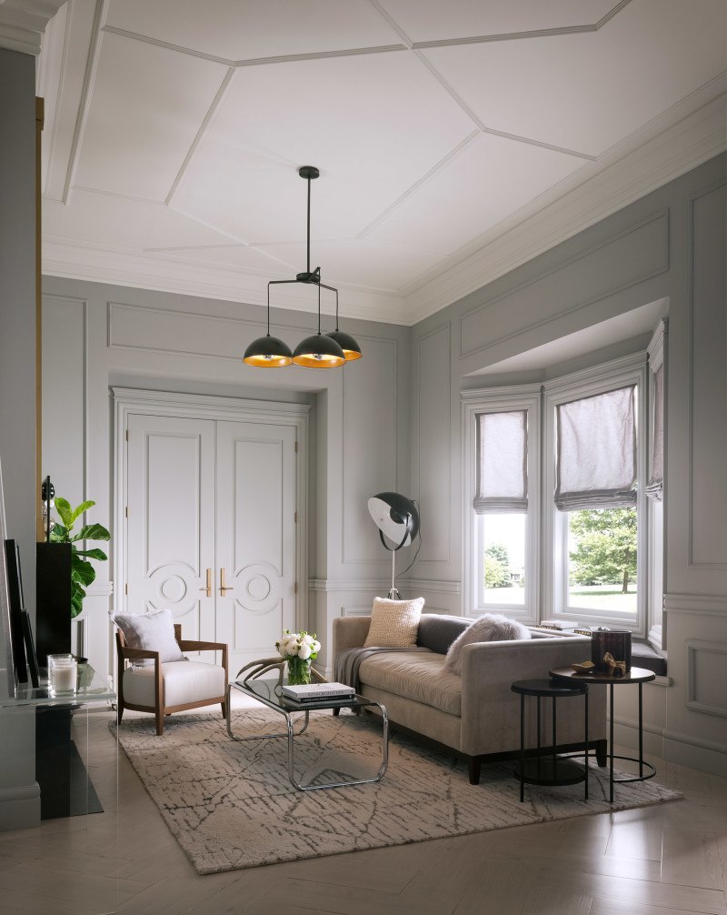
Sophie Burke is the designer for Metrie – Love the ceiling detail!
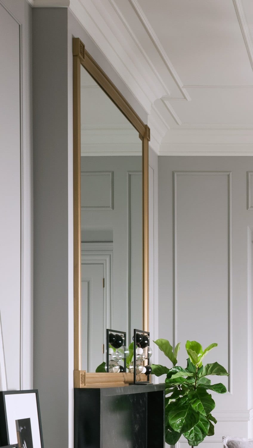
I mean I REALLY LOVE IT! I would give anything to have this kind of detail on my bedroom ceiling. These small applied mouldings are great for high ceilings. However, they’re really great for lower ceilings when one wants a coffered ceiling look that isn’t so heavy or going to lower the ceiling further.
In you’re interested, there’s a great tutorial by Nicole Gibbons on Metrie’s blog, “The Finished Space” about how to make this fabulous mirror from Metrie mouldings and a little paint.
I have so enjoyed sharing this information regarding classical architecture and the wonderful company Metrie. By the way, they have stores all over Canada and the USA. Again, if you haven’t done so, please check Metrie out here.
xo,
![]()
Related Posts
 Plaster Ceiling Design + Architectural Mouldings
 Window treatment styles – How to select color, type, pattern
 Freshen Your Home for the New Year {part III | wall paint!}
 Common Mistakes Folks Make With Their Small Kitchen
 The Only Six White Paint Trim Colors You’ll Need
 20 Stunning Lifestyle Instagram Feeds You Must Follow
 21 Interior Design Mistakes You Need To Stop Making







39 Responses
I recommend Old House Guy blog for the best explanation I’ve found of why old house elements are built the way they are and how modern replacements don’t look quite right.
Artchitectural Tourist is also a good site that picks apart traditional and modern buildings around Alanta and how they work. He is a big fan of Alexander’s Pattern Language and of vernacular and classical architecture, and early modernism.
Hi Kathy,
I just went over and took a look. Love his take and agree. I just read the post about Victorian decoration. It’s really all ersatz. I wrote once about those gross doors that people put in. They are not even remotely Victorian. It’s some bastardization of one or two elements. Really bad.
I am addicted to your web page and am constantly sending links to my friends working on their homes. But now I have a question. I’m trying to improve my 1958 home that presently has no moulding of any sort and baseboards that look like glued on left-over 2 X 2’s would you add more elaborate moulding if you could?
Grace
Hi Grace,
Thanks! Me too! haha.
Re: mouldings. Difficult to say without seeing the home, the other furnishings, etc.
Great post, I agree, I love architectural details too!!! I’m not into modern stuff, and think that most buildings look horrible, like big boxes. I’m a color consultant, and work with a lot of people who have beautiful older homes with lots of moldings. But, I’m often dismayed when some gut their kitchens and baths, and make them super slick and modern. I don’t understand why they buy old homes, and strip out the good stuff. ???
Hi Diane,
I’m with you all the way on that one. I once worked on a classic Victorian in Bedford, NY. Someone had ripped out the kitchen and put in something plastic and contemporary. It felt like an affront for such a grand old home!
Laurel,
I love the post! It is such a great reminder of why things look pleasing to the eye. You explained it all so well. I have to say, EVERY time I go to write out mouldings spell checker marks it as wrong…drives me nuts!
I wish I had your art history teacher. Mine just droned on and on. It was almost impossible to remember all of the info for tests.
Maybe someday we will be in a home that this company’s products would work wonderfully. Right now, we are in a ranch style home, which is okay because of our view. But without the view, the house is ehhh.
It’s a great reminder to build architecturally interesting homes and not boxes.
Hi Wendy,
Thanks for the great comment! I lucked out with art history teacher. It’s funny how certain people have a positive effect on you for the rest of your life!
Captivating. I actually met a rep from Metrie at this year’s Design Bloggers’ Conference in Atlanta. I am even more fascinated now that I have read your blog. I was pulled in from the get go to the last funny pic of you. Thanks so much.
Hi Mary,
Oh how funny! I was at the DBC, too! I wish there was more focus on the mechanics of BLOGGING and less about some other things. However, Bunny Williams was AWESOME! I even wrote a post about her.
https://laurelberninteriors.com/why-bunny-williams-husband-hates-me/
I too love moldings, er, mouldings. It’s one of the great characteristics of my house. But this just took it to the next level! Alas, I did not grow up with the green and avocado home, but I did have the next best thing… plush shag carpet in every room except the kitchen and bathroom. Each a different color no less. If I remember correctly, my room was lavendar. 🙁
Hi Kim,
I’ve often wondered, “what on earth were people thinking?” It made me come up with this saying;
“just because you can doesn’t mean you should.”
Thanks for stopping by!
Ah, that’s what’s been missing. I knew I didn’t like late 20th century architecture. Best I could do for explaining why was using words like boring, ugly, lacking in soul, etc. Now I understand!
Hi Molly, Yeah… not to mention those really fugly brown exteriors. Just a lot of hideous which started to improve in the 90’s. Not all modern architecture is bad. But I think there needs to be lots of glass and beautiful lighting! Proportion is also key.
I always love attending Laurel’s school of design!!! You are an awesome teacher. And thanks for the intro to Metrie. Off to check out more. Stay fabulous!
Hi Bro,
lol!!! I’m still kvelling over your property and gardens! Anyone seeing this comment needs to get on over to your blog STAT! http://toneontoneantiques.blogspot.com/2015/04/early-spring.html
My fave, fave, fave course was Art History. It was at a little community college in Los Altos Hills, CA. The professor made it all come alive with words and music. Extraordinary! This was back before the flood. lol He would have the most entertaining stories about how he would smuggle in his camera and stuff like that. xoxo
Love the detailed explanation, and gorgeous photos! And while the moulding at my house is not quite so gorgeous, it does make such a huge difference! It was one of the first things I added when we moved in.
And those doors are to die for…I’m itching for renovation time to roll around at my house (or the next one). Thanks for the great info, as usual!!
Hi Ashley,
It really does make such a big difference. I think I said this already in another comment, but I think it’s even more important than the paint color. Everything looks better when the architectural bones are beautiful!
Beautiful post Laurel. I am glad the world is filled with talented designers like you. I don’t have design bone in my body, I just know it looks great.
Thanks for stopping by John! if you know that something looks great, it means you DO have a design bone in your body. Maybe even two or three bones. ;]
Tried it on my pc with firefox and it works. Yay!
Great post. I am going to home depot now to get some thin 1/2 round molding to go around my left and right fireplace walls making the thin box like molding like on the photo from Sophie Burke on the walls next the the beautiful doors. Great inspiration, thanks Laurel
oh phew! Thanks for getting back to me Chris. It’s fine on all of my apple devices (well, forget about the phone right now thanks to the mobular debacle—loooooong boring story!) I did try Safari on both pad and macbook though and it’s fine. But glad you got it on Firefox. I use FF on my mac too, just because I’m used to it and like it.
I used picture frame moulding all over my old home and loved it so much! I’m positive it’s one reason why the home sold in about 2 seconds. So pretty! My home now, came that way, but the ceiling in the bedroom needs help. One day, I hope! Good luck with your moulding project! Please send me pics if you like when it’s finished.
Oh, boohoo, all the images are distorted on my iPad:(
Is it only me using Safari browser?
Hi Laurel. Great post! I enjoyed the beginning about math. In photography, we use the Fibonacci spiral to improve composition. Metrie is well known here in Canada, and in fact we find their products everywhere in Quebec. So I was quite happy to read about them on your blog!
Hi Valerie! Thanks so much for stopping by! Yes, I imagine they are well-known in Canada. They recently rebranded and I think are trying to expand their reach.
Very cool about using the Fibonacci spiral to improve composition. I don’t know if you know that I’m also a ballet dancer. Talk about spirals. LOL At one point, I was even a dance major in college. When I talked to the dean at the New York School of Interior Design about transferring at least a few credits towards my interior design degree, he looked at me like i had 3 heads! What an idiot! The reality is that my years of dance training has helped me more than just about anything I learned in that silly school!
I love this! What informative fun! I am in love with that Ludwig Mies Van der Rohe house – and those doors with molding. I guess the 2 styles wouldn’t really go together (that’s why you’re the designer.) Thanks for the inspiration.
Hi Therese,
Thank you so much for stopping by! Of course, you’ll see much more on FB, but I think those doors could go anywhere. One of the things that makes the Farnsworth home so special is its setting. Magical!
You write the most wonderful articles! I really enjoyed the review, although math makes my head hurt. I am saving this one forever.
haha! Some numbers I like, but if it’s something with scary words like integer or anything having to do with a spread sheet I’m with you. Thanks so much Ellen!
BRAVA Laurel. I am a journalism major too and your blog makes sense because the numbers make sense. I enjoyed the math. You are right. When he said “Number – everything is number,” Pythagoras was speaking philosophically but it obviously also explains why we enjoy what is underneath the appeal of visually appealing symmetry – the math. Thank you for this education and this informative blog.
Hi Emilia,
Thank you so much! I could’ve written a very lengthy post just talking about the golden mean. I find it all quite fascinating. So many times people focus on color as the solution to give a room its finesse. But a plain, squat boxy room is going to be a plain, squat boxy room no matter what color it is!
I LOVE LOVE LOVE your blog! Thank you so much for sharing your talent with us. I enjoyed the history lesson this morning!
Hi Katherine, Thank you so much! This post was a lot of fun I also learned some things and the rest was a good review. I knew all of the names but not necessarily when they lived. I think putting design elements in the context of history gives us greater clarity why we do things.
Dear ‘Goddess’ Laurel :-)just for this post alone you should be crowned,but then again-your name says all.Your mother got it right.:-)Fascinating stuff and you are absolutely ‘en point’ with your comments about much of today’s architecture that looks to me not only out of place but downright ugly!I wonder if architects would design better, more pleasing spaces if they travelled through the world and so were exposed to the beauty of classically designed buildings?
The NJ Housewives mansions seem to proliferate all around me- a typical NJ suburb- but that just isn’t the place where you would look with favor on a newly built church that looks like a Spanish mission complex, complete with courtyard and red clay roof, plopped down into a neighborhood of big colonial style homes; then there’s my personal eyesore built just two years ago: gigantic single family, dark red brick fronted house situated on a slight hill, that looks like an apartment building building wanna -be. Front sports multiple skinny windows so tiny as to be totally out of proportion, shallow balconies that serve no purpose as the house sits on a corner lot with a nothing view, empty niches built into the corners..and the inside hasn’t a single molding anywhere.It is just the most incredibly ugly building and I have to look at it every day. What architect would want his name associated with such a mess? No golden means applied anywhere..
I love those skinny ceiling moldings!! Going to hop right over to the site and have a look. I can’t have the gorgeous doors in my house unless I moved, but I am going to look into the moldings!!
OMG! too funny Dolores. And YES! That hideous house is in New Jersey! The interior is equally grotesque. Copious amounts of swirling wrought iron and marble – EVERYWHERE!
Ha ha. Laurel, I love the last photo! You’re so funny!
Thank you Linda. I crack myself up too!
Laurel,
I love your work. I love your blog. But darling, my graduate degree is in journalism. I can read a spreadsheet, an annual report, even a project budget. But, honey, I skipped right over your math and got to the photos. Love ’em! Keep up the good work. PS: I too spell it mouldings, but then I also use colour, harbour and theatre in Scrabble, as well. Toodles!
Hi Vee,
Had to laugh. I like geometry because it’s tangible, but algebra, my eyes would glaze over… haha. I once got shat on by an English teacher for spelling it “theatre” but she was a sadistic old cow.