Folks. I just had a really close call. I almost lost nearly my entire hard drive AND the back up. But it’s all been retrieved now! Lesson learned. Gotta get off-site backups!
I am looking forward to the next installment of freshening your home for the New Year which will be all about artwork. After that, I will cover bookcase styling and collections, then table styling. (coffee, console, center hall and end) and finally a post on classic interior design. In that post, I’m going to narrow down the immense field to one piece in each category. This is the interior design equivalent of the “little black dress.” In other words, you cannot possibly go wrong. Of course, there are many other ways that you cannot possibly go wrong, but I thought it would be fun to choose one way.
Here is a preview of wall art from my own portfolio. As an aside, for those of you viewing my portfolio, I have not been able to give that the attention I’d like right now, but hopefully within the next several weeks, there will be some new images to see!
The following image was taken from my own home. I had purchased these charming antique prints while vacationing in Newport Rhode Island. They are whimsical farm animal images. I was taken by the muted colors, stained matting and thin black frames. I knew that they would be perfect in my den, over a small console table.
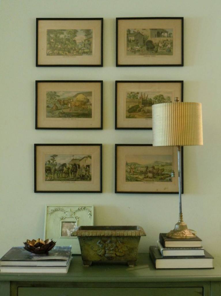
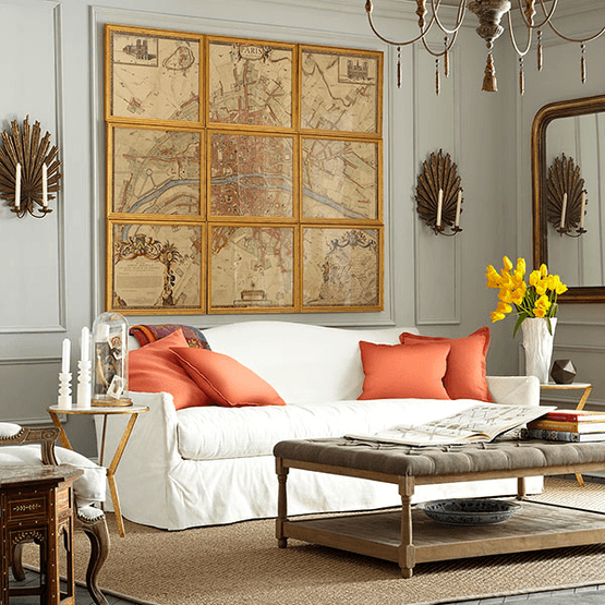
Hanging art in groupings is a great way to present your images. The art work should always be smaller than the piece it’s going over, by at least a couple of inches on each side and if the piece is larger, (like a sofa or long table) it can be a few inches more. This can vary depending on the size of the print and amount of wall space, but I have found that the spacing between the prints should be fairly close. I generally like about 2″ but it could be a bit less or a bit more. I do not like it when the prints are right on top of each other unless it’s meant a map in sections such as this beautiful piece from Wisteria.
Well, that’s the preview. More coming soon and a trick I have found so that you can get the spacing exactly (well, almost exactly) right each time and other hanging tips.
With great relief and joy!
![]()
Related Posts
 A Fall Color Interior Palette Inspired by McGrath II
 Her Bossy Home Builder Needs To Calm Down!
 Evansville Indiana – The Little Known Truth About It
 Living Room Roman Shades + Art + Den Shade Parts 1 & 2
 How To Decorate A Blank Long Living Room Wall
 Part II – The Most Gorgeous Stone Fireplace Mantels Ever!
 He Wants To Keep His Big Black Sofa, But I Hate It


