Special treat today. New photos from the Bronxville kitchen. Before I get into one of my favorite interior design tricks that’s cheap and easy, I just want to say that I feel incredibly blessed to have been able to work on this magnificent home!
The kitchen except for a few accents is done! Now, mind you, these shots were taken with my phone and in low light since it was very late afternoon and this is facing south and east. Therefore, the photos are a bit grainy. Alright, they’re horribly grainy, but it reminds me of that magazine from about 20 years ago which I can’t remember the name, but the pics were kinda like this.
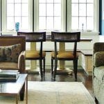
Below is a photo from last week when the table and sideboard were delivered.
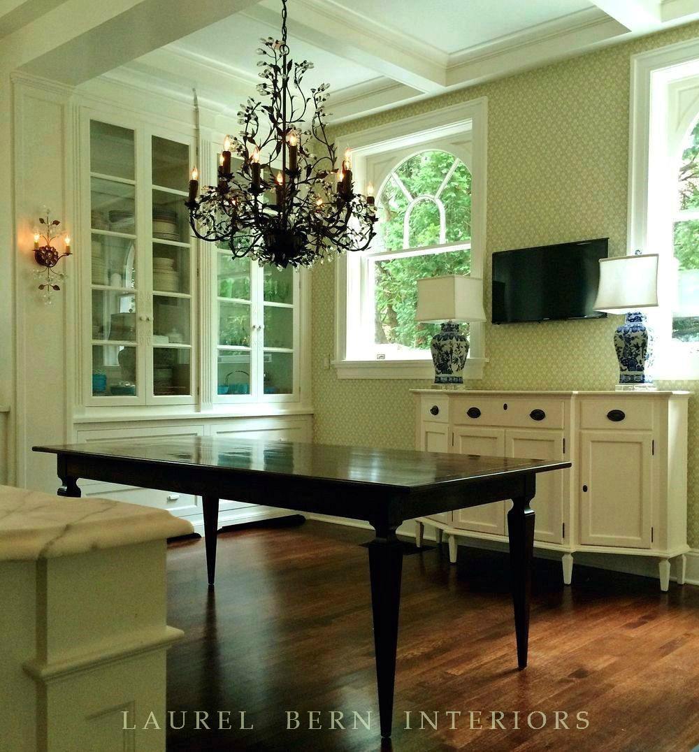
And here is the kitchen now.
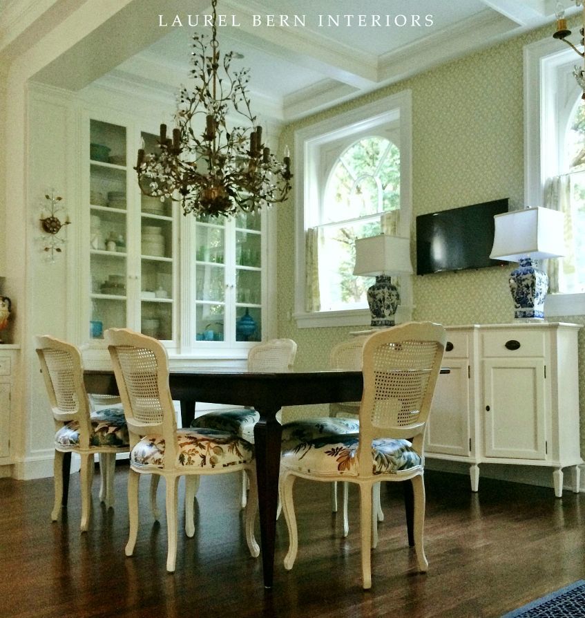
In the back you may notice we have our cafe curtains up. I was a little nervous about them, because the last thing I want to do is muck up these exquisite new windows. For those of you who haven’t been following along. The windows you see were custom-made to match two existing windows created in 1910! And I mean they are EXACT replicas!
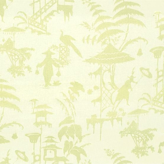
The fabric is Barbara Barry’s Indo Day for Kravet.
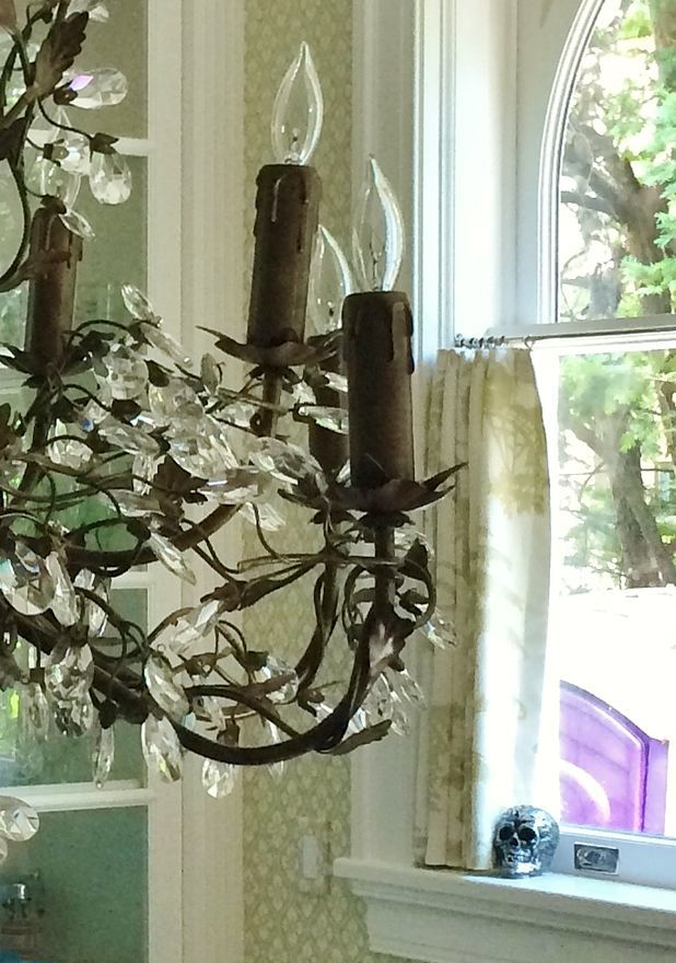
A closer view of the cafe curtains.
The skull is all that’s left of the GC. [really joking, he’s still hard at work as you may have surmised based on the purple porto-potty outside the window. hahaha!]
Then, the chairs. You know, they were ordered so long ago, I forgot at first where they came from. They are tres French, n’est pas? Every time I look at them, I’m craving a Napoleon. Butttttt… that FABRIC! I’m absolutely kvelling over here.
And YES! The fabric placement chair is different!
Intentionally.
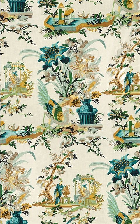
Please don’t ask me how much this costs. If you have to ask, you can’t have it. ;] That’s how expensive it is!
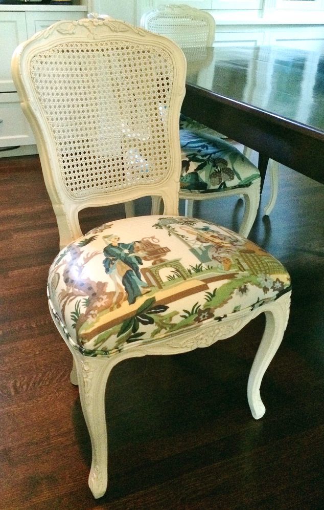
As you can see the repeat is immense and I wanted to see all of it. Making each chair different also gives it a bit of a modern edge. So don’t be afraid of using a large pattern with a large repeat for something small.
OH! yes. Alright. Yes, yes. The fabric IS laminated. It is very matte and not at all noticeable, but, no worries. Go ahead. spit out your coffee. Spazz out with the ketchup. Go grab a sponge and you’re good to go. I do this all the time and everyone at first goes, huh? and when they get it they practically kiss my feet.
You may notice that I’ve only been photographing this one angle recently. We do have plans to have the room professionally photographed.
This brings me to our subject matter.
One of my favorite interior design tricks.
It’s about the chandelier. I bet you already noticed sumtin’ up with that?
In the first photo, it looks nearly black. right?
In the photo with the skull, we see up close that it’s really a bronze-y color.
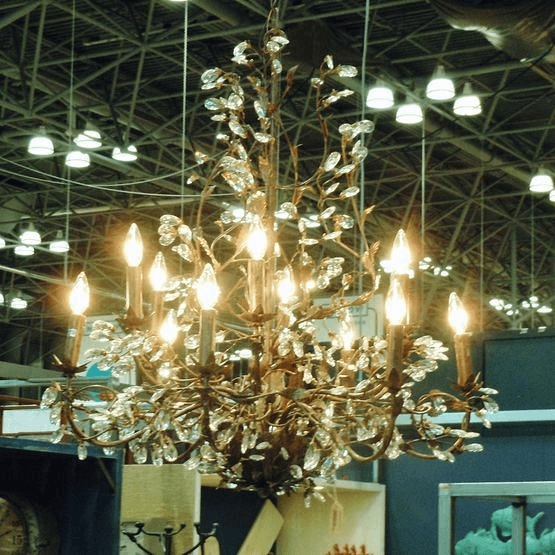
This is the chandelier when I saw it at the New York Now Show in August 2013.
It looks to be antique gold, doesn’t it?
Well, apparently, it’s not and it was bugging the hell outta me, because I think it looks too durned dark. So what to do, what to do. I said to S casually last week that I could brighten it up a bit if she was cool with that.
She was VERY cool with that.
Alright, I suck at tutorials.
For y’all who don’t suck at them and painstakingly take your photos of every step, I think that’s great, but I just needed to get on with things. Therefore, you’re not going to get much detail, but when you find out what a ridiculously easy interior design trick this is, you won’t even need this much.
Here’s the chandelier before up close. We were fine with it not matching the antique gold sconces, but again, too dark.
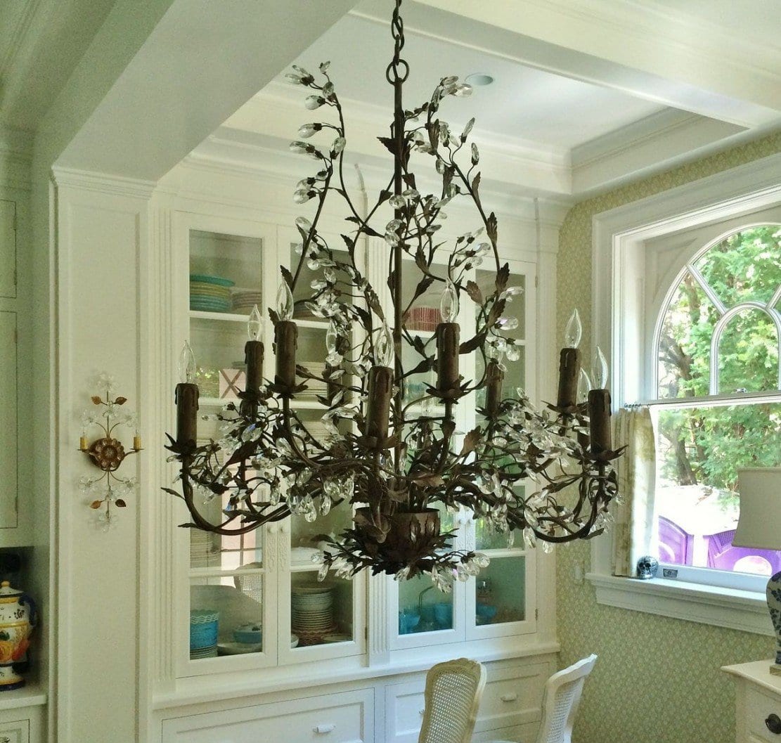
I tried to take a selfie of me painting, but when that proved to be impossible as I left my third hand at home, S said that she would take the photo. Well, she got a bit of the brush in there, anyway. :]
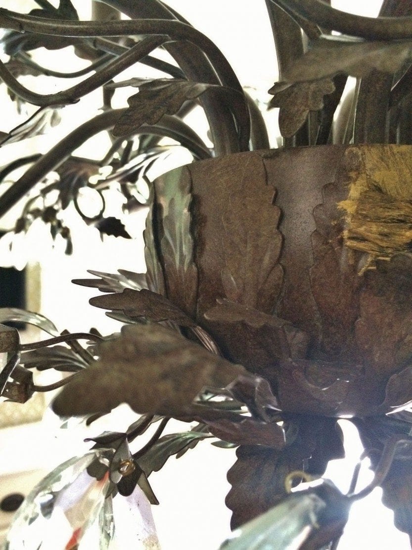
What did I use? Sorry, but I have no idea, lol.
It’s some water-based gold paint I got at the hardware store. You can use lots of different things. Any kind of craft paint will do. McCloskey makes a very nice one as part of their special effects paints. One hint though is that if you are painting over dark and wanting something to be a warm gold, go for a nice red-gold as the dark surface will make the color go green and it’ll end up looking cheap and brassy. In fact, sometimes we use the copper color for our gold drapery rods. It looks like a lovely warm gold on the wrought iron.
Is there a special technique I use?
Oh, Yes! Please pay very close attention as this is quite important.
I randomly smoosh on the paint with my brush little by little not putting too much paint on the brush and move it around until it looks good. If necessary, I’ll go over some parts and if it looks too heavy and fake, scrape some off with a finger nail. But, the idea is to not make it look too even. So, it’s fine if some areas are more gold and others are darker, just as a true antique gold piece would be.
Do you need a primer? naaaahhh… But do a test first; it usually sticks just fine.
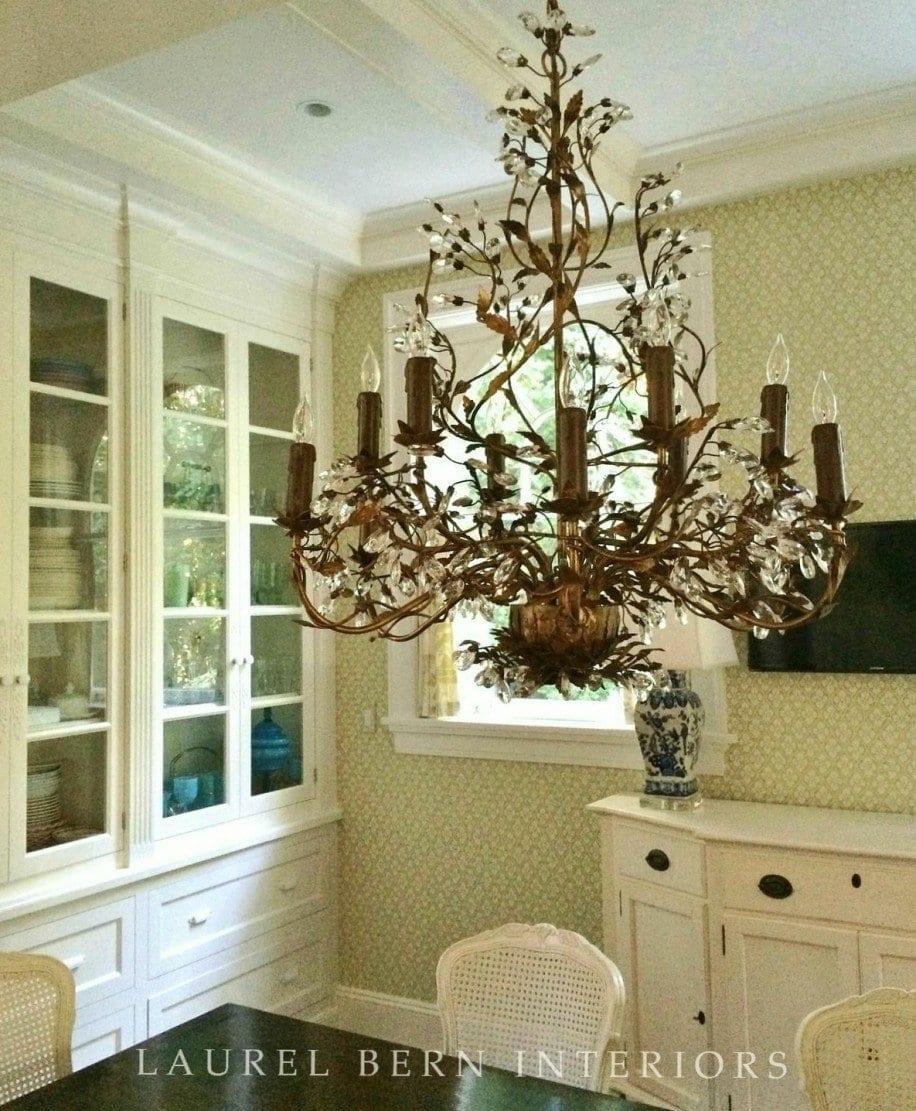
et voila!
Well… almost voila!
We’re not too fond of the candle covers. Too dark. Don’t you think? Sooo… have you seen these?
They’re actually made of beeswax and they come in standard and custom-sizes.
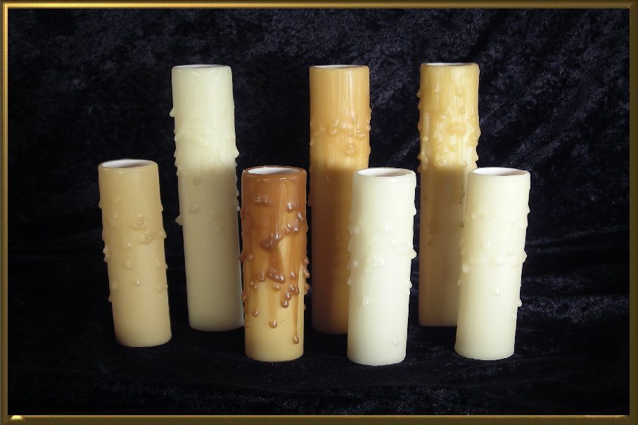
These are from Lighthouse Industries. I’ve left them a message. We’ll do the cream, I think. That will be pretty and will also lighten things up even more.
I’ll finish off with one more grainy image taken with the lights on dimly.
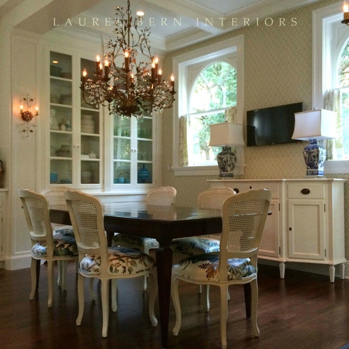
Imagine this staged and beautifully photographed. I’m so grateful to all of the wonderful artisans who made this all possible!
More coming soon! Wait until you see the media room occasional chairs and more!
xo,
![]()
Related Posts
 How To Create The Mark D Sikes Look For Your Patio Furniture
 Top 25 Must See Kitchens on Pinterest
  What They Didn’t Tell You About The Best Yellow Paint Colors
 Why I Love Interior Designer Barbara Barry | Part 2
 12 Of The Hottest Kitchen Trends – Awful or Wonderful?
 14 Common Home Painting Mistakes You Might Be Making
 Why Is kitchen Lighting The Hardest Thing To Get Right?


