It still doesn’t seem quite real. But a week ago, I was sitting on a stage at the annual Kitchen and Bath Industry Show (KBIS) with NATE BERKUS!
And every time I see a photo of myself standing or sitting with the rest of the panel… I think. “Who is that bitch wearing my dress!” ;]
That’s how surreal the whole thing is.
And it’s not like I’ve never been on a stage before. Some of you may know that I have a pretty extensive background in theatre and dance.
See? Nothing goes to waste.
But still… most of that was a long time ago and in between were more than two decades of heavy-duty child-rearing and clients.
But, it really did happen and here’s the proof.

Awww… can I take him home with me. Pleeeeeeease???
As you can see… I was a happy gurl.
And NO, I did NOT SNIFF HIM. Somebody said that in a comment and sorry, but that’s a little gross. He’s a married man and I do not go around sniffing married men!
And believe me when I tell you that his husband is far, far prettier than I. haha.

Here’s the entire panel – top photo. Andrea Magno from Benjamin Moore, Alena Capra, designer and the wonderful moderator, NB, Amy Wax a fabulous color specialist also from New York, Daniel Germani, a designer from Phoenix and somebody wearing my dress!
Where were we? Oh yes… I forgot for a moment why we are here.
(and I don’t mean that in an existential way) ;]
The topic of the panel was a talk about color trends in general but also specifically about kitchens and baths.
Here’s what Nate Berkus had to say about design trends of all sorts.
Get your tweeter ready: it’s a doozy.
“Trends exist to make people feel badly about what they don’t have.” ~ Nate Berkus
Like, holy crap yeah!

I guess that’s why we love him so. Not only is he really, really cute, he’s witty, charming and smart.
and talented.
Oh, and he remembered my name.
I have to work on that one.
I do understand that there’s a video coming out of the color chats and when it does, I am definitely going to put up a big banner ad in my sidebar with the link.
And from a design stand-point, I found myself agreeing with everything he said, except for the part about listening to your house painter for color advice.
WHAT???
You are not to listen to your painter for color advice, unless he’s the one in a hundred who is capable of doing that. And perhaps Nate’s painter is that dude. Your painter, most likely will not be.
Oh, and there was one other thing.
Nate wasn’t really there to talk about color. That’s just an incidental.
You know that and I know that. Nate was there to plug his new products at LG appliances.
And ummmmmmmm… The finish.
uh oh…
Nate confessed that he realized that people were a bit doubting of it. Images come up of the horrid BLACK and soon-to-be-dated appliances of about 15 years ago +/-.
I admitted on the panel that I was one of the doubters, but I was going to come over to LG and take a look.
Nate is also a fantastic salesman. He described the color as not at all black, but this bronzey rich color.
“It’s a classic,” he said.
But, I’m thinking, if it’s a bronze-y tone, it probably would look good with earth-colored cabinetry, but not so great with white.
After lunch, I sauntered over to the next building where LG lives to see the black, but not really black stainless.

And I kid you not.
20 seconds after I arrived, Nate walked in to give a presentation.

Now that we’re fast friends, ;] he gave me a friendly “hi” and then a little brotherly smooch on the cheek.
I’m thinking, wow, I couldn’t have planned this better.

And just to his right I got immediately distracted by the “black stainless” fridge.
He’s right; it really isn’t black.

The design itself is very nice. You knock on the window and it lights up in case you’re too lazy to open the door. But it’s cool. The kids will like that and maybe they won’t stand there with the door open for an hour.
But lets talk about the finish. Okay?
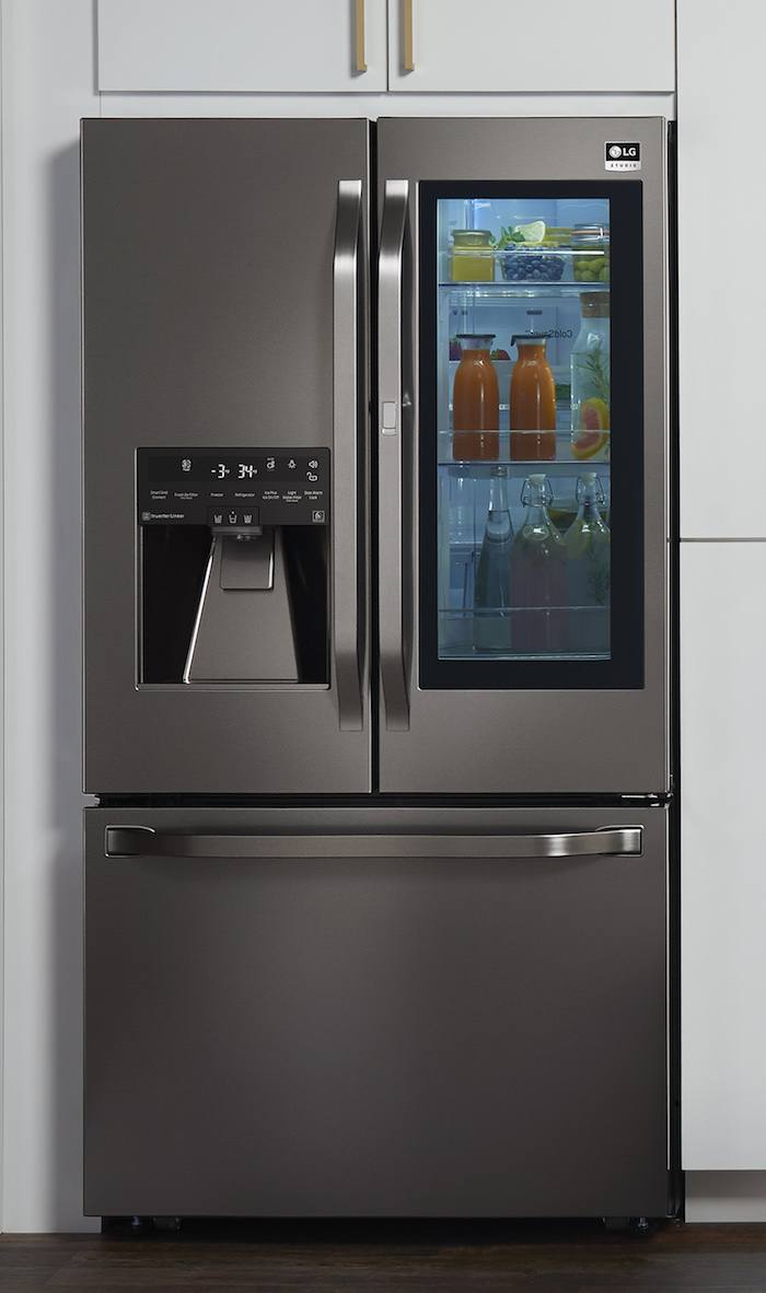
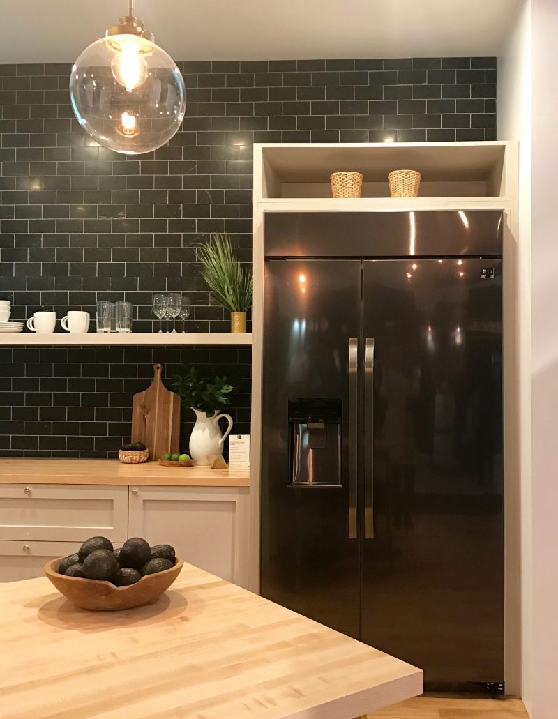
LG STUDIO NATE BERKUS BLACK STAINLESS BUT NOT REALLY REFRIGERATOR
Here are the glossy-not glossy, black-not black website shots of the fridge.
Looks matte, doesn’t it?
It’s not matte. In fact, it’s not really stainless either.
My pics aren’t airbrushed. This one, apparently is.
So, if one is expecting this, they are probably going to be disappointed.
The finish actually looks and feels like shiny plastic.
But something else and forgive my nit-picking, but doesn’t it clash with the tile? Well, I think so.
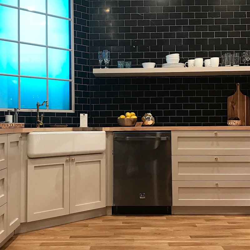
The dishwasher, however, seems to be a different material and is closer in color to the tile and less shiny, but I would still like it to be as matte as the handles. Then, it would be kinda cool.
But I do not think this is a classic; even if it was matte.
Sorry Nate. You’re adorable and very talented and I still love you but, please forgive me, I’m not a fan of the black-not really black stainless.
Here’s my solution. Clad the fridge in cabinetry. The rest is fine but I wouldn’t classify it as classic.
But here’s the thing. I’m not even sure how much control Nate had over this; probably less than we’d like to think.
So, from an aesthetic standpoint, I give the LG appliances a C+. They can do better. Maybe next year?
Functionality, I have no idea. Anything would be better than the cheap crap I have in my kitchen.
And no, you cannot see it! It’s shamefully awful.
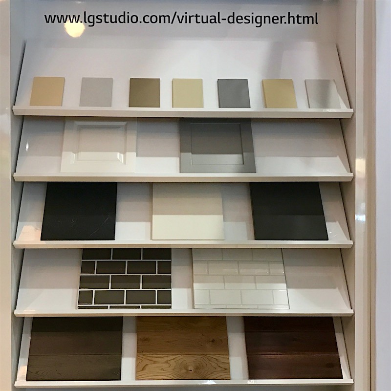
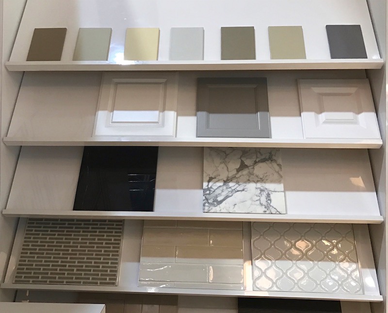
But… getting off this train, on another wall lived several cabinet door samples. I asked a salesman if he knew the colors?
“No m’am that’s the studio department.”
Fine. I’ll fend for myself.
I turned one of the samples over and pay dirt!
There on the back of each of them is the name of the Benjamin Moore color they are!
And yeah… Like any self-respecting Design Hound, I took pics of the names, which I’ll get to in a sec.
And they are great colors. In fact some of them are in the Laurel Home Paint Color and Palette Collection!
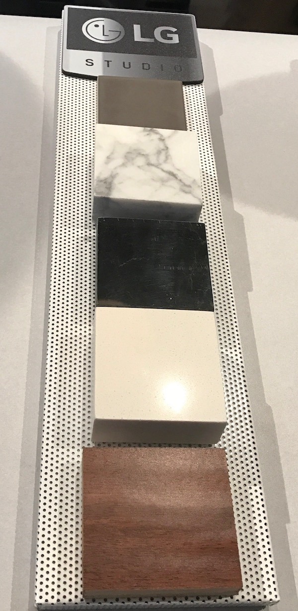
More samples of finishes. Me like!
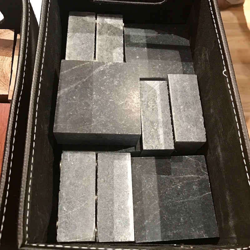
These ARE classics. Soapstone, Carrera or Statuary marble and a neutral earthy quartz solid surface.
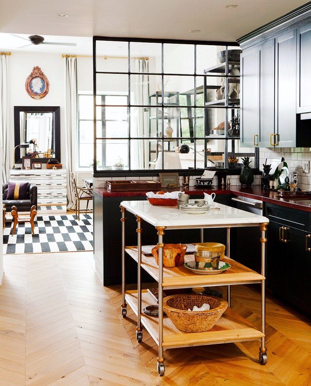
Nate’s old kitchen via Domaine
So a little presie for you guys.
I made a graphic with all of the Nate colors of the cabinets there and then added in a Navy because he likes Navy as seen in his old kitchen above. He’s doing a new kitchen now.
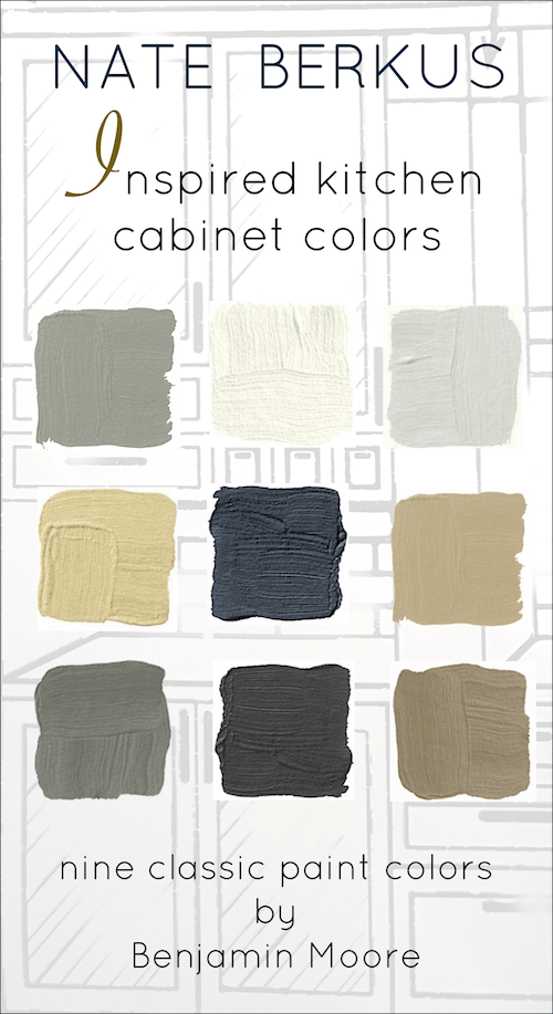
The colors are: from left to right, top to bottom
FIELDSTONE 1558
WHITE DOVE OC-17
STONINGTON GRAY OC- HC-170
POWELL BUFF HC
HALE NAVY HC-154
BENNINGTON GRAY HC-82
CINDER AF 705
ONYX 2133-10
ALEXANDRIA BEIGE HC-77
I think that this is a very handsome, earthy color scheme and what’s cool is that they all work together.
While we’re talking kitchens and counters,

To finish off, I have to show you the raspberry Aga. And yeah, I had to tackle and hog-tie several people to get an image sans the crowds, but isn’t it a beauty?
Oh, I have some other news.
On January 26th at the New York Armory is a “young collectors” night for the Winter antiques Show and I’m on the committee.
Now, you can be 105 and still be a young collector. Young means a neophyte collector. If so, then I’m a fetus. haha. But if you can make it that would be a lot of fun!

Well, that’s all for now.
See ya on Sunday!
xo,

Related Posts
 The Best No Fail Benjamin Moore Gray Bathroom Colors
 Should These Top Decorating Trends Stay or Go?
 50 Interior Design Trends for 2020 – In or Out?
 333 Decorating Rules You Need To Know is Here
 12 Of The Hottest Kitchen Trends – Awful or Wonderful?
 The Perfect Shade Of White Wall Paint For Oak Trim
 Interior Design Lessons We Can Learn From The Masters










48 Responses
Oh I want to be standing outside of Nate’s door when he gets rid of the cart/island in his “old” kitchen … I love it. Maybe he’d load it in my car for me LOL Of course, in my kitchen those shelves would be filled with a cat or two. It’s great that people in the know realize that everyone can’t afford the real stone counter tops. I’ve sent this to my niece who is trying to find alternatives, but I wonder if this new stuff will stand up to scratches and knife cuts? My counters are some kind of old laminate and (because of me) have many scratches, scuffs and yes admittedly I’ve been too lazy to move over to the cutting board and just sliced away on the counter. I guess I can always say it’s “vintage”. I still haven’t joined the SS camp for kitchen appliances, they remind me of a morgue. My house came with white and my condo had black appliances but that yellow fridge does sound lovely.
Hi Betty,
I like white appliances. But unfortunately, what I love is the white La Cornue.
This will do.
http://www.williams-sonoma.com/products/la-cornue-cornufe-stove-ivory-white/?cm_src=PIPRecentView
LOL
Rich husband? Are you out there??? Rich husband?????????? 😀
Black stainless – the combo of these two words feels trendy! I had to laugh on the the header of the last post as in my thoughts I was like did she mean nkba? We almost went with a laminate counter due to cost. There are carrera and soapstone options. Looking around we found dark blue gray with black slabs of gabbro that cost more but reasonable in that we could afford it. Would love to see more from that show!
Hi MAM. I love those stone choices.
I think that NKBA owns KBIS. A little confusing for sure!
Well I’m one of those who still has black appliances. I just painted my cabinets white dove and added black counter tops. While I would like stainless appliances it’s not in the cards right now. I actually think they don’t look bad with my white cabinets. Black and white is always classic right? And I don’t think it looks like black holes either.
Hi Deb,
My old kitchen was black and white. We had a white fridge and dishwasher and the last range we had was a hand-me-down black one from my neighbor.
It worked which is all I have to say about that.
But a lot depends on configuration, size of the kitchen and size of the appliances.
Before you give up on your stainless, try Barkeepers Friend glass stovetop cleaner (not regular BKF, the stuff made for smooth top ranges). Then follow with rubbing alcohol. This is also amazing on glass shower doors and cleaning bathtubs). I resisted stainless in my small condo remodel, then just did it as there were way more choices. They added sparkle and I do see them as a classic,and I’m very happy with them. Of all the finishes (I mixed up brands according to product reviews), the Bosch dupishwasher is the hardest to keep up and the GE cafe range the easy one. It polishes up like a jeweler’s window :).
Hi Linda,
Wow! Thanks for the great cleaning tip! We can all certainly use that!
I walked into a Lowe’s Store and saw one of these new laminate countertops. I loved the color, design and pattern- until I looked in the corner and noticed that, on this L shaped kitchen, the pattern turns the counter and the streaks of color are now going a different direction! Your kitchen will have some lines and streaks of color running north and south, then east and west on a L shape countertop. Very unsightly! If you are just looking at a sample, you may not realize this could happen to you, so may I suggest you take the largest sample you can get, take it home, hold it over your base cabinets and walk it down to the corner, then turn the corner. Yikes!
It’s a good point Karen, and yes, always bring home a large sample.
But I also see this example as one of the 100+ reasons why someone should always work with a kitchen designer.
I don’t know why the store did that, but one has to be very careful when running a linear or any geometric pattern for that matter in an L-shaped kitchen counter. It is possible in some kitchens to have the pattern running in the same direction on both sides, but it depends where the openings are for sink, range, fridge, etc. are.
Karen, I’m sorry to hear that! I work at Wilsonart and manage the Lowe’s account. What location did you see this at? I would love the opportunity to address the display.
Laurel,
I’m new to your blog; and so happy I found you!!! I enjoy every word you put to paper (virtual paper)!! Keep doing what you’re doing!
Your new friend,
Blair
Hi Blair,
Thanks so much for your sweet message! I appreciate the support more than I can say!!! xoxo
Please let us know what the Wilsonart laminate color name & number is for that shown in the laundry room and the photo before that with the really large island top?
Thank you!
Tricia
Hi Tricia,
I just wrote my contact and will have an answer to you shortly, I’m sure because they are very much on the ball!
Well, I could’ve waited a few minutes. Here it is:
The laundry room wood-looking laminate is Rediscovered Oak and Rediscovered Oak Planked.
The marble-looking laminate on the kitchen countertop is Wilsonart Laminate in Marmo Bianco with Ultra Matte Finish. Unfortunately, this was a product preview, so it’s not yet on the market. It will be available in May. In the meantime, some similar patterns include White Carrara, Calcutta Marble and Cipollino Bianco.
If you made a graphic with that Nate Berkus quote I would pin it in a heartbeat. Love it.
Your photos are great but remind me of a saying one of my friends in college had; “Never date a man with hair prettier than yours” 😉
Oh crap. I did last night! What’s wrong with me?!?!? It’s there now. Pin away!
And haha on the quote!
Hi Laurel,
Your posts are the highlight of my inbox. I just LOVE them. I tend to agree with you about the ‘black/notblack’ appliances. Oh, and the self loading and unloading dishwashers (teehee). Just a clarification of the new Nate colour (i’m Canadian) chart. In your list of the colours, are Oynx and Alexandria beige reversed? Just wondering….
Michele
Hi Michele,
Oops! You are right! I made the change. Sowwy about that. The Onyx was also added in, but I think it’s a warm black that would look good with the not-black stainless. But of course, anyone wanting to try that, please double check as I don’t have samples.
Hi Laurel,
It looks to me like bennington gray & fieldstone are also switched on the list.
Jeannie
Hi Jeannie,
Thanks for letting me know! I think I must’ve been very tired when I did this. So sorry! I fixed it. At least I didn’t put the colors on the chart.
Laurel, I could hug you for saying that you don’t care for the not-black stainless. I don’t like it either, but the lemmings will probably love it. No, it won’t be a classic. The idea of a window in the door seems like a good idea until you realize that there is no door storage in a door with a window. Where would I put my butter and cheese? But you are talking to a low-tech 1958 GE canary yellow Holly Golightly owning refrigerator person here. Yes, I traded my top-of-the-line French door, stainless, all the bells and whistles $3600 fridge for a 1958 canary yellow one, and I have never looked back. I am thrilled with my fridge. Works great, is super energy efficient and people love it. Plus, it doesn’t take up half my kitchen. It’s way more stylish than any not-black stainless, overpriced, soon-to-be-extinct appliance could ever be.
Hi Cynthia,
That sounds way cool! There are some companies who are doing the vintage thing too, but yours sons like it’s the real thing?
And yeah. No door storage. I hadn’t thought of that. Or at least only one shelf below the window. How dumb. I really use my door storage too because it corrals things better. haha!
You’re so right, Laurel. We need door storage to hold salad dressings and the like. And yes, my fridge is the real thing from 1958. I love what they are doing with vintage style fridges, but there are a few things I don’t love about the new ones: 1. The price! They are too expensive. 2. The size – they are too deep. The old ones are only as deep as kitchen counters, so they don’t stick out. 3. They are not as energy efficient as my old one. They have a chill/thaw cycle, which the old ones don’t. That means a yearly defrost, which I don’t mind at all, for the low cost of running it all year.
Also, new refrigerators are not built nearly as well as the old ones, which is why the old ones are still around. Mine is nearly 60 years old, needs no maintenance, and looks great.
Hi Cynthia,
That’s so interesting about the energy efficiency of the old fridges and the rest too. I can remember quite vividly, my mom defrosting our fridge in the 60’s.
DARN! You didn’t sniff his neck!?! Not even a whiff of his cologne? Okay….. Back to the subject matter, we are painting our cabinets White Dove this weekend and I am so excited to see that it is on the list of Nate Berkus and Laurel Bern approved colors! You are amazing and the lady with your dress on is gorgeous!
Haha Andrea! I was right there too! But in a typically vain moment, was so worried about making a goofy expression or something, none of that registered.
I’m just proud of myself for asking if we could do a selfie. It was right before we went on. I knew if I waited, that the opportunity would be lost because sure enough, he was swept away very quickly afterward. Busy dude!
About the white. Dang, but it wasn’t one of the colors on the shelf, but I figured that he would approve. I didn’t have the navy either or the fieldstone, but that is a classic gray cabinet color. I’m not even sure if Nate picked the colors that were there, but they were in the same room with his appliances as part of the studio collection.
Nate’s quote was spot on… We suckered ourselves into joining the stainless revolution. Now our stainless steel dishwasher and refrigerator are clad…in streaks and more streaks.
H A T E T H E M
I clean them all the time and they always look worse. Love the Pinterest tips that say to give them a buff with cooking oil. (Our dogs do, too…they think it’s delish.)
So I was a little interested when the blackish finish showed up at the big box store.
Thanks for saving me from the next $4K mistake 🙂
When they come up with a “fingerprint finish”, I’ll know I’ve found one we can maintain.
Hi Em,
hahahaha on the dogs licking your appliances clean and smacking the lips the entire time.
I think that stainless is going to stay because it really is the most versatile of the finishes and has that industrial vibe like a real “cook’s kitchen.”
I am wondering if your brand of stainless is the problem. I don’t know. I’ve never had a nice range. The one I have now is the basic apartment-grade GE in white. lol I don’t mind it, but when on when are they going to wake up and make white appliances that match the popular white paint colors like white dove or simply white?
Now, that’s an idea.
Yes, I know… and the reason is a little sad so let’s not go there.
One of the most interesting fridges I ever saw was about 23 years ago. Friends of ours in Westport, CT had just redone their kitchen. The fridge was in this brushed aluminum which was actually a little rustic, almost antique looking.
When I complimented it, the friends laughed and said, “oh, that’s not the finish, we’re waiting for the wood panel to arrive!” And sure enough, the next time we visited, the wood panel was installed and while it was certainly fine, I didn’t like it nearly as much.
Laurel,
That is SO funny! The “interim” house that you haven’t seen, had a kitchen I had to “live” with as it was short term. It was very nicely done, but was brown wood, not my favorite. The refrigerator doors and dishwasher had the heavy brown wood panels. I took them off and loved the industrial finish underneath. I prefer things a bit more polished now but it took some of the “seriousness” out of that kitchen! The guys that bought the house were not amused and made quite certain that the panels would remain with the house!
Too funny! Nancy. Thanks for sharing that story.
I wonder when they will come up with something that will replace stainless steel appliances –they have been trying for quite a while (remember the Bronze ones?).
Also interesting that the colors of the cabinets are all earthy colors–is this the start of moving on from the cooler gray colors?
Hi Maggie,
Actually, I don’t remember the bronze ones, but I just looked them up. omg! how gross. Like the appliances are covered with axle grease!
My questions is and not to you but to the world:
Why does there have to be something to replace stainless?
Nobody is saying, “When will they come up with something to replace a diamond engagement ring?”
I think that there’s this perception based on advertising and marketing that what we have isn’t good enough. We must always move onto that elusive shiny next thing.
Fine. I’ll take a 43 inch La Cornue in white with brass and stainless trim. lol
and I’m sure that I will love it just as much for the rest of my days!
https://cdn.decorpad.com/photos/2016/01/31/white-and-gold-kitchen-hood-la-cornue-cornufe-range.jpg
Well, I am not happy until I get your weekly blog, and this week TWO of them!!
Has anyone ever told you Bette Midler could be your sister?? Loved the pictures and all the info you pass d our way!!
So happy I can live with all my new stainless steel appliances for another year!! Yikes, I was in a panic they were out of style before I paid for them…..
I wish I lived closer to use your services. I am close to San Francisco, so we love your humor!!
Thanks, Laurel
Hi Tamara,
Yes, Bette is on the list along with:
Lily Tomlin
Shirley Maclaine
Renee Zellweger (before she had her eyes done) ;]
Paulina porizkova
Okay, not Paulina. lol
I lived in Palo Alto for 2.5 years in the 70’s. And rest easy, I’m not taking on any new clients at this time. But thank you so much for your kind words!
I saw the new black stainless the other day. I’m not a fan! No way is it a classic. It’ll be like the Ice White – here today, gone tomorrow. Don’t tell Nate I said that. Shhhhh
And, that raspberry Aga. Be still my heart ❤️ I’m a big fan of red. I know from reading some blogs that women either love it or hate it. I’m in the love camp. My front door is painted BM Raspberry Truffle. Love! Love! Love it!
Those new laminates are impressive. My neighbour bought flooring that looks like slate. It can fool you at first sight. My bathroom floors are a bit creaky so
I’m afraid any natural stone or tile would end up cracking.
Loving the KBIS posts,
Hi Joanna,
I won’t say a word. And who knows? Maybe he’s not enamored either, but he’s under contract to “love it.”
They can forget all of the weird finishes. Just give me a self-cleaning bathtub! hahaha – and a sink that loads the dishes in the dishwasher and takes them out and puts them away. Then, we’ll have something to write about!
Hi Laurel. My husband and I have recently retired and moved into an 1920’s craftsman that “needs work”. We’re doing an extensive remodel on the kitchen. At KBIS did you learn anything about the trend to paint the island a different color than the perimeter cabinets? Does this current trend have staying power? We’re going Shaker style cabinets in BM White Dove. Still undecided on the island and a bit nervous to “take the plunge”. I love the look but worry about getting caught up in a trend. This will be our last home until the kids put us in the home 🙂 Thanks Laurel.
Hi Debbie,
That’s a very interesting question. But… for the last twenty years have ALWAYS done the island in a different color.
And yes, lots of mixing of finishes.
My friend Linda Holt did a fabulous post about trends. http://www.lindaholtinteriors.com/blog/
And this post by Maria Killam is really good about mixing colors.
http://www.mariakillam.com/kitchen-cabinet-uppers-lowers-different-colours/
Can I jump in? I did a renovation of my kitchen a couple years back and had the cupboards painted a soft white. It was suggested to me,through the designer, to paint the island a contrasting color, so it doesn’t just blend in with the cupboards behind. I loved it then and love it now. Go for it!
*It adds a little something, something to what could be a boring white kitchen *
Hi Joanna,
Of course you can jump in! I cleared all the sharks out! lol Absolutely paint the island a different color. It’s rare that I don’t and it always looks great when we do!
The new black stainless appliances are not the new ” classic”. Classic is forever.
This new finish scratches easily, there is not a product available for repairing the scratches…and it looks like a plastic. Very disappointing.
Hi Kelly,
They claim that it is scratch resistant.
Obviously, they didn’t test it on my family! haha! But, it does look like shiny plastic. At least the fridge does.
Thanks for expanding on the colors and making the chart! I hope there is more to mine from KBIS. Keep the posts coming!
Your outfits are very becoming with your coloring. You look chic and comfortable. With so much walking, the feets, they must hurt at some point.
Hi Libby,
There’s one more post and it’s going to be the prettiest one.
We are not to talk about my feet. haha. Former ballet dancer. Need I say more?
Yep, I’d take the raspberry over the black, for sure! Who wants a bunch of black holes in their kitchen?
Hi Susie,
Right? unless the lower cabinets are also black but then, I’d still like it broken up, most likely.