Hey Guys,
This is a continuation of our looking at kitchen lighting and kitchen light fixtures.
Here’s the good news.
The options are practically endless.
Here’s the bad news.
The options are practically endless.
So, the first thing we need to do when planning our kitchen light fixtures is to think about our home as a whole.
- What scale do we need?
- What materials?
- What’s our budget?
- What style are we going with?
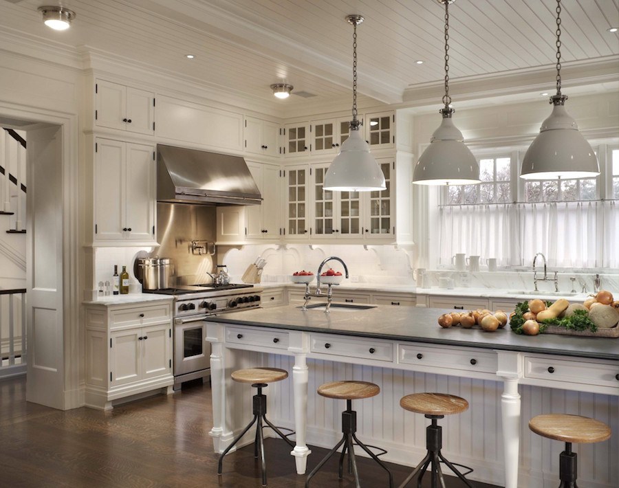
But there are here. And BTW, I can assure you that the island is not a different color than the rest of the cabinets. It’s the lighting! And it’s one reason why I almost always do the island in a different color or finish from the main cabinets. It doesn’t always happen, but I have seen this many times.
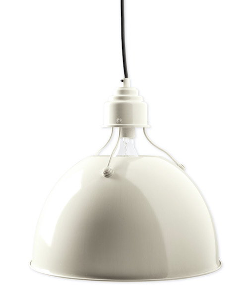
Visual Comfort makes a similar one. Actually, I prefer it.
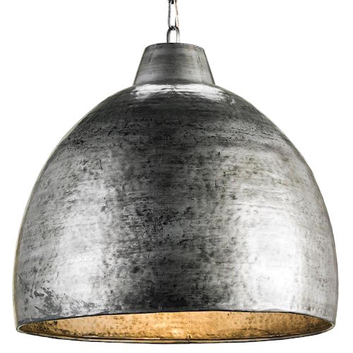
I couldn’t find the same pendants, but these are pretty cool from Currey & Company.
But Laurel, isn’t this industrial look for kitchen light fixtures getting kind of trendy?
Yes, it is.
But, if you love it– and it works with the rest of your home, then why not? There are lots of trendy looks and just because something is a trend, doesn’t mean it’s bad. It’s only bad if you’re doing it because you think you should be doing it! (you can tweet that.)
Let’s move on to another enduring classic.
The schoolhouse fixture.
Usually, it’s a pendant, but sometimes it’s a flush mount or a semi-flushmount. There are many, many versions.
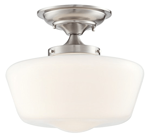
Whoa! Guys, this one from Franklin Ironworks looks pretty fabulous and at 30 bucks how can you go wrong? I did check the reviews and six gave it five out of five on Amazon! And it comes in a bunch of different finishes.
At 10.25″ high, it can easily work in a kitchen or hall with an eight-foot ceiling. What I love about semi-flush mount lights is that the light has an opportunity to bounce up and since this has a shade, it’s coming out all the way around. This is an excellent fixture for all-over ambient light.
And for those who are concerned about bulb glare. We have that one covered too. This style would look great in most traditional or country kitchens.
What I think might work with this schoolhouse semi-flushmount would be to do a different type of schoolhouse pendant.
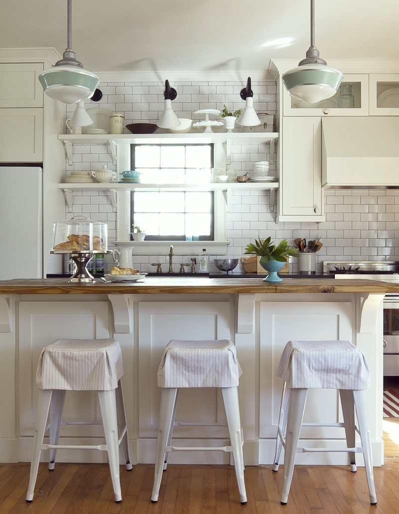
Fabulous kitchen by Julie Holloway and Anisa Darnell of Milk and Honey Home
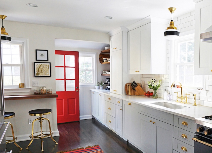
These are from Barnlight Electric which is one of the newer sources in Laurels Rolodex.
Image is from the lovely kitchen of Architectural Digest editor Melissa Maria.
Going back to more traditional kitchen light fixtures. Traditional, but not stodgy at all.
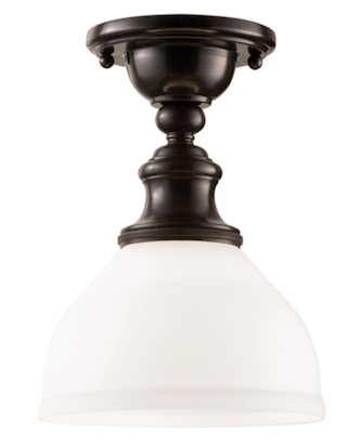
Another type of ceiling fixture I’ve seen in Victoria Hagan’s kitchens is some variation of this lovely piece by Hudson Valley Lighting. Again, it comes in a bunch of finishes. Hudson is a mid-priced line and I’ve ordered from them before and the fixtures are really lovely.
I think it would look fabulous with a couple of bell jar lanterns over the island.
This one from JV Lighting is only $310.00. It’s a slightly more formal look.
I know that some of you will cringe because of the glass, dust, grease and all… But if you have a lot of grease, it means that your fan isn’t doing its job. After all, if it’s landing on your surfaces, you’re also breathing it in and that’s not healthy.
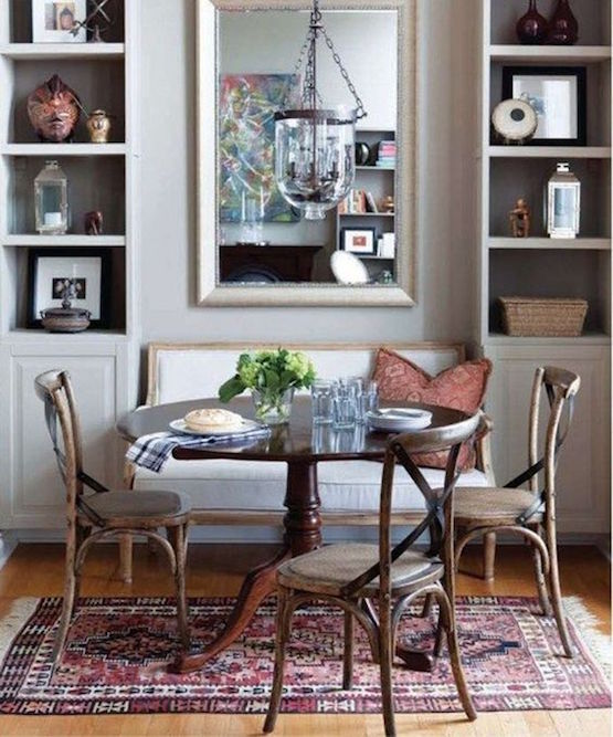
original source unknown.
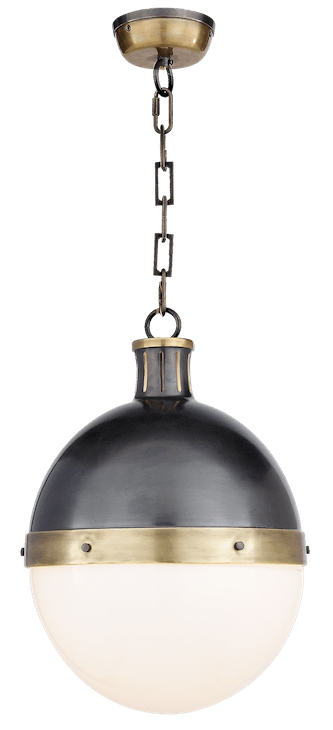
Or the classic Hicks Pendant, designed by Thomas O’Brien by Visual Comfort
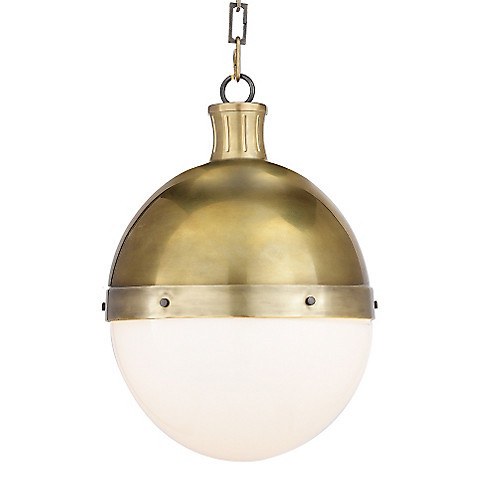
Love it in the antique brass too.
There is also a ceiling mount version of this fixture but I wouldn’t use them both in the same room.
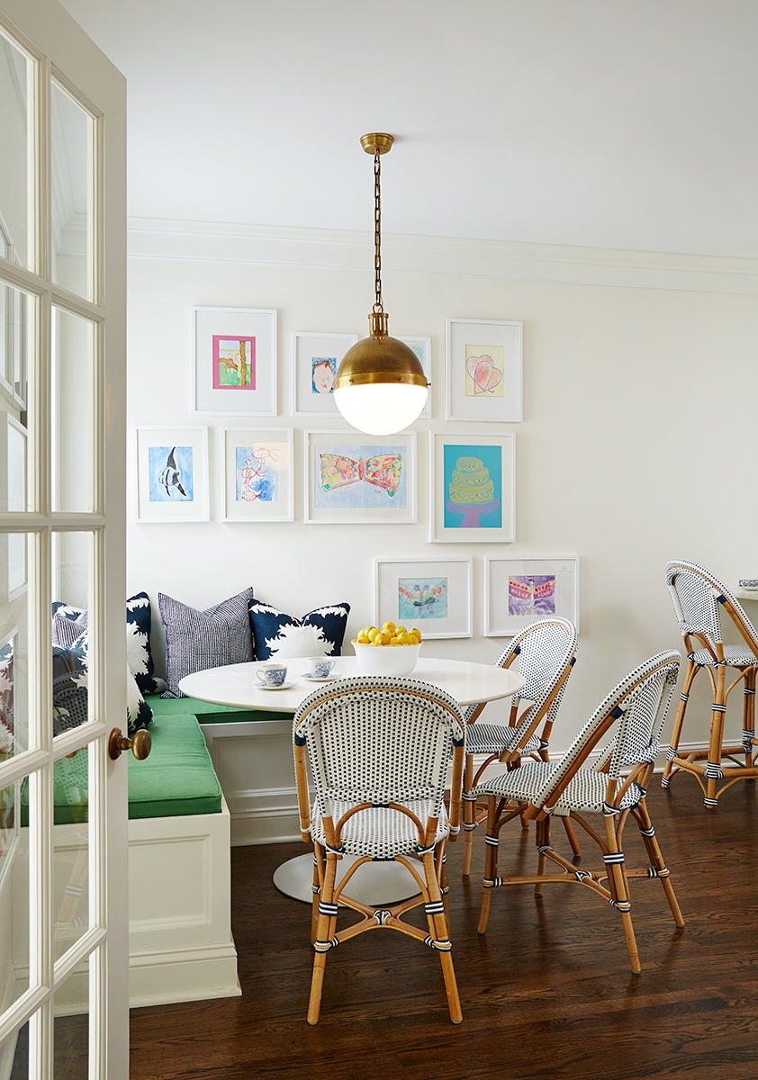
This one is similar from Serena and Lily.
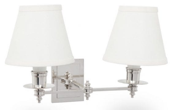
Victoria Hagan also does this or some variation of this sconce from Ann-Morris Antiques.
It would look terrific in the above kitchen scheme in bronze, however, it goes into the category of “if you have to ask, you can’t afford it.” It comes in a bunch of finishes. Victoria usually does it in a dark bronze color.
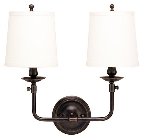
Hudson Valley makes this pretty Pelham two-arm sconce and also a lovely one-arm version. I love its simplicity and classic lines. It also comes in different finishes.
Another iconic kitchen light fixture is this brass marine pendant
(I don’t know where this particular one is from)
Hudson Valley makes a pretty version of this pendant. It’s about $800
This is a nice version from Visual Comfort
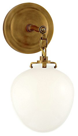
Love this Kate Acorn Sconce from Visual Comfort.
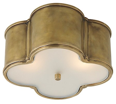
The Basil Flush Mount from Visual Comfort would look great too!
Oh wow! There’s still more to do. But I was thinking it might be fun to do a hi-low post. Or high, medium and low. Something like that.
Happy Spring y’all!
xo,
Related Posts
- Astonishing Home Makeovers You Won’t Believe
- My 16 Favorite Benjamin Moore Paint Colors

- A Beautiful Home Renovation Makes Big Bucks For The Sellers
- Top 25 Must See Kitchens on Pinterest
- Our Modest Starter Home Might Be Our Forever Home.
- Will My Warm Paint Color Palette Look Dated in Five Years?
- The Laurel Home Paint Palette and Home Furnishings Collection is Here!
47 Responses
Hi Laurel! First time-time Reader her and I’m hooked! Can you please advise if it’s okay to not do a chandelier over the dining table if the space is part of the kitchen? We purchased my husband’s childhood home, built in the 50’s and currently it has a brass/glass fixture above the table. I would love to do a flush-mount type fixture instead. The ceilings are 8’ but the space is quite small as they did a ‘remodel’🙄 in the 80s and put too much oak cabinetry in and too many can lights, in 3 sets of 2 that resembles a small runway, eliminating a separation between kitchen/dining area. (I wish I could show you photos of the space. You’d be able to use it, I’m sure for a kitchen mistake post).
I’m so excited to be part of your community of followers. Thank you for all you are doing to help us love our homes!
Hi Laurel! This is my first comment, although I’ve been lurking for about 3 months. I am thoroughly enjoying your blog, I do love the traditional classic timeless style. Back in the 1980’s I studied and worked as an interior decorator, but changed careers in the 90’s. I like to think that I still have a small clue about decorating, I also think it’s more difficult to self-decorate. haha that just sounds weird!
We purchased our home late October with the intention of “doing a bit of painting” before moving in. Well, we’re still not in. It turns out that its more of a fixer upper than we thought. Bet you’ve never heard that before, haha.
I have a question about mixing and matching metals in the house. We bought oil rubbed bronze (ORB) ceiling & wall light fixtures with opaque shades. (I really don’t like to see the light bulbs) I wonder which metal finishes could we use or stay away from? It is so confusing! And nary an article to be found regarding the mix or match of metals for appliances, plumbing, door hardware, or lighting. I recall an article somewhere that metals would be the same at horizontal planes in a room. I don’t know if that is true or not, back in my day everything matched!!
Our home is rustic contemporary/Nordic cottage… if there is such a design style, I think we nailed it :\ We have exposed ceiling beams on the main floor, interior wooden doors that we are staining deeper and cloud white cabinets, ceilings, baseboards, door & window trim. We found door levers in a pitted pewter finish that take on a gorgeous warm glow next to the dark stained doors. Mix, match, or otherwise, the door hardware stays!! I can return all the ceiling lights; they haven’t been installed yet.
What do you think about mixing and matching metals? Is there a “rule” that ORB can be mixed with copper but not with chrome? Or something along those lines? Conversely, is there a metal mixing/matching rule that we could break?
Thank you Laurel, for the all the research and effort you put into your blog. The topics you cover are informative and so well written in your unique writing style mixed with a little humor. I feel like I found you at just the right time and have been reacquainted with my decorating self.
I completely understand that you may not be able to answer my question directly. Perhaps you have already written about this topic and I just haven’t found it yet. Thanks for your time, Michele
Hi Michele,
First of all… thank you for such a sweet comment.
Second of all… decorating for yourself is HORRIBLE! No matter if this is one’s profession or not.
I mean, does a brain surgeon operate on his own head???
In fact, I’ve always said that if I was my client, I would kill her! lol
But, this is a great topic and I’m sure has been touched on, somewhat.
But not only do I think you can mix metals, I think that in most cases, you should!
But there are warm and cool colors. You can mix all of the warms anyway you like, but one should predominate, perhaps. I tend to like the warm metals for light fixtures, most of the time. I love nickel for faucets and cabinet hardware, however. But you can use chrome or stainless too.
I’m not as fond of dark handles on white cabinetry because I think it’s too much contrast, but of course, there are exceptions. But ORB is very nice in homes with rusticity.
Perhaps look through the kitchen posts here and so forth and I think that might be helpful. If you put in ‘kitchen’ in the blog search box, they’ll all pop up.
I love this post! Here’s a question that has been burning for quite some time. What do YOU do for light bulbs in these fully-enclosed fixtures? You can’t use LED and I abhor CFLs. And while you can still find a few incandescent and halogen regular bulbs – how long will they really be around to purchase? Ack. The whole light bulb thing makes me crazy! (And then you have the whole issue of canned lights and what to do there.) Thank you sweet lady! Keep up the marvelous work!
Hi Kristol,
Sorry, I don’t know what fixtures you’re referring to. It’s a myth that incandescent bulbs are going away. They have made them more energy efficient is all.
But I hear you. It makes me crazy too.
This is the point where I would poor myself a glass of wine; if I drank wine. lol
Oh Lordy! My living & dining room are one big space. It has 2 black & brass library sconces & over my round dining table I have a Pottery Barn lantern. I selected it because I thought it worked with my casual home. But the finish is bronze. I’ll be honest…when I purchased it, I never gave the finish a second thought. I guess I could spray paint it brass.
Every time I read your latest post, I realize another thing I did wrong.
Hi Mary,
Oh dear… I’m sorry I gave that impression because the bronze sounds terrific! Bronze is plenty casual. In fact, sometimes more so.
So please worry not!
Here is a link to maybe my second post and you can see my screen and my Pottery Barn chandelier that arrived completely different than it looked in the photo. This photo is at least 15 years old and the chandelier, from about 20 years ago.
https://laurelberninteriors.com/no-weeping-going-on-here-chartreuse-decor/
The Feiss Cadence Mini pendant is really close to the Visual Comfort Hicks pendant. I loved the Hicks pendant but it was out of my price range so Feiss it was. I put it over my kitchen sink/window area.
Hi Eleanor,
Yes, I’ve seen that one and looks quite nice. I bet that it looks great in your kitchen!
Well, you’ve done it again! You have read my mind. I’m in kitchen design mode and just when I started thinking “what the bleep am I going to do for lighting?” it’s Laurel to the rescue. Thank you!. One question, if I do scone(s) over the sink, how far out from the wall should they project in order to properly light the work space? From the reading I’ve done, pendants and/or cans are often 12″ from wall, but most scones are less shallow. P.S. Have you any magic tricks for getting husbands to like sconces?
Hi Gail,
Oh man, I haven’t gotten to that yet, but I will. Seriously, this could be a book! But to answer quickly, the articulated library sconces have become very popular recently.
Trendy?
Yes. but a very nice trend I think! You can point them any which way you like and they can extend out further than a regular sconce. There is one type in the photo with the schoolhouse pendants.
Someone mentioned getting sconces right. Is there a rule of thumb for placement.. how high etc? Thanks!
Hi MAM,
Well, again, it depends a little bit on the sconce because some hang down and so, not at all. But as a general rule of thumb– for an eight-foot ceiling, usually about 60″-66″ looks good. If the ceiling is taller or the sconce is unusually long, it can go higher.
Oftentimes, the electrician puts the electric box in before the sconces are selected, which makes it a little tricky.
Another great post Laurel! Thank you! And I concur- would LOVE to see a high/low post! I love those!
Hi Erin,
Me too. And the ones I love the best are when you can’t tell the difference! I’ll do my best. :]
Hi Laurel! Loved this post…so helpful (as usual) – I love these stunning kitchens.I do agree that most of the time, two pendants look better above an island.
Thanks so much Jo!
I love these “roundup” type of posts and I’d love to see you do more of them. You choose the best images — I usually end up pinning most of them. If I won the lottery John B. Murray would get my call–I swoon over their website frequently.
Hi Alice,
I find myself gravitating to his work too. I select the image and then find out who did it usually. But I love his work, too. It’s always beautiful! Wonderful collaboration between him and Victoria Hagan.
Hi Laurel- Thanks for continuing your discussion on kitchen lighting. I really love your posts and look forward to reading them each week. I noticed you did not include a kitchen with one large fixture over a kitchen island. Was that on purpose – does that not work? Some islands are so large that the center is hard to dust and it seems like an opportunity for a larger fixture to balance the huge island? Also please, please, please do a post on how to correctly incorporate sconces! I am afraid to include them because I fear I will mount them incorrectly. Thanks!! 😳
Hi Annette,
That’s a very good question and actually I did have one kitchen with a big fixture but didn’t include it because it was so different.
I just added it at the end with a little blurb. It would have to be a good-sized chandelier to look good which would mean quite a high ceiling and a large-ish kitchen.
Oh my goodness did you make me feel special with the addition to your post! Thanks! 😉
Another great post!!
I like the idea of a high-low post. As a home stager I’m always looking for stylish but inexpensive light fixtures to suggest to home owners to up-date their home before it goes on the market!
Maggie
PS I loved your posts about staging!! Spot on (like ALL your posts)
Thanks so much Maggie. I’m chuckling because I’m thinking of that generic black iron fixture (or brass sprayed black) that goes in every home! Although, that is certainly better than some weird gaudy thing.
I love the bell jar too! With an 8 ft. Ceiling would the light bulbs in a bell jar or a lantern hung over a table be too glaring?
Hi Mary,
Well, they wouldn’t be more glaring than any other chandelier with naked bulbs, except that there are only 3 or 4, not six or eight. Still, there’s always other light nearby and they shouldn’t have to be turned on too brightly.
If you don’t already have, perhaps try going to a lighting store.
Great ideas for kitchen lighting. I’ve always liked the schoolhouse hanging light fixtures, simple and does the job. A high and low would be a great help too … always look forward to your postings, they have helped me through many a dilemma.
Hi Betty,
Terrific! I was thinking of doing high-lo with this one and realized that it would take me another ten hours. lol
Hello Laurel, Funny, but my favorites here are the expensive St. James sconce, which looks like it is worth the money, and the cheap schoolhouse fixture, which is rescued by them not trying to improve it with extra decorations, etc. Why do so few people use bar fixtures over long islands, rather than spotty and inelegant hanging pendants (I know, I know, but those are rapidly becoming a pet peeve!)?
–Jim
Hi Jim,
I have done a bar or I guess they are call billiard table fixtures a couple of times. One was from Ann-Morris and the other from Hudson Lighting. I think the latter already had that style when the clients moved in, but it was way too fussy with curly cues. The fixture we got was very handsome!
You’re opening sentences have just made me laugh out loud.
It’s 7 a.m. here & that is some kind of record for laughing so early in the morning.
it made the dogs jump.
Best,
Jox
Hi Jox,
Please give your doggies a big hug and kiss for me!
Laura,
Another wonderful post, and your sense of humor is sublime! Love the John B. Murray architects kitchen, especially the range hood with the bar across. Any idea where that one or similar are from?
Hi Linda,
Thanks so much. I’m sorry but I don’t know where the hood is from. I tried to find out but no luck.
Hi Linda,
Thanks so much. I’m sorry but I don’t know where the hood is from.
Yes, please! High, medium, low would be a great feature on light fixtures and all other design elements as well. Thank you for your fantastic posts. M
Thanks for the input McKenna. Much appreciated!
I love your blog posts, Laurel, thank you!! I am working through the island pendant dilemma right now, what great timing! I have two questions for you:
1. You note that if doing bronze fixtures, the antique brass looks best for alternative fixtures. I am using polished nickel fixtures above the island. What other finish do you think would look best for alternative fixtures?
2. This may be something you’ll address in another post, but I’m wondering more about scale. The island is 8′ long and I have 3 pendants which are 8.25″ in diameter each. I just received them this week and I’m worried they may look a little small. The next size up is around 11.5″, which I had originally thought may be too big. Do you have any thoughts on this?
Hi Mia,
I love gold and/or unlacquered brass with nickel.
As for fixtures. It’s a little difficult to know for sure without seeing the kitchen and the fixture itself. Usually, I only do two fixtures over the island. I’m not saying that you can’t do three. It depends what else is going on, the shape, the amount of light needed, etc.
Thank you for teaching with examples. I look forward to all of your posts and learn something with every one! Would love to learn more about lighting. Even something like how to select the right size lamp shade for a lamp.
Hi Brenda,
Now, that is an excellent idea and actually one that’s a bit tricky because of the harp. I’ve noticed some lamp companies have the wrong sized- harp on the lamp.
My pet peeve is when you can see the stem of the lamp that’s clearly supposed to be covered from most angles. It looks like the shade isn’t big enough, when in fact, it’s the right size, just sitting up too high!
But then, to further complicate matters, there are different ways that the shades go on the lamp. Most regular lamps have a shade that sits on top of the harp and then there’s a finial that holds it all together. Most, but not all.
I am thinking about putting together a lighting guide, one day with these technical things in it, all in one place.
Thanks, Laurel! You’re giving me great ideas–and courage!
Hi Lisa,
Courage is a good thing! And glad you’re liking the ideas.
I love your posts Laurel! I alway learn something and get to laugh out loud too!
Keep it up!
Thanks so much for the support Teresa! It gives me strength!
Another great post .I also love the bar stools in the Andrew Howard kitchen …they are just different enough
Hi Jeanne,
Yeah, those stools are pretty cool with the slip covers.