Fine. I’m a masochist. I admit it.
I mean, I must be because I’m going to discuss a kitchen and bathroom remodel.
Why does that make me a masochist?
It’s my kitchen and bathroom.
My trapezoidal galley kitchen and the world’s smallest full bathroom.
I realize that part of my decorating dilemma comes from the fact that nothing is really that terrible. But the kitchen must have new appliances before my fridge decides to take itself to the morgue. The dishwasher isn’t far behind. I’ve had both of them repaired twice.
But first a little update. I’ve decided not to do the fan, but I will probably be giving one away!
And I’m making headway on the hall too. More about that later on.
Today, since I have a tendency to bite off more than I can swallow in less than 20 hours, I’m only going to focus on the bathroom. And then continue next week.
Here’s my little bathroom.
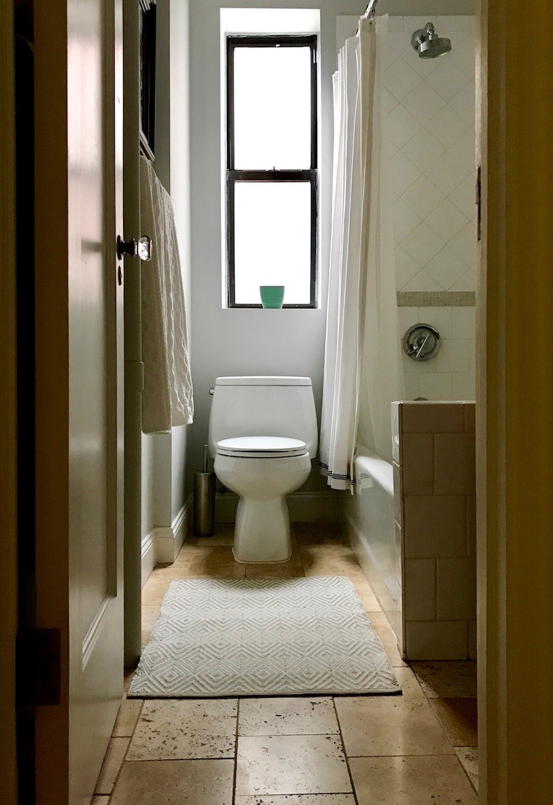
It is also slightly trapezoidal in shape. All of the rooms are.
And I am sorely trying to avoid anything like this.
So, let’s start from the floor up.
It’s supposed to be Jerusalem lime stone. I guess so. I never would’ve picked it. It’s not the worst thing, but this is a 1920s Tudor building. Not that it has to be a museum, but this is pretty far off the beam.
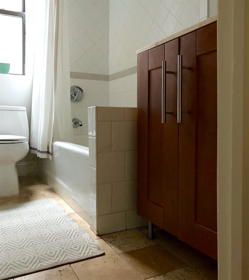
The vanity. ugh. It’s horrible in every way possible. It’s the wrong size for starters. There’s a three-inch gap on each side. The color is hideous. HIDEOUS! That’s a Dash and Albert little indoor/outdoor rug that’s indestructible. The shower curtain is by Serena and Lily and blimey but they’ve discontinued the Gobi pattern in the shower curtain.
They do have it in these gorgeous towels and these gorgeous sheets, (lots of colors too!) but no longer the shower curtain. :[
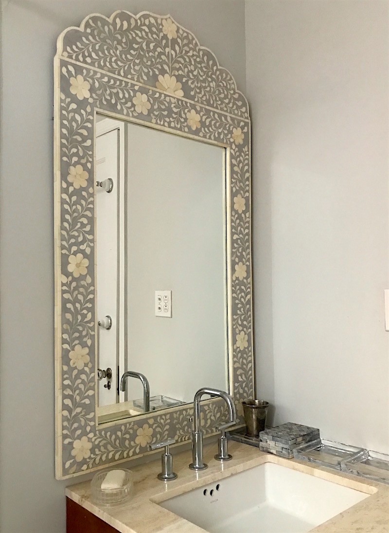
And My Serena and Lily mirror. They discontinued that too! I adore this mirror. It’s too big for the vanity, or rather the vanity is too small for the mirror and the room! I put those little dishes there to catch things. haha.
The wall color is Benjamin Moore Shoreline 1471 from the Laurel Home Paint and Palette Collection. The paint collection is about to have its first anniversary.
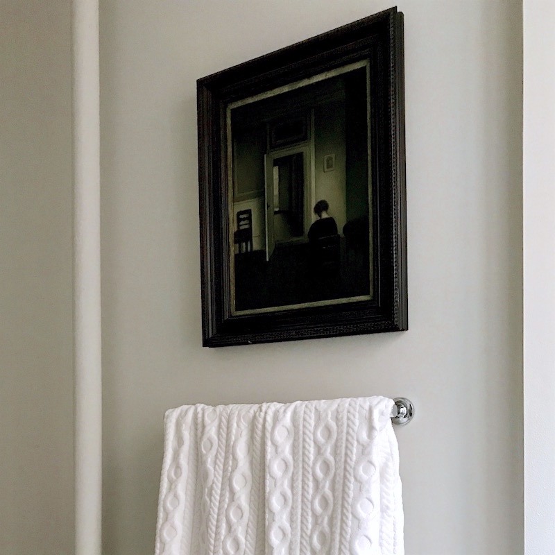
My depression era painting that I got a long time ago and had a very expensive frame put on it. My younger son hates it because he says it looks so depressing. I like the colors and it reminds me of my grandmother. I never met her because she died in 1943, but somehow I feel that it’s her.
What I love is if she would just pick up her sweet head, she would see that there’s a bright warm light just down the hall. It’s a great metaphor for life. The hope for a better tomorrow.
Oh where were we? ;]
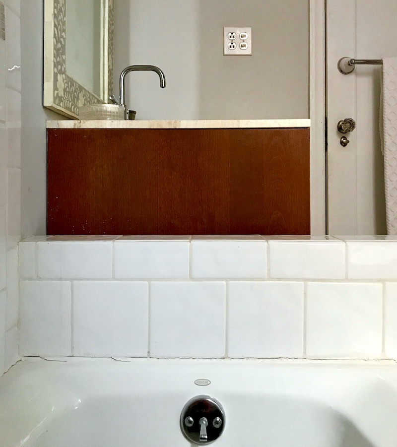
Oh yes… I had to get in the tub for this shot. haha. (yes, yes, I know that we need a little re-grouting.)
But as I was taking the photo, I had a HUGE AHA MOMENT!
A giant epiphany.
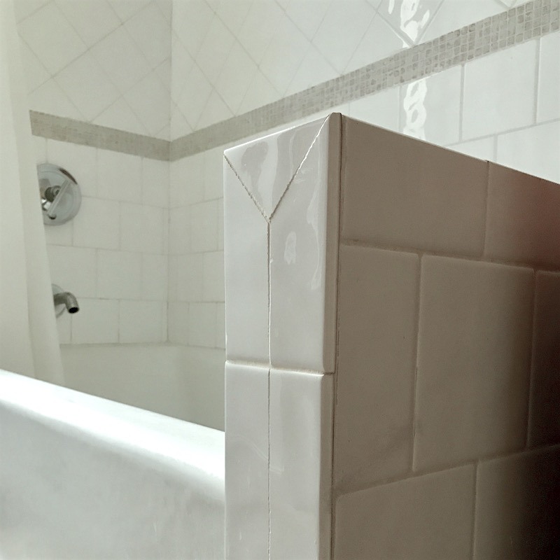
Do we need that thing?
That big white ugly 5.5″ wide weirdly tiled wall?
(no worries, we’ll get to the horrid accent tile in a sec.)

Here’s me having an epiphany in my bathroom. ;]
The space is 35.5 inches which means that most 36″ vanities will fit in there!
Hooray, it opens up a lot of great options.
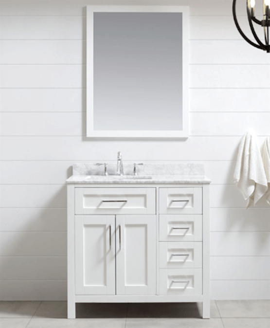
This one from Ove Decor is very cool with 5 drawers! Boy, that would change my life! It really would!
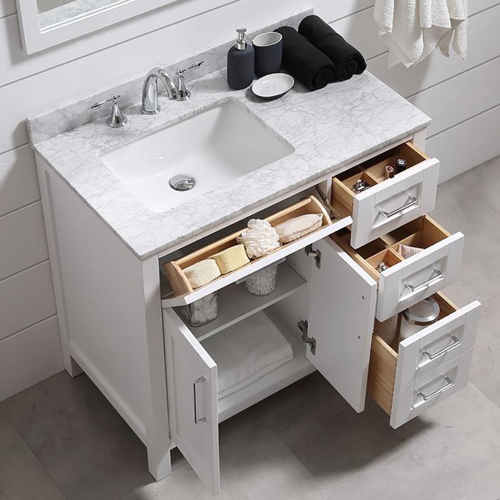
Look at all of that beautiful storage and a shelf too!
Love the little sink drawer; perfect for elastic bands, hair clips and combs, etc.
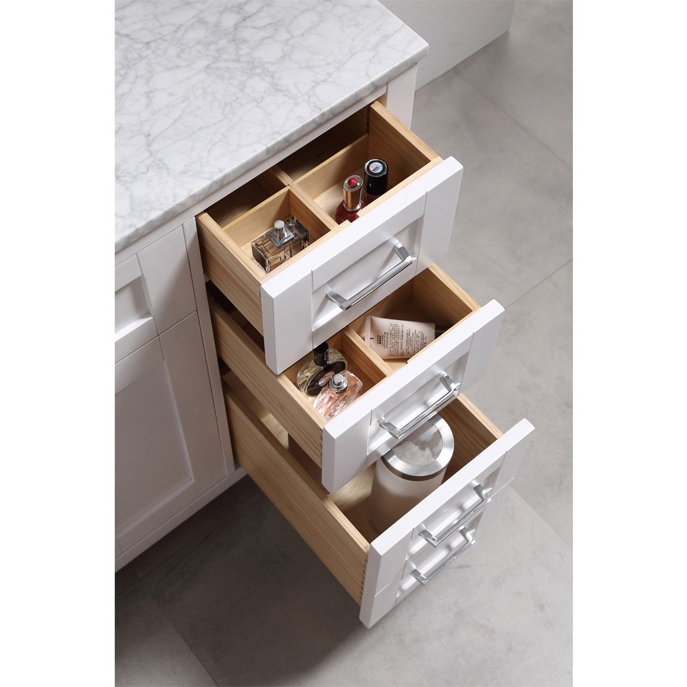
very nice details and the separators can be removed.
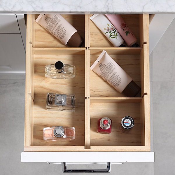
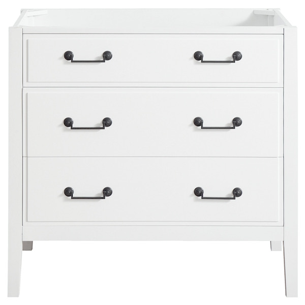
This piece from Avanity is also very nice. I like that I could pick my own top
I’ll have to see if there’s a compelling reason we need the ugly wall. Right now the vanity is 24″ so even 30″ would be a help.
Here’s a good possibility for the floor.
It’s a classic Carrara Marble hex.
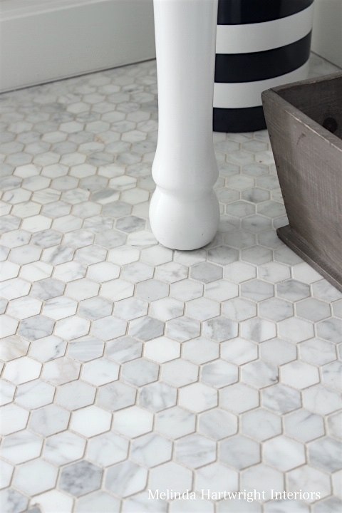
I looked at a lot of floors, but most of them didn’t look so great with the mirror.
I found some lovely Carrara hex tiles here.
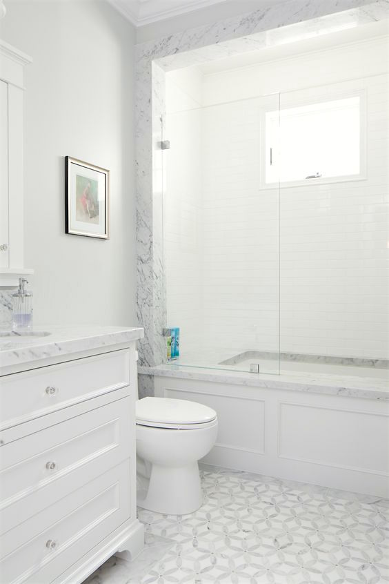
This is a pretty bathroom with an interesting marble inlay floor.
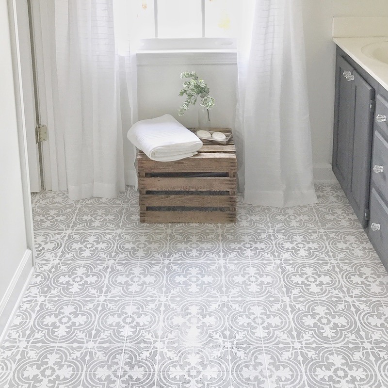
Cement tile? No, it sure looks like it, but this girl STENCILED this on her old linoleum floor. (and she goes into great detail to say how she did it.) Good God, that’s gorgeous! There are some cement tiles along these lines, but nothing that completely wows me.

I realize that the mirror doesn’t exactly evoke the 1920s either. However, the Moorish influence was prevalent in Tudor style design, so it’s not that far out.
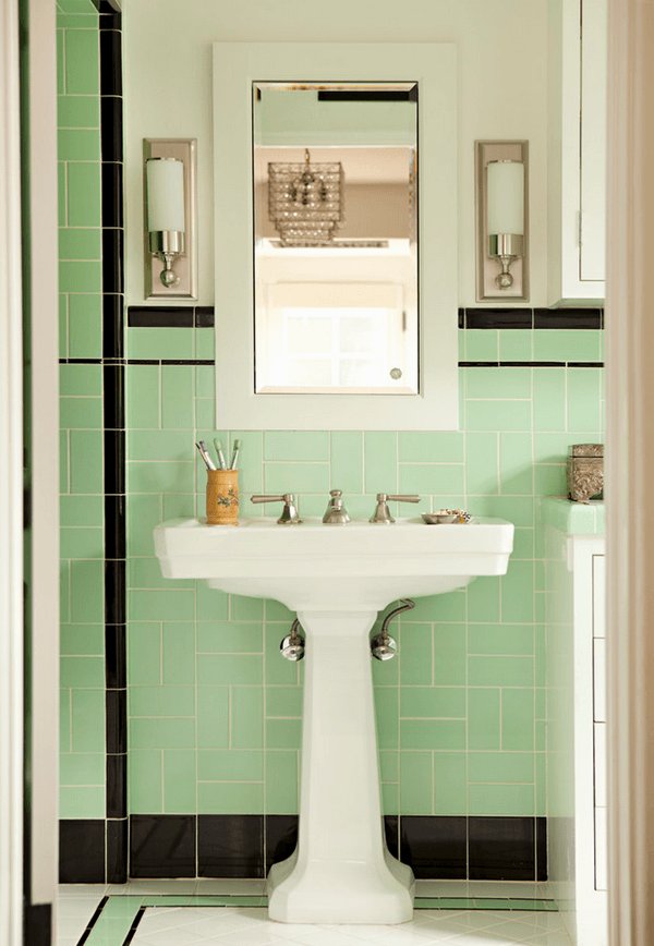
Here’s a typical 20s bathroom with black. The tiles could be white and the floor could be black and white.
But we have the gray mirror that i love. And black doesn’t look so great with it. (original source unknown)
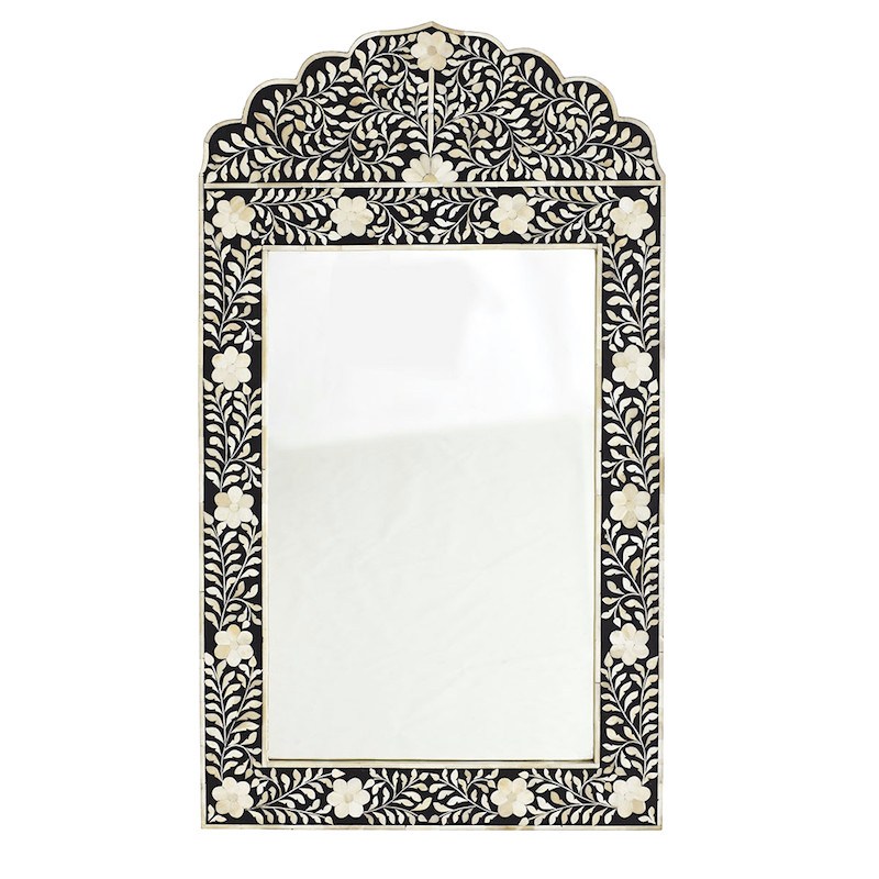 But Wisteria does make the mirror in black
In a lot of ways it actually helps the possibilities because then I could add more black. There already is black with the painting and the window frame is almost black. It looks black in the photo but it’s not quite there in real life.
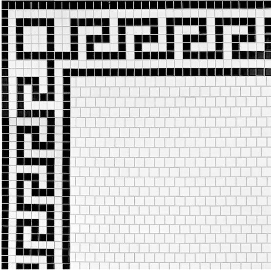
Then, I could do this classic Greek Key Pattern tile . That is very 1920s!
And you guys know that I adore a Greek Key pattern!
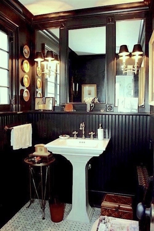
Speaking of “key,” I love Nancy Keyes’ gorge black and white bathroom.
I think mine would need to be more white though.
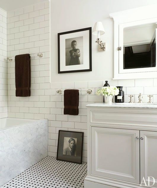
More, this feeling.
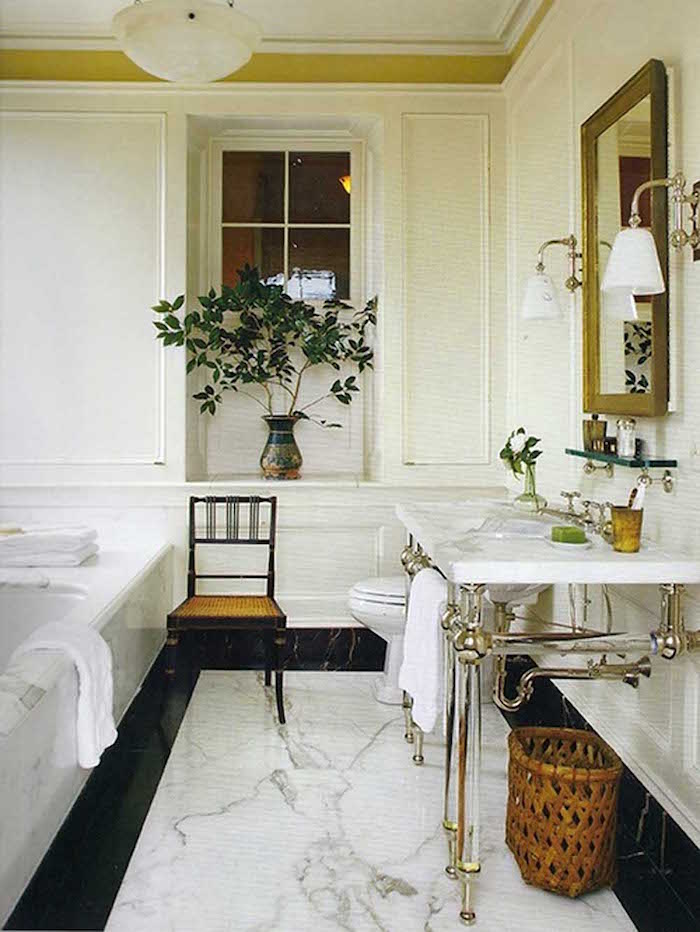
I can’t carry this one off. The bathroom is just too small. And I must have a vanity because there’s no bathroom storage at all!
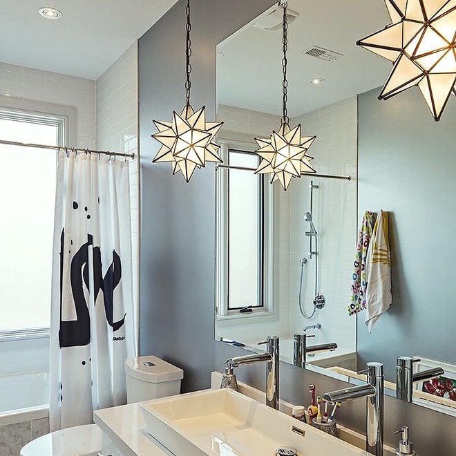
In any case, I think that I’d love a Moravian star fixture over the toilet.
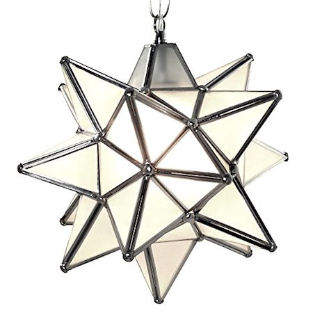
Here’s a nice one with frosted glass from Duda Home.
Now for the tile debacle.

The ol’ accent tile stripe that makes no sense whatsoever.
Oh, it was worse. It WAS brown! One day, I couldn’t take anymore, so I dabbed on some gray paint. At least I can live with it–barely.
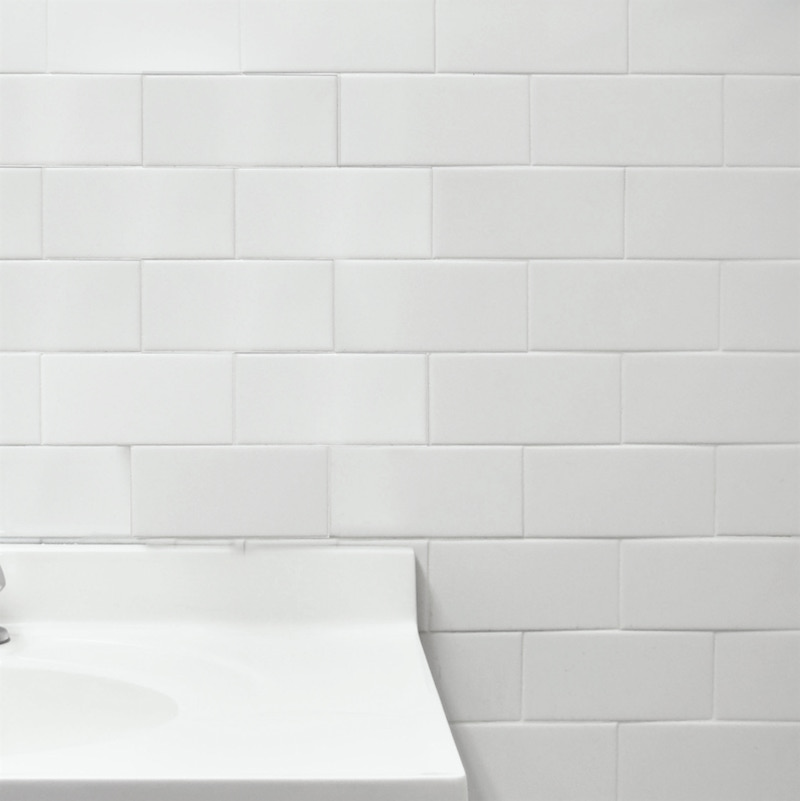
I found this tile by Somer Tile that has a little bit of a handmade look, but at a machine-made price.
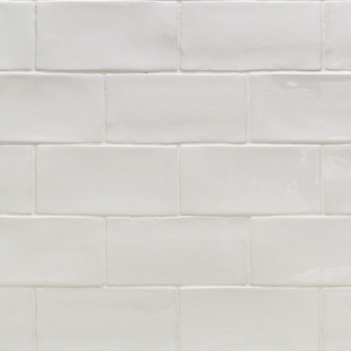
The Tile Bar also makes a lovely subway tile.
And to finish off…
The other day I was looking at Mural Sources. I think they must’ve recently refreshed their website because it’s looking far slicker than I remember.

And this popped up going all the way across the screen. And I thought. Yes! That’s it!

I think this would be beautiful off my living room and would work whether the bathroom was gray and white or black and white. But I’m thinking that maybe I need to make it black and white. What do you think?
xo,

Related Posts
 The Surprising Thing That Nate Berkus Said About Design Trends
 things I love – Gustavian Swedish Style
 3 Common Staircase Design Mistakes {and what to do instead}
 Wait Until You See This Dream Bathroom Design!
 What You Need to Know About Wallpaper
  A Disturbing Bathroom Renovation Trend To Avoid
 Freaking Out Over Your Kitchen Backsplash?









127 Responses
Hi Laurel,
Neat post, and timely for me as I’m planning (dreaming) about my own bathroom remodel. Thanks for soliciting your readers’ advice, and here’s my two cents for what they’re worth (lol).
You suggested in one of your replies to another comment that maybe you don’t plan on living in this apartment forever (so 10 years or less?). If that’s the case, then I personally would spend my money on the items that would give me the biggest style points for my remodeling dollar. For me that would be replacing the flooring, tile tub surround, and vanity/top/faucet; while also figuring out how to shrink the profile of that half wall between tub and vanity for a reasonable cost. Based on the irregular (and small) dimensions of the room I’d stay away from the Greek key or other contrasting boarder on the floor, and stick with a one or two inch hex or penny tile; use subway tile on the tub surround; find a slim profile toilet with more traditional lines and detailing; a vanity with 1920’s era molding profiles; a porcelain vanity top; and nickel faucets with more traditional lines. I’d also invest in nickel lighting fixtures with milk glass or other translucent shades. Personally I wouldn’t spend extra money on marble tile or even vanity top in this bathroom- it seems too posh and stylistically inappropriate for your building (also, maintaining and sealing that material while risking more burns from that hot pipe – yikes!). I’m saying this as a person with a background in historic preservation and architectural history (that’s where one of my two cents comes from!).
Finally, I personally love the grey/ cream mirror, but white ( tile, vanity) is more historically accurate, and the cream in the mirror may look “dirty” against the white; maybe switch to the b&w mirror, keep the blackish window trim, and consider a dark grout on the floor tile for subtle contrast? Too much jarring b&w contrast makes me feel jumpy and unsettled…..especially in a smaller room.
Phew! I apologize for the ramble….in any event, good luck with your project and post updates please! 😀
Hi Dee,
I concur and actually have studied a lot of this myself both in design school and privately. Although, I’m sure that your background is far more intensive.
A couple things. I HAVE to keep the blackish window trim. That’s the window and it can’t be painted. The white in the black and white mirror is the same white that’s in my gray mirror. It’s just the photo. But if I keep that mirror, am planning on stretegically putting a little white paint on some of the darker parts. No one but me will know.
Actually, it should be a pedestal sink, but that’s not doable because of the aforementioned storage needs.
The original bathrooms and there are still some have this gorgeous subway tile on all four walls all the way up to the ceiling. I put in a link to a photo of one. It’s in the post about the horrible reno in the apartment “like mine.”
Too many people ripped it all out and put in something like I have or worse. It makes me so sad. I agree that the entire room encased in tile is a bit much, but that tile is so gorgeous. Each one is a slightly different shade of white and the effect is almost Opaline.
I agree about too much jarring contrast too. In fact some patterns do make me dizzy and nauseous.
My goal is to pay respect to the period, not necessarily create a museum.
I am late to the party so hope this hasn’t already been said. The bathroom seems too small to carry off the greek key design in the flooring. I am wondering what the shower curtain rod connects to on the other side since there is no wall there. If that pony wall can go it’s a big improvement and a new vanity will make a huge difference. I am re-doing a powder room and had originally ordered sconces and then realized there was not enough room for a decent sized mirror. I ordered some clear glass pendants. For me it’s one little decision at a time. I would not put too much black in the room unless your are going to go dramatically black like Nancy’s bathroom. I’m not brave enough for that but her bathroom is adorable. My parents turn of the century home had black tile going half way up the walls with a claw foot tub. It was very cool but it’s never fun to shower in those claw foot tubs.
Hi Laurie,
The shower rod connects to a wet wall between the kitchen and bathroom and the exterior wall on the other side.
The black is cool, but I think is better with a more square room. With white tile, it would be like half the room would be black and half white.
Hi Laurel,
You could get a pedestal or claw foot tub. I definitely don’t think you need that wall on the back end of the tub. It has no point. If you don’t need a tub you could just make a shower stall with a glass wall. You could get more space with just a shower depending on the size.
Thanks,
Amy
Hi Amy,
I probably do need a wall as the drain is on that side for some weird reason I don’t know.
Taking out a tub is a big horrifically messy deal, but, the other thing is resale. It’s a mistake to take out the only tub in a home because a lot of people have to have one and I could lose out on a potential sale. Unfortunately, I have to keep this in mind– not that I plan on doing anything bizarre, but one person’s beauty is another’s hideous.
My cast iron tub will be cut up in place. Will you contractor be able to do this? I guess it depends if they have the equipment. I hope the mess is minimized and you get the smaller tub/shower you want.
I would swap out toilet and sink positions if possible. Ugly opening door to vacant toilet at best, and if occupied…well.. Less of a destructive project than replacing tub and cheaper since you want s new vanity anyways. Mirror to the side allows you to look close at face without the sink top keeping you at bay.
When replacing sink, suggest you either get one that sits flush on floor or open, an option you don’t want due to lack of storage. If you value the skin on top of hand if you intend to clean under it, something recommended. Hate designers that leave just enough room on bottom of furniture to scrape off skin
Surround the piles with radiator cover like lattice work and add hooks for towel and robe. Toasty warm on cold days.
You doing the bedroom too? I live a few miles away from you and wish you could help in staging my McMansion that is a disaster for sale
Hi Rebecca,
Thanks so much for your suggestions. I agree about the location of the toilet. but since it’s me alone here 99% of the time, having someone barge in, is not an issue. When my sons comes to visit, I lock the door. ;]
It’s an old building and I’m 99% sure that moving the toilet is not an option because of location of the waste stack.
I’m sorry; wish I could help you but am not taking on any new jobs at this time.
I am picking the materials for my very small bathroom that will be a total gut (except ceiling). The job is complicated by mold issues and the separate contractors for that. Plus, just one bathroom – same as you. So, I also have to figure hotel costs. Plus I will have pet boarding costs. I’m finding the process difficult. Flooring choice and some issues with the shower are styming me.
Good luck with your project. It will look fantastic and work better for you. I’m very happy for you that your plans are coming together!
Hi Libby,
Sorry for the issues. I’m sure that I have mold too. Many, many leaks over the years from the apartment above.
I read my comment several times before I posted ….to be clear I commiserate with you about having to move out and the additional cost involved for you. I really hope they get you back in your home very quickly.
Well, there’s a lot that needs to happen before this project can begin. But thanks Libby. You’re a doll!
Another great post Laurel! FYI I have used sheets to make shower curtains for clients all the time when a pattern has been discontinued for the shower curtain but we can still get sheets! Good solution when your heart is set on a pattern. I have them lined and no one ever knows!
Hi Suzanne,
Thanks for letting me know. Great idea!
Love your blog! Ideas…black and white differently, vintage basket weave floor, if you decide to do shower area as well, white tile with some of the same basket weave around the faucet area, losing the round faucet and replacing with vintage handles. YES..please knock tile shelf off for more eye flow. Raise a custom shower curtain to almost ceiling and closer to floor, maybe a oval shower rod if you didn’t decide to remove existing tile, then the custom shower curtain could wrap around the entire tub, cover the tub. Love the Decor vanity. What about painting the window and back of door a pop of color from the mural paper and a matching Roman shade fabric used for shower curtain. Order the Wisteria mirror or an Art Deco black and white mirror and a more vintage pendant over the toilet. Anyhow, good luck you are awesome and make me 😂 xo
Thanks so much Sandi. Great ideas that I too love!
A few of my inputs 🙂
1) If there are pipes in the wall for the tub drain you could still take out the wall and run the pipes through the vanity.
2) You can save some time and money and just tile on top of the old floor. Usually you can get away with this one time. The door may have to be shaved down.
3) Keeping the tub would also save a good deal of time and money but I’d probably frame it in with some paneling.
https://www.pinterest.com/pin/154037249731329208/
http://www.hgtv.com/design/rooms/bathrooms/update-a-bathtub-surround-using-beadboard
4) If you are ripping out the tub maybe just put in a shower with glass all around. I’m not a tub person! But this is expensive
5) The new vanity should probably not be as deep as the old one. It looks like when you open the bath door the vanity is right there. Seems cramped.
6) Maybe frame the window and add roman blinds. Although it looks nice now, I like wood framed windows.
Yes to black and white!
..and weird shaped rooms are so much more interesting the stupid squared-off rooms.
Hi George,
Thanks for all of that! I do love a wood clad tub. I am not getting rid of it. All you are hearing is the voices going off in my head! In the end, 97% of the time, the choice is a good one. But, I take my time and do the same with clients. If they are in a super massive hurry, well, when I was taking on clients, they would be better off going elsewhere. Not that I take huge amounts of time, but I do live with the choices for a few days and very often I realize that there’s a better way!
The vanity is a standard 25″. There is 7″ clearance between that and the door frame, so plenty of room– unless I’m bending over to get something from that sink-hole of a vanity. It’s awful.
Alas… Wait until you see the kitchen! Another beige stone floor! I am pulling my hair out about that one too! I can’t do black and white in the bathroom and keep the kitchen floor. It’s positively schizophrenic! I keep looking at the encaustic cement or EC look and none of them seem right with the Chinoiserie paper. I don’t mind a little funky. Not John Derian funky, lol but in that direction– a little.
Lauren,
No I can’t say I have the hazard of a hot pole. That would be a bit tough. I know you’ll make it beautiful! I love your style!
I have to say this, your bathroom is larger than mine! Wish mine was at least as the size of yours! In my dinky bathroom, you can sit on the toilet and wash your hands at the same time. The toilet and sink are kinda catty-corner to one another. No room for a vanity only pedestal sink. Barely 50 inches wide and I do have a tub, believe it or not. When I get out of the tub I have this wee little area to stand in and dry off. Personally I love your bathroom…..
Hi Pamela,
Okay, you have me beat in the size department. But do you also have a pole that gets hot enough to burn flesh standing a mere 26″ from the tub and 32″ from the vanity?
I’ve burned myself on it more times than I can count. And every time I go, Did I really just do that? haha
And one of these shower curtains. Why not? 😉
https://www.etsy.com/listing/247731902/fabric-shower-curtain-cecilia-french?ga_order=most_relevant&ga_search_type=all&ga_view_type=gallery&ga_search_query=gray%20and%20white%20shower%20curtain&ref=sr_gallery_23
https://www.etsy.com/listing/399802533/shower-curtain-world-map-minimalist-soft?ga_order=most_relevant&ga_search_type=all&ga_view_type=gallery&ga_search_query=gray%20and%20white%20shower%20curtain&ref=sr_gallery_8
Hi Lorri,
Etsy to the rescue again! Some of those are very pretty!
What a sweet thought about the dark-haired lady looking down the hall at “hope”, and your grandma. I love that painting so much. It’s the style of painting I have been looking for for years but can never find. Can you share more about it so that I might find something similar? Artist’s name?
Hi Elsie,
I think one of the earlier comments mentioned the artist. I’m sure that it’s a repro. I bought it at an antique store in Mount Kisco, NY about 15 years ago. But it’s long gone.
The first thing you need to consider is evaluating potential space versus existing space. For example, have you considered moving your bathroom door out to your hallway instead of being recessed between your two closets? That would give you multiple options to open up one of those closet spaces for bathroom space – storage or otherwise. And yes, I know closets are essential, but you can replace that storage with another redesign elsewhere. As someone who recently gutted and rebuilt 2 bathrooms acting as my own GC, I can guarantee you that this will be more than a cosmetic re-tile with new vanity. If you don’t push the envelope you’ll be disappointed with the result.
Hi Kat,
You have some great ideas. I just went and took a look. I have considered it, however, I would be eliminating one of only three closets in this place. There is no elsewhere. I have plenty of storage, but just need the vanity to function better and even if it’s 30″, it’s already big enough. I just loved all of those little drawers to organize things better.
The closets are another issue. It will never be perfect, but I am slowly coming up with a good plan. (I think)
Hi Laurel. I had to laugh when I read you weren’t doing the fan. That post gave me a chuckle because it was like the story where the girl gets a new throw pillow and has to redecorate the entire living room around it…. As for the bathroom, I love to soak in the tub. Your tub is bizarre in that the overflow drain is on the opposite end to the taps and faucet so there is no end where you can rest your back comfortably. I would definitely replace the tub, get a nice inexpensive soaker (maxx has some nice ones through Home Depot) then put a glass partition at the end of it to provide separation yet give the most space possible for the vanity. You won’t need the ugly tiled pony walk and the glass will open up the space. Paint the window and trim black and add black accents to the tile work. I love the hex marble tile but mine is so high maintenance that I swore never never again on a floor. Unless you can afford a full time maid the keep a those grout lines clean! How about a dark charcoal hex tile with darK grout? Change the toilet to something less modern since it’s so visible. Check out the kohler Devonshire, Memoirs, or Stately. l Agree with not crowing the “head.” Use you star over the vanity if you must have it. Of course you are THE pro and whatever you specify will be fabulous. It’s fun to weight in though. Thanks for asking.
Hi Gail,
I don’t like the toilet either. I’m in a one bedroom apartment and am here ALL. THE. TIME. I was seriously looking up porta potties for the infirm. It’s the only way I can think of that it’s remotely possible unless I move out for a few weeks.
Boy, we all sure do love talking about bathroom renos!
I’m in the midst of my own bathroom renos, master and then kids, and am doing the gray and white with a bit of black palette (like the whole world–don’t care, love it). My master bath floor will be a hex tile very similar to the Melinda Hartwright photo. It’s made of recycled glass and we’ll use a soft gray grout. No white grout for me. I wish you great luck with yours and will enjoy reading about it!
Sounds terrific Anne! And great luck with yours as well!
Hi Lauren, Whatever you choose between the gray/white or the black/white will be lovely. If going with black I would do the black in very small amounts. My friend who put hex tile on the bathroom floor which was beautiful said that if they had to do it again they wouldn’t because the ratio of grout to tile was similar. Too much grout with staining in the grout where foot traffic is higher. I was jealous seeing it though. Since your bathroom is small I would use a free standing tub or one with feet to create more visual space allowing you to tile the floor under the tub opening things up. On your faucets and hardware I would pick polished nickel on all and use the same shape meaning rounded on all or square on all. Will flow better. You are fortunate to have a window one of my personal requirements. I like your mirror, cute and unexpected.
Thanks for all of the suggestions Ginger! I love nickel too!
Hello Laurel,
What a lovely apartment! I can see how you fell in love with it and all its’ period details. That arched detail in the hallway! Wow! Here are my thoughts on the bathroom reno. (They’re worth what you’re paying for them! ha) I love marble so much I want to marry it, BUT I used black and white in my bathroom remodel. It fits my 1939 little house. And thoughI love hex, somehow I ended up using black & white spiral on the floor from Lowe’s or somewhere cheap, white subway tile in the tub/shower surround with black stick or pencil tile (love love it) as a detail inside a band of “soldiers” along the top. And I used black cove base tile with white bullnose along the bottom of the walls. So clean and fresh. And I know you love your pretty mirror (it’s gorgeous and in black too) I added something I hadn’t used in years, a Kohler medicine cabinet with a pretty curved top which adds much needed storage – all in vintage glass vessels.
I can’t wait to see what you go with. It will be fabulous! Here are some photos I used for inspiration:
http://www.apartmenttherapy.com/bathroom-tour-from-bungalow-ti-46596 and https://www.pinterest.com/pin/224194887670369403/
https://www.pinterest.com/pin/224194887670369408/
https://www.pinterest.com/pin/224194887673015452/
https://www.pinterest.com/pin/224194887671276188/
Keep us posted!
Janet
Thanks for all of the info and inspo. I had just saved the one with the stripes on the shower curtain!
go gray. keep the mirror
thanks Gilda!
I love the black and white idea for sure! Very classic. I can’t wait to see the after pics.
Again, I just have to say how much I enjoy receiving your post.
Thanks so much Lisa and glad that you’re enjoying the posts!
Hi Laurel,
Your bathroom is similar to mine in layout and are some comments, all my humble opinion and experience. Placement of toilet: it’s unlikely you can move the waste stack in a multiple dwelling, I wouldn’t even try. That star fixture is beautiful but I wouldn’t place it over the toilet, which seems like an anointing. You don’t mention the window, but I would replace it with one that has a white interior and more importantly is one piece with a handle which is much more functional and better for aging-in-place. I wish I had one.
When I moved into my apartment the bathroom had grey hex tiles, zillions of unmatched subway tiles post multiple plumbing repairs, a flushometer, and pedestal sink. The hex tile was drably grey and I disliked it although it’s back in style. Now I have period water closet, a new tub with apron (correct term?) to accommodate marching tile, a custom vanity that takes up the entire space between the doorway wall and the same plumbing wall you have. This was pre-quartz so I have a thassos marble vanity top which I hate (not too strong a word). Now I would get one of those sparkly (not patterned) quartz surfaces. There is a glass shelf above the sink with “brackets” in the same pattern as the towel bars, all metal being polished nickel. There is a medicine chest for more storage, mine is isn’t framed but I have seen artistically framed cabinets. The floor 2×2 square tiles running diagonally inset within a border of smaller white tiles, with the larger tiles running straight around the perimeter of the room. The walls are covered with white subway tile and marching trim tiles in the English style, I can send pics. Finally, on top of the plumbing wall there is a piece of frosted glass; one end of the curtain rod is affixed. Oh, re the floor – now I would do marble basket weave with beige, not black, which I’ve seen somewhere.
Hi Naomi,
I’m sure that you are correct about the waste stack. And I’m also not positive I have the stomach for an entire gut job. My super has lived her for 25 years and knows every apartment in intimate detail. And he just happens to be a GC too and does lovely work.
The tile around the tub looks like Walker Zanger? You could leave that and just take out the belly band of mosaic tile for something more Tudorish. Keep finding more places for storage. One can rarely have enough. The marble hex tile will need sealing several times a year to protect the marble and save you from cleaning the grout with a toothbrush.
Hi Judy,
It is definitely not Walker Zanger. If only! It is cheap crap from Lowes or some place like that. It’s machine-made trying to look hand-made and fails in person.
I love the mirror! If you are wanting accent tile/bordertile that pick up any of the patterns that you love – the mirror, Greek Key, Morovian star – I’m your girl. Exactly what I do. Create patterns inspired by existing materials or favorite motifs.
And I am with Ruth about the grey and white vs. black and white. Maybe a combo of the two – black and white floor and light to dark greys in other areas.
Hi Cyra,
Thank you so much for your input. I’ll need to take a look at your website!
Mural – perfect
Bathroom – White w/ a little bit of black
All your choices are fab, classic and timeless. You’ve got this!
When your person comes to work on this, have them fix/add the electircal plugs and such in the bedroom and hang the TV..start that “honey do” list of things you don’t/can’t do…I’ve renovated 8 bathrooms and built 5 in 27 years of home ownership…planning is the KEY…an I always have a running list of “extras” to get fixed/changed when I have workers on site.
Seriously, the first photo was the original bathroom of our 1918 English Tudor on Long Island…it stands the test of time…I had a flashback…
Hi Thea,
The green black and white was your bathroom? Is that the one you are talking about? Great advice too! Planning IS the key!
haha…no, NOT my bathroom, but it looked exactly like that…LOL.
Dear Laurel,
I’m in love with this painting. I really get what you’re saying about the connection..actually most of the portraits I have remind me of somebody close and dear. I won (on EBTH) an etching-by a rather prominent artist, but I didn’t know it then-of an old man. I’m sure it’s my great grandfather in the etching, even though I know it can’t be. It’s very special and comforting to imagine it’s him. Admirable life, and tragic death. The etching commemorates the life for me, and who he was to everybody who knew him. So what if it wasn’t him, sitting for that portrait..
I love the mirror..it’s the mirror of my dreams. It’s a pity these are usually expensive..I wanted same idea for the kids’/guests’ bath of ours, but since it was the only place we changed only cosmetically during the remodel, trying to save on something-couldn’t justify the expense. Maybe I was wrong?
Anyway. You mentioned between the studs storage..yes, yes, and yes!! That was a part of cosmetic improvement for this kids’ bath of ours,small and lacking storage-I bought the longest cabinet I could found(I think on Wayfair? but not so sure. unfinished wood, 400$..all new wood is crazily expensive)..we asked our GC to paint it the color of the walls but take it sheen higher since it’s wood..it looks very unobtrusive, and is a huge, huge game changer. The amount of storage this rather shallow thing gives is incredible. Whatever you do add it-you’ll never regret this decision.
As a rule I love Jerusalem Limestone but agree of course it has nothing to do with your specific bath, whatsoever. The vanity-even less. Well.. then it’s exciting to change them I guess, for something that will be more authentic to your room and to you:) I love all your inspiration pics..less fan of a Greek Key but it’s just me. Whatever you decide to go with I’d make sure it’s the least slippery tile possible.
Oh, and I’d get a rug, of course.
And maybe a hand knotted one at that lol. They withstand abnormal amount of abuse. And moisture. They clean them with snow, after all..:)
I’d keep to a shower curtain..this or another..a) I’m nuts about shower curtains and b) glass has its place and I love it too, but I somehow see it less in your wonderful bath. Wonderful-because the bones are pretty..that window? Oh my.
I’d be careful with overhead pendants even though I love them…make sure the one you put in is suitable for moist environments. If they let you put it btw..here in CA prohibited, at least over the tub for sure. Of course people still do that, if no inspection is involved. But it won’t pass an inspection. You can put the approved recessed lighting and switch it later, which is what I was going to do..but all this gloomy electrical talk made me so nervous I just left that recessed light be..:)
I think the bathroom can easily be a bit black a bit gray and a bit white:) And something in between(c, Celerie Kemble)
My most favorite inspiration picture is the one with the mustard accent, and a big vase with branches. Such room you can change endlessly yet it will still be herself and beautiful and distinct, like a very talented actress.
Hi Jenny,
I don’t know how I missed your lovely comment! But fortunately, my admin area lets me know if I haven’t answered them all. Thank you so much. Lots of great advice here. I may forego the stars in the bathroom and put something way cool in the hall!
Laurel,
I recently redid my master bath in black and white with a Campaign theme in keeping with the bedroom.
I could send you pics, not sure how on this site.
Kathy
Hi Kathleen,
If you’re a subscriber, just answer the email I sent you and I will get it. Or if not, you can write via the contact info and I’ll respond that way too.
In my former home, a 1939 Colonial, there was white, hexagonal tile with a black perimeter border in the main bath. Weirdly, maybe because it was built just before the war, there were no other tiles in the room. The plaster was incised to look like tile, but painted and ran halfway up the wall. The net affect, for me anyway, was that the white and black floor had a cold, institutional look even with a couple of rugs. I couldn’t afford to change the floor so I cut a piece of soft green indoor-outdoor carpet to fit. It completely changed the character of the bathroom and made it very warm and comfortable. And no, the carpet never got stinky or ugly. Just my experience.
Thanks so much Marsha. I do love green black and white! And yes, black and white can look institutional. I think the trick is artwork and maybe some gold (like in a light fixture) and a little color.
Tubs are typically 60″ and getting nonstandard sizes and styles can quickly get pricey.
It was very common to put tubs in their own alcove in the 20s and 30s. It was also common to have tubs that fit against two walls and was exposed on two sides, requiring a curved shower curtain pole. That short wall may have originally been a full one.
The tub itself looks decent to me. How about building a custom vanity (or semi-custom with a fabricated top) with a waterfall edge to take the place of that tiled wall? Then you can get the storage arranged as you like it, and maintain access to the plumbing stack and get rid of the tiled wall, probably for less than it would cost for a quality new tub. Putting a full wall back may be another option, and it could be glass if you don’t want to block light to the vanity.
Salvage might be a source for an authentic tub of the period that would fit the space. They had more variety of sizes then. There are also new alcove and freestanding tubs that run a bit smaller, but they can be pricey and the freestanding ones require expensive plumbing and are a pain to clean around, esp. in a tight space.
RetroRenovation.com has tons of information on historic bathrooms dating back to the late 20s. It celebrates the odd and quirky, so it all may not be your taste, but the info is great and it does offer information on hard to find things like period appropriate bath fixtures and whatnot. Worth a look.
Wow! Kathy, Thank you so much for all of that. I will check out Retrorenovation.com! It is not easy to find original bathrooms because most have been updated and most people weren’t taking pics of their loos back then. lol
If it was my bathroom, I would do gray & white. As I’ve learned through bad decorating mistakes, I prefer less contrast. It’s more calming to me.
And I think it would look lovely with your mirror & the mural.
Last but not least…if you do another shower curtain instead of glass doors, please take the curtain rod up to the ceiling. Yes, you may have to get a custom curtain but I’m starting to see longer length curtains & liners for sale on-line.
Hi Mary,
Absolutely on the custom curtain to the ceiling! Thanks so much! It’s just two different looks. Neither is wrong. What’s there is, however. I’d give it a C-. Better than an F! ;]
Just a thought on the custom length shower curtain. You could easily buy a king or maybe even queen sheet with that pattern, flip it, and make the shower curtain out of that.
Anne Solene (Bloomies) makes sheets w/that style stripe on the flat sheet.
Hi Melody,
Great idea! The shower curtain is a heavier material, but that shouldn’t matter.
iMO ( and I have no decorating experience) save the black drama for other rooms. Marble and greys is so soft, appealing and touchable. And timeless!
Hi Anne,
I have no other rooms– lol, but I know what you mean. It’s not for everyone, but I have seen some amazing mostly black bathrooms. I did a post here somewhere about them. In any case, the bathroom would be mostly white with only very small touches of black.
I LOVE that you are thinking about what’s period-appropriate for your building without being slavish about it. I think you will be happier with a black-and-white bathroom because it’s timeless and always sharp and chic. An all-white (with gray-white marble floor tiling would also work, too but using too much gray will date it, I think.
I wish I’d had my head a little more together when we redid our bathroom 10 years ago. I wish you’d had a blog back then! We paneled the whole thing in solid cherry and it’s lovely but not as durable as we thought. We have classic white/gray marble tile around the tub and a matching sink top, but the floor is this wild mix of tiles that I threw together at the last minute when we found out that the tile I’d ordered from Europe was never going to arrive and the tile guy had to come in two days. I should have gone with marble hex . . . and I might still!
Hi Elle,
Thanks so much for you input. I love old buildings and feel their soul. I even think about the people who might have lived here 90 years ago.
I vote for the black and white. It will be a classic forever, but I’m not sure gray and white will be. Love you and your blog!
Thanks so much Frances. I agree with that.
I’m for black and white as well. We owned a turn of the century condo in Harvard Square and that was the bathroom. White subway tiles and the hex floor. The tub was white cast iron with rounded rim and built right into the wall.
But I love another floor in your pictures. The marble (without the wide black edging). Our condo lobby floors were marble, as were the huge stairs leading up to the magnificent interior door (so heavy, I could barely pull it open).
Oh wow Judith! That building must be exquisite! I love Boston/Cambridge!
Hi Laurel,
First time commenting, but I’ve been reading your blog for a while and I love it! I recently went through a bathroom renovation and it was like dejavu reading your post! I had an almost identical vanity put in with the marble hexagon tile floor and white subway tiled walls. Everything is perfect and I could not be happier with the end result. I live in an older home in a coastal community and I have the peace of mind knowing these design choices will stand the test of time! It’s great to hear someone of your caliber loves the look too.
Everything you picked for a potential renovation is fabulous, IMO. But one thought on the mirror, if you love it, keep it!! And if it just won’t work in the bathroom, perhaps you can find another place for it in your home? It is a beautiful piece.
Thanks so much Jenn. Yes, classic. Always. At least I think so!
Hi Laurel,
Really lovely post! I love small bathrooms! Not the, so small you have to contort yourself to brush your teeth (and risk hitting your elbow on something) or so small the shower is no bigger than a coffin) but the small that is functional and quick to clean! Your bath fits so beautiful with the rest of your place with.
And, I love gray and white bathrooms. LOVE! I have been desperate for the hexagon tile you referenced (or some version of it) for years. It is so simple and classic looking. And, I LOVE your mirror. I know you want to be true to your 1920’s era home (and yes, black and white is a really beautiful option and would be gorgeous) but if it were me, and my home, I would do the hexagon tile floor, keep the mirror and subway tile the shower 🙂 Add in your star lights over the toilet and keep your hauntingly beautiful depression era framed art (because, even if it isn’t a perfect match to the gray, you love it, it invokes emotion for you and it is ultimately your home).
Best of luck and I am very excited for you to have a new vanity with storage!!!
Hi Megan,
That is great advice. Thank you so much! There’s another piece to the puzzle.
The kitchen. It’s a true Pandora’s Box!
Hi Laurel:
Great minds. Just did a reno on guest bath and my ensuite. In my bathroom I did the marble hex tile and almost the same white vanity. It turned out beautifully. I used Farrow and Ball Blackened for the wall colour.
And yes! Lose that tile wall thingy!
Good luck, it will be gorgeous! Your taste is always impeccable.
Lisa
Thanks so much Lisa!
Hi Laurel
I am a HUGE fan.
Check with a plumber. I hate to say it but it looks like your tub overflow drain pipe might be in that wall space. If it is, maybe it can be redone to take up less space – all hope not lost. Or maybe be it could poke into the side of the vanity.
Your plans are gorgeous!
Brenda
Hi Brenda,
Yes, the wall is there for a reason and that is one of them. The overflow pipe. But all is not lost. I have to weight the options. See how much pain I’m willing to endure– lol and also see if I can work out a deal with some of my sources. Thanks so much for your input and great ideas!
Tub fillers can be free standing and…..pipes can be connected by elbows. You are NOT limited to having to have the filler on THAT end/side. Also, a free standing tub can be shorter, and the filler place at the outside corner.Is a free standing tub in the budget?
Hi Paula,
Well… it might be in the budget. We’ll have to see… I may be able to get some sponsored products. Wouldn’t that be great???
The Wisteria link opens a Patterson Homes website.
Oh thanks for letting me know Anne. I fixed it. Sorry.
Laurel here’s and idea! I just saw b&w toile wallpaper on top and white bead board on the bottom!
That’s a pretty idea, but don’t want wallpaper in the bathroom. There’s no fan for one thing. I do leave the window open a crack, and the door, but it gets very steamy in there!
Laurel,
You don’t give measures of your bathroom, but here’s a suggestion
Move your tub horizontally under the window, and then place your toilet next to your enlarged vanity ? And, you don’t look at the toilet first thing when you walk in the door, as an extra bonus..
Love the hand painted wallpaper idea. I would do wall sconces due to such limited space. Go with grey/white colors – soft & serene
I agree with your son – move the somber picture to another spot
That’s my 2 cents.
Thoroughly enjoy you and your blog!
Hi Barb,
Thanks so much for the idea. I do agree. I would far rather have the tub horizontal. Unfortunately it won’t fit that way by about 3 inches.
I do love my painting and it looks pretty on that wall. :] Where some see depression; I see hope. Life IS full of sadness and pain but it’s also full of the most beautiful and incredible moments imaginable. The pain is there to teach us something we need to learn.
OMG-I am the first to comment. Firstly…thanks for the darling photo of you. Shows your energy and personality. Second, MARBLE. Yes, the marble hex floor would be wonderful. Get rid of that tub wall. What is the purpose of that thing? Do you absolutely love having a tub? What about a large shower with beautiful marble on the walls and a glass door? Some people MUST have a tub. If you stay with the tub, how about a lovely train rack hung on the back wall for towel storage? The vanity you selected, with all of the great compartments, is a great choice. I also really like the Wisteria mirror in the color you have. Very soft and feminine. I saw your existing shower curtain. Have you thought of doing a custom shower curtain. They are much longer. I take them to the ceiling, and to the floor. Tie them back when not in use. Looks more like custom drapes. I have often purchased a very nice shower curtain, the fabric side, not the waterproof side (more on that) of the longest standard size available. Then select a “trim ” fabric to border it on the bottom and side, to make the curtain long enough for ceiling to floor. Then maybe use the “trim” fabric for a lovely shade on your window. For the waterproof side of the shower curtain, go to TJ Maxx, Home Goods, or Tuesday Morning, buy 2 high quality waterproof shower curtains, the kind that are not plastic, but feel like fabric. Use one for the actual curtain, and cut the bottom off the other one to add on to the actual curtain. Use a French seam to join the bottom addition. You can also do the the entire curtain custom, with a lovely fabric of your choice. Very easy to whip up. PM me if you want my help. I owe you after all of your help and inspiration.
Hi Petti,
Not the first but definitely one of the best comments! Wow! And yes, I would normally take the curtain all the way up. But I just went with what was here. I do love shower curtains or else iron doors. Love that look. Thanks so much for all of this fabulous info!
just to add-some ready made curtains are longer than others.
mine for example is 84 inches instead of 72..yes took me time to find it, and no I won’t reveal the price..:) we share the laptop and all you know..:)
but just saying
also some stores on Etsy specialize in making longer curtains.
Thanks Jenny.
Good Morning, Laurel!
Loved seeing my “Mark D. Sikes” copy on the blog this AM. I am voting for black and white. I agree you would need more white, but mine is a powder room and being dark is fine. Love the Greek key, or the marble floors. The Gil Schafer bath and the one above were in my master bath inspiration file, too. When we renovated our master bath we turned it into a “wet room” so the shower is completely open, no curtain or doors and it opens the space up dramatically. I saved a wall above the tub for a chinoiserie panel but haven’t found the right one yet. Love your ideas and the “break through”! XO
Hi Nancy,
If this weren’t a one-bedroom apartment with no other bathroom, I’d rip that sucker out and never look back. I love what you have. I’d love a black steel door. Very old-world. But that can’t happen here because it’s just the one bathroom and there are a lot of folks who MUST have a tub. I think it would be a dumb move. Thanks so much for all of your sage advice and inspiration!
I could never live without a tub. I had surgery once and could only take a shower for a week. I don’t remember what the surgery was for, but I sure do remember not being able to get in the bath tub. Adore the steel door idea. If we had to have a door that is exactly what I would have done!
Thanks so much! I love everything you do!
Laurel,
I love black & white, it is classic and never goes out of style. I also have an old picture, mine is of a woman (Holland)sitting on a bench in her living room, time era is about 1500-1600, she is holding a letter and looking out the window. (This was the era that letter writing in art was the thing).You see a painting with a windmill in it, blue and white pottery dish with lemons in it and the floor is black and white tile with some type of sea grass rug on it. It’s the first thing I hang to feel like I am home and that has been 13 homes so far.
Needless to say the new house I am building will have black and white tile floors. Upon reading this I think I will make my 1/2 bath, white bead board and black top, ooh la la!
I can’t wait to see all your changes!
Cindy
Thanks so much Cindy! You guys are giving me strength!
I just installed the marble hex, it’s fantastic! I vote grey and white.
Thanks so much Justine. I love both!
I just had an epiphany while reading about your epiphany! I had been contemplating having our (3) bathroom vanities refinished, replacing the countertops, sinks, etc. It had never even occurred to me that I could just buy new vanity sets-duh! Also, I loved the stenciled linoleum-great post Laurel!!
Thanks so much Amy. Yes, sometimes it’s better to take out the old and start afresh. This is especially true with gunky mouldings.
I just sent you an email with an image from the Southeastern Show House that is very fitting for today’s post. I’m a big fan of yours and if I still lived in Westchester I’d have been a client of yours, to be sure.
Hi Monica,
Just took a look. It is very pretty but looks beige in the photo.
Oh darn. I wish you could see this tile in person. It is crisp white with gray and silver veins throughout. Goes beautifully with the white bathroom cabinetry, polished nickel-clad free standing tub, other fixtures in the room, and the marble vanity top. Whatever you select will be perfect for your space and it’s so much fun to watch as it unfolds.
Thanks so much Monica. Who’s the designer? Maybe I can find it that way.
Dear Bathtub Laurel,
Here’s my two cents. Keep that amazing mirror! If you go with the 30 or 36″ vanity (and I love that first white one), it will be appropriately sized. I have noticed it in other photographs of your home and have always liked it. In a small bath, don’t you think less contrast (shades of gray and white) might be more pleasing than the black and white? And I know you will find the perfect paint color to pull it all together! Good luck. You are doing a great job. (And I just love your blog.)
Hi Ruth Ann,
All great points. If I do the black, I will not be putting it into the wall tile. While typical for that time, I’m not a huge fan of it. Fine if it’s there already.
The original bathrooms in this building and there are still some after nearly 100 years have subway tile going straight up to the ceiling on all of the walls. Oh, I have a pic of it here in one of my older posts! Dang. Wait. yes, I found it. It’s here in the post about the apartment that is never going to sell. :/
https://laurelberninteriors.com/open-concept-home-renovation/
I’m afraid you’ll need something at the end of the tub that can shed water and not leak it down into your floor, where it will eventually rot the floor and migrate further. The overflow is there, meaning when you remove that wall the plumbing will be exposed. Plus, that wall may be necessary for support for a flimsy tub (I can’t tell if it’s cast iron). I would talk to a plumber before planning too much. I only know this because I just went through 2 bathroom remodels. Sorry to be debbie downer.
Hi Renee,
Almost called you Debbie. lol – no, not at all! And I do not do anything ever when it comes to building without consulting the proper professionals who do this all the time! but I am sure that you are right about the overflow pipe.
The solution is a smaller, sleeker tub!
Black & white. Love everything you suggested. Calling a contractor about my bathroom next week. You are a motivator!
Hi Eileen,
Oh that is wonderful!
Laurel,
I think the black and white would be perfect! Then you can sell me your current mirror than I’ve coveted since I first saw in on an earlier post! I have searched for something similar with no luck.
Do you ever have water issues from the shower on that crazy half wall? If not, I don’t why a new wall couldn’t end at the height of the tub. You might even be able to gain that inch for your new vanity.
I know that whatever you decide, it will be lovely.
I loved every bathroom shared today.
Sue
Hi Sue,
Presumably there might be some plumbing in there; not sure. But a smaller tub for sure. half of the bathroom is tub!
Good morning Laurel,
Love that your doing your bathroom! Probably perfect timing for many of us. However, I do have a request…..drum roll please. As you work on your project please give us the nitty gritty of it all. For example when you have a double sink vanity or a single vanity “what is the right or correct size mirror?”, how big can a tub be in a small space or bigger space. When you do your lighting, how many layers will you have? Will you get one of those half shower doors on your tub or just keep with the curtain?
As always, loving everything you do,
Tina
Hi Tina,
Well… you’re catching on… Or I am rather. But a big part of this is a laboratory of sorts. And yes– write about all of it! As difficult as it may be to understand I have never in my 61 years created a bathroom or a kitchen for myself. I did cosmetic stuff to the last one I lived in for 22 years, but that was all.
Hi Laurel,
Wow! That mural is heaven! GORG!
I think a gray and white bathroom would be soft and lovely with it
Mural is a no brainer!!
XO, Ellie
Hi Ellie,
Yes, you are right. As is… it is spa like, but the black and white a little less so. Or maybe not. I dunno, I don’t spend a huge amount of time in there. :] Just regular pit stops. ;] And I do walk past frequently.
Hi Laurel,
Thanks for sharing your bathroom with us!
Couple thoughts…
1.
I Love your painting….. Vilhelm Hammershoi.
https://www.nytimes.com/2015/11/20/arts/design/vilhelm-hammershois-paintings-at-scandinavia-house.html?_r=0
http://www.art.com/gallery/id–a33104/vilhelm-hammershoi-posters.htm
If you have an original Hammershoi, congratulations!
And I love that it reminds you of your grandmother.
2. We had a bathroom with this configuration in a 1904 house.
We moved the tub to under the window ( tiled up to the window frame and glass blocked the window itself….we could do that since it was our house. : ).
This improved the space a thousandfold. Or a few hundredfold.
3. Whatever you do, that tiled wall has served whatever purpose it ever had.
4. Love the hexagonal marble tiles or the greek key floor. Not so much the cement tile look for your 20´s tudor.
5. The mirror? Keep it and use the cash on getting the other elements of the room as you wish them to be. It ´s beautiful and who needs everything all matchy?
Thank you for letting me weigh in.
Always a pleasure to read your blog!
Hi Ann,
I agree that the tub always looks better horizontally. And that could be a possibility maybe. I have 57″ to work with. I don’t think that you can see, but there is a little piece of wall that juts out 2.5″ that is 26″ long. I’m sure it’s that way for a good reason. Either structural or pipes. There is already an annoying pipe just the other side of the door. In the winter, it is very easy to burn oneself on it.
The bathroom is wider in the front (63.5″)
I agree not everything all matchy, but at 2:00 in the morning, I was hallucinating and seeing myself with a black sharpee coloring in all the gray!
hahaha!
Hi Laurel,
Yes, Designers Need their own Designers. Too many possibilities and Loves…..
Your mirror is your pallet; white and grey and when your out and about a nice bouquet of flowers, hand towels, candles, whatever decor in some crazy color that speaks to you at the moment! And definitely keep granny in the bath if you like, I like her and the nice dark accent.
Yes the short, 5 1/2″ thick wall needs work, awkward proportions.
That looks like a newer Kohler tub, I wonder if there’s any plumbing in that short wall, other than the waste/overflow. I would open up the vanity side of that wall and take a peek inside, you might gain a couple inches for your vanity, or some between the studs storage.Since a vanity is 20 something inches deep and a tub is typically 36″.
I am sure a finish carpenter, cabinet maker or tile guy can build a wall as thick as required to fill the new space between your new vanity and the end of the tub. Maybe extend the vanity top over the wall for more counter space or build 1/2 wall 6″ taller than vanity for a backsplash or hidden cubby.
I also Love a gardeny, birdy mural in your winding hallway. I think the lighter color in your last example is a nice contrast to your beautiful LR screen.
Hi Ruth,
Thanks for all of those suggestions! Actually, the problem is the TUB! Bathrooms are not my strong suit. In all of my years and with dozens of clients, they either didn’t touch the bathrooms and/or did something without me or it was just help with cosmetic stuff.
Anyway, that tub is 60″. It’s an alcove meaning that it does need the support on three sides. But I don’t need a 60″ tub and the person after me will have to make do. I can get a smaller tub and have a larger vanity!
Oh dear, this is sounding like a gut job. Hmmm… my neighbor did it. She said that the contractor who’s our super haha put her toilet back every night. That’s fine, but I usually have to go once or twice during the day. Porto San in the living room? LOL
Do what we did when we renovated our only bathroom — went on vacation for the first week, and then took showers at our gym and used our friendly upstairs neighbor’s bathroom in emergencies when the whole place was torn apart. If you keep your toilet where it is, then you should be fine most of the time.
Hi Elle,
Thanks so much.
Those are great ideas but I work from home, so that won’t work and I don’t go to a gym.
I think I would need to move out. haha
I came to a similar epiphany when remodeling my own older home. Before you count on removing the tub end wall, please ensure it is not needed for structural support of the bathtub. It was in my case. You may be able to decrease the thickness of the wall by turning the 2x4s on side. I love your mural selection. It’s classic, classy and beautiful.
Oh Leasa,
I am sure that you are right! But… maybe a smaller tub and something more attractive? and thinner or just something different. In fact, for the 24″ vanity, it should’ve been thicker, so that I could more easily put something on top. Normally I sit a basket with hair products in it, but took it out for the photo.
Hi Laurel,
Love your mirror, but would you consider relegating it to your bedroom or hall and replacing it with a tall mirrored-door cupboard, with internal width of a toilet roll? And, below it, a vanity, thus creating upper space for toiletries, toilet paper, tooth cleaning needs, bathroom cleaning stuff, hairdryer and medicine and the lower place for storing towels etc.
Of course, ideally, that tiled wall nib could go and be replaced with a thin screen, possibly glass.
Recently, I had success in ordering marble mosaic tiles form China. they were water jet cut, almost exactly the same as the photo of a high end tile, but way, way cheaper. Worth considering.
Hi Carole,
Thanks for that suggestion but I really want a pretty mirror over the vanity. Just me. But… I have thought about the possibility of putting a closet “between the studs” behind the door. There is a closet on the other side. I wouldn’t even mind borrowing an inch or two if necessary.
Gorgeous black and white was fashionable in the 1920s and 1930s and is still as fashionable now. Enough said!
Thank you Alison!