Hi Everyone,
Phew! It’s hot here again in the northeast. Hope y’all have air-conditioning.
This is a post that I think you’re going to love about a house flip done right.
However, I promise that we are going to continue with the architecture of our homes as we discussed how to get classical architectural proportions perfectly, every time.
And, next we’ll go inside, to look at interior trim, windows, fireplace, etc. I’ve been working on this post ever since Sunday.
Therefore, I am giving an extra amount of time, because it’s an important topic. And, I want to get it right. Or, as right as possible. The reason being, as a lot of things, there’s a lot wrong out there. I mean, a lotta, lotta wrong!
It drives me nuts.
As many of you probably know, many website owners farm out their blogs. They hire young writers (well, maybe they’re writers) who are not professional designers and have not had any training in the field. I am presuming that these “writers” research other blog posts and articles on the internet about the topic.
The result is that there is often a lot of faulty information out there that gets regurgitated from article to article. This blog post hi-lights this issue in a report that appeared in a very well-respected publication.
So, I want this to be decorating advice that you can feel confident will give you a beautiful result.
Well, God came to my rescue with an email today from an old long-distance consult client from five years ago. And, perfect. I’d love to discuss their house flip done right. In addition, it’s connected to much of what we’ve been talking about.
However, the focus here is on the presentation of the home. There is so much written about this topic of home staging for selling purposes; and, conveyed, ahem… on TV that I do not agree with.
I disagree that a home should be stripped neked of any personality, OR personal effects such as family photos and taste-specific decor.
The reason for this is that I believe that a home that appears to be well-loved is far more appealing than a sterile, depersonalized box.
Of course, one wouldn’t want to plaster family photos in every room. And, the decor should be in good taste. To me, that means that it’s in keeping with the style of the home, the area and should feel fresh and inviting.
No, I mean INVITING.
Like, “please buy our home. You know you want to! Because if you do, you’ll be happy just like we are living here.”
Still, it only takes ONE buyer to buy a house.
And, the proof here in this Louisville, Kentucky 1921 charmer is how quickly it sold. From the day the house was listed May 14th 2018 to its closing date, July 3, 2018 was only a matter of SEVEN weeks. That means, that they must’ve had an accepted offer within days of it going on the market.
But, even better is the profit that was made. I have estimated that the profit after all expenses including realtor fees was approximately $85,000.00 and in only 18 months!
Wow! Impressive!!! That is how you do a house flip!
What’s extra cool about this house flip is that the owners Patti and Chris, now, in their 60s went through the same exercise only a few years ago.
In fact, I loved what they did so much, that I did a post about it in September 2016. Since the majority of you reading didn’t see that post, please check it out. Oh, they sold that place super quickly as well and also made a hefty five-figure profit.
The proof is in the puddin’.
And, after you take a gander at their previous digs, please check out Patti and Chris’ daughter, Jessica’s gorgeous home they built four years ago. Jess was one of my last clients before I stopped taking new jobs. Ironically, I had never worked long-distance like this before. Well, it was one of my favorite jobs. Lovely parents, children and grand children.
That brings me to my next point because I’ve gotten some flack for this.
Yes, Patti and Chris are grandparents. But, “Granny Decor” is not about age. You could be 25 and decorate in “granny-style.”
Sure. It is so named because let’s face it, there ARE some grannies who decorate this way. But, definitely not everyone over the age of 55.
As in their previous home, Patti and Chris did a gorgeous job of updating this classic stucco pre-war home. At this moment in time, I don’t have many before images.
I found three of the exterior off of the internet. But, at least you’ll see a dramatic improvement in the landscaping and curb appeal of the home.
But, hang on, I just spoke to Patti. Hooray! I have the before pics now.
Laurel, are you going to show us the house flip?
No. I’m too busy. I have to go and pick the fluff out of my navel.
See ya later. Stay cool. Ba bye.
*
Geeezzz! Of course, I’m going to show you the house flip!
Besides, I know you guys. You scrolled ahead by the time you read the words “house flip.” lol
No worries. I would’ve scrolled ahead after reading the words, “Hi Everyone.” :]
In addition, kind Patti gave me a ton of information, including that they had an ACCEPTED offer in only THREE days of it going on the market. Now, that’s how you do a house flip!
Let’s first take a look at the home as it looked some time before 2015.

The home is known in this neighborhood called the Highlands as “The Dream House.” The reason, being that the original owner had this built as her dream house. And, nearly 100 years ago. Neither Patti, who’s a realtor or I could come up with a classification for this home which as she explained is full of quirks.
However, it’s not terrible either.
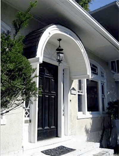
Still, I don’t think that Ben Pentreath would approve of this portico. I’ve been reading his book of what to do and NOT do. And, it is really excellent. I highly recommend that you pick up a copy.
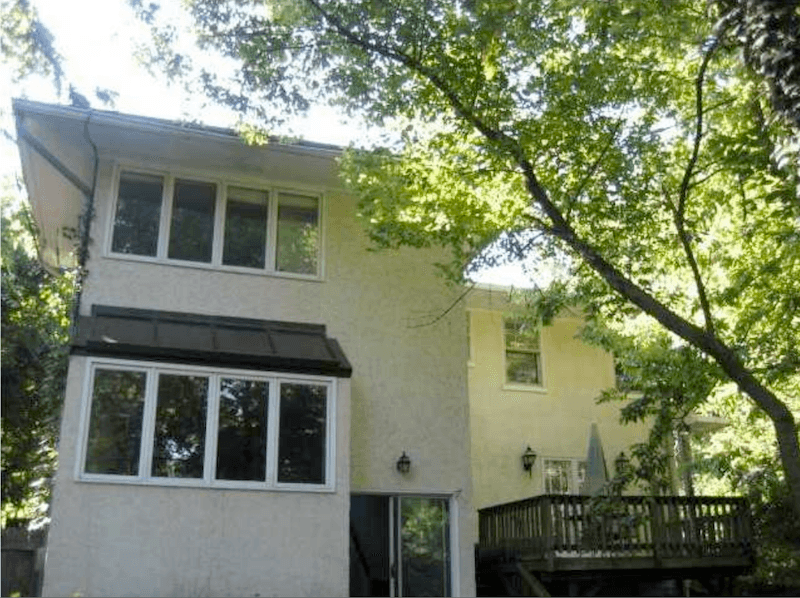
ugh. Nothing is worse than an addition on an old home that is positively screaming
I’M AN ADDITION. I DON’T BELONG HERE. IT WAS A MISTAKE. AND, THERE’S NOTHING YOU CAN DO ABOUT IT. SEE IF I CARE!
Before Chris and Patti got a hold of this place in 2016 for their house flip, another realtor purchased this house and did the bulk of the updates. Most of them, I think, are very good. Some are excellent.
But, unfortunately, the photos are quite poor. Understatement. And, that’s a problem, too. Maybe there are some better ones somewhere else, but still. Zillow has them up. Good ol’ Zillow. haha
Now, let’s do a comparison to see the changes with house flip one and house flip two by Patti and Chris.
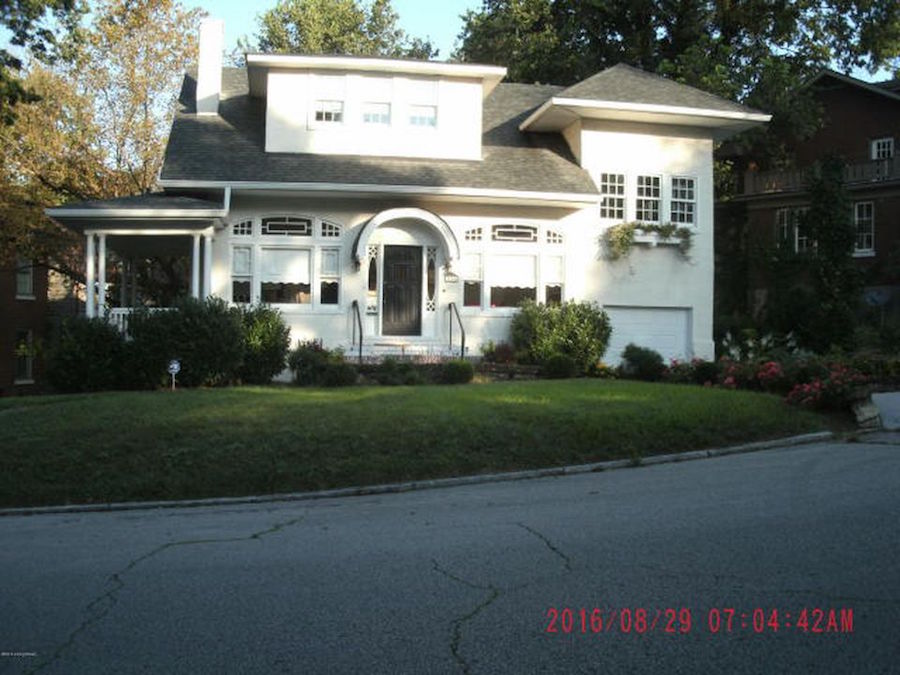
Already, so much better. The previous owner fixed that sad dormer by having it raised up. Although, not classically accurate, I think it’s the best solution, for this situation.
I’m liking what she did with the porch and changing the garage door was a good move. This way, it blends in better with the rest of the house.
She also changed the roof which I’m liking a whole lot better as it’s lighter.
Please, do not put the date and time on your real estate images. ugh.
Can you imagine Sotheby’s Realty having the date/time on their images? Seriously.
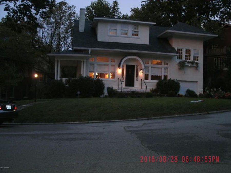
What’s worse than a photo with a date/time on it? A photo taken in the evening or at night with the date/time on it. That is… unless it’s a professional photograph and there’s some special reason, like the cool contemporary house in Las Vegas with the incredible view of the Las Vegas strip.

I don’t know why that low curved stone wall is there. Anyone? Oh, wait. I know. It’s like a speed bump to keep the kids from running out into the street. Instead, they’ll break their shins. That should slow them down a bit. Wish we had had one of those back in the day. Very useful, I think.
Speaking of, the “boy,” now 29 is going to be here for a visit any minute! So, so happy!!!

A little overgrown and/or messy. I’m not a gardener. But, this isn’t something I would use to advertise a house for sale. I love how it’s covering everything BUT the neighbor’s satellite dish. haha.
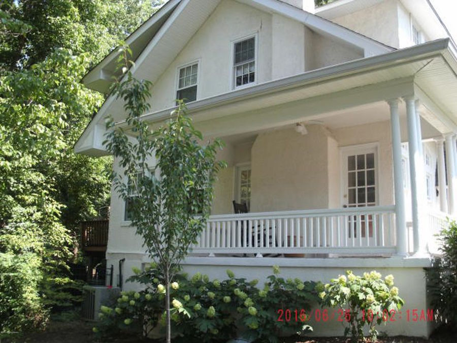
This looks quite nice, however.
Okay, now it’s time to see what Patti and Chris did to the exterior of the house and property to get it ready for their house flip.
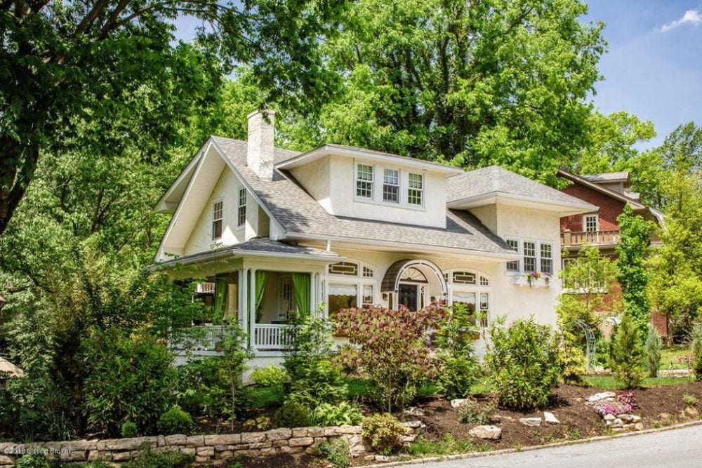
Can you believe it? The power of plants! Patti said that Chris did a real number on the landscaping. I’ll say. Just gorgeous!
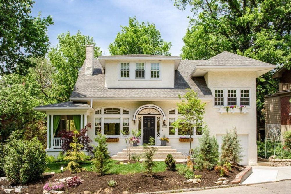
And, I bet in a few years it’ll be even better. But, case in point. First impressions are everything.
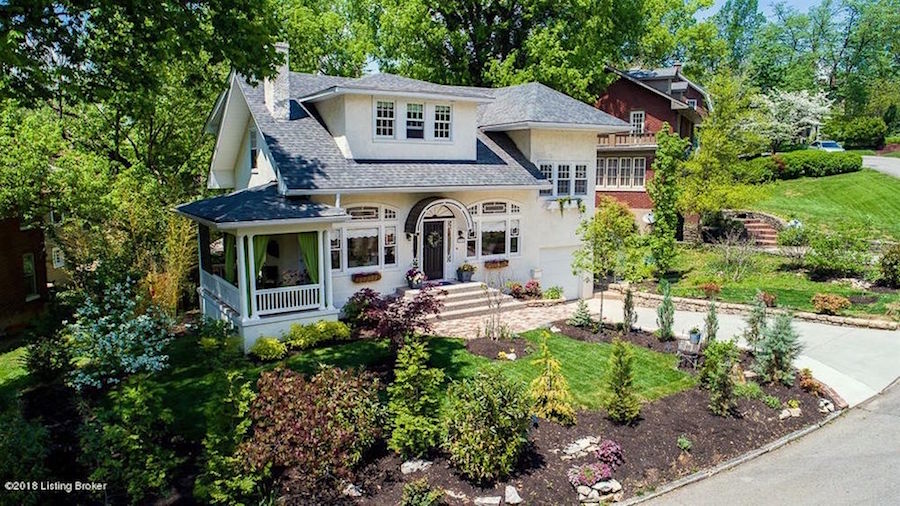
Patti says that it’s now the nicest home in the neighborhood. I have no doubt of that!
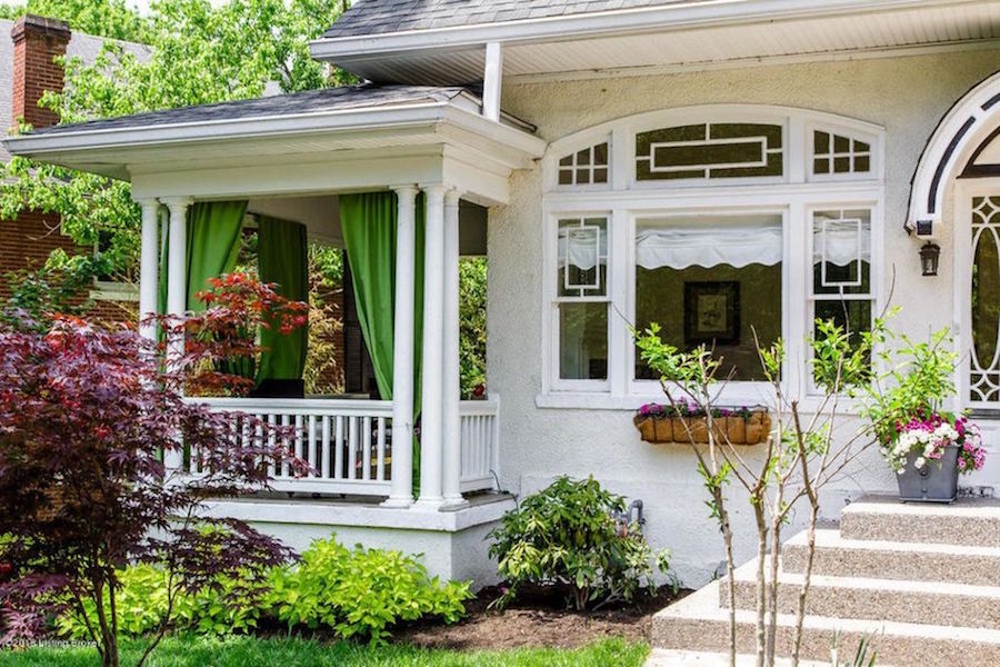
Love the green outdoor curtains. They add a lot of class and curb appeal.
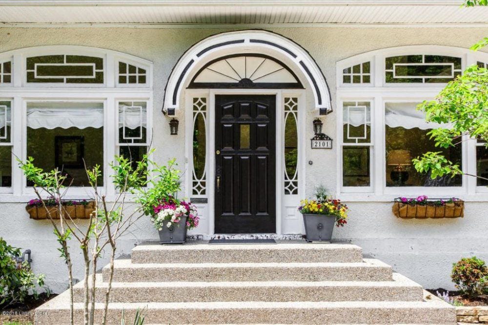
Loving the front door area now.
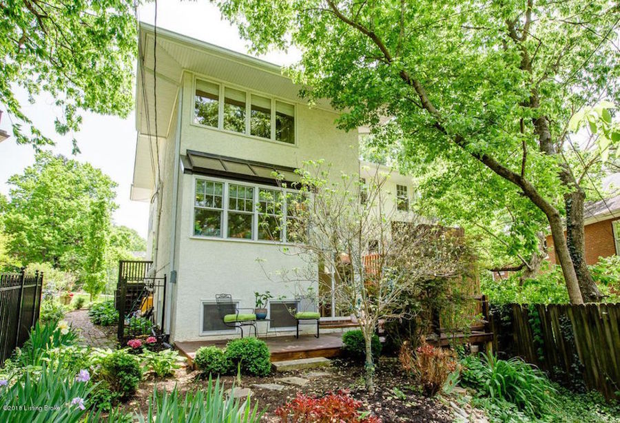
The rear facade is much improved with the addition of new sash windows with divided lights. Thank you very much! So bad to not have windows coordinating. Patti also told me that this part of the house was poorly insulated. But, they fixed that too.
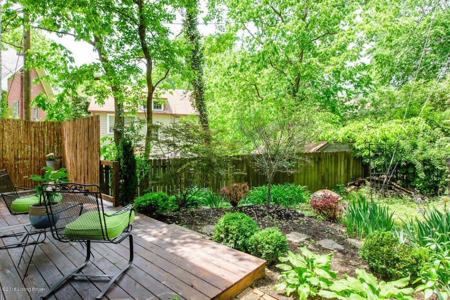
Lovely landscaping off of the rear deck.

An aerial shot of the house and surrounding area. That’s really great to show prospective buyers the entire area. Very smart.
In addition, it looks like these exterior shots were taken at the height of spring-time.
Excellent. In fact, if you are planning or are even thinking of planning on putting your home on the market some time in the near future, this is the best time to take those exterior images. We had the presence of mind to do so, the spring before we put our home on the market and the realtor was so happy to have those pics to use for the listing.
Okay, time to go inside. Isn’t this fun? That was always my favorite part of being an interior designer.
But, like the exterior, we will begin with the previous iteration. Please note that these are the photos that Patti and Chris probably saw and obviously, it didn’t hinder their decision to purchase.
There’s a lesson in that too. In other words, don’t sweat it too much. But still… I don’t think that the previous owner did nearly as well, financially. However, I’m not sure of that, either.
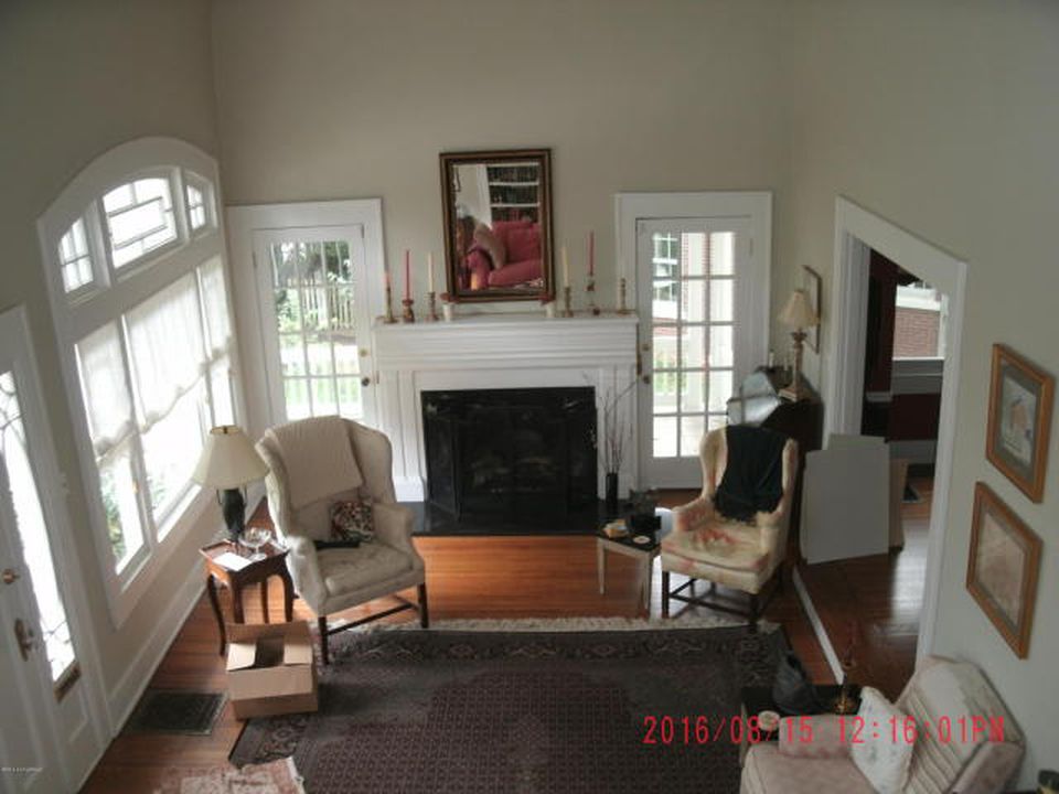
No offense. I’m not the world’s best house keeper. But, why is there an empty box?
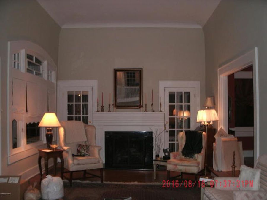
Wait. No… Is that the trash that needs to be taken out? Please forgive me. Just reporting what I see. Night time, fuzzy, dark, date, trash. No!
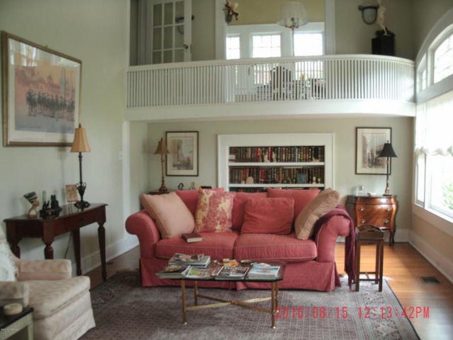
It’s not terrible, but does look a little tired, IMO. I would’ve changed the pillows, new lamps and gotten a seagrass rug, perhaps. But again, it’s not terrible; as well, the date does match the sofa. That’s a nice touch. :/
However, this is the home that Chris and Patti bought and then fixed up.
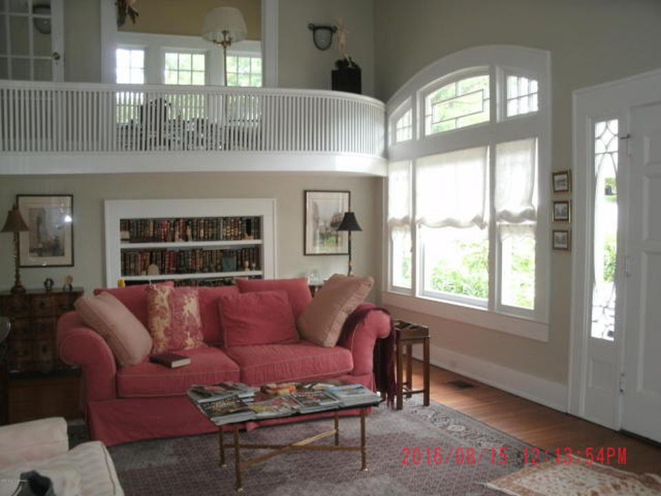
In addition, some fresh, white cotton duck slipcovers on all of the furniture would’ve helped to lighten the space and given it a more unified and classier look.
I know. The railing.
Okay, it’s time to see what Patti and Chris did to make this home flip sing!
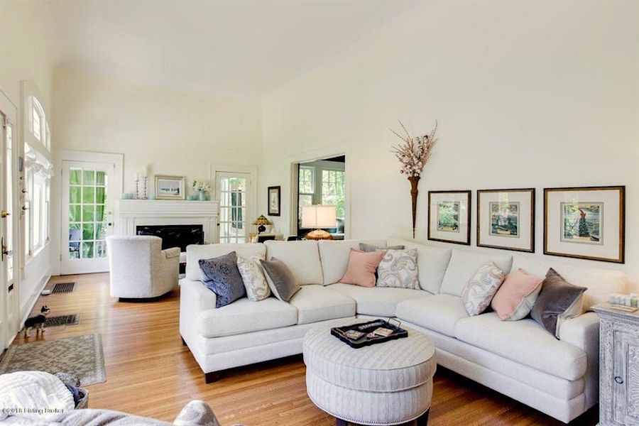
The contemporary sectional in a pale covering looks fresh and family-friendly.
I told Patti, I had a couple of things to point out and she’s cool with that.
This is only in the interest of making things even better. I think that Patti is extremely talented. Plus, she has not had any training.
I would put the art about 5″-6″ higher up on the wall. And since the ceiling is so high, it would be wonderful if there were nine of these prints.
And, maybe the pillows could be an inch or two larger. For more about throw pillows, click here.
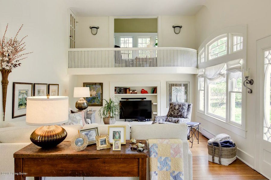
I adore this view. I told Patti that it would be cool if there were bi-fold doors to cover the TV. She liked that idea, as well. I love the homey touches here.
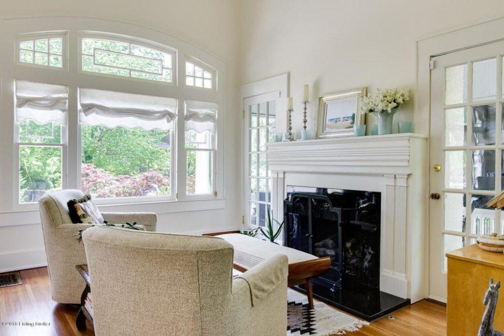
Normally, I’d face the chairs into the room. Of course, I understand why they are facing the fireplace. :]
As for the fireplace, itself. It’s clear that it’s too big. But, that’s the original gas fireplace and mantel, Patti says. I would love to see a large rectangular mirror. However, the way it is staged is fine.
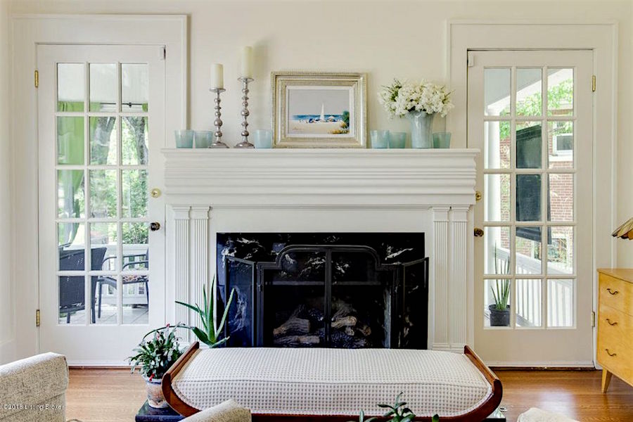
Painting everything one color is a great way to minimize the fact that the fireplace is too large. There should be at least six inches of breathing room between the mantel and doors.
By the way, the paint color is Benjamin Moore Ivory White 925. And yes, one of the 144 colors in my paint collection.
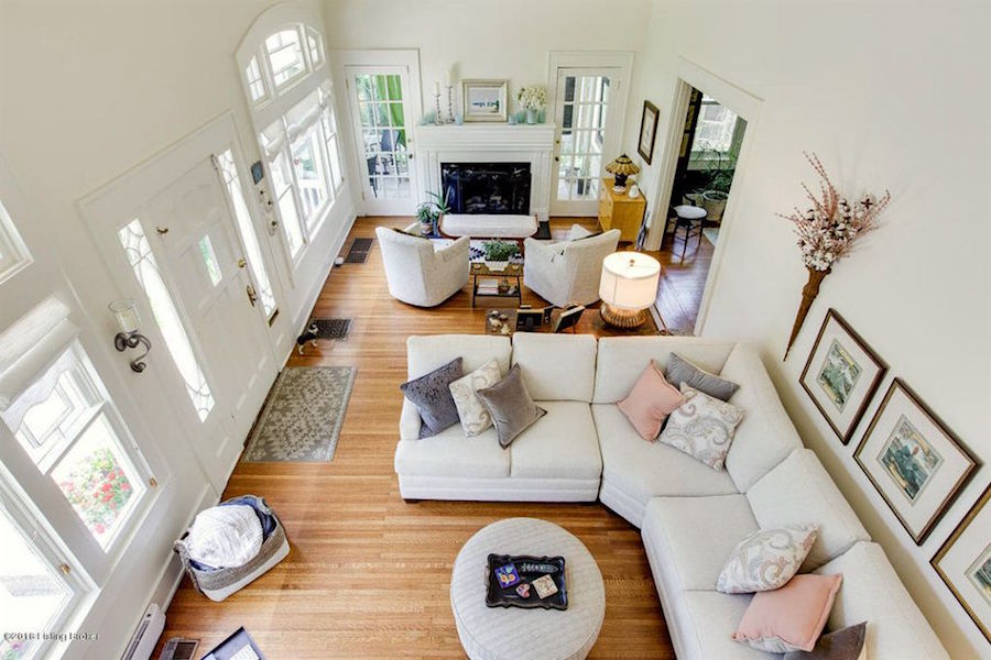
Love this shot.
Let’s move onto the dining room as it was before the Patti and Chris’ home flip.
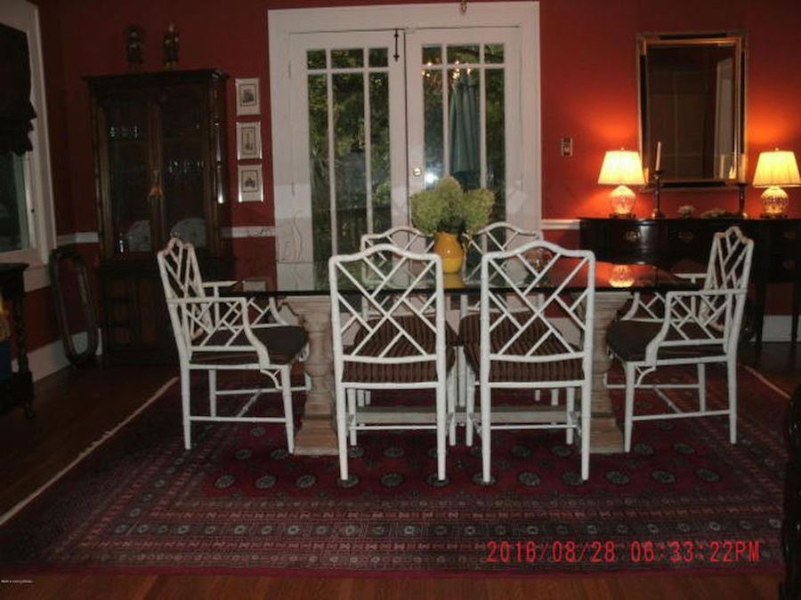
This isn’t terrible, except that it is. And, it’s ALL because of the horrendous photography. It’s turning what is probably a lovely dining room into something scary. I guess this drives the point home. No night time photos, please!
Let’s look at Patti and Chris’ home flip dining room.
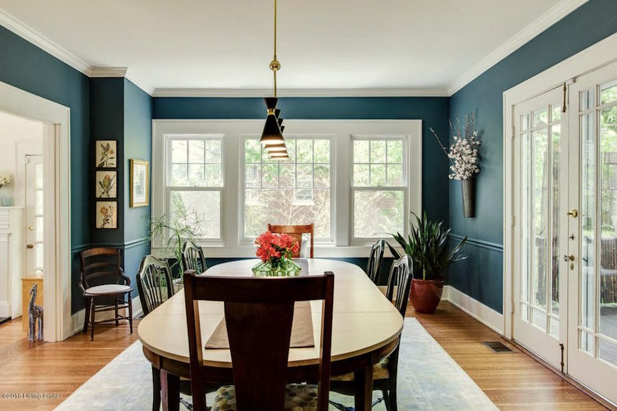
Oh, how I love this refreshing, teal-blue! I was sure it was one of the Laurel Home Paint Collection colors. It is close to Newburg Green. And, just a little bit more blue than Jack Pine.
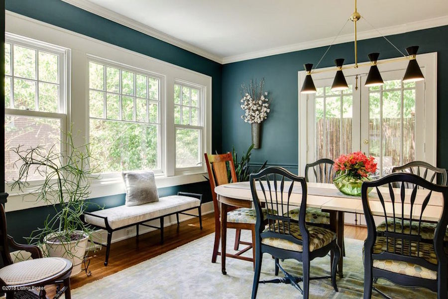
Patti says that the wall color is Glidden Superstition.
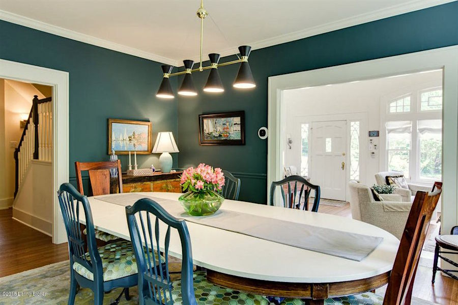
Love the black contemporary light fixture. I think it’s perfect. Not sure what’s going on with the table top. Maybe if Patti sees this, she’ll explain. It looks like it’s a new top, but not sure what it’s made out of.
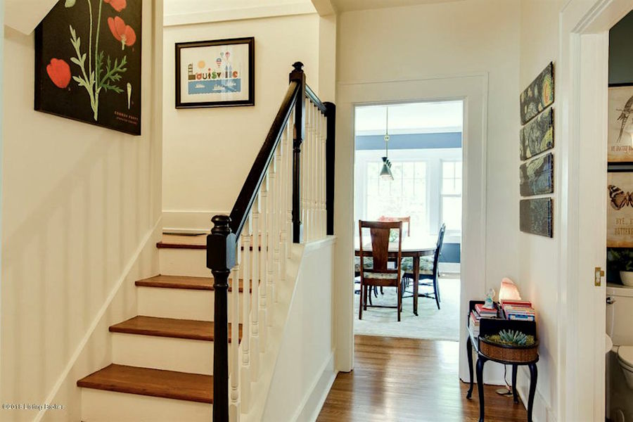
I really love this area and the black painted hand-rail is very chic. It is okay to do it differently than the other railings as long as the two aren’t very close together.
Time to go to the kitchen before Patti and Chris’ home flip.
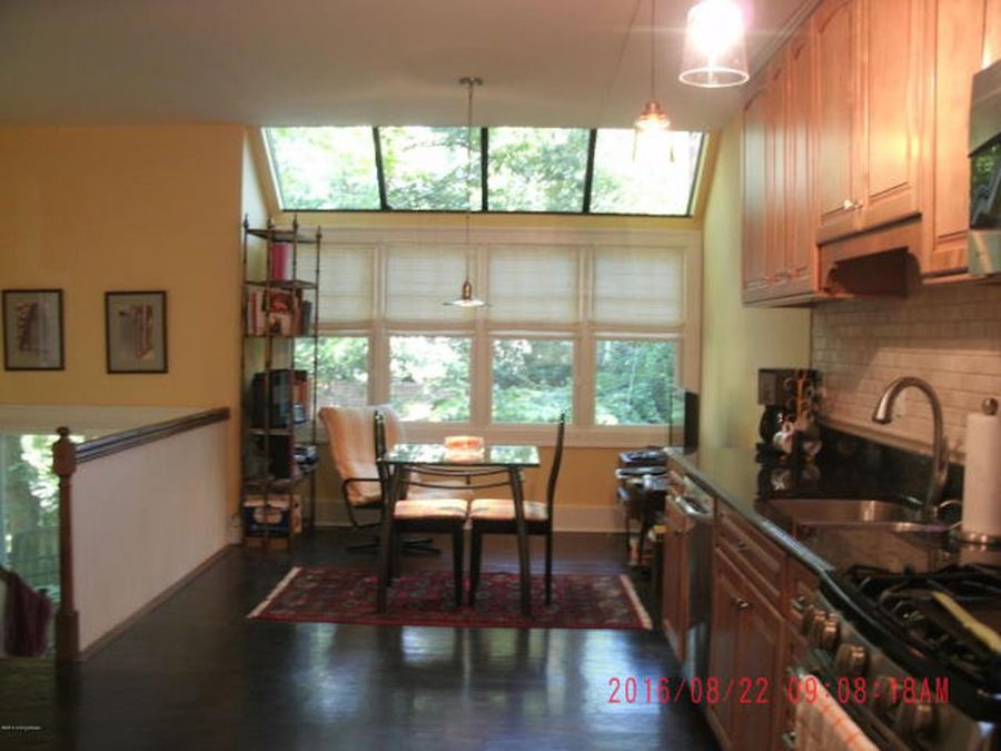
Uh oh… I don’t know what happened. The floor here was stained dark, but not in the other rooms. That should be avoided. If doing a hardwood floor, usually, it’s the same color everywhere. However, this kitchen is pretty separate from the other living areas, so it’s probably okay.
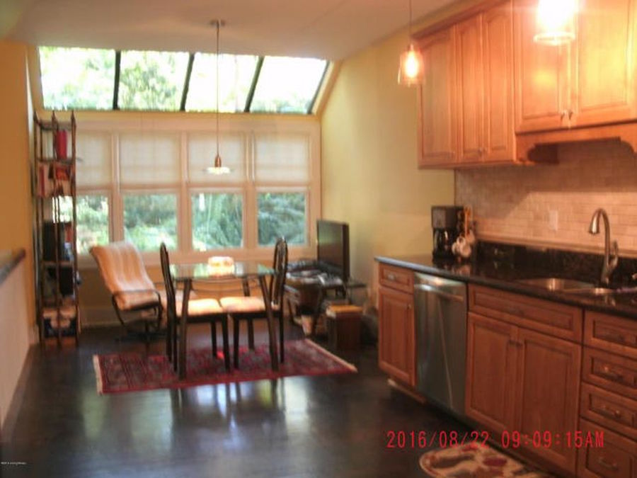
But, aside from the shockingly poor photography, it’s pretty underwhelming, isn’t it? And, it really is better to take photos without the lights on. Or, if on, very dim.
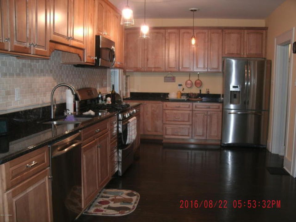
This lighting is way too bright and is not helping matters at all.
And now, for my favorite part of this house flip. And, that’s because it looks terrific and also looks like they did way more than they actually did.
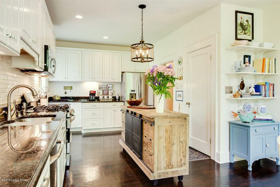
Wow! Don’t you love this! All they did is paint the cabinets, Benjamin Moore Ivory White 925. (One of the Laurel Home beautiful shades of white paint), then they added new hardware and the island. And, then some new furniture and lighting.
But, it looks like a completely different kitchen! That’s the power of well-lit and non-fuzzy photography– plus freshly painted white cabinetry.
This is a good post for fixing up a kitchen without gutting the entire thing.
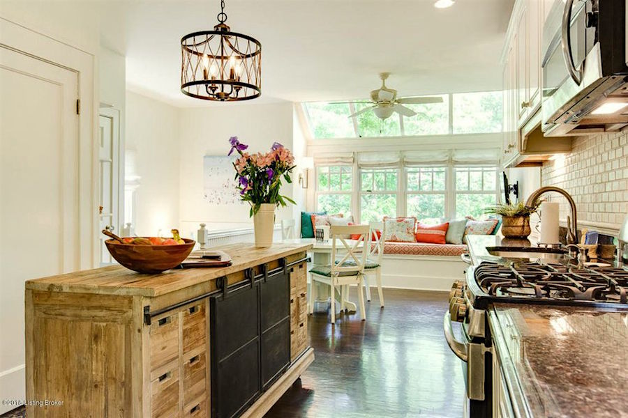
I really can’t believe that this is the same kitchen. Patti says that she had the banquette made and it is ten feet long!
There are now four bedrooms and an extra bath and a half from the original home. And, in addition there’s a new mother-in-law or rental apartment with a separate entrance on the lower level.
What Patti and Chris did with this exceptional home flip is turn an awkward, quasi-traditional but tired and dated home into a young, new-trad family home.
And, that’s exactly who purchased this home; a young family.
Superb job, Patti and Chris and once again, thank you for sharing your lovely work with me and others.
By the way, Patti says that they have one more home they are currently working on that is late 19th century. Oh, I hope she sends those images my way, one day.
Stay cool guys!
xo,

Please check out the newly updated hot sales and also the Nordstrom Anniversary sale. They’ve just added hundreds of new items to the sale. I’ve added a couple of things to the widgets, which you can find here.
Related Posts
 Benjamin COTY 2022 – A Color For The Sages
 Can This Boring Bland Living Room Be Saved?
 12 Of The Hottest Kitchen Trends – Awful or Wonderful?
 The 12-Step Decorating Plan That Always Works!
 Finding Bathroom Storage For A Small Difficult Bathroom
 Is The “Unkitchen” Kitchen Design Trend, Here To Stay?
 The Dangers of Curtains Over Baseboard Heat!


