And why don’t they want you to know this decorating trick?
Well… I can’t speak for them. :]
But this one’s so simple, and yet I don’t see anyone writing about it.
The trick to creating beautiful, professional-looking interiors is…
Are you ready?
You steal it.
That’s right. Take. Borrow. Copy. Imitate. Steal.
Oh, I know. I bet you think it’s wrong to steal. Well, in this case, I’m telling you that it’s okay.
I mean. Isn’t that how we learn?
Let me put it this way. When you were born, did you know how to walk and talk? No. You copied other people.
Did all of the great painters just put their brush to canvas and out came a masterpiece the first time?
No. They learned as apprentices by imitating and copying their mentors.
And then, over time, they developed their own style.
What about Mozart? Did he just sit at the piano and start composing a concerto when he was three?
Okay, that one isn’t a great example because he started composing long before three. haha But he still learned from his father and his fellow musicians. There was a particular form and style that they all employed. He just did it better than everyone else. And then other musicians copied him.
When I was a ballet dancer, I copied my teacher and dancers who were better than me. That’s how I learned to
Well… it’s no different when we’re designing and decorating our homes.
By now, it’s all been done before, anyway.
But dang it all, sometimes we see stuff in magazines.
We become obsessed.
A piece of furniture.
A fabric.
But, they don’t tell us where it came from! They tell us where everything else came from except for the two things we really want to know about. Doesn’t that drive you nuts?
Well, I might be able to help you with that too!* So, please hang on!
*When I say help you, it would be very helpful for you not to take that literally and use me as your concierge service. Yes, people do that several times a week. However, I am happy to tell you how to help yourself find whatever it is you’re looking for. So, please keep reading!
So, let’s put this not-so-secret decorating trick into action. I will take a beautiful room and share how I source items.
In so doing, I will attempt to share how to get the look without spending a fortune.
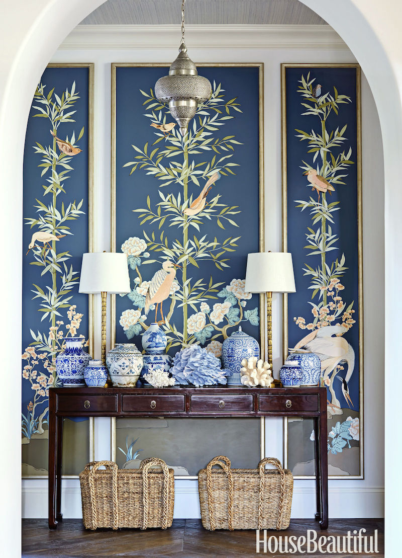
The room is this beauty that was on the cover of House Beautiful May 2016 by one of my favorite interior designers, the fabulous Chicago (my birthplace!) interior designer, Summer Thornton!
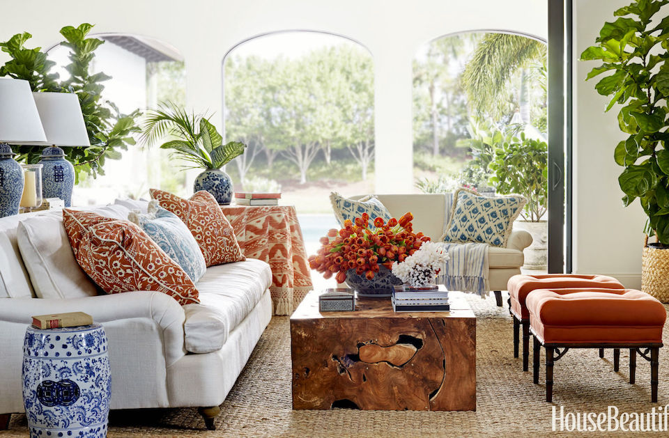
If it looks familiar, this is a completely reworked post from 2016. In fact, this post spawned one of the most read posts on Laurel Home. Yeah, the shocking truth about Resto.
I always love to point out that their stock prices have flourished in the five and a half years since that post was written.
But let’s move on now and get into my favorite decorating trick!
One of the things I love about Summer’s designs is that not everything is insanely expensive. Some of it is, yes, but not everything.
Let’s begin with the fabulous entry.
There’s nothing I would change in this exquisite and quietly dramatic entry.
The gorgeous Chinoiserie panels are hand-painted by Allison Cosmos
hmmm… That has to be somewhere in the ‘hood of 10k. But I don’t know. In any case, most of us, myself included, don’t have that kind of money, no matter how spectacular.
However, if you have the money, you can purchase a similar mural on Chairish!!!
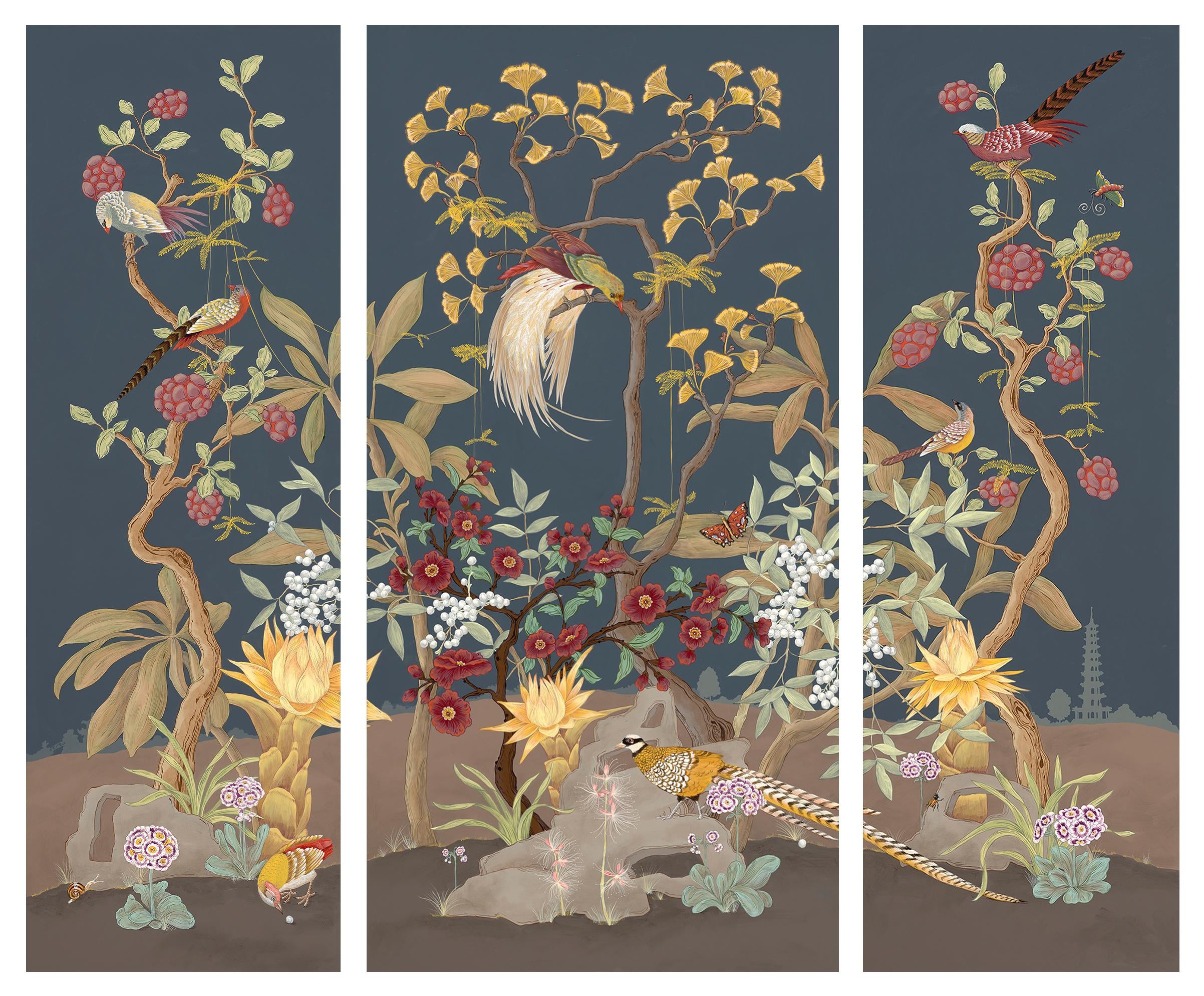
Allison Cosmos Chinoiserie Hand-Painted Mural Triptych on Chairish
These two images are prints made from the original. They come in two sizes. However, they are a lot smaller than the original painting.
You could also do one of these fantastic murals from Casa Cosima (The Mural Source)
Please click on any image for more information.
Below are some beautiful Chinoiserie console tables.
Next comes lighting.
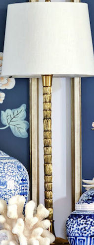
Those are cool buffet lamps, but I don’t recognize them. I did one of my favorite tricks when I don’t know where a lamp is from. I crop it tightly and put it in google images.
Dang, it often works, but not this time.
So, now what?
I opened up Laurel’s Rolodex.
Oh man, if you don’t have Laurel’s Rolodex, then you are missing out on another wonderful decorating trick.
I use mine all the time and wonder how I got by all those years without it! (not very well, sometimes. lol) I just went to the lighting section and started scrolling through the dozens of sources, and bingo! I found the source on page 246- Vaughan Lighting! I feel giddy when that happens!
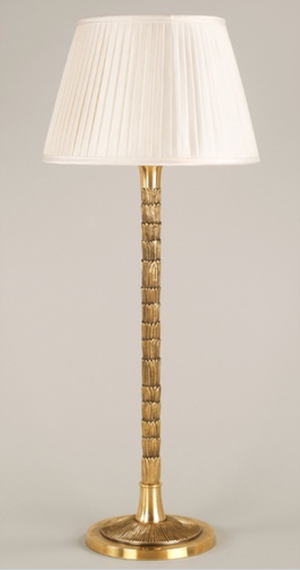
The shade is different, but Vaughan offers many shade options.
What is so great about using Laurel’s Rolodex is that all of the links are right there, so you can quickly click on a link and go through each vendor’s products as fast as you can scroll.
Below are some other beautiful lamps.
The Chinoiserie lamp goes behind the sofa on another console table.
For the accessories, there are so many places that carry great stuff.
One of my favorite sources for Chinoiserie porcelains is Legend of Asia. And, they have the entire line at Perigold!
Okay, in addition to the mini widgets, I have also created a large widget where I can put in some descriptions. Not everything in the widget will be in this one room. However, they could all be in the same home, but in another room.
And now maybe you can start to see why I love this decorating trick so much.
That’s because in the process of “stealing” someone else’s design, by the end, we always end up with a room that is perhaps reminiscent of the original design; however, in the end, it becomes our own.
For me, starting the process from a solid jumping-off point gets my creative juices flowing, and sometimes, the room ends up being very different from the original.
I think that’s one of the most extraordinary aspects of design. Just like people, no two rooms are ever alike. And, the possibilities are endless.
xo,
PS: Please check out the newly updated HOT SALES. There are some special surprises this week and a big sale that’s ending very soon!
Related Posts

- Inherited Furniture That Must Stay – How To Work With It
- The Most Amazing English Country House Of Them All
- Impressive Decorating On A Shoestring Budget – Only 1,100.00 bucks!

- 30 Cheap Table Lamps + Sources + What Size to Get
- Curtain and Drapery Hardware – What You Need To Know
- 30 Astonishingly Beautiful and Best Front Door Colors
- The Death Of The Boring White Kitchen and Bathroom at KBIS
26 Responses
Funny, Laurel, we’re on the same page this month! In my recent blog post 143+ healthy ways to outwit fear (I started blogging after reading Laurel’s epic how-to-blog guide), number 133 says Don’t Say “It’s Been Done Before.” That’s because we all put our own spin on everything. We give it our own flavor. All the greats do it.
I fell in love an absurd vintage velvet chaise in an orange and pink stripe at a local thrift shop. I waited a few months and then bought it. I’ve designed my loft around it and I’m so close to finished. I’m going over the top with orange and purple and am more than a little inspired by Bakst’s Set designs for Scheherazade (which I absolutely did order in a 30×24 canvas print for $50). I’ve discovered, however counterintuitively, the more colors I add, the less over the top it appears. It’s a rather magical place where maximalist becomes cozy and the whole house feels better.
I have fallen in love with these drapes that I saw in the October 2003 edition of Traditional Home but have not been able to find them anywhere. Any suggestions?
Loved the post. I am always looking at magazines and decorating books in the library or book store. I have your Rolodex. It rocks.
I use Google Chrome as my browser (both on the computer and on my cellphone). I love using Google Lens (rather than Reverse Image Lookup for the same goal).
If you see an image on your computer, you can right click it and choose “Search Image with Google Lens”. It allows you to crop which part of the image without having to do it in some other program and then uploading the image to Google search. It’s also extremely helpful when you have an image like the Summer Thorton room that has a bunch of items in the room that you’d like to try and source. You don’t have to make several different crops of the same image.
It’s similar on your cellphone, but just a little too complicated to write out all the steps here. A quick search will show how to do it for anyone interested.
Great, informative and inspirational post once again.
Thanks!
Cindy
Steal? Several years ago a friend suggested a useful synonym “inspired by”. It sounds far less larcenous. And imitation is, after all, the sincerest form of flattery.
Laurel, I’m glad that you include a Braxton Culler link now and then. For those who don’t have completely elastic amounts of money for furnishings, their offerings are stylish and well made, at a very good price. Above all, their chairs and sofas are appropriately scaled! Not one piece looks like a giant Muppet waiting to swallow someone.
Today, I have a chance to really thank you for your work, Laurel. I come here to decompress from the not so nice realities of daily life as I am generally very tuned in to all of that. Here, I can get my dose of creativity while the world spins on. This is especially appreciated at this moment.
Second, I adore that Thorton room at the top. I wonder if you could do a post which takes a lovely room like that and changes it in order to give us perspective as to what direction any given design can be spun out into without losing what attracted us in the first place.
For example, if the room was painted red or conversely blue, how does the design change, what about our response to that change tells us something about our preferences and/or what should or should not be tried?
I am asking this because I often see something I adore but I know I would not want to live in that room as it is presented. Instead, I often want to change the colorways and that seems to lead to something quite different and maybe not so nice.
I have a pretty distinct set of color desires which I know work, so it is not that I am mentally doing something which absolutely should not be done. And also, I am often attracted to very neutral rooms but know that I don’t really want a neutral room. Yet when I add color in my mind, everything seems to go sideways. It is not the colors per se, but something else that I cannot figure out.
I cannot quite figure out what goes wrong and I can’t quite figure out how to explain what I am asking about.
So, the best that I can say is that a posting about taking an inspiration room through a series of changes would really fascinate me.
SandyC, Thanks for the endorsement! I too have a small file of how not to do it alongside the tons of good things where every element plays its part. That Summer Thornton room is a good exercise — it’s easy to see how one could reverse the proportions of blue and coral for a different look, but without the window wall the room would be totally different and would probably need a different layout — or a huge mirror, which would again change the room entirely.
Hi Laurel…I remember that original Summer Thornton post. I’ve succeeded sometimes doing the Google images search – but many times not. It’s helped when I added the image plus a description in the search bar.
I will have to look on your Rolodex too…didn’t think of that!
Thanks,
Linda
Yes, the image + description is helpful and sometimes just the description if still coming up dry. If the piece still exists, I would say I have a 90% success rate of finding it.
yes, love looking at rooms by various designers…Summer Thorton is great!! Amazing how you can find thrift store stuff that can help you create the look.
GL, you’re so right about analyzing, analyzing, analyzing. I even analyze some rooms I almost or don’t like because it challenges me to mentally change and “fix” things. The whole exercise of analyzing also stimulates “thinking outside the box” which can be frustrating for me sometime but always delightfully rewarding in the end. I love Summer Thornton’s room but you’re right about the architecture of the room – that wall of windows is something heavenly. But great that the room can be just as successful in a different setting which is why it’s going into my Inspiration files.
Stealing from the designer is precisely why I subscribe to “shelter” magazines and look at the pictures you share!! :]
Hi Susan,
Bingo!!! And, it’s also why it’s so frustrating when they don’t list all of the sources. Sometimes, it’s true, they are one-of-a-kind or discontinued. Just because the room is new to us, doesn’t mean it was done yesterday, or even two years ago. In fact, they take photos sometimes a year in advance. When I had an entire home in House & Garden, in December ’04, the project was actually completed three years earlier.
Great post, as always. I agree that having your Rolodex is a VERY useful tool for designers and design enthusiasts alike. It saves a lot of time!
Thanks so much, Anne! One of my favorite uses is when I’m racking my brain trying to remember the name of a source. Right? So, instead of wasting time on that exercise, I just go to Laurel’s Rolodex, and within three minutes–tops, I’ll have my answer.
Hi Laurel,
I never thought I’d see the day that West Elm would offer an English Roll Arm sofa. But here we are.
I really need to teach myself how to use Google images. How hard could it be?
Hi Mary,
I know! And, I really love the lines on this piece, too! It’s a beautiful blend of contemporary and trad without being weird, IMO.
And, for google images, it’s frighteningly easy. Here’s the link. https://images.google.com/
Do this on a desktop/laptop computer. Put your image on your desktop and drag it into the box and magic will happen.
The Serena & Lily 20% off custom uplostery has expired. Do you know of another code or how often the custom upolstery sale happens?
Ugh! Profound apologies, Jennifer!!! I forgot to check the captions. My bad. It’s all fixed now. (I think.)
As for how often they have their sales, that’s a very good question. First of all, they rarely tell me and when they do, I’m not allowed to say anything, but if I say there’s a really BIG sale coming up (winky face) let’s just say it’s almost definitely S & L.
How often do their upholstered pieces go on sale? I would estimate, roughly 4-6 times a year for the custom upholstered furniture. Sometimes it’s the entire site on sale, and sometimes it’s all custom upholstered furniture. So, of course, it’s worth waiting for the sale. There are also sales of living room furniture, bedroom furniture, dining room furniture. When they have those sales, the upholstered pieces in those rooms are on sale, as well.
Fun post, Laurel, Schumacher has come out with wall panels and some would be fantastic in the application you’ve outlined 😊
Oh, thank you Dee. I’ll have to go and have a look!
As Laurel says, the final advice on this “stealing” process is that it’s really about finding the essential starting point for something that may well end up rather different. You can’t steal a whole room, as you haven’t got that room’s architecture to start with.
As always, I can see DIY possibilities here, but won’t go into that. Perhaps more important when inspecting inspirational photos is to analyse them. Try mentally taking away a few elements to see if it still works — why does it work? Magazine pictures always move stuff around for the camera shot — you can spot items which appear in the sitting room and then in the bedroom before moving to the study, because each time they improve the whole image. The question is why? What does that object do? Maria Killam says “compare, compare, compare”. I’d say “analyse, analyse, analyse”.
Thanks so much, GL! Great advise as always! And, yes, mag articles and placement of furniture is hilarious sometimes. They’ll put a sofa in front of a door, for example. But, it sure looks great! So often, it really IS the architecture of the room; not the furniture and definitely not the wall color that’s what’s so appealing.