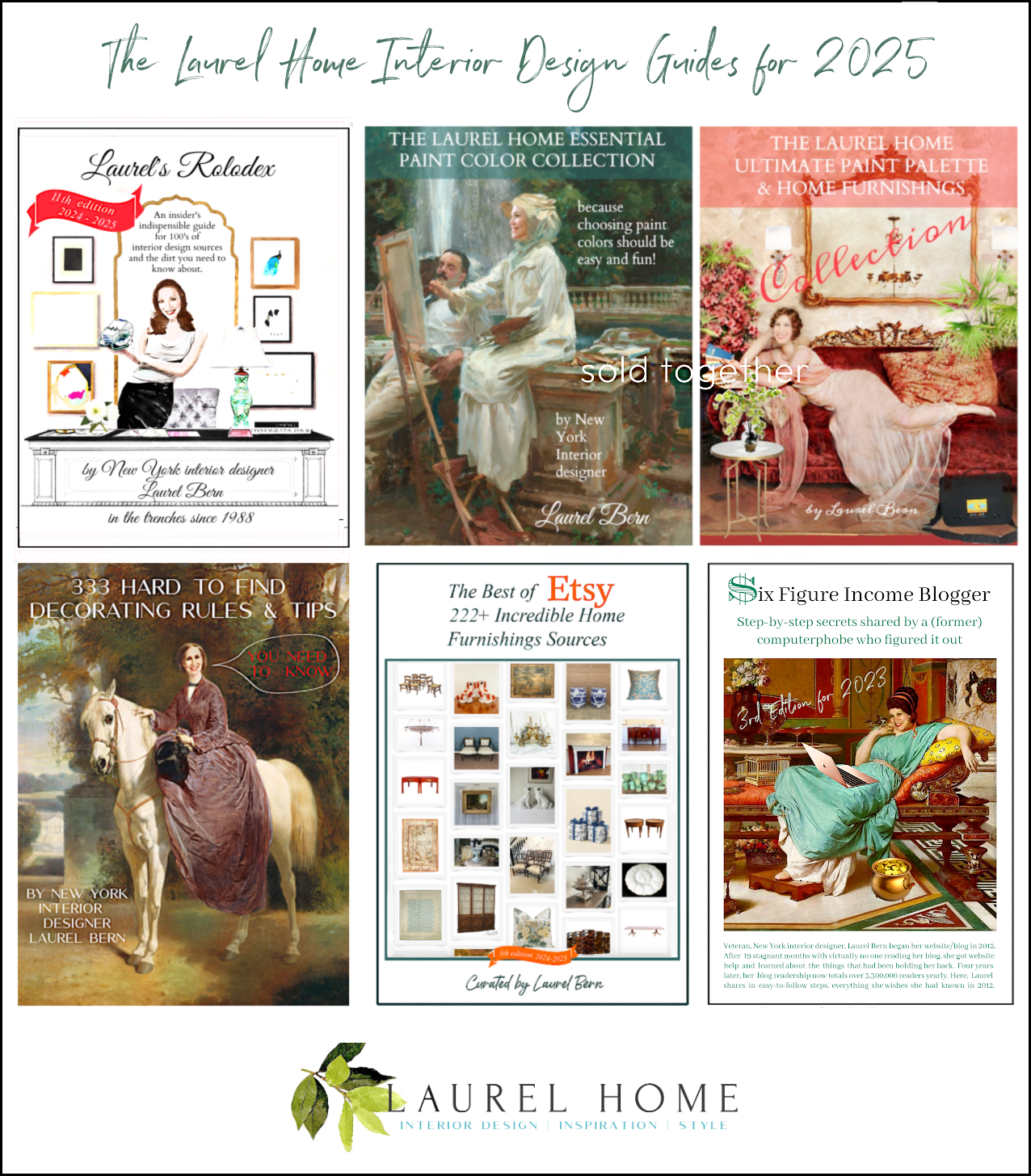
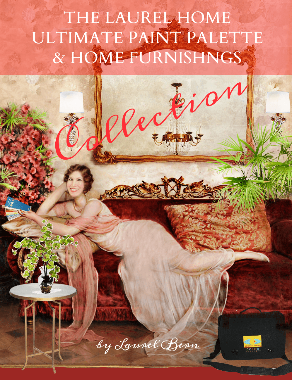
Welcome to the Info Page for the Laurel Home Paint & Palette Collection!
This 500-page easy-to-read two-part volume is the no-nonsense guide to choosing the right paint colors and creating a palette that actually works—in your home, with your light, and your furnishings.
Hi Everyone,
If you’re new here, you might not realize that I’ve been an interior designer for over 35 years, and if I’ve learned one thing, it’s this:
Selecting paint colors is a bitch.
There, I said it. But, it’s true, and the most difficult aspect is selecting paint colors for yourself.
It seems like such a small decision—until you’re standing in a room that suddenly looks pink when you wanted cream.
Or your white kitchen looks yellow. Or, your trim reads purple. Yes, folks. It happens to all of us.
Decision fatigue is a real thing, and even the most seasoned pro can fall victim to it. After all, we’re human, too.
Still, the decision can be daunting, and especially if you’re just starting out or have limited experience selecting paint colors.
That’s why I created this two-part essential guide to help you get it right the first time, with much less stress.
The Laurel Home paint collection isn’t just a list of pretty paint colors (although they are very pretty). It’s a complete roadmap to making smart, confident decisions about color, along with beautiful flow, and some of my favorite, classic furnishings for inspiration and context.
I spent hundreds of hours developing these two guides over a period of two years. It was worth it because I’ve received countless notes from readers who purchased these guides and wept tears of joy because it saved their sanity!
Below are two recent comments from lovely readers who purchased the paint guides.
Yvette said:
I just wanted to let you know that I’ve been following your blog for about three years, now. In those three years, I’ve undertaken to do a little renovation to my 1908 Toronto semi-detached home. I’ve been doing it as I can afford it, so it’s taking a looooonnng time to get done. (It’s become a running joke with my friends – I had people over for my birthday in June and I made centrepieces out of power tools and scrap materials!) All the while, I’ve come back to your blog for common sense advice, lots of laughs (shot coffee out of my nose, once. Not gonna lie.) and your generosity with colour advice.
Now that I’m paying someone else to paint my home for the first time in my life, I definitely freaked out and obsessed over the palette – until the first two rooms were finished. I chose colours from your descriptions, tested like crazy and even my painter thinks I am a goddamn genius. The middle bedroom is Oystershell – he told me he had tried like hell to find a colour like this and no luck. And yet there it was – and holy it’s beautiful. Second room is Abalone. And again I am in love. I have every confidence in the rest of my colours, now.
Thank you so very very much for helping me through this. It’s a crazy undertaking for a single obsessive-compulsive and you’ve made so much of it rewarding and delightful.
Now please don’t show me anything else I will like better!
Sarah said:
This paint pallet has saved my behind and sanity (in no particular order) on several occasions. With such a large selection of paint colors on the planet, choosing a color can become an agonizing decision and hold up progress. This collection is chosen with such great taste with just enough of a variety to give you directional choices, but not so much that it’s overwhelming. Worth every cent.
So, let’s look inside the guides to see what’s included in this two-part volume:
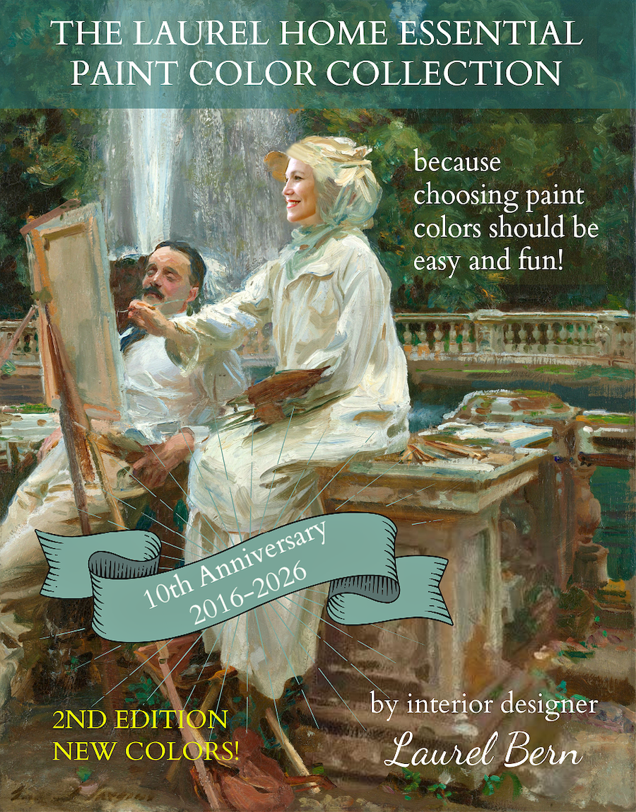
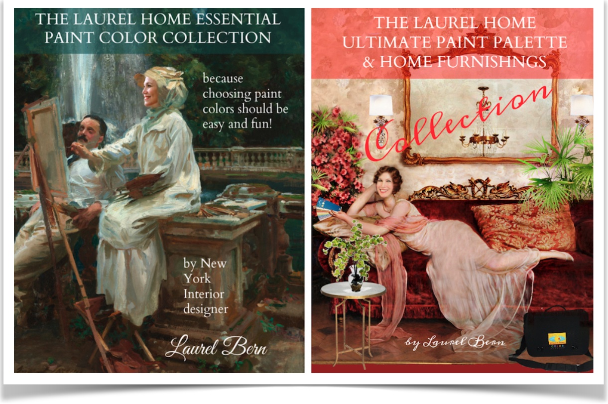
PART 1: The Laurel Home Essential Paint Color Collection – All New for 2025-2026!
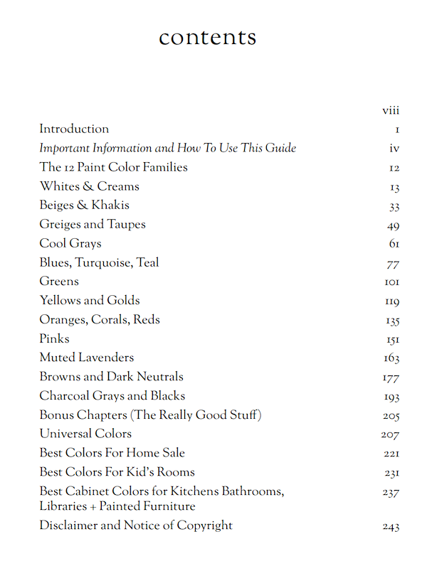
- 144 tried-and-true paint colors that work in real homes—with my commentary, caveats, and notes.
- Insights on undertones, light direction, finishes, and how to avoid common color disasters.
- Personal favorites in all color families, and go-to timeless neutrals that designers like me actually use.
- In addition, you’ll get the best trim colors to go with each wall color.
Then, you’ll get four bonus chapters:
- A large list of Universal paint colors. These are colors that go together in whatever combination you wish. You can’t go wrong!
- Another bonus chapter shares the best kitchen cabinet colors.
- There’s a bonus chapter that shares the best non-barfy colors for your kids, which they will love, too!
- Finally, there is a bonus chapter on the best exterior paint colors if you plan on selling your home and want to repaint the exterior first.
Below is the Table of Contents for Part 1, the Essential Paint Collection
Below is the Laurel Home Curated Paint Collection of 144 beautiful Benjamin Moore colors
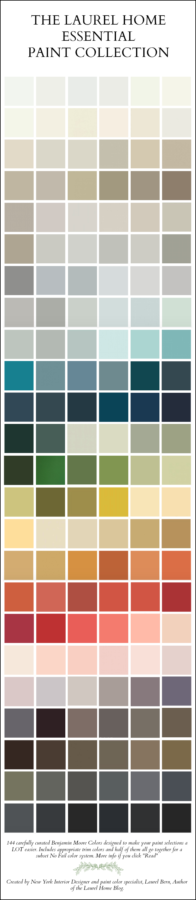
As you can see, I covered a lot of ground in this unique paint color collection.
This is real designer wisdom, the culmination of decades of experience, but never dull. After all, it’s me who wrote it. lol
You’re not getting vague color theory or anything “on trend.” We don’t do trends at Laurel Home. (eyeroll) After all, are you planning on repainting your living room every year? Right? My philosophy has always been and always will be about embracing all that is classic and classical.
These are time-tested colors. If they happen to be popular, it’s because they are fantastic paint colors! However, I’ve included lesser-known personal favorites my readers have used and love!
As much as I hate to admit it, I obsessed for hours over each color, so you don’t have to!
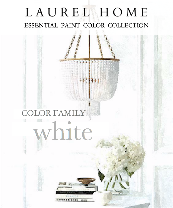
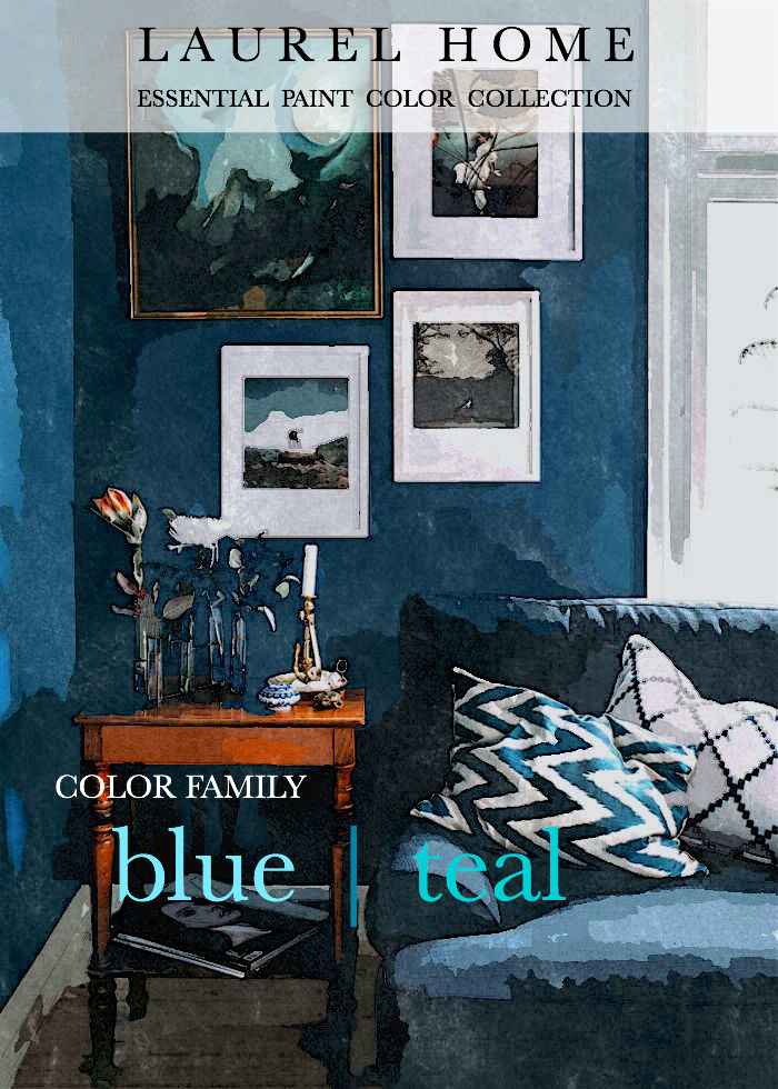
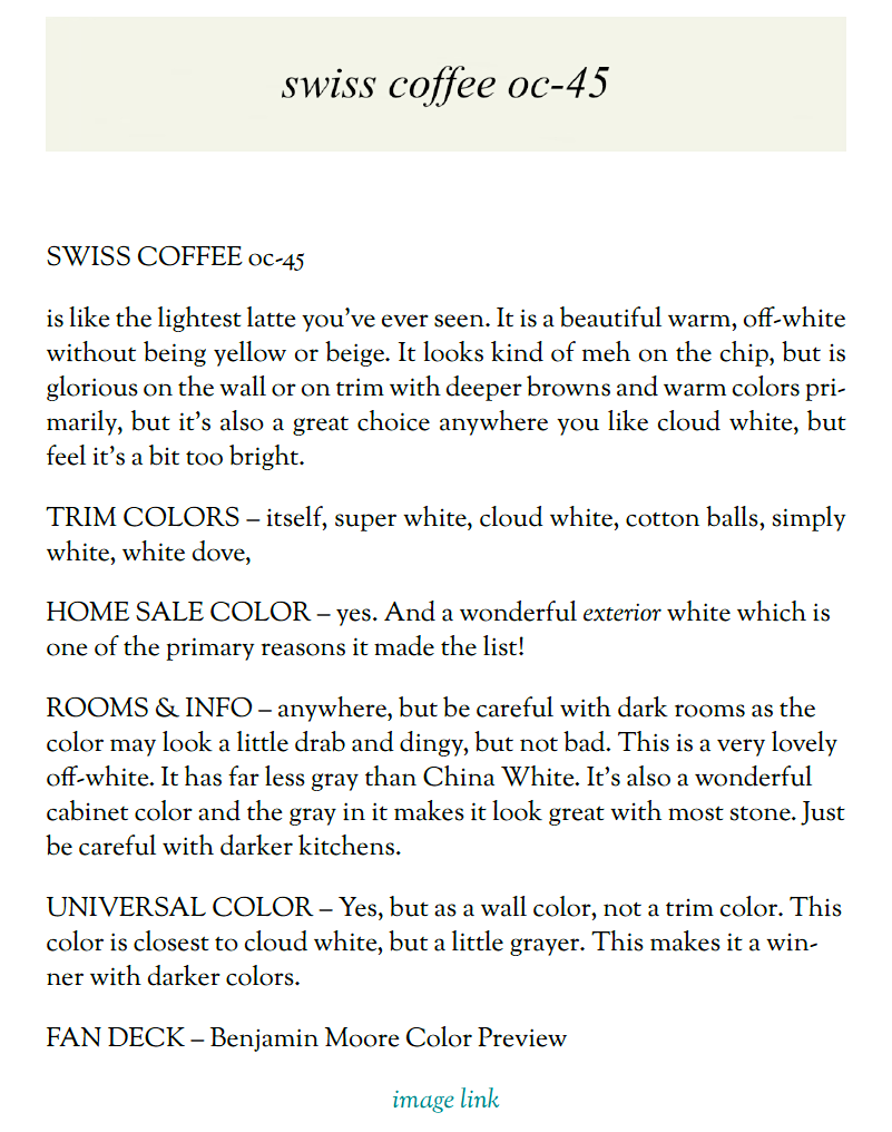
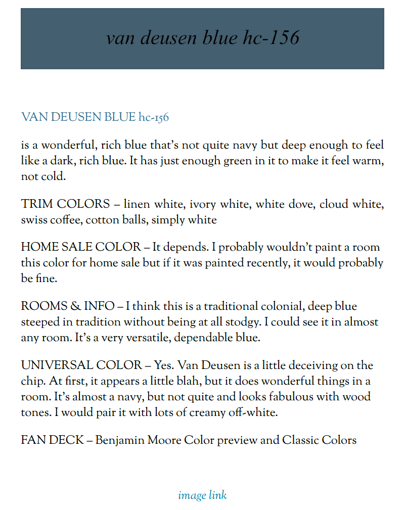
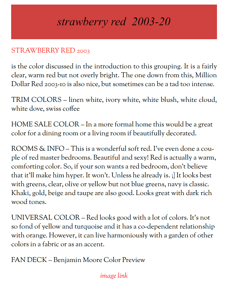
Below are three examples from the 144 color pages. (These are screenshots, so the links don’t work.)
***
***
However, that was only part 1. Below is a look inside the Palette and Home Furnishings Collection:
- 40 beautifully curated color palettes to suit a variety of moods, styles, and rooms.
- These are then broken down into 12 palette families for greater versatility and options.
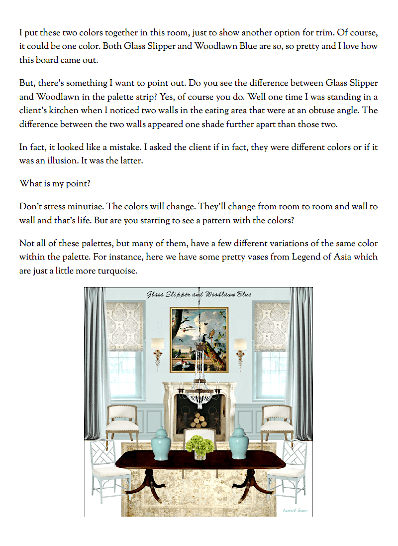
- Each palette includes a mood board with suggested paint colors and coordinating furnishings, decor, and lighting.
- Insider tips on how to pull the look together and avoid costly mistakes.
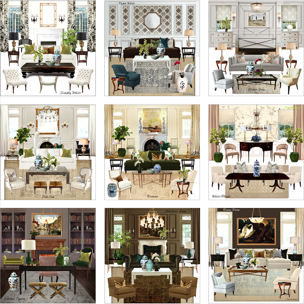
Below are some excerpts from the palette collection showing a mood board with furnishings, text, and the 12-color palette: (Note that these images are reduced in size, and again, they are screenshots.
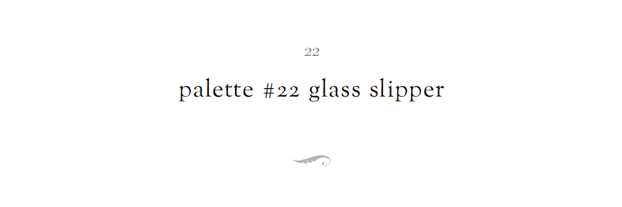
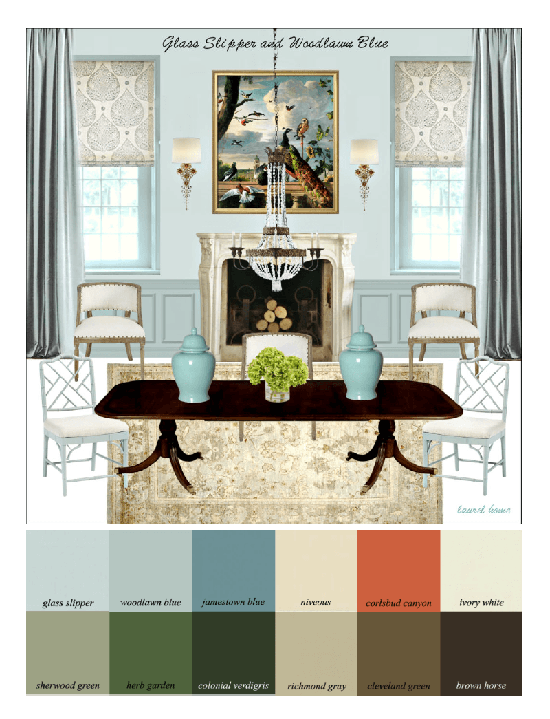
Below is Palette Family #1 – Neutral, But Never Boring.
And yes, the images in the guide are larger than this. That’s the beauty of PDF files—you can expand them! However, these are nine of the 40 palette boards.
(Please note: Some of the links still work, and some don’t. However, you still have something to work with instead of a palette with no context whatsoever.
Some pieces are vintage or one-of-a-kind.
There are several bedrooms, dining rooms, and many living rooms.
If you’d like to see some more palette boards from the collection, please click here.
As you can see, you’ll be getting a lot more than some paint colors and palettes. This is really like an intensive year-long interior design course.
Plus–
You’ll Get Instant Access—There’s no waiting, no shipping. Download your PDF guides and start planning today.
Below are a few more kind testimonials from blog readers who purchased these guides:
Julie said:
I can’t thank you enough for all of the HOURS of hard work you put into your “Laurel Home Paint Color Collection”. I bought it just as I had painters coming in to paint my living room and kitchen.
My kitchen wall runs into the back wall of my dining room and I wanted color in the kitchen so it had to work with my dining room and living room walls which run into each other.
I chose Saybrook Sage for my kitchen and back dining room wall and Niveous for the remaining D.R. and L.R. walls. They look beautiful together. The green undertone in the Niveous works beautifully with the Saybrook Sage. I chose white dove for the trim and doors. THANK YOU! I love, love your colors.
***
Karen said:
Thanks for the great offer Laurel. I love my Rolodex and paint guide. There is so much available to the public at retail that I had NO CLUE about, especially regarding furniture. I though I was forever going to be stuck in the Lamps Plus, Pottery Barn, RH rut. These tools you have worked so hard on are a super value and I think all your readers should buy them!!
***
Jane said:
I echo others who say yours is the one blog we never miss. Your Essential Paint Collection is spectacular and a wonderful investment. Thank you, thank you, Laurel.
***
Gaye said:
Dear Laurel,
Discovering “Cotton Balls” has proved a little costly because after seeing how it transformed the breakfast room, I’ve decided to repaint the back halls, which were painted fairly recently, and to use it on the woodwork in the entrance hall, which I’d not intended to paint. My painter is very good, but very expensive. Yet this paint has made as much difference as adding fine wallpaper would have made—only better difference.
Keep up the good work and thanks for teaching an old dog some new tricks.
High on Cotton Balls!
Please check out this page for dozens more messages and comments from the blog and my email.
Get the Paint & Palette Collection Both guides, bundled together with lifetime updates: $199

Frequently asked questions? (FAQs)
Do I need both guides?
Yes. They were designed to work together and sold together as a bundle. Part 1 gives you the essential colors and foundational knowledge. Part 2 shows how to apply it with real-world palettes and furniture suggestions. The furniture is a bonus to help give it a real-world application.
Is this for professionals or homeowners?
Both! It’s written in plain English, with enough clarity for DIYers and enough depth for designers. In fact, one designer wrote me a while back that she got large chips of all the Laurel Home paint colors and that is ALL she shows her clients. She said it has made her life infinitely easier. Everyone loves the paint colors!
Do you sell large samples of the paint colors?
No. However, the easiest, least messy and most accurate way to see the colors is to get samples from Samplize. (I will make a tiny commission if you use the link here.) There’s no extra charge to you, but it helps keep me and this website running!
How do I receive the guides? Instantly!
Once you purchase, you’ll get a link to download both PDFs and keep them forever. However, because there are many levels of technical knowledge and also many devices that people are using, from desktop computers to mobile devices, I wrote this short guide that explains things clearly so you understand how to download and, most importantly, where to keep your guides so you don’t lose them. (Don’t worry; I will always resend your download link. Please know that it never changes. It took me years to learn all of this.)
Are these colors and palettes still current?
Well, yes—because they’re timeless. The colors and palettes in this guide were carefully chosen to transcend trends. As I’ve often said on the blog, “trends” are marketing BS designed to increase product sales. My guides are designed to be helpful and will save you money so you don’t need to keep repainting.
Can you promise that I won’t make a mistake?
Oh gosh, I wish that were possible. I hate mistakes. However, it’s impossible to promise that nothing will go wrong because factors beyond my control can affect how the colors look in your room. That’s why I wrote this helpful blog post to share some ways to help ensure your results are the best they can be. For example, I look at two shades of blue in your cool example, but neither works.
That is the best question ever. The guides are also a terrific jumping-off point. In other words, your perfect color might be the one above or below the Laurel Home color, or it might be on the next page. For example, you like Racing Orange Red, but you might like it to be a little more orange or a darker or lighter shade. However, if you hadn’t looked at Racing Orange Red, you never would’ve come up with your perfect paint color.
What if I still need help? Can I hire you for a paint consultation?
Interior Designers/Color Consultants who do remote consultations usually have assistants who plug in colors for you. (shhhh…I don’t want someone putting arsenic in my coffee!) But you don’t need that; you have the guides. I decided a while back that taking on clients and lots of employees was more than I could handle, and blogging suited me far more. But there are dozens of blog posts on paint, and I can’t stress enough how much helpful information there is in the guides. If you missed it, the two guides together are nearly 500 pages!
Thank you so much for checking out my rockin’ Paint and Palette Collection.
It’s one of my babies (the rest are here), and I couldn’t be more proud of it. Paint should bring joy, not anxiety. With these guides, you will resolve your paint color issues and move forward with greater confidence and success.
Oh, just in case you’d like to read what more kind readers have had to say about the Paint and Palette Collection, please go to this page by clicking here.