Hi Everyone,
Whoa, Mom Nature sure let us know that summer is over this weekend. The rain was desperately needed in these parts, but the sudden blast of noticeably cooler weather came as a bit of a shock.
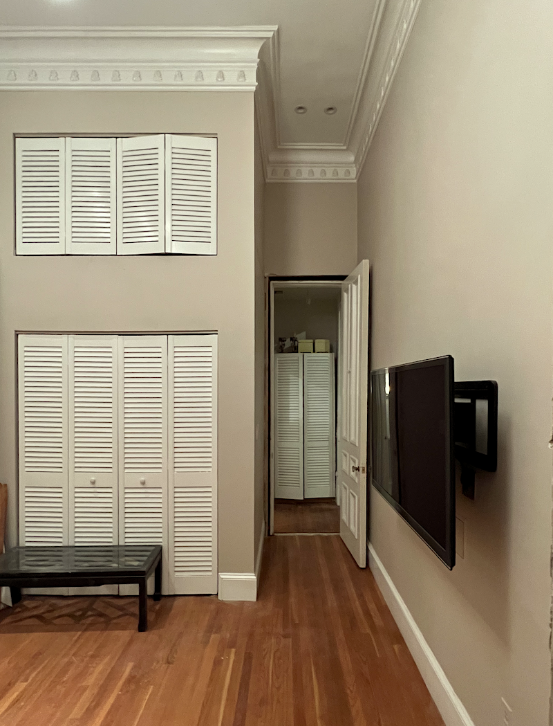
However, nothing in recent days has shocked me as much as the transformation of the den after it was painted with Benjamin Moore North Sea Green, a beautiful deep paint color.
Oh, Laurel. Are you saying you made another mistake?
No. I’m saying it’s a shock. Of course, it’s a shock.
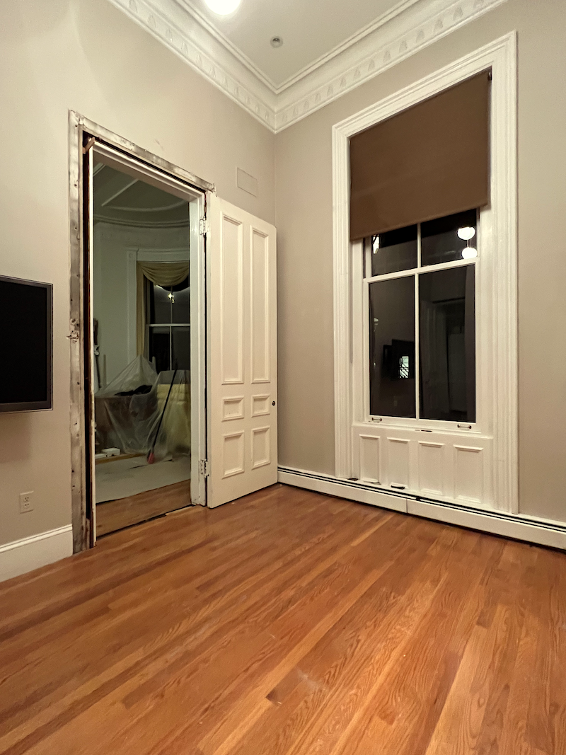
We went from pastel barf to a deep ocean blue. I’ve been dreaming about this color for years.
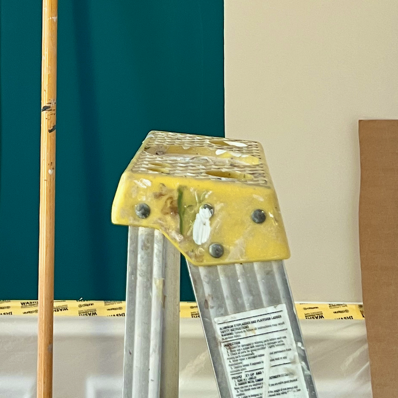
So, what color IS Benjamin Moore North Sea Green?

shifaaz-shamoon Unsplash
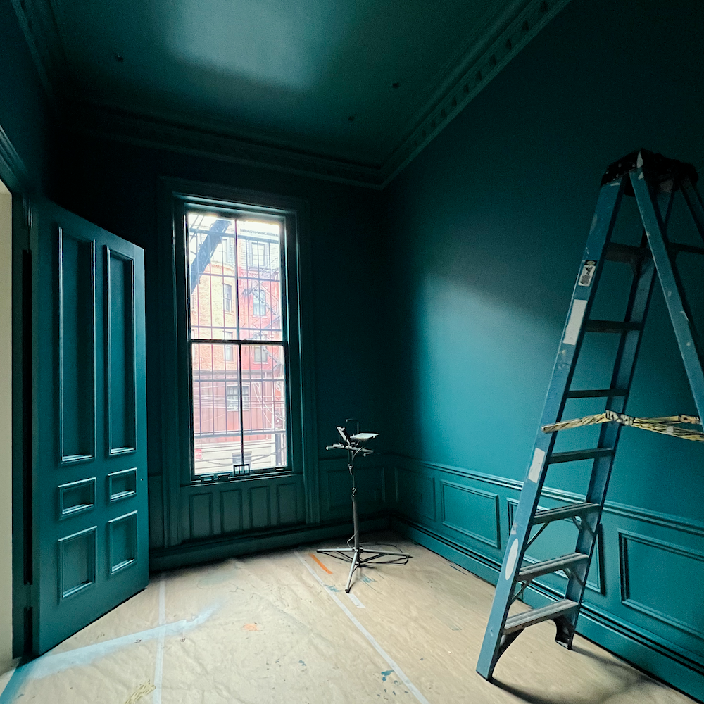
It’s teal. However, just like the ocean, this color CHANGES with the light like MAD.
When the light hits it just right, it can go nearly pastel, but sometimes it looks dark and inky.
It is mostly in between. Still, this is a testament to the need to try out colors in numerous spots.
Coincidentally, Benjamin Moore featured both North Sea Green and Mayo Teal in 2023. I only discovered this after I had selected the two colors.
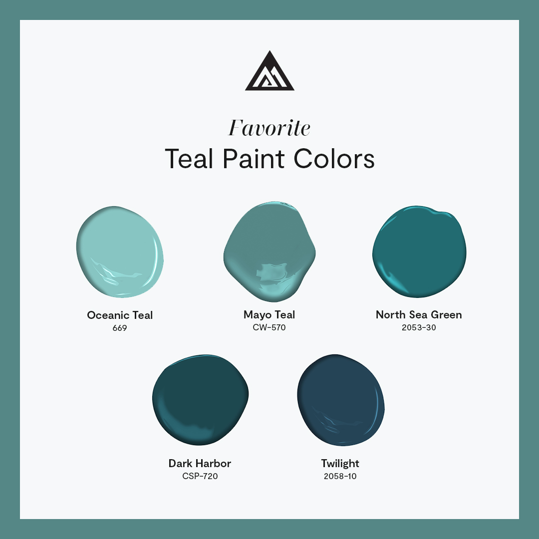
I also looked at Dark Harbor, and Twilight is a Laurel Home Paint & Palette Collection color.
Okay, I came back upstairs on Tuesday in time to see Alex and Paulo off to spray the second coat of paint on the ceiling.
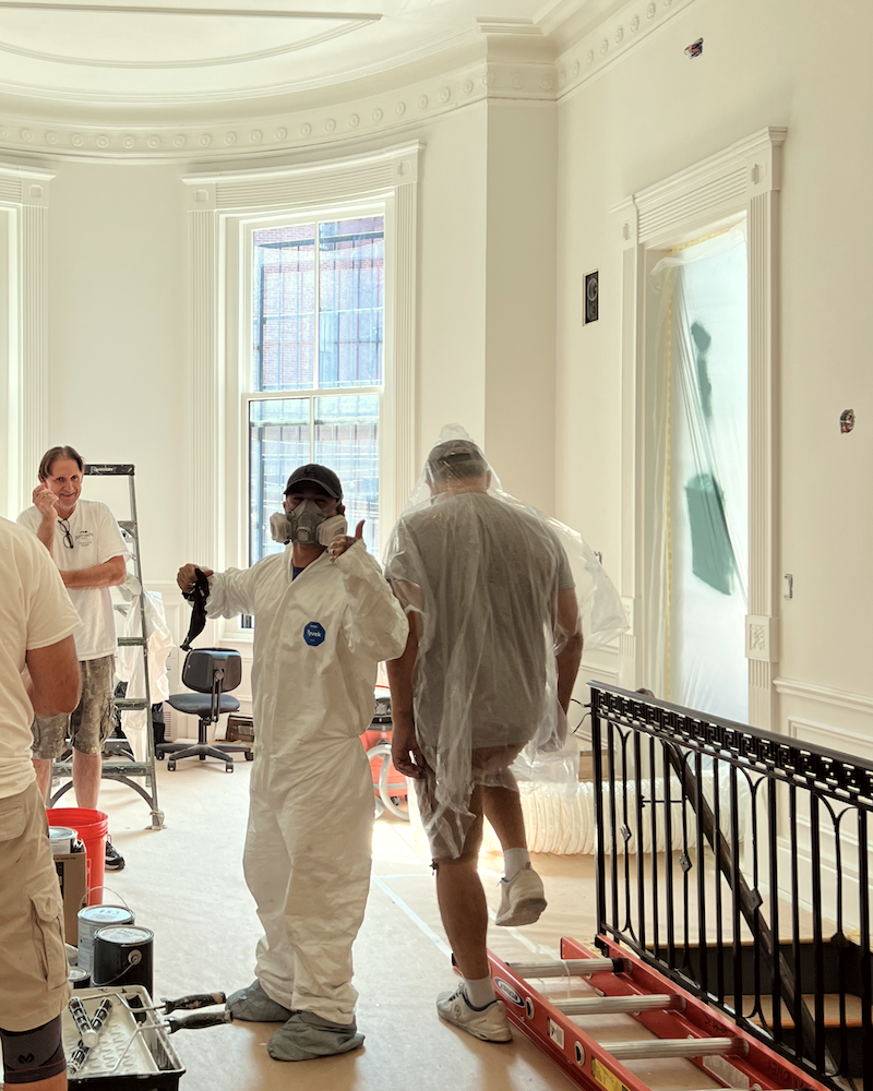
By the way, young Alex isn’t quite as young as I thought. He has a 15-year-old son!
Below is the finished Mayo Teal ceiling, coving, and frieze.
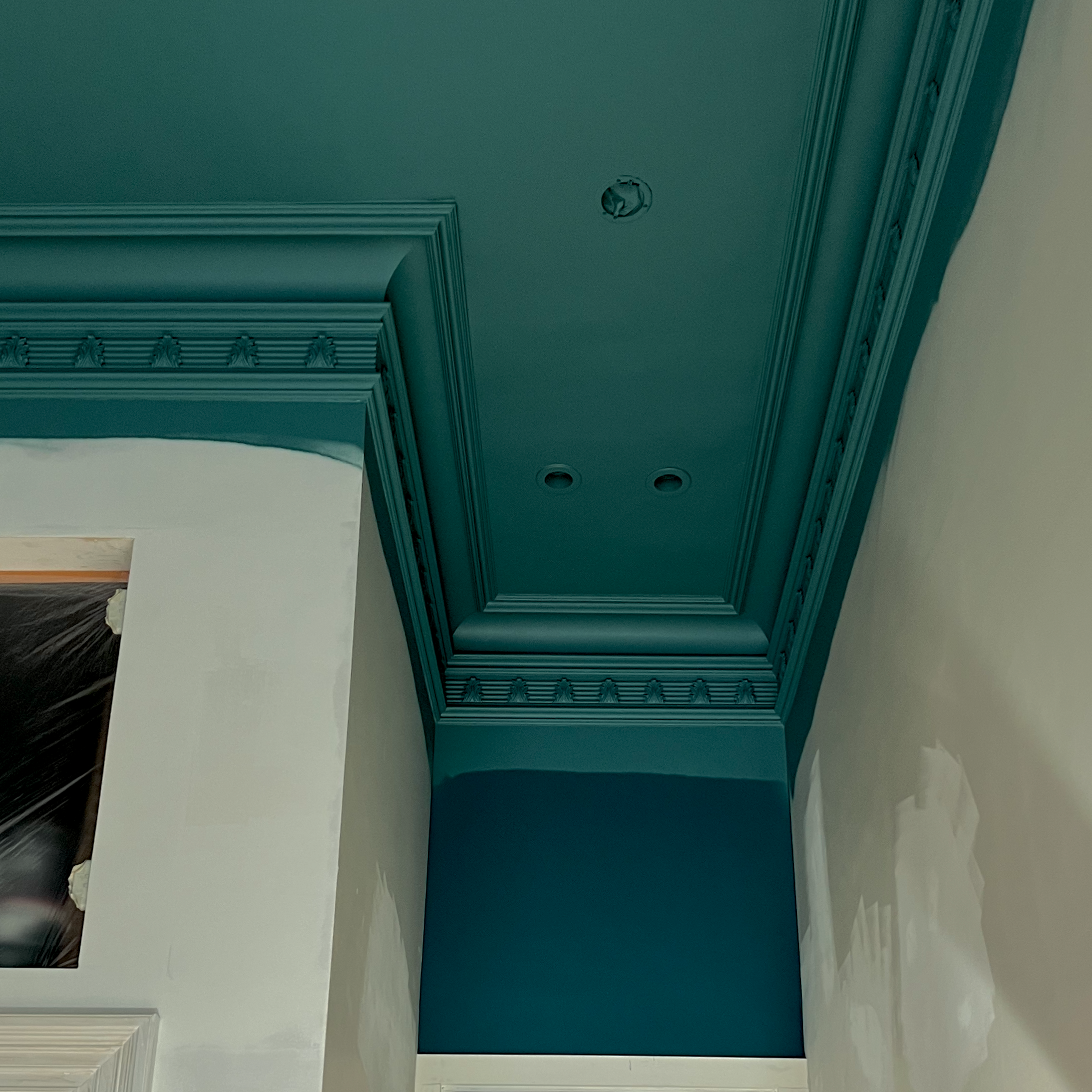
This shot was taken on Tuesday afternoon. North Sea Green is below in one of the darkest spots in the room. Even though it faces the window, it is set back, which doesn’t allow the light to escape as it does over the closet.
Not only is it darker in this area, it is a fair amount more blue.
But look at this paint job.
Unfortunately, I had to put a stop to the spraying on Wednesday morning. Despite everything all covered up, there was blue paint dust everwhere. I know. I’m not happy about that, to put it mildly, but we put on the air scrubber to clean the air.
I know that some of you are curious about the air scrubber.
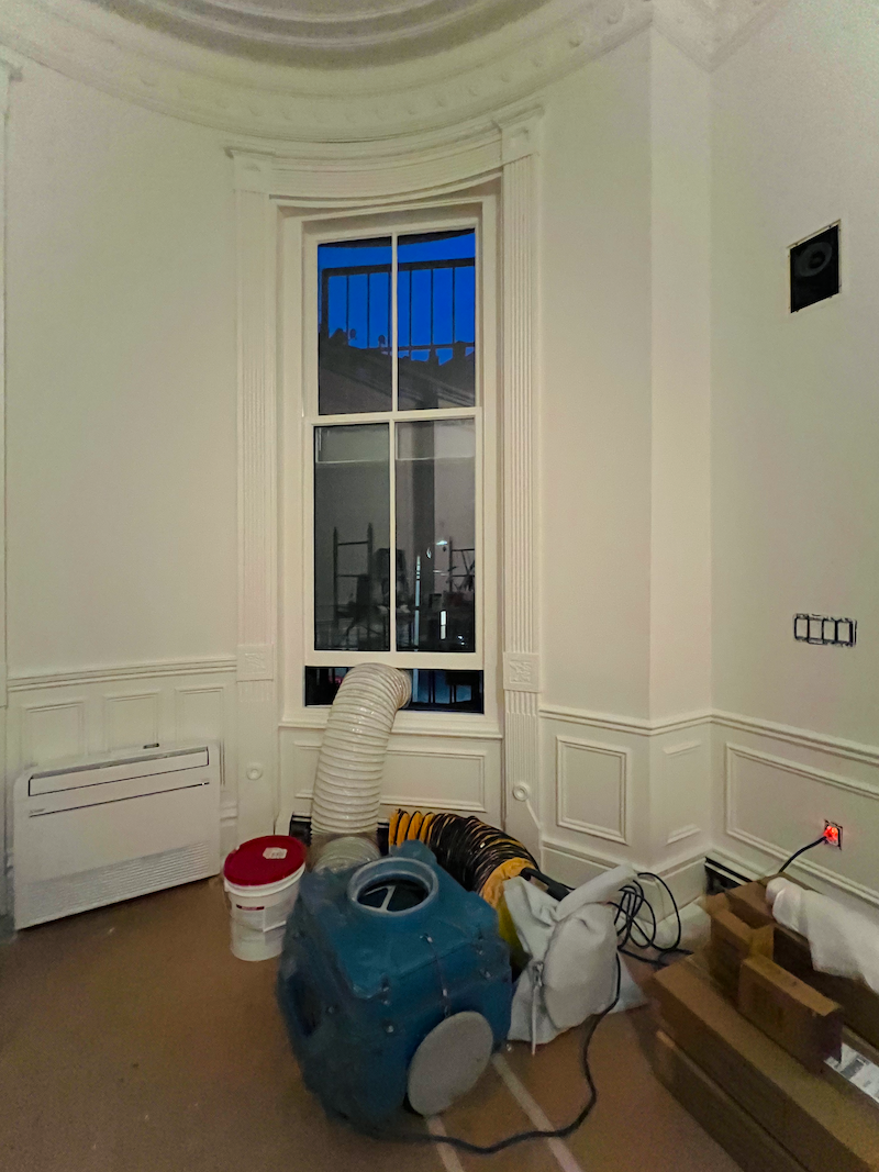
Here’s what it looks like. It soaks up fumes, dust, and VOCs and then spits out the air, passing through a hefty HEPA filter and activated charcoal. At least, that’s what I think it does.
This is an industrial-strength machine. There are some powerful air filters for residential use. If any of you know of one or have one, please feel free to share in the comments.
On Wednesday, I dragged myself upstairs around 11:30 AM, and the guys had already put the first coat of paint on everything, including the trim and walls!
Holy crap!!! See what I mean?
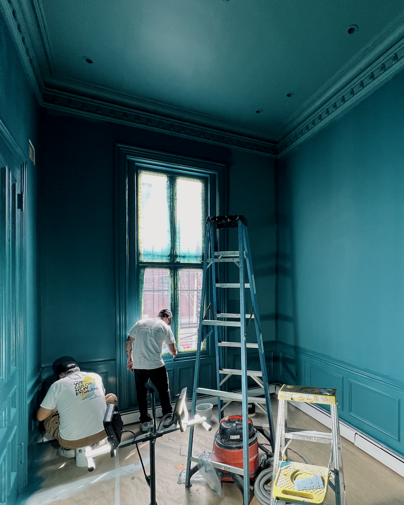
Above, Alex and Paulo are applying the second coat on Wednesday afternoon.
Except for things like the baseboard heaters on Thursday, the den was DONE.
However, I was out until 6:00 PM, so I had the briefest window to take some quick pics.
One of them I posted to Instagram.
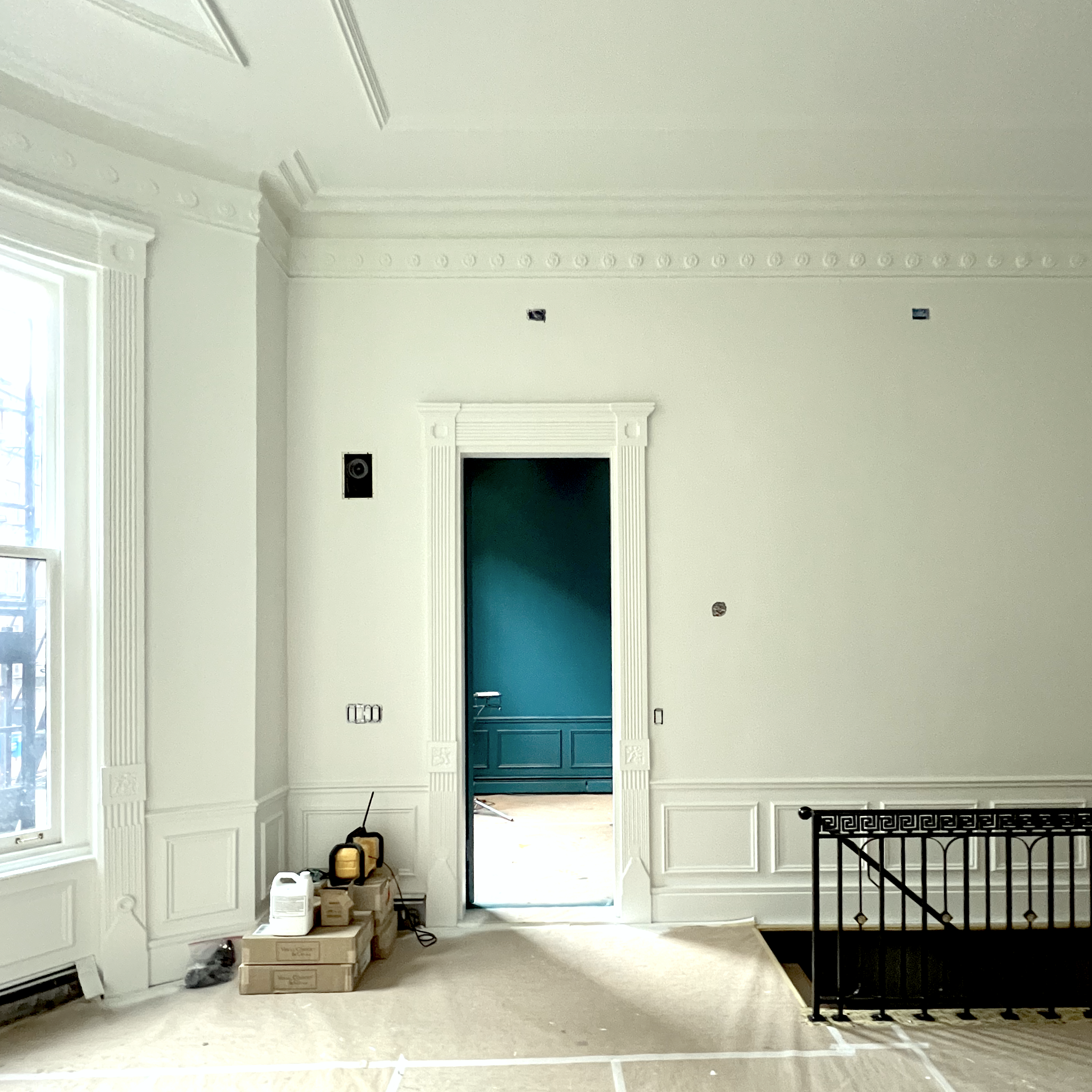
Here is the thing with saturated, deep, rich paint colors.
They need two things.
1. Great lighting
and
2. Stuff.
And by stuff, I mean furniture and beautiful art on the walls—lots of things to break up the color. So, if you go for drama, please don’t freak out—the room isn’t finished!
And like a white room loves pops of color, a deep paint color loves pops of white.
So, right now, the room suffers from bad lighting and no furnishings unless you consider a painter’s ladder to be furniture.
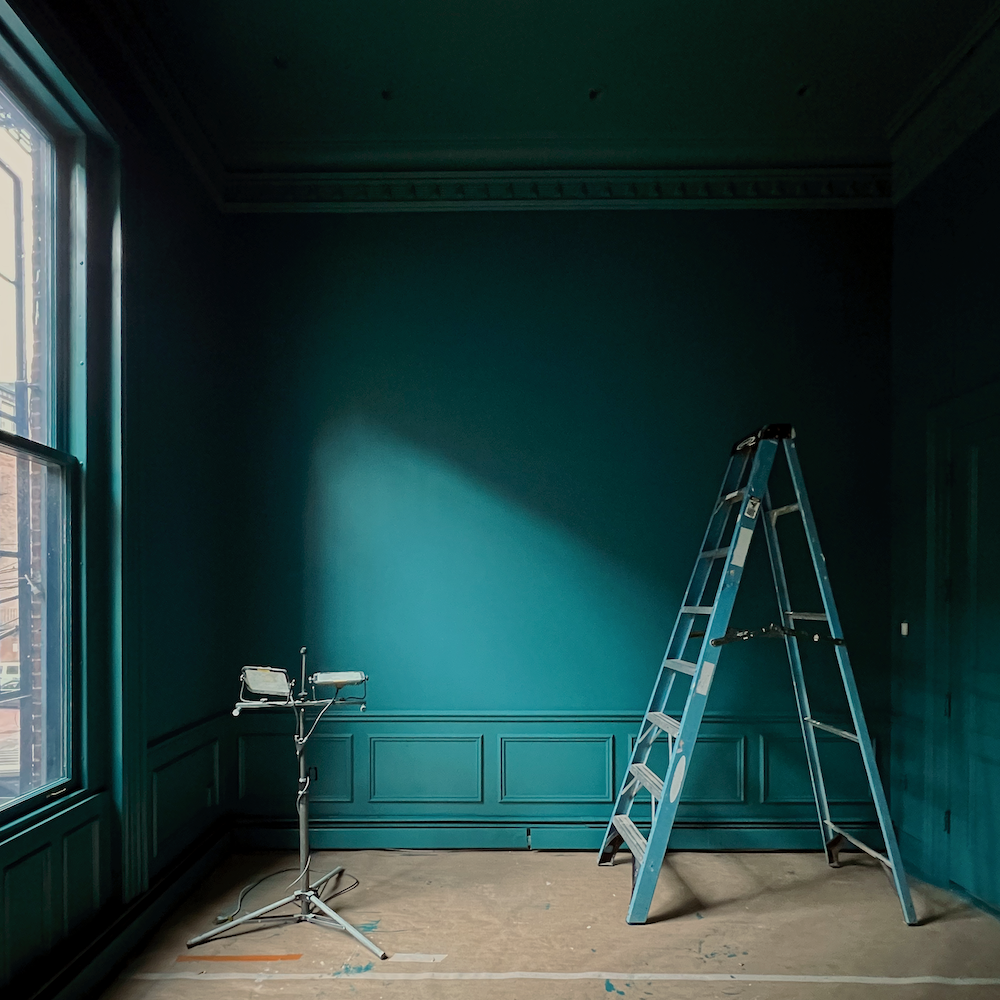
The above and below were taken about one hour before sunset on Thursday. But notice how dark the Mayo Teal looks on the ceiling, crown, and frieze!
I took some night-time shots, too.
Okay, now you’re going to see a superb example of why you should never select a color based on a photograph you saw somewhere.
When I took the shot below, my camera added a lot more light into the space, thus completely washing out the paint color.
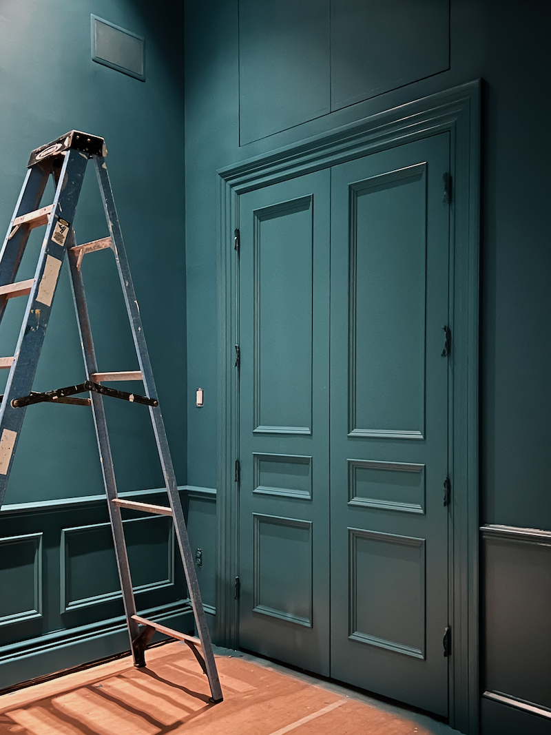
I even darkened it a bit. However, this is not what my eye saw.
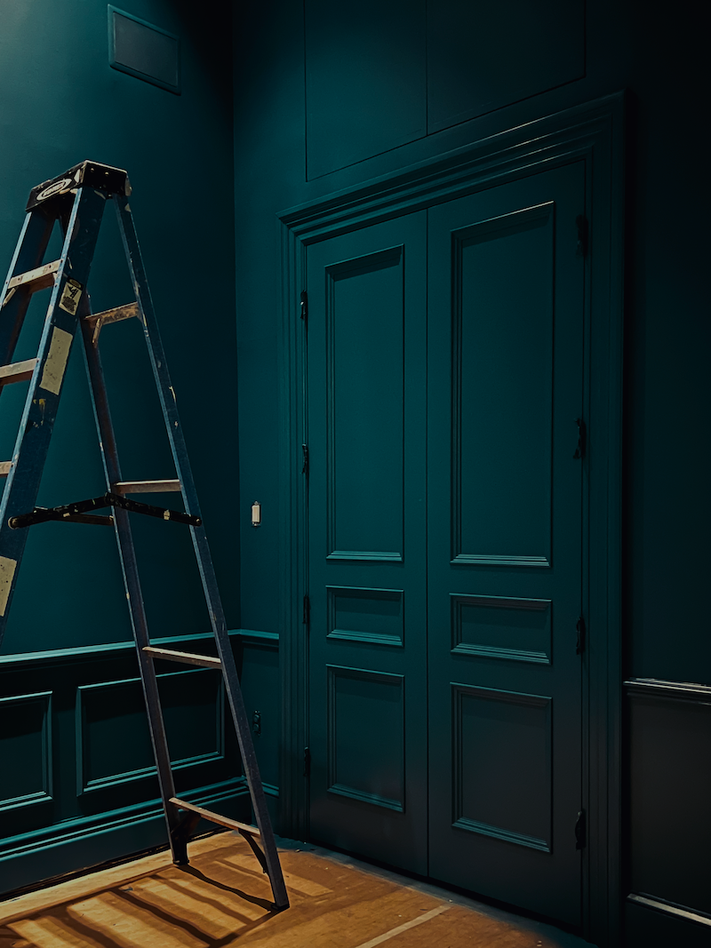
Below is how this image really looked at 8:30 at night with only the halogen downlights on dimly.
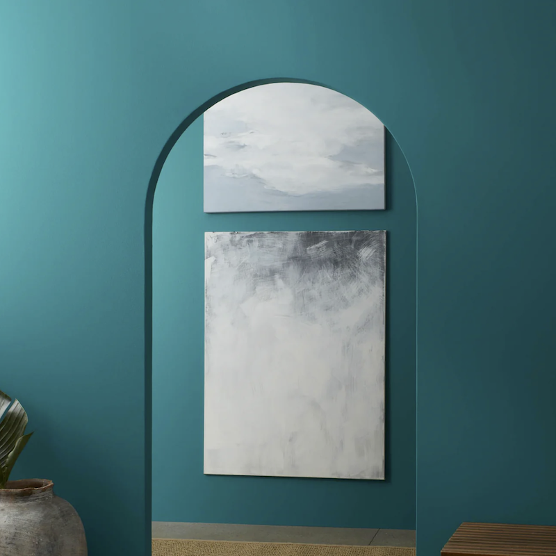
It is interesting. Below is how Benjamin Moore represents this normally enigmatic, deep paint color. The room would have to be flooded with bright light, and even then, I don’t think North Sea Green would ever be this uniformly bright.
Yesterday, Milton and his brother, Peter (both electricians), came and worked on the lighting and finished installing the living room picture lights.
I have to stop here because I can’t. I mean, I can, but I can’t.
What I’m trying to say is that after nearly ten months (!) of living in the DARK, the light in the living room with only these five picture lights is already almost other-worldly. And this is only the five picture lights. We still have the four Anglo-Indian sconces, a large alabaster chandelier, and two lamps by the windows.
Plus, there’s a big mirror coming soon that goes over the fireplace!
Below are my fabulous picture lights. I promise you’ll get to see them in situ very soon.

I got these at Visual Comfort in an open-box sale! They don’t currently have this finish on sale, but they have it. Please go here to find other finishes and dozens of other styles of picture lights on sale!
And if you would like to see more of my favorite light fixtures currently on sale at Visual Comfort, please visit the Hot Sales Lighting page.
Okay, I need to sign off now for real.
But, wait, Laurel. Don’t go yet!
Yes?
You said “picture lights,” right?
Yes.
Are you using them as picture lights or sconces? Can you use them as sconces with no pictures below?
Yes, you can definitely use the picture lights as sconces or both. No worries. We will go over all of it Monday evening, most likely.
xo,
***Please check out the recently updated HOT SALES!
There is now an Amazon link on my home page and below. Thank you for the suggestion!
Please note that I have decided not to create a membership site. However, this website is very expensive to run. To provide this content, I rely on you, the kind readers of my blog, to use my affiliate links whenever possible for items you need and want. There is no extra charge to you. The vendor you’re purchasing from pays me a small commission.
To facilitate this, some readers have asked me to put
A link to Amazon.com is on my home page.
Please click the link before items go into your shopping cart. Some people save their purchases in their “save for later folder.” Then, if you remember, please come back and click my Amazon link, and then you’re free to place your orders. While most vendor links have a cookie that lasts a while, Amazon’s cookies only last up to 24 hours.
Thank you so much!
I very much appreciate your help and support!
Related Posts
- The First Renovation Tour Of The Upstairs Living Areas! (Parts 1 & 2)
- Hardwood Floor and Primary Bathroom Update!

- Laurel’s Home Renovation 2024 – News & Deets!
- Did the Oil-Based Polyurethane Work Out? + Fume Mitigation!
- Colorful Wall Colors – This is Why You’re Afraid of Them!

- Finalizing the Paint Colors for My Newly Renovated Boston Condo!
- 14 month Renoversary! and I’m Back In My Bedroom!
47 Responses
BM’s North Sea Green and Mayo Teal are both beautiful colors. I would consider them for my next project, another bedroom or study. Several years ago I painted my bedroom BM’s Blue Echo and have been very pleased with it.
I’m in love with this room already, and you haven’t even decorated yet!
It’s stunning. Get your lights and then add one more.
I think it’s fan-tab-u-lous and that’s even without everything. Then it’s going to look out of this world. I love deep saturated colors. Your whole apartment is divine.
Gonna be gorgeous when you get your stuff in there!
Love it and I can’t wait to see it furnished and styled…
The saturated color enveloping and “hugging” you in the room is gorgeous! I’ve always loved dark colors for walls and have loved the rooms I’ve used them in but have been on the fence for redecorating our 1901 home with currently light-colored bedroom walls. You’ve given me the courage to go ahead with my dream of the jade-colored guest bedroom. Every inch of your home is stunning, with no detail overlooked! I can’t wait to see it furnished and finished!
I had my first trip to Boston last week and took a tour and now I understand why you moved there, it is a beautiful city. I hope to come back.
I love it!!
Luscious! and spectacular! love the solo ladder shot – please copywright that one…
Awaiting the lighting, framed art and seating …
What a wonderful stress reliever that space is… magnificent color – in all its permutations…
You’re the best, Laurel…
Tsippi S – there are battery operated picture lights. Don’t know how good they are but might be worth investigating.
Love, love the teal saturated den!
Do you have any advice on the appropriate length of a picture light for a 72″ painting? I used your link to look at the visual comfort open box sale lights. The McClain 42″ picture light is currently half price. Would a shorter picture light be better?
Gorgeous color and room!
Oh my gosh that color. Love it.
I love the idea that on the main floor all is white and then you have this room painted in a saturated color! Once it is furnished it will be even more beautiful!
Great choices Laurel!
I think it looks beautiful 😍
I love it ALL….. can’t wait until you have completely finished with your renovation as I hope to steal some of your paint colors, especially for my dining room and master bath. You are an inspiration to us all!
It’s more than stunning. I know how the light will play and with the addition of well curated “stuff” you will be ensconced in perfection. Enjoy
Hi Laurel, Your den paint color is just perfection and contrasted with your white living room it just draws you to want to enter the space. I can’t wait to see how you process your fabric and art choices. I’m working on selecting a new paint color to color wash our den/office. All of the other rooms are Simply White except for the wallpapered dining room and bathrooms. I was hesitant to color wash in such a bold direction. I’m going to look into those deep teals.Thank you for your inspiration! So happy for you to have this long awaited vision come together!
I absolutely love the color. Really well done. I thought about the painted door too, but as you will likely leave it open, you have no choice but to paint it or else it would be this giant white intruder into the gloriously colored room. I am inspired to repaint my den as well! And maybe in the same colors! Wonder how the hubby will take that….🤔😂.
I had Benjamin Moore’s North Sea Green on the front door of my two story red brick Georgian style home for several years, and loved it! So did everyone else. I was ready for a change, so repainted it in Magnificent Blue, also by Benjamin Moore. Also a great color, but I might go back again to North Sea Green. More depth.
The first picture of the room with the ladder and light stand, under the word “furniture” and above the paint samples, is magazine worthy! The light coming in is amazing! Really BM should buy that from you as an ad for those two paint colors!
I love the monochrome paint/trim/ceiling, but how do you transition to a different color in the next room. I am having difficulty drawing the ‘line’.
It’s a truly wonderful, magnificent color… and I’m still here wishing you had kept some blue downstairs too 😉 One interesting problem of two communicating rooms painted in such different colors is how to paint the connecting door. You painted both sides blue, which I guess means you don’t plan on ever closing the door, is that right? It’s hard to say sometimes which room a door belongs to… Would you have painted it in the living room white if you were closing the door frequently? I imagine you must have talked about this in the past, sorry!
IT COULD NOT BE MORE STUNNING!!
Just fabulous. So glad you are educating people about the joy of dark colors!!
Absolutely beautiful. I painted a dining room with grass cloth in a similar color many years ago and love the mood it set.
Laurel, a gorgeous tasteful and with the millwork, interesting room. The colour is so relaxing. A peaceful refuge. The picture lights, wall sconces, table lamps and assorted ceiling lights will provide you with many options. I expect to see several posts in the future where you show us what you have tried out.
Gasp! Your den is shockingly beautiful. So pretty and so happy how it turned out for you.
So yummy. Just like opening a Christmas present .
So happy and excited for you. It’s fantastic that you are so daring , most people as we get older like to play it safe. I have always decorated with dark colours and love the feel.
Cj
I love the shot looking into the den from the living room. Is the fabric you’ve chosen for the sofa going to complement how the NS Green actually ended up looking (fabulous) on the den walls?
The den is just beautiful! I saw the pic on Instagram and couldn’t wait to see more this morning. The photo with the ladder, the work light, and the light streaming in the window is breathtaking! Can’t wait to see the room with all your stuff in it. I’m working on plans to transform my living room into a moody library and all your advice is so helpful. I also love seeing the before and after photos—pastel barf—ha ha!
Hi Laurel,
Your den is as beautiful as I imagined. I bet you can’t wait to furnish it.
Now…I’m going to pretend it’s my den. The first thing I would do is start acquiring teal fabric samples for drapes. The room is screaming for drapes that match the walls.
I can’t wait to see what direction you go. It’s all so yummy!
Hi Laurel. Love the teal den!!! Sorry if I missed it, but have you talked about how the electricians will add all those sconces and picture lights to your plaster walls? Does Boston require solid (non-flexible) conduit for electrical wiring? I would love to add more wall fixtures to my apartment, but each one would require a four or five foot long vertical channel being knocked through the lathe, followed by a major repair. I’m doing that for where I’m placing the TV, but otherwise, it’s just too messy and expensive to contemplate right now.
I love dark moody rooms and this one delivers!!!!
I actually really liked the image with the painted ceiling and lighter wall color. The full saturation was fine too but I personally thought the dark ceiling was enough. Interested to see how it looks decorated! Happy for you.
GORGEOUS!
Stunning! Deep teal, gorgeous wood floor, brass and white! Makes me so happy. Seriously, the ladder shot could be a F&B or BM ad!
I love the color!! When painting a saturated room, What type of paint, satin or gloss? Do you paint everything..walls, ceiling, moulding the same sheen?
I see why it’s shocking, but as you say light and lighting alters it. Artwork will look gorgeous on that colour. I love it.
BTW, I painted my den Knoxville Gray two years ago. I too, love a saturated room. It looks even better with art on the walls.
Hi Laurel,
Love, love, love!💗 Especially the slightly lighter teal to top off the room, like a lid on a jar. I’m going to do this to my bedroom. What sheens did you use?
Colorfully,
Michelle Marceny
The Color Concierge
Wow! Laurel, just wow! The room is beautiful!
Laurel….I LOVE IT! What a great color! And I can’t wait to see it once you have that room furnished.
❤️ ❤️ ❤️ ❤️
yes, I was going to say will look different when your “stuff” is in there. I love blue and green, and dark moody rooms are great. Can’t wait to see finished project. (good thing I skipped the regatta in Marblehead this weekend, weather for sailing not good)
OMG Laurel
It looks absolutely gorgeous even just with the ladder in there
Delicious!
The den looks amazing
I love the colour
Very rich looking
Gorgeous! I love a saturated, “dipped” room! You’re going to love it, I do, already! The mood! The intrigue!
Another educational post! It’s really interesting to see this being done in real life. What we shall see once you’ve finished will be terrific, but this enables us to see each stage in the process. What I notice is how much the dark colour enhances the mouldings, much more than a pale colour, and how the different ceiling colour looks so close to the walls in your second evening shot of the whole room. A casual eye reads walls and ceiling as the same.
Stuff really makes a room, and the “what have I done” moment after painting is part of the process. A point made by Jocasta Innes in her book on paint finishes in 1981 (or perhaps 1987, I’ve got the revised edition) when these things were all the rage.