Dear Laurel,
My wife and I are recent transplants from New Orleans to the Pacific Northwest. We got a great deal on our new house and while the view is beyond belief, the house sucks.
I mean – IT SUCKS!!!
It was built in the 60’s and unfortunately, any ‘muckdates’ were on the cheap and tacky— including a master bath ensuite with NO separation or privacy. And believe me, when I tell you it is not in a cool way, but just plain weird.
We’re casual folks who met a little later in life and have two school-age children.
I read that you’re not doing consultations anymore, but am hoping you will somehow reconsider this one time?
My wife, J adores your work.
Thank you for your time and consideration,
J & S
*********
Hey, everyone. J & S are a real couple and this is a real home.
And it’s a big bloody mess too.
I told them that I was not doing any paid consultations, but if it was okay, would like to feature this on the blog so that others can see what’s possible and learn from it.
I am planning on doing this now and then. Please know that if you send me your situation, I may feature it. So please don’t send it to me if you’re not prepared for that. And also know that because of the number of submissions, I may not be able to post it. It’s not personal at all. I will respond if I have questions and/or it’s a good fit for the blog.
I chose to take on J & S’ home because it’s an open floor-plan which is very common these days. But it is an open floor plan that is a little too open, IMO and there is too much wasted space and other oddities.
In addition, there is as Sam said, a tremendous amount of fugly and we are going to get rid of all of it.
However, there is a lot of potential here and that is why I took on this challenge.
And then, there’s the view.
A sweeping panoramic view of the Pacific Ocean – that takes one’s breath away.
We need an interior living space that will complement that gorgeousness, not impinge on it.
First, I want to show you a few shots of the lovely home that J & S left behind in NOLA.
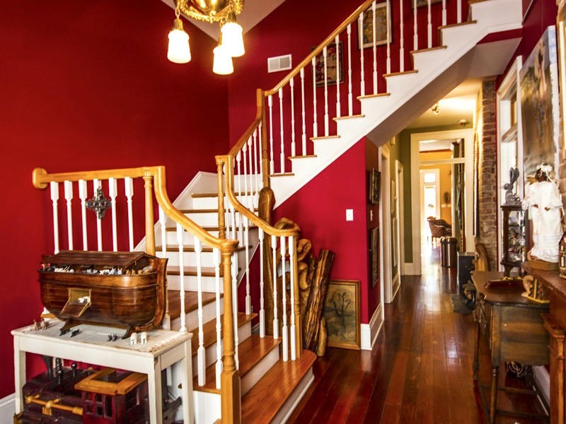
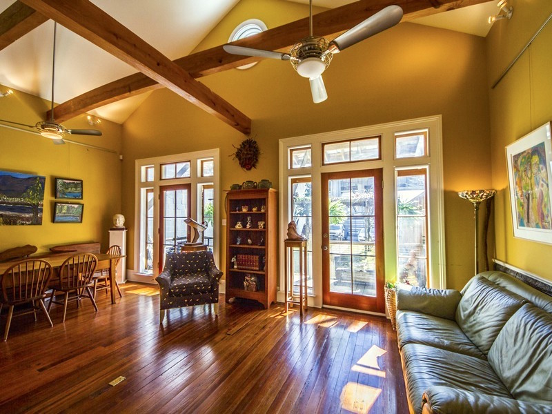
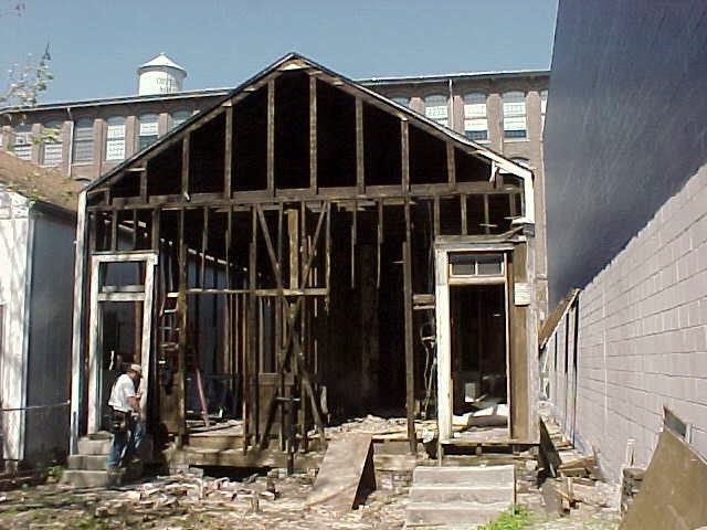
Oh, and this was the home 15 years ago when J & S took it on to renovate.
Woo Ha! Well, I can plainly see that these guys aren’t afraid to take on a project!
And by the way, J and S still own this home and have it listed for short-term rentals here if you are interested in staying in one of the best locations in NOLA!
Moving on to our ugly house (with a lot of potential) and a killer view.
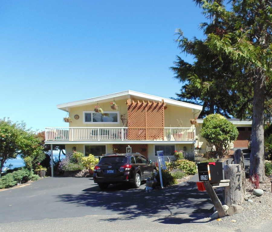
The driveway -duh and side of the house. I was hoping that J & S disdained that strange trellis pergola thing as much as I do.
They do.
Otherwise, with a few tweaks, it’s really not bad.
yet.
Frankly, I’d probably just paint out the entire thing in a very pale, soft, dove-gray.
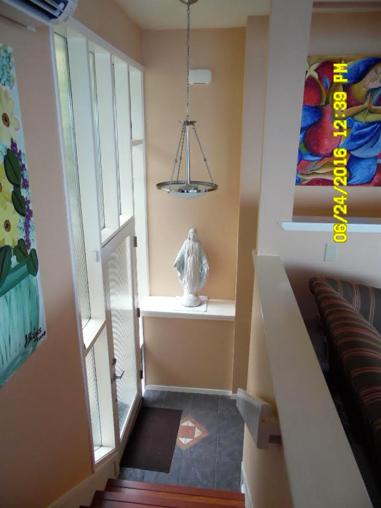
One of my favorite parts is this Mondrian-like entrance, but the wall color!
When we come through the front door, we have a choice of going to the lower level which is going to be the kid’s area. It needs a lot of help too, but we are going to focus on the main living level.
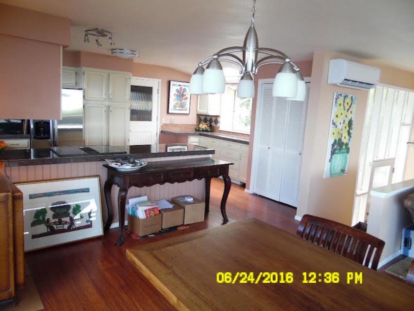
Once up the stairs, to our immediate right is the kitchen. It’s not the worst kitchen I’ve ever seen, but it’s going bye-bye, for a lot of reasons.
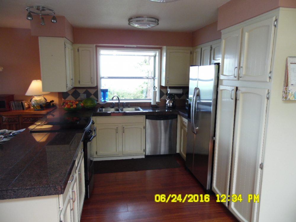
One is that on closer inspection, the cabinets are really shit. And that back splash! Oy!
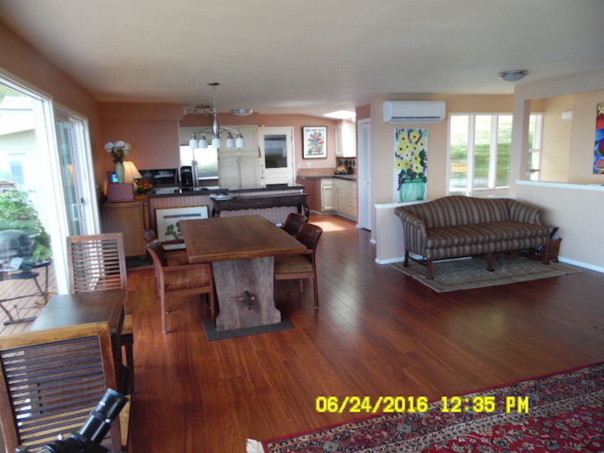
Backing up we see the dining area and to the right of that— dum, dum, dum… the vast wasteland; now occupied by an abandoned-depressed-Chippendale settee, on the verge of offing itself over the railing it is so lonely.
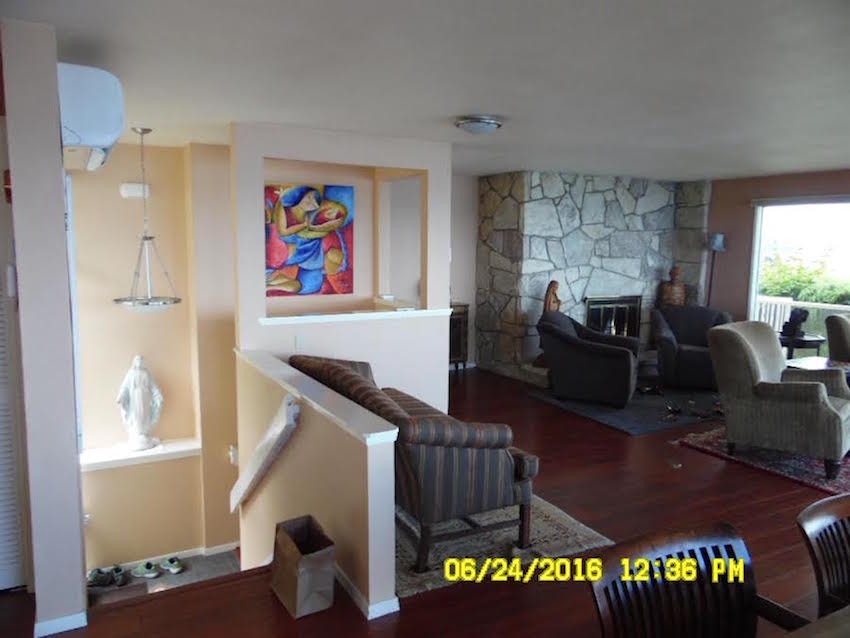
And then we come to our piece de resistance — the fireplace. Oh, if only we could just set fire to the entire thing! And no worries. S & J are on board with that one!
But then…
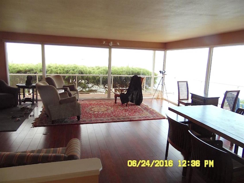
We come to why S and J bought this place. It must’ve been a little gray when this photo was taken but that is the blue ocean out yonder.
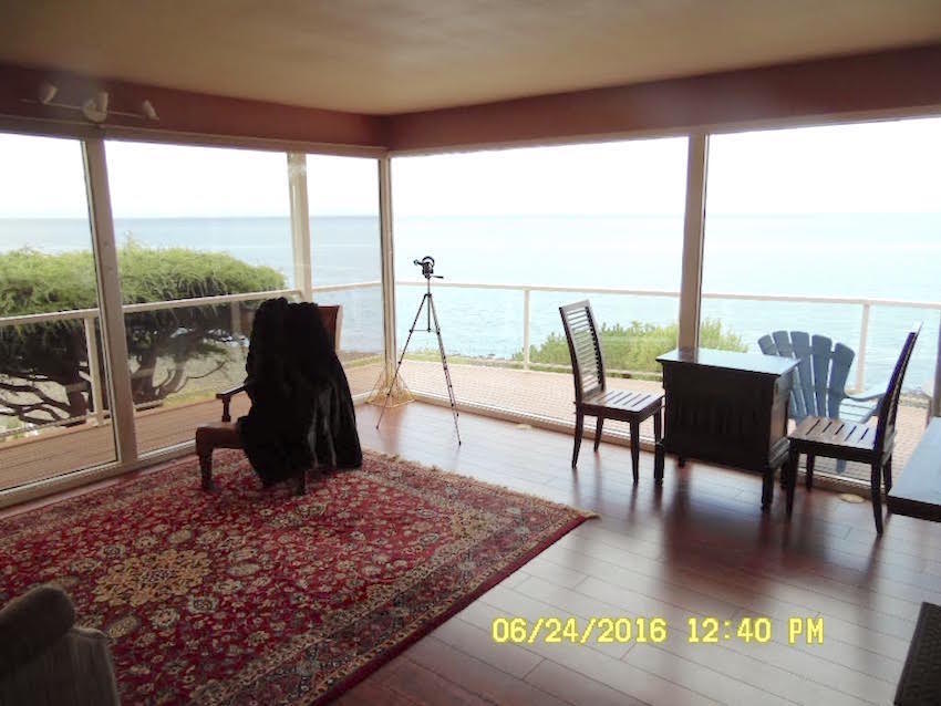
There it is!
There are two things we need to fix.
- The bones – meaning the architecture and finishes.
- The furnishings
The kitchen, I am not going to get into in a big way, except to address the dining room connection.
Let’s jump in here with the floor.
Yes, it’s a laminate. You can see that it’s a laminate even before you even step foot on it, that’s how much it is screaming CHEAP LAMINATE!
Obviously, it has to go.
The new floor
There is only one floor I am envisioning. It is a pale, matte oak or ash–something like that, in a Herringbone pattern.
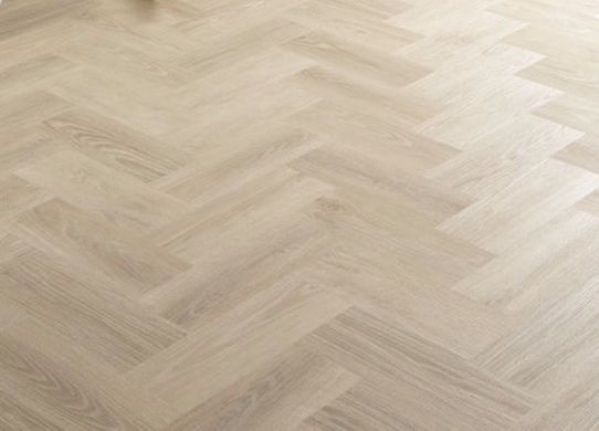
Not too pink, too gray, but pale like sand.
I don’t know about you, but I am already starting to feel better!
J & S have tons of choices and it will be up to them to decide. They could of course, do hard-wood, but there are also wonderful engineered woods like this, then there’s porcelain tile that really does look like wood. It’s verrry difficult to tell the difference. You don’t have to worry about scratches and it never needs to be refinished.
It is cool under foot unless you have radiant heating. However, radiant heating costs more than a four-year college education at an Ivy League school, so they may not want to do that.
the walls
will be white.
Which one, Laurel?
Or please purchase my paint collection to find out the only four I use 99% of the time. (there are 12 whites in the collection, but it’s only so that I don’t get panicked emails.) :]
Are all the walls white?
yes.
Isn’t that going to be boring?
no.
Please let me move on… much to cover. :]
The fireplace
Hey Joe— over here with the backhoe!
All kidding aside, (for a second) there’s the other issue besides the insanely gross stone that for some bizarre reason wraps around the wall. Maybe it’s trying to throw itself off the balcony?
This is a house that needs some architectural Prozac!
Yes, in the 4th row, you look like you’d like to say something?
Isn’t it a problem that the fireplace is off-center, Laurel?
Bingo! I knew you guys would catch that.
Now, we could leave it off-center– I guess. The furniture plan is such that it won’t matter that much.
Still. It bugs the crap outta me.
But…
Here’s the problem. We can move it. But it’ll need to go to gas, not wood. And that is because moving the wood-burning chimney is probably more expensive than the radiant heating for floor. That’s two kids who won’t go to college, so maybe not.
The trade-off is aesthetics, or wood.
If we are able to move the fireplace we could have two built-in book-cases flanking the mantel.
And conceptually, it would look something like this. (it helps to squint your eyes a little)
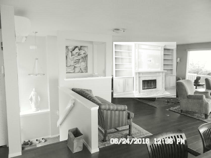
By golly. This place is already starting to look like a home!
Swinging around to the kitchen. Yes, it should be white too. And yes, it could be this open but what if we did something like this?
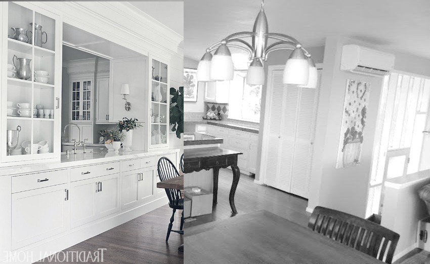
The angle is a little off of but the idea is create a little separation between kitchen and dining/living but still keep it quite open. The range would go in a different area and we don’t have to have the sink here either.
I like the sconces and I would have the cabinet light up too with rope lighting.
Also, there does not need to be a crown moulding but I don’t see any harm in adding a small crown, maybe 3 inches, even in this contemporary home. It will make the ceiling appear taller too. It’s only 8 feet. And we could also just do the crown for the cabinets and not run it around in the living room.
Now, for the vast wasteland. I won’t make you scroll up again.

Imagine. We have our beautiful pass through cabinet– and we have room to move it forward into the dining area a few inches
To the right of that beauty, is the air-conditioner?
Pffft!
We must find another far less obtrusive spot for it!
And here’s the dilemma, what to do with this area. Here are my thoughts…
The doorway-Mondrian-glass surround is just a little too mid-century specific and that’s fine, but it’s also fighting with even a transitional kitchen. AND, we have the state of Montana sitting next to the dining room table.
Soooo… here is what we’re going to do. (and this is the beauty of me having full authority.;]
 awww… miss Robin Williams so much!
We are going to get rid of the cutouts which are unnecessary, busy and yes, weird. We are going to cut the railing back at the top of the steps a bit. Or put up a proper railing with a newel post.
And, then, we’re going to create a big beautiful closet perpendicular to the fireplace wall. The opening will be parallel to the tree ocean wall.
Oh, stop it! I know what you’re thinking. You’re thinking that is crazy. NO, what is crazy is that some drunk architect thought it was a good idea to have all that SPACE and it’s not a good idea. I promise you that when it’s done, it will look like it was always that way. And besides, just think of what we could put in that big gorgeous storage area that will free up space in the kitchen!
Parallel to the dining table, we are going to put up a wall, which will allow us to put in a beautiful free-standing cabinet.
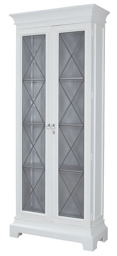
from European Classics–via Layla Grace
Or it could be a chest with a lamp and art.
One last thing– architecturally speaking.
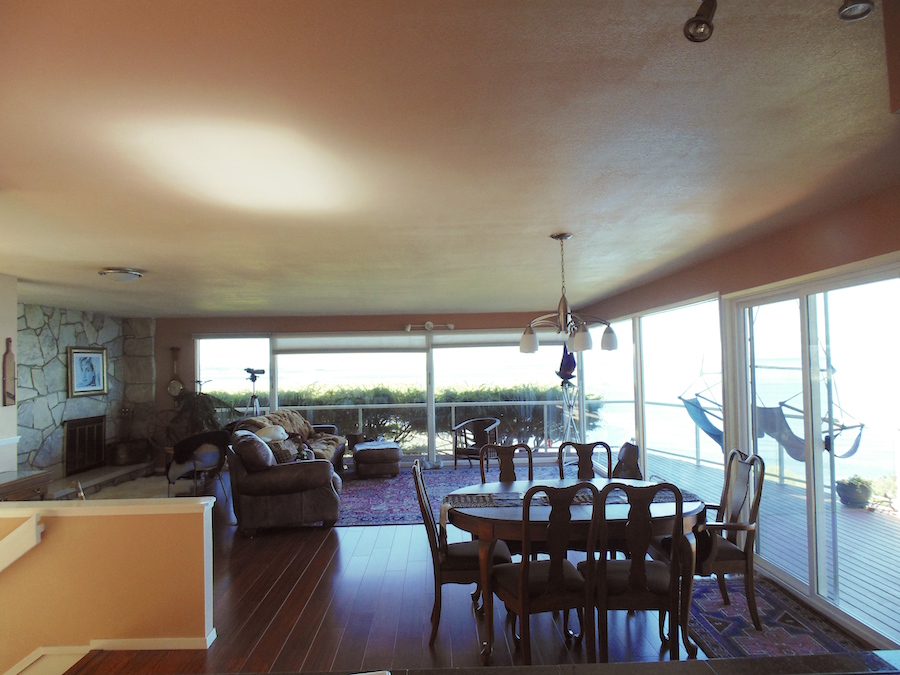
See that ceiling that looked like King Kong peed on it?
Sorry, that was disgusting, but it’s been a long day.
It’s the Sahara desert but a lot shinier. And even though we’ve gotten rid of some of it with our new closet, we need to break it up.
What I did was extend the fireplace hearth over. You can’t see it, but I had in my notes that there’s a door to the master bedroom, So I created a little hall and brought the entrance forward.
From there we can add a 4″ deep horizontal beam shown by a dotted line on the floor plan coming up.
No shiny paint please!
The ceiling is flat and the walls are matte.
And now that we have the architecture/finishes in place, we are ready to furnish.
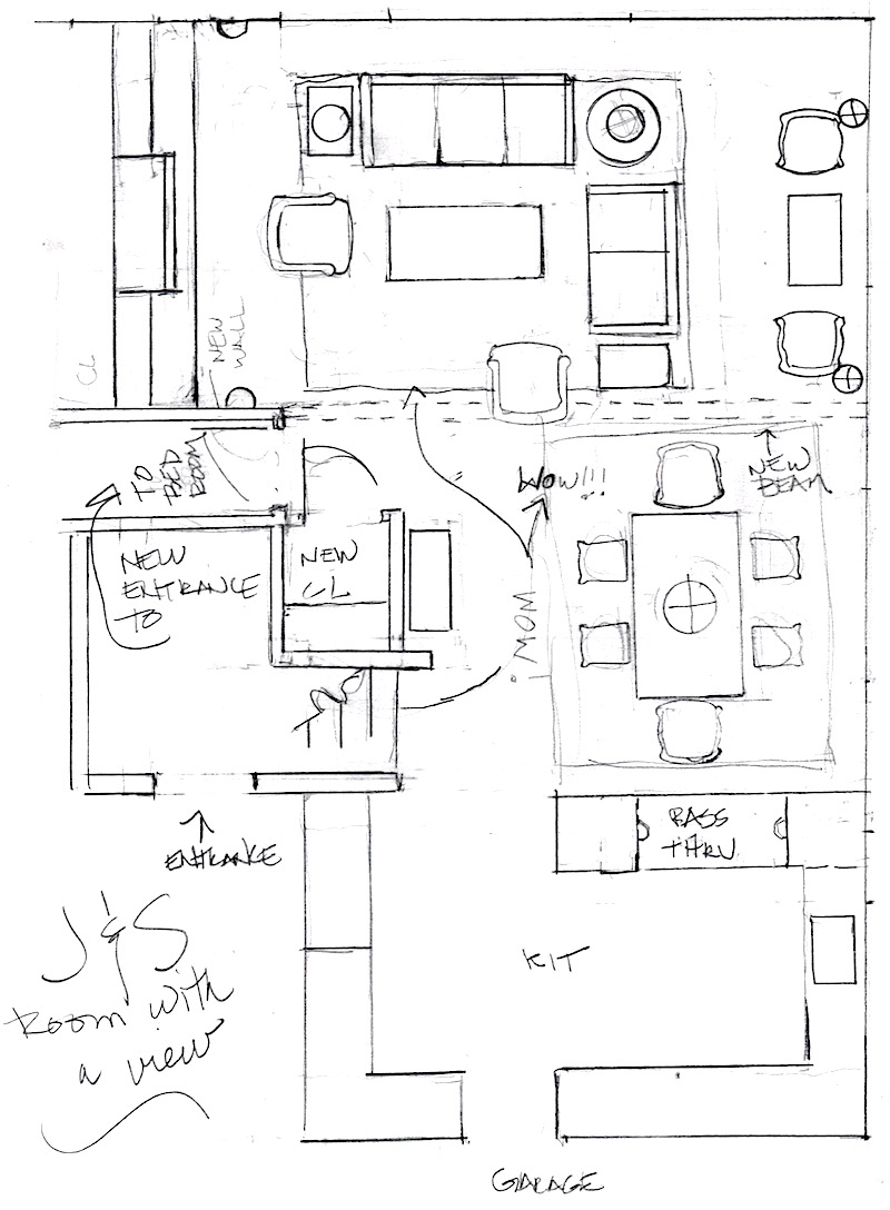
And here is the floor plan with the architectural changes and furniture layout. Sorry, it’s a little rough and the measurements might be off a bit. Again, this is all concept and not written in stone. However, the drawing is to scale.
The original idea I had, was to do some cool mid-century-esque modern interior ala Jonathan Adler.
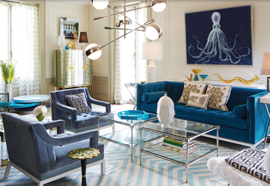
And, we could… but I’m not sure that this is really S & J. I mean, it’s quite a departure from their NOLA home – AND I think it’s just a little too bossy for the ocean view.
It didn’t take me long to realize that what I wanted to see was that carefree California-casual, neo-traditional look that is my favorite style. After-all, J & S wanted to hire me and by now, they must realize that’s pretty much what I’m doing. Yes, sometimes it’s a little more formal but most of the time, it’s not.
I started collecting pieces at my favorite boutique retail line.
I looked at other stuff too. But almost everything here is from them.
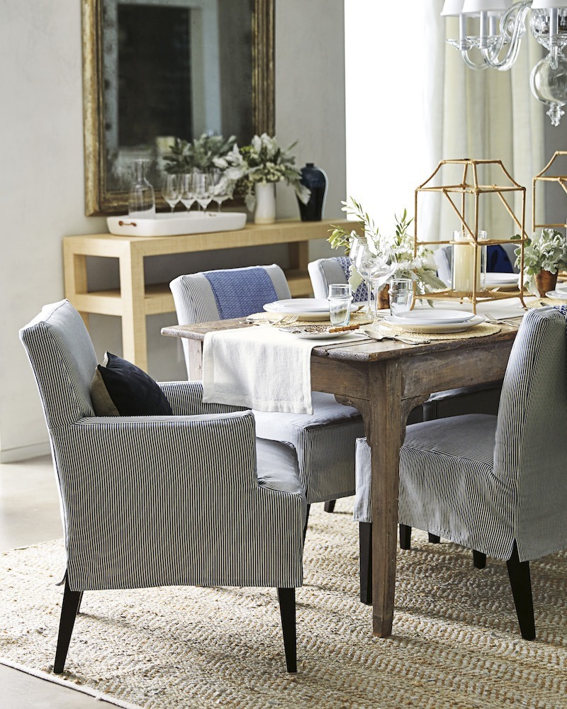
I think that J & S could keep their rustic dining table and we could add this slipcover chair in both the side and arm-chair version.
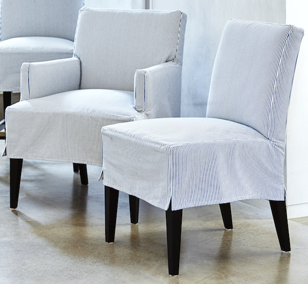
I like the accent of the dark legs
 With this Chandelier. For designers, it looks like it’s from Ro-Sham-Beaux
And the upholstered furniture in case you don’t know is manufactured by Lee Industries. So, if you are in the trade, you can most likely get the same furniture for less than your Serena and Lily discount.

And if they want a rug in the dining room.
This is a terrific rug– from Madeline Weinrib
But, they don’t have to have a rug.
Now, for the seating area.
If there was ONE THING THAT WAS DRILLED INTO ME IN INTERIOR DESIGN SCHOOL.
THERE MUST BE A SENSE OF ENTRANCE AND A CONVERSATIONAL GROUP FOR AT LEAST SIX PEOPLE.
J & S aren’t designers, but they are enthralled with the view. And absolutely, the view is very important.
But, S also said that when their friends come over he wants them to walk in and go.
Wow!
Wow!!!
But there comes a time, if you are having people over, that they stop oohhing and awing over the view and start talking to each other. No?
I tried to put a sofa facing the window with the trees.
It was awful. Horrible.
I can just hear Maggie Cohen (taught me space planning) going.
What are you doing Laurel??? Did I not teach you ANYTHING?
As soon as I cleared the sofa out, I felt like I could suddenly breathe.

I put in a sleek linen slip covered sofa and matching love seat with lots of pretty pillows in shades of blue and white mostly.
Serena and Lily have a great pillow collection, but you’re better off getting the inserts elsewhere because the inserts should be a little bigger than the cover and theirs are not. It’s alright for the smaller pillows, but not the bigger ones.
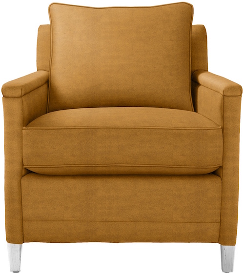
Then two of these way cool leather arm chairs in a warm curry color – just to give a little hit of zip to the other wise, cool tones. But we can cool it off with a blue and white pillow, perhaps.
I think that S & J will be pleased because they do love color. But having the room in this simple color scheme will also allow their art to shine. They have a vast collection. I hope they choose something smashing for over the fireplace.
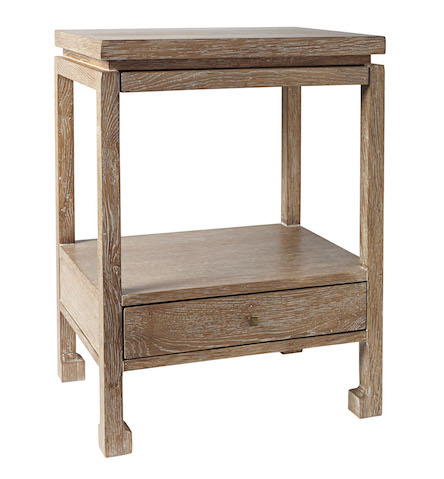
We’ll need two side tables and this little ming table is one of my faves.
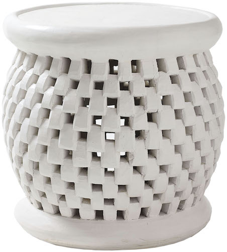
and a garden bench or two.
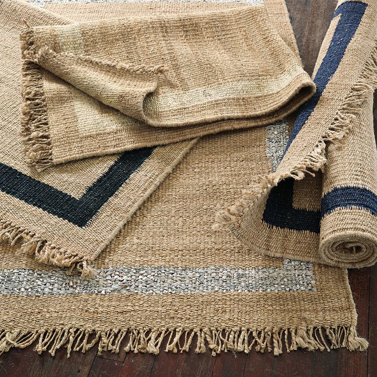
I think the area rug should be a simple jute or sea grass. Or, they could do this casual rug from Serena and Lily with the dark blue border.
By the window, we can keep the little game table or whatever that is and do two more armchairs. Or put the armchairs there and just keep the side chairs around the table. Or vice versa.
And I love this simple raffia Parson’s coffee table
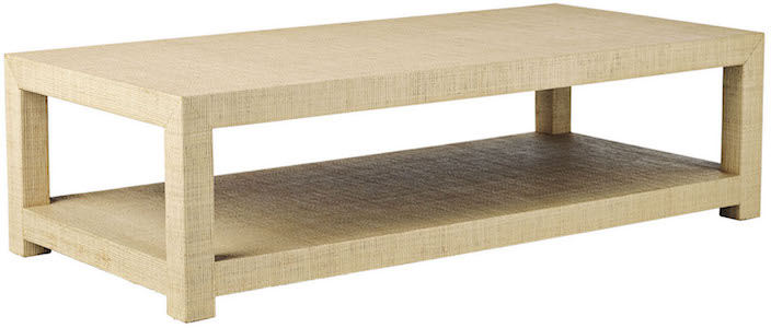
All of the above furniture is available through Serena and Lily.
Lighting
The first thing we are going to do, is get rid of the parking lot lights on the tree ocean wall.
They are gross!
And then we are going to abolish all flush mount Home Depot ceiling lights.
We can have one halogen eyeball shining on our magnificent piece of art over the fireplace and that is all! No worries, we are going to have a ton of beautiful soft, warm light.
In the entry, i think it would be fun to do something like this which has a little retro feel, but still very simple.
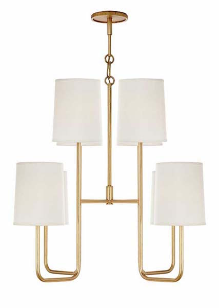

This would be a pretty ode to mid-century for two table lamps
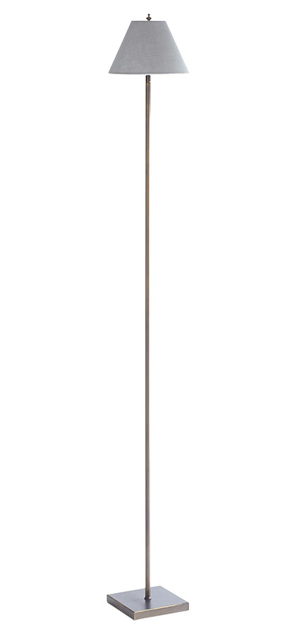 This is the world’s tiniest floor lamp that I’ve never actually used, but long admired. We could put two of these in the game table area by the window and they won’t block the view. These are available at Wisteria
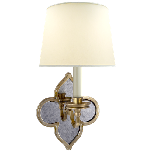
These two sconces would be cool facing each other perpendicular to the fireplace wall. They are from Circa Lighting. But Circa which is really the Visual Comfort line for you designers has a zillion wonderful sconces. This is a new one by Alexa Hampton.
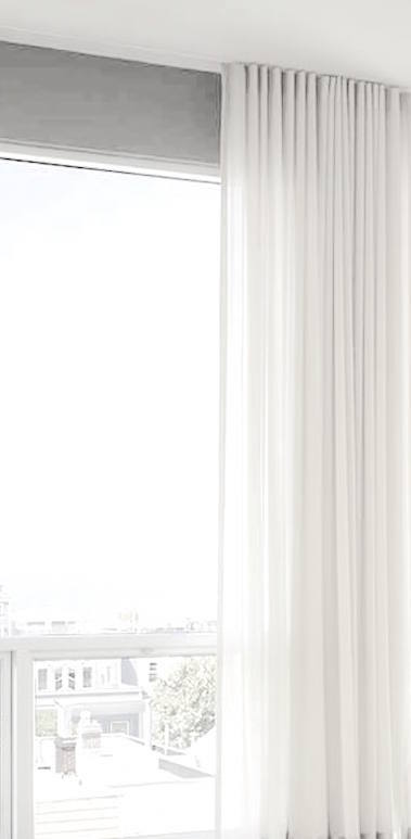
And finally, even though I believe there are window shades, I would like to see a light-weight linen (but lined) or it could be a more sheer fabric (but no, poly please!) on the two ends of the windows. They don’t need to close, but should be nice and full, so I would do a triple panel on each end. If J & S desire to have the drapes close, they will need more than 6 widths. They could also add some panels to the two corners, but that will block a little of the view.
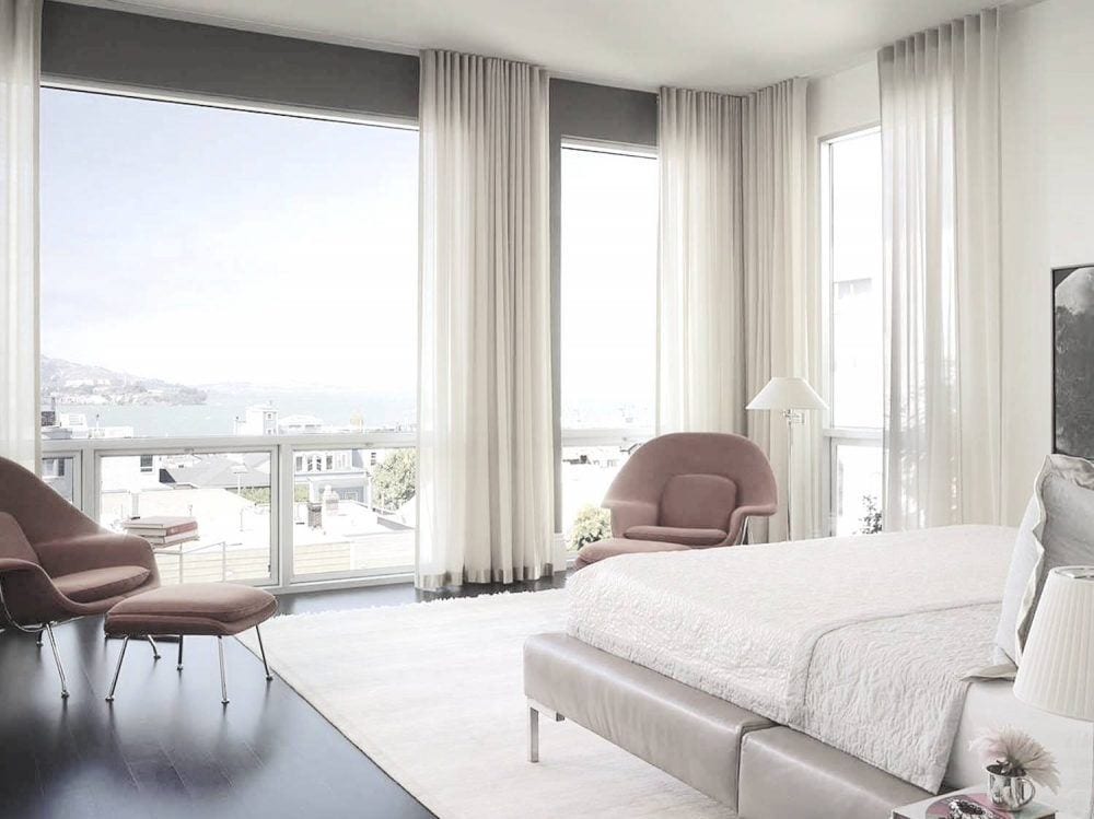
something like this.
If there’s no crown moulding, the drapes could be installed into the ceiling with a hospital track. Don’t ask me how it’s done. I’ve only seen it. But if you know more about it, please do share.
If there’s a crown, they would need to use a decorative rod, but hung right under the moulding.
And by golly, are you still with me?
Instead of doing a regular mood board, I have a little surprise for y’all.

But first, let’s look at the before image.
And are you ready?
Close your eyes now and no fair peeking!
Of course, it’s not exactly like it would be, but it’s the concept and feel of the space.
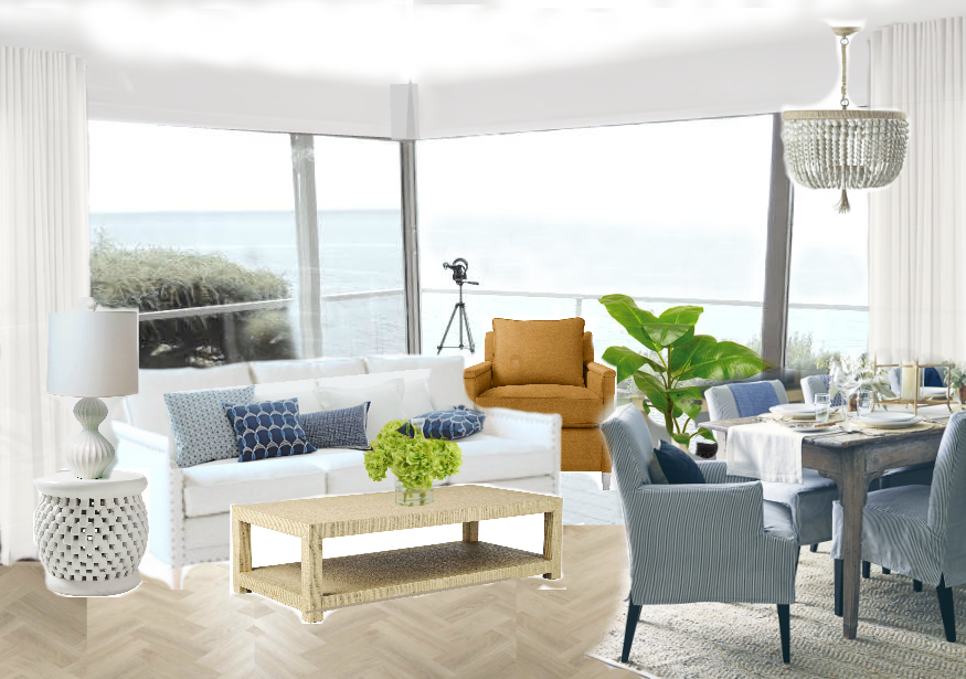
ta dahhhh!!!
This is a room that to me feels like a natural extension of the water and surrounding terrain. It’s light, bright and yet elegantly casual, just like I’m sure that J and S are.
Oh… one last thing. I would paint the outside deck. PLEASE. No pink deck! It could be the sand color or a pale gray to coordinate with the water and the room it’s connected to.
I had a lot of fun doing this. It’s everything I love about interior design without all of the accompanying difficulties inherent in this business.
For more of my favorite furnishings please visit Serena and Lily.
xo,

Save
Related Posts
 12 Of The Hottest Kitchen Trends – Awful or Wonderful?
 A Week’s Worth of Wallpaper Ideas | Chinoiserie
 Boxy, Boring, Dark Living Room. Is There Any Hope?
 All About Hardwood Flooring + The Common Cleaner That’ll Ruin Them!
 The Only Six White Paint Trim Colors You’ll Need
 9 Fabulous Shades of Green Paint and One Common Mistake
 60 Downton Abbey Colors +10 Palettes {like you’ve never seen}









67 Responses
That air conditioner is actually a house-wide system that is comprised of duct work and heats and cools, so it is actually very expensive to move it. We have this system and it runs you about $12,000 for a complete unit.
Yeah… We’ve had to replace a couple of them.
I really, really loved this post! There is so much information and a wonderful “before and after”, to boot. I am wondering why you said no polyester for the drapes. I don’t know if the question applies to just sheers or what your reasoning was. I would love to know! Thanks. CM
Hi Cathy,
Thanks so much! I said no to poly because 99% of it looks cheap to me. There might be one or two out there that do a good job of imitating cotton, but most look chintzy to me. In the past, I’ve done linen sheers which are lovely and I’ve also lined the linen sheer fabric which is really pretty too.
This post was great. My favorite was the idea that the furniture wanted to throw itself over the balcony, hah! Gosh, what a view though.
I have started a journal of all the tips you share. As I read a post I’ll jot down important tips and also vendors. I say this next bit with humor:
I found your blog because I was frustrated with my design choices (design is used very loosely here) and was looking for help. You have helped……too much:)
I’ve been breaking some serious rules Laurel, I mean!!!!
My grandmother was an interior designer but gave me none of her DNA on that score. She did leave me with a love of swivel chairs and a touch of the color red. I’ve already dipped a brush into Chili Pepper.
A little funny before I leave you alone. I went to BM to look at the colors from the color book. I must have been using Laural speak (from all my reading) because the salesman asked me if I was a designer, to which I replied, not even in my own mind
Hi Teresa,
I’ve had many a client who when we started working together knew very little, but by the time we had finished a few different jobs 5 years later, could’ve put out their own shingle.
Don’t sell yourself short. I wasn’t born with a T-Square in my mouth. I went back to college when I was 32 not knowing if I had any abilities whatsoever.
Lordy Laurel, you are talented! So fun to see your virtual transformations!
Aww… Thank you Jeanelle! It’s fun to make them!
Laurel, I loved this post, and especially fell in love with the Serena and Lily jute rug with the navy border. My living room is getting a bit busy with pattern, and I thought this was the rug that would tie the room together. Also, I need a small hearth rug to protect the bigger Persian carpet from sparks, and soot.. I rushed to the Serena and Lily website only to find they don’t ship to the UK. I was also having second thoughts about putting a jute rug on top of our vintage Persian, in case it was too rough a texture, and shed grit. So I found a wool/cotton dhurrie of the same colour as the jute, added a fabric medium to some high quality paint, and painted a very dark navy border around the dhurrie. The resulting rug looks separated at birth from the S and L one. Now the Persian will be protected and the room as a whole is more grounded. This was the first time I’ve attempted this kind of DIY job, so thanks for the inspiration!
Hi Kirsten,
I love this little story so much! Really made my day. And that is one of my goals which is to inspire folks to create their unique solutions to their decorating problems. Thanks so much for sharing that!
I found your blog because I couldn’t decide on paint colors.
The most helpful thing I read was darker colors make a room look bigger and to not use white in a room without a lot of light.
I always wanted a crisp white-walled mid-century room. I love white like you mentioned.
The whites were not working though and I couldn’t figure out why (our tow house doesn’t have windows on the sides so we don’t get a lot of natural light).
Once I chose darker colors the rooms were transformed significantly. I didn’t go that dark BM Beacon Gray and BM Serenata. Thank you for this advice. It was so helpful.
Hi George,
I’m glad the advice was helpful! Thanks so much for stopping by!
Hi Laurel, I was just bumping around on the website and came across your post from October 2015. I think the readers of this post might enjoy it. There are some pale blues, Serena and Lily, and treatments that are similar to what you have suggested in this post. Read and enjoy!
https://laurelberninteriors.com/boxy-dark-living-room-is-there-hope/
Thanks Libby. Obviously, I am attracted to those colors. I find them quite soothing and classic.
I love this type of post! Your overhaul of the walls and floor plan is wonderful and will make such a difference in the homeowner’s lives. I also thought it was great that you addressed the view vs furniture placement and the thoughts that went into your solutions. The flooring and cabinetry is especially beautiful.
Looking at the interior and exterior I think that the a/c unit is in the only place it can be. You have already addressed radiant heating, wood vs gas, moving the fireplace and I love, love that you addressed all those issues! Thank you so much.
If it’s not too much, I would be interested in a post on the front deck/pergola, privacy issue. Obviously close to the street, maybe houses across the way. The pergola gives some privacy to the bed and bath and door that is there (according to your post). I’m trying to solve the problem in my mind! Outdoor curtains might be sloppy or impractical on the coastline. Screen in the deck? I think it would make for any interesting and helpful post. And no, I don’t know S. & J, !!
Hi Libby,
Thanks for all of that! I was thinking, with the closet there, the air conditioner won’t be noticeable, so that’s solved.
You’re KILLING me with this post!
“(it helps to squint your eyes a little)” and “See that ceiling that looked like King Kong peed on it?” LMAO
I have seen similar problems in the PNW with *that paint color* … I think people go to the paint store, find a chip called “SOMETHING SAND” and use it liberally in their coastal vision when it bears NO resemblance to sand. ICK.
Hi Kathy,
I imagine so… but well… vision… yes. haha. It does prove however, that location IS everything and that if that’s there, prospective buyers will overlook a lot of bad.
You are a talented writer. I enjoy reading your posts; you have a way of making decorating less stressful and more fun, and often funny.
Thank you so much Linda!
That octopus picture is EVERYTHING AND I LOVE IT.
We have a lot of art and I don’t like matchy matchy ” hotel” art but it can be hard for it to not look discordant. I’m actually thinking of installing the biggest piece ( a huge tile mosaic ) on the floor under glass so it stops dominating the wall.
What a great post!!! There is a lot to learn from you. Tnank you Laurel!
Hi Val,
Thanks for stopping by!
I like your plan, everything seems to work. Personally (as another designer) I would probably lose the sconces as they are a bit fancy for my taste but it, as always, depends more on the clients’ tastes. I might lose the curry-coloured chair in favour of a muted blue stripe but I agree the room needs a jolt of colour.
The dining table – there are different ones in different photographs – which one would you consider ‘savable’? I like the rectangular one in preference to the oval one, and I think that is the one you like too.
I hope you aren’t offended by my comments. For me it is fun to see another designer’s work, since I can’t work any more (long story short: accident).
Sorry you got injured and can’t work. That sucks. And it’s one of the reasons why I’ve gone in a different direction.
The dining chairs are already a stripe. :] I considered dark blue leather chairs but when I put the curry chairs up, they looked better to me.
Wow! You must have had so much fun putting this space together and sharing it with J and S! Beautifully done, Laurel!
Thanks Gina, I did.
what happened is that I told them about five weeks ago that I would and that was in the middle of one website issue after another which some of you guys were probably aware of some of them. I think they are all sorted out.
But the other day, I was feeling very guilty that I had put them off after saying that I would and it was late at night when I was tired which is never a good time to make any kind of decision except should I use the Italian toothpaste or the Sensodyne tonight? lol
I knew that this was going to take me a LONG time to put together. Hell, just creating the drawing with the planning, took me several hours to figure out.
I think one of the lessons and it’s one that I’ve encountered my entire career and one that a lot of people are facing is that open concept sounds better than it is– unless, it’s open for a REASON. AND, there’s consideration given to where people are going to put stuff. Because with open concept there needs to be more storage, not less and yet with few walls, that opportunity is lost.
Therefore, what has happened many times, is that we put UP more walls. Interior designers are allowed to add, but if we take away, we really do need an architect or an engineer to get involved.
27 years ago. Gosh, can’t believe it was that long ago. But I had a summer job working for an ID in Manhattan. Very interesting. She lived in a tenement-type building on the upper east side. Her apt. was a LR, a kitchen, with a tub. And then a large closet and a WC but no bedroom that she shared with her composet-husband. Then, her office was down the hall! That was the apartment of her former partner who had passed away recently.
Earlier, he renovated his place and removed a wall, and the entire friggin’ ceiling fell down.
I don’t remember what happened next, but what I do recall is that it was very expensive to fix and I’m sure that the landlord was hopping mad!
Loved your response to someone’s comment that in part said, “a blog can’t be just about a bunch of pretty pictures.” This is one of the reasons your blog is so popular. You dig into the dirty work of demo when that is what’s required. Correcting poor or dated design is probably the hardest thing for most people to conceive or visualize. To me it is the most rewarding aspect of design. Loved this post and look forward to similar posts in the future.
Hi Tricia,
Have to say and I’m sure you can relate– it’s so much fun designing, certainly with the people in mind, but without the restraint of objections and then having to go back to the drawing board– literally! (or maybe not literally these days).
The other thing is that a lot of people have trouble seeing in their mind’s eye how it will be. I do understand that. I think it’s a gift someone is born with. But I also think like a lot of things, that it’s a “muscle” one can develop to some extent. Certainly, as designers, we flex it on a regular basis. haha.
I want to win a consultation!!!! That would be a dream come true! I am sure there is a reason you chose white rather than another pale color. Can you share why? Love your work.
Hi Meghann,
Well, white is actually my favorite COLOR! And I think for an open space like this is the perfect backdrop. I also wanted to let as much light in as possible so that it feels like one is outside.
Then, if one wants more color, they can do that in the more private rooms.
Also, there’s a whole other living space below this one. There’s a humongous gross bar sitting in the middle of it on an angle. And another horrid floor. That’s going to be more of the kid’s space. And while it needs to tie in, it’s not as tied into the water so could take more color, I think.
And good luck to you Meghann!
Hooray! New great post! Which confirmed several things I kinda knew:
-NOLA homes rule like crazy. As NOLA itself. Want to go there again
-Northwestern Pacific is gorgeous(I was, but only to Vancouver and only once; and my dream is to go all way up from here along the coast..)
-I have awful spatial thinking which surprizingy doesn’t get better with age
-it’s not that strange that I bought Ming like nightstands couple months ago, after all
-as long as you can afford not to use polyester for window treatments-please, don’t
-(almost) all the people I’d really love to meet live too damn far away.
Thank you for making Sundays sunnier, Laurel. Seriously, thank you so much.
PS Circa is Visual Comfort? How interesting.
Hi Jenny,
Yes, all true! I don’t know if Circa has other vendors as well, but their primary one is VC.
And thank you for making my Sunday sunnier too!
This is great Laurel! Love having a feature like this on your blog. Love your humor. The view makes it all worth it, so lovely.
Your changes are going to be amazing. Hope they do your floor choice and i vote for simply white. Please post an after J and S and have Laurel visit!
Hi Brooke,
Thanks so much!
I hope they do the floor too. And Simply White would be an excellent choice!
Brilliant!
BUT darn Laurel, you’re excluding all the non US residents from your free consultation contest and I would so want to win!!! I’m a huge follower, heck if I lived in New York I’d probably be a Peeping Tom as well, just to see what the next post is going to be about. I can hardly wait to get up Sunday mornings, grab my coffee and plunk myself down for a good (and hilarious) read!
Joan
(In Canada, eh!)
Hi Joan,
While it’s true that 99.9% of the vendors are in the US, you can definitely get BM paint in Canada. So if you got the paint collection, it wouldn’t be for naught.
And, even with the rolodex– a huge portion of the companies have web versions and will definitely ship to Canada.
But thank you just the same for all of your kind words!
Brilliant Laurel!! You transformed the space – the kitchen pass through and closet ideas are amazing, hope they do it. LOVE Serena and Lily, I have their Riviera chairs in dandelion in our kitchen, so fun:) Thank you for another gorgeous post on a Sunday morn!
Hi Angela,
Thank you so much! Yes, S & L is one of my favorite companies!
Laurel,
LOVE this post and the suggested changes! They are a great combination of fresh and ocean, and will truly make the view the focus. I can’t wait to see more.
Hi Jennifer,
Thank you! Me too!
“Looks like King Kong peed on it” Laurel you are hilarious. You say what everyone is thinking in such an entertaining way. Another brilliant post!
Thank you Suzanne.
This is really a case of people working very hard to make a really-not-bad home, ugly. The home isn’t really ugly. It’s just covered up with a lot of muck!
Oh wow, Laurel!! “We’re not worthy!” It’s amazing how you transformed the space. I love that you updated the interior to a classic and modern home (very you) but you didn’t feel chained to the mid-century items that were existing. The hardest part of putting our house together is looking beyond the 90s traditional stuff all around me. You’re amazing.
Hi Katie,
Of course you guys are worthy!!!
It’s a process. And when designing, I consider many options.
I had a client about 16 years ago who has a home that was built in the 70’s. Very modern. Very brown.
The woman is very traditional—but, she LOVED the neighborhood and that meant more to her than the home not meeting her aesthetic.
So, we ignored the exterior but created rooms that were filled with the type of furnishings that she loved.
And she redid the kitchen about 8 years ago and I walked in and my jaw dropped. That’s how fabulous it was! I only added some window treatments and chair seats for that project.
WOW, wow is an understatement Laurel, not to mention the view is spectacular and I would kill for the kitchen and its counter top space … . LOVE, LOVE all your recommendations and all in all IMHO your upgrades certainly knocked it out-of-the ball park with a Home Run!
-Brenda-
P.S.: Learning so much from your expertise and enjoying your sense of humour …. so thank you.
Thank you so much Mrsben!
Yea Laurel!!! Making America beautiful…one home at a time.
Thank you Nancy! One down. 200 million to go. lol!
Laurel, You are a genius…and you just made the case for hiring a good designer(if anyone was unsure of the value of using a design pro)! You took a room that looked hopeless and turned it into a place anyone would kill to live in!!
Great post!
Maggie
Hi Maggie,
Actually, Serena and Lily are geniuses. But yes, as soon as I saw this home and the water, I knew that everything in the home has to pay hommage to it. And I still needed to pay respect to the vintage of the home without making it a period piece.
It’s funny, but if you notice, Jonathan Adler usually puts his “mid-century” furnishings in very traditional homes with soaring ceilings! Of course, everything looks better when you have that!
I so enjoy your humor, honesty in costs and of course, design. My guess is that more people will talk/follow you when you blog about common design issues to most homeowners who need to renovate. Of everything you proposed,it surprised me that you enclosed the kitchen. Was there not a way to differentiate the separate rooms other than erecting a wall?
Hi Beth,
Thank you for the lovely comment. Maybe it’s not completely clear. But it’s not a wall. It’s a cabinet and there would be cabinets on the opposite side too.
So, either it should be something like this or NO upper cabinets at all. Because the one on the left looks quite awkward and like a mistake.
In the design here, it’s not completely closed off either. There’s about a 50″-60″ opening in between the two tall cabinets, so there’s still a lot of openness, but also some separation.
In addition, there’s a good sized opening of about 4 feet into the kitchen.
I find that most people, when it comes down to it, don’t want to live in ONE room.
IMO, this solution gave the best of both worlds and provided a ton of additional and very much needed storage space.
What an incredibly generous gesture on your part, Laurel!
I’m sure these lucky homeowners, as well as your subscribers, agree..:-)
Thank you so much Dolores. I figure that this is a way to help a lot of people see what’s possible. And I get to be creative.
It’s really not enough to post a bunch of pretty pictures. Folks who’ve never done this have no idea how it got that way or where to start.
And that is another thing I want to cover. How to come up with a design concept!
Laurel…This is my favorite of all your blogs I’ve received since enrolling! It sheds light into and clearly explains a professional’s visual/thought processes in conceptualizing creative (practical and adaptable)solutions for troublesome issues and helps me to confidently expand that little decor/design “idea bank” I have in my head.
I wish you could reconsider and do more such posts. But, of course, I mustn’t think only of the enjoyment I had perusing this one, I must consider what works for you and I fully understand your position.
Thanks for the fun today. Gloria
Hi Gloria,
Thank you so much! But, I think you misunderstood. I am not doing PAID consultations where I’m actually working with someone. But I do have plans to do more of these types of posts that will help a larger number of people.
Love love love your blog!!!!! So much great info that I can use! I need your help desperately for my Clearwater Fl townhouse. How do I send info for a consultation!!!???? Do you work remotely??? Please let me know!!!!
Hi Diane,
Thank you so much! I am not doing paid consults at this time. But once or twice a month am planning on doing a post along these lines.
You may send me a few photos and maybe you’ll be selected. However, I am getting a lot of these, so please don’t feel badly if you’re not selected.
I need to choose places that I feel I can help and that will also be helpful to a large number of readers.
You may send a submission to laurel (at) laurel bern interiors (dot) com (no spaces, of course and the appropriate symbols)
Maybe you can talk Wisteria into bringing back that tiny but tall floor lamp. I bought one and LOVE it, it’s so cool & the shade is a perfect soft blue-gray. Last time I looked, however, it was no longer available. : (
Hi Lana,
It IS back! I didn’t realize it had left. Maybe they have a new vendor making it. But here’s the link.
http://www.wisteria.com/The-Very-Skinny-Floor-Lamp_2/productinfo/W4714
Beautiful, it makes me want to just take a deep breath and say ahhh or do a yoga stretch. This is so very calming and the view … a person could sell tickets for that view. I can just imagine what that is like in the evening. It never ceases to amaze me the talent and vision you have. We common folk need people like you to point us in the direction we want to go, but don’t have a clue.
I do love the New Orleans home … love it to death! (I’ve Pinned it) The wood, the vibrant wall color and that adorable Noah’s Ark – I want that. I can envision myself in that house, curled up in a big comfy chair reading with a wolf hound at my feet LOL Yes I’ve seen Mr. Blandings Builds His Dream House many, many times.
Have a lovely day
Hi Betty,
S and J said the photos don’t come anywhere near close to sharing how unbelievable that view is! And yes, their NOLA home is fabulous! That is one reason why I selected their project. I can see that they have the taste level to understand what I’m talking about.
Ya know… I’ve seen the scene with the painter about a dozen times, but don’t know that I’ve seen the entire film. (and I was quite the old movie buff in my youth). I must get it!
I love this post. What a tranformation. Thank you for the visuals, i need to see it to understand. You are the best.
Hi Eileen,
Thank you so much!
I know there are computer programs that would’ve done a better job than my rough mock ups, but the last one came out pretty well. I’m getting better at PicMonkey
Ta Dah is right! Laurel, we love you!!! When I first stepped into the living area and saw the view, I was brought to tears… You have me crying again…thank you for such an elegant design. Are you sure the pergola needs to go? Just kidding! Just like our New Orleans home, in Robin William’s words, “You’re only given a little spark of madness. You mustn’t lose it.” We are used to madness and look forward to sharing the spark with you soon! Love, S and J
S & J,
Thank you so much. Madness is a good word. And I’m happy if my vision has given you a solid jumping off point. I will look forward to seeing the real after!