As promised, the second installment from my recent trip to the High Point Furniture Market. If you missed the first post, it featured many vignettes filled with rich saturated color.
This post is largely a 180 from the first High Point Post. Whites, creams, blacks, browns, plums and gray dominate these images. It’s the masculine yang to the feminine yin.
Alright not here, but very soft and pale. Gorgeous wallpaper, below from Thibaut.
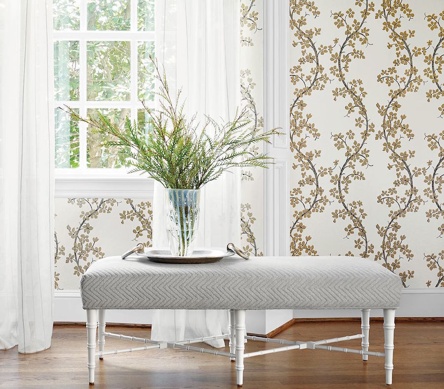
Back to the market photos.
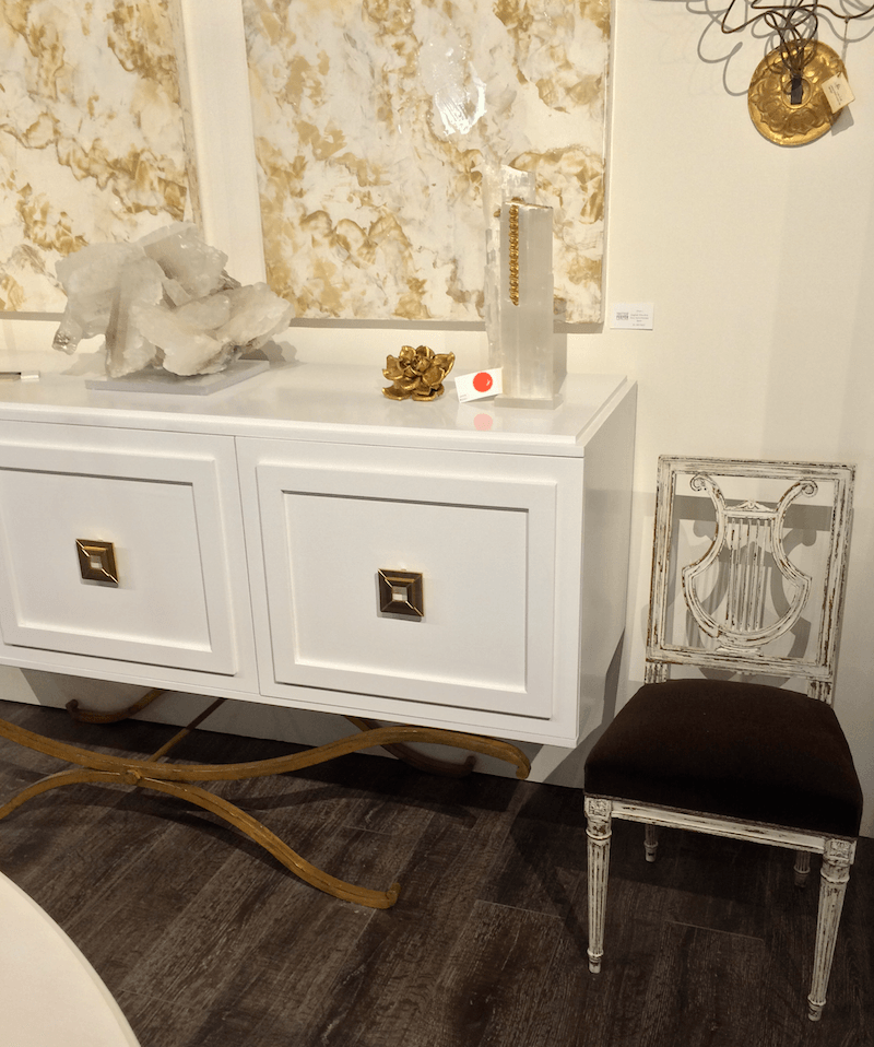
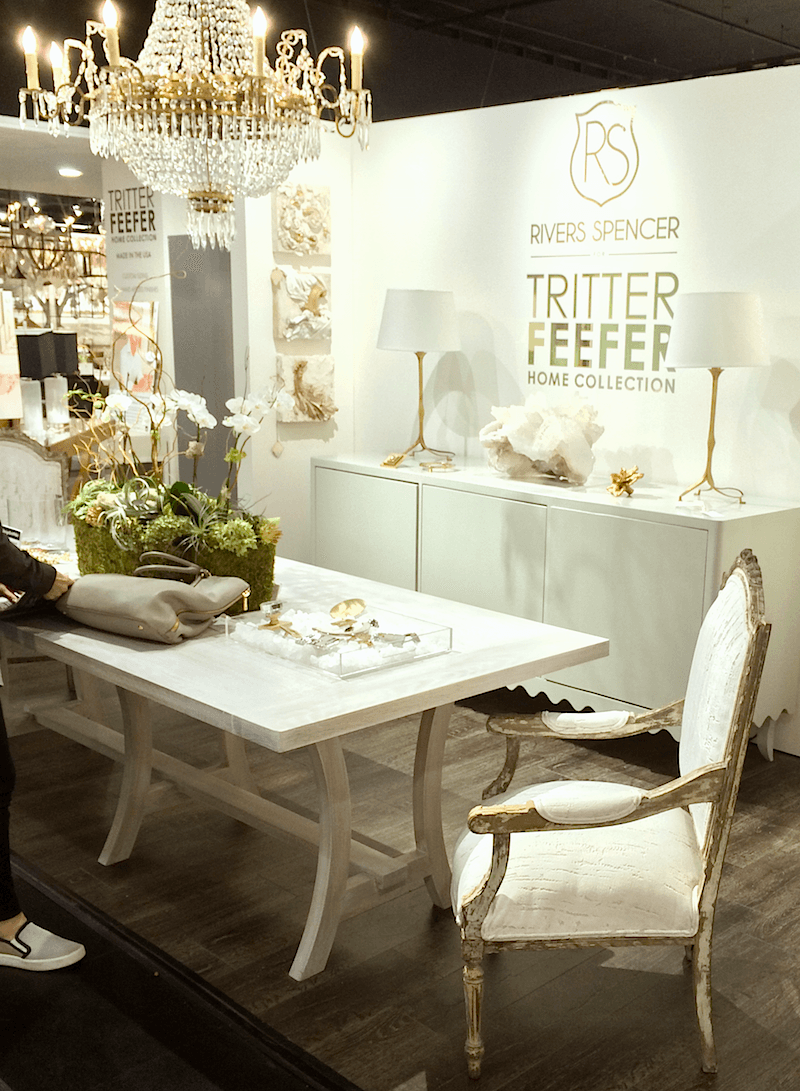
Above and below from Tritter Feefer’s new collection by the very talented designer, Rivers Spencer.
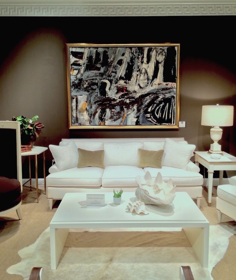
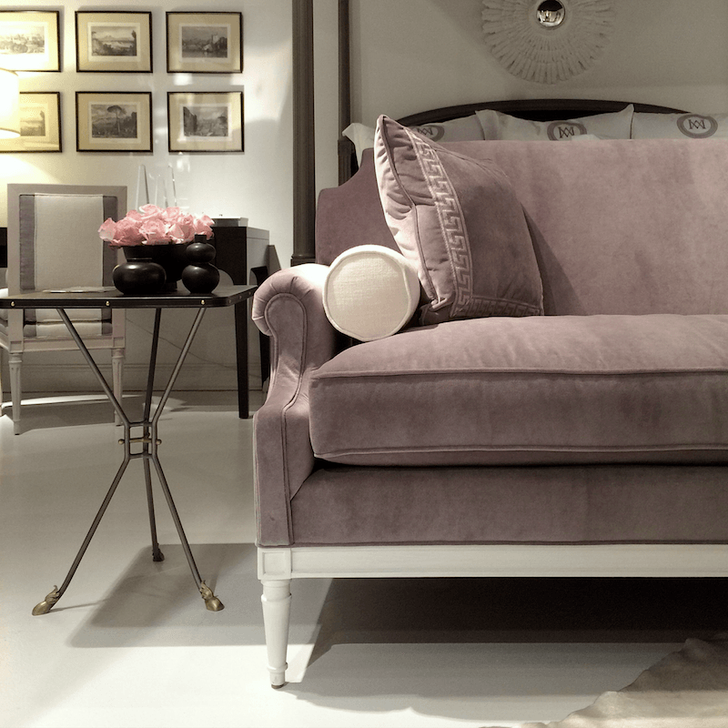
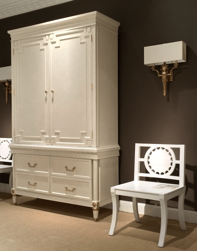
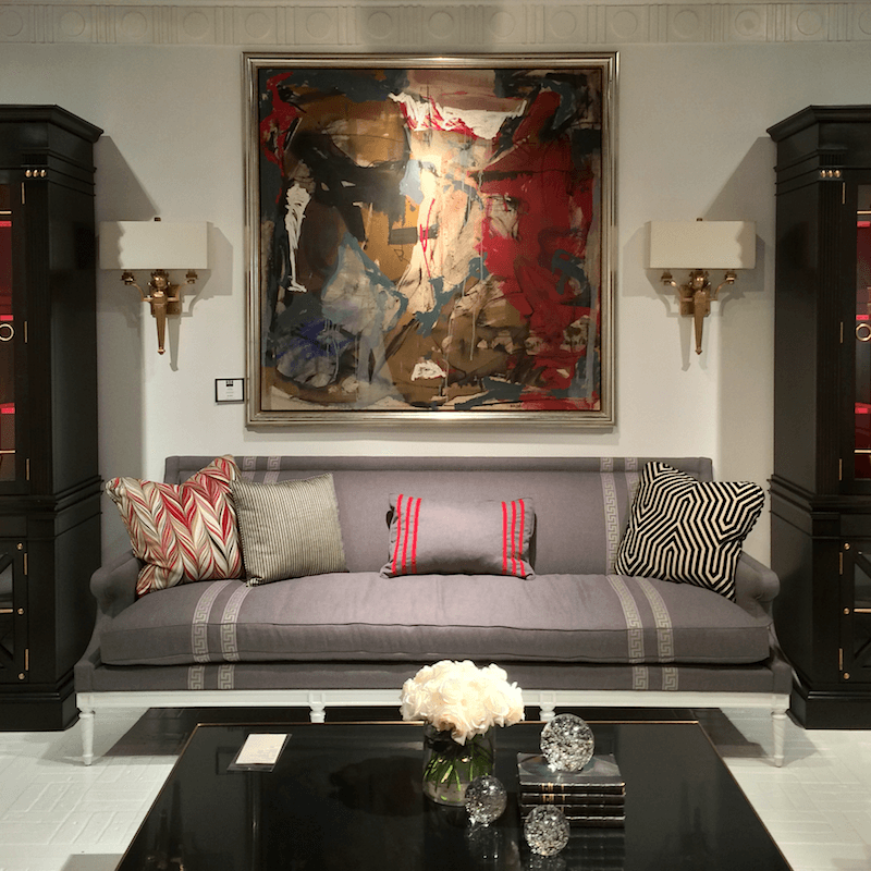
The next four images are from the Mary McDonald Collection for Chaddock Home. I don’t believe that any of this is new this season, but it was wonderful to see it in person!
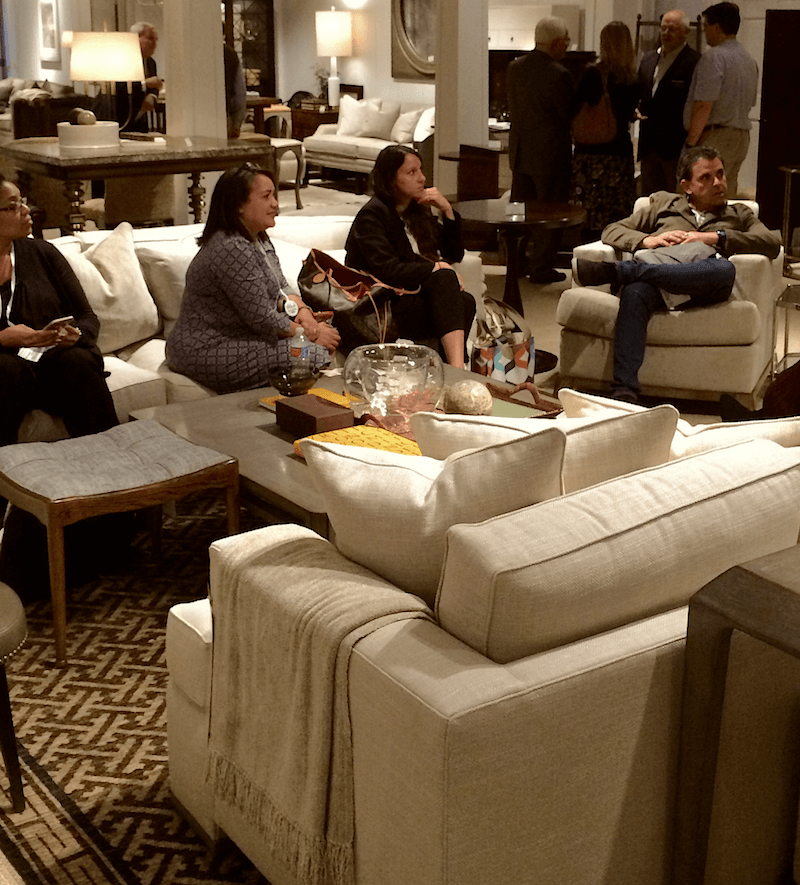
Here’s part of the gang relaxing for exactly 90 seconds. This is the showroom of one of our sponsors, Century Furniture and the oh-so-stunning collection by Thomas O’Brien. I did get to meet him briefly!
From left to right. Ronique Jones Gibson, Ivy Deleon, Courtney Allison, and Adam Japko of Esteem Media who put this thing all together!
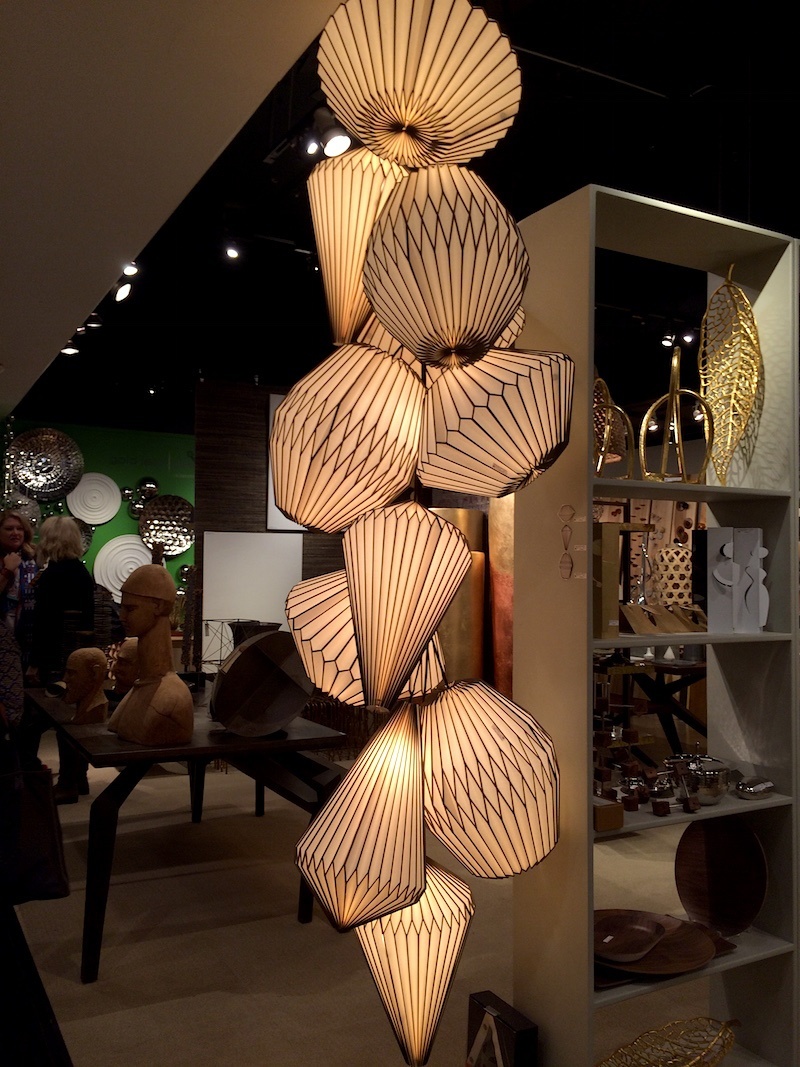
Another sponsor with some very unusual and beautiful accents was Gold Leaf Design Group. While they did have some pieces in gold, they had many more in other materials, especially paper. Everyone adored these interesting paper lanterns which are not at all chintzy and fold up flat for shipping.
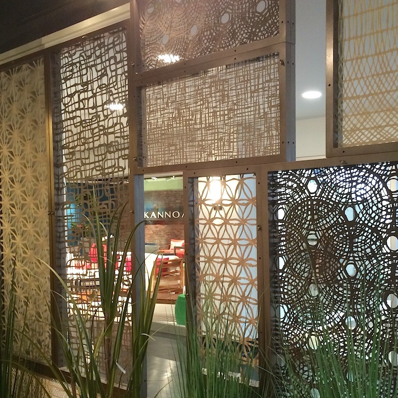
Below are screens made from– paper. They are surprisingly strong. The material could be used decoratively or as is shown here would make a wonderful room divider. These are all of the different patterns.
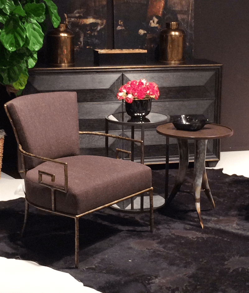
A most handsome vignette from Bernhardt Furniture, another of the design blogger tour sponsors. We were ushered around by the most delightful Heather who was an outstanding guide. Bernhardt, a totally family owned business has been around for 126 years. Whoa!
The line has some very interesting pieces and at a moderate price point. OH, for you designers out there. Bernhardt IS Designer Friendly! That will be updated in Laurels Rolodex. You can look for that update late in November if you already own the rolodex.
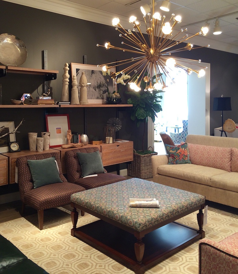
Wesley Hall, a company known for it’s neo-traditional and colorful furnishings has also jumped on the muted bandwagon. Have to say that I don’t hate this vignette, but don’t think it’s 100% successful either. Most troubling is the ottoman. It’s dated and I’m not very not fond of the solid base. The slipper chairs seem too traditional for the rest of the furnishings. Otherwise, it has a cool young-family family room look. Love the Sputnik chandelier.
The showroom was busy and it was difficult to hear and we were rushed for time due to our tight schedule, but Julianne Taylor of Taylor Burke Home was showing a line here. We’ll get to that in the next post. She has some gorgeous furnishings!
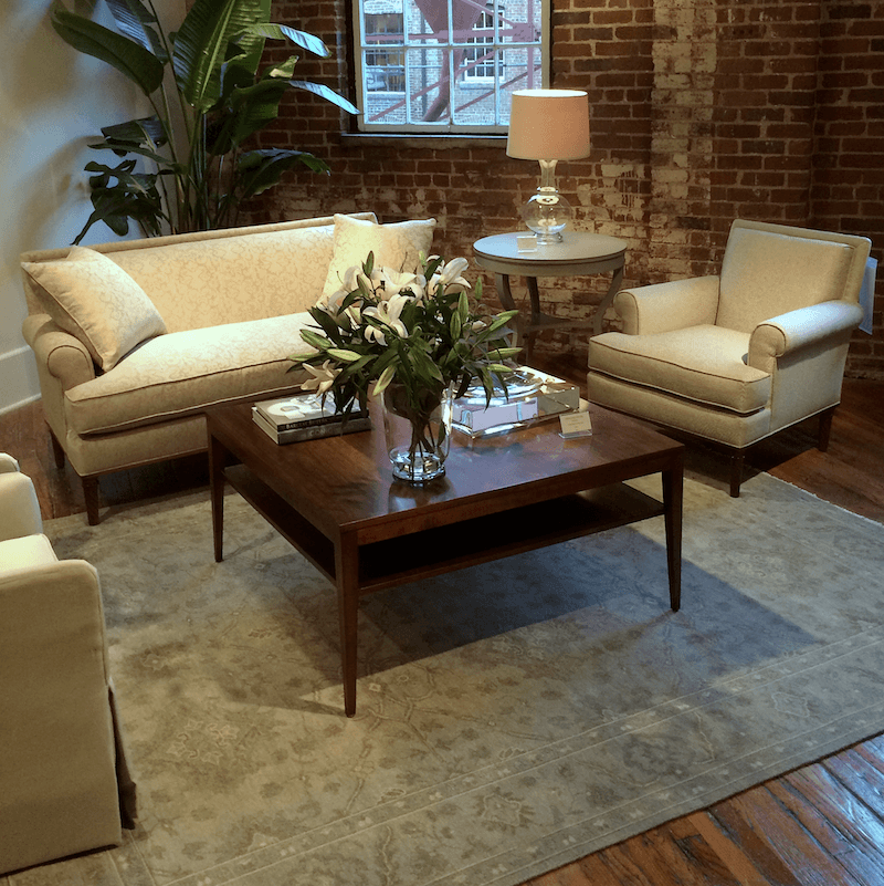
Another showroom I wanted to visit at Historic Market Square is Highland House. This is a company that in recent years has gone through a major over-haul and with gorgeous results. They also have two wonderful design lines by Barclay Butera and Candace Olson. The above is the epitome of young trad styling. It’s chic, luxe yet is casual enough to appeal to young families. It’s a great line and designer friendly!
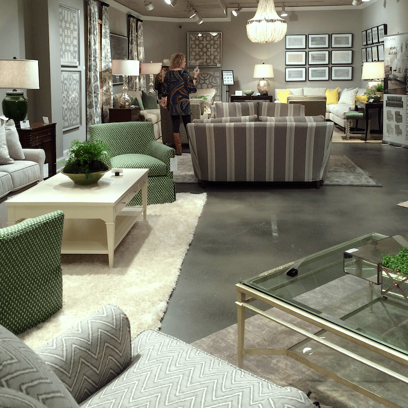
Remember the vivid vignettes in the last post from CR Laine. Well, as you can see, the entire showroom wasn’t all like that.
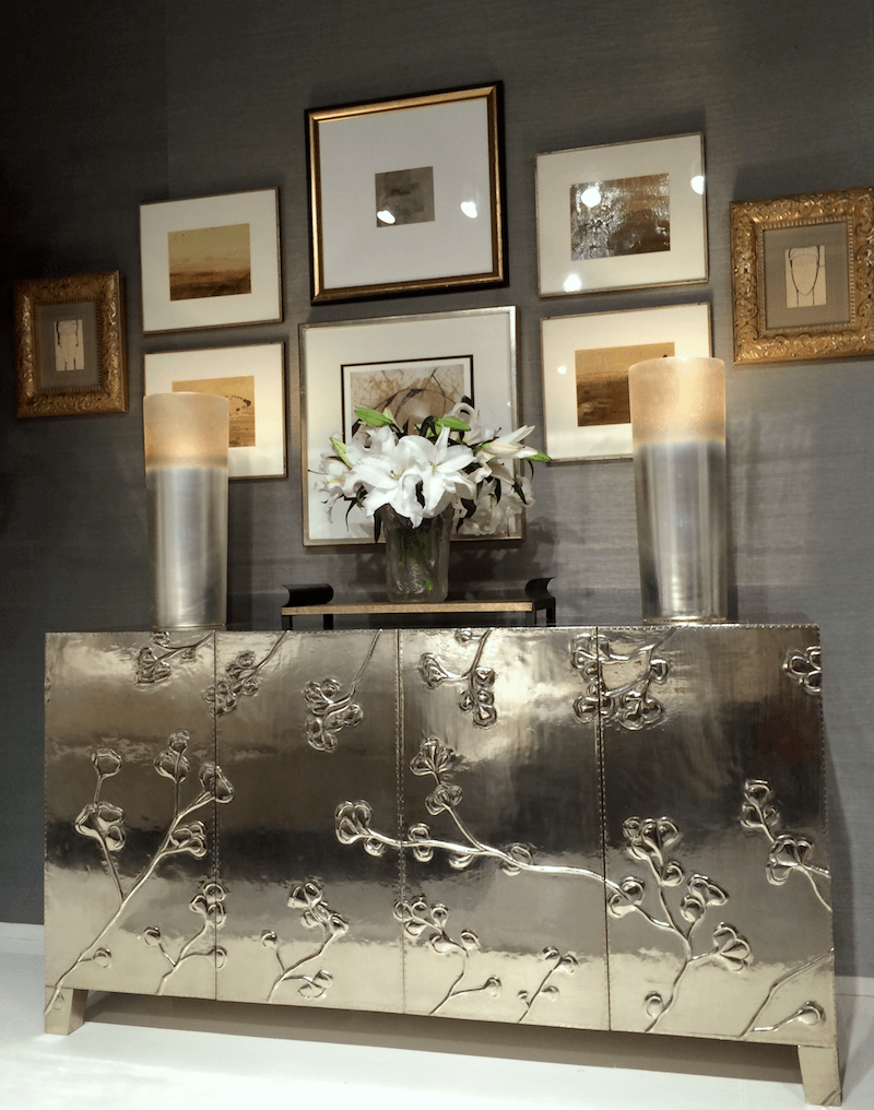
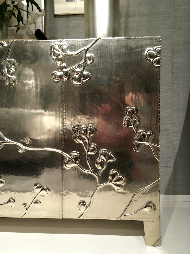
Back to Bernhardt. Another stand-out piece was this striking credenza in what is called “German Silver.” Every hear of that before? Me neither. It doesn’t actually have a lick of silver in it. It’s an alloy of nickel and copper and sometimes some other metals.
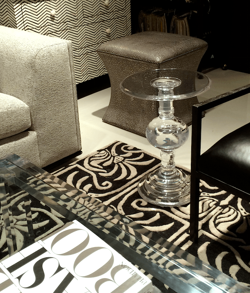
This section of Bernhardt was dark, handsome and urbane. Don’t you just adore that little acrylic occasional table?
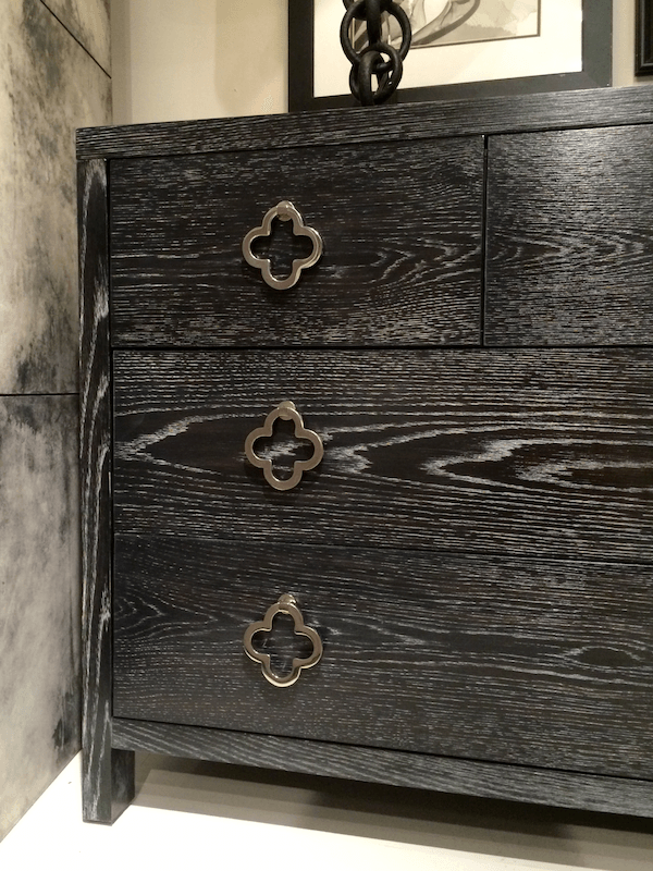
Handsome chest with quatrefoil drawer pulls in limed or cerused oak finish. Here’s a tutorial I found if you’re interested in creating the look yourself.
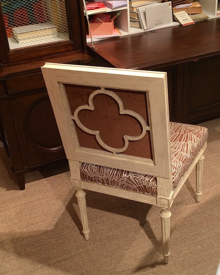
Back at Ambella Home, a chair with a quatrefoil motif on the back. The chair came with a choice of three or four different back options. It would be fun to do a mix of all of them!
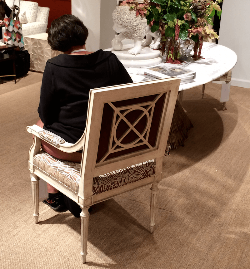
Here is Ronique sitting in a the chair with a different back. BTW, she can instagram, talk, walk and do cartwheels all at the same time. Okay, not cartwheels, but she’s good!
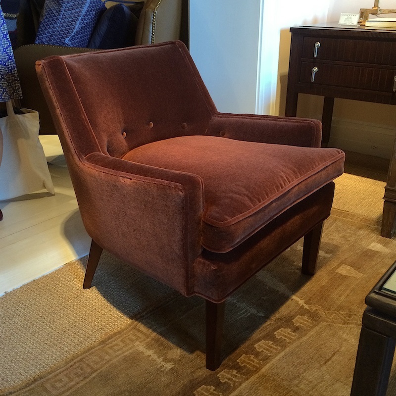
I fell head over heals in love with this vintage inspired design by Thomas O’Brien for Century furniture. More earthy plum colors and gold! His designs are incredibly elegant.
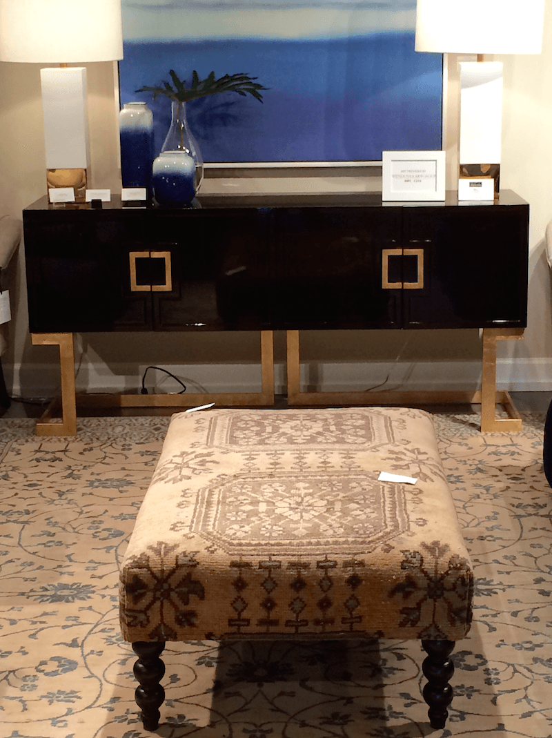
Love the mix of styles and colors here from CR Laine, again. That’s a kilim carpet on the ottoman.
Well… that’s all for now!
I’m saving some of the best info for last!
xo,

Related Posts
 Freshen Your Home for the New Year {part III | wall paint!}
 Presenting | The Hottest Color Palette | Fall 2014
 Three Decorating Trends You Need To Be Warned About
 20 {Great} Shades of Orange Wall Paint {and Coral, Apricot, Kumquat…}
 Freshen Your Home for the New Year | kitchen shelf styling
 Feelin’ a bit orange |orange decor
 What Discount Do Interior Designers Get at Americasmart in Atlanta?







14 Responses
On behalf of everyone at B E R N H A R D T, thanks so much for visiting, Laurel, and for including us in this lovely post. We are honored.
Wishing you, and all those you serve, joy and comfort—always. And, much continuing success!
Hi Stephanie,
Thanks for stopping by! My absolute pleasure! I was very happy to become better acquainted with Bernhardt to find out how designer friendly they are! In fact, I have an order coming in! hooray!
Thank you for including Century Furniture in your post about the High Point Market! Wonderful to have met you and had the chance to show you what we have been up to. Again, thank you! Love reading your highlights.
Thanks so much Comer! I’m always impressed when companies I’ve written about find me. I guess it means we’re all doing something right!
Thanks for filling us in on High Point. I’m looking forward to your next post. I especially enjoyed all the credenza photos and links.
I swear the first post contained a closeup photo of an armless slipper chair upholstered in an overscale print. It was gorgeous. Am I dreaming? At the time I saw it I thought it would look beautiful in your bedroom because the print had a touch of dusky purple. I was going to try to find the post that featured your wall color and check my premise.
Would it look nice ?, Laurel?
Hi Libby, I’m not sure what chair you mean? The closest to an over-scale floral slipper chair in that post is Cynthia Rowley. lol Although, over-scale is not exactly the word I’d use to subscribe her. She’s quite petite.
It was an overscale paisley on a white or cream background if I recall correctly. Evidently the image was in another post. You did list the manufacturer. I don’t recall the name.
I likened the pics from the first installment so much better. I may not use as bold of colors in every room or mix them the same way the designers did, but I didn’t realize how much I love color until I saw these today. Snooze…….
Hi Noelle,
LOL! I agree… some of them are bordering on cold and dreary. Some of that is a function of the showroom lights, however. Still… I’m not a gray person. I do love white however. I love the Tritter Feefer showroom, for instance. But again, theirs is always beautifully lit and filled with gold, texture and a bit of sparkle. (but not too much sparkle and not at all glitzy!)
Agree again laurel! Love white with lots of light and gold accents. My favorite picture is the first one you posted with the Thibaut wallpaper. It was the only pic with some life to it. I love dark, rich saturated colors as well, but this monochromatic mid-tone look is depressing.
Looking forward to seeing more photos from your visit. thanks for posting!
Laurel, I paint and refinish furniture (not shabby-chic, more upscale), so it is nice to see what people are emulating. That cerused oak is gorgeous. Did you see a lot of lacquer finishes on the white furniture, or was it more subtle?
Hi Teri, There is definitely a fair amount of lacquer out there. My over-all impression and this isn’t an absolute is that there’s an over-riding trend toward modernity. More homogeneous in that there’s less distinction between showrooms. Again, it’s my perception based on the places I managed to visit.
I love the chair from Ambella Home! Reminds me of a chair I ‘think’ I saw in one of Bunny William’s rooms?
As far as the Wesley Hall design vignette-I can’t appreciate that style of furniture and design so maybe I shouldn’t even be commenting-but this one just left me totally cold.
Hi Dolores! I know… I liked some aspects of that vignette but it didn’t feel like it all came together and looked tired after the crisp bright, furnishings in other areas of the showroom.