

As promised, I am beginning my “great shades of… wall paint” classic color series.
a little preamble…
I had this problem when I was a student. If the teacher gave out a choice of one out of three extra credit options, I did all three. Just in case. Just in case of what, I have no idea, but that’s how God made me. And now that I’ve spent two days on this post, I realize that I really, really need to break it up into two posts. [which I did] I don’t know if I’ll be doing this with every color, but at least for the first one [after white], it’s appropriate.
And what’s funny, is that in honor of the autumn season which is ending in a couple of days. haha, I’m going to write yet again about ORANGE— and its derivatives. And then, I will put it to rest for a while! Isn’t it interesting how words like coral, apricot, persimmon, and saffron, sound so much better than the banal – orange?
As in the post about the 20 best whites, I am going to choose the “20 best” in each category.
Are there other great colors in these categories? Sure. But the point is to make your life easier, not fraught with more stress-inducing confusion.
In each color category will be many, many variations from light to dark, from muted to bright of that general hue. While these are all great colors, they may not be so great for you and your tastes and/or situation. Therefore, it is important to remember, that the point of this exercise is to narrow down the field from say 500 or so of any particular color family to only 20 or so.
We will explore these colors in terms of how they make us feel and consider our preconceived notions based on our early childhood associations for better or worse.
In the case of orange, I have already discussed a couple of times here my early associations of that hideously embarrassingly bad decade of really, really bad design all the way around— the 70’s.
The 70’s did more harm for great colors like green, gold and orange than I care to think about it. To make it all even worse, isn’t orange the color we associate with fast food and some more down market logos like Home Depot and orange flavored soda. That chewy sour orange candy. And orange popsicles?
and well…
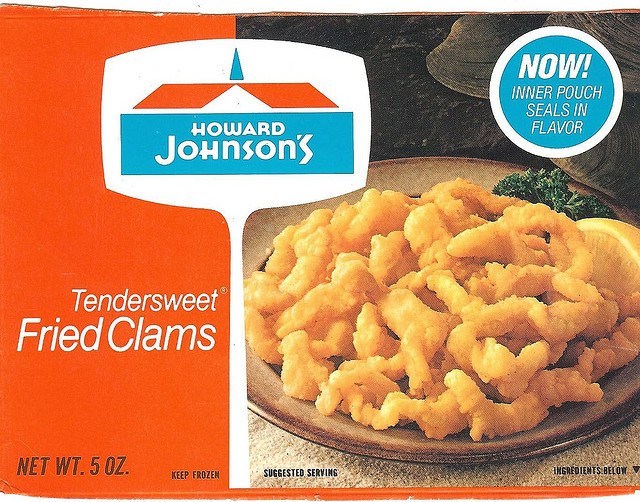
I’ll never forget the time we took a family trip down to Miami Beach Florida in the early 60’s from southern Indiana when I was a wee thing. A sickly child, I had acute tonsillitis and puked my guts out the entire way down there. (sorry if that’s TMI) My father was a shoe salesman and there were always some shoe boxes lying around to collect the vomitus. We stopped at a Ho Jo’s only I had to hang out in the motel room ’cause I was sick. I think that they did feed me— eventually. :]
Oranges. I could be super pretentious and say the eponymous fruit. Not quite as healthy as the fried clams, however, they are good for our necessary vitamin C.
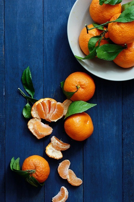
Things are now on the upswing. Although… hmmm… I think that those are actually tangerines. Oh well.
Orange, which if you don’t already know is a combination of red and yellow. It stimulates are minds and appetites [for more fried clams.] It creates energy. The good kind of energy.

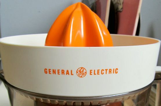
or like this vintage electric juicer.
The softer paler tones are more serene and calming.
However, the word peach has become dated. Nectarine is better. No fuzz, I guess.
And did you know that orange is actually the most classic color? Classic, elegant, worthy of kings and queens?
Yep. Orange.
Oh, you don’t believe me? Well, I didn’t believe me either until I started uhhh… digging for answers.
We humanoids absolutely love our orange and apparently always have.

From the ancient caves of Lascaux
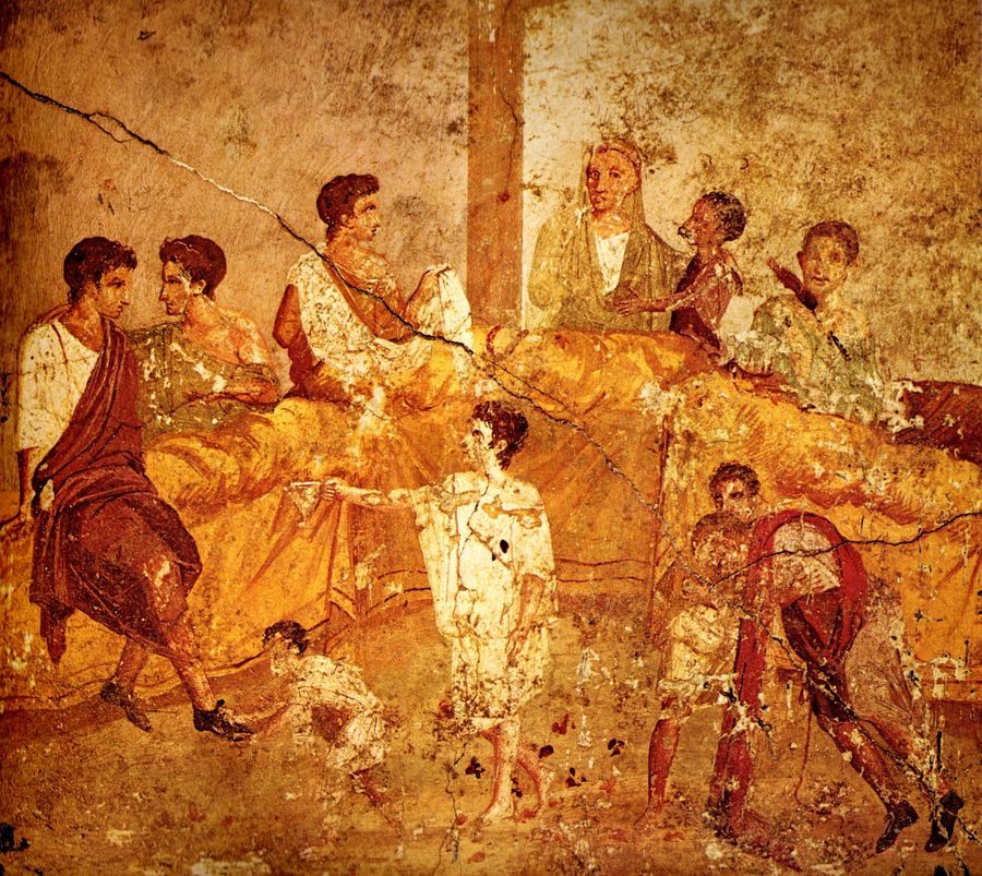
to the Pompeian ruins
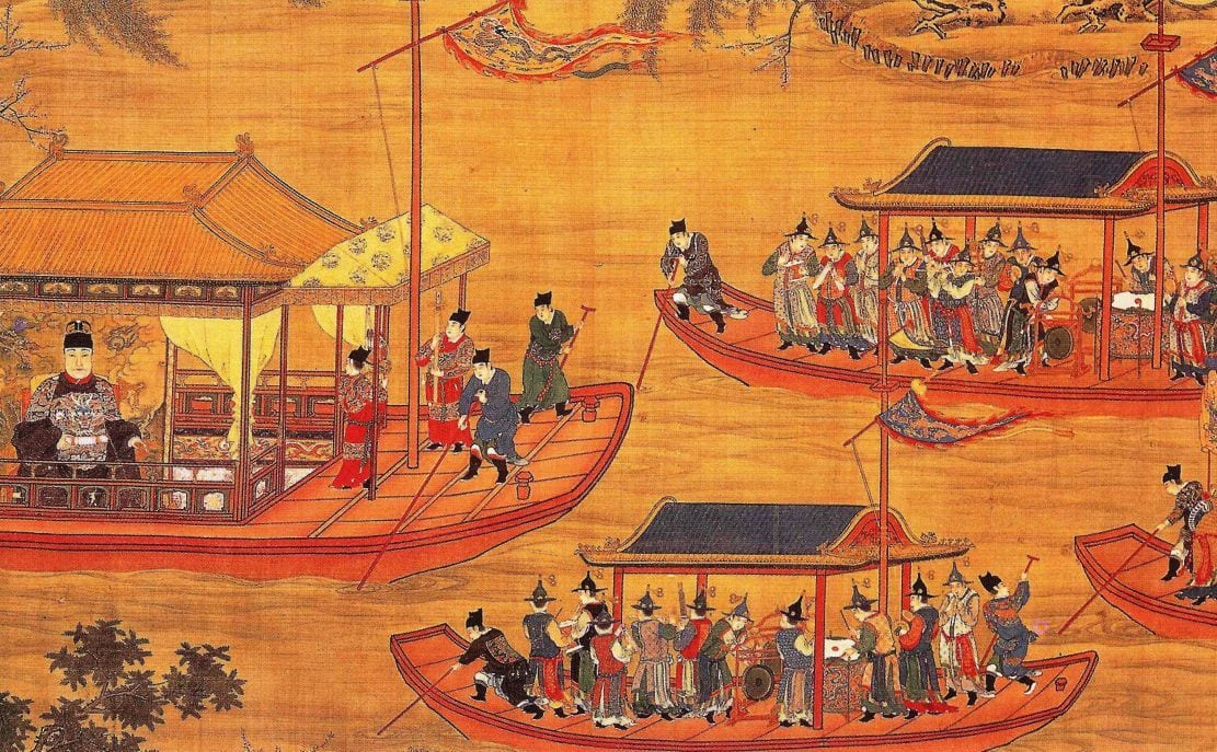 To this Chinese artwork dating back to the Ming Dynasty.
Hell, even the water is orange!
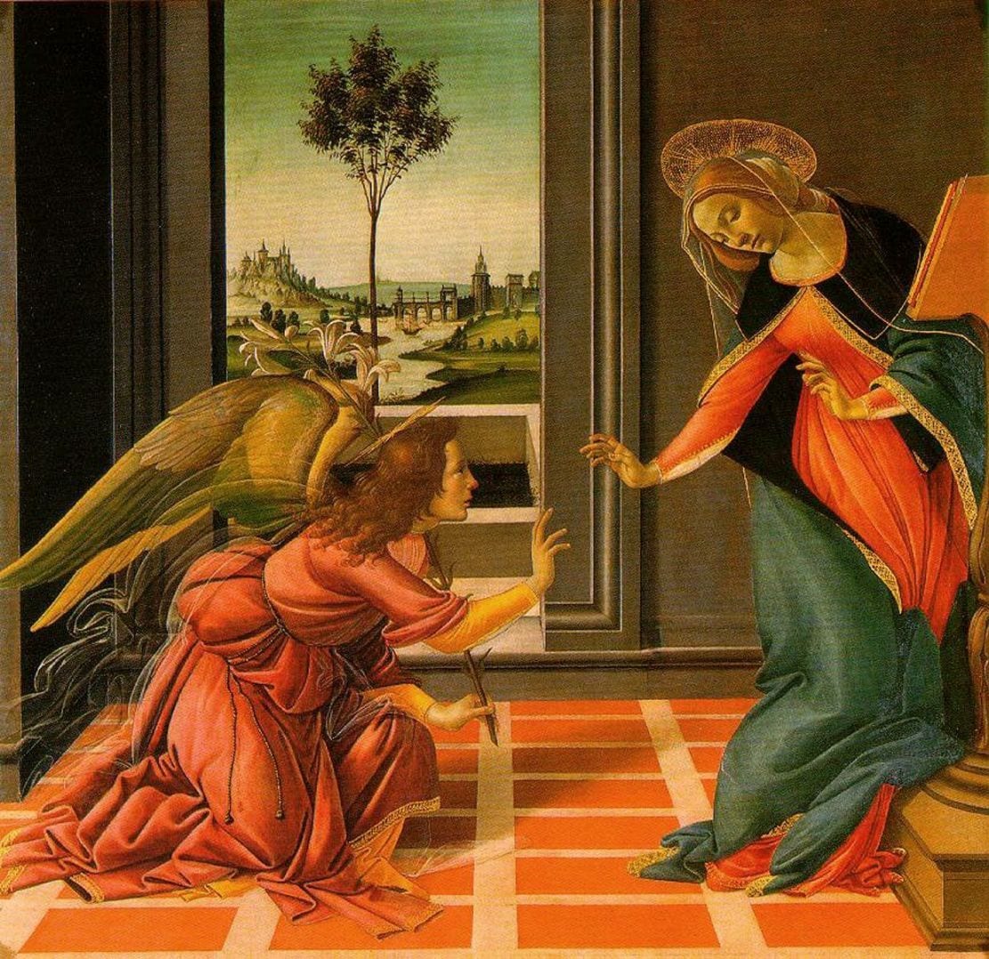 Botticelli‘s The Annunciation.
Even our Angels and Virgin mother are grandly draped in orange.
Did you ever realize this?
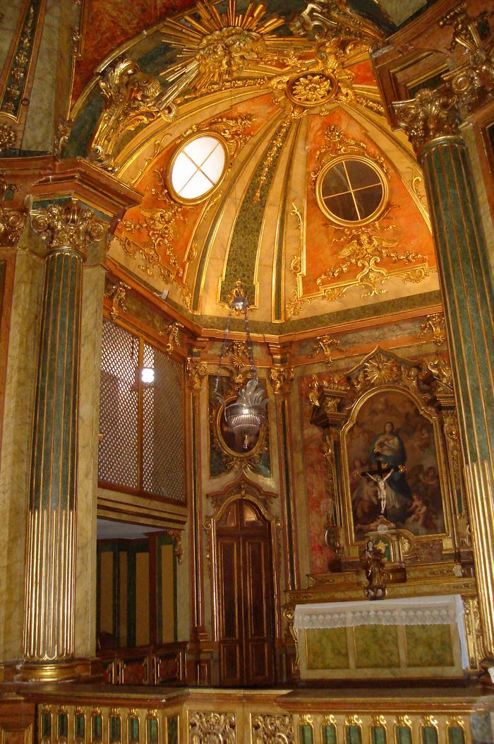
Apparently, heaven is also orange.
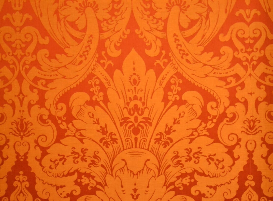
The orange silk damask that lines the walls of the Palace de Chambord
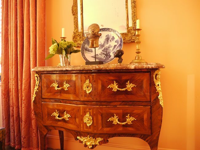
A French Ormolu Marquetry chest against orange on orange.From the very orange and fabulously decorated home of Maureen Footer
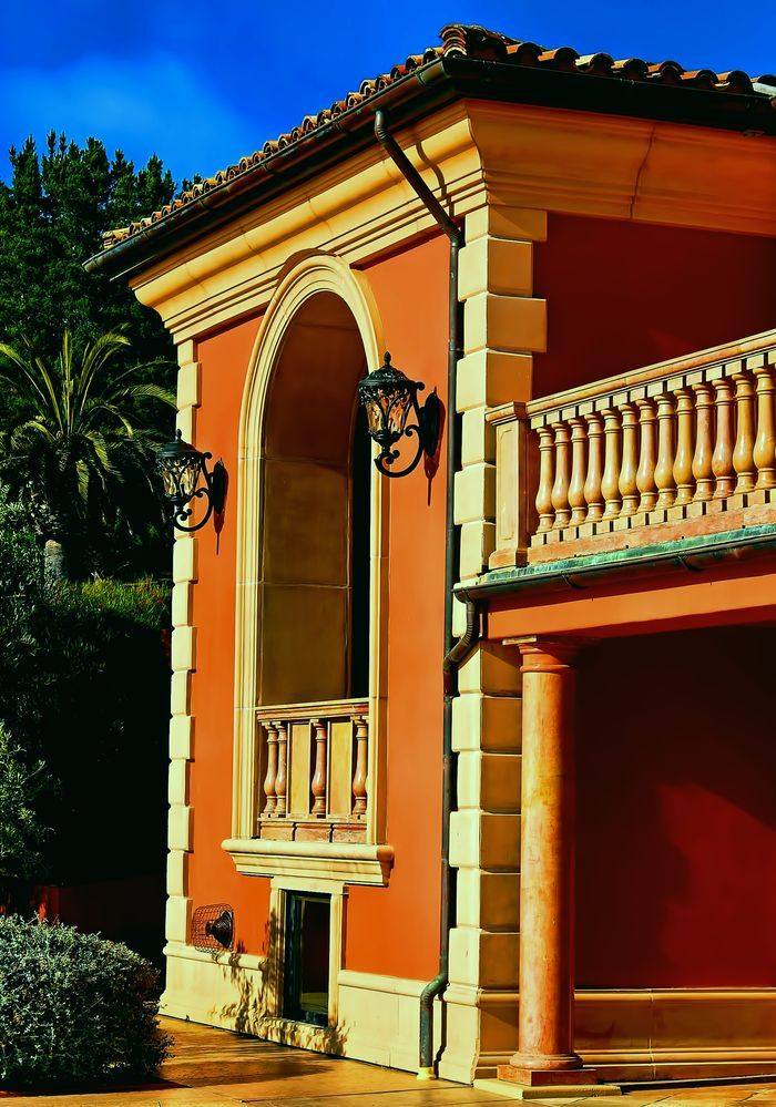
One of the most opulent estates in the world—Castello Della Costa Doro
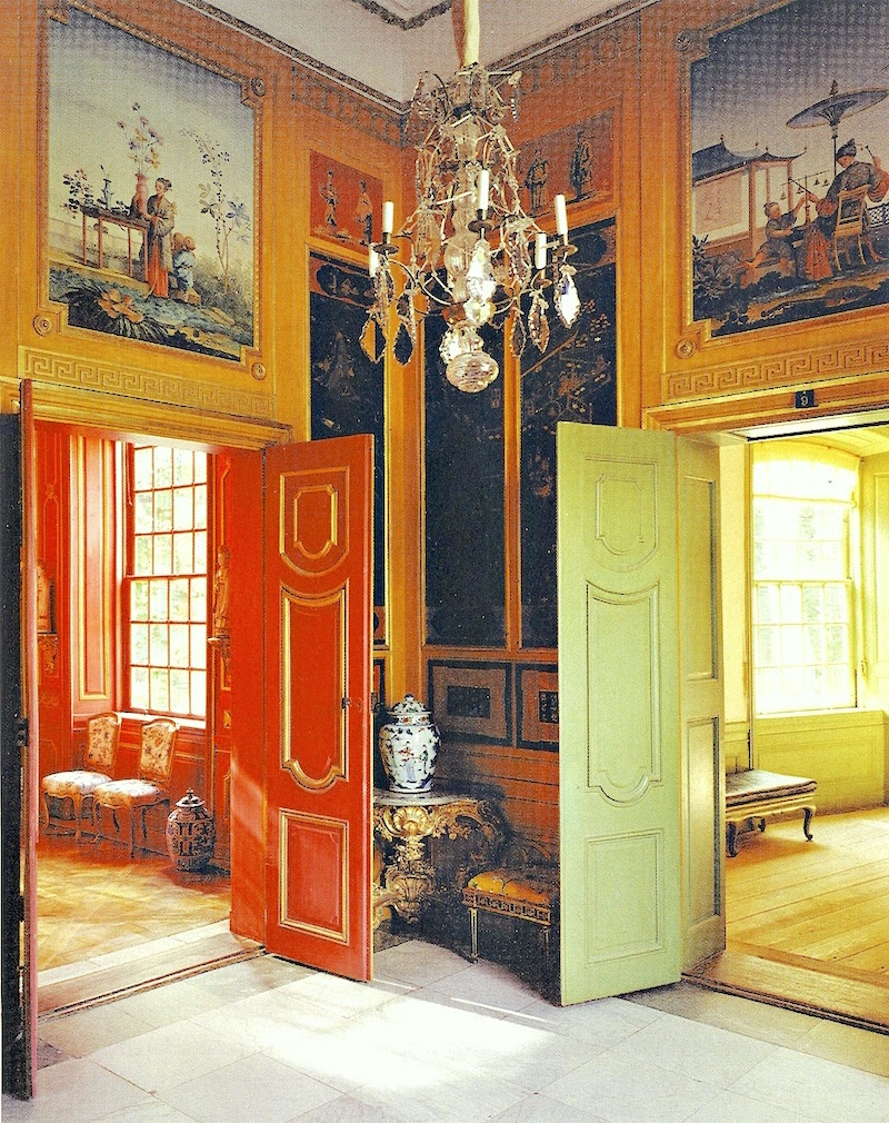
Kina Slott via Ladies Abroad Chinese Pavilion – colorful Gustavian and Chinoiserie Decor
Gustavian Orange? Doesn’t sound quite right now, does it? But, there it is! Well, my ignorance.
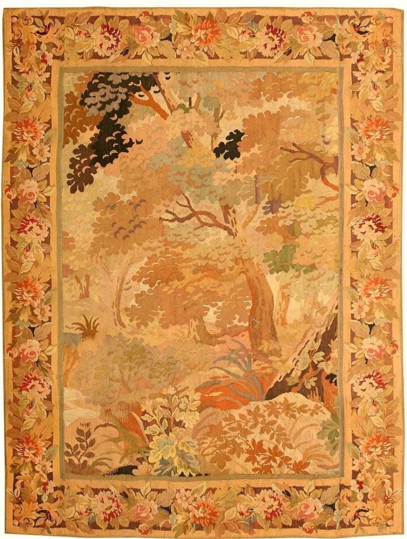
These colors were very common in the 17th and 18th centuries.
The most classic, enduring and elegant color of them all. The color of queens and emperors
Orange.
I guess Home Depot knows what they are doing.
xo,
![]()
Related Posts
 A Master Bedroom Design Process, and What Inspires Me
 What are the Best Interior Color Schemes?
 The Classic Kitchen – A Complete Source List
 Poor Orange. The most misunderstood color
 Mark D Sikes – High-Low – How to Get the Look!
 The Number One Interior Decorating Dilemma and How to Get Past It!
 My Kitchen Appliances Have Died. Now what?


3 Responses
I was also really surprised to see those orange buildings in Sweden ! They are lovely too.
Thank you so much Margot! I’m looking forward to the future posts as well, haha! but am still immersed in this one color, but not for much longer. [I hope!] What I found so interesting are the orange buildings in Sweden, a place I associate with grays and pale blues. I guess that’s just on the inside.
How interesting! What a great post ! And I always associated purple with royals, but this makes me think again. So many of the buildings in Italy are orange, or some shade of it, apricot or persimmon, call it what you want. Perhaps it’s influenced by the sun, or the red clay of the earth, or the terra cotta tiles on the roofs. I have spent and enjoyed time in Germany in recent years over the summers, and was surprised to find orange used in a lot of their modern interior decor. They seem to love pops of orange. I have seen it frequently even used in bedding. I think it is a happy color. If I weren’t so obsessed with white walls, I’d love to be brave and paint my house in bold colors. I so look forward to your future posts on other colors.