

Third in the series on freshening your home for the new year is paint. Wall paint, specifically. Over the years, I have had more clients come to me in a dead panic over this subject, than I care to count. Often, they have just moved or are about to and have to paint everything even though they have no idea what else is going in the room. That is another subject. But for our purposes, since this is a refresh, we’ll say that your room is more or less done. However, the color never worked for you because…
- it looked great on the chip, but when it went up it was a completely different color.
- it looked great in the store, but when it went up it was a completely different color.
- I’m afraid of really “strong” colors, so I chose a color that is several shades lighter than what I wanted and now it looks like I have Crest toothpaste all over my walls
- I painted one wall, the color I like as an “accent wall” but it’s just not working.
Right. It’s not working because it looks like you forgot to paint the other three walls, or ran out of that color and went with something else. I bet that’s how the ol’ “accent wall” got started. They ran out of paint. Please, this is very important and I am going to say this as kindly as possible.
DO NOT PAINT ONE WALL AS AN ACCENT WALL.
Why? 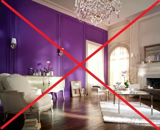
Ugh. What a crying shame. That’s why.
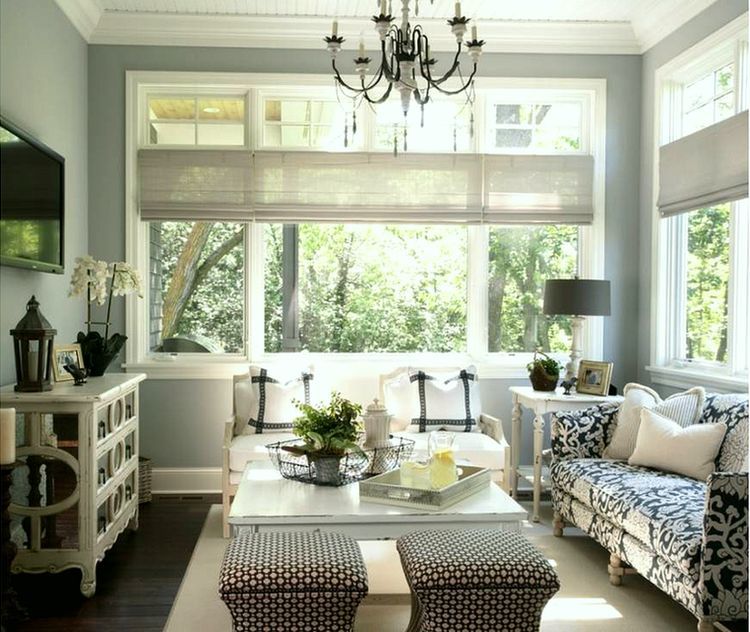
Alright there are some exceptions, which I will go into in another post, but if you have fairly normal walls and room shapes, please, don’t do it. It is never a mistake to paint all the walls the same color. If the color is so gag awful (pls see above) that you only care to see it on one wall, please choose a color that you love.
Alright, now that I’ve told you what not to do, here’s what you should do.
Hire me. haha! However, if you don’t want to do that and want to venture out on your own, here are some tips that I’ve learned over the years.
But before we get started a quick questionnaire about wall paint. Did you know…
- North facing rooms have grayer, cooler, darker light and it does weird things to paint colors?
- Paint colors often have undertones of a different color that are not readily seen in all lights?
- Choosing a paint color at night with only the lights on is not a good idea?
- Dark colors actually make a room look LARGER? They make the walls recede, just like dark pants make your legs recede. Same principal. What dark colors do, however, is absorb the light, so the room will be darker, but sometimes that’s very nice.
Now, that I’ve made you even more nervous, I’m going to give you ten colors that are almost always a sure thing, no matter what. (Of course, there are many, many more, but the idea is to cut through to some of the best). These are all going to be from Benjamin Moore. I do like some other companies as well, but BM is readily available and has some wonderful colors; thousands actually!
One rule that always works well is to think “sky.” After sky… think water and earth.
The colors of sky, water and earth— nature, go with everything, don’t they? Mom nature is the most brilliant designer ever!
After that, go to the Benjamin Moore Historical colors. There is a reason why they are “historical.” :]
Here are some colors that I have used and/or have seen and liked. (Please always try your color of choice out first, either on the wall or a piece of sheet rock or cardboard taped directly to the wall. And look at it on all four walls and at different times of the day and night.)
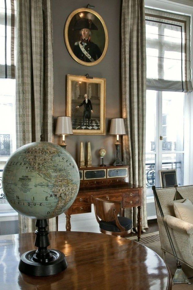
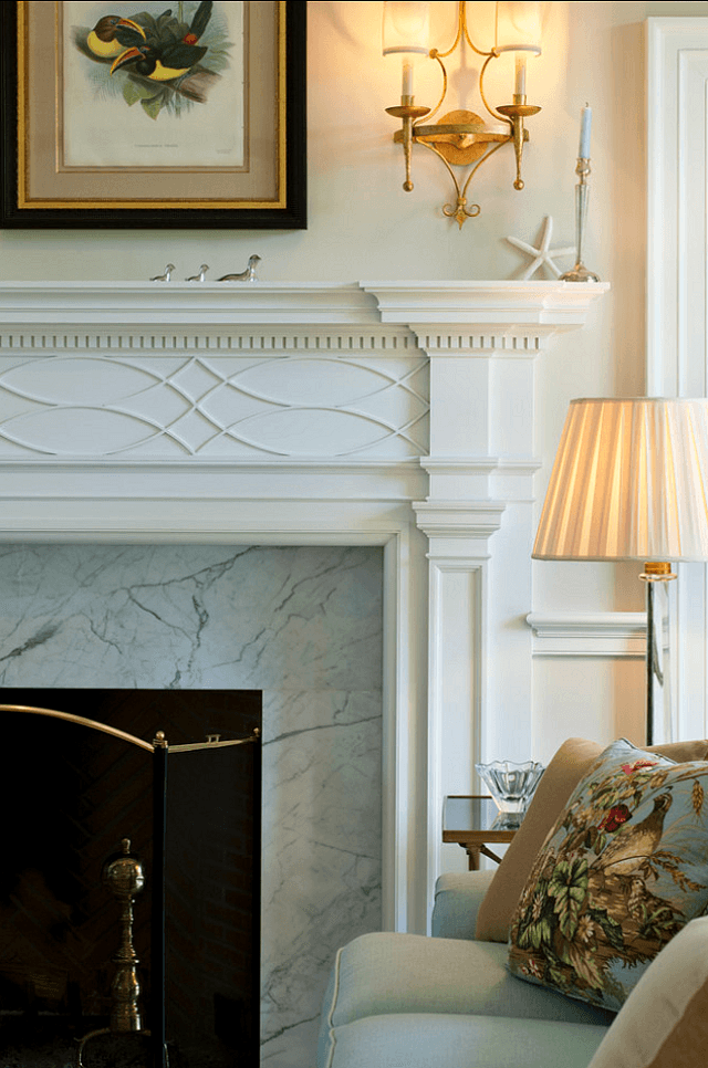
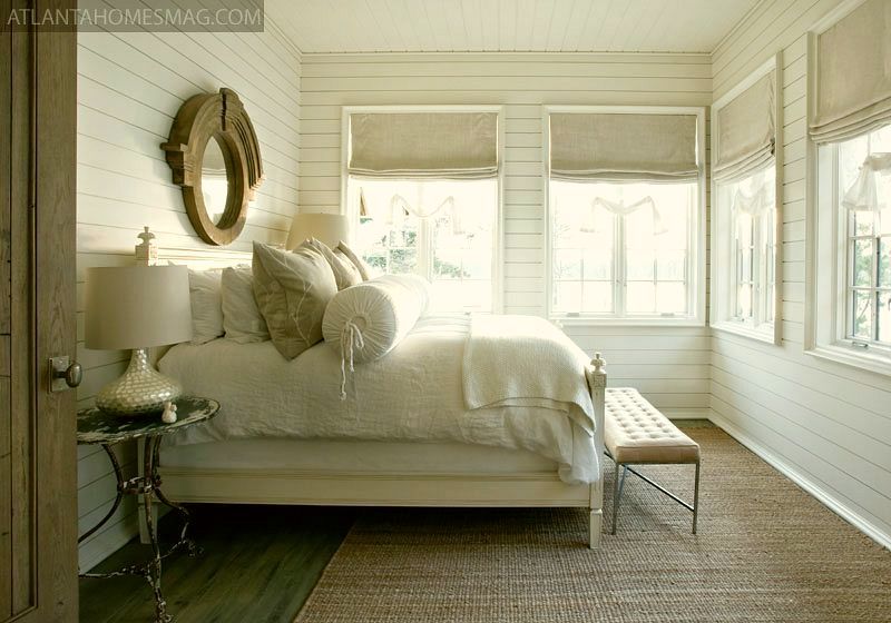
All photos via pinterest unless otherwise stated.
Benjamin Moore 2145-70 Cotton Balls. This is a very clean, fresh, warm white. It’s one of their most popular whites.
Benjamin Moore 1471 Shoreline. Pale grey is very hot right now, but it is also a classic color. Shoreline, is a pale complex grey which seems to change shades very subtly throughout the day. I painted my bathroom this color and I’m a very happy girl!
Benjamin Moore 2108-60 Abalone. A wonderful, warm, neutral, not beige, not grey, but a combo of the two with a subtle lavender undertone. I just did it in two bedrooms. One faces north and one faces south. It looks sensational in both rooms; very versatile!
Benjamin Moore HC-168 Chelsea Gray. This is a very sophisticated dark, warm gray with a hint of taupe. Brooke Shields used this color in her New York apartment.
Benjamin Moore White Dove trim with Linen White walls. These are in their standard white collection. Linen white looks its best in a well-lit room.
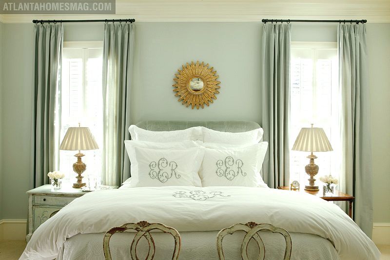
Benjamin Moore 1563 Quiet Moments. This is an extremely lovely light blue-green with just enough grey to keep it from looking like toothpaste. If you want to try a more grey tone, 1598 silver lake is also very nice.
Benjamin Moore 2152-70 Mayonnaise. This is a lovely classic cream which looks good in north or south-facing rooms
This is Benjamin Moore HC-169 Coventry Gray. This color goes with EVERYTHING. It is a medium gray with blue undertones.
Benjamin Moore, HC-172 Revere Pewter. There are paint aficionados who claim this to be THE perfect color. It is a warm grey with olive undertones. It also goes with everything!

For the more adventurous, this is Benjamin Moore HC-166 Kendall Charcoal. Alright, I have never used this color before, but for everyone who’s ever used it, they have fallen madly in love with it. I could see it in almost any room. It is dark, warm and rich and makes a wonderful background for art.
Please notice that I stay away from “color of the year” gimmicks. The colors here are colors that you can live with and then you can ADD the color of the year!
My final word, today is about white.
White is a color, too! And for me, the most beautiful of all. It is never wrong to paint your walls a lovely white with a touch of cream or grey. It’s classic and goes with everything.
Stay safe and warm if you live in the frigid zones!
![]()
related articles


Related Posts
 Creating A Chic, Cosy Home Library-Best Colors, Lighting and Furniture
 Three interior decorators with no formal training– Scary!
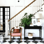 A Fave Affordable Lighting And Home Furnishings Source
 120+ Cool Holiday Gifts for 2022-Under $50.00!
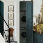 A Laundry Closet Entrance Combines Beauty & Function
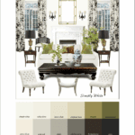 My Paint Guide Got a Makeover Without My Knowledge or Consent!
 I Live With a Drove of Pigs, But I Want To Decorate with White


34 Responses
Laurel,
Your blog has been so helpful and inspiring! I would appreciate your feedback on the following paint questions
1. Does an open floor plan always require one paint color throughout the open areas?
2. How do you stop and start different paint colors when the outside corner beading on the walls is rounded? Should you not use more than one color in this situation?
3. How do you select paint colors for a busy travertine floor that has most undertones represented in it (from pink-beige to gold even gray, cream, and tan) or does everything go with it?
4. Is painting kitchen and bath cabinetry durable?
5. What brand/type/sheen of paint do you recommend for high moisture bathroom walls and trim?
1. No, but it depends on the layout
2. If the corner is rounded, I would tear the wall down and start over. Oh wait. That’s not the answer you want to hear. Yes, you’ll need to stick with one color.
3. There’s a warm white that I’ve used in situations similar to this. Benjamin Moore 904 White Blush. I talk about it in The Laurel Home Essential Paint Color Collection
4. It is if the necessary steps are taken and there are numerous steps.
5.Benjamin Moore makes a formulation specifically for bathrooms. It’s also important that the right kind of sheetrock is used. I do like the matte finish for all walls and I use semi-gloss for trim.
Thank you for such an informative post! I considering Abalone for living/dining/kitchen (we live in a townhome with only a 3-pocket glass sliding door providing light from the north – there’s also a screen in porch off the back of that which further restricts light) but after seeing your comment about it reading “cooler”, I’m not sure what to pick. We have some blue/gray couches with a warmer tone floor. I’m concerned that if we go too dark, the kitchen (at the farthest end) would feel like a cave.
I’m loving Abalone too. So pretty! Would you recommend it for a whole-house color? I’m a little nervous about it turning purple (especially in my NW facing-but bright-family room). Also, totally agree about the accent walls. They always look so weird to me!
Hi Monica,
I don’t think I would paint an entire home that color, but rather use a palette of coordinates for variety. It does have a little lavender undertone which makes it nice for bedrooms, especially.
Hello Laurel, I recently purchased a big “northern style” house with a lot of wood – pine ceiling, dark wood floor in the greatroom. I’m going to redo the kitchen in white but my big problem is wall color – for the entire house. I’m struggling between BM Mayonnaise and BM Butterfield 897. With the wood, I’m thinking Butterfield may be a better, warmer choice — but I sure can’t find much discussion about it online! I wonder if it’s a newer color or just not very popular. Do you know anything about Butterfield? Is it one of those “mistake” colors? 🙂 Alternatively, do you think Mayonnaise would look too stark/formal in a very wood-y house? I have enjoyed your articles and very much appreciate any response!
Hi Tess,
As it happens, I have used Butterfield 897. It was about 17 years ago (!) in a north facing living room. It was gorgeous! Just a beautiful, buttery cream color. Mayonnaise is also a nice color but maybe a tad duller. I would make sample boards of each and move them around and look at them at different times of the day and at night.
There is not a significant difference between the two colors. In fact, if you painted one room one color and an adjacent room the other, they might very well look like the same color. The opposite is true that if you use one color in one room it could look very different in another.
It’s all lighting and the other things that are going in the room. Pick the color that hums to you more, over-all.
And remember that paint is only one very small element in the room. It’s how everything works together and especially the architecture of the room that’s of prime importance.
Hi Laurel, I just realized I never said thanks for your response. You helped give me confidence to go ahead with Butterfield for the whole (4000 sq ft) house. Because it “hummed” to me …. and I love it!! Looks great in all rooms, all lights. Warm, clean, classic, beautiful and never pink or green – and I have some weird rooms that can bring out odd undertones! Wanted to attach a cute pic but don’t see how. Anyway, THANKS!!!
Hi Tess,
Thanks for letting me know and no worries about not thanking me. Believe me, I can’t remember most of the time who I said what to and when.
I am considering redoing my master bedroom and love the bedroom colors in “Quiet Moments” for Elizabeth Elsey. I especially love the monogramming on the bed linens! Can you tell me where that might be purchased? Thanks.
Hi Beth,
I’m not sure where that came from and it’s not something anyone has asked me to do. However, whenever I need something, I put it in my google search box and that usually leads me to what I am looking for. You might also try typing it into pinterest, but I would go with google first.
Love your articles–I could really be a bit braver when it comes to paint colors! I have a small office that is lit with fluorescents and not much natural light, and would like grey walls (rather than institutional beige, ugh). Would a color like Coventry Grey or Revere Pewter look completely different under that kind of light? They look so beautiful with natural light and open space….
Hi Nicole,
Thanks so much!
It’s impossible to say, I’m assuming you have cool fluorescents but there are warm fluorescents too.
But just like everything else, I would test some colors. Coventry gray would probably be a good place to start. The other thing is that I don’t think it’s a crime to add in a little table lamp even with the overhead lighting.
Thank you for this list!!!
I’m loving Abalone too.
What color trim is used in that provided pic?
Justine 🙂
Justine, It’s not my room, but there are a ton of whites that would be beautiful. I would look at white dove, 967 and 904. The latter is a color that looks particularly lovely with taupey colors. It looks a little pink on the chip, but does not look pink when up. Just very lovely and warm.
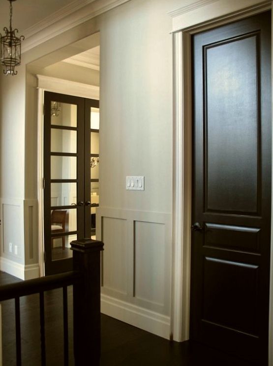
People get very hung up on trim colors and there are only a few rules that apply. Otherwise, most colors can take a good many different trim colors!
Many thanks for your help Laurel!.
I had that one listed 🙂
Love your blog will be coming to and from over the next 12 months.
Justine, Australia.
Thank you Laurel. Which colour from Farrow and Ball would be a good dupe for Benjamin Moore’s 1563 Quiet Moments do you think?
Hi Layla, I wish I could help you but your question goes under the category of individual advice and for that there’s a fee. Thank you for your understanding.
Hi, I am loving all the Benjamin Moore colours especially 1563 quiet moments. Unfortunately we do not have any in the UK. Please can you recommend me a good substitute to that paint colour from maybe dulux, farrow and ball or crown paint? Thank you.
Hi Layla,
Farrow and Ball is a wonderful company. We have it here too but it’s very expensive. I am not familiar with the other UK brands, however.
We have moved into a 1830’s cottage on the north shore if Lake Ontario and your blog has been invaluable
Hi Peter, I’m so happy to hear that! Thanks for stopping by!
Thank you! I just finally decided on all my colors. I am doing my kitchen in kendall charcoal. And the dining room in edgecomb gray. I sure hope I am making the right choice. I am being way too brave with this color pallet! Any final suggestions,before it goes up?
Hi Again Missy! Quite frankly, it all sounds completely stunning! Please send me photos if you like, when it’s done!
I’ve decided to paint the walls in my kind of small, very dark living room, that has dark brown couches Chelsea gray. I have a somewhat raised celing. Any color that would look great for the ceiling?
Hi Missy,
Sounds lovely. Difficult to say for sure, but if the room is dark, I would probably paint it one of the warm creamy whites like maybe 925 ivory white. But really, 967 cloud white or white dove oc17 would all be fine–and more. Oh, and Swiss Coffee. They’re all beautiful. What I would avoid is the horrid “ceiling white.” It’s cold and gray and does nothing for most colors unless they are cool but even then, I usually like a touch of warmth in the ceiling
Hi Laurel,
I love your article about choosing the right white paint. Some designers think that using the same white for the walls and the trim is acceptable. If you choose not to go that route, how do you recommend choosing two whites that go together? Is there a rule of thumb?
Many thanks!
Hi Merrilee,
The undertones need to coordinate in the two whites. Quite frankly, I can’t stand icy, cool whites. The biggest problem is with colors like blue and yellow. They don’t look good with whites that are beige-y or pink-y in tone. If you make samples and hold them up side by side, your eye will tell you if they look good together or not.
I have a very dark north facing house. The color scheme I have chosen is Wedgewood gray, Edgecomb gray, revere pewter, and Kendall charcoal. My living room has dark brown couches and chairs. The remaining furniture is done in annie sloan old white chalk paint and with a touch of duck egg blue chalk paint. A professional recommended one accent wall for my picture wall to be Wedgewood gray and the rest of the room revere pewter. The accent wall is along the doorway and will enter into the dining room which will also be Wedgewood gray. Then the dining room joins into the kitchen which will be Edgecomb gray with a kendall charcoal accent wall kind of hidden and intended to be our wall that has all of our house stuff like calendars, lists, etc. My questions is: what would it look like to have an accent wall in the living room and to paint the dining room (which has very little light) Kendall charcoal, if I paint all of the furniture the Annie Sloan old white? My dining chairs are light gray linen. Also, you said no on the accent wall but a professional told me yes, your thoughts?
Forgot to mention that I have standard granite countertops with blacks, browns, creams and walnut wood trim, cabinets and crown molding.
Hi Missie,
I’m sorry, but I can’t give individual advice in comments–especially as detailed as this. In addition, and believe me, you’re not the only one— as powerful as my visual skills are, I need to see a lot more. Therefore, if you are needing pro advice, please contact me under the contact link in the main menu. And yes, I still dislike accent walls unless they make architectural sense.
I thought you didn’t like Abalone…? Wasn’t it in your “yuck” list?
Hi Maryanne, oh no! Abalone is a fabulous color! Maybe there’s another name that sounds something like that? It does read ever so slightly lavender so it’s a great color for a bedroom but also could be in just about any other room. It reads a little cooler and darker in north facing rooms.
Thank you. I have 7 different paint colors on my bedroom wall and none of them make sense to me. I greatly appreciate this article and your wisdom.