Oh Dear… Another letter from an upset homeowner…
Dear Laurel,
My husband and I just bought our first home and we’re a tad house poor. lol I guess we over spent on the home but it’s so expensive around here and we’re banking on some promotions shortly.
I don’t even want to tell you where we got our rug. I’m sure, as a designer you would scoff, but never mind. Alright, it was one of those 800 number places. Super cheap. We measured carefully and they came and put it down. Well, it just doesn’t look right. Before we ordered it, we went online and found a great decorating rules guide on Pinterest from This Old House. It said to leave a 2 foot border all the way around the room. Well, our fireplace juts out about 3 feet and the room is already pretty narrow. It looks more like a runner than an area rug. I mean the dimensions are 6 feet by 20 feet.
What did we do wrong?
Sincerely,
Rita Rugrunner
Hi Rita,
Yeah. I hear ya and I’m so sorry that you were duped mislead like that.
This is all very timely because someone the other day mentioned something about how to know what size area rug to choose. In addition, I just did a survey to gather some information about some products I’m planning to develop. One of them is a whole house decorating rules of thumb and measuring guide.
Most people loved the idea, but a few people made comments like this:
“Available all over the internet…”
“I think a quick search on pinterest would give you most of the answers to these questions…”
And they’re right. You CAN find the answers, but that doesn’t mean that they are the right answers! In fact, so often I see some advice that is waaaaay off the mark.

Rita, I feel so badly for you. You didn’t do anything wrong except for believing that something you saw in print was good advice– for you. It might be good advice for someone else, but it wasn’t good for you. I know the article you’re talking about and that is only one of many issues.
Your particular situation is not easy. I might’ve recommended a cut out like we just did for a recent job.

We left a one-foot wood margin around the perimeter and only 6″ around the fireplace hearth. It looks great and in perfect proportion to the room–not at all, like a runner.
It’s very disappointing what I see going on. I mean, it’s This Old House. Love Norm. I mean, who doesn’t? Too bad Norm didn’t write that piece. (although, he’s a builder/master carpenter, not a designer/writer.) I doubt anyone even bothered to check it. It sounds sort of alright if one isn’t really focusing on what they are reading. But once we examine the measurements more closely, we’ll see that they just don’t add up!
What I find most disturbing is that it’s not only this article; it proliferates all over the internet and from people who should know better based on their so-called expertise. This is not a matter of opinion or aesthetics. It’s just plain wrong.
Sorry, I realize that sounds pretty nasty but if you’re going to stick your neck out and tell the entire world to hang their sconce up at 48″ off of the floor, you better be ready to take some flack. I can’t think of any situation to ever hang a sconce any lower than 60″. (okay, a kid’s playhouse with a 6 foot ceiling.) Usually, we hang sconces at about 62-66″ unless the ceiling is higher.
Before I move on… I just have to interrupt myself to show y’all a little reality. I’m preparing to meet a new client tomorrow with a room layout and ideas for updating two rooms with some new furniture and FABRICS.

haha! I’ll clean it up. I’ll clean it up!
Okay, where were we?
Oh yes…
Decorating Rules That Suck
Exhibit #1
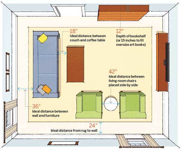
The distance from the sofa to the wall can be anything unless one needs to walk behind it as a major path and then yes, it should be at least 3 feet. Since it’s not a path here, the depth from the wall can be whatever will make the room function best.
A bookshelf does not need to be deeper than 12″ to hold even the largest coffee table book! I have one monster book that is 12″ wide but the rest are plenty large and only 10.5″. In addition, if going to a store or ordering from a catalog, measurements are taken from the widest, deepest point, so if there’s a crown, that’s included in the over-all measurement. If the cabinet with the crown is 12″, then the cabinet itself is probably about 10″ or so.
12″ between coffee table and sofa is standard. Yes, 18″ is also okay, but I would’ve said between 12″-18″.
The most glaring snafu is the distance between the two chairs @ 42″
WHAT???
That should be 24″-30″ IF there’s a table in between. If no table then they can be 6″ apart. 42″ is ridiculous in most situations, unless there’s a larger table in between but then it would have to be at least a 36″ table which would look funny too. The table in the diagram looks to be about 18″ in diameter.
 Suzanne and Lauren McGrath in Domino
See what I mean? I’ve never seen two side by side chairs at 42″ apart.
Exhibit #2
 This one is probably my favorite. :/
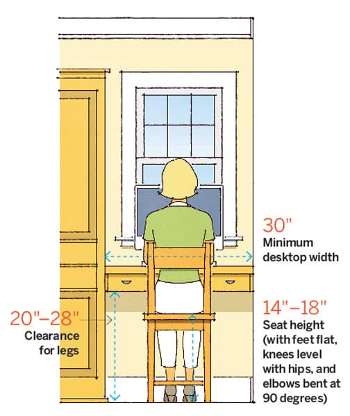
A Desk or dining table height is @29″-31″ with most at 30″. This situation between two walls shown here is one that is uncommon, so actually probably not even worth mentioning. What disturbs me are the seat height and clearance measurements.
I measured my desk which is 30.5″ high and there is a clearance of 25.5 inches between the bottom of the pencil drawers and floor. This is adequate, however, anything under 24″ is NOT adequate for most people. I have no idea where they came up with 20″
But then, there’s seat height. There is no such thing as a desk chair that is 14″ high.
How big are these people? That, is a child’s chair- lol. The child’s chair below measures 13 x 13 x 27 with a 14″ seat height according to the vendor.
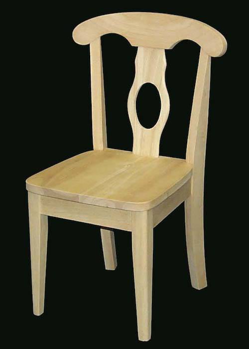
17″ would be the rock bottom lower limit I would recommend and that is definitely on the low side for most people. I measured every chair in my home and I actually have 3 different dining type chairs which range in height from 19″-20″. My desk chair is 19″. There is about 6 or so for me to sit underneath the table and that’s perfectly comfortable.
In the above diagram, if somebody had a normal height chair and bought a desk with a clearance of only 20″ that would leave them with about one whopping inch to squeeze their legs under.
But there’s more.
There is no such thing as a desk with a 20″ clearance. Standard clearance with a pencil drawer is about 25″.
TOH Claims that these dimensions and clearances are based on building and interior design industry guidelines.
NO WAY!!!
I could keep going with TOH inaccuracies but need to move on to other bad advice. Of course, I am not going to mention any names. I did change the wording slightly only so that it would not reflect duplicate content. That would not be nice on my part. In so doing, no meaning has changed and the numbers are the same.
- You need 26”-36” for a major pathway in a room or 36″-48″ for a more airy feeling
No, The minimum is 36″. If it’s just a tiny corner of a chair and not a long table or sofa, I’ll go down to 30″ but that is my rock bottom!
- The end tables should be about 2” less than the height of the sofa arm
I see… Oh boy. The arm on an English Roll Arm sofa is usually at about 23″ – tops. Try and find a 21″ side table. I dare you. Okay, mid-century—maybe, but do you want a mid-century side table next to your English roll arm? My rule is that if the arm is low, the table should be at least one inch higher and as much as 4″ higher. A lot of side tables are 28″-29″ but I think that looks a bit high. Sometimes we can cut down the legs if the design permits.
If we have a high arm, such as with a Chesterfield, Knole or Tuxedo style, we could very well have an arm 34″-35″. In that case, it’s also going to be difficult to find a side table at 32″ high and it would look silly, in any case.
In this case, I’ll go down as much as five inches. That’s alright and makes sense.

- Cocktail tables should be 1”-2” less than the height of the sofa’s seat cushion
Yes, that is correct, but they can also be lower. Some coffee tables are as low as 15″ and it is absolutely fine. So, the range should be 1″-4″ lower with an average seat height of 18″-19″ for most sofas.
But here’s a whopper.
- In a small grouping, 15″ by 24″ or smaller [did she really say SMALLER?] can be a great size for a cocktail table
Folks. Sorry. I don’t know what to say. Obviously, these are mutant pygmies living in this house or else… she’s never mind…That size cocktail table doesn’t exist in nature or in the world of furniture manufacturing either. If it does. Fine. I’ll hang up my shingle right this second and go and work as a waitress at Denny’s. 15″ x 24″ is a small SIDE TABLE! And she said, “or smaller?” That’s a similar size to this end table from Phillips Scott, only taller than a coffee table.
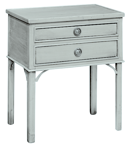
A small coffee table would be like this one 24″ x 37″ from Phillips Scott.
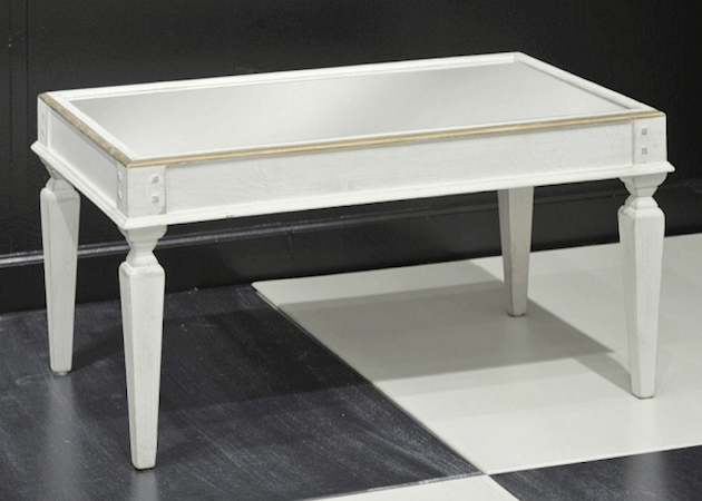
And under what circumstance would you need a coffee table less than 37″ wide?

Even here in this small sun room we did last year, we used two garden stools in front of a settee. (The other one is by a chair.) Side by side they are over 40″ wide.
The smallest sofa/loveseat is 60″. Rules are great. Rules that make sense.
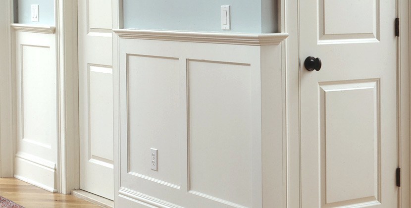
- Wainscoting should be about 36” – 48” above the finished floor
- Chair rails should be 34”-36” above the floor
First of all, the chair rail, caps the wainscoting so, that number should be the same. That is, unless she means a chair rail by itself. But, it still should be the same. There is a higher wainscoting which would be at about 60″-66″, but it should never cut the room in half. A good rule of thumb in proportion is to think in “thirds.”
48″ is wrong. This chick has a thing about 48″. I’m firing her right this instant! In an 8 foot high room, that cuts the wall exactly in half. Unfortunately, I see this a lot and it looks horrible.
Furthermore, it’s called a CHAIR RAIL. The original purpose of this decorative moulding was to protect the wall from the duhhh… chairs. A chair height is not usually 48″. From an aesthetic standpoint, a height of no more than 36″ is nice. If anything, I prefer my chair rails a little lower, like 32″ for a home with an eight foot ceiling.
- Dining tables should be 30” high
That is correct.
- Allow 18” of table width per person
That is not correct. The MINIMUM allowance per person is 24″
- For a rectangular table, you’ll need a table that is at least 48″ long to seat 6 people
Again, wrong, UNLESS the table is also 48″ deep. Otherwise, for a standard 48″ X 36″ table, 6 people would be very uncomfortable. The people on the ends need some room too. In fact, seating 6 at a 60″ table is a little tight. I prefer a minimum of 66″-72″ for more gracious dining.
- Dining seat height should be 16”-18” high from the floor to the top of the seat
Nope. See above. This number is the same as the desk chair
moving on…
Here’s a direct quote from the designer’s book regarding sconce height.

How does it work for me? Thanks for asking.
It doesn’t work is how it works. 60″ is okay. 48″ is absurdly low. That is the height of a light switch not a sconce! My kids have just impaled themselves on them. I’m suing.
Alright. My point isn’t to bitch-slap disparage my colleagues. It’s even possible that they never said that. I’ve been misquoted in print many times. But over and over and over in one article or book?
This is why I want to create this guide. There’s nothing out there with all of this info in one place and that’s also reasonably accurate. Of course, there are exceptions, but many rules do not change. Unless one is in a wheel chair, kitchen counter height is 36″. I’ve seen it listed anywhere from 30″ – 52″. The latter was in a laundry room. There is no such thing as a counter @52″. Counters are always @ 36″
I will be basing my findings on my three years of education at the New York School of Interior Design, actual furniture sizes and real building codes, not made up ones. Plus, there’s 27 years of on the job experience.
Right now, I’m feverishly working on the rolodex. I can’t wait to uhhhh… roll it out! :]
xo,
![]()
Save
Related Posts
 The Most Beautiful Fireplace Mantels | White Mantels | Part I
 Decorating Around The TV | 20 Elegant, Inspiring Ideas
 I Hate My House | Help For a Small Living Room
 20 Great Shades of White Paint {and some to avoid}
 I Can’t Afford A New Kitchen. Can You Paint Stained Wood?
 The Hidden Truth About Paint Colors That No One Ever Told You
 Three Decorating Trends You Need To Be Warned About








24 Responses
I know I’m late to the party here but, oh, I’m feeling awfully incorrect. In our 800-sf apartment, the main path behind our wall of bookcases and our sofa is 27″ — today, since the sofa moves when I vacuum. We’ve managed this successfully since 1999 or so, since we are smallish people, I guess. If we made the path wider, our sofa would be bang-up against the coffee table, which would be bang-up against the fireplace.
It’s true that when very big guys have visit, they inevitably knock over a chair (and also break the toilet… twice), so we visit them instead.
Our chair rail is 44″ high with our 10″ ceiling but it has been there for a century (or a century and a half), so don’t blame us!
We have hundreds old archaeological tomes and big art books and you are absolutely right that almost no book is wider than 10″, so shelves can be 12″ deep. However, one of the books my husband wrote is 13″ deep. It goes sideways.
Hi Elle,
All rules get thrown out the window with a gorgeous 800 sq ft. apartment with ten foot ceilings and beautiful mouldings. 44″ is acceptable for a 10 foot ceiling. It’s not for an 8 foot ceiling as it would nearly cut the wall at its half-way point.
However, I am wondering how deep your sofa is? If it’s 36″ or less, then fine. Otherwise, if you go to change the sofa at some point, I would look for one no deeper than 36″ – overall depth.
Amen! You tell’em Laurel! I thank you a zillion times for being the one voice of reason in a wilderness of poor design advice. I’m waiting with bated breath for the 26th!
Thank you so much Leslie! I can’t wait myself!
As always, great, relevant information delivered in a fun and catchy way. Thanks for setting the world straight! You go girl!
Thanks so much Terri! I so appreciate all the wonderful support.
Great info! Do you know the white paint color of the Wainscot Solutions photo? It looks so soft and warm. Love it, thanks
Hi Lora,
Sorry, no I don’t know the exact color. However, please check out this post. These are all very nice–it just depends on the lighting.
https://laurelberninteriors.com/the-only-six-white-paint-trim-colors-youll-need/
Laurel—-I love you! Cat
awwww… thank you Cat! Your name reminds me of my Peaches who went to kitty heaven last December. I still can’t believe he’s gone.
Thank you for sharing your advice and experience! You’ve given us some real “aha” moments. You also make me laugh!
I appreciate the way you are informative without being condescending.
Thank you so much Anita!
Laurel, love your posts. They are relevant, fun, and so very informative. I found your blog, a year ago?,by googling ‘English roll arm sofa’. My favorite sofa. And lo and behold, there you were. It is my favorite design blog and the one that is the most fun. Can’t wait for more treats from you!
Annie, Scroggins, TX
Hi Ann,
How kind you are! So funny, just specified two of them for a job today!
I can’t wait, either! I’m so excited for you and your new info sharing plans!
Thanks Gina! It’s pretty intense. Everyone says… “oh, it doesn’t have to be perfect.” They don’t know me. haha!
I had about 5 minutes to specify the height of electrical boxes on either side of a powder room sink– so the contractor & I choose the standard 60″ from the ground since we had no idea what the sconces were going to look like. Now, every sconce we try looks way too high! I think that the BULB height should turn out to be 60″ from the ground, not the back plate. That’s a big difference & means you can’t cut your hole for the box until you have the exact dimensions of your sconce– i.e. where the bulb falls in relation to the backplate. Sure didn’t see this suggestion in any on-line guide!
That’s a great point Joanne. And yes, that’s a big part of it as well as the size of the sconce itself. Quite frankly, a lot of stuff like that gets “eyeballed” but usually, we don’t have that luxury if we’re in the middle of a reno and the electrician needs to know where the electrical box goes!
Forgot to offer my congratulations on being invited to High Point! Way to go!!
I will also say that there’s only one other design blogger besides you that I would miss terribly if the blog ever ended, and that is Joni from Cote de Texas..
Oh wow, thank you Dolores! That is some esteemed company there!
What can I say..I broke a decorating rule! Mea culpa:-) My coffee table is 23” high, but made with a glass top so it doesn’t overpower the sofa.I just like my coffee tables to be higher, I find it so much more convenient reaching for my cup of tea & book and the extra height stops me from banging my shins into a low, invisible table.:-) True!
Plus..makes it more difficult for my standard poodles to help themselves to MY goodies..
And I second Celeste- you are wonderful to lavish all that care on us.. Thank you!! xoxox
Hi Dolores, Well, there is a tea table which is higher, so no rule broken. You don’t see it in the US as much. But it just goes to show that saying that a coffee table should be lower than the sofa by 1 or 2 inches is misleading.
I cannot ever thank you enough for these articles. My husband and I are very nice people but we are absolutely awful at decorating. I love your online store, I hope you add to it
Thanks so much Celeste. I hope to be adding to the store soon!