Thanks so much, everyone, for your terrific comments on Mary’s big beautiful secretary/bookcase. Of course, there are many solutions when a piece of furniture isn’t quite working in the space.
But, what if the furniture doesn’t fit?
This post was inspired by another reader, Sally, who also sent in photos last week. And, we will get to her dilemma in a bit. But, first, let’s go over the various ways that furniture might not fit. Then, I’ll give you ideas for how to rectify the issue.
Below are some ways that furniture might not fit
- Sometimes the furniture doesn’t even fit through the front door or the back door. There is no way to bring the furniture into the house.
- The furniture won’t fit through the door to the room it’s going in.
- Sometimes, the furniture won’t make a tight turn in a hallway or can’t make it up or down the stairs.
- Another common situation is that the furniture fits through the doorways and into the room, but once in the room, it is so crowded that movement is restricted. Plus, it looks terrible.
This is why whenever you’re purchasing larger pieces, it is a good idea to think carefully about where it’s going and how it will get there.
And, the final way that furniture doesn’t fit is what brings us to Sally’s dilemma.
When a piece that requires wall space is either too large for the wall, it needs to go on. Or, there are not enough walls to accommodate these pieces. Sometimes, the walls are there, but the windows are impeding.
Remember this post about the super-long unbroken living room wall? Well, this is the opposite situation from that.
So, let’s begin with Sally’s problem.
Here are the photos interspersed with Sally’s note:
Dear Laurel,
I just read your post about painted wood furniture –Â and this one: “I hate my formal dining room.”
I love both posts, and after reading them, I have decided to paint my dining room a Ralph Lauren Polo blue to make the mahogany furniture disappear.
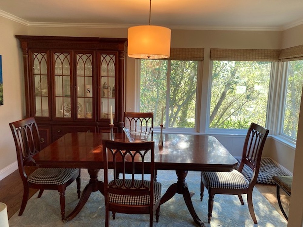
However, now I’m considering strawberry red! Your mood board with the strawberry walls is beautiful!
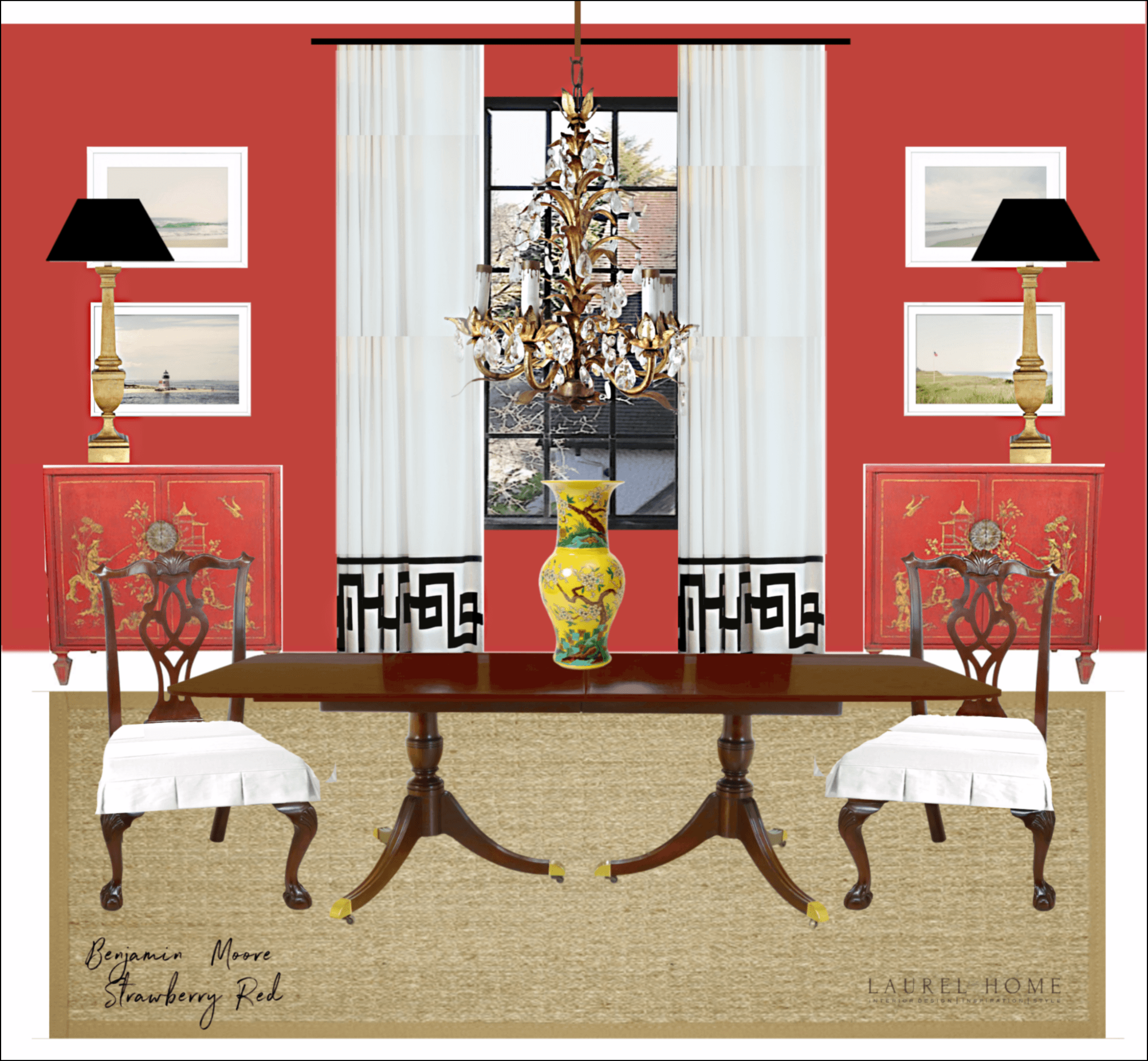
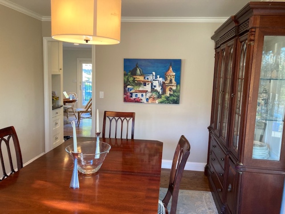
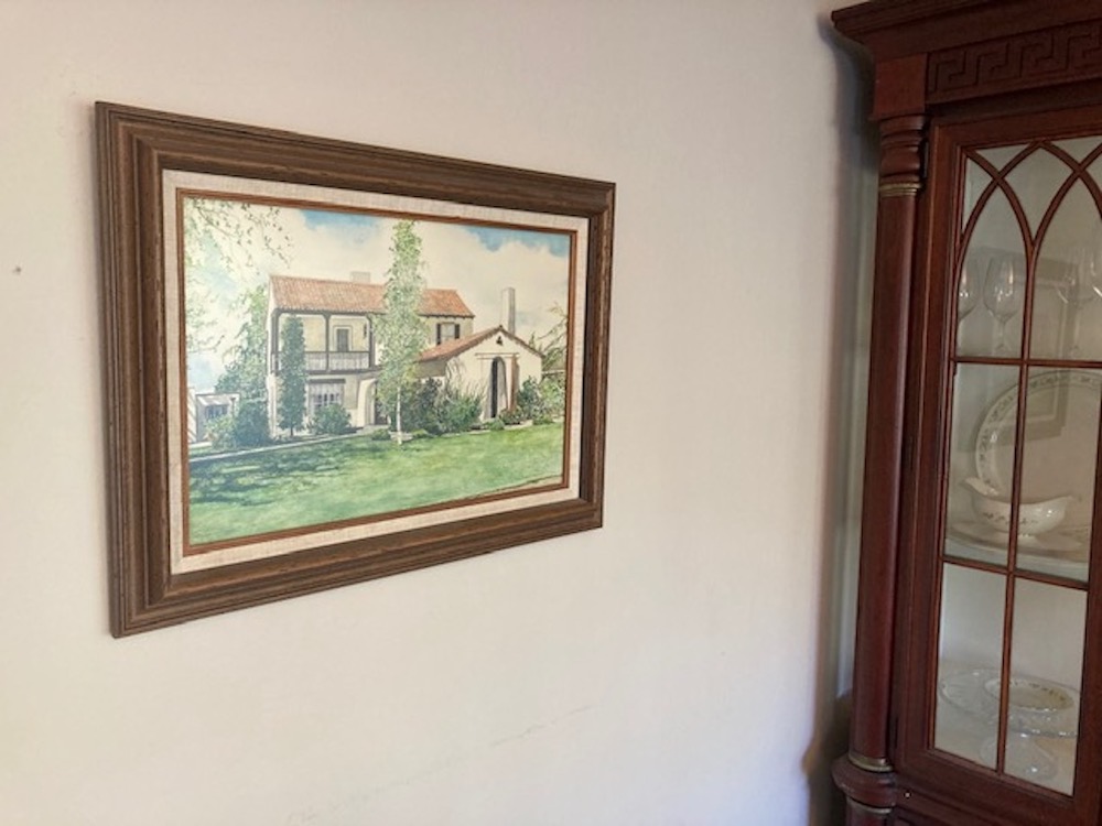
My question is, is my art is too busy and detailed for blue or red walls?
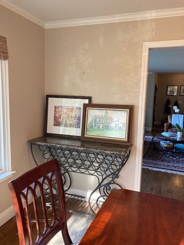
The art has sentimental value, and I want to keep it. The painting of the Spanish-style house with the red tile roof is my grandmother’s house in Central California. My grandparents built this house in 1937, and this house represents stability to me since my family moved so much.
My husband and I purchased the other two pieces of art on our honeymoon in Italy.
Do I need to invest in new art that is more neutral, like ocean scenes or other landscapes, to go with blue or red walls and the very traditional dining room furniture?
By the way, I’m 52 and blonde; I live in Northern California (the SF Bay Area) with my twin daughters (age 10), our yellow lab, Daisy.
We live in a ranch house built in 1972, and our town is relatively rural, although it is only 25 miles from San Francisco.Â
Also, I know my decorating needs help. I’m trying! That massive hutch in the dining room was my husband’s, and I realize it might be too large for the room.
Maybe painting the walls a darker color would help the cabinet to disappear.
I also know that the sideboard, which isn’t really a sideboard, doesn’t work. And the rug probably doesn’t work either. I’m trying!
[yes, it’s not easy]Â
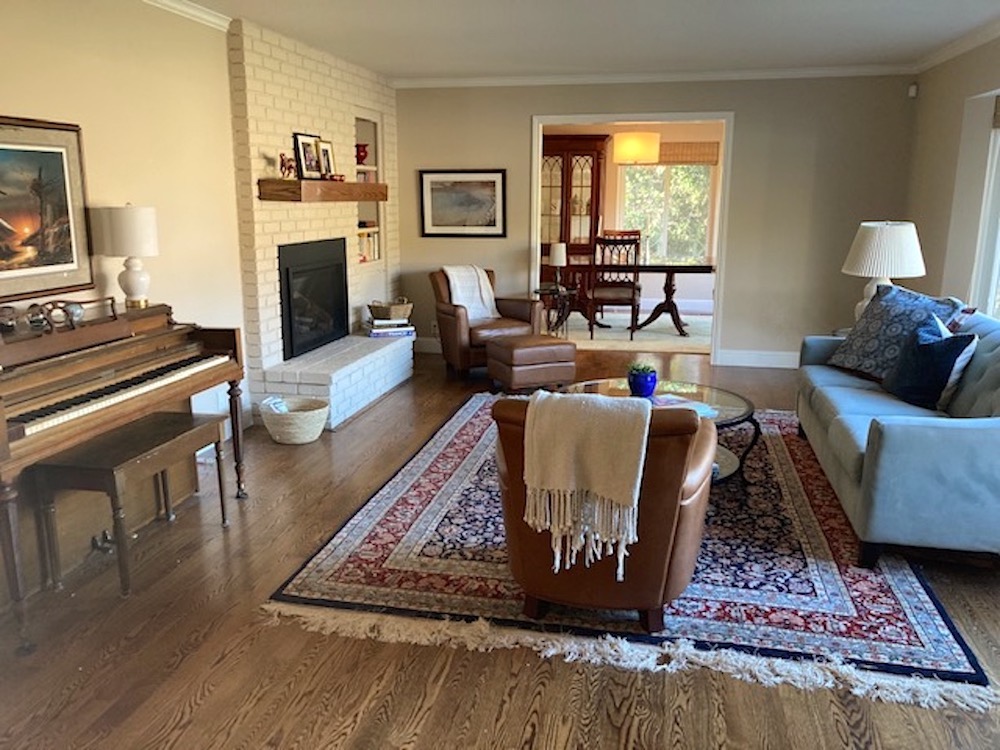
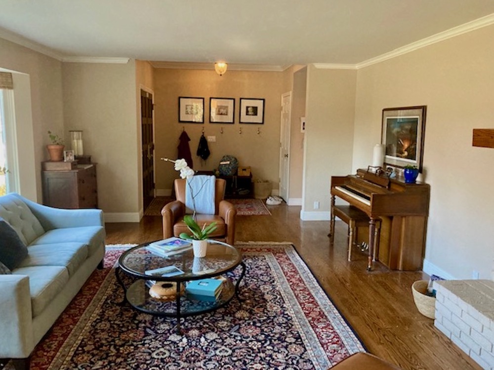
The entry, living room, and dining room all connect, so I’ve attached pictures of all these rooms as well as the art.
Thank you in advance for any direction you can provide!
Okay, I think this house has a lot of potential.
However, there is a problem that plagues a lot of people. The overall style of the home and furniture is casual and contemporary. That is, except for the dark dining room furniture.
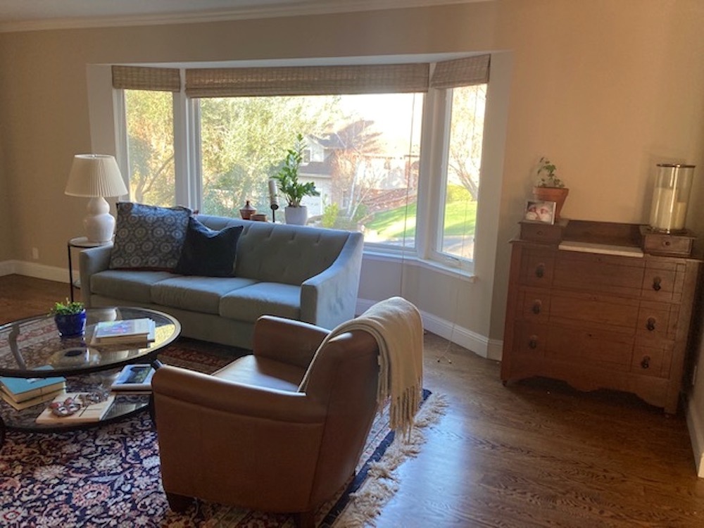
The first thing I’m suggesting is to take the china cabinet out of the dining room and put it where the piano is. Over the years, many of my clients didn’t have room in their dining room for a china cabinet but had plenty of room for one in their adjacent living room. So, the living room went, and they always looked great there.
Sally says that the piano doesn’t have to stay there and nobody plays it anyway.
I think that the cabinet will breathe a lot easier when it’s not stuffed on that wall next to the windows.
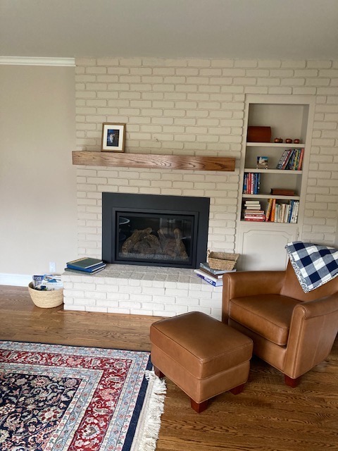
But, now there’s a problem with the adjacent fireplace wall, which is very casual. At the very least, a more traditional mantel will help that area a lot. Plus, some better styling. I would maybe put up a good-sized mirror over the fireplace or larger art.
The next place that caught my eye is the entrance area into the living room.
I feel that the opening is too open.
That leaves two choices.
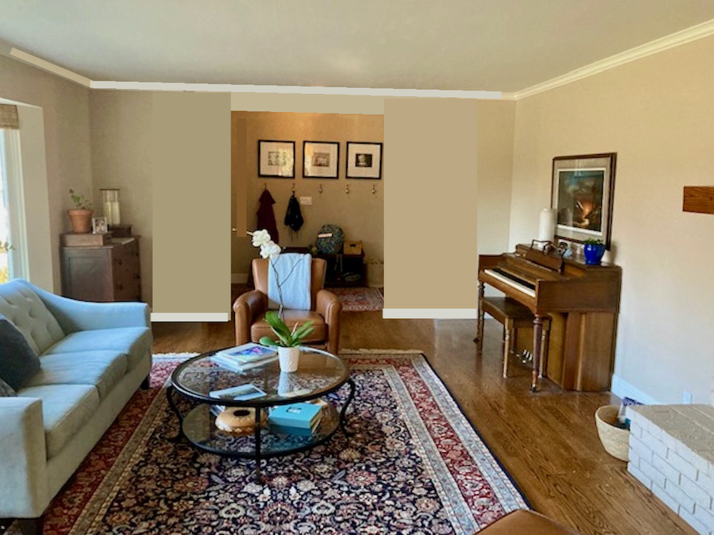
One is to close in those two walls a little bit.
I didn’t indicate this, but it might be possible to have two bookcases here.
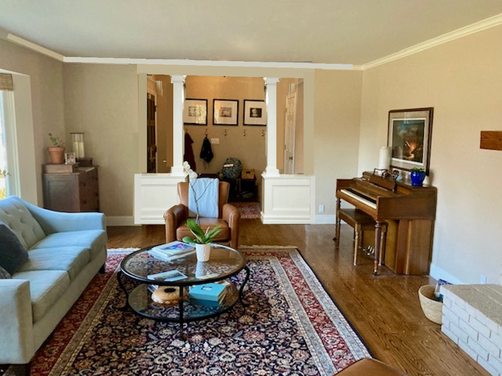
Or, Sally could do a pony wall extension. Above is a rough representation. But, I think it gives a good idea. I love this one because it adds architectural interest and a separation between the entry and living spaces.
In addition, I think this looks much more elegant and will be great for resale. Also, I would run the crown moulding all around the room. For more pony wall ideas, go here.
The other day, I got another email from Sally, who realized that her home could benefit from window casings.
This was after reading Sunday’s post about decorating details.
She’s right, but in her case, I think if she put up floor-to-ceiling curtains, it would be fine not to do the window casings as they won’t be seen very much.
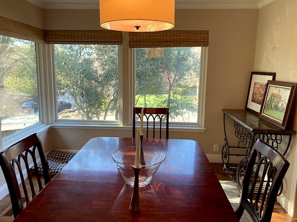
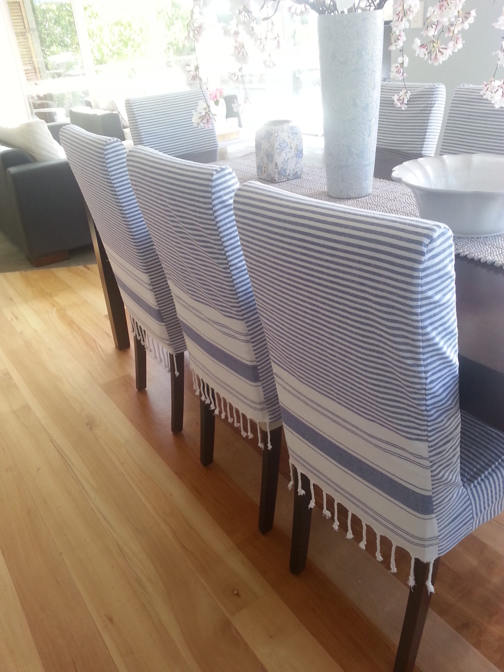
It might look great to add some heavy cotton slipcovers for the dining room chairs.
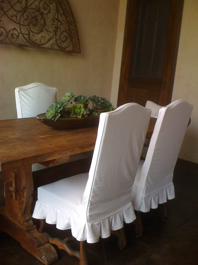
Maybe something like this
For a lot more great slipcover ideas, please check out these posts.
These dining room slipcovers are pretty cool too.
I would love to see a seagrass rug, or at least a darker area rug, on the floor.
As for the wall color, I think that either a beautiful soft red or a deep blue or navy would be terrific.
I couldn’t find a Polo Blue from Ralph Lauren. But, there are some beautiful navy blues in the Laurel Home Paint and Palette Collection.
I think the living room is off to a good start. I love the Pottery Barn Irving chairs! They are available in numerous leathers and fabrics.
I’m not going to go into a lot more detail here regarding the decor. Those ideas are extras.
The post’s main idea is that when the furniture doesn’t fit, sometimes it can go someplace else that you might not have thought of.
By the way, I have ordered furniture for clients that didn’t fit. Yes, indeed. I’ve talked about some of those sad occurrences in other posts. We’ve always worked it out. But working it out always costs me money. haha
This link will take you to more posts about ranch houses and ideas for updating them.
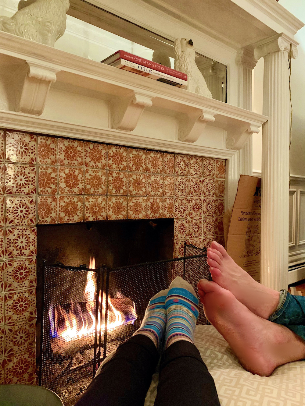
It was so lovely having my son, Cale, come for a 5-day visit. Last night he made a beautiful fire in the fireplace, and here we are enjoying it. Please note the new Staffordshire dogs on the mantel!
Today was wonderfully mild for February, a reminder that spring isn’t too far off.
xo,
PS: Please check out the newly updated HOT SALES!
Related Posts
- The 10 Best Sofas | What you Need to Know Before Buying
- Mixing Patterns – The Ultimate Guide To Getting It Right
- 30 Cheap Table Lamps + Sources + What Size to Get
- 12 Gorgeous Bedrooms + Common Questions Answered
- How To Get Gorgeous Free Art That Looks Expensive
- A Common Renovation Mess – Can it be Fixed?
- The Living Room TV As We’ve Known it, Is Over
35 Responses
Love the pic of your dogs and the Staffordshire porcelains! Cozy socks.
Tara Imani, I blushed when you called me out. Hah! I’m so impressionable. You’re my new bestie.
So many great suggestions. Laurel, I’m 100% in favor of softening the dining room chairs with slips. And I never would have thought to modify the entrance. Brilliant, as usual.
Sally, thank you for sharing your space with us to play with!
Right now, I’m holding a picket sign, marching in circles while chanting “More art, More art, More art.”
You’ve got a lovely start on it. And go with your heart when it comes to art (oooh, that rhymes!) More art! More art!
If you’ve got a strong color on the walls and want the art to play nice with the color, I generally recommend lots of white or cream matting, so the eye has a break between the two.
If it’s a piece of art that can’t be matted, just frame it.
Dat’s it from me. (More art!)
I think the issue is that the house is modern and the furniture and styles are traditional. That fireplace will always seem modern due to its asymmetry. Not to say they shouldn’t try to make themselves happy with what they have, but it may always feel off-kilter because it literally is.
Thank you for your informative post, Laurel! You always give the best ideas and solutions!
Anne-Marie:
Maybe a diagonal space plan could work after all… see NY apartment makeover in Architectural Digest January 2021 issue by designer Jeremiah Brent.
But as Donna Hoffman always says: “the architecture always wins.” So… maybe change the architecture.
Mary E, I feel just the same about off-center fireplaces! Poor Sally has to choose between the fireplace and the lovely bay window. There doesn’t seem to be room for one seating area based on each, so whichever one you don’t choose as the centre will have to straddle the space awkwardly.
Some people want the wall color (especially if doing bold colors ) to complement or not overpower/clash with their hair color. Along the lines of switching out lightbulbs for more flattering light.
Jayne mentioned a “curved sofa in the bay window”… I liked that idea. And I, too, wondered how best to select and position furniture to enhance that beautiful window.
So many great ideas from everyone… the peel and stick wallpaper idea on the back of the China cabinet. I might try that in some built-ins.
I saw a dynamic diagonal seating arrangement in the January issue of AD… I’m not saying that would work here. But something needs to be done to break up the long narrow Living Room.
I loved the idea of making the LR the Dining Room. It could become a dual purpose – Library, Dining, Projects, etc. The “sunroom” (with all the windows in the existing Dining Room, that’s what it makes me think of) could become a Parlour but then you’d miss sitting by the fireplace.
With the Fireplace “shoved” in the corner, it’s a bit tricky to create a sitting area near it without obstructing the pathway to the Dining Room, but it can be done somehow, I’m sure.
This is why people pay the big bucks to Designers to figure this all out.
So many big box e-tailers offer “free” design services – based on their (limited) inventory. They require you to measure your space and provide the dimensions and pics. They’ll, in turn, send you a layout.
As Maria Killam often says, “you’re looking for a look and a feel.” To that end, I think the idea of Arts & Crafts square columns might be more in keeping with the architectural design of the home’s exterior.
It’s a delightful project. Enjoy !! And I hope to see an update someday soon.
We now have water and power in Houston. What a week. We are blessed to be alive and well.
Thank you, Laurel, for letting me opine.
( trying to restrain myself from treating this comment section like a DIY Facebook forum- as that would be disrespectful, imo. And please forgive me if I have done so. No intention of that at all. You’re the Designer here. We are your faithful fans and readers).
Great post. I also live in Northern California! My parent’s home looks similar to the photos in this post. I now can better understand what I can do to help transition it into 2021. Thank you!
The china cabinet is beautiful. I have inherited furniture that has not always gone with my decor. I suggest using a peel and stick wallpaper in a bold design or color (push outside of your comfort range a bit) use it on the back panel inside the cabinet. It adds instant drama (or charm) depending on the paper. Also easy to remove when you change decor.
As always, Laurel’s suggestions are spot-on! I think seagrass or seagrass-look rugs are versatile and can relax a too formal space w/out looking wrong. One in Sally’s LR combined with the china cabinet could be great.I too loved the Strawberry Red mood board but noticed that there’s lots of green in your landscape. Do you want a strong contrast b/w walls and the view? With the general color scheme and feel in your home, I’d go with a deep moody blue in the dining room and repeat it on the fireplace. I just wallpapered the back panel of a china cabinet (inherited piece and in the LR!) with “York HO3300 Forest Lake Scenic Green Blue Wallpaper”and LOVE it. You might take a look at that colorway and think of trying a wallpaper in your cabinet. One thing, if you slipcovered the DR chairs, maybe do a tailored “slipcover” over the wine rack/console? Good luck Sally!
Hi, No, it’s in Porterville!
Hello,
Love your suggestions Laurel. There is one thought that I would add…I would simplify the entry by removing the hooks from the wall and perhaps placing them in a hallway or by the garage entrance to the home. Then I would add a larger console and one large piece of art or a great large mirror to the entryway wall. The family photos could also be added into the Living Room or perhaps also in a bedroom hallway. The entry would seem less busy, and would set the tone for the entire living area…Just my thoughts.
Agreed!
Perfect timing! I have a large hutch that I adore from my favorite aunt. We are downsizing, and will no longer have a place for it near the table. But, I can paint it to change the style and move it into my office. Storage bonus. And, like others, I love these posts brainstorming solutions for readers’ design dilemmas. Thanks!
Yes, of course move the sideboard to the living room. Laurel has taught us to see these things as obvious as soon as she mentions them, if not before.
Redo the dining room first. I would lean towards red as it is very enveloping for dramatic night dinners. Painting should be inexpensive if you do it yourself. As others have suggested, move the living room rug into the dining room. And yes to reframing the art. Good framing costs a lot, but you might find a decent sale at a chain store. I do not see a color problem regarding the art in any way. Do make the frames/mats bigger and study the various frame styles very carefully.
Maybe get two upholstered host chairs. Lose the wine rack? sideboard completely. Install a more traditional chandelier but not too formal — don’t go for crystals as it will only reinforce the difference between the living room casual and the dining room formal.
Then take stock of what strikes you as most important to do next. Once the dining room feels right, start making changes in the entry/living room. But personally, I’d put my money into the living room rug, etc. before changing the entryway at all.
Hi Laurel,
Between your suggestions & those from your readers, I think everything was covered. I can’t think of anything else to add.
But I would like to know why fireplaces in so many homes are off-center on the wall? It makes decorating so difficult.
I like your fireplace, Laurel. Will you be incorporating the tile colors into your decor? They are fabulous!
(my comment below was in response to the comment by Anne Davis)
Ha! No, I believe in another post that Laurel commented that she can often ascertain colors that a person likes based on their coloring. I think she said something about blondes tending to like red?
First, I would swap the rug in the Dining Room which is softer and more neutral with the area rug in the Living Room. The more neutral rug wouldn’t fight with the rug in the entry and the rug in the living room is more in keeping with the style of the dining room table and chairs. Next, I would change out the lighting in the dining room. The table needs a chandelier since it’s so formal. I wouldn’t paint the dining room a dark color — the rooms seems dark anyway — I would go with a light grey in the living room and dining room and the art work would work well in either. I also don’t mind the mantle in the living room because it is a California ranch and a more fancy mantle would be completely out of character. The other change, I would like — I like symmetry — is a curved sofa in the window alcove with the chairs flanking/facing each other. To make the fireplace more current and eliminate that big black hole, I would paint the brick a dark charcoal grey and the mantle will pop. I also think you need drapery panels on either side of all the windows to soften the space and maybe add some pattern.
“By the way, I’m 52 and blonde”
Hahaha – is she hitting on you?
I am curious if the Grandmothers home was in Merced, Ca in the San Joaquin Valley. I think I recognize the home.
My, my, my. I feel like I just hit the jackpot. There are so many ideas here that will motivate me throughout the day as I take a “tour” of my own house.
Thank you Sally and Lauren.
PAT,
I love all your comments. In addition, how about a larger piece in the entrway to make it more dramatic ? A larger piece with storage for shoes, etc. and a lamp with a mirror to check oneself out before leaving the house and for added light.
Agree, china hutches usually look better in the living room where there is room for them and not in the dining room which is usually too small to begin with. Regarding the artwork, there are three elements to think about: the image, the matting and the framing. If she is in love with the images, she needs to redo the matting and framing. I think a look at Steve Cordony’s living room would provide a lot of inspiration for this living room.
I have to say that I think Sally’s dining room furniture is really pretty, although maybe a bit formal for her casual style house, and I agree that the china cabinet is too big for the dining room. I like the idea of slipcovers.
I know I am digressing, Laurel, but I love the tiles on your fire place. The sides look as if they are older, and might be original to the fireplace. Do you think the top section was added at a later time?
I didn’t comment on Sunday’s post but am very grateful to both readers for sharing their lovely homes. I love these makeover posts too. After 5 years of reading your blog, I’ve learned so much. Sometimes I see a solution before you suggest it and I get so excited. It’s quite silly. I feel like the kid that got the right answer in algebra class. As soon as I saw the piano I thought “the hutch should go there!” Yeah.
I love the artwork and think it will be even more beautiful on a dark wall. To me art should stir some emotion or memory in us rather than just compliment the decor. Thanks for sharing Sally.
Thanks, Anne, I do not see the ad any longer either. I’ll check my settings, thanks for the info.
What a beautiful home, location, setting, and view, and what great windows! I’m going to go against the grain and say that I love the china cabinet where it is, because it is something good to look at from the other end of the living room! Having painted two different dining rooms red, I’m going to recommend the blue option! I think that room would look great in a darker blue, maybe something pulled from the living room rug? What about moving the dog bed and putting a tall plant in the window corner to balance the cabinet, and also add something big to the dining table, that could also be seen from the other end of the living room?
To me, it’s the living room sofa and rug combo that isn’t working. Could the rug go in the dining room and get a natural rug for the living room? And maybe a sofa that vibes better with the leather chairs? As to art, it will look great on a colored wall.
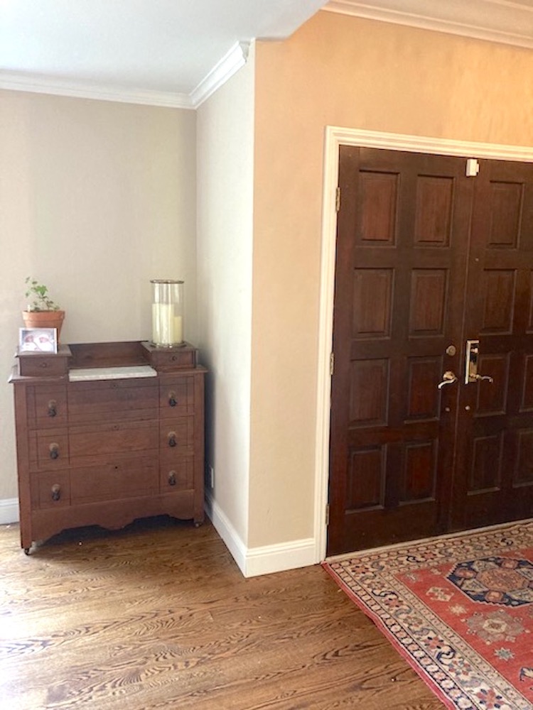
I think you need more, though. The dresser near the entry looks a bit crowded where it is. Could it go on the wall to the right of the dining room opening, to balance out the brown chair? As to the wine rack console, it vibes more Tuscan than any of your other furnishings. I used to have one and moved it onto a screen porch, where it worked great. Thanks for sharing your beautiful home!
Agree… this house CAN be delightful.
Moving the china cabinet to the LR is brilliant!… and then fill it with books, and LARGE items. the little “dresser” inside the door of the LR is probably incredibly handy and useful… but it looks lost. And poor little spinet piano… but at least it’s not a 48 inch black upright!
Knee walls are fab… perhaps simple tapered “craftsman” square pillars?
When walls are slightly darker or richer, gold picture frames set off the paintings brilliantly (you can order impressive but less expensive online… esp easy for oils).
And indeed, the fireplace argues with the china cabinet and the rug … charcoal sounds interesting and perhaps painting the mantle a contrasting “pop” of off-white?
And I’m back to “I hate my MASSIVE brick fireplace”…
I think the painting of the grandparent’s house is lovely, but should be given a new frame. It would make it fresh again!
Often times people have company come for dinner (prior the pandemic) and then off to the great room for coffee ad dessert. My suggestion is switch your unused living room into your dining room. Now the living room is the dining room and the once was dining room becomes a reading room. Lovely. Or, my Greek friends have a tradition, the women go to the living room and the men go to the garage. That’s an IDEA!
Great ideas, Laurel, as usual. I would like to reply to Diana’s comment about the popup ads: Diana please check the popup settings in your browser as those affect the ads. I do not see the Walgreens ad you see blocking Sally’s letter, nor did I experience the problems with popups that were mentioned in Sunday’s post comments.
Very informative post!
I understand that you are monetizing your blog, and that there are pop-up ads. However, now there are ads that are totally covering the copy, and you can’t close them. I am referring specifically to the Walgreen’s ad at the beginning of Sally’s letter. When the ads interfere with reading your words, that is a problem.
I think the living room rug would go nicely in the dining room and, as Laurel said, paint the walls the red or blue. I’d also paint the walls or fireplace a different color so there’s a bit of contrast.
I love the artwork of the grandparents’ homestead and the other Italian village. And I love your idea, Laurel, of creating a grander entryway using the architectural columns and half walls. Could that white woodwork paneling be carried up and along the wall and then feature those two paintings on either side, adding art lights above each.
I can’t wait to see the beautiful China cabinet in place of the piano as you suggested. It deserves prominence and breathing room. I love it all: your sky blue & white pinstripe slip covers for the dining room chairs, etc.
I wonder if the piano would fit comfortably on the wing wall separating the Dining room and LR – opposite the fireplace.
The only element that bothers me is the fireplace (you did suggest a more formal mantle) and built in shelves. Would this element look better painted a deep charcoal grey or whatever blue she chooses from your palette.
Like Michele Winter said in the comments section for the last post, I, too, love these “design challenge” posts.
I’ve created a Pinterest board called “Space Planning Challenges” and am pinning them there.
I would buy those two art pieces. They really speak to me. But I understand they’re not for sale.
Nice socks!! :).
Good night,
Tara