Over the years, I have heard over and over that it really pays to have professional photographs for your interior design portfolio. And now and then, a photographer will contact me to tell me about his services. One recently, even went so far as explaining how he got rid of anything even remotely “unsightly” like the light switches, for instance. In one photo, he added an out of focus person walking down the hall. The result was so slick— it looked like a 70 year-old-woman attempting to look 25; quite artificial.
Well, I don’t want my rooms to look artificial. I want them to look like you could just step right in and plop yourself down with a cup o’ jo or something stronger and feel really, really good being there. That is why I prefer the photos in Domino to those in Architectural Digest, as a rule.
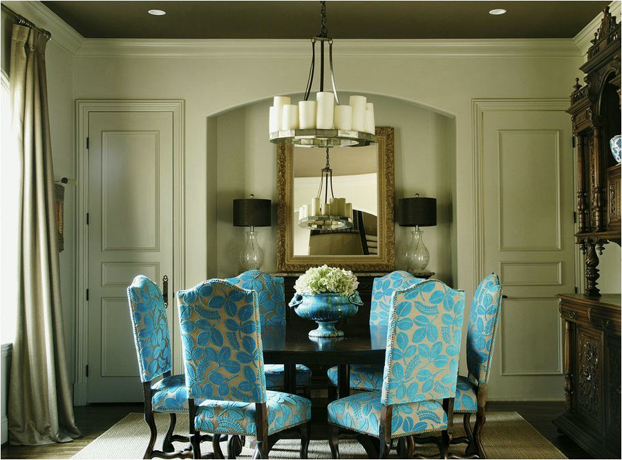
And I’m not saying that I’m never going to hire a pro photographer. I’ve seen some designer’s portfolios where I think that the photography is stupendous! Here is one such portfolio.
What makes these photos great?
- high-resolution images and large on the screen
- the rooms are beautifully staged
- the shots are beautifully composed
- the lighting is natural and soft
- there is careful attention to color
Color is a very important aspect which I find is often overlooked. Oftentimes, I see photos where it looks like there is a thick film of pink or purple over the entire photo. And I mean PURPLE. Digital photography tends to run bluer than it should be, I’ve discovered. The old-style [remember film?] cameras tended to make everything yellow. I’m sure that a camera geek could explain that better.
Since this is not a guide to photo editing but just one easy photo editing trick I discovered, I will shut up :] and get to my point; the one ridiculously easy photo editing trick [that I think you’re gonna love.]
This is my desk with the [legendary] Zuber screen and TURQUOISE vintage lamp I picked up on Etsy for 60 bucks.

Errrrm… Laurel… umm… the lamp is not turquoise; it is most decidedly blue.
Thank you. Yes, I know that. :] It certainly looks blue in the photo, but in real life, it is absotively, posolutely turquoise and I so wish I could just yank y’all into my pretty always-sunny living room, for ten seconds, just to prove it to you. It is only one shade brighter than the Laura Kirar fabric on the pillow on the chair. All the other colors are as true as can be. [at least on my screen which is a Dell PC]
I took this photo about a year ago and it has been bugging me ever since. It didn’t stop me from using it, because otherwise, I think that this shot turned out great. And while I don’t mind the color in a it’s-not-too-matchy-matchy-kinda-way, it’s not really what it is. BTW, when I saw the photo of the lamp on Etsy, it also looked blue. I was very surprised that the lamp was not blue when I got it, but loved it anyway.
There’s something else, also very interesting. When I was at Americasmart last month, I took this shot at the Emissary showroom.
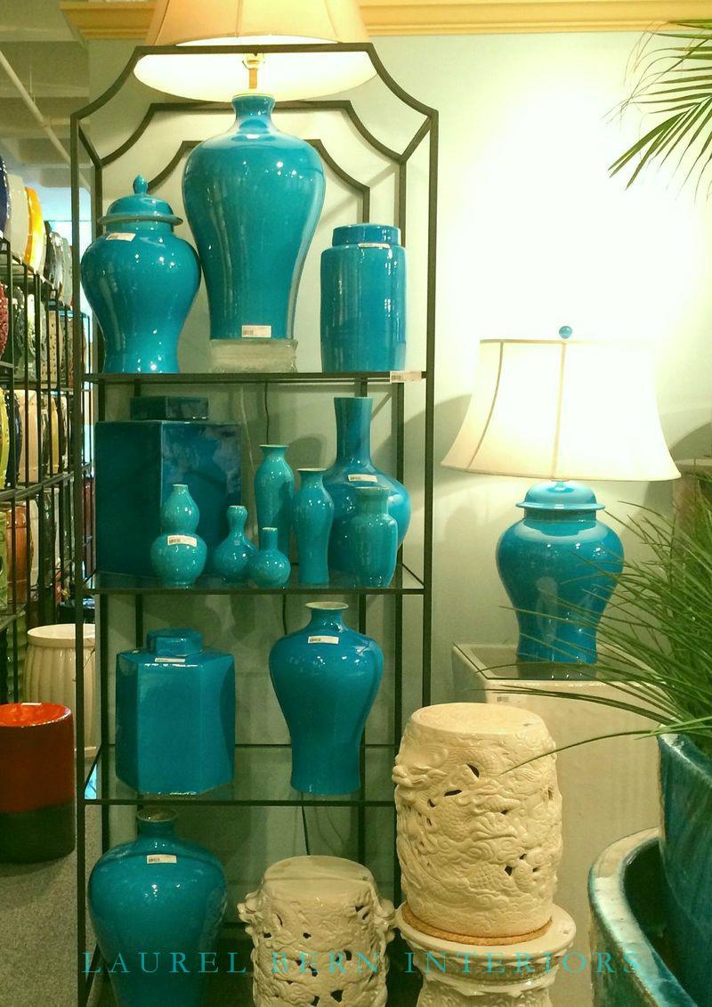
These are heavily color-corrected and they still are not quite as turquoise as they really are. The display was stunning! Therefore, there must be something in the way that the camera lens interprets turquoise porcelain that renders it blue. Any camera geeks out there who can explain this phenomenon?
Anywho. Sorry, this was supposed to be a quick post and here I’ve been bending your ear some 600 words later.
Remember picmonkey which is more fun than a barrel of pickles? ;] Picmonkey if you haven’t read my other posts or don’t know what it is, is Photoshop for smart dummies. It’s FREE, [or maybe there’s a small fee for the upgrade] and it’s EASY, EASY to work. Very intuitive. And, it’s fun. And no, they are not paying me to say that.
Here is how you do the one easy photo editing trick.
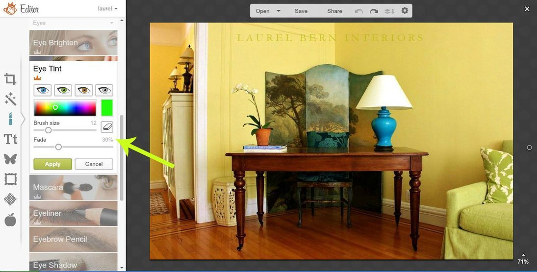
In picmonkey, you open up the picture editor and upload your photo. I thought that perhaps I could find a little “makeup” to change the color of my lamp, and just the lamp. I found “eye tint” which I opened up for you in my screenshot image. As you can see, there are some little toggle thingies to adjust the color, brush size and fade. Fade controls the amount of translucency of the color you want to use to change your object. Then, you carefully “paint” whatever you want to change; in this case, the lamp, of course. When you get the effect you want, you save it to wherever you want to keep it on your puter. I usually rename it and I also keep open the image on picmonkey temporarily in case I need to come back and change something. Once you close it there, it’s gone. Picmonkey does not save your work. Perhaps they should. There is another program that is similar called Canva which I believe does save your work, if you like.
And here is the finished result.
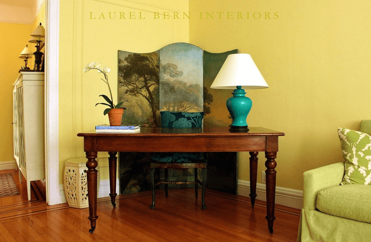 My desk with the now color-corrected lamp base done in picmonkey! I love it! I think that it looks completely natural and now, it’s the right color!
I’m going to need to redo the portfolio page soon, because something weird happened to it and I can’t add anything new without the size changing, so eventually, it’ll get on the page in its new form.
xo,
![]()
Related Posts
 How to find the source of an image on google
 Virtual Interior Design Services Preview
 My Living Room in Bronxville, NY
 Painted (upholstered) Furniture – yes, upholstered!
 Greetings from the Design Bloggers Conference Atlanta {#dbc2014}
 Looking for the Perfect Rug {and some art for Laurel’s Home}
 the laurel-home shop and Don


