Last fall I told myself –“Come Hell or Googlegeddon, I’m going to the High Point Market Spring 2015.
After-all, it’s only been NINE-TEEN YEARS!
WHAT? YOU HAVEN’T BEEN TO HIGH POINT IN NINETEEN YEARS LAUREL???
Geeezzz… Please– stop yelling! I’m already feeling badly enough as it is. However, when it came time to decide to you-know-what or get off the pot, last March; I couldn’t do it. The reasons were compelling. I’ve learned when I get red lights to heed the warning. Still, as I was researching this post, was feeling quite a sharp twang and it wasn’t in my ailing foot. All I can say is… when I finally do go… I hope that everyone uses my pics (with a link back!) :]
But LAUREL- WAIT. How are you able to know what’s what in the design world without going to High Point?
Surprisingly easily. After-all, don’t forget we have our crap New York Now show. There’s advertising, online vendors that I stalk, colleagues and even other clients from time to time. There are lots of ways to see the furniture. It wasn’t all that long ago, that I had a closet full of catalogs. No more. It’s all online which is one of the most wonderful things about the internet.
In addition, it wasn’t that long ago that interior designers were often met with a not-so-friendly demeanor by vendors who were only interested in selling to stocking dealers placing huge volume orders. Well… the recession hit and a lot of those stores no longer exist.
Now us once lowly decorators have a lofty place as sponsored attendees and style spotters. A few years ago, marketers realized that manufacturer/vendors would be wise to partner with us design bloggers who attract 100s of thousands if not millions of readers a year.
One of our early designer-blogger pioneers is our own immensely talented Tobi Fairley. And as it happens, she was the darling of this spring’s show and just darling- period. I’ve met her a couple of times. If you aren’t familiar with her, please check out her website. Not only is she a fabulous interior designer, she has a side-gig coaching other interior designers about how to run their businesses. And now she’s designing home furnishings.
Tobi debuted not one but two collections at this high point market spring 2015. The first is a cool collection of abstract art for Soicher-Marin a wonderful vendor of fine art prints.
The second collection, which I’ve been anticipating for nearly a year is her collaboration with one of my favorite upholstery vendors, CR Laine.
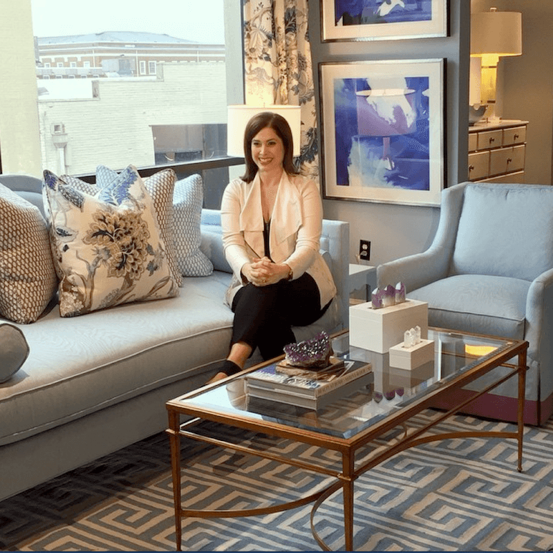
Here’s Tobi sitting proudly in one of her exquisite vignettes for CR Laine with art by Soicher-Marin. The piece she’s sitting on is actually a day bed, but it’s the most “unbeddy” day bed I’ve ever seen. And it’s so pretty too! Tobi designed lots of interesting details which are optional in all of the pieces.
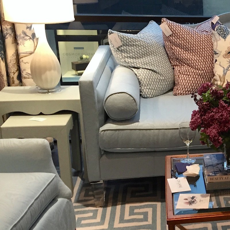
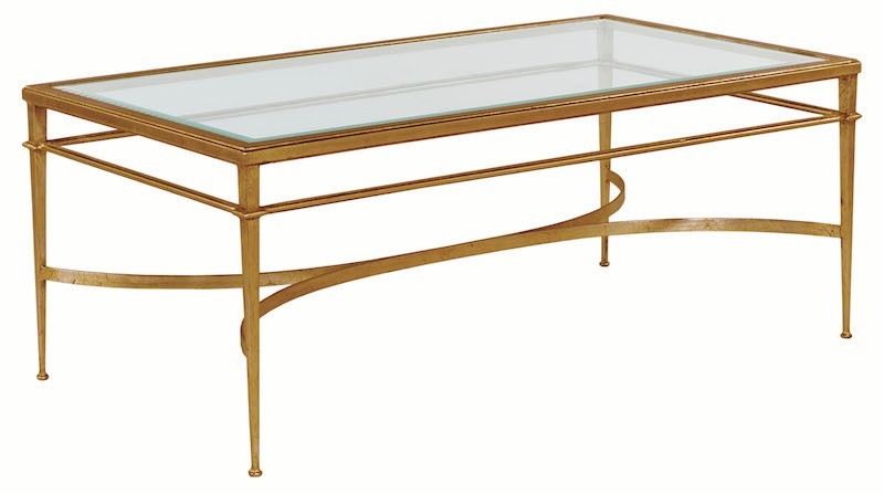
In this case, she included some cool lucite legs for a sleek neo-trad look. I know that you’re dying to know where the coffee table came from. I was too! Isn’t it wonderful? It’s from Woodbridge Furniture.
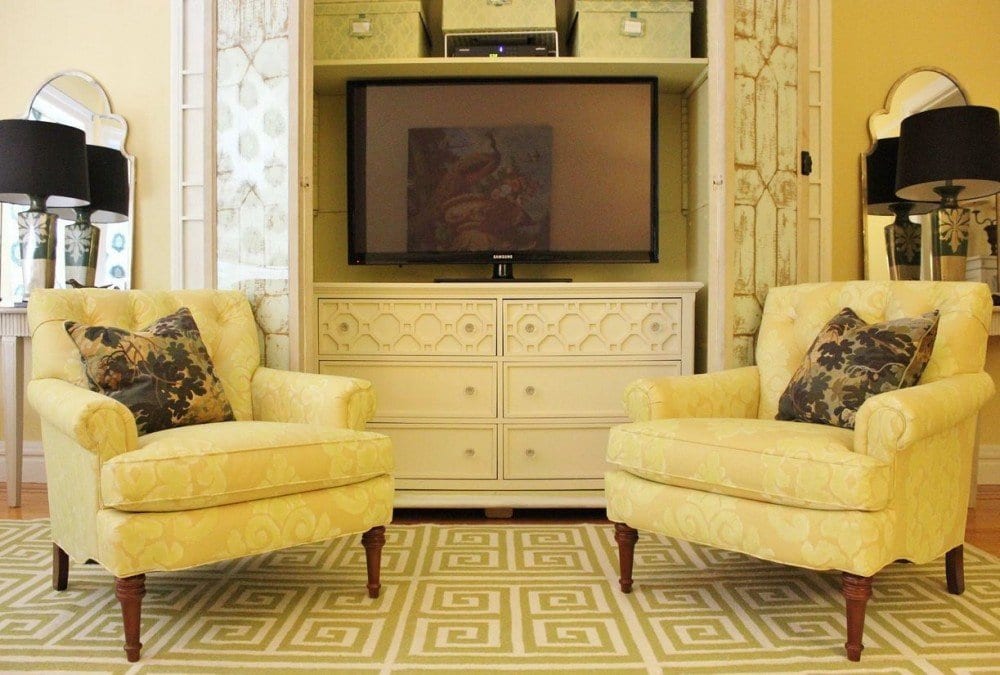
Yes, the blue rug in Tobi’s vignette is the same pattern I did 2 years ago—From Surya. I LOVE my rug! OH! and the chairs are from CR Laine! How funny!
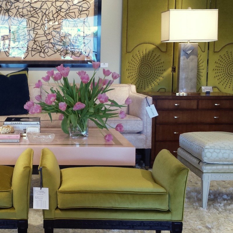 photo by Lynda Quintero-Davids
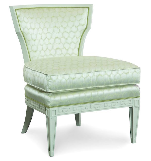
Another fabulous vignette from CR Laine. Tobi’s style is glamorous, classical and retro all at the same time. Oh man… am I a happy girl to finally see a trend towards sleeker, smaller furniture! I adore that retro-inspired sofa!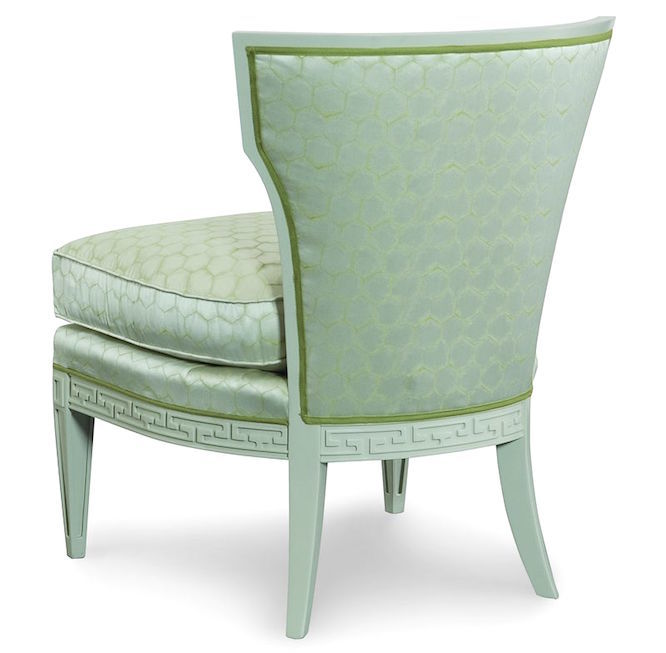 Fabulous carved Greek Key-esque detailing on the apron of this slipper chair.
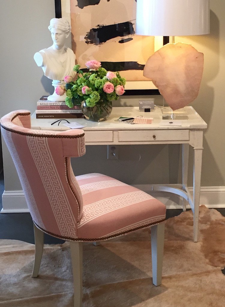
Fabulous chair with desk. Classical and pretty. The quartz lamp is by a wonderfully talented designer, Lauren Renfrow of Times Two Design
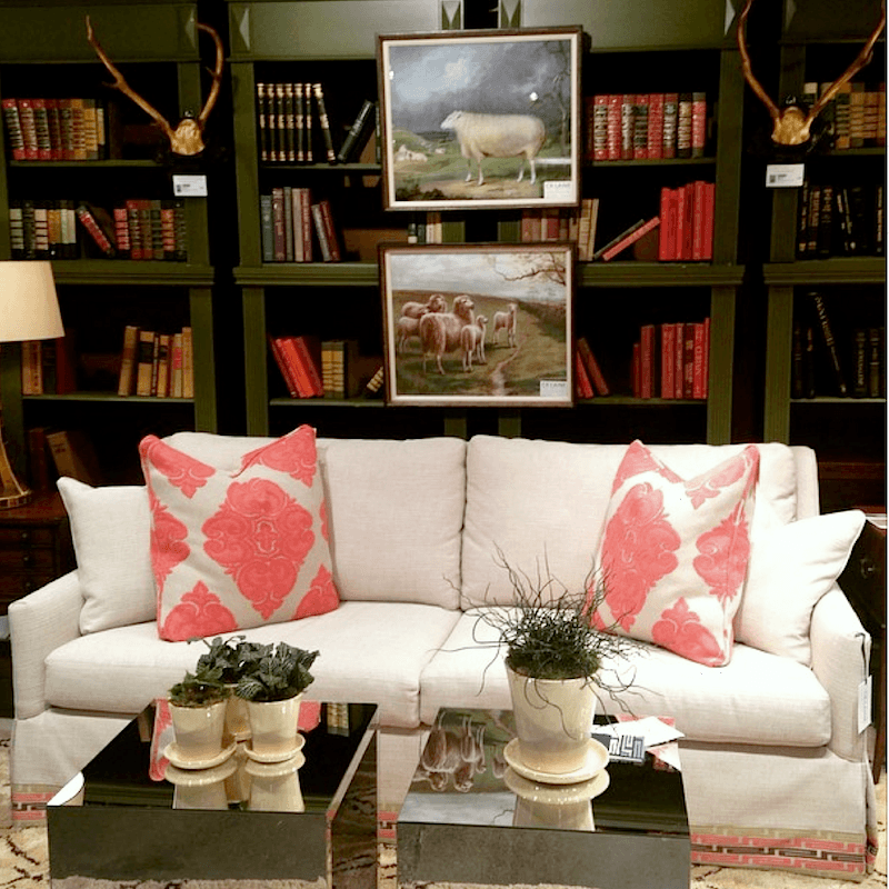 photo by: Victoria Louise Art (Guglieimi)
Another shot from the CR Laine Showroom. Love the trim on the bottom of the sofa.
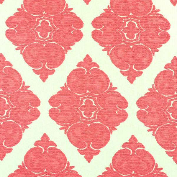
The pillow fabric is a new introduction this spring at CR Laine.
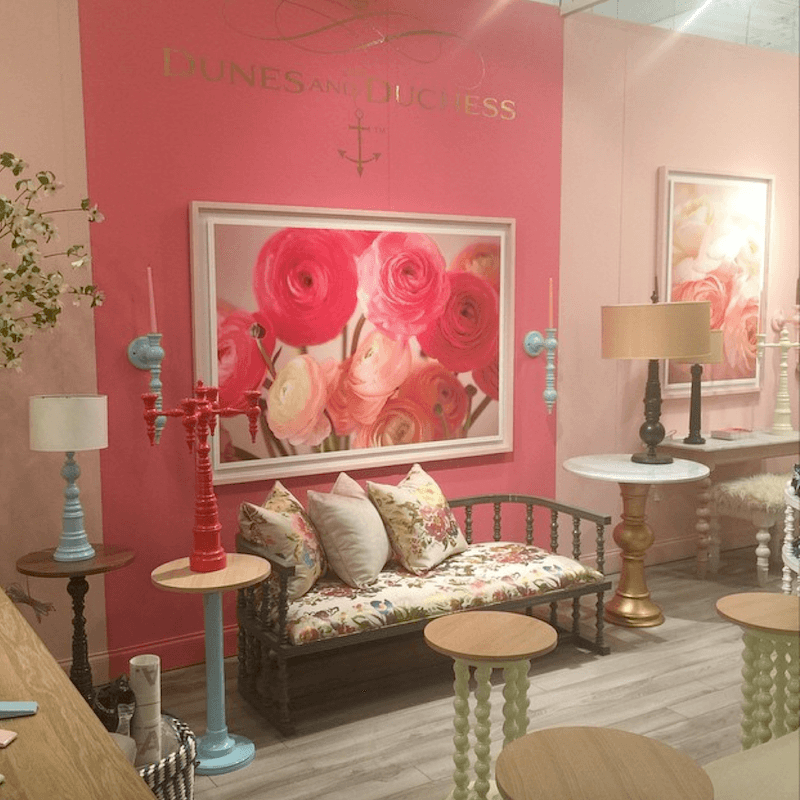
Above and below is the Dunes and Duchess showroom owned by Stacy Kunstel. I met Stacy last summer as she was a speaker at the day of design at the Mayflower Grace in Washington, CT. Her booth of charming and colorful home accents is the epitome of this year’s over-riding theme.
COLOR— And LOTS OF IT!
and flowers too!
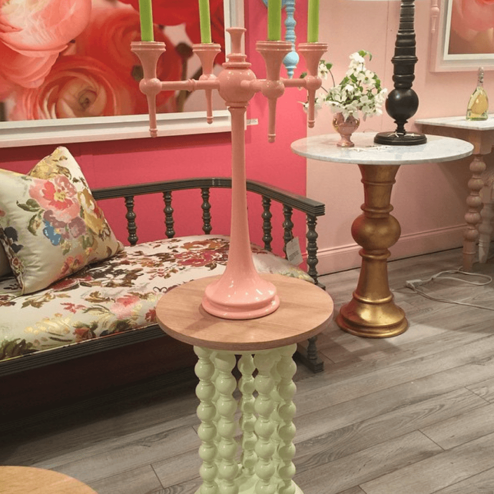
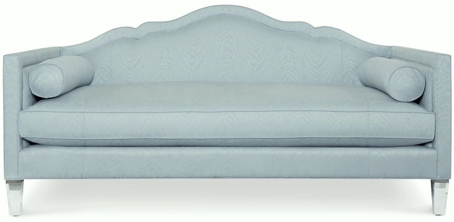
Here’s another shot of Tobi Fairley’s daybed for CR Laine. Tobi didn’t just work in pastel tones. She also had bright orange and fuschia pieces which you can see on Lynda’s Flikr pages.

Another vivid vignette from CR Laine – photo by Lynda Quintero Davids
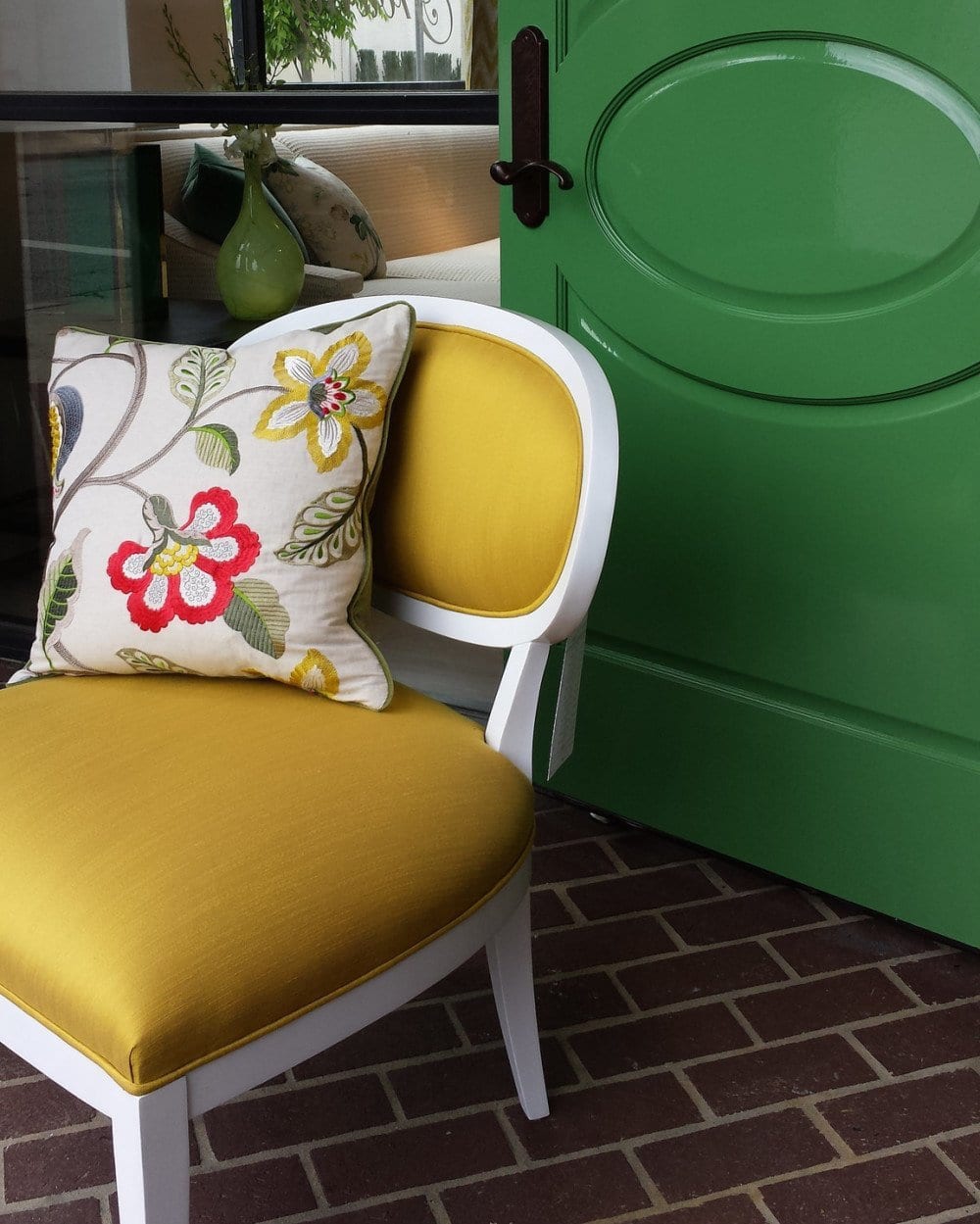
Another wonderful neo-traditional vendor is Wesley Hall. Their line positively reeks with high style. Oh, and check out those gorgeous doors. They remind me of those cool doors at Metrie.
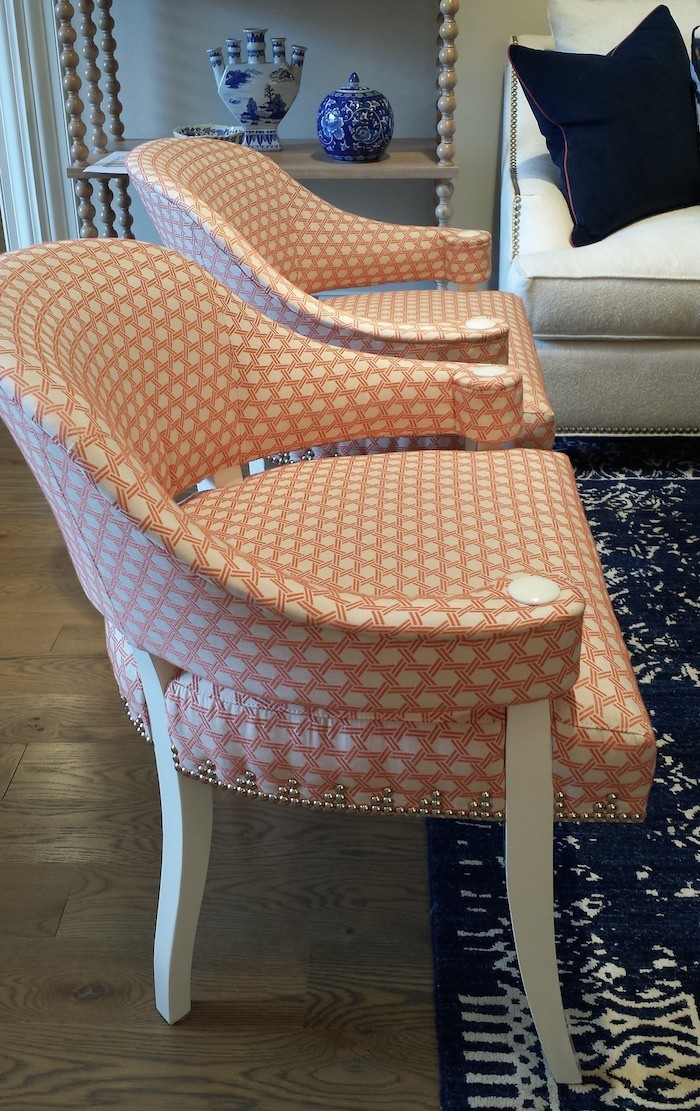 photo by Lynda Quintero-Davids
Another on-fire design diva is Meredith Heron. She just came out with a line of fabrics for JF Fabrics and this is one of them. Love it and love this barrel chair from Wesley Hall.
*********
And now, I want to take you to the Junior League Showhouse Sponsored by Traditional Home that opened up concurrently with the market.
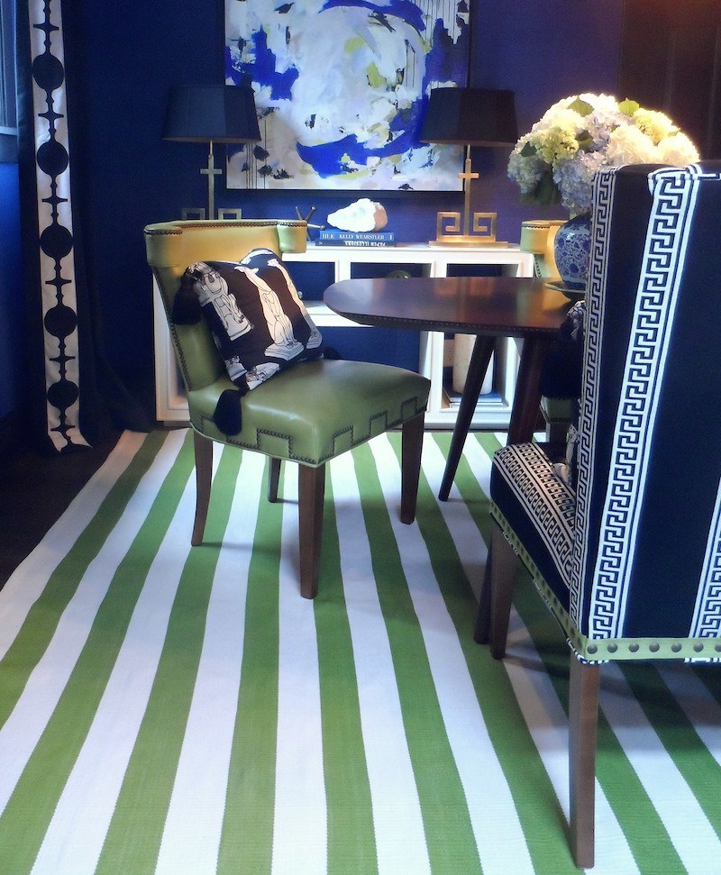 photo by Lynda Quinterio-Davids
JUST SHUT UP!!!
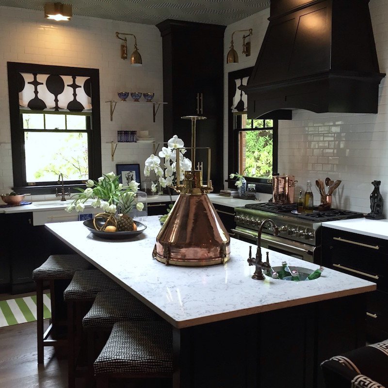
Above and below the show-stopping kitchen by Lisa Mende. The space is so well-thought out and rich in detailing. Of course, I was stopped dead in my tracks by the Greek Key patterns. And ahem. Notice the same chair as in Tobi’s ethereal workspace, now in acid green leather and decorative nailhead trim.
Lisa has struck just the right balance between a vintage feel and contemporary bold prints. I adore the light fixtures, the open shelves and the fabric on the Roman Shades–well, all of it. Truly inspired!
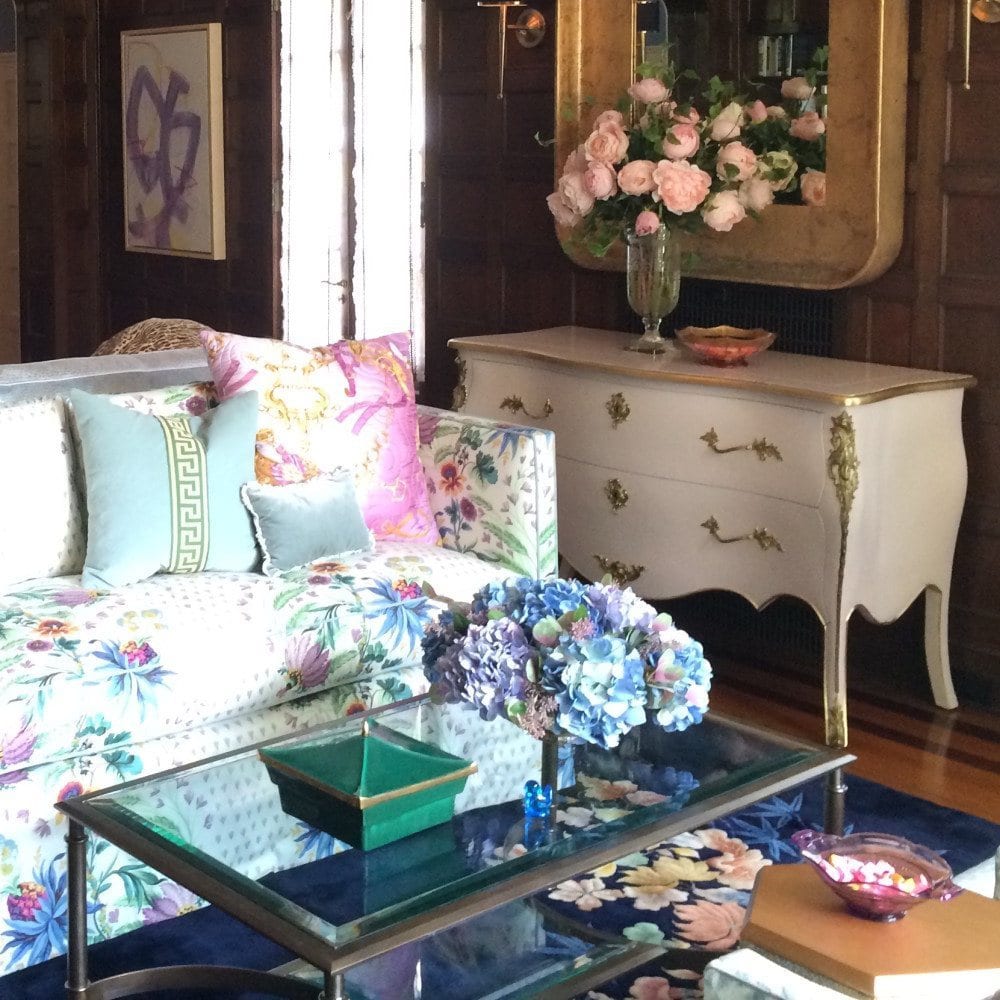
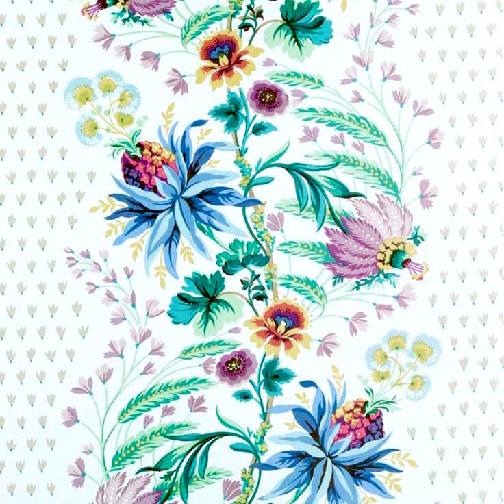
Astonishingly wonderful room by Michelle Workman. She took a paneled library and did the diametric opposite of what one would expect. The pivotal fabric is a reissued document print by Bailey & Griffin (available through Duralee Fabrics). It has that snooty country club look of the 70’s but the way it’s used here looks fresh and modern, even. Brilliant!
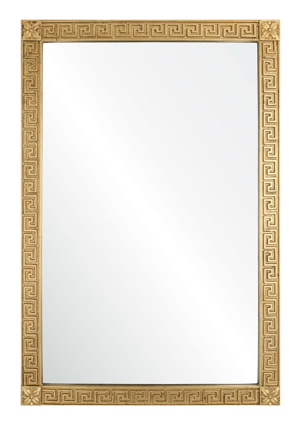 I want this mirror. It’s designed by Michael S. Smith for Mirror Image Home.
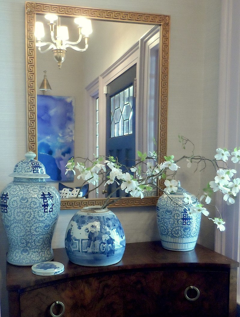
Below, Tracy Zeller used the very same mirror in her elegant entry for the showhouse.
A special shout goes to Lynda Quintero Davids who is an interior design colleague of mine via facebook. She took a BAZILLION photos and generously allowed me to use some of them. If you want to see virtually the entire show, please check out her flickr pages.
I very much enjoyed my virtual visit to the High Point Market Spring 2015. I enjoyed the free-spirited vignettes. While not everything was full of strong color, there was a noticeable trend towards more feminine shapes and lots of pink, green and blue! Gold is still very hot and so is Chinoiserie. I’m so glad.
Pretty is on trend!
xo,
![]()
Related Posts
 The Best of the 2014 Spring High Point Market | #hpmkt
 Interior Design Larchmont NY | New Portfolio Photos!
 Revealing The Hottest Interior Design Trends For 2015
 10 Common Interior Design Mistakes
  Hot Off The Press! High Point Furniture Market Fall 2014
 Laurel’s #1 pick for the best sofa (addendum)
 How Much does it Cost to Furnish a Room?


