HELP ME PLEASE! My Child Picked An Ugly Paint Color!

Dear Laurel,

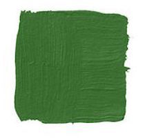
Thanks for all of your posts about painting adult rooms. But what about kids’ rooms? My son is 6 and I thought I would let him select a color, so we went to the store and he chose the brightest most putrid green I’ve ever seen. It’s called Sweet Pea 2031-30

What am I going to do? There is no way I can live with this wretched color!

Gonna Hurl

***

Dear Gonna,

Sweet Pea, eh? Yuck, you are so right. There ain’t nothin’ sweet about that color! It looks like the run off from a toxic waste dump.
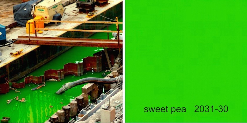
toxic-waste-sweet-pea

Alright. You are indeed in a bit of a day glow pickle. However, you asked for help, so please take this in the loving spirit in which it’s intended. And know that this is coming from a mom with combined 45 years parenting experience. (with two high maintenance boys) And, I’ve helped dozens of young families pick paint colors. So here goes…

I don’t recommend letting your child actually pick THE ugly paint color.

Here’s what I would say, “honey, would you like your room to be yellow, blue, green, orange, red, pink or purple? That is enough for 99% of all 6-yr-olds. If you happen to have a color genius on your hands, then wonderful! Let them come and work for me. :]

However, yes, it’s too late. You let them at it with the fan deck and he put his adorable little sights on the most hideous shade out of the whole bunch. But, fortunately, there’s a way out.

This is what you’re going to do.

You’re going to lie.

Oh, stop looking at me like I suggested you go streaking across Madison Square Garden! YES, LIE!

The first rule of good parenting is the art of lying to your children. ;] I don’t mean the kind of lying like not telling them that they were adopted until they are 18. I mean the kind of lying like slipping in a bit of zucchini or spinach into his burger!

Most, not all, but most 6-yr-olds have no idea what a color will look like on the wall. Hell, most adults don’t either. A color that looks good on the chip is possibly not going to look so great when it’s magnified 100,000 times.

There are two ways you can lie.

One is an out-and-out lie. “Honey, I’m so sorry, but they don’t make that color anymore… there’s an extreme shortage of the radioactive plutonium oxide required to create that unique color!”

The truth of the matter is… They should NOT be making that color! It’s disgusting. There is absolutely no application I can think of except perhaps the interior of a holding cell where they keep terrorists or something like that.

This is what happened.  Some 20 years ago, many people were complaining about how “drab and muddy” the Benjamin Moore colors were. You know… Revere Pewter, Horizon, Quiet Moments, etc… the colors that are WILDLY popular now. So, the suits at BM went to the opposite extreme and created COLOR PREVIEW, a collection of largely insanely bright colors. Doesn’t Preview mean a glimpse of something to come? Well, I don’t know what happened, but a few years later they brought back the old colors and did a Coca Cola and now call those horrid muddy colors the “Classic Colors.” Oh whatever. We believe whatever they put in front of us. For some reason, they kept the so-called preview. I do use the preview fan deck because amidst the chromatically assaulting colors are still some lovely shades and some of their best shades of white.

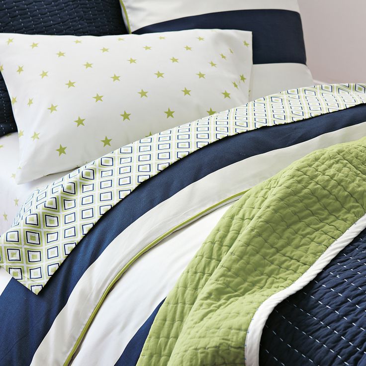
Alright. Of course, that doesn’t help you with the fact that there is no way you can live with this barftastic color. And you don’t have to. Since they “don’t make that color anymore”, perhaps suggest something else in that color? For instance, some cool bedding like this.

serena and lily boys greenSerena and Lily

Serena and Lily has fabulous bedding for kids and adults. It’s one of my favorite websites!

The other lie that works really well is don’t tell him anything and choose a color something like the one he chose but toned down to a manageable level.

I promise you… He will not notice the difference.

But Laurel. I hate green. HATE IT!

Okay, okay… please calm down! It’s not hopeless. I agree, some shades of green can be very annoying, but if you know how to work with it, you can create a very chic and charming space for your little boy.

Here’s how to work with green to make it chic and not an ugly paint color

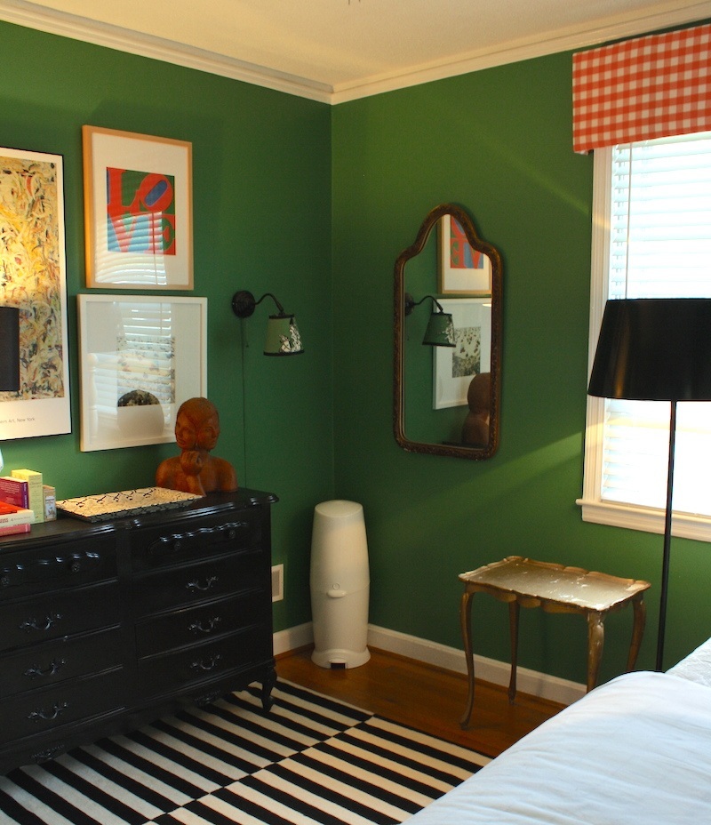
  • Green loves other greens. Pair the bright green with other greens and it will become a glorious analogous composition.
  • Green loves black.
  • It loves navy too. In fact, it loves most shades of blue
  • Green loves white. White adds a note of freshness.
  • It’s okay to also in small amounts or red and/or yellow as long as it’s tempered with black and white

whaling-city-cottage-bunker-green-3Whaling City Cottage

Above and below. This fabulous boy’s bedroom has it all. Love the art wall, too!
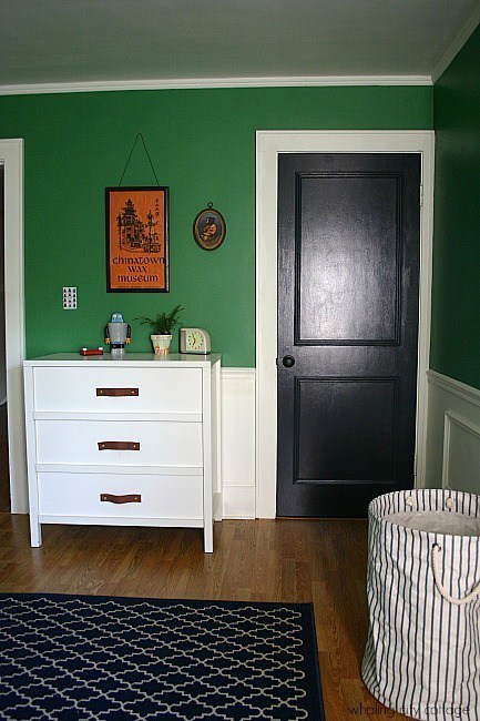
whaling-city-cottage-bunker-green-1benjamin-moore-basil-greenBenjamin Moore BASIL GREEN 2029-10 is a good alternative to some of the more neon greens.

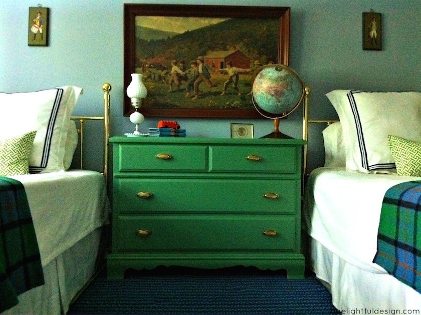
a delightful design grown up boys bedroomA Delightful Design

Another cool boy’s bedroom. (or it could be a girl’s room too!) Another option is to take your child’s favorite color and use it as an accent. I love kid’s rooms that don’t scream baby. I had a client once who put an Oushak rug in her nursery. It was fabulous!

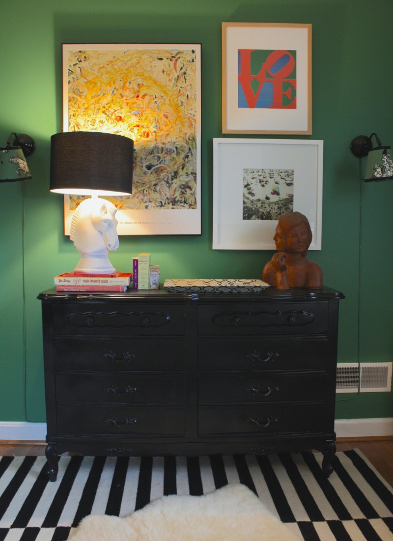
the-avarice-bunker-hill-greenThe Avarice

Above and Below by Whitney McGregor

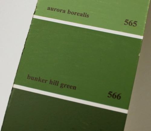
Love this boy’s room. This wall color is Benjamin Moore 566 BUNKER HILL GREEN.
566 bunker hill green

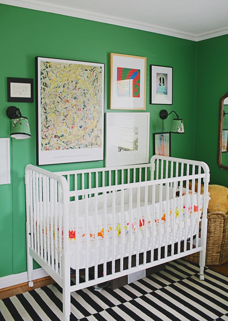
the-avarice-bunker-green-2

the avarice green cool nursery ugly paint color white crib art wall

This is the same room and I’m not sure if it’s an earlier or a later iteration, but it is the nursery for her daughter. My boys would’ve been hanging from the sconces – lol. But they sure are cool!

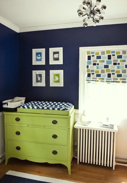
cathy-blue-green-nursery540_via Apartment Therapy

Yellow greens look fabulous with dark blues.

artfully wallsArtfully Walls

A beautiful, rich deep blue for a boy’s room is CARIBBEAN AZURE 2059-20. It would look great with lots of white, green and black.

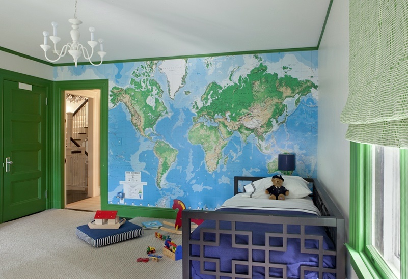
nina farmer interiors_boys_green_bedroomNina Farmer Interiors

I adore how Nina integrated the large map on one wall and used the vivid green as an accent on all the wood trim. Again, a black bed, blue bedding and it’s a sophisticated, balanced and fun space.

I’m all for having your kids have a say in how their room will look– if it matters to them. However, I think it’s perfectly fine to interject some adult sensibility into the design. I’ve seen many parents who’ve gone ahead and painted the offensive color in the name of giving their kids “full-control.” I know you want to be nice and you want your kids to be happy. However, it’s not good for you, and it’s not good for the kids either.

I mean, you don’t let a young child drive your car and do their own grocery shopping, right? So, help them out with the paint colors too. It’s possible to have a fun, beautiful room that you both will love!

xo,

laurel

24 Responses

    1. thanks so much Erin! Glad you found it! It’s a fabulous room! It is actually very difficult to find well-done kids’ bedrooms. And I share your philosophy that just because a kid is young doesn’t mean they can’t have sophisticated art, etc. in their room! How else are they supposed to learn to appreciate it?

  1. It’s not just boys, or small children. When my just-graduated-from-college daughter, who will be living at home until she can get a *paying* job in her career field (Health Science) and not just an internship with a paycheck coming from waitressing, announced she wanted a purple bedroom (her university colors are purple and white), I:
    1. hyperventilated for a moment
    2. selected three acceptable purples from the Benjamin Moore library
    3. invited her to buy a sample paint pot for as many of these as she liked – her thrift (hey, when she has to spring for the $, she gets parsimonious) – she chose two
    4. we ended up with Benjamin Moore Spring Flowers 1430, a periwinkle blue I can live with long after she has the “Masters degree in relevant field and/or two years of relevant experience” and moves out.

  2. Love your style, Laurel!
    My son and dil let their boys chose their own colors–years ago. One a gross dark green, the other black! Not one word could pass my lips……I can only imagine what the kids now choose for their children!!!!
    No black rooms in my house and no green, either.

    Mark me as a new follower.

  3. Great ideas!
    She could also try a green with yellow in it, like Agave by Ben Moore.
    Light blues, orange & grapefruit look amazing with it!

    1. Hi Loretta,

      Oh, you don’t have to convince me about yellow-greens! That’s my fave color! All of them! Except the REALLY neon ones.(well, anything neon!) I once saw a master bedroom painted a blinding chartreuse… oh my… But yes, otherwise, the yellow-greens go with everything. It’s the one color in nature you see in both the spring and fall! Agave is very handsome. I don’t pay a lot of attention to the Affinity colors just because enough is enough. Well, it’s all actually TOO much!

  4. Laurel, Laurel, Laurel …. I’m absolutely ashamed of you. That you would suggest a parent lie to their child? Why I’ve never lied to my child. Except of course when she dropped her pacifier and I told her they didn’t make any more. Or the time when she lost her favorite Care Bear and I told her the bear was visiting Grandma. Or when my daughter wanted to paint her room a horrendous horrible shade of fluorescent pink and I said they didn’t make that color anymore. Truly a LOL momemt. Once again you’ve nailed it and I applaud your genius-ness! P.S.: Go Golden State Warriors.

    1. lol Valarie. I was cracking myself up the entire time I was writing it too! When I found the photo of the green run off, I was just cackling like an old hen!

  5. Great post and so helpful! I too have two sons, now late teens, early twenties. I am definitely NOT the nice parent who would show my kids the paint deck and ask them to choose. My boys both told me they wanted a blue room so I picked Woodlawn Blue from the Benjamin Moore Historical Collection and we all lived happily ever after for several years. With not a peep from them of course, they were just happy to have a blue room. Woodlawn blue is a great blue for a kids room by the way, not too sweet or baby blueish.

    1. Hi Jo,

      Actually, I don’t think it’s nice; just misguided. But I know what you mean. Your way IS nice! Woodlawn Blue is wonderful. Gosh, I like all of them on that strip! I also like Buckland Blue which of course is a lot deeper but very handsome without being navy.

      I did my boys’ room when they were 8 and almost 4. (now 25 and 20!) The older one, I didn’t realize until he was 14 (!) is partially color-blind and believe me, he did not care one hoot. The younger one has special needs and therefore, also didn’t care. I had a color palette of gold, blues and red with a green accent with pine beds. I loved how it turned out!

  6. Laurel, this article is proof positive why you’re worthy of the greenbacks. The mother must be overjoyed she seeked out your design sensibility and boy did this presentation deliver on so many levels. Love the ideas of brining in a different-but-similar color to tone down the day glow green slime, I’ll admit I’ve done it myself on more than one occasion when a client hands me their favorite color chip as I secretly cringe and I bounce back a design board with a ‘similar’ color that they think is the original chip blended in with other design elements, after they’ve raved about how their color is perfect for the room that’s when I fess up and lay their original chip on top of the revised chip and they too see the light so it becomes team work in their eyes. Hard to blame the mass consumer as there are so many overwhelming color chips to choose from let alone glossy or matte. Your reference photos show a room that will grow with his boyhood. Like most – maps, globes and stars are a big favorite of mine and so is chalkboard painted walls in matching room color, did you include one here? Can’t wait to see this room come to fruition. -T

    1. Hi Theresa,

      You always make my day with your wonderful comments! Great idea you had with the client. I always say that the color on the chip is not the same as the color on the wall. Clients pick up the chip and look down on it which is also not the color. It always looks darker pressed up against the wall. That’s why I always say that the sample needs to taped up flat against the wall, not propped up.

      I’ve always loved kids’ rooms even for very young children that can grow with them. After-all, you blink and they are gone!

  7. Well, you certainly saved this poor woman’s eyes, and her child’s! I love the color comparison the toxic run off!! HAHAHAHA! Enough said. Great examples for the mom, too. My niece had the same “bright” idea when they built a new home last year. Lovely traditional home, taupes and blues, etc. Sadly the 8 and 10 year olds were allowed to pick their room colors. Hideous bright lavender and bright green! You can see the glow from the foyer up to the second floor. Huge mistake! Let the children pick out their bedding then choose a complimentary color, showing them that it’s the only one that looks good with their fabulous bedding choice. One of my client’s sons insisted he wanted “John Deere green” for his bedroom. Based on the muted earthy colors of what he was putting in the room, he quickly agreed that BM Greenbriar Beige was the right choice. I agree this boy will never know there’s a softer color on the wall. Lose the paint chip and let him concentrate on cool bedding! Let us know how it turns out, ok??

    1. Hi Gina,

      Oh gosh… that’s horrible and I have seen that too! I agree, let them pick out the bedding first. Great idea!

      All of my “Dear Laurel” questions are fictitious. (based on real situations, however) Although, I just reread my subscription email and it did make it sound like a real client! It was inspired by a recent paint consult. And no, the children were not present and the mom knew the basic colors that her kids were interested in. But… that’s why I’m there!

  8. You nailed it again, Laurel! The only other suggestion I have IF that Mom wants to go ahead and indulge her son, is to use that color as an accent wall, and get a tall headboard to cover much of it up..at least she’d have 3/4 of the room in a non-puke color 🙂
    The way I offered color choices to the kids was to bring home a color strip in the agreed upon color- but in a spectrum that I could live with..

    1. Hi Martha,

      Good question. Most of the time I’m not a fan of the old accent wall. However, if it makes architectural sense like there’s a dormer or something like that it’s okay. The other time is behind the bed wall usually works alright if it’s a solid wall. That’s my feeling about it.

Leave a Reply

Your email address will not be published. Required fields are marked *

This site uses Akismet to reduce spam. Learn how your comment data is processed.

Welcome To Laurel Home!

laurel-aarons-18th-e1456449963926

Hi, I’m Laurel, and Laurel Home is the website and blog for Laurel Bern Interiors.
I’ve been creating new-traditional interiors since 1988. The blog is where I share all.

New Edition, November 2023! Get The Indispensable Guide For 100s of Home Furnishings And Interior Design Sources That Everyone Is Raving About

laurels-rolodex-final-book-cover-master 10th edition 23-24

laurel home archives

Categories:

Please click the image below for more info about my rockin’ Interior Design Guides for 2024!

Laurel Home Interior Design Guides 2024
Amazon ad

please click below to check out my favorite decorating & design books

Laurel Bern's Favorite Interior Design and Decorating Books