Cotton Balls, Benjamin Moore’s “Secret” White to the Rescue!

Hi Everyone,

Anyone who’s read my blog for a while may already know that I’m known for liking the Benjamin Moore paint color Cotton Balls.

In fact, several years ago, when pressed with a gun to my head, ;] I said that if you had to choose ONE white paint color, Cotton Balls was most likely your ticket.

Well, some years later, I recanted that position and gave Simply White the Edge. It’s not that Cotton Balls doesn’t go with everything, but because of its warmth, a clean white that is a bit cooler will be more versatile.


Although lacking in undertone, Chantilly Lace might be too stark to be “the one.”


Ultimately, I think Super White or White Heron are probably the best white paint colors. They are like a blend of Chantilly Lace and Cotton Balls.

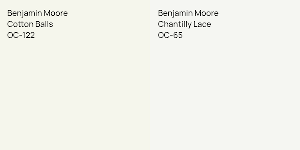
Benjmain Moore super white PM-1

White Heron, AKA Oxford White, is another great choice.

white heron oc-57
It, too, is like a blend of Chantilly and Cotton but leans more towards Chantilly. Below is the very cool, standard white OC-151. If you’re looking for a cool, very pale gray, this might be what you’re looking for.


Many years ago, I also posted about the only six white paint colors you need.


Please understand that Chantilly Lace, Simply White, Cotton Balls, and others didn’t exist in the 20th century.


Hold on a sec. I am being called downstairs.

We were discussing some of the details.


Laurel, how many times has this room been painted?


The walls, inside the panels, have never been painted. But, most of the trim has been painted four times.

If you recall, the first time was the disaster with the original painter when he was painting with gritty paint.

The second time was Swiss Coffee, which looked okay on some walls but too muddy on others.

The last time, we were going to paint the room Cotton Balls. However, Chris mentioned White oc-151, and instead of trusting my years of experience and instinct, I went with Chris’ years of experience.

Now, as I said, my old bedroom in Bronxville originally had plain white trim, and it looked good in the south and west-facing rooms. It was a soft, very slightly warm white. It never looked purple and I was surrounded by red brick in that building, too.


Okay, yes, window treatments will help with the lighting situation.


However, this version of Benjamin Moore OC-151 was either mixed wrong or the formulation was changed. No matter, I’m not fond of this cold, drab white that clashes with the ceiling, floors, and embrasure door hall.


Laurel, I’m not sure I understand. If the bathroom and embrasure hall are Cloud White, why don’t you just paint the bedroom, Cloud White?


That is a super, amazingly fantastic, and extremely astute question.

I pondered it intensely. Certainly, that makes the most sense, except the bedroom is the only one of those spaces with windows, so right there, during the day, we have a big difference. But more than that, the most problematic area has been the crown moulding in the bedroom.

Here’s why.

I adore this moulding, and one reason is that most of it lies on the ceiling, not on the wall. However, because of this, a pretty intense shadow occurs. Shadows are gray, so any red in the paint color will render that shadow purple. The fact that oc-151 already has a hint of purple, well, you get it.


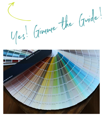
If we observe the colors underneath Cotton Balls in the fan deck, we’ll see they are yellow greens with a touch of brown.


a

Benjamin Moore paint colors adjacent to Cotton Balls in the fan deck

Therefore, it stands to reason that Cotton Balls has a very dilute amount of the same colors.

But, does Cotton Balls look green? I have used it several times in south, west, and north-facing rooms and have never seen it look green. That doesn’t mean that it doesn’t. It always looks like a soft but clean, non-beige cream. It is never icy, but it is on the brighter side of white.


Now, let’s do some color comparisons with eight popular Benjamin Moore White paint colors. (This is the corrected version. Sorry about that!)
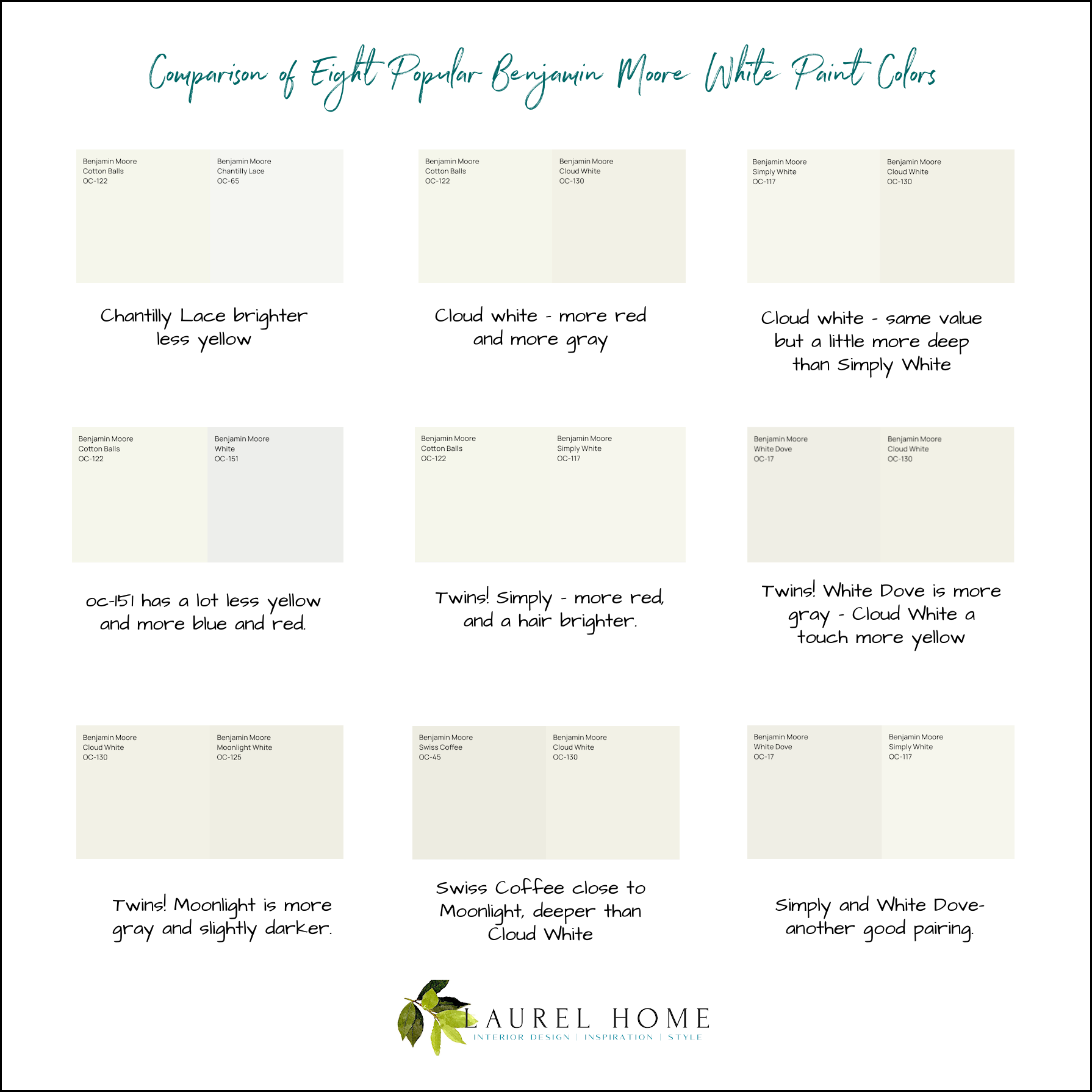
Comparison of Eight popular Benjamin Moore White Paint Colors Updated


Starting on the left, the top row is Chantilly Lace with Cotton Balls. Here, we can see that Chantilly Lace is a super-stark white paint color. However, you might see Cotton Balls as a super yellow-looking paint color.

Cloud White is one of the predominant white paint colors in the apartment. I didn’t want to use it in the bedroom because the hue resembles Simply White, and I was afraid it might skew pink. The same was true of White Dove, a similar color to Cloud White but a hair less gray and a hair more yellow.


In the second row, there is a comparison of Cotton Balls and OC-151.


This is a huge difference! And yes, OC-151 is a very pale gray.

Cotton Balls and Simply White are similar in value but Simply has that passive red undertone.

Cloud White and Moonlight White are my pairing in the living room. They are very close, and they look lovely together.

Swiss Coffee and Moonlight White are very close to each other.

Simply White and White Dove make a terrific pairing on the bottom right.


Laurel, I’m not convinced. Cotton balls still looks like a yellow-green color.


I admit it does here, but that doesn’t mean it will look yellow-green on the walls, especially in my naturally pink bedroom.

On Monday, I checked on the color early on, and it looked like a nice, clean white.

Today, with the walls mostly done, it does not look at all green.

They still need to do another coat on the walls.
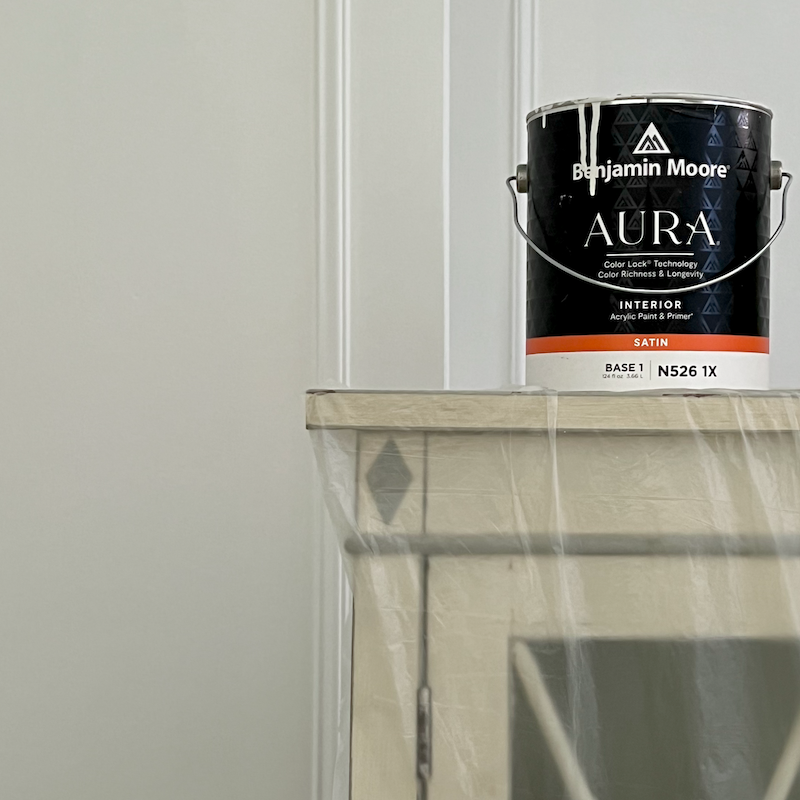
 

Cotton Balls oc-122 - a clean warm white paint color
My painted bookcase is pushed away from the wall. It has yellowed somewhat over the years and could stand to be freshened up. You are looking at the fireplace bump-0ut and the niche behind it.
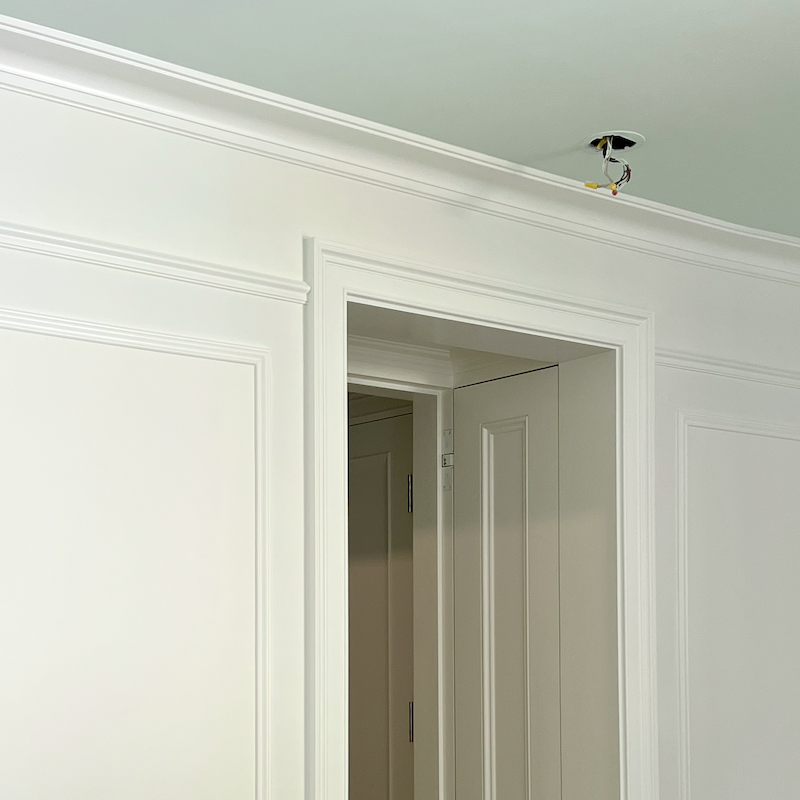
 

Italian ice green ceiling + Cotton Balls - Bedroom + Embrasure Hall - Cloud White
Cloud White looks warm in the hall and bathroom, and when I looked at the trim last night, I felt confident that it would look terrific in the bedroom.
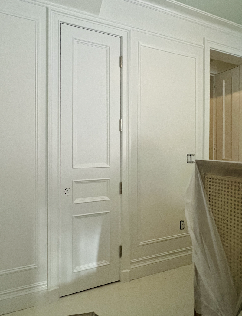
 

Benjamin Moore oc-122 Cotton Balls

I am very happy with how this looks; it will be even better after the second goes on the walls.

By the way, I have never used Aura for myself, and it is absolutely divine. There is no odor whatsoever. They might as well be painting with milk paint.

xo,


***Please check out the recently updated HOT SALES!

There are some fantastic new sales that began after the weekend!

There is now an Amazon link on my home page and below. Thank you for the suggestion!

Please note that I have decided not to create a membership site. However, this website is very expensive to run. To provide this content, I rely on you, the kind readers of my blog, to use my affiliate links whenever possible for items you need and want. There is no extra charge to you. The vendor you’re purchasing from pays me a small commission.

Amazon ad

To facilitate this, some readers have asked me to put

A link to Amazon.com is on my home page.

Please click the link before items go into your shopping cart. Some people save their purchases in their “save for later folder.” Then, if you remember, please come back and click my Amazon link, and then you’re free to place your orders. While most vendor links have a cookie that lasts a while, Amazon’s cookies only last up to 24 hours.

Thank you so much!

I very much appreciate your help and support!

34 Responses

  1. I love the combination you have chosen, and are pulling out green and blue undertones to work with your ceiling and gorgeous teal saturated walls! I also hear otters looking to stay away from yellow or grey hues when they are finding a white. I went with Farrow and Ball Wimbourne White. It plays well with my furniture (lots of blue and cream/brown velvets and mohairs, linen accents) and Gustavian and Louis XVI painted and waxed antiques I curated over the years on a budget (love FB Marketplace, Chairish and our Houston impeccable antiques at Joyce Horn and Chateau Domingue). Wimbourne White is a very true warm and unblemished white for those still in the hunt

  2. Hi, I use Sherwin Williams Alabaster which is a wonderful soft white. My whole house and trim painted this color, love it !!!

  3. I studied multiple times all that you said about whites and northern facing rooms, so when I was in charge of redecorating almost our whole church, I picked Chantilly Lace and it has been great. There was one area though where it would have been too purely white and I went with Cotton Balls. So happy with all of it! At home, I use Super White, and like others have said, I found the painter trying to use a Sherwin Williams “match” for the BM Super White. I insisted it be re-done in BM Super White. Now, when I actually use a painter instead of doing it myself, I say in the contract that I will buy the paint in the quantities they tell me they need. That way, I know the product is what I want.

  4. Oh, and regarding the whites…I always luck out with Cotton Balls! I learned the hard way, when we wanted to ‘illuminate’ a dark LR in a 1940s low ceiling colonial and painted it Simply White, all I saw was grey shadows everywhere, we had to look for a warmer white and found Cotton Balls! Used it in other rooms too and always came out nice. Chantilly Lace I would only use in a room that gets a ton of light, I only used in once in our large Back Bay BR that had miles tall windows and looked fabulous, very modern, but did not use it ever since and will only use it again in a setting like that. So for me Cotton Balls is always a safe choice, and I would chose it over Simply White as I feel has more depth, it’s simply beautiful. It looks so pretty in your room and the quality of the workmanship is excellent!! Glad you found a stellar painter!

  5. Hi Laurel! Just back from a few weeks stay in Sweden where now the white color ‘de rigueur’ is a slightly greyish white, something like Ammonite or Drop Cloth from FB. So glad you picked Aura from BM, it’s the only paint I use with some FB here and there, last summer they painted our whole house with Aura, no smell or discomfort, beautiful quality. The Huntington White you picked for the LR is so dreamy, I am glad to finally see it in action as it has been long on my list to try, it’s unbelievably beautiful! I cannot wait to see your GS sofa! On my bucket list too, although I have to have the Josef Frank round coffee table before I die as well! (If someone is headed to Stockholm, the Svenskt Tenn store is drop dead gorgeous, not to be missed and this year they have a 100 year anniversary – sorry for the off topic!)Charles Spada is a huge, huge favorite of mine, I am amazed he still works, although I never dared venture into his studio in the South End, maybe some day I gear up some courage 🙂

  6. Hi Laurel,
    I’m so glad you found the perfect white for your bedroom. We were all pulling our hair out with you.
    So is this it? Are you now done selecting paint colors?

  7. Moved into a barn home with high wood ceilings, greyish posts & beams and a great room with large French doors & transoms facing North, South, & West. It was all painted an ugly beige & despite all the glass, was dark & depressing. After agonizing over all the shades of white, we finally settled on BM Super White in a matte finish w/satin trim and it’s fabulous. The light streams into the great room all hours of the day and it stays a true white, despite the surrounding green & yellow meadows. Went on to tackle the large beige horizontal shiplap entry hall & open staircase facing East. The same paint but all in satin finish w/flat on the ceiling, really opened up the place…again, a true white. It’s such a dramatic difference, that when our realtor stopped by, he asked what we had done to change the place so much…nothing like a few (dozen) cans of paint!

  8. In my 90s rancher, we are slowly changing the ugly trim to update the look. The current paint is very creamy. I wanted to go whiter but didn’t want the newly installed trim to scream against the old. Cotton balls is perfect. The two bedrooms across the hallway from each other. One south and very bright. One north and very dark. Outside of our dark master is a lawn leading to a solid wall of cedar trees. You couldn’t get any more green and the cotton balls trim has not picked that green up at all. It just looks white, not cream, not gray, not anything other than white. I love it, and I went with it because of your recommendation.
    Eventually, the walls in the star bedroom will be green. It’s dark and cosy anyway so I might as well embrace that.
    Congratulations on nearing the end.

  9. It’s so different selecting a paint color for a room with furniture. Since I love to do my own painting, I pick a color after the furniture is in place. The sample is moved around the round near furniture different times of the days. Just like your outside red brick, furniture can so change the color needs. Love your blog!

  10. After reading about everything white on your blog and in your ebook, my daughter and I chose Cotton Balls for her bedroom, which has a south and west exposure. When she started painting, the green tint appeared right away. I encouraged her to keep on going, let it dry. Well, the green remained, and she couldn’t get to the paint store fast enough to buy a different white (I believe it was White Dove). Haha! It was pretty bad, so needless to say, Cotton Balls is not on our list of whites. Your bedroom, however, looks lovely.

  11. OK Laurel I am a bit confused. So what are your final picks for the bedroom? Cotton Balls on the walls and what color on the trim. And what color is the ceiling? It looks blue on my computer. White colors are tough so I get your concerns. Thanks for explaining.

    1. Hi Lorene,

      The trim is also cotton balls, but in satin. The walls are matte. The ceiling is Italian Ice Green 2035-70. It is a pale aqua, but sometimes looks more blue or green depending on the light.

  12. Dear Laurel,
    Half a dozen years ago we bought a new house. I’ve been a loyal reader for a LOOOONG time and I knew I wanted several rooms and trim done in white. I did sample but not well enough. I went with Cotton Balls (because you’d said it was “the one”). Well it turned green. Fair enough, I thought, I know better than to not sample in large swatches and on several walls (you taught me that). So I did my sampling and went with Simply White and its perfect. BUT I had to write because I thought I was crazy about the green thing until your post today. It’s especially green when you have a lot of green outside and the room does not receive a lot of natural light. Anyway my eyes nearly popped out of my head when you said it could turn green. Because, yes! But I had convinced myself that I was just seeing things.

    1. Hi Shannon,

      I once had a client and everything we tried in her bedroom turned green. No matter how much pink was in the neutral tone, it looked GREEN. Finally, we went with Ivory White, which also looked green, but it was a lovely, pale celery green.

  13. Hi Laurel,
    Great article. I have always used Ben Moore Super White. Its covers beautifully and its a fantastic color.

    1. Hi Stef,

      I used it in my south-facing room shortly before I moved to Boston for the trim and ceiling and also loved it. It was a lovely, clean white with a touch of warmth and looked fabulous with the yellow walls. However, I’ve been quite dismayed to see in the newer fan decks, as well as online, that many colors have changed from my older fan decks.

      Super White looks more gray and cool that it did just four years ago. And, the sample Chris made corroborated that. However, most of the white samples were off-color. I am wondering if the calibration is slightly off at the paint store. I have heard that they are continually changing the formulas. It’s enough to drive anyone loony!

  14. This explanation of the best whites was just what I needed today! Thanks! Please remind me what color is on that ceiling??

  15. I have real problems seeing colours and undertones for what they really are. I’m getting better because of your charts and explanations They’re invaluable!

    I wonder if the captions on these pairings are correct:
    Row 2, groups 1&2
    Row 3, group 3

    If they are, I’ll have to study them again in different light.

    Thank you for all you do for us, Laurel!

  16. Here’s a caveat: On some forums for pro painters, there is a lot of talk about how much they hate using Chantilly Lace and even Simply White. Some of these painters are true jerks and brag about having the paint stores add extra black to Chantilly to improve coverage. They claim “the homeowner never knows.” Um, the homeowner may not know what the painter did, but they’ll know they don’t like the color as much as they thought they would. They’ll also definitely figure it out when they go to do some touch ups in a few years. My original (now fired) painter refused to use Chantilly Lace. I didn’t have the energy to fight, so I switched to Super White. When I came to see the place after a couple days, I could tell it wasn’t Super White. I could also tell it wasn’t Benjamin Moore. I painted a white strip of Super White on a ceiling he had finished and then told him “the paint store must have made a mistake.” I really wish I had fired him then, but I let him redo the parts he had done. He finally supposedly “finished” half the place, but it looks so bad my new painters are insisting on redoing everything. I should have fired the original painter the second he refused to use the color I wanted. Having said all that, Super White is amazing in my south-facing apartment.

  17. Laurel I feel your pain. As you may recall I’m in love with Cottonballs myself and chose it for the trim in this new house. As I was already too overwhelmed with the move and the remodel, I did not choose different whites per room. Big mistake. Cottonballs matches my kitchen backsplash tiles which are in the style of Zellige, but the plain white subway tiles in the bathroom are crying for Chantilly Lace and cottonballs looks dirty next to them. For now I’m ignoring the issue until battle fatigue wears off. Best of luck

  18. Sorry, if I may have missed this along the way, but what sheen of aura are you using? And have you used the same sheen throughout? Same with trims and baseboards? Your reports are fascinating!

    1. Hi Colleen,

      At first, Chris used the Scuffex formulation. It is not low VOC, however, and I had to put a stop to it. Regal Select is very low VOC and I believe that Aura is NO VOC. The ceilings are mostly matte, but some might be flat. The walls are all matte and the trim is satin throughout. Satin in latex looks closer to the old semi-gloss in oil.

  19. Hate to nitpick, but I think the captions on the first two comparisons in the second row of your chart are switched.
    In any event, picking a white paint color is hellishly difficult. After days of angst, I used BM Acadia white for my living room, a color you discussed in one of your posts. It is beautiful in the room, and not at all yellow. The room has ample daylight from east, south and north facing windows. The color reads as a very light parchment.
    What it looks like on the sample, may not be what it looks like on the wall.

    1. Hi Caryl,

      I want to point out that Acadia White is the same as Ivory White. There’s a lot of that at Benjamin Moore. In fact, there are colors that go by 3 or even 4 names! Imagine getting samples of three colors and they are all the same. However, the people mixing and selling the paint would be aware of this fact, as I’m sure it’s in their manual.

      When BM redid their website about two years ago, they came clean on their dupes.

      Ack! I just found a forum on Reddit with a bunch of professional painters. It’s quite horrifying! However, I’ve read numerous stories like these.

      https://www.reddit.com/r/paint/comments/10kk3pw/bad_new_benjamin_moore_formula_for_simply_white/

      PS: I don’t expect it’s different with other brands. In fact, Chris said that Farrow & Ball is notorious for bad color matching.

  20. Thank you for the comparisons! White is so difficult. I was tired of the color of our foyer, stairwell and upstairs hallway and after reading the glowing reports of the versatility of Cotton Balls, finally chose it. Such a mistake. It’s a muddy yellow on my walls. I’m pretty sure that the problem is the trim color which has a hint of lavender and becomes gray in certain lights. I hadn’t learned about undertones then. I’ll have to repaint the Cotton Balls walls as the thought of repainting the trim and cabinets in the whole house is daunting. Looking forward to seeing how your room works out.

  21. Really great research in finding the right white for your bedroom. So worth it to get the color that looks best. And the ceiling color is so pretty and calming. That next to the last picture captured it so well. I swoon over the painter’s expertise. The woodwork looks glorious!

Leave a Reply

Your email address will not be published. Required fields are marked *

This site uses Akismet to reduce spam. Learn how your comment data is processed.

Welcome To Laurel Home!

laurel-aarons-18th-e1456449963926

Hi, I’m Laurel, and Laurel Home is the website and blog for Laurel Bern Interiors.
I’ve been creating new-traditional interiors since 1988. The blog is where I share all.

New Edition, November 2023! Get The Indispensable Guide For 100s of Home Furnishings And Interior Design Sources That Everyone Is Raving About

laurels-rolodex-final-book-cover-master 10th edition 23-24

laurel home archives

Categories:

Please click the image below for more info about my rockin’ Interior Design Guides for 2024!

Laurel Home Interior Design Guides 2024
Amazon ad

please click below to check out my favorite decorating & design books

Laurel Bern's Favorite Interior Design and Decorating Books