This is the continuation of my tribute to the insanely talented interior designer Barbara Barry.
If you missed part 1 – Barbara Barry A Household Name You Don’t Know, you may click on the link.
Actually, I’m insisting. ;] Then, please take a little potty break and come on back, because there’s a lot more. And no peeking unless you’ve already read part 1. :]
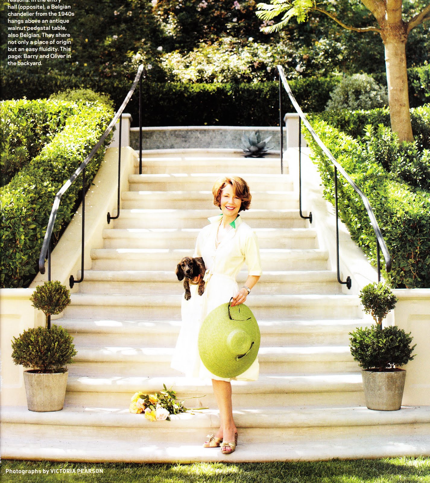
Interior designer Barbara Barry on the steps of her Hollywood, CA home
To pick up where we left off— interior designer Barbara Barry caught my attention back in the early 90’s. I was mesmerized by her incredible use of color and deft mixing of French Deco pieces that she re-interpreted through companies like Baker Furniture, HBF and Boyd Lighting.
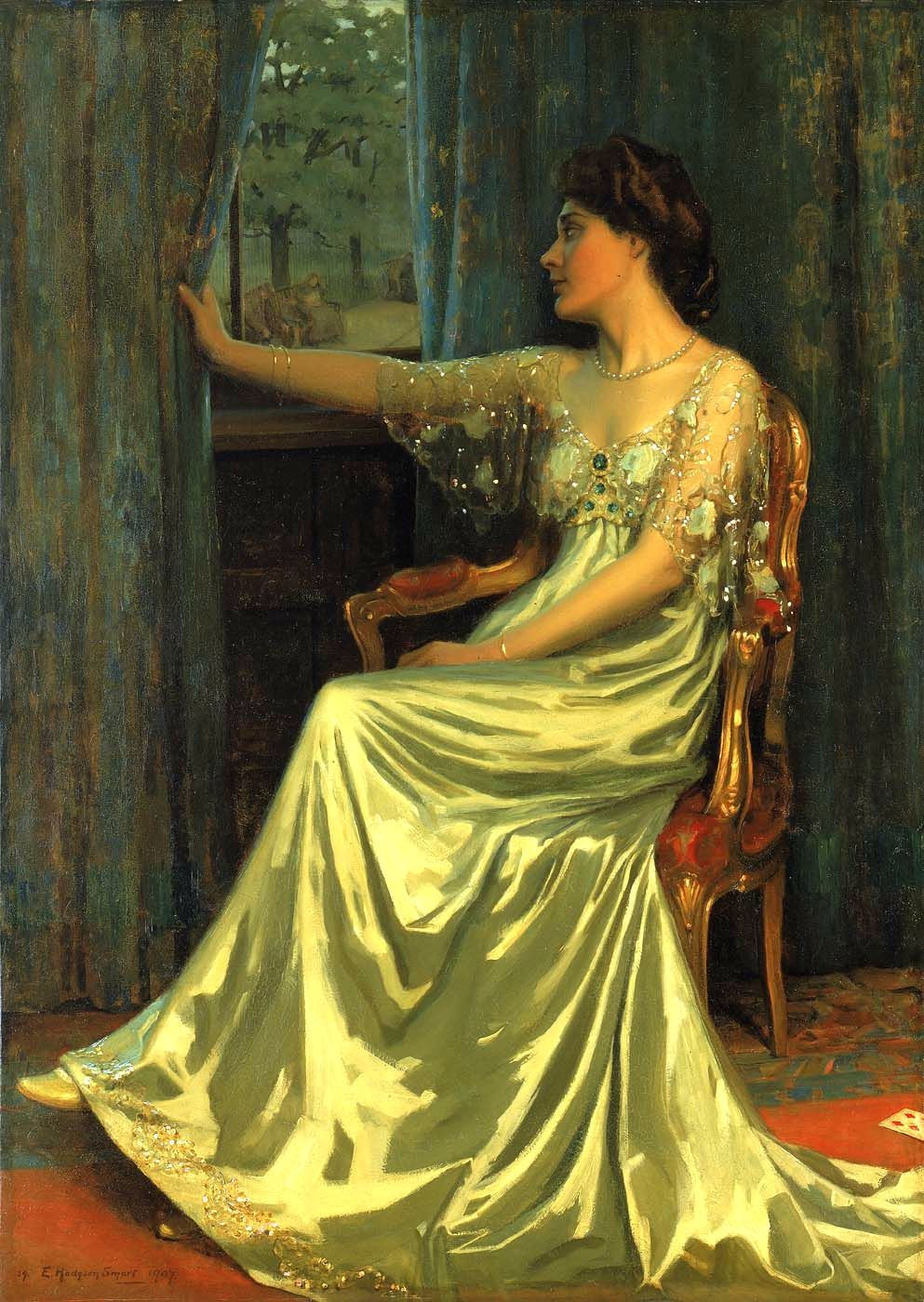
It is much more than that though. There is a mystique about Barbara that sets her far apart from the rest of us mere mortals. Through her philosophy on life and design there is a link back to a bygone era when people seemed to be a lot more genteel and gracious; they had tea and wore beautiful clothes. Barbara is the linger-in-a-rose-scented-bathtub-with-a-glass-of-fine-chardonnay-kinda-girl; not the grabbing-a-spoonful-of-peanut-butter-straight-outta-the-jar-kinda-girl.
I think this painting explains it even better.
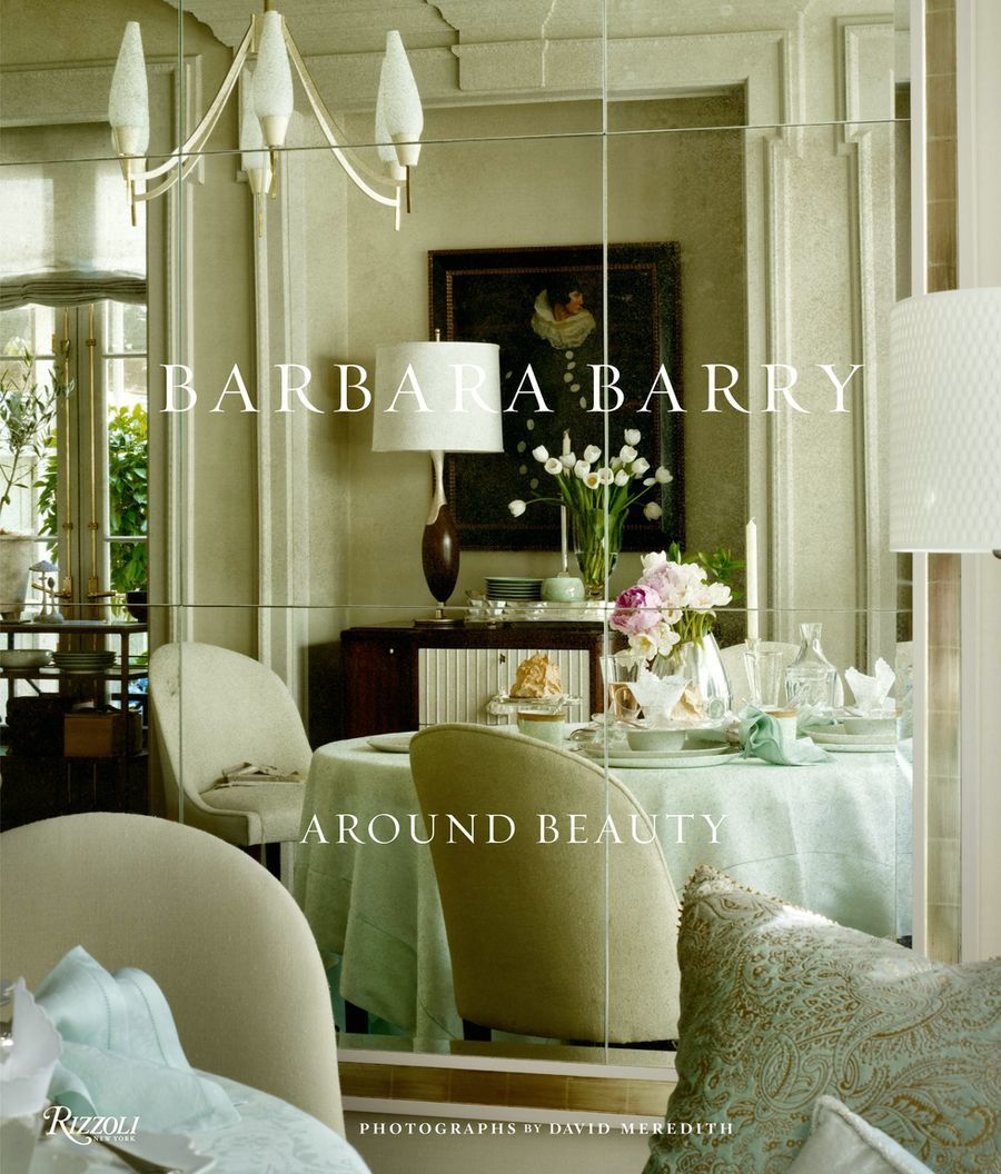
Barbara Barry’s unique and elegant personal style is synonymous with the title of her gorgeous book— Around Beauty.
The exquisite photos in the book and in many of these images are by David Meredith
Here, you will only find a sampling. Get the book. There’s so, so much more and so much more of Barbara. But for now, hopefully all of this will entice you!
Everything Barbara Barry touches is a work of art.
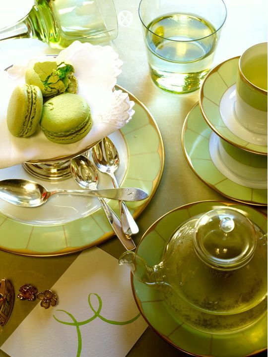
This is really how Barbara lives.
Every day.
Okay. Maybe she doesn’t have the hand-painted stationary. But then, it wouldn’t surprise me if she did and all seemingly effortlessly, too. Even if green isn’t your color, how can one not love this incredible image from her book?
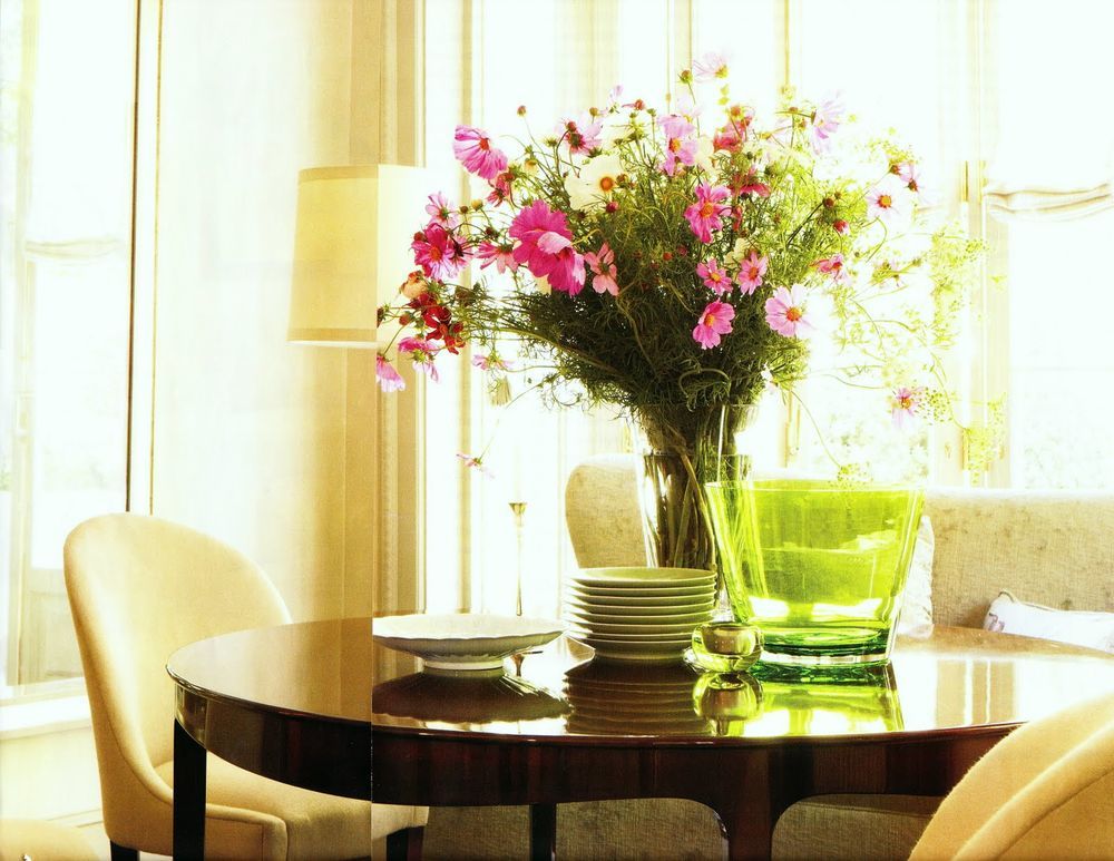
Barbara’s dining room. I love this chair she had made, inspired by the cool furnishings of early 20th century furniture designer, Emile-Jacques Ruhlmann
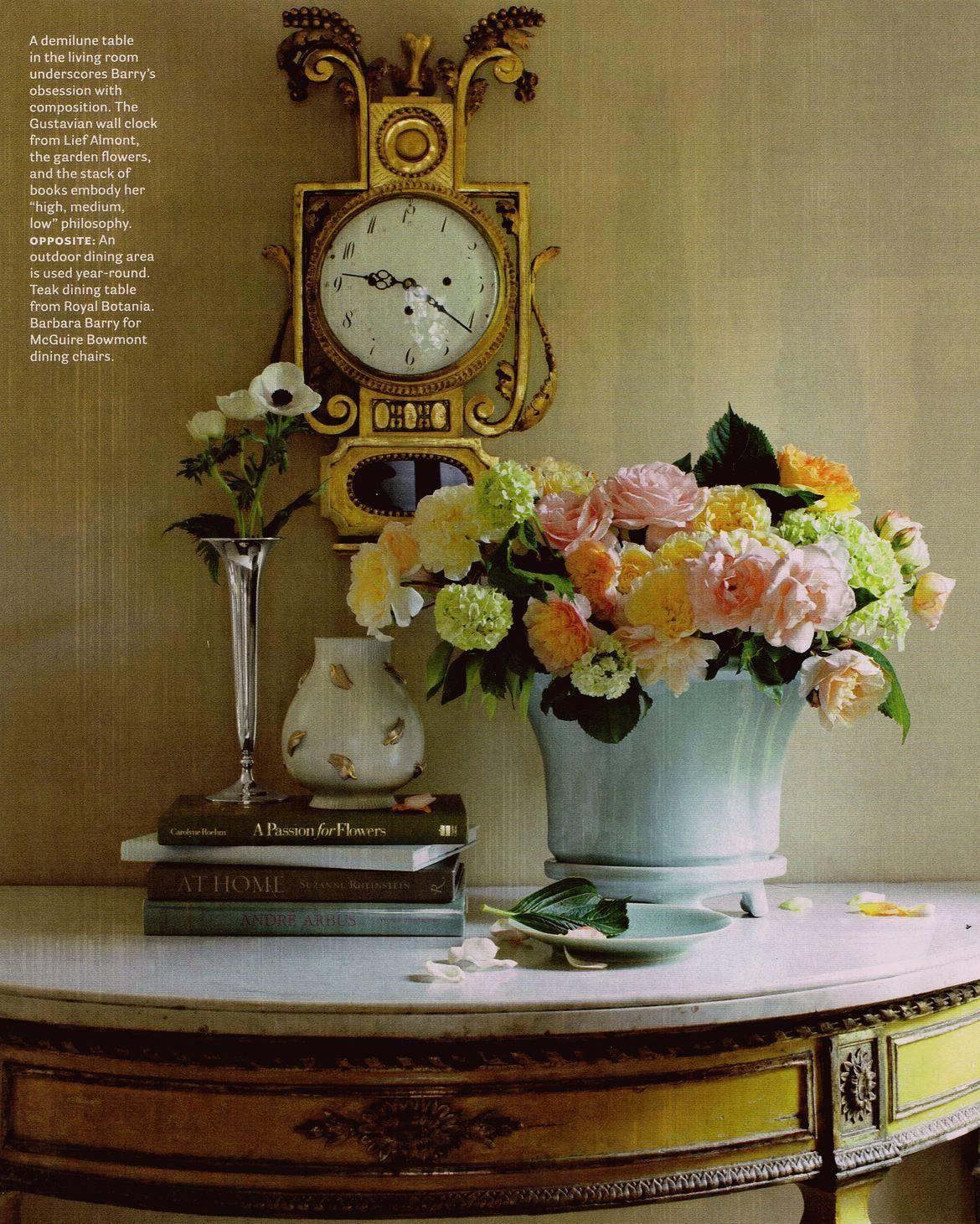
A vignette from Barbara’s living room featuring a French demilune table and Gustavian wall clock. Perfection.
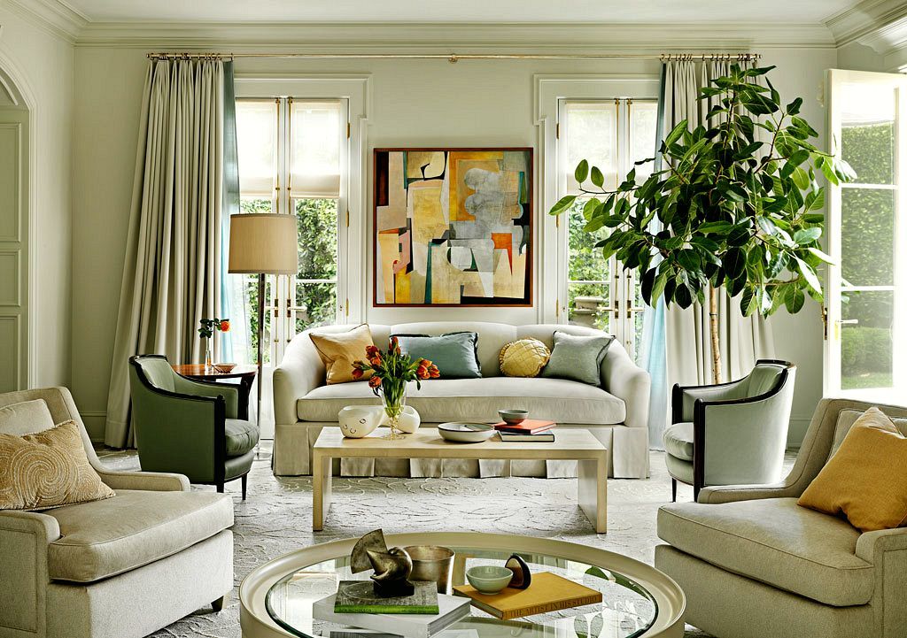
Barbara’s living room
[BTW, we did those chairs [by the sofa] many, many years ago when they first came out. Baker Furniture makes them, but maybe not now, because I saw a pair of them on First Dibs. They are so timeless and classic. Absolutely exquisite!]
Okay. Remember when I said that a “living room” is any room WITH a TV? Well, there’s always an exception to a rule. And here it is. Barbara doesn’t need a TV to live in her living room. :]
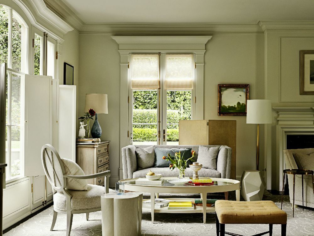
Another view into her living room

I imagine she just sits there all day long looking elegant and stares at all of the beauty. I mean, I would… Wouldn’t you?
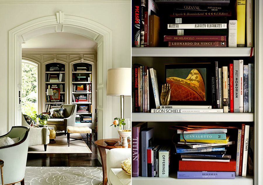
More living room. And in the midst of the perfect order of things, the books are shall we say, just a bit of a mess? I can assure you that is intentional. I love that and I bet that Barbara actually READS her books.
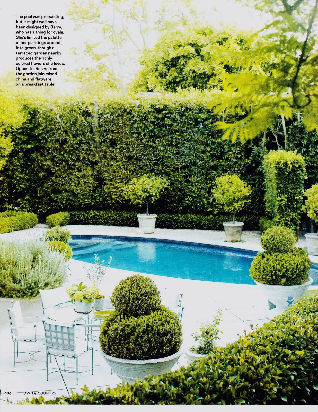
This is Barbara’s pool.
Okay. Here’s the kinda weird freaky [in a good way] part.
See the oval pool? Yes, of course you do. The house CAME this way. Barbara did not put in this pool.
Alright, Laurel, what’s so weird about that?
I will tell you. You see, it’s like this…
Barbara Barry = OVAL
in a sorta close encounters of the oval kind.
Here’s what I mean.
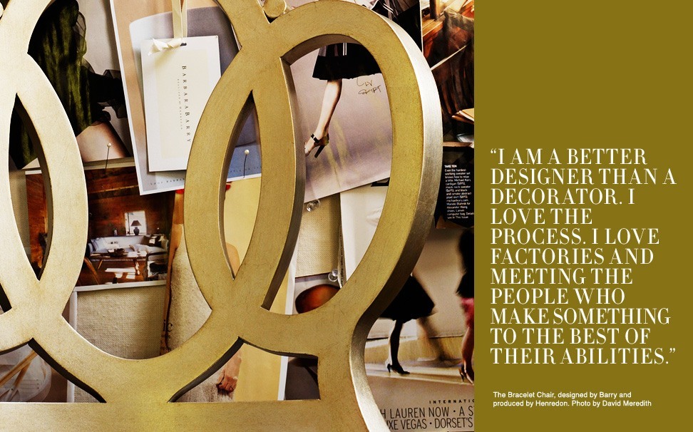
Below, Barbara Barry’s Bracelet Chair for Henredon Furniture.
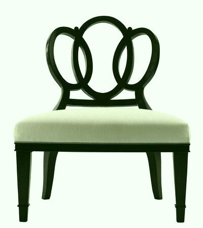

yes, I know. This is Barbara’s old logo. [and it was the only image of it I could find!] It is the one that was on the invitation I received to go hear her talk. It is green and there’s the ubiquitous oval.
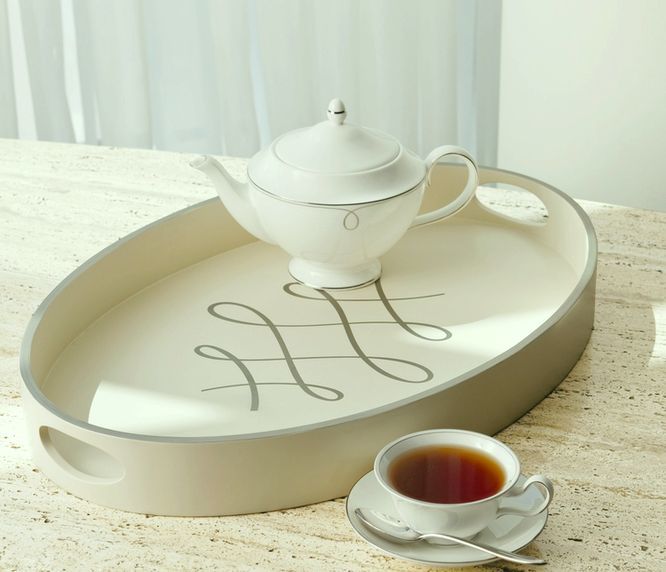
Script Oval Tray by Barbara Barry for Global Views
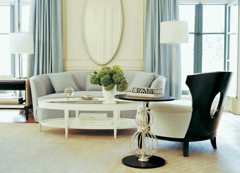
Vignette from the Barbara Barry Collection for Henredon
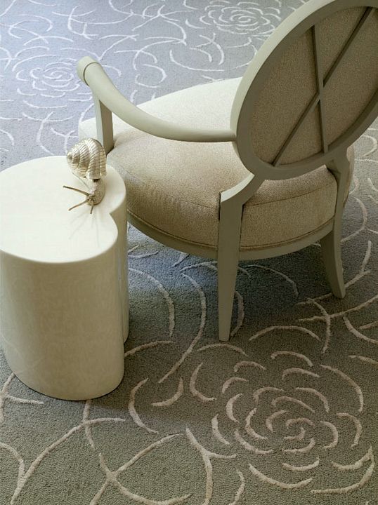
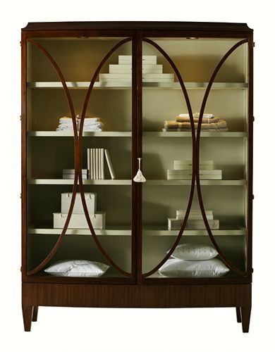
From the Barbara Barry Collection for Baker Furniture
Barbara Barry’s Script Chair for McGuire [Baker Furniture]
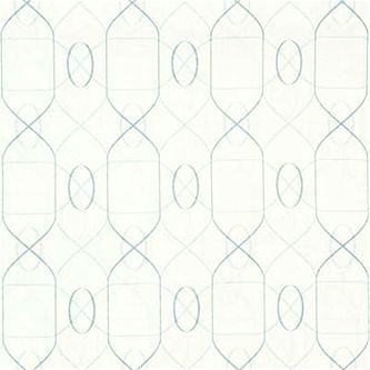
Barbara Barry for Kravet. Signature
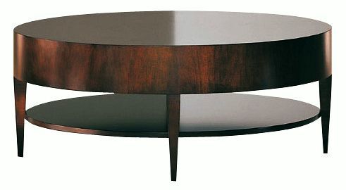
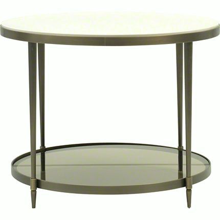
Oval Catalina Table by HBF. I did this table in the round version for a client some 11 years ago. Tres cool!
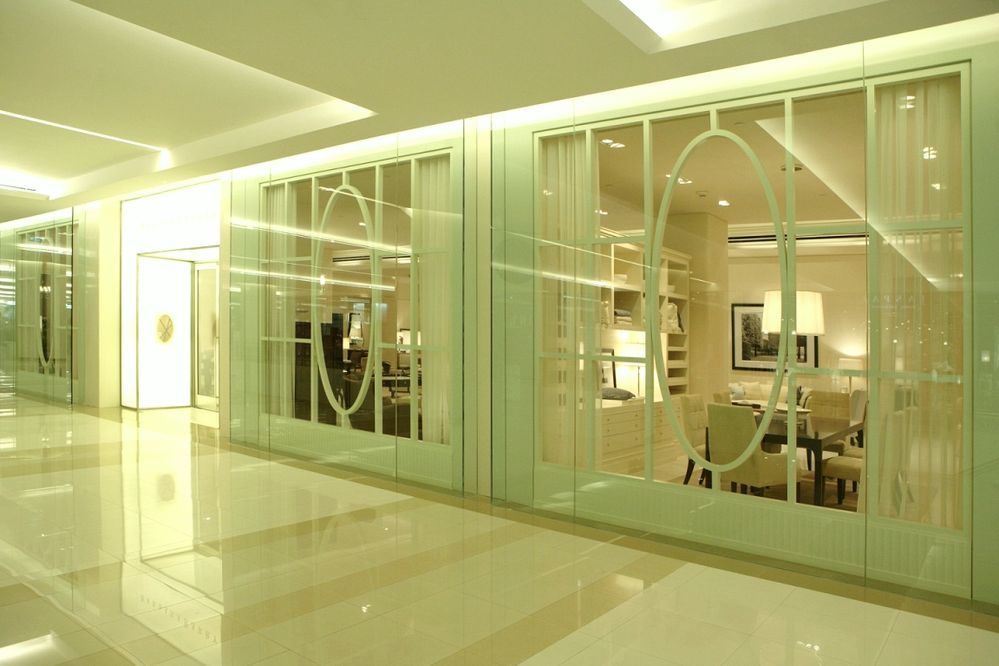
Don’t ask me where I found this photo. I couldn’t even get on the website and probably corrupted all of my files getting it off. Don’t worry. You’ll be fine. Obviously, it’s a store of her’s somewhere.
See what I mean?
Green. Oval. Barbara.
You don’t suppose that she bought THAT particular home because of the oval pool? Maybe!
OOOOOOOOOOOOOOOOOOOOOOOOOOOOOOOOOOOOOOOOOOOOOOOOOOOOOOOOOOO
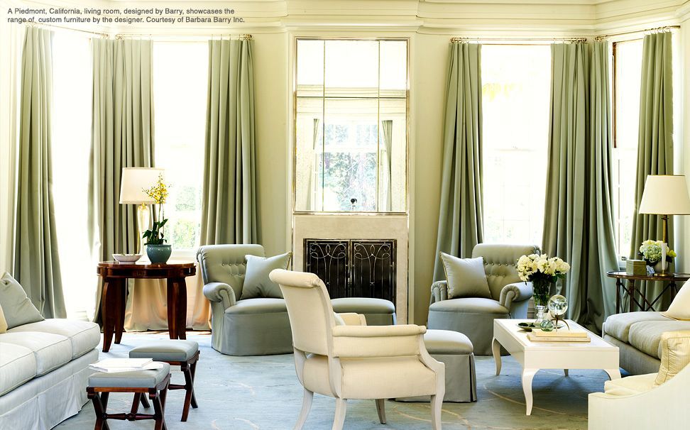
This photo epitomizes the Barbara Barry “look.” [although there is more than one as you will soon find out.] However, the vast majority of her work is characterized by the following:
- subtle use of tone on tone and analogous colors in soft muted shades
- often many shades of green from chartreuse to Celadon
- sinuous shapes
- ovals, x and other geometric shapes
- little or no pattern
- sometimes one main pattern
- sensuous materials like satin and silk
- retro influences, primarily from the French Art Deco period of the early 20th century
- classical influences especially in architecture.
- fine French Antiques
- Chinoiserie
- light and organic forms are the basis from which designs emerge.
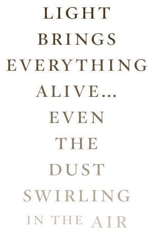
~ Barbara Barry
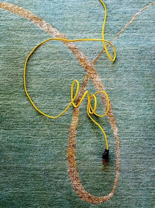
Rug designed by interior designer Barbara Barry for Tufenkian Rugs
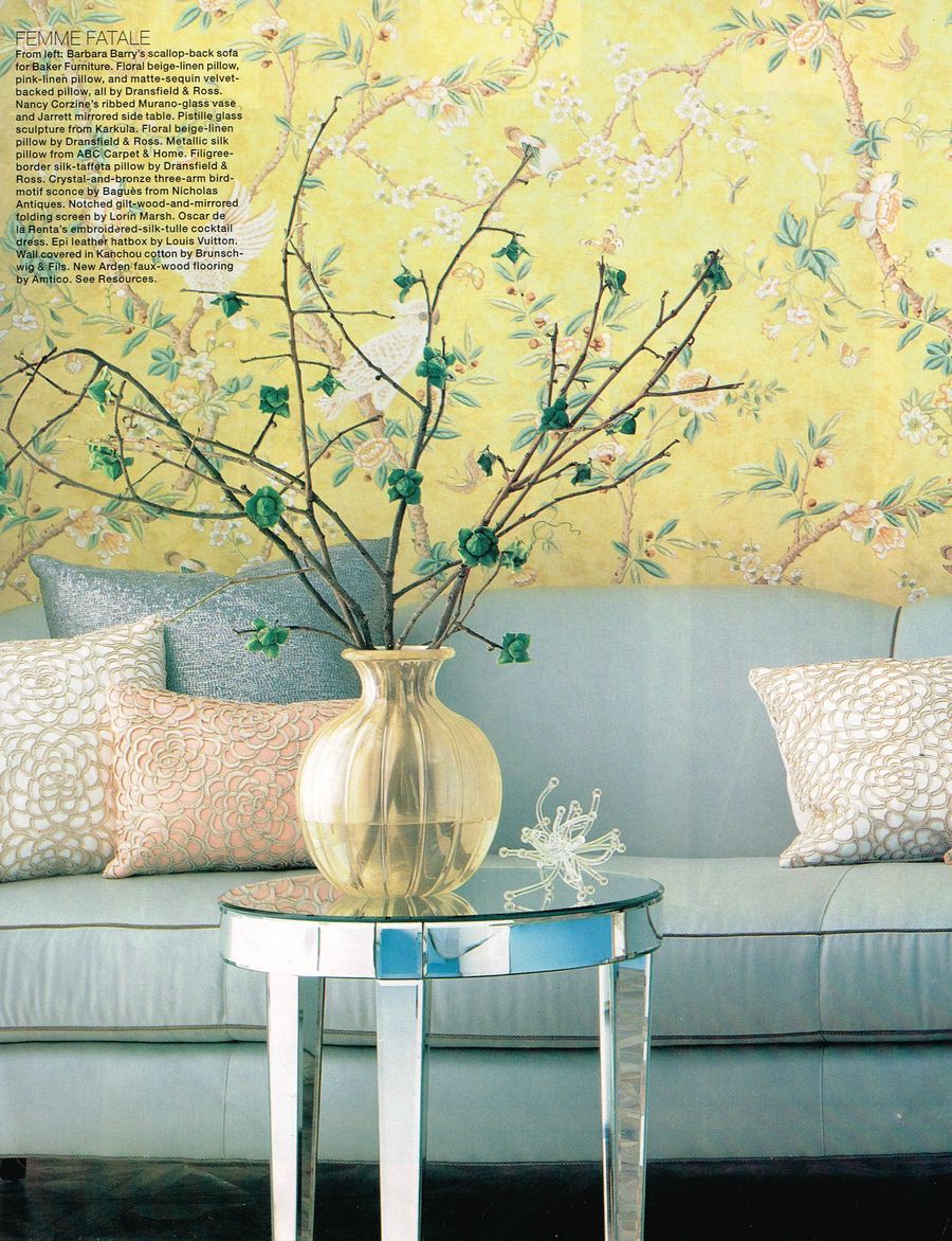
There are those who equate Barbara’s work with NO PATTERN WHATSOEVER. However, that is not true. Barbara’s rooms often DO have pattern, but it is used judiciously and with purpose. One of her favorite patterns is that of Chinoiserie vines and flowers. Above is the Brunschwig et Fils Kanchou pattern.
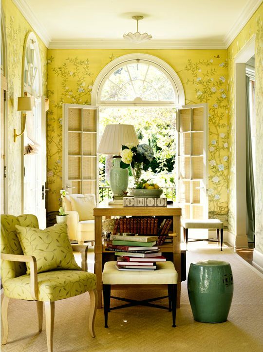
From Barbara’s portfolio. A sunny spot with Chinoiserie wallpaper.
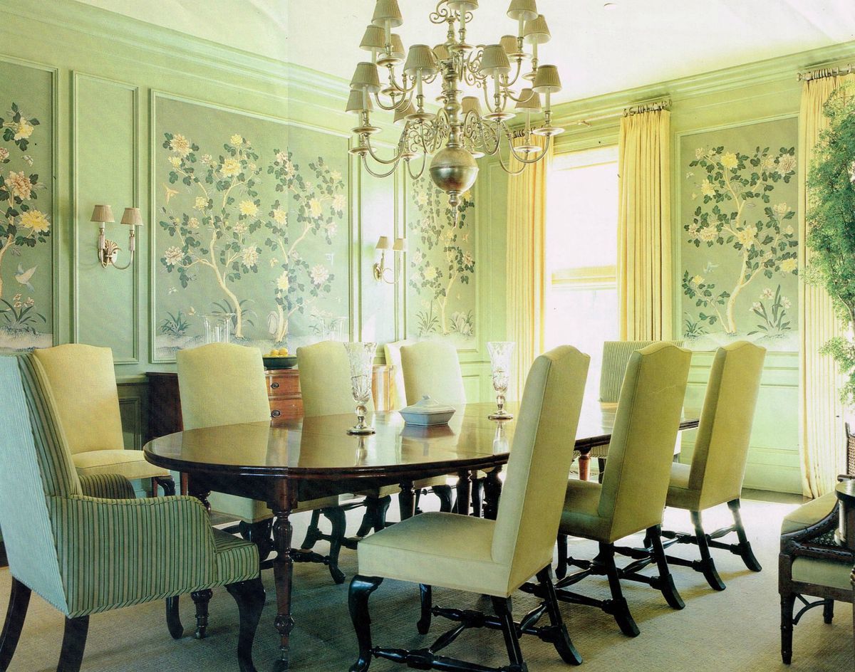
Above and below. Magazine images which I saved from several years ago. Even Barbara’s traditional rooms have a modern, fresh feel. Images from Veranda Magazine.
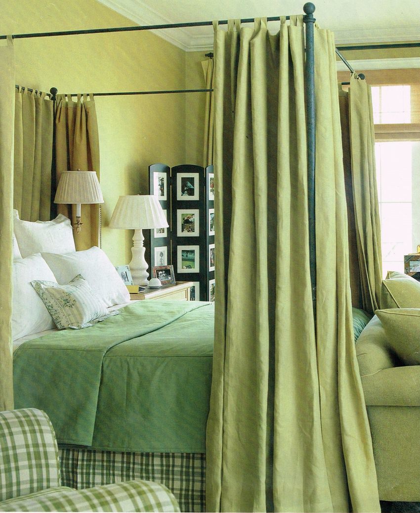
Love the green on green and who knew? Barbara uses plaid! She always has a surprise or two up her tailored sleeve.
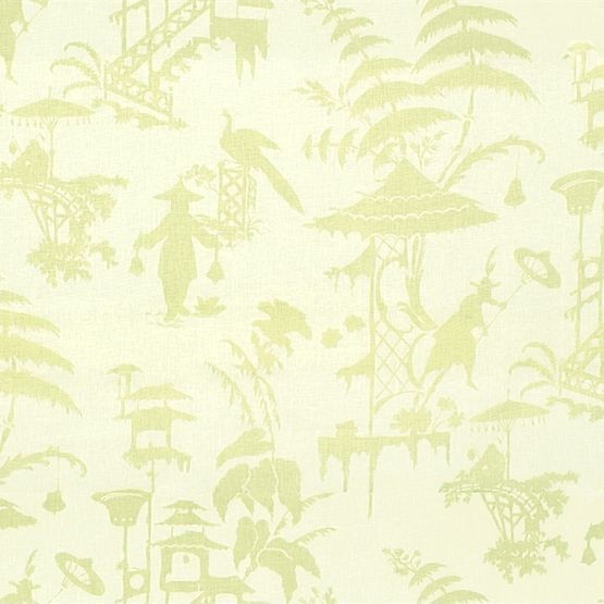
Above is the Barbara Barry for Kravet Chinoiserie pattern, Indo Day in Green Tea. It is going in the Bronxville kitchen— very soon!
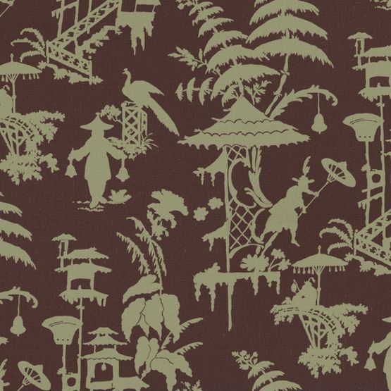
And Indo Night, which is a fabulous aubergine and warm gray that I’ve done for pillows for clients.
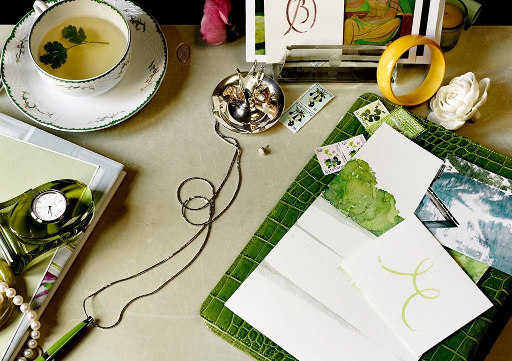
Another exquisitely crafted vignette with accessories from Global Views.
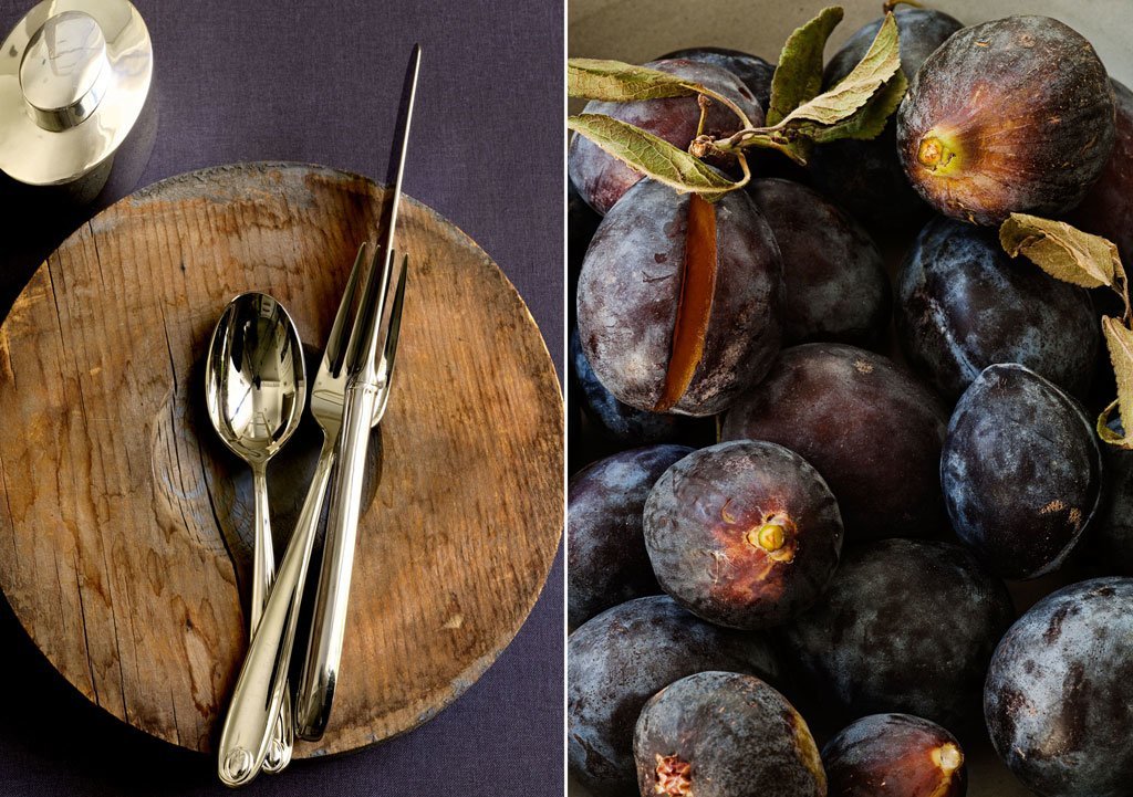
Again a wonderful image from her book. A secondary favorite color of Barbara’s is plum and aubergine. That makes sense because it is a complimentary color to Barbara’s favorite yellow greens. She is inspired by all things natural and of this earth.
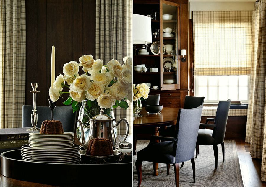
From Barbara’s portfolio. A mountain home. Incredibly chic and sophisticated!
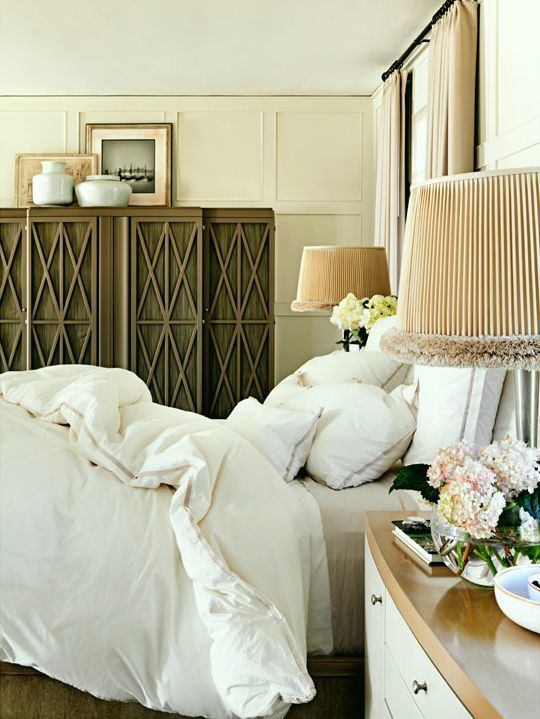
A messy bed. Yes! I love airing out my bed after sleeping in it.
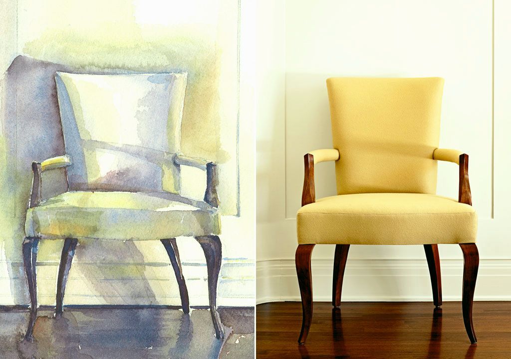
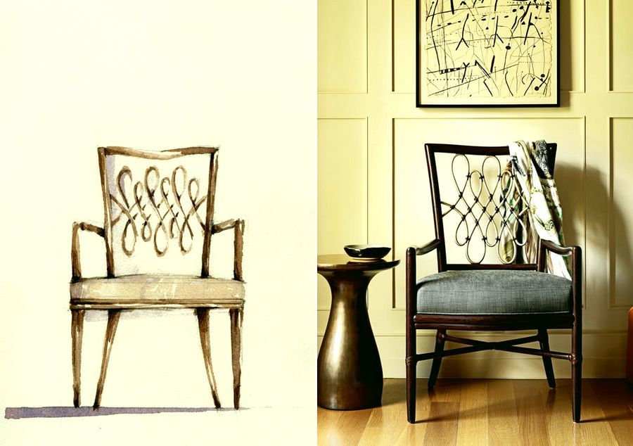
A Barbara Barry chair, first realized in water color and then the final product by Baker Furniture
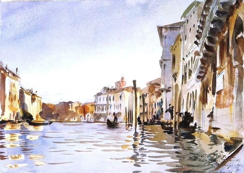
Barbara’s palette is also inspired by fine art such as this wonderful watercolor [Watercolors of Venice] by John Singer Sargent.
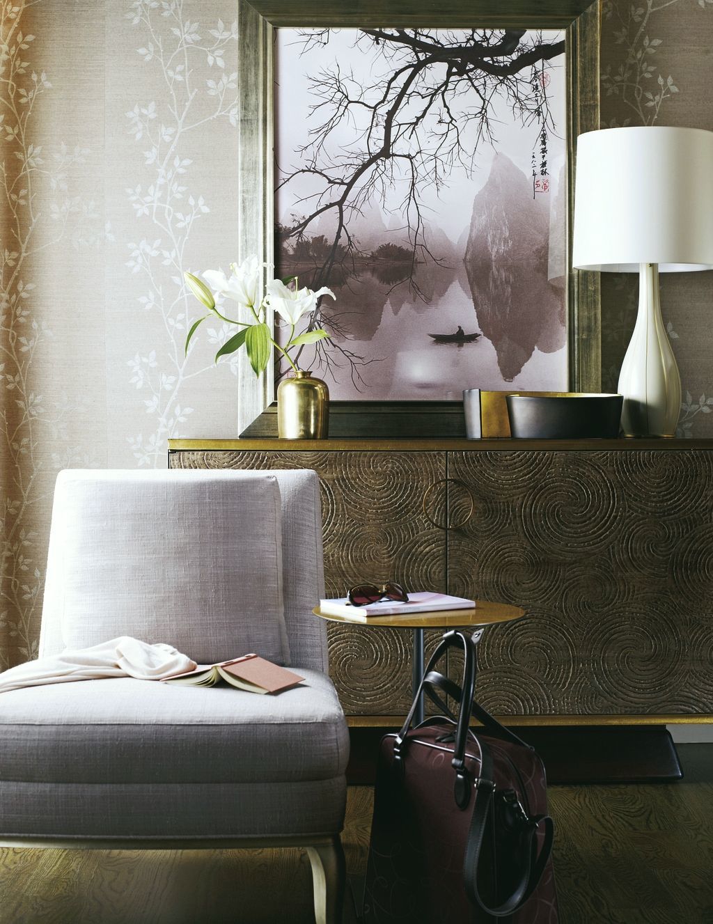
Many of Barbara’s interiors also have an almost other-worldly ethereal feeling. But it is always juxtaposed against stronger forms and intensity.

I think the lithograph in the room above inspired this lovely Chinoiserie linen print, Marco Polo Mist fabric produced by Kravet.
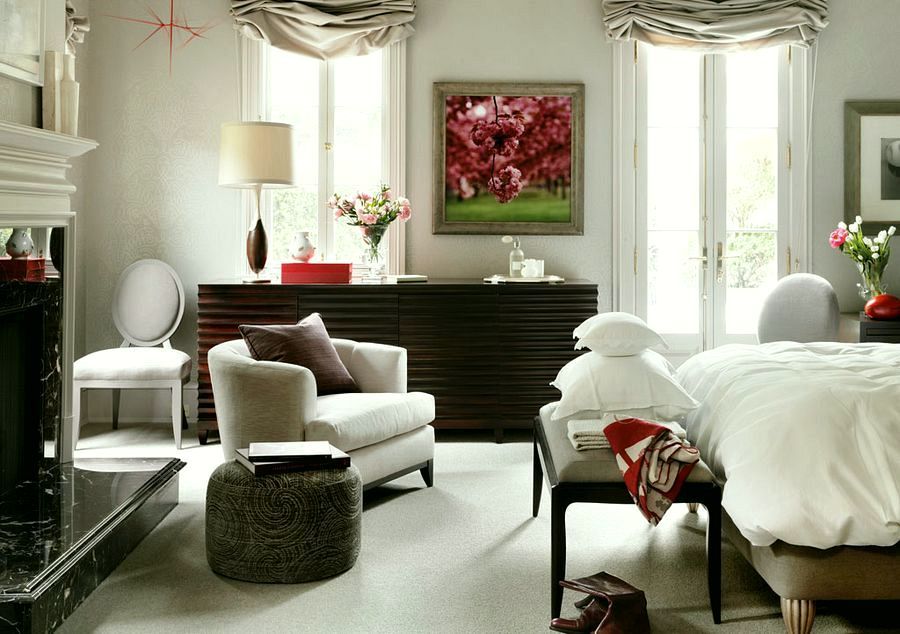
Barbara’s glamorous bedroom. I love her “messy” Roman shade.
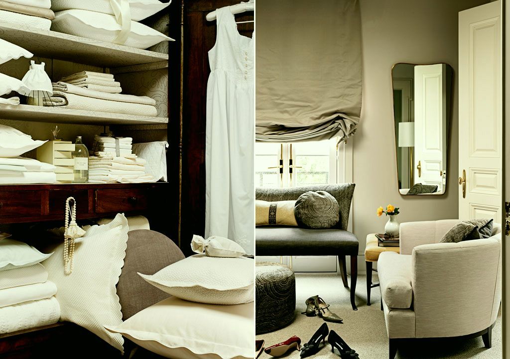
Her closet.
She leaves her shoes laying around all over the place too?
This is why I love Barbara Barry. She’s perfect.
Perfection doesn’t really exist, however.
That’s why she’s perfect.
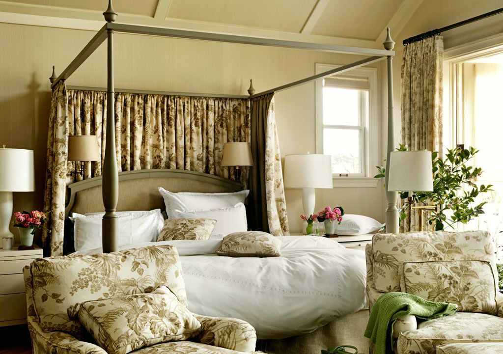
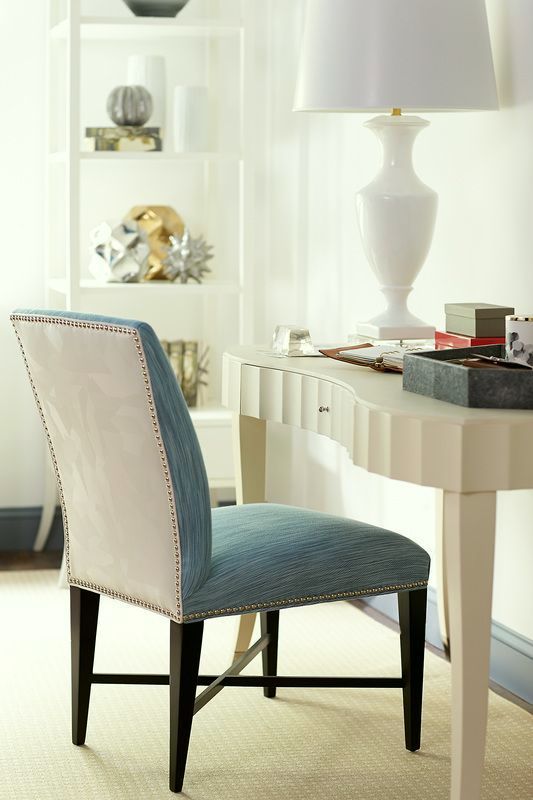
Love this sepia toned linen print in a bedroom by Colette van de Thillart in Traditional Home. Please note how at home the Ruhlmann inspired table lamps look. These are part of the collection of lighting fixtures that Barbara has created for Circa Lighting.
A vignette by the delightful interior designer, blogger and conference speaker Jennifer Mehditash’s charming bedroom from the Ronald McDonald House. It features a Barbara Barry designed desk after Jacques Ruhlmann.
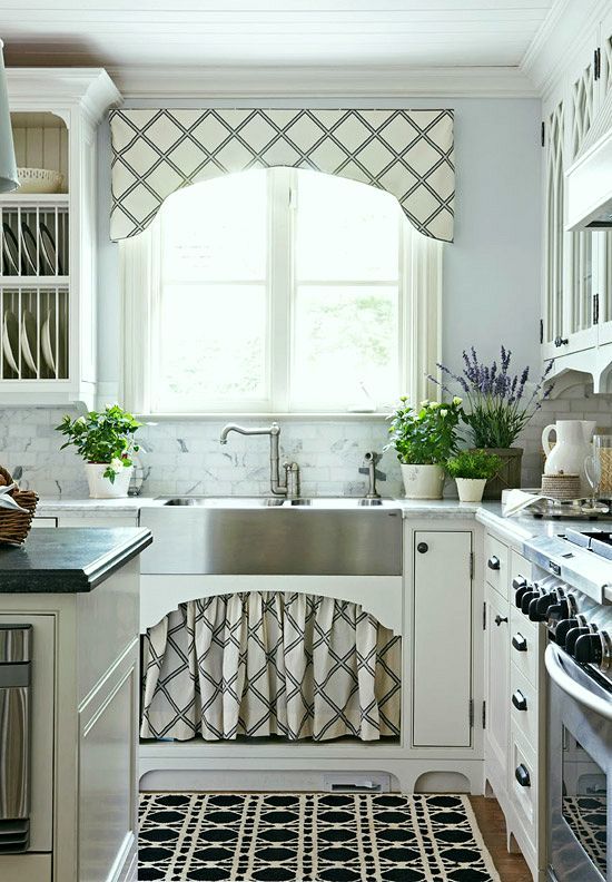
Another Barbara Barry for Kravet fabric that looks so fresh in this country kitchen.
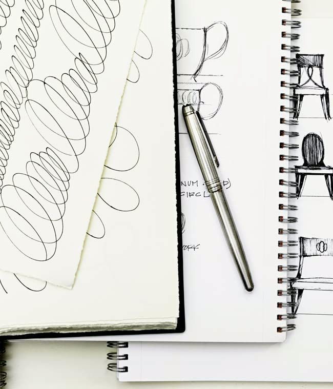
Scribbles. Ovals. Barbara Barry. Genius.
Hope you enjoyed!
xo,
![]()
Related Posts
 Exquisite Bedroom Furnishings Inspired By Mark D Sikes!
 What If Your Room Plan Falls Apart In The Middle?
 Here it is! A Palette For No-Fail Paint Colors
 A Master Bedroom Design Process, and What Inspires Me
 Can You Do A Guestroom Suite on a Shoestring Budget?
 Six Figure Income Blogger 150 Page Guide Is Here!
 20 Little Known Small Room Ideas to Maximize Space


