I’ve decided that once a month or so, I’m going to feature an interior designer who’s influenced me and/or one that I admire hugely.
This month the focus is on Vicente Wolf. The master of the mix of old and new and everything in between.
You may recall that I entered a pinterest contest a couple of weeks ago, but unfortunately, despite the fact that I poured my heart and soul into each of the 227 images I pinned—I didn’t win. Although, in a way I did win, because I love the board I made to honor him. Vicente has said that it’s best to do what’s in your heart and what pleases you and so that’s what I did. What I think I’m the most upset about is that I won’t get to meet him— this time, that is. However, if you want to see what I did, you can check out the final #MeetVicenteWolf #pinterest board. I had so much fun doing this! I love how all the colors and images work together to make a kind of composition in and of itself. I interwove his work, my work, the new paint colors, old pieces of fine art, his furniture and some Swedish pieces and even some ballerinas. Well anyway, it’s there.
However… there was one photo I forgot to add from my clippings that I’ve saved for decades!
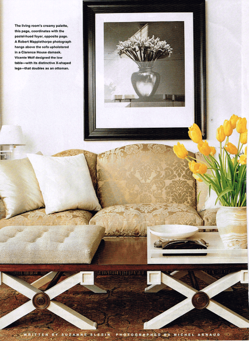
I believe that this room is from the mid 90’s. I was absolutely gobsmacked when I first saw it. The very formal damask under the Robert Mapplethorpe and then that cool, cool, coffee table (designed by Vicente, of course) which I absolutely flipped for. And then the gorgeous Persian rug! I stared at this image for hours because it is a rare creative genius who could put all of these divergent things together and make it work in such a harmonious way. It was like a breath of fresh air and to me, it still is.
These next two images are on the pinterest board however. And they are also beauties that I had saved from around that time.
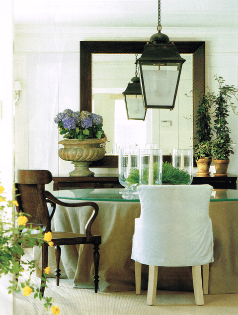
What I love about Vicente’s rooms in addition to their immense cool factor, is that you cannot tell when in time they were done. To me, that is the truest test of a beautifully designed room.
Now, for the coups de grace. And let me tell you, from this one image alone, (one of my all-time favorite bedrooms) I should’ve won the contest.:]
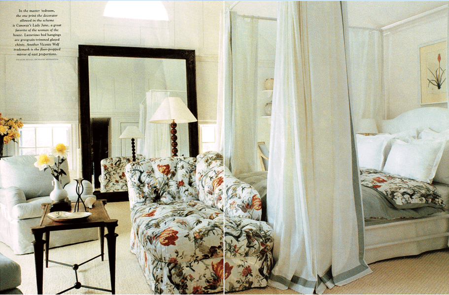
Yes, my friends, that is a FLORAL CHINTZ on the chaise and duvet cover. It is a discontinued pattern from Manuel Canovas. Now, my interior design friends will most likely be quite shocked, but for the rest of you who don’t regularly follow this stuff please allow me to explain. Vicente Wolf putting a chintz in one of his rooms is like Mozart playing jazz. In other words, it never happens. Except that it did and it wouldn’t surprise me if Mozart also played jazz. (when no one was looking, [or listening] that is.)
The other thing about Vicente that may come as a surprise is that he is usually best-known for using a lot of pale earth tones, grays, blue grays— very soft watery tones.
Like this beauty, for instance.
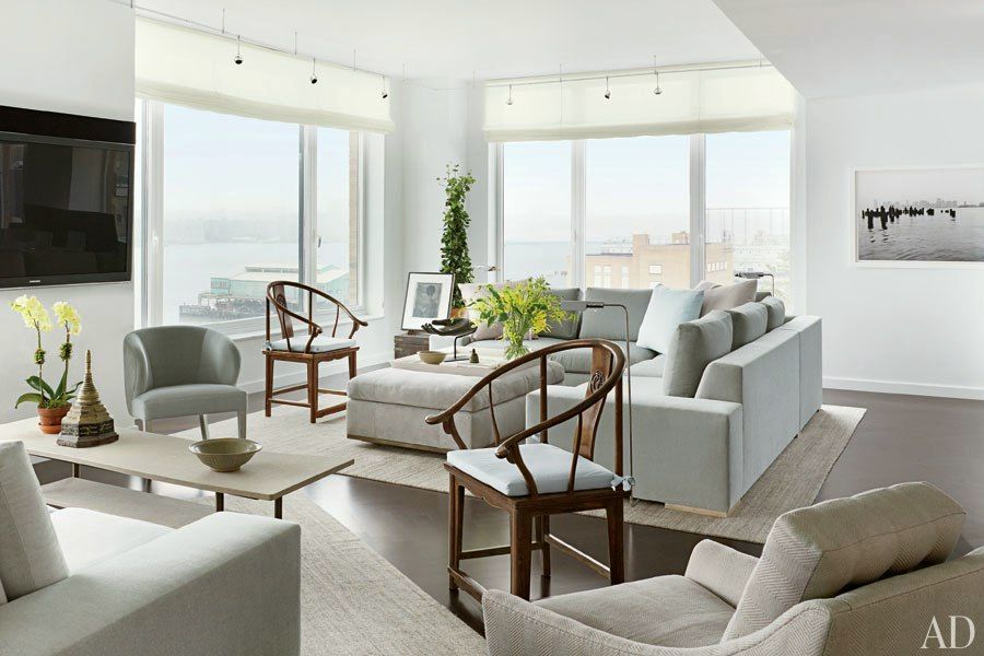
and this
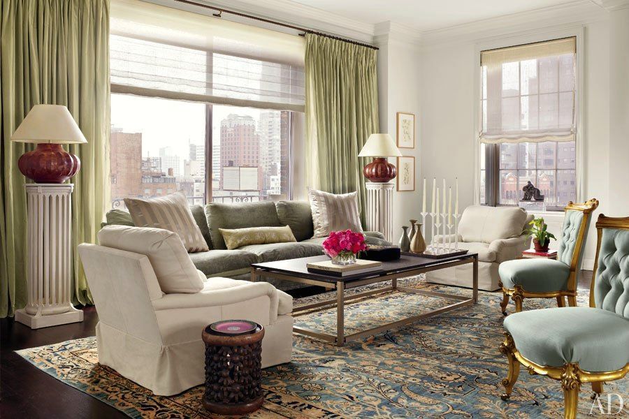
and these
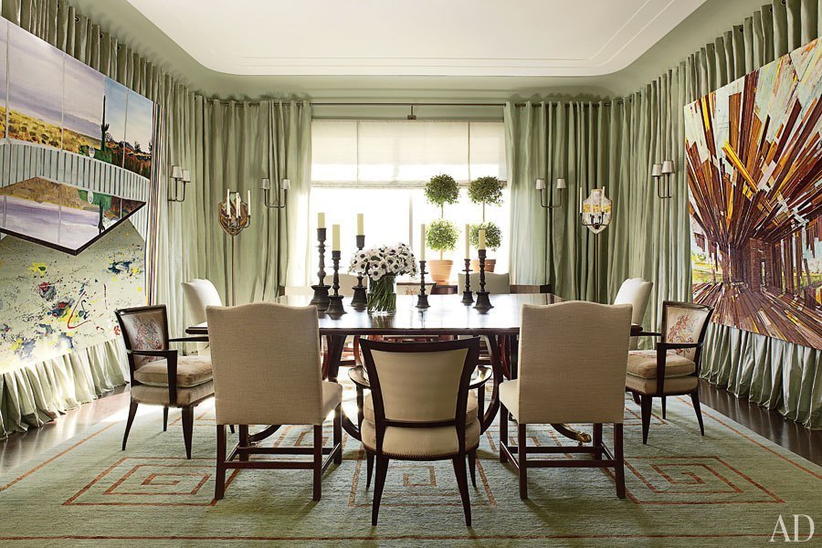
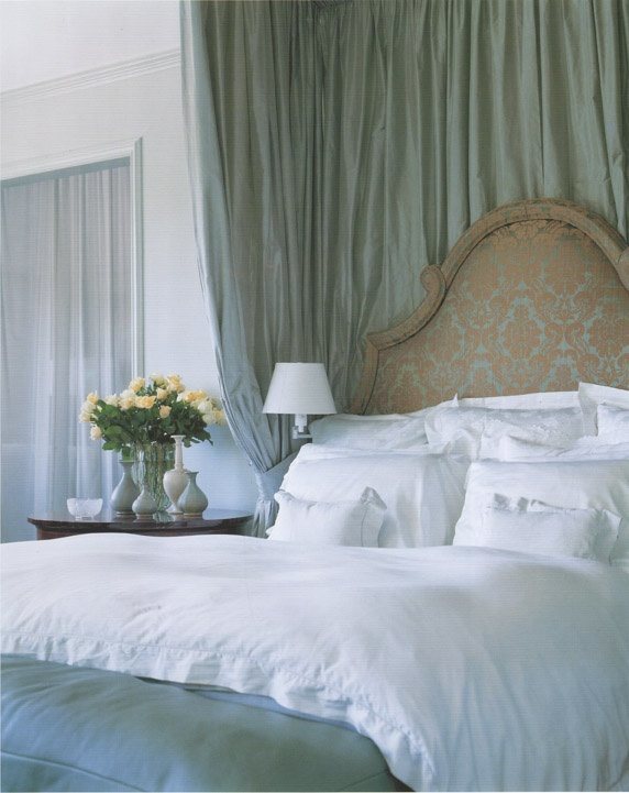
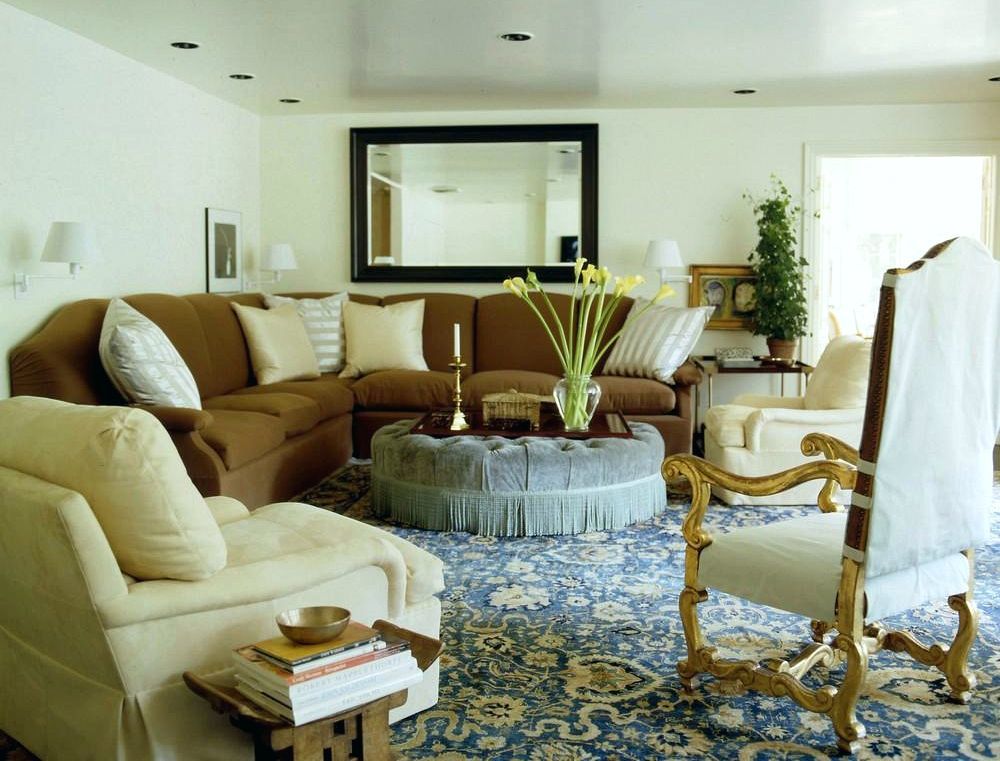
and these
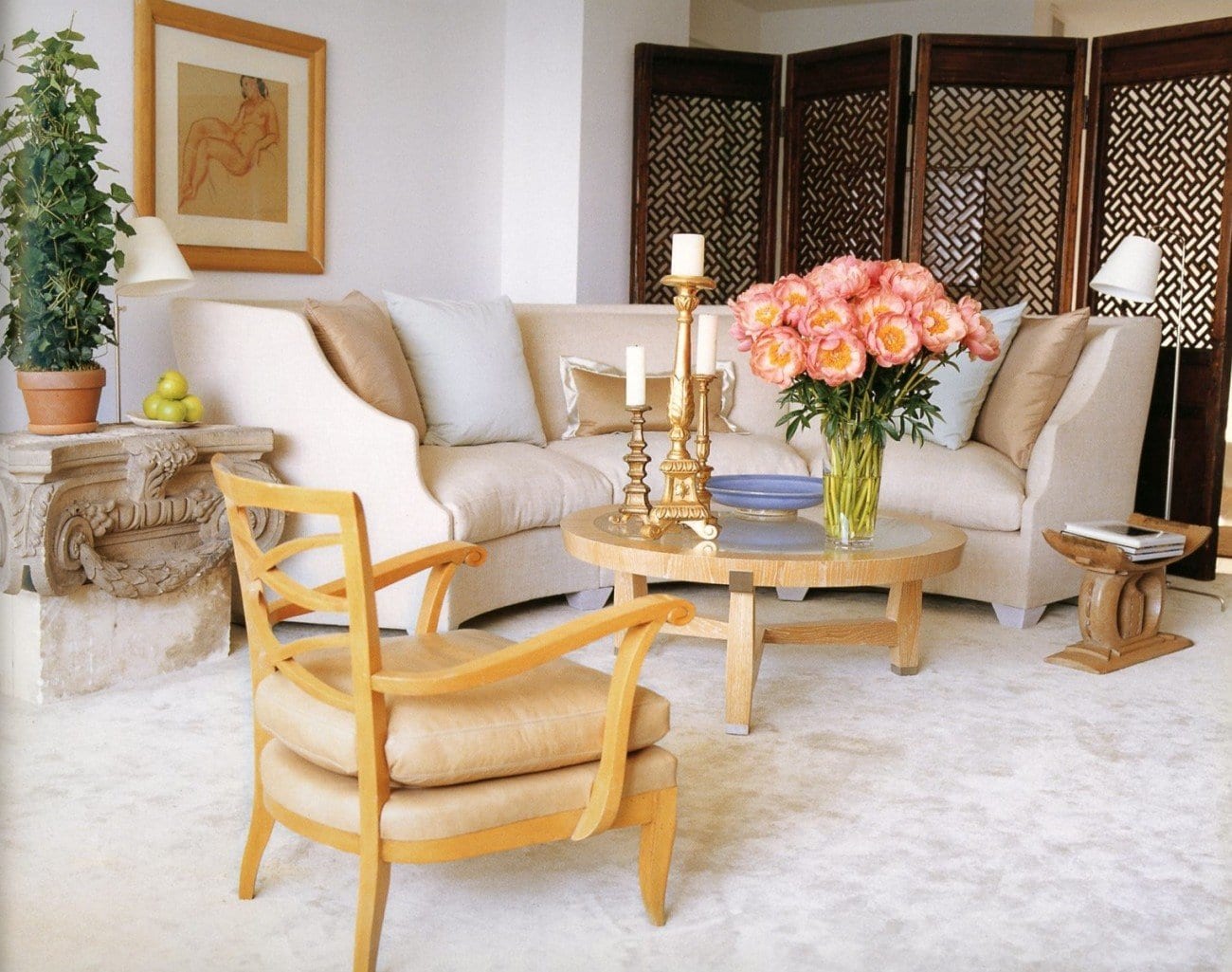
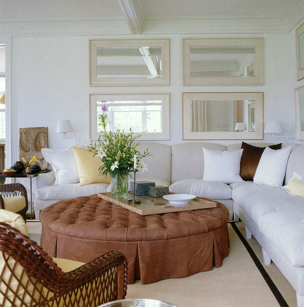
and this image from one of his Kip’s Bay Showhouse rooms.
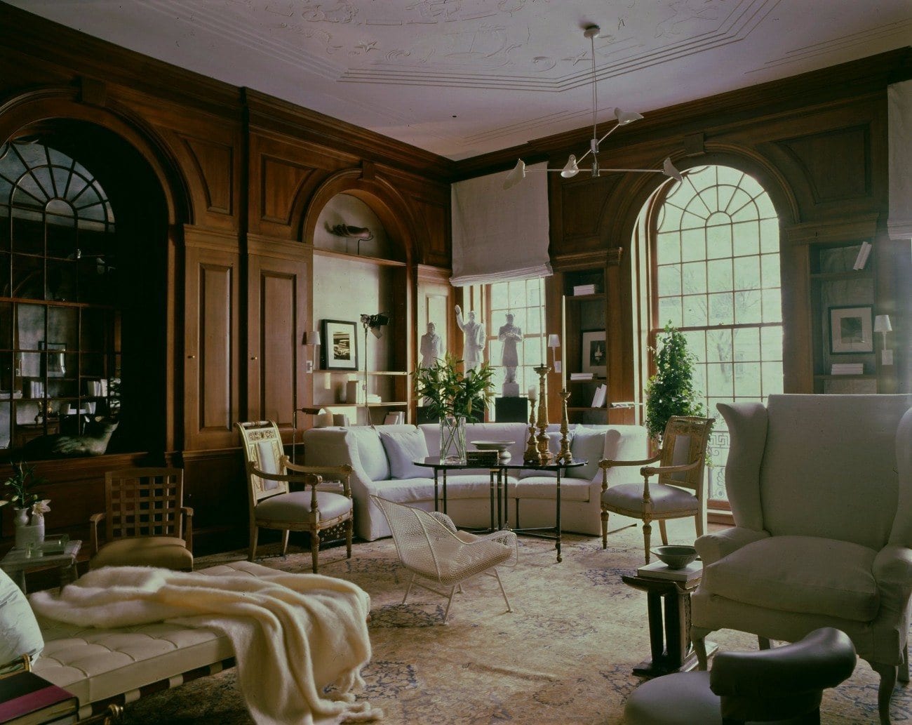
Brilliant! The room is just dripping with casual luxurious elegance!
On my board, I added in lots of classic art pieces which mimicked Vicente’s subtle and sophisticated palettes such as this incredible piece, below by the prolific John Singer Sargent. I guess this was in the days before Prozac. But the colors!!!
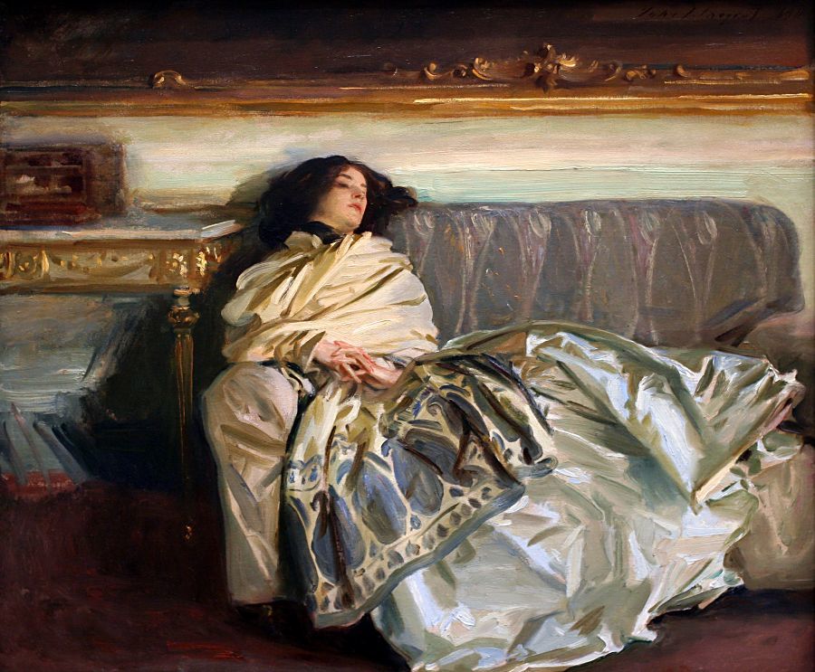

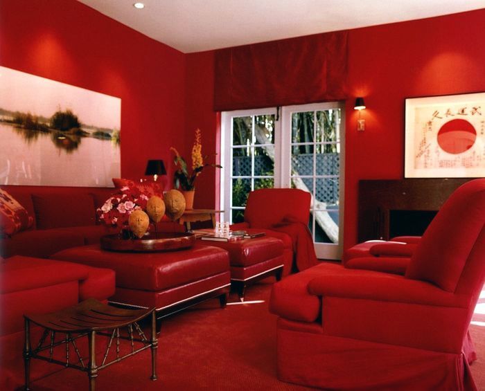
…But what a lot of people don’t know about Vicente is that he has another side to his creative persona which is hinted at in the art above that is completely contrary to everything some people have accused him of. (that everything he does is always the same.)
It most definitely is not!

Room by Vicente Wolf for the Kip’s Bay Showhouse. Vicente’s work is influenced by many things but probably none more than his travels all over the world.

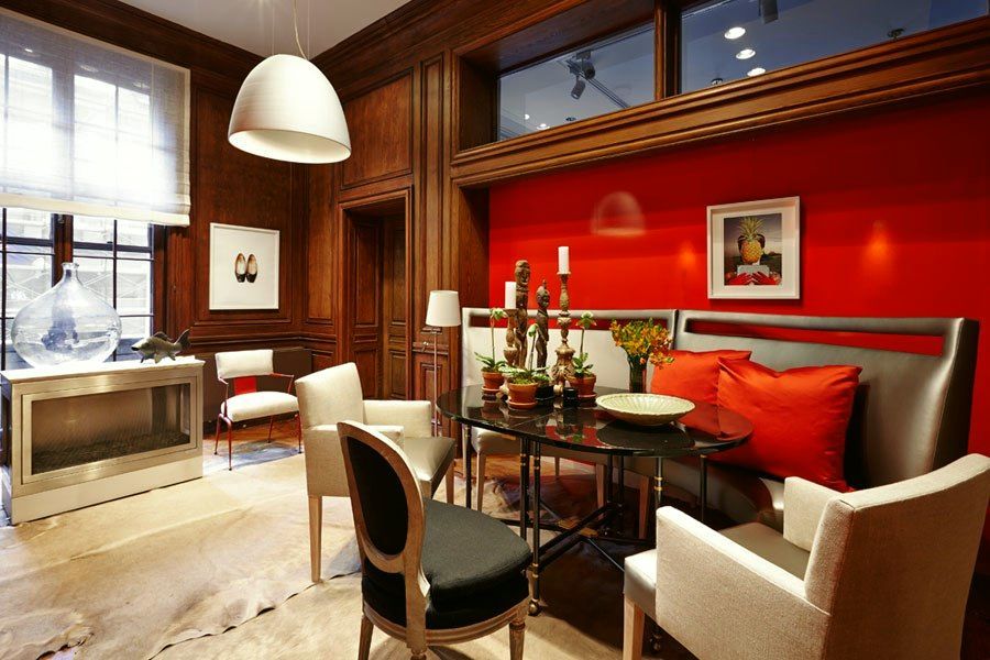
And then he did this… Two years ago for Kip’s Bay. I remember that on his blog he had asked US (!) what he should do. I chimed in that he should do something that no one would ever know was a Vicente Wolf room. hmmm… I’m sure that he had the idea, himself, all along.
It reminds me of this incredible piece of art by Mark Rothko

Or this brilliant painting by El Greco of Pope Pius the V (aren’t you just dying to know what he was thinking?)

which also reminds me of Vicente’s current installation at the Kips Bay Designer Showhouse in NYC 2014.

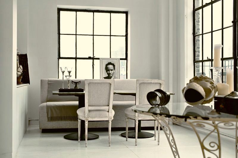
Vicente Wolf— looking pensive in his ever-changing amazing loft.
Love the electric cord— cause it’s real. That’s another reason why I love him so. And to boot, he doesn’t always make his bed!
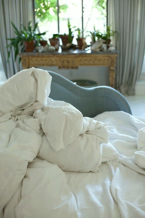
don’t ask me where I unearth this stuff.
Well… one day… I hope that I get to meet him and maybe I’ll even work up the nerve to ask someone to take a photo of us. My sister Holly suggested that I invite him out for lunch. What do you think? Should I do it? Please be honest. Wouldn’t that be so, so cool? It would be even cooler if he said yes!
xo,
![]()
Related Posts
 Feelin’ a bit orange
 Laurel’s #1 pick for the best sofa (addendum)
 The Trick to Choosing Color Schemes|Analogous Colors
 What are the Best Interior Color Schemes?
 The Number One Interior Decorating Dilemma and How to Get Past It!
 A Home For Sale Runs Amok {part II} bathrooms and more
 All About Hardwood Flooring + The Common Cleaner That’ll Ruin Them!


