Tinted Wallpaper? Here’s How to Do It + Renovation News!

Hi Guys,

In addition to my mom’s expression, “It’s like a marshmallow in the snow,” another even more popular saying she had was, “busier than a one-armed paper hanger.”

I’m sure that’s politically incorrect; no offense is meant.

However, that’s me. Fortunately, all of my body parts are currently in good working order and intact. However, there is so much that does not normally happen, and I’m only three people. So, something has to give.  That is why I’m a little off my schedule.

Before we get into the little-known topic of tinted wallpaper…


Last night, around 8:00 PM, I was so sleepy that I could’ve nodded off, but then I received a notification. I had a delivery outside my front door.


Okaaaaay, I better go and fetch it.


250 lbs of marble tile

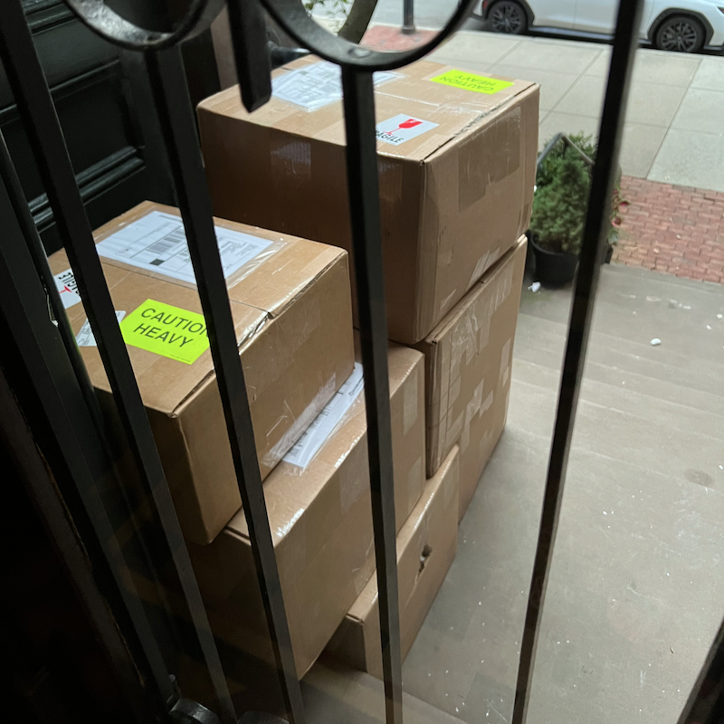
You have got to be forking kidding me!

BUT, it’s the new marble floor. Me have to bring inside. No one was there to help me.

Me have to suck it up and do this.


WHAT??? I’m a little old lady. Don’t they know that?

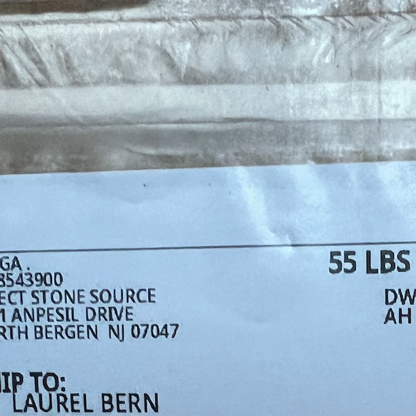
Fortunately, only one box weighed this much. The rest, except for one, were a mere 37 pounds.


Wait, you got that inside, Laurel? How on earth did you pick up 55 pounds?


I didn’t. I rolled it in. just behind the first locked door. Brendan and Eugene are back this week and brought it inside for me today.

Okay, before I get into the topic of tinted wallpaper, a few words about the mural I’m hoping to do.

While the vast majority of you left darling, supportive comments, my snarkometer was smoking.

Please understand that my home is not a museum.


It is normal and expected to have furniture in front of a mural. And that includes pieces much larger than my antique bookcase.


Murals are typically broken up, with huge swaths missing due to furniture, windows, doors, fireplace mantels, mirrors, art, cabinetry, lighting, slanted ceilings, wainscoting, and more. In a room used for living, it’s unavoidable.

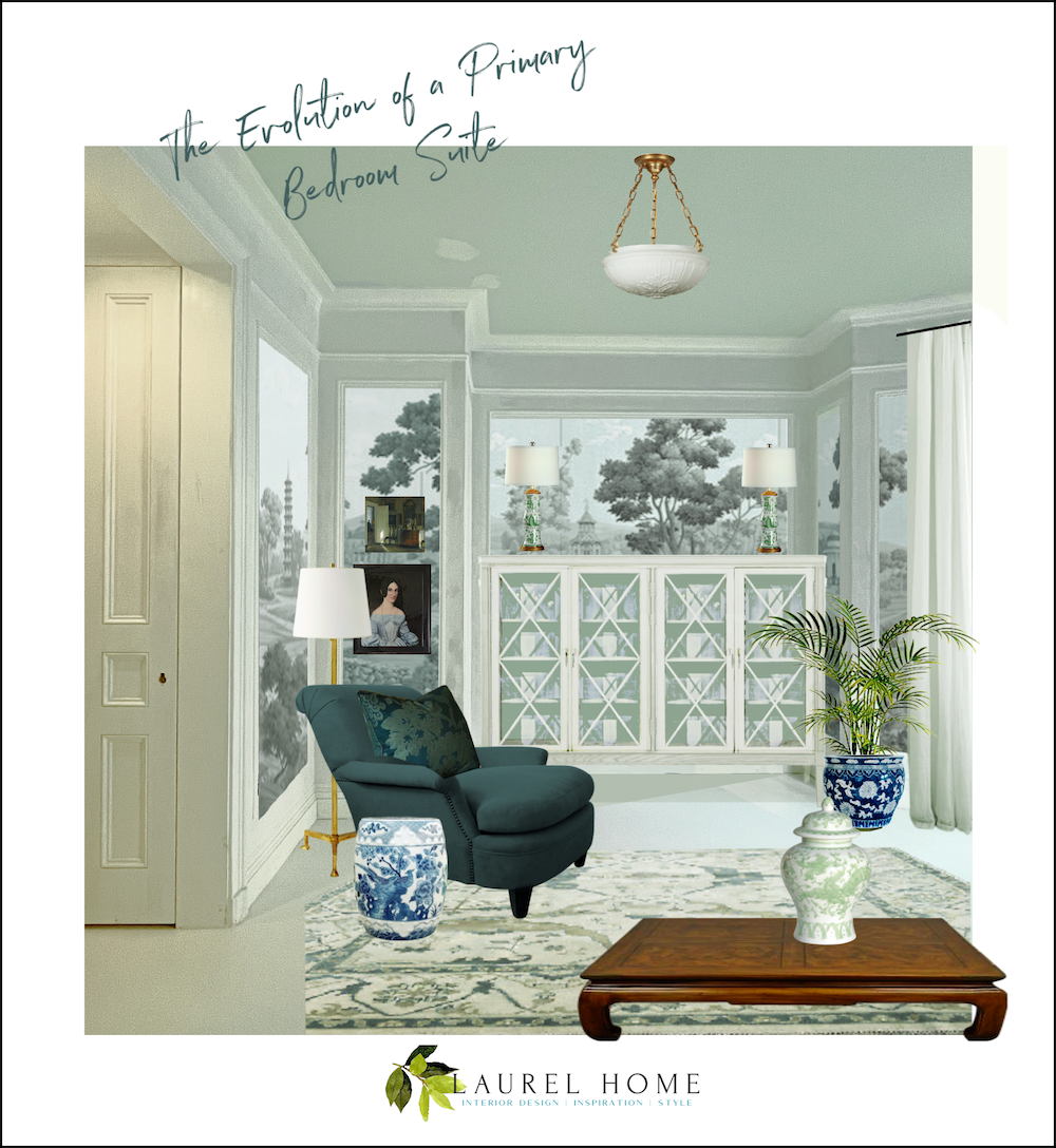
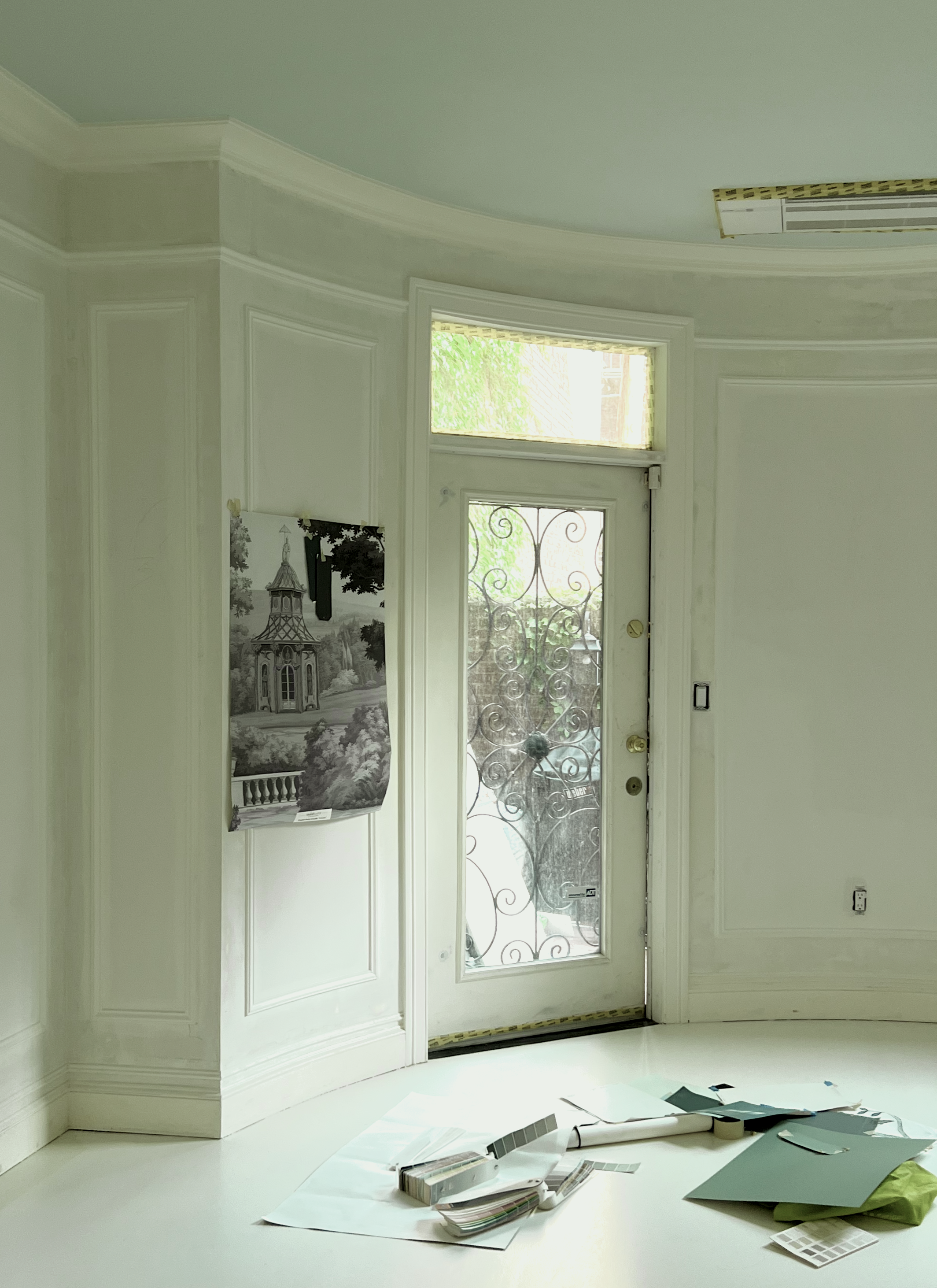
In addition, the niche across from my bed is the only place for my antique bookcase to go. I held my breath for over a year, not knowing if it would fit. (It does with one inch to spare!) The fact that some of the mural is covered up by furniture is a non-issue for me.

Many of the panels will be unobstructed, but most will have some obstruction. Again, this is typical.


Steve Cordony dining room - mural by Iksel
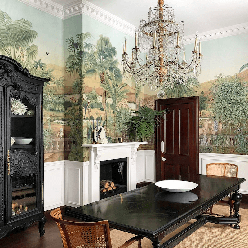
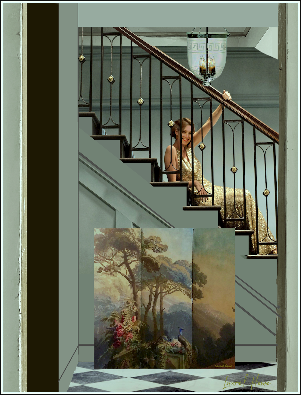
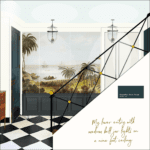
Lovely Iksel mural in the dining room of Steve Cordony


So, would another mural be better than this one?


That’s subjective. However, I feel that the tone-on-tone English Parks Grisaille mural by the Mural Source makes for a more soothing, less busy, and sophisticated backdrop for furniture.


However… There IS a problem with the mural.


I mean, it’s a problem for me. The mural is exquisite.

It’s the color. What I did in the rendering is not what it is.


English Gardens Grisaille bedroom white floor furnished Primary Bedroom Suite
It’s what I want it to be.

Yes, it’s gray, but like black and white, not all grays are alike. This one is overall a warm gray with a red undertone. At night, the color looks so brown that I thought it might’ve been mismarked as the Brunaille colorway of English Parks.


No, this is the grisaille colorway.


But, during the day, most of the mural has a slight, passive purple undertone. It doesn’t always pop out, but compared to my other colors, it does in my room.

Now, there’s nothing wrong with this color. I’m sure that some of you will adore it. I like it too, just not for my bedroom.


The Mural Source English Gardens Grisaille - warm gray


I would prefer not to see any purple undertones and I don’t want it to look as brown at night.


So, in my ideal situation, what color would I like to see?

I’d like it to be a cooler gray, one with a slight blue-green undertone—not so much that it will read as teal, but it will complement the greens and teals in my color scheme.


The Mural Source English Parks Grisaille before tint


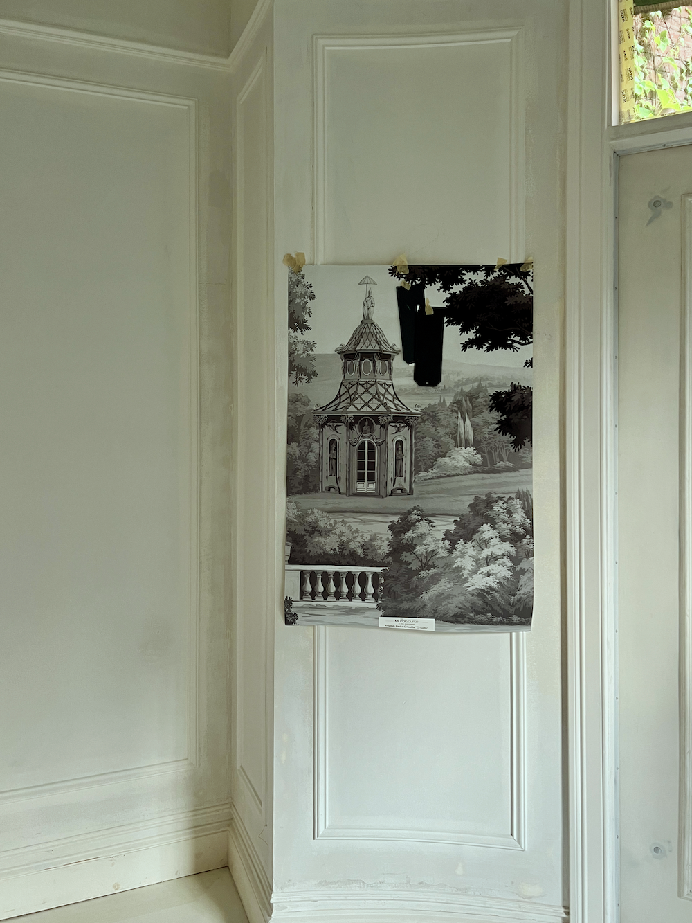
Above is how the mural looks most of the time.

Below, with the magic of Picmonkey, I virtually tinted the mural sample.


virtually Tinted wallpaper - grisaille mural
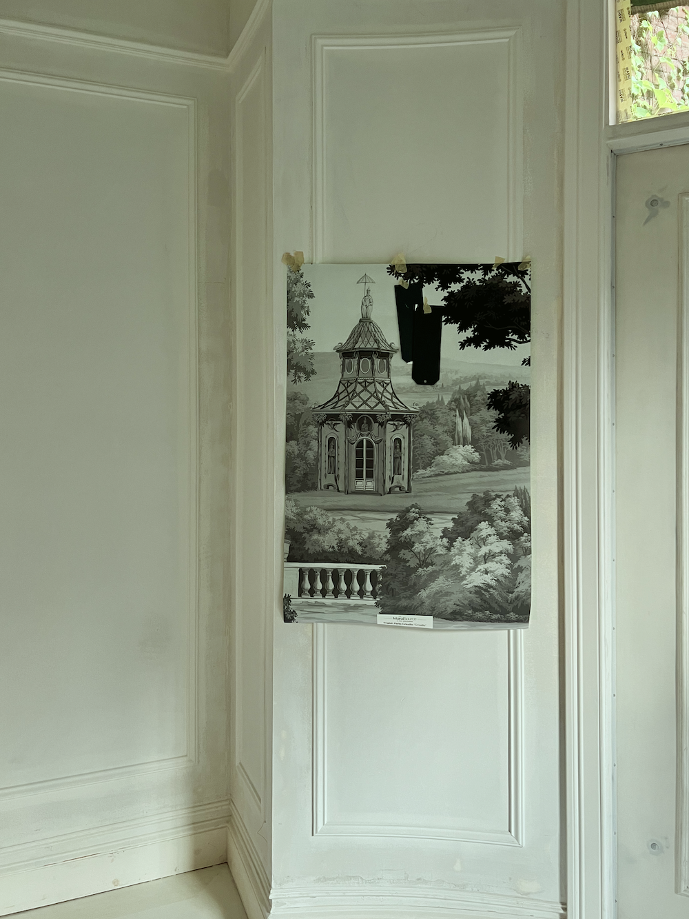
Yes, it’s subtle. It’s subtle because it has to be.


Wait, Laurel. Is it okay to do this? Can’t you ask The Mural Source to tweak the color?


Yes, I could, but it isn’t easy to accomplish. Plus, it might not work, and I don’t want to trouble them. Besides, I would like to show you how to do a tinted wallpaper or mural. There is always an element of experimentation involved. However, it is possible to tweak the color of a wallpaper if it otherwise is perfect for you.

You could also antique the wallpaper or mural.


I spoke to Chris about my idea and he got right to it.

(Although, this is something I’d like to do on my own.)

First, he sealed about a 9″ square corner of the paper. Then, about four hours later, he applied a transparent green-tinted glaze.


Experimenting with tinted wallpaper - large mural sample with a tinted corner
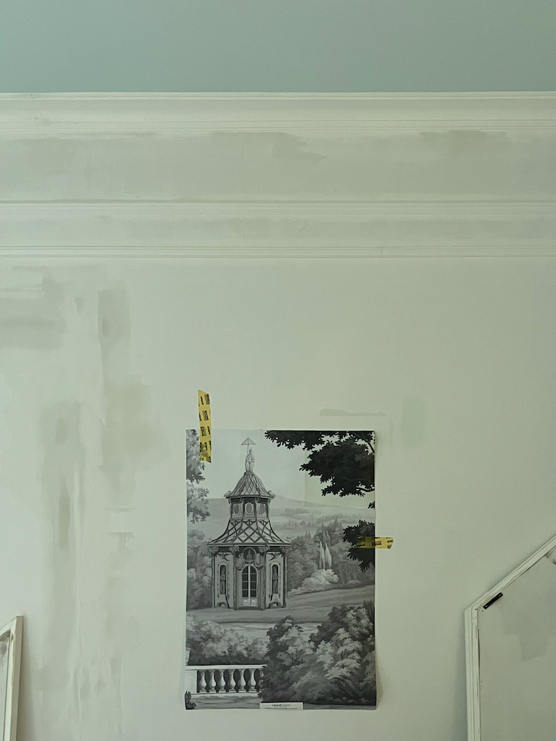
The tint is in the upper right corner. I wasn’t present when Chris did this, but I would’ve had him make it a speck more blue and a touch less color. So, tomorrow, he’ll try again, and then he’s taking a few days off. So, I hope he can leave the products, and I will play with them over the weekend.

Hooray, he was successful in changing the color. Please note that it was still wet here.

When we get it sorted out, I will give you the recipe and products used.


Okay, a few things to know about tinted wallpaper.


You can either make an image lighter or slightly darker. However, if you make it lighter, you will begin to lose some of the design. Sometimes, that might be the effect you want; however, I don’t want to do that for this mural

Therefore, unless you’re trying to make the design more murky, it is best to use a transparent tint, like a universal tint, not a pigmented paint.

Tinted wallpaper detail wall mural

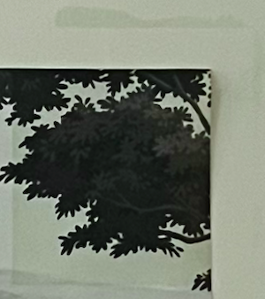
Above is a detail of the tinted mural with a thin border of the untinted mural on the left and bottom. You can see a bit of the color he used. It’s a good start, but I think it will be perfect if we can make it a little more blue and a touch less color, perhaps. We’ll have to see after it’s fully dry.


We will also experiment to see if the paper requires sealing first. If so, then that is an important first step before applying any tinted glaze.


In other color-related news, Chris made a bunch of large samples on poster board for me.

I told him he could do either Chappel Green by Farrow & Ball or Grenadier Pond by Benjamin Moore.

He did the former.


Farrow & Ball Chappell Green staircase wall

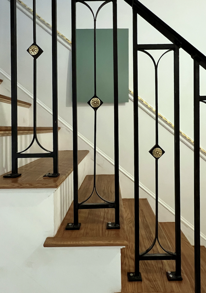
We still have the sucky lights, but this gives a good idea of how fantastic this beautiful jade green color will look juxtaposed behind the black staircase railing.


Grenadier Pond - Chappell Green new stair handrail design inspired by upstairs-downstairs (2010) my face


I’m closing with a shot of the painters at work early this afternoon. As you can see, the floor is now fully covered.


floor covered painters at work
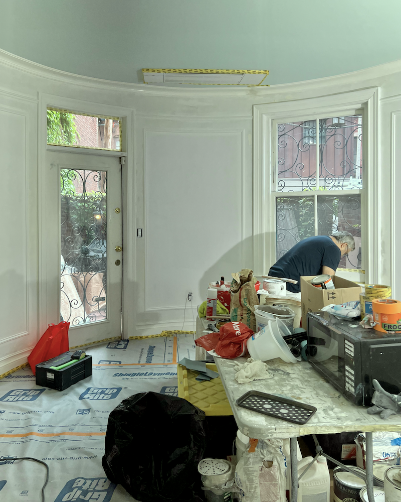
They plan to do as much of the painting as possible before moving me back to my bedroom on the 30th or 31st. Incidentally, this view is the focal point of the bedroom and I don’t plan to have any furniture covering it up. Or at least nothing large.


And finally, the bathroom tile installation is set to begin this coming Tuesday.

However, I’m going to see if it can begin on Monday. In any case, I will be back in my bedroom by the end of this month.

It has been a Godsend to hang out at my neighbor’s unit while she’s on vacation. After nearly eight months, a respite from the construction is most welcome.

There’s more news, but I’ll save it for the weekend.

Note after publishing. Some of you can’t let go of this non-issue. omg! Please, no more words about the rendering, the size of the bookcase, the placement of the mural, etc. I have been trying to explain that the rendering, as all of them are, is conceptual, not necessarily what it will end up being.

These renderings take forever, and I only do them as a demonstration of the concept. And, in this case, so you wouldn’t crap all over me over the floor, yet you found something else to crap all over me about. Please think very carefully about why you have the need to be so critical. It’s not helpful. It’s like a fly buzzing around my head.

Yes, I could spend another three hours fixing it so you won’t be bothered, but if possible, I would rather spend that time sleeping.

I love you all!


***Please check out the recently updated HOT SALES!

There is now an Amazon link on my home page and below. Thank you for the suggestion!

Please note that I have decided not to create a membership site. However, this website is very expensive to run. To provide this content, I rely on you, the kind readers of my blog, to use my affiliate links whenever possible for items you need and want. There is no extra charge to you. The vendor you’re purchasing from pays me a small commission.

Amazon ad

To facilitate this, some readers have asked me to put

A link to Amazon.com is on my home page.

Please click the link before items go into your shopping cart. Some people save their purchases in their “save for later folder.” Then, if you remember, please come back and click my Amazon link, and then you’re free to place your orders. While most vendor links have a cookie that lasts a while, Amazon’s cookies only last up to 24 hours.

Thank you so much!

I very much appreciate your help and support!

23 Responses

  1. I LOVE reading your posts! You have so much cute personality! Love the green paint you chose, and all your other final choices along the way. I think the word “stunning” is not even close to what you have accomplished. Your renderings are so impressive–you’re a computer genius. Please don’t bother replying to this fan mail–take a nap–you deserve one. <3 (I don't know how to make a real heart!)

  2. First, to Jessica Kever (in case Laurel is unable to get back to you) – If you search for Hand Painted Green & White Porcelain Vase Lamp by Chelsea House, you will find a few places that sell it online. It’s such a beautiful lamp!

    Laurel, my back hurts just thinking about you bringing in all those heavy boxes. But, how exciting to receive the tiles! Your home is looking so gorgeous – classy, classic, comfortable – just really special (like its owner) ;] I am swooning over the pic with the Chappel green walls and your stunning stairway railing. You are knocking it out of the park, Laurel!

    One more thing: I really appreciate the renderings that take so much time and effort! They help me to see your vision like nothing else can. Not to mention, I pretty much “swoon” every time I see one – such beauty!

  3. I truly apologize for coming off as being critical of your wallpaper or design. I meant to throw out an idea that might or might not work. My idea did concern moving the bookcase but only because the mural is so lovely. Please remember that, when you ask for feedback, most of us don’t have the knowledge and design skill that you do. I know I only speak for myself, but whatever comments I have offered over the years, they have been with a loving heart. Peace! You have enough on your plate!!❤️

    1. Hi Barbara,

      Your comment was fine. It’s words like “If you must,” or “how could you consider such a thing?” that I’m objecting to. Or stating that another designer did it perfectly with a see-through table, implying that I need to study this person’s work to learn what I don’t know how to do. However the table wasn’t see-through, it had a mirror underneath the top. And a huge mirror over it.

      All I’m asking is for people to trust that I will use good common sense when deciding which parts of the mural to use where and won’t cut a building in half. I agree, that’s to be avoided, however, I didn’t take the time to pick the best part of the design for behind the bookcase. Plus, the bookcase might be a little taller than it is. It’s only 54″ high. I could’ve made these changes, but because the paper is in the back of so many elements and the image was blended into one image instead of layers, I would’ve had to start over. That’s ridiculous and it’s especially frustrating when people insist on it being a problem.

      My only goal was to show how adding the right elements can make a white room with a white floor look pretty darned good. Of course, there are many directions to go in that will accomplish the same thing.

  4. I can only imagine the frustration involved in trying to get colors accurately presented in your photos.
    I appreciate your efforts and I think the staircase is the prettiest iron design that I have ever seen for a home.
    The floors wouldn’t my lifestyle at all! We are far too messy.

  5. Tinting wallpaper – who knew?? Thank you again and again for being brave enough to share your trials and tribulations!

  6. All the complaints about the bookcase are just silly. Good design is all about layers: Lamps in front of art, etc. I imagine we’re all just anxious to see the full picture. You can only convey so much via this blog and some of it still exists in your head!

  7. Brillant idea on the tinting! Is it possible to use the bookcase upstairs as a room divider, just a thought?!
    Is it possible to use a different paper behind the bookcase that co-ordinates with rest of the paper but is a focal point, or a piece of art, just above the bookcase, thinking cost difference as well
    If you feel it’s right then all is well and do it like you want, have No regrets!
    Love the color and I have the similar colors in my master bath, black and white subway tile and SW Hazel, a winning combination! Black and gold fleur di lis curtain rods in the master also.
    Anxiously waiting for the finale!!!!
    Cindy

    1. Hi Cindy,

      I think my point has been made ad nauseum. lol

      My place is only 1215 square feet. There is no place a room divider would work due to the configuration and size of the rooms. The living room as it is, is phenomenally tight. I am determined to have a sofa facing the fireplace.

      However, even if I had the space, it would be problematic getting that bookcase to be stable on its slender legs. The piece is only 11″ deep by 54″ high by 84″ long. In addition, the back is unfinished and currently falling apart. The entire piece is quite fragile. I was hoping the carpenters would be able to fix it and another small wobbly table I have. We’ll see. Right now, they have to fix my garden gate that completely broke off its hinges.

      Please, no anxiety. There is not going to be a finale, or a big reveal. That is for TV. This place will very much be a work in progress.

      I am exceedingly exhausted. Whatever I’m sharing isn’t even the half of it.

  8. Do you have a source for those two green lamps? Been looking for something almost exactly like those! Your suite looks great; hang in there.

  9. After seeing the mural in Steven Cordony’s dining room, it has become clear to me why I was bothered by the cabinet in front of the panel. In the dining room, his mural is not framed out in individual panels, so my mind still reads it as a continuous “storyline” despite the furniture, fireplace, door, etc. However, in your bedroom, I was reading the framed panels more like I would pieces of artwork hanging on walls. Therefore, it seemed strange to put furniture in front of it. However, when one is actually in the room with the advantage of peripheral vision, I think it will be stunning. I also think the mural will visually expand the boundaries of the walls by allowing the eye to travel into the scenes and beyond the actual walls.

  10. Your bedroom seems to be coming right along! I hope you’ll be able to sleep in it in your own bed soon. I love the mural wallpaper–it’s beautiful. I have to be honest–I had no damn idea you could tint wallpaper yourself. None. I only knew you could paint or stain anaglypta, which I’ve seen done. This post has blown my mind.

    It makes me wonder how many other things you know that you probably think everybody knows (people who are very knowledgeable about something often think what they know is common knowledge). This must be one of the reasons you love design so much, because there is always something new to learn.

    Thanks for being a great teacher.

    Madonna

    1. Hi Madonna,

      When I moved out of my long-time home at the end of 2012 to my one-bedroom apartment in Bronxville, New York, I painted everything. First I painted the large cabinet from Zentique. I hated it as it was and loved it after it was painted.

      Then, I realized that the chair fabric looked too summery, so I painted that too. Then, it was perfect. I cried and painted and cried and painted. And then I got busy with my blog and stopped crying. (as much)

  11. Janet C. hit the nail on the head: the English Park mural provides depth and perspective, which gives an expansive feel to your (any) room! I think the tint is a brilliant idea and you and Chris will make it look exactly as you want it to. I cannot wait to see your gorgeous finished home! Cheers!

  12. Laurel, OMG! You didn’t move those heavy boxes! We had left over marble tile after reno’ng our master bath – I moved the “small” boxes myself and regretted it. I can only imagine how you felt afterwards. Okay, really love the green. And I agree with another of your readers, you and Chris are mad scientists – tinting wallpaper! Am so curious to see how it turns out.

  13. Tinting wallpaper? Who knew? You & Chris are a couple of mad scientists. 😂
    I love the green paint color you’ve chosen. It feels like a little hug.

  14. Laurel – you’re a real gem. I’ve been living in a construction zone in my house for 20 months (yeah I guess we use baby age-speak when we reference home renovation projects!) and while I am very sorry about how long yours is taking, and all the challenges you’re facing head on and knocking out like an expert champion of “only 3 people” 😀 — there is some sense of misery in company. I appreciate you sharing your lessons learned and the joys & sorrows of this very personal process. It’s coming together beautifully and seemingly in a well constructed manner. All the best as you continue along XO

  15. Tinting wallpaper is something I had never considered before reading your blog entry. Very interesting! I like the English Parks Grisaille mural because it provides depth and perspective and one can visually wander around the serene landscape.

  16. Laurel,
    Don’t know if you’e ever considered Donald Kaufman Paint Colors, but I’ve had great results with them. He’s got two whites I’ve used that I’m wild about and am currently considering two greens I like a lot. Have been comparing them to BM and F&B, and they don’t compare to DKC.

    Also – Have you ever put a sealer on a bathroom wallpaper? I haven’t, but would like your opinion.

    Btw, you and I had lunch several years ago at the Bronxville Field Club. I’m so excited about your new place. I retired from the world of stockbrokerage and am now in Litchfield CT living in a 1780 house! Still have my Brooklands apt, but never go there.

    All the best, Linda Blakely

  17. These developments are stunning-love the color choice against the railings. It is all coming together – cannot wait for more!

Leave a Reply

Your email address will not be published. Required fields are marked *

This site uses Akismet to reduce spam. Learn how your comment data is processed.

Welcome To Laurel Home!

laurel-aarons-18th-e1456449963926

Hi, I’m Laurel, and Laurel Home is the website and blog for Laurel Bern Interiors.
I’ve been creating new-traditional interiors since 1988. The blog is where I share all.

New Edition, November 2023! Get The Indispensable Guide For 100s of Home Furnishings And Interior Design Sources That Everyone Is Raving About

laurels-rolodex-final-book-cover-master 10th edition 23-24

laurel home archives

Categories:

Please click the image below for more info about my rockin’ Interior Design Guides for 2024!

Laurel Home Interior Design Guides 2024
Amazon ad

please click below to check out my favorite decorating & design books

Laurel Bern's Favorite Interior Design and Decorating Books