Hi Guys,
Thanks so much for your thoughtful comments regarding Kat’s Florida coast condo.
I’m glad most of you enjoy these posts about readers’ homes. Through these dilemmas, I’m trying to hone in on what it is that makes for great decorating.
But, in so doing, I’m beginning to see some clear patterns.
First of all, most of you already have beautiful homes. However, what usually happens is that when I receive a letter, the issue is usually a minor one that’s not addressing the proverbial “elephant in the room.”
What is the elephant in most homes that are preventing an okay room from being great decorating?
The most common issue is architectural problems that are working against you, such as:
- Homes without walls (AKA: the so-called “open floor plan.”
- Homes with a lack of architectural interest.
- Cheap finishes that look it.
For example, remember Cher?
She first wrote me about her fireplace issues. Frankly, I felt the fireplace was the least of the problems. The BIGGEST problem was the kitchen hanging out into the living space; not as in an open floorplan, but more like when the ointment comes oozing out of the tube kind of way.
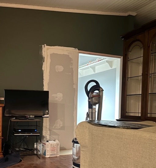
Well, get this. They’ve already put the wall in and even though it’s obviously still under construction, it’s making me feel so much better!
But, why didn’t Cher notice this but focus on the fireplace instead?
She focused on it because it’s the room’s focal point, and while it needs a bit of finessing, it didn’t occur to her about the rest until pointed out and a new floor plan was created.
So, planning is a big part of the secret to great decorating.
However, the secret ingredient that many of you are overlooking is the ability to have a way to VISUALIZE the finished results.
In the olden days, way back in the 20th century, I would go to my client appointments armed with a hand-drawn floor plan including space planning, a bag full of fabrics, another bag filled with fabric books, finish samples, a notebook, paper, architect’s scale, and printouts of images of rooms, pieces of furniture, and pages from a catalog, etc.
It would take me a good hour or two to gather all of this together.
Then, I would sit with my clients and carefully show and explain “my vision.” They would give me feedback; I would tweak my ideas and come back for round two. I can only remember one time when I showed up, and the client loved everything and said, “Okay, let’s do it!” Usually, the process took at least five visits or more if it was a sizeable job.
For those of you who’ve purchased and read My Six Figure Income Blogging Guide, you’ll know that it wasn’t until 2002 when client Leslie “Butturchump” sent me the FIRST email my life changed forever.
Soon, I got the hang of it, and now I had a new way of sharing information back and forth that helped tremendously in between visits.
However, one thing I would do in my emails is make the beginnings of a “mood board” and share a few images in the body of the email.
I might have also arranged some pictures on my computer screen, moving them around and resizing them. Then, I could take a screenshot and send that to a client.
But, then, around 2010, I didn’t know where or how, but I learned about a program called Olio Board. (It no longer exists)
However, what I noticed was shockingly incredible! Instead of five or six visits, I could whittle that down to two or three visits when sharing the boards.
These boards weren’t in perspective, like the ones I do these days, but they showed the items in relation to each other. That, plus the real-life fabric samples and larger images, helped the clients to SEE my vision and how it would look in their space in a way that made sense.
So, the ability to see what you’re going to do is something you can do to help yourself envision how everything will look together.
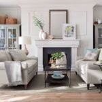
For example, in Kat’s situation, I put in two beautiful peacock blue velvet sofas. I knew that some of you would be horrified by this notion in a sub-tropical home just feet away from the balmy ocean.
However, as seen in this post from 2018, one doesn’t have to decorate in pure “coastal style” if one’s home is on the coast. Hell, you can decorate however you like. But, I always think it’s lovely to bring some colors from the outside inside. So, in an ocean home with lots of gorgeous shades of blue outside, I’ll be bringing in some blue, even if it’s only an accent color.
My point is I could take Kat’s sofas in peacock blue velvet and make white or cream slipcovers for them. We could change the pillow covers or leave them as is. Most of us have at least two seasons, with tremendous temperature swings of 100 degrees or more. So, being able to switch the furniture coverings is a great idea.
The other thing I frequently see is the one-note room. There is no depth. Everything is very light, or medium and light.
Oh man, I just got to hear a rehearsal of the Boston Symphony Orchestra. Holy crap, that was a treat! Because of my years of listening to Cale play in dozens of groups in and out of school and my own experience playing the flute for eight years, it’s fun to pick out the different instruments. Of course, the balance and blend are perfect with the BSO. But, you know what sets my heart all aflutter? It’s the bass violins. Those deep, rich low notes. The bottom of the chords.
The bass violins are the “black of the orchestra.”
Even in a light, airy space, you MUST have some bass tones. After the first piece, I also saw a contrabassoon walk off the stage. Yes, I only saw that huge bassoon walking off.
Okay, it is now nine hours later. That is how long it took me to make my final board.
Now, my mood boards are a bit “fancy.” I realize that. But, the more realistic you can make your space, the better.
Therefore, if you’ve ever studied art or perspective drawing, you know that items in the front appear larger than items farther away. That’s how our eyes can judge distances. Well, sometimes.
I’m pretty sure most of you know that I use picmonkey. I did a tutorial a few years ago. They’ve changed their interface since then. Mostly, it’s for the better. If you get stuck, they have tutorials. Or, you can google something like, “How do you turn off the bloody snap-in-place feature?”
Sometimes I want to know that something is IN the middle or lined up with something else. However, 90% of the time, I turn that off by going to settings; from there, you can switch it off.
So, let me start by showing you what crazy looks like.
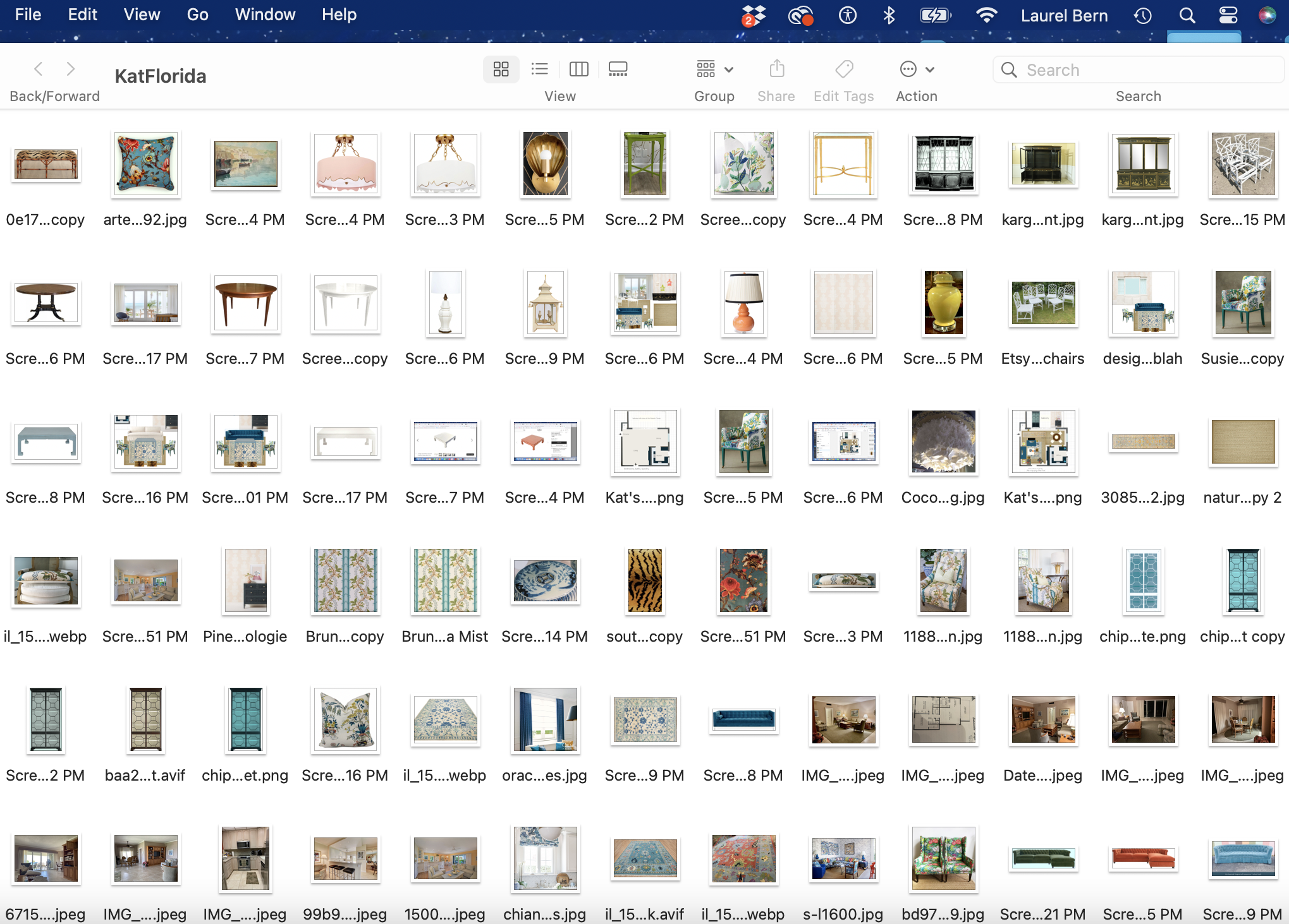
What is this you would like to know? It is the file for this one post where I put 95% of the images I considered using. Some didn’t make it into the folder. Incidentally, they are in the order they were added to the folder. As you will soon see, most of these images did not make it into the post.
This is after hours of thinking about what I might do, or searching for something that will work.
A lot of the accessories are from when I created the boards for the Paint and Palette Collection.
Now, I needed to keep plugging away.
And, I am going to say right now. Sometimes what I had in MIND did not end up working out.
I will repeat that. Some ideas that I thought were so terrific ended up not being terrific.
Do you see how a “great idea” can get you into trouble?
It is wise to do more than visualize in your mind. The more visual you can make your design BEFORE you purchase anything, the better. It’s not that something else won’t work. There is seldom one solution, even if you make a mistake.
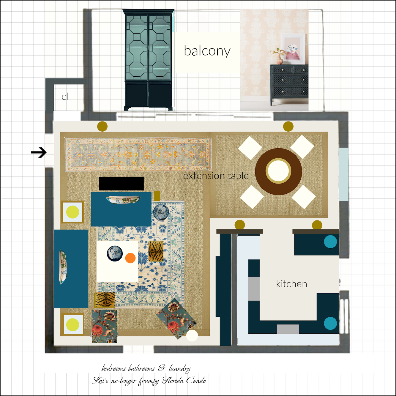
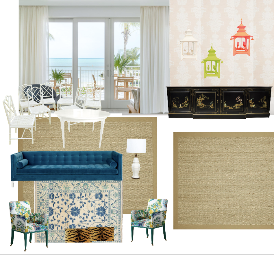
This is an L-shaped room, so I wasn’t sure if I could get everything on one board. Let’s see.
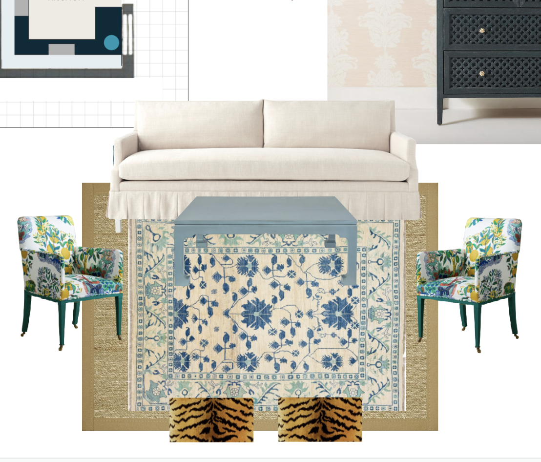
I started experimenting with some of the items you saw last week. My floor plan is in the upper left corner for reference.
Then, I looked at the blue sofa.
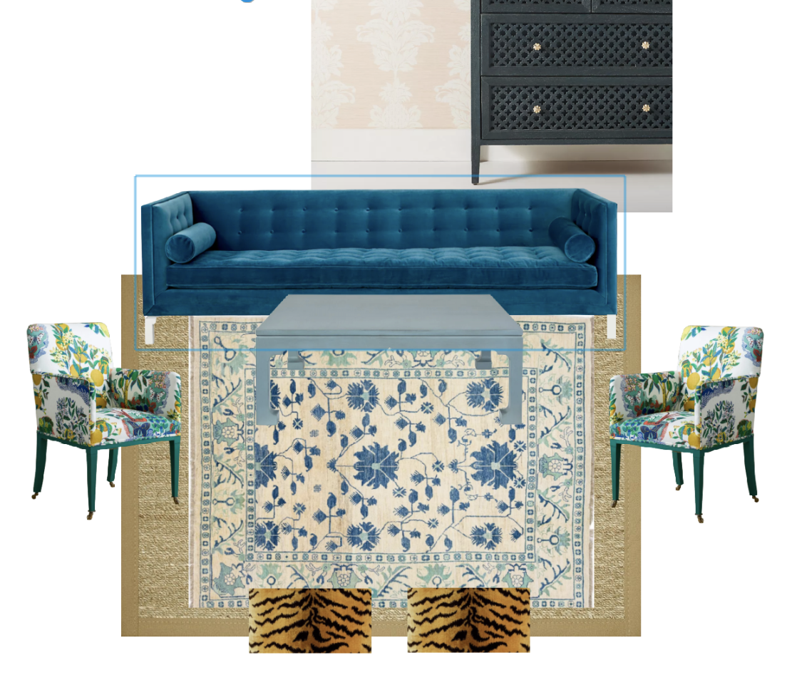 With this rug, I think the blue sofa is better. Of course, you could do the white sofa, and you could do it with this rug. If so, I would definitely do a dark, maybe even a black coffee table.
I think a beautiful print on the chairs would be fun.
Again, it doesn’t have to be that way. You could do a solid fabric, either upholstered or slipcovered. Of course, I could do some great decorating with white slipcovers and seagrass rugs and call it a day. However, I wanted to do something a little different.
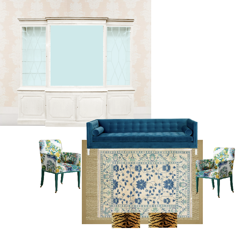
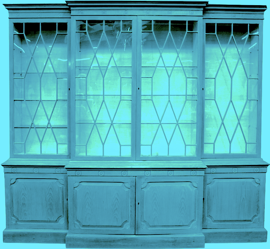
Initially, I thought I would do a big cabinet for the TV. I had it as a black cabinet in the floor plan, but when doing it in perspective, all of that black looked too heavy. Actually, it was a soft blue-black, but still not right.
However, white looks too blah. Well, it does for this living room with an ocean view. This would be lovely for a bedroom, or maybe a dining room if there was a separate one.
What about teal? This is an image I manipulated but didn’t remove the background yet. I rejected this idea, too.
No, I want to see some black. I think that will be lovely across from the vivid blue sofa with a white or cream coffee table in between.
However, it needs to be a low piece. And, as soon as I put up the low Chinoiserie cabinet, I knew it was exactly what I wanted to see.
Are you beginning to see how throwing up pictures of the items you’re thinking of incorporating IS the secret to getting the mix right? This is how one creates great decorating if doing it on your own.
Your eyes WILL tell you. But, sometimes, I like everything. Or, I wouldn’t say I like any of my choices.
Above, I was experimenting with lantern colors. The original lantern looks like this.
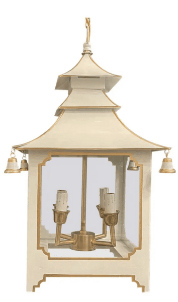
How do I change the colors?
I do that in picmonkey. Or sometimes, I start it in my photo editor, especially if I’m trying to turn orange into blue. That takes a few passes with editing. I can turn this white lantern into a black lantern. That one is easy.
Picmonkey also does a pretty good job of removing image backgrounds 9 times out of 10. Oh, how I wish I had that feature when creating my original boards for the palette collection. I went on Fiverr and paid a young woman from India 50 cents an image to remove the backgrounds. Well, I think it was a young woman. It could’ve been an 85-year-old man, for all I know!
So, I needed to create the final board and decided to begin the way I always do.
I always begin by putting in the wall and the floor, as you can see above.
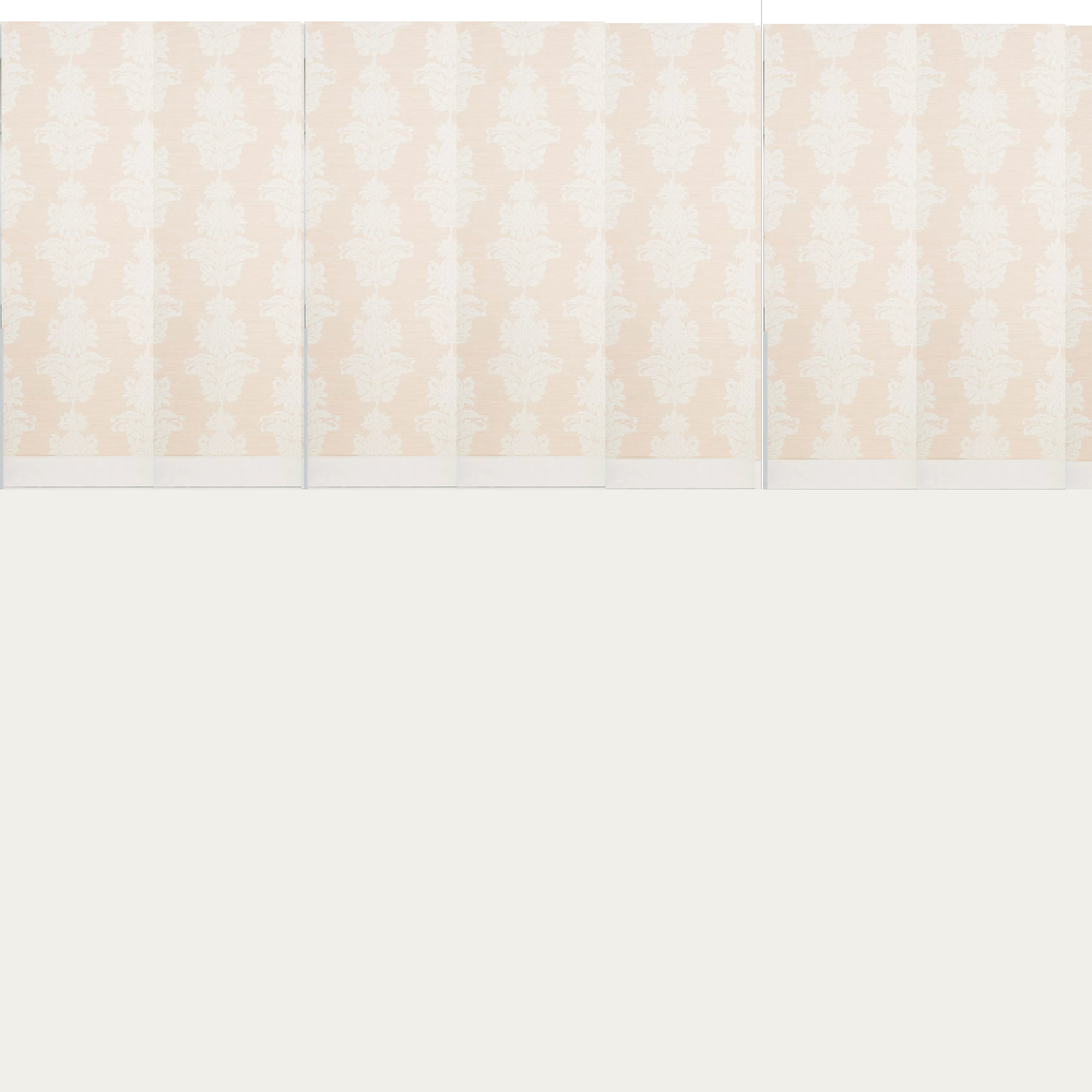
Sometimes I just leave the floor white, but for this board, I made it a cream color. I actually used a color that’s IN the wallpaper. There’s an eyedropper icon that lets you select colors.
I found an image from a hotel with a lovely ocean view. Unfortunately, there was some furniture in the way that I had to get rid of. I made separate images of the lovely light linen curtains to cover them up.
You can use a crown moulding with a recess to put the drapes behind along with the traverse rods, so they’re hidden.
And, now, for the final board.
My goal was to make it a little Hollywood Regency, maybe a touch of art deco, with vibrant tropical colors. However, I did not want to create the classic blue and white coastal look.
I mean, there’s nothing wrong with that. However, all you need to do is go to Serena & Lily, and you’ll be all set.
I also didn’t want to go too hog wild with the flamingo pink and turquoise, but there is some of that.

Please note: This is NOT the room layout. This is a mood board designed to incorporate as many elements as possible onto one board in a pleasing manner.
In the end, I made the dining table aqua, for fun. I found the perfect table on 1stdibs, which is currently stained. Guys, it is well after midnight. I so badly want to add sources, but I can’t, as I still have to edit.
Do you see the bass violins in the back?
Where are the trombones, Laurel?
The trombone players are hanging off the balcony with one arm and playing the trombone with the other arm. ;]

Cale at age nine with his first trombone.

A few years ago. Maybe in Boston!
Oh, I didn’t tell you, but I took a ballet class last Sunday at the Boston Ballet School, and I plan to return tomorrow.
I’m only returning because last week’s lesson didn’t kill me. Otherwise, I probably wouldn’t be going back. ;] It did hurt like hell, but it’s a little like having a baby. You swear you’ll never go through that again, but then you forget. Hopefully, this week will be better. Fortunately, the class isn’t until later in the day.
Okay, I hope you enjoyed this post, and learned some tips to create great decorating. I will try to add some sources if you’d like to know where some things are from.
Anyway, it’s a big holiday shopping weekend.
Therefore, please check out the HOT SALES! There are a lot of new items to see this weekend, and of course, some amazing sales!
xo,

Related Posts
 Hubs Thinks Farmhouse Style Is For Farmers- Period.
- Stainless Steel Sucks – What You Should Use Instead
- Drunk Driver Antiquing in Copenhagen Careens Off Embankment
- But, WHY is it Bad Architecture? I’ll Tell You Why.
- She Fears Her Trendy, Painted Antique Table is a Mistake
- company coming – best sleeper sofas and alternatives
- Bedroom Decorating Ideas You Might Not Have Considered