Betty Bluper thought she had chosen a fantastic pale blue wall color. Please read what she had to say.
Dear Laurel,
I only discovered your blog a few days ago. I think I was up until 3:00 AM the other day because I couldn’t put it down. Thanks.
I hate you, now.
Seriously, I’m joking. The truth is, I wish I had found you a month ago. We just painted our living room. I wanted it to be one of those soft silvery, calming light blue wall colors I see all over the place.
I chose what I thought was one of the best light blue wall colors I’ve ever seen. It looked amazing on the paint chip.
The painters came. I went to work, and nine hours later, I returned home. And, well, the light blue paint color was a lot more BLUE-BLUE than I was expecting. But, there wasn’t enough time to do anything about it. You see, in three days, my husband’s sister and husband were coming for a visit.
And, I had to ensure that everything was dry and put back. Did I mention that S-I-L is having her first baby in six months?
They arrived right on time. (Always.)
However, I was so busy mopping up the glass of chocolate milk my four-year-old had just dumped all over the dog, the cat, and himself. The rest of it resided in a splatter radius of eight feet.
Fortunately, my DH arrived home from work an hour early and was there to greet and entertain the inlaws until I could make myself semi-presentable.
I like my S-I-L. But, for some reason, I’ve never felt that I quite measure up as she’s super beautiful and talented. Yes, that’s my problem, I’m sure. However, she looked quite happy to see me.
And, then she said, with a beaming smile in our freshly painted LIVING ROOM, “Betty, this is absolutely the perfect shade of BABY BLUE for our new nursery. I just found out that we’re having a baby boy! Oh, please be a dear and tell me what is this baby blue paint color?”
I tried so hard to smile, but I had a pressing urge to slap that happy grin off her face.
However, God came in to rescue me as, at that very moment, I realized that the roast was burning and ran into the kitchen.
Oh, Laurel, I wouldn’t have slapped her; I was just embarrassed. And, that’s because she’s right.
Even more depressing is that the color is even worse during the day. In fact, my sister-in-law never mentioned wanting to know the color again.
How could this have gone so horribly wrong?
The color looked so beautiful when I saw it online.
And, I worked really hard to find out what it was, too. I asked the designer on HOUZZ and was so thrilled when she let me know the name of the paint color. It was one of the best light blue wall colors- ever. In her room, that is. Maybe she lied? I don’t know.
Oh, just so you don’t think I’m a complete idiot, I did check out the color before bringing the two gallons home. As I said, it looked beautiful on the chip– in the store, that is.
Maybe you could turn this into a blog post if you think there’s a lesson here.
Please tell me that others have made this mistake.
Thanks so much,
Betty Bluper
****
Oh, Betty,
Not only have others made this mistake, I’m sure that I have too, at some point. But, I’ve probably blocked it out. Believe me. I’ve made 100s of mistakes when decorating. If it makes you feel any better, you can read about some of the more hideous ones here. However, that’s how we learn. Hopefully. :]
And, for 21 common decorating mistakes, click here.
Okay, this IS a great topic and for numerous reasons.
Actually, there was more than one mistake made. But, please don’t beat yourself up!
Gosh, they don’t even teach this stuff in design school. They should, but they don’t. And, they don’t teach it anywhere else, either. Well, except for here and maybe some other interior design bloggers. So, how are you supposed to know the pitfalls of choosing paint colors, particularly the more tricky light blue wall colors?
Below are the three main problems I will address when selecting the best shades of pale blue paint colors, or any color, for that matter.
- One – selecting a paint color from a magazine, website or book, brochure, etc.
- Two – understanding that the paint color doesn’t stand alone.
- Three – not understanding how to select a color. Here’s a very good post that goes over that in detail.
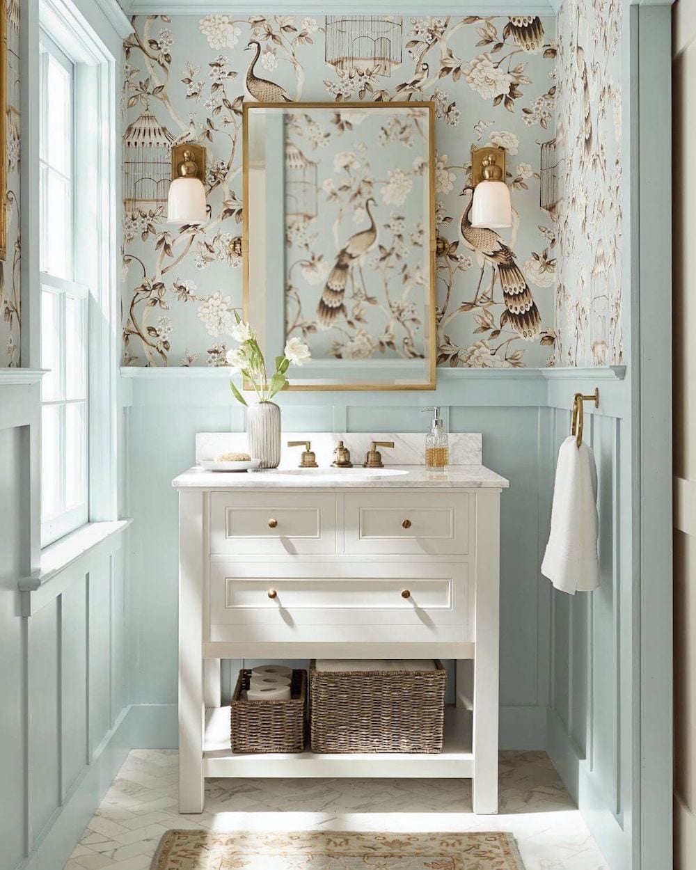
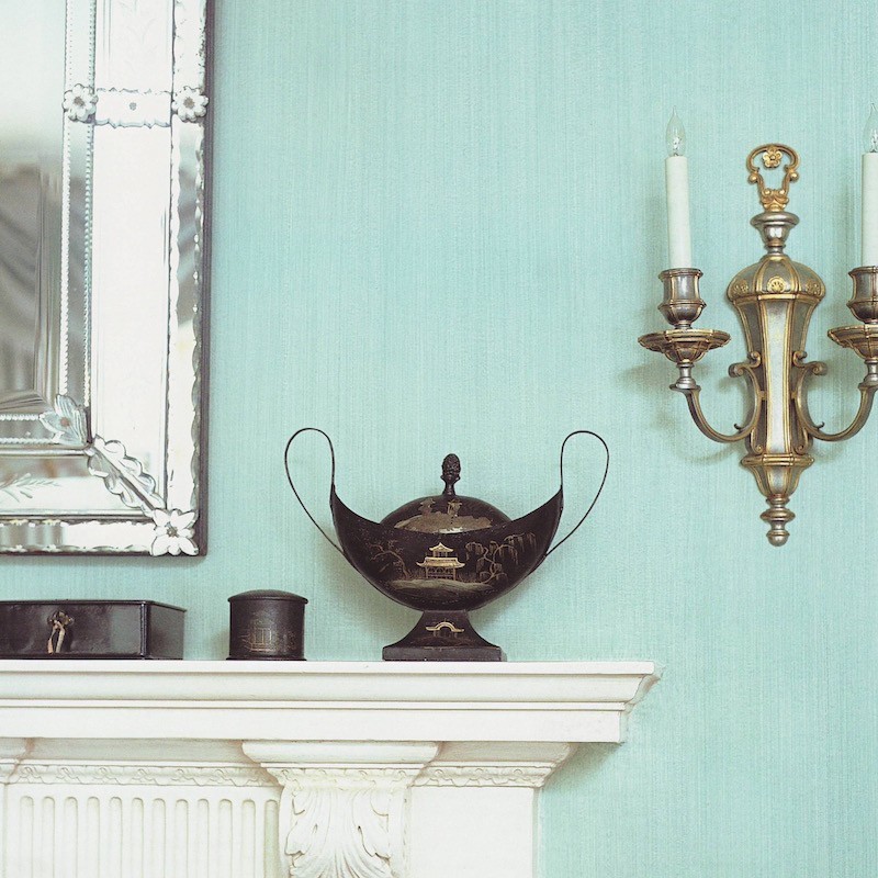
Exhibit A
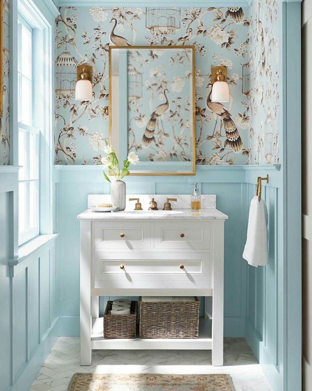
Above is an image I’ve shared on the blog before from Pottery Barn. I Adore that Covington Faucet! The last time I posted this image, at least a dozen people asked me for the paint color and the wallpaper.
This is another topic, but I hope you’ll understand that unless it’s my room you’re seeing, I almost definitely won’t know the color or anything else in the room without researching it.
Now, I’m going to demonstrate the problem, aside from the fact that this is not my room, and I have no idea what the ACTUAL color is.
And, even if I knew the name of this pretty light blue paint color, I can pretty much guarantee that it’s not going to look the same in your home.
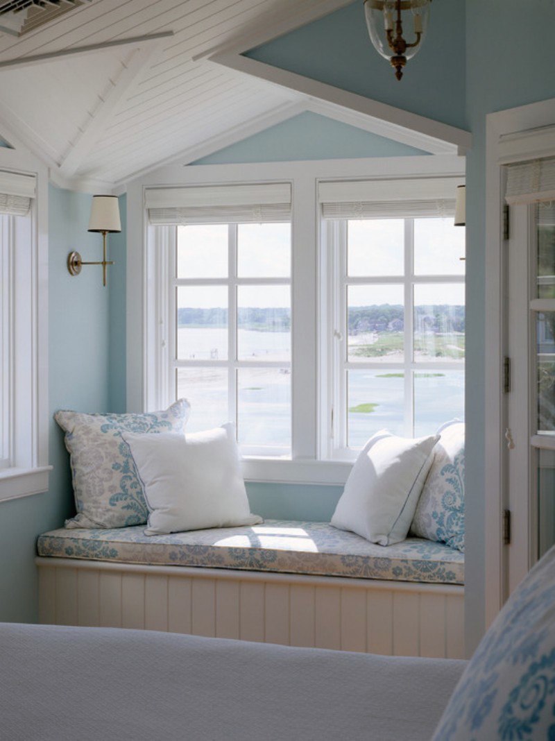
Let’s look at the space below.
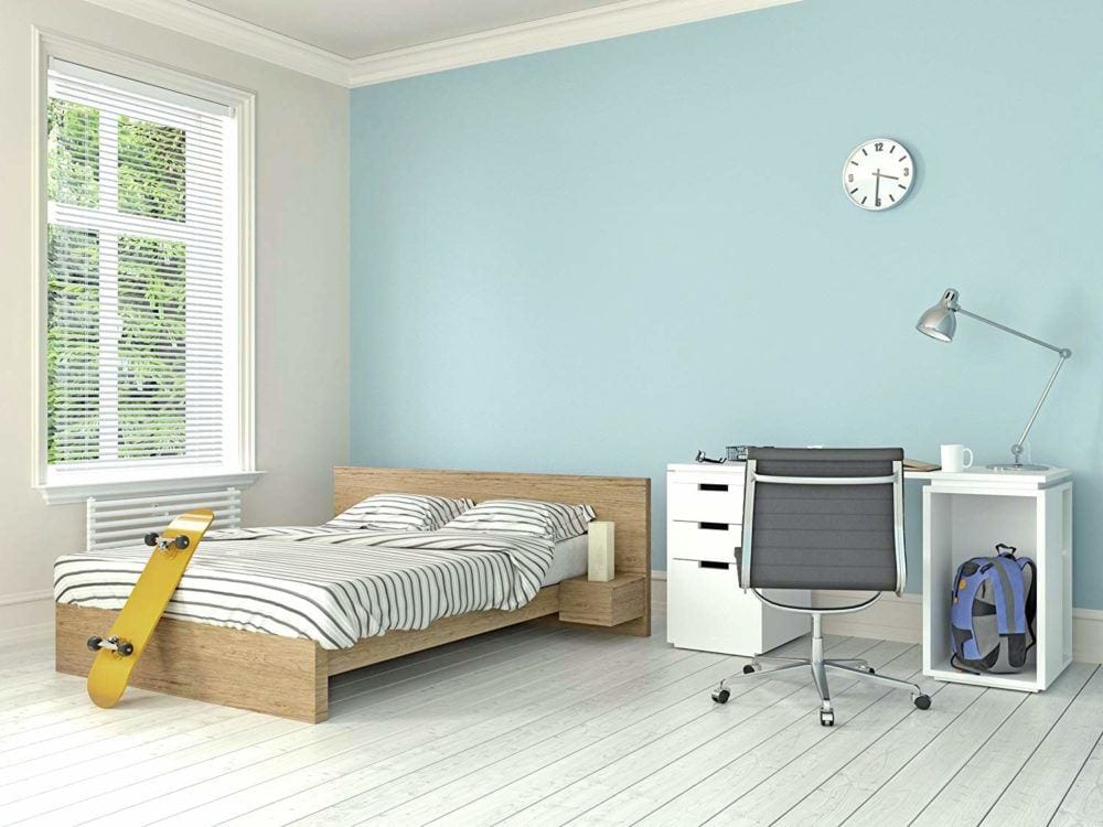
Let me ask you. If I shared this image on the blog, would you be frothing at the mouth, dying to know what this wall color is? Most likely not.
BUT wait! It’s the SAME pale blue wall color as in the Pottery Barn bathroom.
So, why is it that you aren’t jamming my inbox wanting to know what it is?
Does anyone want to tell us why?
Okay, don’t all shout it out all at once. ;]
Alright, I realize it’s disgustingly hot and you’ve had a tough day. So, I’ll just tell you what most of you already know. ;]
You far prefer the boy’s room pale blue paint color in the Pottery Barn bathroom because the bathroom is gorgeous and charming. The boy’s room is nothing special.
Will the room become more special with a different paint color? No, the paint color will not do much to make it more memorable. The reason is that paint colors are only one aspect of creating a beautiful room.
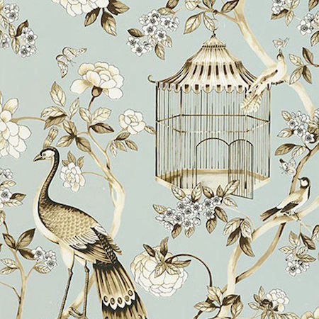
Okay, haha, after saying I don’t know what the wallpaper is, I accidentally discovered that the wallpaper is Atelier Oiseaux Et Fleurs by F. Schumacher.
You can purchase the paper here if you’re not in the trade.
But, let’s bring down that image from Pottery Barn again.
Right. This is another problem. The wall color in the image above is not a good match for the wallpaper sample. When doing wallpaper, you must have the sample of the paper AND, if possible, a CFA (cutting for approval) of the current dye lot.
And, that is BEFORE you select your perfect pale blue wall color.
Above is a color-corrected version of the bathroom. I based the new color on the sample I found online.
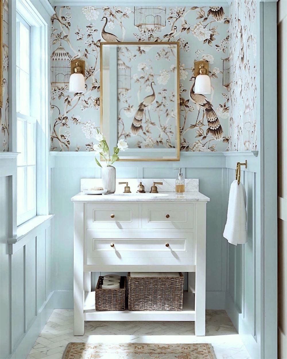
Above is a third version of the Pottery Barn bathroom I found. Will the actual light blue paint color please stand up?
The reality is, I could’ve posted any one of these three images of this lovely bathroom, and, I’m quite positive, I would’ve gotten the “Laurel-what-is-that-gorgeous-light-blue-paint-color-question.
Which one? As you can see, there are three variations of light blue paint colors. However, as I hope I’ve demonstrated, it is not the wall color making you swoon.
Therefore, the precise wall color is irrelevant.
I repeat. The precise wall color is irrelevant. What IS relevant is how a color looks in your space and with the other givens surrounding it.
Do you think that this is an isolated example?
No, it’s a prevalent issue.
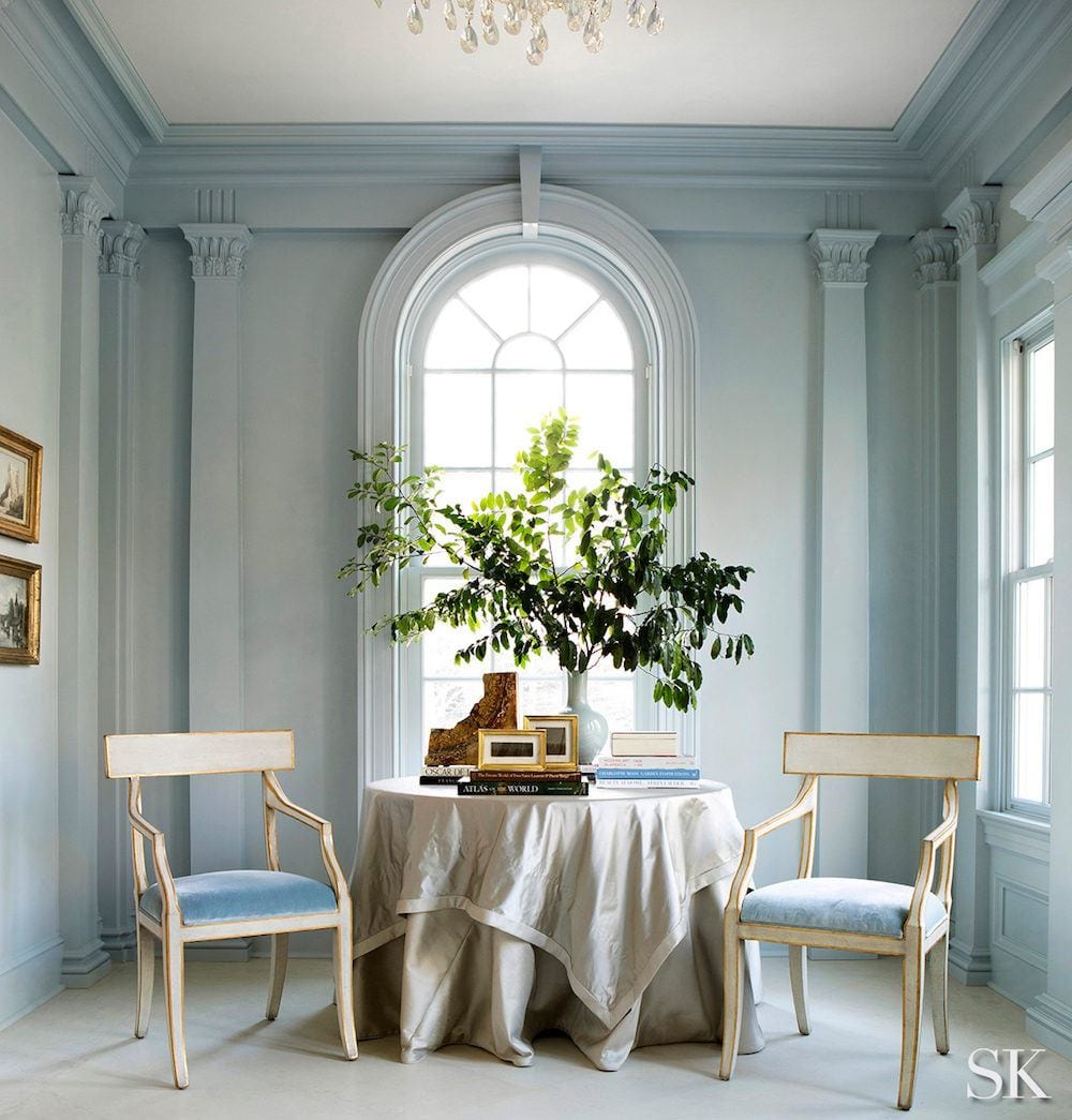
Above is an exquisite entry to an award-winning home by Suzanne Kasler. Suzanne, one of my favorite interior designers, is the queen of pale, watery ethereal light blue wall colors. And, BTW, I’ve met her a couple of times, and she’s exceedingly lovely and humble.
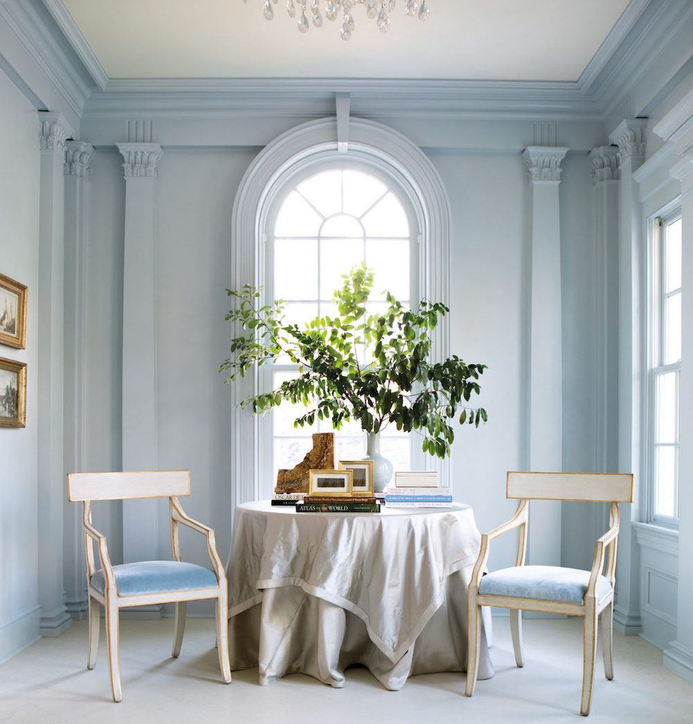
However, I found another image of the same room.
The lovely furniture is Suzanne’s design for Ambella Home.
But, do you see that this image differs from the one on top?
The first pale blue room came from Suzanne’s website. The bottom one the internet. I imagine the one on Suzanne’s site was color corrected as images straight out of the camera tend to have some color distortion.
Did you know that?
And then, there’s the situation of our computer monitors. The colors vary there, too. So, when we see an image online, most of us don’t know if the image has been color corrected or not.
***Therefore, if you see a color somewhere that you like, try to find a paint color that matches WHAT YOU SEE. And, looks the way you’d like it to in your space.***
I can’t stress this enough. It would be best if you did everything as close to how it’s going to live in real life as possible.
And, even then, please test your color(s) before it goes all over your walls.
One other thing. Please do NOT take the wallpaper to the store to have them computer match it. I did that very early on in my career. It did not match. Fortunately, the clients were either color blind or didn’t care. Phew! I dodged that bullet. It wasn’t horrible, but it could’ve been a lot better. Coincidentally, it was a wallpaper from Schumacher.
So, now we’ve addressed problems one and two. Please bookmark this post. It’s super important. Most mistakes are made when we try to take shortcuts. It’s not advisable.
This brings us to the third issue: selecting which of the light blue wall colors is best for your room. Pale blues are more challenging to choose if you’re inexperienced and only looking at a small paint chip.
The best light blue wall colors frequently look drab and dull on the paint chip. But, when they go on the wall, the blue really pops out. That’s why some blues can go quite intense even though they don’t appear that way at first.
And, then it’s important to remember the following when selecting all paint colors:
Please do not put any size sample flat on a table unless it’s the table you’re going to be painting. It needs to be FLAT against the wall.
Do not select a paint color IN the store. The lighting is going to be different than in your home.
Also, please resist the temptation to look at the paint chips on the way home.
For rookie designers out there:
Please do not select a paint color while looking at it in your own home. Believe me. I can’t tell you the number of times I had it “all figured out” in my home, where I worked. However, it was not good when I got to the client’s home!
Now that I’ve scared the living crap out of you, ;] I’m going to share some of my favorite light blue wall colors.
Some of these are in the Laurel Home Paint and Palette Collections and some are not. And a few others in the collection are not listed here.
I’m also going to share some images. None of the photos are mine, and in almost every case, I don’t know what the actual paint color is. Therefore, it might look like the color name underneath, but I can’t guarantee that.
There is a chart coming up with the paint colors to pin to your Pinterest boards.
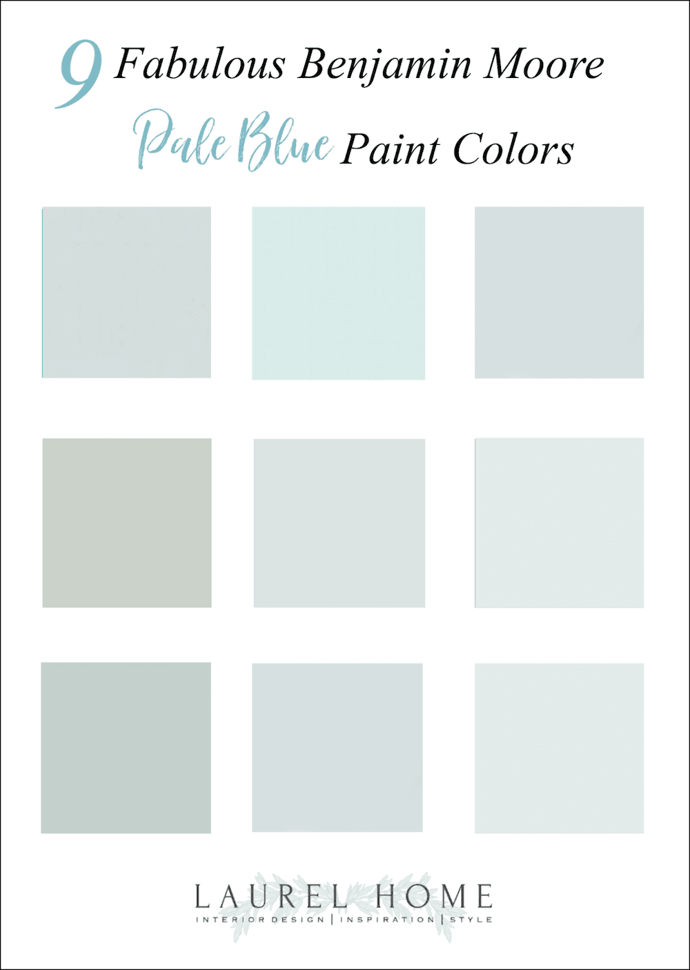
Here are some beautiful Benjamin Moore Pale Blue Paint Colors
GRAY SKY 2131-70
LOOKOUT POINT 1646
GLASS SLIPPER 1632
HEALING ALOE 1562
Click here for a home I did a while back with Healing Aloe.
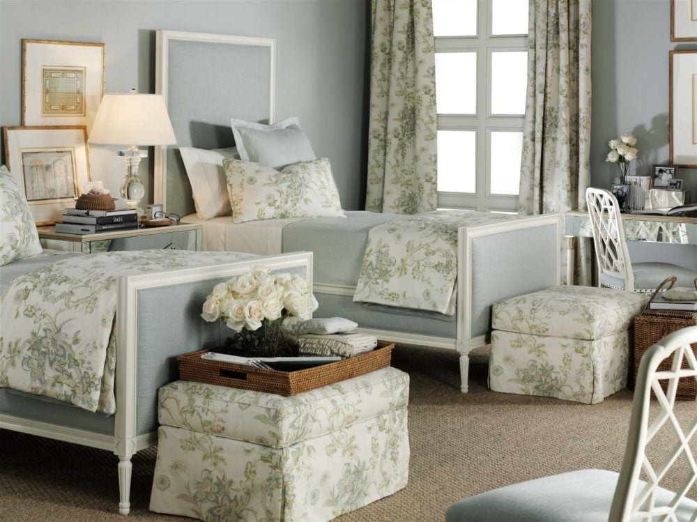
QUIET MOMENTS 1563
This is one of my all-time favorite go-to colors and is especially lovely in bedrooms. In addition, it is a color loved by both men and women.
ICE CAP 1576
For more terrific bedroom ideas, click here.
And some more terrific bedroom paint colors you’re probably not using.
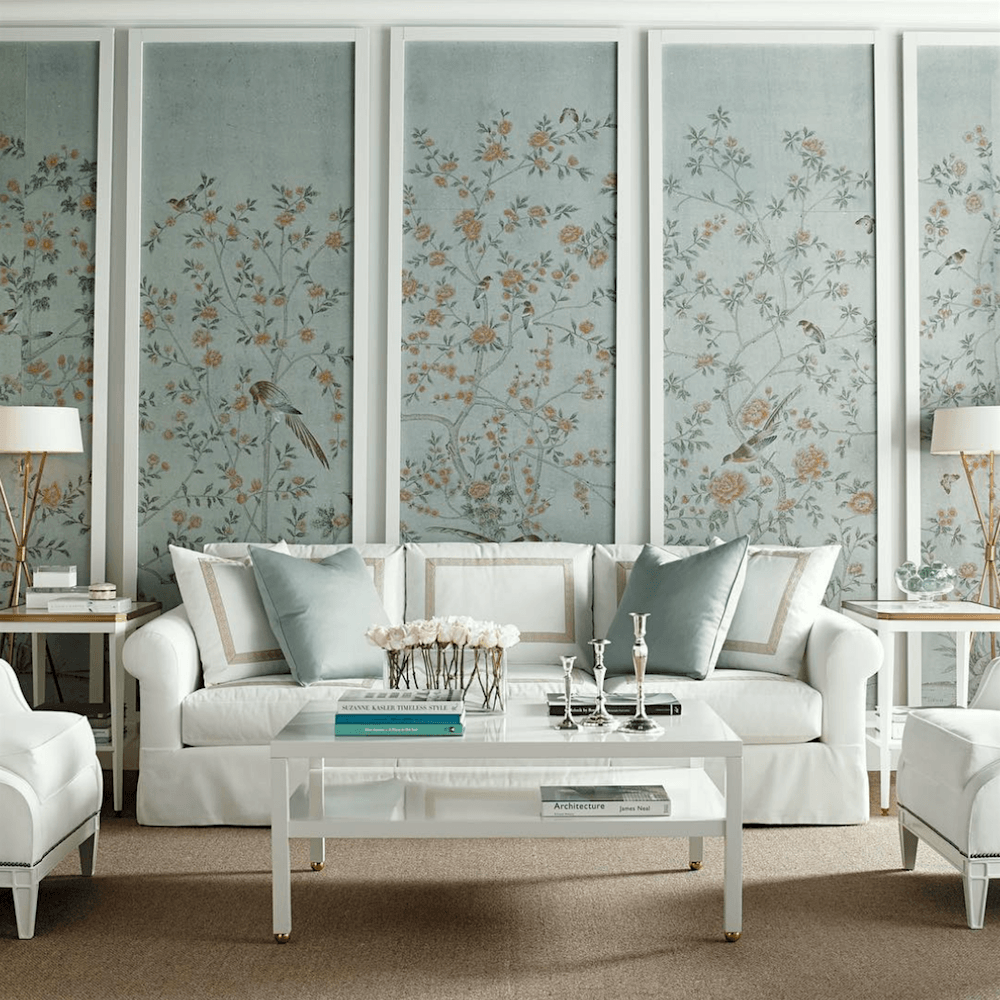
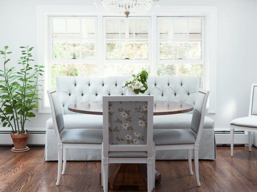
SEA FOAM 2123-60
More furniture by Suzanne Kasler for Hickory Chair. The fabulous Chinoiserie wallpaper panels are by De Gournay.
SILVER CREST 1583
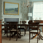
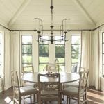
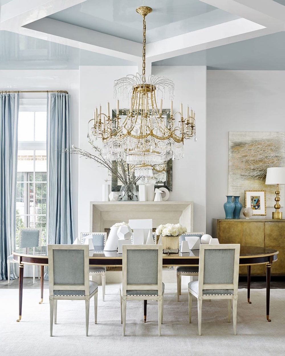
I don’t think the walls are actually blue here, but this has to be the most beautiful eating area I’ve ever seen! I would be the one who would slobber marinara sauce all over the settee and, while I was cleaning it up, would knock the coffee over.
If this were my dining area, I wouldn’t serve my guests anything but saltines and seltzer. ;]
By the way, those gorge chairs, I recognize as one of my faves from Hickory Chair by the wonderful Suzanne Kasler. Love the floral fabric on the back. Really smart.
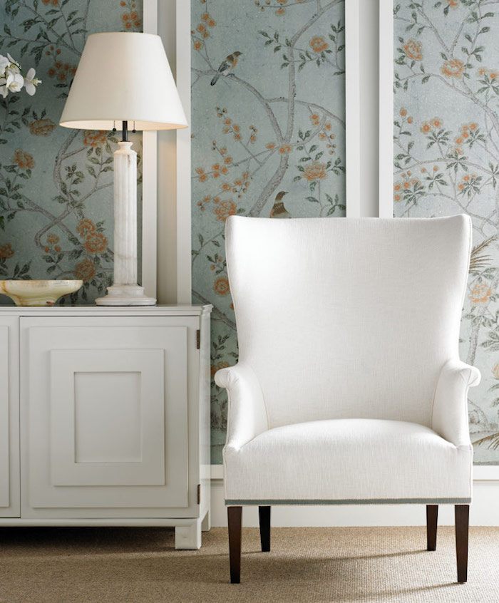
Another fabulous Suzanne Kasler for Hickory Chair vignette. Gorgeous wing chair.
I designed some wing chairs for a client and myself that were almost identical about 19 years ago.
And, don’t forget the ceiling! A pale blue-green-gray is fantastic on the ceiling.
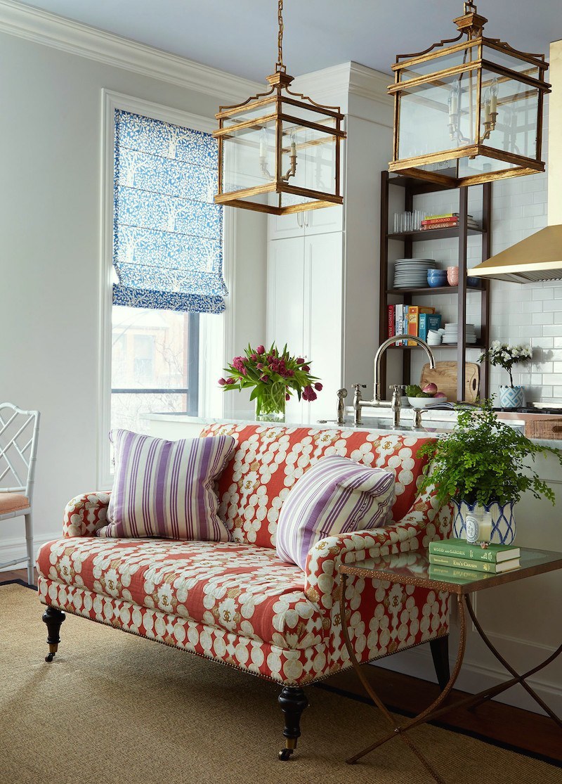
Another Suzanne Kasler beauty with furniture for Hickory Chair
For more wonderful ceiling colors, click here.
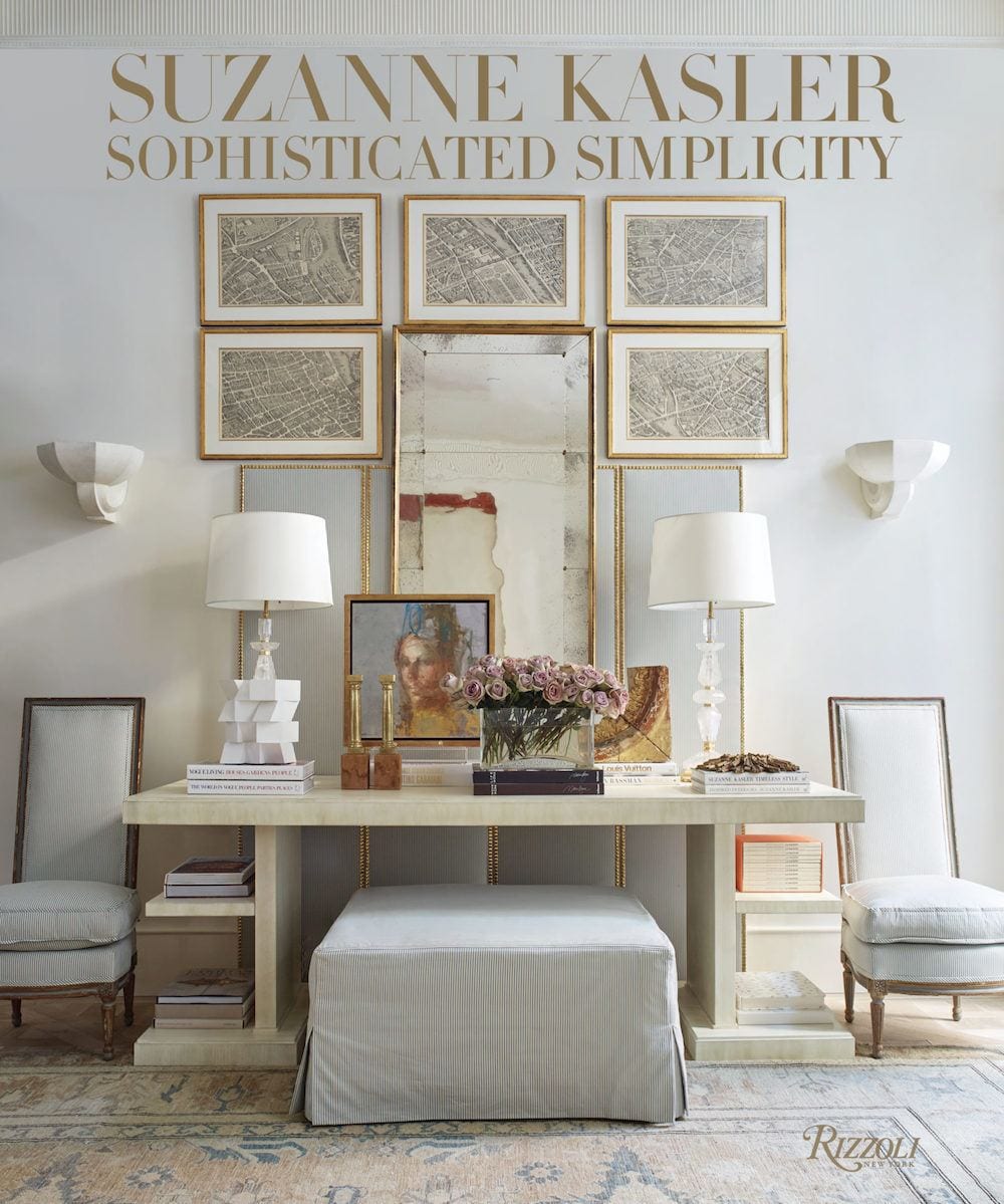 Suzanne wrote a beautiful book that came out a few years ago. Click the link for more info.
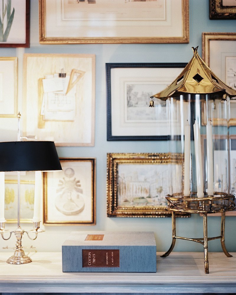
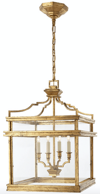
I adore these Pagoda Lanterns.
They are the Mykonos Medium lantern from Visual Comfort. There is also a smaller version available. But, the medium is pretty significant.
PICNIC BASKET CSP 730
We used this Benjamin Moore light blue wall color in a master bedroom, and it’s quite lovely. Picnic Basket has a lot of green and gray in it.
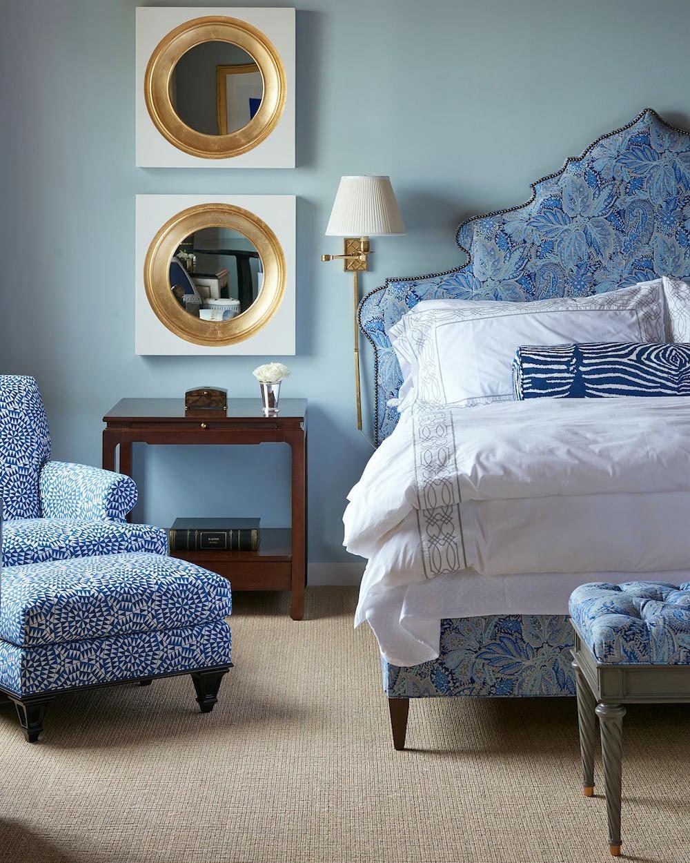
A wonderful blue-on-blue Bedroom by Alexa Hampton
This is not a representation of Picnic Basket; just a beautifully done blue-on-blue bedroom.
CRYSTAL BLUE – 2051-70
This isn’t Crystal Blue, but not too far off. It’s a strie of these two colors, MYSTICAL BLUE 792 glazed with FADED DENIM 795. Actually, this looks nothing like those two colors!
WOODLAWN BLUE HC-147
Woodlawn is the bluest of the light blues here, but it’s a definite winner!
Please pin to your Pinterest boards for reference.
Please pin to your Pinterest boards for reference.
If you’d like to see a post about some deeper blue paint colors, click here.
This post has some even deeper blue colors and shades of navy.
Also, this post on cool gray paint colors has some colors that read more blue than gray.
xo,

Related Posts
 Seagrass Rugs and Carpeting – Good Idea or a Nightmare?
- 30 Fantastic Coffee Tables – Plus Sofa Pairings!
- All About The Exquisite, Enigmatic Art of Grisaille
- 12 Farrow and Ball Colors For The Perfect English Kitchen
- Original Old Home Details – Is it OK to change them?
- Astonishing Before and After Home Exterior Shots + News!
- The Nightmare of Doing Long-Distance Interior Design Work