

On Sunday, after the last post came out about my favorite decorating trick, Ramona asked some compelling questions in a comment.
Her questions relate to creating a unified interior color palette.
Here’s what she said:
Today, I have a chance to really thank you for your work, Laurel. I come here to decompress from the not-so-nice realities of daily life as I am generally in tune with all of that. Here, I can get my dose of creativity while the world spins on. I appreciate this very much at this moment.
Second, I adore that Thorton room at the top. I wonder if you could do a post that takes a lovely room like that and changes it to give us perspective as to what direction any given design can transform into without losing what attracts us in the first place.
For example, if the room was painted red or conversely blue, would that affect the design, and if so, how?
I am asking this because I often see something I adore, but I know I would not want to live in that room as it is. Instead, I often want to change the colorways, which seems to lead to something entirely different. So, there goes the unified interior color palette.
I have a pretty distinct set of color desires, which I know work, so it is not that I am mentally doing something which is a mistake. And also, I am often attracted to very neutral rooms but know that I don’t really want a neutral space. Yet when I add color, everything seems to go haywire. It is not the colors per se, but something else that I cannot figure out.
I guess what I’m trying to say is how does one create a unified interior color palette from room to room?
I cannot quite figure out what goes wrong, and I’m not even sure if I’m making sense. lol So, the best I can say is that a post that takes an inspiration room through a series of changes would fascinate me.
***
Thank you, Ramona, for your kind words and interesting questions regarding creating a unified interior color palette. If I understand this correctly, there are a couple of parts.
One, if you find an inspiration room, but parts of it aren’t working for your situation, how do you make substitutions?
Two, how do you create a unified interior color palette, in general?
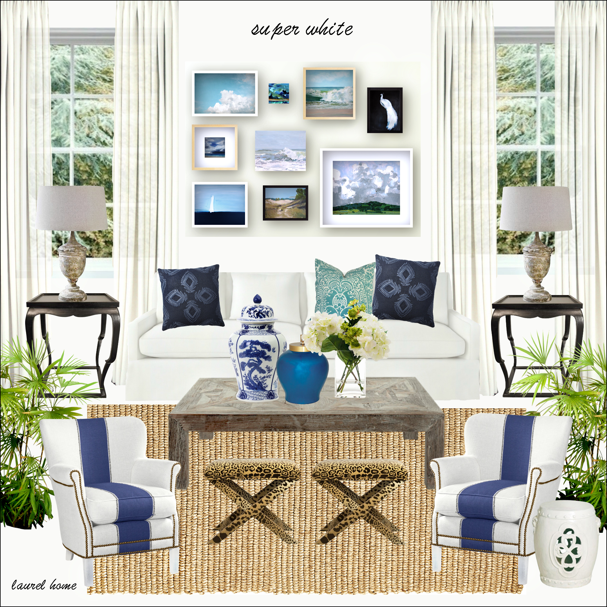
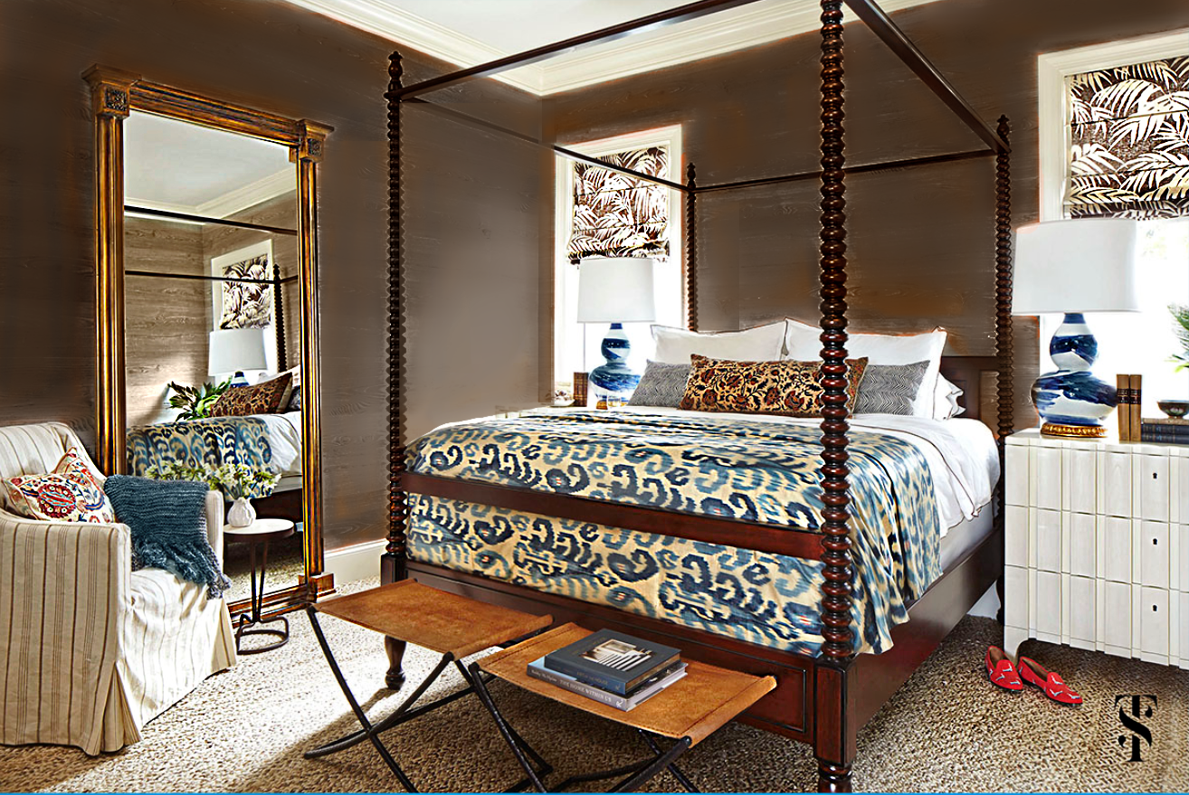
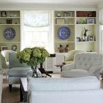
Now, let’s go back to Summer’s beautiful room in Naples, Florida.
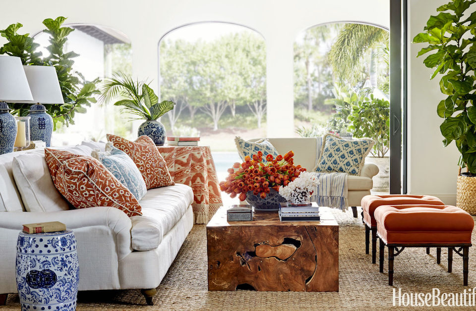
What I’m going to do is link to the entire project in her portfolio.
Here, we can see the entire home and how Summer deftly used every color in the palette in various concentrations for the different rooms.
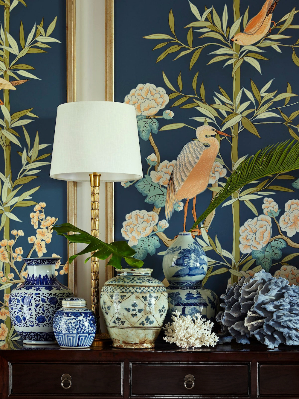 Looking at each photo, you will see that Summer’s entire interior color palette is keyed off the gorgeous vignette in the entry featuring the exquisite Chinoiserie mural painted by Allison Cosmos.
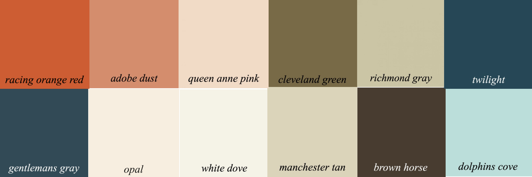
Above, I created a palette of 12 colors from the Laurel Home Paint Palette Collection which has 144 Benjamin Moore Paint Colors.
Folks, if you don’t yet have the two-part paint and palette collection, I highly recommend you do if you’re struggling with paint colors and palettes. You can read about the palette collection here. They are sold together for less than the cost of the paint for most living rooms.
As it happens, there are already boards in the Laurel Home Paint and Palette Collection using these same colors.
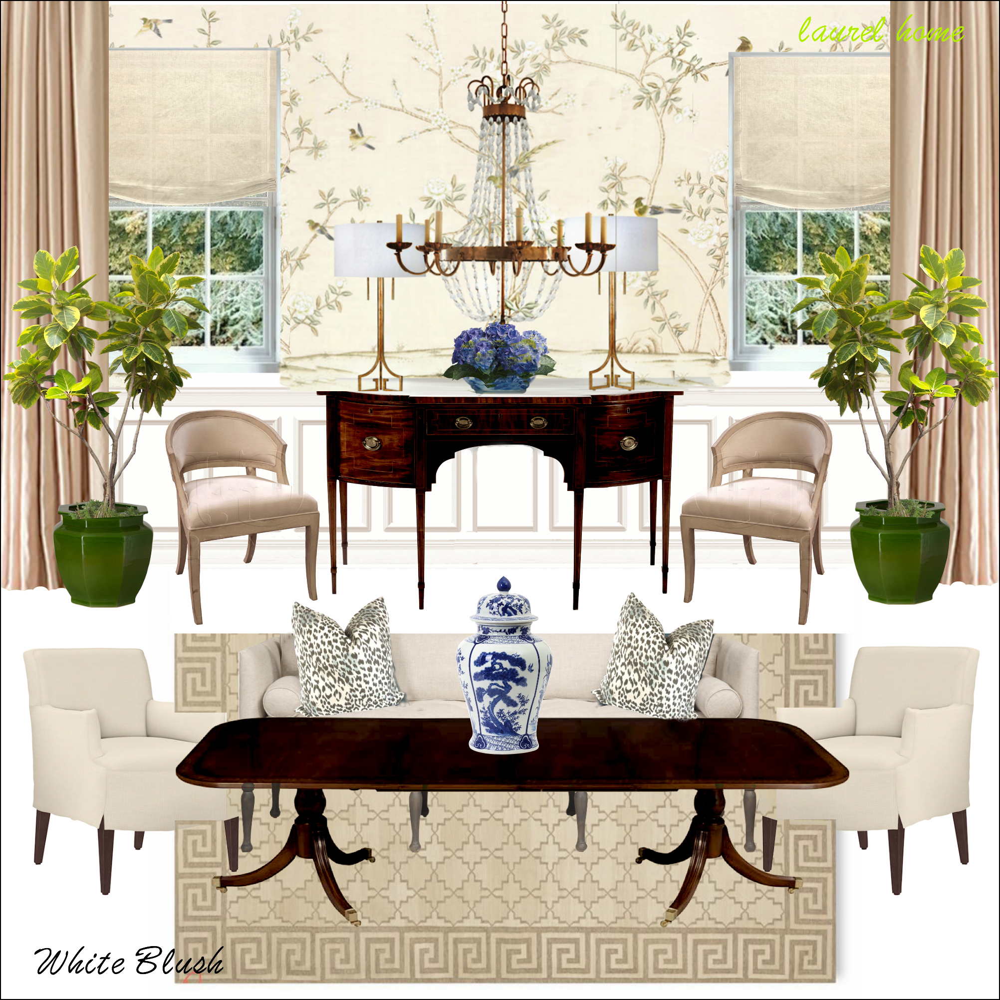
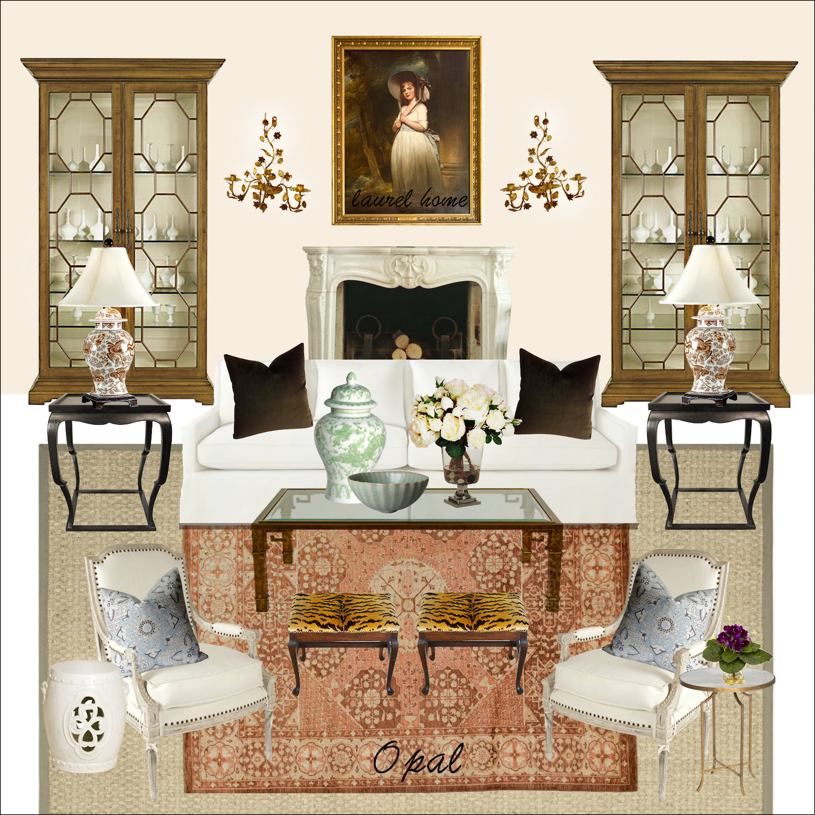
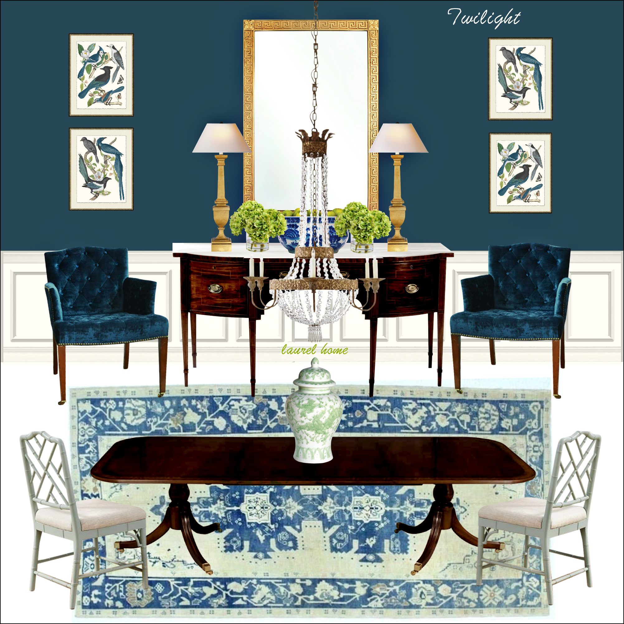
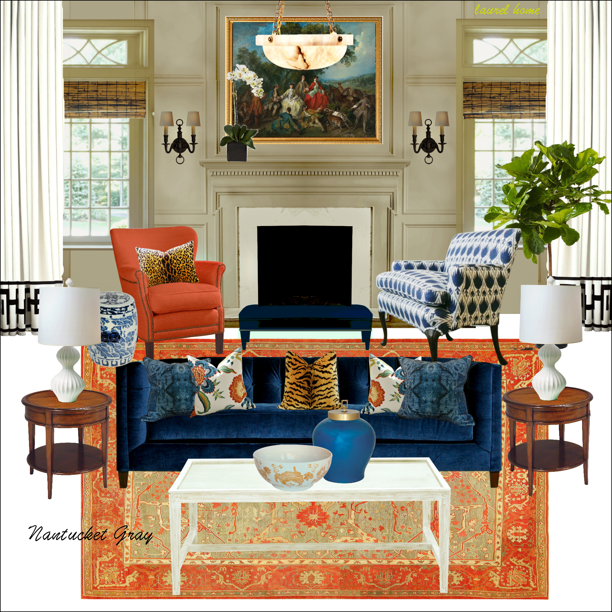
Hopefully, you can see that the boards and palettes I created are a helpful tool to provide inspiration and a unified interior color palette.
Another idea you can try if you’re not sure is a virtual wall color change.
I use picmonkey to do this. Here’s a Picmonkey Tutorial. They’ve changed their site around since I made it, but it’s not difficult to figure out.
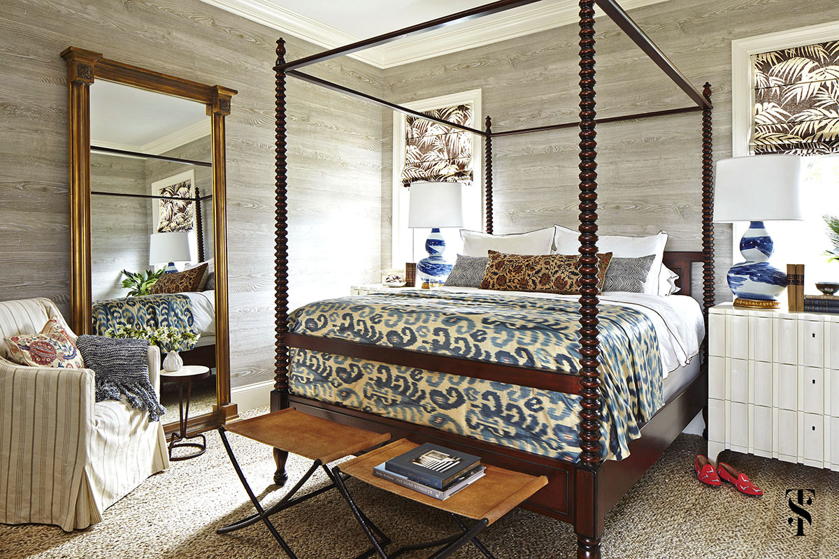
Let’s say that you love this bedroom. But, for whatever reason, you don’t want to do the wood-paneled walls.
So, what I did, was try different colors on the walls. In some cases, I changed some of the other elements.
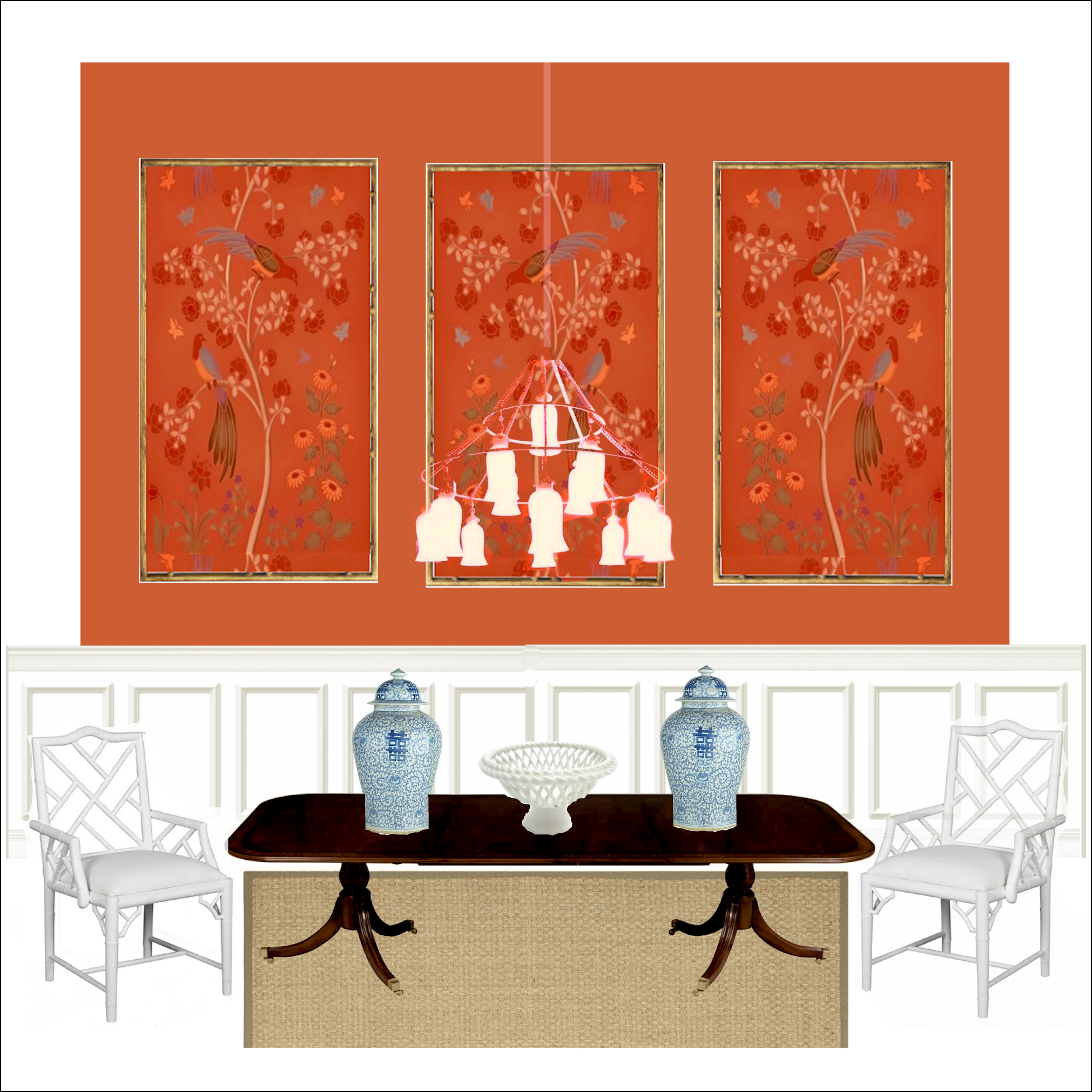
The first color I chose is the Racing Orange Red 2169-10.

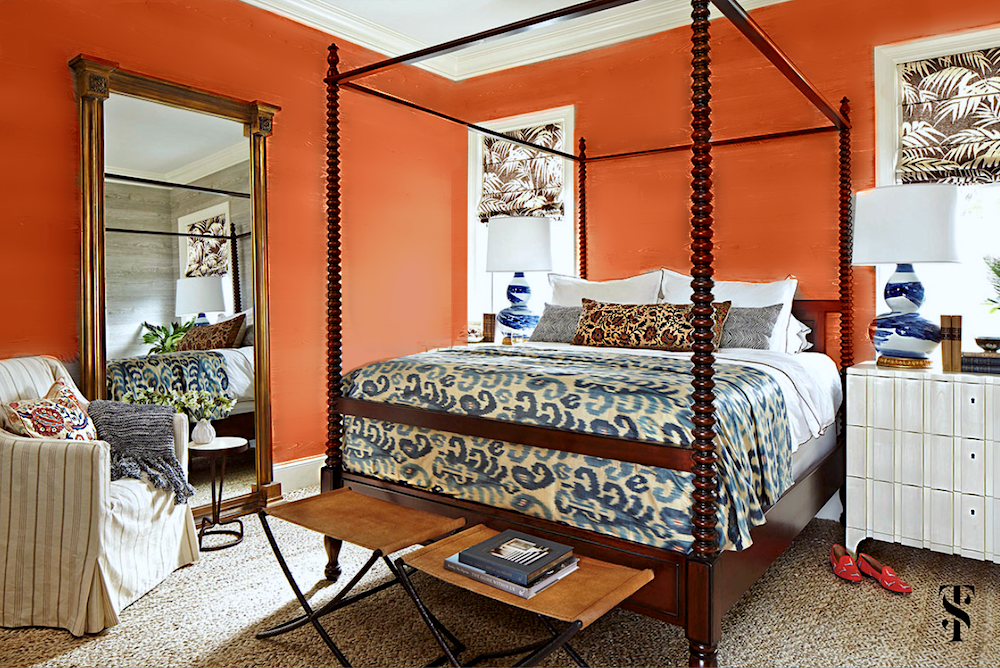 I think that looks great. It’s a different look, but I think it works. Of course, this scheme could also be used in a den, office, dining room, etc.
How do I change the color of the walls?
I use the Touchup tab in the sidebar. Then, I find that for changing a color, the eye shadow option works well. You can try one of their preselected colors, but I find it better to click on the palette icon and pick a specific shade that works. You can play with the concentration to get the effect you want.
In addition, because of the heavy wall texture, I the airbrush option works well to smooth things out.
Next I tried Benjamin Moore Twilight, which is a saturated, deep, warm, almost teal blue.

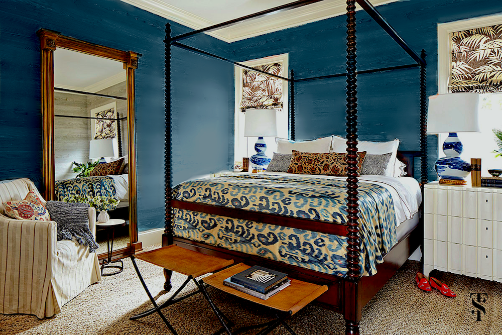 That’s lovely too, I think. I’d like to see some more art on the wall, however.
Sometimes, if something doesn’t look right, it’s either the architecture or the balance of the design elements.
The last color is brown. So, I took the classic Brown Horse 2108-30.

 I think this is a handsome and interesting variation. Please note that I changed the color of the throw blanket.
However, I went a step further using a slightly warmer brown.
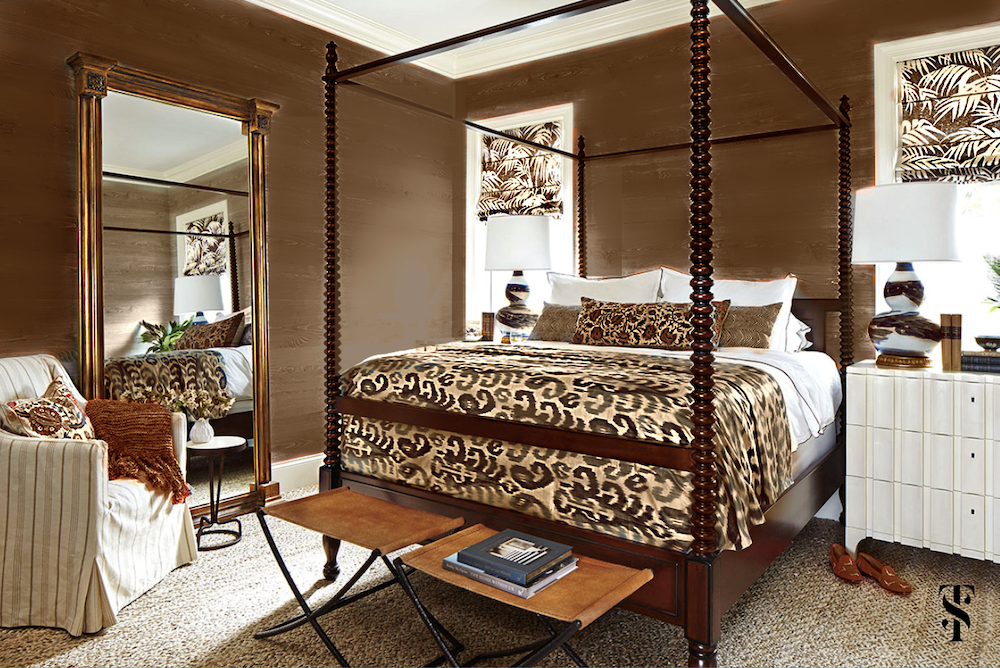 As you can see, I eliminated the blue for a more monochromatic neutral color scheme. I also changed the color of the lamps and bed covering.
I like this version, as well.
So, the main point of this exercise is to create a strong, unified interior color palette, one must have a jumping-off point.
Good choices are fabrics, art, wallpaper, or a rug.
That’s all there is to it. However, yes, a certain amount of talent is required to put the colors together in the right concentration. Please look at the fantastic job Summer Thornton did with this home. There’s a reason that many shelter magazines have published it.
Now, I’m not going to post any images of another Florida home recently published in Veranda. This is the Kips Bay Showhouse 2022. Yes, it was done by numerous designers who apparently didn’t consult each other about their palettes.
No further comment about the decor, the colors, or furnishings for most of the rooms. I guess no comment, IS a comment. lol
But, you certainly can comment, if you like. Please do not mention anyone’s name, however.
In closing, I hope this palette exercise will give those struggling with paint colors a means for creating a unified interior color palette.
xo,

PS: Please check out the newly updated HOT SALES!
And, too funny. After the last post where we talked about one of my favorite decorating tricks, I was asked how often Serena & Lily puts their gorgeous furniture on sale. I only found out on the 7th that the sale was beginning on the 8th of March. This is a great opportunity to get 20% off on almost everything on their site.
Related Posts
 Your Home Office Could Be Dangerous For Your Health
- Is A Dark Exterior House Color A Good Idea?
- She Wants A Classical Home in Florida. And, Cheap too!
- 77 Budget Fabrics That Look Rich + Sources!
- The Classic Kitchen – A Complete Source List
- She Loves A Brown, Masculine Room, But He Doesn’t. Huh?
- One Living Room Layout – Seven Different Ways!


44 Responses
That Nantucket Gray room is speaking my love language, Laurel! I don’t know if there’s any research on that, but I’m about to find out.
This tutorial was brilliant. Thank you.
That “other” Florida house is the most hideous collection of rooms I think I have ever seen. It is a house of horrors.
Laurel,
Can you tell me where the bed in your tutorial is from?
Thanks
I love your blog.
Hi Claudia,
Sorry, I don’t know the source of the bed. It’s not my room. I used it for demo purposes.
Some of these rooms were over the top. I’m afraid the combination of these rooms would give me a headache!
This is an outstanding article. I really enjoy the suggestions you made in your blog. Thank you for sharing this helpful information with us.
Oh dear, I’m clearly in the minority. IMO one of the Kips Bay rooms is a fun, fresh design in the Palm Beach Regency style. To me, it seems well-suited to a sprawling Florida mansion with a whimsical vibe and gorgeous outdoor views. I spy many design elements, such as Greek key trim, bamboo furniture and trellis patterns, that I just love.
**If I’m not supposed to reference a specific room, please just delete my comment.
Thank you for a great post with very practical help. It’s going to save a lot of us time, worry, money and heartache. (That gorgeous Summer Thornton foyer must be the most pinned photo ever, btw!)
Laurel, what a great post! Melissa and I will go over each picture as we are choosing a color for her new sunroom! The color changes you made with PicMonkey were fabulous. I was looking at the blue room and something was missing that I didn’t feel with the previous rooms. You’re so right it was the room where I noticed the lack of art.
As for the show house I planned to scroll through very quickly so I could enjoy my Veranda and look at everything carefully. But I don’t think there is one room I ever care to see again…XO
Karen, Yes that house is right out of Pillow Talk! LOL
I may be confused about this: Must the entire house share a unified color palette? For example, if the main bedroom is done in quiet, restful neutrals, does that preclude using vibrant jewel tones, for example, in another room in the house? If the overall style of the rooms is unified, can you play around with color in each room but still achieve a harmonious flow?
Thank you for explaining this concept!
Oh Laurel, those rooms you put together are beautiful! I’d live there!
You did such a lovely job of making every room have it’s own personality, but pulled together by color.
Must have taken you forever.
JJ – I agree with you 100%. The “look is cohesive in being all from the 70s.” You could rent this home out for Halloween parties. Just don’t bring the kids as it would scare them more than any witches’ set up.
How could you possibly secure a client from any of these nightmares?
Reply to Merri:
Thanks, and yes you are correct. The houses are usually put on the market after they have been stripped as the designers retrieve everything they can. If the buyers make an offer before then, they usually have the opportunity to purchase furniture, window treatments, etc from the designer of each particular room.
I do agree with some of the comments about some sketchy designs, but sadly most established designers have stopped participating in showhouses/ high end model homes due to the expense, damage, theft, etc that goes along with thousands of people trekking through. Just not worth it. So you sometimes end up with lower quality work from less experienced professionals by default. But it’s THEATER, it’s entertaining, and it’s also fun to HATE rooms, too! You never really know what you like until you also know what you don’t like….
I love several rooms in that show house, and I think a few of them could be adjusted to fit in a cohesive (if maximalist) home fairly easily.
The entry, main dining room, salon, breakfast porch, and lounge, and maybe the guest dining and kitchen could be shifted in color just a hair and make a lot of sense together. I’m kind of in love with the green cabinetry in the guest kitchen. I don’t really get the ombre carpet on the stairs though. It just looks washed out. Also the toddler room fits, but wtf those ceiling dust collectors? The primary bedroom would be perfect if it pulled in the teal instead of navy. The closet is absurd and I kind of love it.
But it is clearly not meant to be cohesive.
*** meant to include Pam Ozment in my reply
I was going to reply separately but you nailed it! There are many pieces in each room that I felt were beautiful and would work in many homes. And this is also not someone’s personal home, correct?
A lot of designers didn’t even participate in Palm Springs Modernism Week this year because of the uncertainties of Covid and the simple fact that procuring what they need by a date certain is currently impossible. The manager at Room & Board told me that the company has established a temporary policy of 100% of product going to customers with prepaid orders, so no show houses no employee discounts until the supply chain improves. I appreciate that policy. Nothing is worse than waiting nine months for a chair, only to find out that the company is letting people and events jump the queue.
Thank you for explaining the concept, Pam. I understand. That said, there is not one single room in this ‘show house’ that would ever attract me as a new client, and I’m definitely not alone in this assessment. Each and every room is an exercise in bad design. Or at least, poor taste. Or, no taste. What a waste of time and money.
Laurel,
I am thrilled you responded to my post. I am busy for the next few days with a number of urgent things, so I will just post that I am going to play around with picmonkey as I am now convinced it will help me make some decisions.
I don’t have a problem making a home color cohesive, but that initial transformation from the color scheme in a room I love to my preferred color scheme just doesn’t lead to the same result in my imagination. I can see/feel it doesn’t please me.
As I haven’t actually gone through the process by using picmonkey I may be imagining it wrong.
And the first part of this post is precisely what I was asking for — but using a different color scheme — maybe in the same proportions, maybe not.
Back in a few.
As a designer who has participated in several Showhouses since the 1980s, it seems that most people are not aware that a “Showhouse” is not meant to be a cohesive design to attract a buyer. They are usually fundraisers where designers volunteer their time/talent/money to showcase their own personal design aesthetic in one room of an existing house and hopefully attract new clients. Designers are assigned rooms and are encouraged to do imaginative and exciting things that they probably could never get away with in a regular clients home. Each room is its own unique space, meant to be taken in individually and not expected to relate to any adjoining rooms or even the style of the home itself. Many hours and Thousands of dollars that can’t be recouped are spent to essentially advertise their business and design talent. Visitors are expected to be inspired and amused by new ideas and looks that can verge on fantastical, impractical, even shocking. It’s FUN! It’s like Disneyland for those who love design! If you go expecting a ‘model home’ then you just don’t understand the concept.
That Summer Thornton house is magnificent. I could move right in. My palate is the same in my home… whites, blues, aquas, greens, and touches of orange and coral. Throw in some natural wood and wicker and I’m done. Just exquisite.
Oh my. That showhouse. One wonders if the decor theme direction given to the participants was “70s porn vibe”.
Oh my, where’s the fainting couch? But I did look back again and could find an item or two in each room I could like in another setting.
what a wonderful post – thank you.
About to re-do the LR and home office – very inspiring… Can you identify the carpet used in the ‘nantucket gray’ widget? It would work perfectly for me…
And love the bedroom iterations…
Your talent is our gift….
As my dear FIL was fond of saying about the “primitive” pieces my dear MIL was fond of collecting; the showcase home “got hit with the ugly stick”. Oh, but oh, the lovely home Summer did is beautiful in every way. (Except for using too much blue for my taste but I am good at visualizing greens.) I may have found my wall color with the Benjamin Moore “Opal”. Off to the paint store I go….
This was a great help in taking the next steps in decorating my home. I went very neutral and dove gray on all the walls (I think because 1. I wasn’t sure we were going to be able to afford to stay and it seemed the smart choice and 2. because the gut reno/second floor addition was so taxing there was no way I could think through a color scheme and 3. because I knew decorating was going to be heavily influenced at first by furniture I could find on FB Marketplace and there was no direction to head in until that serendipity had happened.) I’m headed toward the English country home layered look – patterns and faded color (but definitely several colors) and collected items – but as the emailer who inspired this post has said, it is a bit hard to keep a thread going but not get either repetitive or too contrasting.
One thing that has helped is the new book The Well-Loved House by Ashley Whittaker (which can be found on the Serena & Lily site for 20% off via the sale you alerted us to!). She is a master of color without garishness and I have loved studying the pictures from room to room in the featured houses to find the through lines. She also does a nice (though not in depth) job of describing her jumping off points and how she carries points of the main colors throughout the home. I always try home dec books out via the library first, but this one is worth purchasing.
Thank you Laurel for another well crafted post. I always learn so much from your posts. Plus, I love your sense of humor! The Kips Bay Showhouse was simply hysterical to me! So “gimmicky” looking to me. I love color but this was a physical assault! Lol!
A lovely post Laurel, as always!
A tip for Ramona though, and anyone trying to decompress from chaotic goings on, the link to the Kips Bay Showhouse may not help you decompress at all. I find it quite unsettling.
Great post as usual!
As to the Veranda house, I find it fascinating that every. single. designer seems to be trying to outdo each other to create a visual definition of the word ‘hideous’. There *must* be something in the water; a hallucinogenic, perhaps. I have a headache, now, and my stomach hurts.
Laurel, have to say again another great post. This one especially had me to thinking about my decorating choices. Years ago when we built our home, I bought all the good books and met with designers in order to make, at that time, the best choices we could afford without becoming house poor. Invest in quality over quantity as they say. So now after 30 years with some good pieces in fairly well built rooms, the challenge is keeping the place from looking dated – and without spending all our retirement savings. Styles and colors change as quickly as our shoe trends. As in example: in the 90’s chintz and jewel tones were in all the mags – then everything went neutral and geometric, lovely window treatments went into the bin favoring the barest of window coverings, carpeting was pulled out for wood everywhere, traditional furniture went into disfavor as decorators returned to the 60’s midcentury decor (ugh), etc. So as I said keeping a home from looking like your grandmother’s is a challenge. I think your posts do a good job of advising on how to avoid this problem. Thank you.
Did you ever watch the movie “Pillow Talk”? Doris Day plays an interior designer who decorates Rock Hudson’s apartment in the most garish way possible as a form of punishment. The end result looked like some of the rooms in the Veranda Showhouse!
Yes, it does appear that color is back!! These rooms remind me of women who wear large quantities of makeup and jewelry!Sometimes it is best to choose the best pieces and showcase them. Diplomatic enough??? LOL
The Veranda home reminds me of a New York fashion show where the clothes are artistically garish and not to be worn by normal people, but give a hint to trends that are coming. Veranda house screams that color is back! I could not find one room that would make a person want to sit a spell, sip tea or bourban, have a conversation, or read a good book. But, the Summer Thornton house is my favorite home from room to room to room. What a beauty and what a contrast to the Veranda house. Thank you so much for this post, I love every blog post you write. Hope your home is coming along, can’t wait to see pictures of the progress
This is another great post, Laurel, and that Summer Thorton room is beyond beautiful. I think the designers of the Kips Bay home should have taken a ‘less is more’ approach and kept their ideas more in keeping with quiet dignity of the architectue and style of the beautiful exterior. The patios are fine–it’s the interior rooms I could not live with. All of it is very jarring, and the kitchen is no exception.
Laurel ..!!! Apologies!!! That darn spell-check got me again!#!§@!! Guess it’s too familiar with a friend of mine 🥴
Lauren….this post….LOVE IT! I’ve been redecorating my home from the floor up and although I have a palette chosen it’s been hard to get beyond the first three rooms. I’ve had PicMonkey downloaded for quite some time but this post has inspired me to start using it! Thanks for your tips and showing how to use it to explore different color ways for a room.
With the exception of 2 classic rooms with neutral stripes, it looks like someone ate a box of crayons and barfed. Just TELL us color is back 🙂 please stop the visual assault. Think I’ll pass.
Trying to pigeonhole the decorating style, it finally occurred to me that it must be “Reign of Terror”. What a shocker.
You must have had a blast doing this post, Laurel. This is by far my most favorite post and I love how you put all these rooms together. Terrific! And yes, The Kips Bay Showhouse was interesting and I was curious to hear your reaction.
while I would not go as far as the comment above, my first reaction is there must be an army of “servants” cleaning 24-7, and these people are beyond wealthy. beautiful collections of nothing that seems personal, well presented, but soulless. perhaps a decorator show house, one of many these clients must have if they had no interest in choosing anything. all that being said, good for the designers, they need those clients, but not reality for most of us.
Just realized I was in such a state that I didn’t mention I was talking about the veranda home! Your post is fabulous and I’m going to try pic monkey to figure out my new living room wall color. I have your palette and paint collection ebooks and love them!
LOL LOL I just can’t! If they hadn’t sworn that that was one house, I would assume it was some random collection of photos. And after the bizarre’s schizophrenia of the first group of photos, I literally felt like I got kicked in the stomach when I saw the kitchen.
And just when I thought it was over it kept going and going. WTF? I think I need my meds