It’s February, and that means Valentine’s Day is coming up! Therefore, in honor of the day of love, let’s review some of the best shades of red paint colors. And, also gain inspiration from decorating with red.
Of course, it’s okay if you dislike red. Or, even if you think you dislike red.;] Maybe you’ll feel somewhat differently after reading this post. Or, maybe you won’t.
This post focusing on the color red is one of three posts about red paint. The other two are:
romantic color palettes inspired by red,
and some misconceptions about red.
In this post, I’ll present 12 fabulous red paint colors and gorgeous interiors incorporating shades of red, wall coverings, and furnishings.
Please note that lighting can change these red paint colors quite a bit.
For example, a red that might look a bit dark during the day will usually look quite vibrant with warm lighting on it at night.
Most of the colors are from Benjamin Moore, with a few from Sherwin Williams and a couple of others that I like. I will intersperse the color names with the images. They are not necessarily painted that color but should look close to it.
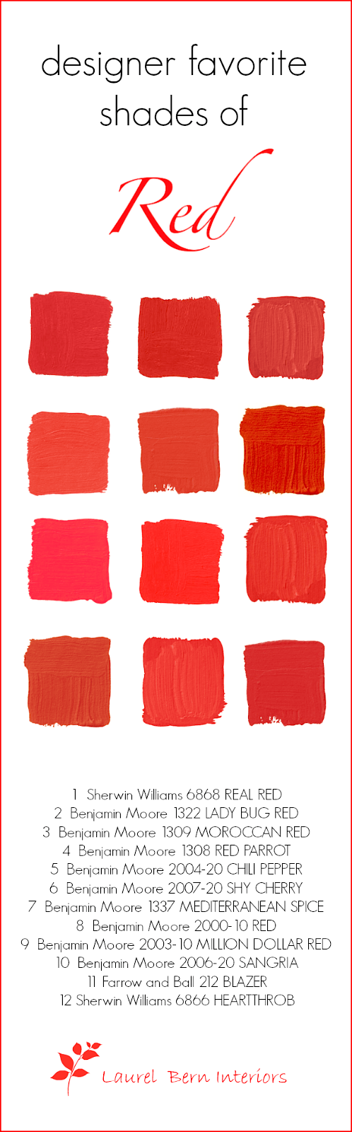
Near the bottom of the page, you will find a helpful graphic with 12 beautiful red paint colors that you can pin on your Pinterest board to serve as a handy reference.
Sherwin Williams 6868 REAL RED
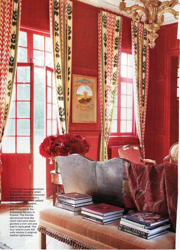 Sally Perrin House Beautiful 2004
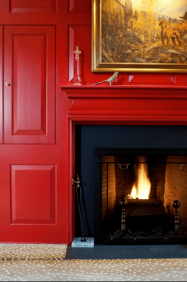
Benjamin Moore 1322 LADYBUG RED
I love that this room is 18 years old!
Benjamin Moore 1309 MOROCCAN RED is one of my favorite go-to red paint colors. It’s not bright, nor is it too blue or brown. This is a room I did around 2003!
Benjamin Moore 1308 RED PARROT – sitting just above Moroccan Red, Red Parrot is a tad brighter and would be better for a darker room
Benjamin Moore 2004-20 CHILI PEPPER


 Above is one of the 40 boards from the Laurel Home Paint and Palette Collection.
Benjamin Moore 2007-20 SHY CHERRY
(I cannot tell a lie – in honor of George Washington, of course. It’s not really all that shy)
Red on Redd— via Ballard Designs
 Another board from the Laurel Home Paint and Palette Collection.
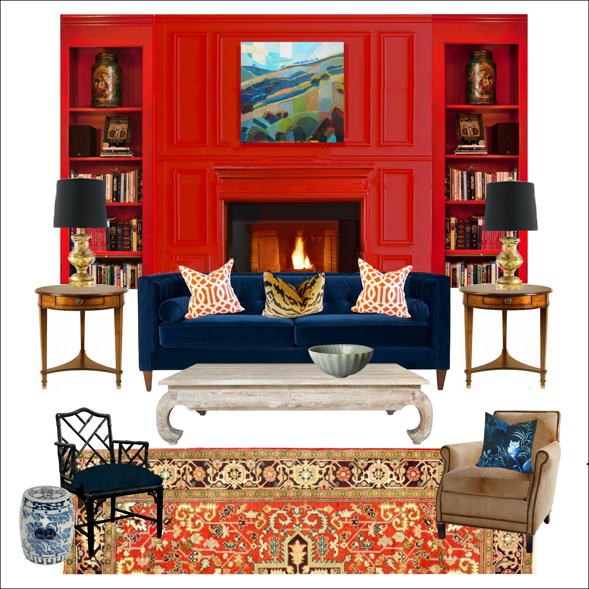
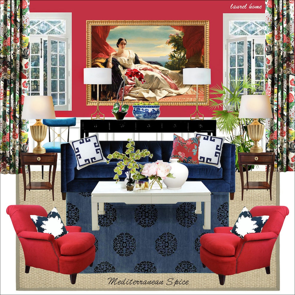
Benjamin Moore 1337 MEDITERRANEAN SPICE. This is an amazing color, and you will not find it on anybody else’s list. (unless they’re copying me)
That might be because it looks a tad magenta on the chip. However, on the wall, it’s a gorgeous shade. I did it once for a young teenage girl in a mostly north-facing room, and it almost glowed. My painting contractor liked it so much that he painted his daughter’s room the same color. You could definitely also do it in a living room.
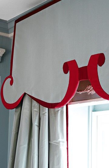
Custom Chinoiserie lambrequin with red trim in two different shades. The effect is that of Trompe L’oeil. I’ve never seen anyone do anything like this before! I believe that Miles single-handedly has brought back the lambrequin.
Benjamin Moore 2000-10 RED
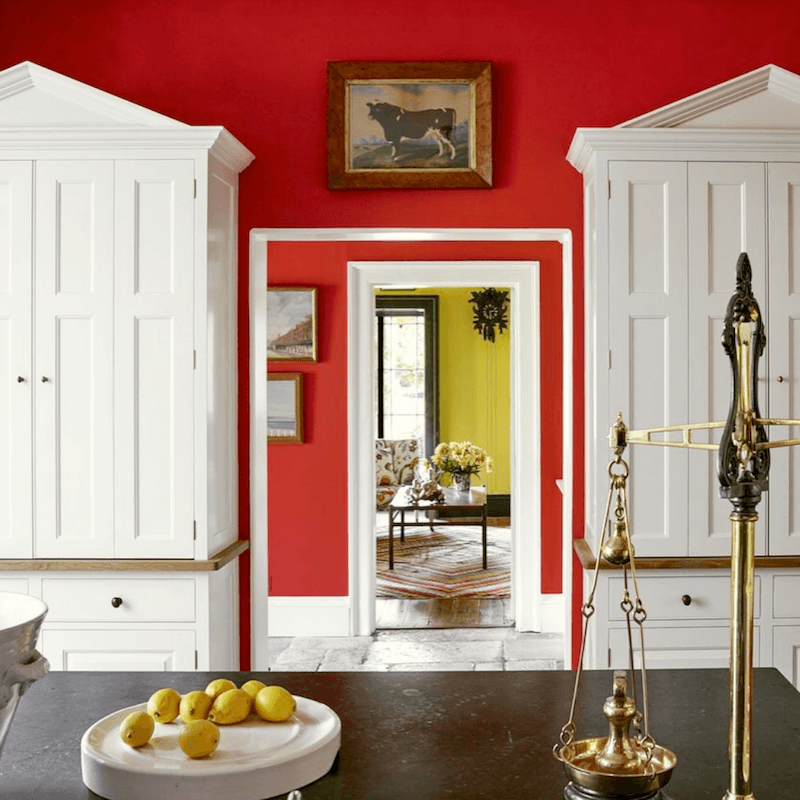
Wonderful kitchen by Ben Pentreath
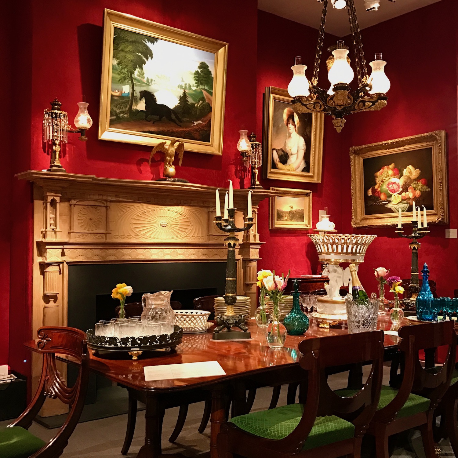
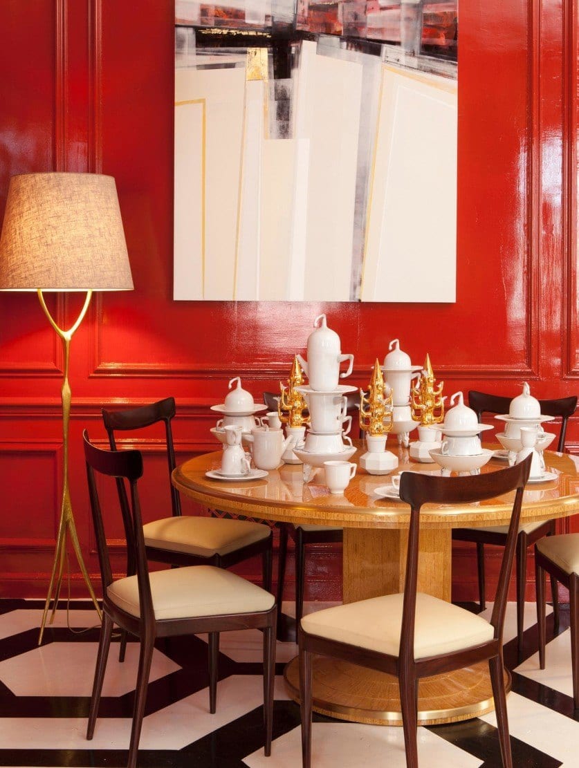
I took an image of a stunning red dining room set up for an antique show in New York City in either 2016 or 2017.
![]() Photo by me last summer of a classic Beacon Hill Red door.
Photo by me last summer of a classic Beacon Hill Red door.
Of course, there are all of the gorgeous red doors in Beacon Hill.
And, the red holiday doors are here.
Plus, there are some holiday doors here, as well.
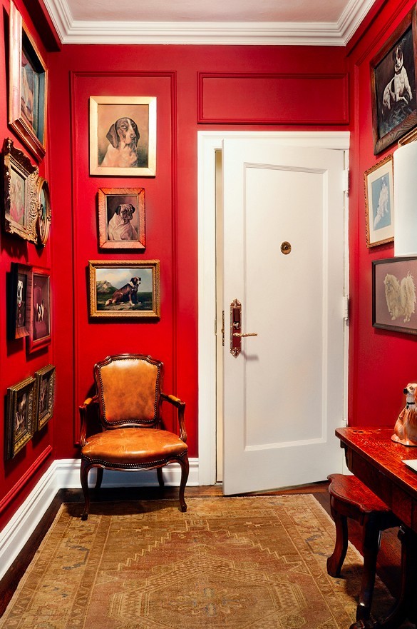
Benjamin Moore HERITAGE RED – This one isn’t on the graphic below, but it is one of the most classic red paint colors.

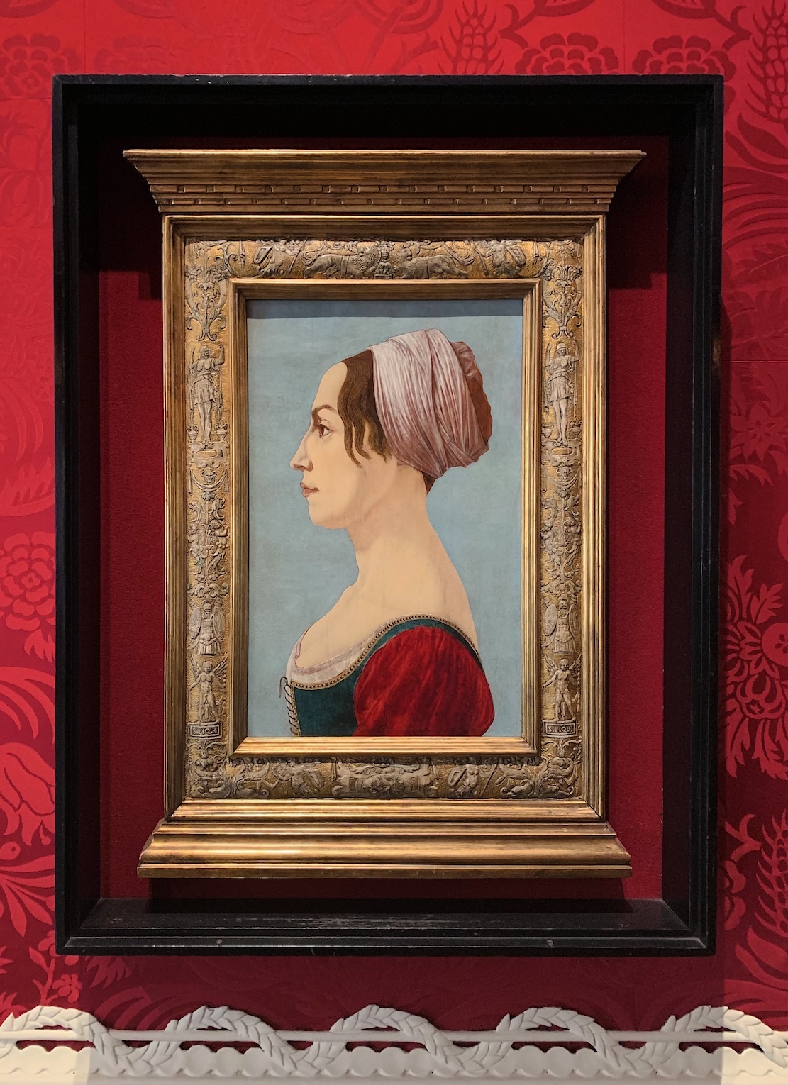
Gustav_III,_King_of_Sweden,_and_his_brothers
Every time I see this incredible painting, the brother in the lavender reminds me so much of the ballet dancer David Hallberg.

Above and below by Inson Dubois Wood for the Holiday Showhouse. Here’s a link for the before shots. It’s always fun to see where the designer started and where he ended up!
Benjamin Moore 2003-10 MILLION DOLLAR RED is a warm red with life but not too bright.
I love the juxtaposition of elements in this vignette from Lonny.
Benjamin Moore 2006-20 SANGRIA
Farrow and Ball 212 BLAZER
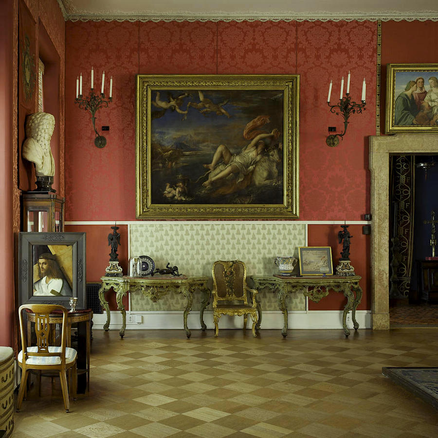
Above Via The Isabella Stuart Gardner Museum.
The next three shots were taken by me during a trip to the ISG Museum, about a mile and a half from me, here in Boston.

Look at those gorgeous red paint colors in one of the hundreds of fine art pieces at the Isabella Stuart Gardner Museum in Boston.

I went with my dear friend, Linda Holt, late last September. And, we were amazed at all of the mismatched wallpaper. I mean, MISMATCHED, not just clashing reds. That’s another post, however.
Sherwin Williams 6866 HEARTTHROB
Please pin it to Pinterest for Reference.
I also added a widget of beautiful home furnishings with red paint colors.
Usually, there are captions, but I left them out this time for most of the images to save time. But, if you click on any of them, you will be taken to its source.

Have you ever painted any rooms red?
Between 1996- and 2015, I specified about 15-20 rooms painted red. All of them looked terrific.
Although, it’s currently not as popular as green, blue, and white, it’s definitely a classic color.
It’s the color of love.
xo,

PS: Please check out the newly updated HOT SALES! Please note that the Serena & Lily custom upholstery sale ends at 11:59 PM PT – on February 9th. So, if you want to take advantage of their 20% off sale, there’s not much time left.
Related Posts
 Bookshelf Styling-The Ultimate Guide with Templates!
- Six Drab Paint Colors – Should You Try Them?
- A Jewel Box Powder Room You’re Going To Love!
- Is An Unorthodox Small Unkitchen A Good Idea?
- I think I Just Made a Terrible (and costly) Decorating Mistake
- 12 Of The Hottest Kitchen Trends – Awful or Wonderful?
- 20 Favorite Exterior Paint Colors + Doors and Trim


58 Responses
Hello Laurel. After searching for sanity and beauty in home decor I finally found you a few weeks ago and am delighted. Yes, two rooms have seen the red brush (one with the ceiling as well) and both are very memorable. Before seeing the one with the red ceiling people were rolling their eyes and trying not to snigger until they saw the finished product and it was gratifying to see the nearly instant change in reaction.
Anyway, you’ve re-affirmed my confidence in following doing what I love and fine-tuning. Much of the house is undergoing major decor changes and it’s exciting.
Somehow I overlooked your birthday and do wish you a very happy belated and have found as time goes on, we get to celebrate for many more days as I hope you are doing.
Thank you for your wonderful posts — looking forward to each and every one.
Carol
Thank you too, Carol!
I had a red dining room for approximately 12 years, which is now SW Sea Salt for a more updated look, but I really enjoyed the red color for all that time. Your widgets are beautiful and spot on.
Happy (belated) birthday, Laurel! Are you an Aquarius or a Capricorn?
Hi Lisa,
Aquarius is my sun sign.
I love red! My house is a dark blue color and the back door which exits to the garden is Benjamin Moore Dutch Tulip!
I love all the reds in your post! The first three photos are the shades I would definitely use. I had a red powder room in my last house, accented with black and white. Even men commented positively on it.
There are those who think it’s an angry colour but to me it’s stimulating.
Thank you for another great post!
I read somewhere that a woman should always wake up in a room that flatters her, so our navy bedroom was painted Ripe Current by Behr almost our first project together as newlyweds, and I hung brocade valances…I felt like a quenn in her castle turret every day! If you DIY, you need 4 coats usually, and a Grey or pink primer. Thanks for the red colors, Laurel! My bedroom is blue now, but I miss my red so much! We took all the colors in our old house, and moved them around in our new house. Our BM blue (Jamestown?) from our living room is in our bedroom, and the Ripe Currant went on our built in bookshelves. Happy Valentine’s Weekend!
Thank you, Laurel, for another beautiful post. I don’t just love red, I LOVE red. I love to decorate with it and wear it. I once owned a home with a small foyer, and the front door opened to a wall that I painted Mediterranean Spice. In front of that wall, I had a beautiful antique chest with a black and gold lamp and blue and white chinoiserie vases. Everyone that entered told me how they loved the red entry. I LOVE the vignette by Lonny.
Cocoa Chanel said she spent her whole life asking painters to create for her the perfect Chinese Lacquer Red for her apartment and no one was ever able to do it. Actually I think it was more like “No one could even figure out what I was talking about” ’cause that sounds more like her, haha. AND really great post, Laurel Bern!
I love red, but like many others, (I’m sure), am a bit timid about introducing it as a wall color in a room. A piece of furniture, yes, a decorative accent, definitely.
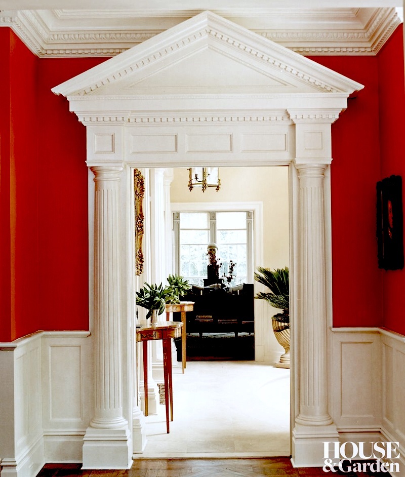
That Timothy Whealon hallway space, and view into the adjacent rooms is just stunning. Red and gold just look gorgeous together – a match made in heaven.
Pops of red are OK, especially in a “country” decor or in summer when it gets to be July but I’m not really into being awash in a sea of red. But there was that one interior designer that has a place in Jaipur, India who did her whole decor in red, white and turquoise color. I have saved the photographs of that decor.
Thanks for another beautiful post, Laurel. While I appreciate the drama, red is not a favorite of mine. I do love touches of it in art work and decor, though.
Just Googled David Hallberg. Being from SD, odds are good he’s part Swedish. Perhaps with royal ancestry!
Our living room is Moroccan Red and it has been perfect. It lands somewhere between red and orange in an earthy terra cotta with no hint of maroon or garishness. However, I am ready to lighten up a bit, and in a couple of weeks the walls will be Dolphin’s Cove. New furniture, new paint, and a lot of comfort from this blog.
My last 3 houses had red wallpaper in my dining rooms. My daughter’s bedroom in my current home was red. And my front door used to be red.
It seems as I get older I like things lighter hence I have been slowly painting my walls white and am in love with white as it makes furniture and artwork pop!
I do have red in some of my furniture, just not on my walls anymore!!!
I’m a fan of the color red. I especially love to wear it. I don’t have a lot of red in my decorating – just a few accent pieces. I love the red rooms you have featured here. BUT, I have to say, EVERY time I see one of your boards from your Paint and Palette Collection, I’m blown away by the beauty you have created. I’d love to live in any of those boards :]
In the late 1990’s I owned a 1927 bungalow with original (painted) woodwork, 10′ ceilings and hardwood floors. The front entry off of a wrap-around porch was the dining room – quite small in which I had a primitive black buffet with natural wood top which was found in the dirt floored basement of a great grandmother’s home. I used a dark walnut antique library table as the dining table, and spray painted four large wicker arm chairs glossy black. Cushions were a black-based floral with subtle roses. I painted the walls an eggshell red, similar to Laurel’s photo from this article, “… stunning red dining room set up for an antique show in New York City in either 2016 or 2017.” The windows were floor to about 10″ below the crown moulding. I painted the trim in a high gloss Martha Stewart “Whipped Cream”, and the ceiling in the same color but flat paint. There were plain white linen sheers hung within the frame. On the interior were Ralph Lauren drapes in “Teresa” print which were stunning with their yellow background and cabbage roses in reds, pinks and whites. The floor was original thin-stripped oak. I found an extremely thick oriental patterned mainly red rug that nearly covered the room with creams, black and a bit of blue. It seemed a risky bright combo for the entry room, and so small. Consistently guests exclaimed, “Oh my ____,” when entering the room. I was new to the university town I lived in. In my office more than once I overheard conversations that went like, “…have you seen that house at ____ at night when you drive by, the one with the red walls and black wicker?” This was noteworthy as the landscaping was perhaps more notable with surrounding privets, double layered cut in a battlement style (like a castle). I never heard comments on the privets! Although I did not remain in that home or city long, it was one of the most spectacular rooms I’ve done. During waking hours it was the room where I spent the majority of my time.
While red is not a color I decorate with (or wear), it’s a real color and I appreciate color! I feel like I see it more in older homes, usually? I could see doing something with that Mediterranean Spice with a bold pink, deep purple and lotus green!
Sorry. I meant to say…
That’s why I enjoy your posts. Blame it on the martini!🤭
I like to use reds sparingly and only as accents. I painted a connecting family room/kitchen in red and I suffered through it for years. It’s easy to say, “It’s only paint, just repaint it.” Not always that simplistic.
I loved many of the pictures you shared in the post. Many were very formal. I’m a minimalist. I like to explore ideas, not necessarily adopt them.
That’s my I enjoy your posts.
Thanks do much, Laurel.
Awesome post–I love red! I hate to think that any color is “passe.” If the room is done well, it can last a very long time. All of the rooms shown in your post are beautifully done.
Thanks!
First, thanks for this post! I love all things red and Redd!
Second, I have done several red rooms, and I have loved them all. In my current house I do not have one, but I am reconsidering the green Fresh Sprout I used in the LR some years ago, and thinking of returning to red. It was WONDERFUL to see something in a blog besides grey and white.
Last, I just read a book you might like, since you live in Boston and are interested in art. It is THE ART FORGER by B A Shapiro. Great read!
So glad you did this wonderful red post. Red is the most glorious of colors. Years ago I painted my livingroom Wright Red. I think it was a Duron color before Duron was bought out. In the room I had a baby grand piano, a white sectional, a glass coffee table, a chinese console table, two velvet chair–yes in red, lots of mirrors and a different red-toned Heriz Persian rug. The room also had white dentile molding. It was truly a work of art–also with lots of art which helped the red to not be so overpowering. So many people commented favorably on it. It didn’t have a lot of light but it was so warm. And that red had enough blue in it that it didn’t give off a tomato hue. My lovely next door neighbor would come by frequently to simply stand in that room and exhale almost as if she was taking a ‘red’ bath or absorbing some of that red energy. I sold that house but sorely miss that room.
I do not like red. I don’t wear or decorate with it. The only time I can appreciate red is in nature.
Laurel, I have an idea for a post that would be sooooooo helpful for me, and perhaps a good many other people. I am not a design person and find much of the discussion in decor blogs to be something south of Sanskrit. I do, however, sigh with envy when my Ballard catalog finds its way to my door. All the pages seem so well beautifully done; they don’t have matchy matchy furniture, there are no ruffles, and it all seems perfectly effortless. Could you do a post on what it is in these catalogs that makes it look so good? Is there any way regular humans can achieve that besides buying everything on the page? (Believe me, at $500+/lamp and $75/small topiary, this won’t be me, unfortunately.) Please consider this. Thank you!!!
Hi Laurel, I have a question about when it’s appropriate to paint a room dark or light. My family room is quite a large room with 12 foot coffered ceilings. It has 5-10 foot tall windows on each side facing north and south. The room, Is completely painted cream. It has 2-7’ red velvet couches slip covered in cream and a 4×5’ cream coffee table In front of the fireplace along with two upholstered armchairs. There is another 6 foot cream sofa facing the fireplace with an old trunk as a second coffee table along with two more upholstered armchairs. The only color in the room are throw pillows in blue paisley and a blue and red Fortuny fabric I love. This room is open to my kitchen. The inside of the shelves flanking the fireplace are a steal blue. I have hung 25 various blue and white plates as s permanent wreath above the fireplace. And have 2 large blue and white porcelain ginger jar lamps and one brass. The rug is braided grass over dark hardwood floors. I’ve kept to his room light because it gets so much light. Could you ever picture it looking wonderful painted dark? A navy or red possibly?
Hi Laurel! My family room has 12’ coffered ceilings and 5-10’ windows on each side facing south and north. I have 2 matching 7’ slip covered cream linen sofas facing each other in front of a fireplace and a third 6’ different sofa as a third facing the fireplace, plus 2 sets of matching club chairs to add to this arrangement. My entire room is cream except for some blue paisley throw pillow and some blue and red Fortuny pillows. I’ve been taught it’s better to paint a dark room dark and a light room light. My 2-7’ sofas are red velvet underneath the slips. Would it ever look great to paint this room a darker color and take the slips off? It’s such a bright room.
Hi Laurel,
The closest I ever came to bringing red into my home was back in the early 2000’s. We painted our kitchen a shade of burgundy. It took 5 coats but looked great with my red oak cabinets.
I’m not a big fan of red. I don’t even use red in my Christmas decor.
Well, I needed this post. I just sold my beautiful home in Michigan and returned to California. I miss the home, not the weather. My study was due west and painted red with lots of white trim and built in shelves. It was glorious to work in. It felt like a womb. I was really able to concentrate in that room. It didn’t get direct light until the short afternoons. I am now contemplating red for my new study. The one large window is due east. I am waiting to see how the light changes in there before deciding. I couldn’t paint anywhere else red in this climate. That red was one of the best decisions I ever made.
Kay, actually it takes less coats of a lighter color to cover a red wall then it does to paint a wall red over say a white wall. It has to do with how paint colors are made. When a red paint is made, the base they have to use to get a strong red is like milky water with very little coverage power.
Not a fan. Most of the reds look orangey to me, and I intensely dislike orange, except in nature. Red is great as an accent color but way too much for me as a wall color. In my endless house hunting, every time I see red walls in a possibility, I groan inwardly and think how many coats of paint will be required to cover it completely.
We just bought a house and when we got it a very dark, small, north-facing room was painted dark burgundy/red. It feels like a cave. We are currently picking out new colors and I just can’t wait to paint over it! I think I want it to be much brighter, while also keeping a warm color.
Thank you Marsha Stopa! Will do! Can’t wait to try! Laura
I live in Michigan where there can be snow on the ground for up to 5 months…it use to be 6 months but with global warming, it’s a bit shorter. Because of this fact, I have always needed the feeling of warmth in my home. When we built a number of years ago, I did our living room in a beautiful dark cherry with white furniture. It stayed this color for many years. I ended up changing a few years ago, because being a red pigment paint and a southern exposed room with a lot of light, the color was fading. I also did our large lower family room in a burnt red and it is still one of my favorite rooms in the house.
Laura Hamburger: Check out BM’s Million Dollar Red. I’ve used it on furniture and it had a definite raspberry flavor. I glazed over it with a walnut stain and got a great look.
Early marriage I painted our bedroom SW Gypsy Red with a very pale gray (Gray Kid) on the ceiling and Pewter on the trim. With a classic scroll style brass bed. Made long, pleated curtains from gray mattress ticking. Refinished red oak floors. Was stunning. Friends used to ask to go upstairs just to see the room!
Unlike all the other commenters, I absolutely cannot stand red in home decor. I literally have a visceral reaction to it! It’s so funny, no other color does this to me and I can’t even stand as much as a red bowl or any art with red in it. Call me strange😂
I recently repainted the backs of my family room built ins from an old Martha Stewart red to Benjamin Moore Neon Red, which in in no way a “neon red”! My new project is to paint the powder room BM “Spiced apple cider”, a dead ringer for Farrow and Ball’s “Red Earth”. My kitchen has red accents in small appliances, dishtowels and valences.
Thank you for the fun post and beautiful images!
My aunt had a gorgeous red foyer (paint) and kitchen (wall covering) in a previous home that were stunning. I gravitate towards warmer tones in all colors, and I love reds and corals and happily incorporate them into our decor; here in FL a red room can feel a bit ‘much’ but I would definitely consider it in another climate/locale.
Always have had to have a red room wherever I lived. Love, love, love it. So stunning. Currently in smallest bedroom which I have turned into a cozy library — pops of color with white woodwork and lamp along with a blue buffalo check chair, antique mahogany desk and a wall of books. My favorite room to sit and relax with a “cuppa” and a good book.
Hello Lauren, I loved reading this post. It came at a perfect time for me as I am looking for a pinkish red or to be more specific a raspberry red. I will check out Mediterranean Spice but if you know other “raspbery red” please let me know. I so enjoy all your readings! Laura
Hi Laurel, This is such an inspiring post! I love how you incorporate fine art, furnishings and accessories into a post based on color. As an artist/painter, interior design for me really is art in 3D. All of the wonderful designers you share with us embrace a depth of visual and tactile understanding that make them true masters. I’ve learned so much about layering, scale and color from your blog. This post around the color red is so well done. Thank you
Laurel, I have had red dining room, but was years ago. Currently, it’s black. Red is my favorite color and love all the examples you have shown above. The room with the mediterranean spice walls speaks to me!!!! I can’t tell you how much I love it! It’s my all time favorite of yours! Now, to figure out where I can paint that color! Thanks so much!
I LOVED my 1990’s dining room in something close to Moroccan Red with off-white sheers and valances of Brunshwig’s luscious La Portuguesa (brown stripe). It just LOOKED like food should taste.
I painted my entryway a brick red about 20 years ago and have been happy with it for about 17 years. I still want the enveloping hug I feel when I walk through the door, but I’m ready for a change. One thing I do like about red is that you can pull in some pinks without your husband really noticing. Also, Christmas decorating is amazing and easy!
I painted a small sitting room Drum Beat (Not sure the manufacturer); copious broad and chunky millwork balanced this deep blue-red-cordovan color…meaty in the daylight; mysterious at night! I loved it…adjacent diningroom was red Country Life wallpaper, fabric swag/jabots, and a settee in same…The white millwork certainly kept it all from being too heavy. I loved and miss it now that I’ve rebuilt.
You are speaking my language! When the entire world went griege (even saying that word sounds like vomit!), I clung to red. I just inherited a 10 x 13 antique wool Moroccan rug with glorious reds, blues, oranges, and yellows. Those colors are my happy place! Love all our your images today!
Hi Marcia, as I just posted above, benjamin moore’s Drop Dead Gorgeous worked wonderfully me in a very bright room with big south and west facing windows! check it out!
best wishes!
I painted the walls of my dining area Benjamin’s Moore “Drop Dead Gorgeous” 1329 and have gotten drop-jawed compliments on it for years. It took a lot of tries to get to the right red – the first color my decorator chose looked like campbell’s tomato soup when the painter finished! he and I just looked at each other and said, noooooooo…. but when we got the right red, it has been perfect. There are big south and west facing windows in the walls so tons of light and the room can take a strong color. I have champagne-gold silk curtains that pick up the gold hue of the limestone countertops in the adjacent kitchen, and a brass chandelier that continues the gold. It is perfect. Usually I use a table cloth that picks up the reds and/or golds. Everyone loves to sit in that room because it is warm, bright, cheerful and beautiful.
In my previous home I did the small master bedroom in C2’s Audacious. My Nana thought I was crazy. The room had 2 doors, 2 windows and 2 double closet doors all in white . The light carpet and white bedding made it pop. I LOVE artwork on dark walls and the red was no different.
Quick note — Stewart not Stuart, for the wonderful museum!
Great post and very timely for me! I’ve done a few red rooms in the past. (MANY years ago BM had a color called “Tomato Spice” which I used in a library. My husband heard me talking to our painter and worried that I was putting a Bloody Mary on the walls LOL (he loved the result).
Do you have suggestions for a red in a very bright room? I’m considering red for our next living room but struggling a bit because this room is absolutely flooded with light — south and southwest exposures with no obstructions. (dealing with this much light is a new challenge for me, after years in a narrow north-facing rowhouse).
You are so talented, and I love you blog!
I love the use of red in a home! To me it communicates life, warmth, welcome, safety, love and joy. I painted the living room in our last house something like Farrow and Ball’s Blazer and loved it so much, we kept it for 20 (!)years. I loved the way the room exuded warmth when it got dark outside, and it always felt to me as though I was being wrapped in a cozy red wool blanket. Christmas felt more like Christmas in that red room.
Our front door also was red (SW Heartthrob), and we got many compliments on both.
My taste has changed a lot as I have gotten old(er), and I now lean towards light, airy, spa-like colors, but in our new house I will definitely paint our front door red again and will have a sprinkling of some red throughout the home ❣️
Hello Laurel, I have a lot of reservations about red rooms. I worry that they will not wear well, and that living up to them might be difficult, but that getting rid of them might prove problematic. I did have a red living room in one house I rented, and perhaps the nightmare of that room helped to turn me off of red walls. I do think that red or jewel-tone walls need to be perfectly painted, and also require that touch of a master decorating hand to make everything work. Thus, many can admire a Miles Redd interior, but if they try it themselves they are doomed. I do like red accents, however. I have a lot of Chinese objects that are red,but the red which was on the deep side to begin with has further patinated until they seem to blend in with the darker wood tones, instead of providing that bright accent of color as in your photos above.
–Jim
I recently painted my kitchen island Benjamin Moore Ryan Red. It’s really more of a coral than a true red. It was really scary going on, especially next to the blue painters tape. Wet, it looked like traffic cone orange but dried to the perfect warm pop of color I was hoping for.
Laurel, you point out that lighting can change these red colours quite a bit. But you don’t mention the hideous consequences of moving to LED lighting, which turns terracotta-type reds to a muddy colour. One half of our sitting room ceiling looks revolting in the evening, while the other half is still good because of the halogen sconces. I don’t know what we shall do when halogen becomes illegal here!
My husband and I both hated beiges, so we decorated our first townhome in grays back in the early 90’s. He wanted to do something dramatic, so he picked out a lipstick red for the vaulted kitchen ceiling. I remember the painter triple- checking with me before he started, but he was impressed when it was done. It turned out smashing.
Also, did I miss the photo with the painted brick you mention?
oops, sorry, Cindy. That was an editing error that I’ve corrected.