Hi Everyone,
Wow! Last weekend it was cold and wet, wet, wet. This weekend it is blisteringly hot.
There’s so much going on.
But, right now, at the front of my mind is finishing the designs for my renovation.
It truly is like one giant puzzle because many elements affect others, as you’ll soon see.
Today, I want to tackle my horrible closets. Well, at least one of them.
I haven’t written a lot about closets.
There’s this ancient post about “sucky closets.” Actually, it’s a pretty sucky post. I even recall thinking so at the time. So, that means that it’s really bad. So, please enjoy a good laugh.
Hopefully, this post will be better.
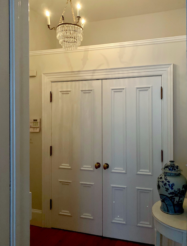
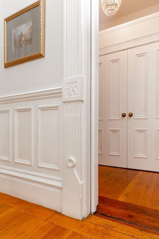
This time I am focusing on my horrible entry closet.
At first look, it doesn’t look so bad.
But, we’re going to look a little closer.
The challenge here is making it functional but also flow seamlessly into the kitchen. And without it seems to be part of the kitchen.
Even though it is. Haha.
True, it will seem to be a part of the kitchen when one is sitting in the living room, but not when one walks through the front door.
In fact, I just have to mention this one thing about the kitchen.
(Please see this recent post about my plans for the kitchen.)
I had a lengthy convo with our darling Nancy Keyes the other day. She has so many terrific ideas and, in my opinion, is a genius when it comes to designing kitchens. (please Nancy’s incredible kitchen here.) She got me thinking about not having the fridge where it currently is. It’s disrupting the flow. The bottom line is that I really want to do under-cabinet refrigeration.
Only.
Oh, stop looking at me like I just showed up at church wearing only a bikini.
However, four drawers are just about the same cubic feet as the upright fridge I was thinking of. But, the beauty is that I’ll have five full feet of uninterrupted counter space, and I can put a beautiful lamp in the corner. So, THAT is what will be seen when one walks in.

You know, something like the one Rivers Spencer has in her shop in New Orleans.
But, Laurel, I don’t think three fridge drawers and one freezer drawer are enough for you.
Yes, you’re right about that one. But, I don’t think so either. But, I have an idea that is a win-win, I think.
I’ve spent hours working on the garden/bedroom level. And, I have to say that I really love it. There is a TON of closet space now. What is a ton of closets?
Believe it or not, EIGHT closets. (only one walk-in)
And guess what I’m planning on putting in one of them?
Yes, another small fridge/freezer or fridge drawers if I can swing it.
If you’re curious, I just added the new schematic to the post where I talked about the lower level.
But, Laurel…
Yes, what is bothering you now? No, wait. Don’t tell me. Now, you’re worried that I’m going not to have enough non-cold storage IN the kitchen.
Guys, some of you apparently have trust issues. Haha.
But, please allow me to explain. If you don’t already understand, this is going to be an “unkitchen.”
I want people to walk in and say, “Where is the kitchen?”
Sorry, this is not supposed to be a post about the kitchen.
But, as I said initially, it’s like the hip bone is connected to the thigh bone…
It’s all connected.
However, please believe me when I tell you that there will be gobs and gobs of storage on both levels. So, please stop interrupting and let me explain. ;]
It has to do with the horrible entry closet.
Why is it a horrible closet?
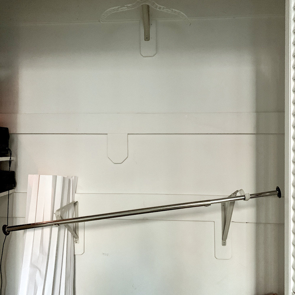
Here, it’s time to take a closer look.
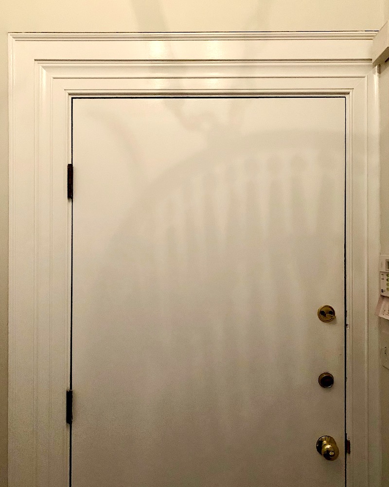
First of all, the closet is crowding the entry door. Second, do you see how the moulding on the right is less wide than on the left? That is just plain wrong. Plus, the way they did the sheetrock is also wrong. They should’ve taken the moulding off first. But, no, they just cut around the door casing. Ickypoo.
Then, the wall should really have gone up to the ceiling. It looks unfinished. I can only imagine what’s growing up there. lol
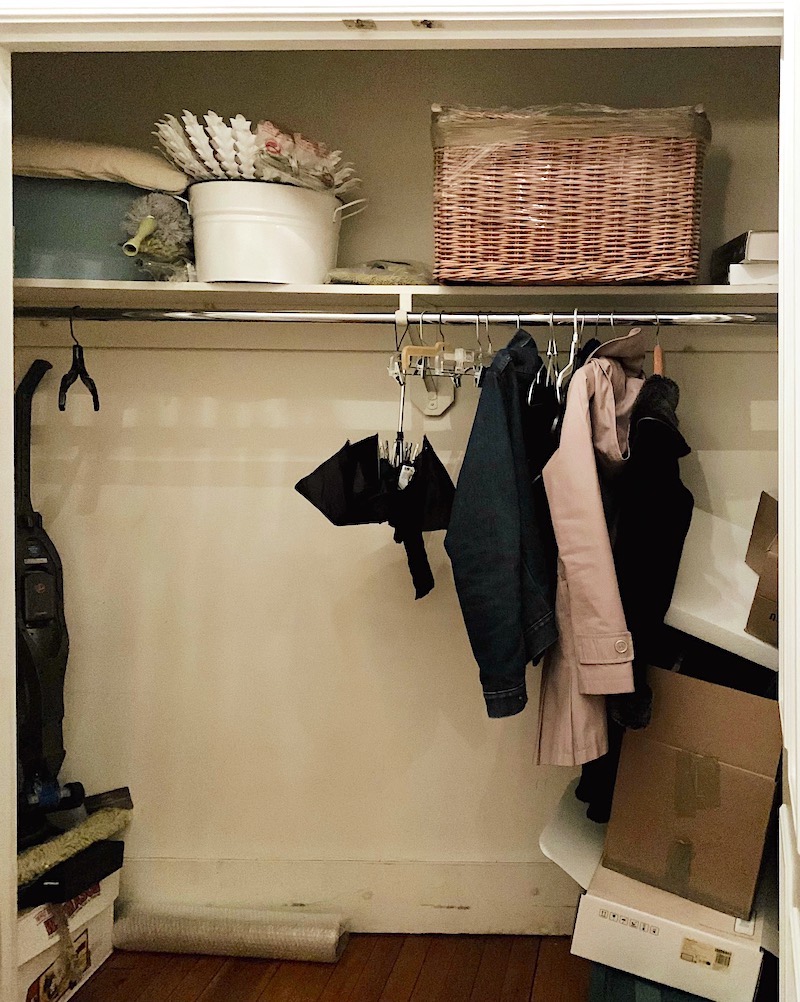
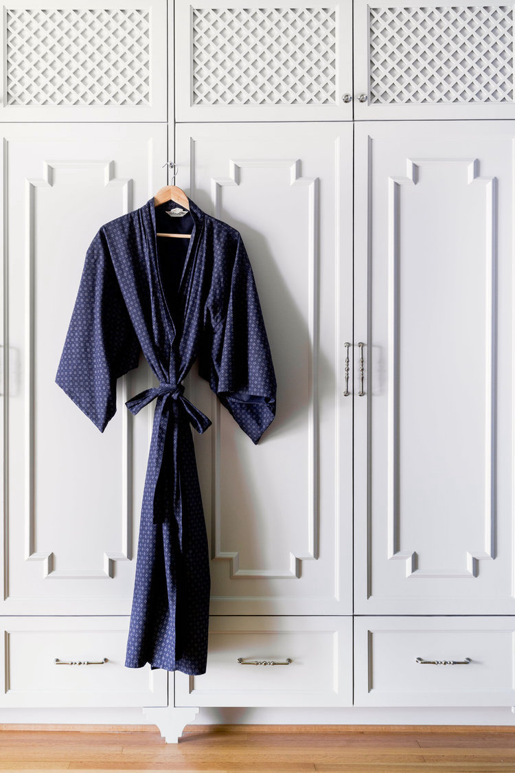
Inside the horrible closet are one shelf and one bar.
This will be perfect for all of the seances I’m planning on hosting in the wintertime.
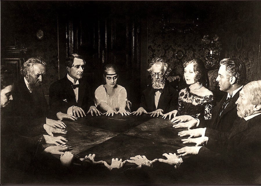
1922 film Dr. Mabuse the Gambler on youtube seance
By the way, you can purchase that image on Etsy.
Alas, this is an old house built in 1880– the Victorian Era.
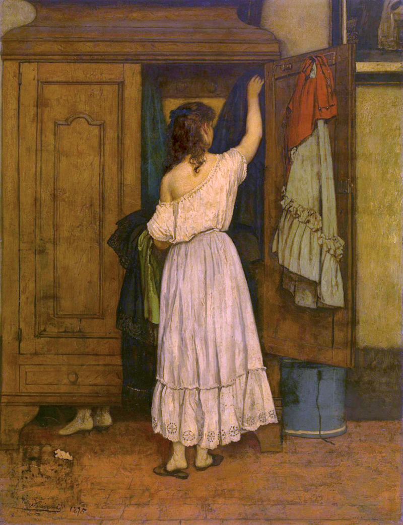
Willem_Linnig_the_Elder_-_The_closet-created 1876
However, one pretty well-known thing is that horrible closets and old buildings seem to go hand-in-hand.
Still. The Victorians had “stuff.” Right? Where did they put it? They didn’t leave their belongings strewn all over the place.
Yes, of course, they put their stuff in furniture: wardrobes, armoires, and the like.
Plus, they didn’t own 200 pairs of shoes. They didn’t have nearly as much crap as we do.
For men, most of their clothing was folded in what we call a bachelor’s chest or high boy. They called it a clothing press. We now usually call that a linen press or armoire.
Hangars on rods were not in use, as far as I know, in the 1800s. Although, I read that Thomas Jefferson, that clever guy, 3rd President, and architect of Monticello, did invent one. They used hooks, instead.
As for what we deem to be a closet, there were few, if any.
However, according to some sources, the reason for this is that closets were considered a room, and the more rooms, the higher the taxes on the house. But, then I read in several other articles that the closet tax thing is a myth.
What I believe to be true is what I said in the beginning.
Folks, even well-heeled folks, did not have as much stuff as most of us do.
Does this mean I’m going to rip out all of the horrible closets and put in wardrobes and linen presses in their place?
Not exactly.
However, I don’t see why a closet has to look like an ordinary door to another room if it’s only two feet deep. I am thinking of a kind of hybrid design of a built-in piece of furniture. It won’t be the typical closet nor a typical free-standing wardrobe. And, not really like any of the fitted wardrobes I’ve seen, either. Most of them are a little boring.
Yes, what I’m talking about is an Un-Closet. Or, Uncloset. I mean, it makes sense to me to have an uncloset off of the aforementioned unkitchen. Right?
So, I googled “uncloset” to see if anyone else was using the term. And, if so, what did their unclosets look like.
Well, I did find a company by that name. This company doesn’t make closets, but chic handbags. Alas, the young startup out of the UK appears to have gone out of business. Their last Instagram post was August 7, 2017.
Okay, that is all I found on unclosets. Therefore, I think it’s safe to assume that I’ve completely lost my mind.
So be it.
Okay, so how can we apply my loony idea to my horrible entry closet?
In my mind, before putting anything on paper, I envisioned a 3 part breakfront style built-in or “fitted,” as our friends across the pond call it.
The center part (coat closet) would be the standard two feet deep and about three feet wide or a little more to accommodate hangers on a rod.
And the two side sections will be about 18″ deep and 18″ wide. These two sections will serve as pantry and utility closets for my new stick vacuum from Roborock, and I could even use one to house my new Robbie so he doesn’t have to hang out in the entry. Of course, I can also charge my stick vacuum in there as well.
That would be the smaller section closest to the front door.
On the other side of the coat, the section would be the mirror image of the utility closet/pantry. In here will only be a pantry. Quite frankly, will I need it?
No, and Yes.
After going back and forth with myself 100 times, I really want to do all-glass doors in the back.
Plus, now, I’m losing one entire base cabinet to one of the under-counter fridges.
I do have some ideas for beautiful storage for some of the dry food items. And, most of the time, the rest of the storage will most likely be adequate for me.
However, it is always better to have too much storage than too little. Right?
Oh, gosh, I hope you’re following all of this.
However, here’s the interesting thing. Well, I think it’s interesting. haha
When I was researching wardrobes, I discovered that many old Victorian wardrobes were made in three sections, not dissimilar in many ways to the vision I have for my built-in furniture-like un-closet. So, at least, it appears that somehow I’m channeling the spirit of Victorian design!

But, the other day, I researched this post, and I couldn’t find anything like what I’m envisioning.
And, then, FINALLY, without knowing anything else, I found a design that has many aspects of what I’m thinking of.
I don’t remember where I found it, but I clicked on the image, and to my delight, I found myself on my good friend and colleague, Carla Aston’s blog!
You can also see more of Carla here.
 Beautiful job, Carla! Miss you! Please follow Carla Aston on Instagram, as well.
But, then, there’s another wonderful, incredibly inspiring account on Instagram.
I know that I have featured A + B Kasha here a couple of times.
Who are they?

A+B Kasha is an interior architecture firm in Paris. Actually, they are a husband and wife, two super-talented Americans in Paris. They take these old Parisian apartments that look like crap and renovate them to look as they did 100+ years ago; only better.
Please follow ABKasha on Instagram if you aren’t already doing so.
Through them, and others I’ve found a ton of inspiration for my horrible closet off the kitchen.
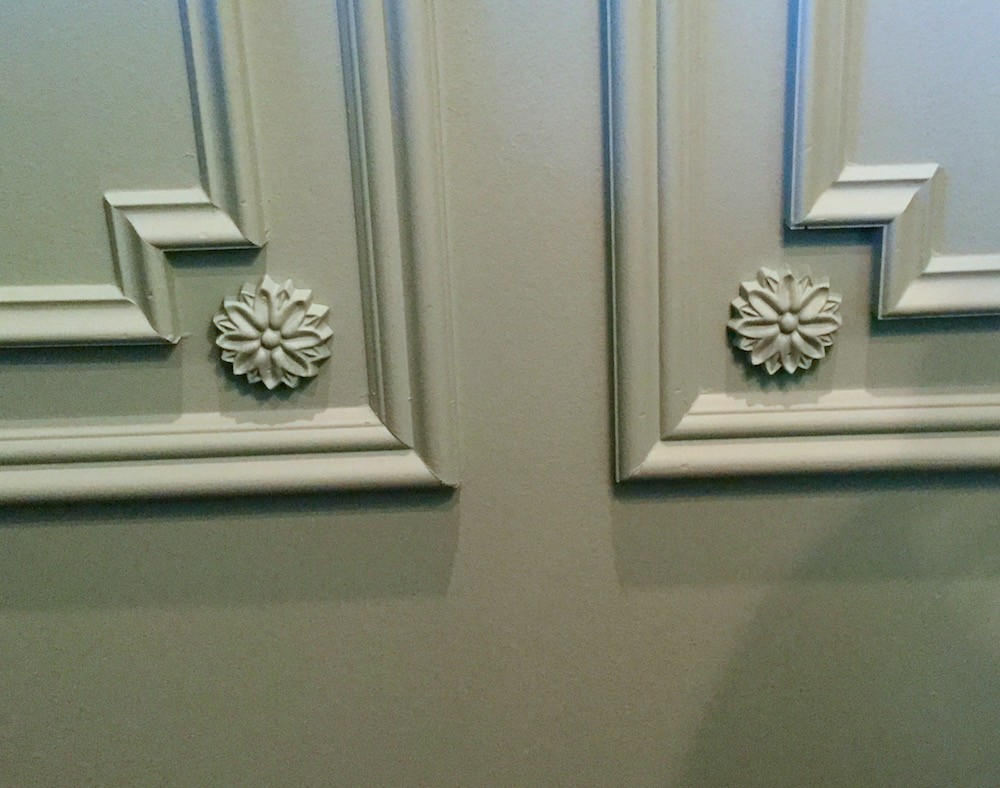
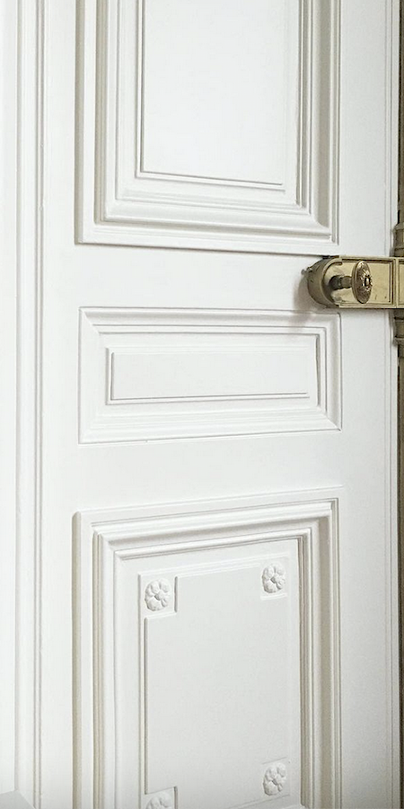
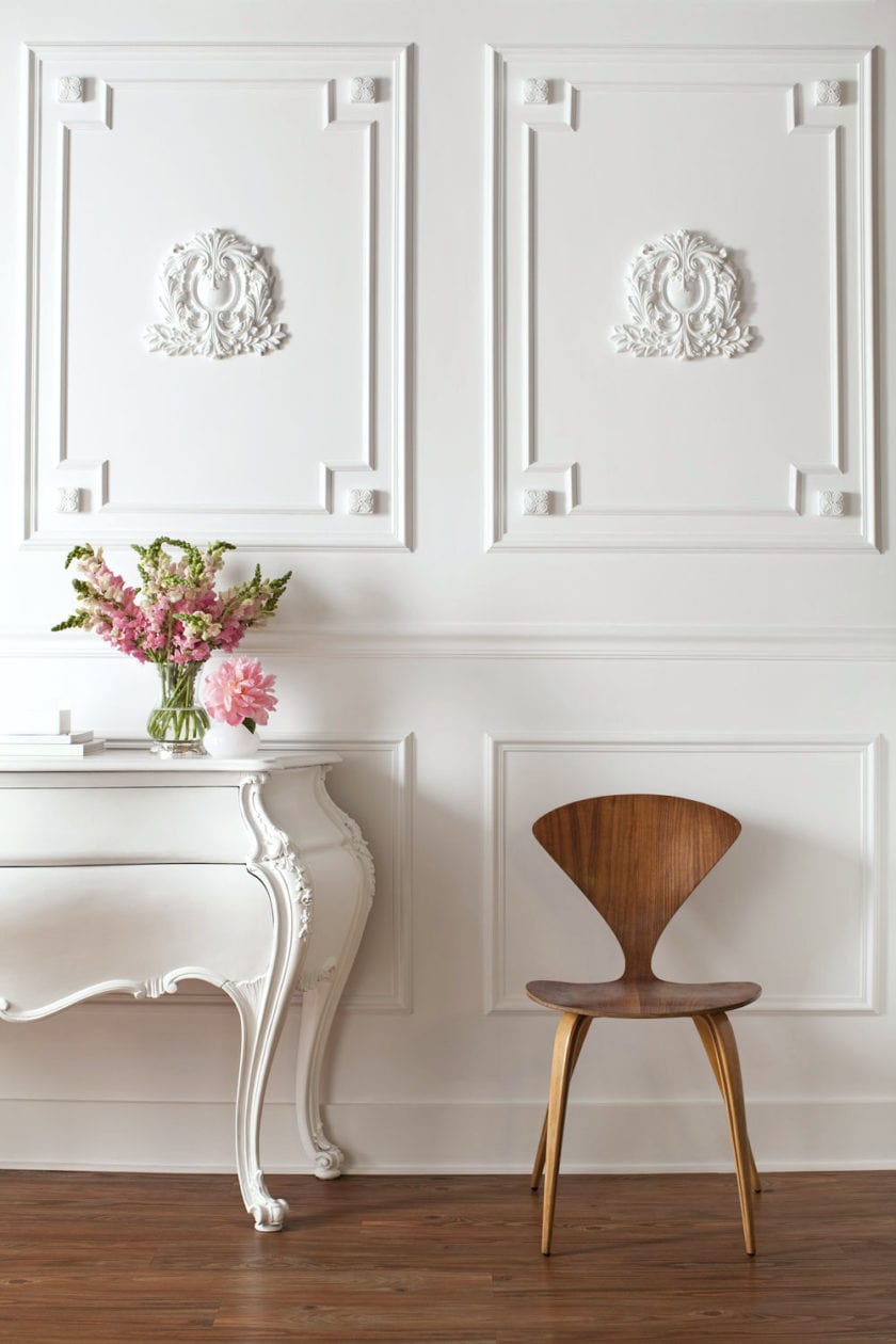
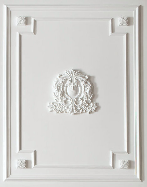
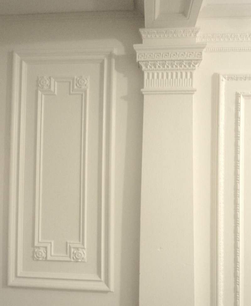
However, there’s this one moulding pattern I have loved for years.
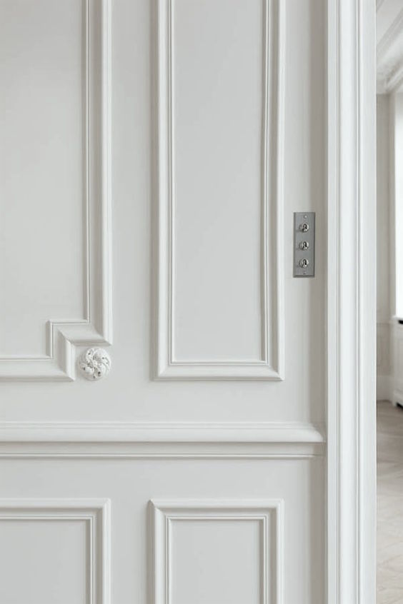
I adore this image and you can see it also on one of my favorite posts about wainscoting.
I’m sure this type of moulding with the cut corner and applique has a name, but I don’t know what it is. If you know, please shout it out. Oh, wait. I know someone who almost definitely knows.
GM, ma chérie?, est-ce que tu lis maintenant?
Please understand that my français is not nearly that good. I cheated.
Anyway, I hope she or someone else will know what this type of moulding is called and what those things in the corners are called?
Maybe they are, Rosettes? Petit Roundel?
However, sometimes the rosettes are square. I love them both. Square would make sense because of the motif on my door and window casings.
 However, I do love the round and, that speaks to the circle motif. I’d love for the transom which you can see here.
Let’s look at some more inspiration images by the Magnifique ABKasha. By the way, please do look at their Instagram and website. They sometimes post their before pics. And, that is when you’ll see their genius at work.
By AB Kasha
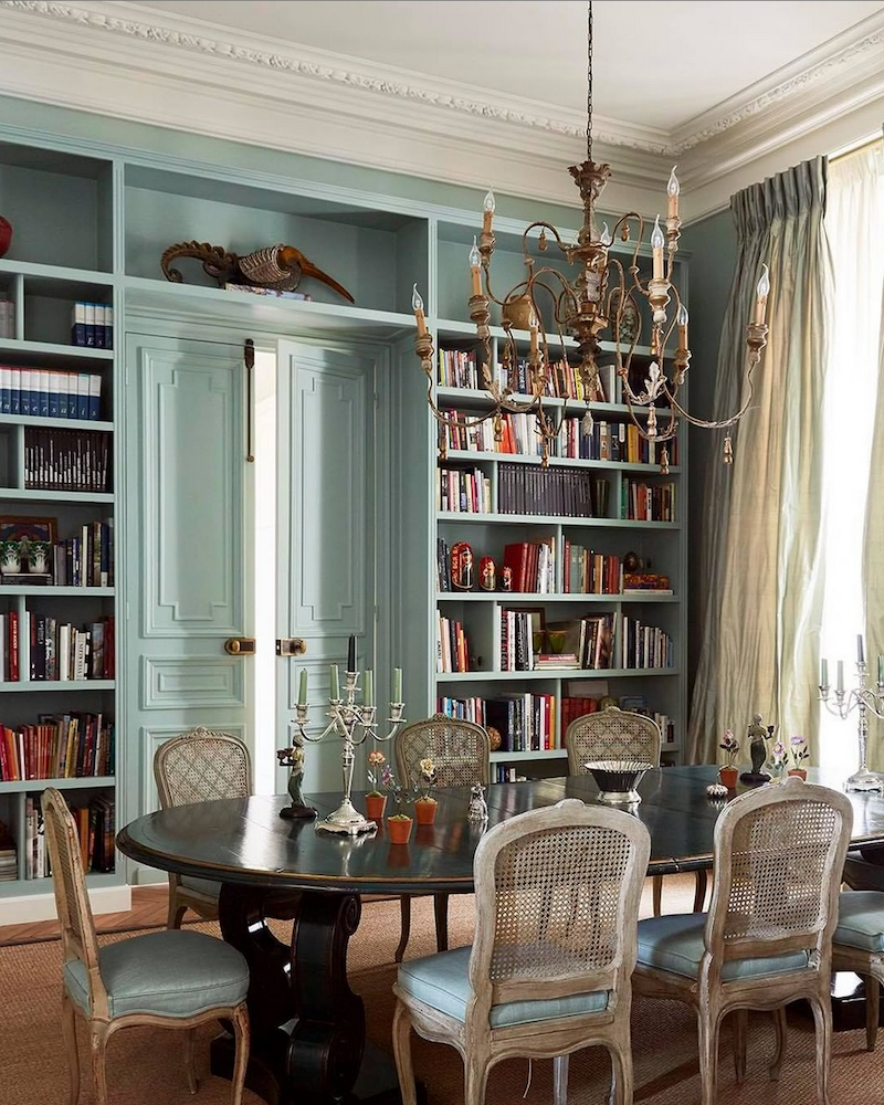
I have posted this image before. In fact, there was a reader a few years ago who copied this pattern in her home.
You can see more of her home here. She even did it on the ceiling in the next room, and it looks amazing!
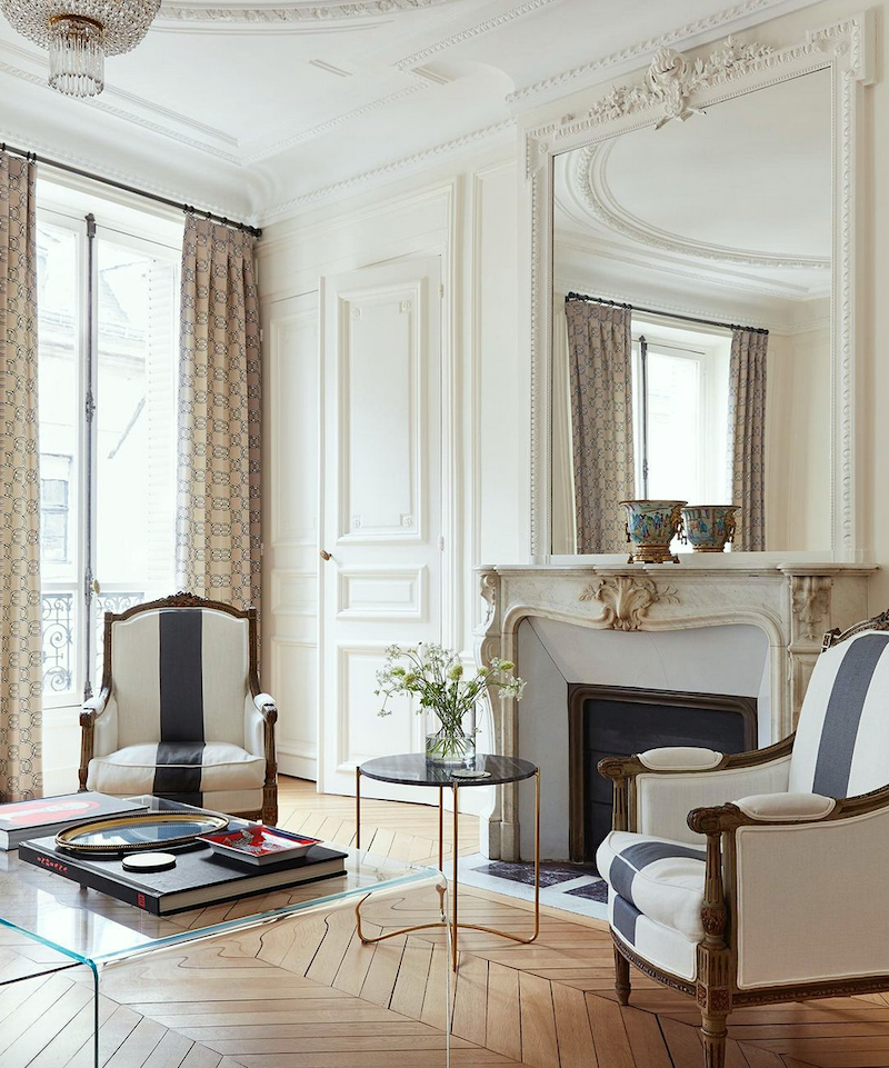
photo @idhalindhag_photographer
abkasha on Instagram Paris flat
Here you can see this moulding on a door.
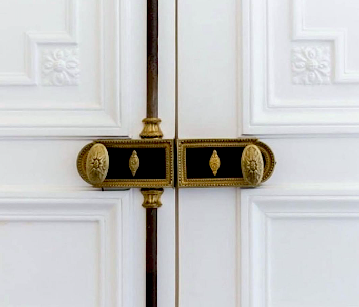
ABKasha on Instagram – And another exquisite beauty with original handles.
One last photo from A+B Kasha
Frederic Flanquart #projetsolferino – beautiful French door
This is another wonderful account on Instagram.
I found this interesting door on 1st Dibs. Don’t those look like tongue depressors? ha
I’ll also need to address the main door, which is too short and perfectly plain with is not acceptable. Above, we see a gorgeous overdoor, it’s called. I found this image on Etsy, but I don’t believe it’s their image.
Another idea I’d like to incorporate on two doors only is inspired by this image below.
beautiful moulding+Josef m design – styling – Jody Moon Styling
The carved applique is called an onlay.
Okay, that’s enough for this topic. Although, we haven’t even looked at the other horrible closets:
 in the den.
Haha.
And, the horrid linen closet outside the lovely guest bathroom.
I have lots of ideas. However, I need to get them down on paper to show the contractor.
Please stay cool!
And, if you’re looking for some cool gift ideas for Father’s Day, please check out this page.
Please also check out the newly updated HOT SALES pages—lots of beautiful new things to see this weekend.
xo,
 PS: I just remembered something. Eight years ago, I stayed at a charming inn on the street I now live on, and a few blocks west of me.
 PS: I just remembered something. Eight years ago, I stayed at a charming inn on the street I now live on, and a few blocks west of me.
That was before I had an I-phone, I believe. Anyway, isn’t it funny? What isn’t funny is that the hotel still exists, but they renovated it in 2015. Here’s what it looks like today. The outside is fine.
The inside? Ummm, typical early 21st century, urban, boutique hotel. I’m sure that it’s quite comfortable, but… leaning too far towards something too heavy, IMO. Granted, it needed renovating. While my room was awesome, the bathroom was full of mold. Ew.
However, I wish it looked more like the exquisite work of A+B Kasha! Please look at them on insta!
Related Posts
 How To Select The Perfect Color Scheme For Your Home
- Door Knobs – The Good And The Not-So-Good + Sources
- Window treatment styles – How to select color, type, pattern
- My 20 All-Time Favorite Benjamin Moore Paint Colors
- Is Your Hardwood Floor Getting Wrecked? An Ages Old Solution
- 12 No-Fail Classic Kitchen Cabinet Colors
- 12 Farrow and Ball Colors For The Perfect English Kitchen