Hi Everyone,
What glorious weather we’ve been having here in Boston the last few days. No air-conditioner is needed. So, I’ve opened the windows but first spent quite a while cleaning the soot-infested sills. No sense having all of that blowing inside!
While I’m no longer able to answer every comment, I read all of them, and several days ago, one caught my attention after the post concerning decorating paralysis.
It’s an interesting topic, I think. Does your home’s architecture have to dictate your design style?
Here is what LVWoods said in her comment:
I am in the midst of a kitchen remodel myself, and I’ve certainly suffered from design/decor paralysis. I believe Pinterest is the primary culprit…so many rabbit holes to go down over there.
To your point of continuity and design style “flow” between rooms and throughout the house, I think we can often become entrenched in what we think we want and dig in our heels, even if it’s not what’s best suited to the house. The problem with this approach is that the house itself should get at least a say in how it all unfolds. Ultimately, the design and decor don’t belong to us; they belong to the house.
Okay, I understand her point; however, do I think that the inside of the house needs to dictate the design style?
Well, some of you might be surprised to read that I don’t think the architecture and the design style need to match.
Here’s why.
Once you’ve walked into the house, it’s just another place with ceilings, walls, and floors. And I can say from experience that it is possible to have a different style on the inside.
Some examples of houses and what we might expect in terms of design style inside.
A beach house with beach-style furnishings and colors– ala Serena & Lily
Mid-century modern home with mid-century furnishings
Or, a center hall colonial with traditional (based on 18th-century designs) furniture.
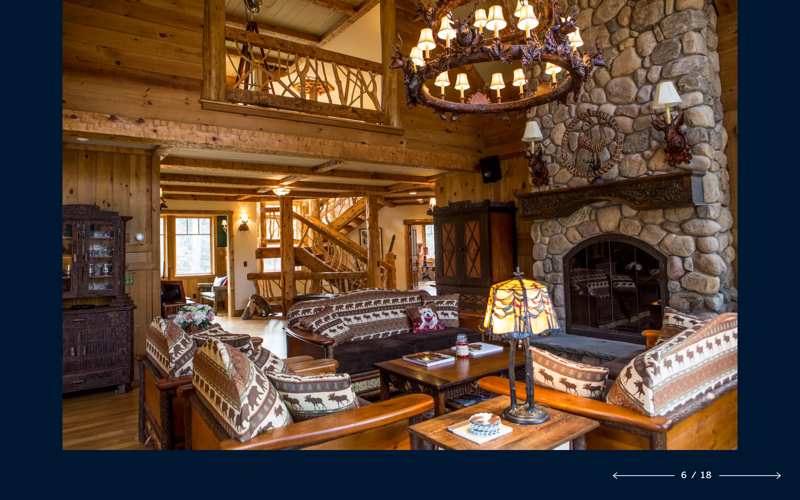
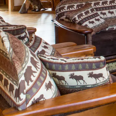
It could be a log cabin home in the Adirondacks with the obligatory deer head trophy, and all of the rest one is “required” to have in a home of that style.
 It doesn’t have to be like this. Please check out this post when I first introduced the fabulous Jean Stoffer. There you can see what she did with a rustic home. Plus, there are a lot of other fantastic rustic homes with a trad bent to them.
In fact, what I think is more important than the architectural style is what is going on OUTSIDE the house. What do you see through the windows?
For instance, if it’s a beach home and you’re right by the ocean, are you going to do a red, green, and gold color scheme? Well, I wouldn’t.
One example I’ve been sharing recently is Philip Mitchell’s exquisitely designed former home in Toronto.
Philip uses the hashtag #pmd914yongestreet on Instagram.
Please follow Philip Mitchell on Insta if you aren’t already.
So, I googled 914 Yonge Street and found the building.

I’ve been to Toronto maybe 15 times. My waslaws live there. And, yes, this is the typical, contemporary downtown apartment condominium building. There are dozens of these buildings.
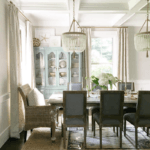
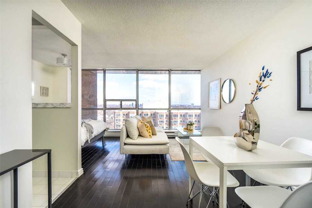
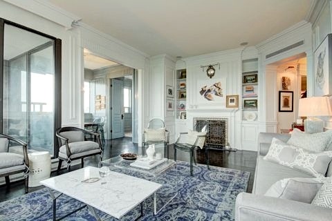
 Above and below are a couple of typical apartments that one can find in this building. Certainly, as far as design style goes, they are what I would expect to see with a modern building like this. Right?
But, do you remember Philip’s apartment?
Of course!
Well, he sold it in 2017.
You may recall that Phillip is the genius behind one of the best and most popular galley kitchens ever. In fact, I bet he got a lot of work, just based on how fabulous this jewel box of a kitchen it is.
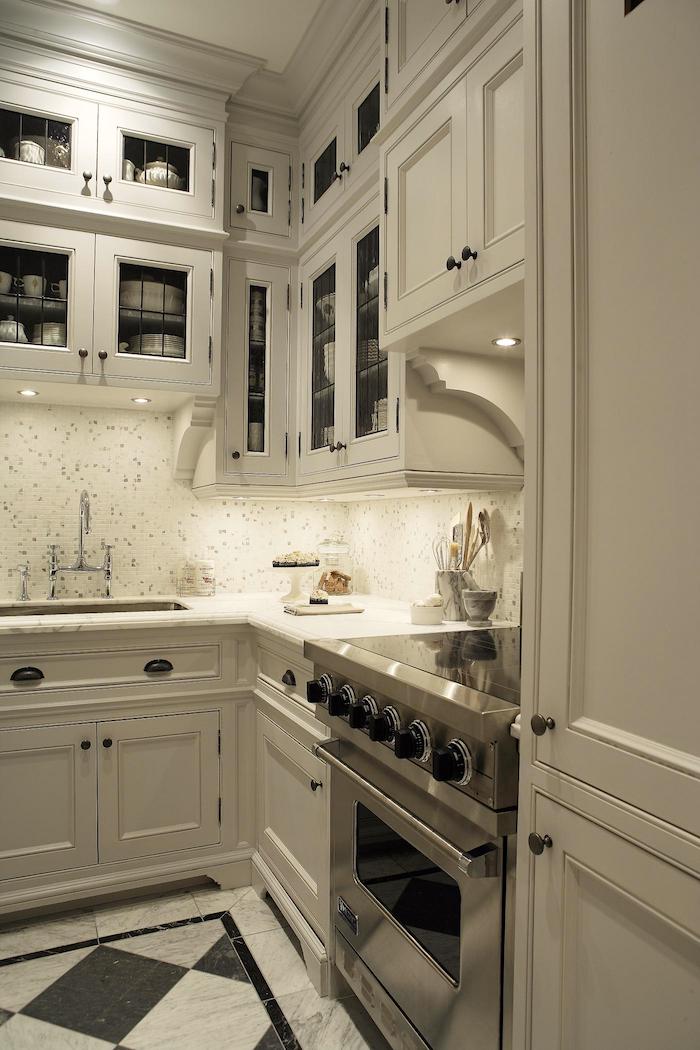
But to be clear. THIS kitchen is in THIS building.
914 Yonge Street in Toronto
This certainly doesn’t look like an apartment I would expect to find in such a modern-style building. But, is it wrong to do an apartment that is the diametric opposite in design style?
I don’t think so. I think it’s fantastic. That’s why I love showing Philip’s wonderful work; it’s like a mini interior design course.
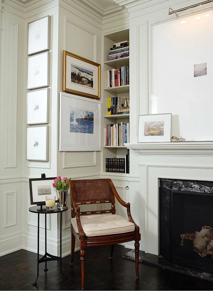
Another view of the living room.
See how deftly he handled the contemporary windows? And, of course, the exquisite use of mouldings is what takes this place to another architectural level. Also, this place is the penthouse, and yes, the ceilings are higher than in the other two apartments above, but I don’t think they are more than nine feet high.
What makes them look like they’re soaring is that incredible crown moulding which is creating the illusion of a few more inches because it extends onto the ceiling. Also, read about wainscoting and what you should never do.
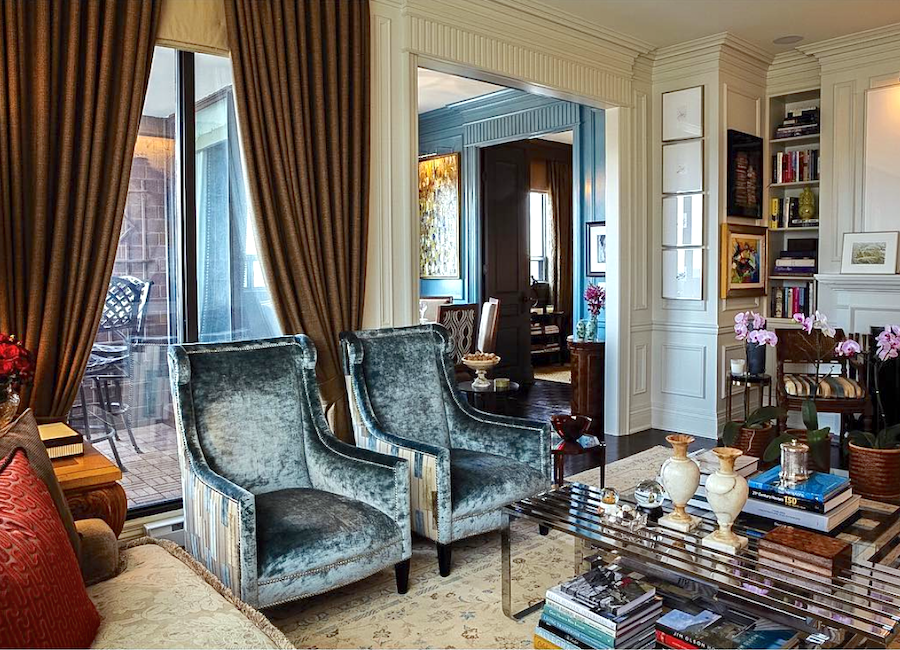
I found this image from a real estate listing. Obviously, they moved all of their furniture out and took down the window treatments. And then they moved in the furniture that was supposed to go into a dentist’s office. No further comment is necessary. Of course, the bones are still there. But…
You can see more of this kitchen and the rest of this stunning apartment furnished beautifully on Philip Mitchell’s portfolio.
Now, I imagine some of you are wondering WHY Philip and his partner bought a place that is so the antithesis of their classic, new-traditional style.
That’s a wonderful question, but you already know the answer.
The answer is the three most important words in real estate.
1.LOCATION
2.LOCATION
3.LOCATION
That’s why.
Isn’t this fun?
Let’s look at another example. And, actually, these were some of my favorite clients waaaay back. I did a sizeable amount of work for them in 1999-2000. And again in 2006-07.
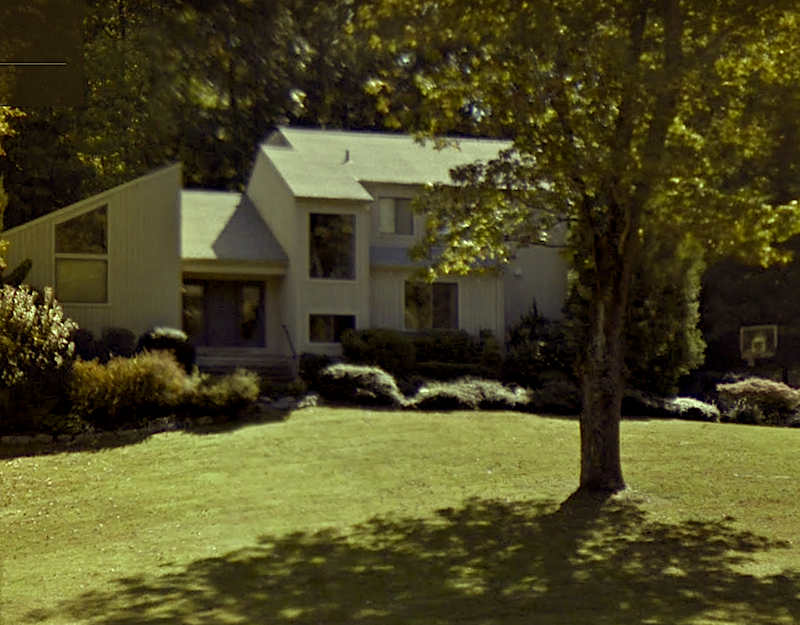
Here’s the house via Google maps.
However, when I started working on the house, it was the color that nearly every house built in the 70s and early 80s was painted…
BROWN
A BIG BROWN PIECE OF CRAP.
Sorry. Not sorry. It was the time of bad architecture and bad hair, too.

Oh, so young and sooooh dumb. lol
If you’d like and haven’t already, you can read the backstory here of how this disaster happened.
However, 80s music was great! Rember the New Wave?
Therefore, please enjoy today’s musical selections. Many of you have requested this. I can’t promise I’ll do it for every post, but I’m happy to share music I love. These are 3 of my favorites by the 80s British pop group, THE SMITHS! They still have a cult following, and for good reasons.
The Boy With The Thorn In His Side

There Is A Light That Never Goes Out

Heaven Knows I’m Miserable Now

I hope you enjoyed the Smiths. Please let me know in the comments.
Okay, let’s continue with our topic of mixing design styles and let’s bring down that 70s-80s contemporary in northern Westchester County, NY.
Mrs. D hated the house. She hated it. (said with an English Cockney accent).
BUT– she LOVED the neighborhood.
Ahh, there’s that word, again. Location. It trumps all, time after time.
Anyway, Mrs. D, in our first appointment, bemoaned that what she really wanted for this, their forever home was a center hall colonial.
I took a look around, and I said something to the effect that it was never going to be that, but we could definitely make it feel much more like the house she really wanted. So I went over some of the very doable changes. Mrs. D was very excited and hired me on the spot. That’s always a good sign it’s going to be a terrific experience.
Okay, I looked and looked for pics of this house.
Even bad pics. I’m sorry, I don’t seem to have them in any of my old files that are stored in the cloud. I have some from other clients from this time period but not of this place. And, it looks like the D’s are still there, so there aren’t even any real estate photos.
However, I can describe briefly what we did to make this home feel more traditional.
As you can see, it began on the outside. But, first, they painted the exterior a beautiful pale gray, which made a world of difference.
Walking inside the large double door, you can see in the image; there lived a beige marble floor. That was juxtaposed next to the typical orangey-yellow oak floor.
At the time, I had a really terrific floor guy.
And we came up with a stain that was actually a thinned down Benjamin Moore paint in a pale off-white with a slight green tone. This counteracted the red in the wood. He finished the stain with three coats of clear acrylic poly.
It was beautiful, and now the oak floor blended in very nicely with the marble floor.
In addition, there were no mouldings anywhere. So, we got a simple 4″ wide casing. Finally, in the family room, we did a built-in bookcase instead of the makeshift furniture.

On a shopping trip in Manhattan, I came across a rug very much like this one, above from Exquisite Rugs.
The D’s loved it, so I built their family room and dining room around this color scheme.
However, we stuck primarily to golds, tan, and white. And, we did white linen Roman shades with a Greek Key border.
Yes, back in 2000!
Six years later, they expanded and remodeled their kitchen. It was very much like a DeVOL kitchen with Shaker cabinets. It was perfect for the house. I wasn’t involved with that except for some window treatments and cushions.
So, you see, even though the house was definitely of the modern style, the inside had traditional elements that looked like they had always been there.
Oh, I could keep going with my ideas about juxtaposing decorating styles. However, much of this idea has already been expanded upon in the following posts.
I encourage you to have a look at them if this idea of mixing design styles interests you.
Can a Modern-Style Home Mix with Traditional Mouldings?
The Trick to Mixing Modern and Traditional Furniture
Ranch House Decor Mistakes You Might Be Making
Can a Raised Ranch Become a Traditional Home?
Boxy, Boring Ranch Home. Is There Any Hope?
Contemporary Interiors. Are They Trendy or Timeless?
Well, Laurel, how does one know how to do this so that it looks pulled together?
That’s a great question. But, actually, most of us do it naturally without giving it a lot of thought.
However, if you look at the images I posted, they pretty much follow the 80/20 rule. The 80/20 rule seems to apply to just about everything.
In the case of a design style, it means 80% of one style and 20% of another. Or, it could be 90/10.
What it shouldn’t be is 50/50.
That is when it’s probably going to feel like a mishmash. Then, of course, someone will point out a situation that IS 50/50 and looks spectacular. However, most of the time, I believe that keeping one style as the predominant one is the way to go.
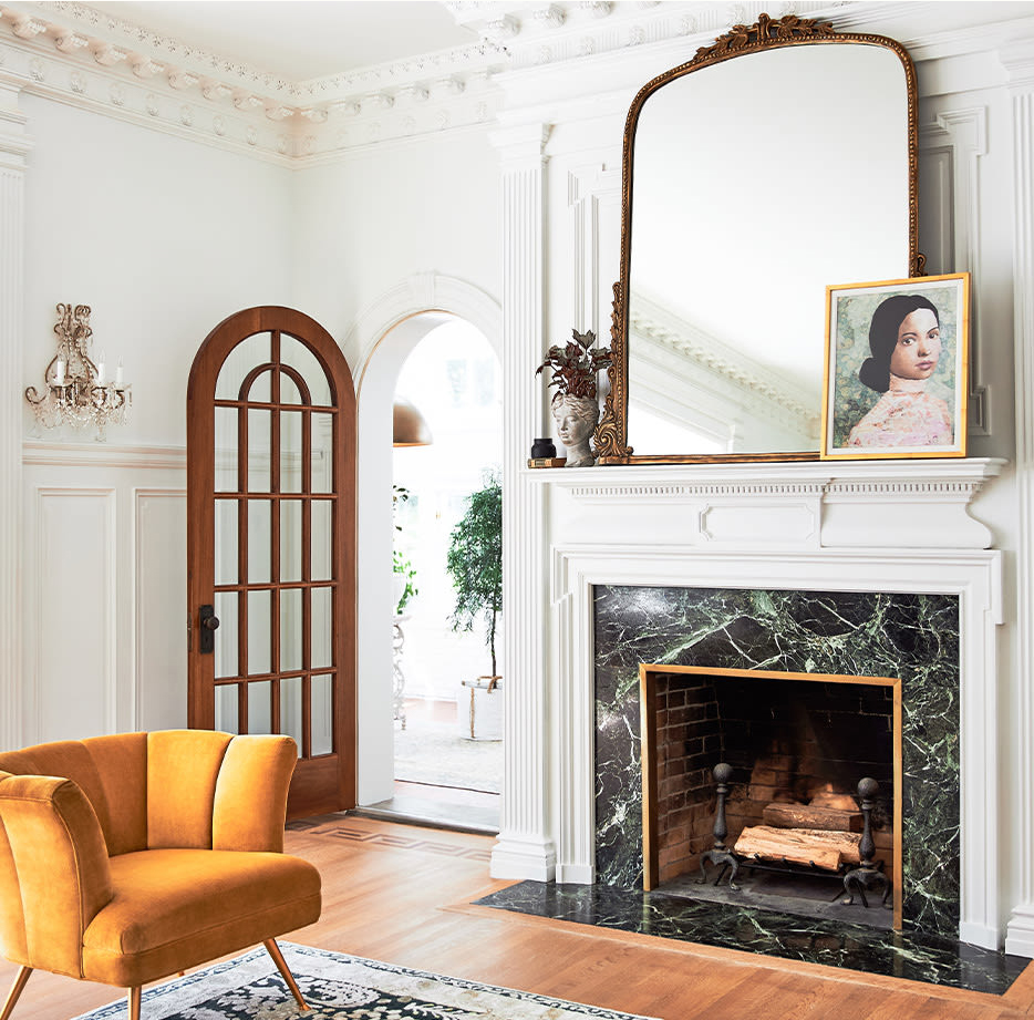
Above is a terrific example from this image via Anthropologie. It’s a great example of the 80/20 rule where we have a room with exquisite, probably 19th-century architecture. That is juxtaposed with a mid-century chair, contemporary rug, and artwork. The rest is trad.
By the way, I saw that some of you hate mid-century modern furniture. I was not talking about the type you see above. I was talking about designers like Billy Baldwin, who designed sleek, classic modern furniture.
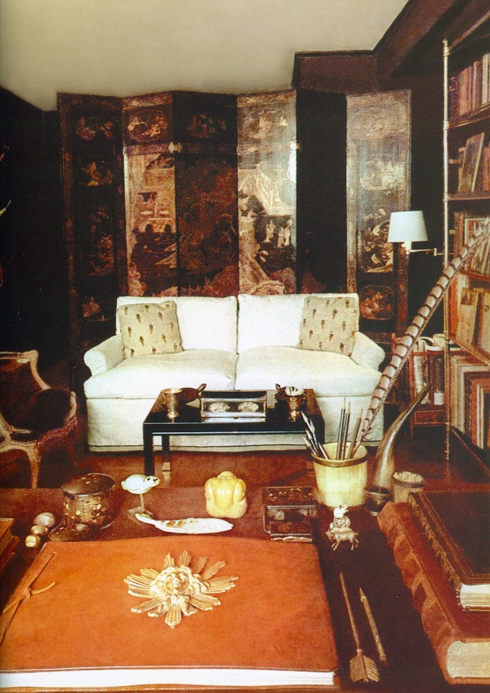
Classic modern interior design by Billy Baldwin
Well, does this mean that it’s wrong to stick to one style only for the inside and outside?
I can’t say that I think it’s wrong to do that. But, I feel pretty strongly that it’s more interesting to include some of a different style. However, I wouldn’t just stick any old thing in a different style to make it more interesting. Those different pieces need to speak to you and feel connected to the space.
One master of this is William McLure.
Okay, that’s a wrap for this one. I hope you enjoyed this post about the juxtaposition of your design style for visual interest.
xo,

***PS: The HUGE MEMORIAL DAY WEEKEND HOT SALES ARE HERE! Please be sure to click on that link to check out some of the biggest savings of the year at my favorite home furnishings brands!***
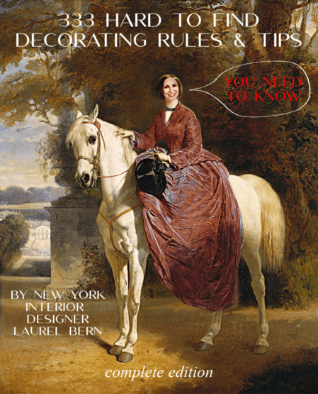
This resource is exceedingly helpful for space planning, proportions, window treatments, what sizes to get of all home furnishings, living rooms, bedrooms, art placement, lighitng and much more! You can read about 333 Decorating Rules & Tips here.
Related Posts
 How To Mix Dining Room Chairs Like A Pro
- 80+ Timeless & Classic Home Furnishings You Will Love!
- To Brass or Not To Brass In the New Un-Bathroom
- Two Doctors Try To Save Man’s Eye After Dining Room Lighting Accident
- Paint Palettes Preview and A Cool Trick I Discovered
- My Husband is Insisting on An Ugly Sectional Sofa
- No Foyer Entry-We Enter Straight Into The Living Room