Over the years, I’ve focused on one paint brand more than any other, by far, and that is Benjamin Moore.
I think it’s an excellent product, and I have also specified it more than any other paint brand. And, for a good reason. It’s the largest brand in the US and highly accessible for most of us. Plus, I think it’s an excellent brand of paint. They’re a little antiquated in terms of their marketing, but that’s okay.
Another company I love is Pratt and Lambert.
I’m not sure what happened to P & L because it seems that they have fallen off the radar. At least that’s my perception. Although, I still think they have a spectacular line of paint. I did look them up, and they are alive and kicking. However, compared to Benjamin Moore and Sherwin Williams, and others, they are a lesser-known brand is my impression.
When I lived in northern Westchester between 1991-2012, I was within an easy drive to two locations that sold P & L. In 1996, when I first began my business and painted our townhouse, we went with Pratt & Lambert. I was happy with the paint, but that was back in the days of stinky non-low VOC paints, as well as oil-based paints for semi and high gloss trim colors.
However, over the years, I have been intrigued by the English Company Farrow & Ball.
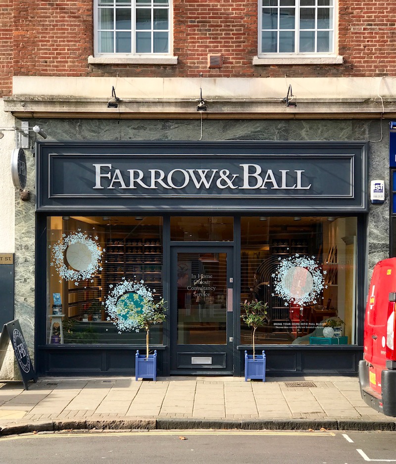
Above is my photo of the Farrow and Ball store in Cambridge, UK, taken while I was on that incredible tour of English classical architecture in the fall of 2017.
The only problem back in the 20th century is that Farrow & Ball paint was not accessible except through a showroom in the D & D building. And, it was double the price of Benjamin Moore and Pratt & Lambert.
Still, I specified their beautiful wallpapers at least half a dozen times, between 2005-2014.
My favorite pattern is the gorgeous Ringwold wallpaper. Their wallpapers use the same colors that are in their paint line.
 farrow-and-ball-ringwold-wallpaper-Schwarz-house beautiful
You can purchase the Ringwold and other Farrow & Ball wallpapers here.
However, this post is about 16 magical Farrow and Ball PAINT colors.
Although, quite frankly, there are a lot more than 16. In fact, out of the 156 or so colors, there are probably only about 16 I don’t like. Maybe this should’ve been the 16 suckiest Farrow & Ball Paint Colors.
Oh, please tell us which of the Farrow & Ball paint colors suck, Laurel?
Umm, haha, sorry, guys, but that’s a slippery slope. And, I’ve had enough tsuris for one month, thank you very much! Truth be told, even with the colors I don’t like, in the hands of a gifted designer, they will easily prove me wrong.
So, why am I talking about Farrow and Ball at this time?
There’s a very good reason.
Well, the paint has been sold in retail stores for about the last decade-plus/minus.
However, I recently found out that you can buy the paint ONLINE!
And, not just the paint, but samples, both card samples, and sample pots. Plus, all of their beautiful wallcoverings. Plus, everything else you need, down to the wallpaper paste, primer, and paintbrushes.
Okay, here’s the 364,000 dollar question. (Adjusted for inflation, lol)
What about the price of the paint? Isn’t it like double the price of Benjamin Moore and maybe even more than double the others’ price?
Yes, no doubt that Farrow & Ball paints are more expensive. However, there are a few other things to consider.
One is coverage. I read an article wherein this woman’s experience, Farrow & Ball, covers better than other less expensive paints. That means you’ll need less of it.
Okay, my bad. I can’t find the article now. However, I will say a few things based on my experience and what I’ve read and also heard from many of you.
The opinions vary from “It doesn’t make one iota of difference” to “Are you kidding me? The difference is HUGE.”
The only time I have used Farrow and Ball paint for a client was for this job. And yes, the paint was gorgeous. I believe the color was light blue. The clients used it in their small family room/breakfast room and also on their kitchen island. The family room was dark, so the color came across as a medium blue-green-gray. However, it looked like a light blue-green-gray on the kitchen island. Interesting.
So, I’m not the one to say whether it’s worth it or not.
However, I’m sure that amongst some of you, there will be plenty of opinions. :]
The only thing I can say for sure is this: It would certainly be worth it if you painted it with another brand and the color didn’t turn out the way you thought it would and then either had to live with it or repaint it. There would be no economy there.
Therefore, if you can swing the extra money, I have always maintained that it is better to get the paint brand that makes the color.
Yes, I know. Some of you will disagree with that. However, color-matching IS a crapshoot. I know this from my painful experience at the beginning of my career.
One other interesting point that I have heard is that Farrow & Ball doesn’t use black in their paints. However, that is not true. I know this because, on their website, they list each color, and there’s a short video about each of them with a brief description. And, many of the colors, they say, do have some black pigment added to the mix.
Okay, it’s time to get into the 16 winners. At least these are amongst my favorites. Also, in some cases, I’m going to add some other colors in the same family. Therefore, it’s really a few more than 16, but I’m trying to reign myself in, is all.
Oh, if you’d like to follow along, here is a link to the Benjamin Moore conversion chart. Please note that for some Farrow & Ball colors, there isn’t an exact match. In addition, just to make us all a little confused than we already are, I have found some inconsistencies with their color cards.
Please note that these are all taken from the main collection of 132 colors of Farrow & Ball Paint Colors.
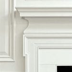
WIMBORNE WHITE is a creamy off-white that is quite versatile, soft, and classic.
Above is from the incredible Heckfield Place Hotel.
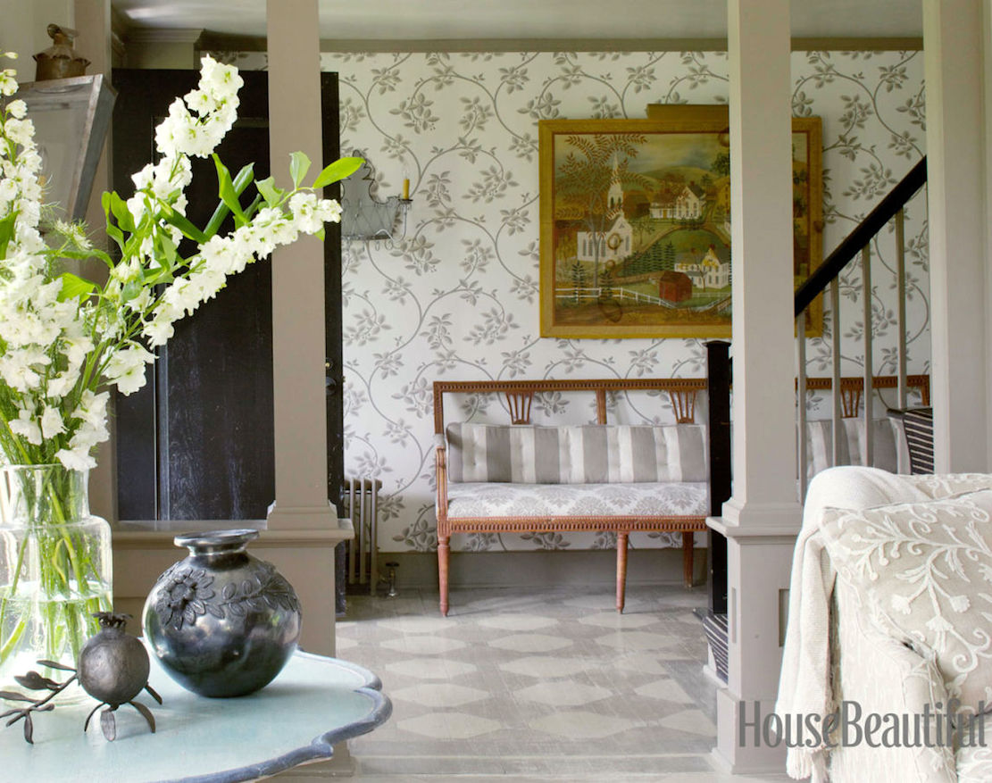
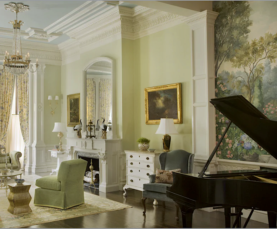
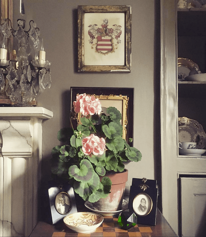
This is a lovely, ethereal neutral which can look ever so slightly lavender depending on the light. The other colors that go with it are, Wevet, Ammonite, and Purbeck Stone.
Borrowed Light is a pale, delicate blue. It works well in low-light rooms. Or, in a sunny room as well. This is also a terrific color to paint your ceiling.
BLUE GRAY – Also, try Light Blue, which is a bit of a misnomer as it has a lot of green in it.
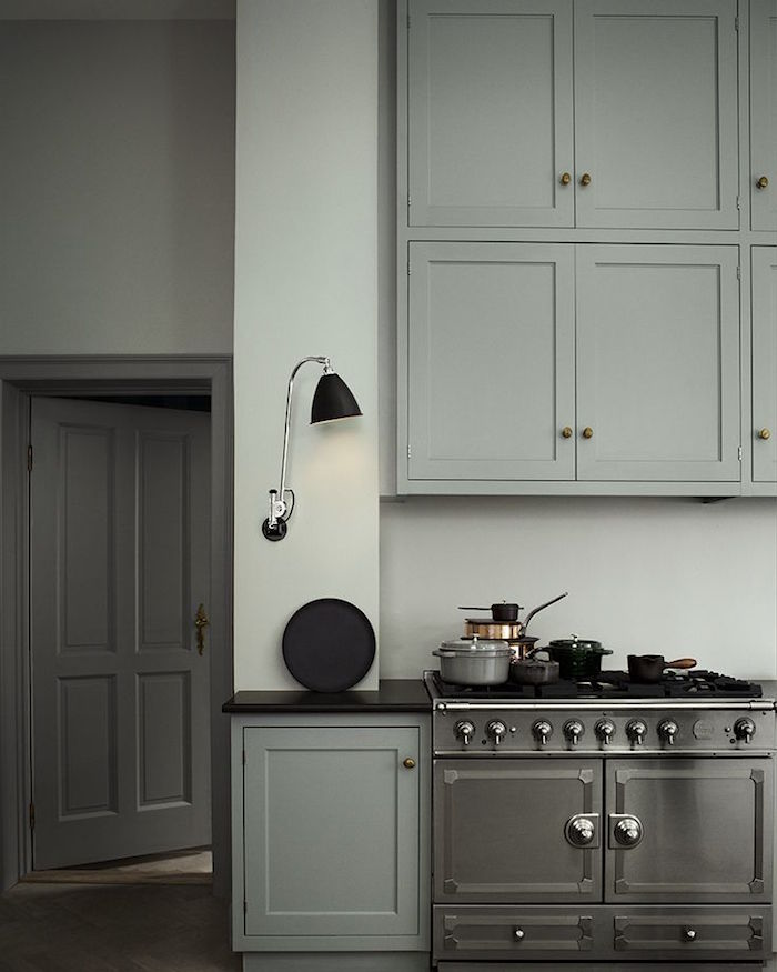
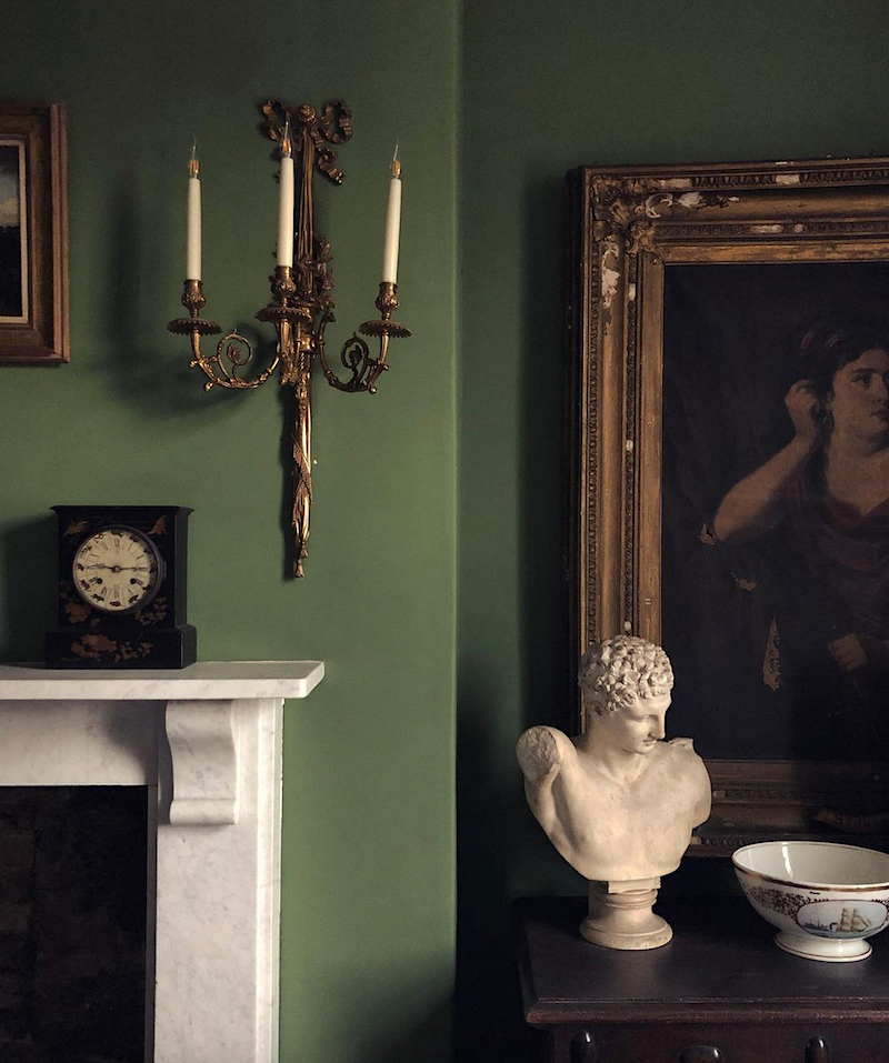
FRENCH GRAY is a soothing green-gray. Sometimes, it can look more green than it does above. Farrow & Ball says that it’s a popular color for a front door. I think it would be amazing with red brick.
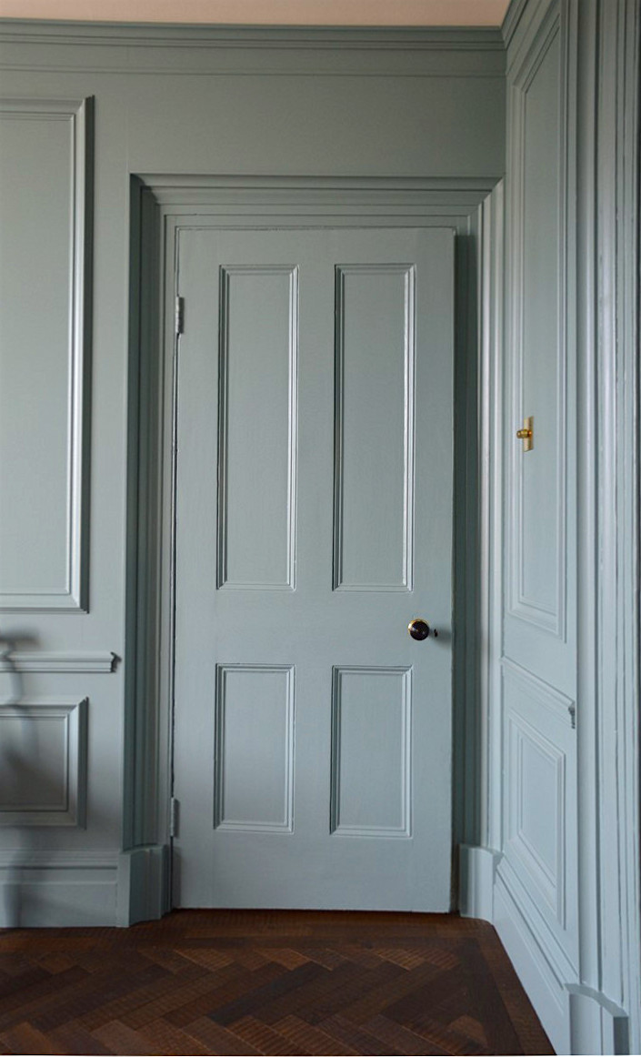
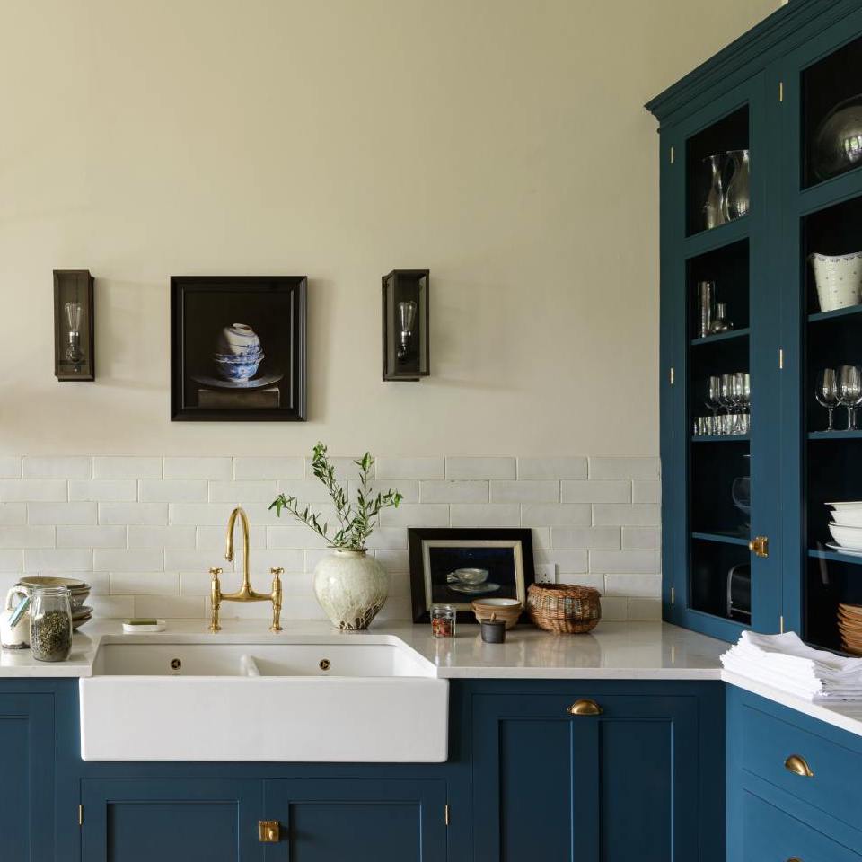
LAMP ROOM GRAY is a smokey blue-gray that is sensational for cabinetry. It can look brighter in well-lit rooms.
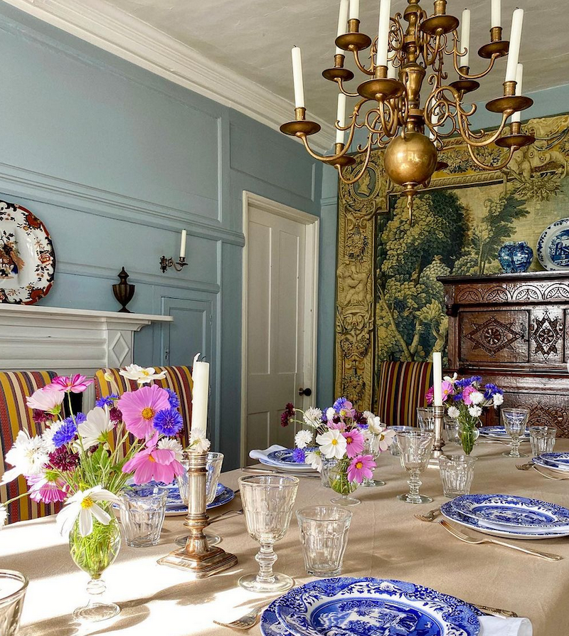
This fantastic dining room is from the incredible Instagram account of British interior designer Carlos Garcia. Parma Gray is a vibrant blue-gray that looks fantastic in older homes.
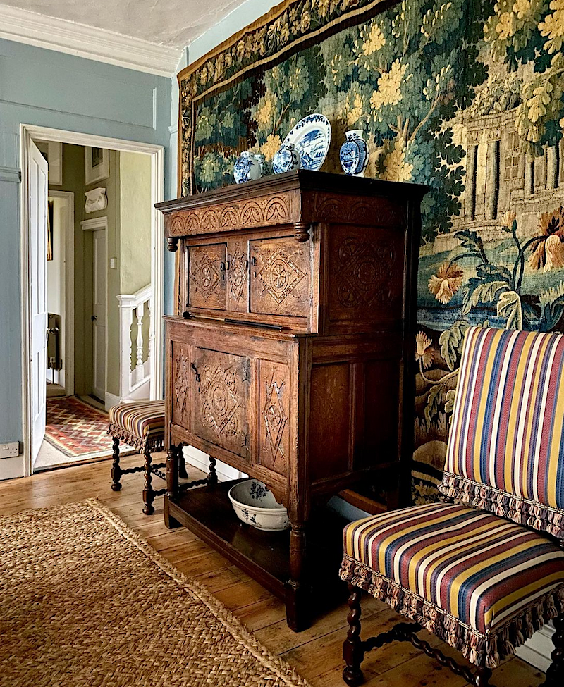
Just have to post another pic of that exquisite tapestry in Carlos’ dining room. Please follow him on Instagram!
There are a couple more photos of his stunning home coming up. My sister had a request for “cozy rooms.” I think that Carlos’ style is the epitome of English coziness. But, it’s a style that I think most Americans would appreciate as well.
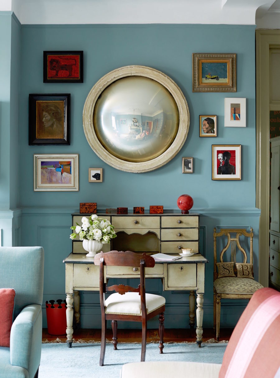
Yes, this is the incredible living room of Sheila Bridges, who we were just talking about. She’s been one of my favorite interior designers for the last 25 years.
Sheila designed the fantastic Harlem Toile.
ST GILES BLUE is the color that Ben Pentreath painted his glorious dining room. It’s breathtakingly beautiful. I was there. Trust me on that one! However, what makes this room, in addition to the Farrow & Ball paint color are the furnishings, especially those black and white prints. That’s what makes a strong color like this work so well.
HAGUE BLUE is a rich, saturated navy with a touch of green which I adore. I don’t care what you say; this shade of blue has no equal. ;] Okay, if you’ve found one, please let us know. Not that there aren’t other great dark blues, but this one is exceedingly special. It also makes a great front door color.
![]()
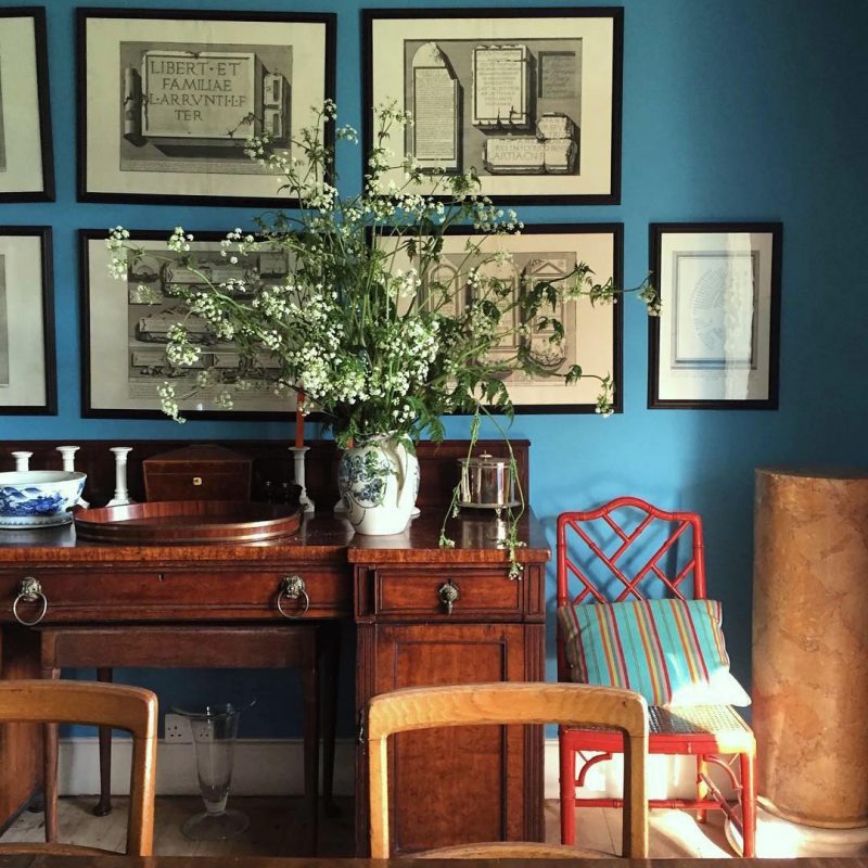
Last January, I took this photo shortly after I moved to Boston while strolling around Beacon Hill. Pretty sick, isn’t it.
This is a cheery yellow-green, but will look deeper in darker rooms. Ahh, you guys know how much I love yellow-greens and chartreuse. This is another image from the fantastic British designer Carlos Garcia.
GREEN GROUND is an extra color. It’s just a shade brighter than cooking apple green and a true soft chartreuse. The photo above is courtesy of The College Club of Boston, a bed and breakfast inn, just a 3-minute walk from me here in Back Bay Boston.
BREAKFAST ROOM GREEN – This is another photo from Carlos Garcia’s Instagram. Love them greens. I’m not 100% sure that this is Breakfast room green. But, it’s one of Farrow & Ball’s most popular colors, and this certainly does look it.
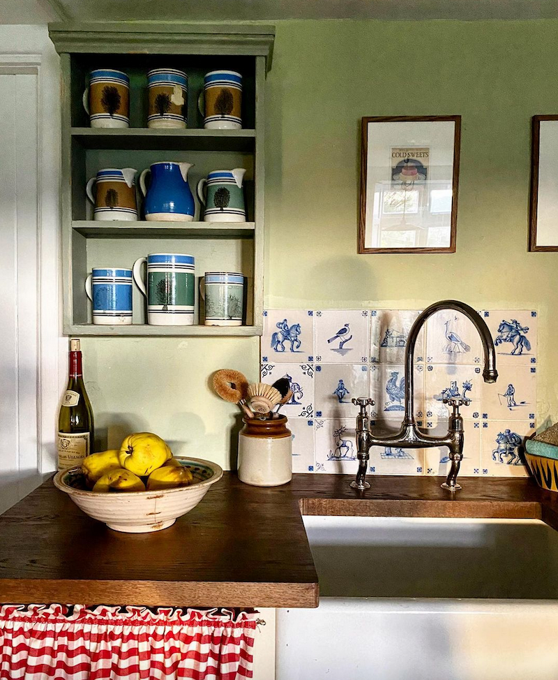
CALKE GREEN is the quintessential English Library green. A classic, if there ever was one.
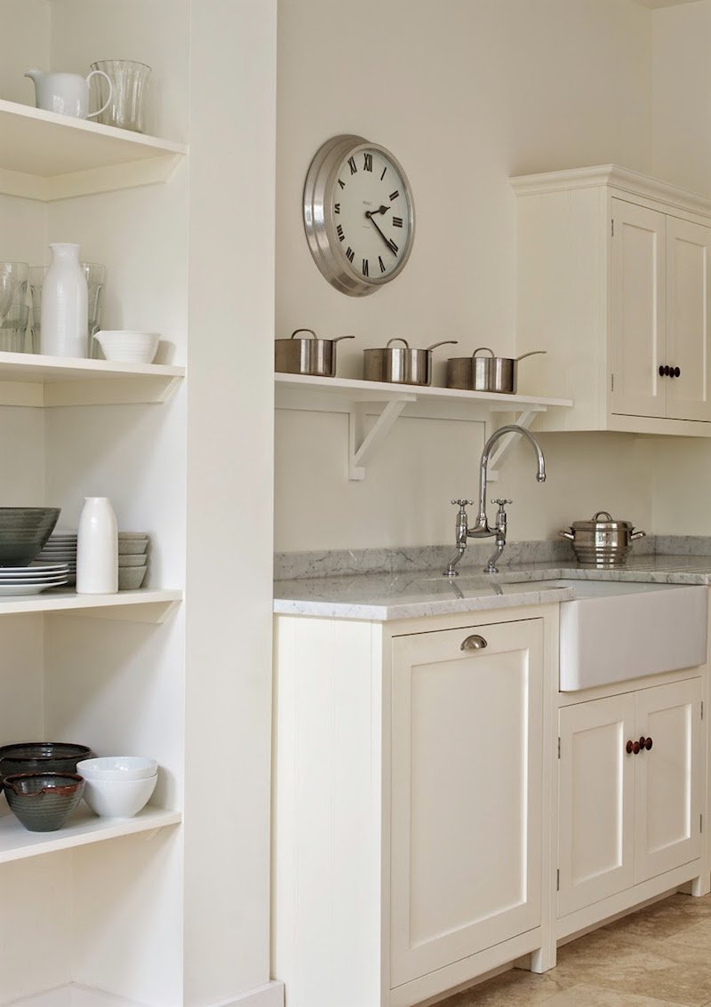
And, please come see Calke Green in this kitchen and pantry renovation.
MOUSE’S BACK – is a rich, deep neutral, with a green, toasty undertone and makes a wonderful backdrop for art.
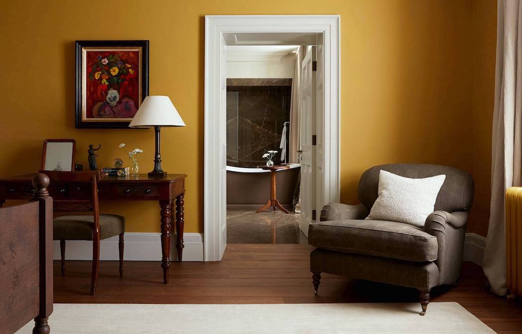
INDIA YELLOW looks like the gorge gold at Heckfield Place. It’s similar to the archived Orangery. For more of the wonderful Heckfield Place Hotel, please check out this post.
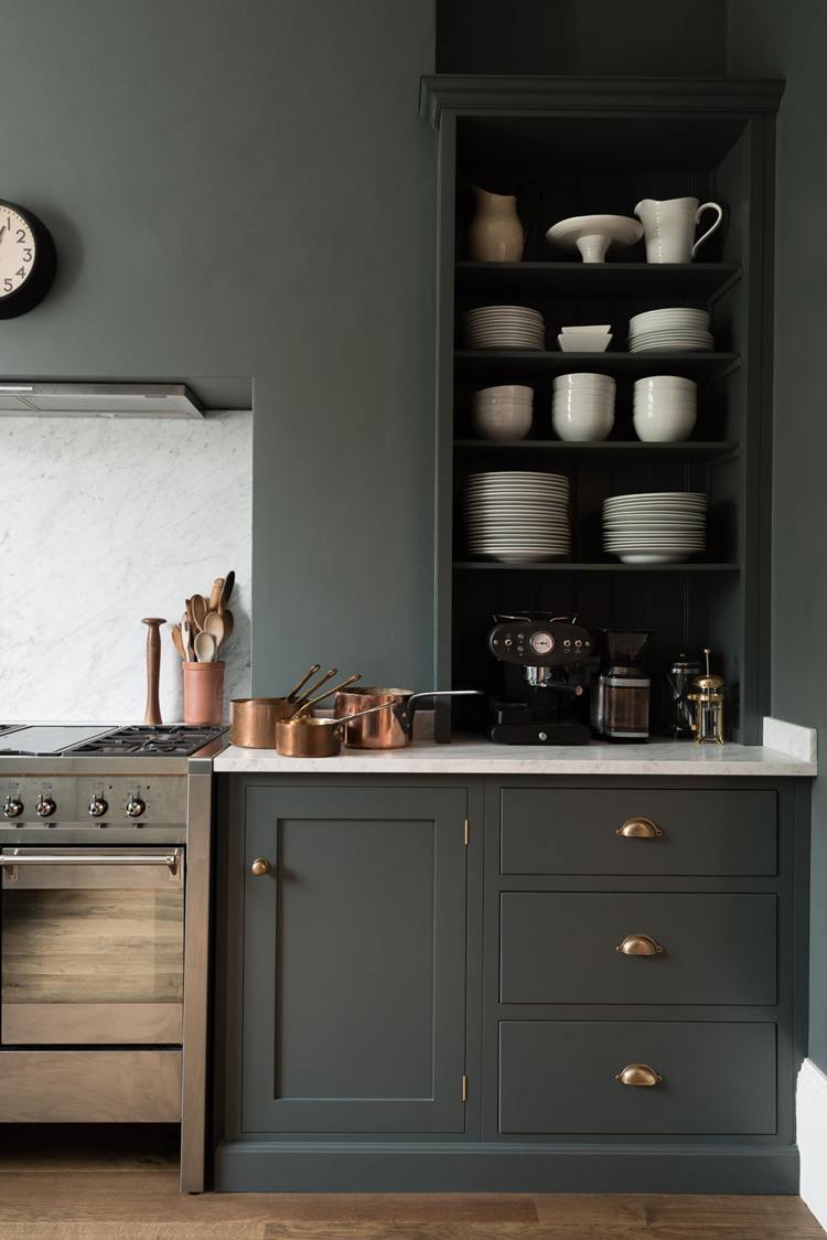
DOWN PIPE is probably my favorite F&B color. In fact, it has become quite the cult classic with many fans! This is another one that makes for a great front door color. For more great exterior doors, please go here.
RAILINGS is my favorite Farrow & Ball shade of black. It’s actually the darkest navy. This is another one that, in gloss, makes for a stunning front door color.
Whew! I did it!
You might also enjoy reading about 12 of my favorite Farrow & Ball Kitchen cabinet colors for the perfect English kitchen.
For quick linking to all of the colors in this post, I made a widget of all of the colors. Clicking on any image will take you directly to the Farrow & Ball site, where you can learn more about the colors and purchase samples and paint!

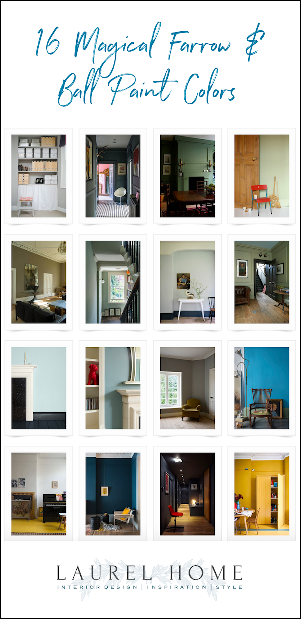
And below is an image you can pin to Pinterest for reference.
Did you see some of your favorite Farrow & Ball paint colors? Did I leave out your favorite? Please let us know.
xo,

Please check out the newly updated HOT SALES!
In Loving Memory of my incredible Step-Dad, Mark Raffel, who would’ve been 100 years old March 30, 2021. Some of you may recall that 25 years ago, he helped me immensely when I started my business, Laurel Bern Interiors. I’ll always be grateful!
Related Posts
 The Death Of The Boring Beige Living Room
- Six Problem Ceilings – And How To Fix Them
- The Most Amazing English Country House Of Them All
- The Guaranteed Way To A Beautiful Room (It’s Not The Wall Color)
- Creating A Chic, Cosy Home Library-Best Colors, Lighting and Furniture
- 12 Gorgeous Bedrooms + Common Questions Answered
- 80+ Timeless & Classic Home Furnishings You Will Love!