

Guys,
Oh my, before we get into the universal color, I don’t know what to say about Sunday’s post, except it was the heights of good and the depths of bad.
Most of you are incredibly kind and supportive, and I appreciate that more than I can say. However, it was a struggle to get out of bed this morning. That’s how bad the onslaught was to tear me down.
Good God for those of you ill-mannered guests. Do you go to a friend’s house for dinner after they’ve spent hours cleaning and cooking and then proceed to rip them apart? No, you don’t. You don’t, or you won’t be invited back.
Well, it’s the same here. If you don’t like my cooking, you’re free to leave.
’nuff said.
You know, some of you have suggested that I pour myself a glass of wine. But, I really don’t drink.
I mean, rarely and then only a few sips. Literally. It just doesn’t agree with me. In fact, it seems that every gentleman on match dot con loves to go sailing with a bottle of wine. Since I also get seasick just walking down the sidewalk, that’s not my idea of a good time.
So, what do I do when I want to escape?
Well, sometimes I’ll have a glass of banana cream pie. (BCP) Remember this legendary BCP? I will never forgive myself for not getting a doggie bag!
Otherwise, since I’m a computer addict, I get online and look at beautiful things like art and ballet.
Since it was a blog day, I ostensibly exercised some discipline in the name of “blog research.”
Ha!
It’s always the same for me.
Oil paintings. Somewhere around the 18th century, give or take 100 years.
I love the deep rich colors, featuring greens, gold, teal, blue, and sometimes a little red, rust, or orange.
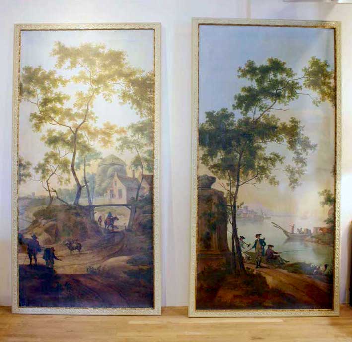
I’ve been OBSESSED for months with these gorgeous and HUGE paintings attributed to the “Circle of Jan Van Os.” I believe that means they probably weren’t painted by him, but maybe someone who studied with him? Anyway, they are still for sale at Gerald Bland’s shop in NYC. It says on his website to inquire about the price.
And you know what that means.
It means, “If you have to ask, then you can’t afford it.”
Right?
They’re probably like $50,000.00 or something like that. Wouldn’t they be amazing in my living room?
Maybe a housewarming gift?
LOLOLOLOL!!!
Anyway, I’m too chickenshitscared to inquire. If anyone wants to and get back to me, I would be grateful. Oh gawd… imagine if like 50 of you call tomorrow. haha.
Another option to “get the look” is yes…
No, I don’t have the strength.
Let’s just say I could commission an artist to paint a copy of an art masterpiece.
For instance, maybe a section of the two following images by Jan Both.
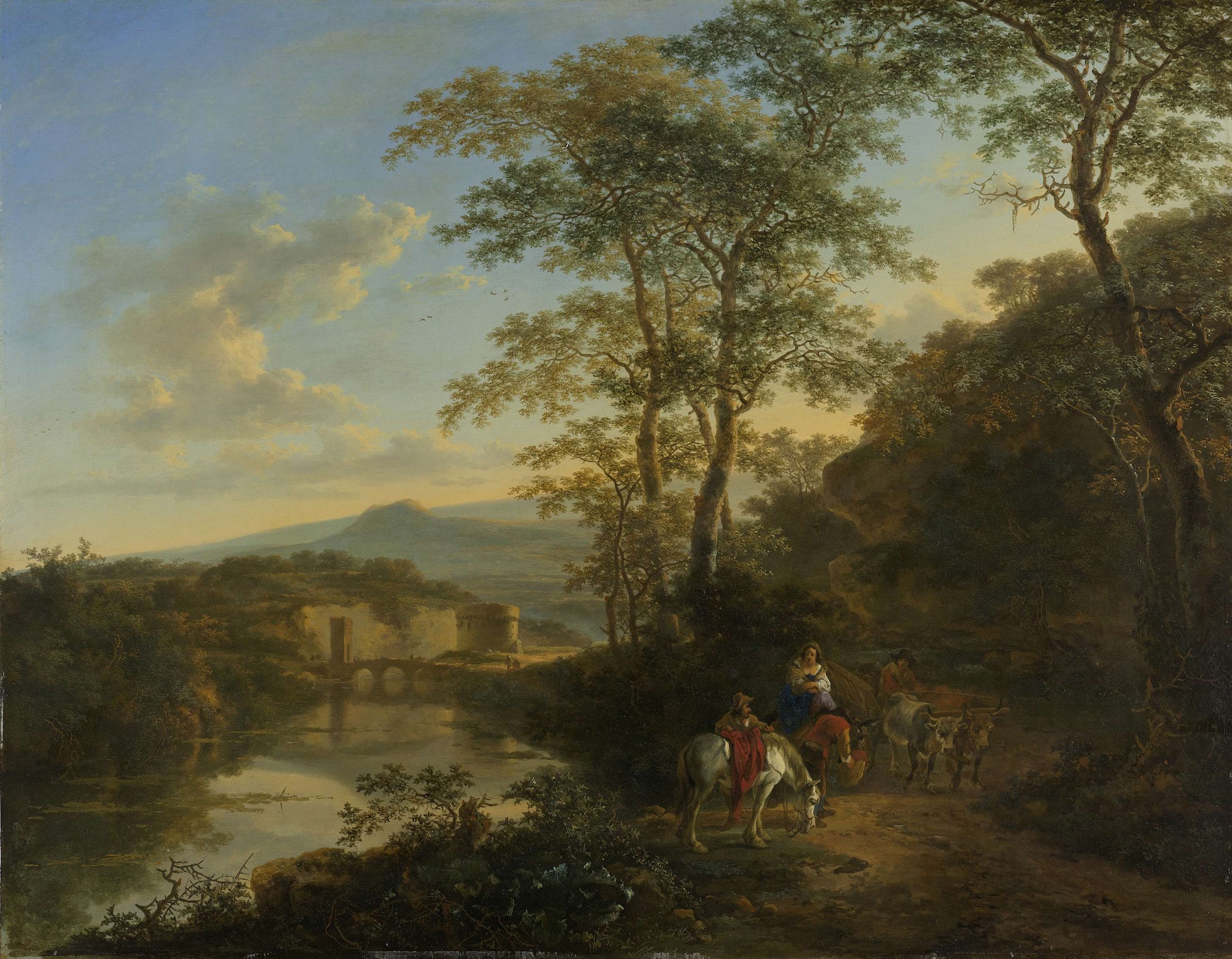 Italian-Landscape-with-the-Ponte-Molle.-1640-1652-Jan-Both-oil-painting
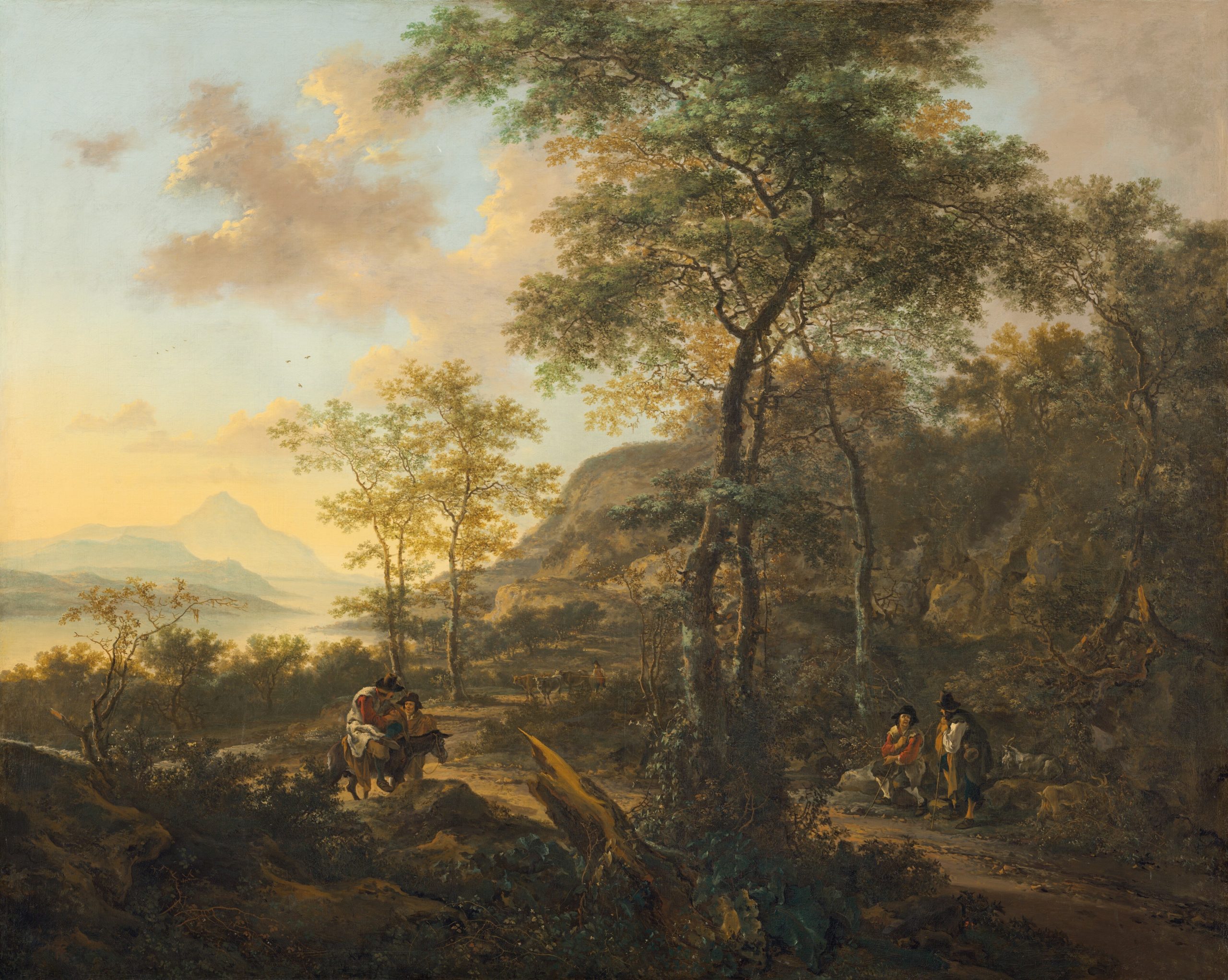 an_italianate_evening_landscape by Jan Both
It’s about my favorite color.
It’s chartreuse—everything from gold to any amount of yellow mixed with green.
Something I realized years ago is that chartreuse is truly a universal color.
If you don’t already have my paint and palette guide, you’ll learn about universal colors. And, you won’t ever have to guess what goes with what.
In fact, if you have a room that’s dull and lifeless and you don’t know how to wake it up, add a shot of chartreuse.
By the way, I was going to redo a couple of old posts. However, the first post about chartreuse was back in April 2012. No worries, I went back a while back and fixed it. It was so bad. But I don’t want to get rid of it.
And yes, Laurel Home is going to be NINE YEARS OLD!!!
Above is a wonderful image I helped myself to from my friend, Kyle Hoepner, from his Instagram. Kyle was on the trip to Italy nearly five years ago. He was the editor-in-chief for New England Home Mag but now consults for the interior design and related trades.
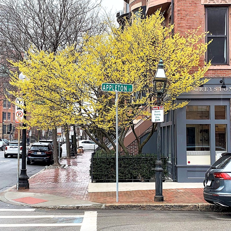
So, what IS that glorious chartreuse tree?
Well… coincidentally…

A couple of weeks ago, I walked with one of my new Boston friends in the public garden when we happened upon this foreign but delightfully fragrant tree with chartreuse flowers. She’s only been here 18 months, and neither of us knew what this tree was. So, we snapped pics, and she looked it up on one of those apps. How cool is that! And yep. It’s witch hazel.
But, you Bostonians all knew that, already.
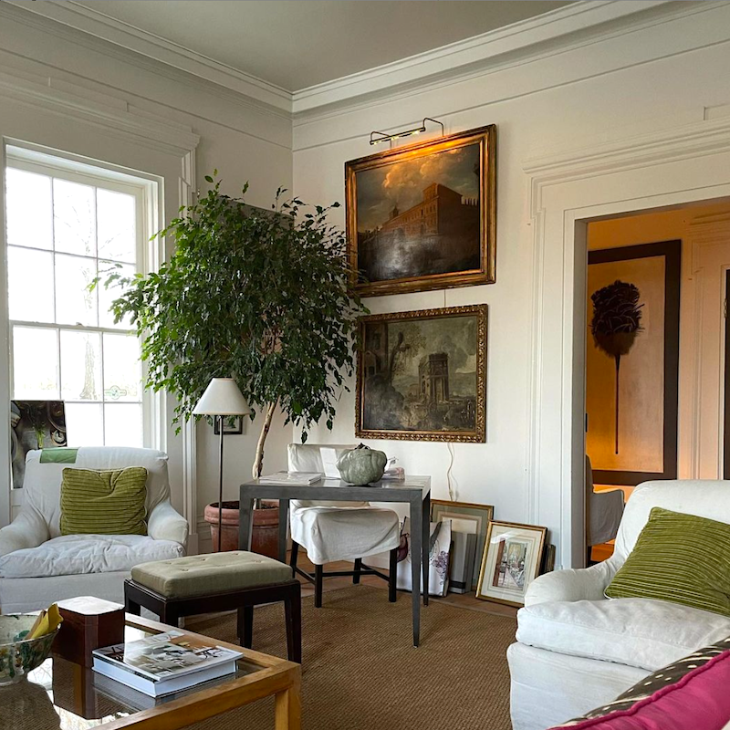
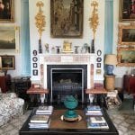
The next three shots, I swiped from Gerald Bland’s glorious Instagram account. Please follow him if you aren’t already. If you want to learn how to put together an elegant room, just do what he does. Indeed, he makes it all look effortless. It’s not, of course.
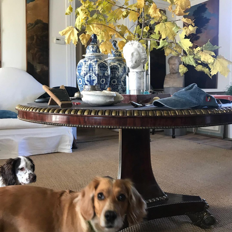
Lucky dogs!
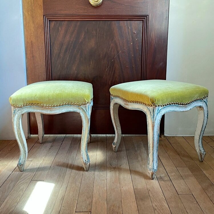
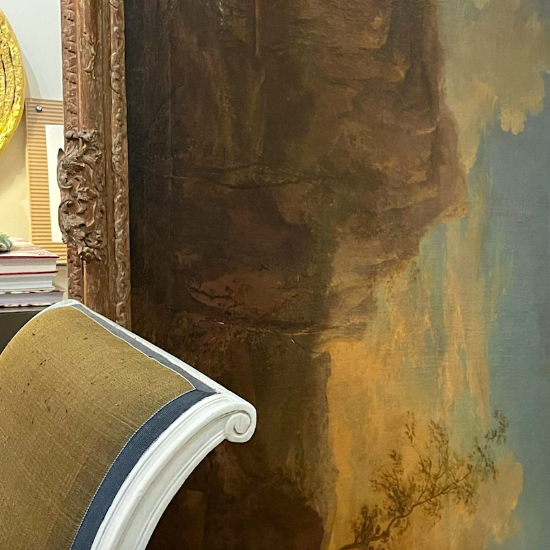
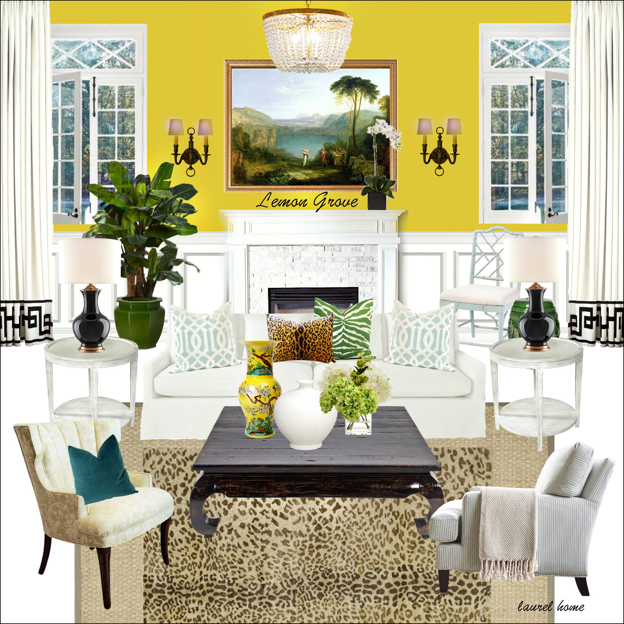
Gorgeous tabourets, they are called. We can just call them stools. (Louis XV – Rococo)). That is the same period of time as Pillement who painted the glorious Chinoiserie toiles and other paintings. There’s that yellow-green. That looks to be a linen velvet.
Oh my! Gerald has the same fabric on his pillows as is on my settee. Only his pillows aren’t horribly faded.
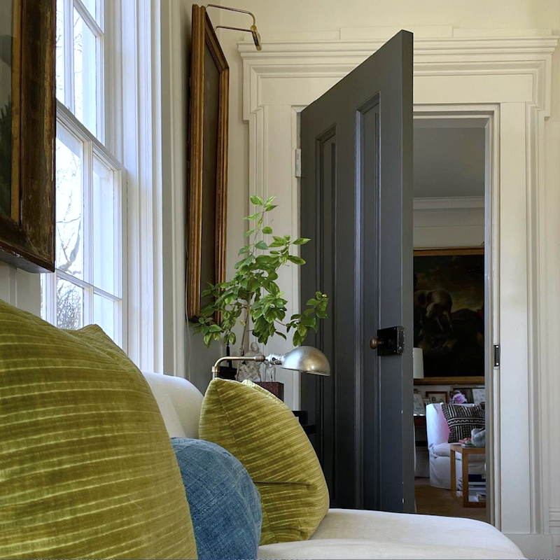
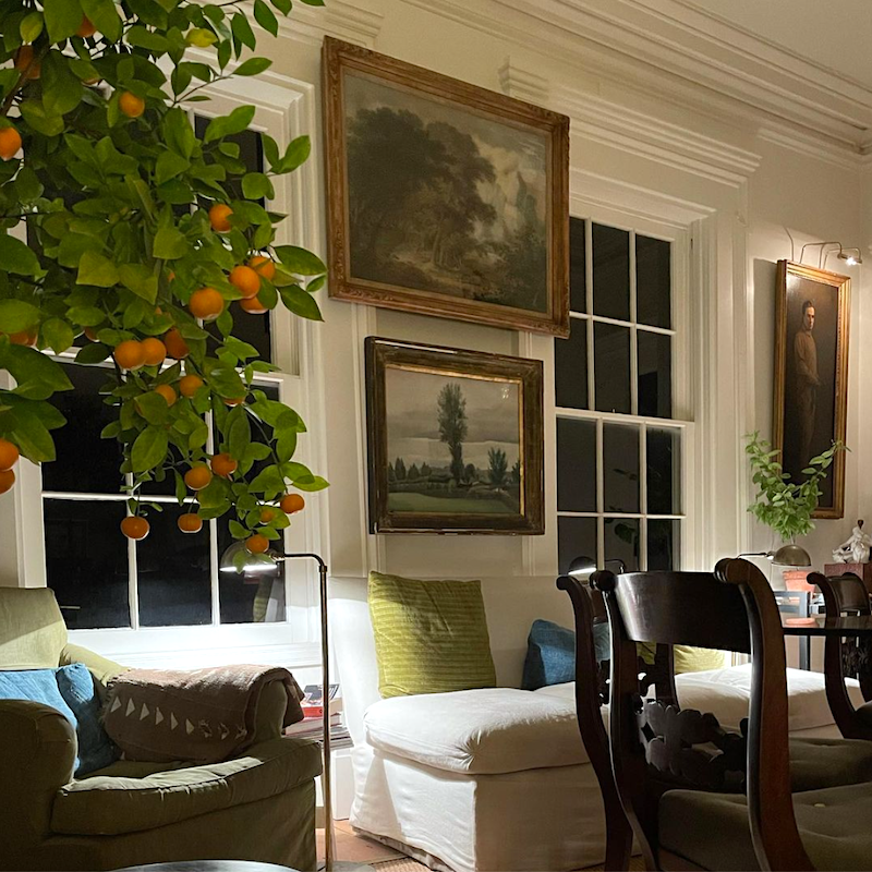
Above and below is from my new living room in Boston.
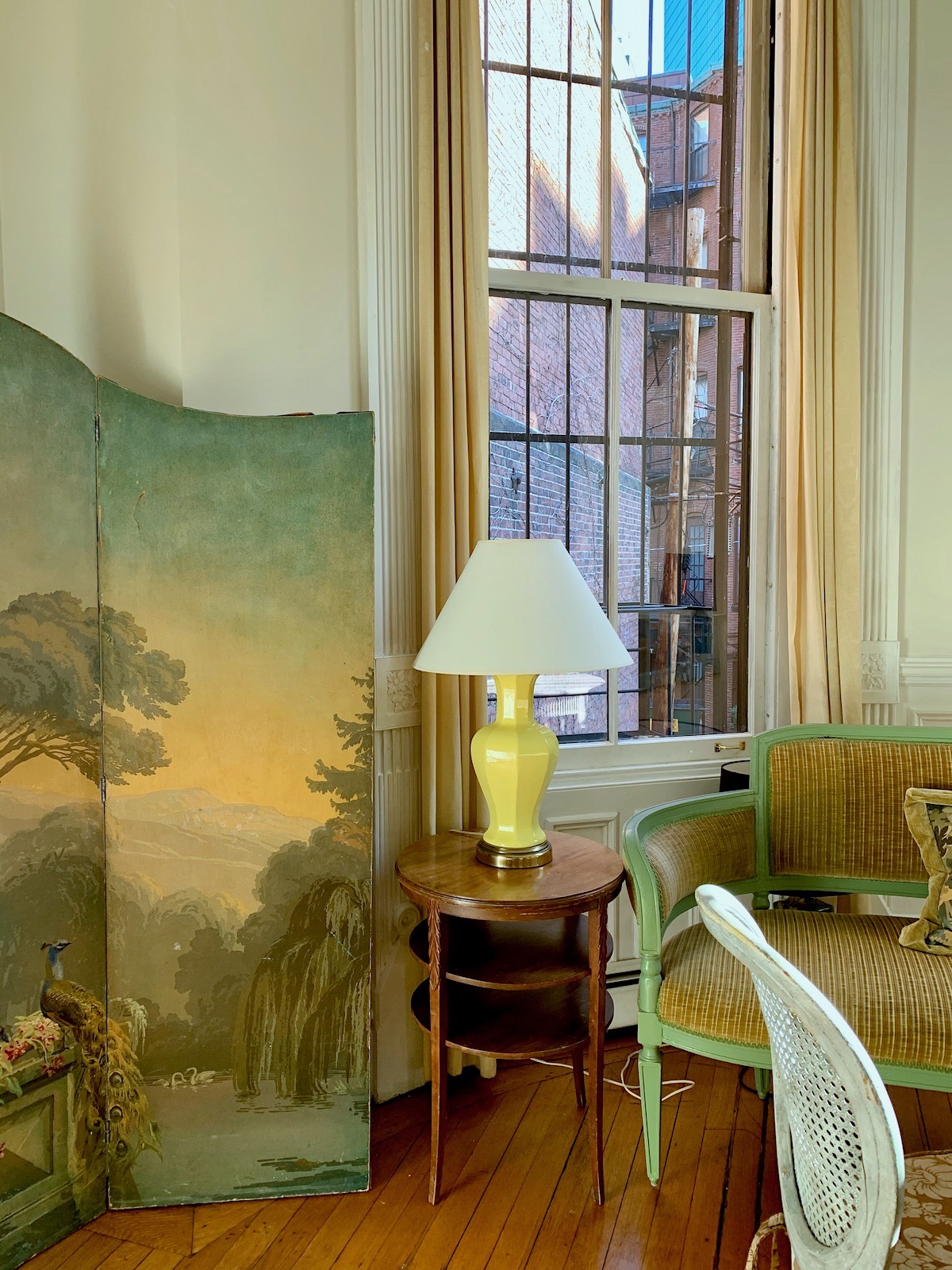 This one with the lights out is more accurate.
Oh, one more painting, and I bet very few of you have heard of this artist. I would not have heard of him, except there’s a gorgeous painting of his in the Bronxville Library.
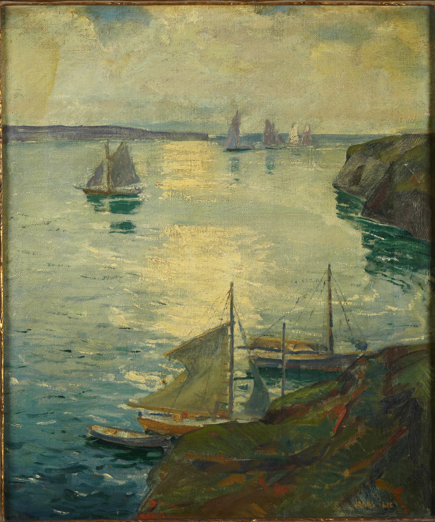
Most of his work is early 20th century. So painterly is his work. And the colors!
Back to Gerald Bland.
Remember this post about “bland decor” (not) that I devoted to him. I’m a huge fan, obviously!
Oh, it matters not that the painting is on its side. I see shapes and the glorious colors. It’s the same with music. I don’t care about lyrics so much; it’s the melody that speaks to me.
You see, people in paintings don’t generally jump out at me unless there’s a lot of drama and they’re getting their heads chopped off or something like that.
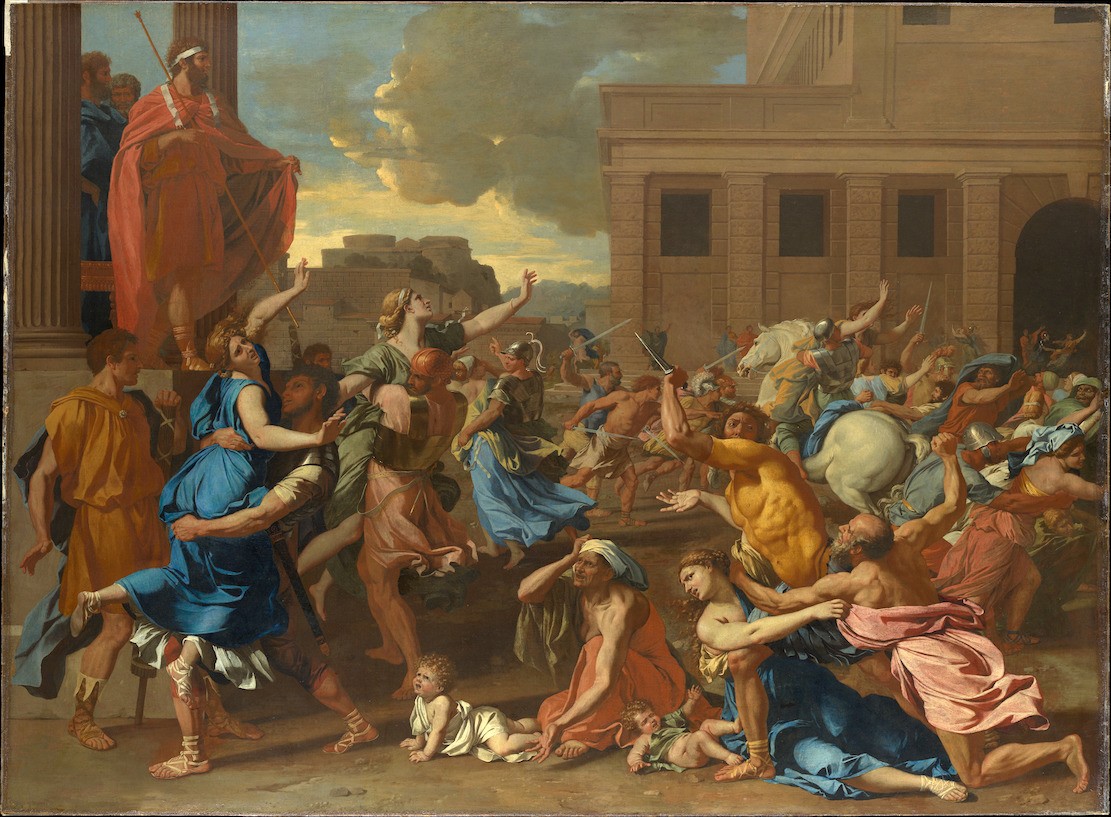
Poussin Abduction of the Sabine Women 1633 – Met Museum

Okay, there are a few exceptions. This dude I noticed. hubba hubba. Yes, please carry me off. I will see you in heaven. ;]
.
What I love about Gerald’s home is everything, but I would never have the courage to hang the art across the window frames like that. And yet, it looks perfectly correct when he does it. BTW, I do go over proper art placement in my 333 Decorating Rules & Tips You Need to Know Guide
There’s a lesson in all of this. It’s the same lesson in nearly every post.
It’s the bones. If you get that right, the rest doesn’t matter as much.
Yes, that’s some costly old art he has collected, amongst other treasures. But, there’s a relaxed old-money look that’s not easy to come by.
Ha! But, when did that ever stop me?
In the meantime, the rest of my fun was in creating another beautiful widget.
I know that I’ve been doing a lot of them recently. And yes, if you buy something, I’ll probably make a few dollars. But, really, it’s just so much fun hunting for the right pieces. I never expect anyone to get anything, but I am grateful to those who do.
The widget below features home furnishings that are in the universal color chartreuse family.
However, I added in other colors that I think all work great together. So, in that way, it becomes a palette one could use for decorating.
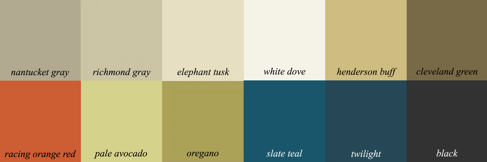
It’s a lot like my Nantucket gray palette from the Laurel Home Paint and Palette Collection.
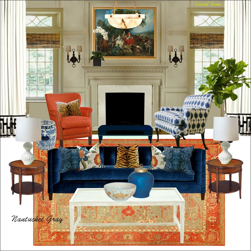 Here’s the board
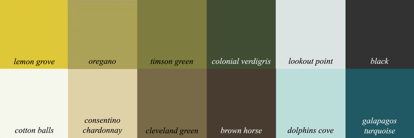
And, the lemon grove palette and also has more colors. This color is in the same palette family. All of the colors in each palette family go together. So, no guessing!
Okay, here’s the widget. Please enjoy the beautiful furnishings.

Well, that’s all for now.
Blessings to all of you!
xo,

PS: Please check out the newly updated HOT SALES
Related Posts
 The Only Six White Paint Trim Colors You’ll Need
- How To Create The Mark D Sikes Look For Your Patio Furniture
- Stainless Steel Sucks – What You Should Use Instead
- The Ultimate Guide To Fireplace Mantel Decorating
- How To Create The Perfect Summer Home
- Is The “Unkitchen” Kitchen Design Trend, Here To Stay?
- Some Unusual Renovation Ideas for a Brownstone Duplex


134 Responses
I just found your blog, and I just want to say, with regards to ‘Sunday’s post’, your response and reasoning were awesome, and I greatly appreciated your critical thinking on the matter. Nuff said. Your blog is wonderful, and your followers are lucky that you contribute your wealth of experience and talent! Thank you 🙂
I adore you. I adore your site. I understand that you were not familiar with the hypersexualization of Asian women in our culture, and the awful things that come from it.
This is an especially painful and frightening time for most of your readers right now – we are tender. The pandemic has taken its toll. And part of it for some of us is there is a rash of violence against Asian Americans – mostly targeting the elderly and women. It is always the most vulnerable who are targeted. 🙁 i love my mother in law very much and I am very much afraid for her and have been for the last year. The stomach knotting fear like you when you have the school dreams where you arrive and it is a test but you can’t remember anything and you can’t find your pencil and are you even wearing pants? The violence is real even if it is barely making the news. It is painful to see it dismissed. It is painful to have the pain and fear dismissed.
I adore you and your blog. Please understand that people who are afraid right now are your readers, and finding distraction and enjoyment from your blog, Your blog has gotten me through very dark moments of this pandemic,
You are a talented designer and writer and I appreciate you sharing your gifts with us. I love your posts. And I love toile a ridiculous amount. 🙂
Thank you for sharing your experience and feelings, Ellie. I am very sorry for your pain. It is a horrible crime by a very sick young man with a gun. I pray the violence stops. It can happen anywhere and we are all vulnerable. {{{hugs}}}
Ahhh….toile. Thank you for that beautiful post. I wonder why people can’t accept toile for what it is-no basis in reality. Just a fantasy design style. If you really think about it, it is no different than faeries or unicorns on fabric or wallpaper. Too bad some people can’t appreciate the artistic talents and creativity of others and find it acceptable to make personal attacks. You keep doing your job and serving us beauty, craftsmanship, and creativity to admire every week. The world needs more of what you do and less knee-jerk, not-thought-about, mean commentary. Thanks, Laurel.
Danielle, could you please direct me to the post with Barcelona chairs and the camel back sofa? I have my Gran’s Barcelona chairs and I’m fighting a rear guard action to keep them in the same room as my camel back sofa. Having a picture of that interior you talk about could be a big help! Cheers!
“But, there’s a relaxed old-money look that’s not easy to come by.” Great comment! I’ve been thinking about this for quite a while- ever since I saw the remarkable interior of a British manor house where they’d mixed Barcelona chairs and camelback velvet sofas to great effect. I wonder if it is because everything is first-rate all by itself? The very best- however old it is. Perhaps family heirlooms that are handed down, and everything layered over with a good sense of proportion and probably some color coordination. You are right, it’s tough to pull off. I’m not sure it can be bought, only accumulated. I’m working hard at it with the (much less exquisite) items I’ve inherited- and the bits here and there where it is working out is very satisfying. Thinking that something might be passed down has also made me much more careful and willing to spend money than I have been in the past.
And yes!! Chartreuse! Although I’ve been used a more subdued, mossy green it’s definitely the same yellow green hue. Love your Nantucket Gray and Cleveland Green Palettes and use them through my home. Thanks so much.
Your blog is one of the bright spots of my day. I can only feel pity for those who choose to say negative things about you. Their sentiments are crap and should be tossed aside as such. Chinoiserie is a a wonderful interpretation and not a condemnation of anything. Please keep posting. You are wonderful!!!!
Dear Laurel
Look forward to and love your posts. You go out of your way to educate, inform and share your considerable knowledge in an entertaining manner. And went out of your way last week to NOT offend. And yet the trolls were still there. Oh well, the internet has given them a platform.
Please keep on doing what you do and allowing us to learn from your hard work.
Chartreuse is my favorite color too. Lime green or anything in that family.
I agree with the others. Don’t let the haters get you down my gosh 90% of the art that depict people would be withdrawn from the worldview if these crazies get their way. Same with Classic Movies and they’re even trying to rename the wonderful Washington and Lee University and take Lee out of it. This is a man who never owned any slaves and saved the University and so many other good things.
He was a real hero, and people don’t know that story about him, they only know he was leader of the Confederacy. People bone up on your history. Don’t erase it or we’re just like the Taliban.
Please don’t stop getting up on your soapbox! Please don’t let these loud protesting voices drown out the rest of us who are just living our lives. We are not all lemmings conforming to the tide of public opinion in our hyper-sensitive-crazed culture currently promoting group think whilst lifting every rock looking for the mythical word-monster. Mercy, have some common sense. Why can’t they leave you alone & follow some other platform that aligns w/their thinking if it’s SO offensive to them? as difficult as it must be for you you’re a voice of reason for us all when you refuse to be shamed. I completely agree that eventually life will trip them up w/a real problem in lieu of an imaginary one cause that’s life. This week our 37 yr old type 1 diabetic son got COVID. Exactly the same week last year when my mom got COVID, was hospitalized and subsequently died. Real life, real problems. P.S. I LOVE all the greens and find it impressive that looking at great art is more relaxing than wine.
Art. From the moment we wake up to the moment we close our eyes we are enjoying, or at least observing, something someone thought about, designed, refined, created or manufactured…loved and appreciated by some, but not by others. I recently heard a scientist express that science and the arts go hand in hand, because there is a seed planted in the very process of creation, a passion and yearning for questions to be answered and an overall sense of curiousity in the scientist and the artist. She said that people who don’t understand that inner drive to continuously observe the world, ask questions and create, just aren’t wired the same way, and therefore don’t understand. I think Ben Mankowitz of TCM explains it best…that if we stopped showing movie creations like Gone With The Wind, we are not only tossing aside Hattie McDaniels superb major role, and wonderful performance, possibly to be forgotten or unappreciated by generations following her…we are also choosing then to hide or erase our history, and the lessons we have to learn from it. I’m sure the same could be said for West Side Story or Flower Drum Song. TCM has no intention of not showing anything in their collection, but they’ve added great conversations prior and after more controversial films, that are engaging and thought provoking.
Whew! Now, about chartreuse…the only green in my home is in art or minimally in rugs. As a child, I had very dark brown, but light sensitive eyes, so my Mother or Father would put their green tinted sunglasses on me, which made me car sick, and then there were years of migraines (before discovering cheese allergy) that didn’t like green. My working class Vic is filled with lots of saturated, warm and inviting colors, just no green…however, when I designed the different rooms and levels in our pollinator gardens, researching over many years during winters, I planned for leaf color and texture as much as for bloom colors. I knew I wanted Chartreuse, because it adds additional warmth, and looks outstanding against cocobean mulch. Even if you are in the city with only a small garden, you can add this lovely, fine textured plant, Amsonia hubrechti. In the spring it emerges as a mound of star shaped, true blue flowers, which then turn yellow green, to bright green for summer, then chartreuse as autumn arrives before the tips blush at the end of the season. It’s soft, fluffy and moves in the wind in a way that relaxes you while observing, and birds like hopping under it. The Annual flowering Nicotianna (flowering nicotine) is also another chartreuse plant with lovely fragrant blossoms. I try to add some to my green and white gardens each year, along with florida boy caladiums, a house plant that helps tuck in other shades of yellow green and great texture to the landscape. Lately, I’ve noticed more plants, such as Iris, where the blossoms are chartreuse leaning mixed with white. Maybe chartreuse will be the straw that breaks the grey and white camel’s back:) Thanks Laurel for your excellent Blog…I hope people will mind their manners.
Chartreuse makes my heart sing. Pale avocado has been above my dining room chair rail for years and will be again in our new house. My sofa is a very similar green as yours. I bought the World Market green lamp from your widget as it is similar to your green lamp and I like them together. I am currently being drawn to Uzbekistan embroidered pillows that use chartreuse silk embroidery floss. Gorgeous. I was going to paint an old short secretary black. But now looking at your widget, dare I paint pale avocado? You have nearly convinced me to get a sea grass rug but I have to research size. The one in your widget might be too small. Thank you for sharing your expertise, humor, and yes, opinions.
I was late to the party, and missed a whole debacle on toile! It actually happens to be one of my favorite fabrics and wallpapers. In fact my 15 minutes of fame revolves around my master bedroom on the cover of Better Homes & Gardens with a red and white toile fabric on my bed!! your blog is one of the only ones I actually read. I enjoy your insight and your good taste AND your great sense of humor. I’m sorry that people attacked you, for trying to educate people, about what a wonderful fabric toile du Jouy is! Now, on to chartreuse. I think it looks beautiful in your home, but because it’s a color is it looks absolutely horrible on me, I can’t imagine having it in my own home. I guess because my home sit on the other side of the color wheel with the Reds!! I hope you keep writing what you feel. I think 95% of us agree with you!
I have never regretted painting my downstairs in BM’s Rainforest Dew after seeing it featured in one of your posts!
We are remodeling and I was so lucky to accompany my husband to the dump. I have never been to the dump. We were assigned to a giant booth and right there were two nice chartreuse ceramic planters in perfect condition, 18 inches tall and 14 wide. I never thought I liked green very much but my heart leapt with joy when I saw those, they are so cheerful, I just love them.
Laurel, I think you’re great in every way. I love chartreuse too, probably too much lol. I feel like having it everywhere, but I know that’s not a good look. Currently I have a new sapphire velvet sofa with silk chartreuse throw pillows. Blessings, and I hope you have a wonderful Spring in Boston!
sorry that happened to you Laurel, there is a whole lotta hate out there
when I started my landscape & interior business 32 years ago a client had a massive tragedy and let me know all about it. The pink tulips we planted the previous fall came up in spring RED. it is rare when bulbs are mismarked but it happens.
I was a newbie and that lashing really set me back, big time. I have since decided she had not lived life long enough, did not know what a tragedy truly is. agree with your assessment of your “critics”. I would block them!
First let me say how much I look forward to your posts. My grandmother loved shades of greens and gold. Mine is blue, all shades but as I mature every day am finding those colors more and more in my home. My Ethan Allen furniture are white but the accessories are the rich gold and greens with old brass and glass tables. Geez, the tables are 30 some years old and I paid a fortune back then. Anyway, thanks again for your wonderful words and please forgive the ignorance of others. Gram always said “Ignore is bliss” and “An idle mind is the devils workshop”.
I LOVE chartreuse when it leans towards green.
I want to say it’s my FAV color, but as soon as I say that, I remember how much I adore orange!
And as soon as I say how much orange is my favorite color I remember how much purple get’s me goin’.
And as soon as I state that purple is my all-time favorite, I remember how much I love chartreuse.
Can’t seem to make up my mind.
Love your blog Laurel. Don’t let people get you down. People choose to be offended over all kinds of things these days. Shake it off. You’re awesome. 🙂
Enjoyed this post. The board with the blue couch is going to be inspiration for my living room redo.
I love that Nantucket Gray board! It was my inspiration for my sitting room adjacent to my dining room. I used what I had and bought all of those pillows, the blue ceramic ginger jar, and the rug on Overstock. It’s such a pretty room! The artwork is beautiful, too, but you didn’t mention where it came from in your book. If you have any idea, I’d love to know!
Hi Laurel!
I’m a long time reader now, first time to comment. Thank you. Just, thank you- for all that you are, and all that you do. My daughter is 13 and loves ballet, I love it when you post snippets of ballet! My husband & I now love to watch ballet as well. We built our home recently, & I used your knowledge extensively to try to build a classic/non- “builder” home. Bought your guides as well, such great information!
It makes me sad that people spew hate.
Shouldn’t we all just simply be absolutely disgusted by the actions of these people that are murdering other humans, period? I live in CO and will never forget all of the mass shootings, since Columbine. Very, very sad. I realize my comment is all over the place, just lots of quick things I wanted to say before things got busy.
Anyhow, you are a bright light in this world, Laurel. Thank you again!
Chartreuse is my favorite Color! I knew we were of like minds! I have gorgeous Chartreuse Silk drapery panels in my Living Rm- such a statement! In my earlier life I was a Flight Attendant and spent much of my time in the Orient. I have antique Imari as well as Blue & White pieces that I treasure, as I do of all my wonderful experiences In Japan, China, etc. I loved both of your posts about Chinoiserie. Our world has gone through such sorrow over the past year. I look forward to your blogs and especially your sense of humor…Thank you Laurel!
It is time for all of you to let go of this vitriol you are posting on this blog. I dare say we come to Laurels blog to escape the world problems. Just let go and enjoy her wonderful knowledge of design.
@Kathy Bussey – Sorry, you are right. I realized you were referring to the ATL shooting (not the CO mass shooting or the ATL arrest last night of another guy with 5 guns). Hard to keep straight which crazy guy had which weapon. Apologies.
Good morning Laurel,
I’ll be sharing this post with my daughter. She’s a big fan of chartreuse. Her home has quite a bit of it. I believe it started with a pair of chartreuse lamps I passed on to her. She loves the color & has been adding more of it. It looks lovely with all the blue in her home.
Hang in there Laurel. We love you! 😘
@Kathy Bussey – it’s a distinction without a difference. The weapon was a Ruger AR-556 “pistol”, which is a semi-automatic combat weapon with the firepower of a long gun (google it and look a the picture). It is not a standard type handgun, but an assault weapon.
Again Laurel – feel free to delete as off-topic: to my knowledge, the Ruger AR-556 does not come in chartreuse.
Just for clarification, the weapon used in the shootings was a handgun according to the news.
I want to like chartreuse, and I do, but it’s one of those colors that make me look ghastly ill if I wear it. So it is hard to put it in my home in more than small doses. But my mother painted the living room of the house I grew up in a color called Green Banana. It was literally the color of an unripe banana, and it was gorgeous, warm and inviting.
It’s fun to see colors you don’t expect to be neutral play so well with others. I bought an antique couch and planned to have it recovered as it was a soft red, almost pink but not quite. I’ve never bothered to recover it, because I’ve always managed to make it work. I love to change around my decor, and it’s gone well with a reproduction wallpaper from the 1930’s as well as my abstract art from the 70’s. I bet it would even look good against the Green Banana walls of my childhood!
Laurel, perhaps you’re familiar with this poem which describes the color perfectly:
NOTHING GOLD CAN STAY
Nature’s first green is gold,
Her hardest hue to hold.
Her early leaf’s a flower;
But only so an hour.
Then leaf subsides to leaf.
So Eden sank to grief,
So dawn goes down to day.
Nothing gold can stay.
—Robert Frost
Im here for the design info.
I don’t have to get rid of my Ginger jars do I? Those damn things were really expensive!!
None of us will agree on the politics. Including Laurels’s 2A stuff. I choose to argue politics with a different set of internet strangers whose minds I’ll never change. I follow this blog to make my house nicer, and nothing else.
I agree with you & everyone should have their own ideas but let’s let everyone have those ideas. It would be terribly boring if everyone looked or thought the same way. That is what makes life interesting! Thoughts go out to you & take care of you.
Thanks for the response, Laurel. Peace to you.
LOL LOL LOL I LOVE your sense of humor, Laurel!!! You have to have a sense of humor to survive in this world these days. xoxo
Thank you and yes, I couldn’t agree more.
Laurel, after all the hullabaloo, I love you even better than I did before. Don’t stop being you.
Actually, I’m a registered Democrat, but I vote for PEOPLE, not parties. And, I’m obviously a moderate. I can’t get into any kind of radicalization on either side. BUT– Please, no more! I don’t want to alienate anyone. My BFF who died and other friends are conservatives. The way it works is we just love each other as people and very rarely, if ever, talk politics.
Please accept my apologies. My intention was not to upset or harass you. I truly appreciate you and the information you so freely share with us.
It’s okay. I’m not mad at you, Carolyn; just really tired.
If you’re searching for similar art, I love this set by Nicholas Lancret at the Cleveland Museum.
And it’s wonderful to add, they let you download the full-sized high-resolution photo for free.
https://www.clevelandart.org/art/collection/search?search=1948.176&filter-include-parts=1
You could easily clean it up a bit in Photoshop or a similar free software, then have it printed in panels.
The images are 6000 pixels tall, so you could print it at 40 inches high, which is big!
There are many other museums that let you download high-res art for free or cheap. This one from the Library of Congress has captured my heart: https://www.loc.gov/resource/pga.12118/
And at the risk of raising another ruckus, the Met has some wonderful, free, hi-res chinoiseries by Pillement. https://www.metmuseum.org/art/collection/search/364542?searchField=All&sortBy=Relevance&ft=pillement&offset=0&rpp=20&pos=13
I think the reason that your favorite color goes with everything is that – at least here in Florida – it’s a prominent color of nature and how can you have other colors not look good in nature?
So sorry for the distress caused you by posting wallpaper of all things. These are not normal times. Well, they have happened many times before in history but not during happy well-remembered periods. Best wishes to you, Laurel.
Yay, so there are other fans of yellow-green out there! It’s a wonderful color… somehow it can be both warm and cool at the same time. (I just hate the name “chartreuse”– it sounds like a disease (although I believe it was named after the liqueur.)
Hang in there, Laurel.
Hi, Laurel. I want to comment but I really don’t know how to articulate everything I’m feeling after reading the things you’ve said, and what others have said. It’s a lot to process. Surely you know that you opened the floodgates by stating in your last post that you didn’t think the shootings were race-motivated. As for Dorie’s comment, as a bystander, I don’t believe that was meant to be a personal attack on you or a “bitch slap” as you put it. White privilege is different from simply “being privileged.” I understood her comment to evoke the former, but I don’t know. I admit, I’m left wondering if you believe that white privilege or systemtic racism exists in this country. I appreciate the toile de jouy and chinoiserie history you’ve provided us. I am aesthetically attracted to both and hadn’t even considered if any of it would be considered offensive. I hope we can all grow in our understanding of each other, although I see a lot of disparaging remarks and jokes here which makes me sad. All the best.
Yes, Michelle, I definitely believe systemic racism exists. I have donated to Black Lives Matter. People are making lots of assumptions about me that are not true. Wishing everyone peace.
This is in response to Adrian. Indeed, several commenters went to unfortunate political extremes on both sides. But I thought many more comments were very thoughtful and struck a balance. I think many people DID listen to (I guess non-white) commenters’ feelings. Just because not everyone agreed with certain characterizations of (events? Chinoiserie?) does not mean you were not heard. I think Laurel deserves thanks for hanging in there and I was thrilled that my chartreuse sofa is finally getting the appreciation it deserves.
Laurel, I love your blog and look forward to it every week. You have taught me so much!! Just ignore all of those nasty commenters. Why do they have to spout political correctness when we are on here to enjoy beautiful homes? There are times and places for political discussions and I don’t think this is the place. Keep up the good work, Laurel.
I’ve found that, rather than favorite colors, I have favorite color combinations. Chartreuse and periwinkle is one of them.
If you want a chuckle, do a Google image search for ‘chartreuse color.’ I realize that screens/monitors display colors differently…but, goodness! There must be most of the greens in the fan deck there.
Laurel, I admire your common sense. And I love your blog. Please continue being you!
Just want to say hi Laurel! I grew up in Scarsdale and lived in Bronxville after college. We moved to a suburb north west of Boston ( Westford) about 25 years ago and raised our boys here. When I see a new blog post from you, I always wait to read it when I have plenty of time… like to take in all your info! I really appreciate all the time and effort you put into your posts. Other people I follow never reach out and find new photos and examples…. thank you!
I’m not sure why people feel free to say anything in writing that they wouldn’t say to your face. I appreciate the many different aspects of decorating you present to us. Even the tiniest detail can give me a new idea for my home. I love seeing how other people decorate even though their taste is not at all like mine. Think how boring life would be if our houses all looked the same. Variety is wonderful! Keep presenting us with ideas that expand our horizons! There’s always a take-away.
And sorry, I wish to explain that my “thought-bullying” remark is directed at Amy George. You may have all the good intentions in the world, but just stop it.
Love Love your blog!!!! Love Love YOU!!
I pour over every word and picture… if you have seen my Pinterest it’s full of your images lol. I follow every link too, GREAT stuff Laurel. Stay happy even if it takes a BCP!
Hello Amy,
I wholeheartedly agree. Listening with an open mind is how we find common ground. Ending senseless killing certainly seems like something we can all agree on, however, uncomfortable we are with the discussion. It is obviously on everyone’s minds or Laurel would not have brought it up. I love toile and was not aware of it origins. the evolution of design is fascinating. Thankfully, my bedroom toile has a forest theme. And my living room is already almost chartreuse. Lots of common ground once we listen to each other.
I think it is incredibly sad and unfortunately a sign of our times that readers turn a design blog into a forum for their own opinions/criticisms about….everything. My vote is that they be…..cancelled!
Laurel,
I like that when you’re not happy, you seek out beauty to cheer you up. I’m going to incorporate that into my life. I can’t imagine how much those paintings are, but if it’s the style you’re after, you can try https://oilpaintingsforsale.com/collections/landscape-paintings and see if there’s anything there that catches your eye. From what I gather, they’re genuine oil paintings (not prints) and there are thousands of replicas of famous paintings done by real artists. Maybe “treat yo’ self” to something pretty?
Anyway, thanks for spreading sunshine with your blog. Some people may try to cloud things up, but clouds are always temporary.
Cheers!
Very welcome post for me! I have felt drawn to chartreuse for the last month for my entry room wall. It is small and dark and needs a pick me up color. I have found the search either too yellow, olive or green. Does everyone see something different in a color group. Please make the color group pinable. I already have the gold walls and slate sofa, navy blue and black accents. I really appreciate the time that it took to post all your work.
I love chartreuse and orange-red as accents. Since I have quite a lot “brown” wood furniture, it really perks things up!
A touch of chartreuse and teal came to the rescue for my brown sofa when I inherited plush harvest gold carpeting in my home in excellent condition. I wanted to rip it out, but the wood flooring underneath would have had to be patched, and I got outvoted!
Orange-red and green went into the pale slightly minty, almost celery, dining room, and it looks better than it sounds. We did rip out the carpeting in that room, but kept the paint color that matched the pinch pleat curtains.
CC – I have had that EXACT same thought! Where do they get their beautiful tree branches? I have a few expensive fakes but they aren’t nearly the same.
@Tina — That’s fascinating, thanks so much for the roots of chartreuse. I like it even more now : )
Tina, thank you for teaching us more about the origin of the word chartreuse. Fascinating!
A hearty Harumph! I’ve often wondered who ARE the Nazis?
Love you Laurel! Keep doing your fantastic blog!
Laurel,
Another timely post that delights. We are completing total master bath reno with new flooring in the master bedroom, bath and closet all adjoining. I love the new crown moulding is going up today in bedroom and bath. I can see chartreuse velvet on the bench at the foot of the bed. Wow. Still struggling a little with paint color for bedroom wall. Your blog has helped with many decisions. Would love to share more on this reno when complete.
Thank you for this pleasant segue into the world of chartreuse. I’ve always adored this color and love saying the word. I must have imprinted on it as a child. My mother, an artist, had a chartreuse lounge chair in our 1950’s living room, plus a chartreuse and black tropical-themed wallpaper in the foyer. Don’t I wish I had them now.
This also reminds me of the chartreuse liquor made by monks. Curious facts on the etymology of chartreuse from Wikipedia:
The French word chartreuse means “charterhouse”. The monasteries that the monks of the Carthusian order (who started producing Chartreuse liqueur in 1764) live in, of which the first one was established in 1082 by Saint Bruno, are called charter houses because they were chartered—and given generous material support—by the Duke of Burgundy known as Philip the Bold when he took over the area in 1378. Philip the Bold’s elaborately decorated tomb was initially installed at a Carthusian charterhouse when he died in 1404.[4]
Long time follower and here and also a designer. I have to say I agree with Lisa. I was disappointed by Sunday’s post because it didn’t seem like you were taking a moment to listen. If BIPOC people of color are saying that something is offensive to them – as a white woman we should take pause and listen. We should not complain that they are offended. Take a breath and listen and reflect. Asian Americans ARE being attacked and killed and we do not another white person explaining to them how they should feel. I’m white, I’m also an interior designer and I love a toile but I had never thought about the imagery prior to your post. I took the time to read more about the origins of the pattern and realize, I can get that same look without having imagery of other cultures in it. I encourage you to take some time to listen to other voices and perspectives, even the ones that make you uncomfortable and take them as honest feelings and perspectives.
Amy, I agree with you completely. We are talking about two different things. And several Chinese Americans are taking offense in the opposite way.
I believe that there IS racism and that minorities have a right to demand change. However, based on what I know, this case is based on the fact that they were sex workers who happen to be Asian. If they were Swedish sex workers, or Lithuanian sex workers, or Italian sex workers, or any other race or nationality, then I believe the outcome would’ve been the same. Of course, we may never know for sure.
My problem is how did this young man get a hold of a deadly assault rifle? If he had not, then there would’ve been no murders. Or, at least fewer of them.
No matter, it’s a horrifying crime and I for one am crying out for a ban on assault weapons. I did not say ALL guns, but the ones that can kill a number of people very quickly. It’s now two massacres in the span of a week.
I see this is as a HUMAN ISSUE.
Folks, please let’s try to be kind to one another. That is ALL I’ve ever asked for. Let’s not call each other names here. I do believe that for the most part, we want the same things. We want to live happy, healthy, prosperous lives. Let’s focus on the good and beauty that is all around us. I choose to stay positive and I encourage everyone else to do that too.
Thank you.
Has anyone ever noticed how designers (like Gerald Bland in the photo, or especially Steve Cordony — Laurel has a post on him too) never seem to run out of big beautiful tree branches to put in vases?
As a city slicker I have always envied this look but short of sneaking into a public park with a hacksaw…. Oh well 🙂
Thank you for bringing attention to these beautiful old paintings that generally go under the label ‘Old Masters'(denoting paintings from the Renaissance to the 1800s) in auction catalogues. I think these impart a sense of calm, peace and serenity in a way that modern art often doesn’t. They are also often covered with old, yellowed varnish, as you can see in some examples above, that would need to be removed by a professional restorer so that the true underlying colors could be revealed. Nonetheless, some people actually prefer them like this, as it adds to their ‘old world charm’. If you notice, many of these pastoral scenes are also the underlying motifs of the Toile discussed in previous post – isn’t it interesting how all art is intertwined? Another good source for these is LiveAuctioneers, with works by unknown or lesser artists are selling quite cheap. I think they are making a comeback now in decorating, after having fallen out of favor for a few decades as people were going for more modern art. They work so nicely in the type of interiors and colors you show.
Oh Laurel, you always know how to make my day! I am a total amateur where design and decor are concerned, But I have always felt that yellow greens are a great neutral. My favorite sofa is in that color and now needs to be recovered. Fabrics in that color aren’t all that easy to find. I painted our house Benjamin Moore Georgian Green and I love it too.
Oh, I forgot! Laurel, I have been looking for prints that may be in public domain, and Fine Art America is an excellent resource. They are a publishing house for artists, and make it possible for artists’ work to be printed on a variety of surfaces. It might be a way to get a beautuful reproduction?
My husband always says when he enters a shop, he gravitates toward the most expensive things…he calls it a sign of good taste ;D
Have a lovely day, Laurel!
Beautiful post.
I didn’t get a a chance to comment on Sundays post, but I was going to say that I appreciate when you give lessons on the origins of various design elements. And I appreciated the discussion of culture and racism. It’s sad that these types of discussions cause such anger and bad manners. Thank you for what you do. I’m sorry that you were attacked and I hope you’ll continue on.
Hello, Laurel!
I was so sad after reading Sunday’s comments…the sad feeling in one’s tummy when there is so much sadness and anger, and no way to personally change it. So I prayed, for you, for others, for me. I can’t change my Scandinavian pale skin, or my Viking heritage. But I smile with my eyes behind my mask…and whenever I drive in the car, especially. I love people..they are all so beautiful.
And I never thought about chartreuse, but I do have a thing about yellow…it was my favorite color when I was three, and I always thought there was a problem when the yellow crayon or marker was missing from my art box! Now I just have to have yellow walls in my house, and maybe work I’ll work my way towards chartreuse.
We don’t have witch hazel in Alabama, but we have redbud trees ( which are actually purple blooms!) And lots of daffodils! So pretty right now, even though the pollen is so thick there is yellow (chartreuse!) Dust everywhere!
Love you, Laurel!!
Hi Laurel, long time reader; first time commenter. It is true that chartreuse goes with everything. Back in the day I was a home-stager and I had a lot of chartreuse accessories in my inventory as the worked everywhere. LOVE your blog. Very inspiring!
Laurel, which Annie Selke chalk paint color would you say is chartreuse? I’m about to paint a red, demilune table I bought when I was living in Beijing. It’s not an antique, but has a nice shape.
Thanks, in advance, for your advice.
I just wish everyone would dial it down, that’s all. Sick of watching the left vs right drama.
Can we get back to chartreuse? Laurel please do feel free to delete all the political crap (including this post).
(I did, just the first part) ~ Laurel
Love the post, have a chartreuse bathroom, and love it. A saying I try to assess comments with is ; it’s not what you look at, it’s what you see. Generally, what one sees is in their own heart, not necessarily what was intended.
Hi Laurel what’s the difference between chartreuse and BM apple green? Please explain. Loved your chinoiserie and toile post.
Well, it’s subjective, but apple green has more green in it. I love mixing greens, like in my widget.
I like rich, saturated jewel tones as well. My grandmother used to like wallpaper with those be-wigged people frolicking in the meadow with their sheep. To each his own!!
Great post–I love the photo of the tree. We recently bought a condo and a chartreuse chair was left behind. I thought I’d have it recovered but the color is really growing on me. For me the color suffers for the overuse in the 1970s but I’m starting to give it a chance. About those paintings–isn’t good taste a curse sometimes? Half of the things I have pinned are more than I make in a year and I will never own them, but they’re lovely too look at.
Chartreuse! Brings back fond memories of my childhood. My mother must have had a great decorator in the 50’s, as she had the daybed in our basement “rec room” covered in a fanciful print of giant grasshoppers playing musical instruments on a ground of chartreuse! Man, I wish I had some leftovers of that fabric now. It was so FUN! (I hope my post doesn’t offend any grasshoppers.)
Donna! Do you travel?! I could use your help in Colorado! 😉
I saw that tree a year ago when I visited Boston! I took pictures, too! But wasn’t didn’t think to Google and learn what it was.
Thanks for teaching us so much, Laurel, and thanks for today’s dose of fine art. What a fun (and BEAUTIFUL) post!
My second post was a reply to Caroline.
and, Diane, it was deleted. We do not mention that person’s name on here. ever.
I completely agree!!!! I discovered this about 20 years ago in a funny way. My middle school aged daughter needed shoes for a choir concert and I was looking for a nice neutral that would go with everything–couldn’t find anything for her weird little feet. The only thing we could find were these chartreuse sandals which I bought in desperation. Needless to say we quickly discovered there really wasn’t anything they didn’t look great with. Lesson learned and it quickly became a favorite of mine. Fashion to home fashion–it all works the same.
Dianne Krop,
“Just a few generations ago…” yes people wouldn’t get worked up over chinoiserie. But many black people in the South couldn’t vote and Jews were banned from certain “restricted” suburbs of Westchester (this, from experience). The last few generations are not perfect, but they have made progress too and are not just out “to destroy.”
“Notice that THEY bring nothing to the table” – there are many talented young designers from recent generations who bring a lot to the table. (Sheila Bridges, for one). Don’t forget that a lot of lovely traditional styles were all tossed in the dumpster in favor of wall-to-wall shag carpet by the baby boomers (not the millenials). Each generation does their own kind of destruction.
Art and good design don’t belong to one generation vs another. There are people with good and bad taste of all ages (see e.g. Trump gilt toilet).
Art and good design don’t belong to the right or the left either. There are talented interior designers and artists supporting both parties. You are right that little of beauty came out of communism. Not much out of fascism either. Only a handful of nutters are advocating for either extreme. Most of us (right/left, young/old) are ordinary people looking to create peace with our neighbors and beauty in the world.
I believe the W-to-W shag carpeting was the generation before us boomers. At least, I hope so!
You are speaking my whole home color palette! Love teals, chartreuse, gold, caramel, orange, charcoal, animal print and oriental accessories. I have little in the more contemporary furnishings, mostly family pieces and vintage. I don’t care if anyone else likes it…it speaks to me and I’m happy in my surroundings every day. Keep doing what you’re doing, your way. Many of us love your blog, your aesthetic, your design eye, and are always thrilled when we see a post from Laurel. Don’t change a thing of who you are and what you have to say. Let the unhappy, damaged souls find somewhere else to spout their crap. We love you.
Thank you, Diane, and Amen!
hahahahaha This post cracked me up!!! So hilarious and entertaining. And BEAUTIFUL as always. Oh, and BTW, I love little Chinese faces. I think they’re so sweet. In fact, as you already know, I have them all over my dining room walls and they make me smile bigly. Never had a thought about it until it was brought up here. Gosh, I’d be honored if someone had my face plastered all over their walls. Have a great day, Laurel! And much love to you!
Hi, I love seeing (in the BCP link) pictures of Sir Lawrence Alma-Tadema’s work. I love him and first discovered him at the Tate. Dying to go back!
Anyway….I’m in a bind. My house needs to be painted but neighbors recently painted theirs my favorite color. My house is currently sage green, 2010 sage. Next door is a lovely blue similar to P&L Postal blue and on the other side, another blue house – more of a Marine blue. Across the street are 3 houses, two grey and the other beige. Then the 3rd is grey.
Please help me find a color in the green family (unless you think of another one) that will look nice on our street. White trim only please (house used to be all white). Thank you so much in advance!!!
My home is filled with toile and Chinese Export. Never in my life did I think my fabric would talk back to me. My grandmother was an interior designer in the early 1900’s. She imported beautiful decorative objects from Asia. Today they bring me great joy and memories of what must have been a fabulous time in design.
Now I look forward to your post every week as they bring me joy. As my Father used to say “ Don’t let the bastards get you down. “. Onward we go.
Also my Witch Hazel tree brings me the greatest joy in Spring.
I thoroughly enjoy your blog and appreciate all the decorating info and advice. I am painting an older French china hutch with Chinoiserie side panels now so your recent blog was very pertinent.
Your blog is a fun gift to my life. Thank you for all your research !!!!!!!!!!
Sincerely, Barbara
My favorite color is orange which seems to be another one of those colors that people either love or hate but very few in between. My second fav is cooking apple green. I am so thankful that you have such true decorating style without being a slave to only current trend. It’s great when what you love becomes trendy because it’s much easier (and cheaper). I’m waiting for cooking apple green and orange to become trendy in something other than childrens bedding. lol
Hi Laurel,
Spring is also my favorite season so maybe that’s why I like chartreuse so much. Most of the rooms in my house have chartreuse/citron accents. I just painted the guest room with BM Chameleon at 75% strength and it looks amazing!
I’m so sorry that you had to suffer trolls who feel a need to politicize interior decor for Heaven sake! The rest of us enjoy and appreciate your knowledge, experience, insight and quirky sense of humor.
Sherry
I enjoy all your blog posts and have for many years. Please do not let those who want to divide and cancel our culture and all our heritage have a voice, There are more of us then them for sure but only their voices are being heard right now thanks to the media – this is not what the majority in this country stands for but we must speak up and NOT allow them to cancel us. You are an inspiration by showing the beauty in life.
We love you! Don’t let the negativity get you down. We are in great need of compassion, sorely missing I’m afraid in our society.
Just a few generations ago your Sunday post would have been purely about decor.The generations that grew up to destroy not create brought us to what happened on Sunday. Notice that they bring nothing to the table, rather they want to chop the table up and burn it. I will have to get political myself and say the Donald Trump showed us a very different vision, one that embraced MERITOCRACY which leads to creativity. I had high hopes that if he had been re-elected a new renaissance would have begun but my hopes have been dashed with the more communist-leaning administration running the show. No beauty was ever created in Communism. I still have hope but not much sadly and I am grateful for you and the many people here that support you,Laurel. Bless you and them.
Hi Laurel, Thanks for the tip on Gerald Bland, I love to look at beautiful things too. Wasn’t chartreuse Jackie Kennedy’s favorite color?
Thank you for continuing to give us beauty in a world gone ugly.
Marsha Coats
Laurel, I LOVE toile de jouy AND chinoiserie- they both tell stories and who doesn’t like creating stories? I agree with the many- how can you talk about decorating without bringing them up. As for offensive- I find lots of things in my real world much more offensive.
QUESTION I am moving back to Boston after almost three years in Minneapolis (where I should have never been by the way) but I want a full service building. Owned a brownstone on marlborough before and found it lonely. BUT- and here’s the question….how do I bring your style (which is also mine) into a space with huge modern windows, no mouldings, and an open floor plan??? Thoughts?? Thank you- and I love, love your blog. It’s my happy start to most days.
Chartreuse is one of those colors that I’m sure must be ordained by the gods! I have it as pops of color all around my house in paintings and pillows and throws. The color evokes a happy joyous feeling in my soul!
Sending you supportive hugs and love Laurel. Keep being you and hold your head high.
Oh Laurel, I didn’t read comments from last week because I knew what would be there. Glad you survived.
But on to the topic at hand: yellowy greens. Love them! My city house’s first floor is chartreuse and pink. My country house will have a similar color, with creams and Blues ( probably periwinkle) as accents.
I’m a recent convert to your site, enjoying your entertaining and well-thought-out posts. I think chartreuse is an underdog of a color — not appreciated at times (“ugly puke color”) but when it’s in the mix, it gets your attention in the best of ways and elevates the colors around it.
Laurel, I truly enjoy your blog and your unique wit. I live near Woodstock, GA. the town where the horrible GA. shootings occured. Please, please be a “duck” and let the naysayers vitriol roll off of your back. Your post was about art and history and those things are important. I ignore the bullies that want to politicize everything. You are seem to be a very caring and delightful person and I think those who slammed your opinions should be ashamed. Keep up the good work and I will be there supporting your right to your opinion!!!!!
Kathy,
I am being deluged by them, but thank you, I very much appreciate the support.
Carolyn, another Carolyn here. Please be aware that many, many people find the tone of your message tiresome, a bit self absorbed, and patronizing.
Everyone and every group is an “other” to someone else. That is why the laws of the US are based on individual rights. My ancestors fought in two wars to secure individual rights for all Americans.
The king of the castle just stepped in as I was reading your post. I explained some of the Sunday madness and read your response. He said, “Excellent” and appropriate. He is a simple man; direct, kind and thoughtful. You two would get along well.
Geri, This is Laurel. I have deleted your comment. Please NO POLITICAL STATEMENTS!!! This is not the place for that.
Guys, you need to exercise some self-control. Get your ideologies out on facebook or twitter. NOT HERE!
Good Morning,
I’m thoroughly enjoyed Sunday’s post as I do all of yours. Chock full of information, wit and beauty. As the kids say, Haters gonna hate! I’m sorry that people were rude to you. I think with the advent of social media, people are under the mistaken idea that “Everyone is entitled to MY opinion!” Keep doing what you’re doing, it’s wonderful!
My final words. This is about decorating. And all I have to say about Chartreuse, is I am so glad there are those of you out there who appreciate the color. I’m not one of them for any household items, but I can honestly say I would miss it if I didn’t have it. I am drawn to it in pictures, just as purple (and variations thereof). It hits a perfect note.
Hi Laurel,
Bless you dear for all you do and all those you tolerate while doing so!
I Love this color too. I have a shot of it in several rooms.
I really like the NEON Pothos plant for this purpose. Very easy to grow and it’s a great accent.
Mr.Bland looks like he just nonchalantly walks in and puts things down in the perfect spot.
These paintings are beautiful…wonder if we do all need to go buy some quickly before there is no art with people left in this world.
‘White fragility’
They have an entire lexicon of bullshit which is nothing more than fascism. Think like me or you will be villified.
Never give in to cancel culture, Laurel. Freedom of thought and speech are precious rights. Thank you for protecting them and thank you for your wonderful blog.
I know for a fact that my heart is in the right place and my conviction to do what I feel in my heart is right is staunch. I’ve never been one to conform (in the last 40 years) without giving it close examination to figure out if what is being said is right for me. Thank you for your defense, Rachel, but I fear it’s only going to rile the trolls up further.
Carolyn, I think Laurel was explicit in this morning’s posting that she was not addressing this topic, and was fairly dismayed that people chose to steer her column, which was focused on design (and, more importantly, history of design), in a direction she did not want to go.
Thank you, Paula. I very much appreciate your reminding them.
Thanks Laurel for plowing ahead. While it may seem to many as “not the place” for discussions about race, colonialism and hate crime, the reality is this is exactly the type of place these discussions should occur. Each of our actions and words impact others. The heated accusations of “snow flake” “political correctness” and “cancel culture” “woke culture” are all part of a long, long history of depersonalization and vilification of anyone who is “other.” The “other” may be opinions or religion or race or gender or culture. Really any thinking or anyone who is not the same as “me.” I can not truly know the fear my Asian daughter is currently experiencing. I know my own fear for her, but I have never been aware that someone in my community will be afraid of me because of my race, religion or culture. But, people have been afraid of me, because I am in the group who made the laws and rules of society at this moment. Not me as an individual, but me as a representation.
The reason this is the place for these discussions is because the way true change comes is via exposure, discourse, and proximity. My deeply Christian neighbors live next to the “nice” female couple next door, and “their daughter turned out ok! So maybe they aren’t that bad,”
Laurel had the bravery, ba%#s, gall, audacity etc, to bring up a divisive topic and start the discussions.
Fear and ignorance is the basis of discrimination and bias. When someone is unaware that their feelings are biased he/she/them will never address those feelings.
Thank you Laurel for daring to address this topic.
Honestly, Carolyn and others——– PLEASE I am begging ALL of you to STOP. I did not address anything except that I do not see any evidence that Chinoiserie is poking fun at anyone. It is just the opposite. Sheila Bridges knows that most of her toile is being purchased by non-black people. She’s not having a problem with that. I can’t control what people like or don’t like or what offends them.
Again, this is my home and in my home, I need all of you to act like polite guests. Thank you.
Have you thought about poking your nose into some estate sales in your area? I’m sure Boston has quite a few each weekend. You might be about to pick up some lovely oil paintings at affordable prices, especially if you go towards the end. If you need help bickering let me know. I’m your girl, horse trading is my super power. 😉
While I love the idea of finding art that way, it’s not normally my thing, as a rule. I’m spending too much time hunting for a boyfriend. lol
You deserve your moment on the soapbox and I can’t agree with you more. I loved your Sunday post as well as this one. Your wonderful blog has not just educated me, it’s allowed me to get out of my box and rethink my rooms. Shake it off and move forward. 💗
Chartreuse! Thank you for this post. I have a room that is currently apple green and I have been looking for another green to replace it. Was thinking something in the “sage” family, but a chartreuse would be much better.
Chartreuse! Love it, even when poorly executed in the form of . . . wait for it . . . . shag carpet. It was in my parent’s living room in the 70’s and was paired with apricot colored chairs! This was the “formal” room where we were supposed to receive visitors. I will never forget that room and even though it was full out Austin Powers it always struck me as joyful. Thank you, dear Laurel, for reminding me and for another beautiful post.
Lovely post with great inspiration, as always!
I have one question that is “off color” but regarding the picture lights in Gerald’s room…
I have several pictures that I would love to illuminiate, but will nevah get darlin man to agree to adding wired-in lights or sconces (can hardly get a picture hung, adding another NAIL HOLE, horrors).
Any suggestions, dear Laurel? Do you know a source for picture lights similar to those Gerald is using (with the cord hanging down to the plug, and an on-off switch on the cord?).
I’m sorry, I don’t know off-hand.
I’m sorry about the unpleasantness hurled at you on Sunday. Who knew that fabric and wallpaper could offend so deeply? I guess I get it. My decorating attempts offend me daily! That’s why I love your blog as it inspires and educates in beautiful design. Love this post about chartreuse. I think I’ll give it a shot in our library with the lamp from Lamps Plus.
Keep on blogging, please!!!
Laurel, so sorry to hear about the war waged in your comment feed last Sunday. I deliberately avoided it, as I had a feeling the woke mob would be rushing to judgement. I found the post wonderfully informative – I have always been a toile de jouy fan. As for chartreuse – wonderful colour. I have exactly one chartreuse cushion in my house and it never fails to turn my head when I walk into the room. Clearly, time for some more. BTW, just got my cataracts removed – wow. Had no idea there were such vibrant colours sprinkled throughout my house. I highly recommend the procedure before picking paint colours!!
It does seem like being offended on behalf of other people for no reason has turned into an Olympic sport. It would be funny if it wasn’t so insufferable. I didn’t know art therapy was a thing but now it’s my favorite, just like your blog. Hang in there, friend.
Chartreuse is great. Unfortunately as a child it gets the short end of the stick – I vividly remember chartreuse being pretty universally considered the “ugly puke color” in school. Took me about a year to convince the husband that chartreuse curtains were not crazy.
(@Amanda – I know we feel for Laurel, but maybe let’s not open up that can of worms again. Part of the reason the comments got so out of control on the last post was people went to extremes of calling each other “brainwashed Marxists” vs “insensitive racists.” Then the discussion stopped being about the actual content of Laurel’s well-researched post and turned into fighting an entire culture war on her blog. Over FABRIC. Laurel is not a politically extreme person; let’s not make the blog about that. Whatever our personal views, at the end of the day, the conversation was meant to be about fabric choices.)
Gorgeous color (colors)! Springy!
I always love your palettes.
But it infuriates me that some were rude to you regarding your last post. Your deep knowledge of design and the history behind the myriad design styles and elements is just one of the many reasons I treasure your posts! Last week’s was a perfect example of how you often take a deep dive into a particular topic and give your readers a mini course. I thought you made a great and balanced comment when you pointed out all the Europeans depicted on fabrics and wallpapers. It is mind boggling to me that you would be criticized for discussing history and design. Do these same people avoid museums?
Don’t let them get you down Laurel!
I need to circle back to Sunday and say I loved your post. It was refreshing and honest. Can we all just ‘get along’? Amen.
I was out of town and did not read the comments from your post, however, gathered that the “I am woke” and “cancel culture crowd” (except their own; funny how that works) gave you some crap.
My opinion is that this country is in the midst of a marxist takeover and its all part of the plan. Forgive them; actually, forget them, as they are only sheeple following the convictions they get from the news media reading a teleprompter. Not an original critical thinking skill in the bunch.
YES! I literally had an internal conversation with myself today about how I used to dislike citron and peridot (mine and my daughter’s birthstones) but luckily learned to love the yellow-greens because of their universal character! I honestly cannot think of one other color that they doesn’t compliment, including my red hair. My daughter has a similar aversion to teal, which isn’t quite as universal, but I hope someday she has a similar change of heart. In fact, all greens are the most compatible colors – from yellows through blues – in my opinion.
Its 3am guess my body has had enough sleep.
Inspiration,you have it and keep giving it.
For over 60 years I have been saying …..dont care about the words in songs ,it is the melody that attracts me . I get wierd looks saying that.
A comfort read Laurel. Love those trees!
Chartreuse! Cool post, Laurel. My favourite thing from my late granny is an exquisite Venetian damask cushion in chartreuse. Zing! Also thanks for the red & white frock in yesterday’s post, just what I’ve been looking for. Many cheers to you.